Bardan Bias 3.0this script uses SMAs on both the viewed chart and BTC/USD chart so user can get a general market direction
Medie mobili

GutroThis TradingView indicator automatically plots Fibonacci retracement levels based on the day’s first confirmed swing between the session high and low (9:30 AM – 4 PM ET). It includes dynamic 0%, 38.2%, 50%, 61.8%, and 100% levels, a shaded golden zone, VWAP bands with standard-deviation envelopes, and a 9/21 EMA ribbon for trend confirmation.
3-Phasen-Scanner (BPS / BWB / Neutral) – exakt wie TV-EMA3-Phasen-Scanner (BPS / BWB / Neutral) – exakt wie TV-EMA
MLogic v5 — Lean, EOD Momentum System for Serious TradersMLogic v5 is a clean, end-of-day momentum framework built for traders who value clarity, discipline, and audibility. It combines Supertrend-style trend logic with RSI filtering, MACD-based prep signals, and a volatility-aware trailing stop to deliver high-integrity buy/sell signals across global markets.
Core Features:
• Confirmed Buy/Sell Signals based on trend flips and RSI momentum
• MACD Prep Tier with shaded background alerts for early rotation cues
• Volatility-Scaled Trailing Stop to protect gains and reduce drawdown
• Unified Sell Alerts triggered by either trend reversal or stop breach
• EOD Confirmation Logic ensures stable, auditable signals—no intraday noise
Designed For:
• Systematic momentum traders
• Global equity and ETF portfolios (India, Eurozone, US, UK)
• Public-facing performance reporting and visual clarity
• Scalable list-based scanning and automation workflows
For ETF scanning, RSI threshold should be adjusted to 50 to improve responsiveness in slower-moving instruments. A dedicated ETF-optimized version of MLogic may be released separately.
MLogic v5 is not a scalping tool or a mean-reversion system—it’s built for clean, sustainable momentum capture with minimal cognitive load. Whether you’re trading sector ETFs or high-beta names, MLogic helps you stay focused, disciplined, and transparent.

Rita Swings •Impulses and Setbacks (Banana Trader)🚀 I just created an indicator that automatically shows market impulses and pullbacks 📊
With this indicator, you'll be able to see where the price is really moving and where the market pauses before the next move 💪
A simple yet powerful tool to improve your chart reading 🔥

✝️📈📉☢️🔱NUKE is a multi-ticker signal indicator, optimized for intraday futures and stocks trading.
To use: Add to a multi-timeframe charts (e.g., 1m, 5m, 15m), select up to 5 tickers (e.g., MNQ, MES), and set an anchor mode (daily, weekly, monthly, or manual) for session resets. Enable/disable signal components like AVWAP, Price Stoch, VWEMA crosses, ADX, and BB in settings.
For trading: Monitor the dynamic table for recent LONG (L↑) or SHORT (S↓) entries with strength ☢️ (1 to 6, higher indicates stronger confluence). Enter positions in the signal direction on the chart ticker or selected ones, using multi-timeframe confirmation (e.g., anchor to daily while trading on seconds/minutes).
Apply proper risk management, such as ATR-based stops, and test in demo mode.

580TrendTrades - Ride the Wave, Master the Trend580TrendTrades by 580TradingLab is a precision-built trend-following indicator designed to help traders identify and stay aligned with major market moves. Using multi-EMAs alignment, momentum confirmation and adaptive filters, it detects strong directional shifts while avoiding choppy noise.
It highlights clear BUY and SELL zones, helping you capture the middle of big trends-not just the tops or bottoms.
Focus on momentum. Trade in sync with the trend.

Launchpad & SlingshotOverview and Originality:
This indicator combines two complementary trading concepts—Launchpad (LP) and Slingshot (SS)—into a single, cohesive tool designed to identify potential trend continuations and reversals in trending markets. Launchpads provide context on overall trend alignment via stacked moving averages, acting as a filter for higher-probability setups, while Slingshot pinpoints precise entry timing during short-term pullbacks or bounces within those trends. This synergy reduces false signals by requiring both trend confirmation (LP) and momentum shift (SS), making it more robust than using either in isolation. Unlike simple merges, this script adds original enhancements such as a "curling" filter on the shortest Launchpad MA to ensure directional momentum, separate configurable MAs for bullish/bearish Slingshot thresholds, and combined LP/SS alerts for chained patterns (e.g., LP following SS). These improvements aim to enhance usability for trend-following strategies, particularly in volatile stocks or forex pairs, by providing visual labels, alerts, and multi-timeframe support without overcomplicating the core logic.
Underlying Concepts:
Launchpad (LP): Based on the idea of moving average "stacking," where shorter-period MAs align above longer ones in uptrends (bullish stack) or below in downtrends (bearish stack). This detects when price is in a strong, aligned trend phase, similar to how Guppy Multiple Moving Averages identify trend strength through ribbon compression/expansion. The script uses up to four customizable MAs (default: 8/21/50/200 EMAs of close), calculating the highest/lowest among included ones as the key crossover level. A signal triggers when the stack forms from a non-stacked state and price crosses the extreme MA, indicating potential trend acceleration.
Slingshot (SS): Draws from Scot1and's bullish pattern, which looks for price to remain below a 4-period EMA of highs for three consecutive bars (signaling a controlled pullback), then close above it (indicating rebound momentum). This script symmetrizes it for bearish cases using a separate 4-period EMA of lows, allowing detection of breakdowns after temporary bounces in downtrends. The separation of bull/bear sources is an original adaptation to better capture market structure asymmetry—highs for resistance in uptrends, lows for support in downtrends—reducing noise compared to a single-source approach.
The components work together by allowing users to spot "LP after SS" patterns: a Slingshot pullback/rebound followed by a Launchpad stack crossover, which often signals stronger continuations. This chained logic is grounded in momentum trading principles, where short-term mean reversion (SS) aligns with longer-term trend bias (LP) for improved risk-reward entries.
How It Works: The script calculates signals on each bar as follows:
Launchpad Calculations:
Build an array of included MAs (users can exclude any via inputs).
Check for stacking: For bull LP, shorter MAs > longer ones; for bear, shorter < longer.
Require a transition from non-stacked to stacked state.
Price must cross above the highest MA (bull) or below the lowest (bear).
Original filter: The shortest MA must be "curling" up (current > previous for bull) or down (current < previous for bear) to confirm recent momentum, preventing signals in counter-trend flattenings.
Slingshot Calculations:
Use separate MAs: Bull SS uses EMA of highs (default); Bear SS uses EMA of lows.
For bull SS: Close below bull MA for the prior N bars (default 3), then close above it.
For bear SS: Close above bear MA for prior N bars, then close below it.
No additional filters like volume or momentum jumps are applied, staying true to the pattern's simplicity.
Combined and Additional Signals:
"LP after SS": Triggers if LP occurs immediately after an SS, highlighting high-conviction setups.
Stack alerts: Pure stack with price above/below extremes, for trend monitoring.
All MAs can use multi-timeframe data via the timeframe input.
Alerts are set for each condition, and labels appear on the chart (configurable visibility, size, colors). Labels combine (e.g., "Bull LP & SS") if both trigger simultaneously.
How to Use It: Add the script to your chart via TradingView's indicator menu. Default settings suit daily/intraday charts for trending assets like stocks in bull markets (e.g., tech sector during rallies).
Interpretation:
Bull SS: Look for labels during uptrends; enter long on close above the blue Bull SS MA line after a 3-bar pullback. Use as a dip-buy signal.
Bear SS: In downtrends, enter short on close below the purple Bear SS MA after a 3-bar bounce.
Bull LP: Confirms trend strength; enter long on crossover if shortest MA is rising (green label).
Bear LP: Short entry on downside crossover with falling shortest MA (red label).
Prioritize "LP after SS" for layered confirmation—e.g., SS rebound leading into LP acceleration.
Monitor stack alerts for overall bias; avoid trading against the stack.
Customization:
Launchpad Group: Adjust lengths/sources/types; exclude MAs for simpler stacks (e.g., just 50/200 for long-term).
Slingshot Group: Change length (4 default), type (EMA), sources (high/low defaults), or preceding bars (3 default).
Display: Toggle labels, set timeframe (e.g., "D" for daily MAs on hourly chart), adjust offset for label positioning.
Test on historical data: Apply to strong trenders like AAPL or BTC; backtest entries with stops below recent lows.
For best results, combine with volume confirmation or broader market context—e.g., above 200-day MA for longs. This is not financial advice; always use risk management.

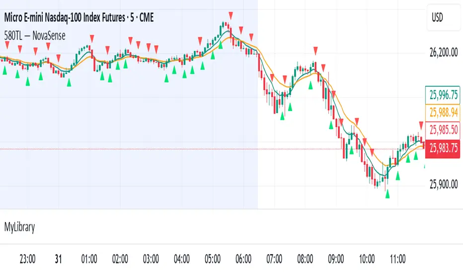
580TL — NovaSenseNovaSense by 580TradingLab combines multi-EMA structure, price actions, momentum confirmation, and volatility logic to detect trend strength and early reversals with high accuracy. It filters out market noise, identifies "location zones" for optional entries, and sends timely Buy/Sell alerts when institutional momentum shifts. Designed for traders who value clarity, discipline, and precision.
Trade with clarity. Sense the trend before it flips.
SA_EMA Combo + UT BotEMA Combo + UT Bot is an indicator designed to make it easier to track trend direction and momentum reversals on the same chart.
The indicator combines multiple EMA lines (50/100/150/200) with a short- and medium-term EMA cloud. This cloud visually shows whether the market is in a bullish or bearish trend through color changes.
In addition, it uses the UT Bot algorithm to generate buy and sell signals adapted to market volatility. These signals are triggered when the price crosses the ATR-based trailing stop level.
Users can choose to use Heikin Ashi candles and adjust signal sensitivity via the Key Value parameter. This allows traders to follow overall trends and potential reversal zones using a single tool.
Disclaimer: This indicator is for technical analysis purposes only and should not be considered financial advice.
Developed for Future Alpha Club.
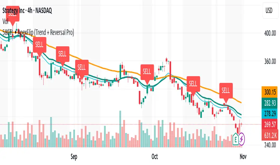
580TL • ApexFlip (Trend + Reversal Pro)Use EMA to find trends. Look for EMA cross, or EMA break with trends. Combine price action to find entry and set stop loss behind EMA.
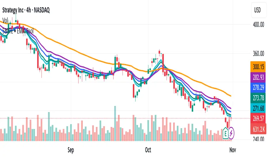
580TL • EMA ToolUse EMA to find trends. Look for EMA cross, or EMA break with trends. Combine price action to find entry and set stop loss behind EMA.
Relative Distance to Moving AverageThis indicator calculates the Relative Distance to a Moving Average (RDMA), a momentum oscillator that measures how overextended a price is from its moving average baseline. It expresses this distance as a percentage, oscillating around a zero line. High positive values may indicate overbought conditions, while large negative values may suggest oversold conditions.
Key Features:
Customizable MA Baseline: The oscillator's baseline is a moving average. Users can select from a wide range of MA types (e.g., EMA, SMA, WMA) and apply volume weighting (Volume weighted) for enhanced responsiveness.
Normalization (Geometric Average): Includes an optional 'Normalize' mode. When enabled, the indicator uses a Geometric Moving Average (GMA) as its baseline and measures the percentage distance from this compound growth average, making it suitable for exponential markets.
Full Divergence Suite (Class A, B, C): The indicator's primary feature is its integrated divergence engine. It automatically detects and plots all three major divergence classes between price and the RDMA:
Regular (A): Signals potential trend exhaustion and reversals.
Hidden (B): Signals potential trend continuations during pullbacks.
Exaggerated (C): Signals weakness at double tops/bottoms.
Divergence Filtering and Visualization:
Price Tolerance Filter: Divergence detection is enhanced with a percentage-based price tolerance (pivPrcTol) to filter out insignificant market noise.
Persistent Visualization: Divergence markers are plotted for the entire duration of the signal and are visually anchored to the RDMA level of the confirming pivot.
Note on Confirmation (Lag): Divergence signals rely on a pivot confirmation method to ensure they do not repaint.
The Start of a- divergence is only detected after the confirming pivot is fully formed (a delay based on Pivot Right Bars).
The End of a divergence is detected either instantly (if the signal is invalidated by price action) or with a delay (when a new, non-divergent pivot is confirmed).
Multi-Timeframe (MTF) Capability:
MTF RDMA Line: The RDMA oscillator itself can be calculated on a higher timeframe, with standard options to handle gaps (Fill Gaps) and prevent repainting (Wait for...).
Limitation: The Divergence detection engine (pivDiv) is disabled if a timeframe other than the chart's timeframe is selected. Divergences are only calculated on the active chart timeframe.
Integrated Alerts: Includes 14 comprehensive alerts for:
The start and end of all 6 divergence types.
The RDMA oscillator crossing the zero line.
DISCLAIMER
For Informational/Educational Use Only: This indicator is provided for informational and educational purposes only. It does not constitute financial, investment, or trading advice, nor is it a recommendation to buy or sell any asset.
Use at Your Own Risk: All trading decisions you make based on the information or signals generated by this indicator are made solely at your own risk.
No Guarantee of Performance: Past performance is not an indicator of future results. The author makes no guarantee regarding the accuracy of the signals or future profitability.
No Liability: The author shall not be held liable for any financial losses or damages incurred directly or indirectly from the use of this indicator.
Signals Are Not Recommendations: The alerts and visual signals (e.g., crossovers) generated by this tool are not direct recommendations to buy or sell. They are technical observations for your own analysis and consideration.

Versatile Moving AverageThe Versatile Moving Average (VMA) is a comprehensive, all-in-one tool for trend analysis. It is designed to act as a central hub for advanced MA calculations by combining a wide selection of average types, calculation modes, and a multi-timeframe engine.
Key Features:
Comprehensive MA Selection: Provides a wide variety of moving average types (e.g., EMA, SMA, WMA, HMA, and their volume-weighted counterparts). Allows full customization of length, source, and offset.
Advanced Calculation Modes:
Volume Weighting: Optionally weights the selected MA calculation by volume, making it more responsive to market participation.
Normalization (Geometric Average): A key feature is the optional 'Normalize' mode. When enabled, the indicator calculates a Geometric Moving Average by averaging the logarithms of the source price. This measures the average compound growth rate, making it well-suited for analyzing assets with exponential price behavior.
Multi-Timeframe (MTF) Engine: The indicator includes an MTF conversion block. When a Higher Timeframe (HTF) is selected, advanced options become available: Fill Gaps handles data gaps, and Wait for timeframe to close prevents repainting by ensuring the indicator only updates when the HTF bar closes.
Integrated Alerts: Comes with built-in alerts for the source price crossing over or under the calculated VMA, allowing for timely notifications.
DISCLAIMER
For Informational/Educational Use Only: This indicator is provided for informational and educational purposes only. It does not constitute financial, investment, or trading advice, nor is it a recommendation to buy or sell any asset.
Use at Your Own Risk: All trading decisions you make based on the information or signals generated by this indicator are made solely at your.
No Guarantee of Performance: Past performance is not an indicator of future results. The author makes no guarantee regarding the accuracy of the signals or future profitability.
No Liability: The author shall not be held liable for any financial losses or damages incurred directly or indirectly from the use of this indicator.
Signals Are Not Recommendations: The alerts and visual signals (e.g., crossovers) generated by this tool are not direct recommendations to buy or sell. They are technical observations for your own analysis and consideration.

Multi-Day SMAmade this script due to the frustration of not having the 5 day SMA added with the 10 20 and 50. I need the 5 SMA for my type of trading to determine when to sell with stocks showing exponential growth.
so heres this: Multi SMA
5 day SMA pink
10 day SMA white
20 day SMA blue
50 day SMA red
200 day SMA green

MA 44 moving averages.
There is nothing more to it, but I have to write this otherwise TV wont let me publish.
Emperor Moving Averages📘 Description: Emperor Moving Averages — Smart Trend Strength System
Emperor Moving Averages (EMA) is a next-generation trend tracking and confirmation system designed for traders who demand clarity, structure, and actionable precision.
It goes beyond traditional moving averages — combining multi-length dynamic trend analysis, color-coded slope momentum, trend strength visualization via table, and smart crossover alerts.
This indicator is ideal for scalpers, swing traders, and position traders who want to stay aligned with the dominant market momentum without cluttering the chart.
⚙️ Core Features
🧠 1. Dynamic Multi–Moving Average System
Plot up to 8 customizable MAs (EMA, SMA, WMA, or HMA).
Each line dynamically reflects short to long-term trend behavior — perfect for spotting confluence zones and directional bias.
🎨 2. Auto Slope Coloring
Each moving average is automatically colored based on slope direction:
🟢 Bullish (Up Slope) — Trend gaining strength upward
🔴 Bearish (Down Slope) — Trend losing strength or reversing
The slope logic helps identify momentum shifts far earlier than crossover-based signals.
🌫️ 3. Clean Chart Toggle
Toggle all MA lines ON/OFF instantly using
“Show Moving Average Lines?”
for a clutter-free chart — view only the Trend Strength Table when you want a quick macro snapshot.
📊 4. Trend Strength Table
The heart of the indicator — the Trend Strength Table displays every MA’s direction in real-time.
It instantly tells you:
Which MAs are bullish or bearish
How many are aligned in one direction
Whether the overall bias is strengthening or weakening
You can move this table anywhere on your chart — including:
Top / Middle / Bottom + Left / Center / Right positions
This makes it ultra-flexible for any chart layout or resolution.
🔔 5. Intelligent Cross Alerts
Built-in alerts notify you whenever a faster MA crosses over or under a slower MA.
Crossover Up: Fast MA breaks above slow MA → Bullish signal
Crossunder Down: Fast MA breaks below slow MA → Bearish signal
You can adjust the cross sensitivity for tighter or wider detection.
📈 How to Use
Choose your MA type (EMA / SMA / WMA / HMA).
Set the number of MAs (up to 8) and their lengths.
Turn “Show Moving Average Lines” on or off based on preference.
Use the Trend Table to instantly gauge trend strength alignment across all MAs.
Turn on Cross Alerts to get notified on key trend shifts.
🧩 Recommended Setups
Short-term traders (Scalping):
Use smaller MA lengths (e.g., 9, 21, 34) to capture micro-trends.
Swing traders:
Combine 20, 50, 100, 200 to analyze structure shifts and retracements.
Institutional confluence:
Use all 8 MAs together for high-confidence directional bias.
⚡ Advantages
✅ Trend visualization made intuitive
✅ No lagging repainting elements
✅ Adjustable table positioning
✅ Lightweight performance
✅ Perfect companion to price action strategies
💬 Alerts
MA Crossover Up: Fast MA > Slow MA
MA Crossover Down: Fast MA < Slow MA
Use these alerts for automated trend confirmation and entry management.
👑 Final Words
Emperor Moving Averages isn’t just another MA indicator —
it’s a visual intelligence tool that helps traders see market structure clearly, without noise.
Built for clarity, precision, and professional-grade usability.
⚔️ Perfect Combination — Emperor RSI Candle + Emperor Moving Averages
🔸 Emperor RSI Candle
Detects internal candle momentum and RSI power zones
Identifies early exhaustion or entry zones
Great for timing precise entries and exits
🔹 Emperor Moving Averages
Confirms directional trend and slope strength
Validates macro structure and overall momentum direction
Great for staying aligned with the dominant trend flow
✅ Together they create a complete Emperor Trend System:
Use RSI Candle for entry timing and momentum confirmation.
Use Emperor MA Trend Table to confirm overall trend strength.
Enter trades when both align — for maximum accuracy and confidence.
📢 Credits
Developed by Live Trading Emperor — Creator of the Emperor Series for advanced market analysis.
Follow for more premium-grade, scalper-friendly, and MTF-enhanced tools.

iulifx EMAThe indicator is built on an 8-period moving average that closely follows price action.
When a candle closes completely beyond the moving average, it’s a signal to be cautious, as this may indicate a potential trend reversal.
If only the wick of the candle reaches the moving average and then gets absorbed, it can be interpreted as a retest, suggesting an opportunity to enter the market in the current trend direction.
Additionally, candle colors reflect market volume conditions:
Blue candles indicate an overbought zone, showing strong buying pressure — a potential start of a bullish move.
Black candles indicate an oversold zone, reflecting strong selling pressure.
If one of these colored candles breaks the moving average with strength and momentum, it strongly suggests that a trend reversal is likely underway.

Breakout FinderFindling possible breakouts.. works well when you use short SL and High Risk to Reward Ratio

7 MM colored 3 BB clouded + MACD + RSI Zones7 MM colored
3 BB clouded
MACD flèches rouges et vertes
RSI Zones sur vente étoile jaune

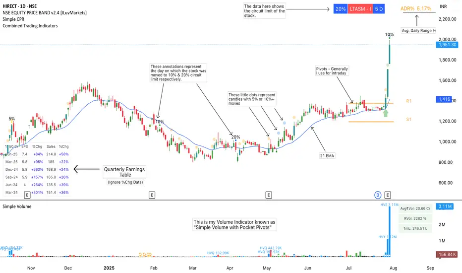
Combined Trading IndicatorsThis indicator is a combination of EMAs (4 Editable EMAs), Quarterly Earnings, OOPs Reversal day, Burst Power Indicator, RS Rating, ADR% Settings and a few more to come.
Basically it is designed for swing traders who are using TradingView's Basic or Essential Program.
Please ignore the %Chg data in QE Table.
Gold $25 line + CDCGold Trading CDC + option line
trading with ema to see trendline + Option strike price

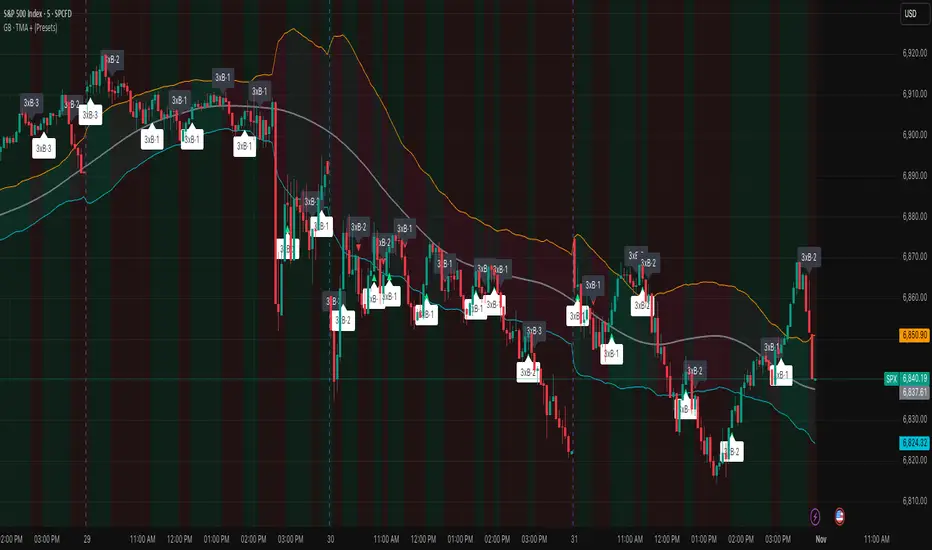
Grizzly Brahman · PRO SCALPERGrizzly Brahman TMAX 4 is a fourth-generation Trend-Momentum-Adaptive Crossover system built to identify true intraday direction and volatility alignment before price acceleration begins.
It combines adaptive moving-average bands, momentum filtration, and trend-fill logic to produce crystal-clear long/short zones directly on the chart.
Preset Modes
“Aggressive / Balanced / Disciplined” presets optimize responsiveness for scalping, intra-day, or swing conditions.
Session Shading & ORB Levels
Optional overlays for Opening Range Breakout, Pre-Market High/Low, and Previous Day High/Low to frame liquidity targets.
Heikin Ashi Compatibility
Optimized to read momentum flow cleanly on Heikin Ashi charts for false-breakout filtering.
Momentum Bands
Adaptive outer bands act as over-extension or “take-profit” zones — similar to ATR channels but smoothed for consistency.
How to Use
Identify Trend Zone — watch for color fill change and TMA alignment.
Enter on Marker Confirmation — green triangle = long momentum confirm, red triangle = short.
Manage Risk around outer TMA/ATR band touches or when color intensity fades.
Combine with GB Set-Up & Confirmation (lower pane) for dual-signal entry validation.