CBC Flip with Volume [Pt]█ CBC Flip with Volume
A price-action based indicator that detects real-time control flips between bulls and bears, enhanced with volume filtering and Pine Screener compatibility.
This tool tracks when the market shifts from bear control to bull control or vice versa, using candle structure and volume behavior. It highlights key reversal points, filters low-conviction moves, and provides two screener-ready outputs for directional monitoring.
█ What It Detects
This script identifies when control flips between buyers and sellers on a candle-by-candle basis. A flip is confirmed only when both price structure and volume meet strict criteria. The indicator uses an internal state to track who is in control and updates when a flip occurs.
█ Flip Conditions
Bull Flip
• Previous bar was under bear control
• Current candle closes above the previous high
• Candle is bullish (close is above open)
• Volume is greater than the previous bar
Bear Flip
• Previous bar was under bull control
• Current candle closes below the previous low
• Candle is bearish (close is below open)
• Volume is greater than the previous bar
When a flip occurs, the indicator updates the control state and records the open price of the flip candle.
█ Strong Flip Detection
A flip is considered strong when volume is also greater than the average volume over a set number of candles (default is 50). Strong flips are visually emphasized using larger markers and darker background shading. This helps filter out moves that lack follow-through volume.
█ Visual Elements on Chart
• Bull Flip (Normal): Small teal triangle below the candle
• Bull Flip (Strong): Larger green triangle below the candle
• Bear Flip (Normal): Small salmon triangle above the candle
• Bear Flip (Strong): Larger red triangle above the candle
• Background Color:
– Green shades for bull flips
– Red shades for bear flips
– Darker color when flip is strong
These visual elements appear only on the candle where a flip is detected. No markers are shown on continuation candles.
█ Inputs
• Volume MA Lookback : Sets the moving average length used for determining whether volume is high enough for a strong flip (default: 50)
█ Alerts
• Bull Flip – Notifies when bulls take control
• Bear Flip – Notifies when bears take control
Alerts are triggered at candle close.
█ Pine Screener Support
This script includes two output columns for TradingView’s Pine Screener:
• Bull in Control (% gain) : Shows the percentage gain from the bull flip’s open to the current close. Resets to 0 when bulls lose control.
• Bear in Control (% gain) : Shows the percentage drop from the bear flip’s open to the current close (as a positive number). Resets to 0 when bears lose control.
These outputs allow you to filter for active moves. For example:
• Bull in Control (% gain) > 2.0 to find strong uptrends
• Bear in Control (% gain) > 1.5 to find sharp breakdowns
█ Use Cases
• Confirm breakouts using volume-backed flips
• Spot short-term reversals at key zones
• Filter out low-volume chop
• Combine screener results with trend or volatility filters
• Build entries around control flips and follow-through strength
Inspired by MapleStax’s original CBC method.
Ptgambler

Market Sentiment Index US Top 40 [Pt]▮Overview
Market Sentiment Index US Top 40 [Pt} shows how the largest US stocks behave together. You pick one simple measure—High Low breakouts, Above Below moving average, or RSI overbought/oversold—and see how many of your chosen top 10/20/30/40 NYSE or NASDAQ names are bullish, neutral, or bearish.
This tool gives you a quick view of broad-market strength or weakness so you can time trades, confirm trends, and spot hidden shifts in market sentiment.
▮Key Features
► Three Simple Modes
High Low Index: counts stocks making new highs or lows over your lookback period
Above Below MA: flags stocks trading above or below their moving average
RSI Sentiment: marks overbought or oversold stocks and plots a small histogram
► Universe Selection
Top 10, 20, 30, or 40 symbols from NYSE or NASDAQ
Option to weight by market cap or treat all symbols equally
► Timeframe Choice
Use your chart’s timeframe or any intraday, daily, weekly, or monthly resolution
► Histogram Smoothing
Two optional moving averages on the sentiment bars
Markers show when the faster average crosses above or below the slower one
► Ticker Table
Optional on-chart table showing each ticker’s state in color
Grid or single-row layout with adjustable text size and color settings
▮Inputs
► Mode and Lookback
Pick High Low, Above Below MA, or RSI Sentiment
Set lookback length (for example 10 bars)
If using Above Below MA, choose the moving average type (EMA, SMA, etc.)
► Universe Setup
Market: NYSE or NASDAQ
Number of symbols: 10, 20, 30, or 40
Weights: on or off
Timeframe: blank to match chart or pick any other
► Moving Averages on Histogram
Enable fast and slow averages
Set their lengths and types
Choose colors for averages and markers
► Table Options
Show or hide the symbol table
Select text size: tiny, small, or normal
Choose layout: grid or one-row
Pick colors for bullish, neutral, and bearish cells
Show or hide exchange prefixes
▮How to Read It
► Sentiment Bars
Green means bullish
Red means bearish
Near zero means neutral
► Zero Line
Separates bullish from bearish readings
► High Low Line (High Low mode only)
Smooth ratio of highs versus lows over your lookback
► MA Crosses
Fast MA above slow MA hints rising breadth
Fast MA below slow MA hints falling breadth
► Ticker Table
Each cell colored green, gray, or red for bull, neutral, or bear
▮Use Cases
► Confirm Market Trends
Early warning when price makes highs but breadth is weak
Catch rallies when breadth turns strong while price is flat
► Spot Sector Rotation
Switch between NYSE and NASDAQ to see which group leads
Watch tech versus industrial breadth to track money flow
► Filter Trade Signals
Enter longs only when breadth is bullish
Consider shorts when breadth turns negative
► Combine with Other Indicators
Use RSI Sentiment with trend tools to spot overextended moves
Add volume indicators in High Low mode for breakout confirmation
► Timeframe Analysis
Daily for big-picture bias
Intraday (15-min) for precise entries and exits

Options Chart Lite [Pt]█ Options Chart Lite
────────────────────────────
█ Introduction
Options Chart Lite is a simplified version of the full Options Chart+ tool — created for traders who want a clean and easy way to visualize option volume around price without extra complexity.
It displays live call and put volume and pricing directly on your TradingView chart, centered around the most relevant strikes for the selected expiry.
────────────────────────────
█ What Is Options Chart Lite ?
Options Chart Lite is a tool that shows real-time call and put activity in a clean, strike-by-strike table.
It provides:
- Side-by-side call/put volume and pricing
- Live table centered on current price
- Total call and put volume summary
- Quick insight into flow without overlays or clutter
────────────────────────────
█ Key Features
Visual Option Table
- Volume and price for calls and puts
- Table auto-centers around current price
- Up to 20 strikes shown
Total Volume Summary
- Call vs put volume shown at the bottom
Formatted Expiry + Timeframe
- Full expiry display (e.g. “Fri Apr 11, 2025”)
- Fixed to 1D timeframe
Reset & Warnings
- Button to reset strike range
- Optional delayed data notice
────────────────────────────
█ Inputs
Option Expiry Date (YYMMDD): Must match a valid expiry
Strike Increment: Strike spacing (e.g., 1, 2.5, 5)
Reference Strike Denominator: Rounds price to valid strike
Font Size Option: Choose Auto, Tiny, Small, or Normal
Reset Button: Re-centers if price moves
Delayed Data Warning: Toggle display of warning
────────────────────────────
█ Use Cases
Spot Key Strikes
See which strikes have the most activity.
Quick Flow Insights
Volume bias without opening an option chain.
Prep Levels
Align price action with strike flow.
Volume Skew Snapshot
Check if calls or puts dominate.
────────────────────────────
█ Known Limitations
- Invalid Expiry or Strike Inputs Will Error
Inputs must match real listed options for the symbol.
- Options Data Must Be Available
Volume will appear as 0 if TradingView data isn’t accessible.
- Strike Range is Limited
Script renders ~20 strikes. Use Reset Indicator if price moves too far.

Options Chart+ [Pt]█ Introduction
Since the launch of options data support on TradingView, the landscape for retail options traders has started to shift. But until now, no tool in the public TradingView library has offered a full-featured, visual-first interface for reading option strike activity directly from your chart.
www.tradingview.com
Options Chart+ changes that — bringing an institutional-style strike analysis interface to TradingView.
It reads the option chain for any symbol and expiry, dynamically builds a strike-by-strike volume and price table, highlights top areas of market activity, and helps you interpret directional sentiment through both total and skew-adjusted implied moves.
────────────────────────────
█ What Is Options Chart+ ?
Options Chart+ is a premium script for analyzing call and put option volumes and pricing for any option chain that's readily available on TradingView.
It provides a real-time, on-chart display of:
- Strike-Level Volume and Price Table
- Gradient Heatmaps for Volume Activity
- Overlayed Top Strikes on the Chart
- Implied Move and Directional Bias Metrics
By visualizing where options traders are concentrating their positioning, this tool helps uncover potential support/resistance zones, directional bets, and key gamma levels — all from the flow.
────────────────────────────
█ Key Features
Visual Option Chain Table
- Centers around the current price
- Real-time volume and price per strike
- Clean formatting with total summaries
Gradient Volume Coloring
- Highlights activity using customizable color gradients
- Makes volume spikes obvious at a glance
Top Strike Overlays
- Automatically highlights top volume call/put strikes
- Overlays labeled lines on the chart for price context
Implied Move and Directional Bias
- ATM straddle = Total Implied Move
- Volume-weighted extrinsics = Directional Implied Move (DIM)
- Shows skew-based bias: bullish or bearish
────────────────────────────
█ Inputs & Customization
Option Expiry Date (YYMMDD): Must match valid options for the symbol
Strike Increment: Matches strike spacing (e.g., 1, 2.5, 5)
Reference Strike Denominator: Rounds the center strike
Volume Timeframe: Any valid chart timeframe
Gradient Volume Coloring: Toggle on/off
Call/Put Volume Colors: Fully customizable
Draw Top Strike Lines: Enables chart overlays
Start / End Offset: Customize overlay length
Font Size: Auto, Tiny, Small, or Normal
Delayed Data Warning: Adds footnote in the table
Reset Button: Re-centers the tool if price moves too far
────────────────────────────
█ Use Cases
1. Spotting High-Interest Strikes
Use gradient heatmaps and overlays to see where volume is clustering.
Example: Heavy calls at 4200 may act as a magnet or gamma level — perfect for breakout or fade setups.
2. Interpreting Sentiment with DIM
Gauge where the flow is leaning directionally.
Example: Bullish DIM = call extrinsics outweigh puts → sentiment skewed bullish.
3. Sizing Risk Around Implied Movement
Use Total Implied Move to set range boundaries.
Example: Avoid selling premium inside the expected move unless risk is tight.
4. Combining Volume and Price Action
Overlay strikes with price structure for confluence trades.
Example: A heavy put strike with price holding = potential bounce zone.
5. Structuring Straddles or Strangles
Use volume skew to inform multi-leg positions.
Example: If call side is bid up, lean strangle wider to the upside.
────────────────────────────
█ Known Limitations
- Invalid Expiry or Strike Inputs Will Error
You are responsible for selecting a valid expiry and strike increment that matches the symbol’s listed options.
- Options Data Must Be Available
This tool depends on TradingView's options feed. If you do not have access (delayed or real-time), the script will fail to load.
- Strike Range is Limited
Renders ~20 strikes max to preserve clarity. If price moves beyond that, use the Reset Indicator input.
────────────────────────────
█ Final Thoughts
Options Chart+ is built for traders who operate on flow, structure, and sentiment. It lets you trade with confidence by showing where the real positioning is happening — visually, clearly, and in real-time.
If you:
- Think in terms of option flow
- Trade around volume levels or gamma exposure
- Want faster access to skew and sentiment
- Or just need clarity over chaos in an options chain...
This tool is for you.

TICK+ [Pt]█ TICK+ – Advanced US Market Internals & TICK Distribution Tool
TICK+ is a comprehensive indicator that decodes US market internals by leveraging the TICK index—the net difference between stocks ticking up and those ticking down. Unlike many standard TICK tools that only plot raw values, TICK+ provides multiple visualization modes, dynamic moving averages, an independent MA Ribbon, a detailed distribution profile, divergence and pivot analysis, and real-time data tables. This integrated approach offers both visual and quantitative insights into intraday market breadth, trend sustainability, and potential reversals—making it an indispensable tool for trading US indices, futures, and blue‑chip stocks.
Market internals enthusiasts often consider the TICK index indispensable for trading these markets. By offering an immediate snapshot of sentiment and confirming trends through additional analytics, TICK+ gives traders a decisive edge—helping to determine whether a rally is truly supported by broad participation or if caution is warranted.
--------------------------------------------------------------------------------------------------------
█ Key Features:
► Market Internal – Multiple Display Modes:
Line Mode: Plots the TICK index as a continuous line for a clear view of real‑time values and trend direction.
Bar Mode: Uses traditional bar charts to represent the TICK index, emphasizing the magnitude of changes.
Heikin Ashi Mode: Applies the Heikin Ashi technique to smooth out fluctuations, making the underlying trend easier to discern.
Iceberg TICK Mode: Fills the area between zero and the highs in green, and between zero and the lows in red—highlighting how long the market remains in positive versus negative territory.
How It Works & Usage:
These display modes enable traders to select the visualization that best fits their analysis style. For instance, Iceberg TICK Mode highlights the duration of market strength or weakness, a critical factor for intraday directional assessment.
Comparison of Display Modes
► Dual Moving Average – Fast & Slow:
Computes two moving averages on the TICK index:
• Fast MA – reacts quickly to recent changes.
• Slow MA – confirms the overall trend.
Crossovers provide clear signals:
• Fast MA crossing above the slow MA indicates rising bullish momentum.
• Fast MA crossing below the slow MA indicates increasing bearish pressure.
How It Works & Usage:
These dual moving averages assist in detecting momentum shifts. Crossover signals can be used to time entries and exits to align with prevailing market sentiment.
Dual MA Crossover Example
► Moving Average / Smoothed MA – Smoothed & Base Moving Averages:
Calculates a Base MA and a Smoothed MA on the TICK index to reduce short‑term volatility.
Helps clarify the prevailing trend, providing additional confirmation alongside the dual moving averages.
How It Works & Usage:
These averages filter out noise and offer extra validation of the current trend, enhancing the reliability of trading signals.
Base and Smoothed MA Example
► Moving Average Ribbon – MA Ribbon:
Independently plots several moving averages together as a “ribbon,” each line customizable in length and type.
Visually reflects overall market directional strength:
• Consistent green color indicate sustained bullish conditions.
• Uniform red color indicate prevailing bearish sentiment.
How It Works & Usage:
The MA Ribbon provides a layered perspective on market internals. It enables traders to quickly gauge the robustness of a trend or identify early signs of a potential reversal.
MA Ribbon Trend and Shading
► Divergence - Pivot based – Divergence & Pivot Analysis:
Integrates divergence detection with pivot-based trendline analysis.
Identifies instances when the TICK index and price action diverge, serving as an early warning of a weakening trend.
How It Works & Usage:
Divergence signals help refine trade entries and exits by indicating potential trend reversals or adjustments in market sentiment.
Divergence Analysis
► TICK Distribution Profile – TICK Distribution Profile:
Divides the TICK index range into multiple bins to create a profile of how TICK values are distributed.
Identifies the point of control—the level where most TICK readings concentrate—relative to zero.
Allows adjustment of the lookback period to detect shifts in market bias, such as a move from a neutral zone toward extreme levels.
How It Works & Usage:
By visualizing the distribution of TICK readings, traders can monitor changes in market internals that may precede significant trend changes.
TICK Distribution Profile
► ZigZag – ZigZag:
Applies a zigzag algorithm to filter out minor fluctuations and identify significant swing highs and lows.
Highlights trend extremities and potential reversal points.
Offers an optional extension to the last bar for dynamic trend tracking.
How It Works & Usage:
The ZigZag feature helps traders focus on the major price swings that define market structure, eliminating the noise of insignificant movements.
ZigZag Example
► Pivot Trendline – Pivot Trendline:
Draws trendlines connecting pivot highs and pivot lows.
Provides settings to display only the most recent trendline or extend the last trendline.
Assists in identifying evolving support and resistance levels.
How It Works & Usage:
Pivot trendlines offer clear visual cues for key price levels and potential reversal zones, aiding in the timing of trades.
Pivot Trendline Example
► TICK Levels – TICK Levels:
Defines key thresholds for the TICK index, including neutral levels, trend zones, and overbought/oversold (OB/OS) extremes.
Highlights these levels to assist in identifying conditions that may trigger caution or present opportunities.
How It Works & Usage:
Marking these levels provides an immediate reference for assessing when the TICK index enters critical zones, guiding risk management and trade planning.
TICK Levels
► Background Color – Background Color:
Optionally changes the chart background based on TICK or moving average thresholds.
Provides additional visual cues regarding shifts in market sentiment.
How It Works & Usage:
Background color changes help reinforce key signals by immediately indicating shifts in market internals, enhancing overall situational awareness.
Background Color Example
► Data Tables – Data Table:
Displays essential market data in a single, easy-to-read table, including the TICK index source, market sentiment (e.g. Bullish, Bearish, or Neutral), trend status (such as Accelerating ⇗ or Retracing ⇘), and the current TICK value with color-coded strength.
Consolidates numerical data for a quick and precise assessment of market internals.
How It Works & Usage:
The data tables provide live, numerical feedback that complements the visual analysis, making it easy to monitor market sentiment and trend changes at a glance.
Data Table Display with Metrics
--------------------------------------------------------------------------------------------------------
█ Customization & Input Flexibility:
TICK+ offers extensive input options organized into feature‑specific groups, enabling traders to tailor the tool to various strategies:
► Market Internals Group:
Selects the primary TICK index source (with an optional custom override).
Provides a choice of display modes (Line, Bar, Heikin Ashi, Iceberg TICK) with configurable color schemes.
Includes options for iceberg overlays and highlighting.
► Moving Averages Groups (Dual, Smoothed/Base, MA Ribbon):
Dual MA group: Settings for fast and slow moving averages, including type, length, color, and crossover alerts.
Smoothed/Base MA group: Additional methods to filter out short‑term noise and confirm trends.
MA Ribbon group: Independently plots multiple moving averages as a ribbon, with full customization for each line.
► Divergence & Profile Groups:
Includes inputs for divergence detection (source, pivot lookback) and customization of the TICK Distribution Profile (lookback period, color thresholds, layout details).
► ZigZag & Pivot Trendline Groups:
Allows customization of zigzag parameters to highlight trend extremities.
Provides settings for pivot trendline appearance and behavior.
► TICK Levels & Background Colors:
Defines thresholds for neutral, trend, and extreme levels.
Offers color selections for level markers and optional background shading.
► Data Table Configuration:
Enables setting of table location, lookback intervals, and font size to present essential TICK metrics in a user‑friendly format.
--------------------------------------------------------------------------------------------------------
█ Additional Insights:
► TICK Index Fundamentals:
Monitors the net difference between stocks ticking up and down.
A positive reading indicates broader market participation, while a negative reading suggests increased selling pressure.
Understanding how long the TICK stays above or below zero is crucial for gauging intraday momentum.
► Role of Moving Averages:
Smooth out short‑term fluctuations, helping to highlight the prevailing trend.
Crossovers between fast and slow MAs can serve as clear signals for market momentum shifts.
► Interpreting the MA Ribbon:
Provides a layered perspective on market direction.
Consistent color and alignment confirm a strong trend, while variations may hint at reversals.
► Utility of the Distribution Profile:
Breaks down the TICK index into bins, identifying the point of control.
Changes in this control zone—particularly over different lookback periods—can signal potential trend changes.
► Precision of Data Tables:
Supplies live numerical feedback on key market internals, ensuring trading decisions are based on precise, real‑time measurements.
► Comparative Advantage:
Unlike many TICK tools that simply plot raw values, TICK+ provides an integrated, multidimensional analysis of market internals.
Its advanced features—ranging from unique display modes to sophisticated analytical components—make it indispensable for trading US indices, futures, and blue‑chip stocks.
--------------------------------------------------------------------------------------------------------
Disclaimer
This indicator is provided for educational and research purposes only and does not constitute financial advice. Trading involves risk, and thorough testing on historical data is recommended before applying any strategy using TICK+ in live markets.

Market Structure MTF Trend [Pt]█ Author's Notes
There are numerous market structure indicators in the TradingView library, each offering a unique approach to identifying price action shifts. Market Structure MTF Trend was created with simplicity and flexibility in mind—providing a highly customizable multi-timeframe setup, visually clear trendlines, and straightforward labeling. This combination helps both new and experienced traders easily spot and interpret market structure changes.
█ Overview
Market Structure MTF Trend is a powerful yet user-friendly indicator designed to identify and visualize key turning points in price action. It focuses on two core concepts:
Change of Character (CHoCH): A momentary shift in the market’s behavior, signaling that the current price movement may be losing momentum and could soon reverse.
Break of Structure (BoS): A more definitive event confirming a new price pattern, where the market establishes a fresh trend direction by surpassing previous swing highs or lows.
By combining these signals across up to four different timeframes, even traders unfamiliar with market structure can quickly learn to spot and validate potential trend reversals or continuations.
█ Key Features
Multi-Timeframe Analysis: Monitors CHoCH and BoS events simultaneously on multiple intervals (e.g., 15m, 30m, 60m, 240m), providing a clear, layered understanding of market dynamics.
Straightforward Visual Cues: Labels are placed directly on the chart at swing highs and lows, while colored bars at the bottom give an instant snapshot of whether each timeframe is bullish or bearish.
Configurable Timeframes & Pivot Strength: Easily set up the desired intervals and adjust pivot strength to tune how sensitive the indicator is to minor price fluctuations.
Color-Coded Signals: Different colors help you distinguish between potential early reversals (CHoCH) and confirmed shifts (BoS), ensuring each signal’s importance is immediately clear.
█ Usage & Benefits
Learn Market Structure Basics: For those new to swing highs/lows, CHoCH, and BoS, the script’s on-chart labels and dynamic bar coloring provide a practical, visual way to grasp these concepts.
Spot Reversals Early: CHoCH alerts you to possible shifts in momentum, allowing you to anticipate trend changes before they fully develop.
Confirm Trend Breaks: BoS events confirm that the market has established a new directional bias, reinforcing higher‐probability entry or exit points.
Reduce Noise & Stay Focused: The multi-timeframe setup ensures you won’t overlook larger trends or get lost in smaller fluctuations.
Streamline Decision-Making: Color-coded bars let you gauge overall market sentiment at a glance—ideal for quickly validating trades without juggling multiple charts.
Market Structure MTF Trend is perfect for traders who want to learn or refine their understanding of price action. By integrating multiple timeframes into a single, cohesive interface, this tool highlights both subtle shifts and confirmed breaks in market structure, empowering you to trade with greater insight and confidence.

Volume Stack US Top 40 [Pt]█ Overview
Volume Stack US Top 40 is a versatile TradingView indicator designed to give you an at-a-glance view of market sentiment and volume dynamics across the top 40 U.S. large-cap stocks. Inspired by the popular Saty Volume Stack, this enhanced version aggregates essential volume and price strength data from major tickers on both the NYSE and NASDAQ, and works seamlessly on all timeframes.
█ Key Features
Dynamic Buy / Sell Volume Stack: This indicator dynamically stacks the volume bars so that the side with higher volume appears on top. For example, green over red signals more buy-side volume, while red over green indicates greater sell-side volume.
Cross-Market Analysis: Easily toggle between NYSE and NASDAQ to analyze the most influential U.S. stocks. The indicator automatically loads the correct set of tickers based on your selection.
Flexible Coverage: Choose from Top 10, Top 20, Top 30, or Top 40 tickers to tailor the tool to your desired scope of analysis.
Dynamic Table Display: A neat on-chart table lists the selected ticker symbols along with visual cues that reflect each stock’s strength. You can even remove exchange prefixes for a cleaner look.
█ Inputs & Settings
Market Selector: Choose whether to view data from the NYSE or NASDAQ; the indicator automatically loads the corresponding list of top tickers.
Number of Tickers: Select from ‘Top 10’, ‘Top 20’, ‘Top 30’, or ‘Top 40’ stocks to define the breadth of your analysis.
Color Options: Customize the colors for bullish and bearish histogram bars to suit your personal style.
Table Preferences: Adjust the on-chart table’s display style (grid or one row), text size, and decide whether to show exchange information alongside ticker symbols.
█ Usage & Benefits
Volume Stack US Top 40 is ideal for traders and investors who need a clear yet powerful tool to gauge overall market strength. By combining volume and price action data across multiple major stocks, it helps you:
Quickly assess whether the market sentiment is bullish or bearish.
Confirm trends by comparing volume patterns against intraday price movements.
Enhance your trading decisions with a visual representation of market breadth and dynamic buy/sell volume stacking.
Its intuitive design means you spend less time adjusting complex settings and more time making confident, informed decisions.
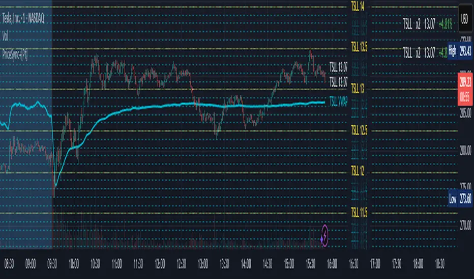
Price Sync Mapper+ [Pt]█ Description:
Price Sync Mapper is a robust TradingView indicator designed to plot correlated price levels of related assets onto the primary chart. This tool is particularly useful for traders who want to trade one asset while monitoring the price action and key levels on another correlated asset, such as leveraged ETFs, inverse ETFs , and other correlated trading pairs. By mapping the price levels of one asset onto another, traders can gain insights into relative price movements and potential trading opportunities.
█ Key Features:
► Multiple Asset Mapping: Supports mapping up to two different tickers onto the primary chart, each with customizable settings, including leverage and inverse properties.
► Dynamic Price Levels: Define the number of price levels to map based on the price movements of the correlated asset, with the scale defined by the multiplier setting.
► VWAP Integration: Option to display Volume Weighted Average Price (VWAP) lines for each mapped ticker, providing additional context on average trading prices. Users can also choose to smooth the VWAP line with a moving average.
► Custom Target Levels: Set and display custom price targets with detailed labels, allowing visualization of key price levels for trading strategies. Users can define labels, tickers, and offsets for up to 8 custom price targets.
► Flexible Update Frequency: Choose to update the indicator on every tick or at the close of each candle, providing flexibility based on trading style and preferences.
► Extended Hours Highlighting: Option to highlight extended trading hours sessions, helping to differentiate between regular and extended trading periods.
► Price Change Display: Displays the percentage price change for each mapped ticker, providing quick insights into the relative performance of correlated assets.
► Table Display: Option to show a table with the current prices, leverage factors, and percentage changes of the mapped tickers, enhancing overall usability and information accessibility. The table can be positioned at various locations on the chart and its font size can be customized.
█ Usage Examples:
► Example 1:
Map the price levels of the Direxion Daily TSLA Bull 2X Shares (TSLL) onto the primary chart of Tesla Inc. (TSLA). This allows traders to see how the leveraged ETF's price movements align with the underlying stock, providing insights into potential trading opportunities based on leverage effects.
► Example 2:
Trade ProShares UltraPro Short QQQ (SQQQ) price levels on Invesco QQQ Trust (QQQ). By mapping the inverse 3x leveraged ETF's price levels onto the underlying asset, traders can set their targets directly on the QQQ chart without flipping between charts and 'guess-timate' which level correspond to which level.
█ Cautionary Note:
Price mapping may not work properly during extended trading hours due to lack of price data, and different trading dynamics and volume.
Consolidation Range Detector [Pt]█ Author's Note:
After extensively reviewing the existing consolidation detection tools in the TradingView library, I found that none fully met my expectations. Some tools were overly sensitive, producing too many invalid ranges, while others lacked the necessary sensitivity. Consequently, I decided to develop my own tool. I hope that you, fellow traders, find it valuable and enjoy using it.
█ Description:
The Consolidation Range Detector is a sophisticated TradingView tool designed to identify and visualize periods of price consolidation on any financial chart. This indicator employs advanced algorithms to detect ranges where price movements are confined, helping traders spot potential breakout zones and make informed trading decisions.
█ Key Features:
► Customizable Detection Sensitivity: Adjust the sensitivity of the detection algorithm to suit your trading strategy, ensuring a precise fit within the consolidation range.
► Dynamic Coloring: Choose between random or fixed colors for the consolidation ranges, with options to match different background color schemes (Dark, Light, Neutral).
► Visual Clarity: Highlight detected consolidation ranges directly on the chart with customizable color schemes to enhance visibility and provide clear visual cues.
► ATR-Based Validation: Ensures detected consolidation ranges are significant and reliable by using the Average True Range (ATR) for validation.
█ User-Defined Inputs:
► Minimum Detection Bars: Set the minimum number of bars required to detect a consolidation range.
► Max Range Multiplier: Define the maximum range for detection as a multiple of the ATR.
► Detection Sensitivity: Adjust the sensitivity of the detection algorithm. Higher values mean a tighter fit within the consolidation range.
► Color Options: Choose the color for the consolidation range boxes and decide whether to use random colors.
► Color Scheme (Background): Select a color scheme for the chart background (Dark, Light, Neutral).
█ How It Works:
► Range Detection: The indicator scans the chart for potential consolidation ranges based on user-defined parameters. It calculates the average price and ATR to determine the significance of the range.
► Validation: Each detected range is validated based on criteria such as ATR threshold, range validity, average price comparison, and the number of touches at the range boundaries.
► Visualization: Validated ranges are highlighted on the chart with colored boxes, providing a clear visual cue of potential consolidation zones.
█ Usage Examples:
► Example 1:
The image below showcases the Consolidation Range Detector in action on a chart of S&P 500 E-mini Futures. The indicator highlights several consolidation ranges with different colors, demonstrating its ability to adapt to varying market conditions and visually emphasize key areas of price consolidation. The annotations for breakouts and price reactions are manually marked to illustrate the practical application of the tool in identifying potential trading opportunities based on these key areas.
█ Practical Applications:
► Identify Breakout Zones: Use the detected consolidation ranges to identify potential breakout zones, helping to anticipate significant price movements.
► Identify Key Price Levels: The tool helps in pinpointing key price levels where there is a high probability of significant price reactions, providing crucial insights for trading strategies.
► Enhance Technical Analysis: Integrate the Consolidation Range Detector into your existing technical analysis toolkit to improve the accuracy of your trading decisions.
█ Conclusion:
The Consolidation Range Detector is a powerful tool for traders looking to identify periods of price consolidation and potential breakout zones. With its customizable settings and advanced detection algorithms, it provides a reliable and visual method to enhance your trading strategy. Whether you're a beginner or an experienced trader, this indicator can add significant value to your technical analysis.
█ Cautionary Note:
While the Consolidation Range Detector is a powerful tool, it's important to combine it with other indicators and analysis methods for comprehensive trading decisions. Always consider market context and external factors when interpreting detected consolidation ranges.

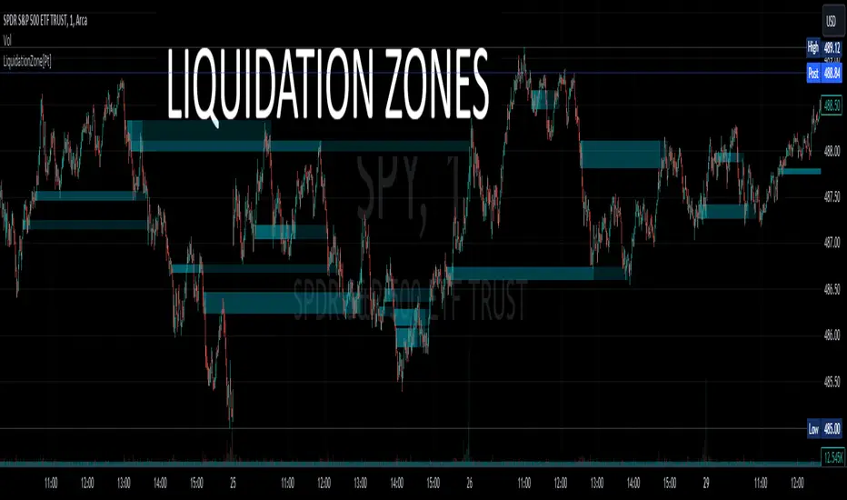
Liquidation Zone [Pt]█ Introduction
The Liquidation Zone indicator is designed to identify key price ranges where significant market activity, such as the liquidation of positions, is likely to occur. These zones are identified based on a specific candlestick pattern, offering insights into potential areas of market sensitivity.
█ Key Features:
► Specific Candlestick Pattern Identification: The indicator identifies liquidation zones by detecting a pattern where a red candle is encased within a series of green candles (in bullish scenarios) or a green candle within red candles (in bearish scenarios). This pattern often suggests a point where the market pauses to liquidate positions before continuing the prevailing trend.
► Market Reaction Points: These liquidation zones represent significant levels where the market previously decided to liquidate or adjust positions, indicating potential areas where price might react upon revisit.
► Integration with Volatility and Volume Data: The script combines these candlestick patterns with volatility (using ATR) and volume data, adding depth to the analysis and increasing the reliability of these zones as potential reaction areas.
► Visual Zone Mapping on Charts: Liquidation Zones are clearly marked on the trading chart for easy identification, aiding traders in visualizing these critical market areas.
█ Possible Use Cases
► Identifying Potential Reaction Areas
Traders can use the Liquidation Zone indicator to pinpoint zones where the market might pause or reverse due to previous liquidation activities. These areas can be key for planning entries, exits, or expecting increased market volatility.
► Enhancing Trading Strategy
Incorporating the analysis of liquidation zones into a trading strategy allows for a more nuanced understanding of market behavior, particularly in recognizing potential areas where price might experience significant support or resistance.
► Complementing Technical Analysis
This indicator is a valuable addition to a technical analyst's toolkit. When used alongside other analysis tools, it provides a more comprehensive view of the market, enhancing decision-making and strategy formulation.
Price Range Volume Profile++ [Pt]█ Introduction
The Price Range Volume Profile++ (PRVP++) is an advanced, feature-rich indicator specifically designed for volume profile users for in-depth volume analysis. Unlike most other volume profile tools that are limited to a 5000-bar lookback, PRVP++ can utilize all available candles on the chart, offering an unparalleled scope of historical data analysis.
█ Main Features
Full Chart Historical Lookback : PRVP++ sets a new standard with its ability to analyze the entire history of candles available on a chart, far exceeding the typical 5000-bar limit of other tools. This feature allows traders to conduct a comprehensive and detailed study of volume data over extensive time periods.
Volume Profile Analysis : The tool provides an in-depth volume profile analysis, showcasing the distribution of trading activity across different price levels. This is crucial for identifying key areas of interest in the market.
Bull/Bear Strength Profile : A standout feature that displays the relative strength of buyers (bulls) and sellers (bears) at different price levels. This visual representation helps traders gauge market sentiment and power dynamics.
Automatic HVN and LVN Identification : PRVP++ automatically highlights High Volume Nodes (HVNs) and Low Volume Nodes (LVNs), making it easier for traders to identify significant zones of trading activity and potential breakout areas.
Customization and Visual Enhancements : Offers customization for the profile's width, horizontal offset, and a sophisticated gradient color scheme for HVNs and LVNs, enhancing the tool's visual appeal and analytical utility.
█ Input Parameters
Price Range : Sets the percentage distance for the volume profile relative to the current closing price, determining the extent of volume data analysis.
Profile Step Size (Tick Size) : Users can choose automatic sizing or set a specific tick step size, offering flexibility in the granularity of the volume profile.
Volume Profile Options : Includes settings for gradient power and color selections for high and low volume areas, along with a fun mode for random color variations.
Profile Placement and Appearance : Adjustments for profile width, horizontal offset, and the option for background fill to enhance visibility.
Background Fill : Allows users to fill the background of the volume profile range, enhancing the visual impact and readability.
Time Weighted Profile : An option that weights the volume profile to give more emphasis to recent trading activities, highlighting the impact of recent market movements.
Smooth Filter : A feature that smoothens the volume profile to reduce noise and fluctuations, offering a clearer view of dominant volume levels.
High and Low Volume Node Settings : Customizable detection settings for HVNs and LVNs, line styles, label text sizes, and the option to extend lines for clearer market analysis.
Extra Settings : Includes displaying the current price on the profile, a customizable settings table with adjustable location and font size, and table opacity.
Random Color Generation : A feature for dynamically changing the colors used in the volume profile.
█ Possible Use Cases
Long-Term Market Analysis : Due to its ability to analyze all available candles on the chart, PRVP++ is exceptionally suited for long-term market analysis. Traders can study the historical volume profile over extended periods, identifying significant volume trends and shifts that could impact long-term investment strategies.
Identifying Key Support and Resistance Levels : The automatic HVN and LVN identification feature of PRVP++ makes it easier for traders to spot potential support and resistance levels. HVNs often correspond to strong support or resistance zones where significant trading activity has occurred, while LVNs may indicate levels where the price could break through more easily.
Gauging Market Sentiment with Bull/Bear Strength Profile : The Bull/Bear Strength Profile helps traders understand the prevailing market sentiment at different price levels. By analyzing the dominance of buying or selling pressure, traders can align their trades with the market's direction or prepare for potential reversals.
Intraday Trading and Scalping : For intraday traders and scalpers, the time-weighted feature and the ability to adjust profile step size offer valuable insights. By emphasizing recent trading activity and adjusting the granularity of the profile, traders can make more informed decisions based on short-term price movements and volume changes.
Breakout Trading : By utilizing the LVN identification, traders can pinpoint areas with low trading activity that might serve as potential breakout points. This information can be instrumental in formulating strategies to capitalize on sudden price movements.
Volume Gap Analysis : PRVP++ can be used to identify volume gaps, which are areas with significantly low volume. These gaps can act as important indicators for price movements, as prices may move quickly through these levels due to the lack of historical trading activity.
Risk Management and Position Sizing : Understanding the volume profile can aid in better risk management and position sizing. By recognizing areas of high and low volume, traders can set stop-loss orders more effectively and adjust their position sizes according to the perceived strength of support or resistance levels.
Swing Trading : For swing traders, the comprehensive historical lookback and HVN/LVN analysis provide critical information about where to enter and exit trades. Swing traders can utilize these features to identify trend reversals and momentum shifts.
█ Best Practices and Tips
Start with a Clear Understanding : Before utilizing PRVP++, ensure you have a solid grasp of volume profile concepts. Understanding High Volume Nodes (HVNs), Low Volume Nodes (LVNs), and their implications on market behavior is crucial.
Combine with Other Analysis Tools : While PRVP++ is powerful, it's most effective when used in conjunction with other technical analysis tools and indicators. Combining volume profile data with price action analysis, trend lines, and technical indicators can provide a more comprehensive market view.
Customize According to Your Trading Style : Tailor the tool's settings to fit your trading strategy. Day traders might prefer a more detailed profile, while long-term investors may benefit from broader data analysis.
Pay Attention to HVNs and LVNs : HVNs can indicate potential support or resistance areas, while LVNs might suggest breakout points. Monitor these areas closely for trading opportunities.
Utilize the Full Historical Lookback Feature : For a broader perspective, use the full historical lookback feature to understand long-term volume patterns and their impact on current price movements.
Keep an Eye on Bull/Bear Strength : Use the Bull/Bear Strength Profile to gauge market sentiment at different price levels. This can help in predicting potential price movements.
Regularly Update Your Strategy : As market conditions change, regularly review and adjust your use of PRVP++ to ensure it aligns with current market dynamics.
Stay Informed About Market News : Be aware of how economic news and global events might affect the volume and price, as these factors can significantly impact the effectiveness of volume-based strategies.
█ Disclaimers and Risk Advice
No Guarantee of Profits : Trading involves risk, and the use of the PRVP++ tool does not guarantee profits. Always be aware of the potential for loss.
Educational Purposes Only : The information provided by PRVP++ is for educational purposes only and should not be considered financial advice.
Not a Standalone Tool : PRVP++ should not be used as a standalone decision-making tool. Combine it with comprehensive market analysis and personal judgment.
Past Performance Not Indicative of Future Results [/b: Historical data and trends analyzed by PRVP++ do not guarantee future market behavior.
Use Risk Management : Always employ sound risk management strategies, including setting stop-loss orders and managing position sizes to protect your capital.
Personal Responsibility : Trading decisions remain the responsibility of the individual trader. Use PRVP++ as one of several tools in your decision-making process.

Periodic Volume Profile++ [Pt]█ Introduction
The Advanced Pro ++ Version of the Periodic Volume Profile is an advanced TradingView indicator, designed for traders focusing on volume-driven strategies. It provides detailed volume distribution and key levels over selected periods with extensive customization options.
█ Features Overview
Highly customizable and versatile, this tool is essential for a trader's toolkit, offering a variety of settings to suit specific trading needs.
█ Volume Profile
Display Modes: Four options - Off, Total, Up/Down, Gradient.
POC Highlighting: Option to highlight the Point of Control (POC) VP histogram bar.
VP Bar Size Control: Customize the number of ticks per VP bar, including a 'use min tick' option.
Volume Display: Show volume figures on the profile.
Developing VP Color Theme: Different color themes for developing VP.
█ Point of Control (POC)
Historical POCs: Display POCs from a specified number of past periods.
POC Levels: Auto-drawn levels indicating price, period, timeframe, and volume.
Color Customization: Separate color options for closest POCs, older POCs, and NPOCs (Naked POCs).
Closest Historical POC Display: Show nearest historical POC within a customizable range.
Low Volume POC Fading: Fade out low volume POC lines.
█ Value Area and Background Color
Display Options: Off, Custom Color, or Color based on Period Close vs. Open.
Customizable Colors: Tailor the color scheme as per preference.
Value Area High/Low Prices: Display options for VAH and/or VAL.
█ Extra Options
Periodic Candle Bar Display: Show candle bar for each period with customizable colors.
Previous POC, VAH, VAL Display: Display these levels in dashed lines.
The Advanced Pro ++ Volume Profile indicator is a top choice for traders seeking in-depth analysis of volume patterns and market structure, offering unparalleled customization and precision.

Price Range Volume Profile [Pt]█ Introduction
The Price Range Volume Profile (PRVP) is a revolutionary indicator. This tool stands out from its peers due to its unique ability to capture the entire price chart history, thus providing a comprehensive volume profile of the entire asset's trading history, as available on TradingView chart. It's worth noting that I believe this tool is the first of its kind to accomplish such a feat. A much recommended tool if you are a volume profile trader.
█ Main Features
► Historical Lookback: This feature dives deep into the past, grasping all the historical data of an asset. It's equipped to handle up to 20,000 bars, although users without a premium TradingView account are advised to keep it at a maximum of 10,000 bars, or just use the "Full Historical Lookback" feature.
► Volume Profile / POC: Displays the distribution of volume across price levels for the selected price range. The Point of Control (POC), which is the price level with the highest traded volume, is also highlighted.
► Customization: Users have the flexibility to adjust the profile's appearance, including profile width, horizontal offset, and the option to fill the background of the profile range.
► Time Weighting: This feature allows users to give more weight to recent trading activity, which can be especially useful for intraday traders or during times of high volatility. Note that this feature will impact the volume profile and POC level.
► Settings Table: A settings table is displayed on the chart for users to quickly reference their input parameters.
█ Input Parameters
► Lookback Timeframe: Determines the period for which the volume profile is generated.
► Price Range: The percentage distance to consider for the profile, adjusted above and below the current closing price.
► Profile Step size: The granularity of the volume profile. Users can opt for automatic step size based on a predefined calculation or set their preferred tick step size.
► Historical Bars Lookback: Determines the number of bars to include in the volume profile calculation.
► Profile Visuals: Adjust the appearance and layout of the volume profile on the chart.
► Extra: Additional settings including the display of a settings table and its location.
█ Basic Understanding of Volume Profile - How to use PRVP?
Volume Profile is a valuable tool for traders who want insights into where the majority of trading activity has occurred. Here are some tips to make the most of it:
► Understand the Basics: Before using the Volume Profile, ensure you understand the difference between it and the standard volume histogram. While both represent volume, the former displays it against price while the latter shows it against time.
► Identify High Volume Nodes (HVN) and Low Volume Nodes (LVN):
◊ HVN: Areas where there's a lot of trading activity and where the price has spent a lot of time. These areas can act as strong support or resistance.
◊ LVN: Areas where there's a lack of trading activity. Prices might move quickly through these areas, and they can act as potential breakpoints or accelerators for price movement.
► Locate the Point of Control (POC): This is the price level with the highest traded volume for a specified period. It often acts as a magnet for price, and it can serve as a pivot or reference point.
► Trend Confirmation: A shift in the volume profile from one price level to another can confirm a trend. For instance, if higher volume starts to build at higher price levels, it may indicate a strong uptrend.
► Watch for Volume Gaps: If there's a significant gap in the volume profile, prices may move quickly through these levels as there's little historical trading activity to act as support or resistance.
█ Other Usage Tips
◊ For optimal performance, ensure that the chosen timeframe aligns closely with the chart timeframe. Differences in timeframes may lead to minor discrepancies in the volume profile.
◊ To address any errors arising from too many levels displayed on the volume profile, consider increasing the Profile Step size or reducing the Price Range.

Above/Below Average Index US Top 40 [Pt]█ Introduction
Introducing the "Above/Below Average Index US Top 40 ", a comprehensive market sentiment visualization tool. This powerful and easy-to-use indicator allows users to get a direct measure of market sentiment by analyzing the status of a chosen group of stocks (Top 10, Top 20, Top 30, or Top 40) in relation to their chosen moving average. The sum of stocks either above or below their respective moving averages can be an insightful indicator of the market's overall trend and bias.
The power of this tool lies in its ability to measure the net number of these top stocks either above or below their respective moving averages. A positive value, represented by green histogram bars, signifies a bullish bias among the Top 40 stocks, while a negative value, displayed as red histogram bars, suggests a bearish sentiment.
The indicator can be applied to both the NYSE and NASDAQ markets, offering users the flexibility to select their preferred stock exchange. The Top 40 stocks within these markets are customizable, ensuring you have full control over which companies are included in your market sentiment analysis.
The indicator also includes dual moving average lines representing the fast and slow moving averages of the sum of stocks above or below their chosen moving average. These lines serve as an invaluable trend analysis resource, providing a visual representation of short-term and long-term market trends, as well as potential trend reversals
█ Potential Uses
The indicator presents numerous application possibilities. Here are a few ways this tool can be utilized:
► Market Sentiment Gauge: Depending on the number of stocks chosen (Top 10, 20, 30, or 40), this tool can offer a broad or more focused gauge of overall market sentiment. A high positive value suggests strong bullish sentiment, while a high negative value can indicate bearish sentiment.
► Identification of Market Trends: By looking at the colors of the histogram bars and their corresponding values, users can identify whether the overall market trend is bullish (green) or bearish (red).
► Trend Confirmation and Reversal Identification: The dual moving average lines offer a powerful way to confirm market trends and identify potential trend reversals. For instance, a crossover of these lines (when the fast moving average line crosses the slow line) can signal a shift in market momentum, often indicating a possible trend reversal. Also, to confirm a bullish trend, for example, the fast moving average should be above the slow moving average line.
► Comparison of Different Markets: By switching between NYSE and NASDAQ, users can compare market sentiments across the two major stock exchanges. This could potentially highlight divergences or confirm similarities in market behavior.
► Customized Analysis: With the ability to customize the Top 40 stocks used in the calculation, users can refine their analysis to focus on the sectors or industries they are most interested in.
Remember, while this tool provides a visual representation of market sentiment, it is important to use it in conjunction with other forms of analysis to make informed trading decisions.
=====================================================================================================
█ Setting Highlights
Moving Average Type options:
◊ Simple Moving Average (SMA): The SMA is the average stock price over a certain period and gives equal weight to all price points, providing a clear view of overall trends but responding slower to recent price changes.
◊ Exponential Moving Average (EMA): The EMA gives more weight to recent prices and responds quicker to price changes than the SMA, making it more suitable for traders looking to capture short-term trends.
◊ Smoothed Moving Average (SMMA/RMA): The SMMA or RMA minimizes the impact of random price spikes and smoothens out the data, offering a balanced view of long-term and short-term trends.
◊ Weighted Moving Average (WMA): The WMA assigns more weight to recent data points, offering a faster response to recent price changes than SMA but slower than EMA.
◊ Volume Weighted Moving Average (VWMA): The VWMA takes into account both the closing price and volume of the stocks, offering insights into both price movement and trading activity.
◊ Hull Moving Average (HMA): The HMA is designed to reduce lag and improve smoothness, providing faster signals for trend changes, which is ideal for traders looking for quick entry and exit points.

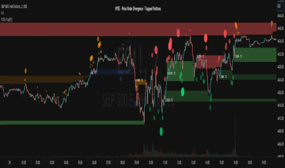
Market Price Order Divergence + Trapped Positions [Pt]█ Introduction
Specifically designed for trading on NYSE, NASDAQ, Dow Jones, and AMEX related instruments like SPY, QQQ, ES, NQ...etc., this innovative tool provides traders with advanced market insights to help them comprehend the market intricacies and make well-informed decisions. Comprising three primary features: Price Order Divergence (POD) Bubbles, Market Order Bubbles, and Trapped Positions/Zones, this tool assists traders in deciphering the nuances of market order flow and trends.
An important point to note is that TradingView doesn't currently provide direct access to market order data, such as buy and sell order flow. Therefore, this tool cleverly leverages TICK index data to estimate the overall market buy and sell strength.
█ Price Order Divergence (POD)
POD serves to detect disparities between the prices of US indices and estimated market orders during regular trading hours (9:30 to 16:00 EST). Bullish divergence indicates that the estimated market order flow is biased towards buy orders, despite bearish price action. In contrast, bearish divergence indicates that the market order flow is biased towards sell orders while the price exhibits bullish action. By default, PODs are visually represented as green bubbles under the candle for bullish divergence and red ones above the candle for bearish divergence. The bubble's size symbolizes the estimated market order strength.
█ Market Order Bubbles (MOB)
During extended or Globex hours, instead of POD, the tool uses Market Order Bubbles (MOB) to estimate market orders using volume data. Sophisticated algorithm is used to distinguish between bullish vs bearish volume. A strong bullish volume represents significant buy orders, whereas a strong bearish volume represents substantial sell orders. By default, MOBs during these hours are shown in blue for bullish and yellow for bearish divergence. Again, the bubble's size symbolizes the estimated market order strength.
█ Trapped Positions/Zones
Trapped positions materialize when PODs or MOBs emerge in trending markets. For example, a bearish divergence during an uptrend suggests significant selling (including shorting), and if the price continues ascending without offering short positions any profit, these positions become 'trapped shorts' and is shown as 'TS' in the zone. The opposite is true for 'trapped longs' or 'TL'.
A price range zone can be delineated from the trapped position candles. If prices revisit these zones, and the prevailing market trend stays bullish, the trapped shorts will probably liquidate near the break-even point to mitigate losses. The same rationale applies to bullish divergence in a downtrend. Therefore, these zone often times represents support / resistance zones.
█ Potential Use Cases
► Trend Confirmation: POD or MOB can confirm the strength of an ongoing trend. For example, during a bullish trend, a plethora of green bubbles or blue MOBs can affirm the trend's solidity.
► Spotting Reversals: Large, isolated POD or MOB bubbles could indicate potential market reversals. For instance, a prominent red bubble or yellow MOB during an uptrend might hint at an impending trend reversal.
► Risk Management: The Trapped Positions/Zones feature could assist in risk management. When prices approach these zones, traders can anticipate potential large market orders impacting price movements.
► Profit Optimization: This tool can aid traders in optimizing profits by identifying when trapped positions are likely to liquidate, thus predicting potential sharp price movements.
Remember, as with any tool, this should be used alongside other market analyses and not as a standalone indicator. Happy trading!
================================================================================================================
█ Settings Overview
◊ Market - available options: NYSE, NASDAQ, Dow Jones, AMEX. This will be displayed
◊ Lookback period- # of bars to lookback for detecting price vs market order divergences
▼ Regular Hour - Price Order Divergence Bubbles
◊ Show Price Order Divergence (POD) Bubbles - toggle on/off for POD bubbles
◊ └ Use Market Order Sentiment only - Shows divergences between price movement and market order sentiment (amount of buying vs selling)
◊ └ Use Market Order Trend Bias - On top of market order sentiment, the indicator also looks at overall market short term trends to determine divergences
◊ └ Use Threshold Min. Threshold - For filtering order size, the lower the threshold, the more sensitive
◊ └ Use Volume Strength - Take volume into consideration as well, only shows divergence when there is strength in volume
▼ Extended Hour - Market Order Bubbles
◊ Show Market Order Bubbles - toggle on/off for MOB. Using volume data to estimate significant market order activities. Bubbles indicate possible large liquidation activities
◊ └ Volume Analysis period - lookback period for volume analysis
◊ └ Volume Strength period - lookback period for volume strength
▼ Trapped Position Zones
◊ Show Potential Traps - toggle on/off for un-activated trapped zones. They are shown as lightly shaded areas of potential traps. These areas will be activated once price hit the activation %
◊ Show Trapped positions (Regular Hours) - toggle on/off for POD trapped zones. By default, trapped shorts are shown in green, trapped tongs are shown in red.
◊ Show Trapped positions (Extended Hours) - toggle on/off for MOB bubbles. By default, trapped shorts are shown in blue, trapped tongs are shown in orange.
◊ └ Activation % - Trapped zones are activated if price goes x% of the potential trapped range in the undesirable direction. Default is 100%
◊ Liquidate display options - options: On first touch, Per touch, Fully liquidated
Trapped zones liquidate display options:
▼ Display
◊ General color settings for bubbles, trapped zones, and label size
◊ Use Emoji for bubbles - fun setting that displays bulls and bears by default. This helps really visualize where the bulls and bears are! 🤣🤣 These emoji can be changed in the style setting.
▼ Trapped Zone Channel
The trapped zone channel represents a continuous channel of the closest activated trapped zone area. This allows for creating alerts for trapped zones, and the plot outputs allows for custom Pinescript integration.
◊ Trapped Zone Channel Buffer % - Adds upper and lower buffer for trapped zone channel
◊ Show Trapped Channel - toggle on/off on trapped zone channels
◊ └ Remove channel changing lines - toggle on/off the transition plot lines when switching to the closest trapped zones
◊ Show Trapped Channel Fill - toogl
▼ Extra
◊ Display settings for chosen market and indicator title
▼ Trend Follower
◊ Show Trend Following Bar Color - toggle trend follower algorithm. This is an experimental trend following algorithm that attempts to detect bullish, neutral and bearish trends.
▼ Outputs
◊ Output Bubbles
Outputs for Bubbles for external interface. These can be used as inputs to your own indicator or strategy Pinescript. For more info, take a look at this TradingView blog:
www.tradingview.com
Bubble type can be chosen within the settings:
Both - Default, output will include both Market Price Order Divergence Bubbles (during Regular Hours) and Market Order Bubbles (during Extended Hours)
POD Only (RTH) - Output will include only Market Price Order Divergence Bubbles; otherwise, output = 0 during Extended Hours
MOB Only (ETH) - Output will include only Market Order Bubbles; otherwise, output = 0 during Regular Hours
Market Order Bubbles output values:
3 = Large size Bullish Bubble
2 = Medium size Bullish Bubble
1 = Small size Bullish Bubble
0 = No Bubble
-1 = Small size Bearish Bubble
-2 = Medium size Bearish Bubble
-3 = Large size Bearish Bubble
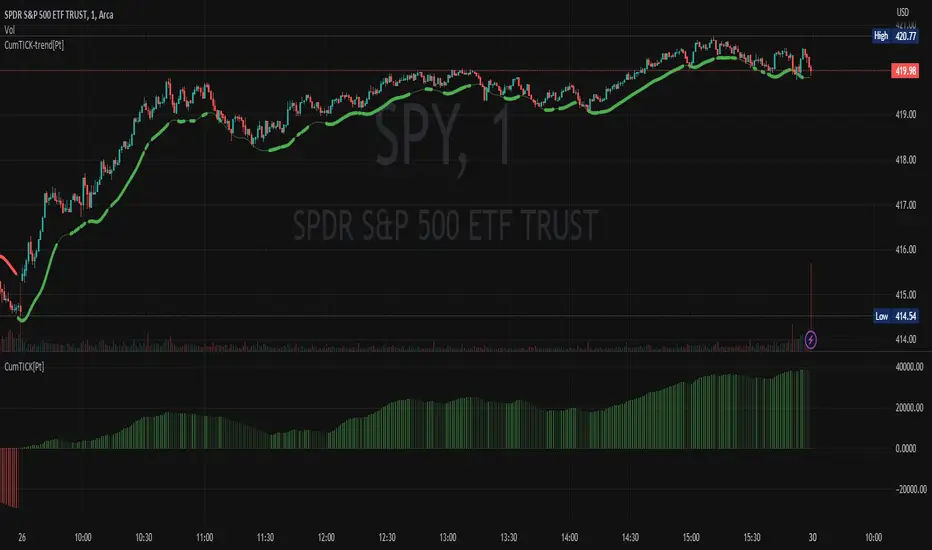
Cumulative TICK [Pt]Cumulative TICK Indicator, shown as the bottom indicator, is a robust tool designed to provide traders with insights into market trends using TICK data. This indicator visualizes the cumulative TICK trend in the form of colored columns on a separate chart below the main price chart.
Here's an overview of the key features of the Cumulative TICK Indicator:
1. Selectable TICK Source 🔄: The indicator allows users to choose from four different TICK data sources, namely USI:TICK , USI:TICKQ , USI:TICKI , and $USI:TICKA.
2. TICK Data Type Selection 🎚️: Users can select the type of TICK data to be used. The options include: Close, Open, hl2, ohlc4, hlc3.
3. Optional Simple Moving Average (SMA) 📊: The indicator offers an option to apply an SMA to the Cumulative TICK values, with a customizable length.
4. After-hour Background Color 🌙: The background color changes during after-hours to provide a clear distinction between regular and after-hour trading sessions.
🛠️ How it Works:
The Cumulative TICK Indicator uses TICK data accumulated during the regular market hours (9:30-16:00) as per the New York time zone. At the start of a new session or at the end of the regular session, this cumulative TICK value is reset.
The calculated Cumulative TICK is plotted in a column-style graph. If the SMA is applied, the SMA values are used for the column plots instead. The columns are colored green when the Cumulative TICK is positive and red when it is negative. The shades of green and red vary based on whether the Cumulative TICK is increasing or decreasing compared to the previous value.
This is a simple yet powerful tool to track market sentiment throughout the day using TICK data. Please note that this indicator is intended to be used as part of a comprehensive trading strategy. Always ensure you are managing risk appropriately and consulting various data sources to make informed trading decisions.
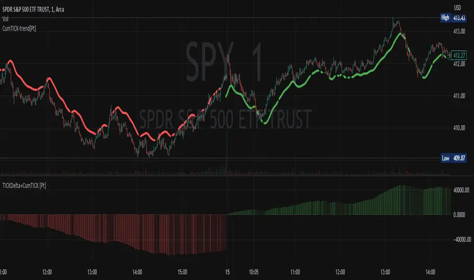
Cumulative TICK Trend[Pt]Cumulative TICK Trend indicator is a comprehensive trading tool that uses TICK data to define the market's cumulative trend. Trend is shown on ATR EMA bands, which is overlaid on the price chart. Cumulative TICK shown on the bottom pane is for reference only.
Main features of the Cumulative TICK Trend Indicator include:
Selectable TICK Source: You have the flexibility to choose your preferred TICK source from the following options, depending on the market you trade: USI:TICK, USI:TICKQ, USI:TICKI, and USI:TICKA.
TICK Data Type: Select the type of TICK data to use, options include: Close, Open, hl2, ohlc4, hlc3.
Simple Moving Average (SMA): You can choose to apply an SMA on the calculated Cumulative TICK values with a customizable length.
Average True Range (ATR) Bands: It provides the option to display ATR bands with adjustable settings. This includes the ATR period, EMA period, source for the ATR calculation, and the ATR multiplier for the upper band.
Trend Color Customization: You can customize the color of the bull and bear trends according to your preference.
Smooth Line Option: This setting allows you to smooth the ATR Bands with a customizable length.
How it Works:
This indicator accumulates TICK data during market hours (9:30-16:00) as per the New York time zone and resets at the start of a new session or the end of the regular session. This cumulative TICK value is then used to determine the trend.
The trend is defined as bullish if the SMA of cumulative TICK is equal to or greater than zero and bearish if it's less than zero. Additionally, this indicator plots the ATR bands, which can be used as volatility measures. The Upper ATR Band and Lower ATR Band can be made smoother using the SMA, according to the trader's preference.
The plot includes two parts for each trend: a stronger color (Red for bear, Green for bull) when the trend is ongoing, and a lighter color when the trend seems to be changing.
Remember, this tool is intended to be used as part of a comprehensive trading strategy. Always ensure you are managing risk appropriately and consulting various data sources to make informed trading decisions.
Market Order Bubbles + Trapped Positions [Pt]"Market Order Bubbles + Trapped Positions" is a multifaceted TradingView indicator, employing volume data to depict intensified market activities. By highlighting aggressive buying/selling behaviors, this tool serves as a dependable aid in pinpointing potential trading reversals. Additionally, it proves an effective device for real-time market trend monitoring. The unique ability of this indicator to spotlight 'Trapped Positions'—resulting from such vigorous trading activity—helps identify crucial price levels or ranges that may lead to significant price responses.
Market Order Bubbles
The Market Order Bubbles feature capitalizes on volume data to estimate market orders. High bullish volume is indicative of a surge in buy orders, while strong bearish volume flags an increase in sell orders. These orders are visually represented by bubbles of different sizes, corresponding directly to the volume strength, thus providing traders with an immediate, intuitive understanding of market activity.
Trapped Positions/Zones
The concept of Trapped Positions emerges when sizable buy orders appear during a bearish market trend, or vice versa. For instance, if a considerable sell order is detected during a bullish uptrend, it signifies that those short positions may be 'trapped'. These positions help in plotting potential price range zones. When the price revisits these zones and the market trend maintains its bullish inclination, trapped shorts might opt for liquidation near break-even to mitigate losses. The reverse holds true in a bearish downtrend.
Trend Follower
The Trend Follower feature is a supportive tool that aims to discern price trends, color-coding candle bars for clarity. This function assists traders by presenting a simplified view of the prevailing trend, helping to minimize distractions caused by minor price shifts.
The utility of the Trend Follower is its ability to aid traders in focusing on the larger market direction. It allows traders to concentrate on the more substantial trend and make decisions that align with this broader market movement, rather than reacting to every minor price fluctuation. As a result, this feature may support traders in maintaining their positions for a longer duration, which could potentially enhance their trading outcomes. The Trend Follower, therefore, offers a helpful contribution to a balanced and effective trading approach.
In essence, the "Market Order Bubbles + Trapped Positions" indicator with its Trend Follower feature provides traders with a comprehensive understanding of market dynamics, allowing them to navigate the financial markets with increased precision and confidence. Its unique features, designed to highlight significant market activities and trends, can greatly aid in refining trading strategies, making it a potentially invaluable tool in a trader's arsenal.

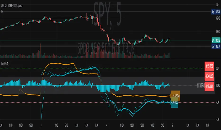
Market Breadth Ratio+ [Pt]This is a + version of my original Market Breadth Ratio Indicator
DESCRIPTION
The Market Breadth Ratio+ indicator is a tool that can help traders gain a more comprehensive understanding of market breadth by providing a ratio between Up volume (UVOL) and Down volume (DVOL).
While the VOLD indicator provides a straightforward measure of the difference between UVOL and DVOL, it doesn't account for the rate of change. The Market Breadth Ratio+ indicator, on the other hand, takes the rate of change into account, providing a plot line that is easier to interpret and understand.
The Up Volume vs Down Volume Ratios measure the strength of buying versus selling pressure in the market. A ratio greater than 1 indicates that there is more buying pressure, while a ratio less than -1 indicates more selling pressure. The ratio is calculated by dividing the total volume of stocks that closed up on the day by the total volume of stocks that closed down.
|| ------------------------------------------------------------------------------------------------------------------------------------------------------------------------------------||
This script includes the following premium unique features.
1) Custom Moving Average line for Breadth Ratio line. There are a few MA type to choose from: SMA, EMA, RMA, WMA, VWMA, HMA
- This feature provide a smoother plot for better interpretation of the market trend
- MA crossovers can also be used as trend reversal signals
2) Breadth Strength Index (BSI)
- This graph shows the relative strength of the Breadth Ratio. This is a momentum based oscillator that measure the rate of change of the Breadth Ratio. It shows the strength and weakness in the Breadth Ratio plot.
- A bar close to 1 means the market is very strong in the Bullish direction, conversely, a bar close to -1 means the market is very weak, but very strong in the Bearish direction
- Above 0 shows Bullish strength
- Below 0 shows Bearish strength
3) Two display modes for Breadth Strength Index
- Histogram
- Line
- These can be combined to show different markets together, such as NYSE and NASDAQ
4) Custom Moving Average can be applied to the BSI
- This will provide smoother graph for easier interpretation
5) Aggregated Market Strength
- This feature combines the BSI of multiple markets, such as NYSE and NASDAQ, to provide a more comprehensive view of the overall US market. Often time, one of these indices will have a stronger 'pull' on the entire market. By observing the dominant color (of your choosing), you can see which index is pulling the market. And by trading the market that has the bigger pull, traders can leverage on the possible higher volatility for greater trade opportunities.
6) Custom Moving Average can be applied to the Aggregated Market Strength
- This will provide smoother graph for easier interpretation
7) Show alternating trend colors on Aggregated Market Strength
- This provides an intuitive view of the market strength that's based on market breadth ratio
QQQ NDX NQ Price Converter+ [Pt]This is a + version of my original QQQ NDX NQ Price Converter indicator
Description
The QQQ NDX NQ Price Converter is a powerful and easy-to-use tool that allows traders to view corresponding price levels for linked instruments in real-time. This includes QQQ, NDX, NQ, and NAS100USD. Although these instruments often move in sync, differences in price movements, volume, and trading hours can create unique key levels and support/resistance areas for each. By mapping these levels on the same chart, traders can more easily spot trading opportunities and improve their chances of success.
Customizable features
- multiplier from the closest whole number price level
- line color
- line style
- label position / size
- # of levels to display
- toggle current price display table
|| ------------------------------------------------------------------------------------------------------------------------------------------------------------------------------------||
This script includes the following premium unique features.
QQQ / NDX Gaps detector
A gap is an area on a chart where the price between two bars changes significantly without any trades happening between them. Such gaps often occur when a strong shift in sentiment happens during the hours when markets are usually closed. This indicator highlights these gaps on the chart and extends them further until they have been covered (i.e., when a newer bar has crossed that gap).
Overnight gaps from QQQ or NDX can be mapped directly onto NQ chart
VWAPs
VWAPs of these linked instruments can be mapped onto the chart. For example, NQ VWAP mapped onto QQQ chart, or vise versa. This allows for clear visualization of the price action near these VWAP levels.
Custom Cross Instruments Price Targets
Want to trade QQQ options while watching NQ chart or vise versa? You can set upto 8 price targets and see the corresponding converted price level. No need to switch between charts to try to figure out which price level corresponds to which.
SPY SPX ES Price Converter+ [Pt]This is a + version of my original SPY SPX ES Price Converter indicator
Description
The SPY SPX ES Price Converter is a powerful and easy-to-use tool that allows traders to view corresponding price levels for linked instruments in real-time. This includes SPY, SPX, ES, and SPX500USD. Although these instruments often move in sync, differences in price movements, volume, and trading hours can create unique key levels and support/resistance areas for each. By mapping these levels on the same chart, traders can more easily spot trading opportunities and improve their chances of success.
Customizable features
- multiplier from the closest whole number price level
- line color
- line style
- label position / size
- # of levels to display
- toggle current price display table
|| ------------------------------------------------------------------------------------------------------------------------------------------------------------------------------------||
This script includes the following premium unique features.
SPY / SPX Gaps detector
A gap is an area on a chart where the price between two bars changes significantly without any trades happening between them. Such gaps often occur when a strong shift in sentiment happens during the hours when markets are usually closed. This indicator highlights these gaps on the chart and extends them further until they have been covered (i.e., when a newer bar has crossed that gap).
Overnight gaps from SPY or SPX can be mapped directly onto ES chart
VWAPs
VWAPs of these linked instruments can be mapped onto the chart. For example, ES VWAP mapped onto SPY chart, or vise versa. This allows for clear visualization of the price action near these VWAP levels.
Custom Cross Instruments Price Targets
Want to trade SPY options while watching ES chart or vise versa? You can setup to 8 price targets and see the corresponding converted price level. No need to switch between charts to try to figure out which price level corresponds to which.

QQQ NDX NQ Price Converter [Pt]A must have tool for QQQ NDX NQ traders~!!!
Description
The QQQ NDX NQ Price Converter is a powerful and easy-to-use tool that allows traders to view corresponding price levels for linked instruments in real-time. This includes QQQ, NDX, NQ, and NAS100USD. Although these instruments often move in sync, differences in price movements, volume, and trading hours can create unique key levels and support/resistance areas for each. By mapping these levels on the same chart, traders can more easily spot trading opportunities and improve their chances of success.
Customizable features
- multiplier from the closest whole number price level
- line color
- line style
- label position / size
- # of levels to display
- toggle current price display table
SPY SPX ES Price Converter [Pt]A must have tool for SPY SPX ES traders~!!!
Description
The SPY SPX ES Price Converter is a powerful and easy-to-use tool that allows traders to view corresponding price levels for linked instruments in real-time. This includes SPY, SPX, ES, and SPX500USD. Although these instruments often move in sync, differences in price movements, volume, and trading hours can create unique key levels and support/resistance areas for each. By mapping these levels on the same chart, traders can more easily spot trading opportunities and improve their chances of success.
Customizable features
- multiplier from the closest whole number price level
- line color
- line style
- label position / size
- # of levels to display
- toggle current price display table