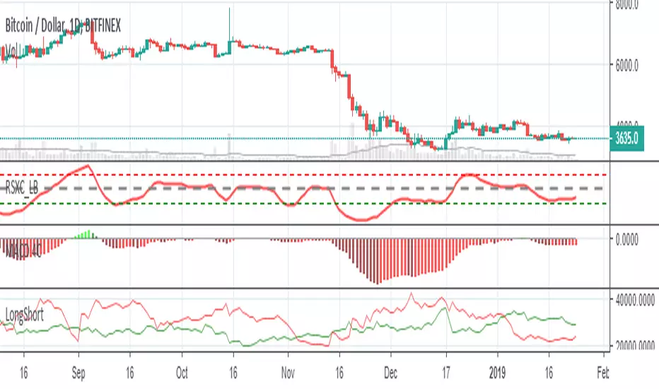
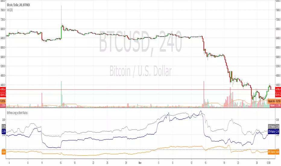
Bitfinex Sentiment Index [Long-Short]BSI provides two attractive graphs that breakdown the long (green area) and short (red area) positions ratio for the all Bitfinex margin cryptocurrency pairs only .
It is a quantitative measure of the bullishness or bearishness that can be used as a trading rule or in a trading system entries or exits. Included slow stochastic oscillator.
Ratio


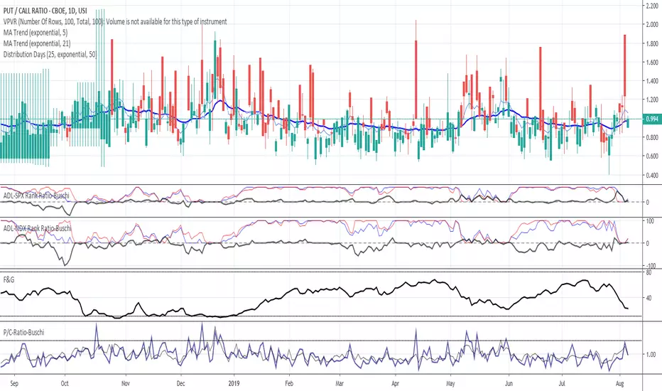
Put/Call-Ratio-Buschi
English:
This script shows the Put/Call-Ratio as seen on the Cboe-Website: www.cboe.com
A higher Put/Call-Ratio means a higher trading volume of puts compared to calls, which is a sign of a higher need for protection in the market.
For best reflection of the Cboe's data, which is shown in 30 minutes intervals, a 30 min-chart is recommended.
30 min-data as well as end-of-day data are shown.
Deutsch:
Dieses Skript zeigt das Put/Call Ratio, wie es auf der Cboe-Website angegeben ist: www.cboe.com
Ein höheres Put/Call Ratio bedeutet ein höheres Handelsvolumen von Puts gegenüber Calls, was ein Zeichen für Absicherungsbedarf im Markt darstellt.
Um die Cboe-Daten bestmöglich wiederzugeben, die in 30 Minuten-Intervallen herausgegeben werden, wird ein 30 min-Chart empfohlen.
Es werden sowohl die 30-Minuten-Daten als auch die Tagesenddaten angezeigt.
VIX-VXV-Ratio-Buschi
English:
This script shows the ratio between the VIX (implied volatility of SPX options over the next month) and the VXV (implied volatility of SPX options over the next three months). Since in normal "Contango" mode, the VXV should be higher than the VIX, the crossing under 1.0 or maybe 0.95 after a volatility spike could be a sign for a calming market or at least a calming volatility.
Deutsch:
Dieses Skript zeigt das Verhältnis zwischen dem VIX (implizite Volatilität der SPX-Optionen über den nächsten Monat) und dem VXV (implizite Volatilität der SPX-Optionen über die nächsten drei Monate). Da im normalen "Contango"-Modus der VXV höher als der VIX liegen sollte, kann das Abfallen unter 1,0 oder 0,95 nach einer Volatilitätsspitze ein Anzeichen für einen ruhiger werdenden Markt oder zumindest eine ruhiger werdende Volatilität sein.

Symbols PairDraws the ratio between two input symbols.
You might find patterns in the ratio.
# Open Source
The code is open source @ github.com and uses the commonpine library github.com
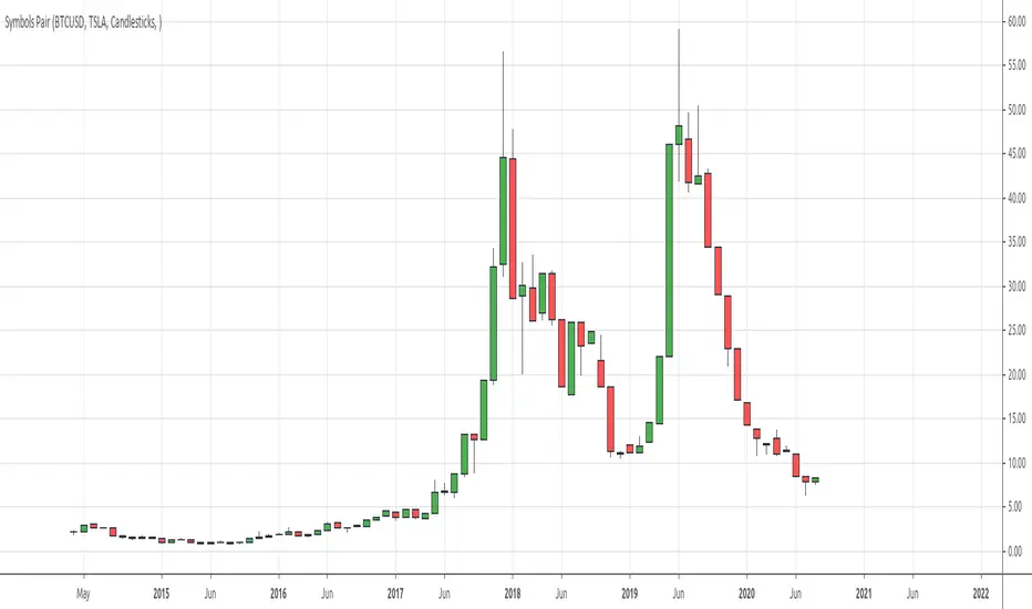
BTC ETH RatioBTCUSD / ETHUSD Ratio.
You might find patterns when to move from BTC to ETH and vice versa.
# Open Source
The code is open source @ github.com and uses the commonpine library github.com

Blockchain Rhythms by Cryptorhythms🎼 Blockchain Rhythms v1.0 by Cryptorhythms
This indicator and data plot suite is for bitcoin BTCUSD analysis over longer periods and higher time frames. 🚨For this to plot anything you must use on Daily or higher timeframe🚨 .
You want to have an alternative to the typical technical indicators you see everywhere? This is it. Seen crypto twitter talking about/using all sorts of indicators you have never seen before on tradingview? Here you go. Are you a long term investor and not a short term speculator?... I think you get the picture...
With the wealth of data here, I cannot go into a fully detailed analysis for every indicator. Please make liberal use of google and as always DYOR before trading on a system you have never used.
These indicators are best observed versus a logarithmic price scale. If I have missed any indicators you think should be in here let me know! Let me preempt that by saying MVRV and UTXO Age Distribution are not possible to create on Tradingview at this time.
🚧Error Screen:
If you see this you need to choose a data-point or indicator to plot!
⌚If you are loading this indicator with alot of chart history shown (as in the example screenshots) it may take up to a minute to load.
Please note: some of the screenshots below show chart title plots which I subsequently had to remove due to limitations. If you would like a title for all the plot, simple use the Indicator Labels checkbox option located in the scales tab of chart settings.
[b📊 Fundamental Blockchain Indicators
NVT Signal & Ratio
Both are related. NVT / NVT Signal can be interpreted as the strength of market confidence in the means of payment / settlement layer narrative. A “measure of the chain’s strength as a payment network compared to its market value — a low NVT may suggest that a network is undervalued compared to the service it is providing as a settlement layer” (Matteo Leibowitz).
💰NVT Ratio:
NVT Ratio (Network Value to Transactions Ratio) is similar to the PE Ratio used in equity markets.
When Bitcoin`s NVT is high, it indicates that its network valuation is outstripping the value being transmitted on its payment network, this can happen when the network is in high growth and investors are valuing it as a high return investment, or alternatively when the price is in an unsustainable bubble.
🚦NVT Signal:
NVT Signal (NVTS) is a derivative of NVT Ratio created by Dimitry Kalichkin. This indicator provides more emphasis on predictive signaling ahead of price peaks.
🚀Bitcoin Velocity
Velocity is a measure of how quickly money is circulating in the economy. Is bitcoin trending towards savings or payments? This can help you decide. It is similar to Bitcoin Network Momentum, except this takes into account bitcoins increasing supply.
🏃Bitcoin Network Momentum
Network Momentum is a view created by PositiveCrypto which looks into the value transmitted through the Bitcoin blockchain denominated in BTC value plotted against Bitcoin's price. It serves as a leading indicator to bitcoin price, in that we need high levels of value throughput to drive the bull market. This indicator is experimental.
Both daily transaction values and price exhibit cyclical patterns, but not in sync with each other. A hypothesis to explain the mismatch is that short-term mindset traders (using exchanges) heavily influence price; but long-term mindset investments (more likely to be directly recorded on-chain) have a greater contribution to the daily transaction value recorded in the ledger.
An alternative to the NVT / NVT Signal - tracks the relationship between Bitcoin’s price and BTC volume flowing through the blockchain network.
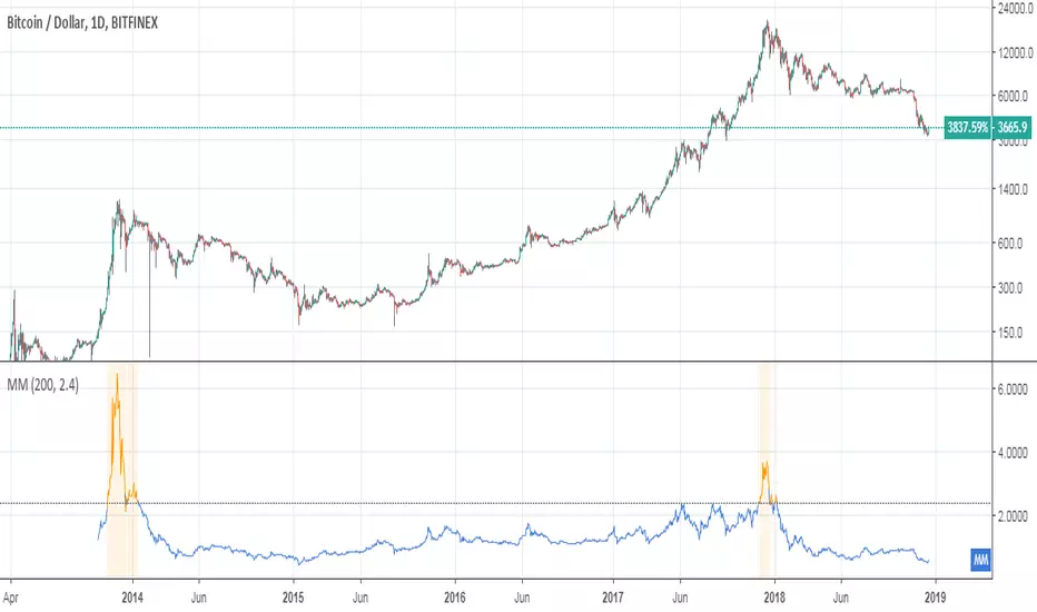
Ⓜ Mayer Multiple
Introduced by Trace Mayer as a way to gauge the current price of Bitcoin against its long range historical price movements (200 day SMA by default), the Mayer Multiple highlights when Bitcoin is overbought or oversold in the context of longer time frames.
It`s worth noting as the market becomes larger and less volatile, the peaks are becoming less exaggerated. This is because a 200 day moving average baseline is a static yardstick against an ever growing, more stable, Bitcoin market. We should eventually re-calibrate what constitutes the overbought/oversold extremes on this chart accordingly.
A more fully featured Mayer Multiple version available here:
💲 BTC Marketcap and Thermocap
We are all familiar with marketcap, but it does come with its disadvantages.
A more appropriate measure of network value was recently put forth by Nic Carter. Remember capital flows in crypto generally do not come in via exchanges (miners notably like to sell OTC). Every buy in an exchange is matched by a sell. Money that comes in = money that goes out.
True inflows (in Bitcoin, at least) are the aggregate of resources spent by miners¹. And a good proxy for that is the amount these folks are earning back from networks they support in return for their investments. That’s aggregate security spend (or Thermocap): what was actually paid out to miners (transactions * their price in USD at the time they were mined).
There is an option to deduct lost coins, genesis (Satoshi's) coins, and dead HODL'ers coins from the marketcap. This information was taken from ChainAnalysis' 2017 report
This shows both plots for comparison on a logrithmic scale:
⛏Mining Indicators & Data
⛏ Petahash Dollar Ratio
Bitcoin’s Hashrate (Daily PetaHashes) to Daily Mining Earnings (PetaHashDollar) is a robust metric to asses the day to day mining profitability. In addition, when plotted over the past five years, its overall trend represents a good way to quantify and visualize the relative progress in efficiency of ASICs (more specifically the inverse of that metric: 1/relative mining efficiency).
⛏Unmined Coins Marketcap
A simple statistic I created to plot the value of the unmined BTC still waiting to be extracted. If you find any interesting value for analysis please message me and let me know.
⛏Percentage of Total BTC Mined
I hope this one doesnt need an explanation. 😅
#️⃣ Network Hash Rate
A network's hashrate is the most important data point in blockchain tech. It indicates to the world how secure its network is. The hashrate is the "bridge" between the analog world, and the digital world. Essentially, the hashrate describes how much computing power (called hashing power in blockchain speak) is being thrown at the network, by users all across the world. These "miners" are running servers with dedicated processing chips to solve random, cryptographic math problems. The reason miners do this constant computing is that it betters their chances to reap a "block reward." The block reward entitles them to:
1.)Newly "mined" coins, and
2.)Transaction fees
Both of these are typically paid out with each new block. This rewards miners for their “proof-of-work.” It signals to the world that real "work" and resources, like electricity, have been spent on the Bitcoin network.
As more and more miners compete for the block reward, the hashrate, mining calculations and block difficulty will increase. This increase in the network's hashrate over time means an increase in the network’s security. Much better detail on this is available elsewhere, but primarily, this process solves digital money's vulnerability to attacks and the "double spend" problem.
I like to plot it directly on the price chart (click on the indicator and drag it up)
⛏ Revenue Per Transaction
A chart showing miners revenue divided by the number of transactions.
Fee Per Block Kilobyte
A measure of how much it costs per kilobyte of blockchain block size.
⛏Return Per TeraHash (TH)
Revenue per TH of mining hash power.
Can also be plotted on price chart and looks nice:
Cost Per TX (CPT) and Cost % Per TX Volume
CPT - A chart showing miners revenue divided by the number of transactions
C%PRV - A chart showing miners revenue as percentage of the transaction volume
Blockchain Statistics & Data Plots
🏋Network Difficulty
A relative measure of how difficult it is to find a new block. The difficulty is adjusted periodically as a function of how much hashing power has been deployed by the network of miners.
I like plotting this one on price chart as well:
Daily Output Value
The total value of all transaction outputs per day (includes coins returned to the sender as change).
🔢Number of Unique Addresses Used
Addresses are kind of like bank accounts.
Unlike bank accounts, addresses on the blockchain can be generated by anyone, anywhere and one single person could have thousands.
The plot shows bitcoins growth of addresses which are both unique and active per day, smoothed out over 14 days for clarity (using a zero lag ema). As you can see bull runs typically lead to more unique addresses the assumption being that more new money is drawn into the market due to the news cycle.
This is another one I prefer to plot on the price chart.
🔢Number of Transactions (NoTX) and NoTX - Exchange Wallets
Number of TX's on the chain (green line) and NoTX minus (-) Exchange Wallets (blue line).
⏳ Median Confirmation Time
The median time for a transaction to be accepted into a mined block and added to the public ledger (note: only includes transactions with miner fees). Displayed in minutes.
🔊Volume Dominance (Liquidity to Transaction Volume Ratio)
Volume Dominance is another metric I invented simply to show the ratio between spot exchange TXs (liquidity/speculation) and blockchain TXs (utility/HODLing). Its shows percent of volume attributed to blockchain TXs.
🙃 We REALLY hope you enjoy and find this indicator useful. I certainly enjoyed creating it and learned quite a bit myself manipulating the data! I welcome any suggestions or ideas you may have to further extend, or create new indicators.
👍 Enjoying this indicator or find it useful? Please give me a like and follow! I post crypto analysis, price action strategies and free indicators regularly.
💬 Questions? Comments? Want to get access to an entire suite of proven trading indicators? Come visit us on telegram and chat, or just soak up some knowledge. We make timely posts about the market, news, and strategy everyday. Our community isn't open only to subscribers - everyone is welcome to join.

Mayer MultipleThis indicator was created by Trace Mayer as a way to analyze the price of Bitcoin in a historical context. Consider it as a kind of Volatility Ratio that was created by Jack Schwager for the securities.
To learn more about Mayer Multiple see:
charts.woobull.com
mayermultiple.info
www.theinvestorspodcast.com
Good luck!
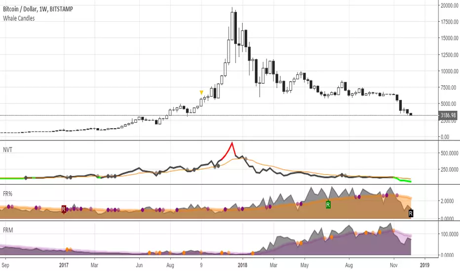
FRM - Bitcoin Fee Ratio MultipleBitcoin Fee Ratio Multiple (FRM) is a BTC specific study that measures its strength as a Store of Value.
FRM may be a solid alternative to the Network Value to Transaction (NVT) indicator.
A low FRM suggests that Bitcoin can maintain its current security budget (miner revenue) without having to rely on an inflationary subsidy.
Conversely, a high FRM suggests that Bitcoin will require heavy inflation via block reward subsidies in order to maintain its existing security levels.
This means that in order to reach current security budget levels without block reward subsidies, transaction fee revenue for each chain has to grow as many times as the FRM indicator points.
We would naturally expect a strong inverse correlation between large price movements and FRM.
Strong price action in either direction is usually accompanied by a surge in volume →
More volume suggests more people are moving assets to exchanges →
More people transacting with crypto asset means higher transaction fee revenue →
Therefore, higher transaction fee revenue means lower FRM
In the long run the correlation between price and FRM would tend to disappear.
FRM for capped supply assets would continue to decline over time, eventually reaching something close to 1, the point at which transaction fee revenue makes up 100% of total miner revenue.
Some notes about NVT.
NVT is used to measure a chain’s strength as a payment network compared to its market value. A low NVT may suggest that a network is undervalued compared to the service it is providing as a settlement layer.
NVT and FRM will not always be correlated. A chain could feasibly have a high number of transactions and a low network value, and therefore a low NVT, while simultaneously having a high FRM depending on the current size of block rewards and average transaction fee.
Moreover, NVT is far easier to spoof than FRM: one merely need spam the network with low fee transactions. By contrast, significant manipulation of FRM would by definition require significant cost as FRM measures the aggregate value of transaction fees rather than count.
User notes:
This study only plots in Bitcoin charts.
It plots in Daily, Weekly and Monthly time frames.
It doesn't render in intraday charts.
Credit for this idea goes to Matteo Leibowitz: medium.com
Based on the story: medium.com
You're welcome to add it to your charts. Hope you find it useful!
FR(%) - Bitcoin Fee RatioBitcoin Fee Ratio is a BTC specific study aiming to replace the ever-misleading ‘market capitalization’ (marketcap).
It answers to the following question:
“If block rewards disappeared tomorrow what percentage of economic volume would we have to pay in fees to replace them”
A low FR means that users can transact securely while simultaneously paying a minimal % of each transaction as a fee.
Conversely, a high FR means that users have to pay a high % of each transaction as a fee in order to transact securely.
User notes:
This study only plots in Bitcoin charts.
It plots in Daily, Weekly and Monthly time frames.
It doesn't render in intraday charts.
The FR value is expressed in relative (%) terms.
Credit for this idea goes to Matteo Leibowitz: medium.com
Based on the story: medium.com
You're welcome to add it to your charts. Hope you find it useful!
Crypto Mineable vs Not Mineable (Market Caps Ratio)Hello traders!
This indicator shows you the ratio between market capitalizations of the mineable and not mineable cryptocurrencies from TOP-20 (excluding Bitcoin Cash).
NOTE : The market capitalizations are calculated dynamically . The word "dynamically" means that I did not hardcode supplies for presented cryptocurrencies.
What else is included
Alert for the specified positive % change
Alert for the specified negative % change
How to get access
Buy for only 25$ to get lifetime access to this indicator
Like and follow for more cool indicators!
Happy Trading!


Earnings Support and Resistance Levels [NeoButane]Inspired by @LazyBear's/@timwest's script:
Usage: support and resistance levels based on averaging price around earnings and quarterly opens.
What it is plotting:
1. A horizontal level whenever earnings occur. If actual earnings is higher than estimated, the line turns green, else red.
2. A horizontal level every quarterly open, colored black.
3. An average between the two mentioned above, colored orange.
4. 5% moves away from 3M open and earnings
5. Misc: 5% move away from that 5% move away, then 10% move away from the 2nd 5% move away.
By default, 4 and 5 are off to reduce visual noise.
Idea: Traders panic around certain dates that always happen, and traders always panic in the wrong direction. The market is composed of traders trading in the wrong direction at the same time, all the time. That means price will bounce back and forth as the gambling dens colloquially known as 'forex brokerages' or 'stock exchanges' take your money in the form of fees, time, and liquidations. So I put two lines on the chart and put one right in between, because it always goes back. I hope you can find it useful!
Note: This was a part of the old fundamental data indicators and is not officially for use, so while it should work on most U.S. stocks and a couple of other exchanges, it is not perfect.

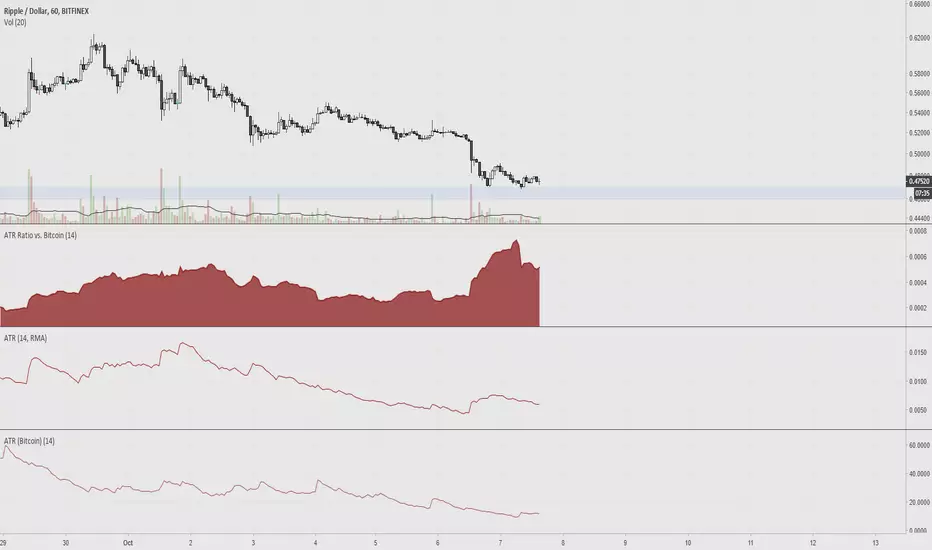
ATR Ratio vs. BitcoinAverage True Range is used to determine if a ticker's trading range is widening or narrowing, which is helpful for finding the trend or to use as a stop loss. The idea of this indicator is to compare the ATR of altcoins versus bitcoin, since volatility is low.
Bitcoin Studies (NVT et. al) [NeoButane]Currently studying the effect of NVT on price action and volume.

Bitfinex Long vs Short RatiosWas impressed with the 'Longs vs Shorts Ratio' idea from the tweet below so I coded an indicator, enjoy.
twitter.com
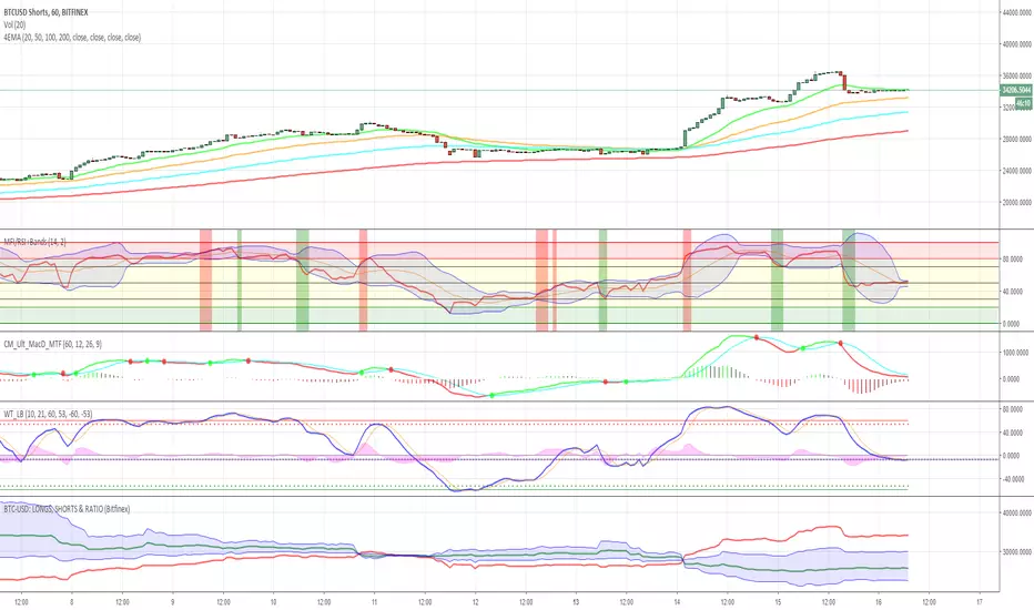
BTC-USD: LONGS, SHORTS & RATIO (Bitfinex)This script allows you
1. to plot the outstanding BTC long (green) and/or short (red) positions
2. to plot an area (blue) corresponding to the ratio between the outstanding long and short positions, shifted and rescaled, such that the zero-line corresponds to the mid-point between the long and short positions: ratio => ratio * mid + mid
OratioA simple ratio between two assets. When the ratio tops or bottoms out it can anticipate inversions in both assets.


BITFINEX Long to Short RatioShows the ratio of longs to shorts. Above 1.0 means more longs. Below 1.0 means more shorts. A value of 1.0 means equilibrium.
