Global M2 Money Supply // Days Offset =This is the original version.. there is no update... just needed to re-install the script.
Cerca negli script per "美国m2历年数据"

Recession Warning Model [BackQuant]Recession Warning Model
Overview
The Recession Warning Model (RWM) is a Pine Script® indicator designed to estimate the probability of an economic recession by integrating multiple macroeconomic, market sentiment, and labor market indicators. It combines over a dozen data series into a transparent, adaptive, and actionable tool for traders, portfolio managers, and researchers. The model provides customizable complexity levels, display modes, and data processing options to accommodate various analytical requirements while ensuring robustness through dynamic weighting and regime-aware adjustments.
Purpose
The RWM fulfills the need for a concise yet comprehensive tool to monitor recession risk. Unlike approaches relying on a single metric, such as yield-curve inversion, or extensive economic reports, it consolidates multiple data sources into a single probability output. The model identifies active indicators, their confidence levels, and the current economic regime, enabling users to anticipate downturns and adjust strategies accordingly.
Core Features
- Indicator Families : Incorporates 13 indicators across five categories: Yield, Labor, Sentiment, Production, and Financial Stress.
- Dynamic Weighting : Adjusts indicator weights based on recent predictive accuracy, constrained within user-defined boundaries.
- Leading and Coincident Split : Separates early-warning (leading) and confirmatory (coincident) signals, with adjustable weighting (default 60/40 mix).
- Economic Regime Sensitivity : Modulates output sensitivity based on market conditions (Expansion, Late-Cycle, Stress, Crisis), using a composite of VIX, yield-curve, financial conditions, and credit spreads.
- Display Options : Supports four modes—Probability (0-100%), Binary (four risk bins), Lead/Coincident, and Ensemble (blended probability).
- Confidence Intervals : Reflects model stability, widening during high volatility or conflicting signals.
- Alerts : Configurable thresholds (Watch, Caution, Warning, Alert) with persistence filters to minimize false signals.
- Data Export : Enables CSV output for probabilities, signals, and regimes, facilitating external analysis in Python or R.
Model Complexity Levels
Users can select from four tiers to balance simplicity and depth:
1. Essential : Focuses on three core indicators—yield-curve spread, jobless claims, and unemployment change—for minimalistic monitoring.
2. Standard : Expands to nine indicators, adding consumer confidence, PMI, VIX, S&P 500 trend, money supply vs. GDP, and the Sahm Rule.
3. Professional : Includes all 13 indicators, incorporating financial conditions, credit spreads, JOLTS vacancies, and wage growth.
4. Research : Unlocks all indicators plus experimental settings for advanced users.
Key Indicators
Below is a summary of the 13 indicators, their data sources, and economic significance:
- Yield-Curve Spread : Difference between 10-year and 3-month Treasury yields. Negative spreads signal banking sector stress.
- Jobless Claims : Four-week moving average of unemployment claims. Sustained increases indicate rising layoffs.
- Unemployment Change : Three-month change in unemployment rate. Sharp rises often precede recessions.
- Sahm Rule : Triggers when unemployment rises 0.5% above its 12-month low, a reliable recession indicator.
- Consumer Confidence : University of Michigan survey. Declines reflect household pessimism, impacting spending.
- PMI : Purchasing Managers’ Index. Values below 50 indicate manufacturing contraction.
- VIX : CBOE Volatility Index. Elevated levels suggest market anticipation of economic distress.
- S&P 500 Growth : Weekly moving average trend. Declines reduce wealth effects, curbing consumption.
- M2 + GDP Trend : Monitors money supply and real GDP. Simultaneous declines signal credit contraction.
- NFCI : Chicago Fed’s National Financial Conditions Index. Positive values indicate tighter conditions.
- Credit Spreads : Proxy for corporate bond spreads using 10-year vs. 2-year Treasury yields. Widening spreads reflect stress.
- JOLTS Vacancies : Job openings data. Significant drops precede hiring slowdowns.
- Wage Growth : Year-over-year change in average hourly earnings. Late-cycle spikes often signal economic overheating.
Data Processing
- Rate of Change (ROC) : Optionally applied to capture momentum in data series (default: 21-bar period).
- Z-Score Normalization : Standardizes indicators to a common scale (default: 252-bar lookback).
- Smoothing : Applies a short moving average to final signals (default: 5-bar period) to reduce noise.
- Binary Signals : Generated for each indicator (e.g., yield-curve inverted or PMI below 50) based on thresholds or Z-score deviations.
Probability Calculation
1. Each indicator’s binary signal is weighted according to user settings or dynamic performance.
2. Weights are normalized to sum to 100% across active indicators.
3. Leading and coincident signals are aggregated separately (if split mode is enabled) and combined using the specified mix.
4. The probability is adjusted by a regime multiplier, amplifying risk during Stress or Crisis regimes.
5. Optional smoothing ensures stable outputs.
Display and Visualization
- Probability Mode : Plots a continuous 0-100% recession probability with color gradients and confidence bands.
- Binary Mode : Categorizes risk into four levels (Minimal, Watch, Caution, Alert) for simplified dashboards.
- Lead/Coincident Mode : Displays leading and coincident probabilities separately to track signal divergence.
- Ensemble Mode : Averages traditional and split probabilities for a balanced view.
- Regime Background : Color-coded overlays (green for Expansion, orange for Late-Cycle, amber for Stress, red for Crisis).
- Analytics Table : Optional dashboard showing probability, confidence, regime, and top indicator statuses.
Practical Applications
- Asset Allocation : Adjust equity or bond exposures based on sustained probability increases.
- Risk Management : Hedge portfolios with VIX futures or options during regime shifts to Stress or Crisis.
- Sector Rotation : Shift toward defensive sectors when coincident signals rise above 50%.
- Trading Filters : Disable short-term strategies during high-risk regimes.
- Event Timing : Scale positions ahead of high-impact data releases when probability and VIX are elevated.
Configuration Guidelines
- Enable ROC and Z-score for consistent indicator comparison unless raw data is preferred.
- Use dynamic weighting with at least one economic cycle of data for optimal performance.
- Monitor stress composite scores above 80 alongside probabilities above 70 for critical risk signals.
- Adjust adaptation speed (default: 0.1) to 0.2 during Crisis regimes for faster indicator prioritization.
- Combine RWM with complementary tools (e.g., liquidity metrics) for intraday or short-term trading.
Limitations
- Macro indicators lag intraday market moves, making RWM better suited for strategic rather than tactical trading.
- Historical data availability may constrain dynamic weighting on shorter timeframes.
- Model accuracy depends on the quality and timeliness of economic data feeds.
Final Note
The Recession Warning Model provides a disciplined framework for monitoring economic downturn risks. By integrating diverse indicators with transparent weighting and regime-aware adjustments, it empowers users to make informed decisions in portfolio management, risk hedging, or macroeconomic research. Regular review of model outputs alongside market-specific tools ensures its effective application across varying market conditions.

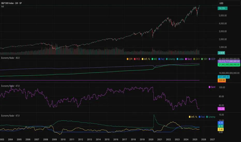
Economy RadarEconomy Radar — Key US Macro Indicators Visualized
A handy tool for traders and investors to monitor major US economic data in one chart.
Includes:
Inflation: CPI, PCE, yearly %, expectations
Monetary policy: Fed funds rate, M2 money supply
Labor market: Unemployment, jobless claims, consumer sentiment
Economy & markets: GDP, 10Y yield, US Dollar Index (DXY)
Options:
Toggle indicators on/off
Customizable colors
Tooltips explain each metric (in Russian & English)
Perfect for spotting economic cycles and supporting trading decisions.
Add to your chart and get a clear macro picture instantly!
M2SL/DXY RatioThis is the ratio of M2 money supply (M2SL) to the U.S. dollar index (DXY), taking into account the impact of U.S. dollar strength and weakness on liquidity.
M2SL/DXY better represents the current impact of the United States on cryptocurrency prices.
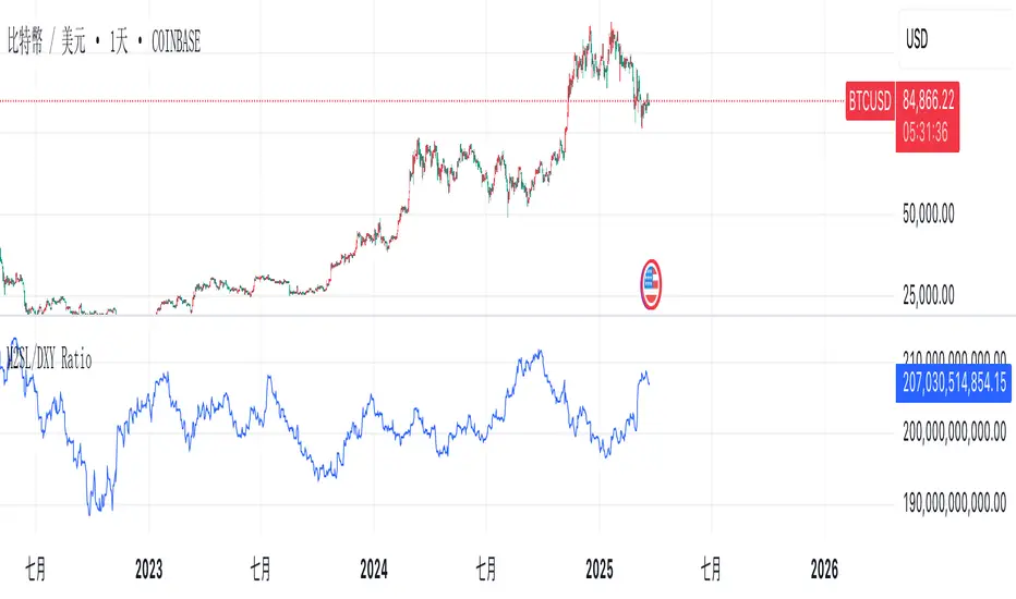
M2SL/DXY RatioA custom financial ratio comparing:
Numerator: M2 Money Supply (M2SL)
U.S. monetary aggregate measuring cash, checking deposits, and easily convertible near money
Denominator: US Dollar Index (DXY)
Trade-weighted geometric mean of USD value against six major currencies

Momentum Theory Quick BiasMomentum Theory Quick Bias is a watchlist screener tool for rapid multi-timeframe analysis. It displays a variety of information from higher timeframes in order to set a directional bias including: breakout levels, peak levels, previous bar closes, and swing points.
✅ 8 Symbol Watchlist Scanner
✅ Quickly Set Directional Bias
✅ For Scalpers, Day Traders, and Swing Traders
--- 📷 INDICATOR GALLERY ---
--- 🚀 QUICK LOOK ---
✔ Multi-Timeframe Analysis
Displays various higher timeframe information in order to read how an asset is moving with one quick glance. Utilizes icons and colors that serve as visual cues.
--- ⚡ FEATURES ---
✔ Breakout Bias
Shows if the current price is above or below the breakout level on the timeframe.
✔ Peak Bias
Shows if the current previous peak has been triggered and where price is relative to it.
✔ Previous Bar Close
Shows how the previous bar closed and whether it's bullish or bearish.
Breakout
Fakeout
Inside
Outside
✔ Swing Point
Shows if the timeframe has currently flipped its breakout level.
✔ Bias Alignment
Shows visual icons if there is bias alignment between the timeframes.
↗️↘️ Breakout Bias Alignment
🔼🔽 Peak Bias Alignment
🔀 Breakout and Peak Bias Alignment, but opposite
✅ Breakout and Peak Bias Alignment
✔ Quick Analysis
Hover over the symbol name to view which timeframe levels are bullish or bearish and if peak levels have been triggered.
--- 🔥 OTHER FEATURES ---
✔ Built-In Presets
Create your own custom watchlist or use one of the built-in ones (using Oanda charts)
It's recommended to use the same source for all assets in your watchlist whenever possible
✔ Customized Layouts
Display the watchlist in a variety of different column arrangements.
✔ Dark and Light Modes
Adjustable theme colors to trade your chart the way you want.
✔ Plug-and-Play
Automatically changes the relevant levels depending on the viewed timeframe. Just fill in your watchlist, add it to your chart, and start trading!
Set the indicator to the following timeframes to view those arrangements:
Month Timeframe - Y / 6M / 3M / M
Week Timeframe - 6M / 3M / M / W
Day Timeframe - 3M / M / W / D
H4 Timeframe - Y / M / W / D
M15 Timeframe - M / W / D / H8
M10 Timeframe - M / W / D / H4
M5 Timeframe - W / D / H8 / H2
M3 Timeframe - W / D / H4 / H1
M2 Timeframe - D / H8 / H2 / M30
M1 Timeframe - D / H4 / H1 / M15
--- 📝 HOW TO USE ---
1) Create your watchlist or use one of the built-in presets and place it on the timeframe you want to see. If no watchlist is created, it automatically sets to the current asset.
2) Alignments will trigger in real-time and push to the top of the column.
It is recommended to place the indicator in a different chart window, so it won't have to refresh every time the asset or timeframe changes.
Weighted US Liquidity ROC Indicator with FED RatesThe Weighted US Liquidity ROC Indicator is a technical indicator that measures the Rate of Change (ROC) of a weighted liquidity index. This index aggregates multiple monetary and liquidity measures to provide a comprehensive view of liquidity in the economy. The ROC of the liquidity index indicates the relative change in this index over a specified period, helping to identify trend changes and market movements.
1. Liquidity Components:
The indicator incorporates various monetary and liquidity measures, including M1, M2, the monetary base, total reserves of depository institutions, money market funds, commercial paper, and repurchase agreements (repos). Each of these components is assigned a weight that reflects its relative importance to overall liquidity.
2. ROC Calculation:
The Rate of Change (ROC) of the weighted liquidity index is calculated by finding the difference between the current value of the index and its value from a previous period (ROC period), then dividing this difference by the value from the previous period. This gives the percentage increase or decrease in the index.
3. Visualization:
The ROC value is plotted as a histogram, with positive and negative changes indicated by different colors. The Federal Funds Rate is also plotted separately to show the impact of central bank policy on liquidity.
Discussion of the Relationship Between Liquidity and Stock Market Returns
The relationship between liquidity and stock market returns has been extensively studied in financial economics. Here are some key insights supported by scientific research:
Liquidity and Stock Returns:
Liquidity Premium Theory: One of the primary theories is the liquidity premium theory, which suggests that assets with higher liquidity typically offer lower returns because investors are willing to accept lower yields for more liquid assets. Conversely, assets with lower liquidity may offer higher returns to compensate for the increased risk associated with their illiquidity (Amihud & Mendelson, 1986).
Empirical Evidence: Research by Fama and French (1992) has shown that liquidity is an important factor in explaining stock returns. Their studies suggest that stocks with lower liquidity tend to have higher expected returns, aligning with the liquidity premium theory.
Market Impact of Liquidity Changes:
Liquidity Shocks: Changes in liquidity can impact stock returns significantly. For example, an increase in liquidity is often associated with higher stock prices, as it reduces the cost of trading and enhances market efficiency (Chordia, Roll, & Subrahmanyam, 2000). Conversely, a liquidity shock, such as a sudden decrease in market liquidity, can lead to higher volatility and lower stock prices.
Financial Crises: During financial crises, liquidity tends to dry up, leading to sharp declines in stock market returns. For instance, studies on the 2008 financial crisis illustrate how a reduction in market liquidity exacerbated the decline in stock prices (Brunnermeier & Pedersen, 2009).
Central Bank Policies and Liquidity:
Monetary Policy Impact: Central bank policies, such as changes in the Federal Funds Rate, directly influence market liquidity. Lower interest rates generally increase liquidity by making borrowing cheaper, which can lead to higher stock market returns. On the other hand, higher rates can reduce liquidity and negatively impact stock prices (Bernanke & Gertler, 1999).
Policy Expectations: The anticipation of changes in monetary policy can also affect stock market returns. For example, expectations of rate cuts can lead to a rise in stock prices even before the actual policy change occurs (Kuttner, 2001).
Key References:
Amihud, Y., & Mendelson, H. (1986). "Asset Pricing and the Bid-Ask Spread." Journal of Financial Economics, 17(2), 223-249.
Fama, E. F., & French, K. R. (1992). "The Cross-Section of Expected Stock Returns." Journal of Finance, 47(2), 427-465.
Chordia, T., Roll, R., & Subrahmanyam, A. (2000). "Market Liquidity and Trading Activity." Journal of Finance, 55(2), 265-289.
Brunnermeier, M. K., & Pedersen, L. H. (2009). "Market Liquidity and Funding Liquidity." Review of Financial Studies, 22(6), 2201-2238.
Bernanke, B. S., & Gertler, M. (1999). "Monetary Policy and Asset Prices." NBER Working Paper No. 7559.
Kuttner, K. N. (2001). "Monetary Policy Surprises and Interest Rates: Evidence from the Fed Funds Futures Market." Journal of Monetary Economics, 47(3), 523-544.
These studies collectively highlight how liquidity influences stock market returns and how changes in liquidity conditions, influenced by monetary policy and other factors, can significantly impact stock prices and market stability.

Stef's Money Supply IndicatorI have been fascinated by the growth in the Money Supply. Well, I think we ALL have been fascinated by this and the corresponding inflation that followed. That's why I created my Money Supply Indicator because I always wanted to chart and analyze my symbols based on the Money Supply. This indicator gives you that capability in a way that no other indicator in this field currently offers. Let me explain:
How does the indicator work?
Chart any symbol, turn on this indicator, and instantly it will factor in the M2 money supply on the asset's underlying price. Essentially, you are seeing the price of the asset normalized for the corresponding rise in the money supply. In some ways, this is a rather unique inflation-adjusted view of a symbol's price.
More importantly, you can compare and contrast the symbol's price adjusted for the rise in the Money Supply vs. the symbol's price without that adjustment by indexing all lines to 100. This is essential for understanding if the asset is at all-time highs, lows, or possibly undervalued or overvalued based on the current money supply situation.
Why does this matter?
This tool provides a deeper understanding of how the overall money supply influences the value of assets over time. By adjusting asset prices for changes in the money supply, traders can see the true value of assets relative to the amount of money in circulation.
What features can you access with this indicator?
The ability to normalize all lines to a starting point of 100 allows traders to compare the performance of the Money Supply, the symbol price, and the symbol price adjusted for the money supply all on one readable chart. This feature is particularly useful for spotting divergences and understanding relative performance over time with a rising or falling Money Supply.
What else can you do?
This is just version 1, and so I'll be adding more features rather soon, but there are two other important features in the settings menu including the following:
• Get the capability to quickly spot the highest and lowest points on the Money Supply adjusted price of your asset.
• Get the capability to change the gradient colors of the line when going up or down.
• Turn on the Brrrrrrr printer text as a reminder of our Fed Overlord Jerome Powell... lol
• Drag this indicator onto your main chart to combine it with your candlesticks or other charting techniques.
Stef's Money Supply Indicator! I look forward to hearing your feedback.

Cosine smoothed stochasticDescription
The "Cosine Smoothed Stochastic" indicator leverages advanced Fourier Transform techniques to smooth the traditional Stochastic Oscillator. This approach enhances the signal's reliability and reduces noise, providing traders with a more refined and actionable indicator.
The Stochastic Oscillator is a popular momentum indicator that measures the current price relative to the high-low range over a specified period. It helps identify overbought and oversold conditions, signaling potential trend reversals. By smoothing this indicator with Fourier Transform techniques, we aim to reduce false signals and improve its effectiveness.
The indicator comprises three main components:
Cosine Function: A custom function to compute the cosine of an input scaled by a frequency tuner.
Kernel Function: Utilizes the cosine function to create a smooth kernel, constrained to positive values within a specific range.
Kernel Regression and Multi Cosine: Perform kernel regression over a lookback period, with the multi cosine function summing these regressions at varying frequencies for a composite smooth signal.
Additionally, the indicator includes a volume oscillator to complement the smoothed stochastic signals, providing insights into market volume trends.
Features
Fourier Transform Smoothing: Advanced smoothing technique to reduce noise.
Volume Oscillator: Dynamic volume-based oscillator for additional market insights.
Customizable Inputs: Users can configure key parameters like regression lookback period, tuning coefficient, and smoothing length.
Visual Alerts: Buy and sell signals based on smoothed stochastic crossovers.
Usage
The indicator is designed for trend-following and momentum-based trading strategies . It helps identify overbought and oversold conditions, trend reversals, and potential entry and exit points based on smoothed stochastic values and volume trends.
Inputs
Cosine Kernel Setup:
varient: Choose between "Tuneable" and "Stepped" regression types.
lookbackR: Lookback period for regression.
tuning: Tuning coefficient for frequency adjustment.
Stochastic Calculation:
volshow: Toggle to show the volume oscillator.
emalength: Smoothing period for the Stochastic Oscillator.
lookback_period, m1, m2: Parameters for the Stochastic Oscillator lookback and moving averages.
How It Works
Stochastic Oscillator:
Computes the stochastic %K and smoothes it with an EMA.
Further smoothes %K using the multi cosine function.
Volume Oscillator:
Calculates short and long EMAs of volume and derives the oscillator as the percentage difference.
Plots volume oscillator columns with dynamic coloring based on the oscillator's value and change.
Visual Representation:
Plots smoothed stochastic lines with colors indicating bullish, bearish, overbought, and oversold conditions.
Uses plotchar to mark crossovers between current and previous values of d.
Displays overbought and oversold levels with filled regions between them.
Chart Example
To understand the indicator better, refer to the clean and annotated chart provided. The script is used without additional scripts to maintain clarity. The chart includes:
Smoothed Stochastic Lines: Colored according to trend conditions.
Volume Oscillator: Plotted as columns for visual volume trend analysis.
Overbought/Oversold Levels: Clearly marked levels with filled regions between them.
Alert Conditions
The indicator sets up alerts for buy and sell signals when the smoothed stochastic crosses over or under its previous value. These alerts can be used for automated trading systems or manual trading signals.
breakthrough of the indicators method :
Initialization and Inputs:
The indicator starts by defining necessary inputs, such as the lookback period for regression, tuning coefficient, and smoothing parameters for the Stochastic Oscillator and volume oscillator.
Cosine Function and Kernel Creation:
The cosine function is defined to compute the cosine of an input scaled by a frequency tuner.
The kernel function utilizes this cosine function to create a smoothing kernel, which is constrained to positive values within a specific range.
Kernel Regression:
The kernel regression function iterates over the lookback period, calculating weighted sums of the source values using the kernel function. This produces a smoothed value by dividing the accumulated weighted values by the total weights.
Multi Cosine Smoothing:
The multi cosine function combines multiple kernel regressions at different frequencies, summing these results and averaging them to achieve a composite smoothed value.
Stochastic Calculation and Smoothing:
The traditional Stochastic Oscillator is calculated, and its %K value is smoothed using an EMA.
The smoothed %K is further refined using the multi cosine function, resulting in a more reliable and less noisy signal.
Volume Oscillator Calculation:
The volume oscillator calculates short and long EMAs of the volume and derives the oscillator as the percentage difference between these EMAs. The result is plotted with dynamic coloring to indicate volume trends.
Plotting and Alerts:
The indicator plots the smoothed stochastic lines , overbought/oversold levels, and volume oscillator on the chart.
Buy and sell alerts are set up based on crossovers of the smoothed stochastic values, providing traders with actionable signals.

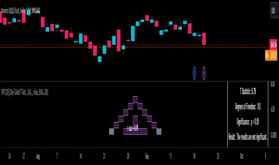
Statistical Package for the Trading Sciences [SS]
This is SPTS.
It stands for Statistical Package for the Trading Sciences.
Its a play on SPSS (Statistical Package for the Social Sciences) by IBM (software that, prior to Pinescript, I would use on a daily basis for trading).
Let's preface this indicator first:
This isn't so much an indicator as it is a project. A passion project really.
This has been in the works for months and I still feel like its incomplete. But the plan here is to continue to add functionality to it and actually have the Pinecoding and Tradingview community contribute to it.
As a math based trader, I relied on Excel, SPSS and R constantly to plan my trades. Since learning a functional amount of Pinescript and coding a lot of what I do and what I relied on SPSS, Excel and R for, I use it perhaps maybe a few times a week.
This indicator, or package, has some of the key things I used Excel and SPSS for on a daily and weekly basis. This also adds a lot of, I would say, fairly complex math functionality to Pinescript. Because this is adding functionality not necessarily native to Pinescript, I have placed most, if not all, of the functionality into actual exportable functions. I have also set it up as a kind of library, with explanations and tips on how other coders can take these functions and implement them into other scripts.
The hope here is that other coders will take it, build upon it, improve it and hopefully share additional functionality that can be added into this package. Hence why I call it a project. Okay, let's get into an overview:
Current Functions of SPTS:
SPTS currently has the following functionality (further explanations will be offered below):
Ability to Perform a One-Tailed, Two-Tailed and Paired Sample T-Test, with corresponding P value.
Standard Pearson Correlation (with functionality to be able to calculate the Pearson Correlation between 2 arrays).
Quadratic (or Curvlinear) correlation assessments.
R squared Assessments.
Standard Linear Regression.
Multiple Regression of 2 independent variables.
Tests of Normality (with Kurtosis and Skewness) and recognition of up to 7 Different Distributions.
ARIMA Modeller (Sort of, more details below)
Okay, so let's go over each of them!
T-Tests
So traditionally, most correlation assessments on Pinescript are done with a generic Pearson Correlation using the "ta.correlation" argument. However, this is not always the best test to be used for correlations and determine effects. One approach to correlation assessments used frequently in economics is the T-Test assessment.
The t-test is a statistical hypothesis test used to determine if there is a significant difference between the means of two groups. It assesses whether the sample means are likely to have come from populations with the same mean. The test produces a t-statistic, which is then compared to a critical value from the t-distribution to determine statistical significance. Lower p-values indicate stronger evidence against the null hypothesis of equal means.
A significant t-test result, indicating the rejection of the null hypothesis, suggests that there is statistical evidence to support that there is a significant difference between the means of the two groups being compared. In practical terms, it means that the observed difference in sample means is unlikely to have occurred by random chance alone. Researchers typically interpret this as evidence that there is a real, meaningful difference between the groups being studied.
Some uses of the T-Test in finance include:
Risk Assessment: The t-test can be used to compare the risk profiles of different financial assets or portfolios. It helps investors assess whether the differences in returns or volatility are statistically significant.
Pairs Trading: Traders often apply the t-test when engaging in pairs trading, a strategy that involves trading two correlated securities. It helps determine when the price spread between the two assets is statistically significant and may revert to the mean.
Volatility Analysis: Traders and risk managers use t-tests to compare the volatility of different assets or portfolios, assessing whether one is significantly more or less volatile than another.
Market Efficiency Tests: Financial researchers use t-tests to test the Efficient Market Hypothesis by assessing whether stock price movements follow a random walk or if there are statistically significant deviations from it.
Value at Risk (VaR) Calculation: Risk managers use t-tests to calculate VaR, a measure of potential losses in a portfolio. It helps assess whether a portfolio's value is likely to fall below a certain threshold.
There are many other applications, but these are a few of the highlights. SPTS permits 3 different types of T-Test analyses, these being the One Tailed T-Test (if you want to test a single direction), two tailed T-Test (if you are unsure of which direction is significant) and a paired sample t-test.
Which T is the Right T?
Generally, a one-tailed t-test is used to determine if a sample mean is significantly greater than or less than a specified population mean, whereas a two-tailed t-test assesses if the sample mean is significantly different (either greater or less) from the population mean. In contrast, a paired sample t-test compares two sets of paired observations (e.g., before and after treatment) to assess if there's a significant difference in their means, typically used when the data points in each pair are related or dependent.
So which do you use? Well, it depends on what you want to know. As a general rule a one tailed t-test is sufficient and will help you pinpoint directionality of the relationship (that one ticker or economic indicator has a significant affect on another in a linear way).
A two tailed is more broad and looks for significance in either direction.
A paired sample t-test usually looks at identical groups to see if one group has a statistically different outcome. This is usually used in clinical trials to compare treatment interventions in identical groups. It's use in finance is somewhat limited, but it is invaluable when you want to compare equities that track the same thing (for example SPX vs SPY vs ES1!) or you want to test a hypothesis about an index and a leveraged share (for example, the relationship between FNGU and, say, MSFT or NVDA).
Statistical Significance
In general, with a t-test you would need to reference a T-Table to determine the statistical significance of the degree of Freedom and the T-Statistic.
However, because I wanted Pinescript to full fledge replace SPSS and Excel, I went ahead and threw the T-Table into an array, so that Pinescript can make the determination itself of the actual P value for a t-test, no cross referencing required :-).
Left tail (Significant):
Both tails (Significant):
Distributed throughout (insignificant):
As you can see in the images above, the t-test will also display a bell-curve analysis of where the significance falls (left tail, both tails or insignificant, distributed throughout).
That said, I have not included this function for the paired sample t-test because that is a bit more nuanced. But for the one and two tailed assessments, the indicator will provide you the P value.
Pearson Correlation Assessment
I don't think I need to go into too much detail on this one.
I have put in functionality to quickly calculate the Pearson Correlation of two array's, which is not currently possible with the "ta.correlation" function.
Quadratic (Curvlinear) Correlation
Not everything in life is linear, sometimes things are curved!
The Pearson Correlation is great for linear assessments, but tends to under-estimate the degree of the relationship in curved relationships. There currently is no native function to t-test for quadratic/curvlinear relationships, so I went ahead and created one.
You can see an example of how Quadratic and Pearson Correlations vary when you look at CME_MINI:ES1! against AMEX:DIA for the past 10 ish months:
Pearson Correlation:
Quadratic Correlation:
One or the other is not always the best, so it is important to check both!
R-Squared Assessments:
The R-squared value, or the square of the Pearson correlation coefficient (r), is used to measure the proportion of variance in one variable that can be explained by the linear relationship with another variable. It represents the goodness-of-fit of a linear regression model with a single predictor variable.
R-Squared is offered in 3 separate forms within this indicator. First, there is the generic R squared which is taking the square root of a Pearson Correlation assessment to assess the variance.
The next is the R-Squared which is calculated from an actual linear regression model done within the indicator.
The first is the R-Squared which is calculated from a multiple regression model done within the indicator.
Regardless of which R-Squared value you are using, the meaning is the same. R-Square assesses the variance between the variables under assessment and can offer an insight into the goodness of fit and the ability of the model to account for the degree of variance.
Here is the R Squared assessment of the SPX against the US Money Supply:
Standard Linear Regression
The indicator contains the ability to do a standard linear regression model. You can convert one ticker or economic indicator into a stock, ticker or other economic indicator. The indicator will provide you with all of the expected information from a linear regression model, including the coefficients, intercept, error assessments, correlation and R2 value.
Here is AAPL and MSFT as an example:
Multiple Regression
Oh man, this was something I really wanted in Pinescript, and now we have it!
I have created a function for multiple regression, which, if you export the function, will permit you to perform multiple regression on any variables available in Pinescript!
Using this functionality in the indicator, you will need to select 2, dependent variables and a single independent variable.
Here is an example of multiple regression for NASDAQ:AAPL using NASDAQ:MSFT and NASDAQ:NVDA :
And an example of SPX using the US Money Supply (M2) and AMEX:GLD :
Tests of Normality:
Many indicators perform a lot of functions on the assumption of normality, yet there are no indicators that actually test that assumption!
So, I have inputted a function to assess for normality. It uses the Kurtosis and Skewness to determine up to 7 different distribution types and it will explain the implication of the distribution. Here is an example of SP:SPX on the Monthly Perspective since 2010:
And NYSE:BA since the 60s:
And NVDA since 2015:
ARIMA Modeller
Okay, so let me disclose, this isn't a full fledge ARIMA modeller. I took some shortcuts.
True ARIMA modelling would involve decomposing the seasonality from the trend. I omitted this step for simplicity sake. Instead, you can select between using an EMA or SMA based approach, and it will perform an autogressive type analysis on the EMA or SMA.
I have tested it on lookback with results provided by SPSS and this actually works better than SPSS' ARIMA function. So I am actually kind of impressed.
You will need to input your parameters for the ARIMA model, I usually would do a 14, 21 and 50 day EMA of the close price, and it will forecast out that range over the length of the EMA.
So for example, if you select the EMA 50 on the daily, it will plot out the forecast for the next 50 days based on an autoregressive model created on the EMA 50. Here is how it looks on AMEX:SPY :
You can also elect to plot the upper and lower confidence bands:
Closing Remarks
So that is the indicator/package.
I do hope to continue expanding its functionality, but as of now, it does already have quite a lot of functionality.
I really hope you enjoy it and find it helpful. This. Has. Taken. AGES! No joke. Between referencing my old statistics textbooks, trying to remember how to calculate some of these things, and wanting to throw my computer against the wall because of errors in the code, this was a task, that's for sure. So I really hope you find some usefulness in it all and enjoy the ability to be able to do functions that previously could really only be done in external software.
As always, leave your comments, suggestions and feedback below!
Take care!
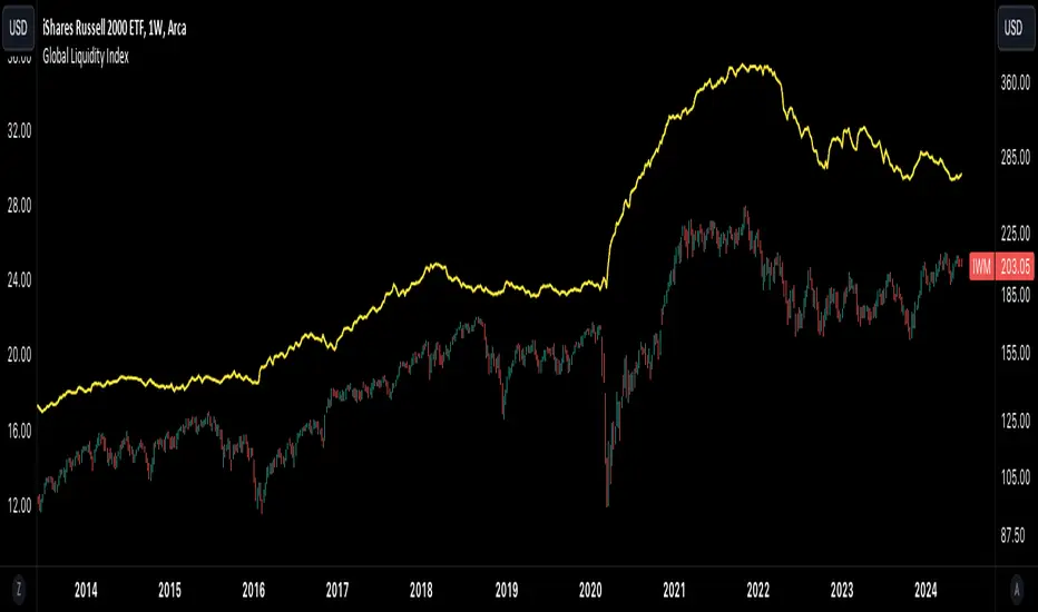
Global Liquidity IndexThe Global Liquidity Index offers a consolidated view of all major central bank balance sheets from around the world. For consistency and ease of comparison, all values are converted to USD using their relevant forex rates and are expressed in trillions. The indicator incorporates specific US accounts such as the Treasury General Account (TGA) and Reverse Repurchase Agreements (RRP), both of which are subtracted from the Federal Reserve's balance sheet to give a more nuanced view of US liquidity. Users have the flexibility to enable or disable specific central banks and special accounts based on their preference. Only central banks that both don’t engage in currency pegging and have reliable data available from late 2007 onwards are included in this aggregated liquidity model.
Global Liquidity Index = Federal Reserve System (FED) - Treasury General Account (TGA) - Reverse Repurchase Agreements (RRP) + European Central Bank (ECB) + People's Bank of China (PBC) + Bank of Japan (BOJ) + Bank of England (BOE) + Bank of Canada (BOC) + Reserve Bank of Australia (RBA) + Reserve Bank of India (RBI) + Swiss National Bank (SNB) + Central Bank of the Russian Federation (CBR) + Central Bank of Brazil (BCB) + Bank of Korea (BOK) + Reserve Bank of New Zealand (RBNZ) + Sweden's Central Bank (Riksbank) + Central Bank of Malaysia (BNM).
This tool is beneficial for anyone seeking to get a snapshot of global liquidity to interpret macroeconomic trends. By examining these balance sheets, users can deduce policy trajectories and evaluate the global economic climate. It also offers insights into asset pricing and assists investors in making informed capital allocation decisions. Historically, riskier assets, such as small caps and cryptocurrencies, have typically performed well during periods of rising liquidity. Thus, it may be prudent for investors to avoid additional risk unless there's a consistent upward trend in global liquidity.
Maschke-IndikatorThis indicator is based on market data independently from the current chart being used. It considers data from FED (M2, net liquidity) as well as heavy truck index and Redbook index. This combination allows the determination of the current market situation and factors that influence short term future economy.
As an indicator is not able to determine the absolute maximum values and it does not make sense to shed light back to history more than 5 years or to consider those minimum values long time ago, the default minimum and maximum values for the 4 primary indicators have been selected to fix to those in the last 5 years, with the possibility to change the consideration limits for the user. As the index is calculated in percentage between those ranges, the values entered for minimum and maximum have great influence, but also give the experienced user the possibility to change those limits based on her or his knowledge.
This indicator has a particularly high correlation with the S&P 500. It is clearly leading in some places. I use the indicator on the daily and hourly charts, manually bring the indicator over the S&P chart as best I can and see if the indicator is showing a major breakout ahead that the chart hasn't followed yet. Larger deviations are also a sign that the price is moving too far away from the indicator and that this deviation will probably be closed in the near future. The indicator shows the theoretical course more from the economic side, how the course should run. The deviation is therefore primarily due to the mood. I recommend using the indicator together with others, so as not to rely on this indicator alone.

Global GDPThis is the GlobalGDP of the richest and most populous countries
It is measured in USD
The countries included are the same than are included in my Global M2 indicator, as of to be able to compare them side to side.

Bitcoin Relative Value IndicatorThis script retrieves the close price data for Bitcoin, DXY, CPIAUCSL, M2 money supply, and SPX and calculates the average of the four data points. It then calculates the relative value of Bitcoin by dividing the Bitcoin close price by the average of the four data points. The script determines whether the relative value is increasing or decreasing and plots the relative value on the chart using a green line if it's increasing and a red line if it's decreasing.

Multi-Polar WorldA new macro analysis tool for easily analyzing the multi-polar world's economic powerhouses / spheres of influence, making for an easy to use visual when comparing a number of statistics:
GDP, GDP per Capita, External Debt, Government Debt, Exports, Imports, Gold Reserves, Employed Persons, Military Expenditure, Population, Bank Lending Rate, Balance of Trade, Central Bank Balance Sheet, M2 Money Supply, and CPI . Includes option to provide the total for each pole, or view individually for more detailed comparison. Meant to be used when analyzing the macro-economic conditions/trends in conjunction with other "Big Picture" type indicators when adjusting your macro framework.

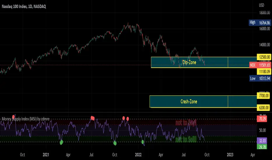
Money Supply Index (MSI) by zdmreThe primary objective of the states monetary policy is to maintain price stability with sustainable maximum economic growth. In anticipation of higher inflation , the Central Banks raise short-term interest rate thereby to reduce money supply. Conversely, the Central Banks reduce short-term interest rate to inject additional money into the economy in apprehension of unleashing recessionary forces. The stock markets usually respond negatively to interest rate increases and positively to interest rate decreases. The linkages between money market and stock market a wealth effect due to a change in money supply disturbs the equilibrium in the portfolio of investors.
This index indicates the long-run and short-run dynamic effects of broad money supply (M2) on U.S. stock market (this symbol is optional (Bitcoin, Gold or Oil or other markets etc.)).
#DYOR
Financial DeepeningFinancial Deepening is defined as increases in the ratio of a country's financial assets to its GDP. It has the effect of increasing liquidity. Having access to money can provide more opportunities for investment growth. If done properly financial deepening can increase the country's resilience and boost economic growth.
US Money Supply M2 / US GDP. (ratio)

Expected DCA PriceShowing the expected price of the DCA strategy in half a year / one year / two years, weighted by the USD supply (M2) by default

BBC M2 Pi Ratio Indicator v2Pi Cycle indicator expressed as a ratio such that when the indicator triggers (350DMA *2 = 111DMA) the ratio will be 1. This allows you to place an alert on the ratio line for crossing certain thresholds such as 1.1.
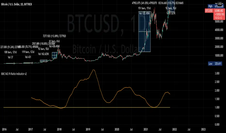
BBC M2 Pi Ratio IndicatorPi Cycle moving averages expressed as a ratio to visually show the distance and timing of next all time high. Ratio is multiplied by 100,000 to move it into visual range. I recommend drawing a horizontal line at 100,000 for reference too.

gold price levels denominated in usd/gramsPlots the gold price (USD) for the quantities (grams) identified as support or resistance in the indicator settings. Default values are:
75 gold grams
300 gold grams
500 gold grams
1000 gold grams
5000 gold grams
More context: The purchasing power of Bitcoin

Double Moving AverageWith this script you can view TWO moving average with ONE indicator (really helpful if you have the limit of four indicator in the chart).
It is very simple to use:
1) In "Preset" you can choose between three standard pairs (7-21, 11-22, 50-200) or "Custom".
2) The parameters "Custom M1" and "Custom M2" only work if "Custom Preset" is selected, otherwise they are IGNORED.
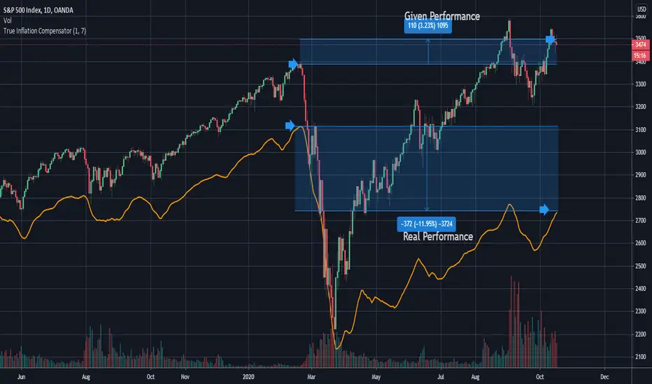
True Inflation Compensator (USD)This script will draw your underlying ticker compensating for a truer USD inflation rate based on an average between the M2 money supply increase and the government's reported CPI. It only considers the last year of inflation by default, but you can set any amount of years in the options.
This is especially relevant given the current massive printing that is going on within the US economic system. If you look at the S&P500 the market has by no means completely recovered, but due to massive printing most do not realize this by just looking at the base chart. A similar concept applies to Bitcoin. Unfortunately due to today's economic climate one must compensate for printing to get a true analysis of how investments are doing.