FXN - Week and Day Separator midnight open. A simple modification of the regular FXN day separator indicator. It starts the days at 12:00 of the time-zone you select as opposed to the regular 17:00 server time.
Cerca negli script per "accumulation"

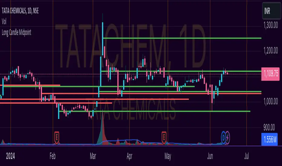
Unlocking the Power of Long Candle MidpointI'm excited to share with you a fascinating concept that can help you identify potential breakout points in the market.
The Pine Script code provided below is designed to identify the midpoint of a long candle, which can be a crucial level for traders to watch.
In this blog post, we'll dive deeper into the concept, explore its applications, and analyze a real-life example of TATACHEM listed on NSE, which is currently trading around a potential psychology line.
What is the Long Candle Midpoint?
The long candle midpoint is a technical indicator that calculates the midpoint of a candlestick that has a significant price movement. This midpoint is then used to draw a horizontal line, which can serve as a potential support or resistance level. The idea is that if a candlestick has a large price movement, it's likely that the market will react to this movement by testing the midpoint of the candle.
How Does the Long Candle Midpoint Indicator Work?
The Pine Script code provided above is designed to calculate the midpoint of a long candle based on the following parameters:
Length: The length of the candlestick is calculated using the len input parameter.
Line Length: The length of the line is calculated using the linExt input parameter.
Calculation Method: The calculation method can be set to either "Highest True Range", "Average True Range", or "Both".
Multiplier: The multiplier is used to adjust the midpoint calculation based on the average range of the candlestick.
The script then plots a horizontal line at the midpoint of the long candle, which can be used as a potential support or resistance level.
Real-Life Example:
Let's take a look at TATACHEM, a stock listed on the National Stock Exchange of India (NSE). As you can see in the chart below,
TATACHEM has been trading around a potential psychology line drawn from the midpoint of a large candle.
As you can see, the stock has previously failed to break above this line, but it's currently trading around it. This could be a sign that the market is preparing for a potential breakout. If the stock can break above this line, it could lead to a bullish rally.
Conclusion
The long candle midpoint indicator is a powerful tool that can help traders identify potential breakout points in the market. By analyzing the midpoint of a long candle, traders can gain insights into the market's sentiment and potential areas of support or resistance.
In the case of TATACHEM, the stock is currently trading around a potential psychology line, which could be a sign of a potential breakout. Traders can consider this point in their watch list for a potential entry. Tips for Traders
Use the long candle midpoint indicator in conjunction with other technical indicators to gain a more comprehensive understanding of the market.
Look for confirmation from other indicators before entering a trade.
Set stop-loss and take-profit levels based on the potential breakout point.
Monitor the market closely and be prepared to adjust your strategy if the market doesn't behave as expected.
By incorporating the long candle midpoint indicator into your trading strategy, you can gain an edge in the market and make more informed trading decisions.
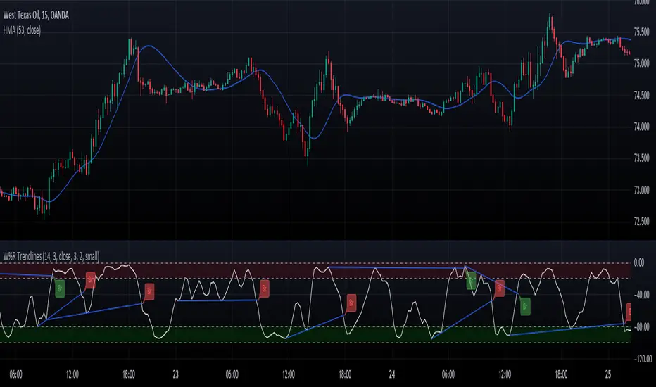
Williams Percent Range with Trendlines and BreakoutsHere is my "Williams Percent Range with Trendlines and Breakouts" indicator, a simple yet powerful tool for traders. This indicator combines the classic Williams %R oscillator, which helps identify overbought and oversold levels, with added trendlines for easier trend analysis at a glance.
It's designed to make spotting potential breakouts easier by drawing attention to significant price movements. With customizable settings for the Williams %R period and trendline sensitivity, it's a flexible tool for various symbols and trading styles.
Whether you're looking to refine your trading strategy or just need a clearer view of market trends, this indicator should offer a straight forward approach to hopefully enhance your trading decisions.
Disclaimer: This indicator is intended for educational and informational purposes only. Always conduct your own research and analysis before making trading decisions.
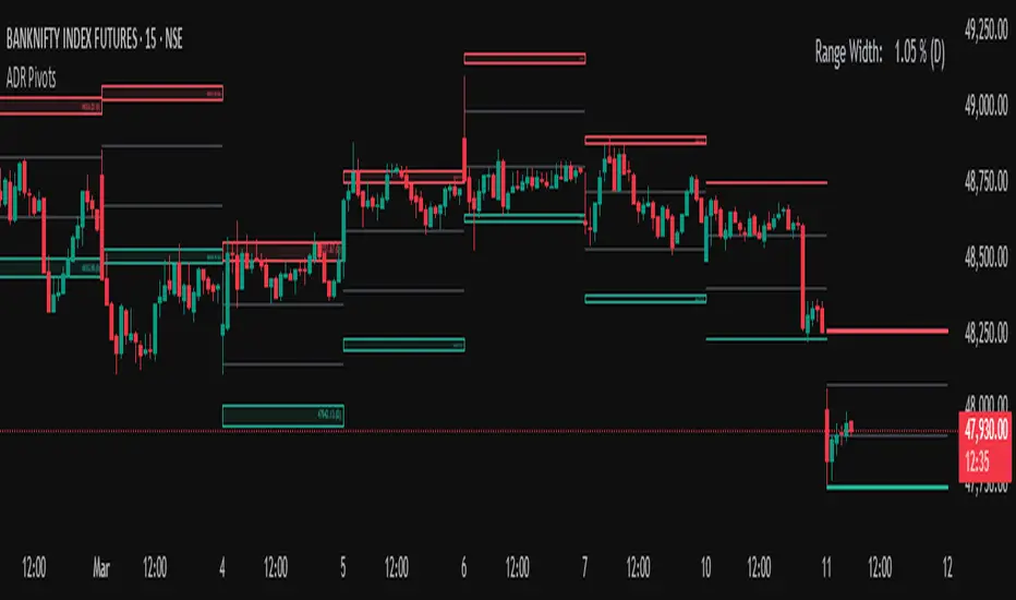
Average Daily Range (ADR) (Multi Timeframe, Multi Period)Average Daily Range (ADR)
(Multi Timeframe, Multi Period, Extended Levels)
Tips
• Narrow Zones are an indication of breakouts. It can be a very tight range as well.
• Wider Zones can be Sideways or Volatile.
What is this Indicator?
• This is Average Daily Range (ADR) Zones or Pivots.
• This have Multi Timeframe, Multi Period (Up to 3 Levels) and Extended Target Levels.
Advantages of this Indicator
• This is a Leading indicator, not Dynamic or Repaint.
• Helps to identify the reversal points.
• The levels are more accurate and not like the old formulas.
• Can practically follow the Buy Low and Sell High principle.
• Helps to keep minimum Stop Loss.
Who to use?
• Highly beneficial for Day Traders
• It can be used for Swing and Positions as well.
What timeframe to use?
• Any timeframe.
When to use?
• Any market conditions.
How to use?
Entry
• Long entry when the Price reach at or closer to the Green Support zone.
• Long entry when the Price retrace to the Red Resistance zone.
• Short entry when the Price reach at or closer to the Red Resistance zone.
• Short entry when the Price retrace to the Green Support zone.
• Long or Short at the Pivot line.
Exit
• Use past ADR levels as targets.
• Or use the Target levels in the indicator for breakouts.
• Use the Pivot line as target.
• Use Support or Resistance Zones as targets in reversal method.
What are the Lines?
Gray Line:
• It the day Open or can be considered as Pivot.
Red & Green ADR Zones:
• Red Zone is Resistance.
• Green Zone is Support.
• Mostly price can reverse from this Zones.
• Multiple Red and Green Lines forms a Zone.
• These lines are average levels of past days which helps to figure out the maximum and minimum price range that can be moved in that day.
• The default number of days are 5, 7 and 14. This can be customized.
Red & Green Target Lines:
• These are Target levels.
What are the Labels?
• First Number: Price of that level.
• Numbers in (): Percentage change and Change of price from LTP (Last Traded Price) to that Level.
General Tips
• It is good if Stock trend is same as that of the Index trend.
• Lots of indicators creates lots of confusion.
• Keep the chart simple and clean.
• Buy Low and Sell High.
• Master averages or 50%.
Volume Risk Avoidance IndicatorPrice Pattern Analysis is the core of trading. But price patterns often fails.
VRAI (Volume Risk Avoidance Indicator) shows Volume Pressure, so that you can avoid volume-based risks.
For example, never short when you see green (buying pressure). Never long when you see red (selling pressure).
You still need to pick good price patterns, because the crossover of volume pressure is not reliable.
Enjoy!

Break of structure indicatorThis indicator allows you to set a range of price which you want to get an alert about if price breaks that structure.
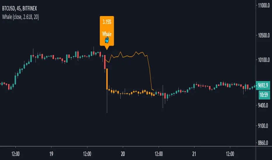
Whale Hunter [Gu5]Indicator to show a big change (Whale) in the same candle
The candles change color, until the Momentum returns to zero
After the movement of a whale, the market is usually on range, and there may be false entries
The default values (2.618% and 20 lenght), are optimized for BTCUSD 15m
---
Spanish
Este indicador muestrar un gran cambio porcentual (ballena) en la misma vela
Las velas cambian de color, hasta que el Momentum vuelve a cero
Luego de el movimiento de una ballena, el mercado suele quedar en lateral, y puede haber falsas entradas
Los valores por defecto (2.618% y 20 lenght), están optimizados para BTCUSD 15m
Volume Ticks - Increasing Volume Bar Count [LucF]Volume Ticks is a zero-lag market sentiment indicator. It works by providing a cumulative count of increasing volume columns.
A one count is added for each increasing volume column where close>open, and one is subtracted on an increasing volume column if close
IO_EMA_Delta_OscillatorThis is a EMA Delta Oscillator: An attempt to show ranging markets based on the slope of the EMA.
Green = Bullish Market
Blue = Ranging Market
Red = Bearish Market
The EMA Slope is normalized to make it work like an oscillator with values between 0 and 1.
Bar colors show the oscillator colors, bar borders show the actual candle colors.
- Invsto
(sarangab)

XBT Volatility Weighted Bottom Finder. [For Daily Charts]An update to:
Made it into and indicator.
v. 0.0.1
DESIGNED FOR DAILY CHARTS

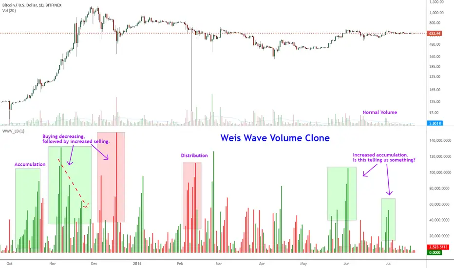
Weis Wave ChartThis indicator is based on the Weis Wave described by David H. Weis in his book Trades About to Happen: A Modern Adaptation of the Wyckoff Method, more info how to use this indicator can be found in this video . The Weis Wave is an adaptation of Richard D. Wyckoff’s method Wave Charts. It works in all time periods and can be applied to all asset types.
Unlike other implementations I found here on TradingView, this implementation make use of a Renko-like zig zag pattern, very similar to how it is described in David H. Weis' book. The settings for the zig zag pattern are very similar to the standard Renko settings here on TradingView, in the "Renko Assignment Method" you either chose "ATR" or "Traditional" (read more about it here ). The ATR length or the brick size is then entered in the textbox "Value". You can also chose another setting in the "Renko Assignment Method" drop down named "Part of Price" which calculate the brick size from the current close and divide it by the value in the text box "Value". It is also possible to chose if the zig zag pattern shall use the high/low, the open/close or just the close as the most extreme values in its calculation, you select this in the drop down "Price Source".
TradingView's pine script does currently not support to print non-static text on the chart, so it is not possible at this point to write out the volume on the zig zag chart. It is also not possible to have both an overlay and separate chart pane in the same indicator, therefor this indicator is split up in two.
You can find the volume indicator here:

Weis Wave VolumeThis indicator is based on the Weis Wave described by David H. Weis in his book Trades About to Happen: A Modern Adaptation of the Wyckoff Method, more info how to use this indicator can also be found in this video . The Weis Wave is an adaptation of Richard D. Wyckoff’s method Wave Charts. It works in all time periods and can be applied to all asset types. For assets that do not support volume Weis propose in his book to use the true range instead, so if you want to use this indicator for assets that do not support volume, make sure to enable the checkbox "Use True Range instead of Volume".
Unlike other implementations I found here on Trading, this implementation make use of a Renko-like zig zag pattern, very similar to how it is described in David H. Weis' book. The settings for the zig zag pattern are very similar to the standard Renko settings here on TradingView, in the "Renko Assignment Method" you either chose "ATR" or "Traditional" (read more about it here ). The ATR length or the brick size is then entered in the textbox "Value". You can also chose another setting in the "Renko Assignment Method" drop down named "Part of Price" which calculate the brick size from the current close and divide it by the value in the text box "Value". It is also possible to chose if the zig zag pattern shall use the high/low, the open/close or just the close as the most extreme values in its calculation, you select this in the drop down "Price Source". If you want the price to oscillate around a zero value, enable the "Oscillating" checkbox.
TradingView's pine script does currently not support to print non-static text on the chart, so it is not possible at this point to write out the volume on the zig zag chart. It is also not possible to have both an overlay and separate chart pane in the same indicator, therefor this indicator is split up in two.
You can find the zig zag indicator here:


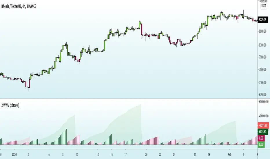
Indicator: Weis Wave Volume [LazyBear]This indicator takes market volume and organizes it into wave charts, clearly highlighting inflection points and regions of supply/demand.
Try tuning this for your instrument (Forex not supported) by adjusting the "Trend Detection Length". This "clubs together" minor waves. If you like an oscillator-kind-of display, enable "ShowDistributionBelowZero" option.
Note: This indicator is a port of a clone of WeisVolumePlugin available for another platform. I don't know how close this is to the original Weis, if any has access to it, do let me know how this compares. Thanks.
More info:
weisonwyckoff.com
Complete list of my indicators:
VSA Trading SystemMaster Reference Guide
📚 TABLE OF CONTENTS
PART 1: Core VSA Framework & Philosophy
PART 2: Volume Analysis Deep Dive
PART 3: Key VSA Setups (Complete)
PART 4: Wyckoff Accumulation & Distribution
PART 5: Multi-Timeframe Analysis
PART 6: Candle & Spread Analysis
PART 7: Entry, Stop Loss & Take Profit Rules
PART 8: Position Sizing & Risk Management
PART 9: Complete Trade Checklists
PART 10: Common Mistakes & Quick Reference
PART 11: Trade Journal Template
PART 1: CORE VSA FRAMEWORK & PHILOSOPHY
The Foundation Principle
╔════════════════════════════════════════════════════════════════╗
║ VSA FOUNDATION PRINCIPLE ║
╠════════════════════════════════════════════════════════════════╣
║ ║
║ "Smart Money leaves footprints in VOLUME" ║
║ ║
║ • Institutions cannot hide their activity ║
║ • Large orders create volume anomalies ║
║ • Price can lie, but volume confirms truth ║
║ • Volume is the FUEL, Price is the VEHICLE ║
║ • No fuel = No real move ║
║ ║
╚════════════════════════════════════════════════════════════════╝
The Golden Rule: Effort vs. Result
┌─────────────────────────────────────────────────────────────┐
│ HARMONY = TREND CONTINUATION │
│ ANOMALY = TREND REVERSAL │
└─────────────────────────────────────────────────────────────┘
Volume-Price Harmony Matrix
Price Action Volume Signal Interpretation
Rising ↑ Rising ↑ ✅ STRONG BULLISH Healthy uptrend, buyers in control
Rising ↑ Falling ↓ ⚠️ WEAK BULLISH Fuel running out, reversal near
Falling ↓ Rising ↑ ✅ STRONG BEARISH Aggressive selling, downtrend healthy
Falling ↓ Falling ↓ ⚠️ WEAK BEARISH Sellers exhausted, bottom forming
Effort vs. Result Complete Matrix
╔══════════════════════════════════════════════════════════════════╗
║ EFFORT VS RESULT MATRIX ║
╠═══════════════╦══════════════════╦════════════════════════════════╣
║ EFFORT ║ RESULT ║ INTERPRETATION ║
║ (Volume) ║ (Price Move) ║ ║
╠═══════════════╬══════════════════╬════════════════════════════════╣
║ ║ ║ ║
║ HIGH Volume ║ WIDE Spread ║ ✅ Normal - Trend healthy ║
║ ║ ║ ║
╠═══════════════╬══════════════════╬════════════════════════════════╣
║ ║ ║ ║
║ HIGH Volume ║ NARROW Spread ║ ⚠️ Absorption - Reversal soon ║
║ ║ ║ ║
╠═══════════════╬══════════════════╬════════════════════════════════╣
║ ║ ║ ║
║ LOW Volume ║ WIDE Spread ║ ⚠️ Fake move - Will reverse ║
║ ║ ║ ║
╠═══════════════╬══════════════════╬════════════════════════════════╣
║ ║ ║ ║
║ LOW Volume ║ NARROW Spread ║ 😐 No interest - Wait ║
║ ║ ║ ║
╚═══════════════╩══════════════════╩════════════════════════════════╝
PART 2: VOLUME ANALYSIS DEEP DIVE
Volume Classification (Compare to 20-period MA):
━━━━━━━━━━━━━━━━━━━━━━━━━━━━━━━━━━━━━━━━━━━━━━━━━━━
ULTRA HIGH ▓▓▓▓▓▓▓▓▓▓▓▓▓▓▓▓ (>200% of 20-period average)
→ Major institutional activity
→ Potential climax or absorption
HIGH ▓▓▓▓▓▓▓▓▓▓▓▓ (150-200% of average)
→ Significant interest
→ Breakout/breakdown confirmation
ABOVE AVERAGE ▓▓▓▓▓▓▓▓▓ (100-150% of average)
→ Healthy trend participation
→ Normal directional moves
AVERAGE ▓▓▓▓▓▓ (80-120% of average)
→ Baseline activity
→ Consolidation periods
LOW ▓▓▓ (50-80% of average)
→ Lack of interest
→ Test bars, pullbacks
ULTRA LOW ▓ (<50% of average)
→ No participation
→ Holiday/pre-news quiet
Volume Bar Colors & Meanings
┌─────────────────────────────────────────────────────────────┐
│ VOLUME BAR ANALYSIS │
├─────────────────────────────────────────────────────────────┤
│ │
│ GREEN Volume Bar (Buying Volume Dominant) │
│ ▓▓▓▓▓▓▓▓▓ │
│ + Green Candle = Healthy Buying │
│ + Red Candle = Possible Accumulation (watch for reversal) │
│ │
├─────────────────────────────────────────────────────────────┤
│ │
│ RED Volume Bar (Selling Volume Dominant) │
│ ░░░░░░░░░ │
│ + Red Candle = Healthy Selling │
│ + Green Candle = Possible Distribution (watch for drop) │
│ │
└─────────────────────────────────────────────────────────────┘
Volume Context Analysis
┌─────────────────────────────────────────────────────────────────┐
│ CONTEXT IS EVERYTHING │
├─────────────────────────────────────────────────────────────────┤
│ │
│ Same high volume candle means DIFFERENT things: │
│ │
│ AT SUPPORT: AT RESISTANCE: │
│ ┌─────────────┐ ┌─────────────┐ │
│ │ High Volume │ │ High Volume │ │
│ │ Small Body │ │ Small Body │ │
│ │ = BUYING │ │ = SELLING │ │
│ │ (Bullish) │ │ (Bearish) │ │
│ └─────────────┘ └─────────────┘ │
│ │
│ IN UPTREND: IN DOWNTREND: │
│ ┌─────────────┐ ┌─────────────┐ │
│ │ High Volume │ │ High Volume │ │
│ │ Small Body │ │ Small Body │ │
│ │ = Potential │ │ = Potential │ │
│ │ TOP │ │ BOTTOM │ │
│ └─────────────┘ └─────────────┘ │
│ │
└─────────────────────────────────────────────────────────────────┘
Volume Spike Interpretation
SCENARIO 1: Volume Spike at Support
─────────────────────────────────────
│
↓ ← Price drops to support
═════════════ Support Line
▼
▓▓▓▓▓▓▓▓▓▓▓▓ ← ULTRA HIGH Volume
→ INTERPRETATION: Absorption/Accumulation
→ ACTION: Prepare for LONG entry after confirmation
─────────────────────────────────────
SCENARIO 2: Volume Spike at Resistance
─────────────────────────────────────
▓▓▓▓▓▓▓▓▓▓▓▓ ← ULTRA HIGH Volume
▲
═════════════ Resistance Line
↑ ← Price rises to resistance
│
→ INTERPRETATION: Churning/Distribution
→ ACTION: Prepare for SHORT entry OR exit longs
─────────────────────────────────────
SCENARIO 3: Volume Spike on Breakout
─────────────────────────────────────
↗ ← Price breaks out
═════════════════════════════ Resistance
│
▓▓▓▓▓▓▓▓▓ ← HIGH Volume on breakout
→ INTERPRETATION: Valid Breakout
→ ACTION: ENTER in breakout direction
─────────────────────────────────────
SCENARIO 4: Low Volume on Breakout
─────────────────────────────────────
↗ ← Price breaks out
═════════════════════════════ Resistance
│
▓▓ ← LOW Volume on breakout
→ INTERPRETATION: FAKE Breakout
→ ACTION: DO NOT ENTER, wait for failure
─────────────────────────────────────
Recommended Volume Indicators
ESSENTIAL INDICATORS:
━━━━━━━━━━━━━━━━━━━━━━━━━━━━━━━━━━━━━━━
1. STANDARD VOLUME
└─ Basic but essential
└─ Color-coded by candle direction
2. VOLUME MOVING AVERAGE (20-period)
└─ Shows average volume
└─ Helps identify "high" vs "low" volume
└─ CRITICAL: Only consider signals where Volume > 1.5x MA
└─ Ultra High = Volume > 2x MA
3. VOLUME WEIGHTED AVERAGE PRICE (VWAP)
└─ Intraday fair value
└─ Institutional reference point
OPTIONAL BUT USEFUL:
━━━━━━━━━━━━━━━━━━━━━
• On-Balance Volume (OBV) - Cumulative flow, good for divergences
• Accumulation/Distribution Line - Money flow direction
• Volume Profile - Price levels with most volume
• Money Flow Index - Volume-weighted RSI
PART 3: KEY VSA SETUPS (COMPLETE)
Setup 1: Test No Supply (Bullish)
VISUAL:
Prior Uptrend
↗
↗
↗
↗
↗
↗ ┌───┐
↗ │ R │ ← Small RED candle (Test)
↗ └───┘
↗ │
↗ │ LOW VOLUME
↗ │
↗ ══════╧══════
COMPLETE CHECKLIST:
□ Existing uptrend (HH + HL pattern)
□ Small pullback candle (red/bearish)
□ Volume BELOW average (ideally <70% of 20-MA)
□ Volume LESS than previous 2 bars
□ Spread (range) is NARROW
□ Candle closes near its high (upper half)
□ Doesn't break previous swing low
□ Wicks are small (no heavy selling)
ENTRY TRIGGER:
→ Next candle closes green above test candle high
→ Volume on entry candle is average or above
STOP LOSS:
→ Below the test candle low
→ OR below the previous swing low
WHY IT WORKS:
Smart money "tests" to see if sellers remain.
Low volume = No sellers left = Safe to push higher
Setup 2: Test No Demand (Bearish)
VISUAL:
┌───┐
│ G │ ← Small GREEN candle (Test)
└───┘
│ LOW VOLUME
↗ │
↗ ══════════╧══════
↗ ↘
↗ ↘
↘
↘ Downtrend continues
COMPLETE CHECKLIST:
□ UP bar (close > open) - Green candle
□ Volume LESS than previous 2 bars
□ Volume BELOW average (ideally <70% of 20-MA)
□ Spread (range) is NARROW
□ Close in MIDDLE or LOW of bar
□ Located at resistance OR after uptrend
□ Price struggling to make new highs
ENTRY TRIGGER:
→ Next candle closes red below test candle low
STOP LOSS:
→ Above the test candle high
WHY IT WORKS:
Buyers tried but professionals not interested.
Low volume = No demand = Prepare for drop
Setup 3: Spring (Bull Trap Reversal)
VISUAL:
Support Line
═══════════════════════════════
↓↗ ← Spring (false breakdown + quick recovery)
Spring
(Bear Trap)
Price Chart:
════════════════════ Support
↓
↓ ← Break below support
▼
SPRING ← Ultra low point
↗
↗ ← Quick recovery above support
════════════════════
↗
↗ ← Uptrend begins
Volume Pattern:
On Spring: ▓▓▓ (Can be high or low)
On Test: ▓ (Must be LOW)
On Breakout: ▓▓▓▓▓▓▓ (High)
CHECKLIST:
□ Price dipped below support (Spring)
□ Quickly reversed back above support
□ Pullback test shows LOW VOLUME
□ Test candle doesn't break spring low
ENTRY:
→ Enter LONG on low volume test after spring
→ OR enter when price closes above spring high
STOP LOSS:
→ Below the spring low
Setup 4: Upthrust (Bear Trap Reversal)
VISUAL:
↑ False breakout above resistance
═══════════════════════════════ Resistance
↗↓ ← Upthrust (break above + fail)
Upthrust
(Bull Trap)
Price Chart:
↗
↗ ← Price rises
════════════════════ Resistance
↗
UPTHRUST ← Ultra high point (false break)
↓
↓ ← Quick rejection below resistance
════════════════════
↓
↘ ← Downtrend begins
Volume Pattern:
On Upthrust: ▓▓▓▓▓ (Often high - sucking in buyers)
On Test: ▓ (Must be LOW)
On Breakdown: ▓▓▓▓▓▓▓ (High)
CHECKLIST:
□ Price broke ABOVE resistance
□ Quickly FAILED and fell back below
□ Pullback test (rally) shows LOW VOLUME
□ Test candle doesn't break upthrust high
ENTRY:
→ Enter SHORT on low volume test after upthrust
→ OR enter when price closes below upthrust low
STOP LOSS:
→ Above the upthrust high
Setup 5: Absorption (Churning)
BEARISH ABSORPTION (Distribution at Top):
━━━━━━━━━━━━━━━━━━━━━━━━━━━━━━━━━━━━━━━
Price: ──────────────── Resistance
│ ▲ │
│ █ │ ← Small GREEN body
│ ▼ │ (buyers trying to push up)
─────┴───┴─────
Volume: ▓▓▓▓▓▓▓▓▓▓▓▓▓▓▓▓ ← MASSIVE (>200% average)
COMPLETE CHECKLIST:
□ Small/Medium GREEN candle
□ Volume > 2x average
□ Close in MIDDLE or LOWER half of candle
□ Located at resistance OR after extended uptrend
□ Price NOT making significant new highs despite volume
INTERPRETATION:
• Price tries to go up
• Huge volume BUT small price movement
• Where did all that buying go?
• Answer: Institutions ABSORBED it by selling
CONFIRMATION:
□ Next candle should be RED
RESULT: Expect price drop
═══════════════════════════════════════════════════
BULLISH ABSORPTION (Accumulation at Bottom):
━━━━━━━━━━━━━━━━━━━━━━━━━━━━━━━━━━━━━━━━━━━
│ ▼ │
│ █ │ ← Small RED body
│ ▲ │ (sellers trying to push down)
─────┴───┴─────
Price: ──────────────── Support
Volume: ▓▓▓▓▓▓▓▓▓▓▓▓▓▓▓▓ ← MASSIVE (>200% average)
COMPLETE CHECKLIST:
□ Small/Medium RED candle
□ Volume > 2x average
□ Close in MIDDLE or UPPER half of candle
□ Located at support OR after extended downtrend
□ Price NOT making significant new lows despite volume
INTERPRETATION:
• Price tries to go down
• Huge volume BUT small price movement
• Where did all that selling go?
• Answer: Institutions ABSORBED it by buying
CONFIRMATION:
□ Next candle should be GREEN
RESULT: Expect price rise
Setup 6: Climactic Action
BUYING CLIMAX (Marks the TOP):
━━━━━━━━━━━━━━━━━━━━━━━━━━━━━━
▲
/│\ ← WIDEST candle in uptrend
/ │ \ + Close near HIGH
/ │ \
/ │ \
▓▓▓▓▓▓▓▓▓▓▓▓▓ ← HIGHEST volume in uptrend
CHARACTERISTICS:
□ Widest spread (range) in the trend
□ Highest volume in the trend
□ Usually closes near the high
□ Euphoria/FOMO buying
□ Professionals SELLING to public
→ Signals END of Uptrend
→ Distribution phase begins
→ DO NOT BUY - Wait for short setup
═══════════════════════════════════════════
SELLING CLIMAX (Marks the BOTTOM):
━━━━━━━━━━━━━━━━━━━━━━━━━━━━━━━━━━
\ │ /
\ │ /
\ │ /
\│/ ← WIDEST candle in downtrend
▼ + Often closes OFF the lows
▓▓▓▓▓▓▓▓▓▓▓▓▓ ← HIGHEST volume in downtrend
CHARACTERISTICS:
□ Widest spread (range) in the trend
□ Highest volume in the trend
□ Often closes in middle or upper half (key difference!)
□ Panic selling
□ Professionals BUYING from public
→ Signals END of Downtrend
→ Accumulation phase begins
→ DO NOT SELL - Wait for long setup after TEST
Setup 7: Stopping Volume
STOPPING VOLUME (Bottom Formation):
━━━━━━━━━━━━━━━━━━━━━━━━━━━━━━━━━━━
Price falling...
↓
↓
↓
┌───────────┐
│ ███████ │ ← Wide spread DOWN bar
│ ███████ │ BUT closes OFF the lows
│ │ │ (Close in UPPER half - KEY!)
└─────│─────┘
│
▓▓▓▓▓▓▓▓▓▓▓▓▓▓ ← ULTRA HIGH volume
CHECKLIST:
□ Downtrend in progress
□ Wide spread (large range) candle
□ Ultra high volume (>200% of average)
□ Closes in UPPER HALF of the bar (critical!)
□ May have long lower wick
INTERPRETATION:
→ Professionals absorbing all selling
→ Supply being removed from market
NEXT STEPS:
→ Expect sideways consolidation
→ Wait for LOW VOLUME TEST before entry
→ Do NOT enter immediately - wait for confirmation
Setup 8: Breakout Confirmation
VALID BREAKOUT: FAKE BREAKOUT:
─────────────── ───────────────
│ ↑ HIGH VOLUME │ ↑ LOW VOLUME
─────│───────── ─────│─────────
│ │
▓▓▓▓▓▓▓▓▓ (Volume >150% avg) ▓▓▓ (Volume <100% avg)
✅ ENTER TRADE ❌ DO NOT ENTER
(Wait for failure/retest)
VALID BREAKOUT CHECKLIST:
□ Price closes ABOVE resistance (for long) or BELOW support (for short)
□ Volume > 150% of 20-period average
□ Candle closes near the extreme (high for long, low for short)
□ Preferably preceded by low volume consolidation
□ Higher timeframes support the direction
ENTRY:
→ Enter on close of breakout candle
→ OR enter on low volume retest of breakout level
STOP LOSS:
→ Below breakout level (for longs)
→ Above breakout level (for shorts)
PART 4: WYCKOFF ACCUMULATION & DISTRIBUTION
WYCKOFF ACCUMULATION
Price:
│
│ PS SC
│ ↘ ↓
│ ↘ ↓ AR
│ ↘ ↓ ↗
│ ↘ ↓ ↗ ST
│ ↓↗──────────┐ LPS
│ PHASE A │ PHASE B │ ↘ ↗ SOS
│ │ │ ↘ ↗ ↗
│ │ │ ↓ ↗
│ │ │ SPRING↗
│ │ PHASE C│ │↗ PHASE D
│ │ │ ↗
└────────────┴─────────┴────┴──────────→
PHASE DEFINITIONS:
━━━━━━━━━━━━━━━━━━
PHASE A - Stopping the Downtrend:
PS = Preliminary Support (first buying appears)
SC = Selling Climax (panic selling absorbed - HIGH volume)
AR = Automatic Rally (dead cat bounce)
ST = Secondary Test (retest of SC lows - lower volume than SC)
PHASE B - Building the Cause:
→ Sideways accumulation
→ Volume generally decreasing
→ Multiple tests of support and resistance
→ "Backing up to the creek" patterns
PHASE C - The Test:
SPRING = False breakdown below support (bear trap)
→ Can be high or low volume
→ Key: Quick recovery above support
TEST = Low volume retest after spring (CRITICAL ENTRY POINT)
PHASE D - Markup Begins:
SOS = Sign of Strength (strong rally with high volume)
LPS = Last Point of Support (final low volume pullback)
→ This is the LAST safe entry before markup
PHASE E - Markup (Not shown):
→ Strong uptrend with increasing volume
→ Higher highs and higher lows
VOLUME PATTERN:
━━━━━━━━━━━━━━━
▓▓▓▓▓▓ ▓▓ ▓▓ ▓▓▓▓▓
(High) (Lower) (Low on) (High on
at SC during Spring SOS)
Phase B Test
Key Accumulation Entry Point
ENTRY CHECKLIST - THE SPRING + TEST:
━━━━━━━━━━━━━━━━━━━━━━━━━━━━━━━━━━━━━
□ Phase A complete (SC and AR visible)
□ Phase B complete (sideways range established)
□ Spring occurred (price dipped below support)
□ Price quickly recovered above support
□ Test pullback has LOW VOLUME (critical!)
□ Test doesn't break spring low
ENTRY TRIGGER:
→ Enter LONG after low volume test
→ OR enter on break above spring high with volume
STOP LOSS:
→ Below spring low
TARGET:
→ Measure the range (support to resistance)
→ Project that distance above resistance
Wyckoff Distribution Schematic--
WYCKOFF DISTRIBUTION
Price:
│ PSY
│ ↗ BC
│ ↗ ↗ ↘
│ PHASE D ↗ ↗ ↘ UTAD
│ ↘ ↗ ↗ ↘ ↗↘
│ ↘ ↗ ↗────────↘↗ ↘
│ ↘ ↗ │ PHASE B │ ↘ SOW
│ ↘ ↗ │ │ ↘
│ ↘ │ PHASE C │ ↘
│ LPSY │ │ ↘
│ │ │ ↘
└────────────────┴─────────┴─────────→
PHASE DEFINITIONS:
━━━━━━━━━━━━━━━━━━
PHASE A - Stopping the Uptrend:
PSY = Preliminary Supply (first selling appears)
BC = Buying Climax (euphoric buying absorbed - HIGH volume)
AR = Automatic Reaction (first drop)
ST = Secondary Test (retest of BC highs - lower volume than BC)
PHASE B - Building the Cause:
→ Sideways distribution
→ Volume patterns show supply entering on rallies
→ Multiple tests of support and resistance
PHASE C - The Test:
UTAD = Upthrust After Distribution (false breakout above resistance)
→ Bull trap
→ Often high volume (sucking in late buyers)
TEST = Low volume retest after upthrust (ENTRY POINT FOR SHORTS)
PHASE D - Markdown Begins:
SOW = Sign of Weakness (strong drop with high volume)
LPSY = Last Point of Supply (final low volume rally)
→ This is the LAST safe short entry before markdown
PHASE E - Markdown (Not shown):
→ Strong downtrend with increasing volume
→ Lower highs and lower lows
PART 5: MULTI-TIMEFRAME ANALYSIS
The 4-Step Alignment Process
╔════════════════════════════════════════════════════════════════╗
║ 4-HOUR CHART (MACRO VIEW) ║
╠════════════════════════════════════════════════════════════════╣
║ ║
║ PURPOSE: Determine the PRIMARY trend direction ║
║ ║
║ ANALYZE: ║
║ □ Overall trend (Uptrend/Downtrend/Range) ║
║ □ Major support/resistance levels ║
║ □ Volume trend (increasing/decreasing with price) ║
║ □ Any divergences forming (Price↑ Volume↓ = warning) ║
║ □ Look for Accumulation/Distribution phases ║
║ ║
║ SIGNALS TO NOTE: ║
║ • Climax volume at extremes ║
║ • Trend line breaks ║
║ • Higher timeframe absorption patterns ║
║ ║
║ RULE: Only trade in the direction of 4H trend ║
║ ║
╚════════════════════════════════════════════════════════════════╝
↓ ALIGNED?
╔════════════════════════════════════════════════════════════════╗
║ 1-HOUR CHART (STRUCTURE) ║
╠════════════════════════════════════════════════════════════════╣
║ ║
║ PURPOSE: Confirm trend and identify key levels ║
║ ║
║ ANALYZE: ║
║ □ Trend alignment with 4H ║
║ □ Key swing highs and lows ║
║ □ Support/resistance zones ║
║ □ Moving average positions (if used) ║
║ □ Current Wyckoff phase ║
║ □ Volume pattern on recent moves ║
║ ║
║ SIGNALS TO NOTE: ║
║ • Structure breaks (BOS - Break of Structure) ║
║ • Change of character (CHoCH) ║
║ • Volume spikes at key levels ║
║ ║
║ RULE: Structure must support trade direction ║
║ ║
╚════════════════════════════════════════════════════════════════╝
↓ ALIGNED?
╔════════════════════════════════════════════════════════════════╗
║ 30-MIN CHART (SETUP) ║
╠════════════════════════════════════════════════════════════════╣
║ ║
║ PURPOSE: Identify specific trade setups ║
║ ║
║ ANALYZE: ║
║ □ Pullback/rally quality ║
║ □ Is pullback volume DECREASING? (Required for entry) ║
║ □ Approach to key levels ║
║ □ VSA patterns forming ║
║ □ Price action quality ║
║ ║
║ SIGNALS TO NOTE: ║
║ • Test patterns (No Supply/No Demand) ║
║ • Absorption at levels ║
║ • Volume drying up on counter-moves ║
║ ║
║ RULE: Wait for low volume pullback before entry ║
║ ║
╚════════════════════════════════════════════════════════════════╝
↓ ALIGNED?
╔════════════════════════════════════════════════════════════════╗
║ 15-MIN CHART (ENTRY TRIGGER) ║
╠════════════════════════════════════════════════════════════════╣
║ ║
║ PURPOSE: Precise entry timing ║
║ ║
║ ANALYZE: ║
║ □ Entry trigger candle forming ║
║ □ Volume on trigger candle ║
║ □ Exact stop loss placement ║
║ □ Immediate support/resistance ║
║ ║
║ ENTRY TRIGGERS (Need one): ║
║ • Test No Supply / Test No Demand ║
║ • Spring/Upthrust + Test ║
║ • Absorption + Confirmation candle ║
║ • Breakout with High Volume ║
║ ║
║ CRITICAL RULE: Wait for candle CLOSE before entering ║
║ ║
╚════════════════════════════════════════════════════════════════╝
↓ ALL ALIGNED?
═══════════════════════════
✅ EXECUTE TRADE
═══════════════════════════
PART 6: CANDLE & SPREAD ANALYSIS
Candle Close Position Analysis
WHERE DOES THE CANDLE CLOSE?
Strong Bullish: Neutral: Bearish:
┌─────────┐ ┌─────────┐ ┌─────────┐
│ ████████│ ← Close │ │ │ │ │
│ ████████│ at TOP │ │ │ ← Close │ │ │
│ ████████│ (Upper │ ████ │ MIDDLE │ │ │
│ │ │ third) │ ████ │ │ ████████│ ← Close
│ │ │ │ │ │ │ ████████│ BOTTOM
└─────────┘ └─────────┘ └─────────┘
✅ Buyers won ⚠️ Struggle ❌ Sellers won
decisively (indecision) decisively
APPLICATION RULES:
━━━━━━━━━━━━━━━━━━
□ Close in UPPER 1/3 + High Volume = Strong Buying
□ Close in LOWER 1/3 + High Volume = Strong Selling
□ Close in MIDDLE + High Volume = Battle (Wait for clarity)
FOR ABSORPTION SIGNALS:
□ Bearish Absorption: Green candle closes in MIDDLE or LOWER half
□ Bullish Absorption: Red candle closes in MIDDLE or UPPER half
Spread (Range) Analysis-
SPREAD = High - Low of Candle
┌──────────────────────────────────────────────────────────────┐
│ SPREAD ANALYSIS │
├──────────────────────────────────────────────────────────────┤
│ │
│ WIDE SPREAD + HIGH VOLUME: │
│ ┌─────────────────────┐ │
│ │ │ │ │
│ │ ███████████ │ → HEALTHY momentum │
│ │ ███████████ │ → Trend continuation │
│ │ │ │ → Strong commitment │
│ └─────────────────────┘ │
│ ▓▓▓▓▓▓▓▓▓▓▓▓▓▓▓▓▓▓▓▓▓ │
│ │
├──────────────────────────────────────────────────────────────┤
│ │
│ NARROW SPREAD + HIGH VOLUME: │
│ ┌───────────┐ │
│ │ ████ │ ← Small body │
│ │ ████ │ │
│ └───────────┘ → ABSORPTION warning! │
│ ▓▓▓▓▓▓▓▓▓▓▓▓ → Effort with no result │
│ → Expect reversal │
│ │
├──────────────────────────────────────────────────────────────┤
│ │
│ WIDE SPREAD + LOW VOLUME: │
│ ┌─────────────────────┐ │
│ │ │ │ │
│ │ ███████████ │ → FAKE MOVE warning! │
│ │ ███████████ │ → No commitment │
│ │ │ │ → Will likely reverse │
│ └─────────────────────┘ │
│ ▓▓▓ │
│ │
├──────────────────────────────────────────────────────────────┤
│ │
│ NARROW SPREAD + LOW VOLUME: │
│ ┌───────────┐ │
│ │ ████ │ → No interest │
│ │ ████ │ → Consolidation │
│ └───────────┘ → WAIT for signal │
│ ▓▓ │
│ │
└──────────────────────────────────────────────────────────────┘
PART 7: ENTRY, STOP LOSS & TAKE PROFIT RULES
╔═══════════════════════════════════════════════════════════════╗
║ LONG ENTRY CRITERIA ║
╠═══════════════════════════════════════════════════════════════╣
║ ║
║ MULTI-TIMEFRAME CHECK: ║
║ ──────────────────── ║
║ □ 4H: Uptrend + Rising Volume (or no bearish divergence) ║
║ □ 1H: Uptrend + Price holding above support ║
║ □ 30M: Pullback with DECREASING volume ║
║ □ 15M: Entry trigger present ║
║ ║
║ VOLUME CONFIRMATION: ║
║ ─────────────────── ║
║ □ Pullback candles have LOW volume ║
║ □ No bearish absorption at highs ║
║ □ Prior trend showed harmony (price↑ + volume↑) ║
║ □ Volume compared to 20-MA (signal volume significant?) ║
║ ║
║ CANDLE CONFIRMATION: ║
║ ─────────────────── ║
║ □ Entry candle closes in upper half ║
║ □ No abnormally wide spread with low volume (fake move) ║
║ □ Test candle had appropriate close position ║
║ ║
║ ENTRY TRIGGERS (Any One): ║
║ ──────────────────────── ║
║ ○ Test No Supply confirmed (low vol red, next green) ║
║ ○ Spring + Low Volume Test ║
║ ○ Breakout with High Volume (>150% of average) ║
║ ○ Bullish Absorption at support + green confirmation ║
║ ○ Stopping volume + Test ║
║ ║
║ WAIT FOR CANDLE CLOSE BEFORE ENTERING! ║
║ ║
╚═══════════════════════════════════════════════════════════════╝
Short Entry Criteria-
╔═══════════════════════════════════════════════════════════════╗
║ SHORT ENTRY CRITERIA ║
╠═══════════════════════════════════════════════════════════════╣
║ ║
║ MULTI-TIMEFRAME CHECK: ║
║ ──────────────────── ║
║ □ 4H: Downtrend OR Bearish Divergence (price↑ volume↓) ║
║ □ 1H: Lower Highs forming OR at resistance ║
║ □ 30M: Rally with DECREASING volume ║
║ □ 15M: Entry trigger present ║
║ ║
║ VOLUME CONFIRMATION: ║
║ ─────────────────── ║
║ □ Rally candles have LOW volume ║
║ □ No bullish absorption at lows ║
║ □ Bearish Absorption visible at resistance ║
║ □ Anomaly present (price↑ but volume↓) ║
║ ║
║ CANDLE CONFIRMATION: ║
║ ─────────────────── ║
║ □ Entry candle closes in lower half ║
║ □ No abnormally wide spread with low volume (fake move) ║
║ □ Test candle had appropriate close position ║
║ ║
║ ENTRY TRIGGERS (Any One): ║
║ ──────────────────────── ║
║ ○ Test No Demand confirmed (low vol green, next red) ║
║ ○ Upthrust + Low Volume Test ║
║ ○ Sign of Weakness (SOW) - Big red + High Volume ║
║ ○ Breakdown with High Volume (>150% of average) ║
║ ○ Bearish Absorption at resistance + red confirmation ║
║ ║
║ WAIT FOR CANDLE CLOSE BEFORE ENTERING! ║
║ ║
╚═══════════════════════════════════════════════════════════════╝
Stop Loss Placement Rules-
╔════════════════════════════════════════════════════════════╗
║ STOP LOSS PLACEMENT RULES ║
╠════════════════════════════════════════════════════════════╣
║ ║
║ FOR LONG TRADES: ║
║ ───────────────── ║
║ Option A: Below the TEST candle low ║
║ Option B: Below the Spring low (if Spring setup) ║
║ Option C: Below support zone + ATR buffer ║
║ ║
║ BUFFER FORMULA: ║
║ SL = Support Level - (0.5 × ATR of entry timeframe) ║
║ ║
║ VISUAL: ║
║ ─────────────────────────────── Support/Demand Zone ║
║ ← Entry Point ║
║ ║
║ ─────────────────────────────── SL: Below Support ║
║ │← 1-2% below zone OR below spring low ║
║ ║
╠════════════════════════════════════════════════════════════╣
║ ║
║ FOR SHORT TRADES: ║
║ ────────────────── ║
║ Option A: Above the TEST candle high ║
║ Option B: Above the Upthrust high (if Upthrust setup) ║
║ Option C: Above resistance zone + ATR buffer ║
║ ║
║ BUFFER FORMULA: ║
║ SL = Resistance Level + (0.5 × ATR of entry timeframe) ║
║ ║
║ VISUAL: ║
║ │← SL: Above resistance/recent high ║
║ ─────────────────────────────── Resistance Zone ║
║ ← Entry Point (Short) ║
║ ║
╚════════════════════════════════════════════════════════════╝
Take Profit Rules-
╔════════════════════════════════════════════════════════════╗
║ TAKE PROFIT RULES ║
╠════════════════════════════════════════════════════════════╣
║ ║
║ MINIMUM RISK:REWARD = 1:2 ║
║ ║
║ TP LEVELS (Based on Structure): ║
║ ──────────────────────────── ║
║ TP1: First resistance/support level = Aim for 1R ║
║ TP2: Second resistance/support level = Aim for 2R ║
║ TP3: Major level OR measured move = Aim for 3R+ ║
║ ║
║ SCALING OUT METHOD: ║
║ ───────────────────── ║
║ □ TP1 (33-40%): Close first portion at 1R ║
║ → Move SL to breakeven after TP1 hit ║
║ ║
║ □ TP2 (33-40%): Close second portion at 2R ║
║ → Trail SL to 1R profit level ║
║ ║
║ □ TP3 (20-34%): Close final portion at 3R or trail ║
║ → Use trailing stop below each new swing ║
║ ║
║ TRAILING STOP METHOD: ║
║ ────────────────────────────── ║
║ Longs: Trail SL below each new Higher Low ║
║ Shorts: Trail SL above each new Lower High ║
║ ║
║ VISUAL (Long Trade): ║
║ ║
║ TP3 ─────────────── (Major Resistance: 3R) ║
║ ║
║ TP2 ─────────────── (Next Resistance: 2R) ║
║ ║
║ TP1 ─────────────── (First Resistance: 1R) ║
║ ║
║ ENTRY ────────────── ║
║ ║
║ SL ───────────────── ║
║ ║
╠════════════════════════════════════════════════════════════╣
║ ║
║ EXIT ON VSA WEAKNESS SIGNALS: ║
║ ───────────────────────────── ║
║ Exit immediately if you see: ║
║ □ Climactic volume against your position ║
║ □ Absorption candle against your position ║
║ □ Break of structure on entry timeframe ║
║ □ Test No Demand (if long) or Test No Supply (if short) ║
║ ║
╚════════════════════════════════════════════════════════════╝
PART 8: POSITION SIZING & RISK MANAGEMENT
Position Size Calculator-
╔════════════════════════════════════════════════════════════════╗
║ POSITION SIZE CALCULATOR ║
╠════════════════════════════════════════════════════════════════╣
║ ║
║ STEP 1: Define Account Risk ║
║ ───────────────────────────── ║
║ Account Size: $__________ ║
║ Risk Per Trade: ____% (Recommended: 1-2%) ║
║ Dollar Risk: $__________ (Account × Risk%) ║
║ ║
║ STEP 2: Define Trade Risk ║
║ ──────────────────────── ║
║ Entry Price: $__________ ║
║ Stop Loss: $__________ ║
║ Risk Per Unit: $__________ (Entry - SL, absolute value) ║
║ ║
║ STEP 3: Calculate Position ║
║ ───────────────────────── ║
║ ║
║ Dollar Risk ║
║ Position Size = ───────────────── ║
║ Risk Per Unit ║
║ ║
║ ═══════════════════════════════════════════════════════════ ║
║ EXAMPLE: ║
║ ═══════════════════════════════════════════════════════════ ║
║ ║
║ Account: $10,000 ║
║ Risk: 1% = $100 ║
║ Entry: $50.00 ║
║ Stop Loss: $48.00 ║
║ Risk Per Share: $2.00 ║
║ ║
║ Position Size = $100 ÷ $2.00 = 50 shares ║
║ ║
╚════════════════════════════════════════════════════════════════╝
Risk Management Rules-
╔════════════════════════════════════════════════════════════╗
║ RISK MANAGEMENT RULES ║
╠════════════════════════════════════════════════════════════╣
║ ║
║ CAPITAL PROTECTION: ║
║ ─────────────────── ║
║ □ Never risk more than 1-2% per trade ║
║ □ Maximum 3 trades open at same time ║
║ □ Maximum 5% total portfolio risk at any time ║
║ □ Reduce size by 50% after 2 consecutive losses ║
║ □ Stop trading after 3 consecutive losses (review) ║
║ ║
║ CORRELATION AWARENESS: ║
║ ────────────────────── ║
║ □ Don't take same-direction trades in correlated pairs ║
║ □ Treat correlated positions as single larger position ║
║ ║
║ DRAWDOWN RULES: ║
║ ─────────────── ║
║ □ 5% daily drawdown = Stop trading for the day ║
║ □ 10% weekly drawdown = Review and reduce size ║
║ □ 20% monthly drawdown = Pause and full strategy review ║
║ ║
╚════════════════════════════════════════════════════════════╝
Position Scaling Strategy-
ENTRY SCALING (Building Position):
━━━━━━━━━━━━━━━━━━━━━━━━━━━━━━━━━━━━━━━
┌─────────────────────────────────────┐
│ │
│ Initial Entry: 50% of position │
│ First Add: 25% of position │
│ Second Add: 25% of position │
│ │
│ Add ONLY when: │
│ • Price moves in your favor │
│ • Volume confirms the move │
│ • Move SL to breakeven first │
│ • New VSA confirmation present │
│ │
└─────────────────────────────────────┘
EXIT SCALING (Taking Profits):
━━━━━━━━━━━━━━━━━━━━━━━━━━━━━━━━
┌─────────────────────────────────────┐
│ │
│ TP1 (1R): Close 40% of position │
│ → Move SL to breakeven │
│ │
│ TP2 (2R): Close 40% of position │
│ → Trail SL to 1R │
│ │
│ TP3 (3R+): Close remaining 20% │
│ → Trail or let run │
│ │
└─────────────────────────────────────┘
PART 9: COMPLETE TRADE CHECKLISTS
Pre-Trade Validation Checklist-
╔════════════════════════════════════════════════════════════════════╗
║ COMPLETE VSA TRADE CHECKLIST ║
╠════════════════════════════════════════════════════════════════════╣
║ ║
║ TRADE TYPE: □ LONG □ SHORT ║
║ DATE: ___________ PAIR/ASSET: ___________ ║
║ ║
║ ═══════════════════════════════════════════════════════════════ ║
║ SECTION A: MULTI-TIMEFRAME ALIGNMENT (Must have 4/4) ║
║ ═══════════════════════════════════════════════════════════════ ║
║ ║
║ 4H CHART: ║
║ □ Trend aligned with trade direction ║
║ □ Volume confirms trend (harmony) ║
║ □ No major resistance/support blocking immediately ║
║ □ No bearish/bullish divergence against trade ║
║ ║
║ 1H CHART: ║
║ □ Trend aligned with trade direction ║
║ □ Structure intact (HH/HL for long, LH/LL for short) ║
║ □ Key level identified and respected ║
║ □ Wyckoff phase supports trade ║
║ ║
║ 30M CHART: ║
║ □ Trend aligned with trade direction ║
║ □ Pullback/Rally has DECREASING volume (LOW volume) ║
║ □ Near support zone (long) or resistance zone (short) ║
║ □ VSA setup forming ║
║ ║
║ 15M CHART: ║
║ □ Entry signal clearly present ║
║ □ Volume confirming the signal ║
║ □ Candle close position supports trade ║
║ □ Waiting for candle CLOSE before entry ║
║ ║
║ ═══════════════════════════════════════════════════════════════ ║
║ SECTION B: VOLUME ANALYSIS (Must have 4/4) ║
║ ═══════════════════════════════════════════════════════════════ ║
║ ║
║ □ Volume compared to 20-MA (is signal volume significant?) ║
║ □ Volume and Price in Harmony OR Clear reversal signal ║
║ □ Pullback/Rally has LOW volume (below average) ║
║ □ No absorption signals against trade direction ║
║ ║
║ ═══════════════════════════════════════════════════════════════ ║
║ SECTION C: CANDLE/SPREAD ANALYSIS (Must have 3/3) ║
║ ═══════════════════════════════════════════════════════════════ ║
║ ║
║ □ Spread (range) appropriate for the signal ║
║ □ Close position supports trade direction ║
║ □ No wide spread + low volume moves (fake move warning) ║
║ ║
║ ═══════════════════════════════════════════════════════════════ ║
║ SECTION D: ENTRY SIGNAL (Must have 1 confirmed) ║
║ ═══════════════════════════════════════════════════════════════ ║
║ ║
║ □ Test No Supply / Test No Demand ║
║ □ Spring / Upthrust + Low Volume Test ║
║ □ Absorption at key level + Confirmation candle ║
║ □ Breakout with High Volume (>150% average) ║
║ □ Stopping Volume + Test ║
║ ║
║ ═══════════════════════════════════════════════════════════════ ║
║ SECTION E: RISK MANAGEMENT (Must have 5/5) ║
║ ═══════════════════════════════════════════════════════════════ ║
║ ║
║ □ Risk ≤ 1-2% of account ║
║ □ Risk:Reward ≥ 1:2 ║
║ □ Stop Loss placed at logical structure level ║
║ □ Position size calculated correctly ║
║ □ Not during major news event (checked economic calendar) ║
║ ║
║ Entry Price: _______________ ║
║ Stop Loss: _______________ ║
║ Risk Per Unit: _______________ ║
║ Position Size: _______________ ║
║ TP1 (1R): _______________ ║
║ TP2 (2R): _______________ ║
║ TP3 (3R): _______________ ║
║ ║
║ ═══════════════════════════════════════════════════════════════ ║
║ SECTION F: FINAL CONFIRMATION ║
║ ═══════════════════════════════════════════════════════════════ ║
║ ║
║ □ Wait for candle CLOSE (don't enter mid-candle) ║
║ □ Check spread/slippage acceptable ║
║ □ Trade noted in journal before entering ║
║ ║
║ ════════════════════════════════════════════════════════════ ║
║ MINIMUM REQUIREMENTS: ║
║ • Section A: 4/4 timeframes aligned ║
║ • Section B: 4/4 volume checks passed ║
║ • Section C: 3/3 candle checks passed ║
║ • Section D: 1+ entry signal confirmed ║
║ • Section E: 5/5 risk checks passed ║
║ • Section F: All final checks done ║
║ ║
║ TOTAL: 17+ checks must be YES to execute ║
║ ════════════════════════════════════════════════════════════ ║
║ ║
║ ════════════════════════════ ║
║ ✅ EXECUTE TRADE ║
║ ════════════════════════════ ║
║ ║
╚════════════════════════════════════════════════════════════════════╝
Quick Decision Flowchart-
┌─────────────────┐
│ POTENTIAL │
│ TRADE SPOTTED │
└────────┬────────┘
│
▼
┌──────────────────────────┐
│ Is 4H trend in your │
│ trade direction? │
└──────────────┬───────────┘
│ │
YES NO
│ │
▼ ▼
┌──────────────┐ ┌─────────────┐
│ Check 1H │ │ NO TRADE │
│ alignment │ │ ─────── │
└──────┬───────┘ └─────────────┘
│
ALIGNED?
│ │
YES NO → NO TRADE
│
▼
┌───────────────────┐
│ Is 30M showing │
│ LOW VOLUME │
│ pullback/rally? │
└─────────┬─────────┘
│
YES │ NO
│ │
│ ▼
│ ┌────────────┐
│ │ WAIT │
│ │ for setup │
│ └────────────┘
│
▼
┌───────────────────┐
│ VSA Signal on │
│ 15M Chart? │
│ (Candle CLOSED?) │
└─────────┬─────────┘
│
YES │ NO → WAIT
│
▼
┌───────────────────┐
│ R:R at least 1:2? │
└─────────┬─────────┘
│
YES │ NO → NO TRADE
│
▼
┌───────────────────┐
│ Risk ≤ 2% of │
│ account? │
└─────────┬─────────┘
│
YES │ NO → REDUCE SIZE
│
▼
┌───────────────────┐
│ Major news │
│ within 30 min? │
└─────────┬─────────┘
│
NO │ YES → WAIT
│
▼
╔═════════════════════╗
║ EXECUTE TRADE ║
║ ═══════════════ ║
║ • Set Entry ║
║ • Set Stop Loss ║
║ • Set Targets ║
║ • Log in Journal ║
╚═════════════════════╝
PART 10: COMMON MISTAKES & QUICK REFERENCE
Top 10 VSA Mistakes to Avoid-
╔════════════════════════════════════════════════════════════╗
║ TOP 10 VSA MISTAKES ║
╠════════════════════════════════════════════════════════════╣
║ ║
║ 1. ❌ Analyzing volume in ISOLATION ║
║ ✅ Always combine volume + price + location + context ║
║ ║
║ 2. ❌ Entering on HIGH volume pullback ║
║ ✅ Only enter on LOW volume pullback (Test) ║
║ ║
║ 3. ❌ Ignoring the CLOSE position of candle ║
║ ✅ Where it closes matters as much as volume ║
║ ║
║ 4. ❌ Trading VSA signals against higher TF trend ║
║ ✅ Always align with 4H/1H direction first ║
║ ║
║ 5. ❌ Chasing breakouts without volume confirmation ║
║ ✅ Wait for high volume OR don't enter ║
║ ║
║ 6. ❌ Entering during NEWS events ║
║ ✅ Volume is distorted during news - wait 30min ║
║ ║
║ 7. ❌ Misreading climax volume as continuation ║
║ ✅ Recognize climax = potential reversal ║
║ ║
║ 8. ❌ Not waiting for TEST confirmation ║
║ ✅ Wait for Spring/Upthrust to be TESTED (low volume) ║
║ ║
║ 9. ❌ Ignoring spread (candle range) ║
║ ✅ Wide spread + Low volume = FAKE MOVE warning ║
║ ║
║ 10. ❌ Not using relative volume ║
║ ✅ Compare to 20-period volume MA ║
║ ║
╚════════════════════════════════════════════════════════════╝
Critical Rules - Never Break These-
╔═══════════════════════════════════════════════════════════════╗
║ NEVER BREAK THESE RULES ║
╠═══════════════════════════════════════════════════════════════╣
║ ║
║ 1. NEVER enter without volume confirmation ║
║ ║
║ 2. NEVER trade against the higher timeframe trend ║
║ ║
║ 3. NEVER chase breakouts with low volume ║
║ ║
║ 4. ALWAYS wait for the TEST after accumulation/distribution ║
║ ║
║ 5. ALWAYS use stop loss - no exceptions ║
║ ║
║ 6. ALWAYS confirm 4H → 1H → 30M → 15M alignment ║
║ ║
║ 7. ALWAYS wait for candle CLOSE before entering ║
║ ║
║ 8. When Volume and Price DIVERGE → Expect REVERSAL ║
║ ║
║ 9. High Volume + Small Candle = Smart Money Activity ║
║ ║
║ 10. Low Volume on Pullback = Healthy Trend (entry zone) ║
║ ║
║ 11. High Volume on Pullback = Warning Sign (don't enter) ║
║ ║
║ 12. NEVER risk more than 2% on any single trade ║
║ ║
╚═══════════════════════════════════════════════════════════════╝
PART 11: TRADE JOURNAL TEMPLATE
Trade Journal Entry--
╔════════════════════════════════════════════════════════════════════╗
║ TRADE JOURNAL ║
╠════════════════════════════════════════════════════════════════════╣
║ ║
║ TRADE #: _____ DATE: ___________ TIME: ___________ ║
║ ║
║ PAIR/ASSET: _______________ DIRECTION: □ LONG □ SHORT ║
║ ║
║ ═══════════════════════════════════════════════════════════════ ║
║ PRE-TRADE ANALYSIS ║
║ ═══════════════════════════════════════════════════════════════ ║
║ ║
║ TIMEFRAME ALIGNMENT: ║
║ 4H: _____________________________________________ ║
║ 1H: _____________________________________________ ║
║ 30M: ____________________________________________ ║
║ 15M: ____________________________________________ ║
║ ║
║ VSA SETUP TYPE: ________________________________ ║
║ ║
║ VOLUME OBSERVATION: ____________________________ ║
║ _________________________________________________ ║
║ ║
║ CANDLE/SPREAD NOTES: ___________________________ ║
║ _________________________________________________ ║
║ ║
║ ═══════════════════════════════════════════════════════════════ ║
║ TRADE PARAMETERS ║
║ ═══════════════════════════════════════════════════════════════ ║
║ ║
║ Entry Price: _______________ ║
║ Stop Loss: _______________ ║
║ Position Size: _______________ ║
║ Risk Amount: $_____________ (____% of account) ║
║ ║
║ TP1: _______________ (1R) ║
║ TP2: _______________ (2R) ║
║ TP3: _______________ (3R) ║
║ ║
║ ═══════════════════════════════════════════════════════════════ ║
║ POST-TRADE ANALYSIS ║
║ ═══════════════════════════════════════════════════════════════ ║
║ ║
║ RESULT: □ WIN □ LOSS □ BREAKEVEN ║
║ ║
║ Exit Price: _______________ ║
║ P&L: $_____________ (____R) ║
║ ║
║ WHAT WENT WELL: ║
║ _________________________________________________ ║
║ _________________________________________________ ║
║ ║
║ WHAT COULD IMPROVE: ║
║ _________________________________________________ ║
║ _________________________________________________ ║
║ ║
║ DID I FOLLOW MY RULES? □ YES □ NO ║
║ If NO, which rule was broken? _____________________ ║
║ ║
║ SCREENSHOT SAVED: □ YES ║
║ ║
║ LESSONS LEARNED: ║
║ _________________________________________________ ║
║ _________________________________________________ ║
║ _________________________________________________ ║
║ ║
╚════════════════════════════════════════════════════════════════════╝
Weekly Review Template-
╔════════════════════════════════════════════════════════════════════╗
║ WEEKLY REVIEW ║
╠════════════════════════════════════════════════════════════════════╣
║ ║
║ WEEK OF: _______________ ║
║ ║
║ STATISTICS: ║
║ ─────────── ║
║ Total Trades: _____ ║
║ Wins: _____ (____%) ║
║ Losses: _____ (____%) ║
║ Breakeven: _____ ║
║ Total R Gained/Lost: _____R ║
║ P&L: $_____ ║
║ ║
║ BEST TRADE THIS WEEK: ║
║ Setup: ______________ R Gained: _____R ║
║ Why it worked: ____________________________________ ║
║ ║
║ WORST TRADE THIS WEEK: ║
║ Setup: ______________ R Lost: _____R ║
║ Why it failed: ____________________________________ ║
║ ║
║ RULES FOLLOWED: _____% ║
║ RULES BROKEN: _____% ║
║ ║
║ PATTERNS NOTICED: ║
║ _________________________________________________ ║
║ _________________________________________________ ║
║ ║
║ GOALS FOR NEXT WEEK: ║
║ 1. _______________________________________________ ║
║ 2. _______________________________________________ ║
║ 3. _______________________________________________ ║
║ ║
╚════════════════════════════════════════════════════════════════════╝
FINAL SUMMARY
╔════════════════════════════════════════════════════════════════╗
║ THE VSA TRADING PROCESS ║
╠════════════════════════════════════════════════════════════════╣
║ ║
║ 1. SCAN for volume anomalies on charts ║
║ ║
║ 2. IDENTIFY the pattern (Test, Absorption, Spring, etc.) ║
║ ║
║ 3. CONFIRM across multiple timeframes (4H → 1H → 30M → 15M) ║
║ ║
║ 4. ANALYZE candle close position and spread ║
║ ║
║ 5. WAIT for trigger (don't anticipate, react to confirmation) ║
║ ║
║ 6. CALCULATE position size based on stop distance ║
║ ║
║ 7. EXECUTE with predefined entry, stop, and targets ║
║

Smart Money Flow Signals [QuantAlgo]🟢 Overview
The Smart Money Flow Signals indicator synthesizes significant volume-price dynamics through multi-component analysis to identify potential accumulation and distribution phases driven by substantial market participants. It combines Money Flow Index momentum, Chaikin Money Flow accumulation patterns, volume-weighted price momentum, and buying/selling pressure metrics into a unified composite oscillator that quantifies periods of concentrated capital movement, helping traders and investors identify conditions where significant volume participants may be actively positioning across multiple market conditions and timeframes.
🟢 How It Works
The indicator's core methodology lies in its weighted composite approach, where multiple volume-price components are calculated sequentially and then integrated to create a comprehensive significant flow activity signal.
First, the Money Flow Index (MFI) is calculated to measure buying and selling pressure by incorporating volume into price momentum analysis:
raw_money_flow = source * volume
positive_flow = source >= source ? raw_money_flow : 0
negative_flow = source < source ? raw_money_flow : 0
positive_money_flow = math.sum(positive_flow, mfi_period)
negative_money_flow = math.sum(negative_flow, mfi_period)
money_flow_index = 100 - 100 / (1 + positive_money_flow / negative_money_flow)
This creates an RSI-style momentum indicator that tracks whether money (price × volume) is flowing into or out of the asset, with values ranging from 0 to 100 where readings above 50 suggest buying pressure dominance.
Then, Chaikin Money Flow (CMF) is computed to evaluate accumulation and distribution by analyzing where prices close within each bar's range, weighted by volume:
money_flow_multiplier = high != low ? (close - low - (high - close)) / (high - low) : 0
money_flow_volume = money_flow_multiplier * volume
volume_sma = ta.sma(volume, trend_period)
chaikin_money_flow = volume_sma != 0 ? ta.sma(money_flow_volume, trend_period) / volume_sma : 0
Positive CMF values indicate accumulation (closes near the high of the range), while negative values indicate distribution (closes near the low of the range), with volume weighting emphasizing periods of significant participation.
Next, Volume Analysis is performed to quantify current volume intensity relative to historical averages:
volume_average = ta.sma(volume, trend_period)
volume_strength = volume_average != 0 ? volume / volume_average : 1
volume_weight = math.log(volume_strength + 1)
The logarithmic transformation creates a volume weight that amplifies signals during high-volume periods while preventing extreme volume spikes from overwhelming the composite calculation.
Following this, Buy/Sell Pressure is quantified by comparing cumulative volume during bullish versus bearish candles:
buying_pressure = math.sum(volume * (close >= open ? 1 : 0), trend_period)
selling_pressure = math.sum(volume * (close < open ? 1 : 0), trend_period)
pressure_ratio = (buying_pressure - selling_pressure) / (buying_pressure + selling_pressure) * 100
This creates a directional pressure ratio that reveals whether significant participants are predominantly buying or selling, expressed as a percentage between -100 (all selling) and +100 (all buying).
Then, Volume-Weighted Momentum is calculated through an exponential smoothing channel that adjusts price deviation based on volume intensity:
exponential_smooth_average = ta.ema(source, momentum_channel_period)
deviation = ta.ema(math.abs(source - exponential_smooth_average), momentum_channel_period)
channel_index = deviation != 0 ? (source - exponential_smooth_average) / (0.015 * deviation) * (1 + volume_weight * 0.5) : 0
This channel index measures how far price has deviated from its exponential average relative to typical deviation, with the volume weight multiplier (1 + volume_weight * 0.5) amplifying the signal when significant volume accompanies the price movement.
Finally, the Composite Wave is constructed by combining all components with specific weighting to create the final oscillator:
momentum_wave = ta.ema(channel_index, trend_period)
money_flow_wave = (money_flow_index - 50) * 1.2
chaikin_flow_wave = chaikin_money_flow * 100
composite_wave = momentum_wave * 0.5 + chaikin_flow_wave * 0.3 + money_flow_wave * 0.2
smoothed_wave = ta.sma(composite_wave, signal_smoothing)
This creates a multi-dimensional volume flow oscillator that combines price-volume momentum, accumulation-distribution patterns, and buying-selling pressure into a single signal, providing traders with probabilistic insights into periods of concentrated market activity and directional bias based on weighted component convergence.
🟢 Signal Interpretation
▶ Positive Values (Above Zero, Green): Composite money flow above equilibrium indicating net accumulation pressure, positive buying volume dominance, and bullish volume-price alignment = Favorable conditions for long positions, significant capital flowing into the asset = Buy/hold opportunities
▶ Negative Values (Below Zero, Red): Composite money flow below equilibrium indicating net distribution pressure, negative selling volume dominance, and bearish volume-price alignment = Unfavorable conditions for long positions, significant capital flowing out of the asset = Sell/short opportunities
▶ Extreme Overbought Zone: Excessive bullish money flow indicating potential accumulation exhaustion, where buying pressure may have reached unsustainable levels with elevated reversal risk = Caution on new longs, potential distribution phase beginning, profit-taking zone for existing positions
▶ Extreme Oversold Zone: Excessive bearish money flow indicating potential distribution exhaustion, where selling pressure may have reached unsustainable levels with elevated reversal risk = Caution on new shorts, potential accumulation phase beginning, buying opportunity zone for contrarian entries
▶ Smoothed Trend Line (White) Alignment: When the smoothed trend line confirms the composite wave direction, it validates the underlying volume-price trend and filters false signals caused by short-term noise
▶ Volume Intensity Correlation: Gradient intensity (color saturation) reflects combined wave strength, volume participation, and directional alignment, where darker/more saturated colors indicate stronger concentrated activity and higher-probability directional moves
🟢 Features
▶ Preconfigured Presets: Three optimized parameter configurations accommodate different trading styles, timeframes, and market analysis approaches.
1. "Default" provides balanced volume flow measurement suitable for swing trading on 4-hour and daily charts, offering moderate responsiveness to money flow shifts with standard RSI-equivalent MFI period and moderate smoothing for most market conditions.
2. "Fast Response" delivers heightened sensitivity optimized for active intraday trading and scalping on 1-minute to 1-hour charts, using compressed calculation periods across all components and minimal smoothing to capture rapid volume flow changes and quick trend shifts as they develop, ideal for early entry/exit opportunities with acceptance of increased signal frequency during consolidation.
3. "Smooth Trend" offers conservative extreme identification ideal for position trading and long-term analysis on daily to weekly charts, employing extended periods across all money flow components with substantial smoothing to filter short-term noise and isolate only strong, sustained accumulation and distribution phases driven by significant volume participants.
▶ Built-in Alerts: Seven alert conditions enable comprehensive automated monitoring of significant money flow transitions and extreme market states.
1. "Bullish Flow" triggers when the composite wave crosses above zero, signaling the shift from distribution to accumulation and concentrated buying activity beginning.
2. "Bearish Flow" activates when the composite wave crosses below zero, signaling the shift from accumulation to distribution and concentrated selling activity starting.
3. "Any Flow Direction Change" provides a combined notification for either bullish or bearish crossover regardless of direction, useful for general money flow momentum shifts.
4. "Extreme Overbought" alerts when the composite wave reaches or exceeds the overbought threshold (default +60), indicating excessive buying pressure and potential exhaustion.
5. "Extreme Oversold" notifies when the composite wave reaches or falls below the oversold threshold (default -60), indicating excessive selling pressure and potential capitulation.
6. "Overbought Reversal" triggers specifically when the wave crosses back down through the overbought level after being extended, signaling the beginning of distribution from extreme levels.
7. "Oversold Reversal" activates when the wave crosses back up through the oversold level after being extended, signaling the beginning of accumulation from extreme levels.
▶ Color Customization: Six visual themes (Classic, Aqua, Cosmic, Ember, Neon, plus Custom) accommodate different chart backgrounds and visual preferences, ensuring optimal contrast and immediate identification of bullish versus bearish volume flow conditions across various devices and screen sizes. Optional bar coloring provides instant visual context of current significant volume activity intensity and direction without switching between the price pane and indicator pane, enabling traders and investors to immediately assess volume-price positioning dynamics while analyzing price action.

Market Electromagnetic Field [The_lurker]Market Electromagnetic Field
An innovative analytical indicator that presents a completely new model for understanding market dynamics, inspired by the laws of electromagnetic physics — but it's not a rhetorical metaphor, rather a complete mathematical system.
Unlike traditional indicators that focus on price or momentum, this indicator portrays the market as a closed physical system, where:
⚡ Candles = Electric charges (positive at bullish close, negative at bearish)
⚡ Buyers and Sellers = Two opposing poles where pressure accumulates
⚡ Market tension = Voltage difference between the poles
⚡ Price breakout = Electrical discharge after sufficient energy accumulation
█ Core Concept
Markets don't move randomly, but follow a clear physical cycle:
Accumulation → Tension → Discharge → Stabilization → New Accumulation
When charges accumulate (through strong candles with high volume) and exceed a certain "electrical capacitance" threshold, the indicator issues a "⚡ DISCHARGE IMMINENT" alert — meaning a price explosion is imminent, giving the trader an opportunity to enter before the move begins.
█ Competitive Advantage
- Predictive forecasting (not confirmatory after the event)
- Smart multi-layer filtering reduces false signals
- Animated 3D visual representation makes reading price conditions instant and intuitive — without need for number analysis
█ Theoretical Physical Foundation
The indicator doesn't use physical terms for decoration, but applies mathematical laws with precise market adjustments:
⚡ Coulomb's Law
Physics: F = k × (q₁ × q₂) / r²
Market: Field Intensity = 4 × norm_positive × norm_negative
Peaks at equilibrium (0.5 × 0.5 × 4 = 1.0), and decreases at dominance — because conflict increases at parity.
⚡ Ohm's Law
Physics: V = I × R
Market: Voltage = norm_positive − norm_negative
Measures balance of power:
- +1 = Absolute buying dominance
- −1 = Absolute selling dominance
- 0 = Balance
⚡ Capacitance
Physics: C = Q / V
Market: Capacitance = |Voltage| × Field Intensity
Represents stored energy ready for discharge — increases with bias combined with high interaction.
⚡ Electrical Discharge
Physics: Occurs when exceeding insulation threshold
Market: Discharge Probability = min(Capacitance / Discharge Threshold, 1.0)
When ≥ 0.9: "⚡ DISCHARGE IMMINENT"
📌 Key Note:
Maximum capacitance doesn't occur at absolute dominance (where field intensity = 0), nor at perfect balance (where voltage = 0), but at moderate bias (±30–50%) with high interaction (field intensity > 25%) — i.e., in moments of "pressure before breakout".
█ Detailed Calculation Mechanism
⚡ Phase 1: Candle Polarity
polarity = (close − open) / (high − low)
- +1.0: Complete bullish candle (Bullish Marubozu)
- −1.0: Complete bearish candle (Bearish Marubozu)
- 0.0: Doji (no decision)
- Intermediate values: Represent the ratio of candle body to its range — reducing the effect of long-shadow candles
⚡ Phase 2: Volume Weight
vol_weight = volume / SMA(volume, lookback)
A candle with 150% of average volume = 1.5x stronger charge
⚡ Phase 3: Adaptive Factor
adaptive_factor = ATR(lookback) / SMA(ATR, lookback × 2)
- In volatile markets: Increases sensitivity
- In quiet markets: Reduces noise
- Always recommended to keep it enabled
⚡ Phase 4–6: Charge Accumulation and Normalization
Charges are summed over lookback candles, then ratios are normalized:
norm_positive = positive_charge / total_charge
norm_negative = negative_charge / total_charge
So that: norm_positive + norm_negative = 1 — for easier comparison
⚡ Phase 7: Field Calculations
voltage = norm_positive − norm_negative
field_intensity = 4 × norm_positive × norm_negative × field_sensitivity
capacitance = |voltage| × field_intensity
discharge_prob = min(capacitance / discharge_threshold, 1.0)
█ Settings
⚡ Electromagnetic Model
Lookback Period
- Default: 20
- Range: 5–100
- Recommendations:
- Scalping: 10–15
- Day Trading: 20
- Swing: 30–50
- Investing: 50–100
Discharge Threshold
- Default: 0.7
- Range: 0.3–0.95
- Recommendations:
- Speed + Noise: 0.5–0.6
- Balance: 0.7
- High Accuracy: 0.8–0.95
Field Sensitivity
- Default: 1.0
- Range: 0.5–2.0
- Recommendations:
- Amplify Conflict: 1.2–1.5
- Natural: 1.0
- Calm: 0.5–0.8
Adaptive Mode
- Default: Enabled
- Always keep it enabled
🔬 Dynamic Filters
All enabled filters must pass for discharge signal to appear.
Volume Filter
- Condition: volume > SMA(volume) × vol_multiplier
- Function: Excludes "weak" candles not supported by volume
- Recommendation: Enabled (especially for stocks and forex)
Volatility Filter
- Condition: STDEV > SMA(STDEV) × 0.5
- Function: Ignores sideways stagnation periods
- Recommendation: Always enabled
Trend Filter
- Condition: Voltage alignment with fast/slow EMA
- Function: Reduces counter-trend signals
- Recommendation: Enabled for swing/investing only
Volume Threshold
- Default: 1.2
- Recommendations:
- 1.0–1.2: High sensitivity
- 1.5–2.0: Exclusive to high volume
🎨 Visual Settings
Settings improve visual reading experience — don't affect calculations.
Scale Factor
- Default: 600
- Higher = Larger scene (200–1200)
Horizontal Shift
- Default: 180
- Horizontal shift to the left — to focus on last candle
Pole Size
- Default: 60
- Base sphere size (30–120)
Field Lines
- Default: 8
- Number of field lines (4–16) — 8 is ideal balance
Colors
- Green/Red/Blue/Orange
- Fully customizable
█ Visual Representation: A Visual Language for Diagnosing Price Conditions
✨ Design Philosophy
The representation isn't "decoration", but a complete cognitive model — each element carries information, and element interaction tells a complete story.
The brain perceives changes in size, color, and movement 60,000 times faster than reading numbers — so you can "sense" the change before your eye finishes scanning.
═════════════════════════════════════════════════════════════
🟢 Positive Pole (Green Sphere — Left)
═════════════════════════════════════════════════════════════
What does it represent?
Active buying pressure accumulation — not just an uptrend, but real demand force supported by volume and volatility.
● Dynamic Size
Size = pole_size × (0.7 + norm_positive × 0.6)
- 70% of base size = No significant charge
- 130% of base size = Complete dominance
- The larger the sphere: Greater buyer dominance, higher probability of bullish continuation
Size Interpretation:
- Large sphere (>55%): Strong buying pressure — Buyers dominate
- Medium sphere (45–55%): Relative balance with buying bias
- Small sphere (<45%): Weak buying pressure — Sellers dominate
● Lighting and Transparency
- 20% transparency (when Bias = +1): Pole currently active — Bullish direction
- 50% transparency (when Bias ≠ +1): Pole inactive — Not the prevailing direction
Lighting = Current activity, while Size = Historical accumulation
● Pulsing Inner Glow
A smaller sphere pulses automatically when Bias = +1:
inner_pulse = 0.4 + 0.1 × sin(anim_time × 3)
Symbolizes continuity of buy order flow — not static dominance.
● Orbital Rings
Two rings rotating at different speeds and directions:
- Inner: 1.3× sphere size — Direct influence range
- Outer: 1.6× sphere size — Extended influence range
Represent "influence zone" of buyers:
- Continuous rotation = Stability and momentum
- Slowdown = Momentum exhaustion
● Percentage
Displayed below sphere: norm_positive × 100
- >55% = Clear dominance
- 45–55% = Balance
- <45% = Weakness
═════════════════════════════════════════════════════════════
🔴 Negative Pole (Red Sphere — Right)
═════════════════════════════════════════════════════════════
What does it represent?
Active selling pressure accumulation — whether cumulative selling (smart distribution) or panic selling (position liquidation).
● Visual Dynamics
Same size, lighting, and inner glow mechanism — but in red.
Key Difference:
- Rotation is reversed (counter-clockwise)
- Visually distinguishes "buy flow" from "sell flow"
- Allows reading direction at a glance — even for colorblind users
📌 Pole Reading Summary:
🟢 Large + Bright green sphere = Active buying force
🔴 Large + Bright red sphere = Active selling force
🟢🔴 Both large but dim = Energy accumulation (before discharge)
⚪ Both small = Stagnation / Low liquidity
═════════════════════════════════════════════════════════════
🔵 Field Lines (Curved Blue Lines)
═════════════════════════════════════════════════════════════
What do they represent?
Energy flow paths between poles — the arena where price battle is fought.
● Number of Lines
4–16 lines (Default: 8)
More lines: Greater sense of "interaction density"
● Arc Height
arc_h = (i − half_lines) × 15 × field_intensity × 2
- High field intensity = Highly elevated lines (like waves)
- Low intensity = Nearly straight lines
● Oscillating Transparency
transp = 30 + phase × 40
where phase = sin(anim_time × 2 + i × 0.5) × 0.5 + 0.5
Creates illusion of "flowing current" — not static lines
● Asymmetric Curvature
- Upper lines curve upward
- Lower lines curve downward
- Adds 3D depth and shows "pressure" direction
⚡ Pro Tip:
When you see lines suddenly "contract" (straighten), while both spheres are large — this is an early indicator of impending discharge, because the interaction is losing its flexibility.
═════════════════════════════════════════════════════════════
⚪ Moving Particles
═════════════════════════════════════════════════════════════
What do they represent?
Real liquidity flow in the market — who's driving price right now.
● Number and Movement
- 6 particles covering most field lines
- Move sinusoidally along the arc:
t = (sin(phase_val) + 1) / 2
- High speed = High trading activity
- Clustering at a pole = That side's control
● Color Gradient
From green (at positive pole) to red (at negative)
Shows "energy transformation":
- Green particle = Pure buying energy
- Orange particle = Conflict zone
- Red particle = Pure selling energy
📌 How to Read Them?
- Moving left to right (🟢 → 🔴): Buy flow → Bullish push
- Moving right to left (🔴 → 🟢): Sell flow → Bearish push
- Clustered in middle: Balanced conflict — Wait for breakout
═════════════════════════════════════════════════════════════
🟠 Discharge Zone (Orange Glow — Center)
═════════════════════════════════════════════════════════════
What does it represent?
Point of stored energy accumulation not yet discharged — heart of the early warning system.
● Glow Stages
Initial Warning (discharge_prob > 0.3):
- Dim orange circle (70% transparency)
- Meaning: Watch, don't enter yet
High Tension (discharge_prob ≥ 0.7):
- Stronger glow + "⚠️ HIGH TENSION" text
- Meaning: Prepare — Set pending orders
Imminent Discharge (discharge_prob ≥ 0.9):
- Bright glow + "⚡ DISCHARGE IMMINENT" text
- Meaning: Enter with direction (after candle confirmation)
● Layered Glow Effect (Glow Layering)
3 concentric circles with increasing transparency:
- Inner: 20%
- Middle: 35%
- Outer: 50%
Result: Realistic aura resembling actual electrical discharge.
📌 Why in the Center?
Because discharge always starts from the relative balance zone — where opposing pressures meet.
═════════════════════════════════════════════════════════════
📊 Voltage Meter (Bottom of Scene)
═════════════════════════════════════════════════════════════
What does it represent?
Simplified numeric indicator of voltage difference — for those who prefer numerical reading.
● Components
- Gray bar: Full range (−100% to +100%)
- Green fill: Positive voltage (extends right)
- Red fill: Negative voltage (extends left)
- Lightning symbol (⚡): Above center — reminder it's an "electrical gauge"
- Text value: Like "+23.4%" — in direction color
● Voltage Reading Interpretation
+50% to +100%:
Overwhelming buying dominance — Beware of saturation, may precede correction
+20% to +50%:
Strong buying dominance — Suitable for buying with trend
+5% to +20%:
Slight bullish bias — Wait for additional confirmation
−5% to +5%:
Balance/Neutral — Avoid entry or wait for breakout
−5% to −20%:
Slight bearish bias — Wait for confirmation
−20% to −50%:
Strong selling dominance — Suitable for selling with trend
−50% to −100%:
Overwhelming selling dominance — Beware of saturation, may precede bounce
═════════════════════════════════════════════════════════════
📈 Field Strength Indicator (Top of Scene)
═════════════════════════════════════════════════════════════
What it displays: "Field: XX.X%"
Meaning: Strength of conflict between buyers and sellers.
● Reading Interpretation
0–5%:
- Appearance: Nearly straight lines, transparent
- Meaning: Complete control by one side
- Strategy: Trend Following
5–15%:
- Appearance: Slight curvature
- Meaning: Clear direction with light resistance
- Strategy: Enter with trend
15–25%:
- Appearance: Medium curvature, clear lines
- Meaning: Balanced conflict
- Strategy: Range trading or waiting
25–35%:
- Appearance: High curvature, clear density
- Meaning: Strong conflict, high uncertainty
- Strategy: Volatility trading or prepare for discharge
35%+:
- Appearance: Very high lines, strong glow
- Meaning: Peak tension
- Strategy: Best discharge opportunities
📌 Golden Relationship:
Highest discharge probability when:
Field Strength (25–35%) + Voltage (±30–50%) + High Volume
← This is the "red zone" to monitor carefully.
█ Comprehensive Visual Reading
To read market condition at a glance, follow this sequence:
Step 1: Which sphere is larger?
- 🟢 Green larger ← Dominant buying pressure
- 🔴 Red larger ← Dominant selling pressure
- Equal ← Balance/Conflict
Step 2: Which sphere is bright?
- 🟢 Green bright ← Current bullish direction
- 🔴 Red bright ← Current bearish direction
- Both dim ← Neutral/No clear direction
Step 3: Is there orange glow?
- None ← Discharge probability <30%
- 🟠 Dim glow ← Discharge probability 30–70%
- 🟠 Strong glow with text ← Discharge probability >70%
Step 4: What's the voltage meter reading?
- Strong positive ← Confirms buying dominance
- Strong negative ← Confirms selling dominance
- Near zero ← No clear direction
█ Practical Visual Reading Examples
Example 1: Ideal Buy Opportunity ⚡🟢
- Green sphere: Large and bright with inner pulse
- Red sphere: Small and dim
- Orange glow: Strong with "DISCHARGE IMMINENT" text
- Voltage meter: +45%
- Field strength: 28%
Interpretation: Strong accumulated buying pressure, bullish explosion imminent
Example 2: Ideal Sell Opportunity ⚡🔴
- Green sphere: Small and dim
- Red sphere: Large and bright with inner pulse
- Orange glow: Strong with "DISCHARGE IMMINENT" text
- Voltage meter: −52%
- Field strength: 31%
Interpretation: Strong accumulated selling pressure, bearish explosion imminent
Example 3: Balance/Wait ⚖️
- Both spheres: Approximately equal in size
- Lighting: Both dim
- Orange glow: Strong
- Voltage meter: +3%
- Field strength: 24%
Interpretation: Strong conflict without clear winner, wait for breakout
Example 4: Clear Uptrend (No Discharge) 📈
- Green sphere: Large and bright
- Red sphere: Very small and dim
- Orange glow: None
- Voltage meter: +68%
- Field strength: 8%
Interpretation: Clear buying control, limited conflict, suitable for following bullish trend
Example 5: Potential Buying Saturation ⚠️
- Green sphere: Very large and bright
- Red sphere: Very small
- Orange glow: Dim
- Voltage meter: +88%
- Field strength: 4%
Interpretation: Absolute buying dominance, may precede bearish correction
█ Trading Signals
⚡ DISCHARGE IMMINENT
Appearance Conditions:
- discharge_prob ≥ 0.9
- All enabled filters passed
- Confirmed (after candle close)
Interpretation:
- Very large energy accumulation
- Pressure reached critical level
- Price explosion expected within 1–3 candles
How to Trade:
1. Determine voltage direction:
• Positive = Expect rise
• Negative = Expect fall
2. Wait for confirmation candle:
• For rise: Bullish candle closing above its open
• For fall: Bearish candle closing below its open
3. Entry: With next candle's open
4. Stop Loss: Behind last local low/high
5. Target: Risk/Reward ratio of at least 1:2
✅ Pro Tips:
- Best results when combined with support/resistance levels
- Avoid entry if voltage is near zero (±5%)
- Increase position size when field strength > 30%
⚠️ HIGH TENSION
Appearance Conditions:
- 0.7 ≤ discharge_prob < 0.9
Interpretation:
- Market in energy accumulation state
- Likely strong move soon, but not immediate
- Accumulation may continue or discharge may occur
How to Benefit:
- Prepare: Set pending orders at potential breakouts
- Monitor: Watch following candles for momentum candle
- Select: Don't enter every signal — choose those aligned with overall trend
█ Trading Strategies
📈 Strategy 1: Discharge Trading (Basic)
Principle: Enter at "DISCHARGE IMMINENT" in voltage direction
Steps:
1. Wait for "⚡ DISCHARGE IMMINENT"
2. Check voltage direction (+/−)
3. Wait for confirmation candle in voltage direction
4. Enter with next candle's open
5. Stop loss behind last low/high
6. Target: 1:2 or 1:3 ratio
Very high success rate when following confirmation conditions.
📈 Strategy 2: Dominance Following
Principle: Trade with dominant pole (largest and brightest sphere)
Steps:
1. Identify dominant pole (largest and brightest)
2. Trade in its direction
3. Beware when sizes converge (conflict)
Suitable for higher timeframes (H1+).
📈 Strategy 3: Reversal Hunting
Principle: Counter-trend entry under certain conditions
Conditions:
- High field strength (>30%)
- Extreme voltage (>±40%)
- Divergence with price (e.g., new price high with declining voltage)
⚠️ High risk — Use small position size.
📈 Strategy 4: Integration with Technical Analysis
Strong Confirmation Examples:
- Resistance breakout + Bullish discharge = Excellent buy signal
- Support break + Bearish discharge = Excellent sell signal
- Head & Shoulders pattern + Increasing negative voltage = Pattern confirmation
- RSI divergence + High field strength = Potential reversal
█ Ready Alerts
Bullish Discharge
- Condition: discharge_prob ≥ 0.9 + Positive voltage + All filters
- Message: "⚡ Bullish discharge"
- Use: High probability buy opportunity
Bearish Discharge
- Condition: discharge_prob ≥ 0.9 + Negative voltage + All filters
- Message: "⚡ Bearish discharge"
- Use: High probability sell opportunity
✅ Tip: Use these alerts with "Once Per Bar" setting to avoid repetition.
█ Data Window Outputs
Bias
- Values: −1 / 0 / +1
- Interpretation: −1 = Bearish, 0 = Neutral, +1 = Bullish
- Use: For integration in automated strategies
Discharge %
- Range: 0–100%
- Interpretation: Discharge probability
- Use: Monitor tension progression (e.g., from 40% to 85% in 5 candles)
Field Strength
- Range: 0–100%
- Interpretation: Conflict intensity
- Use: Identify "opportunity window" (25–35% ideal for discharge)
Voltage
- Range: −100% to +100%
- Interpretation: Balance of power
- Use: Monitor extremes (potential buying/selling saturation)
█ Optimal Settings by Trading Style
Scalping
- Timeframe: 1M–5M
- Lookback: 10–15
- Threshold: 0.5–0.6
- Sensitivity: 1.2–1.5
- Filters: Volume + Volatility
Day Trading
- Timeframe: 15M–1H
- Lookback: 20
- Threshold: 0.7
- Sensitivity: 1.0
- Filters: Volume + Volatility
Swing Trading
- Timeframe: 4H–D1
- Lookback: 30–50
- Threshold: 0.8
- Sensitivity: 0.8
- Filters: Volatility + Trend
Position Trading
- Timeframe: D1–W1
- Lookback: 50–100
- Threshold: 0.85–0.95
- Sensitivity: 0.5–0.8
- Filters: All filters
█ Tips for Optimal Use
1. Start with Default Settings
Try it first as is, then adjust to your style.
2. Watch for Element Alignment
Best signals when:
- Clear voltage (>│20%│)
- Moderate–high field strength (15–35%)
- High discharge probability (>70%)
3. Use Multiple Timeframes
- Higher timeframe: Determine overall trend
- Lower timeframe: Time entry
- Ensure signal alignment between frames
4. Integrate with Other Tools
- Support/Resistance levels
- Trend lines
- Candle patterns
- Volume indicators
5. Respect Risk Management
- Don't risk more than 1–2% of account
- Always use stop loss
- Don't enter every signal — choose the best
█ Important Warnings
⚠️ Not for Standalone Use
The indicator is an analytical support tool — don't use it isolated from technical or fundamental analysis.
⚠️ Doesn't Predict the Future
Calculations are based on historical data — Results are not guaranteed.
⚠️ Markets Differ
You may need to adjust settings for each market:
- Forex: Focus on Volume Filter
- Stocks: Add Trend Filter
- Crypto: Lower Threshold slightly (more volatile)
⚠️ News and Events
The indicator doesn't account for sudden news — Avoid trading before/during major news.
█ Unique Features
✅ First Application of Electromagnetism to Markets
Innovative mathematical model — Not just an ordinary indicator
✅ Predictive Detection of Price Explosions
Alerts before the move happens — Not after
✅ Multi-Layer Filtering
4 smart filters reduce false signals to minimum
✅ Smart Volatility Adaptation
Automatically adjusts sensitivity based on market conditions
✅ Animated 3D Visual Representation
Makes reading instant — Even for beginners
✅ High Flexibility
Works on all assets: Stocks, Forex, Crypto, Commodities
✅ Built-in Ready Alerts
No complex setup needed — Ready for immediate use
█ Conclusion: When Art Meets Science
Market Electromagnetic Field is not just an indicator — but a new analytical philosophy.
It's the bridge between:
- Physics precision in describing dynamic systems
- Market intelligence in generating trading opportunities
- Visual psychology in facilitating instant reading
The result: A tool that isn't read — but watched, felt, and sensed.
When you see the green sphere expanding, the glow intensifying, and particles rushing rightward — you're not seeing numbers, you're seeing market energy breathing.
⚠️ Disclaimer:
This indicator is for educational and analytical purposes only. It does not constitute financial, investment, or trading advice. Use it in conjunction with your own strategy and risk management. Neither TradingView nor the developer is liable for any financial decisions or losses.
المجال الكهرومغناطيسي للسوق - Market Electromagnetic Field
مؤشر تحليلي مبتكر يقدّم نموذجًا جديدًا كليًّا لفهم ديناميكيات السوق، مستوحى من قوانين الفيزياء الكهرومغناطيسية — لكنه ليس استعارة بلاغية، بل نظام رياضي متكامل.
على عكس المؤشرات التقليدية التي تُركّز على السعر أو الزخم، يُصوّر هذا المؤشر السوق كـنظام فيزيائي مغلق، حيث:
⚡ الشموع = شحنات كهربائية (موجبة عند الإغلاق الصاعد، سالبة عند الهابط)
⚡ المشتريون والبائعون = قطبان متعاكسان يتراكم فيهما الضغط
⚡ التوتر السوقي = فرق جهد بين القطبين
⚡ الاختراق السعري = تفريغ كهربائي بعد تراكم طاقة كافية
█ الفكرة الجوهرية
الأسواق لا تتحرك عشوائيًّا، بل تخضع لدورة فيزيائية واضحة:
تراكم → توتر → تفريغ → استقرار → تراكم جديد
عندما تتراكم الشحنات (من خلال شموع قوية بحجم مرتفع) وتتجاوز "السعة الكهربائية" عتبة معيّنة، يُصدر المؤشر تنبيه "⚡ DISCHARGE IMMINENT" — أي أن انفجارًا سعريًّا وشيكًا، مما يمنح المتداول فرصة الدخول قبل بدء الحركة.
█ الميزة التنافسية
- تنبؤ استباقي (ليس تأكيديًّا بعد الحدث)
- فلترة ذكية متعددة الطبقات تقلل الإشارات الكاذبة
- تمثيل بصري ثلاثي الأبعاد متحرك يجعل قراءة الحالة السعرية فورية وبديهية — دون حاجة لتحليل أرقام
█ الأساس النظري الفيزيائي
المؤشر لا يستخدم مصطلحات فيزيائية للزينة، بل يُطبّق القوانين الرياضية مع تعديلات سوقيّة دقيقة:
⚡ قانون كولوم (Coulomb's Law)
الفيزياء: F = k × (q₁ × q₂) / r²
السوق: شدة الحقل = 4 × norm_positive × norm_negative
تصل لذروتها عند التوازن (0.5 × 0.5 × 4 = 1.0)، وتنخفض عند الهيمنة — لأن الصراع يزداد عند التكافؤ.
⚡ قانون أوم (Ohm's Law)
الفيزياء: V = I × R
السوق: الجهد = norm_positive − norm_negative
يقيس ميزان القوى:
- +1 = هيمنة شرائية مطلقة
- −1 = هيمنة بيعية مطلقة
- 0 = توازن
⚡ السعة الكهربائية (Capacitance)
الفيزياء: C = Q / V
السوق: السعة = |الجهد| × شدة الحقل
تمثّل الطاقة المخزّنة القابلة للتفريغ — تزداد عند وجود تحيّز مع تفاعل عالي.
⚡ التفريغ الكهربائي (Discharge)
الفيزياء: يحدث عند تجاوز عتبة العزل
السوق: احتمال التفريغ = min(السعة / عتبة التفريغ, 1.0)
عندما ≥ 0.9: "⚡ DISCHARGE IMMINENT"
📌 ملاحظة جوهرية:
أقصى سعة لا تحدث عند الهيمنة المطلقة (حيث شدة الحقل = 0)، ولا عند التوازن التام (حيث الجهد = 0)، بل عند انحياز متوسط (±30–50%) مع تفاعل عالي (شدة حقل > 25%) — أي في لحظات "الضغط قبل الاختراق".
█ آلية الحساب التفصيلية
⚡ المرحلة 1: قطبية الشمعة
polarity = (close − open) / (high − low)
- +1.0: شمعة صاعدة كاملة (ماروبوزو صاعد)
- −1.0: شمعة هابطة كاملة (ماروبوزو هابط)
- 0.0: دوجي (لا قرار)
- القيم الوسيطة: تمثّل نسبة جسم الشمعة إلى مداها — مما يقلّل تأثير الشموع ذات الظلال الطويلة
⚡ المرحلة 2: وزن الحجم
vol_weight = volume / SMA(volume, lookback)
شمعة بحجم 150% من المتوسط = شحنة أقوى بـ 1.5 مرة
⚡ المرحلة 3: معامل التكيف (Adaptive Factor)
adaptive_factor = ATR(lookback) / SMA(ATR, lookback × 2)
- في الأسواق المتقلبة: يزيد الحساسية
- في الأسواق الهادئة: يقلل الضوضاء
- يوصى دائمًا بتركه مفعّلًا
⚡ المرحلة 4–6: تراكم وتوحيد الشحنات
تُجمّع الشحنات على lookback شمعة، ثم تُوحّد النسب:
norm_positive = positive_charge / total_charge
norm_negative = negative_charge / total_charge
بحيث: norm_positive + norm_negative = 1 — لتسهيل المقارنة
⚡ المرحلة 7: حسابات الحقل
voltage = norm_positive − norm_negative
field_intensity = 4 × norm_positive × norm_negative × field_sensitivity
capacitance = |voltage| × field_intensity
discharge_prob = min(capacitance / discharge_threshold, 1.0)
█ الإعدادات
⚡ Electromagnetic Model
Lookback Period
- الافتراضي: 20
- النطاق: 5–100
- التوصيات:
- المضاربة: 10–15
- اليومي: 20
- السوينغ: 30–50
- الاستثمار: 50–100
Discharge Threshold
- الافتراضي: 0.7
- النطاق: 0.3–0.95
- التوصيات:
- سرعة + ضوضاء: 0.5–0.6
- توازن: 0.7
- دقة عالية: 0.8–0.95
Field Sensitivity
- الافتراضي: 1.0
- النطاق: 0.5–2.0
- التوصيات:
- تضخيم الصراع: 1.2–1.5
- طبيعي: 1.0
- تهدئة: 0.5–0.8
Adaptive Mode
- الافتراضي: مفعّل
- أبقِه دائمًا مفعّلًا
🔬 Dynamic Filters
يجب اجتياز جميع الفلاتر المفعّلة لظهور إشارة التفريغ.
Volume Filter
- الشرط: volume > SMA(volume) × vol_multiplier
- الوظيفة: يستبعد الشموع "الضعيفة" غير المدعومة بحجم
- التوصية: مفعّل (خاصة للأسهم والعملات)
Volatility Filter
- الشرط: STDEV > SMA(STDEV) × 0.5
- الوظيفة: يتجاهل فترات الركود الجانبي
- التوصية: مفعّل دائمًا
Trend Filter
- الشرط: توافق الجهد مع EMA سريع/بطيء
- الوظيفة: يقلل الإشارات المعاكسة للاتجاه العام
- التوصية: مفعّل للسوينغ/الاستثمار فقط
Volume Threshold
- الافتراضي: 1.2
- التوصيات:
- 1.0–1.2: حساسية عالية
- 1.5–2.0: حصرية للحجم العالي
🎨 Visual Settings
الإعدادات تُحسّن تجربة القراءة البصرية — لا تؤثر على الحسابات.
Scale Factor
- الافتراضي: 600
- كلما زاد: المشهد أكبر (200–1200)
Horizontal Shift
- الافتراضي: 180
- إزاحة أفقيّة لليسار — ليركّز على آخر شمعة
Pole Size
- الافتراضي: 60
- حجم الكرات الأساسية (30–120)
Field Lines
- الافتراضي: 8
- عدد خطوط الحقل (4–16) — 8 توازن مثالي
الألوان
- أخضر/أحمر/أزرق/برتقالي
- قابلة للتخصيص بالكامل
█ التمثيل البصري: لغة بصرية لتشخيص الحالة السعرية
✨ الفلسفة التصميمية
التمثيل ليس "زينة"، بل نموذج معرفي متكامل — كل عنصر يحمل معلومة، وتفاعل العناصر يروي قصة كاملة.
العقل يدرك التغيير في الحجم، اللون، والحركة أسرع بـ 60,000 مرة من قراءة الأرقام — لذا يمكنك "الإحساس" بالتغير قبل أن تُنهي العين المسح.
═════════════════════════════════════════════════════════════
🟢 القطب الموجب (الكرة الخضراء — يسار)
═════════════════════════════════════════════════════════════
ماذا يمثّل؟
تراكم ضغط الشراء النشط — ليس مجرد اتجاه صاعد، بل قوة طلب حقيقية مدعومة بحجم وتقلّب.
● الحجم المتغير
حجم = pole_size × (0.7 + norm_positive × 0.6)
- 70% من الحجم الأساسي = لا شحنة تُذكر
- 130% من الحجم الأساسي = هيمنة تامة
- كلما كبرت الكرة: زاد تفوّق المشترين، وارتفع احتمال الاستمرار الصعودي
تفسير الحجم:
- كرة كبيرة (>55%): ضغط شراء قوي — المشترون يسيطرون
- كرة متوسطة (45–55%): توازن نسبي مع ميل للشراء
- كرة صغيرة (<45%): ضعف ضغط الشراء — البائعون يسيطرون
● الإضاءة والشفافية
- شفافية 20% (عند Bias = +1): القطب نشط حالياً — الاتجاه صعودي
- شفافية 50% (عند Bias ≠ +1): القطب غير نشط — ليس الاتجاه السائد
الإضاءة = النشاط الحالي، بينما الحجم = التراكم التاريخي
● التوهج الداخلي النابض
كرة أصغر تنبض تلقائيًّا عند Bias = +1:
inner_pulse = 0.4 + 0.1 × sin(anim_time × 3)
يرمز إلى استمرارية تدفق أوامر الشراء — وليس هيمنة جامدة.
● الحلقات المدارية
حلقتان تدوران بسرعات واتجاهات مختلفة:
- الداخلية: 1.3× حجم الكرة — نطاق التأثير المباشر
- الخارجية: 1.6× حجم الكرة — نطاق التأثير الممتد
تمثّل "نطاق تأثير" المشترين:
- الدوران المستمر = استقرار وزخم
- التباطؤ = نفاد الزخم
● النسبة المئوية
تظهر تحت الكرة: norm_positive × 100
- >55% = هيمنة واضحة
- 45–55% = توازن
- <45% = ضعف
═════════════════════════════════════════════════════════════
🔴 القطب السالب (الكرة الحمراء — يمين)
═════════════════════════════════════════════════════════════
ماذا يمثّل؟
تراكم ضغط البيع النشط — سواء كان بيعًا تراكميًّا (التوزيع الذكي) أو بيعًا هستيريًّا (تصفية مراكز).
● الديناميكيات البصرية
نفس آلية الحجم والإضاءة والتوهج الداخلي — لكن باللون الأحمر.
الفرق الجوهري:
- الدوران معكوس (عكس اتجاه عقارب الساعة)
- يُميّز بصريًّا بين "تدفق الشراء" و"تدفق البيع"
- يسمح بقراءة الاتجاه بنظرة واحدة — حتى للمصابين بعَمَى الألوان
📌 ملخص قراءة القطبين:
🟢 كرة خضراء كبيرة + مضيئة = قوة شرائية نشطة
🔴 كرة حمراء كبيرة + مضيئة = قوة بيعية نشطة
🟢🔴 كرتان كبيرتان لكن خافتتان = تراكم طاقة (قبل التفريغ)
⚪ كرتان صغيرتان = ركود / سيولة منخفضة
═════════════════════════════════════════════════════════════
🔵 خطوط الحقل (الخطوط الزرقاء المنحنية)
═════════════════════════════════════════════════════════════
ماذا تمثّل؟
مسارات تدفق الطاقة بين القطبين — أي الساحة التي تُدار فيها المعركة السعرية.
● عدد الخطوط
4–16 خط (الافتراضي: 8)
كلما زاد العدد: زاد إحساس "كثافة التفاعل"
● ارتفاع القوس
arc_h = (i − half_lines) × 15 × field_intensity × 2
- شدة حقل عالية = خطوط شديدة الارتفاع (مثل موجة)
- شدة منخفضة = خطوط شبه مستقيمة
● الشفافية المتذبذبة
transp = 30 + phase × 40
حيث phase = sin(anim_time × 2 + i × 0.5) × 0.5 + 0.5
تخلق وهم "تيّار متدفّق" — وليس خطوطًا ثابتة
● الانحناء غير المتناظر
- الخطوط العلوية تنحني لأعلى
- الخطوط السفلية تنحني لأسفل
- يُضفي عمقًا ثلاثي الأبعاد ويُظهر اتجاه "الضغط"
⚡ تلميح احترافي:
عندما ترى الخطوط "تتقلّص" فجأة (تستقيم)، بينما الكرتان كبيرتان — فهذا مؤشر مبكر على قرب التفريغ، لأن التفاعل بدأ يفقد مرونته.
═════════════════════════════════════════════════════════════
⚪ الجزيئات المتحركة
═════════════════════════════════════════════════════════════
ماذا تمثّل؟
تدفق السيولة الحقيقية في السوق — أي من يدفع السعر الآن.
● العدد والحركة
- 6 جزيئات تغطي معظم خطوط الحقل
- تتحرك جيبيًّا على طول القوس:
t = (sin(phase_val) + 1) / 2
- سرعة عالية = نشاط تداول عالي
- تجمّع عند قطب = سيطرة هذا الطرف
● تدرج اللون
من أخضر (عند القطب الموجب) إلى أحمر (عند السالب)
يُظهر "تحوّل الطاقة":
- جزيء أخضر = طاقة شرائية نقية
- جزيء برتقالي = منطقة صراع
- جزيء أحمر = طاقة بيعية نقية
📌 كيف تقرأها؟
- تحركت من اليسار لليمين (🟢 → 🔴): تدفق شرائي → دفع صعودي
- تحركت من اليمين لليسار (🔴 → 🟢): تدفق بيعي → دفع هبوطي
- تجمّعت في المنتصف: صراع متكافئ — انتظر اختراقًا
═════════════════════════════════════════════════════════════
🟠 منطقة التفريغ (التوهج البرتقالي — المركز)
═════════════════════════════════════════════════════════════
ماذا تمثّل؟
نقطة تراكم الطاقة المخزّنة التي لم تُفرّغ بعد — قلب نظام الإنذار المبكر.
● مراحل التوهج
إنذار أولي (discharge_prob > 0.3):
- دائرة برتقالية خافتة (شفافية 70%)
- المعنى: راقب، لا تدخل بعد
توتر عالي (discharge_prob ≥ 0.7):
- توهج أقوى + نص "⚠️ HIGH TENSION"
- المعنى: استعد — ضع أوامر معلقة
تفريغ وشيك (discharge_prob ≥ 0.9):
- توهج ساطع + نص "⚡ DISCHARGE IMMINENT"
- المعنى: ادخل مع الاتجاه (بعد تأكيد شمعة)
● تأثير التوهج الطبقي (Glow Layering)
3 دوائر متحدة المركز بشفافية متزايدة:
- داخلي: 20%
- وسط: 35%
- خارجي: 50%
النتيجة: هالة (Aura) واقعية تشبه التفريغ الكهربائي الحقيقي.
📌 لماذا في المركز؟
لأن التفريغ يبدأ دائمًا من منطقة التوازن النسبي — حيث يلتقي الضغطان المتعاكسان.
═════════════════════════════════════════════════════════════
📊 مقياس الجهد (أسفل المشهد)
═════════════════════════════════════════════════════════════
ماذا يمثّل؟
مؤشر رقمي مبسّط لفرق الجهد — لمن يفضّل القراءة العددية.
● المكونات
- الشريط الرمادي: النطاق الكامل (−100% إلى +100%)
- التعبئة الخضراء: جهد موجب (تمتد لليمين)
- التعبئة الحمراء: جهد سالب (تمتد لليسار)
- رمز البرق (⚡): فوق المركز — تذكير بأنه "مقياس كهربائي"
- القيمة النصية: مثل "+23.4%" — بلون الاتجاه
● تفسير قراءات الجهد
+50% إلى +100%:
هيمنة شرائية ساحقة — احذر التشبع، قد يسبق تصحيح
+20% إلى +50%:
هيمنة شرائية قوية — مناسب للشراء مع الاتجاه
+5% إلى +20%:
ميل صعودي خفيف — انتظر تأكيدًا إضافيًّا
−5% إلى +5%:
توازن/حياد — تجنّب الدخول أو انتظر اختراقًا
−5% إلى −20%:
ميل هبوطي خفيف — انتظر تأكيدًا
−20% إلى −50%:
هيمنة بيعية قوية — مناسب للبيع مع الاتجاه
−50% إلى −100%:
هيمنة بيعية ساحقة — احذر التشبع، قد يسبق ارتداد
═════════════════════════════════════════════════════════════
📈 مؤشر شدة الحقل (أعلى المشهد)
═════════════════════════════════════════════════════════════
ما يعرضه: "Field: XX.X%"
الدلالة: قوة الصراع بين المشترين والبائعين.
● تفسير القراءات
0–5%:
- المظهر: خطوط مستقيمة تقريبًا، شفافة
- المعنى: سيطرة تامة لأحد الطرفين
- الاستراتيجية: تتبع الترند (Trend Following)
5–15%:
- المظهر: انحناء خفيف
- المعنى: اتجاه واضح مع مقاومة خفيفة
- الاستراتيجية: الدخول مع الاتجاه
15–25%:
- المظهر: انحناء متوسط، خطوط واضحة
- المعنى: صراع متوازن
- الاستراتيجية: تداول النطاق أو الانتظار
25–35%:
- المظهر: انحناء عالي، كثافة واضحة
- المعنى: صراع قوي، عدم يقين عالي
- الاستراتيجية: تداول التقلّب أو الاستعداد للتفريغ
35%+:
- المظهر: خطوط عالية جدًّا، توهج قوي
- المعنى: ذروة التوتر
- الاستراتيجية: أفضل فرص التفريغ
📌 العلاقة الذهبية:
أعلى احتمال تفريغ عندما:
شدة الحقل (25–35%) + جهد (±30–50%) + حجم مرتفع
← هذه هي "المنطقة الحمراء" التي يجب مراقبتها بدقة.
█ قراءة التمثيل البصري الشاملة
لقراءة حالة السوق بنظرة واحدة، اتبع هذا التسلسل:
الخطوة 1: أي كرة أكبر؟
- 🟢 الخضراء أكبر ← ضغط شراء مهيمن
- 🔴 الحمراء أكبر ← ضغط بيع مهيمن
- متساويتان ← توازن/صراع
الخطوة 2: أي كرة مضيئة؟
- 🟢 الخضراء مضيئة ← اتجاه صعودي حالي
- 🔴 الحمراء مضيئة ← اتجاه هبوطي حالي
- كلاهما خافت ← حياد/لا اتجاه واضح
الخطوة 3: هل يوجد توهج برتقالي؟
- لا يوجد ← احتمال تفريغ <30%
- 🟠 توهج خافت ← احتمال تفريغ 30–70%
- 🟠 توهج قوي مع نص ← احتمال تفريغ >70%
الخطوة 4: ما قراءة مقياس الجهد؟
- موجب قوي ← تأكيد الهيمنة الشرائية
- سالب قوي ← تأكيد الهيمنة البيعية
- قريب من الصفر ← لا اتجاه واضح
█ أمثلة عملية للقراءة البصرية
المثال 1: فرصة شراء مثالية ⚡🟢
- الكرة الخضراء: كبيرة ومضيئة مع نبض داخلي
- الكرة الحمراء: صغيرة وخافتة
- التوهج البرتقالي: قوي مع نص "DISCHARGE IMMINENT"
- مقياس الجهد: +45%
- شدة الحقل: 28%
التفسير: ضغط شراء قوي متراكم، انفجار صعودي وشيك
المثال 2: فرصة بيع مثالية ⚡🔴
- الكرة الخضراء: صغيرة وخافتة
- الكرة الحمراء: كبيرة ومضيئة مع نبض داخلي
- التوهج البرتقالي: قوي مع نص "DISCHARGE IMMINENT"
- مقياس الجهد: −52%
- شدة الحقل: 31%
التفسير: ضغط بيع قوي متراكم، انفجار هبوطي وشيك
المثال 3: توازن/انتظار ⚖️
- الكرتان: متساويتان تقريباً في الحجم
- الإضاءة: كلاهما خافت
- التوهج البرتقالي: قوي
- مقياس الجهد: +3%
- شدة الحقل: 24%
التفسير: صراع قوي بدون فائز واضح، انتظر اختراقًا
المثال 4: اتجاه صعودي واضح (لا تفريغ) 📈
- الكرة الخضراء: كبيرة ومضيئة
- الكرة الحمراء: صغيرة جداً وخافتة
- التوهج البرتقالي: لا يوجد
- مقياس الجهد: +68%
- شدة الحقل: 8%
التفسير: سيطرة شرائية واضحة، صراع محدود، مناسب لتتبع الترند الصعودي
المثال 5: تشبع شرائي محتمل ⚠️
- الكرة الخضراء: كبيرة جداً ومضيئة
- الكرة الحمراء: صغيرة جداً
- التوهج البرتقالي: خافت
- مقياس الجهد: +88%
- شدة الحقل: 4%
التفسير: هيمنة شرائية مطلقة، قد يسبق تصحيحاً هبوطياً
█ إشارات التداول
⚡ DISCHARGE IMMINENT (التفريغ الوشيك)
شروط الظهور:
- discharge_prob ≥ 0.9
- اجتياز جميع الفلاتر المفعّلة
- Confirmed (بعد إغلاق الشمعة)
التفسير:
- تراكم طاقة كبير جدًّا
- الضغط وصل لمستوى حرج
- انفجار سعري متوقع خلال 1–3 شموع
كيفية التداول:
1. حدد اتجاه الجهد:
• موجب = توقع صعود
• سالب = توقع هبوط
2. انتظر شمعة تأكيدية:
• للصعود: شمعة صاعدة تغلق فوق افتتاحها
• للهبوط: شمعة هابطة تغلق تحت افتتاحها
3. الدخول: مع افتتاح الشمعة التالية
4. وقف الخسارة: وراء آخر قاع/قمة محلية
5. الهدف: نسبة مخاطرة/عائد 1:2 على الأقل
✅ نصائح احترافية:
- أفضل النتائج عند دمجها مع مستويات الدعم/المقاومة
- تجنّب الدخول إذا كان الجهد قريبًا من الصفر (±5%)
- زِد حجم المركز عند شدة حقل > 30%
⚠️ HIGH TENSION (التوتر العالي)
شروط الظهور:
- 0.7 ≤ discharge_prob < 0.9
التفسير:
- السوق في حالة تراكم طاقة
- احتمال حركة قوية قريبة، لكن ليست فورية
- قد يستمر التراكم أو يحدث تفريغ
كيفية الاستفادة:
- الاستعداد: حضّر أوامر معلقة عند الاختراقات المحتملة
- المراقبة: راقب الشموع التالية بحثًا عن شمعة دافعة
- الانتقاء: لا تدخل كل إشارة — اختر تلك التي تتوافق مع الاتجاه العام
█ استراتيجيات التداول
📈 استراتيجية 1: تداول التفريغ (الأساسية)
المبدأ: الدخول عند "DISCHARGE IMMINENT" في اتجاه الجهد
الخطوات:
1. انتظر ظهور "⚡ DISCHARGE IMMINENT"
2. تحقق من اتجاه الجهد (+/−)
3. انتظر شمعة تأكيدية في اتجاه الجهد
4. ادخل مع افتتاح الشمعة التالية
5. وقف الخسارة وراء آخر قاع/قمة
6. الهدف: نسبة 1:2 أو 1:3
نسبة نجاح عالية جدًّا عند الالتزام بشروط التأكيد.
📈 استراتيجية 2: تتبع الهيمنة
المبدأ: التداول مع القطب المهيمن (الكرة الأكبر والأكثر إضاءة)
الخطوات:
1. حدد القطب المهيمن (الأكبر حجماً والأكثر إضاءة)
2. تداول في اتجاهه
3. احذر عند تقارب الأحجام (صراع)
مناسبة للإطارات الزمنية الأعلى (H1+).
📈 استراتيجية 3: صيد الانعكاس
المبدأ: الدخول عكس الاتجاه عند ظروف معينة
الشروط:
- شدة حقل عالية (>30%)
- جهد متطرف (>±40%)
- تباعد مع السعر (مثل: قمة سعرية جديدة مع تراجع الجهد)
⚠️ عالية المخاطرة — استخدم حجم مركز صغير.
📈 استراتيجية 4: الدمج مع التحليل الفني
أمثلة تأكيد قوي:
- اختراق مقاومة + تفريغ صعودي = إشارة شراء ممتازة
- كسر دعم + تفريغ هبوطي = إشارة بيع ممتازة
- نموذج Head & Shoulders + جهد سالب متزايد = تأكيد النموذج
- تباعد RSI + شدة حقل عالية = انعكاس محتمل
█ التنبيهات الجاهزة
Bullish Discharge
- الشرط: discharge_prob ≥ 0.9 + جهد موجب + جميع الفلاتر
- الرسالة: "⚡ Bullish discharge"
- الاستخدام: فرصة شراء عالية الاحتمالية
Bearish Discharge
- الشرط: discharge_prob ≥ 0.9 + جهد سالب + جميع الفلاتر
- الرسالة: "⚡ Bearish discharge"
- الاستخدام: فرصة بيع عالية الاحتمالية
✅ نصيحة: استخدم هذه التنبيهات مع إعداد "Once Per Bar" لتجنب التكرار.
█ المخرجات في نافذة البيانات
Bias
- القيم: −1 / 0 / +1
- التفسير: −1 = هبوطي، 0 = حياد، +1 = صعودي
- الاستخدام: لدمجها في استراتيجيات آلية
Discharge %
- النطاق: 0–100%
- التفسير: احتمال التفريغ
- الاستخدام: مراقبة تدرّج التوتر (مثال: من 40% إلى 85% في 5 شموع)
Field Strength
- النطاق: 0–100%
- التفسير: شدة الصراع
- الاستخدام: تحديد "نافذة الفرص" (25–35% مثالية للتفريغ)
Voltage
- النطاق: −100% إلى +100%
- التفسير: ميزان القوى
- الاستخدام: مراقبة التطرف (تشبع شرائي/بيعي محتمل)
█ الإعدادات المثلى حسب أسلوب التداول
المضاربة (Scalping)
- الإطار: 1M–5M
- Lookback: 10–15
- Threshold: 0.5–0.6
- Sensitivity: 1.2–1.5
- الفلاتر: Volume + Volatility
التداول اليومي (Day Trading)
- الإطار: 15M–1H
- Lookback: 20
- Threshold: 0.7
- Sensitivity: 1.0
- الفلاتر: Volume + Volatility
السوينغ (Swing Trading)
- الإطار: 4H–D1
- Lookback: 30–50
- Threshold: 0.8
- Sensitivity: 0.8
- الفلاتر: Volatility + Trend
الاستثمار (Position Trading)
- الإطار: D1–W1
- Lookback: 50–100
- Threshold: 0.85–0.95
- Sensitivity: 0.5–0.8
- الفلاتر: جميع الفلاتر
█ نصائح للاستخدام الأمثل
1. ابدأ بالإعدادات الافتراضية
جرّبه أولًا كما هو، ثم عدّل حسب أسلوبك.
2. راقب التوافق بين العناصر
أفضل الإشارات عندما:
- الجهد واضح (>│20%│)
- شدة الحقل معتدلة–عالية (15–35%)
- احتمال التفريغ مرتفع (>70%)
3. استخدم أطر زمنية متعددة
- الإطار الأعلى: تحديد الاتجاه العام
- الإطار الأدنى: توقيت الدخول
- تأكد من توافق الإشارات بين الأطر
4. دمج مع أدوات أخرى
- مستويات الدعم/المقاومة
- خطوط الاتجاه
- أنماط الشموع
- مؤشرات الحجم
5. احترم إدارة المخاطرة
- لا تخاطر بأكثر من 1–2% من الحساب
- استخدم دائمًا وقف الخسارة
- لا تدخل كل الإشارات — اختر الأفضل
█ تحذيرات مهمة
⚠️ ليس للاستخدام المنفرد
المؤشر أداة تحليل مساعِدة — لا تستخدمه بمعزل عن التحليل الفني أو الأساسي.
⚠️ لا يتنبأ بالمستقبل
الحسابات مبنية على البيانات التاريخية — النتائج ليست مضمونة.
⚠️ الأسواق تختلف
قد تحتاج لضبط الإعدادات لكل سوق:
- العملات: تركّز على Volume Filter
- الأسهم: أضف Trend Filter
- الكريبتو: خفّض Threshold قليلًا (أكثر تقلّبًا)
⚠️ الأخبار والأحداث
المؤشر لا يأخذ في الاعتبار الأخبار المفاجئة — تجنّب التداول قبل/أثناء الأخبار الرئيسية.
█ الميزات الفريدة
✅ أول تطبيق للكهرومغناطيسية على الأسواق
نموذج رياضي مبتكر — ليس مجرد مؤشر عادي
✅ كشف استباقي للانفجارات السعرية
يُنبّه قبل حدوث الحركة — وليس بعدها
✅ تصفية متعددة الطبقات
4 فلاتر ذكية تقلل الإشارات الكاذبة إلى الحد الأدنى
✅ تكيف ذكي مع التقلب
يضبط حساسيته تلقائيًّا حسب ظروف السوق
✅ تمثيل بصري ثلاثي الأبعاد متحرك
يجعل القراءة فورية — حتى للمبتدئين
✅ مرونة عالية
يعمل على جميع الأصول: أسهم، عملات، كريبتو، سلع
✅ تنبيهات مدمجة جاهزة
لا حاجة لإعدادات معقدة — جاهز للاستخدام الفوري
█ خاتمة: عندما يلتقي الفن بالعلم
Market Electromagnetic Field ليس مجرد مؤشر — بل فلسفة تحليلية جديدة.
هو الجسر بين:
- دقة الفيزياء في وصف الأنظمة الديناميكية
- ذكاء السوق في توليد فرص التداول
- علم النفس البصري في تسهيل القراءة الفورية
النتيجة: أداة لا تُقرأ — بل تُشاهد، تُشعر، وتُستشعر.
عندما ترى الكرة الخضراء تتوسع، والتوهج يصفرّ، والجزيئات تندفع لليمين — فأنت لا ترى أرقامًا، بل ترى طاقة السوق تتنفّس.
⚠️ إخلاء مسؤولية:
هذا المؤشر لأغراض تعليمية وتحليلية فقط. لا يُمثل نصيحة مالية أو استثمارية أو تداولية. استخدمه بالتزامن مع استراتيجيتك الخاصة وإدارة المخاطر. لا يتحمل TradingView ولا المطور مسؤولية أي قرارات مالية أو خسائر.

Liquidity Market Seeking SwiftEdgeThis indicator is designed to identify potential liquidity levels on the chart by detecting swing highs and lows, which are often areas where stop-loss orders or significant orders accumulate. It visualizes these levels with horizontal lines and labels on the right side of the chart, color-coded based on volume to help traders understand where the market might seek liquidity.
How It Works
Swing Highs and Lows: The indicator uses the ta.pivothigh and ta.pivotlow functions to identify significant swing points over a user-defined lookback period (Swing Length). These points are considered potential liquidity levels where stop-loss orders might be placed.
Volume Analysis: The indicator compares the volume at each swing point to the average volume over a specified period (Volume Average Length). Levels with above-average volume are colored red, indicating higher liquidity, while levels with below-average volume are colored green.
Liquidity Visualization: Horizontal dashed lines are drawn at each identified level, extending across the chart. Labels on the right side display the estimated liquidity amount (simulated based on volume and a multiplier, Volume Multiplier for Liquidity).
Sell Signal: A "SELL NOW" label appears when the price approaches a liquidity level after an uptrend (detected using a simple moving average crossover). This suggests a potential reversal as the market may target liquidity at that level.
Strategy Concept: Market Seeking Liquidity
The indicator is based on the concept that markets often move toward areas of high liquidity, such as clusters of stop-loss orders or significant order accumulations. These liquidity pools are typically found around swing highs and lows, where traders place their stop-losses or large orders. By identifying these levels and highlighting those with higher volume (red lines), the indicator aims to show where the market might move to "grab" this liquidity. For example, after an uptrend, the market may reverse at a swing high to take out stop-losses above that level, providing liquidity for larger players to enter or exit positions.
Settings
Swing Length: The number of bars to look back for detecting swing highs and lows. Default is 20.
Liquidity Threshold: The price threshold for merging nearby levels to avoid duplicates. Default is 0.001.
Volume Average Length: The period for calculating the average volume to compare against. Default is 20.
Volume Multiplier for Liquidity: A multiplier to scale the volume into a simulated liquidity amount (displayed as "K"). Default is 1000.
Usage Notes
Use this indicator on any timeframe, though it may be more effective on higher timeframes (e.g., 1H, 4H) where swing points are more significant.
Red lines indicate levels with higher volume, suggesting stronger liquidity pools that the market might target.
Green lines indicate levels with lower volume, which may be less significant.
The "SELL NOW" signal is a basic example of how to use liquidity levels for trading decisions. It appears when the price approaches a liquidity level after an uptrend, but it should be used in conjunction with other analysis.
Adjust the Volume Multiplier for Liquidity to scale the displayed liquidity amounts based on your instrument (e.g., forex pairs may need a higher multiplier than indices).
ADM Indicator [CHE] Comprehensive Description of the Three Market Phases for TradingView
Introduction
Financial markets often exhibit patterns that reflect the collective behavior of participants. Recognizing these patterns can provide traders with valuable insights into potential future price movements. The ADM Indicator is designed to help traders identify and capitalize on these patterns by detecting three primary market phases:
1. Accumulation Phase
2. Manipulation Phase
3. Distribution Phase
This indicator places labels on the chart to signify these phases, aiding traders in making informed decisions. Below is an in-depth explanation of each phase, including how the ADM Indicator detects them.
1. Accumulation Phase
Definition
The Accumulation Phase is a period where informed investors or institutions discreetly purchase assets before a potential price increase. During this phase, the price typically moves within a confined range between established highs and lows.
Characteristics
- Price Range Bound: The asset's price stays within the previous high and low after a timeframe change.
- Low Volatility: Minimal price movement indicates a balance between buyers and sellers.
- Steady Volume: Trading volume may remain relatively constant or show slight increases.
- Market Sentiment: General market interest is low, as the accumulation is not yet apparent to the broader market.
Detection with ADM Indicator
- Criteria: An accumulation is detected when the price remains within the previous high and low after a timeframe change.
- Indicator Action: At the end of the period, if accumulation has occurred, the indicator places a label "Accumulation" on the chart.
- Visual Cues: A yellow semi-transparent background highlights the accumulation phase, enhancing visual recognition.
Implications for Traders
- Entry Opportunity: Consider preparing for potential long positions before a possible upward move.
- Risk Management: Use tight stop-loss orders below the support level due to the defined trading range.
2. Manipulation Phase
Definition
The Manipulation Phase, also known as the Shakeout Phase, occurs when dominant market players intentionally move the price to trigger stop-loss orders and create panic among less-informed traders. This action generates liquidity and better entry prices for large positions.
Characteristics
- False Breakouts: The price moves above the previous high or below the previous low but quickly reverses.
- Increased Volatility: Sharp price movements occur without fundamental reasons.
- Stop-Loss Hunting: The price targets common stop-loss areas, triggering them before reversing.
- Emotional Trading: Retail traders may react impulsively, leading to poor trading decisions.
Detection with ADM Indicator
- Manipulation Up:
- Criteria: Detected when the price rises above the previous high and then falls back below it.
- Indicator Action: Places a label "Manipulation Up" on the chart at the point of detection.
- Manipulation Down:
- Criteria: Detected when the price falls below the previous low and then rises back above it.
- Indicator Action: Places a label "Manipulation Down" on the chart at the point of detection.
- Visual Cues:
- Manipulation Up: Blue background highlights the phase.
- Manipulation Down: Orange background highlights the phase.
Implications for Traders
- Caution Advised: Be wary of false signals and avoid overreacting to sudden price changes.
- Preparation for Next Phase: Use this phase to anticipate potential distribution and adjust strategies accordingly.
3. Distribution Phase
Definition
The Distribution Phase occurs when the institutions or informed investors who accumulated positions start selling to the general market at higher prices. This phase often follows a Manipulation Phase and may signal an impending trend reversal.
Characteristics
- Price Reversal: The price moves in the opposite direction of the prior manipulation.
- High Trading Volume: Increased selling activity as large players offload positions.
- Trend Weakening: The previous trend loses momentum, indicating a potential shift.
- Market Sentiment Shift: Optimism fades, and uncertainty or pessimism may emerge.
Detection with ADM Indicator
- Distribution Up:
- Criteria: Detected after a verified Manipulation Up when the price subsequently falls below the previous low.
- Indicator Action: Places a label "Distribution Up" on the chart.
- Distribution Down:
- Criteria: Detected after a verified Manipulation Down when the price subsequently rises above the previous high.
- Indicator Action: Places a label "Distribution Down" on the chart.
- Visual Cues:
- Distribution Up: Purple background highlights the phase.
- Distribution Down: Maroon background highlights the phase.
Implications for Traders
- Exit Signals: Consider closing long positions if in a Distribution Up phase.
- Short Selling Opportunities: Potential to enter short positions anticipating a downtrend.
Using the ADM Indicator on TradingView
Indicator Overview
The ADM Indicator automates the detection of Accumulation, Manipulation, and Distribution phases by analyzing price movements relative to previous highs and lows on a selected timeframe. It provides visual cues and labels on the chart, helping traders quickly identify the current market phase.
Features
- Multi-Timeframe Analysis: Choose from auto, multiplier, or manual timeframe settings.
- Visual Labels: Clear labeling of market phases directly on the chart.
- Background Highlighting: Distinct background colors for each phase.
- Customizable Settings: Adjust colors, styles, and display options.
- Period Separators: Optional separators delineate different timeframes.
Interpreting the Indicator
1. Accumulation Phase
- Detection: Price stays within the previous high and low after a timeframe change.
- Label: "Accumulation" placed at the period's end if detected.
- Background: Yellow semi-transparent color.
- Action: Prepare for potential long positions.
2. Manipulation Phase
- Detection:
- Manipulation Up: Price rises above previous high and then falls back below.
- Manipulation Down: Price falls below previous low and then rises back above.
- Labels: "Manipulation Up" or "Manipulation Down" placed at detection.
- Background:
- Manipulation Up: Blue color.
- Manipulation Down: Orange color.
- Action: Exercise caution; avoid impulsive trades.
3. Distribution Phase
- Detection:
- Distribution Up: After a Manipulation Up, price falls below previous low.
- Distribution Down: After a Manipulation Down, price rises above previous high.
- Labels: "Distribution Up" or "Distribution Down" placed at detection.
- Background:
- Distribution Up: Purple color.
- Distribution Down: Maroon color.
- Action: Consider exiting positions or entering counter-trend trades.
Configuring the Indicator
- Timeframe Type: Select Auto, Multiplier, or Manual for analysis timeframe.
- Multiplier: Set a custom multiplier when using "Multiplier" type.
- Manual Resolution: Define a specific timeframe with "Manual" option.
- Separator Settings: Customize period separators for visual clarity.
- Label Display Options: Choose to display all labels or only the most recent.
- Visualization Settings: Adjust colors and styles for personal preference.
Practical Tips
- Combine with Other Analysis Tools: Use alongside volume indicators, trend lines, or other technical tools.
- Backtesting: Review historical data to understand how the indicator signals would have impacted past trades.
- Stay Informed: Keep abreast of market news that might affect price movements beyond technical analysis.
- Risk Management: Always employ stop-loss orders and position sizing strategies.
Conclusion
The ADM Indicator is a valuable tool for traders seeking to understand and leverage market phases. By detecting Accumulation, Manipulation, and Distribution phases through specific price action criteria, it provides actionable insights into market dynamics.
Understanding the precise conditions under which each phase is detected empowers traders to make more informed decisions. Whether preparing for potential breakouts during accumulation, exercising caution during manipulation, or adjusting positions during distribution, the ADM Indicator aids in navigating the complexities of the financial markets.
Disclaimer:
The content provided, including all code and materials, is strictly for educational and informational purposes only. It is not intended as, and should not be interpreted as, financial advice, a recommendation to buy or sell any financial instrument, or an offer of any financial product or service. All strategies, tools, and examples discussed are provided for illustrative purposes to demonstrate coding techniques and the functionality of Pine Script within a trading context.
Any results from strategies or tools provided are hypothetical, and past performance is not indicative of future results. Trading and investing involve high risk, including the potential loss of principal, and may not be suitable for all individuals. Before making any trading decisions, please consult with a qualified financial professional to understand the risks involved.
By using this script, you acknowledge and agree that any trading decisions are made solely at your discretion and risk.
This indicator is inspired by the Super 6x Indicators: RSI, MACD, Stochastic, Loxxer, CCI, and Velocity . A special thanks to Loxx for their relentless effort, creativity, and contributions to the TradingView community, which served as a foundation for this work.
Best regards Chervolino
Overview of the Timeframe Levels in the `autotimeframe()` Function
The `autotimeframe()` function automatically adjusts the higher timeframe based on the current chart timeframe. Here are the specific timeframe levels used in the function:
- Current Timeframe ≤ 1 Minute
→ Higher Timeframe: 240 Minutes (4 Hours)
- Current Timeframe ≤ 5 Minutes
→ Higher Timeframe: 1 Day
- Current Timeframe ≤ 1 Hour
→ Higher Timeframe: 3 Days
- Current Timeframe ≤ 4 Hours
→ Higher Timeframe: 7 Days
- Current Timeframe ≤ 12 Hours
→ Higher Timeframe: 1 Month
- Current Timeframe ≤ 1 Day
→ Higher Timeframe: 3 Months
- Current Timeframe ≤ 7 Days
→ Higher Timeframe: 6 Months
- For All Higher Timeframes (over 7 Days)
→ Higher Timeframe: 12 Months
Summary:
The function assigns a corresponding higher timeframe based on the current timeframe to optimize the analysis:
- 1 Minute or Less → 4 Hours
- Up to 5 Minutes → 1 Day
- Up to 1 Hour → 3 Days
- Up to 4 Hours → 7 Days
- Up to 12 Hours → 1 Month
- Up to 1 Day → 3 Months
- Up to 7 Days → 6 Months
- Over 7 Days → 12 Months
This automated adjustment ensures that the indicator works effectively across different chart timeframes without requiring manual changes.

Bitcoin Macro Trend IndicatorBitcoin Macro Trend Indicator: A Multi-Timeframe Confirmation System for Strategic Positioning
Introduction
The Bitcoin Macro Trend Indicator is a comprehensive technical analysis tool designed for cryptocurrency traders and investors seeking to navigate Bitcoin's volatile cycles. It integrates multiple exponential moving averages (EMAs) and MACD variations into a unified system that identifies long-term accumulation zones, bull market tops, and strategic re-entry points. This document outlines the logical foundation of this integration, explains the synergistic operation of its components, and provides practical guidance for its application.
Rationale for Multi-Indicator Integration
Bitcoin's market behavior exhibits distinct cyclical patterns characterized by extended accumulation periods, parabolic advances, and sharp corrections. Single indicators often generate false signals during volatile conditions. This system employs a layered confirmation approach where:
Ultra-long-term EMAs establish the primary trend context
Medium-term EMA crossovers identify trend transitions
Multiple MACD configurations detect momentum shifts across different time horizons
This multi-timeframe methodology reduces noise and increases signal reliability by requiring convergence across independent but complementary technical elements.
Component Synergy and Operational Mechanism
1. EMA Framework: The Trend Foundation
700-period EMA: Serves as the primary trend baseline. Prices below this line suggest long-term undervaluation (accumulation territory), while sustained positions above indicate established bull markets.
18/63-period EMA Pair: Functions as the core trend transition system. The golden cross (18 above 63) confirms bullish momentum, while the death cross signals potential trend exhaustion.
12/52-period EMA Pair: Specialized for identifying renewed momentum after corrections within ongoing trends, reducing premature re-entry during false recoveries.
12-period EMA (Auxiliary): Provides early warning of short-term trend deterioration that may precede larger corrections.
2. MACD Ensemble: Momentum Verification
Bottom MACD (168/364/6): With exceptionally slow parameters, this configuration filters out short-term noise to identify genuine long-term momentum shifts characteristic of market bottoms.
Top MACD (63/133/1): Optimized for detecting momentum divergence at potential market tops, where traditional MACD settings often lag.
Local Top Warning MACD (30/65/4): Balanced to capture intermediate-term momentum deterioration that frequently precedes significant pullbacks.
Early Bull MACD (9/19/6): Sensitive to initial momentum surges following accumulation periods, providing early confirmation of trend initiation.
3. Signal Hierarchy and Progressive Confirmation
The indicator employs a cascading confirmation logic:
Stage 1 (Accumulation): Requires both long-term MACD improvement AND price position below the 700-period EMA. Strong accumulation signals add Early Bull MACD confirmation.
Stage 2 (Warning): Local top warnings activate only when multiple conditions align: medium-term trend remains bullish, ultra-long-term trend confirms strength, AND specialized MACDs show momentum deterioration.
Stage 3 (Re-entry): Requires both EMA crossover confirmation AND momentum recovery in the warning MACD, reducing false continuation signals.
Stage 4 (Top Confirmation): The most stringent criteria, demanding convergence across long-term, medium-term, and momentum indicators before signaling major trend reversal.
Practical Application and Interpretation
Signal Classification System
Accumulation Zones (Green): Areas where long-term indicators suggest undervaluation. These represent strategic buying opportunities for patient investors.
Strong Accumulation Signals (Dark Green): Enhanced accumulation zones with additional momentum confirmation, suggesting higher-probability entry points.
Local Top Warnings (Orange/Red): Progressive warnings of increasing risk, with red zones indicating conditions historically associated with more severe corrections.
Re-entry Opportunities (Blue): Post-correction zones where momentum recovery aligns with trend resumption signals.
Bull Market Termination (Purple): Signals suggesting completion of major advance cycles, prompting defensive positioning.
Top Confirmation (Dark Red): High-confidence reversal signals with multi-timeframe confirmation.
Usage Guidelines
Timeframe Recommendation: Designed primarily for daily and weekly charts where macroeconomic trends are most evident.
Position Sizing: Accumulation signals support gradual position building, while warning signals suggest reducing exposure rather than immediate liquidation.
Corroboration: Although self-contained, the indicator performs best when combined with volume analysis and fundamental considerations.
Historical Validation: Users should review signal performance across multiple market cycles to understand characteristic behaviors.
Limitations and Considerations
No technical indicator predicts market movements with absolute certainty. This tool provides probabilistic assessments based on historical patterns.
Extraordinary market events or fundamental shifts may override technical signals.
The indicator's parameters, while optimized for Bitcoin's historical behavior, may require adjustment for unprecedented market conditions.
Signals should be interpreted in context of overall market structure and trader/investor time horizon.
Originality and Differentiation
This system represents a novel synthesis of established technical concepts through:
Parameter Optimization: Specific EMA and MACD periods calibrated to Bitcoin's characteristic volatility and cycle duration.
Conditional Layering: Unlike single-criterion systems, signals require convergence across independent technical dimensions.
Progressive Warning System: Multi-stage alerts that distinguish between routine corrections and potential trend reversals.
Macro-Micro Integration: Simultaneous analysis of ultra-long-term trends and short-term momentum shifts.
Empirical Foundation
The indicator's design incorporates observations from Bitcoin's market behavior since 2010, particularly:
The tendency for major bottoms to form during extended periods below long-term moving averages
Characteristic momentum patterns preceding significant tops
The predictive value of specific EMA relationships during different market phases
Historical performance of multi-timeframe confirmation versus single indicators
Conclusion
The Bitcoin Macro Trend Indicator provides a structured framework for identifying high-probability turning points in Bitcoin's market cycles. By integrating multiple technical perspectives into a confirmation hierarchy, it reduces reaction to market noise while maintaining sensitivity to genuine trend changes. Users should employ this tool as part of a comprehensive trading plan that includes risk management protocols and consideration of external market factors. The system's greatest utility emerges when understood not as a predictive oracle but as a systematic method for identifying favorable risk-reward scenarios based on multi-timeframe technical convergence.

Intrabar Volume Flow IntelligenceIntrabar Volume Flow Intelligence: A Comprehensive Analysis:
The Intrabar Volume Flow Intelligence indicator represents a sophisticated approach to understanding market dynamics through the lens of volume analysis at a granular, intrabar level. This Pine Script version 5 indicator transcends traditional volume analysis by dissecting price action within individual bars to reveal the true nature of buying and selling pressure that often remains hidden when examining only the external characteristics of completed candlesticks. At its core, this indicator operates on the principle that volume is the fuel that drives price movement, and by understanding where volume is being applied within each bar—whether at higher prices indicating buying pressure or at lower prices indicating selling pressure—traders can gain a significant edge in anticipating future price movements before they become obvious to the broader market.
The foundational innovation of this indicator lies in its use of lower timeframe data to analyze what happens inside each bar on your chart timeframe. While most traders see only the open, high, low, and close of a five-minute candle, for example, this indicator requests data from a one-minute timeframe by default to see all the individual one-minute candles that comprise that five-minute bar. This intrabar analysis allows the indicator to calculate a weighted intensity score based on where the price closed within each sub-bar's range. If the close is near the high, that volume is attributed more heavily to buying pressure; if near the low, to selling pressure. This methodology is far more nuanced than simple tick volume analysis or even traditional volume delta calculations because it accounts for the actual price behavior and distribution of volume throughout the formation of each bar, providing a three-dimensional view of market participation.
The intensity calculation itself demonstrates the coding sophistication embedded in this indicator. For each intrabar segment, the indicator calculates a base intensity using the formula of close minus low divided by the range between high and low. This gives a value between zero and one, where values approaching one indicate closes near the high and values approaching zero indicate closes near the low. However, the indicator doesn't stop there—it applies an open adjustment factor that considers the relationship between the close and open positions within the overall range, adding up to twenty percent additional weighting based on directional movement. This adjustment ensures that strongly directional intrabar movement receives appropriate emphasis in the final volume allocation. The adjusted intensity is then bounded between zero and one to prevent extreme outliers from distorting the analysis, demonstrating careful consideration of edge cases and data integrity.
The volume flow calculation multiplies this intensity by the actual volume transacted in each intrabar segment, creating buy volume and sell volume figures that represent not just quantity but quality of market participation. These figures are accumulated across all intrabar segments within the parent bar, and simultaneously, a volume-weighted average price is calculated for the entire bar using the typical price of each segment multiplied by its volume. This intrabar VWAP becomes a critical reference point for understanding whether the overall bar is trading above or below its fair value as determined by actual transaction levels. The deviation from this intrabar VWAP is then used as a weighting mechanism—when the close is significantly above the intrabar VWAP, buying volume receives additional weight; when below, selling volume is emphasized. This creates a feedback loop where volume that moves price away from equilibrium is recognized as more significant than volume that keeps price near balance.
The imbalance filter represents another layer of analytical sophistication that separates meaningful volume flows from normal market noise. The indicator calculates the absolute difference between buy and sell volume as a percentage of total volume, and this imbalance must exceed a user-defined threshold—defaulted to twenty-five percent but adjustable from five to eighty percent—before the volume flow is considered significant enough to register on the indicator. This filtering mechanism ensures that only bars with clear directional conviction contribute to the cumulative flow measurements, while bars with balanced buying and selling are essentially ignored. This is crucial because markets spend considerable time in equilibrium states where volume is simply facilitating position exchanges without directional intent. By filtering out these neutral periods, the indicator focuses trader attention exclusively on moments when one side of the market is demonstrating clear dominance.
The decay factor implementation showcases advanced state management in Pine Script coding. Rather than allowing imbalanced volume to simply disappear after one bar, the indicator maintains decayed values using variable state that persists across bars. When a new significant imbalance occurs, it replaces the decayed value; when no significant imbalance is present, the previous value is multiplied by the decay factor, which defaults to zero point eight-five. This means that a large volume imbalance continues to influence the indicator for several bars afterward, gradually diminishing in impact unless reinforced by new imbalances. This decay mechanism creates persistence in the flow measurements, acknowledging that large institutional volume accumulation or distribution campaigns don't execute in single bars but rather unfold across multiple bars. The cumulative flow calculation then sums these decayed values over a lookback period, creating a running total that represents sustained directional pressure rather than momentary spikes.
The dual moving average crossover system applied to these volume flows creates actionable trading signals from the underlying data. The indicator calculates both a fast exponential moving average and a slower simple moving average of the buy flow, sell flow, and net flow values. The use of EMA for the fast line provides responsiveness to recent changes while the SMA for the slow line provides a more stable baseline, and the divergence or convergence between these averages signals shifts in volume flow momentum. When the buy flow EMA crosses above its SMA while volume is elevated, this indicates that buying pressure is not only present but accelerating, which is the foundation for the strong buy signal generation. The same logic applies inversely for selling pressure, creating a symmetrical approach to detecting both upside and downside momentum shifts based on volume characteristics rather than price characteristics.
The volume threshold filtering ensures that signals only generate during periods of statistically significant market participation. The indicator calculates a simple moving average of total volume over a user-defined period, defaulted to twenty bars, and then requires that current volume exceed this average by a multiplier, defaulted to one point two times. This ensures that signals occur during periods when the market is actively engaged rather than during quiet periods when a few large orders can create misleading volume patterns. The indicator even distinguishes between high volume—exceeding the threshold—and very high volume—exceeding one point five times the threshold—with the latter triggering background color changes to alert traders to exceptional participation levels. This tiered volume classification allows traders to calibrate their position sizing and conviction levels based on the strength of market participation supporting the signal.
The flow momentum calculation adds a velocity dimension to the volume analysis. By calculating the rate of change of the net flow EMA over a user-defined momentum length—defaulted to five bars—the indicator measures not just the direction of volume flow but the acceleration or deceleration of that flow. A positive and increasing flow momentum indicates that buying pressure is not only dominant but intensifying, which typically precedes significant upward price movements. Conversely, negative and decreasing flow momentum suggests selling pressure is building upon itself, often preceding breakdowns. The indicator even calculates a second derivative—the momentum of momentum, termed flow acceleration—which can identify very early turning points when the rate of change itself begins to shift, providing the most forward-looking signal available from this methodology.
The divergence detection system represents one of the most powerful features for identifying potential trend reversals and continuations. The indicator maintains separate tracking of price extremes and flow extremes over a lookback period defaulted to fourteen bars. A bearish divergence is identified when price makes a new high or equals the recent high, but the net flow EMA is significantly below its recent high—specifically less than eighty percent of that high—and is declining compared to its value at the divergence lookback distance. This pattern indicates that while price is pushing higher, the volume support for that movement is deteriorating, which frequently precedes reversals. Bullish divergences work inversely, identifying situations where price makes new lows without corresponding weakness in volume flow, suggesting that selling pressure is exhausted and a reversal higher is probable. These divergence signals are plotted as distinct diamond shapes on the indicator, making them visually prominent for trader attention.
The accumulation and distribution zone detection provides a longer-term context for understanding institutional positioning. The indicator uses the bars-since function to track consecutive periods where the net flow EMA has remained positive or negative. When buying pressure has persisted for at least five consecutive bars, average intensity exceeds zero point six indicating strong closes within bar ranges, and volume is elevated above the threshold, the indicator identifies an accumulation zone. These zones suggest that smart money is systematically building long positions across multiple bars despite potentially choppy or sideways price action. Distribution zones are identified through the inverse criteria, revealing periods when institutions are systematically exiting or building short positions. These zones are visualized through colored fills on the indicator pane, creating a backdrop that helps traders understand the broader volume flow context beyond individual bar signals.
The signal strength scoring system provides a quantitative measure of conviction for each buy or sell signal. Rather than treating all signals as equal, the indicator assigns point values to different signal components: twenty-five points for the buy flow EMA-SMA crossover, twenty-five points for the net flow EMA-SMA crossover, twenty points for high volume presence, fifteen points for positive flow momentum, and fifteen points for bullish divergence presence. These points are summed to create a buy score that can range from zero to one hundred percent, with higher scores indicating that multiple independent confirmation factors are aligned. The same methodology creates a sell score, and these scores are displayed in the information table, allowing traders to quickly assess whether a signal represents a tentative suggestion or a high-conviction setup. This scoring approach transforms the indicator from a binary signal generator into a nuanced probability assessment tool.
The visual presentation of the indicator demonstrates exceptional attention to user experience and information density. The primary display shows the net flow EMA as a thick colored line that transitions between green when above zero and above its SMA, indicating strong buying, to a lighter green when above zero but below the SMA, indicating weakening buying, to red when below zero and below the SMA, indicating strong selling, to a lighter red when below zero but above the SMA, indicating weakening selling. This color gradient provides immediate visual feedback about both direction and momentum of volume flows. The net flow SMA is overlaid in orange as a reference line, and a zero line is drawn to clearly delineate positive from negative territory. Behind these lines, a histogram representation of the raw net flow—scaled down by thirty percent for visibility—shows bar-by-bar flow with color intensity reflecting whether flow is strengthening or weakening compared to the previous bar. This layered visualization allows traders to simultaneously see the raw data, the smoothed trend, and the trend of the trend, accommodating both short-term and longer-term trading perspectives.
The cumulative delta line adds a macro perspective by maintaining a running sum of all volume deltas divided by one million for scale, plotted in purple as a separate series. This cumulative measure acts similar to an on-balance volume calculation but with the sophisticated volume attribution methodology of this indicator, creating a long-term sentiment gauge that can reveal whether an asset is under sustained accumulation or distribution across days, weeks, or months. Divergences between this cumulative delta and price can identify major trend exhaustion or reversal points that might not be visible in the shorter-term flow measurements.
The signal plotting uses shape-based markers rather than background colors or arrows to maximize clarity while preserving chart space. Strong buy signals—meeting multiple criteria including EMA-SMA crossover, high volume, and positive momentum—appear as full-size green triangle-up shapes at the bottom of the indicator pane. Strong sell signals appear as full-size red triangle-down shapes at the top. Regular buy and sell signals that meet fewer criteria appear as smaller, semi-transparent circles, indicating they warrant attention but lack the full confirmation of strong signals. Divergence-based signals appear as distinct diamond shapes in cyan for bullish divergences and orange for bearish divergences, ensuring these critical reversal indicators are immediately recognizable and don't get confused with momentum-based signals. This multi-tiered signal hierarchy helps traders prioritize their analysis and avoid signal overload.
The information table in the top-right corner of the indicator pane provides real-time quantitative feedback on all major calculation components. It displays the current bar's buy volume and sell volume in millions with appropriate color coding, the imbalance percentage with color indicating whether it exceeds the threshold, the average intensity score showing whether closes are generally near highs or lows, the flow momentum value, and the current buy and sell scores. This table transforms the indicator from a purely graphical tool into a quantitative dashboard, allowing discretionary traders to incorporate specific numerical thresholds into their decision frameworks. For example, a trader might require that buy score exceed seventy percent and intensity exceed zero point six-five before taking a long position, creating objective entry criteria from subjective chart reading.
The background shading that occurs during very high volume periods provides an ambient alert system that doesn't require focused attention on the indicator pane. When volume spikes to one point five times the threshold and net flow EMA is positive, a very light green background appears across the entire indicator pane; when volume spikes with negative net flow, a light red background appears. These backgrounds create a subliminal awareness of exceptional market participation moments, ensuring traders notice when the market is making important decisions even if they're focused on price action or other indicators at that moment.
The alert system built into the indicator allows traders to receive notifications for strong buy signals, strong sell signals, bullish divergences, bearish divergences, and very high volume events. These alerts can be configured in TradingView to send push notifications to mobile devices, emails, or webhook calls to automated trading systems. This functionality transforms the indicator from a passive analysis tool into an active monitoring system that can watch markets continuously and notify the trader only when significant volume flow developments occur. For traders monitoring multiple instruments, this alert capability is invaluable for efficient time allocation, allowing them to analyze other opportunities while being instantly notified when this indicator identifies high-probability setups on their watch list.
The coding implementation demonstrates advanced Pine Script techniques including the use of request.security_lower_tf to access intrabar data, array manipulation to process variable-length intrabar arrays, proper variable scoping with var keyword for persistent state management across bars, and efficient conditional logic that prevents unnecessary calculations. The code structure with clearly delineated sections for inputs, calculations, signal generation, plotting, and alerts makes it maintainable and educational for those studying Pine Script development. The use of input groups with custom headers creates an organized settings panel that doesn't overwhelm users with dozens of ungrouped parameters, while still providing substantial customization capability for advanced users who want to optimize the indicator for specific instruments or timeframes.
For practical trading application, this indicator excels in several specific use cases. Scalpers and day traders can use the intrabar analysis to identify accumulation or distribution happening within the bars of their entry timeframe, providing early entry signals before momentum indicators or price patterns complete. Swing traders can use the cumulative delta and accumulation-distribution zones to understand whether short-term pullbacks in an uptrend are being bought or sold, helping distinguish between healthy retracements and trend reversals. Position traders can use the divergence detection to identify major turning points where price extremes are not supported by volume, providing low-risk entry points for counter-trend positions or warnings to exit with-trend positions before significant reversals.
The indicator is particularly valuable in ranging markets where price-based indicators produce numerous false breakout signals. By requiring that breakouts be accompanied by volume flow imbalances, the indicator filters out failed breakouts driven by low participation. When price breaks a range boundary accompanied by a strong buy or sell signal with high buy or sell score and very high volume, the probability of successful breakout follow-through increases dramatically. Conversely, when price breaks a range but the indicator shows low imbalance, opposing flow direction, or low volume, traders can fade the breakout or at minimum avoid chasing it.
During trending markets, the indicator helps traders identify the healthiest entry points by revealing where pullbacks are being accumulated by smart money. A trending market will show the cumulative delta continuing in the trend direction even as price pulls back, and accumulation zones will form during these pullbacks. When price resumes the trend, the indicator will generate strong buy or sell signals with high scores, providing objective entry points with clear invalidation levels. The flow momentum component helps traders stay with trends longer by distinguishing between healthy momentum pauses—where momentum goes to zero but doesn't reverse—and actual momentum reversals where opposing pressure is building.
The VWAP deviation weighting adds particular value for traders of liquid instruments like major forex pairs, stock indices, and high-volume stocks where VWAP is widely watched by institutional participants. When price deviates significantly from the intrabar VWAP and volume flows in the direction of that deviation with elevated weighting, it indicates that the move away from fair value is being driven by conviction rather than mechanical order flow. This suggests the deviation will likely extend further, creating continuation trading opportunities. Conversely, when price deviates from intrabar VWAP but volume flow shows reduced intensity or opposing direction despite the weighting, it suggests the deviation will revert to VWAP, creating mean reversion opportunities.
The ATR normalization option makes the indicator values comparable across different volatility regimes and different instruments. Without normalization, a one-million share buy-sell imbalance might be significant for a low-volatility stock but trivial for a high-volatility cryptocurrency. By normalizing the delta by ATR, the indicator accounts for the typical price movement capacity of the instrument, making signal thresholds and comparison values meaningful across different trading contexts. This is particularly valuable for traders running the indicator on multiple instruments who want consistent signal quality regardless of the underlying instrument characteristics.
The configurable decay factor allows traders to adjust how persistent they want volume flows to remain influential. For very short-term scalping, a lower decay factor like zero point five will cause volume imbalances to dissipate quickly, keeping the indicator focused only on very recent flows. For longer-term position trading, a higher decay factor like zero point nine-five will allow significant volume events to influence the indicator for many bars, revealing longer-term accumulation and distribution patterns. This flexibility makes the single indicator adaptable to trading styles ranging from one-minute scalping to daily chart position trading simply by adjusting the decay parameter and the lookback bars.
The minimum imbalance percentage setting provides crucial noise filtering that can be optimized per instrument. Highly liquid instruments with tight spreads might show numerous small imbalances that are meaningless, requiring a higher threshold like thirty-five or forty percent to filter noise effectively. Thinly traded instruments might rarely show extreme imbalances, requiring a lower threshold like fifteen or twenty percent to generate adequate signals. By making this threshold user-configurable with a wide range, the indicator accommodates the full spectrum of market microstructure characteristics across different instruments and timeframes.
In conclusion, the Intrabar Volume Flow Intelligence indicator represents a comprehensive volume analysis system that combines intrabar data access, sophisticated volume attribution algorithms, multi-timeframe smoothing, statistical filtering, divergence detection, zone identification, and intelligent signal scoring into a cohesive analytical framework. It provides traders with visibility into market dynamics that are invisible to price-only analysis and even to conventional volume analysis, revealing the true intentions of market participants through their actual transaction behavior within each bar. The indicator's strength lies not in any single feature but in the integration of multiple analytical layers that confirm and validate each other, creating high-probability signal generation that can form the foundation of complete trading systems or provide powerful confirmation for discretionary analysis. For traders willing to invest time in understanding its components and optimizing its parameters for their specific instruments and timeframes, this indicator offers a significant informational advantage in increasingly competitive markets where edge is derived from seeing what others miss and acting on that information before it becomes consensus.

Adaptive Market Wave TheoryAdaptive Market Wave Theory
🌊 CORE INNOVATION: PROBABILISTIC PHASE DETECTION WITH MULTI-AGENT CONSENSUS
Adaptive Market Wave Theory (AMWT) represents a fundamental paradigm shift in how traders approach market phase identification. Rather than counting waves subjectively or drawing static breakout levels, AMWT treats the market as a hidden state machine —using Hidden Markov Models, multi-agent consensus systems, and reinforcement learning algorithms to quantify what traditional methods leave to interpretation.
The Wave Analysis Problem:
Traditional wave counting methodologies (Elliott Wave, harmonic patterns, ABC corrections) share fatal weaknesses that AMWT directly addresses:
1. Non-Falsifiability : Invalid wave counts can always be "recounted" or "adjusted." If your Wave 3 fails, it becomes "Wave 3 of a larger degree" or "actually Wave C." There's no objective failure condition.
2. Observer Bias : Two expert wave analysts examining the same chart routinely reach different conclusions. This isn't a feature—it's a fundamental methodology flaw.
3. No Confidence Measure : Traditional analysis says "This IS Wave 3." But with what probability? 51%? 95%? The binary nature prevents proper position sizing and risk management.
4. Static Rules : Fixed Fibonacci ratios and wave guidelines cannot adapt to changing market regimes. What worked in 2019 may fail in 2024.
5. No Accountability : Wave methodologies rarely track their own performance. There's no feedback loop to improve.
The AMWT Solution:
AMWT addresses each limitation through rigorous mathematical frameworks borrowed from speech recognition, machine learning, and reinforcement learning:
• Non-Falsifiability → Hard Invalidation : Wave hypotheses die permanently when price violates calculated invalidation levels. No recounting allowed.
• Observer Bias → Multi-Agent Consensus : Three independent analytical agents must agree. Single-methodology bias is eliminated.
• No Confidence → Probabilistic States : Every market state has a calculated probability from Hidden Markov Model inference. "72% probability of impulse state" replaces "This is Wave 3."
• Static Rules → Adaptive Learning : Thompson Sampling multi-armed bandits learn which agents perform best in current conditions. The system adapts in real-time.
• No Accountability → Performance Tracking : Comprehensive statistics track every signal's outcome. The system knows its own performance.
The Core Insight:
"Traditional wave analysis asks 'What count is this?' AMWT asks 'What is the probability we are in an impulsive state, with what confidence, confirmed by how many independent methodologies, and anchored to what liquidity event?'"
🔬 THEORETICAL FOUNDATION: HIDDEN MARKOV MODELS
Why Hidden Markov Models?
Markets exist in hidden states that we cannot directly observe—only their effects on price are visible. When the market is in an "impulse up" state, we see rising prices, expanding volume, and trending indicators. But we don't observe the state itself—we infer it from observables.
This is precisely the problem Hidden Markov Models (HMMs) solve. Originally developed for speech recognition (inferring words from sound waves), HMMs excel at estimating hidden states from noisy observations.
HMM Components:
1. Hidden States (S) : The unobservable market conditions
2. Observations (O) : What we can measure (price, volume, indicators)
3. Transition Matrix (A) : Probability of moving between states
4. Emission Matrix (B) : Probability of observations given each state
5. Initial Distribution (π) : Starting state probabilities
AMWT's Six Market States:
State 0: IMPULSE_UP
• Definition: Strong bullish momentum with high participation
• Observable Signatures: Rising prices, expanding volume, RSI >60, price above upper Bollinger Band, MACD histogram positive and rising
• Typical Duration: 5-20 bars depending on timeframe
• What It Means: Institutional buying pressure, trend acceleration phase
State 1: IMPULSE_DN
• Definition: Strong bearish momentum with high participation
• Observable Signatures: Falling prices, expanding volume, RSI <40, price below lower Bollinger Band, MACD histogram negative and falling
• Typical Duration: 5-20 bars (often shorter than bullish impulses—markets fall faster)
• What It Means: Institutional selling pressure, panic or distribution acceleration
State 2: CORRECTION
• Definition: Counter-trend consolidation with declining momentum
• Observable Signatures: Sideways or mild counter-trend movement, contracting volume, RSI returning toward 50, Bollinger Bands narrowing
• Typical Duration: 8-30 bars
• What It Means: Profit-taking, digestion of prior move, potential accumulation for next leg
State 3: ACCUMULATION
• Definition: Base-building near lows where informed participants absorb supply
• Observable Signatures: Price near recent lows but not making new lows, volume spikes on up bars, RSI showing positive divergence, tight range
• Typical Duration: 15-50 bars
• What It Means: Smart money buying from weak hands, preparing for markup phase
State 4: DISTRIBUTION
• Definition: Top-forming near highs where informed participants distribute holdings
• Observable Signatures: Price near recent highs but struggling to advance, volume spikes on down bars, RSI showing negative divergence, widening range
• Typical Duration: 15-50 bars
• What It Means: Smart money selling to late buyers, preparing for markdown phase
State 5: TRANSITION
• Definition: Regime change period with mixed signals and elevated uncertainty
• Observable Signatures: Conflicting indicators, whipsaw price action, no clear momentum, high volatility without direction
• Typical Duration: 5-15 bars
• What It Means: Market deciding next direction, dangerous for directional trades
The Transition Matrix:
The transition matrix A captures the probability of moving from one state to another. AMWT initializes with empirically-derived values then updates online:
From/To IMP_UP IMP_DN CORR ACCUM DIST TRANS
IMP_UP 0.70 0.02 0.20 0.02 0.04 0.02
IMP_DN 0.02 0.70 0.20 0.04 0.02 0.02
CORR 0.15 0.15 0.50 0.10 0.10 0.00
ACCUM 0.30 0.05 0.15 0.40 0.05 0.05
DIST 0.05 0.30 0.15 0.05 0.40 0.05
TRANS 0.20 0.20 0.20 0.15 0.15 0.10
Key Insights from Transition Probabilities:
• Impulse states are sticky (70% self-transition): Once trending, markets tend to continue
• Corrections can transition to either impulse direction (15% each): The next move after correction is uncertain
• Accumulation strongly favors IMP_UP transition (30%): Base-building leads to rallies
• Distribution strongly favors IMP_DN transition (30%): Topping leads to declines
The Viterbi Algorithm:
Given a sequence of observations, how do we find the most likely state sequence? This is the Viterbi algorithm—dynamic programming to find the optimal path through the state space.
Mathematical Formulation:
δ_t(j) = max_i × B_j(O_t)
Where:
δ_t(j) = probability of most likely path ending in state j at time t
A_ij = transition probability from state i to state j
B_j(O_t) = emission probability of observation O_t given state j
AMWT Implementation:
AMWT runs Viterbi over a rolling window (default 50 bars), computing the most likely state sequence and extracting:
• Current state estimate
• State confidence (probability of current state vs alternatives)
• State sequence for pattern detection
Online Learning (Baum-Welch Adaptation):
Unlike static HMMs, AMWT continuously updates its transition and emission matrices based on observed market behavior:
f_onlineUpdateHMM(prev_state, curr_state, observation, decay) =>
// Update transition matrix
A *= decay
A += (1.0 - decay)
// Renormalize row
// Update emission matrix
B *= decay
B += (1.0 - decay)
// Renormalize row
The decay parameter (default 0.85) controls adaptation speed:
• Higher decay (0.95): Slower adaptation, more stable, better for consistent markets
• Lower decay (0.80): Faster adaptation, more reactive, better for regime changes
Why This Matters for Trading:
Traditional indicators give you a number (RSI = 72). AMWT gives you a probabilistic state assessment :
"There is a 78% probability we are in IMPULSE_UP state, with 15% probability of CORRECTION and 7% distributed among other states. The transition matrix suggests 70% chance of remaining in IMPULSE_UP next bar, 20% chance of transitioning to CORRECTION."
This enables:
• Position sizing by confidence : 90% confidence = full size; 60% confidence = half size
• Risk management by transition probability : High correction probability = tighten stops
• Strategy selection by state : IMPULSE = trend-follow; CORRECTION = wait; ACCUMULATION = scale in
🎰 THE 3-BANDIT CONSENSUS SYSTEM
The Multi-Agent Philosophy:
No single analytical methodology works in all market conditions. Trend-following excels in trending markets but gets chopped in ranges. Mean-reversion excels in ranges but gets crushed in trends. Structure-based analysis works when structure is clear but fails in chaotic markets.
AMWT's solution: employ three independent agents , each analyzing the market from a different perspective, then use Thompson Sampling to learn which agents perform best in current conditions.
Agent 1: TREND AGENT
Philosophy : Markets trend. Follow the trend until it ends.
Analytical Components:
• EMA Alignment: EMA8 > EMA21 > EMA50 (bullish) or inverse (bearish)
• MACD Histogram: Direction and rate of change
• Price Momentum: Close relative to ATR-normalized movement
• VWAP Position: Price above/below volume-weighted average price
Signal Generation:
Strong Bull: EMA aligned bull AND MACD histogram > 0 AND momentum > 0.3 AND close > VWAP
→ Signal: +1 (Long), Confidence: 0.75 + |momentum| × 0.4
Moderate Bull: EMA stack bull AND MACD rising AND momentum > 0.1
→ Signal: +1 (Long), Confidence: 0.65 + |momentum| × 0.3
Strong Bear: EMA aligned bear AND MACD histogram < 0 AND momentum < -0.3 AND close < VWAP
→ Signal: -1 (Short), Confidence: 0.75 + |momentum| × 0.4
Moderate Bear: EMA stack bear AND MACD falling AND momentum < -0.1
→ Signal: -1 (Short), Confidence: 0.65 + |momentum| × 0.3
When Trend Agent Excels:
• Trend days (IB extension >1.5x)
• Post-breakout continuation
• Institutional accumulation/distribution phases
When Trend Agent Fails:
• Range-bound markets (ADX <20)
• Chop zones after volatility spikes
• Reversal days at major levels
Agent 2: REVERSION AGENT
Philosophy: Markets revert to mean. Extreme readings reverse.
Analytical Components:
• Bollinger Band Position: Distance from bands, percent B
• RSI Extremes: Overbought (>70) and oversold (<30)
• Stochastic: %K/%D crossovers at extremes
• Band Squeeze: Bollinger Band width contraction
Signal Generation:
Oversold Bounce: BB %B < 0.20 AND RSI < 35 AND Stochastic < 25
→ Signal: +1 (Long), Confidence: 0.70 + (30 - RSI) × 0.01
Overbought Fade: BB %B > 0.80 AND RSI > 65 AND Stochastic > 75
→ Signal: -1 (Short), Confidence: 0.70 + (RSI - 70) × 0.01
Squeeze Fire Bull: Band squeeze ending AND close > upper band
→ Signal: +1 (Long), Confidence: 0.65
Squeeze Fire Bear: Band squeeze ending AND close < lower band
→ Signal: -1 (Short), Confidence: 0.65
When Reversion Agent Excels:
• Rotation days (price stays within IB)
• Range-bound consolidation
• After extended moves without pullback
When Reversion Agent Fails:
• Strong trend days (RSI can stay overbought for days)
• Breakout moves
• News-driven directional moves
Agent 3: STRUCTURE AGENT
Philosophy: Market structure reveals institutional intent. Follow the smart money.
Analytical Components:
• Break of Structure (BOS): Price breaks prior swing high/low
• Change of Character (CHOCH): First break against prevailing trend
• Higher Highs/Higher Lows: Bullish structure
• Lower Highs/Lower Lows: Bearish structure
• Liquidity Sweeps: Stop runs that reverse
Signal Generation:
BOS Bull: Price breaks above prior swing high with momentum
→ Signal: +1 (Long), Confidence: 0.70 + structure_strength × 0.2
CHOCH Bull: First higher low after downtrend, breaking structure
→ Signal: +1 (Long), Confidence: 0.75
BOS Bear: Price breaks below prior swing low with momentum
→ Signal: -1 (Short), Confidence: 0.70 + structure_strength × 0.2
CHOCH Bear: First lower high after uptrend, breaking structure
→ Signal: -1 (Short), Confidence: 0.75
Liquidity Sweep Long: Price sweeps below swing low then reverses strongly
→ Signal: +1 (Long), Confidence: 0.80
Liquidity Sweep Short: Price sweeps above swing high then reverses strongly
→ Signal: -1 (Short), Confidence: 0.80
When Structure Agent Excels:
• After liquidity grabs (stop runs)
• At major swing points
• During institutional accumulation/distribution
When Structure Agent Fails:
• Choppy, structureless markets
• During news events (structure becomes noise)
• Very low timeframes (noise overwhelms structure)
Thompson Sampling: The Bandit Algorithm
With three agents giving potentially different signals, how do we decide which to trust? This is the multi-armed bandit problem —balancing exploitation (using what works) with exploration (testing alternatives).
Thompson Sampling Solution:
Each agent maintains a Beta distribution representing its success/failure history:
Agent success rate modeled as Beta(α, β)
Where:
α = number of successful signals + 1
β = number of failed signals + 1
On Each Bar:
1. Sample from each agent's Beta distribution
2. Weight agent signals by sampled probabilities
3. Combine weighted signals into consensus
4. Update α/β based on trade outcomes
Mathematical Implementation:
// Beta sampling via Gamma ratio method
f_beta_sample(alpha, beta) =>
g1 = f_gamma_sample(alpha)
g2 = f_gamma_sample(beta)
g1 / (g1 + g2)
// Thompson Sampling selection
for each agent:
sampled_prob = f_beta_sample(agent.alpha, agent.beta)
weight = sampled_prob / sum(all_sampled_probs)
consensus += agent.signal × agent.confidence × weight
Why Thompson Sampling?
• Automatic Exploration : Agents with few samples get occasional chances (high variance in Beta distribution)
• Bayesian Optimal : Mathematically proven optimal solution to exploration-exploitation tradeoff
• Uncertainty-Aware : Small sample size = more exploration; large sample size = more exploitation
• Self-Correcting : Poor performers naturally get lower weights over time
Example Evolution:
Day 1 (Initial):
Trend Agent: Beta(1,1) → samples ~0.50 (high uncertainty)
Reversion Agent: Beta(1,1) → samples ~0.50 (high uncertainty)
Structure Agent: Beta(1,1) → samples ~0.50 (high uncertainty)
After 50 Signals:
Trend Agent: Beta(28,23) → samples ~0.55 (moderate confidence)
Reversion Agent: Beta(18,33) → samples ~0.35 (underperforming)
Structure Agent: Beta(32,19) → samples ~0.63 (outperforming)
Result: Structure Agent now receives highest weight in consensus
Consensus Requirements by Mode:
Aggressive Mode:
• Minimum 1/3 agents agreeing
• Consensus threshold: 45%
• Use case: More signals, higher risk tolerance
Balanced Mode:
• Minimum 2/3 agents agreeing
• Consensus threshold: 55%
• Use case: Standard trading
Conservative Mode:
• Minimum 2/3 agents agreeing
• Consensus threshold: 65%
• Use case: Higher quality, fewer signals
Institutional Mode:
• Minimum 2/3 agents agreeing
• Consensus threshold: 75%
• Additional: Session quality >0.65, mode adjustment +0.10
• Use case: Highest quality signals only
🌀 INTELLIGENT CHOP DETECTION ENGINE
The Chop Problem:
Most trading losses occur not from being wrong about direction, but from trading in conditions where direction doesn't exist . Choppy, range-bound markets generate false signals from every methodology—trend-following, mean-reversion, and structure-based alike.
AMWT's chop detection engine identifies these low-probability environments before signals fire, preventing the most damaging trades.
Five-Factor Chop Analysis:
Factor 1: ADX Component (25% weight)
ADX (Average Directional Index) measures trend strength regardless of direction.
ADX < 15: Very weak trend (high chop score)
ADX 15-20: Weak trend (moderate chop score)
ADX 20-25: Developing trend (low chop score)
ADX > 25: Strong trend (minimal chop score)
adx_chop = (i_adxThreshold - adx_val) / i_adxThreshold × 100
Why ADX Works: ADX synthesizes +DI and -DI movements. Low ADX means price is moving but not directionally—the definition of chop.
Factor 2: Choppiness Index (25% weight)
The Choppiness Index measures price efficiency using the ratio of ATR sum to price range:
CI = 100 × LOG10(SUM(ATR, n) / (Highest - Lowest)) / LOG10(n)
CI > 61.8: Choppy (range-bound, inefficient movement)
CI < 38.2: Trending (directional, efficient movement)
CI 38.2-61.8: Transitional
chop_idx_score = (ci_val - 38.2) / (61.8 - 38.2) × 100
Why Choppiness Index Works: In trending markets, price covers distance efficiently (low ATR sum relative to range). In choppy markets, price oscillates wildly but goes nowhere (high ATR sum relative to range).
Factor 3: Range Compression (20% weight)
Compares recent range to longer-term range, detecting volatility squeezes:
recent_range = Highest(20) - Lowest(20)
longer_range = Highest(50) - Lowest(50)
compression = 1 - (recent_range / longer_range)
compression > 0.5: Strong squeeze (potential breakout imminent)
compression < 0.2: No compression (normal volatility)
range_compression_score = compression × 100
Why Range Compression Matters: Compression precedes expansion. High compression = market coiling, preparing for move. Signals during compression often fail because the breakout hasn't occurred yet.
Factor 4: Channel Position (15% weight)
Tracks price position within the macro channel:
channel_position = (close - channel_low) / (channel_high - channel_low)
position 0.4-0.6: Center of channel (indecision zone)
position <0.2 or >0.8: Near extremes (potential reversal or breakout)
channel_chop = abs(0.5 - channel_position) < 0.15 ? high_score : low_score
Why Channel Position Matters: Price in the middle of a range is in "no man's land"—equally likely to go either direction. Signals in the channel center have lower probability.
Factor 5: Volume Quality (15% weight)
Assesses volume relative to average:
vol_ratio = volume / SMA(volume, 20)
vol_ratio < 0.7: Low volume (lack of conviction)
vol_ratio 0.7-1.3: Normal volume
vol_ratio > 1.3: High volume (conviction present)
volume_chop = vol_ratio < 0.8 ? (1 - vol_ratio) × 100 : 0
Why Volume Quality Matters: Low volume moves lack institutional participation. These moves are more likely to reverse or stall.
Combined Chop Intensity:
chopIntensity = (adx_chop × 0.25) + (chop_idx_score × 0.25) +
(range_compression_score × 0.20) + (channel_chop × 0.15) +
(volume_chop × i_volumeChopWeight × 0.15)
Regime Classifications:
Based on chop intensity and component analysis:
• Strong Trend (0-20%): ADX >30, clear directional momentum, trade aggressively
• Trending (20-35%): ADX >20, moderate directional bias, trade normally
• Transitioning (35-50%): Mixed signals, regime change possible, reduce size
• Mid-Range (50-60%): Price trapped in channel center, avoid new positions
• Ranging (60-70%): Low ADX, price oscillating within bounds, fade extremes only
• Compression (70-80%): Volatility squeeze, expansion imminent, wait for breakout
• Strong Chop (80-100%): Multiple chop factors aligned, avoid trading entirely
Signal Suppression:
When chop intensity exceeds the configurable threshold (default 80%), signals are suppressed entirely. The dashboard displays "⚠️ CHOP ZONE" with the current regime classification.
Chop Box Visualization:
When chop is detected, AMWT draws a semi-transparent box on the chart showing the chop zone. This visual reminder helps traders avoid entering positions during unfavorable conditions.
💧 LIQUIDITY ANCHORING SYSTEM
The Liquidity Concept:
Markets move from liquidity pool to liquidity pool. Stop losses cluster at predictable locations—below swing lows (buy stops become sell orders when triggered) and above swing highs (sell stops become buy orders when triggered). Institutions know where these clusters are and often engineer moves to trigger them before reversing.
AMWT identifies and tracks these liquidity events, using them as anchors for signal confidence.
Liquidity Event Types:
Type 1: Volume Spikes
Definition: Volume > SMA(volume, 20) × i_volThreshold (default 2.8x)
Interpretation: Sudden volume surge indicates institutional activity
• Near swing low + reversal: Likely accumulation
• Near swing high + reversal: Likely distribution
• With continuation: Institutional conviction in direction
Type 2: Stop Runs (Liquidity Sweeps)
Definition: Price briefly exceeds swing high/low then reverses within N bars
Detection:
• Price breaks above recent swing high (triggering buy stops)
• Then closes back below that high within 3 bars
• Signal: Bullish stop run complete, reversal likely
Or inverse for bearish:
• Price breaks below recent swing low (triggering sell stops)
• Then closes back above that low within 3 bars
• Signal: Bearish stop run complete, reversal likely
Type 3: Absorption Events
Definition: High volume with small candle body
Detection:
• Volume > 2x average
• Candle body < 30% of candle range
• Interpretation: Large orders being filled without moving price
• Implication: Accumulation (at lows) or distribution (at highs)
Type 4: BSL/SSL Pools (Buy-Side/Sell-Side Liquidity)
BSL (Buy-Side Liquidity):
• Cluster of swing highs within ATR proximity
• Stop losses from shorts sit above these highs
• Breaking BSL triggers short covering (fuel for rally)
SSL (Sell-Side Liquidity):
• Cluster of swing lows within ATR proximity
• Stop losses from longs sit below these lows
• Breaking SSL triggers long liquidation (fuel for decline)
Liquidity Pool Mapping:
AMWT continuously scans for and maps liquidity pools:
// Detect swing highs/lows using pivot function
swing_high = ta.pivothigh(high, 5, 5)
swing_low = ta.pivotlow(low, 5, 5)
// Track recent swing points
if not na(swing_high)
bsl_levels.push(swing_high)
if not na(swing_low)
ssl_levels.push(swing_low)
// Display on chart with labels
Confluence Scoring Integration:
When signals fire near identified liquidity events, confluence scoring increases:
• Signal near volume spike: +10% confidence
• Signal after liquidity sweep: +15% confidence
• Signal at BSL/SSL pool: +10% confidence
• Signal aligned with absorption zone: +10% confidence
Why Liquidity Anchoring Matters:
Signals "in a vacuum" have lower probability than signals anchored to institutional activity. A long signal after a liquidity sweep below swing lows has trapped shorts providing fuel. A long signal in the middle of nowhere has no such catalyst.
📊 SIGNAL GRADING SYSTEM
The Quality Problem:
Not all signals are created equal. A signal with 6/6 factors aligned is fundamentally different from a signal with 3/6 factors aligned. Traditional indicators treat them the same. AMWT grades every signal based on confluence.
Confluence Components (100 points total):
1. Bandit Consensus Strength (25 points)
consensus_str = weighted average of agent confidences
score = consensus_str × 25
Example:
Trend Agent: +1 signal, 0.80 confidence, 0.35 weight
Reversion Agent: 0 signal, 0.50 confidence, 0.25 weight
Structure Agent: +1 signal, 0.75 confidence, 0.40 weight
Weighted consensus = (0.80×0.35 + 0×0.25 + 0.75×0.40) / (0.35 + 0.40) = 0.77
Score = 0.77 × 25 = 19.25 points
2. HMM State Confidence (15 points)
score = hmm_confidence × 15
Example:
HMM reports 82% probability of IMPULSE_UP
Score = 0.82 × 15 = 12.3 points
3. Session Quality (15 points)
Session quality varies by time:
• London/NY Overlap: 1.0 (15 points)
• New York Session: 0.95 (14.25 points)
• London Session: 0.70 (10.5 points)
• Asian Session: 0.40 (6 points)
• Off-Hours: 0.30 (4.5 points)
• Weekend: 0.10 (1.5 points)
4. Energy/Participation (10 points)
energy = (realized_vol / avg_vol) × 0.4 + (range / ATR) × 0.35 + (volume / avg_volume) × 0.25
score = min(energy, 1.0) × 10
5. Volume Confirmation (10 points)
if volume > SMA(volume, 20) × 1.5:
score = 10
else if volume > SMA(volume, 20):
score = 5
else:
score = 0
6. Structure Alignment (10 points)
For long signals:
• Bullish structure (HH + HL): 10 points
• Higher low only: 6 points
• Neutral structure: 3 points
• Bearish structure: 0 points
Inverse for short signals
7. Trend Alignment (10 points)
For long signals:
• Price > EMA21 > EMA50: 10 points
• Price > EMA21: 6 points
• Neutral: 3 points
• Against trend: 0 points
8. Entry Trigger Quality (5 points)
• Strong trigger (multiple confirmations): 5 points
• Moderate trigger (single confirmation): 3 points
• Weak trigger (marginal): 1 point
Grade Scale:
Total Score → Grade
85-100 → A+ (Exceptional—all factors aligned)
70-84 → A (Strong—high probability)
55-69 → B (Acceptable—proceed with caution)
Below 55 → C (Marginal—filtered by default)
Grade-Based Signal Brightness:
Signal arrows on the chart have transparency based on grade:
• A+: Full brightness (alpha = 0)
• A: Slight fade (alpha = 15)
• B: Moderate fade (alpha = 35)
• C: Significant fade (alpha = 55)
This visual hierarchy helps traders instantly identify signal quality.
Minimum Grade Filter:
Configurable filter (default: C) sets the minimum grade for signal display:
• Set to "A" for only highest-quality signals
• Set to "B" for moderate selectivity
• Set to "C" for all signals (maximum quantity)
🕐 SESSION INTELLIGENCE
Why Sessions Matter:
Markets behave differently at different times. The London open is fundamentally different from the Asian lunch hour. AMWT incorporates session-aware logic to optimize signal quality.
Session Definitions:
Asian Session (18:00-03:00 ET)
• Characteristics: Lower volatility, range-bound tendency, fewer institutional participants
• Quality Score: 0.40 (40% of peak quality)
• Strategy Implications: Fade extremes, expect ranges, smaller position sizes
• Best For: Mean-reversion setups, accumulation/distribution identification
London Session (03:00-12:00 ET)
• Characteristics: European institutional activity, volatility pickup, trend initiation
• Quality Score: 0.70 (70% of peak quality)
• Strategy Implications: Watch for trend development, breakouts more reliable
• Best For: Initial trend identification, structure breaks
New York Session (08:00-17:00 ET)
• Characteristics: Highest liquidity, US institutional activity, major moves
• Quality Score: 0.95 (95% of peak quality)
• Strategy Implications: Best environment for directional trades
• Best For: Trend continuation, momentum plays
London/NY Overlap (08:00-12:00 ET)
• Characteristics: Peak liquidity, both European and US participants active
• Quality Score: 1.0 (100%—maximum quality)
• Strategy Implications: Highest probability for successful breakouts and trends
• Best For: All signal types—this is prime time
Off-Hours
• Characteristics: Thin liquidity, erratic price action, gaps possible
• Quality Score: 0.30 (30% of peak quality)
• Strategy Implications: Avoid new positions, wider stops if holding
• Best For: Waiting
Smart Weekend Detection:
AMWT properly handles the Sunday evening futures open:
// Traditional (broken):
isWeekend = dayofweek == saturday OR dayofweek == sunday
// AMWT (correct):
anySessionActive = not na(asianTime) or not na(londonTime) or not na(nyTime)
isWeekend = calendarWeekend AND NOT anySessionActive
This ensures Sunday 6pm ET (when futures open) correctly shows "Asian Session" rather than "Weekend."
Session Transition Boosts:
Certain session transitions create trading opportunities:
• Asian → London transition: +15% confidence boost (volatility expansion likely)
• London → Overlap transition: +20% confidence boost (peak liquidity approaching)
• Overlap → NY-only transition: -10% confidence adjustment (liquidity declining)
• Any → Off-Hours transition: Signal suppression recommended
📈 TRADE MANAGEMENT SYSTEM
The Signal Spam Problem:
Many indicators generate signal after signal, creating confusion and overtrading. AMWT implements a complete trade lifecycle management system that prevents signal spam and tracks performance.
Trade Lock Mechanism:
Once a signal fires, the system enters a "trade lock" state:
Trade Lock Duration: Configurable (default 30 bars)
Early Exit Conditions:
• TP3 hit (full target reached)
• Stop Loss hit (trade failed)
• Lock expiration (time-based exit)
During lock:
• No new signals of same type displayed
• Opposite signals can override (reversal)
• Trade status tracked in dashboard
Target Levels:
Each signal generates three profit targets based on ATR:
TP1 (Conservative Target)
• Default: 1.0 × ATR
• Purpose: Quick partial profit, reduce risk
• Action: Take 30-40% off position, move stop to breakeven
TP2 (Standard Target)
• Default: 2.5 × ATR
• Purpose: Main profit target
• Action: Take 40-50% off position, trail stop
TP3 (Extended Target)
• Default: 5.0 × ATR
• Purpose: Runner target for trend days
• Action: Close remaining position or continue trailing
Stop Loss:
• Default: 1.9 × ATR from entry
• Purpose: Define maximum risk
• Placement: Below recent swing low (longs) or above recent swing high (shorts)
Invalidation Level:
Beyond stop loss, AMWT calculates an "invalidation" level where the wave hypothesis dies:
invalidation = entry - (ATR × INVALIDATION_MULT × 1.5)
If price reaches invalidation, the current market interpretation is wrong—not just the trade.
Visual Trade Management:
During active trades, AMWT displays:
• Entry arrow with grade label (▲A+, ▼B, etc.)
• TP1, TP2, TP3 horizontal lines in green
• Stop Loss line in red
• Invalidation line in orange (dashed)
• Progress indicator in dashboard
Persistent Execution Markers:
When targets or stops are hit, permanent markers appear:
• TP hit: Green dot with "TP1"/"TP2"/"TP3" label
• SL hit: Red dot with "SL" label
These persist on the chart for review and statistics.
💰 PERFORMANCE TRACKING & STATISTICS
Tracked Metrics:
• Total Trades: Count of all signals that entered trade lock
• Winning Trades: Signals where at least TP1 was reached before SL
• Losing Trades: Signals where SL was hit before any TP
• Win Rate: Winning / Total × 100%
• Total R Profit: Sum of R-multiples from winning trades
• Total R Loss: Sum of R-multiples from losing trades
• Net R: Total R Profit - Total R Loss
Currency Conversion System:
AMWT can display P&L in multiple formats:
R-Multiple (Default)
• Shows risk-normalized returns
• "Net P&L: +4.2R | 78 trades" means 4.2 times initial risk gained over 78 trades
• Best for comparing across different position sizes
Currency Conversion (USD/EUR/GBP/JPY/INR)
• Converts R-multiples to currency based on:
- Dollar Risk Per Trade (user input)
- Tick Value (user input)
- Selected currency
Example Configuration:
Dollar Risk Per Trade: $100
Display Currency: USD
If Net R = +4.2R
Display: Net P&L: +$420.00 | 78 trades
Ticks
• For futures traders who think in ticks
• Converts based on tick value input
Statistics Reset:
Two reset methods:
1. Toggle Reset
• Turn "Reset Statistics" toggle ON then OFF
• Clears all statistics immediately
2. Date-Based Reset
• Set "Reset After Date" (YYYY-MM-DD format)
• Only trades after this date are counted
• Useful for isolating recent performance
🎨 VISUAL FEATURES
Macro Channel:
Dynamic regression-based channel showing market boundaries:
• Upper/lower bounds calculated from swing pivot linear regression
• Adapts to current market structure
• Shows overall trend direction and potential reversal zones
Chop Boxes:
Semi-transparent overlay during high-chop periods:
• Purple/orange coloring indicates dangerous conditions
• Visual reminder to avoid new positions
Confluence Heat Zones:
Background shading indicating setup quality:
• Darker shading = higher confluence
• Lighter shading = lower confluence
• Helps identify optimal entry timing
EMA Ribbon:
Trend visualization via moving average fill:
• EMA 8/21/50 with gradient fill between
• Green fill when bullish aligned
• Red fill when bearish aligned
• Gray when neutral
Absorption Zone Boxes:
Marks potential accumulation/distribution areas:
• High volume + small body = absorption
• Boxes drawn at these levels
• Often act as support/resistance
Liquidity Pool Lines:
BSL/SSL levels with labels:
• Dashed lines at liquidity clusters
• "BSL" label above swing high clusters
• "SSL" label below swing low clusters
Six Professional Themes:
• Quantum: Deep purples and cyans (default)
• Cyberpunk: Neon pinks and blues
• Professional: Muted grays and greens
• Ocean: Blues and teals
• Matrix: Greens and blacks
• Ember: Oranges and reds
🎓 PROFESSIONAL USAGE PROTOCOL
Phase 1: Learning the System (Week 1)
Goal: Understand AMWT concepts and dashboard interpretation
Setup:
• Signal Mode: Balanced
• Display: All features enabled
• Grade Filter: C (see all signals)
Actions:
• Paper trade ONLY—no real money
• Observe HMM state transitions throughout the day
• Note when agents agree vs disagree
• Watch chop detection engage and disengage
• Track which grades produce winners vs losers
Key Learning Questions:
• How often do A+ signals win vs B signals? (Should see clear difference)
• Which agent tends to be right in current market? (Check dashboard)
• When does chop detection save you from bad trades?
• How do signals near liquidity events perform vs signals in vacuum?
Phase 2: Parameter Optimization (Week 2)
Goal: Tune system to your instrument and timeframe
Signal Mode Testing:
• Run 5 days on Aggressive mode (more signals)
• Run 5 days on Conservative mode (fewer signals)
• Compare: Which produces better risk-adjusted returns?
Grade Filter Testing:
• Track A+ only for 20 signals
• Track A and above for 20 signals
• Track B and above for 20 signals
• Compare win rates and expectancy
Chop Threshold Testing:
• Default (80%): Standard filtering
• Try 70%: More aggressive filtering
• Try 90%: Less filtering
• Which produces best results for your instrument?
Phase 3: Strategy Development (Weeks 3-4)
Goal: Develop personal trading rules based on system signals
Position Sizing by Grade:
• A+ grade: 100% position size
• A grade: 75% position size
• B grade: 50% position size
• C grade: 25% position size (or skip)
Session-Based Rules:
• London/NY Overlap: Take all A/A+ signals
• NY Session: Take all A+ signals, selective on A
• Asian Session: Only A+ signals with extra confirmation
• Off-Hours: No new positions
Chop Zone Rules:
• Chop >70%: Reduce position size 50%
• Chop >80%: No new positions
• Chop <50%: Full position size allowed
Phase 4: Live Micro-Sizing (Month 2)
Goal: Validate paper trading results with minimal risk
Setup:
• 10-20% of intended full position size
• Take ONLY A+ signals initially
• Follow trade management religiously
Tracking:
• Log every trade: Entry, Exit, Grade, HMM State, Chop Level, Agent Consensus
• Calculate: Win rate by grade, by session, by chop level
• Compare to paper trading (should be within 15%)
Red Flags:
• Win rate diverges significantly from paper trading: Execution issues
• Consistent losses during certain sessions: Adjust session rules
• Losses cluster when specific agent dominates: Review that agent's logic
Phase 5: Scaling Up (Months 3-6)
Goal: Gradually increase to full position size
Progression:
• Month 3: 25-40% size (if micro-sizing profitable)
• Month 4: 40-60% size
• Month 5: 60-80% size
• Month 6: 80-100% size
Scale-Up Requirements:
• Minimum 30 trades at current size
• Win rate ≥50%
• Net R positive
• No revenge trading incidents
• Emotional control maintained
💡 DEVELOPMENT INSIGHTS
Why HMM Over Simple Indicators:
Early versions used standard indicators (RSI >70 = overbought, etc.). Win rates hovered at 52-55%. The problem: indicators don't capture state. RSI can stay "overbought" for weeks in a strong trend.
The insight: markets exist in states, and state persistence matters more than indicator levels. Implementing HMM with state transition probabilities increased signal quality significantly. The system now knows not just "RSI is high" but "we're in IMPULSE_UP state with 70% probability of staying in IMPULSE_UP."
The Multi-Agent Evolution:
Original version used a single analytical methodology—trend-following. Performance was inconsistent: great in trends, destroyed in ranges. Added mean-reversion agent: now it was inconsistent the other way.
The breakthrough: use multiple agents and let the system learn which works . Thompson Sampling wasn't the first attempt—tried simple averaging, voting, even hard-coded regime switching. Thompson Sampling won because it's mathematically optimal and automatically adapts without manual regime detection.
Chop Detection Revelation:
Chop detection was added almost as an afterthought. "Let's filter out obviously bad conditions." Testing revealed it was the most impactful single feature. Filtering chop zones reduced losing trades by 35% while only reducing total signals by 20%. The insight: avoiding bad trades matters more than finding good ones.
Liquidity Anchoring Discovery:
Watched hundreds of trades. Noticed pattern: signals that fired after liquidity events (stop runs, volume spikes) had significantly higher win rates than signals in quiet markets. Implemented liquidity detection and anchoring. Win rate on liquidity-anchored signals: 68% vs 52% on non-anchored signals.
The Grade System Impact:
Early system had binary signals (fire or don't fire). Adding grading transformed it. Traders could finally match position size to signal quality. A+ signals deserved full size; C signals deserved caution. Just implementing grade-based sizing improved portfolio Sharpe ratio by 0.3.
🚨 LIMITATIONS & CRITICAL ASSUMPTIONS
What AMWT Is NOT:
• NOT a Holy Grail : No system wins every trade. AMWT improves probability, not certainty.
• NOT Fully Automated : AMWT provides signals and analysis; execution requires human judgment.
• NOT News-Proof : Exogenous shocks (FOMC surprises, geopolitical events) invalidate all technical analysis.
• NOT for Scalping : HMM state estimation needs time to develop. Sub-minute timeframes are not appropriate.
Core Assumptions:
1. Markets Have States : Assumes markets transition between identifiable regimes. Violation: Random walk markets with no regime structure.
2. States Are Inferable : Assumes observable indicators reveal hidden states. Violation: Market manipulation creating false signals.
3. History Informs Future : Assumes past agent performance predicts future performance. Violation: Regime changes that invalidate historical patterns.
4. Liquidity Events Matter : Assumes institutional activity creates predictable patterns. Violation: Markets with no institutional participation.
Performs Best On:
• Liquid Futures : ES, NQ, MNQ, MES, CL, GC
• Major Forex Pairs : EUR/USD, GBP/USD, USD/JPY
• Large-Cap Stocks : AAPL, MSFT, TSLA, NVDA (>$5B market cap)
• Liquid Crypto : BTC, ETH on major exchanges
Performs Poorly On:
• Illiquid Instruments : Low volume stocks, exotic pairs
• Very Low Timeframes : Sub-5-minute charts (noise overwhelms signal)
• Binary Event Days : Earnings, FDA approvals, court rulings
• Manipulated Markets : Penny stocks, low-cap altcoins
Known Weaknesses:
• Warmup Period : HMM needs ~50 bars to initialize properly. Early signals may be unreliable.
• Regime Change Lag : Thompson Sampling adapts over time, not instantly. Sudden regime changes may cause short-term underperformance.
• Complexity : More parameters than simple indicators. Requires understanding to use effectively.
⚠️ RISK DISCLOSURE
Trading futures, stocks, options, forex, and cryptocurrencies involves substantial risk of loss and is not suitable for all investors. Adaptive Market Wave Theory, while based on rigorous mathematical frameworks including Hidden Markov Models and multi-armed bandit algorithms, does not guarantee profits and can result in significant losses.
AMWT's methodologies—HMM state estimation, Thompson Sampling agent selection, and confluence-based grading—have theoretical foundations but past performance is not indicative of future results.
Hidden Markov Model assumptions may not hold during:
• Major news events disrupting normal market behavior
• Flash crashes or circuit breaker events
• Low liquidity periods with erratic price action
• Algorithmic manipulation or spoofing
Multi-agent consensus assumes independent analytical perspectives provide edge. Market conditions change. Edges that existed historically can diminish or disappear.
Users must independently validate system performance on their specific instruments, timeframes, and broker execution environment. Paper trade extensively before risking capital. Start with micro position sizing.
Never risk more than you can afford to lose completely. Use proper position sizing. Implement stop losses without exception.
By using this indicator, you acknowledge these risks and accept full responsibility for all trading decisions and outcomes.
"Elliott Wave was a first-order approximation of market phase behavior. AMWT is the second—probabilistic, adaptive, and accountable."
Initial Public Release
Core Engine:
• True Hidden Markov Model with online Baum-Welch learning
• Viterbi algorithm for optimal state sequence decoding
• 6-state market regime classification
Agent System:
• 3-Bandit consensus (Trend, Reversion, Structure)
• Thompson Sampling with true Beta distribution sampling
• Adaptive weight learning based on performance
Signal Generation:
• Quality-based confluence grading (A+/A/B/C)
• Four signal modes (Aggressive/Balanced/Conservative/Institutional)
• Grade-based visual brightness
Chop Detection:
• 5-factor analysis (ADX, Choppiness Index, Range Compression, Channel Position, Volume)
• 7 regime classifications
• Configurable signal suppression threshold
Liquidity:
• Volume spike detection
• Stop run (liquidity sweep) identification
• BSL/SSL pool mapping
• Absorption zone detection
Trade Management:
• Trade lock with configurable duration
• TP1/TP2/TP3 targets
• ATR-based stop loss
• Persistent execution markers
Session Intelligence:
• Asian/London/NY/Overlap detection
• Smart weekend handling (Sunday futures open)
• Session quality scoring
Performance:
• Statistics tracking with reset functionality
• 7 currency display modes
• Win rate and Net R calculation
Visuals:
• Macro channel with linear regression
• Chop boxes
• EMA ribbon
• Liquidity pool lines
• 6 professional themes
Dashboards:
• Main Dashboard: Market State, Consensus, Trade Status, Statistics
📋 AMWT vs AMWT-PRO:
This version includes all core AMWT functionality:
✓ Full Hidden Markov Model state estimation
✓ 3-Bandit Thompson Sampling consensus system
✓ Complete 5-factor chop detection engine
✓ All four signal modes
✓ Full trade management with TP/SL tracking
✓ Main dashboard with complete statistics
✓ All visual features (channels, zones, pools)
✓ Identical signal generation to PRO
✓ Six professional themes
✓ Full alert system
The PRO version adds the AMWT Advisor panel—a secondary dashboard providing:
• Real-time Market Pulse situation assessment
• Agent Matrix visualization (individual agent votes)
• Structure analysis breakdown
• "Watch For" upcoming setups
• Action Command coaching
Both versions generate identical signals . The Advisor provides additional guidance for interpreting those signals.
Taking you to school. - Dskyz, Trade with probability. Trade with consensus. Trade with AMWT.
