Margin Changes Per BarBased on
Made a few changes to better show why price might be going up or down.
Increase in longs (lime) and decrease in shorts (teal) are added up and plotted above 0
Increase in shorts (red) and decrease in longs (gray) are added up and plotted below 0
Cerca negli script per "bar"

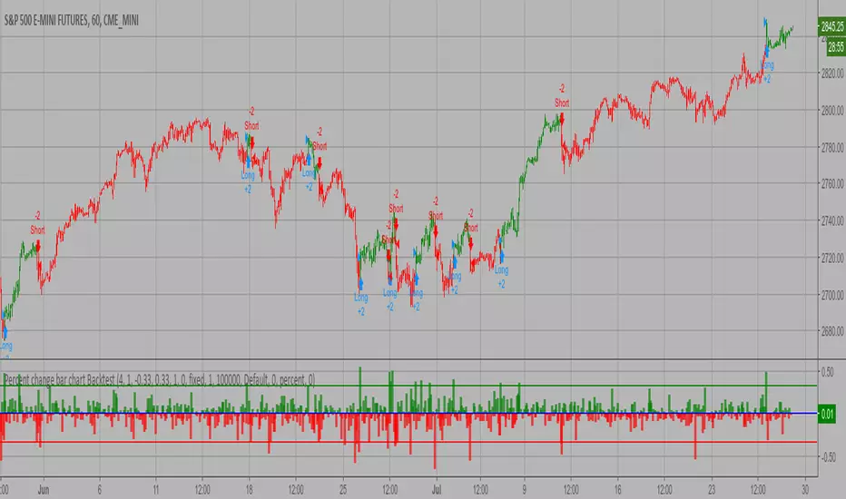
Percent change bar chart Backtest This histogram displays price or % change from previous bar.
You can change long to short in the Input Settings
WARNING:
- For purpose educate only
- This script to change bars colors.
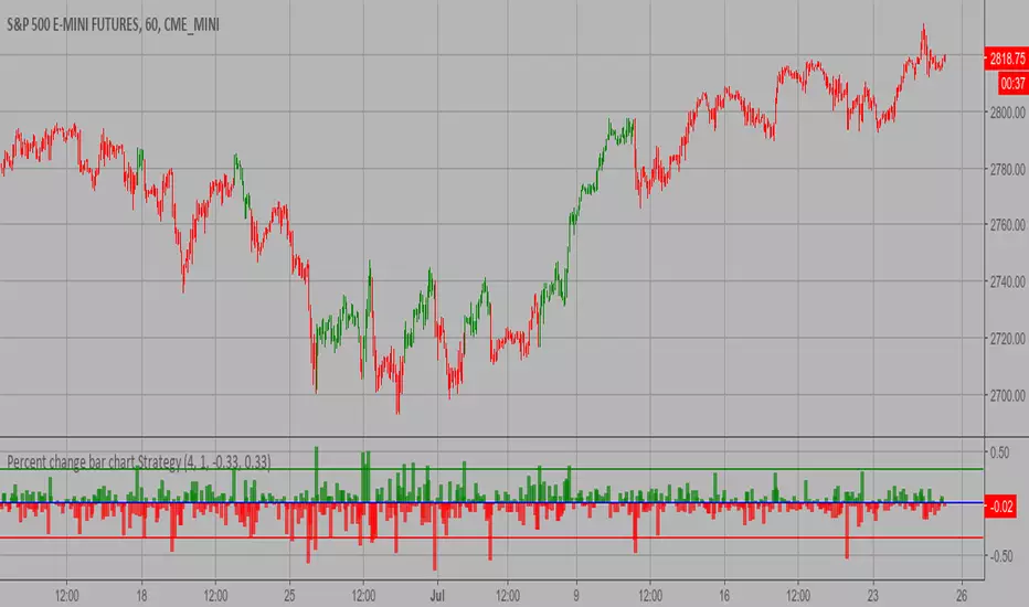
Percent change bar chart Strategy This histogram displays price or % change from previous bar.
WARNING:
- This script to change bars colors.
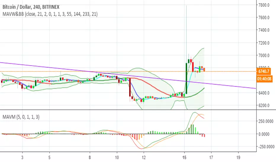
Super Gupper Bar I modified the script of Madrid ,to make a super guppy, the interpretation is the same except that here the super guppy is in linear format. You can still see the pullback and the bullish and bearish trends as with a super guppy! The EMA 200 is placed just above the EMA 70, otherwise it was a big empty space between the last 2 EMA!
You can chose between EMA or MA
1. Red : A downtrend in progress
2. Green: Trend reversal warning
3. Lime : An uptrend in progress
4. Maroon: Trend reversal warning
www.tradingview.com
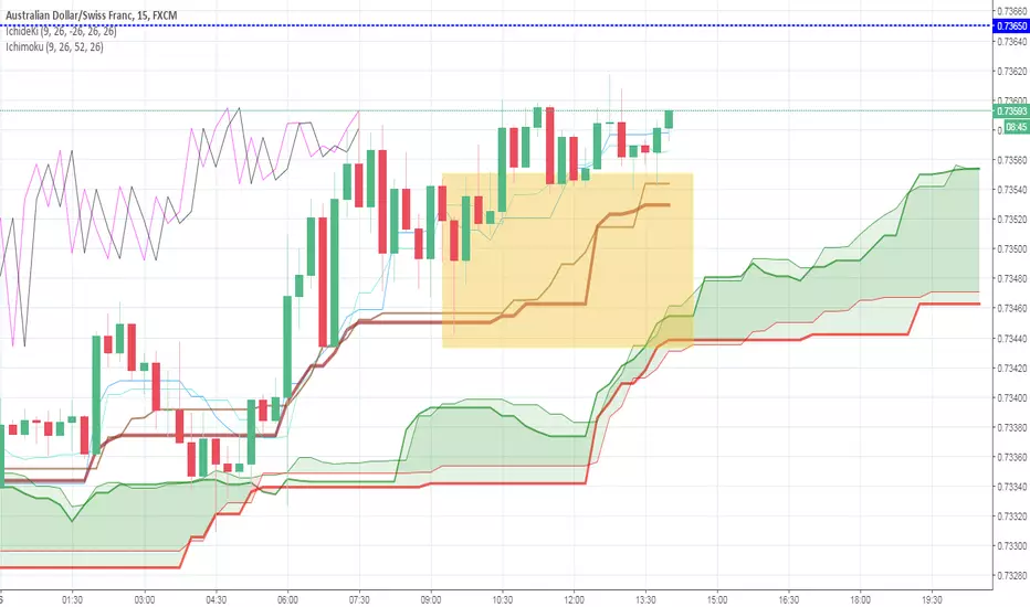
Ichimoku on closing price without current bar @bhutanoThis is the "Ichimoku" rivisited.
The current bar is not considerated on the plotting (so less chance to confusion) and the averages are calculated on the closing prices. It seems to be more precise then the original one.
Leave me a comment please based on your experience


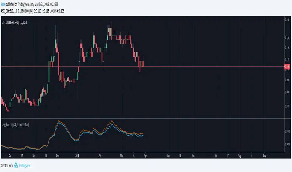
ka66: Average Bar RangeAverages price ranges (high - low) across a set of bars in a given timeframe. Additionally, also plots the Average True Range (ATR) as a better comparison for volatility.
Configurable period and averaging mechanism.
Useful for gauging minimum profits and price movement over a period, a filter for historical volatility.
Furthermore, executing trades is better done with channels like ATR/Keltner channels, or Bollinger Bands.


Colored Volume Bars [LazyBear] with overlayDivs and candle alignment a little easier to see - volume/2 to size correctly - could still use some refining
All credits to LazyBear for his color volume bar source code
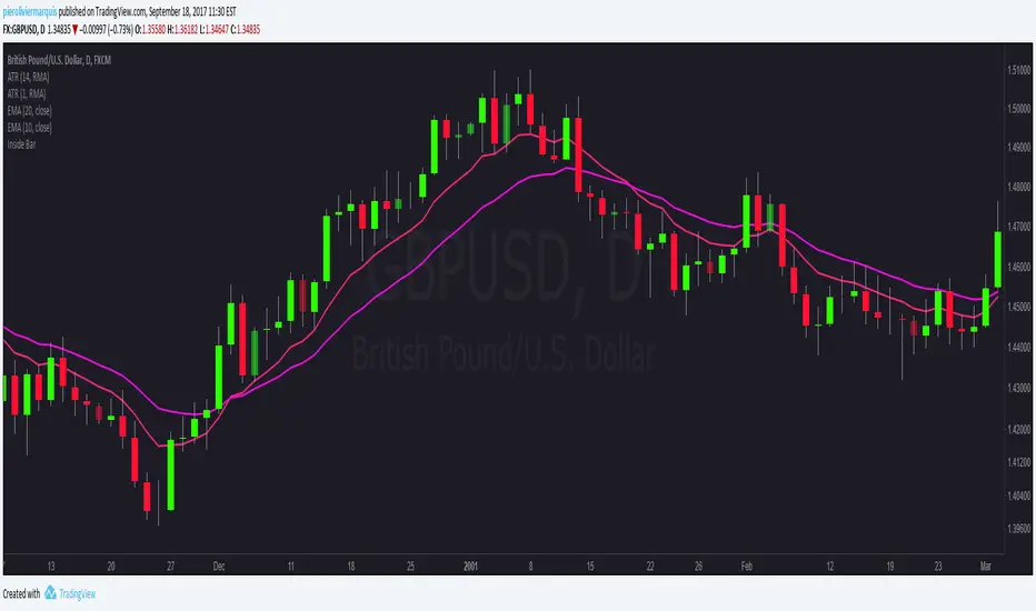
Inside Bars - Rob Dee editCatch Inside Bars with ease with this tool.
Adjust the colour and intensity of the indication candle.


Average Daily Range - without open barBasic ADR-indicator that is showing the daily range on lower timeframes as well, without using the current open daily bar for calculation.
Also plots as line in a separate indicator window. Updates displayed value when hovering over the candles on the chart to see historical Numbers.

Leledc Exhaustion BarAn mt4 indicator converted to pine,its not always accurate but combined with S/R ,pivots, fibs etc will give an edge.
Dots are the major swings holow circles are the minor swings
more here
www.abundancetradinggroup.com

