Peso Pros Daily DineroSignature indicator for use with the Peso Pros Daily Dinero strategy for the USDMXN. How to use the indicator is explained in detail in the members section of your online course.
Cerca negli script per "daily"
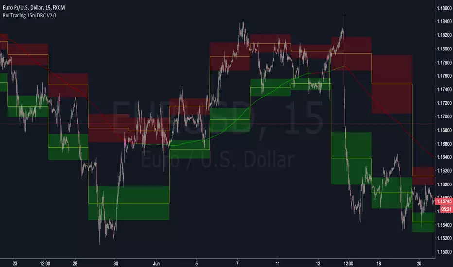
BullTrading 15 Min Daily Retracement Channel V2.0Hi Traders, I have been received tons of private messages asking me access to my previous scripts. Please let me apologize for not being able to answer all messages. Once you publish a script in Tradingview you can manage individual access to the script but there is no option to open the script after being published.
For that reason I decided to open this script for you, this indicator implements many of the best features contained in previous "invite only scripts". It is designed to display alerts for day trading and short term swings using the 15m Timeframe.
How to use "BullTrading 15 Min Daily Retracement Channel V2.0" indicator?
This indicator is experimental but works if the trader applies good judgment and risk management. Neither myself or BullTrading Asset Management is or will be responsible for any live trading loss using this script, so please use it on Demo.
ALWAYS USE PENDING ORDERS!! It is always much better to wait price using your Fibonacci Retracement tool or the indicator reference lines.
Set Buy signals AT THE CLOSE of yellow candlesticks.
Set Sell signals AT THE CLOSE of fuchsia candlesticks.
Most of the time Buy/Sell signals will react with too much anticipation so you can wait for the price to form enough fractals in order to analyze your entry levels, risk management, SL's and TP's.
AVOID AT ALL COSTS to enter the market immediately after a signal. WAIT for fractal formations to confirm reversals. I will say it AGAIN: Use only pending orders and AVOID market execution orders!
If your order is already filled and the moving average changes color or the price consolidates in your entry level it is better to trail tight your SL, exit the trade with small loss or Break Even instead of waiting for a full Stop Loss exit (this conditions usually indicate trend continuations against the indicator signals).
If the market goes against the signal, THINK and use the indicator lines and channels to match a level using your Fib retracement tool. Applying this criteria will lead for better entry levels in the opposite direction.
Feel free to comment suggestions.
Best Regards
GustavoRubi

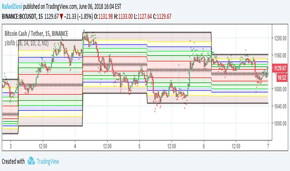
zibi fib smart way to use daily fib the idea based on using zibi indicator which is hipotecal price based on volume and to apply it to daily fib chart. zibi is preeceding the real price candle as it sense the volume changes not the actual price. buy is when zibi bellow -100 and sell when zibi above +100 . can be set to any fib that you choose. signal is easy to set via trading view. also the movment of zibi will tell you where the price will go as volume preceds price:)
the daily fib based on the work of justuncle
RSI: Daily + current TimeFrame
It plots the RSI of the current timeframe + the Daily RSI
it hihlights in green (or red) when they are both in oversold (or overbought)


Fibonacci Pivots Enhanced Levels (daily)Fibonacci pivot point levels
multiply the previous day’s range with its corresponding Fibonacci level.
Tradingview Standard Pivot Template includes S/R Levels 1 – 3 only .
I take into account additional Fibonacci pivot levels (S/R 4 – 7) on daily basis (no need for higher timeframes - weekly, monthly).

SMA's for Daily (7 Week//49MA, 30Week//210MA, 55SMA)SMA's for Daily (7 Week//49MA, 30Week//210MA, 55SMA)

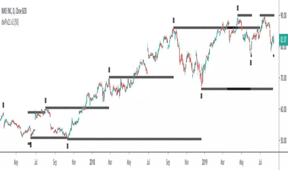
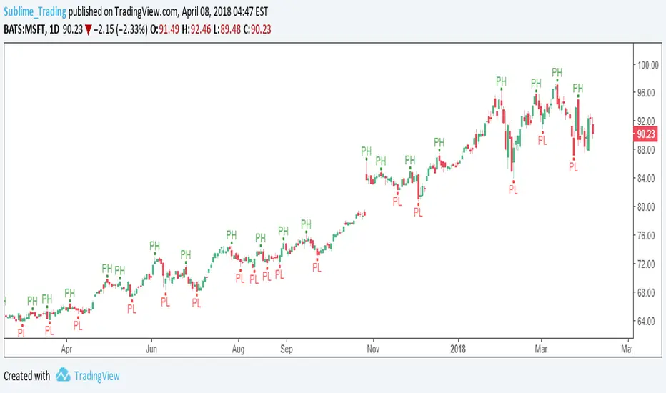
dwPiv21This is a customised indicator highlighting key levels of support and resistance on the daily time frame.
dwPiv11This is a customised indicator highlighting key levels of support and resistance on the daily time frame.
dwPiv4This is a customised indicator highlighting key levels of support and resistance on the daily time frame.

dPiv5This is a customised indicator highlighting key levels of support and resistance on the daily time frame.
OHLC Daily Resolution BandsShout out to nPE- for the idea.
Bands made with stdev from 10 day OHLC.
Keeps resolution to daily, so you can use bands as daily pivots for day trading.
Upper band 1=yesterday close + 0.5 std(ohlc,10)
Upper band 1=yesterday close + 1 std(ohlc,10)
Mid=yesterday close
Lower band 1=yesterday close - 0.5 std(ohlc,10)
Lower band 2=yesterday close - 1 std(ohlc,1

KTS 0.1a [BETA]VERY early release of KTS for those who have contributed to the early efforts of the upcoming Kawaii Trading Suite package.
When you first add this to a chart- nothing will happen. You need to enable the features you want in the indicator's settings menu. Many of these are based off of indicators i've already published (and are linked for in-depth description). The following features available:
Daily Support/Resistance levels
Hourly Support/Resistance levels
General Support/Resistance levels
The three above use the same algorithm but are designed for different timeframes.
Renko Bar Overlay (overlays a Renko chart on any timeframe you want)
Renko Signal Overlay (for those who want to know when renkos go green/red without the giant overlay)
The two above indicators use 1D renkos by default (since that's the shortest TV lets free accounts use) but you can use any timeframe you wish in settings.
Alt Sentiment Signal overlay (Simple up/down arrow when altcoin sentiment changes)
Witchcraft support/resistance clouds (can be toggled individually)
Planned but not-yet-finished features include:
Ichimokou Clouds
Golden Cross signal
Plus many more things I haven't posted anywhere else yet. Be aware that beyond this point, anyone wishing to try this product will have to pay a reasonable fee. Please do not message me asking for access to private indicators if you have no intention of paying for them.

DayHigh - Plot the Moving Average of the Daily HighPlot the Moving Average of the Daily High for short periods of time (i.e 3 day or 5 day). Great for detecting when a stocks SELL pressure is running out and time to switch to a BUY strategy. Use in the DayHIGH indicator for nice price channels on a chart.
DayLow - Chart the Moving Average of the DAILY LOW PriceThis is a moving average of the Daily LOW Price over a short period of time (i.e. 3 day low moving average, etc...) Great for tracking trailing stops for a stock on an up swing.

Three Bars Down and Inside Bar v2Updated Version of my Script. Script includes a Filter for stocks that are down three days in a row. Also it checks for oversold rsi and inside bars. Works best daily with stocks.

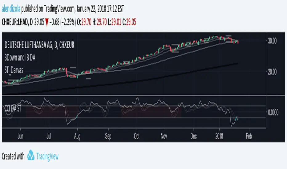
3Down and IB DAScript provides Multiple MAs and checks for 3 Bars down in a row. On top it displays inside Bars. Works best on a daily timeframe with stocks.
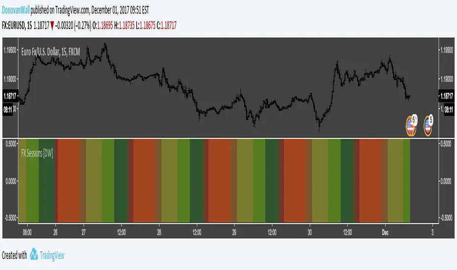
Forex Daily Trading Sessions [DW]This is a simple study designed to highlight the daily forex market sessions. Use it to identify the best sessions to trade your security in.
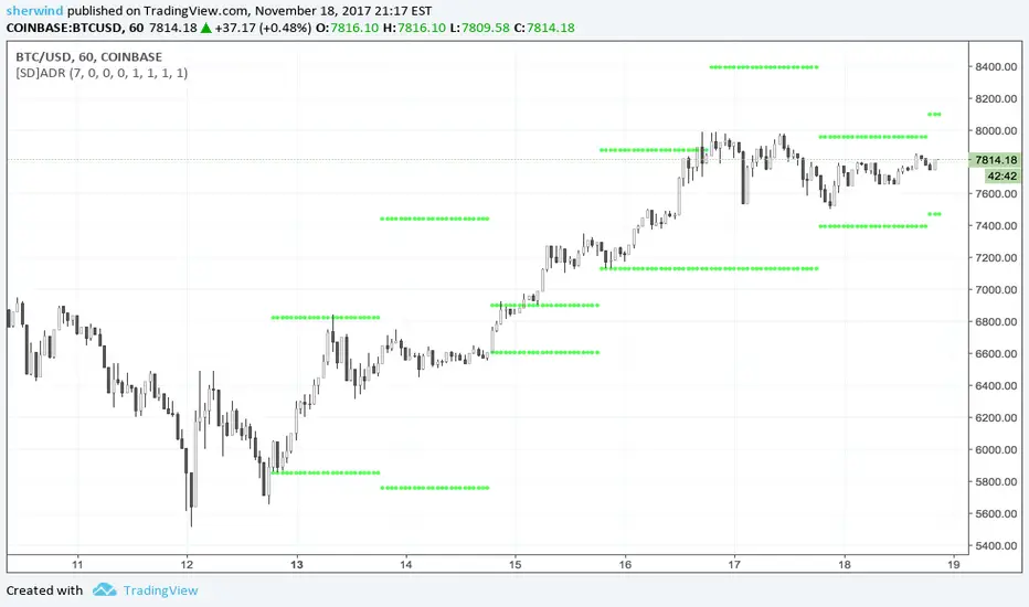
SD - Average Daily Range - Daily Weekly Monthly YearlyAverage Daily Range ('ADR') Indicator for TradingView
This script is based on the "Best 'ADR' Indicator for MT4" described at www.fxdayjob.com
Inputs:
Number of 'ADR' Back - Set the number of calendar days back to plot historical 'ADR'. The default value is 7.
Non-trading days are not taken into account.
A value of 7, for example, would display only 5 'ADR' for a 24x5 market.
Number of 'AWR' Back - Set the number of calendar weeks back to plot historical 'AWR'. The default value is 0.
Number of 'AMR' Back - Set the number of calendar months back to plot historical 'AMR'. The default value is 0.
Number of 'AYR' Back - Set the number of calendar years back to plot historical 'AYR'. The default value is 0.
'ADR' Length parameter - Set the length parameter of 'ADR'. The default value is 1.
'WDR' Length parameter - Set the length parameter of 'AWR'. The default value is 1.
'MDR' Length parameter - Set the length parameter of 'AMR'. The default value is 1.
'YDR' Length parameter - Set the length parameter of 'AYR'. The default value is 1.
See also:
- www.fxdayjob.com
- pivotboss.com
- www.jarrattdavis.com