Ryan Bot Signals ProRyan EMA Trend Screener Pro — Smart Auto Signals + TP/SL Engine + MTF Dashboard
Ryan EMA Trend Screener Pro is an advanced trading system that combines
✔ EMA Ribbon Trend Confirmation
✔ Auto BUY/SELL Signals
✔ ATR-based TP & SL engine
✔ Multi-Timeframe Trend Dashboard
✔ Real-Time Screener
into one clean, powerful tool.
Key Features
🔹 Smart EMA Crossover Signals
Automatically detects momentum shifts using fast vs slow EMA cloud.
🔹 Auto TP/SL System
– Up to 4 Take-Profit levels
– ATR-based dynamic Stop Loss
– Entry, SL & TP lines with labels
– Trade zones highlighted using boxes
🔹 MTF Trend Dashboard
Trend status from 5m, 15m, 30m, 1h, Daily
Shows combined trend strength (Bullish / Bearish).
🔹 Built-in Screener
Scan multiple symbols directly on your chart.
Displays trend direction & recent signals.
🔹 Fully Customizable
Modify EMA lengths, ATR settings, TP count, dashboard position & screener layout.
How to Use
Follow BUY/SELL labels created by EMA2/EMA8 crossover.
Use TP/SL lines to plan exits.
Check dashboard to confirm higher-timeframe trend.
Optional: add your favourite chart structure (S/R, Fibs, Liquidity).
Disclaimer
This tool does not guarantee profits. Use proper risk management.
Cerca negli script per "screener"

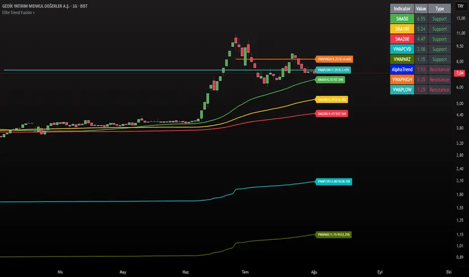
Elite Trend FusionThis indicator combines multiple technical analysis tools to assist traders in identifying trends, support/resistance levels, and potential trading opportunities. Developed by @IQ-TRADER with contributions to the Alpha Section by @KivancOzbilgic, this script overlays the following components on your chart:
EMA1: A customizable Exponential Moving Average for short-term trend analysis.
SMA Cluster (50, 100, 200): Simple Moving Averages on daily timeframes to identify long-term trends and key support/resistance zones.
Anchored VWAP x2 (VWAPCVD & VWAPARZ): Two Volume Weighted Average Price lines anchored to user-defined dates, providing insights into price levels relative to volume from specific points in time.
AlphaTrend: A custom trend-following indicator based on ATR and MFI, helping to gauge market direction and volatility.
Usage InstructionsInstallation:
Copy and paste the script into the Pine Script editor on TradingView, then add it to your chart.
Customization:Adjust the periods for EMA, SMA50, SMA100, and SMA200 under the "Inputs" tab.
Set the anchor dates for VWAPCVD and VWAPARZ to analyze specific historical periods.
Enable or disable individual components (EMA1, SMA50, SMA100, SMA200, VWAPCVD, VWAPARZ, AlphaTrend) and toggle labels via the settings.
Customize colors and line thickness to suit your preferences.
Modify the AlphaTrend multiplier and period for tailored sensitivity.
Interpretation:
Use the EMA1 for short-term momentum and crossovers with SMAs.
Monitor SMA crossovers (e.g., SMA50 crossing SMA200) for trend changes.
The Anchored VWAPs act as dynamic support/resistance levels based on the selected anchor dates.
AlphaTrend provides a visual guide for trend direction; use it alongside other indicators for confirmation.
Labels on the last bar show the current value and percentage distance from the price for each enabled indicator.
Pine Screener Module Usage:
Add this indicator to the Pine Screener to filter stocks, forex pairs, or other instruments based on the calculated distances (in percentage) between the close price and SMA50, SMA100, SMA200, VWAPCVD, and VWAPARZ.
In the Screener, use the "SMA50 Distance (%)", "SMA100 Distance (%)", "SMA200 Distance (%)", "VWAPCVD Distance (%)", and "VWAPARZ Distance (%)" columns to identify overbought/oversold conditions or potential reversal points.
Example filters: Set conditions like "SMA50 Distance (%) > 5" to find stocks trading significantly above the 50-day SMA, or "VWAPCVD Distance (%) < -2" to spot assets below the anchored VWAP, indicating potential support levels.
Combine multiple conditions (e.g., SMA50 Distance (%) > 5 AND AlphaTrend > previous AlphaTrend) to refine your scan for bullish trends.
Note: Ensure the indicator is applied to the chart or screener with the desired timeframe for accurate results.
Notes
This is an overlay indicator, meaning it plots directly on the price chart.
The script uses daily SMA calculations for consistency across timeframes.
Labels appear only on the last bar and are customizable.
This tool is for educational and informational purposes only. Trading involves risks, and it is recommended to consult a financial advisor before making decisions.
The script is credited to @IQ-TRADER with acknowledgment to @KivancOzbilgic for the Alpha Section contribution, adhering to intellectual property guidelines.
No Financial Advice: The description explicitly states that the indicator is for educational use and not financial advice, complying with TradingView's policy against promoting trading signals as guarantees.
Clear Usage: Step-by-step instructions are provided to ensure users can apply the indicator effectively, including screener usage.
No External Links or Promotions: No external links or promotional content is included, aligning with platform rules.
Linear Reg CandlesThe provided Pine Script is a TradingView script for creating a technical analysis indicator called "Humble LinReg Candles." This script includes features such as linear regression for open, high, low, and close prices, signal smoothing with simple or exponential moving averages, and a trailing stop based on Average True Range (ATR). Additionally, the script contains a screener section to display signals for a list of specified symbols.
Here is a breakdown of the script:
Indicator Settings:
It defines various input parameters such as signal smoothing length, linear regression settings, and options for using simple moving averages.
Linear regression is applied to open, high, low, and close prices based on user-defined settings.
ATR Trailing Stop:
It calculates the Average True Range (ATR) and uses it to determine a trailing stop for buy and sell signals.
Signals are generated based on whether the close price is above or below the ATR trailing stop.
Plotting:
The script plots the calculated signal on the chart using the plot function.
Buy and Sell Conditions:
Buy and sell conditions are defined based on the relationship between the close price and the ATR trailing stop.
Plot shapes and bar colors are used to visually represent buy and sell signals on the chart.
Alerts:
Alerts are triggered when buy or sell conditions are met.
Screener Section:
The script defines a screener section to display a watchlist of symbols with long and short signals.
The watchlist includes a set of predefined symbols with corresponding long and short signals.
Table Theme Settings:
The script allows customization of the table theme, including background color, frame color, and text color.
The size and location of the table on the chart can also be customized.
Screener Function:
A function getSignal is defined to determine long and short signals for each symbol in the watchlist.
The getSym function is used to extract the symbol name from the symbol string.
Dashboard Creation:
The script creates a table (dashboard) to display long and short signals for the symbols in the watchlist.
The table includes headers for "Long Signal" and "Short Signal" and lists the symbols with corresponding signals.
Overall, the script combines technical analysis indicators and a screener to help traders identify potential buy and sell signals for a set of specified symbols.
Pro Trading Art - Top N Candle's Gainers/Losers(1-40)Top Gainer/Loser Screener.
Explanation :
With the help of this indicator you can filter top Gainer or Loser in comparison with previous selected range. Suppose you select 5 period inside input tab then this indicator will filter top gainer or losers in 5 days.
Input Parameter:
Timeframe: You can change timeframe of chart. Default timeframe is same as chart.
Period: To select range of candle. Default 5. Means how much price changed in previous 5 candle.
Top : Dropdown option to select top Gainer or Losers
Table Location: Where you want to place your table.
Watchlist Group: You can create watchlist for screener.

PriceCatch-Signals - Buy SignalsHi,
TradingView Community.
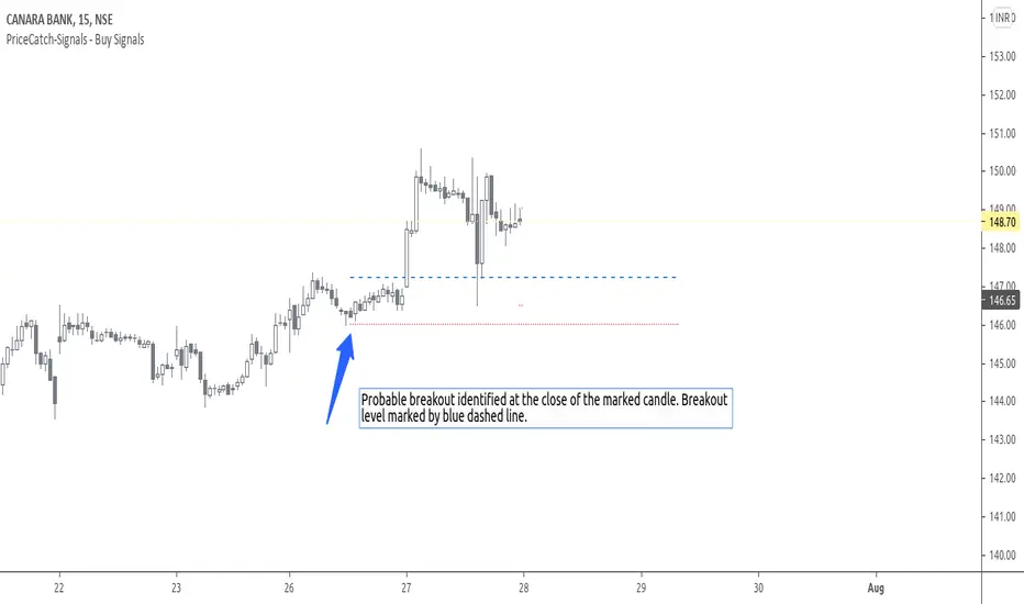
Here is a script that identifies and marks two different buy levels on the chart. It works on all asset classes - equities, forex, crypto.
Probable Breakout Buy Level
Stop-Reverse Buy Level
The bottom images are self-explanatory.
PROBABLE BREAKOUT BUY LEVEL EXAMPLE:
STOP-REVERSE BUY LEVEL EXAMPLE:
IDENTIFICATION OF LEVELS:
The Blue Dotted line represents Probable Breakout Buy Level and the Blue Dashed Line Stop-Reverse Buy Level. The corresponding Red Dotted line below each level should be your initial stop loss price point.
PLAYING SAFE
After taking the trade, to play safe, I follow this method that once the Low of the price goes above the Buy Level, I usually shift the stop loss to buy price to protect against any sudden reversal. For me protecting capital is important. As usual with price action, longer time-frames produce more reliable signals.
NOTE - PRIOR TO USING THIS SCRIPT:
The script uses Heikin-Ashi Candles data to identify the levels. You may use this script in addition to your other indicators or in isolation. Please remember that the script is shared with absolutely no assurances and warranties whatsoever and as a responsible trader, please satisfy yourselves thoroughly and use it only if you are satisfied it works for you. Remember, you are 100% responsible for your actions. If you understand and accept that, you may use the script. The script does not identify any short signals.
ADDITIONAL NOTE:
I shall also be releasing Screener scripts that scan the following markets for the above two conditions or signals thereby helping traders spot opportunities at the right time by making the task of finding right stocks a breeze.
NASDAQ Stocks Screener (Can screen a total number of 160 stocks. 40 stocks at a time)
UK LSE Stocks Screener (Can screen a total number of 90 stocks. 30 stocks at a time)
Euronext Paris Stocks Screener (Can screen a total number of 50 stocks. 25 stocks at a time) - in development.
Singapore Stocks Screener is in development
Other International exchanges will be added based on response from users.
SOME MORE CHARTS:
QUERIES/FEEDBACK
Please PM me.
Regards to all and wish everyone all the best with trading.
PriceCatch-Signals - Buy SignalHi,
TradingView Community.
Here is a script that identifies and marks two different buy levels on the chart. It works on all asset classes - equities, forex, crypto.
Probable Breakout Buy Level
Stop-Reverse Buy Level
The bottom images are self-explanatory.
PROBABLE BREAKOUT BUY LEVEL EXAMPLE:
STOP-REVERSE BUY LEVEL EXAMPLE:
IDENTIFICATION OF LEVELS:
The Blue Dotted line represents Probable Breakout Buy Level and the Blue Dashed Line Stop-Reverse Buy Level. The corresponding Red Dotted line below each level should be your initial stop loss price point.
PLAYING SAFE
After taking the trade, to play safe, I follow this method that once the Low of the price goes above the Buy Level, I usually shift the stop loss to buy price to protect against any sudden reversal. For me protecting capital is important. As usual with price action, longer time-frames produce more reliable signals.
NOTE - PRIOR TO USING THIS SCRIPT:
The script uses Heikin-Ashi Candles data to identify the levels. You may use this script in addition to your other indicators or in isolation. Please remember that the script is shared with absolutely no assurances and warranties whatsoever and as a responsible trader, please satisfy yourselves thoroughly and use it only if you are satisfied it works for you. Remember, you are 100% responsible for your actions. If you understand and accept that, you may use the script. The script does not identify any short signals.
ADDITIONAL NOTE:
I shall also be releasing Screener scripts that scan the following markets for the above two conditions or signals thereby helping traders spot opportunities at the right time by making the task of finding right stocks a breeze.
NASDAQ Stocks Screener (Can screen a total number of 160 stocks. 40 stocks at a time)
UK LSE Stocks Screener (Can screen a total number of 90 stocks. 30 stocks at a time)
Euronext Paris Stocks Screener (Can screen a total number of 50 stocks. 25 stocks at a time) - in development.
Singapore Stocks Screener is in development
Other International exchanges will be added based on response from users.
SOME MORE CHARTS:
QUERIES/FEEDBACK
Please PM me.
Regards to all and wish everyone all the best with trading.

PriceCatch-SignalsHi,
TradingView Community.
Here is a script that identifies and marks two different buy levels on the chart. It works on all asset classes - equities, forex, crypto.
Probable Breakout Buy Level
Stop-Reverse Buy Level
The bottom images are self-explanatory.
PROBABLE BREAKOUT BUY LEVEL EXAMPLE:
STOP-REVERSE BUY LEVEL EXAMPLE:
IDENTIFICATION OF LEVELS:
The Blue Dotted line represents Probable Breakout Buy Level and the Blue Dashed Line Stop-Reverse Buy Level. The corresponding Red Dotted line below each level should be your initial stop loss price point.
PLAYING SAFE
After taking the trade, to play safe, I follow this method that once the Low of the price goes above the Buy Level, I usually shift the stop loss to buy price to protect against any sudden reversal. For me protecting capital is important. As usual with price action, longer time-frames produce more reliable signals.
NOTE - PRIOR TO USING THIS SCRIPT:
The script uses Heikin-Ashi Candles data to identify the levels. You may use this script in addition to your other indicators or in isolation. Please remember that the script is shared with absolutely no assurances and warranties whatsoever and as a responsible trader, please satisfy yourselves thoroughly and use it only if you are satisfied it works for you. Remember, you are 100% responsible for your actions. If you understand and accept that, you may use the script. The script does not identify any short signals.
ADDITIONAL NOTE:
I shall also be releasing Screener scripts that scan the following markets for the above two conditions or signals thereby helping traders spot opportunities at the right time by making the task of finding right stocks a breeze.
NASDAQ Stocks Screener (Can screen a total number of 160 stocks. 40 stocks at a time)
UK LSE Stocks Screener (Can screen a total number of 90 stocks. 30 stocks at a time)
Euronext Paris Stocks Screener (Can screen a total number of 50 stocks. 25 stocks at a time) - in development.
Singapore Stocks Screener is in development
Other International exchanges will be added based on response from users.
SOME MORE CHARTS:
QUERIES/FEEDBACK
Please PM me.
Regards to all and wish everyone all the best with trading.

TheBlackFish EMA bounce alertAbout
This indicator is an EMA indicator with a built-in screener.
20 different ticker symbols are included in the screener. These ticker symbols must be replaced manually. All ticker symbols are from the Stockholm Stock Exchange, Large Cap.
How it works
The lowest price of a bar should be less than EMA and yesterday's closing greater than EMA.
If no conditions are found, there will be no ticker symbols in the box.
If the conditions are met, the ticker symbol / symbols are displayed in the black text box. The information in the box disappears after each new bar.
The default setting is set to EMA 50, but you can select which EMA value you want in its settings.
Change ticker
If you want to change the ticker symbol, do not forget to change both in "Check tickers" and in "Labels content".
Enjoy!
Supply and Demand Scanner Toolkit [TradingFinder]🔵 Introduction
The analytical system presented here is built upon a deep quantitative foundation designed to capture the dynamic behavior of supply and demand in live markets. At its core, it calculates continuously adaptive zones where institutional liquidity, volatility shifts, and momentum transitions converge. These zones are derived from a combination of a regression-based moving average, a long-period ATR, and Fibonacci expansion ratios, all working together to model real-time volatility, price momentum, and the underlying market imbalance.
In practice, this means that at any given moment, five primary bands and seven variable analytical zones are generated around price, representing different market states ranging from extreme overbought to extreme oversold.
Each band reacts dynamically to price volatility, recalibrating with every new candle, which allows the system to mirror the true, constantly changing structure of supply and demand. Every movement between these zones reflects a transition in the strength and dominance of buyers and sellers, a process referred to as volatility-driven price state transitions.
Traditional analytical models often rely on fixed or static indicators that cannot keep up with the rapid microstructural changes in modern markets. This system instead uses regression and smoothing logic to adapt on the fly. By combining a regression moving average with a smoothed moving average, the model calculates real-time trend direction, momentum flow, and trend strength.
When the regression average rises above the smoothed one, the system classifies the trend as bullish; when it falls below, bearish. This dual-layer structure not only helps confirm direction but also enables the automatic detection of critical structural shifts such as Break of Structure (BoS), Change of Character (CHoCH), and directional reversals.
Both the current trend (Live Trend) and projected future trend (Vision Trend) are calculated simultaneously across all available timeframes. This dual analysis allows traders to identify structural changes earlier and to recognize whether a trend is gaining or losing momentum.
In most conventional moving-average-based frameworks, trading signals are delayed because these models react to price rather than anticipate it. As a result, many buy or sell signals appear after the real move has already begun, leading to entries that contradict the current trend. This system eliminates that lag by employing a mean reversion trading model. Instead of waiting for crossovers, it observes how far price deviates from its statistical mean and reacts when that deviation begins to shrink, the moment when equilibrium forces reemerge.
This approach produces non-lagging, data-driven signals that appear at the exact moment price begins to revert toward balance. At the same time, traders can visually assess the market’s condition by observing the spacing, compression, or expansion of the dynamic bands, which represent volatility shifts and trend energy. Through this interaction, the trader can quickly gauge whether a trend is strengthening, losing power, or preparing for a reversal. In other words, the model provides both quantitative precision and intuitive visualization.
A unique visual element in this system is how candles are displayed during transitional states. When Live Trend and Vision Trend contradict each other, for instance, when the current trend is bullish but the projected trend turns bearish, candle bodies automatically appear as hollow.
These hollow candles act as visual alerts for zones of uncertainty or equilibrium between buyers and sellers, often preceding trend reversals, liquidity sweeps, or volatility compression phases. Traders quickly learn to interpret hollow candles as signals to pause, observe, or prepare for potential shifts rather than to act impulsively.
Signal generation in this model occurs when price reverts from extreme zones back toward neutrality. When price exits the strong overbought or strong oversold zones and reenters a milder area, the system produces a reversal signal that aligns with real-time market dynamics. To refine accuracy, these signals are confirmed through several filters, including momentum verification, volatility behavior, and smart money validation. This multi-layered signal logic significantly reduces false entries, helping traders avoid overreactions to temporary liquidity spikes and enhancing performance in volatility-driven markets.
On a broader level, the model supports full multi-timeframe analysis. It can analyze up to twenty symbols simultaneously, across multiple timeframes, to detect directional bias, correlation, and confluence. The result is a holistic map of market structure in real time, showing how each asset aligns or diverges from others and how lower timeframes fit into the macro trend. Variables such as Live Trend, Vision Trend, Directional Strength, and Zone Positioning combine to give a complete structural snapshot at any given moment.
Risk management is handled by an adaptive Trailing Stop Engine that continuously aligns with current volatility and price flow. It integrates pivot mapping with ATR-based calculations to dynamically adjust stop-loss levels as price evolves. The engine offers four adaptive modes, Grip, Flow, Drift, and Glide, each tailored to different levels of market volatility and trader risk tolerance. In visualization, the profit area between entry and stop-loss is shaded light green for long positions and light red for short positions. This design allows immediate recognition of active risk exposure and profit lock-in zones, all in real time.
Altogether, the combination of ATR Volatility Mapping, Fibonacci Band Calibration, Regression-Based Trend Engine, Dynamic Supply and Demand Equilibrium, Conflict Detection through Hollow Candles, Mean Reversion Signal Model, and Adaptive Trailing Stop forms a unified analytical system. It maps the market’s structure, identifies current and future trends, measures the real-time balance of buyers and sellers, and highlights optimal entry and exit points. The final result is higher analytical precision, improved risk control, and a clearer view of the true, data-defined market structure.
🔵 How to Use
Analyzing supply and demand in live financial markets is one of the most complex challenges traders face. Price rarely moves in a straight line; instead, it evolves through phases of expansion, compression, and redistribution. Many traders misinterpret these movements because the zones that appear strong or reactive at first glance often represent nothing more than temporary liquidity redistributions.
These areas, while visually convincing, may lose relevance quickly when volatility increases or when viewed from another timeframe. In high-volatility environments, traditional zone analysis becomes even more unreliable. Price may seem to respect a support or resistance level only to break through it a few candles later. This behavior creates false zones and misleading reversal points.
The key to filtering such movements lies in understanding the context, how volatility, momentum, and structural flow interact across different timeframes. A single timeframe can only tell part of the story. The market’s true structure emerges only when data is synchronized from macro to micro levels.
This is where multi-timeframe correlation becomes essential. Every timeframe offers a different lens through which supply and demand balance can be observed. For example, a trader might see a bullish setup on a 15-minute chart while the 4-hour chart is still showing a strong distribution phase. Without alignment between these layers, trades are easily positioned against the dominant liquidity flow. The model presented here solves this by processing all relevant timeframes simultaneously, allowing traders to see how short-term movements fit within higher-level structures.
Each market phase, whether accumulation, expansion, or reversion, carries a unique volatility fingerprint. The system tracks transitions in volatility regimes, momentum divergence, and structural breakouts to anticipate when a phase change is approaching. For instance, when volatility compresses and ATR readings narrow, it often signals an upcoming breakout or reversal. By monitoring these shifts in real time, the model helps the trader differentiate between liquidity grabs (temporary volatility spikes) and genuine structural changes.
Every supply-demand interaction within this system is adaptive rather than static. The zones continuously recalibrate based on live parameters such as price velocity, momentum distribution, and liquidity displacement. This adaptive structure ensures that the balance between buyers and sellers is represented accurately as market conditions evolve.
In practice, this allows the user to identify early signs of trend exhaustion, potential reversals, and continuation patterns long before traditional indicators would react.
In essence, successful supply and demand analysis requires moving beyond subjective interpretation toward data-driven decision-making.
Manual drawing of zones or relying solely on visual intuition can lead to inconsistent results, especially in fast-changing markets. By combining ATR-driven volatility mapping, mean reversion dynamics, and multi-timeframe alignment, this framework offers a clear, objective, and responsive model of how market forces actually operate. Each decision becomes grounded in measurable context, not assumptions.
The analytical interface is divided into two main sections : the visual chart framework and the scanner data table.
On the chart, five dynamic bands and seven analytical zones appear around price. These are calculated from ATR, regression moving average, and Fibonacci expansion ratios to define whether the market is overbought, oversold, or neutral. Each zone has distinct color coding, allowing traders to recognize the market state instantly without switching tools or indicators.
Price movement within these bands reveals more than just direction, it tells a story of volatility, liquidity flow, and market equilibrium. The upper zones typically indicate exhaustion of buying pressure, while lower zones highlight areas of overselling or potential recovery. The way price reacts near these boundaries can help determine whether a continuation or reversal is likely.
At the heart of the visualization are two layered trend components : Live Trend and Vision Trend.
The Live Trend shows the present market direction based on regression and smoothing logic, while the Vision Trend projects the probable future trajectory by analyzing slope deviation and momentum displacement. When these two align, the trader sees confirmation of market strength. When they diverge, candle bodies turn hollow, a simple yet powerful visual alert signaling hesitation, consolidation, or a possible turning point.
At the bottom of the interface, the Scanner Table organizes all analytical data into a structured display. Each row corresponds to a symbol and timeframe, showing the current Live Trend, Vision Trend, Directional Strength, Zone Position, and Signal Age. This table provides a real-time overview of all assets being tracked, showing which ones are trending, which are in reversal, and which are entering transition zones. By analyzing this table, traders can instantly identify correlation clusters, where multiple assets share the same trend direction, often a sign of broader market sentiment shifts.
The Scanner can simultaneously process multiple timeframes and up to twenty different assets, producing a panoramic market overview. This makes it easy to apply a top-down analytical workflow, starting with higher timeframe alignment, then drilling down into lower levels for execution. Instead of reacting to isolated signals, traders can see where confluence exists across structures and focus only on setups that align with overall market context.
The bands and their color coding make interpretation intuitive even for less experienced users. Darker shades correspond to extreme zones, typically where institutional orders are being absorbed or distributed, while lighter zones mark mild overbought or oversold conditions. When price transitions from an outer extreme zone into a milder region, a signal condition becomes active. At this point, traders can cross-check the event using momentum and volatility filters before acting.
The trailing stop section of the display adds another critical dimension to decision-making. It visualizes stop levels as continuously updating colored lines that follow price movement. These levels are calculated dynamically through pivot mapping and ATR-based sensitivity. The shaded area between the entry point and active stop loss (light green for buys, light red for sells) gives traders immediate insight into how much of the move is currently secured as profit and how much remains exposed. This simple visual cue transforms risk management from a static calculation into a living, responsive process.
All components of this analytical system are fully customizable. Users can adjust signal type, calculation periods, smoothing intensity, and band sensitivity to match their trading style. For example, a scalper might shorten ATR and MA periods to capture rapid fluctuations, while a swing trader might increase them for smoother and more stable readings. Because every element responds to live data, even small adjustments lead to meaningful changes in how the system behaves.
When combined with the scanner’s data table, these features enable a top-down analytical workflow, one where decisions are not made from isolated indicators but from a complete, multi-dimensional understanding of market structure. The result is a system that supports both reactive precision and proactive market awareness.
🟣 Long Signal
A long signal is generated when price begins to rebound from deeply oversold conditions. More precisely, when price enters the strong or extreme oversold zones and then returns into the mild oversold region, the system identifies the start of a mean reversion phase. This transition is not based on subjective interpretation but on mathematical deviation from equilibrium, meaning that selling pressure has been exhausted and liquidity begins to shift toward buyers.
Unlike delayed signals that depend on moving average crossovers or oscillators, this signal appears the moment price starts moving back toward balance. The model’s mean reversion logic detects when volatility contraction and momentum realignment coincide, producing a non-lagging entry condition.
In this situation, traders can visually confirm the setup by observing the spacing and curvature of the lower bands. When the lower volatility bands begin to flatten or curve upward while ATR readings stabilize, it indicates that the market is transitioning from distribution to accumulation.
The strength and quality of each long signal depend on the configuration of trend variables. When both Live Trend and Vision Trend are bullish, the probability of continuation is significantly higher. This alignment suggests that the market’s short-term momentum is supported by long-term structure. On the other hand, when the two trends contradict each other, which the chart highlights with hollow candles, it represents a temporary phase of indecision or conflicting forces.
In these moments, traders are encouraged to monitor volatility compression and observe whether the next few candles confirm a real breakout or revert back to range conditions.
Additional confirmation can be derived from observing the slope of the regression moving average and the magnitude of ATR fluctuations. A steeper upward slope combined with decreasing volatility indicates stronger bullish intent. In contrast, if ATR expands while price remains flat, it signals potential traps or fakeouts driven by short-term liquidity grabs.
Valid long signals often emerge near the end of volatility compression periods or immediately after liquidity sweeps around major lows. These are points where large players typically absorb remaining sell orders before initiating upward movement. Once the long condition triggers, the system automatically calculates the initial stop loss using a combination of recent pivots and ATR range. From that point, the Trailing Stop Engine dynamically adjusts as price rises, maintaining optimal distance from the entry point and locking in profits without restricting trade potential.
For educational context, consider a situation where the market has been trending downward for several sessions, and the ATR value begins to decline, showing that volatility is compressing. As price touches the lower extreme zone and reverses into the mild oversold region while Live Trend starts turning positive, this creates an ideal long condition. A new cycle of expansion often begins right after such compression, and the system captures that early shift automatically.
🟣 Short Signal
A short signal represents the opposite scenario, a point where buying momentum weakens after a strong rally, and price begins to revert downward toward equilibrium. When price exits the strong or extreme overbought zones and moves into the mild overbought region, the model detects the start of a bearish mean reversion phase.
Here too, the signal appears without delay, as it is based on the real-time relationship between price and its volatility boundaries rather than on indicator crossovers.
The system identifies these short conditions when upward momentum shows visible fatigue in the volatility bands. The upper bands start to flatten or turn downward while the regression slope begins to lose angle. This is often accompanied by rising ATR readings, showing an expansion in volatility that reflects distribution rather than continuation.
The quality of the short signal is strongly influenced by the interaction between the two trend layers. When both Live Trend and Vision Trend point downward, the likelihood of sustained bearish continuation increases dramatically. However, if they diverge, candle bodies turn hollow, clearly marking zones of conflict or hesitation. These phases often coincide with the end of a bullish impulse wave and the start of an early correction.
A practical example can illustrate this clearly. Imagine a market that has been trending upward for several days with expanding volatility. When price pushes into the extreme overbought zone and starts pulling back into the mild region, the system interprets it as the first sign of distribution. If at the same time the regression moving average flattens and ATR begins to rise, it strongly suggests that institutional participants are taking profit. The generated short signal allows the trader to position early in anticipation of the downward reversion that follows.
The initial stop loss for short trades is calculated above the most recent pivot high, ensuring logical protection based on the structural context. From there, the Trailing Stop Engine automatically tracks the price movement downward, tightening stops as volatility decreases or expanding them during sharp swings to avoid premature exits.
The engine’s dynamic nature makes it suitable for both aggressive scalpers and patient swing traders. Scalpers can set the trailing sensitivity to “Grip” mode for tighter control, while swing traders can use “Glide” mode to capture larger portions of the trend.
Most short signals form right after volatility expansion or liquidity grabs around major highs, classic exhaustion areas where momentum divergence becomes evident. The combination of visual cues (upper band curvature, hollow candles, ATR spikes) provides traders with multiple layers of confirmation before taking action.
In both long and short scenarios, this analytical system replaces emotional decision-making with structured interpretation. By translating volatility, momentum, and price positioning into clear contextual patterns, it empowers the trader to see where reversals are forming in real time rather than guessing after the move has started.
🔵 Setting
🟣 Logical Setting
Channel Period : The main channel period that defines the base moving average used to calculate the central line of the bands. Higher values create a smoother and longer-term structure, while lower values increase short-term sensitivity and faster reactions.
Channel Coefficient Period : The ATR period used to measure volatility for determining the channel width. Higher values provide greater channel stability and reduce reactions to short-term market noise.
Channel Coefficient : The ATR sensitivity factor that defines the distance of the bands from the central average. A higher coefficient widens the bands and increases the probability of detecting overbought or oversold conditions earlier.
Band Smooth Period : The smoothing period applied to the bands to filter minor price noise. Lower values produce quicker reactions to price changes, while higher values create smoother and more stable lines.
Trend Period : The period used in the regression moving average calculation to identify overall trend direction. Shorter values highlight faster trend shifts, while longer values emphasize broader market trends.
Trend Smooth Period : The smoothing period for the regression trend to reduce volatility and confirm the dominant market direction. This setting helps to better distinguish between corrective and continuation phases.
Signals Gap : The time interval between generated signals to prevent consecutive signal clustering. A higher value strengthens the temporal filter and produces more selective and refined signals.
Bars to Calculate : Defines the number of historical candles used in calculations. Limiting this value optimizes script performance and reduces processing load, especially when multiple symbols or timeframes are analyzed simultaneously. Higher values increase analytical depth by including more historical data, while lower values improve responsiveness and reduce potential lag during live chart updates.
Trailing Stop : Enables or disables the dynamic trailing stop engine. When active, the system automatically adjusts stop loss levels based on live volatility and price structure, maintaining alignment with market flow and trend direction.
Trailing Stop Level : Defines the operational mode of the trailing stop engine with four adaptive styles: Grip, Flow, Drift, and Glide. Grip offers tight stop management for scalping and high precision setups, while Glide allows wider flexibility for swing or long-term trades.
Trailing Stop Noise Filter : Applies an additional filtering layer that smooths minor fluctuations and prevents unnecessary stop adjustments caused by short-term market noise or micro volatility.
🟣 Display Settings
Show Trend on Candles : Displays the current trend direction directly on price candles by applying dynamic color coding. When Live Trend and Vision Trend align bullish, candles appear in green tones, while bearish alignment displays in red. If the two trends conflict, candle bodies turn hollow, marking a Trend Conflict Zone that signals potential indecision or upcoming reversal. This feature provides instant visual confirmation of market direction without the need for external indicators
Table on Chart : Allows users to choose whether the analytical table appears directly over the chart or positioned below it. This gives full control over screen layout based on personal workspace preference and chart design.
Number of Symbols : Controls how many symbols are displayed in the screener table, adjustable from 10 up to 20 in steps of 2. This flexibility helps balance between detailed screening and visual clarity on different screen sizes.
Table Mode : Defines how the screener table is visually arranged.
Basic Mode : Displays all symbols in a single column for vertical readability.
Extended Mode : Arranges symbols side by side in pairs to create a more compact and space-efficient layout.
Table Size : Adjusts the visual scaling of the table. Available options include auto, tiny, small, normal, large, and huge, allowing traders to optimize table visibility based on their screen resolution and preferred chart density.
Table Position : Determines the exact placement of the screener table within the chart interface. Users can select from nine available alignments combining top, middle, and bottom vertically with left, center, and right horizontally.
🟣 Symbol Settings
Each of the 10 available symbol slots includes a full range of adjustable parameters for personalized analysis.
Symbol : Defines or selects the asset to be tracked in the screener, such as XAUUSD, BTCUSD, or EURUSD. This enables multi-asset scanning across different markets including forex, commodities, indices, and crypto.
Timeframe : Sets the specific timeframe for analysis for each selected symbol. Examples include 15 minutes, 1 hour (60), 4 hours (240), or 1 day (1D). This flexibility ensures precise control over how each asset is monitored within the multi-timeframe structure.
🟣 Alert Settings
Alert : Enables alerts for AAS.
Message Frequency : Determines the frequency of alerts. Options include 'All' (every function call), 'Once Per Bar' (first call within the bar), and 'Once Per Bar Close' (final script execution of the real-time bar). Default is 'Once per Bar'.
Show Alert Time by Time Zone : Configures the time zone for alert messages. Default is 'UTC'.
🔵 Conclusion
Understanding financial markets requires more than indicators, it demands a framework that captures the interaction of price, volatility, and structure in real time. This analytical system achieves that by combining mean reversion logic, volatility mapping, and dynamic supply and demand modeling into an adaptive, data-driven environment. Its computational bands and trend layers visualize market intent, showing when momentum is strengthening, fading, or preparing to shift.
Each signal, derived from statistical equilibrium rather than delayed indicators, reflects the exact moment when the balance between buyers and sellers changes. Variables like Live Trend, Vision Trend, Directional Strength, and ATR-based Volatility Context help traders assess signal quality and alignment across multiple timeframes. The system blends automation with human interpretation, preserving macro-to-micro consistency and enabling confident entries, exits, and stop management through its adaptive Trailing Stop Engine.
Every component, from color-coded zones to hollow candles, forms part of a broader narrative that teaches traders to read the market’s language instead of reacting to it. Built on self-correcting analysis, the framework continuously recalibrates with live data. By transforming volatility, liquidity, and price behavior into structured insight, it empowers traders to move from reaction to prediction, a living ecosystem that evolves with both the market and the trader.
Script a pagamento

ROC | QuantumResearch🔍 QuantumResearch ROC Screener
The QuantumResearch ROC Screener is an advanced multi-asset momentum analyzer designed to track relative strength across up to 11 user-defined assets using Rate of Change (ROC). This tool helps traders identify outperformers, underperformers, and rotation opportunities in fast-moving markets.
🧠 How It Works
This screener systematically calculates the Rate of Change (ROC) for each selected asset using two perspectives:
Absolute ROC – Measures the momentum of each asset individually over the chosen lookback period.
Relative ROC Matrix – Compares each asset against every other asset (e.g., BTC vs ETH, ETH vs SOL, etc.) using pairwise ROC ratios.
These values are organized into a dynamic heatmap-style table, highlighting which assets exhibit the strongest directional moves and relative strength. The script also includes:
Averages across all relative pairs to rank each asset.
Color-coded visuals to identify bullish (green), bearish (red), and neutral (white) ROC values.
📊 Main Features
🔢 Up to 11 Assets: Choose any combination of crypto, forex, indices, or commodities.
💡 Pairwise Comparison Matrix: Visualizes each asset’s ROC vs every other asset.
📈 Momentum Ranking: Assets are sorted based on their total average ROC score.
🎨 Color-Coded Table: Makes it easy to spot high or low momentum tokens at a glance.
⚙️ Custom ROC Period: Choose the length of the momentum window.
🧩 Flexible Layout: Position the table anywhere on your screen and adjust font size.
✅ How to Use It
Select your favorite 11 assets (e.g., BTC, ETH, SOL, etc.).
Adjust the ROC length to capture short-term or medium-term momentum.
Spot top trending assets.
Identify reversals or breakouts.
Build rotational or relative strength strategies.
⚠️ Important Notes
Momentum is a powerful tool, but context matters — combine ROC readings with your broader strategy (trend, liquidity, valuation).
This screener is not predictive — it reflects past performance over a defined lookback window.
📉 Disclaimer
Past performance is not indicative of future results. This tool is designed to provide data-driven insight, not financial advice. Always conduct your own research and apply proper risk management.

Enhanced Buy/Sell Pressure, Volume, and Trend Bar analysisEnhanced Buy/Sell Pressure, Volume, and Trend Bar Analysis Indicator
Overview
This indicator is designed to help traders identify buy and sell pressure, volume changes, and overall trend direction in the market. It combines multiple concepts like price action, volume, and trend analysis, candlestick anaysis to provide a comprehensive view of market dynamics. The visual elements are intuitive, making it suitable for traders at different levels. This indicator works together with Enhanced Pressure MTF Screener which is a screener based of this indicator to make it easier to see Bullish/Bearish pressures and trend across multiple timeframes.
Image below: is the Enhanced Buy/Sell Pressure, Volume, and Trend Bar Analysis with the Enhanced Pressure MTF Screener indicator both active together.
Key Features
1.Buy/Sell Pressure Identification
Buy Pressure: Calculated based on price movement where the close price is higher than the opening price.
Sell Pressure: Calculated when the closing price is equal to or lower than the opening price.These pressures help you understand whether buyers or sellers are more dominant for each bar.
2.Volume Analysis
Normalized Volume: Volume data is normalized, making it easier to compare volume levels over different periods.
Volume Histogram: The volume is also presented as a histogram for easy visualization, showing whether the current volume is higher or lower compared to the average.
3.Simplified Coloring Option
You can choose to simplify the coloring of bars to reflect the dominant pressure: green for bullish pressure and red for bearish pressure. This makes it visually easier to identify who is in control. When simplified coloring is disabled, the bars' colors will represent the combined effect of buy and sell pressure.
4.Heikin-Ashi Candles for Pressure Calculation
The indicator includes an option to use Heikin-Ashi candles instead of traditional candles to calculate buy and sell pressure. Heikin-Ashi candles are known for smoothing out price action and providing a clearer trend representation.
5.Trend Background Coloring
This feature uses exponential moving averages (EMAs) to determine the trend:
Short-Term EMA vs. Long-Term EMA: When the short-term EMA is above the long-term EMA, the trend is considered bullish, and vice versa.
The background color changes based on the identified trend: green for an uptrend and red for a downtrend. This feature helps visualize the overall market direction at a glance.
6.Signals for Key Price Actions
The indicator plots various symbols to signal important price movements:
Bullish Close (▲): Indicates a strong upward movement where the close price crosses above the open.
Bearish Close (▼): Indicates a downward movement where the close price falls below the open.
Higher High (•): Highlights new highs compared to previous bars, useful for confirming an uptrend.
Lower Low (•): Highlights lower lows compared to previous bars, which can indicate a downtrend or bearish pressure.
Calculations Explained
1.Buy and Sell Pressure Calculation
The buy pressure is determined by the price range (high - low) if the closing price is above the opening price, indicating an increase in value.
The sell pressure is similarly calculated when the closing price is equal to or below the opening price.
The indicator uses the Average True Range (ATR) for normalization. Normalizing helps you compare pressure across different periods, regardless of market volatility.
2.Volume Normalization
Volume Normalization: To make volume comparable across different periods, the indicator normalizes it using the Simple Moving Average (SMA) of volume over a user-defined length.
Volume Histogram: The histogram provides a clear representation of volume changes compared to the average, making it easier to spot unusual activity that may indicate market shifts.
3.Combined Pressure Calculation
The indicator calculates a combined pressure value by subtracting sell pressure from buy pressure.
When combined pressure is positive, buying is dominant, and when negative, selling is dominant. This helps in visually understanding the ongoing momentum.
4.Trend Calculation
The indicator uses two EMAs to determine the trend:
Short-Term EMA (default 14-period) to capture recent price movements.
Long-Term EMA (default 50-period) to provide a broader trend perspective.
By comparing these EMAs on a higher timeframe, the indicator can identify whether the trend is up or down, making it easier for traders to align their trades with the larger market movement.
Inputs and Customization
The indicator provides several options for customization, allowing you to adjust it to your preferences:
SMA Length: Determines the lookback period for moving averages and volume normalization. A longer length provides more smoothing, whereas a shorter length makes the indicator more responsive.
Buy/Sell/Volume Colors: Customize the colors used to represent buying, selling, and volume to suit your preferences.
Heikin Ashi Option: Toggle between using Heikin Ashi or traditional OHLC (Open-High-Low-Close) candles for pressure calculations.
Trend Timeframe and EMA Periods: You can choose different timeframes and EMA periods for trend analysis to suit your trading strategy.
How to Use This Indicator
Identifying Market Momentum: Use the buy/sell pressure columns to see which side (buyers or sellers) is in control. Positive pressure combined with green color indicates strong buying, while red indicates selling.
Volume Confirmation: Check the volume area plot and histogram. High volume coupled with strong pressure is a sign of conviction, meaning the current move has backing from market participants.
Trend Identification: The trend background color helps identify the overall trend direction. Trade in the direction of the trend (e.g., take long positions during a green background).
Signal Indicators: The plotted symbols like "Bullish Close" and "Bearish Close" provide visual signals of key price actions, useful for timing entry or exit points.
Practical use Example
Scenario: The market is consolidating, and you see alternating green and red bars.
Action: Wait for a consistent sequence of green bars (buy pressure) along with a green background (uptrend) to consider going long, although you can go long without having a green background, the background adds confirmation layer.
Scenario: The market has several bearish closes (red ▼ symbols) accompanied by increasing volume.
Action: This could indicate strong selling pressure. If the background also turns red, it might be a good time to exit long positions or consider shorting.
Higher timeframe pressure and volume: Another way to use the indicator is to check buy/sell volume and pressure of the higher timeframe say weekly or daily or any timeframe you consider higher, once you’ve identified or feel confident in which direction the bar is going along with the full picture of trend, you can go to the lower timeframe and wait for it to sync with the higher timeframe to consider a long or a short. It is also easier to see when markets sync up by also applying the Enhanced Pressure MTF Screener which works in companion to this indicator.
Visual Cues and Interpretation
Combined Pressure Plot: The green and red column plot at the bottom of the chart represents the dominance between buying and selling. Tall green bars signify strong buying, while tall red bars indicate selling dominance.
Trend Background: Helps visualize the overall direction without manually drawing trend lines. When the background turns green, it generally indicates that the shorter-term moving average has crossed above the longer-term average—a sign of a bullish trend.
To Summarize shortly
The Enhanced Buy/Sell Pressure, Volume, and Trend Bar Analysis Indicator is an advanced but simple tool designed to help traders visually understand market dynamics. It combines different aspects of market analysis of candle pressure from buyers and sellers, volume confirmation, and trend identification into a single view, which can assist both new and experienced traders in making informed trading decisions.
This indicator:
Saves time by simplifying market analysis.
Provides clear visual cues for buy/sell pressure, volume, and trend.
Offers customizable settings to suit individual trading styles.
Always, I am happy to share my creations with you all for free. If you guys have cool ideas you would like to share, or suggestions for improvements the comment is below and I hope this overview gave an idea of how to use the indicator :D

MetaFOX DCA (ASAP-RSI-BB%B-TV)Welcome To ' MetaFOX DCA (ASAP-RSI-BB%B-TV) ' Indicator.
This is not a Buy/Sell signals indicator, this is an indicator to help you create your own strategy using a variety of technical analyzing options within the indicator settings with the ability to do DCA (Dollar Cost Average) with up to 100 safety orders.
It is important when backtesting to get a real results, but this is impossible, especially when the time frame is large, because we don't know the real price action inside each candle, as we don't know whether the price reached the high or low first. but what I can say is that I present to you a backtest results in the worst possible case, meaning that if the same chart is repeated during the next period and you traded for the same period and with the same settings, the real results will be either identical to the results in the indicator or better (not worst). There will be no other factors except the slippage in the price when executing orders in the real trading, So I created a feature for that to increase the accuracy rate of the results. For more information, read this description.
Below I will explain all the properties and settings of the indicator:
A) 'Buy Strategies' Section: Your choices of strategies to Start a new trade: (All the conditions works as (And) not (OR), You have to choose one at least and you can choose more than one).
- 'ASAP (New Candle)': Start a trade as soon as possible at the opening of a new candle after exiting the previous trade.
- 'RSI': Using RSI as a technical analysis condition to start a trade.
- 'BB %B': Using BB %B as a technical analysis condition to start a trade.
- 'TV': Using tradingview crypto screener as a technical analysis condition to start a trade.
B) 'Exit Strategies' Section: Your choices of strategies to Exit the trades: (All the conditions works as (And) not (OR), You can choose more than one, But if you don't want to use any of them you have to activate the 'Use TP:' at least).
- 'ASAP (New Candle)': Exit a trade as soon as possible at the opening of a new candle after opening the previous trade.
- 'RSI': Using RSI as a technical analysis condition to exit a trade.
- 'BB %B': Using BB %B as a technical analysis condition to exit a trade.
- 'TV': Using tradingview crypto screener as a technical analysis condition to exit a trade.
C) 'Main Settings' Section:
- 'Trading Fees %': The Exchange trading fees in percentage (trading Commission).
- 'Entry Price Slippage %': Since real trading differs from backtest calculations, while in backtest results are calculated based on the open price of the candle, but in real trading there is a slippage from the open price of the candle resulting from the supply and demand in the real time trading, so this feature is to determine the slippage Which you think it is appropriate, then the entry prices of the trades will calculated higher than the open price of the start candle by the percentage of slippage that you set. If you don't want to calculate any slippage, just set it to zero, but I don't recommend that if you want the most realistic results.
Note: If (open price + slippage) is higher than the high of the candle then don't worry, I've kept this in consideration.
- 'Use SL': Activate to use stop loss percentage.
- 'SL %': Stop loss percentage.
- 'SL settings options box':
'SL From Base Price': Calculate the SL from the base order price (from the trade first entry price).
'SL From Avg. Price': Calculate the SL from the average price in case you use safety orders.
'SL From Last SO.': Calculate the SL from the last (lowest) safety order deviation.
ex: If you choose 'SL From Avg. Price' and SL% is 5, then the SL will be lower than the average price by 5% (in this case your SL will be dynamic until the price reaches all the safety orders unlike the other two SL options).
Note: This indicator programmed to be compatible with '3COMMAS' platform, but I added more options that came to my mind.
'3COMMAS' DCA bots uses 'SL From Base Price'.
- 'Use TP': Activate to use take profit percentage.
- 'TP %': Take profit percentage.
- 'Pure TP,SL': This feature was created due to the differences in the method of calculations between API tools trading platforms:
If the feature is not activated and (for example) the TP is 5%, this means that the price must move upward by only 5%, but you will not achieve a net profit of 5% due to the trading fees. but If the feature is activated, this means that you will get a net profit of 5%, and this means that the price must move upward by (5% for the TP + the equivalent of trading fees). The same idea is applied to the SL.
Note: '3COMMAS' DCA bots uses activated 'Pure TP,SL'.
- 'SO. Price Deviation %': Determines the decline percentage for the first safety order from the trade start entry price.
- 'SO. Step Scale': Determines the deviation multiplier for the safety orders.
Note: I'm using the same method of calculations for SO. (safety orders) levels that '3COMMAS' platform is using. If there is any difference between the '3COMMAS' calculations and the platform that you are using, please let me know.
'3COMMAS' DCA bots minimum 'SO. Price Deviation %' is (0.21)
'3COMMAS' DCA bots minimum 'SO. Step Scale' is (0.1)
- 'SO. Volume Scale': Determines the base order size multiplier for the safety orders sizes.
ex: If you used 10$ to buy at the trade start (base order size) and your 'SO. Volume Scale' is 2, then the 1st SO. size will be 20, the 2nd SO. size will be 40 and so on.
- 'SO. Count': Determines the number of safety orders that you want. If you want to trade without safety orders set it to zero.
'3COMMAS' DCA bots minimum 'SO. Volume Scale' is (0.1)
- 'Exchange Min. Size': The exchange minimum size per trade, It's important to prevent you from setting the base order Size less than the exchange limit. It's also important for the backtest results calculations.
ex: If you setup your strategy settings and it led to a loss to the point that you can't trade any more due to insufficient funds and your base order size share from the strategy becomes less than the exchange minimum trade size, then the indicator will show you a warning and will show you the point where you stopped the trading (It works in compatible with the initial capital). I recommend to set it a little bit higher than the real exchange minimum trade size especially if you trade without safety orders to not stuck in the trade if you hit the stop loss
- 'BO. Size': The base order size (funds you use at the trade entry).
- 'Initial Capital': The total funds allocated for trading using your strategy settings, It can be more than what is required in the strategy to cover the deficit in case of a loss, but it should not exceed the funds that you actually have for trading using this strategy settings, It's important to prevent you from setting up a strategy which requires funds more than what you have. It's also has other important benefits (refer to 'Exchange Min. Size' for more information).
- 'Accumulative Results': This feature is also called re-invest profits & risk reduction. If it's not activated then you will use the same funds size in each new trade whether you are in profit or loss till the (initial capitals + net results) turns insufficient. If it's activated then you will reuse your profits and losses in each new trade.
ex: The feature is active and your first trade ended with a net profit of 1000$, the next trade will add the 1000$ to the trade funds size and it will be distributed as a percentage to the BO. & SO.s according to your strategy settings. The same idea in case of a loss, the trade funds size will be reduced.
D) 'RSI Strategy' Section:
- 'Buy': RSI technical condition to start a trade. Has no effect if you don't choose 'RSI' option in 'Buy Strategies'.
- 'Exit': RSI technical condition to exit a trade. Has no effect if you don't choose 'RSI' option in 'Exit Strategies'.
E) 'TV Strategy' Section:
- 'Buy': TradingView Crypto Screener technical condition to start a trade. Has no effect if you don't choose 'TV' option in 'Buy Strategies'.
- 'Exit': TradingView Crypto Screener technical condition to exit a trade. Has no effect if you don't choose 'TV' option in 'Exit Strategies'.
F) 'BB %B Strategy' Section:
- 'Buy': BB %B technical condition to start a trade. Has no effect if you don't choose 'BB %B' option in 'Buy Strategies'.
- 'Exit': BB %B technical condition to exit a trade. Has no effect if you don't choose 'BB %B' option in 'Exit Strategies'.
G) 'Plot' Section:
- 'Signals': Plots buy and exit signals.
- 'BO': Plots the trade entry price (base order price).
- 'AVG': Plots the trade average price.
- 'AVG options box': Your choice to plot the trade average price type:
'Avg. With Fees': The trade average price including the trading fees, If you exit the trade at this price the trade net profit will be 0.00
'Avg. Without Fees': The trade average price but not including the trading fees, If you exit the trade at this price the trade net profit will be a loss equivalent to the trading fees.
- 'TP': Plots the trade take profit price.
- 'SL': Plots the trade stop loss price.
- 'Last SO': Plots the trade last safety order that the price reached.
- 'Exit Price': Plots a mark on the trade exit price, It plots in 3 colors as below:
Red (Default): Trade exit at a loss.
Green (Default): Trade exit at a profit.
Yellow (Default): Trade exit at a profit but this is a special case where we have to calculate the profits before reaching the safety orders (if any) on that candle (compatible with the idea of getting strategy results at the worst case).
- 'Result Table': Plots your strategy result table. The net profit percentage shown is a percentage of the 'initial capital'.
- 'TA Values': Plots your used strategies Technical analysis values. (Green cells means valid condition).
- 'Help Table': Plots a table to help you discover 100 safety orders with its deviations and the total funds needed for your strategy settings. Deviations shown in red is impossible to use because its price is <= 0.00
- 'Portfolio Chart': Plots your Portfolio status during the entire trading period in addition to the highest and lowest level reached. It's important when evaluating any strategy not only to look at the final result, but also to look at the change in results over the entire trading period. Perhaps the results were worryingly negative at some point before they rose again and made a profit. This feature helps you to see the whole picture.
- 'Welcome Message': Plots a welcome message and showing you the idea behind this indicator.
- 'Green Net Profit %': It plots the 'Net Profit %' in the result table in green color if the result is equal to or above the value that you entered.
- 'Green Win Rate %': It plots the 'Win Rate %' in the result table in green color if the result is equal to or above the value that you entered.
- 'User Notes Area': An empty text area, Feel free to use this area to write your notes so you don't forget them.
The indicator will take care of you. In some cases, warning messages will appear for you. Read them carefully, as they mean that you have done an illogical error in the indicator settings. Also, the indicator will sometimes stop working for the same reason mentioned above. If that happens then click on the red (!) next to the indicator name and read the message to find out what illogical error you have done.
Please enjoy the indicator and let me know your thoughts in the comments below.

Nifty36ScannerThis code is written for traders to be able to automatically scan 36 stocks of their choice for MACD , EMA200 + SuperTrend and Half Trend . Traders can be on any chart, and if they keep this scanner/indicator on , it will start displaying stocks meeting scanning criteria on the same window without having to go to Screener section and running it again and again. It will save time for traders and give them real time signals.
Indicators for scanning stocks are:
MACD
EMA200
Supertrend
HalfTrend - originally developed by EVERGET
Combination of EMA200 crossover/under and MACD crossover/under has worked well for me for long time, so using this combination as one of the criteria to
Scan the stocks. Using Everget's Half Trend method confirms the signal given by MACD , EMA200 and Supertrend Crossover.
I have added 36 of my favourite stocks from Nifty 50 lot. Users of this script can use the same stocks or change it by going into the settings of this scanner.
The Code is divided into 3 Sections
Section 1: Accepting input from users as boolean so that they can scan on the basis of one of the criteria or any combination of the criteria.
Section 2: "Screener function" to calculate Buy/ Sell on the basis of scanning criteria selected y the user.
screener=>
= ta.supertrend(2.5,10)
Buy/Sell on the basis of Supertrend crossing Close of the candle
//using ta.macd function to calculate MACD and Signal
= ta.macd(close, 12, 26, 9)
using HalfTrend indicator to calculate Buy/Sell signals , removed all the plotting functions from the code of Half Trend
Bringing Stock Symbols in S series variables
s1=input.symbol('NSE:NIFTY1!', title='Symbol1', group="Nifty50List", inline='0')
Assigning Bull/Bear ( Buy/Sell) signals to each stocks selected
=request.security(s1, tf, screener())
Assign BUY to all the stocks showing Buy signals using
buy_label1:= c1?buy_label1+str.tostring(s1)+'\n': buy_label1
Follow the same process for SELL Signals
Section 3: Plotting labels for the BUY/SELL result on the in terms of label for any stocks meeting the criteria with deletion of any previous signals to avoid clutter on the chart with so many signals generated in each candle
Display Buy siganaling stocks in teh form of label using Label.new function with parameters as follows:
barindex
close as series
color
textcolor
style as label_up,
yloc =price
textalign=left
Delete all the previous labels
label.delete(lab_buy )
STOCKS SELECTION
We have given range f 36 stocks from NIFTY 50 that can be selected at anytime,. User can chose their own 36 stocks using setting button.
INDICATORS SELECTION
1. MACD: It i sone of the most reliable trading strategy with 39.3% Success rate with 1.187 as profit factor for NIFTY Index on Daily time frame
2. EAM200 + Super trend : Combination of EMA200 crossover and Super trend removes any false positives and considered a very reliable way of scanning for Buy/Sell signals
3. HALF TREND: Originally developed as an indicator by Everget and modified as strategy by AlgoMojo, it generates Buy/Sell signals with 40.2% success rate with 1.469 as profit faction, on 15 minutes timeframe.

Liquidation Levels - By LeviathanThis indicator generates liquidation levels of over-leveraged traders and utilizes a variety of different tools to analyze data such as Open Interest and Volume to provide an edge in your trading system and help you with valuable market insights.
The concept of this indicator is inspired by the platform Hyblock and their Liquidation Levels tool.
The script offers a lot of flexibility in settings, so please read these instructions and test out different parameters to see what works best for you. Here is a short overview of all inputs, one by one.
PRIMARY SOURCE OF DATA
This input allows you to choose the primary source of data that the script uses to calculate liquidation levels. I encourage you to test them all and see which works best for the assets and timeframes you trade. You can also regularly switch between to see confluences.
My personal favorite inputs (and also most accurate ones) are Open Interest, Open Interest + Volume (OI+VOL), and Open Interest + CVD (OI+CVD), as they utilize Open Interest in the calculations, which is the most important factor when it comes to analyzing position opening/closing and market activity in general. The other options that do not include Open Interest (Volume, CVD) were mainly added to provide the possibility to use the indicator on pairs where OI data is not available. Please note that this indicator is built on Tradingview and can only use data (e.g., Open Interest) provided by Tradingview, which is unfortunately quite limited. This is why I recommend using the script with OI-based data source inputs on Binance's perpetual futures pairs, as this is where OI data is available. The volume-based data source inputs can be used on spot pairs, forex, indices, and other markets, where Open Interest data is not provided.
To summarize the use of Primary Source of Data input:
1. Open Interest - use on Binance’s perpetual futures or anywhere else where OI data is available
2. OI + VOL - use on Binance’s perpetual futures or anywhere else where OI data is available
3. OI + CVD - use on Binance’s perpetual futures or anywhere else where OI data is available
4. CVD - use on any pair you wish
5. Volume - use on any pair you wish
DIRECTIONAL BIAS
If turned on, the Directional bias function uses volume and some other calculations to predict which side’s liquidation levels are more likely to be filled and only keep those levels on your chart.
- Directional Bias for Liquidation Levels
Turned ON: only one side’s liquidation levels are shown on the chart
Turned OFF: all liquidation levels are shown on the chart
- Directional Bias for Liquidation Level Bubbles
Turned ON: only one side’s liquidation level bubbles are shown on the chart
Turned OFF: all liquidation level bubbles are shown on the chart
I've separated directional bias options between Liquidation Levels and Liquidation Level Bubbles because sometimes it can be useful to have one of them ON and the other one OFF.
REDUCE SENSITIVITY
The Reduce Sensitivity option allows you to multiply the thresholds for "Smaller Size Liquidation," "Medium Size Liquidation," and "Large Size Liquidation" simultaneously. This is a useful feature as it enables you to easily filter larger positions and their liquidations without having to manually alter the standard deviation multipliers, which will be discussed in further detail later in the article.
The default value is 1, which means that it does nothing.
Increasing it above 1 will increase all thresholds and therefore generate fewer liquidation levels but with larger relative sizes.
Decreasing it below 1 will lower all thresholds and therefore generate more liquidation levels but with both smaller and larger relative sizes.
BASE
This input gives you the possibility to choose between four different bases, from which the liquidation levels will be generated.
CLOSE ⇒ Levels are plotted above and below the close of the candle
HALF ⇒ Levels are plotted above and below the middle of the candle ((high+low)/2)
VWAP ⇒ Levels are plotted above and below the volume-weighted average price
VWMA ⇒ Levels are plotted above and below the volume-weighted moving average
I suggest that you backtest them and see what works best for you.
LIQUIDATION LEVEL BUBBLES
If enabled, "Liquidation Level Bubbles" mark the beginning of a new liquidation level and indicate the relative size of liquidations that would occur if the price were to reach that level.
Liquidation Bubbles or Liquidation Levels in general appear when there is a large influx of new positions and logically, (significant) new positions lead to (significant) new liquidation levels. Liquidation Bubbles can be used to estimate the size and therefore significance of a given liquidation level. It could be argued that the price is more likely to be attracted to larger Liquidation Level Bubbles. While this is often true, it is not always the case as the strong momentum created by large positions can sustain for a prolonged period before reversing and filling the remaining levels Similarly to other features in this indicator, significant new positions are identified and filtered using standard deviation thresholds and their multipliers. New positions are considered significant when newly opened positions exceed the threshold for "Smaller Size Liquidation," leading to the creation of new liquidation levels and bubbles.
1. If new positions exceed the first standard deviation multiplier ("Smaller Size Liquidation Level"), but do not exceed “Medium Size Liquidation Level”, a smaller-sized bubble appears.
2. If new positions exceed the second standard deviation multiplier (”Medium Size Liquidation Level”), but do not exceed “Large Size Liquidation Level”, a medium-sized bubble appears.
3. If new positions surpass the third standard deviation multiplier (”Large Size Liquidation Level”), a large-sized bubble appears.
Significant opened positions are identified and filtered by size using three "thresholds" in the form of standard deviations, which can be modified in the indicator settings, in the section called "Standard Deviation Multipliers".
**Increasing** the standard deviation multipliers of Liquidation Level Bubbles effectively increases the threshold for a given bubble to occur, making the conditions for its appearance stricter.
⇒ Fewer Liquidation Levels - just larger positions are included
**Decreasing** the standard deviation multipliers of Liquidation Level Bubbles effectively decreases the threshold for a given bubble to occur, making the conditions for its appearance looser.
⇒ More Liquidation Levels - smaller positions are included
Keep in mind that this should always be the case:
*Smaller Size Liquidation Level < Medium Size Liquidation Level < Large Size Liquidation Level*
MARKET ORDER BUBBLES
"Market Order Bubbles" is my experimental concept used as a way to analyze large volumes and visualize the market activity at significant levels under certain conditions. It is based on my imitation of CVD which is also used in other parts of the script. The aim of this concept is to give you an idea about the real-time heavy market buying and selling, which could indicate eg. large liquidations, large entries/exits. in order to add confluence to your analysis. Please note that this concept is still in its early stages and may be confusing as it might have been poorly implemented. I recommend taking the time to thoroughly read through this section in order to fully understand it. On the other hand, early backtesting results appear very promising, as the win rate of countertrading buy and sell bubbles under certain conditions was fairly high (70%). I will continue working on this tool, so stay tuned for future updates.
**Market Buy Order Bubbles** appear above the price and possibly signal the following:
- Short positions being liquidated (exit short = buy order)
- New traders entering late longs based on FOMO (enter long = buy order)
- New short positions (sells) of “smarter” traders absorbing liquidated/closed shorts (buys)
⇒ Possible reversal to the downside - look for the liquidation levels of longs to get filled
**Market Sell Order Bubbles** appear below the price and possibly signal the following:
- Long positions being liquidated (exit long = sell order)
- New traders entering late shorts based on FOMO (enter short = sell order)
- New long positions (buys) of “smarter” traders absorbing liquidated/closed longs (sells)
⇒ Possible reversal to the upside - look for the liquidation levels of shorts to get filled
significant volumes are identified and filtered using three “thresholds” in the form of standard deviations, which can be modified in indicator settings.
1. If buy/sell volume surpasses the first standard deviation (”**Smaller Size Market Orders**”), then the **smaller-sized bubble** appears.
2. If buy/sell volume surpasses the second standard deviation (”**Medium Size Market Orders**”), then the **medium-sized bubble** appears.
3. If buy/sell volume surpasses the third standard deviation (”**Large Size Market Orders**”), then the **large-sized bubble** appears.
**Increasing** the standard deviation multipliers effectively increases the threshold for a given bubble to appear, making the conditions for its occurrence more strict.
**Decreasing** the standard deviation multipliers effectively decreases the threshold for a given bubble to appear, making the conditions for its occurrence more strict.
Keep in mind that this should always be the case:
*Smaller Size Market Orders < Medium Size Market Orders < Large Size Market Orders*
COLOR CANDLES
The Color Candles function is a useful and interesting feature that will enhance your analysis with additional context. If enabled, the indicator will color the chart's candles based on different data. Currently, there are three options to choose from, with more to be added in future updates.
Color Candles: OI DELTA
This option will color the candles to reflect Open Interest Delta. If there is a net increase in open positions (positive Open Interest Delta), the candle will be colored green. If there is a net decrease in open positions (negative Open Interest Delta), the candle will be colored red. It is important to note that this option only functions on pairs for which Tradingview provides OI data
Color Candles: VOLUME
This option utilizes volume data to help you identify the trend and momentum, coloring the candles accordingly - upward impulses are colored green and downward impulses are colored red. This makes it easier to recognize trend reversals and adjust your directional bias accordingly.
Color Candles: STOCH
This option uses the Stochastic Oscillator and SMA to color the candles, helping you identify momentum as upward green moves transition to downward red moves and vice versa.
LEVERAGE RATIO
Leverage ratio is another experimental concept I have added to this script. If turned on, it provides a broad insight into whether the market is relatively over-leveraged or if the leverage is relatively low. The aim is to use it as a confluence in anticipating incoming volatility and possibly use it to understand other aspects of market activity. It is still in its early stages of development and needless to say, it only works on pairs where Open Interest data is provided by Tradingview.
Crosses above price = Leverage is relatively high
Crosses below price = Leverage is relatively low
MARKET INFO SCREENER, LEVEL LEGEND, HIDE FILLED LINES
The last three inputs of Basic Settings section:
”The Market Info Screener” feature will display a small panel on the right side of your chart that provides useful data about the market, including Open Interest, Volume, the aggressive side of traders, and the Leverage Ratio. More data coming in future updates.
"Level Legend" option will display a small legend on the right side of the chart, helping you or others viewing the chart to understand what the objects on the chart mean.
"Hide Filled Lines" option will hide liquidation levels that have already been filled, only displaying the active ones in order to reduce clutter on your chart.
APPEARANCE
The “Appearance” settings offer a variety of modifications for colors, styles, and visibility.
The "Line Style" input allows you to choose the style and width of the liquidation level lines. You can also select which levels to display, as well as the color of the liquidation level lines and bubbles. The "Max Number of Lines" input allows you to specify the number of level lines you want on a chart. If you feel that there is too much clutter, you can decrease this number, and old lines will be removed. Please note that Tradingview has a built-in limit of 500 lines on a given chart, so this value cannot be set above 500. The "Market Buy/Sell Bubble Style" input can be used to modify the color and style of the market order bubbles. Enabling the "Show Settings Screener" option will display a screener with a list of all your settings on the right side of the chart, making it easier to share your preferred settings with others."
STANDARD DEVIATION MULTIPLIERS
This is where you can set the standard deviation thresholds for Liquidation Levels and Market Order Bubbles. These values can be customized to your preference, as the default values may not be suitable for your needs or you may want to experiment with different values to see more or fewer liquidation levels or market order bubbles on your chart. Personally, I sometimes use this feature to increase the Large Size Market Orders or Large Size Liquidation Levels multipliers so that large-sized bubbles are only assigned to extremely large positions or volumes.
If you want to only analyze larger positions or volumes, you can increase the "Smaller Size" multipliers, which act as a minimum threshold.
If you also want to include even smaller positions or volumes in your analysis, you can decrease the values of the "Smaller Size" multipliers, which act as a minimum threshold
Please note that the "Reduce Sensitivity" option in Basic Settings affects the standard deviation multipliers of the liquidation levels. Changing the "Reduce Sensitivity" value will equally multiply all of them (the ratio between Smaller, Medium, and Large multiplier values will remain the same)
STANDARD DEVIATION LENGTH
"Standard Deviation Length" defines the length (number of bars) used in all calculations that utilize the standard deviation function in this script. Decreasing it will generate Liquidation Levels and Liquidation Bubbles based more on recent data. Increasing it will generate Liquidation Levels and Liquidation Bubbles based on more long-term data.
CVD LENGTH
"CVD Length" refers to the length used in calculating cumulative volumes. Decreasing it will generate Liquidation Levels, Market Order Bubbles, and apply Directional bias based more on recent data. Increasing it will generate those based on more long-term data."
LEVEL CALCULATION MODES
“Level Calculation Modes” enable you to switch between three modes of calculating the distance between the base and actual liquidation levels.
COPYRIGHT
"Copyright" option will add your username to the copyright section at the bottom of the chart, giving you credit for your analysis if you post it somewhere.
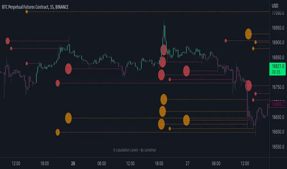
Market PulseBINANCE:BTCUSDT
This is the "Market Pulse" indicator from TOS Indicators.
The scope of this indicator is to identify which one of the four market stages we're in
█ WHAT ARE THE 4 STAGES?
ACCELERATION (or uptrend)
DECELERATION (or downtrend)
ACCUMULATION (occurs after the market has presumably found a bottom and buyers are coming in)
DISTRIBUTION (occurs after the market has presumably found a top and sellers are coming in)
█ WHAT ARE THE TOOLS THAT IT USES TO IDENTIFY THEM?
3 VWMA (Volume Weighted Moving Average)
1 VMA (Variable Moving Average)
VWMA = is a moving average which takes volume into account, and gives closes with higher volume an higher weight
vwma(src, len) => ta.sma(src * volume, len) / ta.sma(volume, len)
VMA = is a moving average which automatically adjusts the smoothing constant using Market Volatility
vma(src, len) =>
vi = ta.cmo(src, len) / 100
alpha = 2 / (len + 1) * math.abs(vi)
vma = 0.0
vma := alpha * src + nz(vma ) * (1 - alpha)
█ HOW CAN I INTERPRET THE INDICATOR?
1) On the top right you can see a box which tells you the Market Stage of the chart you are currently using:
If VWMA8 > VWMA21 > VWMA34 it signals ACCELERATION, color coded in green
If VWMA8 < VWMA21 < VWMA34 it signals DECELERATION, color coded in red
If neither of the previous two conditions are met it signals ACCUMULATION (yellow) if price closes above the VMA and DISTRIBUTION (orange) if price closes below the VMA
2) Next you have the actual VMA which is the line plotted on the chart and color coded in green, red or gray accordingly to the Market Stage with a filter applied:
for a bullish signal (green label) the market needs to be in ACCELERATION and price must be above the VMA
for a bearish signal (red label) the market needs to be in DECELERATION and price must be below the VMA
This characteristic makes it sometimes slower at giving direction indications, but also makes it more suitable to be considered as actual signals for buying and selling
ACCUMULATION and DISTRIBUTION are both rapresented with color gray, if you want you can consider:
the line going from green to gray as ACCUMULATION, your bias is bullish until the line turns red
the line going from red to gray as DISTRIBUTION, your bias is bearish until the line turns green
3) Then you can choose to plot the 3 VWMA to indentify pullbacks and entries for your trades
4) Finally you have the Market Screener, which you can choose to plot and gives a fast look to the markets you are interested on
It basically gives you the Market Stage for every Symbol you choose using the timeframes you input
The maximum number of Symbols you can set is 20, and for all of them you have 2 different timeframes you can choose to analyse.
By default the Symbols are set to the top 20 Cryptocurrency by Market Cap, and the timeframes to 4h and D
There is an option which is on by default and color codes ACCUMULATION and DISTRIBUTION the same as the box on the top right, you can turn it off to make them gray
As I've written in the tooltip inside the indicator you should only use the screener to analyse timeframes which are equal or higher than the one you are currently on your chart.
If you don't plan to use the screener you can delete every symbol from the input boxes to make the indicator update faster when changing timeframe or market.
Be aware that the screener is on BETA and may give repainting signals!
RSI cyclic smoothed ProCyclic Smoothed Relative Strength Indicator - Pro Version
The cyclic smoothed RSI indicator is an enhancement of the classic RSI, adding
additional smoothing according to the market vibration,
adaptive upper and lower bands according to the cyclic memory and
using the current dominant cycle length as input for the indicator.
The cRSI is used like a standard indicator. The chart highlights trading signals where the signal line crosses above or below the adaptive lower/upper bands. It is much more responsive to market moves than the basic RSI.
The indicator uses the dominant cycle as input to optimize signal, smoothing and cyclic memory. To get more in-depth information on the cyclic-smoothed RSI indicator, please read Chapter 4 "Fine tuning technical indicators" of the book "Decoding the Hidden Market Rhythm, Part 1" available at your favorite book store.
Info: Pro Version
This is the actively maintained and continuously enhanced edition of my free, open-source indicator “RSI Cyclic Smoothed v2” which was recognized with a TradingView Editors’ Pick. The Pro Version will remain fully up to date with the latest Pine Script standards and will receive ongoing refinements and feature improvements, all while preserving the core logic and intent of the original tool. The legacy version will continue to be available for code review and educational purposes, but it will no longer receive updates. The legacy open-source version is here
Pro Features V1:
1) Leveraging multi-timeframe analysis
Indicator can be used on one chart by using different time frames at the same time. Read more on TradingView here .
2) Scoring feature added for scanning and filtering
This indicator now provides four distinct scoring states for both bullish and bearish conditions, making it fully compatible with the TradingView Screener .
Each score reflects a specific market phase based on RSI behavior, slope, and crossover signals.
Bullish States (Positive Scores)
+1 – Bull Exhaustion: Price is above the upper threshold and still rising (upsloping).
+2 – Bull Fatigue: Price is above the upper threshold but losing momentum (downsloping).
+3 – Bull Exit: A fresh downward crossover has occurred.
+4 – Recent Bull Exit: A downward crossover occurred within the recent lookback window.
Bearish States (Negative Scores)
–1 – Bear Exhaustion: Price is below the lower threshold and still declining (downsloping).
–2 – Bear Fatigue: Price is below the lower threshold but starting to turn upward (upsloping).
–3 – Bear Exit: A fresh upward crossover has occurred.
–4 – Recent Bear Exit: An upward crossover occurred within the recent lookback window.
The scoring states are shown in the indicator status panel when plotting the indicator on the chart. For a Screener run, use a generic cycle length setting.
How to determine the current active cycle length?
You can use the following additional tools to fine-tune the current dominant cycle length:
1. The advanced dyanmic Cycle Spectrum Scanner
2. The free Detremded Market Rhythm Oscillator
Script a pagamento

JOEJOE VOLUME UNIVERSAL 03112025A universal volume screener that identifies when institutions are aggressively buying a stock by comparing current activity to recent averages, then recommends position sizing based on signal strength.
JOEJOE SHARK INDICATOR - Summary
🎯 Purpose
A volume-based screener that detects institutional buying activity and high-conviction trading opportunities across all global markets (Malaysia, US, Crypto).
📊 What It Does
Identifies 4 Types of Signals:
🟣 Purple Bar (A+ / High Conviction) - Best signal: Both institutional buying AND buy value surge detected
🟡 Yellow Bar (Buy Value Surge) - Strong money inflow detected
🔵 Blue Bar (Institutional Buying) - Large volume with strong buyer control
🟢🔴 Green/Red Bars - Normal volume (no special signal)
🔍 Key Innovation
Universal Design:
Works on ANY market without code changes
Uses relative comparisons (2.5x average) instead of fixed thresholds
Automatically adapts to each stock's normal behavior
Malaysian stocks, US stocks, Bitcoin - all use same logic
📈 Signal Detection Logic
Purple Bar Requirements (ALL must be met):
Volume exceeds 2x the 20-day average (institutional size)
Buy value exceeds 2.5x the 20-day average (money surge)
Price closes in top 30% of candle range (buyer strength)
Price above 50-period EMA (uptrend filter)
Short-term volume MA above long-term (sustained interest)
Candle body is at least 30% of range (decisive move)
Bullish candle (green)
⚙️ Customizable Settings
Signal Configuration:
Buy Value Surge Multiplier (default: 2.5x)
Volume Multiplier (default: 2.0x)
Buyer Strength Threshold (default: 0.7)
Lookback period (default: 20 bars)
Filters (All Toggle-able):
Trend filter with customizable MA length
Sustained interest filter (volume momentum)
Decisiveness filter (candle body size)
Option to require/not require bullish candles
Visual Customization:
All colors adjustable
Toggle markers and dashboard on/off
Volume MA display options
📊 Smart Position Sizing Feature
Calculates Signal Strength (0-100):
Combines Volume Ratio score + Buy Value Ratio score
Higher ratios = higher strength
Position Size Recommendations:
80-100 → 🔥 FULL SIZE (maximum confidence)
60-79 → 75% position (high confidence)
40-59 → 50% position (moderate confidence)
0-39 → 25% position or skip (low confidence)
Purpose: Not all A+ signals are equal - size your position based on actual signal quality
📱 Enhanced Dashboard Display
When High Conviction Signal Active:
Signal status (Active/Inactive)
Signal strength score with emoji indicator
Volume ratio (e.g., 3.2x)
Buy value ratio (e.g., 4.1x)
R/R ratio placeholder (future enhancement)
Position size recommendation with color coding
Visual Indicators:
Blue triangle "A+" marker at chart top
Color-coded position size backgrounds
Professional bordered table
All text in bright blue for visibility
🔔 Alert System
3 Alert Types:
High Conviction Signal (purple bar)
Buy Value Surge (yellow bar)
Institutional Buying (blue bar)
Alert Messages Include:
Ticker symbol
Current price
Signal type with emoji
💡 Screening Workflow
Multi-Chart Setup:
Open 4x4 or 6x3 chart grid
Load watchlist of stocks
Apply indicator to all charts
Scan top-right corners for active signals
Look for blue "A+" triangles at chart tops
Check signal strength scores
Focus on stocks with 80+ scores
🎓 Best Practices
Recommended Settings by Market:
Bursa Malaysia:
Buy Value Multiplier: 2.0-2.5
Volume Multiplier: 2.0
Timeframe: Daily
US Stocks (NYSE/NASDAQ):
Buy Value Multiplier: 2.5-3.5
Volume Multiplier: 2.5
Timeframe: Daily or 4H
Bitcoin/Crypto:
Buy Value Multiplier: 3.5-5.0
Volume Multiplier: 2.5-3.5
Timeframe: Daily or 4H
⚡ Key Advantages
Objective - Based on volume and price data, not subjective patterns
Universal - One indicator for all markets
Adaptive - Compares each stock to its own history
Risk-Aware - Built-in position sizing logic
Screener-Ready - Visual tools for scanning multiple charts
Filter-Heavy - Multiple filters reduce false signals
Customizable - Every parameter adjustable through settings
🚫 What It Doesn't Do
No price targets or stop losses
No prediction of how high price will go
No guarantee of profitability
Doesn't tell you when to exit
Doesn't account for fundamentals or news
R/R ratio currently a placeholder
🎯 Ideal Use Cases
✅ Swing trading - Catching institutional accumulation phases
✅ Stock screening - Finding high-conviction setups in watchlists
✅ Position sizing - Scaling in based on signal quality
✅ Multi-market trading - One tool for Malaysia, US, crypto
✅ End-of-day analysis - Daily timeframe scanning
❌ NOT ideal for:
Scalping (too much noise on low timeframes)
Short selling (designed for long signals)
Range-bound markets (requires uptrend)

ORDER BLCOK custom strategy# OB Matrix Strategy - Documentation
**Version:** 1.0
**Author:** HPotter
**Date:** 31/07/2017
The **OB Matrix Strategy** is based on the identification of **bullish and bearish Order Blocks** and the management of conditional orders with multiple Take Profit (TP) and Stop Loss (SL) levels. It uses trend filters, ATR, and percentage-based risk management.
---
## 1. Main Parameters
### Strategy
- `initial_capital`: 50
- `default_qty_type`: percentage of capital
- `default_qty_value`: 10
### Money Management
- `rr_threshold`: minimum Risk/Reward threshold to open a trade
- `risk_percent`: percentage of capital to risk per trade (default 2%)
- `maxPendingBars`: maximum number of bars for a pending order
- `maxBarsOpen`: maximum number of bars for an open position
- `qty_tp1`, `qty_tp2`, `qty_tp3`: quantity percentages for multiple TPs
---
## 2. Order Block Identification
### Order Block Parameters
- `obLookback`: number of bars to identify an Order Block
- `obmode`: method to calculate the block (`Full` or `Breadth`)
- `obmiti`: method to determine block mitigation (`Close`, `Wick`, `Avg`)
- `obMaxBlocks`: maximum number of Order Blocks displayed
### Main Variables
- `bullBlocks`: array of bullish blocks
- `bearBlocks`: array of bearish blocks
- `last_bull_volume`, `last_bear_volume`: volume of the last block
- `dom_block`: dominant block type (Bullish/Bearish/None)
- `block_strength`: block strength (normalized volume)
- `price_distance`: distance between current price and nearest block
---
## 3. Visual Parameters
- `Width`: line thickness for swing high/low
- `amountOfBoxes`: block grid segments
- `showBorder`: show block borders
- `borderWidth`: width of block borders
- `showVolume`: display volume inside blocks
- `volumePosition`: vertical position of volume text
Customizable colors:
- `obHighVolumeColor`, `obLowVolumeColor`, `obBearHighVolumeColor`, `obBearLowVolumeColor`
- `obBullBorderColor`, `obBearBorderColor`
- `obBullFillColor`, `obBearFillColor`
- `volumeTextColor`
---
## 4. Screener Table
- `showScreener`: display the screener table
- `tablePosition`: table position (`Top Left`, `Top Right`, `Bottom Left`, `Bottom Right`)
- `tableSize`: table size (`Small`, `Normal`, `Large`)
The table shows:
- Symbol, Timeframe
- Type and status of Order Block
- Number of retests
- Bullish and bearish volumes
---
## 5. Trend Filters
- EMA as a trend filter (`emaPeriod`, default 223)
- `bullishTrend` if close > EMA
- `bearishTrend` if close < EMA
---
## 6. ATR and Swing Points
- ATR calculated with a customizable period (`atrLength`)
- Swing High/Low for SL/TP calculation
- `f_getSwingTargets` function to calculate SL and TP based on direction
---
## 7. Trade Logic
### Buy Limit on Bullish OB
- Conditions:
- New bullish block
- Uptrend
- RR > threshold (`rr_threshold`)
- SL: `bullishOBPrice * (1 - atr * atrMultiplier)`
- Multiple TPs: TP1 (50%), TP2 (80%), TP3 (100% max)
- Quantity calculation based on percentage risk
### Sell Limit on Bearish OB
- Conditions:
- New bearish block
- Downtrend
- RR > threshold (`rr_threshold`)
- SL: `bearishOBPrice * (1 + atr * atrMultiplier)`
- Multiple TPs: TP1 (50%), TP2 (80%), TP3 (100% max)
- Quantity calculation based on percentage risk
---
## 8. Order Management and Timeout
- Close pending orders after `maxPendingBars` bars
- Close open positions after `maxBarsOpen` bars
- Label management for open orders
---
## 9. Alert Conditions
- `bull_touch`: price inside maximum bullish volume zone
- `bear_touch`: price inside maximum bearish volume zone
- `bull_reject`: confirmation of bullish zone rejection
- `bear_reject`: confirmation of bearish zone rejection
- `new_bull`: new bullish block
- `new_bear`: new bearish block
---
## 10. Level Calculation
- Swing levels based on selected timeframe (`SelectPeriod`)
- `xHigh` and `xLow` for S1 and R1 calculation
- Levels plotted on chart
---
## 11. Take Profit / Stop Loss
- Extended horizontal lines (`extendBars`) to visualize TP and SL
- Customizable colors (`tpColor`, `slColor`)
---
## 12. Notes
- Complete script based on Pine Script v5
- Advanced graphical management with boxes, lines, labels
- Dynamically displays volumes and Order Blocks
- Integrated internal screener
---
### End of Documentation
High Volume & Near All-Time HighThe **High Volume & Near All-Time High Screener** is a simple yet powerful Pine Script tool designed to help traders identify stocks showing strong price momentum and trading activity. This screener automatically scans multiple tickers that you define in the settings and highlights those meeting two key conditions — daily trading volume greater than **500,000 shares** and the closing price being **within a set percentage (default 2%) of its all-time high**. The results are displayed in an easy-to-read table directly on your chart, making it ideal for traders who want to quickly spot potential breakout stocks without switching between multiple charts.
**How to Use:**
To use this script, open your **TradingView Pine Editor**, paste the code, and click **“Add to Chart.”** Make sure your chart is set to the **Daily timeframe (1D)**, as the script pulls daily data automatically. You can customize the list of symbols, the minimum volume threshold, and the proximity percentage in the settings panel to match your trading style. Once added, the screener will display a table on the right side of your chart showing each symbol, its latest closing price, and whether it currently meets the breakout conditions. A ✅ mark indicates that the stock meets both criteria. This tool works best for swing traders and momentum investors who want to focus on high-volume stocks nearing new highs for potential entries.

Deviation Rate Crash SignalDescription
This indicator provides entry signals for contrarian trades that aim to capture rebounds after sharp declines, such as during market crashes.
A signal is triggered when the deviation rate from the 25-day moving average falls below -25% (default setting). On the chart, a red circle is displayed below the candlestick to indicate the signal.
Backtest (2000–2024, Nikkei 225 stocks):
Win rate: 64.73%
Payoff ratio: 1.141
Probability of ruin: 0.0% (with proper risk control)
Trading Rules (Long only):
Entry: Market buy at next day’s open when the closing price is 25% or more below the 25-day MA.
Exit: Market sell at next day’s open when:
The closing price is 10% above the entry price (take profit), or
The closing price is 10% below the entry price (stop loss), or
40 days have passed since entry.
Notes:
This indicator is tuned for crisis periods (e.g., 2008 Lehman Shock, 2011 Great East Japan Earthquake, 2020 COVID-19 crash, 2024 Yen carry trade reversal).
In normal market conditions, signals will be rare.
Pine Screener BETA Support:
Add this indicator to your favorites and scan with long condition = true.
Screener results display both the MA deviation rate and current price.
When multiple signals occur, use the deviation rate as a reference to prioritize setups.
説明
このインジケーターは、暴落時など短期間で急落した銘柄のリバウンドを狙う逆張りトレードのエントリーシグナルを提供します。
25日移動平均線からの乖離率が -25% を下回ったときにシグナルが点灯します(初期設定)。シグナルはメインチャートのローソク足の下に赤い丸印で表示されます。
バックテスト結果(2000~2024年、日経225銘柄):
勝率: 64.73%
ペイオフレシオ: 1.141
破産確率: 0.0%(適切なリスク管理を行った場合)
トレードルール(買いのみ):
エントリー: 終値が25日移動平均線から25%以上下方乖離した場合、翌日の寄り付きで成行買い。
手仕舞い: 翌日の寄り付きで成行売り(以下のいずれかの条件を満たした場合)
終値が買値より10%以上上昇(利確)
終値が買値より10%以上下落(損切り)
エントリーから40日経過
注意点:
このインジケーターは、2008年リーマンショック、2011年東日本大震災、2020年コロナショック、2024年円キャリートレード巻き戻しショックなど、危機的局面で効果を発揮するように調整されています。
通常の相場ではシグナルはほとんど出現しません。
Pine Screener BETA 対応:
このインジケーターをお気に入り登録し、long condition = true をフィルター条件にしてスキャンしてください。
スクリーナー結果には移動平均乖離率と現在値が表示されます。
シグナルが同時に多数出現した場合は、移動平均乖離率を参考に優先順位をつけてください。

Day 3 PlayDay 3 Play — Indicator Summary
The Day 3 Play indicator is designed to identify outsized moves on Day 1 with a consolidation on Day 2 and are primed for a breakout on Day 3.
Day-1: A stock makes an outsized move (configurable, default = ±3% from prior close) on above-average relative volume (default = ≥3× 30-day average).
Day-2: The stock consolidates inside the Day-1 range (an inside bar).
Day-3: Price is primed for a breakout beyond the Day-2 high (bullish) or Day-2 low (bearish).
How It Works in the Pine Screener
The script computes Day-1 moves, Day-2 ranges, and checks volume requirements in the daily timeframe.
In the Screener, add a watchlist that includes your custom list of stocks. Then, add the custom Day 3 Play indicator. Select the time frame and the parameters from the indicator.
Screener columns (hidden by default) report whether a setup is found, whether it’s bullish or bearish, and the precise trigger/offset levels.
Alerts and Offsets
Alerts are available for:
Breakout at the Day-2 high/low (the trigger).
Approaching within an offset (configurable, default = 0.25%) from the Day-2 high or low.
This lets you catch moves as they’re forming intraday, even in extended hours, and not just after the breakout occurs.
Customization
Thresholds: Adjust the Day-1 % move (default 3%) and minimum relative volume (default 3×).
Alert Offset: Change the proximity level (default 0.25%) where alerts should fire before the breakout.
Visibility: Toggle chart lines (levels and offsets) and a debug panel separately.
Lookback: Control how many past days are scanned for the most recent valid setup.
On-Chart Levels
Day-2 High/Low: Shown as reference levels.
Bull/Bear Level: The breakout level (Day-2 high or low depending on setup).
Alert Offset Lines: Offset from the breakout level by your chosen % for early alerts.
Key Calculations
Relative Volume (RVOL): Day-1 volume ÷ 30-day average (excluding the day itself).
Inside Bar: Day-2 high ≤ Day-1 high and Day-2 low ≥ Day-1 low.
Breakout Levels:
Bullish = Day-2 High (with offset below).
Bearish = Day-2 Low (with offset above).

Bar TimeBar Time is a simple utility for traders who rely on backtesting, Bar Replay, and detailed price action analysis. It solves a common but frustrating problem: knowing the exact time of the bar you are looking at.
While most time indicators show your computer's live clock time, this tool displays the bar's own timestamp, perfectly synchronized with your chart's data and timezone.
Why Is This Important?
When you are deep in a Bar Replay session or analyzing a historical setup, the live clock is irrelevant. You need to know when that critical breakout or reversal candle actually happened. Was it during the pre-market? At the London open? In the last five minutes of the US session? This indicator provides that vital context instantly, without you needing to squint at the small print on the x-axis.
Key Use Cases
1. Mastering Bar Replay
As you click through bars in Replay mode, the displayed time updates with each new bar. This allows you to simulate a live trading session with full awareness of the time of day, helping you train your decision-making under more realistic conditions.
2. Analyzing Screener Signals
This is one of the most powerful uses. Imagine your screener finds a "BUY" signal on a stock from two bars ago. You switch to that stock's chart to investigate. Instead of hunting for the exact bar, this tool instantly shows you the date and time of the bar you are currently hovering over. It dramatically speeds up the workflow of moving from a screener alert to actionable analysis.
3. Detailed Price Action Study
Quickly identify key session timings, see how price reacts to news events at a specific time, or analyze intraday volume patterns with complete temporal clarity.
Features & Customization
The tool is designed to be lightweight, efficient, and fully customizable to match your charting environment.
Timezone-Aware Accuracy: Automatically detects your chart's timezone for a perfect match between the label and the x-axis.
Fully Customizable Position: Place the time display in any of nine screen positions (e.g., Top Left, Bottom Center) using a simple dropdown menu.
Custom Colors: Easily set the background and text colors to blend seamlessly with your chart's theme.