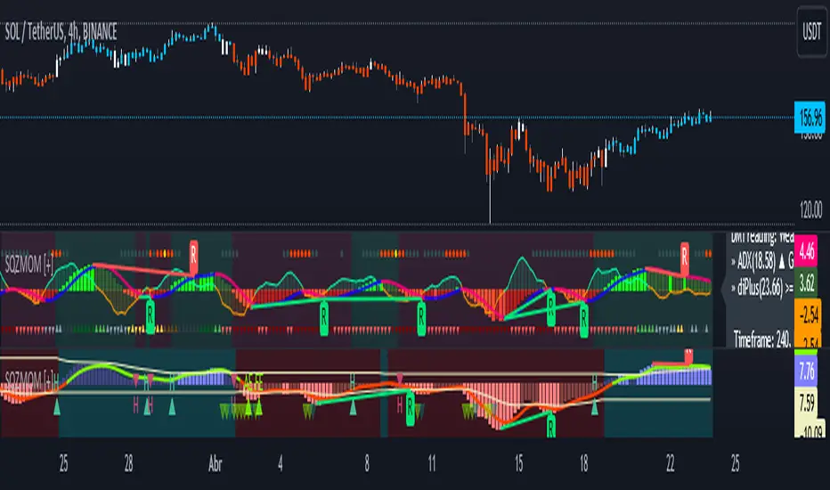
Multi-timeframe Squeeze Mom + ADX and DIsMulti-timeframe Squeeze and ADX
This indicator is designed to be able to get used in combination with others that can lead to a potential help for trading.
The indicator uses colors such us light green, dark green, light red and dark red. Light green and light red to indicate the second half and strongest movement of an upwards and downwards movement, respectively. The same for the first half of an upwards or downwards movement, dark red for the possible start of the upwards movement and dark green ad possible start of the downwards movement.
The indicator is multi-timeframe because the trader can configure within the menu a background timeframe, which plots a squeeze momentum for a different timeframe than the one selected for the main graph. It plots the background timeframe with an area style, while the main squeeze is plotted with a column style. This helps the traders to analyze whether entering a position countering a higher timeframe upwards or downwards squeeze momentum.
It also shows the divergences that occur between the price and the squeeze momentum that can add strength to a potential movement upwards or downwards.
The ADX, DI+ and DI- lines are also added to determine the potential strength of the movement in the monitor (squeeze momentum). If the DI+ is over the DI-, then the strength is likely higher upwards and the opposite for the downwards strength.
Fundamentals
Squeeze momentum: It shows the periods when volatility increases or decreases, in other words, when the market goes from the trend into flat movement and vice versa.
ADX (Average Directional Index): The ADX helps the indicator to estimate the strength of the movement, always considering the DI+ and DI- to not go against the trend strength.
Positive (DI+) and Negative DI (DI-): Both DI+ and DI- measure up and down price movement, in some cases crossovers of these lines can be used as trade signals.
Divergences: Divergence occur when the price of an asset is moving in the opposite direction of a technical indicator, such as an oscillator (squeeze momentum). Divergence warns that the current price trend may be weakening, and in some cases may lead to the price changing direction.
Panel
This panel allows the trader to have a summary of the values of the direction and strength of the movement. It has the following characteristics:
It is placed on the right middle side of the chart indicator by the default.
Its colors changes according to the indicator’s values.
The summary box shows the projection for the main squeeze plot and also for the background squeeze plot. If only one is needed, it can be changed on the menu of the indicator.
Summary
From all previously mentioned, it can be stated that the indicator allows users to:
Detect the direction of trends
Detect price and squeeze divergences
Get a table summarizing important values of the indicator to determine the strength of a trend.
Squeezemomentum

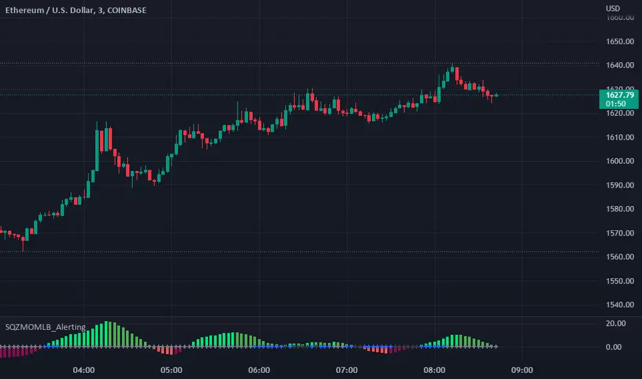
Squeeze Momentum Indicator [LazyBear] added Alerting + webhookA modified version of Squeeze Momentum Indicator visualizing on Price Chart.
author: @LazyBear, modified by @KivancOzbilgic, and by @dgtrd
I took in all of the information as the script below is based on the V2 Script that @LazyBear posted and then added Alerting based on the math and the conditions that @dgtrd added.
Per the description here:
The Squeeze Indicator measures the relationship between Bollinger Bands and Keltner's Channels to help identify consolidations and signal when prices are likely to break out (whether up or down).
The Squeeze Indicator finds sections of the Bollinger Bands which fall inside the Keltner's Channels, and in this case, the market is said to be in a squeeze (indicator turns off, displayed with grey diamond shapes in this study).
When the volatility increases, so does the distance between the bands. Conversely, when the volatility declines, the distance also decreases, and in such cases, the squeeze is said to be released (indicator turns on, displayed with triangle up or triangle down shapes)
Taking the above information and what was in the script was able to base the alert conditions:
So when the condition:
Squeeze On or No Squeeze = In Squeeze
Squeeze Off = Squeeze Release Long or Squeeze Release Long based off conditions.
There are 2 separate alert Types.
1. App, Pop-up, eMail, play sound and Send email to SMS
2. It Is dedicated to Webhook for your various applications.
Alerting Options
i.imgur.com
App Notification
i.imgur.com
i.imgur.com
Webhook test into Discord
i.imgur.com
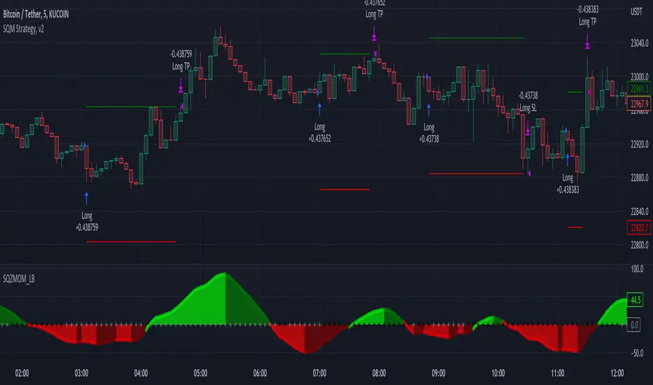
Squeeze Momentum Strategy [LazyBear] Buy Sell TP SL Alerts-Modified version of Squeeze Momentum Indicator by @LazyBear.
-Converted to version 5,
-Taken inspiration from @KivancOzbilgic for its buy sell calculations,
-Used @Bunghole strategy template with Take Profit, Stop Loss and Enable/Disable Toggles
-Added Custom Date Backtesting Module
------------------------------------------------------------------------------------------------------------------------
All credit goes to above
Problem with original version:
The original Squeeze Momentum Strategy did not have buy sell signals and there was alot of confusion as to when to enter and exit.
There was no proper strategy that would allow backtesting on which further analysis could be carried out.
There are 3 aspects this strategy:
1 ) Strategy Logic (easily toggleable from the dropdown menu from strategy settings)
- LazyBear (I have made this simple by using Kivanc technique of Momentums Moving Average Crossover, BUY when MA cross above signal line, SELL when crossdown signal line)
- Zero Crossover Line (BUY signal when crossover zero line, and SELL crossdown zero line)
2) Long Short TP and SL
- In strategies there is usually only 1 SL and 1 TP, and it is assumed that if a 2% SL giving a good profit %, then it would be best for both long and short. However this is not the case for many. Many markets/pairs, go down with much more speed then they go up with. Hence once we have a profitable backtesting setting, then we should start optimizing Long and Short SL's seperately. Once that is done, we should start optimizing for Long and Short TP's separately, starting with Longs first in both cases.
3) Enable and Disable Toggles of Long and Short Trades
- Many markets dont allow short trades, or are not suitable for short trades. In this case it would be much more feasible to disable "Short" Trading and see results of Long Only as a built in graphic view of backtestor provides a more easy to understand data feed as compared to the performance summary in which you have to review long and short profitability separately.
4) Custom Data Backtesting
- One of most crucial aspects while optimizing for backtesting is to check a strategies performance on uptrends, downtrend and sideways markets seperately as to understand the weak points of strategy.
- Once you enable custom date backtesting, you will see lines on the chart which can be dragged left right based on where you want to start and end the backtesting from and to.
Note:
- Not a financial advise
- Open to feedback, questions, improvements, errors etc.
- More info on how the squeeze momentum works visit LazyBear indicator link:
Happy Trading!
Cheers
M Tahreem Alam @mtahreemalam
Variety-Filtered, Squeeze Moving Averages [Loxx]Variety-Filtered, Squeeze Moving Averages is a chop zone indicator that identifies when price is below a specific volatility threshold calculated as the difference between a fast and slow moving average and filtered using ATR- or Pips-based threshold. This indicator can be use as both an entry and exit indicator. It identifies both chop zones and breakouts/breakdowns
How to use
When the candles turn white and the threshold bands appear on the chart, this is indicative of low volatility
When price exits the threshold bands, price will usually explode up or down giving a long or short signal. This acts as a sort of squeeze momentum.
Included:
Bar coloring
Signals
Alerts, 4 types of alerts: Squeeze started, Squeeze ended, long, and short
Loxx's Expanded Source Types
35+ Loxx's Moving Averages

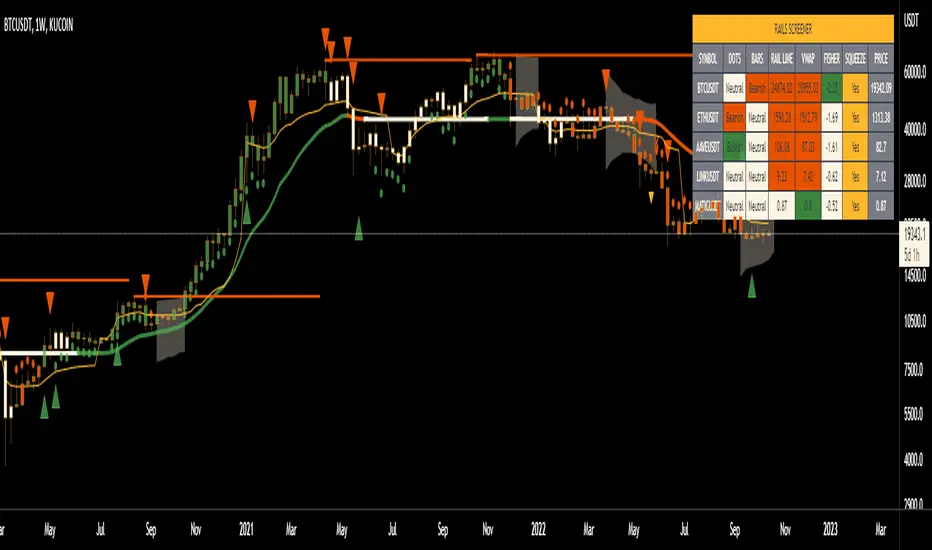
Rails [s3]Centered around a Variable Moving Average. The Variable Moving Average (VMA) is a study that uses an Exponential Moving Average being able to automatically adjust its smoothing factor according to the market volatility. In addition to the VMA, the indicator displays breakouts in volume and when the Bollinger Bands are in a squeeze.
Dots = Microtrend
Triangles = Breakouts in Volume
X = Crossover of Moving Averages
Shaded "Cloud" = Bollinger Bands Squeeze
Alerts can be set for Bearish and Bullish strength (Volume Breakouts), Crossovers, and when Squeezes have started and ended.
Squeeze mom MTF filtered by Wavetrend with div (Tilt)📋 Description :
This script is based on two famous indicators from @Lazybear : Squeeze Momentum and WaveTrend. fr.tradingview.com
The idea is to use the Wavetrend crossovers and filter them according to the momentum curve.
There is a multi timeframe module with automatic selection of the higher timeframe. The user can also choose his timeframe manually.
There is also a detection of regular and hidden divergences
🛠 Options :
- filtering the cross wave trend according to the momemtum curve
- active or not higher timeframe with automatic or manually timeframe selection
- display or not WaveTrend ans squeeze momentum
- Show a tape that signals when wavetrend is overbought or oversold
- choose colors and apparences
- display a panel for the higher timeframe value

Squeeze Momentum 3# Squeeze Momentum 3
First of All, I would like to give my gratitude to for the initital script's idea.
This is my own version of SQZMOM. I had revised all equations and parameters according to Investopedia.
Still, no matter how much we stick to the indicator, the indicator can not see the future.
Trading results vary from time to time. In my opinion, SQZMOM is great for speculating under 4H timeframe.
Remarks;
- implement horizontal shift
- revised all equations. Unfortunately, there is no magic params.
- Be careful with your money management
- Good Luck

Leonidas Squeeze Momentum SystemThis indicator is based on LazyBear SQ Momentum Indicator and SQ Plus Indicator.
This indicator is using ADX and Squeeze Momentum Indicator.
When you see the ADX above 0 line and the slop is positive that means the trend is strong
When the ADX is below 0 line and the trend is weak you will see the slop negative and the color gray
When we see the SQ changing the color from Red to Yellow that means the sell pressure is decreasing this could be a potential buy signal
When we see the color changing from blue to dark blue that means the buy pressure is decreasing this could be a a potential sell signal
Bull/Bear divergences supported
Added SQ signal
this signal is an exponential moving average following the SQ main signal useful for filtering fake signals.
This indicator is very powerful but offers many fake signals it is recommended using this indicator with other indicators to confirm the entries

Squeeze Momentum + Volatility [LeonidasCrypto]Based on Squeeze Momentum indicator by LazyBear
This custom version of SQ is part of my Trading System.
How to use it.
Please read the description of the original author of this indicator here.
Volatility .
When the market is contracting or sideways usually you will see red or blue dots.
Blue dots. the market is in sideways and the volatility is low.
Red dots. the market is in the climax of volatility usually after of a big move this is a potential signal the peak of the move is near.
I added volatility to SQ because I consider volatility is a key factor for trading to anticipate the moves.

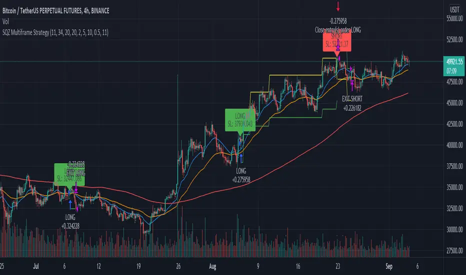
SQZ Multiframe StrategyThis is a first attempt to automate what my current strategy when trading is.
It uses 2 timeframes: the one you are currently using to see the chart and an "anchor trend" which is a higher order frame.
Supported timeframes are: 1m, 5m, 15m, 30m, 1H, 4H, 1D, 1W
The Strategy relies on two indicators:
Squeeze Momentum Indicator
CMF
How does it works?
It looks for a moment when the following conditions are met.
For Long:
Positive directionality in SQZM monitor in anchor timeframe
Positive directionality in SQZM monitor in current timeframe
Recent minimum in CMF
For Short:
Negative directionality in SQZM monitor in anchor timeframe
Negative directionality in SQZM monitor in current timeframe
Recent maximum in CMF
After a BUY or SELL order is executed the plot will start showing two lines: A TP line, and a SL line.
The TP and SL move dynamically based on a greedy algorithm based on 3 input parameters.
Min Profit to Start Moving SL (%): Sets an initial target for the trade.
Maximum Possible of SL (%): This is the maximum amount possible for SL. If volatility is not too high, a shorter SL will be chosen based on Kaufman's Stops method
Take profit factor: Is how much portion of the target I am taking as profit once the target is reached
Example for 5% Min profit:
When the first target is reached (+5%), the SL will be updated to 2.5% over the enter price.
When the second target is reached (+10%), the SL will be updated to 5% over the enter price.
Note: The strategy might abandon the position prematurely if a contrary signal is received while the trade is opened, and will change direction.
The Strategy has been backtested mostly for crypto. It might be good for stocks too, but the parameters mentioned might need some adjustments since price moves at a different rate.
Recommended timeframe is 4H for BTC , and 30min/1H for alts.
Comments and ideas are more than welcome!
ADX MULTICOLOR
ENGLISH:
ADX (AVERAGE DIRECTIONAL INDEX):
It is a non-directional oscillator type indicator, that is, it quantifies the strength of a trend regardless of its direction. In Spanish ADX means index of average direction. It is common to use it together with directional indicators of movement such as the (Squeeze Momentum Indicator), which show us the direction or predominant trend of the market.
HOW TO USE THE ADX INDICATOR
When the ADX is greater than 30, the market is in a strong trend, when it is between 23 and 30 it is not well defined and when it is less than 23 it indicates that the market is in range.
QUANTIFYING THE STRENGTH OF TREND:
ADX values help traders identify the strongest and most profitable trends to trade. Values are also important to distinguish between trending and non-trending conditions. Many traders will use ADX readings above 23 to suggest that the trend is strong enough for trend trading strategies. Conversely, when the ADX is below 23, many will avoid trending trading strategies.
ADX value Trend strength
0-23 Trend absent or weak
23-30 Strong trend
30-75 Very strong trend
75-100 Extremely strong trend
+ DI: (Green Color)
The + DI (Positive Directional Indicator) would be the indicator of positive direction and it would be showing us that the movements are trending upward.
-DI: (Red Color)
The –DI (Negative Directionl Indicator) would be the indicator of negative direction and it would be showing us that the movements have a downward trend.
IMPROVEMENTS IN THE DEVELOPMENT OF THE OSCILLATOR:
It is known that the ADX as a whole is composed of three lines, the first is the ADX itself, which measures the strength of the trend, when it has upward directionality, it means that there is strength in the movement.
The other two lines named (+ DI and -DI) mark if the force is bearish, bullish or, failing that, neutral.
When the + DI is above the -DI, it speaks of Bullish force. On the contrary, when these lines are reversed, we would be in the presence of a bearish force.
On the other hand, when the ADX is below the 23 point, it is considered that there is no force in the movement.
FUSION OF ADX AND LOS (+ DI and -DI):
To simplify this vision, we have merged the three lines that we talked about at the beginning of this section, attributing the color resulting from the crosses of the (+ DI and -DI) to the ADX itself, resulting in a single line that has the color of the type of present force.
CANDLE COLOR:
To help the more inexperienced trader, we have activated a function that will paint the candles the color of the ADX, providing a visual aid to the trader using this indicator.
THE ADX HAS 5 COLORS:
• ADX: Dark Green (Bullish force).
• ADX: Light Green (Loss of bullish strength).
• ADX: Dark Red (Bearish Force).
• ADX: Light Red (Loss of bearish strength).
• ADX: Orange (Lost strength, Disinterest and low volume).
NOTE:
It is possible to activate the lines (+ DI and -DI) in the indicator if you want to use the indicator independently, however, it is recommended to combine this indicator with a directional oscillator, such as the Squeeze Momentum Indicator.
---------------------------------------------------------------------------------------------------------------------------------------------------------------------------------------------------------------------------------------------------
ESPAÑOL:
ADX (ÍNDICE DIRECCIONAL PROMEDIO):
Es un indicador de tipo oscilador no direccional, es decir, cuantifica la fuerza de una tendencia independientemente de su dirección. En español ADX significa índice de dirección media. Es común usarlo junto con indicadores direccionales de movimiento como el (Squeeze Momentum Indicator), que nos muestran la dirección o tendencia predominante del mercado.
CÓMO USAR EL INDICADOR ADX
Cuando el ADX es mayor a 30, el mercado está en fuerte tendencia, cuando está entre 23 y 30 no está bien definido y cuando es menor a 23 indica que el mercado está en rango.
CUANTIFICACIÓN DE LA FUERZA DE LA TENDENCIA:
Los valores de ADX ayudan a los operadores a identificar las tendencias más fuertes y rentables para operar. Los valores también son importantes para distinguir entre condiciones con tendencia y sin tendencia. Muchos operadores utilizarán lecturas de ADX por encima de 23 para sugerir que la tendencia es lo suficientemente fuerte para las estrategias de negociación de tendencias. Por el contrario, cuando el ADX está por debajo de 23, muchos evitarán las estrategias comerciales de tendencia.
Valor ADX Fuerza de la tendencia
0-23 Tendencia ausente o débil
23-30 Fuerte tendencia
30-75 Tendencia muy fuerte
75-100 Tendencia extremadamente fuerte
+ DI: (Color verde)
El + DI (indicador direccional positivo) sería el indicador de dirección positiva y nos estaría mostrando que los movimientos tienen una tendencia alcista.
-DI: (Color rojo)
El –DI (indicador de dirección negativa) sería el indicador de dirección negativa y nos estaría mostrando que los movimientos tienen una tendencia a la baja.
MEJORAS EN EL DESARROLLO DEL OSCILADOR:
Se sabe que el ADX en su conjunto está compuesto por tres líneas, la primera es el propio ADX, que mide la fuerza de la tendencia, cuando tiene direccionalidad ascendente, significa que hay fuerza en el movimiento.
Las otras dos líneas denominadas (+ DI y -DI) marcan si la fuerza es bajista, alcista o, en su defecto, neutral.
Cuando el + DI está por encima del -DI, habla de fuerza alcista. Por el contrario, cuando estas líneas se invierten, estaríamos en presencia de una fuerza bajista.
Por otro lado, cuando el ADX está por debajo del punto 23, se considera que no hay fuerza en el movimiento.
FUSIÓN DE ADX Y LOS (+ DI y -DI):
Para simplificar esta visión, hemos fusionado las tres líneas de las que hablamos al principio de esta sección, atribuyendo el color resultante de los cruces de (+ DI y -DI) al propio ADX, dando como resultado una sola línea que tiene el color del tipo de fuerza presente.
COLOR DE VELAS:
Para ayudar al trader más inexperto, hemos activado una función que pintará las velas del color del ADX, proporcionando una ayuda visual al trader que usa este indicador.
EL ADX TIENE 5 COLORES:
• ADX: Verde oscuro (fuerza alcista).
• ADX: Verde Claro (Pérdida de fuerza alcista).
• ADX: rojo oscuro (fuerza bajista).
• ADX: Light Red (Pérdida de fuerza bajista).
• ADX: Naranja (Pérdida de fuerza, Desinterés y bajo volumen).
NOTA:
Es posible activar las líneas (+ DI y -DI) en el indicador si desea utilizar el indicador de forma independiente, sin embargo, se recomienda combinar este indicador con un oscilador direccional, como el Squeeze Momentum Indicator.

SQZMOM + ADX
ENGLISH:
SQUEEZE MOMENTUM INDICATOR
The Squeeze Momentum Indicator is a momentum oscillator that indicates the explosiveness with which the price is going to move. Its first known version was called "TTM Squeeze" by John Carter explained in his book "Mastering the Trade" (chapter 11). and popularized on TradingView by a developer named LazyBear.
The black crosses in the middle line show that the market has just entered a consolidation. This means low volatility, the market is preparing for an explosive move (up or down). The gray crosses signify the "Squeeze". Carter suggests waiting until the first gray after a black cross and taking a position in the direction of the oscillator. For its part, LazyBear recommends using an additional indicator such as ADX to enhance the effectiveness of the points of entry and closing of positions.
IMPROVEMENTS IN UNDERSTANDING THE OSCILLATOR:
During the indicator creation process we were able to understand the oscillator logic in greater depth, and based on this knowledge we implemented improvements.
IMPROVEMENTS IN THE DEVELOPMENT OF THE OSCILLATOR:
SIDE PANEL:
• The ADX algorithm was incorporated, which is displayed numerically in the right panel of the indicator, it shows the value of the ADX and its directionality.
• An arrow type pointer was added to indicate the Directionality of the Oscillator.
• Two Exponential Moving Averages of 11 and 55 periods were added to the right panel, this will mark if the trend is bullish or bearish depending on the crossing of the EMAs.
• An indicator of the Squeeze of the indicator was also included, which marks the periods of consolidation of the price (OFF) and the periods where the price should react explosively.
• Added a function that allows the automatic color change of the panels based on the color of the oscillator and the ADX.
o ADX: Dark Green (Bullish Force).
o ADX: Light Green (Loss of bullish strength).
o ADX: Dark Red (Bearish Force).
o ADX: Light Red (Loss of bearish strength).
o ADX: Orange (Lost strength, Disinterest and low volume).
SIGNALS:
A very famous strategy that we have learned is that of the trading expert Jaime Merino, who by combining the Squeeze Momentum Indicator and a common ADX, managed to efficiently link the weakness of the ADX with the beginning of a bullish or bearish momentum. The parameterization of its strategy was signaled in buy and sell alerts, which are represented as follows:
B (Buy): It is activated when a bearish movement marked by the ADX (Negative Slope) ends and the oscillator takes bullish directionality (Bullish impulse).
S (Sell): It is activated when an upward movement marked by the ADX (Negative Slope) ends and the oscillator takes bearish directionality. (Bearish momentum).
FILTER:
In order to prevent any trader from trading against the trend, a filter was added that limits the alerts for bearish entries when the trend is up and vice versa, that is, when the EMA 10 is above the EMA55, it is understood that the trend is bullish in that time frame, therefore the bearish entry alerts will not be activated. It will be the decision of each trader whether to activate or deactivate this function.
ALERTS:
This is undoubtedly the most anticipated function by all Latin American traders, (Just kidding), but being aware, I am very proud of the implementation of alerts for each improvement made to this indicator, if you decide to use the Squeeze Momentum Indicator you can automate alerts for the following actions:
• Buy and Sell alerts.
• Alerts for activating the Squeeze to (ON).
• Oscillator quadrant change alerts
o Bullish momentum.
o Bearish momentum.
o Bullish force.
o Bearish force.
RECOMMENDATIONS:
One of the things that became clearer to us in the development of this indicator is the coloring of the quadrants, which is why we recommend the use of four colors, one for each oscillator grid.
ESPAÑOL:
El Squeeze Momentum Indicator es oscilador de momentum que nos indica la explosividad con que el precio se va a mover. Su primera versión conocida se llamo “TTM Squeeze” de John Carter explica en su libro "Mastering the Trade" (capítulo 11). y popularizada en TradingView por un desarrollador llamado LazyBear.
Las cruces negras en la línea media muestran que el mercado acaba de entrar en una consolidación. Esto significa baja volatilidad, el mercado se prepara para un movimiento explosivo (hacia arriba o hacia abajo). Las cruces grises significan el "Squeeze“. Carter sugiere esperar hasta el primer gris después de una cruz negra y tomar una posición en la dirección del oscilador. Por su parte LazyBear recomienda usar un indicador adicional como ADX para potenciar la efectividad de los puntos de entrada y cierre de las posiciones.
CUADRANTE DE IMPULSO: Los cuadrantes de impulso poseen el doble de potencia de los cuadrantes de fuerza, esto se debe a que su misión es cambiar la dirección del oscilador para generar las Ondas.
CUADRANTE DE FUERZA:
Los cuadrantes de fuerza poseen el menos de potencia que los cuadrantes de impulso, podríamos decir que este cuadrante representa la perdida en la fuerza del movimiento.
LOS COLORES:
Particularmente recomiendo usar la configuracion de colores que se presentan en la imagen anterior, ya que brinda mas coherencia en la realizacion del movimiento alcista y bajista.
IMPULSO ALCISTA: El oscilador se tiene pendiente POSITIVA y se encuentra por debajo del punto 0.
FUERZA ALCISTA: El oscilador se tiene pendiente POSITIVA y se encuentra por encima del punto 0.
IMPULSO BAJISTA: El oscilador se tiene pendiente NEGATIVA y se encuentra por encima del punto 0.
FUERZA BAJISTA: El oscilador se tiene pendiente NEGATIVA y se encuentra por debajo del punto 0.
MEJORAS EN LA COMPRENSIÓN DEL OSCILADOR:
Durante el proceso de creación del indicador pudimos comprender la logica del oscilador con mayor profundidad, y con base en este conocimiento implementamos mejoras
MEJORAS EN EL DESARROLLO DEL OSCILADOR:
PANEL LATERAL:
• Se incorporó el algoritmo del ADX el cual se visualiza en forma numérica en el panel derecho del indicador, el mismo muestra el valor del ADX y la direccionalidad de este.
• Se incorporó un señalador de tipo flecha que indica la Direccionalidad del Oscilador.
• Se añadió dos Medias móviles Exponenciales de 11 y 55 periodos al panel derecho, éste marcará si la tendencia es alcista o bajista en función a al cruce de las EMAs.
• También se incluyó un señalador del Squeeze del indicador, el cual marca los periodos de consolidación del precio (OFF) y los periodos donde el precio debería reaccionar de forma explosiva.
• Se añadió una función que permite el cambio de color automático de los paneles en función al color del oscilador y el ADX.
o ADX: Verde Oscuro (Fuerza alcista).
o ADX: Verde Claro (Perdida de fuerza alcista).
o ADX: Rojo Oscuro (Fuerza bajista).
o ADX: Rojo Claro (Perdida fuerza bajista).
o ADX: Naranja (Perdida fuerza, Desinterés y bajo volumen).
SEÑALES:
Una estrategia muy famosa que hemos aprendido es la del experto en trading Jaime Merino, quien combinando el Squeeze Momentum Indicator y un ADX comùn, logró relacionar de forma eficiente la debilidad del ADX con el comienzo de un impulso ALCISTA o BAJISTA. La parametrización de su estrategia fue señalizada en alertas de compra y venta, las cuales se representan de la siguiente manera:
B (Buy): Se activa cuando termina un movimiento bajista marcado por el ADX (Pendiente Negativa) y el oscilador toma Direccionalidad alcista (Impulso alcista).
S (Sell): Se activa cuando termina un movimiento alcista marcado por el ADX (Pendiente Negativa) y el oscilador toma Direccionalidad bajista. (Impulso bajista).
FILTRO:
Con la intención de evitar que ningún trader opere en contra de la tendencia, se añadió un filtro que limita las alertas entradas bajistas cuando la tendencia es alcista y viceversa, es decir, cuando la EMA 10 está por encima de la EMA55, se entiende que la tendencia es alcista en esa temporalidad, por lo cual las alertas de entradas bajistas no se activaran. Será decisión de cada trader si activa o desactiva esta función.
ALERTAS:
Esta sin duda es la función más esperada por todos los traders de Latinoamérica, (Es broma), pero siendo consientes, me siento muy orgulloso de la implementación de alertas para cada mejora realizada a este indicador, si decide usar el Squeeze Momentum Indicator podrá automatizar las alertas para las siguientes acciones:
• Alertas de Buy y Sell.
• Alertas para la activación del Squeeze a (ON).
• Alertas de cambios de cuadrantes del oscilador
o Impulso alcista.
o Impulso bajista.
o Fuerza alcista.
o Fuerza bajista.
RECOMENDACIONES:
Una de las cosas que nos quedó más claras en el desarrollo de este indicador, es la coloración de los cuadrantes, es por ellos que recomendamos el empleo de cuatro colores, uno para cada cuadricula del oscilador.

MC Pro | BMS V3Published 10 July 2021
MC Pro (Momentum Compressor) with Fast MACD
Detects buying selling momentum & consolidation
suitable for Swing & Day Trading.
Check settings option switch to FIFO setup.
Histogram
Green = Buying momentum firing up (good for swing trade)
Red = Pullback (Red below histogram line is Downtrend)
Pink = Rebound (good for bottom catch / FIFO trade)
Dots
Gray = Expansion (can fire up or fire down)
Light Blue = Low compression
Dark Blue = Medium compression
Purple = High compression (sideways consolidation)
Fast MACD & Signal line crossover Green dot & cross-down Purple dot

Squeeze Momentum Indicator MTF with alerts [lazy bear]MTF version of the popular squeeze momentum indicator, created and shared by Lazy Bear

Squeeze Momentum [Plus]The "Momentum" in this indicator is smoothed out using linear regression. The Momentum is what is displayed on the indicator as a histogram, its purpose is obvious (to show momentum).
What is a Squeeze? A squeeze occurs when Bollinger Bands tighten up enough to slip inside of Keltner Channels .
This is interpreted as price is compressing and building up energy before releasing it and making a big move.
Traditionally, John Carter's version uses 20 period SMAs as the basis lines on both the BB and the KC.
In this version, I've given the freedom to change this and try out different types of moving averages.
The original squeeze indicator had only one Squeeze setting, though this new one has three.
The gray dot Squeeze, call it a "low squeeze" or an "early squeeze" - this is the easiest Squeeze to form based on its settings.
The orange dot Squeeze is the original from the first Squeeze indicator.
And finally, the yellow dot squeeze, call it a "high squeeze" or "power squeeze" - is the most difficult to form and suggests price is under extreme levels of compression.
Now to explain the parameters:
Squeeze Input - This is just the source for the Squeeze to use, default value is closing price.
Length - This is the length of time used to calculate the Bollinger Bands and Keltner Channels .
Bollinger Bands Calculation Type - Selects the type of moving average used to create the Bollinger Bands .
Keltner Channel Calculation Type - Selects the type of moving average used to create the Keltner Channel.
Color Format - you to choose one of 5 different color schemes.
Draw Divergence - Self explanatory here, this will auto-draw divergence on the indicator.
Gray Background for Dark Mode - to make them more visually appealing.
Added ADX (Average Directional Index) that measure a trend’s strength. The higher the ADX value, the stronger the trend. The ADX line is white when it has a positive slope, otherwise it is gray. When the ADX has a very large dispersion with respect to the momentum histogram, increase the scale number.
Added "H (Hull Moving Average) Signal". Hull is a extremely responsive and smooth moving average created by Alan Hull in 2005. Have option to chose between 3 Hull variations.
Added "Williams Vix Fix" signal. The Vix is one of the most reliable indicators in history for finding market bottoms. The Williams Vix Fix is simply a code from Larry Williams creating almost identical results for creating the same ability the Vix has to all assets.
The VIX has always been much better at signaling bottoms than tops. Simple reason is when market falls retail traders panic and increase volatility, and professionals come in and capitalize on the situation. At market tops there is no one panicking... just liquidity drying up.
The FE green triangles are "Filtered Entries"
The AE green triangles are "Aggressive Filtered Entries"
(JS) BallistaAlright so this is a script I made by combining two existing ones and making a really cool discovery that has proven very useful.
You'll notice that there are two separate oscillators that are laid on top of each other. The background oscillator is my "Tip-and-Dip" oscillator which you can see here (will refer to this as TnD from here), and the foreground oscillator from the Squeeze , which can be viewed here .
Initially I just wanted to see how they interacted with one another and compare them, but this led to some pretty interesting observations.
First let me go through the options real quick to get that out of the way, though it is mostly self-explanatory.
Lookback Period defines the amount of bars used for the TnD oscillator.
Smoothing Value smooths out the TnD output.
Standard Deviations is used to calculate the TnD formula.
Color Scheme is preset BG colors.
Using Dark Mode changes colors based on dark mode or not.
Squeeze Momentum On turns the Squeeze in the foreground off and on.
Arrows Off turns the arrows on the indicator off and on.
Now to explain the indicator a bit more. I have the default lookback period as 40 due to the Squeeze being 20, which makes the TnD oscillator the "slow" output with the Squeeze being the "fast" output.
Some initial observations were that when both the Squeeze and the TnD are moving in the direction, when the Squeeze is higher (uptrend) or lower (downtrend) it seems to indicate strength in the move. As the move loses steam you'll notice the Squeeze diverge from the TnD.
However, the most useful thing I discovered about the interaction between these two indicators is where the name for it came from. So if you aren't familiar with what a Ballista is, per Wikipedia, "The ballista... sometimes called bolt thrower, was an ancient missile weapon that launched either bolts or stones at a distant target." There are instances where the Squeeze seems to get ahead of itself and gets too far away from the TnD (which is the long term trend between the two). The key thing to look for is an "inverted squeeze" - this is when the squeeze oscillator ends up flipping against the TnD. When this occurs there is an extremely high probability that you'll see price shoot back the opposite way of the Squeeze.
I've been using this setup myself for about a year now and have been very satisfied with the results thusfar. I circled some examples on the SPX daily chart here to show you what I mean with the inverted Squeeze shooting back.
All in one [Liubam]Hey tradingviewers!
This is an All in one Indicator for those who can't add too many indicators on your charts. Inspired by ©LonesomeTheBlue "Indicators all in one" script. I found a lot of very interesting scripts on the public library and I decided to make a tool with some of the greatest IMO, adding some modifications to improve the indicators. With this tool you can plot 1 of 6 different indicators by selecting it from a drop-down list (on the indicator settings).
All the credit goes to it's respective owners (taggeds).
THIS INDICATOR INCLUDES:
1. Classic RSI with some OB/OS tools:
The relative strength index (RSI) is a popular momentum indicator displayed as an oscillator (a line graph that moves between two extremes) that measures the magnitude of recent price changes to evaluate overbought or oversold conditions, in other words it shows signals about bullish and bearish price momentum. I added some visual improvements to help you finding the OB/OS zones.
2. Classic CCI with some OB/OS tools.
The Commodity Channel Index (CCI) is a momentum-based oscillator used as market indicator to help determine market movements that may indicate buying or selling. Added some vistual improvements to the chart.
3. ADX and DMI oscillator with the keylevel coded by @console:
The Average Directional Index (ADX) is non-directional indicator used by some traders to determine the strength of a trend. When the ADX line is rising (Above the keylevel) trend strength is increasing, and the price moves in the direction of the trend whether up or down. Otherwise, low ADX (Below the keylevel) is usually a sign of accumulation or distribution (Range). Non-trending doesn't mean the price isn't moving. It may not be, but the price could also be making a trend change or is too volatile for a clear direction to be present.
Suggested settings of the keylevel is 23-25.... REMEMBER: The trend may be your friend.
4. MFI
The Money Flow Index (MFI) is a technical oscillator for identifying overbought or oversold signals in an asset. Unlike conventional oscillators such as the RSI, the Money Flow Index incorporates both price and volume data, as opposed to just price. It can also be used to spot divergences which warn of a trend change in price.
5. Stochastic:
A stochastic oscillator is range-bound, meaning it is always between 0 and 100. This makes it a useful indicator of overbought and oversold conditions. Traditionally, readings over 80 are considered in the overbought range, and readings under 20 are considered oversold. However, these are not always indicative of impending reversal; very strong trends can maintain overbought or oversold conditions for an extended period. Instead, traders should look to changes in the stochastic oscillator for clues about future trend shifts. I added some features for this popular indicator to show the stochastic crosses.
6. The famous Squeeze momentum Indicator made by @Lazybear:
This is derivate of John Carter's "TTM Squeeze" volatility indicator and its very strong when using with trending indicator such a ADX. Black line (or no-line) on the midline show that the market just entered a squeeze ( Bollinger Bands are with in Keltner Channel). This signifies low volatility , market preparing itself for an explosive move (up or down). Gray line signify "Squeeze release". Mr.Carter suggests waiting till the gray line after a blackline, and taking a position in the direction of the momentum (for ex., if momentum value is above zero, go long). Exit the position when the momentum changes.
------------------------------------------------------------------------------------------------------------------------------------------------------------------------------------------------------------------------------------------------
This script is source code protected, but you can add to your favorite list to use it. Also you can add twice to use 2 different indicators at the same time (E.g. Squeeze Momentum Indicator + ADX)
An additional indicator I made (MA Hunterz + InfoPanel) is needed to not miss good entry points.
Your valuable comment and feedback is much appreciated...
And remember indicators can be really helpfull but always use Price Action.
Matrix Series and Vix Fix with VWAP CCI and QQE SignalsBased on @ChrisMoody Williams_VIX_Fix and @glaz Matrix Series .
This indicator identify potential zone of reversal according to momentum and volatility.
Includes VWAP CCI and QQE Signals.

Squeeze Momentum Indicator v4_pine [By Lazy Bear]This is the famous Squeeze Momentum Indicator made by @LazyBear in v4 version if someone wants to test some strategies, as the original code was in v2 version the code converter couldn't convert to v4.

TopTenAlgo 10. SQZMOM_LSvwMA with Bar ColorEN: This Algorithm is a derivative of John Carter's "TTM Squeeze" volatility indicator. Many strategists have taken the indicator on Tradingview with simple moving averages and have looked at the biggest mistake only by dealing with squeeze and exit processes to squeeze. But I used the algorithm to determine where the markets would actually explode. For example, instead of using SMAs , I tested them on the Linear Regression Curve using Volume Weighted Moving Averages and Hull MAs. This gave me the opportunity to develop a more responsive algorithm and identify where the actual explosion would occur. The Gray Circles in the midline show that the market is entering a new jam (in the Bollinger Bands and Keltner Channel). This means low volatility , the market prepares itself for an explosive move (up or down). White Circles mean that it is about to get out of the jam. The Blue Circles, which no one can calculate, now inform that the exit is no longer jammed and that the explosion has taken place.
Mr. Carter recommends that you wait until the first gray after a gray cross and take a position in the momentum direction (for example, if the momentum value is above zero, relax). Exit position when the momentum changes (increase or decrease, this is indicated by a color change). In this algorithm, I tried to achieve good entry points using an additional indicator such as ADX and WaveTrend. To draw the histogram, I used a different method based on Linear Regression . Mr.Carter uses a simple momentum indicator .
In summary, this algorithm is a strict algorithm in which additional 4-5 indicators are blended. Conveniences for Everyone ...
This algorithm is prepared with @Top10Algo ...
TR: Bu Algoritma John Carter'ın "TTM Squeeze" volatilite göstergesinin bir türevidir. Bir çok stratejist Tradingview' de gösterge' yi basit hareketli ortalamalarla ele almış ve en büyük hatayı sadece sıkışma ve sıkışmadan çıkış süreçlerini ele alarak bakmışlardır. Fakat ben algoritmayı piyasaların asıl patlama yapacağı yeri tespit etmek için kullandım. Örneğin SMA' ları kullanmak yerine Hacim Ağırlıklı Hareketli Ortalamaları ve Hull MA' ları kullanarak onları Linerar Regresyon Eğrisinde stress testine tabi tuttum. Buda bana daha duyarlı bir algoritma geliştirmem ve asıl patlamanın olacağı yerleri tespit etmem için fırsat verdi. Orta hattaki Gri Daireler, piyasanın yeni bir sıkışmaya girdiğini gösteriyor ( Bollinger Bantları ve Keltner Kanalı'nda). Bu, düşük volatilite anlamına gelir, piyasa kendisini patlayıcı bir harekete hazırlar (yukarı veya aşağı). Beyaz Daireler ise sıkışmadan çıkmak üzere olduğu anlamına gelir. Hiç kimsenin hesap edemediği Mavi Daireler ise artık sıkışmadan çıkıldığını ve patlamanın gerçekleştiğini haber verir.
Mr.Carter, gri bir çarpı işaretinden sonra ilk griye kadar beklemenizi ve momentum yönünde bir pozisyon almanızı önerir (örneğin, momentum değeri sıfırın üstünde ise, rahat olun). Momentum değiştiğinde pozisyondan çıkın (artırma veya azaltma, bunu o bir renk değişikliği ile belirtilir). Bu algoritmada ben, ADX ve WaveTrend gibi ek bir gösterge kullanarak iyi giriş noktalarıelde etmeye çalıştım. Histogramı çizmek için ise Linear Regresyon tabanlı farklı bir yöntem kullandım. Mr.Carter basit bir momentum göstergesi kullanır.
Özetle bu algoritma ek 4-5 göstergenin harmanlandığı sıkı bir algoritmadır. Herkese Kolaylıklar dilerim...
Bu algoritma @Top10Algo ile beraber hazırlanmıştır... Kodlamadaki katkılarından ve yol göstericiliğinden dolayı teşekkürü bir borç bilirim.
TopTenAlgo 10. SQZMOM_LSvwMA with Bar Color (Not Based Volume)EN: This Algorithm is a derivative of John Carter's "TTM Squeeze" volatility indicator. Many strategists have taken the indicator on Tradingview with simple moving averages and have looked at the biggest mistake only by dealing with squeeze and exit processes to squeeze. But I used the algorithm to determine where the markets would actually explode. For example, instead of using SMAs , I tested them on the Linear Regression Curve using Volume Weighted Moving Averages and Hull MAs. This gave me the opportunity to develop a more responsive algorithm and identify where the actual explosion would occur. The Gray Circles in the midline show that the market is entering a new jam (in the Bollinger Bands and Keltner Channel). This means low volatility , the market prepares itself for an explosive move (up or down). White Circles mean that it is about to get out of the jam. The Blue Circles, which no one can calculate, now inform that the exit is no longer jammed and that the explosion has taken place.
Mr. Carter recommends that you wait until the first gray after a gray cross and take a position in the momentum direction (for example, if the momentum value is above zero, relax). Exit position when the momentum changes (increase or decrease, this is indicated by a color change). In this algorithm, I tried to achieve good entry points using an additional indicator such as ADX and WaveTrend. To draw the histogram, I used a different method based on Linear Regression . Mr.Carter uses a simple momentum indicator .
In summary, this algorithm is a strict algorithm in which additional 4-5 indicators are blended. Conveniences for Everyone ... (For Symbols that cannot be read on the Volume Indicator)
This algorithm is prepared with @Top10Algo ...
TR: Bu Algoritma John Carter'ın "TTM Squeeze" volatilite göstergesinin bir türevidir. Bir çok stratejist Tradingview' de gösterge' yi basit hareketli ortalamalarla ele almış ve en büyük hatayı sadece sıkışma ve sıkışmadan çıkış süreçlerini ele alarak bakmışlardır. Fakat ben algoritmayı piyasaların asıl patlama yapacağı yeri tespit etmek için kullandım. Örneğin SMA' ları kullanmak yerine Hacim Ağırlıklı Hareketli Ortalamaları ve Hull MA' ları kullanarak onları Linerar Regresyon Eğrisinde stress testine tabi tuttum. Buda bana daha duyarlı bir algoritma geliştirmem ve asıl patlamanın olacağı yerleri tespit etmem için fırsat verdi. Orta hattaki Gri Daireler, piyasanın yeni bir sıkışmaya girdiğini gösteriyor ( Bollinger Bantları ve Keltner Kanalı'nda). Bu, düşük volatilite anlamına gelir, piyasa kendisini patlayıcı bir harekete hazırlar (yukarı veya aşağı). Beyaz Daireler ise sıkışmadan çıkmak üzere olduğu anlamına gelir. Hiç kimsenin hesap edemediği Mavi Daireler ise artık sıkışmadan çıkıldığını ve patlamanın gerçekleştiğini haber verir.
Mr.Carter, gri bir çarpı işaretinden sonra ilk griye kadar beklemenizi ve momentum yönünde bir pozisyon almanızı önerir (örneğin, momentum değeri sıfırın üstünde ise, rahat olun). Momentum değiştiğinde pozisyondan çıkın (artırma veya azaltma, bunu o bir renk değişikliği ile belirtilir). Bu algoritmada ben, ADX ve WaveTrend gibi ek bir gösterge kullanarak iyi giriş noktalarıelde etmeye çalıştım. Histogramı çizmek için ise Linear Regresyon tabanlı farklı bir yöntem kullandım. Mr.Carter basit bir momentum göstergesi kullanır.
Özetle bu algoritma ek 4-5 göstergenin harmanlandığı sıkı bir algoritmadır. Herkese Kolaylıklar dilerim... (Hacim Göstergesi okunamayan Semboller için)
Bu algoritma @Top10Algo ile beraber hazırlanmıştır...

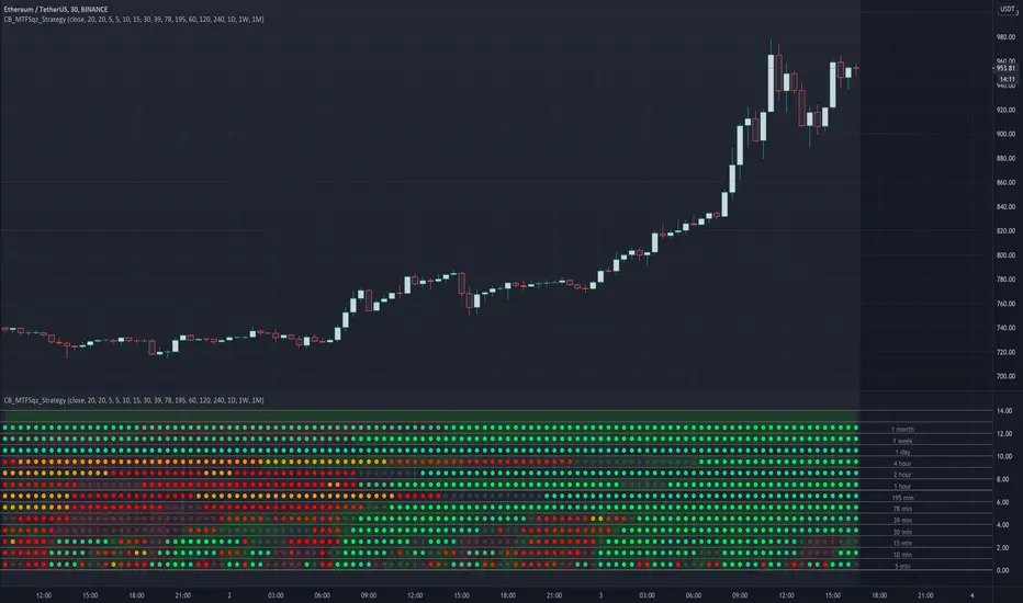
CryptoBreakers MTF Sqz StrategyThis is a Multi Time Frame squeeze strategy that has been consistently catching large BTC and ETH moves.
It's building up on the basic squeeze play of both the upper and lower Bollinger Bands going inside the Keltner Channel
and in one indicator quickly seeing when both Bollinger Bands start to come out of the Keltner channel and positioning us
for the large move that is about to take place.
Before I explain the rules for the winning strategy, let's cover the basics on the indicator.
1. When both the upper and lower Bollinger Bands go inside the Keltner Channel, a compression is in place, and the squeeze is on. This is reflected on the indicator as colored dots.
2. The indicator covers 5min, 10min, 15min, 30min, 39min, 78min, 195min, 1hr, 2hr, 4hr, 1 day, 1 week, and 1 month timeframes for squeezes.
Your chart needs to be set to the lowest time frame resolution of 5min in order for the indicator to show squeezes in all higher timeframe resolutions.
So whatever your chart resolution is, the indicator will show the squeezes in that timeframe and above correctly.
3. ORANGE dots indicate high level of compression. RED dots indicate medium level of compression. BLACK dots indicate low level of compression and the GREEN dots indicate no compression.
4. Generally, higher the level of compression and the longer duration of the squeeze, the more explosive the move expected. With this one indicator I was able to consistently catch 500 plus
point moves in BTC and 30-50 point moves in ETH.
Let's review the rules of the strategy:
1. For the ideal set up, we look for two lower timeframe resolutions (preferably 30 and 39 minutes OR 39 minutes and 78 minutes) to be in squeeze for at least 6 dots and at the sametime we
need to see one or two higher timeframe resolutions in squeeze (195 minutes and 1 day OR 1 day and 1 week resolutions)
2. Determine the direction of the trend in the higher time frames (bullish and bearish). We look for stacked up or down EMAs of 8, 21, 34, 55 and 84 on a daily and/or weekly chart.
3. For entry, wait for the lower timeframe squeeze to fire meaning look for the first green dot after the black, red, or orange dots (minimum six in total).
For example the 30 min row shows the first green dot after the sequence of squeeze dots and the direction of the price movement (up or down) at that green dot bar aligns with the direction of the price movement in the higher timeframe chart.
4. Once the lower timeframe squeezes fire, we follow the move to continuation of the firing of the higher timeframe squeezes.
5. Our exit will be at the price point of 6-9 green dots after the higher timeframe squeeze fired in the same direction as the lower timeframe.
I created this to make it easier to see the set up on any stock and crypto chart. It has been working consistently on BTC and ETH price action. I have not seen anything on TV that cover multi time frame squeeze play in a very simple and clean way.
This makes it very easy to see the set up with one indicator. I'm using this with my trading group.
If you would like to get access, please feel free to DM me at @CryptoBreakers
[Zekis]Squeeze Momentum + IchimokuHi,
This is a strategy developed by @zsone, a strategy suitable mostly for altcoins (but not necessary).
The strategy is using the following indicators: Squeeze Momentum (LazyBear), two Ichimoku Clouds (one is MTF), daily EMA21 and EMA golden cross (optionally).
Setting should be used as default.
Rules for entries (scalping):
Go Long (green line on the histogram):
- use low time frames (3m, 5m, 15m)
- candle closes above the ichimoku cloud
- squeeze momentum, first grey cross on green histogram (2 ways):
1. histogram is green and have a black cross and later it turns to grey cross
2. the histogram is red with grey cross and it goes to green with grey cross without having a black cross, just directly goes green histogram with grey cross
- price is above the daily EMA21
- price is above or inside de ichimoku cloud MTF (1h TF)
- optionally! EMA golden/death cross
Go Short (red line on the histogram):
- vice versa
Rules for exits:
- DI+ crosses down on DI- on longs
- DI- crosses up on DI+ on shorts
- or any fixed, dynamic, trailing... TP/SL (according to the market conditions)
This strategy can be used also for high time frames (12h, 1D) with a golden/death cross confirmation.
Soon I will publish a screener that scan multiple altcoins at once to find setups easier.
P.S.1 The strategy should be used with it's default settings/values (you can change them if you want), but there are 2 versions of Squeeze Momentum from Lazy Bear that you can choose from.
P.S.2 This is not a magic strategy, please do your research before using real money!
P.S.3 The strategy is free to use, just add it to the favorites and then to the chart.
Enjoy!
