Dynamic Spot vs Perps Premium (Area Plot)This is a script to give you an easy overall view on the spot perp premium which could indicate the momentum is drove by spot or perps
Statistics

COBRA X Mastermind – Ultimate Smart Panel✅ COBRA X Mastermind – Ultimate Smart Panel
COBRA X Mastermind – Ultimate Panel | Structure, Volume, Signals & Smart Entry
📝 (Description):
COBRA X Mastermind is a precision smart panel for reading market structure, detecting high-quality entries and visualizing critical components in one screen:
Detect Break of Structure (BoS) and CHoCH with context
Auto-mark Order Blocks and Fair Value Gaps (FVGs)
Volume Spike & VWAP alignment for smart trend confirmation
Directional bias from EMA + Dynamic Flow analysis
Hidden divergence detection to anticipate trap moves
Built-in Signal Strength meter with real-time TP/SL suggestion
Each row in the panel reflects a real-time reading of price action, structure, volume, and entry risk.
🔍 How to use it:
Look for a valid signal only when structure + volume + divergence are in agreement. Use the panel strength bar to validate setups.
This script is open-source and optimized for 1m and 5m charts, especially on Gold and FX pairs.
Clean, non-repainting, and built for professional scalpers.

Daily, Weekly, Monthly Current/Average RangeThe "Daily, Weekly, Monthly Current/Average Range" calculates and displays current and average price ranges (high - low) for daily, weekly, and monthly timeframes in a customizable table.
Users can adjust the lookback period, table size, and font color, with the table updating on the last bar for efficiency.
When the current range exceeds the average for a timeframe, the corresponding cell highlights green, signaling price possibly reaching maximum expansion and potential retracement or consolidation may follow.

Market to NAV Premium Arbitrage Alpha IndicatorMARKET TO NAV PREMIUM ARBITRAGE ALPHA INDICATOR
A quantitative tool for identifying statistical mispricings between market capitalization and net asset value (NAV), designed specifically for arbitrage strategies and alpha generation in Bitcoin-holding companies like MicroStrategy (MSTR), companies or SPACS used mostly to hold crypto, Bitcoin ETFs, and other NAV-based instruments. Can probably be also used in certain spin-offs.
📊 KEY FEATURES:
✅ Real-time Premium/Discount Calculation
• Automatically retrieves market cap data from TradingView
• Calculates precise NAV based on underlying asset holdings
• Formula: (Market Cap - NAV) / NAV × 100
✅ Statistical Analysis Framework
• Historical percentile rankings (customizable lookback period)
• Standard deviation bands (2σ) for extreme value detection
• Smoothing options to reduce noise
✅ Multi-Source Market Cap Detection
• Priority system: TradingView data → Calculated → Manual override
• Automatic fallback mechanisms for data reliability
✅ Advanced NAV Modeling
• Basic NAV: Asset holdings + cash
• Adjusted NAV: Includes software business value, debt, preferred shares. If the company has a lot of this kind of intrinsic value, put it in the "cash" field
• Support for any underlying asset (BTC, ETH, etc.)
📈 TRADING APPLICATIONS:
🎯 Pairs Trading Signals
• Long/Short opportunities when premium reaches statistical extremes
• Mean reversion strategies based on historical ranges
• Risk-adjusted position sizing using percentile ranks
🎯 Arbitrage Detection
• Identifies when market pricing significantly deviates from fair value
• Quantifies the magnitude of mispricing for profit potential
• Historical context for timing entry/exit points
🔧 CONFIGURATION OPTIONS:
• Underlying Asset: Any symbol (default: COINBASE:BTCUSD) NEED MANUAL INPUT
• Asset Quantity: Precise holdings amount. NEED MANUAL INPUT
• Cash Holdings: Additional liquid assets. NEED MANUAL INPUT
• Market Cap Mode: Auto-detect, calculated, or manual
• Advanced Adjustments: Business value, debt, preferred shares
• Display Settings: Lookback period, smoothing, custom colors
🎯 PERFECT FOR:
• Quantitative traders focused on statistical arbitrage
• Institutional investors monitoring NAV-based instruments
• Bitcoin ETF and MSTR traders seeking alpha generation
• Risk managers tracking premium/discount exposures
• Academic researchers studying market efficiency (as you can see, markets are not efficient 😉)
🔗 CONNECT & SUPPORT:
Follow for updates and additional quantitative trading tools. Feedback and suggestions welcome!

Средний ATR за 5 дней (без исключительных баров)The indicator excludes bars where the ATR is more than twice the regular ATR, and shows only the average ATR for the last 5 full days

MonthlyProfitTable# Monthly Profit Table Library
**Automatically create beautiful monthly profit/loss tables for your Pine Script strategies with just 3 lines of code!**
## 🎯 What It Does
This library automatically tracks your strategy's performance and displays it in a clean, professional monthly profit table similar to what you see in institutional trading reports. No manual calculations required - just import and use!
## ✨ Key Features
- **🚀 Super Easy Setup**: Just 3 lines of code to get started
- **📊 Automatic Tracking**: Monitors your strategy's P&L automatically
- **📅 Monthly & Yearly Breakdown**: Shows profits/losses by month and year
- **🎨 Customizable Colors**: Choose your own color scheme
- **📍 Flexible Positioning**: Place the table anywhere on your chart
- **💯 Percentage & Dollar Values**: Shows both absolute and percentage returns
- **🔄 Real-time Updates**: Updates automatically as your strategy runs
## 🛠️ How to Use
// Import the library
import your_username/MonthlyProfitTable/1 as mpt
// In your strategy:
// Step 1: Create a profit tracker
var profitData = mpt.newProfitData()
// Step 2: Update tracking data
profitData := mpt.updateProfitData(profitData)
// Step 3: Display the table
mpt.showSimpleProfitTable(profitData)
## 🎨 Customization Options
- **Precision**: Control decimal places for numbers
- **Colors**: Customize header, cell, positive, and negative colors
- **Position**: Place table in any corner of your chart
- **Styling**: Choose between simple or custom styling
## 💡 Perfect For
- Strategy backtesting analysis
- Performance monitoring
- Professional strategy presentations
- Trading journals and reports
- Risk management analysis
## 📈 Example Output
Creates a table showing:
- Monthly profits/losses for each month
- Yearly totals and percentages
- Color-coded positive (green) and negative (red) values
- Clean, professional appearance
Transform your strategy analysis from basic equity curves to professional-grade monthly breakdowns!
**Compatible with all Pine Script v6 strategies. Works with any timeframe and symbol.**

EdgeXplorer - Gaussian Forecast GridEdgeXplorer – Gaussian Forecast Grid
The Gaussian Forecast Grid is a forward-looking market modeling tool that uses a Gaussian Process Regression framework to estimate future price behavior. Built around a non-parametric machine learning approach, it maps recent historical price data to generate smoothed forecasts, offering an evolving yet mathematically grounded projection of where price could be headed.
This is not a “signal generator”—it’s a probabilistic estimation tool that overlays a fitted baseline with a future-facing forecast curve, giving traders visual guidance on short-term trend expectations while accounting for noise and variance in price behavior.
⸻
🔍 What Does the Gaussian Forecast Grid Do?
Gaussian Forecast Grid takes a fixed historical training sample of price data and fits it using a Gaussian kernel, generating two key visual elements:
• Fit Line — a smoothed, mathematically reconstructed version of the past data window
• Forecast Line — a forward-projected estimation of price behavior based on the shape and curvature of the past data
Traders can adjust how sensitive the model is to local volatility, how smooth the prediction curve is, and how frequently the forecast updates.
⸻
⚙️ How It Works – Technical Logic Explained
1. Kernel Regression Foundation
The tool applies a Gaussian kernel function that evaluates similarity between time steps in a defined window. This results in a covariance matrix that models how likely different values are to move together.
kernel(x1, x2) = exp( - (x1 - x2)² / (2 * scale²) )
• X-axis: Time steps
• Y-axis: Price deviations from baseline
• Scale: Smoothing factor (determines how tight or loose the fit is)
2. Training Phase
A fixed number of bars (Data Sample Length) are selected as the training window, from which the tool:
• Computes a baseline average (via SMA)
• Normalizes price deviations
• Builds a covariance matrix for training (with optional noise)
• Inverts the matrix to solve for weights
3. Forecast Generation
With the model trained:
• Future time steps (Projection Steps) are mapped
• The kernel is applied between past and future points
• A projected set of values is generated based on how past structure likely evolves
4. Model Refresh Options
Users can control when the model retrains:
• Lock Forecast: Generates forecast once and holds it
• Update Once Reached: Recomputes after reaching the end of the forecast window
• Continuously Update: Recalculates forecast on every new bar
⸻
📈 What Each Visual Element Represents
Visual Component Meaning
Blue Line (Fit) A smoothed curve fitted to historical price behavior
Red Line (Forecast) Projected price path based on Gaussian inference
Baseline The mean price used to normalize the data
Polyline Split Left = historical fit, Right = projected future
These lines are dynamically drawn and cleared based on model refresh mode, ensuring only relevant and current data is displayed.
⸻
📊 Inputs & Settings Explained
Training Inputs
Setting Description
Data Sample Length How many bars are used to fit the model (higher = smoother, slower)
Fit Color Color for the historical fit curve
Forecast Controls
Setting Description
Projection Steps Number of future bars to forecast
Prediction Color Color of the projected forecast line
Model Behavior
Setting Description
Smoothing Factor Controls the “tightness” of the curve; lower values = more reactive
Noise Scale Adds Gaussian noise to prevent overfitting; useful in high-volatility assets
Model Behavior (Refresh Mode)
• Lock Forecast = static output
• Update Once Reached = refresh after forecast ends
• Continuously Update = live update every bar
⸻
🧠 How to Interpret It in Real Markets
This indicator does not tell you where price is going. Instead, it provides a smoothed probabilistic path based on the recent shape of price movement.
Use Cases:
• 🧭 Price Projection Framing: Align other tools (like OBs, liquidity zones, or support/resistance) within the estimated trajectory
• 🔄 Reversion vs. Continuation: Compare current price position relative to the forecast path to judge whether the market is returning to structure or breaking from it
• 📐 Bias Context: Use forecast slope direction to determine short-term directional bias
⸻
🧪 Strategy Integration Tips
• Pair with a volatility filter to use only when price is ranging or compressing
• Overlay with SMC tools like OB, FVG, or BOS indicators for confirmation
• Use as a visual narrative tool to avoid chasing price blindly during uncertain phases

Adj Momentum (3M / 6M / 12M)Mirza Salman Volatility Adjusted Momentum.
The Volatility Adjusted Momentum Indicator distills a security’s recent performance into a single, decision-ready metric that captures both the velocity and the reliability of its trend. By simultaneously rewarding sustained price appreciation and discounting erratic fluctuations, the indicator highlights those stocks that are not only advancing but doing so with a consistent, low-volatility profile—attributes typically favoured by quantitative momentum and trend-following frameworks. A high positive reading points to instruments exhibiting strong, orderly upward trajectories, making them prime candidates for capital allocation in momentum-oriented portfolios. Conversely, muted or negative readings reveal markets whose returns have been lacklustre, unstable, or downward-sloping, signalling that they warrant caution or exclusion. In practice, this indicator enables portfolio managers and traders to rank broad watch-lists swiftly, focus due-diligence on the most robust price leaders, and enforce systematic discipline in scaling back exposure to choppier, less reliable names—all without resorting to subjective chart interpretation or ad-hoc volatility filters.

EMA TableSimple price vs. EMA state table describing where price resides relative to the 20, 50, 100, 200 EMA bands

Alpha - Combined BreakoutThis Pine Script indicator, "Alpha - Combined Breakout," is a combination between Smart Money Breakout Signals and UT Bot Alert, The UT Bot Alert indicator was initially developer by Yo_adriiiiaan
The idea of original code belongs HPotter.
This Indicator helps you identify potential trading opportunities by combining two distinct strategies: Smart Money Breakout and a modified UT Bot (likely a variation of the Ultimate Trend Bot). It provides visual signals, draws lines for potential take profit (TP) and stop loss (SL) levels, and includes a dashboard to track performance metrics.
Tutorial:
Understanding and Using the "Alpha - Combined Breakout" Indicator
This indicator is designed for traders looking for confirmation of market direction and potential entry/exit points by blending structural analysis with a trend-following oscillator.
How it Works (General Concept)
The indicator combines two main components:
Smart Money Breakout: This part identifies significant breaks in market structure, which "smart money" traders often use to gauge shifts in supply and demand. It looks for higher highs/lows or lower highs/lows and flags when these structural points are broken.
UT Bot: This is a trend-following component that generates buy and sell signals based on price action relative to an Average True Range (ATR) based trailing stop.
You can choose to use these signals independently or combined to generate trading alerts and visual cues on your chart. The dashboard provides a quick overview of how well the signals are performing based on your chosen settings and display mode.
Parameters and What They Do
Let's break down each input parameter:
1. Smart Money Inputs
These settings control how the indicator identifies market structure and breakouts.
swingSize (Market Structure Time-Horizon):
What it does: This integer value defines the number of candles used to identify significant "swing" (pivot) points—highs and lows.
Effect: A larger swingSize creates a smoother market structure, focusing on longer-term trends. This means signals might appear less frequently and with some delay but could be more reliable for higher timeframes or broader market movements. A smaller swingSize will pick up more minor market structure changes, leading to more frequent but potentially noisier signals, suitable for lower timeframes or scalping.
Analogy: Think of it like a zoom level on your market structure map. Higher values zoom out, showing only major mountain ranges. Lower values zoom in, showing every hill and bump.
bosConfType (BOS Confirmation Type):
What it does: This string input determines how a Break of Structure (BOS) is confirmed. You have two options:
'Candle Close': A breakout is confirmed only if a candle's closing price surpasses the previous swing high (for bullish) or swing low (for bearish).
'Wicks': A breakout is confirmed if any part of the candle (including its wick) surpasses the previous swing high or low.
Effect: 'Candle Close' provides stronger, more conservative confirmation, as it implies sustained price movement beyond the structure. 'Wicks' provides earlier, more aggressive signals, as it captures momentary breaches of the structure.
Analogy: Imagine a wall. 'Candle Close' means the whole person must get over the wall. 'Wicks' means even a finger touching over the top counts as a breach.
choch (Show CHoCH):
What it does: A boolean (true/false) input to enable or disable the display of "Change of Character" (CHoCH) labels. CHoCH indicates the first structural break against the current dominant trend.
Effect: When true, it helps identify early signs of a potential trend reversal, as it marks where the market's "character" (its tendency to make higher highs/lows or lower lows/highs) first changes.
BULL (Bullish Color) & BEAR (Bearish Color):
What they do: These color inputs allow you to customize the visual appearance of bullish and bearish signals and lines drawn by the Smart Money component.
Effect: Purely cosmetic, helps with visual identification on the chart.
sm_tp_sl_multiplier (SM TP/SL Multiplier (ATR)):
What it does: A float value that acts as a multiplier for the Average True Range (ATR) to calculate the Take Profit (TP) and Stop Loss (SL) levels specifically when you're in "Smart Money Only" mode. It uses the ATR calculated by the UT Bot's nLoss_ut as its base.
Effect: A higher multiplier creates wider TP/SL levels, potentially leading to fewer trades but larger wins/losses. A lower multiplier creates tighter TP/SL levels, potentially leading to more frequent but smaller wins/losses.
2. UT Bot Alerts Inputs
These parameters control the behavior and sensitivity of the UT Bot component.
a_ut (UT Key Value (Sensitivity)):
What it does: This integer value adjusts the sensitivity of the UT Bot.
Effect: A higher value makes the UT Bot less sensitive to price fluctuations, resulting in fewer and potentially more reliable signals. A lower value makes it more sensitive, generating more signals, which can include more false signals.
Analogy: Like a noise filter. Higher values filter out more noise, keeping only strong signals.
c_ut (UT ATR Period):
What it does: This integer sets the look-back period for the Average True Range (ATR) calculation used by the UT Bot. ATR measures market volatility.
Effect: This period directly influences the calculation of the nLoss_ut (which is a_ut * xATR_ut), thus defining the distance of the trailing stop loss and take profit levels. A longer period makes the ATR smoother and less reactive to sudden price spikes. A shorter period makes it more responsive.
h_ut (UT Signals from Heikin Ashi Candles):
What it does: A boolean (true/false) input to determine if the UT Bot calculations should use standard candlestick data or Heikin Ashi candlestick data.
Effect: Heikin Ashi candles smooth out price action, often making trends clearer and reducing noise. Using them for UT Bot signals can lead to smoother, potentially delayed signals that stay with a trend longer. Standard candles are more reactive to raw price changes.
3. Line Drawing Control Buttons
These crucial boolean inputs determine which type of signals will trigger the drawing of TP/SL/Entry lines and flags on your chart. They act as a priority system.
drawLinesUtOnly (Draw Lines: UT Only):
What it does: If checked (true), lines and flags will only be drawn when the UT Bot generates a buy/sell signal.
Effect: Isolates UT Bot signals for visual analysis.
drawLinesSmartMoneyOnly (Draw Lines: Smart Money Only):
What it does: If checked (true), lines and flags will only be drawn when the Smart Money Breakout logic generates a bullish/bearish breakout.
Effect: Overrides drawLinesUtOnly if both are checked. Isolates Smart Money signals.
drawLinesCombined (Draw Lines: UT & Smart Money (Combined)):
What it does: If checked (true), lines and flags will only be drawn when both a UT Bot signal AND a Smart Money Breakout signal occur on the same bar.
Effect: Overrides both drawLinesUtOnly and drawLinesSmartMoneyOnly if checked. Provides the strictest entry criteria for line drawing, looking for strong confluence.
Dashboard Metrics Explained
The dashboard provides performance statistics based on the lines drawing control button selected. For example, if "Draw Lines: UT Only" is active, the dashboard will show stats only for UT Bot signals.
Total Signals: The total number of buy or sell signals generated by the selected drawing mode.
TP1 Win Rate: The percentage of signals where the price reached Take Profit 1 (TP1) before hitting the Stop Loss.
TP2 Win Rate: The percentage of signals where the price reached Take Profit 2 (TP2) before hitting the Stop Loss.
TP3 Win Rate: The percentage of signals where the price reached Take Profit 3 (TP3) before hitting the Stop Loss. (Note: TP1, TP2, TP3 are in order of distance from entry, with TP3 being furthest.)
SL before any TP rate: This crucial metric shows the number of times the Stop Loss was hit / the percentage of total signals where the stop loss was triggered before any of the three Take Profit levels were reached. This gives you a clear picture of how often a trade resulted in a loss without ever moving into profit target territory.
Short Tutorial: How to Use the Indicator
Add to Chart: Open your TradingView chart, go to "Indicators," search for "Alpha - Combined Breakout," and add it to your chart.
Access Settings: Once added, click the gear icon next to the indicator name on your chart to open its settings.
Choose Your Signal Mode:
For UT Bot only: Uncheck "Draw Lines: Smart Money Only" and "Draw Lines: UT & Smart Money (Combined)". Ensure "Draw Lines: UT Only" is checked.
For Smart Money only: Uncheck "Draw Lines: UT Only" and "Draw Lines: UT & Smart Money (Combined)". Ensure "Draw Lines: Smart Money Only" is checked.
For Combined Signals: Check "Draw Lines: UT & Smart Money (Combined)". This will override the other two.
Adjust Parameters:
Start with default settings. Observe how the signals appear on your chosen asset and timeframe.
Refine Smart Money: If you see too many "noisy" market structure breaks, increase swingSize. If you want earlier breakouts, try "Wicks" for bosConfType.
Refine UT Bot: Adjust a_ut (Sensitivity) to get more or fewer UT Bot signals. Change c_ut (ATR Period) if you want larger or smaller TP/SL distances. Experiment with h_ut to see if Heikin Ashi smoothing suits your trading style.
Adjust TP/SL Multiplier: If using "Smart Money Only" mode, fine-tune sm_tp_sl_multiplier to set appropriate risk/reward levels.
Interpret Signals & Lines:
Buy/Sell Flags: These indicate the presence of a signal based on your selected drawing mode.
Entry Line (Blue Solid): This is where the signal was generated (usually the close price of the signal candle).
SL Line (Red/Green Solid): Your calculated stop loss level.
TP Lines (Dashed): Your three calculated take profit levels (TP1, TP2, TP3, where TP3 is the furthest target).
Smart Money Lines (BOS/CHoCH): These lines indicate horizontal levels where market structure breaks occurred. CHoCH labels might appear at the first structural break against the prior trend.
Monitor Dashboard: Pay attention to the dashboard in the top right corner. This dynamically updates to show the win rates for each TP and, crucially, the "SL before any TP rate." Use these statistics to evaluate the effectiveness of the indicator's signals under your current settings and chosen mode.
*
Set Alerts (Optional): You can set up alerts for any of the specific signals (UT Bot Long/Short, Smart Money Bullish/Bearish, or the "Line Draw" combined signals) to notify you when they occur, even if you're not actively watching the chart.
By following this tutorial, you'll be able to effectively use and customize the "Alpha - Combined Breakout" indicator to suit your trading strategy.

Range Breakout Statistics [Honestcowboy]
⯁ Overview
The Range Breakout Statistics uses a very simple system to detect ranges/consolidating markets. The principle is simple, it looks for areas where the slope of a moving average is flat compared to past values. If the moving average is flat for X amount of bars that's a range and it will draw a box.
The statistics part of the script is a bit more complicated. The aim of this script is to expand analysis of trading signals in a different way than a regular backtest. It also highlights the polyline tool, one of my favorite drawing tools on the tradingview platform.
⯁ Statistics Methods
The script has 2 different modes of analyzing a trading signals strength/robustness. It will do that for 2 signals native to the script.
Upper breakout: first price breakout at top of box, before max bars (100 bars by default)
Lower breakout: first price breakout at bottom of box, before max bars
The analysis methods themselves are straightforward and it should be possible for tradingview community to expand this type of analysis to other trading signals. This script is a demo for this analysis, yet some might still find the native signals helpful in their trading, that's why the script includes alerts for the 2 native signals. I've also added a setting to disable any data gathering, which makes script run faster if you want to automate it.
For both of the analysis methods it uses the same data, just with different calculations and drawing methods. The data set is all past price action reactions to the signals saved in a matrix. Below a chart for explaining this visually.
⯁ Method 1: Averages Projection
The idea behind this is that just showing all price action that happened after signal does not give actionable insights. It's more a spaghetti jumble mess of price action lines. So instead the script averages the data out using 3 different approaches, all selectable in the settings menu.
Geometric Average: useful as it accurately reflects compound returns over time, smoothing out the impact of large gains or losses. Accounts for volatility drift.
Arithmetic Average: a standard average calculation, can be misleading in trading due to volatility drift. It is the most basic form of averaging so I included it.
Median: useful as any big volatility huge moves after a signal does not really impact the mean as it's just the middle value of all values.
These averages are the 2 lines you will find in the middle of the projection. Having a clear difference between a lower break average and upper break average price reaction can signal significance of the trading signal instead of pure chaos.
Outside of this I also included calculations for the maximum and minimum values in the dataset. This is useful for seeing price reactions range to the signal, showing extreme losses or wins are possible. For this range I also included 2 matrices of highs and lows data. This makes it possible to draw a band between the range based on closing price and the one using high/low data.
Below is a visualisation of how the averages data is shown on chart.
⯁ Method 2: Equity Simulation
This method will feel closer to home for traders as it more closely resembles a backtest. It does not include any commissions however and also is just a visualisation of price reaction to a signal. This method will simulate what would happen if you would buy at the breakout point and hold the trade for X amount of bars. With 0 being sell at same bar close. To test robustness I've given the option to visualise Equity simulation not just for 1 simulation but a bunch of simulations.
On default settings it will draw the simulations for 0 bars holding all the way to 10 bars holding. The idea behind it is to check how stable the effect is, to have further confirmation of the significance of the signal. If price simulation line moves up on average for 0 bars all the way to 10 bars holding time that means the signal is steady.
Below is a visualisation of the Equity Simulation.
⯁ Signal filtering
For the boxes themselves where breakouts come from I've included a simple filter based on the size of the box in ATR or %. This will filter out all the boxes that are larger top to bottom than the ATR or % value you setup.
⯁ Coloring of Script
The script includes 5 color themes, each carefully created using color themes from the pantone color institute. There are no color settings or other visual settings in the script, the script themes are simple and always have colors that work well together. Equity simulation uses a gradient based on lightness to color the different lines so it's easier to differentiate them while still upper breaks having a different color than lower breaks.
This script is not created to be used in conjunction with other scripts, it will force you into a background color that matches the theme. It's purpose is a research tool for systematic trading, to analyse signals in more depth.
Metaverse color theme:
⯁ Conclusion
I hope this script will help traders get a deeper understanding of how different assets react to their assets. It should be possible to convert this script into other signals if you know how to code on the platform. It is my intention to make more publications that include this type of analysis. It is especially useful when dealing with signals that do not happen often enough, so a regular backtest is not enough to test their significance.

🔒 Skrita Znanost - Povprečje🔒 Skrita Znanost – Povprečje
Ta indikator prikazuje dinamično povprečno ceno skozi celotno zgodovino trgovalnega para ter meri trenutno odstotno odstopanje cene od tega povprečja.
Namesto tradicionalnih drsečih povprečij, ki temeljijo na določenem številu svečnikov, ta indikator uporablja kumulativno povprečje od začetka grafikona. S tem omogoča edinstven pogled na to, kako se cena trenutno nahaja v primerjavi z dolgoročnim povprečjem.
🔸 Vizualni elementi:
Oranžna črta prikazuje povprečno ceno skozi celoten časovni obseg.
Na grafu se pojavi dinamična oznaka, ki prikazuje:
Natančno vrednost povprečne cene,
Trenutno odstopanje cene v odstotkih,
Besedno razlago: pozitivno odstopanje ↑, negativno odstopanje ↓ ali brez odstopanja.
📈 Uporaba:
Indikator je uporaben za prepoznavanje potencialnih skrajnosti – ko je cena izrazito nad ali pod dolgoročnim povprečjem, lahko to nakazuje na možen odboj, korekcijo ali nadaljevanje trenda.
This indicator displays a dynamic average price across the full historical range of the selected trading pair and calculates the current percentage deviation from that long-term average.
Unlike traditional moving averages based on a fixed number of candles, this tool uses a cumulative average from the beginning of the chart. This provides a unique perspective on where the price currently stands in relation to its entire historical performance.
🔸 Visual elements:
The orange line represents the cumulative historical average price.
A dynamic label on the chart displays:
The precise value of the average price,
The current deviation in percentage,
A textual note: positive deviation ↑, negative deviation ↓, or no deviation.
📈 Usage:
This indicator is particularly useful for identifying potential extremes – when the price is significantly above or below the historical average, it may signal a possible bounce, correction, or trend continuation.

Bullish/Bearish Average Wicks & Range (1 Month)This Indicator indicates the average upper and lower wick and the average body size of candles for the previous 20 periods. This indicator though separates the bullish and the bearish data from one another.


BTC Breakout Bot (TP/SL + Alerts)📈 BTC Breakout Bot (TP/SL + Alerts)
This strategy is designed for Bitcoin (BTC/USDT) on breakout trades. It detects price breakouts using recent highs and lows, and automatically handles:
✅ Long and short entries
✅ Take Profit and Stop Loss levels
✅ Built-in alert system (compatible with Telegram/webhook)
✅ Customizable lookback, TP, and SL settings
Strategy logic:
Enters a long position when price breaks above the highest high of the last N candles.
Enters a short position when price breaks below the lowest low of the last N candles.
Each trade includes a dynamic Take Profit and Stop Loss based on a % of entry price.
Alerts are triggered for every breakout trade (long or short).
Parameters:
Breakout Lookback: Number of candles to check for breakouts (default: 20)
Take Profit (%): TP level based on percentage from entry (default: 5%)
Stop Loss (%): SL level based on percentage from entry (default: 2%)

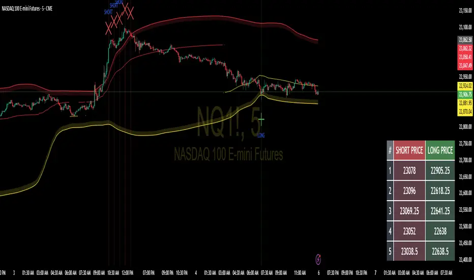
Floor and Roof Indicator with SignalsFloor and Roof Indicator with Trading Signals
A comprehensive support and resistance indicator that identifies premium and discount zones with automated signal generation.
Key Features:
Dynamic Support/Resistance Zones: Calculates floor (support) and roof (resistance) levels using price action and volatility
Premium/Discount Zone Identification: Highlights areas where price may find resistance or support
Customizable Signal Frequency: Control how often signals are displayed (every Nth occurrence)
Visual Signal Table: Optional table showing the last 5 long and short signal prices
Multiple Timeframe Compatibility: Works across all timeframes
Technical Details:
Uses ATR-based calculations for dynamic zone width adjustment
Combines Bollinger Bands with highest/lowest price analysis
Smoothing options for cleaner signal generation
Fully customizable colors and display options
How to Use:
Floor Zones (Blue): Potential support areas where long positions may be considered
Roof Zones (Pink): Potential resistance areas where short positions may be considered
Signal Crosses: Visual markers when price interacts with key levels
Signal Table: Track recent signal prices for analysis
Settings:
Length: Period for calculations (default: 200)
Smooth: Smoothing factor for cleaner signals
Zone Width: Adjust the thickness of support/resistance zones
Signal Frequency: Control signal display frequency
Visual Options: Customize colors and table position
Alerts Available:
Long signal alerts when price touches discount zones
Short signal alerts when price reaches premium zones
Educational Purpose: This indicator is designed to help traders identify potential support and resistance areas. Always combine with proper risk management and additional analysis.
This description focuses on the technical aspects and educational value while avoiding any language that could be interpreted as financial advice or guaranteed profits.
Volume Spikes with EMA LabelVolume Spikes with EMA Label (by Emilio TRIUNFO)
Highlights significant volume surges by comparing real-time volume against a customizable EMA threshold multiplied by 1.5 (default).
Visually marks high-volume bars with colored labels on the chart to help identify strong market activity and trading opportunities.
Adjustable EMA length and multiplier allow flexibility for different strategies.

Jumping watermark# Jumping watermark
## Function description
- Dynamic watermark: Mainly used to add dynamic watermarks to prevent theft and transfer when recording videos.
- Static watermark: Sharing opinions can easily include information such as trading pairs, cycles, current time, and individual signatures.
### Static watermark:
Display the watermark related to the current trading pair in the center of the chart.
- Configuration items:
- You can choose to configure the display content: current trading pair code and name, cycle, date, time, and individual signature content
### Dynamic watermark
Display the configured watermark content in a dynamic random position.
- Configuration items:
- Turn on or off the display of watermark jumping
- Modify the display text content and style by yourself
----- 中文简介-----
# 跳动水印
## 功能描述
- 动态水印: 主要可用于视频录制时添加动态水印防盗、防搬运。
- 静态水印:观点分享是可方便的带上交易对、周期、当前时间、个签等信息。
### 静态水印:
在图表中心位置显示当前交易对相关信息水印。
- 配置项:
- 可选择配置显示内容:当前交易对代码及名称、周期、日期、时间、个签内容
### 动态水印
动态随机位置显示配置水印内容。
- 配置项:
- 开启或关闭显示水印跳动
- 自行修改配置显示文字内容和样式
Kelly Optimal Leverage IndicatorThe Kelly Optimal Leverage Indicator mathematically applies Kelly Criterion to determine optimal position sizing based on market conditions.
This indicator helps traders answer the critical question: "How much capital should I allocate to this trade?"
Note that "optimal position sizing" does not equal the position sizing that you should have. The Optima position sizing given by the indicator is based on historical data and cannot predict a crash, in which case, high leverage could be devastating.
Originally developed for gambling scenarios with known probabilities, the Kelly formula has been adapted here for financial markets to dynamically calculate the optimal leverage ratio that maximizes long-term capital growth while managing risk.
Key Features
Kelly Position Sizing: Uses historical returns and volatility to calculate mathematically optimal position sizes
Multiple Risk Profiles: Displays Full Kelly (aggressive), 3/4 Kelly (moderate), 1/2 Kelly (conservative), and 1/4 Kelly (very conservative) leverage levels
Volatility Adjustment: Automatically recommends appropriate Kelly fraction based on current market volatility
Return Smoothing: Option to use log returns and smoothed calculations for more stable signals
Comprehensive Table: Displays key metrics including annualized return, volatility, and recommended exposure levels
How to Use
Interpret the Lines: Each colored line represents a different Kelly fraction (risk tolerance level). When above zero, positive exposure is suggested; when below zero, reduce exposure. Note that this is based on historical returns. I personally like to increase my exposure during market downturns, but this is hard to illustrate in the indicator.
Monitor the Table: The information panel provides precise leverage recommendations and exposure guidance based on current market conditions.
Follow Recommended Position: Use the "Recommended Position" guidance in the table to determine appropriate exposure level.
Select Your Risk Profile: Conservative traders should follow the Half Kelly or Quarter Kelly lines, while more aggressive traders might consider the Three-Quarter or Full Kelly lines.
Adjust with Volatility: During high volatility periods, consider using more conservative Kelly fractions as recommended by the indicator.
Mathematical Foundation
The indicator calculates the optimal leverage (f*) using the formula:
f* = μ/σ²
Where:
μ is the annualized expected return
σ² is the annualized variance of returns
This approach balances potential gains against risk of ruin, offering a scientific framework for position sizing that maximizes long-term growth rate.
Notes
The Full Kelly is theoretically optimal for maximizing long-term growth but can experience significant drawdowns. You should almost never use full kelly.
Most practitioners use fractional Kelly strategies (1/2 or 1/4 Kelly) to reduce volatility while capturing most of the growth benefits
This indicator works best on daily timeframes but can be applied to any timeframe
Negative Kelly values suggest reducing or eliminating market exposure
The indicator should be used as part of a complete trading system, not in isolation
Enjoy the indicator! :)
P.S. If you are really geeky about the Kelly Criterion, I recommend the book The Kelly Capital Growth Investment Criterion by Edward O. Thorp and others.

Multi-Indicator PanelMulti-indicator panel that combines the following into one panel:
RSI2
RSI14
%K (for stochastics)
%D (for stochastics)
ADX
DI+
DI-
MACD
MACD signal
MACD histogram
All can be toggled on/off and parameters can be adjusted in settings.

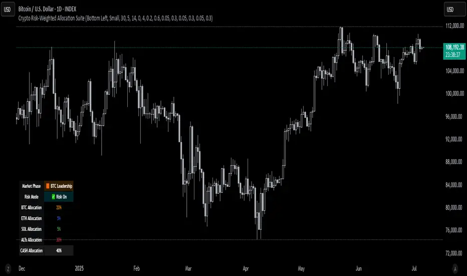
Crypto Risk-Weighted Allocation SuiteCrypto Risk-Weighted Allocation Suite
This indicator is designed to help users explore dynamic portfolio allocation frameworks for the crypto market. It calculates risk-adjusted allocation weights across major crypto sectors and cash based on multi-factor momentum and volatility signals. Best viewed on INDEX:BTCUSD 1D chart. Other charts and timeframes may give mixed signals and incoherent allocations.
🎯 How It Works
This model systematically evaluates the relative strength of:
BTC Dominance (CRYPTOCAP:BTC.D)
Represents Bitcoin’s share of the total crypto market. Rising dominance typically indicates defensive market phases or BTC-led trends.
ETH/BTC Ratio (BINANCE:ETHBTC)
Gauges Ethereum’s relative performance versus Bitcoin. This provides insight into whether ETH is leading risk appetite.
SOL/BTC Ratio (BINANCE:SOLBTC)
Measures Solana’s performance relative to Bitcoin, capturing mid-cap layer-1 strength.
Total Market Cap excluding BTC and ETH (CRYPTOCAP:TOTAL3ES)
Represents Altcoins as a broad category, reflecting appetite for higher-risk assets.
Each of these series is:
✅ Converted to a momentum slope over a configurable lookback period.
✅ Standardized into Z-scores to normalize changes relative to recent behavior.
✅ Smoothed optionally using a Hull Moving Average for cleaner signals.
✅ Divided by ATR-based volatility to create a risk-weighted score.
✅ Scaled to proportionally allocate exposure, applying user-configured minimum and maximum constraints.
🪙 Dynamic Allocation Logic
All signals are normalized to sum to 100% if fully confident.
An overall confidence factor (based on total signal strength) scales the allocation up or down.
Any residual is allocated to cash (unallocated capital) for conservative exposure.
The script automatically avoids “all-in” bias and prevents negative allocations.
📊 Outputs
The indicator displays:
Market Phase Detection (which asset class is currently leading)
Risk Mode (Risk On, Neutral, Risk Off)
Dynamic Allocations for BTC, ETH, SOL, Alts, and Cash
Optional momentum plots for transparency
🧠 Why This Is Unique
Unlike simple dominance indicators or crossovers, this model:
Integrates multiple cross-asset signals (BTC, ETH, SOL, Alts)
Adjusts exposure proportionally to signal strength
Normalizes by volatility, dynamically scaling risk
Includes configurable constraints to reflect your own risk tolerance
Provides a cash fallback allocation when conviction is low
Is entirely non-repainting and based on daily closing data
⚠️ Disclaimer
This script is provided for educational and informational purposes only.
It is not financial advice and should not be relied upon to make investment decisions.
Past performance does not guarantee future results.
Always consult a qualified financial advisor before acting on any information derived from this tool.
🛠 Recommended Use
As a framework to visualize relative momentum and risk-adjusted allocations
For research and backtesting ideas on portfolio allocation across crypto sectors
To help build your own risk management process
This script is not a turnkey strategy and should be customized to fit your goals.
✅ Enjoy exploring dynamic crypto allocations responsibly!
6-Month Average High/Lows Trend LineThis is an indicator that tracks the 6 month high/low average as a MA and the 6 month high/low average as a flat line.
I added alerts if the price action crosses the high or low line. Also makes a great dynamic channel.
If combined with other confirming indicator like the RSI and/or MACD this could be a very effective tool with respect to levels and 6 month high/lows

Logistic Regression ICT FVG🚀 OVERVIEW
Welcome to the Logistic Regression Fair Value Gap (FVG) System — a next-gen trading tool that blends precision gap detection with machine learning intelligence.
Unlike traditional FVG indicators, this one evolves with each bar of price action, scoring and filtering gaps based on real market behavior.
🔧 CORE FEATURES
✨ Smart Gap Detection
Automatically identifies bullish and bearish Fair Value Gaps using volatility-aware candle logic.
📊 Probability-Based Filtering
Uses logistic regression to assign each gap a confidence score (0 to 1), showing only high-probability setups.
🔁 Real-Time Retest Tracking
Continuously watches how price interacts with each gap to determine if it deserves respect.
📈 Multi-Factor Assessment
Evaluates RSI, MACD, and body size at gap formation to build a full context snapshot.
🧠 Self-Learning Engine
The logistic regression model updates on each bar using gradient descent, refining its predictions over time.
📢 Built-In Alerts
Get instant alerts when a gap forms, gets retested, or breaks.
🎨 Custom Display Options
Control the color of bullish/bearish zones, and toggle on/off probability labels for cleaner charts.
🚩 WHAT MAKES IT DIFFERENT
This isn’t just another box-drawing indicator.
While others mark every imbalance, this system thinks before it draws — using statistical modeling to filter out noise and prioritize high-impact zones.
By learning from how price behaves around gaps (not just how they form), it helps you trade only what matters — not what clutters.
⚙️ HOW IT WORKS
1️⃣ Detection
FVGs are identified using ATR-based thresholds and sharp wick imbalances.
2️⃣ Behavior Monitoring
Every gap is tracked — and if respected enough times, it becomes part of the elite training set.
3️⃣ Context Capture
Each new FVG logs RSI, MACD, and body size to provide a feature-rich context for prediction.
4️⃣ Prediction (Logistic Regression)
The model predicts how likely the gap is to be respected and assigns it a probability score.
5️⃣ Classification & Alerts
Gaps above the threshold are plotted with score labels, and alerts trigger for entry/respect/break.
⚙️ CONFIGURATION PANEL
🔧 System Inputs
• Max Retests – How many times a gap must be respected to train the model
• Prediction Threshold – Minimum score to show a gap on the chart
• Learning Rate – Controls how fast the model adapts (default: 0.009)
• Max FVG Lifetime – Expiration duration for unused gaps
• Show Historic Gaps – Show/hide expired or invalidated gaps
🎨 Visual Options
• Bullish/Bearish Colors – Set gap colors to fit your chart style
• Confidence Labels – Show probability scores next to FVGs
• Alert Toggles – Enable alerts for:
– New FVG detected
– FVG respected (entry)
– FVG invalidated (break)
💡 WHY LOGISTIC REGRESSION?
Traditional FVG tools rely on candle shapes.
This system relies on probability — by training on RSI, MACD, and price behavior, it predicts whether a gap will act as a true liquidity zone.
Logistic regression lets the system continuously adapt using new data, making it more accurate the longer it runs.
That means smarter signals, fewer false positives, and a clearer view of where real opportunities lie.
