Michie Breakout 1.0A precision breakout indicator built with adaptive machine learning logic and price action principles.
Designed specifically for TSLA, it detects key volatility shifts and directional momentum zones to capture high-probability breakout setups while filtering noise.
Focuses on clarity, adaptability, and accuracy — optimized for real-time intraday trading.
Statistics

VWAP Kalman FilterOverview
This indicator applies Kalman filtering techniques to Volume Weighted Average Price (VWAP) calculations, providing a statistically optimized approach to VWAP analysis. The Kalman filter reduces noise while maintaining responsiveness to genuine price movements, addressing common VWAP limitations in volatile or low-volume conditions.
Technical Implementation
Kalman Filter Mathematics
The indicator implements a state-space model for VWAP estimation:
- Prediction Step: x̂(k|k-1) = x̂(k-1|k-1) + v(k-1)
- Update Step: x̂(k|k) = x̂(k|k-1) + K(k)
- Kalman Gain: K(k) = P(k|k-1) / (P(k|k-1) + R)
Where:
- x̂ = estimated VWAP state
- K = Kalman gain (adaptive weighting factor)
- P = error covariance
- R = measurement noise
- Q = process noise
- v = optional velocity component
Core Components
Dual VWAP System
- Standard VWAP: Traditional volume-weighted calculation
- Kalman-filtered VWAP: Noise-reduced estimation with optional velocity tracking
- Real-time divergence measurement between filtered and unfiltered values
Adaptive Filtering
- Process Noise (Q): Controls adaptation to price changes (0.001-1.0)
- Measurement Noise (R): Determines smoothing intensity (0.01-5.0)
- Optional velocity tracking for momentum-based filtering
Multi-Timeframe Anchoring
- Session, Weekly, Monthly, Quarterly, and Yearly anchor periods
- Automatic Kalman state reset on anchor changes
- Maintains VWAP integrity across timeframes
Features
Visual Components
- Dual VWAP Lines: Compare filtered vs. unfiltered in real-time
- Dynamic Bands: Three-level deviation bands (1σ, 2σ, 3σ)
- Trend Coloring: Automatic color adaptation based on price position
- Cloud Visualization: Highlights divergence between standard and Kalman VWAP
- Signal Markers: Crossover and band-touch indicators
Trading Signals
- VWAP crossover detection with Kalman filtering
- Band touch alerts at multiple standard deviation levels
- Velocity-based momentum confirmation (optional)
- Divergence warnings when filtered/unfiltered values separate
Information Display
- Real-time VWAP values (both standard and filtered)
- Trend direction indicator
- Velocity/momentum reading (when enabled)
- Divergence percentage calculation
- Anchor period display
Input Parameters
VWAP Settings
- Anchor Period: Choose calculation reset period
- Band Multipliers: Customize deviation band distances
- Display Options: Toggle standard VWAP and bands
Kalman Parameters
- Length: Base period for calculations (5-200)
- Process Noise (Q: Higher values increase responsiveness
- Measurement Noise (R): Higher values increase smoothing
- Velocity Tracking: Enable momentum-based filtering
Visual Controls
- Toggle filtered/unfiltered VWAP display
- Band visibility options
- Signal markers on/off
- Cloud fill between VWAPs
- Bar coloring by trend
Use Cases
Noise Reduction
Particularly effective during:
- Low volume periods (pre-market, lunch hours)
- Volatile market conditions
- Fast-moving markets where standard VWAP whipsaws
Trend Identification
- Cleaner trend signals with reduced false crosses
- Earlier trend detection through velocity component
- Confirmation through divergence analysis
Support/Resistance
- Filtered VWAP provides more stable S/R levels
- Bands adapt to filtered values for better zone identification
- Reduced false breakout signals
Technical Advantages
1. Optimal Estimation: Mathematically optimal under Gaussian noise assumptions
2. Adaptive Response: Self-adjusting to market conditions
3. Predictive Element: Velocity component provides forward-looking insight
4. Noise Immunity: Superior noise rejection vs. simple moving average smoothing
Limitations
- Assumes linear price dynamics
- Requires parameter optimization for different instruments
- May lag during sudden volatility regime changes
- Not suitable as standalone trading system
Mathematical Background
Based on control systems theory, the Kalman filter provides recursive Bayesian estimation originally developed for aerospace applications. This implementation adapts the algorithm specifically for financial time series, maintaining VWAP's volume-weighted properties while adding statistical filtering.
Comparison with Standard VWAP
Standard VWAP Issues Addressed:
- Choppy behavior in low volume
- Whipsaws around VWAP line
- Lag in trend identification
- Noise in deviation bands
Kalman VWAP Benefits:
- Smooth yet responsive line
- Fewer false signals
- Optional momentum tracking
- Statistically optimized filtering
Alert Conditions
The indicator includes several pre-configured alert conditions:
- Bullish/Bearish VWAP crosses
- Upper/Lower band touches
- High divergence warnings
- Velocity shifts (if enabled)
---
This open-source indicator is provided as-is for educational and trading purposes. No guarantees are made regarding trading performance. Users should conduct their own testing and validation before using in live trading.

Dynamic S/R Levels - MTF (1-Week, Strong/Spaced)dynamic support and resistance levels based on timeframe

Info de Vela 1m1-Minute Candle Info Dashboard (Real-Time)
Overview
This is a lightweight, real-time dashboard designed specifically for 1-minute (1m) scalping. It provides critical, non-lagging data about the current 1-minute candle, helping you make split-second decisions on stop-loss placement and risk assessment.The table updates on every tick without flickering or repainting.
Key Features (Real-Time Table)
The dashboard displays three key metrics about the current 1m candle:Time Remaining: A simple countdown timer showing the exact seconds remaining until the current candle closes (e.g., "00:34").Dist. to Extreme (Ticks): This is the core function for scalping. It calculates the distance (in ticks) from the current price to the furthest extreme of the candle (i.e., max(high - close, close - low)). This is ideal for traders who base their stop-loss on the current candle's range.Total Candle Range (Ticks): Displays the full high-to-low range of the current candle in ticks, giving you an instant read on volatility.
How to Use
This tool is designed to solve one problem: speed.Instead of manually measuring the distance for your stop-loss on every candle, you can instantly read the exact tick value from the table. This allows you to calculate your position size (lotage) much faster, which is essential in a fast-moving 1m environment.
REQUIREMENT:This indicator is designed to work ONLY on the 1-minute (1m) timeframe. It will display an error and show no data on any other chart.

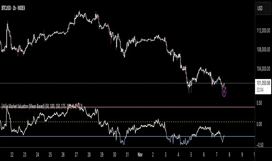
[AA] - Market Valuation (Mean Based) - Market Valuation (Mean Based)
What it does
This indicator estimates whether price is overvalued, undervalued, or fairly valued relative to its structural mean across multiple lookback windows. It builds a single normalized oscillator from short-, mid-, and long-term ranges so traders can quickly see when price is stretched away from equilibrium.
This is not a mashup of existing tools. It’s a custom mean-deviation model that aggregates multi-window range positioning into one score.
How it works (concepts)
For each lookback length (13, 25, 30, 50, 100, 200):
Range & midpoint:
Highest high H and lowest low L.
Structural midpoint Mid = (H + L)/2.
Normalized deviation:
Dev = (Close − Mid) / (H − L) → location of price within its own range.
Aggregation:
The oscillator z_struct is the average of the deviations from the five windows.
Result: a smoothed, dimensionless value (roughly −1 to +1 in typical markets) showing multi-horizon displacement from the mean.
Plots & levels
Oscillator (area): z_struct
Reference lines: +0.40 (OB), 0.00 (equilibrium), −0.30 (OS)
Coloring:
Red when z_struct > OB (extended above mean)
Blue when z_struct < OS (extended below mean)
White in between
Suggested use
Mean reversion context: Fade extremes in range-bound conditions; take profits into OB/OS.
Trend awareness: In strong trends, extremes can persist—use levels as exhaustion context rather than standalone entry.
Filter/confirm: Combine with your trend filter or structure tools to time pullbacks and avoid chasing extended moves.
Inputs
Lookbacks: 13, 25, 30, 50, 100, 200
Thresholds: OB = 0.40, OS = −0.30
Notes & limitations
Works on the current symbol/timeframe only; no security() calls and no repainting beyond normal bar completion.
In very tight or flat ranges (H ≈ L), normalized deviations can become sensitive; consider longer windows or higher timeframes.
This is an indicator, not a strategy. No signals are generated; use with risk management.
Originality statement
This script implements an original, multi-window mean-deviation aggregation. It does not replicate a built-in or a public indicator; its purpose is to quantify cross-horizon valuation in a single, normalized measure.
Dashboard — Vol & PriceDashboard for traders
Indicator Description
1. Prev Day High
What it shows: the previous trading day's high.
Why it shows: a resistance level. Many traders watch to see if the price will hold above or below this level. A breakout can signal buying strength.
2. Prev Day Low
What it shows: the previous day's low.
Why it shows: a support level. If the price breaks downwards, it signals weakness and a possible continuation of the decline.
3. Today
What it shows:
The difference between the current price and yesterday's close (in absolute values and as a percentage).
Color: green for an increase, red for a decrease.
Why it shows: immediately shows how strong a gap or movement is today relative to yesterday. This is an indicator of current momentum.
4. ADR, % (Average Daily Range)
What it shows: Average daily range (High – Low), expressed as a percentage of the closing price, for the selected period (default 7 days).
Why it's useful: To understand the "normal" volatility of an instrument. For example, if the ADR is 3%, then a 1% move is small, while a 6% move is very large.
5. ATR (Average True Range)
What it shows: Average fluctuation range (including gaps), in absolute points, for the specified period (default 7 days).
Why it's useful: A classic volatility indicator. Useful for setting stops, calculating position sizes, and identifying "noise" movements.
6. ATR (Today), %
What it shows: How much the current movement today (from yesterday's close to the current price) represents in % of the average ATR.
Why it shows: Shows whether the instrument has "played out" its average range. If the value is already >100%, there is a high probability that the movement will begin to slow.
7. Vol (Today)
What it shows:
Current trading volume for the day (in millions/billions).
Comparison with yesterday as a percentage (for example: 77.32M (-52.78%)).
Color: green if the volume is higher than yesterday; red if lower.
Why it shows:Quickly shows whether the market is active today. Volume = fuel for price movement.
8. Avg Vol (20d)
What it shows: Average daily volume over the last 20 trading days.
Why it's useful:"normal" activity level. It's a convenient backdrop for assessing today's turnover.
9. Rel. Vol (Today), % (Relative Volume)
What it shows: Deviation of the current volume from the average (20 days).
Formula: `(today / average - 1)` * 100`.
+30% = volume 30% above average, -40% = 40% below average.
Color: green for +, red for –.
Why it's useful:A key indicator for a trader. If RelVol > 100% (green), the market is "charged," and the movement is more significant. If low, activity is weak and movements are less reliable.
10. Normalized RS (Relative Strength)
What it shows: the relative strength of a stock to a selected benchmark (e.g., SPY), normalized by the period (default 7 days).
100 = same result as the market.
> 100 = the stock is stronger than the index.
<100 = weaker than the index.
Why it's needed: filtering ideas. Strong stocks rise faster when the market rises, weak stocks fall more sharply. This helps trade in the direction of the trend and select the best candidates.
In summary:
Prev High / Low — key support and resistance levels.
Today — an instant understanding of the current momentum.
ADR and ATR — volatility and potential movement.
ATR (Today) — how much the instrument has already "run."
Vol + Rel.Vol — activity and confirmation of the movement's strength.
RS — selecting strong/weak leaders against the market.
Price Action Bar Counter for Crypto Traders标注美股开收盘时间的K线辅助指标,自动调整夏令时与冬令时,适用于5m、15m、30m与1h级别。
Highlights U.S. stock market open and close times with automatic DST adjustment.
Best used on 5m, 15m, 30m, and 1h charts.

Trading ScorecardChecklist, note, scorecard, custom table. I originally created the table for currency strength analysis, but it can be used as a checklist. You can also create your own scoring system. The number of columns and rows can be changed. The color and size of the table are customizable.

Index Weighted Returns [SS]This is the index weighted return indicator.
It supports a few ETFs, including:
SPY/SPX
QQQ/NDX
ARKK
SMH
UFO
XBI
QTUM
What it does is it takes the top, approximately 40, of the most heavily weighted tickers on the ETF, monitors their returns using the request security function, and then uses their weight to calculate the synthetic returns of the ETF of interest.
For example, in the chart we have SMH.
The indicator is looking at the top weighted tickers of SMH, calculating their returns, adjusting it for their individual weight on SMH and then predicting the expected return of SMH based on the weighing and holding's returns themselves.
How to Use it
The indicator is pretty straight forward, you select which ever index you are on and your desired timeframe (you can do as low as 30-Minutes or as high as monthly or quarterly).
The indicator will then retrieve the top holdings for that ticker, their corresponding weights and calculate the expected daily return based on the weight and return of these tickers.
It will plot this return for you on the chart.
Other Options
There is an optional table for you to view the actual weight, ticker composition and period returns for each of the top x tickers for an index. You can simply toggle "Show Table" in the settings menu, and it will show you the list of all tickers included, their period returns and their weight on the ETF.
Tips for Use
Works well to see when an index may be over the actual top weighted tickers, implying a pullback/sell, or under. For example:
SPY today fell well below its top tickers and is currently rallying back up to the expected close range.
You can see in the primary chart, SMH fell below and returned to its balance, being at the expected close range based on its component tickers.
That is the indicator!
Its simple but powerful!
Hope you enjoy and as always, safe trades!


Full Floating Dashboard YUJiDisplay information on top right corner.
Info shown:
High and Low
Current Price
24 Hour Change

Candle Tick Size + Value TableCandle Tick Size + Value Table
This indicator calculates and displays the tick size and monetary value of each candle for the selected instrument. It shows a vertical table in the top-right corner of your chart with the following columns:
Time – the timestamp of each candle (HH:MM)
Ticks – the candle’s range converted to whole ticks
Value – total value in dollars based on your cost per tick and number of contracts
Features:
Configurable number of recent candles to display
Supports custom point-to-tick ratio, cost per tick, and contracts
Table colors and font are fully customizable
Provides a quick visual reference of the most recent candle sizes and values
Use Case:
Ideal for futures traders, scalpers, or day traders who want to quickly see candle ranges in ticks and monetary value per trade, helping with position sizing and risk management.

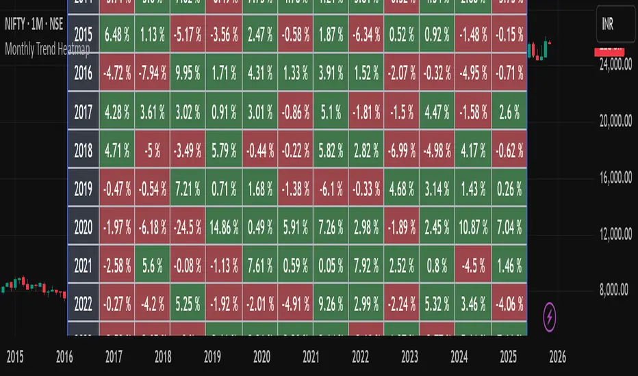
Monthly Trend Heatmap – Price Change by MonthThis indicator analyzes multi-year monthly price seasonality and displays it as a clear table of percentage returns for each month, from 2013 to the current year. By calculating the monthly open-to-close percentage change, it helps traders quickly identify recurring seasonal trends, positive or negative months, and long-term behavioral patterns of the selected market.
The goal of this tool is to make seasonal analysis accessible to everyday traders by presenting the data visually in a simple, structured, and easy-to-interpret format.
How It Works
The script must be used on a 1-Month chart.
For each month and each year, the indicator calculates:
Monthly return = (Monthly Close – Monthly Open) / Monthly Open × 100
The result is plotted inside a table, with green for positive months and red for negative months.
Data auto-updates as new monthly candles form.
This tool is not a signal generator and does not tell you when to buy or sell. It is a statistical seasonality visualizer meant to enhance decision-making.
The information provided is for educational and informational purposes only and should not be interpreted as financial, investment, or trading advice. Trading and investing in the stock market involve a high level of risk, including the potential loss of capital. Past performance does not guarantee future results, and no strategy or analysis can assure profits or prevent losses.
All examples, charts, scripts, indicators, or market discussions are strictly for demonstration, learning, and analytical purposes. No warranties or guarantees are made regarding accuracy, completeness, or future performance.
Smart Flow Tracker [The_lurker]
Smart Flow Tracker (SFT): Advanced Order Flow Tracking Indicator
Overview
Smart Flow Tracker (SFT) is an advanced indicator designed for real-time tracking and analysis of order flows. It focuses on detecting institutional patterns, massive orders, and potential reversals through analysis of lower timeframes (Lower Timeframe) or live ticks. It provides deep insights into market behavior using a multi-layered intelligent detection system and a clear visual interface, giving traders a competitive edge.
SFT focuses on trade volumes, directions, and frequencies to uncover unusual activity that may indicate institutional intervention, massive orders, or manipulation attempts (traps).
Indicator Operation Levels
SFT operates on three main levels:
1. Microscopic Monitoring: Tracks every trade at precise timeframes (down to one second), providing visibility not available in standard timeframes.
2. Advanced Statistical Analysis: Calculates averages, deviations, patterns, and anomalies using precise mathematical algorithms.
3. Behavioral Artificial Intelligence: Recognizes behavioral patterns such as hidden institutional accumulation, manipulation attempts and traps, and potential reversal points.
Key Features
SFT features a set of advanced functions to enhance the trader's experience:
1. Intelligent Order Classification System: Classifies orders into six categories based on size and pattern:
- Standard: Normal orders with typical size.
- Significant 💎: Orders larger than average by 1.5 times.
- Major 🔥: Orders larger than average by 2.5 times.
- Massive 🐋: Orders larger than average by 3 times.
- Institutional 🏛️: Consistent patterns indicating institutional activity.
- Reversal 🔄: Large orders indicating direction change.
- Trap ⚠️: Patterns that may be price traps.
2. Institutional Patterns Detection: Tracks sequences of similar-sized orders, detects organized institutional activity, and is customizable (number of trades, variance ratio).
3. Reversals Detection: Compares recent flows with previous ones, detects direction shifts from up to down or vice versa, and operates only on large orders (Major/Massive/Institutional).
4. Traps Detection: Identifies sequences of large orders in one direction, followed by an institutional order in the opposite direction, with early alerts for false moves.
5. Flow Delta Bar: Displays the difference between buy and sell volumes as a percentage for balance, with instant updates per trade.
6. Dynamic Statistics Panel: Displays overall buy and sell ratios with real-time updates and interactive colors.
How It Works and Understanding
SFT relies on logical sequential stages for data processing:
A. Data Collection: Uses the `request.security_lower_tf()` function to extract data from a lower timeframe (like 1S) even on a higher timeframe (like 5D). For each time unit, it calculates:
- Adjusted Volume: Either normal volume or "price-weighted volume" (hlc3 * volume) based on user choice.
- Trade Direction: Compared to previous close (rise → buy, fall → sell).
B. Building Temporary Memory: Maintains a dynamic list (sizeHistory) of the last 100 trade sizes, continuously calculating the moving average (meanSize).
C. Intelligent Classification: Compares each new trade to the average:
- > 1.5 × average → Significant.
- > 2.5 × average → Major.
- > 3.0 × average → Massive.
- Institutional Patterns Check: A certain number of trades (e.g., 5) with a specified variance ratio (±5%) → Institutional.
D. Advanced Detection:
- Reversal: Compares buy/sell totals in two consecutive periods.
- Trap: Sequence of large trades in one direction followed by an opposite institutional trade.
E. Display and Alerts: Results displayed in an automatically updated table, with option to enable alerts for notable events.
Settings (Fully Customizable)
SFT offers extensive options to adapt to the trader's needs:
A. Display Settings:
- Language: English / Arabic.
- Table Position: 9 options (e.g., Top Right, Middle Right, Bottom Left).
- Display Size: Tiny / Small / Normal / Large.
- Max Rows: 10–100.
- Enable Flow Delta Bar: Yes / No.
- Enable Statistics Panel: Yes / No (displays buy/sell % ratio).
B.- Technical Settings:
- Data Source: Lower Timeframe / Live Tick (simulation).
- Timeframe: Optional (e.g., 1S, 5S, 1).
- Calculation Type: Volume / Price Volume.
C. Intelligent Detection System:
- Enable Institutional Patterns Detection.
- Pattern Length: 3–20 trades.
- Allowed Variance Ratio: 1%–20%.
- Massive Orders Detection Factor: 2.0–10.0.
D. Classification Criteria:
- Significant Orders Factor: 1.2–3.0.
- Major Orders Factor: 2.0–5.0.
E. **Advanced Detection**:
- Enable Reversals Detection (with review period).
- Enable Traps Detection (with minimum sequence limit).
F. Alerts System:
- Enable for each type: Massive orders, institutional patterns, reversals, traps, severe imbalance (60%–90%).
G. Color System: Manual customization for each category:
- Standard Buy 🟢: Dark gray green.
- Standard Sell 🔴: Dark gray red.
- Significant Buy 🟢: Medium green.
- Significant Sell 🔴: Medium red.
- Major Orders 🟣: Purple.
- Massive Orders 🟠: Orange.
- Institutional 🟦: Sky blue.
- Reversal 🔵: Blue.
- Trap 🟣: Pink-purple.
Target Audiences
SFT benefits a wide range of traders and investors:
1. Scalpers: Instant detection of large orders, liquidity points identification, avoiding traps in critical moments.
2. Day Traders: Tracking smart money footprint, determining real session direction, early reversals detection.
3. Swing Traders: Confirming trend strength, detecting institutional accumulation/distribution, identifying optimal entry points.
4. Investors: Understanding true market sentiments, avoiding entry at false peaks, identifying real value zones.
⚠️ Disclaimer:
This indicator is for educational and analytical purposes only. It does not constitute financial, investment, or trading advice. Use it in conjunction with your own strategy and risk management. Neither TradingView nor the developer is liable for any financial decisions or losses.
Smart Flow Tracker (SFT): مؤشر متقدم لتتبع تدفقات الأوامر
نظرة عامة
Smart Flow Tracker (SFT) مؤشر متقدم مصمم لتتبع وتحليل تدفقات الأوامر في الوقت الفعلي. يركز على كشف الأنماط المؤسسية، الأوامر الضخمة، والانعكاسات المحتملة من خلال تحليل الأطر الزمنية الأقل (Lower Timeframe) أو التيك الحي. يوفر رؤية عميقة لسلوك السوق باستخدام نظام كشف ذكي متعدد الطبقات وواجهة مرئية واضحة، مما يمنح المتداولين ميزة تنافسية.
يركز SFT على حجم الصفقات، اتجاهها، وتكرارها لكشف النشاط غير العادي الذي قد يشير إلى تدخل مؤسسات، أوامر ضخمة، أو محاولات تلاعب (فخاخ).
مستويات عمل المؤشر
يعمل SFT على ثلاثة مستويات رئيسية:
1. المراقبة المجهرية: يتتبع كل صفقة على مستوى الأطر الزمنية الدقيقة (حتى الثانية الواحدة)، مما يوفر رؤية غير متوفرة في الأطر الزمنية العادية.
2. التحليل الإحصائي المتقدم: يحسب المتوسطات، الانحرافات، الأنماط، والشذوذات باستخدام خوارزميات رياضية دقيقة.
3. الذكاء الاصطناعي السلوكي: يتعرف على أنماط سلوكية مثل التراكم المؤسسي المخفي، محاولات التلاعب والفخاخ، ونقاط الانعكاس المحتملة.
الميزات الرئيسية
يتميز SFT بمجموعة من الوظائف المتقدمة لتحسين تجربة المتداول:
1. نظام تصنيف الأوامر الذكي: يصنف الأوامر إلى ست فئات بناءً على الحجم والنمط:
- Standard (قياسي)**: أوامر عادية بحجم طبيعي.
- Significant 💎 (مهم)**: أوامر أكبر من المتوسط بـ1.5 ضعف.
- Major 🔥 (كبير)**: أوامر أكبر من المتوسط بـ2.5 ضعف.
- Massive 🐋 (ضخم)**: أوامر أكبر من المتوسط بـ3 أضعاف.
- Institutional 🏛️ (مؤسسي)**: أنماط متسقة تشير إلى نشاط مؤسسي.
- Reversal 🔄 (انعكاس)**: أوامر كبيرة تشير إلى تغيير اتجاه.
- Trap ⚠️ (فخ)**: أنماط قد تكون فخاخًا سعرية.
2. كشف الأنماط المؤسسية: يتتبع تسلسل الأوامر المتشابهة في الحجم، يكشف النشاط المؤسسي المنظم، وقابل للتخصيص (عدد الصفقات، نسبة التباين).
3. كشف الانعكاسات: يقارن التدفقات الأخيرة بالسابقة، يكشف تحول الاتجاه من صعود إلى هبوط أو العكس، ويعمل فقط على الأوامر الكبيرة (Major/Massive/Institutional).
4. كشف الفخاخ: يحدد تسلسل أوامر كبيرة في اتجاه واحد، يليها أمر مؤسسي في الاتجاه المعاكس، مع تنبيه مبكر للحركات الكاذبة.
5. شريط دلتا التدفق: يعرض الفرق بين حجم الشراء والبيع كنسبة مئوية للتوازن، مع تحديث فوري لكل صفقة.
6. لوحة إحصائيات ديناميكية: تعرض نسبة الشراء والبيع الإجمالية مع تحديث لحظي وألوان تفاعلية.
طريقة العمل والفهم
يعتمد SFT على مراحل منطقية متسلسلة لمعالجة البيانات:
أ. جمع البيانات: يستخدم دالة `request.security_lower_tf()` لاستخراج بيانات من إطار زمني أدنى (مثل 1S) حتى على إطار زمني أعلى (مثل 5D). لكل وحدة زمنية، يحسب:
- الحجم المعدّل: إما الحجم العادي (volume) أو "الحجم المرجّح بالسعر" (hlc3 * volume) حسب الاختيار.
- اتجاه الصفقة: مقارنة الإغلاق الحالي بالسابق (ارتفاع → شراء، انخفاض → بيع).
ب. بناء الذاكرة المؤقتة: يحتفظ بقائمة ديناميكية (sizeHistory) لآخر 100 حجم صفقة، ويحسب المتوسط المتحرك (meanSize) باستمرار.
ج. التصنيف الذكي: يقارن كل صفقة جديدة بالمتوسط:
- > 1.5 × المتوسط → Significant.
- > 2.5 × المتوسط → Major.
- > 3.0 × المتوسط → Massive.
- فحص الأنماط المؤسسية: عدد معين من الصفقات (مثل 5) بنسبة تباين محددة (±5%) → Institutional.
د. الكشف المتقدم:
- الانعكاس: مقارنة مجموع الشراء/البيع في فترتين متتاليتين.
- الفخ: تسلسل صفقات كبيرة في اتجاه واحد يتبعها صفقة مؤسسية معاكسة.
هـ. العرض والتنبيه: عرض النتائج في جدول محدّث تلقائيًا، مع إمكانية تفعيل تنبيهات للأحداث المميزة.
لإعدادات (قابلة للتخصيص بالكامل)
يوفر SFT خيارات واسعة للتكييف مع احتياجات المتداول:
أ. إعدادات العرض:
- اللغة: English / العربية.
- موقع الجدول: 9 خيارات (مثل Top Right, Middle Right, Bottom Left).
- حجم العرض: Tiny / Small / Normal / Large.
- الحد الأقصى للصفوف: 10–100.
- تفعيل شريط دلتا التدفق: نعم / لا.
- تفعيل لوحة الإحصائيات: نعم / لا (تعرض نسبة الشراء/البيع %).
ب. الإعدادات التقنية:
- مصدر البيانات: Lower Timeframe / Live Tick (محاكاة).
- الإطار الزمني: اختياري (مثل 1S, 5S, 1).
- نوع الحساب: Volume / Price Volume.
ج. نظام الكشف الذكي:
- تفعيل كشف الأنماط المؤسسية.
- طول النمط: 3–20 صفقة.
- نسبة التباين: 1%–20%.
- عامل كشف الأوامر الضخمة: 2.0–10.0.
د. معايير التصنيف:
- عامل الأوامر المهمة: 1.2–3.0.
- عامل الأوامر الكبرى: 2.0–5.0.
هـ. الكشف المتقدم:
- تفعيل كشف الانعكاسات (مع فترة مراجعة).
- تفعيل كشف الفخاخ (مع حد أدنى للتسلسل).
و. نظام التنبيهات:
- تفعيل لكل نوع: أوامر ضخمة، أنماط مؤسسية، انعكاسات، فخاخ، عدم توازن شديد (60%–90%).
ز. نظام الألوان**: تخصيص يدوي لكل فئة:
- شراء قياسي 🟢: أخضر رمادي داكن.
- بيع قياسي 🔴: أحمر رمادي داكن.
- شراء مهم 🟢: أخضر متوسط.
- بيع مهم 🔴: أحمر متوسط.
- أوامر كبرى 🟣: بنفسجي.
- أوامر ضخمة 🟠: برتقالي.
- مؤسسي 🟦: أزرق سماوي.
- انعكاس 🔵: أزرق.
- فخ 🟣: وردي-أرجواني.
الفئات المستهدفة
يستفيد من SFT مجموعة واسعة من المتداولين والمستثمرين:
1. السكالبرز (Scalpers): كشف لحظي للأوامر الكبيرة، تحديد نقاط السيولة، تجنب الفخاخ في اللحظات الحرجة.
2. المتداولون اليوميون (Day Traders): تتبع بصمة الأموال الذكية، تحديد اتجاه الجلسة الحقيقي، كشف الانعكاسات المبكرة.
3. المتداولون المتأرجحون (Swing Traders): تأكيد قوة الاتجاه، كشف التراكم/التوزيع المؤسسي، تحديد نقاط الدخول المثلى.
4. المستثمرون: فهم معنويات السوق الحقيقية، تجنب الدخول في قمم كاذبة، تحديد مناطق القيمة الحقيقية.
⚠️ إخلاء مسؤولية:
هذا المؤشر لأغراض تعليمية وتحليلية فقط. لا يُمثل نصيحة مالية أو استثمارية أو تداولية. استخدمه بالتزامن مع استراتيجيتك الخاصة وإدارة المخاطر. لا يتحمل TradingView ولا المطور مسؤولية أي قرارات مالية أو خسائر.

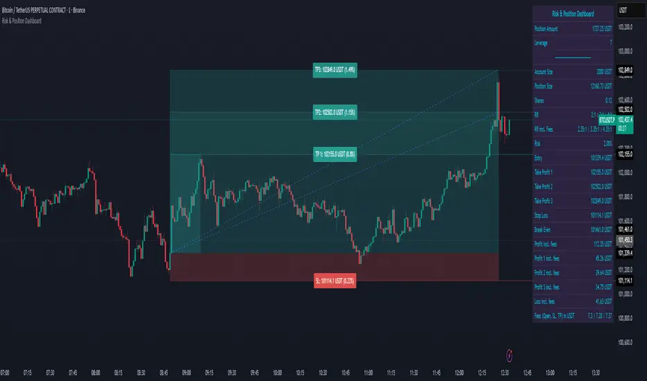
Risk & Position DashboardRisk & Position Dashboard
Overview
The Risk & Position Dashboard is a comprehensive trading tool designed to help traders calculate optimal position sizes, manage risk, and visualize potential profit/loss scenarios before entering trades. This indicator provides real-time calculations for position sizing based on account size, risk percentage, and stop-loss levels, while displaying multiple take-profit targets with customizable risk-reward ratios.
Key Features
Position Sizing & Risk Management:
Automatic position size calculation based on account size and risk percentage
Support for leveraged trading with maximum leverage limits
Fractional shares support for brokers that allow partial share trading
Real-time fee calculation including entry, stop-loss, and take-profit fees
Break-even price calculation including trading fees
Multi-Target Profit Management:
Support for up to 3 take-profit levels with individual portion allocations
Customizable risk-reward ratios for each take-profit target
Visual profit/loss zones displayed as colored boxes on the chart
Individual profit calculations for each take-profit level
Visual Dashboard:
Clean, customizable table display showing all key metrics
Configurable label positioning and styling options
Real-time tracking of whether stop-loss or take-profit levels have been reached
Color-coded visual zones for easy identification of risk and reward areas
Advanced Configuration:
Comprehensive input validation and error handling
Support for different chart timeframes and symbols
Customizable colors, fonts, and display options
Hide/show individual data fields for personalized dashboard views
How to Use
Set Account Parameters: Configure your account size, maximum risk percentage per trade, and trading fees in the "Account Settings" section.
Define Trade Setup: Use the "Entry" time picker to select your entry point on the chart, then input your entry price and stop-loss level.
Configure Take Profits: Set your desired risk-reward ratios and portion allocations for each take-profit level. The script supports 1-3 take-profit targets.
Analyze Results: The dashboard will automatically calculate and display position size, number of shares, potential profits/losses, fees, and break-even levels.
Visual Confirmation: Colored boxes on the chart show profit zones (green) and loss zones (red), with lines extending to current price levels.
Reset Entry and SL:
You can easily reset the entry and stop-loss by clicking the "Reset points..." button from the script's "More" menu.
This is useful if you want to quickly clear your current trade setup and start fresh without manually adjusting the points on the chart.
Calculations
The script performs sophisticated calculations including:
Position size based on risk amount and price difference between entry and stop-loss
Leverage requirements and position amount calculations
Fee-adjusted risk-reward ratios for realistic profit expectations
Break-even price including all trading costs
Individual profit calculations for partial position closures
Detailed Take-Profit Calculation Formula:
The take-profit prices are calculated using the following mathematical formula:
// Core variables:
// risk_amount = account_size * (risk_percentage / 100)
// total_risk_per_share = |entry_price - sl_price| + (entry_price * fee%) + (sl_price * fee%)
// shares = risk_amount / total_risk_per_share
// direction_factor = 1 for long positions, -1 for short positions
// Take-profit calculation:
net_win = total_risk_per_share * shares * RR_ratio
tp_price = (net_win + (direction_factor * entry_price * shares) + (entry_price * fee% * shares)) / (direction_factor * shares - fee% * shares)
Step-by-step example for a long position (based on screenshot):
Account Size: 2,000 USDT, Risk: 2% = 40 USDT
Entry: 102,062.9 USDT, Stop Loss: 102,178.4 USDT, Fee: 0.06%
Risk per share: |102,062.9 - 102,178.4| + (102,062.9 × 0.0006) + (102,178.4 × 0.0006) = 115.5 + 61.24 + 61.31 = 238.05 USDT
Shares: 40 ÷ 238.05 = 0.168 shares (rounded to 0.17 in display)
Position Size: 0.17 × 102,062.9 = 17,350.69 USDT
Position Amount (with 9x leverage): 17,350.69 ÷ 9 = 1,927.85 USDT
For 2:1 RR: Net win = 238.05 × 0.17 × 2 = 80.94 USDT
TP1 price = (80.94 + (1 × 102,062.9 × 0.17) + (102,062.9 × 0.0006 × 0.17)) ÷ (1 × 0.17 - 0.0006 × 0.17) = 101,464.7 USDT
For 3:1 RR: TP2 price = 101,226.7 USDT (following same formula with RR=3)
This ensures that after accounting for all fees, the actual risk-reward ratio matches the specified target ratio.
Risk Management Features
Maximum Trade Amount: Optional setting to limit position size regardless of account size
Leverage Limits: Built-in maximum leverage protection
Fee Integration: All calculations include realistic trading fees for accurate expectations
Validation: Automatic checking that take-profit portions sum to 100%
Historical Tracking: Visual indication when stop-loss or take-profit levels are reached (within last 5000 bars)
Understanding Max Trade Amount - Multiple Simultaneous Trades:
The "Max Trade Amount" feature is designed for traders who want to open multiple positions simultaneously while maintaining proper risk management. Here's how it works:
Key Concept:
- Risk percentage (2%) always applies to your full Account Size
- Max Trade Amount limits the capital allocated per individual trade
- This allows multiple trades with full risk on each trade
Example from Screenshot:
Account Size: 2,000 USDT
Max Trade Amount: 500 USDT
Risk per Trade: 2% × 2,000 = 40 USDT per trade
Stop Loss Distance: 0.11% from entry
Result: Position Size = 17,350.69 USDT with 35x leverage
Total Risk (including fees): 40.46 USDT
Multiple Trades Strategy:
With this setup, you can open:
Trade 1: 40 USDT risk, 495.73 USDT position amount (35x leverage)
Trade 2: 40 USDT risk, 495.73 USDT position amount (35x leverage)
Trade 3: 40 USDT risk, 495.73 USDT position amount (35x leverage)
Trade 4: 40 USDT risk, 495.73 USDT position amount (35x leverage)
Total Portfolio Exposure:
- 4 simultaneous trades = 4 × 495.73 = 1,982.92 USDT position amount
- Total risk exposure = 4 × 40 = 160 USDT (8% of account)
CB Spot v BN Futs Premium by Chop324Coinbase Spot vs Binance Futures Premium Tracker
What This Indicator Does:
This indicator automatically tracks the price premium or discount between Coinbase spot prices and Binance perpetual futures for any cryptocurrency you're viewing. It works dynamically with whatever ticker you load it on - no manual configuration needed.
How It Works:
The script extracts the base currency from your current chart (BTC, ETH, SOL, etc.) and automatically constructs the corresponding tickers:
Coinbase Spot: COINBASE: USD
Binance Perpetual Futures: BINANCE: USDT.P
It then calculates the simple price difference: Coinbase Spot - Binance Futures
Visual Display:
The premium/discount is plotted as a histogram:
Green columns: Coinbase trading at a premium (higher than Binance)
Red columns: Coinbase trading at a discount (lower than Binance)
Baseline at 0: Represents price parity between exchanges
Why This Matters:
Coinbase premium is a useful market sentiment indicator, particularly for institutional/US retail activity:
Positive premium: Often indicates strong US-based buying pressure
Negative premium: May suggest selling pressure or capital flowing to offshore exchanges
Extreme deviations: Can signal localized supply/demand imbalances or arbitrage opportunities
Usage:
Simply load the indicator on any crypto chart (BTCUSDT, ETHUSDT, SOLUSDT, etc.) and it will automatically display the premium/discount for that asset.
Note: Requires both Coinbase spot and Binance perpetual futures data to be available for the symbol you're viewing.

Position Size & Drawdown ManagerThis tool is designed to help traders dynamically adjust their position size and drawdown expectations as their trading capital changes over time. It provides a simple and intuitive way to translate backtest results into real-world position sizing decisions.
Purpose and Functionality
The indicator uses your original backtest parameters — including base capital, base drawdown percentage, and base position size — and your current account balance to calculate how your risk profile changes. It presents two main scenarios:
Lock Drawdown %: Keeps your original drawdown percentage fixed and calculates the new position size required.
Lock Position Size: Keeps your position size unchanged and shows how your drawdown percentage will shift.
Why it’s useful
Many traders face the challenge of scaling their strategies as their account grows or shrinks. This tool makes it easy to visualize the relationship between position sizing, capital, and drawdown. It’s particularly valuable for risk management, portfolio rebalancing, and maintaining consistent exposure when transitioning from backtest conditions to live trading.
How it works
The calculations are displayed in a clean, color-coded table that updates dynamically. This allows you to instantly see how capital fluctuations impact your expected drawdown or position size. You can toggle between light and dark themes and highlight important cells for clarity.
Practical use case
Combine this tool with your TradingView strategy results to better interpret your backtests and adjust your real-world trade sizes accordingly. It bridges the gap between simulated performance and actual account management.
Chart example
The chart included focuses only on this indicator, showing the output table and visual layout clearly without additional scripts or overlays.

Kalman Adaptive Score Overlay [BackQuant]Kalman Adaptive Score Overlay
A powerful indicator that uses adaptive scoring to assess market conditions and trends, utilizing advanced filtering techniques to smooth price data, enhance trend-following precision, and predict future price movements based on past data. It is ideal for traders who need a dynamic and responsive trend analysis tool that adjusts to market fluctuations.
What is Adaptive Scoring?
Adaptive scoring is a technique that adjusts the weight or importance of certain price movements over time based on an ongoing assessment of market behavior. This indicator uses dynamic scoring to assess the strength and direction of price movements, providing insight into whether a trend is likely to continue or reverse. The score is recalculated continuously to reflect the most up-to-date market conditions, offering a responsive approach to trend-following.
How It Works
The core of this indicator is built on advanced filtering methods that smooth price data, adjusting the response to recent price changes. The filtering mechanism incorporates a Kalman filter to reduce noise and improve the accuracy of price signals. Combined with adaptive scoring, this creates a robust framework that automatically adjusts to both short-term fluctuations and long-term trends.
The indicator also uses a dynamic trend-following component that updates its analysis based on the direction of the market, with the option to visualize it through colored candles. When a strong trend is identified, the candles are painted to reflect the prevailing trend, helping traders quickly identify whether the market is in a bullish or bearish state.
Why Adaptive Scoring Is Important
Dynamic Response: Adaptive scoring allows the indicator to respond to changing market conditions. By adjusting its sensitivity to price fluctuations, it ensures that trends are captured accurately, without being overly influenced by short-term noise.
Trend Precision: By combining Kalman filtering with adaptive scoring, the indicator offers a precise and smooth trend-following mechanism. It helps traders stay aligned with the market direction and avoid false signals.
Versatility: The indicator works across multiple timeframes, making it adaptable to different trading strategies, from scalping to long-term trend-following.
Confidence in Market Moves: The adaptive scoring component provides traders with confidence in the strength of the trend, helping them determine when to enter or exit positions with greater certainty.
How Traders Use It
Trend-Following Strategy: Traders can use this indicator to confirm trends and refine their entries and exits. The colored candles and adaptive scoring offer a visual cue of trend strength and direction, making it easier to follow the prevailing market movement.
Multi-Timeframe Analysis: The script supports multi-timeframe analysis, allowing traders to analyze trends and scores across different timeframes (e.g., 1m, 5m, 15m, 30m, 1h, 4h, 12h). This is useful for traders who want to confirm trends on both short and long-term charts before making a trade.
Refining Entry Points: By utilizing the adaptive scoring, traders can identify potential entry points where the score indicates a high probability of trend continuation. Higher scores signal stronger trends, guiding decision-making.
Managing Risk: Traders can use the adaptive scoring system to assess trend stability and adjust their risk management strategies accordingly. For example, higher confidence in the trend allows for larger positions, while lower confidence may require smaller, more cautious trades.
Key Features and Benefits
Kalman Filter for Noise Reduction: The Kalman filter helps to smooth out market noise and allows for a clearer understanding of the underlying price movements. This is particularly useful in volatile markets where short-term fluctuations can cloud trend analysis.
Adaptive Scoring for Flexibility: Adaptive scoring ensures that the indicator remains responsive to changing market conditions. It automatically adjusts to the strength of price movements, enabling better detection of trends and reversals.
Visual Trend Signals: The indicator provides visual signals through candle coloring, making it easier to identify whether the market is in a bullish, neutral, or bearish phase.
Multi-Timeframe Display: The indicator’s multi-timeframe feature allows traders to see the trend and adaptive score on different timeframes simultaneously, providing a comprehensive view of the market.
Customizable Settings: Traders can customize the indicator’s settings, such as the filter parameters, scoring thresholds, and visualization options, tailoring it to their specific trading style and strategy.
Why This is Important for Traders
Improved Decision Making: The adaptive nature of the scoring system allows traders to make more informed decisions based on real-time market data, without being influenced by past volatility.
Market Clarity: By smoothing out price movements and scoring trends adaptively, the indicator provides a clearer picture of market behavior, which is essential for effective trend-following and timing entries and exits.
Increased Confidence in Signals: Adaptive scoring ensures that signals are based on the current market structure, reducing the likelihood of false positives. This boosts traders' confidence when acting on signals.
Conclusion
The Kalman Adaptive Score Overlay offers a dynamic and responsive trend-following tool that integrates Kalman filtering with adaptive scoring. By adjusting to market fluctuations in real time, it allows traders to identify and follow trends with greater precision. Whether you are trading on short or long timeframes, this tool helps you stay aligned with market momentum, ensuring that your entries and exits are based on the most up-to-date and reliable data available.

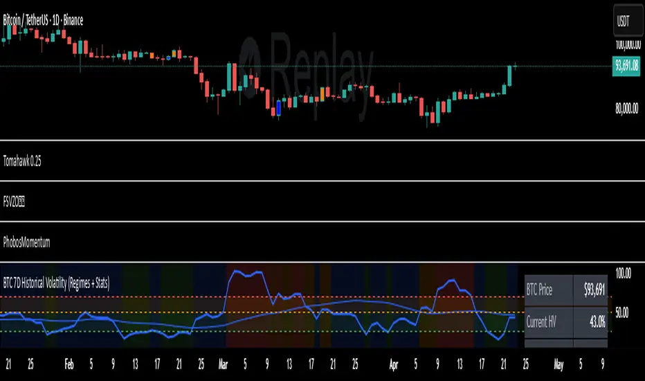
7D Historical Volatility (Regimes + Stats) - ChrrizzyHere’s what that indicator does—at a glance:
### Core idea
It computes **7-day Historical Volatility (HV)** from **daily** log returns (annualized), then shows:
* the **HV line** and its **30-day average**,
* colored **volatility regimes** (Low / Normal / High / Extreme) with thresholds you set,
* a compact **status panel** (top-right, nudged left) with current stats and time-in-zone.
### Calculations
* **HV (7D)**: `stdev(log(close/close ), 7) * sqrt(365) * 100`, always from **daily data** via `request.security`, so it’s consistent on any chart timeframe.
* **Regimes** (defaults):
Low < 25% • Normal 25–50% • High 50–70% • Extreme > 70% (all editable).
* **30-day avg**: SMA of HV.
* **Time in zone (% over window)**: SMA of boolean flags (e.g., in Low=1 else 0) over `statsWin` days (default 300).
* **Rolling median HV**: 50th percentile over `statsWin`.
### What you see on the chart
* **HV line** (bold) + **30-day HV** (lighter).
* **Horizontal dashed lines** at your regime thresholds.
* **Background shading** that changes with the current regime (green/blue/orange/red).
### Panel (top-right)
Shows:
* BTC Price (daily close)
* Current HV
* 30-day Avg HV
* Median HV (over window)
* Current **Regime**
* A two-line summary: **% of time spent** in Low / Normal / High / Extreme over the chosen window.
The panel is shifted slightly left using a hidden spacer column; tweak the **“Panel right padding (chars)”** input to move it.
### Alerts (ready to use)
* **HV crossed up Low**
* **HV crossed down Low**
* **HV crossed up High**
* **HV crossed up Extreme**
### Inputs you can tune
* `HV Lookback (days)` (default 7)
* `Average HV (days)` (default 30)
* Thresholds: Low/High/Extreme
* `Stats Window (days)` (default 300)
* Panel padding, toggle table/zones on/off.
### How to use it
* **Context**: quickly see if BTC is in **compressed** (Low) or **stressed** (High/Extreme) volatility.
* **Regime cross alerts**: get notified when volatility **expands** from Low (potential breakout conditions) or pushes into High/Extreme (risk increases).
* **Stats/median**: compare today’s HV to its typical level over your lookback window.
If you want, I can add an **HV percentile rank** (e.g., “Current HV is at the 38th percentile over 300d”) or mirror the **low-vol breakout signal** from Script A into this panel.
Machine Learning Moving Average [BackQuant]Machine Learning Moving Average
A powerful tool combining clustering, pseudo-machine learning, and adaptive prediction, enabling traders to understand and react to price behavior across multiple market regimes (Bullish, Neutral, Bearish). This script uses a dynamic clustering approach based on percentile thresholds and calculates an adaptive moving average, ideal for forecasting price movements with enhanced confidence levels.
What is Percentile Clustering?
Percentile clustering is a method that sorts and categorizes data into distinct groups based on its statistical distribution. In this script, the clustering process relies on the percentile values of a composite feature (based on technical indicators like RSI, CCI, ATR, etc.). By identifying key thresholds (lower and upper percentiles), the script assigns each data point (price movement) to a cluster (Bullish, Neutral, or Bearish), based on its proximity to these thresholds.
This approach mimics aspects of machine learning, where we “train” the model on past price behavior to predict future movements. The key difference is that this is not true machine learning; rather, it uses data-driven statistical techniques to "cluster" the market into patterns.
Why Percentile Clustering is Useful
Clustering price data into meaningful patterns (Bullish, Neutral, Bearish) helps traders visualize how price behavior can be grouped over time.
By leveraging past price behavior and technical indicators, percentile clustering adapts dynamically to evolving market conditions.
It helps you understand whether price behavior today aligns with past bullish or bearish trends, improving market context.
Clusters can be used to predict upcoming market conditions by identifying regimes with high confidence, improving entry/exit timing.
What This Script Does
Clustering Based on Percentiles : The script uses historical price data and various technical features to compute a "composite feature" for each bar. This feature is then sorted and clustered based on predefined percentile thresholds (e.g., 10th percentile for lower, 90th percentile for upper).
Cluster-Based Prediction : Once clustered, the script uses a weighted average, cluster momentum, or regime transition model to predict future price behavior over a specified number of bars.
Dynamic Moving Average : The script calculates a machine-learning-inspired moving average (MLMA) based on the current cluster, adjusting its behavior according to the cluster regime (Bullish, Neutral, Bearish).
Adaptive Confidence Levels : Confidence in the predicted return is calculated based on the distance between the current value and the other clusters. The further it is from the next closest cluster, the higher the confidence.
Visual Cluster Mapping : The script visually highlights different clusters on the chart with distinct colors for Bullish, Neutral, and Bearish regimes, and plots the MLMA line.
Prediction Output : It projects the predicted price based on the selected method and shows both predicted price and confidence percentage for each prediction horizon.
Trend Identification : Using the clustering output, the script colors the bars based on the current cluster to reflect whether the market is trending Bullish (green), Bearish (red), or is Neutral (gray).
How Traders Use It
Predicting Price Movements : The script provides traders with an idea of where prices might go based on past market behavior. Traders can use this forecast for short-term and long-term predictions, guiding their trades.
Clustering for Regime Analysis : Traders can identify whether the market is in a Bullish, Neutral, or Bearish regime, using that information to adjust trading strategies.
Adaptive Moving Average for Trend Following : The adaptive moving average can be used as a trend-following indicator, helping traders stay in the market when it’s aligned with the current trend (Bullish or Bearish).
Entry/Exit Strategy : By understanding the current cluster and its associated trend, traders can time entries and exits with higher precision, taking advantage of favorable conditions when the confidence in the predicted price is high.
Confidence for Risk Management : The confidence level associated with the predicted returns allows traders to manage risk better. Higher confidence levels indicate stronger market conditions, which can lead to higher position sizes.
Pseudo Machine Learning Aspect
While the script does not use conventional machine learning models (e.g., neural networks or decision trees), it mimics certain aspects of machine learning in its approach. By using clustering and the dynamic adjustment of a moving average, the model learns from historical data to adjust predictions for future price behavior. The "learning" comes from how the script uses past price data (and technical indicators) to create patterns (clusters) and predict future market movements based on those patterns.
Why This Is Important for Traders
Understanding market regimes helps to adjust trading strategies in a way that adapts to current market conditions.
Forecasting price behavior provides an additional edge, enabling traders to time entries and exits based on predicted price movements.
By leveraging the clustering technique, traders can separate noise from signal, improving the reliability of trading signals.
The combination of clustering and predictive modeling in one tool reduces the complexity for traders, allowing them to focus on actionable insights rather than manual analysis.
How to Interpret the Output
Bullish (Green) Zone : When the price behavior clusters into the Bullish zone, expect upward price movement. The MLMA line will help confirm if the trend remains upward.
Bearish (Red) Zone : When the price behavior clusters into the Bearish zone, expect downward price movement. The MLMA line will assist in tracking any downward trends.
Neutral (Gray) Zone : A neutral market condition signals indecision or range-bound behavior. The MLMA line can help track any potential breakouts or trend reversals.
Predicted Price : The projected price is shown on the chart, based on the cluster's predicted behavior. This provides a useful reference for where the price might move in the near future.
Prediction Confidence : The confidence percentage helps you gauge the reliability of the predicted price. A higher percentage indicates stronger market confidence in the forecasted move.
Tips for Use
Combining with Other Indicators : Use the output of this indicator in combination with your existing strategy (e.g., RSI, MACD, or moving averages) to enhance signal accuracy.
Position Sizing with Confidence : Increase position size when the prediction confidence is high, and decrease size when it’s low, based on the confidence interval.
Regime-Based Strategy : Consider developing a multi-strategy approach where you use this tool for Bullish or Bearish regimes and a separate strategy for Neutral markets.
Optimization : Adjust the lookback period and percentile settings to optimize the clustering algorithm based on your asset’s characteristics.
Conclusion
The Machine Learning Moving Average offers a novel approach to price prediction by leveraging percentile clustering and a dynamically adapting moving average. While not a traditional machine learning model, this tool mimics the adaptive behavior of machine learning by adjusting to evolving market conditions, helping traders predict price movements and identify trends with improved confidence and accuracy.

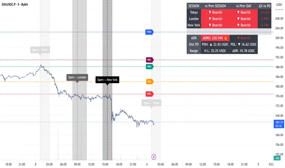
Session Engine — Market Opens, Killzones & Levels — SMC/ICTSession Engine — Market Opens, Killzones & Institutional Levels (Tokyo • London • New York) — SMC/ICT — TradingATH (PueblaATH)
Precision. Sessions. Structure.
Session Engine maps the institutional heartbeat of the day across Tokyo , London , and New York . It draws timezone-accurate Market Open Lines , clean Killzones (incl. London–NY overlap), and a rock-solid, timeframe-safe suite of Previous High/Low Levels (PDH/PDL/PWH/PWL/PMH/PML). On top, a compact Session Comparison Table with an integrated ADR panel shows extension, momentum context, and distance to key levels — at a glance.
Designed for SMC/ICT Traders who demand clarity and reliability, this tool stays stable when you change timeframe, reload, or zoom.
Map the day like a Pro : timezone-true Opens, configurable Killzones, TF-safe PDH/PDL/PWH/PWL/PMH/PML , and a sleek ADR panel beneath a Session Comparison Table . Built for precision SMC/ICT Execution . Zero flicker, full control.
Why Traders Love It
Timezone-Accurate Session Engine — Tokyo, London, New York opens and the London–NY overlap, all resolved to bar-time for precise plotting on any symbol.
Killzones you can trust — choose full-column height or price-bounded height with custom top/bottom tick offsets and label placement.
Bulletproof Previous Levels — PDH, PDL, PWH, PWL, PMH, PML are cached and only refresh on true D/W/M boundaries, eliminating the classic “levels disappear on TF change” problem.
Actionable Context — a compact Session Comparison Table (vs previous session & vs previous day) plus an ADR panel with extension thresholds, distance to PDH/PDL, and current H-L range.
Serious Customization — dotted/solid lines, widths, label size & alignment, auto label backgrounds, block transparency, weekend & timeframe filters, and more.
Performance-Minded — persistent objects are updated in place (not spam-created) to keep your chart crisp and responsive.
What You’ll See
Market Opens — Vertical opens for TOK/LDN/NY with dotted/solid styling, width control, infinite or bounded height, and optional labels.
Killzones + Overlap — Transparent time boxes for session windows (and London–NY overlap). Optional labels, adjustable transparency, and height mode.
Institutional Levels — PDH / PDL / PWH / PWL / PMH / PML with length modes: Infinite, N bars, or End of day. Optional labels with typographic control.
Session Comparison Table — For each session: bias vs previous session and previous day, with optional Δ% column.
ADR Panel — 24h rolling ADR% consumption with two attention thresholds, distance to PDH/PDL (price units), and current H-L range.
How It Works
Session Timing uses explicit IANA timezones (Asia/Tokyo, Europe/London, America/New_York) then anchors to bar_time for pixel-perfect placement.
Killzones are persistent boxes that reset only on daily change, preventing redundant object creation.
Previous Levels are requested once per true period roll (D/W/M) and stored locally; this cache keeps lines stable when switching TFs or reloading charts.
Level Line Length is enforced per-object (Infinite, N bars, End of day) with dynamic x2 handling — no redraw flicker.
ADR uses a timeframe-agnostic 24h rolling window for H/L/range; ADR length is defined in “days” and mapped to bars for any timeframe.
How to Use
Set Session Times (defaults are standard). Adjust the London–NY overlap if your venue differs.
Style your Opens & Killzones — line width, dotted/solid, infinite or bounded height, label font size/align/background.
Choose Level Behavior — Infinite, N bars, or End of day for PD/ PW / PM lines; toggle labels as needed.
Read the Table and ADR — quick bias vs previous session/day, Δ% if you enable it; ADR panel highlights extension with blink thresholds and shows live distance to PDH/PDL.
Inputs
Schedules — Open times + killzone windows for TOK/LDN/NY, and London–NY overlap.
Style — Line width, dotted/solid, label sizes & alignment, auto backgrounds.
Heights — Infinite or tick-bounded line height; full-column or tick-bounded killzones.
Levels — Show/hide PDH/PDL/PWH/PWL/PMH/PML; length mode; label options.
Table & ADR — Font size, arrows, Δ% column, ADR length (days), blink thresholds, show/hide rows.
Filters — Hide visuals on specified timeframe ranges; optional weekend suppression.
Best Practices
Use “End of day” for tidy level lines that still convey right-hand context.
Set ADR thresholds to your instrument’s personality (e.g., 80/120 for FX, 100/150 for crypto).
On exotic trading sessions, verify the IANA timezone alignment and tweak inputs accordingly.
If you stack many tools, consider disabling unused sessions/rows to stay within object limits.
What Makes It Original
A cohesive Session Engine architecture that unifies timezone-true Opens, configurable Killzones/Overlap, and TF-safe previous levels — tailored for SMC/ICT execution.
Robust caching that eliminates TF-switch flicker and preserves dependent calculations (distance to PDH/PDL, ADR%) without gaps.
A unified ADR panel directly under the session table with real-time extension signaling and distance-to-PDH/PDL — pragmatic, trade-ready context you won’t find in generic session scripts.
Deep length & typography controls so visuals are informative and elegant.
Notes & Disclaimer (Originality & Rights)
Original Work Notice — Please read — This script/indicator is an original work created exclusively by TradingATH ( PueblaATH ). It is not derived from, copied from, or authored by any other person or entity. Any resemblance to other scripts is coincidental and limited to the use of public and widely known trading concepts.
Usage & Publication — Redistribution, cloning, or republishing this script (in whole or in part) without the explicit written permission of TradingATH ( PueblaATH ) is prohibited. By using this tool, you acknowledge the author’s exclusive authorship and associated rights.
No Financial Advice — This tool is for educational/informational purposes only and does not constitute financial advice. Markets carry risk; manage your risk and make your own decisions.
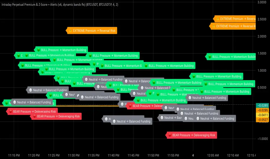
Intraday Perpetual Premium & Z-ScoreThis indicator measures the real-time premium of a perpetual futures contract relative to its spot market and interprets it through a statistical lens.
It helps traders detect when funding pressure is building, when leverage is being unwound, and when crowding in the futures market may precede volatility.
How it works
• Premium (%) = (Perp – Spot) ÷ Spot × 100
The script fetches both spot and perpetual prices and calculates their percentage difference each minute.
• Rolling Mean & Z-Score
Over a 4-hour look-back, it computes the average premium and standard deviation to derive a Z-Score, showing how stretched current sentiment is.
• Dynamic ±2σ Bands highlight statistically extreme premiums or discounts.
• Rate of Change (ROC) over one hour gauges the short-term directional acceleration of funding flows.
Colour & Label Interpretation
Visual cue Meaning Trading Implication
🟢 Green bars + “BULL Pressure” Premium rising faster than mean Leverage inflows → momentum strengthening
🔴 Red bars + “BEAR Pressure” Premium shrinking Leverage unwind → pull-back or consolidation
⚠️ Orange “EXTREME Premium/Discount” Crowded trade → heightened reversal risk
⚪ Grey bars Neutral Balanced conditions
Alerts
• Bull Pressure Alert → funding & premium rising (momentum building)
• Bear Pressure Alert → premium falling (deleveraging)
• Extreme Premium Alert → crowded longs; potential top
• Extreme Discount Alert → capitulation; possible bottom
Use case
Combine this indicator with your Heikin-Ashi, RSI, and MACD confluence rules:
• Enter only when your oscillators are low → curling up and Bull Pressure triggers.
• Trim or exit when Bear Pressure or Extreme Premium appears.
• Watch for Extreme Discount during flushes as an early bottoming clue.
MomentumQ Ratio MatrixMomentumQ Ratio Matrix — Intermarket Risk & Sector Relationship Dashboard
The MomentumQ Ratio Matrix is a compact, on-chart dashboard designed to help traders quickly interpret intermarket relationships and sector leadership through key ETF ratios.
It visualizes the balance between risk-on vs. risk-off sentiment , growth vs. value rotation , and defensive vs. cyclical behavior — giving you an instant read of where capital is flowing in the U.S. market.
What It Does
The indicator compares weekly and daily percentage returns for five critical sector ETF pairs. Each pair represents a specific aspect of market structure or investor preference.
When a ratio is rising , it means the first sector is outperforming the second — signaling increased risk appetite or leadership from growth sectors.
When a ratio is falling , it indicates defensiveness, capital rotation, or weakening momentum in risk-oriented areas.
Examples:
XLY/XLP ↑ → Consumers are spending more on discretionary items (risk-on).
XLY/XLP ↓ → Money shifts into staples (risk-off, defensive tone).
XLK/XLF ↑ → Technology leads Financials (growth leadership).
XLK/XLF ↓ → Financials lead, signaling preference for value or cyclicals.
XLI/XLU ↑ → Industrials outperform Utilities (economic optimism).
XLI/XLU ↓ → Utilities outperform (defensive capital rotation).
XLE/XLB ↑ → Energy leading Materials (inflation or commodity strength).
XLE/XLB ↓ → Materials outperform (cooling inflationary trends).
XLV/XLU ↑ → Healthcare stronger than Utilities (mild defensiveness, but stable risk appetite).
XLV/XLU ↓ → Utilities lead (risk aversion, defensive positioning).
Color-coded cells highlight each ratio’s short-term and medium-term performance:
Green → Ratio rising (risk-on, cyclical, or growth leadership).
Red → Ratio falling (risk-off, defensive, or value rotation).
Gray → Neutral performance.
Key Features
Essential Ratio Coverage — Tracks the five most meaningful ETF ratios for intermarket and sentiment analysis.
Multi-Timeframe Analysis — Displays both Weekly and Daily (or Previous Day) changes for each ratio.
Adaptive Table Layout — Adjustable size, position, and decimal precision to fit any chart.
Light / Dark Mode Support — Automatically adapts to match your TradingView theme.
Performance-Based Coloring — Green for strength, red for weakness, and gray for neutral.
How to Use
Add the indicator to any chart (symbol-independent).
Choose your table position and size from the settings.
Toggle between Today and PrevD mode for different time comparisons.
Use the color-coded returns to gauge where capital is flowing.
Watch for shifts across multiple ratios to confirm changing market regimes.
When most ratios are green, the market generally favors growth and higher risk assets (risk-on).
When most are red, defensive sectors and value stocks tend to lead (risk-off).
Why It’s Valuable
Condenses intermarket and macro relationships into one visual dashboard.
Helps identify leadership shifts between risk, growth, and defensive sectors.
Provides a real-time snapshot of market sentiment without switching charts.
Supports both short-term tactical and long-term trend confirmation.
Disclaimer
The MomentumQ Ratio Matrix is designed for educational and analytical purposes only.
It does not constitute financial advice or guarantee profitability.
Always conduct independent analysis and apply proper risk management when trading.
