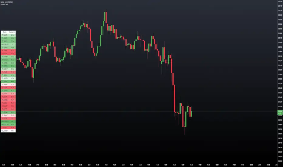
Correlation TableThis indicator displays a vertical table that shows the correlation between the asset currently loaded on the chart and up to 32 selected trading pairs. It offers the following features:
Chart-Based Correlation: Correlations are calculated based on the asset you have loaded in your chart, providing relevant insights for your current market focus.
Configurable Pairs: Choose from a list of 32 symbols (e.g., AUDUSD, EURUSD, GBPUSD, etc.) with individual checkboxes to include or exclude each pair in the correlation analysis.
Custom Correlation Length: Adjust the lookback period for the correlation calculation to suit your analysis needs.
Optional EMA Smoothing: Enable an Exponential Moving Average (EMA) on the price data, with a configurable EMA length, to smooth the series before calculating correlations.
Color-Coded Output: The table cells change color based on the correlation strength and direction—neutral, bullish (green), or bearish (red)—making it easy to interpret at a glance.
Clear Table Layout: The indicator outputs a neatly organized vertical table with headers for "Pair" and "Correlation," ensuring the information is displayed cleanly and is easy to understand.
Ideal for traders who want a quick visual overview of how different instruments correlate with their current asset, this tool supports informed multi-asset analysis
ITALIANO:
Questo indicatore visualizza una tabella verticale che mostra la correlazione tra l'asset attualmente caricato sul grafico e fino a 32 coppie di trading selezionate. Offre le seguenti funzionalità:
Correlazione basata sul grafico: le correlazioni vengono calcolate in base all'asset caricato nel grafico, fornendo informazioni pertinenti per il tuo attuale focus di mercato.
Coppie configurabili: scegli da un elenco di 32 simboli (ad esempio, AUDUSD, EURUSD, GBPUSD, ecc.) con caselle di controllo individuali per includere o escludere ciascuna coppia nell'analisi della correlazione.
Lunghezza di correlazione personalizzata: regola il periodo di lookback per il calcolo della correlazione in base alle tue esigenze di analisi.
Smoothing EMA opzionale: abilita una media mobile esponenziale (EMA) sui dati dei prezzi, con una lunghezza EMA configurabile, per smussare la serie prima di calcolare le correlazioni.
Output codificato a colori: le celle della tabella cambiano colore in base alla forza e alla direzione della correlazione, neutra, rialzista (verde) o ribassista (rosso), rendendola facile da interpretare a colpo d'occhio.
Clear Table Layout: l'indicatore genera una tabella verticale ordinatamente organizzata con intestazioni per "Coppia" e "Correlazione", assicurando che le informazioni siano visualizzate in modo chiaro e siano facili da comprendere.
Ideale per i trader che desiderano una rapida panoramica visiva di come diversi strumenti siano correlati con il loro asset corrente, questo strumento supporta un'analisi multi-asset informata
Statistics
Standard Deviation (fadi)The Standard Deviation indicator uses standard deviation to map out price movements. Standard deviation measures how much prices stray from their average—small values mean steady trends, large ones mean wild swings. Drawing from up to 20 years of data, it plots key levels using customizable Fibonacci lines tied to that standard deviation, giving traders a snapshot of typical price behavior.
These levels align with a bell curve: about 68% of price moves stay within 1 standard deviation, 95% within roughly 2, and 99.7% within roughly 3. When prices break past the 1 StDev line, they’re outliers—only 32% of moves go that far. Prices often snap back to these lines or the average, though the reversal might not happen the same day.
How Traders Use It
If prices surge past the 1 StDev line, traders might wait for momentum to fade, then trade the pullback to that line or the average, setting a target and stop.
If prices dip below, they might buy, anticipating a bounce—sometimes a day or two later. It’s a tool to spot overstretched prices likely to revert and/or measure the odds of continuation.
Settings
Higher Timeframe: Sets the Higher Timeframe to calculate the Standard Deviation for
Show Levels for the Last X Days: Displays levels for the specified number of days.
Based on X Period: Number of days to calculate standard deviation (e.g., 20 years ≈ 5,040 days). Larger periods smooth out daily level changes.
Mirror Levels on the Other Side: Plots symmetric positive and negative levels around the average.
Fibonacci Levels Settings: Defines which levels and line styles to show. With mirroring, negative values aren’t needed.
Background Transparency: Turn on Background color derived from the level colors with the specified transparency
Overrides: Lets advanced users input custom standard deviations for specific tickers (e.g., NQ1! at 0.01296).

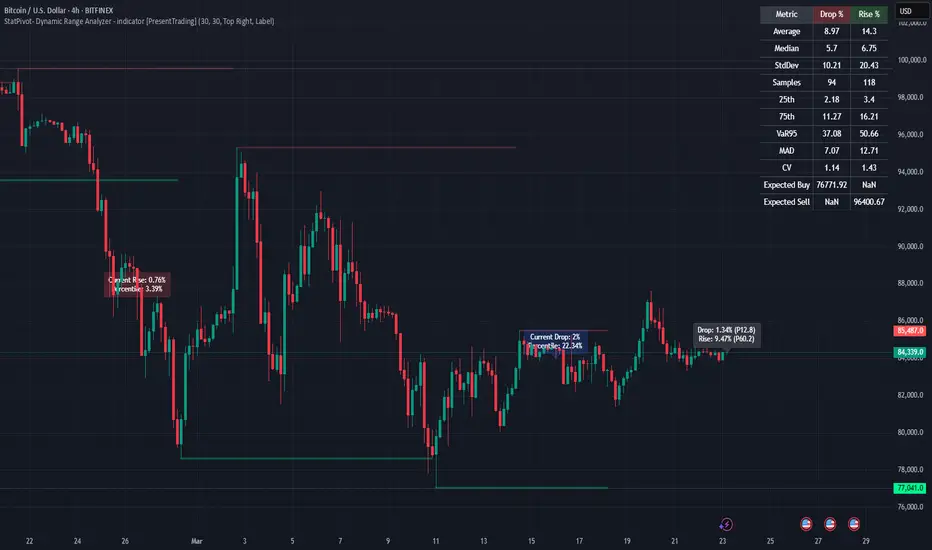
StatPivot- Dynamic Range Analyzer - indicator [PresentTrading]Hello everyone! In the following few open scripts, I would like to share various statistical tools that benefit trading. For this time, it is a powerful indicator called StatPivot- Dynamic Range Analyzer that brings a whole new dimension to your technical analysis toolkit.
This tool goes beyond traditional pivot point analysis by providing comprehensive statistical insights about price movements, helping you identify high-probability trading opportunities based on historical data patterns rather than subjective interpretations. Whether you're a day trader, swing trader, or position trader, StatPivot's real-time percentile rankings give you a statistical edge in understanding exactly where current price action stands within historical contexts.
Welcome to share your opinions! Looking forward to sharing the next tool soon!
█ Introduction and How it is Different
StatPivot is an advanced technical analysis tool that revolutionizes retracement analysis. Unlike traditional pivot indicators that only show static support/resistance levels, StatPivot delivers dynamic statistical insights based on historical pivot patterns.
Its key innovation is real-time percentile calculation - while conventional tools require new pivot formations before updating (often too late for trading decisions), StatPivot continuously analyzes where current price stands within historical retracement distributions.
Furthermore, StatPivot provides comprehensive statistical metrics including mean, median, standard deviation, and percentile distributions of price movements, giving traders a probabilistic edge by revealing which price levels represent statistically significant zones for potential reversals or continuations. By transforming raw price data into statistical insights, StatPivot helps traders move beyond subjective price analysis to evidence-based decision making.
█ Strategy, How it Works: Detailed Explanation
🔶 Pivot Point Detection and Analysis
The core of StatPivot's functionality begins with identifying significant pivot points in the price structure. Using the parameters left and right, the indicator locates pivot highs and lows by examining a specified number of bars to the left and right of each potential pivot point:
Copyp_low = ta.pivotlow(low, left, right)
p_high = ta.pivothigh(high, left, right)
For a point to qualify as a pivot low, it must have left higher lows to its left and right higher lows to its right. Similarly, a pivot high must have left lower highs to its left and right lower highs to its right. This approach ensures that only significant turning points are recognized.
🔶 Percentage Change Calculation
Once pivot points are identified, StatPivot calculates the percentage changes between consecutive pivot points:
For drops (when a pivot low is lower than the previous pivot low):
CopydropPercent = (previous_pivot_low - current_pivot_low) / previous_pivot_low * 100
For rises (when a pivot high is higher than the previous pivot high):
CopyrisePercent = (current_pivot_high - previous_pivot_high) / previous_pivot_high * 100
These calculations quantify the magnitude of each market swing, allowing for statistical analysis of historical price movements.
🔶 Statistical Distribution Analysis
StatPivot computes comprehensive statistics on the historical distribution of drops and rises:
Average (Mean): The arithmetic mean of all recorded percentage changes
CopyavgDrop = array.avg(dropValues)
Median: The middle value when all percentage changes are arranged in order
CopymedianDrop = array.median(dropValues)
Standard Deviation: Measures the dispersion of percentage changes from the average
CopystdDevDrop = array.stdev(dropValues)
Percentiles (25th, 75th): Values below which 25% and 75% of observations fall
Copyq1 = array.get(sorted, math.floor(cnt * 0.25))
q3 = array.get(sorted, math.floor(cnt * 0.75))
VaR95: The maximum expected percentage drop with 95% confidence
Copyvar95D = array.get(sortedD, math.floor(nD * 0.95))
Coefficient of Variation (CV): Measures relative variability
CopycvD = stdDevDrop / avgDrop
These statistics provide a comprehensive view of market behavior, enabling traders to understand the typical ranges and extreme moves.
🔶 Real-time Percentile Ranking
StatPivot's most innovative feature is its real-time percentile calculation. For each current price, it calculates:
The percentage drop from the latest pivot high:
CopycurrentDropPct = (latestPivotHigh - close) / latestPivotHigh * 100
The percentage rise from the latest pivot low:
CopycurrentRisePct = (close - latestPivotLow) / latestPivotLow * 100
The percentile ranks of these values within the historical distribution:
CopyrealtimeDropRank = (count of historical drops <= currentDropPct) / total drops * 100
This calculation reveals exactly where the current price movement stands in relation to all historical movements, providing crucial context for decision-making.
🔶 Cluster Analysis
To identify the most common retracement zones, StatPivot performs a cluster analysis by dividing the range of historical drops into five equal intervals:
CopyrangeSize = maxVal - minVal
For each interval boundary:
Copyboundaries = minVal + rangeSize * i / 5
By counting the number of observations in each interval, the indicator identifies the most frequently occurring retracement zones, which often serve as significant support or resistance areas.
🔶 Expected Price Targets
Using the statistical data, StatPivot calculates expected price targets:
CopytargetBuyPrice = close * (1 - avgDrop / 100)
targetSellPrice = close * (1 + avgRise / 100)
These targets represent statistically probable price levels for potential entries and exits based on the average historical behavior of the market.
█ Trade Direction
StatPivot functions as an analytical tool rather than a direct trading signal generator, providing statistical insights that can be applied to various trading strategies. However, the data it generates can be interpreted for different trade directions:
For Long Trades:
Entry considerations: Look for price drops that reach the 70-80th percentile range in the historical distribution, suggesting a statistically significant retracement
Target setting: Use the Expected Sell price or consider the average rise percentage as a reasonable target
Risk management: Set stop losses below recent pivot lows or at a distance related to the statistical volatility (standard deviation)
For Short Trades:
Entry considerations: Look for price rises that reach the 70-80th percentile range, indicating an unusual extension
Target setting: Use the Expected Buy price or average drop percentage as a target
Risk management: Set stop losses above recent pivot highs or based on statistical measures of volatility
For Range Trading:
Use the most common drop and rise clusters to identify probable reversal zones
Trade bounces between these statistically significant levels
For Trend Following:
Confirm trend strength by analyzing consecutive higher pivot lows (uptrend) or lower pivot highs (downtrend)
Use lower percentile retracements (20-30th percentile) as entry opportunities in established trends
█ Usage
StatPivot offers multiple ways to integrate its statistical insights into your trading workflow:
Statistical Table Analysis: Review the comprehensive statistics displayed in the data table to understand the market's behavior. Pay particular attention to:
Average drop and rise percentages to set reasonable expectations
Standard deviation to gauge volatility
VaR95 for risk assessment
Real-time Percentile Monitoring: Watch the real-time percentile display to see where the current price movement stands within the historical distribution. This can help identify:
Extreme movements (90th+ percentile) that might indicate reversal opportunities
Typical retracements (40-60th percentile) that might continue further
Shallow pullbacks (10-30th percentile) that might represent continuation opportunities in trends
Support and Resistance Identification: Utilize the plotted pivot points as key support and resistance levels, especially when they align with statistically significant percentile ranges.
Target Price Setting: Use the expected buy and sell prices calculated from historical averages as initial targets for your trades.
Risk Management: Apply the statistical measurements like standard deviation and VaR95 to set appropriate stop loss levels that account for the market's historical volatility.
Pattern Recognition: Over time, learn to recognize when certain percentile levels consistently lead to reversals or continuations in your specific market, and develop personalized strategies based on these observations.
█ Default Settings
The default settings of StatPivot have been carefully calibrated to provide reliable statistical analysis across a variety of markets and timeframes, but understanding their effects allows for optimal customization:
Left Bars (30) and Right Bars (30): These parameters determine how pivot points are identified. With both set to 30 by default:
A pivot low must be the lowest point among 30 bars to its left and 30 bars to its right
A pivot high must be the highest point among 30 bars to its left and 30 bars to its right
Effect on performance: Larger values create fewer but more significant pivot points, reducing noise but potentially missing important market structures. Smaller values generate more pivot points, capturing more nuanced movements but potentially including noise.
Table Position (Top Right): Determines where the statistical data table appears on the chart.
Effect on performance: No impact on analytical performance, purely a visual preference.
Show Distribution Histogram (False): Controls whether the distribution histogram of drop percentages is displayed.
Effect on performance: Enabling this provides visual insight into the distribution of retracements but can clutter the chart.
Show Real-time Percentile (True): Toggles the display of real-time percentile rankings.
Effect on performance: A critical setting that enables the dynamic analysis of current price movements. Disabling this removes one of the key advantages of the indicator.
Real-time Percentile Display Mode (Label): Chooses between label display or indicator line for percentile rankings.
Effect on performance: Labels provide precise information at the current price point, while indicator lines show the evolution of percentile rankings over time.
Advanced Considerations for Settings Optimization:
Timeframe Adjustment: Higher timeframes generally benefit from larger Left/Right values to identify truly significant pivots, while lower timeframes may require smaller values to capture shorter-term swings.
Volatility-Based Tuning: In highly volatile markets, consider increasing the Left/Right values to filter out noise. In less volatile conditions, lower values can help identify more potential entry and exit points.
Market-Specific Optimization: Different markets (forex, stocks, commodities) display different retracement patterns. Monitor the statistics table to see if your market typically shows larger or smaller retracements than the current settings are optimized for.
Trading Style Alignment: Adjust the settings to match your trading timeframe. Day traders might prefer settings that identify shorter-term pivots (smaller Left/Right values), while swing traders benefit from more significant pivots (larger Left/Right values).
By understanding how these settings affect the analysis and customizing them to your specific market and trading style, you can maximize the effectiveness of StatPivot as a powerful statistical tool for identifying high-probability trading opportunities.
Time Marker Pro: Vertical Line at Key Times)Smart Vertical Line at Specific Time (with Timezone, Color, and Width Controls)
This script draws a vertical line on your chart at a user-defined time once per day, based on the selected timezone.
🕒 Key Features:
Set your target hour and minute
Choose from a list of common timezones (Tehran, UTC, New York, etc.)
Customize the line color and thickness
Works across all intraday timeframes (1min, 5min, 15min, etc.)
Adjusts automatically to bar intervals — no need for exact time matching
This is perfect for traders who want to:
Highlight the start of a session
Mark specific news times, breakouts, or routine entries
Visualize key time-based levels on the chart
Correlation X macroeconomicsFind the correlation between financial assets and the main Brazilian macroeconomic variables:
SELIC rate (Red)
PIB (Green)
Inflation (Blue)
Employment and income (Yellow)
Unlike other indicators that measure the correlation between two assets, the indicator "Correlation X macroeconomics" measures, for example, the correlation that the VALE3 asset has with the SELIC rate.
The correlation is obtained by calculating the variation suffered by a given asset on the day a given Brazilian macroeconomic variable is released.
This indicator can be used on any financial asset.
Use time frame chart = 1 day.
To calculate the correlation, data published by IBGE and the Central Bank of Brazil over a period of time are used. This time period is different depending on the selected macroeconomic variable. Namely:
16 PIB disclosures (4 years)
24 SELIC rate disclosures (3 years)
24 disclosures of IPCA and employment and income data (2 years)
You can select one or more macroeconomic variables to check the effect of correlation separately on each of them.
This indicator "Correlation X macroeconomics" will be updated monthly, as detailed below:
At the end of the day on which the PIB is released
At the end of the day on which employment and income data are released
At the end of the day following the day on which the SELIC rate is published
On the last business day of the month if none of the aforementioned disclosures occur

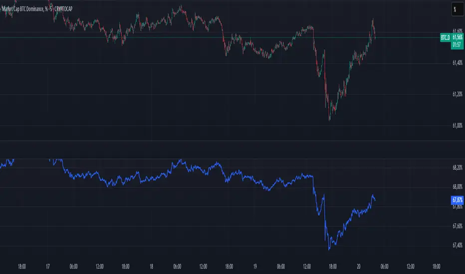
BTC Dominance PercentageThis BTC Dominance Percentage indicator calculates Bitcoin's dominance relative to altcoins, excluding stablecoins.
🔹 Unlike the standard BTC.D metric, which includes all cryptocurrencies (including stablecoins like USDT, USDC, and DAI), this version focuses only on Bitcoin’s market share compared to altcoins.
🔹 It calculates BTC dominance relative to major altcoins (ETH, BNB, ADA, XRP, SOL) and the OTHERS.D index, which represents smaller-cap altcoins.
🔹 Stablecoins are excluded, providing a clearer view of Bitcoin’s actual strength against the altcoin market, without distortion from fiat-pegged assets.
🚀 This is a true BTC dominance metric for tracking Bitcoin’s market position against altcoins!
Multi-Faceted Analysis ToolHere’s a detailed description for the **Multi-Faceted Analysis Tool** TradingView indicator:
---
## Multi-Faceted Analysis Tool
### Overview
The **Multi-Faceted Analysis Tool** is a powerful TradingView indicator designed to enhance your technical analysis by combining several popular indicators: Simple Moving Average (SMA), Relative Strength Index (RSI), and Moving Average Convergence Divergence (MACD). This indicator provides traders with insightful market signals that can be tailored to fit various trading strategies and timeframes.
### Key Features
1. **Simple Moving Average (SMA)**:
- Plots a customizable SMA on the price chart. The length of the SMA can be adjusted to suit your analysis needs (default is set to 50). The SMA helps identify the overall trend direction.
2. **Relative Strength Index (RSI)**:
- Calculates and plots RSI values, providing insights into potential overbought or oversold market conditions. The user can customize the length of the RSI calculation (default is 14).
- Overbought (70) and oversold (30) levels are visually marked, helping traders identify potential reversal points.
3. **MACD**:
- Computes MACD values with customizable parameters for fast length, slow length, and signal length (defaults are 12, 26, and 9 respectively).
- The MACD histogram is displayed, highlighting the difference between the MACD line and the signal line, which can help traders visualize momentum shifts.
4. **Buy and Sell Signals**:
- Generates clear buy and sell signals based on RSI crossover with established thresholds (buy when RSI crosses above 30, sell when RSI crosses below 70). These signals are visually represented on the chart for easy decision-making.
5. **User-Friendly Customization**:
- All parameters are adjustable, allowing traders to set their preferred values based on individual strategies or market conditions. This flexibility ensures that the tool can cater to a wide range of trading styles.

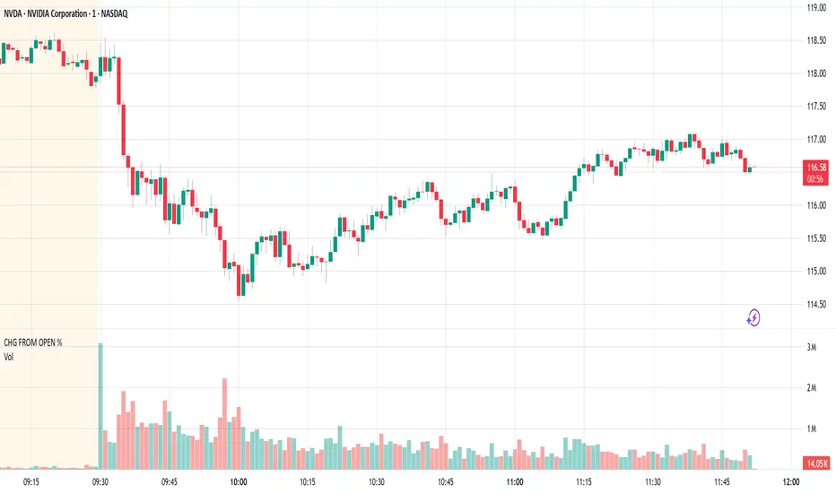
CHG FROM OPEN %As an intraday trader, I'm more interested in seeing the CHG FROM OPEN % than the CHG % measured from yesterday's close. I overlay this script on a separate Volume pane so it doesn't hide my price chart, and I hide the line since the line isn't particularly useful to me.
This script shows the current real-time CHG FROM OPEN % when you hover outside of the chart during regular trading hours (all times NYC/EST). Hovering over the chart will show you the historical CHG FROM OPEN % and, if extended hours, the CHG FROM OPEN % at the previous close.
You can also find CHG FROM OPEN % in the stock screener, but having it in the chart is more convenient for me.
Share Value Indicator**Share Value Indicator**
This TradingView indicator allows traders to track the real-time total value of their stock holdings. Users can input the number of shares they own, and the script calculates the total value based on the current stock price. A horizontal ray is drawn at the last price level, and a label displays the total value of the shares. The indicator updates dynamically, ensuring only one ray and label are visible at a time. Ideal for traders who want to visualize their investment's real-time worth directly on the chart.

rate_of_changeLibrary "rate_of_change"
// @description: Applies ROC algorithm to any pair of values.
// This library function is used to scale change of value (price, volume) to a percentage value, just as the ROC indicator would do. It is good practice to scale arbitrary ranges to set boundaries when you try to train statistical model.
rateOfChange(value, base, hardlimit)
This function is a helper to scale a value change to its percentage value.
Parameters:
value (float)
base (float)
hardlimit (int)
Returns: per: A float comprised between 0 and 100

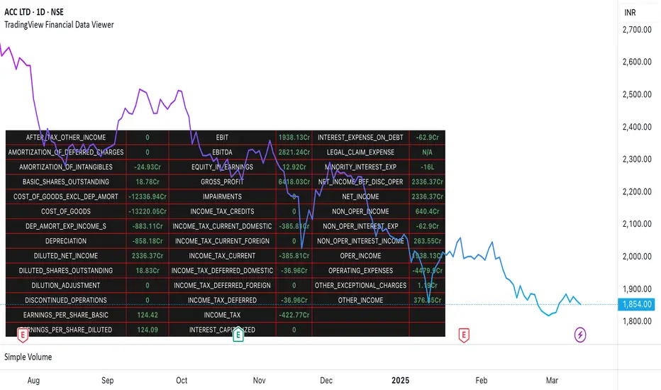
TradingView Financial Data ViewerTrading view provides request.security function to view the financial information of a script. The available sets of data is documented on below link
www.tradingview.com
The problem is there is no easy way to view this data as there are limitations to the # of unique requests that can be made. The limit is 40 for general paid accounts. So its makes it impossible to view the data in case you are looking to build a plugin related to some financial analysis.
So I came up with this trading view plugin which based on the documentation bifurcates the values available in the FQ, TTM and FY periods. Then you can select which period you would like to see. How many values you want to see at a time. And then next set of data can be viewed by increasing the Set # from 1 to which ever number keeps giving you the data.
Notes:
This is a data view only indicator and it will only display the latest data available for which quarter was there.
In case you want to view past data then you should go to replay mode and cut to the relative earning tags where you want to view the data
This is again for educational or study purpose only and is majorly helpful for those who want to create indicators based on Trading view supported financials and want to view what values are given for specific financial ids
The documentation reference and source of the plugin can be checked
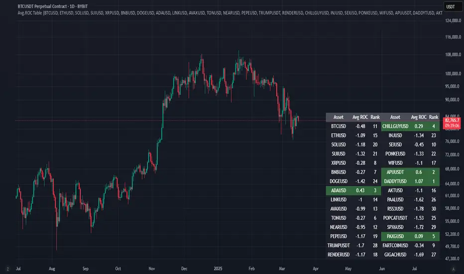
Avg.ROC TableThis indicator calculates the average Rate of Change (ROC) for up to 30 user-selected assets over a specified number of candles. It then ranks the assets—assigning rank 1 to the asset with the highest average ROC (strongest momentum) and rank 30 to the asset with the lowest. The results are displayed in a clean, easy-to-read table split into two stacks of 15 assets each, allowing you to quickly see which assets are performing best.
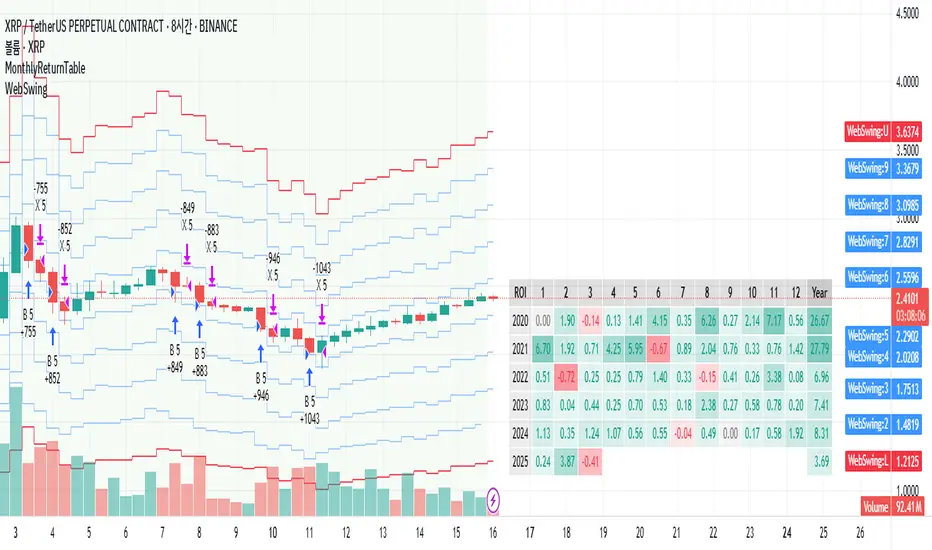
MonthlyReturnTableLibrary "MonthlyReturnTable"
TODO: The table displays monthly returns, profits, MDD, and number of trades.
get_table(mode, tablePosition, precision, textSize, marginTop, marginBottom, marginLeft, marginRight, colorHead, colorBull, colorBear, colorZero)
: get_table
Parameters:
mode (string)
tablePosition (string)
precision (int)
textSize (int)
marginTop (int)
marginBottom (int)
marginLeft (int)
marginRight (int)
colorHead (color)
colorBull (color)
colorBear (color)
colorZero (color)
Returns: : null, plot perfTable
Normalized VolumeOVERVIEW
The Normalized Volume (NV) is an attempt at visualizing volume in a format that is more understandable by placing the values on a scale of 0 to 100. 0 in this case is the lowest volume candle available on the chart, and 100 being the highest. Calling a candle “high volume” can be misleading without having something to compare to. For example, in scaling the volume this way we can clearly see that a given candle had 80% of the peak volume or 20%, and gauge the validity of price moves more accurately.
FEATURES
NV by session
Allows user to filter the volume values across 4 different sessions. This can add context to the volume output, because what it high volume during London session may not be high volume relative to New York session.
Overlay plotting
When volume boxes are turned on, this will allow you to toggle how they are plotted.
Color theme
A standard color theme will color the NV based on if the respective candle closed green or red. Selecting variables will color the NV plot based on which range the value falls within.
Session inputs
Activated with the “By session?” Input. Allows user to break the day up into 4 sessions to more accurately gauge volume relative to time of day.
Show Box (X)
Toggles on chart boxes on and off.
Show historical boxes
Will plot prior occurrences of selected volume boxes, deleting them when price fully moves through them in the opposite direction of the initial candle.
Color inputs
Allows for intensive customization in how this tool appears visually.
INTERPRETATION
There are 6 pre-defined ranges that NV can fall within.
NV <= 10
Volume is insignificant
In this range, volume should not be a confirmation in your trading strategy.
NV > 10 and <= 20
Volume is low
In this range, volume should not be a confirmation in your trading strategy.
NV > 20 and <= 40
Volume is fair
In this range, volume should not be the primary confirmation in your trading strategy.
NV > 40 and <= 60
Volume is high
In this range, volume can be the primary confirmation in your trading strategy.
NV > 60 and <= 80
Volume is very high
In this range, volume can be the primary confirmation in your trading strategy.
NV > 80
Volume is extreme
In this range, volume is likely news driven and caution should be taken. High price volatility possible.
To utilize this tool in conjunction with your current strategy, follow the range explanations above section in this section. The higher the NV value, the stronger you can feel about your directional confirmation.
If NV = 100, this means that the highest volume candle occurred up to that point on your selected timeframe. All future data points will be weighed off of this value.
LIMITATIONS
This tool will not load on tickers that do not have volume data, such as VIX.
STRATEGY
The Normalized Volume plot can be used in exactly the same way as you would normally utilize volume in your trading strategy. All we are doing is weighing the volume relative to itself.
Volume boxes can be used as targets to be filled in a similar way to commonly used “fair value gap” strategies. To utilize this strategy, I recommend selecting “Plot to Wicks” in Overlay Plotting and toggling on Show Historical Boxes.
Volume boxes can be used as areas for entry in a similar way to commonly used “order block” strategies. To utilize this strategy, I recommend selecting “Open To Close” in Overlay Plotting.
NOTES
You are able to plot an info label on right side of NV plot using the "Toggle box label" input. When a box is toggled on this label will tell you when the most recent box of that intensity occurred.
This tool is deeply visually customizable, with the ability to adjust line width for plotted boxes, all colors on both box overlays, and all colors on NV panel. Customize it to your liking!
I have a handful of additional features that I plan on adding to this tool in future updates. If there is anything you would like to see added, any bugs you identify, or any strategies you encounter with this tool, I would love to hear from you!
Huge shoutout to @joebaus for assisting in bringing this tool to life, please check out his work here on TradingView!

Volume +OBV + ADXVolume + OBV + ADX Table
Optimized Buyer & Seller Volume with Trend Indications
Overview:
This indicator provides a comprehensive view of market participation and trend strength by integrating Volume, On Balance Volume (OBV) trends, and ADX (Average Directional Index) signals into a visually structured table. Designed for quick decision-making, it highlights buyer and seller dominance while comparing the selected stock with another custom symbol.
Features:
✅ Buyer & Seller Volume Analysis:
Computes buyer and seller volume percentages based on market movements.
Displays daily cumulative volume statistics to assess ongoing market participation.
✅ On Balance Volume (OBV) Trends:
Identifies positive, negative, or neutral OBV trends using an advanced smoothing mechanism.
Highlights accumulation or distribution phases with colored visual cues.
✅ ADX-Based Trend Confirmation:
Evaluates Directional Indicators (DI+ and DI-) to determine the trend direction.
Uses customizable ADX settings to filter out weak trends.
Provides uptrend, downtrend, or neutral signals based on strength conditions.
✅ Custom Symbol Comparison:
Allows users to compare two different assets (e.g., a stock vs. an index or ETF).
Displays a side-by-side comparison of volume dynamics and trend strength.
✅ User-Friendly Table Display:
Presents real-time calculations in a compact and structured table format.
Uses color-coded trend signals for easier interpretation.
Recommended Usage for Best Results:
📌 Pairing this indicator with Sri_Momentum and Sri(+) Pivot will enhance accuracy and provide better trade confirmations.
📌 Adding other major indicators like RSI, CCI, etc., will further increase the probability of winning trades.
How to Use:
Select a custom symbol for comparison.
Adjust ADX settings based on market conditions.
Analyze the table to identify buyer/seller dominance, OBV trends, and ADX trend strength.
Use the combined signals to confirm trade decisions and market direction.
Best Use Cases:
🔹 Trend Confirmation – Validate breakout or reversal signals.
🔹 Volume Strength Analysis – Assess buyer/seller participation before entering trades.
🔹 Multi-Asset Comparison – Compare the behavior of two related instruments.
This indicator is ideal for traders looking to combine volume dynamics with trend-following strategies. 🚀📈
Time of Day Background with Bar Count & TableDescription:
This indicator provides a comprehensive overview of market activity by dynamically displaying the time-of-day background and tracking bullish and bearish bar counts across different sessions. It also features a table summarizing the market performance for the last 7 days, segmented into four time-based sessions: Morning, Afternoon, Evening, and Night.
Key Features:
Time of Day Background:
The chart's background color changes based on the time of day:
Evening (12 AM - 6 AM) is shaded blue.
Morning (6 AM - 12 PM) is shaded aqua.
Afternoon (12 PM - 6 PM) is shaded yellow.
Night (6 PM - 12 AM) is shaded silver.
Bullish and Bearish Bar Counting:
It tracks the number of bullish (closing higher than opening) and bearish (closing lower than opening) candles.
The sum of the price differences (bullish minus bearish) for each session is displayed as a dynamic label, indicating overall market direction for each session.
Session Breakdown:
The chart is divided into four sessions, each lasting 6 hours (Morning, Afternoon, Evening, Night).
A new label is generated at the start of each session, indicating the bullish/bearish performance and the net difference in price movements for that session.
Historical Session Performance:
The indicator tracks and stores the performance for each session over the past 7 days.
A table is generated in the top-right corner of the chart, summarizing the performance for each session (Morning, Afternoon, Evening, Night) and the price changes for each of the past 7 days.
The values are color-coded to indicate positive (green) or negative (red) results.
Dynamic Table:
The table presents performance data for each time session over the past week with color-coded cells:
Green cells indicate positive performance.
Red cells indicate negative performance.
Empty cells represent no data for that session.
Use Case:
This indicator is useful for traders who want to track market activity and performance across different times of day and monitor how each session contributes to the overall market trend. It provides both visual insights (through background color) and numerical data (via the table) for better decision-making.
Settings:
The background color and session labels update automatically based on the time of day.
The table updates every day, tracking the performance of each session over the past week.
