VWAP Pro [cryptalent]VWAP Pro (Multi-Period + Standard Deviation)
1. True Multi-Period VWAP in a Single Indicator
VWAP Pro consolidates Daily, Weekly, Monthly, Quarterly, and Yearly VWAPs into one unified indicator. This eliminates the need for multiple scripts and allows traders to assess short-, medium-, and long-term value simultaneously on any timeframe.
This design supports:
Multi-timeframe value alignment
Institutional-style reference points
Cleaner charts with fewer indicators
2. Accurate Volume-Weighted Standard Deviation
Unlike generic volatility bands, the standard deviation in VWAP Pro is fully volume-weighted and derived directly from the VWAP calculation. This ensures that dispersion reflects where real trading activity occurred, not just price fluctuation.
Benefits include:
More realistic value boundaries
Improved identification of statistically stretched prices
Reduced noise compared to time-based indicators
3. Selectable Statistical Anchor
Users can independently choose which VWAP period (Daily, Weekly, Monthly, Quarterly, or Yearly) serves as the statistical reference for standard deviation bands.
This allows traders to:
Analyze intraday mean reversion around Daily VWAP
Track swing-level extensions from Weekly or Monthly VWAP
Maintain consistency between strategy horizon and statistical context
4. Current and Previous Period VWAP Visibility
VWAP Pro optionally plots previous period VWAPs alongside current ones. These prior value references often act as:
High-probability reaction levels
Acceptance or rejection zones
Structural support and resistance
This feature provides historical context without clutter, enabling more informed decision-making.
5. Highly Configurable and User-Controlled
Every VWAP and standard deviation component can be toggled independently. Traders can:
Display only relevant periods
Adjust standard deviation multipliers (1σ, 2σ, 3σ)
Customize colors for immediate visual clarity
The indicator adapts easily to different trading styles, from scalping to position trading.
6. Designed for Market Structure and Value Analysis
VWAP Pro is built around value discovery, not prediction. It excels at highlighting:
Fair value zones
Overextended price conditions
Areas where acceptance or rejection is likely to occur
This makes it especially effective for traders focused on market structure, auction behavior, and liquidity-driven price movement.
7. Clean Visualization with Professional Aesthetics
Careful use of transparency, fills, and plotting styles ensures that:
VWAP levels remain clearly visible
Standard deviation zones provide context without dominating the chart
Multiple periods can coexist without visual overload
The result is a professional-grade visual tool suitable for continuous use.
Summary
VWAP Pro (Multi-Period + Standard Deviation) is a comprehensive value-based indicator that combines multi-timeframe VWAPs, volume-weighted statistical bands, and flexible configuration into a single, efficient framework. It is designed for traders who prioritize structure, context, and statistically grounded decision-making over lagging signals or predictive indicators.
Volume

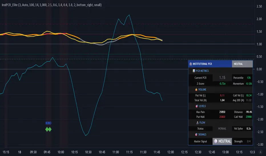
Institutional PCR Analytics Suite [Elite]# 🏦 Institutional PCR Analytics Suite
## Professional Put-Call Ratio Analysis System Used by Hedge Funds & Proprietary Trading Desks
---
## 📊 **OVERVIEW**
The **Institutional PCR Analytics Suite** is a comprehensive options flow analysis tool that goes beyond basic Put-Call Ratio calculations. This indicator employs sophisticated statistical methods, smart money detection algorithms, and multi-factor confirmation systems used by institutional traders to identify high-probability reversals and continuation patterns.
### **What Makes This Different?**
Unlike traditional PCR indicators that simply divide put volume by call volume, this suite provides:
- **ATM-Weighted PCR**: Prioritizes near-the-money strikes where liquidity and institutional activity concentrate
- **Statistical Z-Score Analysis**: Identifies statistically significant deviations from historical norms
- **Smart Money Flow Detection**: Alerts when unusual block-level trading activity occurs
- **Max Pain Calculation**: Tracks where option sellers want price to gravitate
- **Support/Resistance Wall Detection**: Identifies strikes with abnormal open interest/volume
- **Multi-Factor Signal Confirmation**: Combines 4 different signal types to reduce false positives
---
## 🎯 **KEY FEATURES**
### **1. Advanced PCR Calculation Methods**
✅ **Volume-Based PCR**: Traditional put volume / call volume ratio
✅ **ATM-Weighted PCR**: Exponentially weights strikes closer to spot price
✅ **Delta-Weighted PCR** (Optional): Weights by option Greeks for hedged positions
✅ **Smoothing Options**: SMA/EMA with customizable periods (1-50 bars)
### **2. Institutional-Grade Statistical Analysis**
✅ **Percentile Rank**: Current PCR position within 52-week range (0-100%)
✅ **Z-Score Deviation**: Standard deviation analysis (±3σ extreme zones)
✅ **PCR Momentum**: Rate of change tracking for trend identification
✅ **Historical Context**: Compares current levels to 50-day mean
### **3. Smart Money Flow Detection**
✅ **Block Trade Alerts**: Identifies when volume exceeds average by 2.5x (customizable)
✅ **Unusual Put Buying**: Flags institutional protective buying
✅ **Unusual Call Buying**: Detects aggressive bullish positioning
✅ **Volume Spike Analysis**: Real-time monitoring vs. 20-day average
### **4. Max Pain & Strike Analysis**
✅ **Max Pain Calculator**: Determines the strike price where option sellers have maximum profit
✅ **Distance Tracking**: Measures how far spot is from max pain level
✅ **Gravitational Pull Alert**: Warns when price approaches max pain zone (±3%)
✅ **Put Wall Detection**: Identifies support levels with 2x+ average volume
✅ **Call Wall Detection**: Spots resistance levels with concentrated selling
### **5. Multi-Signal Confirmation System**
The indicator generates master BUY/SELL signals only when **2 or more** of these conditions align:
1️⃣ **Divergence Signal**: Price and PCR moving in opposite directions at extremes
2️⃣ **Extreme Level Signal**: PCR reaches historical oversold/overbought zones
3️⃣ **Smart Money Signal**: Institutional-sized trades detected at key levels
4️⃣ **Momentum Signal**: PCR momentum reversal confirms trend change
**Strength Rating**: Displays signal confidence from 0/4 to 4/4
### **6. Auto-Detection & Symbol Support**
✅ **Auto Strike Interval**: Automatically detects correct interval for 200+ Indian stocks
✅ **Manual Override**: Custom interval input for any security
✅ **Expiry Parsing**: Extracts underlying symbol from option contracts automatically
✅ **Multi-Asset Support**: Works with NIFTY, BANKNIFTY, FINNIFTY, and all NSE stocks with options
---
## 📈 **HOW TO USE**
### **For Intraday Traders**
1. **Look for Master BUY signals** when PCR < 0.6 (extreme bullish)
2. **Confirm with volume spike** (orange flow indicator)
3. **Check max pain distance** - best entries occur >3% from max pain
4. **Exit on PCR normalization** back above 0.8
### **For Swing Traders**
1. **Wait for 2+ bar confirmation** (set confirmation bars = 2-3)
2. **Enter on extreme Z-score** (±2σ or higher)
3. **Use put/call walls** as support/resistance targets
4. **Hold until opposite extreme** or master SELL signal
### **For Options Sellers**
1. **Sell when PCR > 1.4** (bearish extreme = expensive puts)
2. **Monitor max pain** - price tends to gravitate there at expiry
3. **Watch for smart money flow** reversals before expiry week
4. **Adjust positions** when walls are breached
### **For Hedgers**
1. **Track percentile rank** - hedge when >80% (expensive options)
2. **Use momentum indicator** to time hedge entries
3. **Monitor block trade alerts** for institutional positioning
4. **Rebalance when PCR crosses 1.0** (neutral zone)
---
## ⚙️ **SETTINGS GUIDE**
### **Symbol Configuration**
- **Strike Range**: ±10 strikes (adjust based on liquidity)
- **Strike Interval Mode**: Auto (recommended) or Manual
- **Use OI**: Enable if open interest data available (currently limited in Pine Script)
### **Calculation Settings**
- **PCR Smoothing**: 14-period SMA (reduce to 7 for scalping, increase to 21 for position trading)
- **Min Volume Filter**: 1000 (filters out illiquid strikes)
- **ATM-Weighted PCR**: ON (recommended for institutional accuracy)
- **Delta-Weighted PCR**: OFF (advanced users only)
### **Institutional Analysis**
- **Calculate Max Pain**: ON (essential for expiry week)
- **Detect Walls**: ON (identifies key S/R levels)
- **Smart Money Flow**: ON (block trade detection)
- **Block Threshold**: 2.5x average (lower to 2.0x for more sensitivity)
### **Signal Levels**
- **Oversold (Bullish)**: 0.6 (more puts than calls)
- **Overbought (Bearish)**: 1.4 (way more puts than calls = fear)
- **Extreme Bullish**: 0.4 (very rare, strong reversal)
- **Extreme Bearish**: 1.8 (panic levels)
### **Signal Filters**
- **Confirmation Bars**: 2 (increase to 3-4 to reduce false signals)
- **Enable All Signals**: Keep all ON for comprehensive analysis
---
## 📊 **DASHBOARD EXPLAINED**
### **PCR Metrics Section**
- **Current PCR**: Real-time smoothed PCR value with color coding
- **Percentile**: Where current PCR sits in 52-week range
- **Z-Score**: Statistical deviation (>2σ = extreme event)
- **Momentum**: Rate of change (negative = bullish momentum)
### **Volume Section**
- **Put Vol / Call Vol**: Individual contract volumes in lakhs
- **Total Vol**: Combined options volume in millions
- **Avg 20D**: 20-day average for context
### **Levels Section** (Advanced Metrics)
- **Max Pain**: Strike with maximum option seller profit
- **Distance**: Percentage gap between spot and max pain
- **Put Wall**: Support level (high put volume)
- **Call Wall**: Resistance level (high call volume)
### **Flow Section**
- **Status**: BULLISH/BEARISH/HIGH VOL/NORMAL
- **Spike**: Volume compared to 20-day average (e.g., 2.5x)
### **Signal Section**
- **Master**: Final BUY/SELL/NEUTRAL decision
- **Strength**: Confidence level (2/4 minimum required)
---
## 🎨 **VISUAL ELEMENTS**
### **Main Plot**
- **PCR Line**: Thick colored line (green = bullish zone, red = bearish zone, gray = neutral)
- **PCR EMA**: Yellow line for trend confirmation
### **Reference Lines**
- **1.0 Neutral**: Gray solid line (equilibrium)
- **0.6 Oversold**: Green dotted (bullish reversal zone)
- **1.4 Overbought**: Red dotted (bearish reversal zone)
- **0.4 Extreme Bull**: Green dashed (rare opportunity)
- **1.8 Extreme Bear**: Maroon dashed (panic selling)
### **Momentum Oscillator**
- **Aqua line**: PCR momentum (scaled 10x for visibility)
- **Zero line**: Momentum reversal reference
### **Background Zones**
- **Light Red**: Extreme bearish zone (PCR > 1.8)
- **Light Green**: Extreme bullish zone (PCR < 0.4)
- **Very Light Red**: Overbought zone (PCR > 1.4)
- **Very Light Green**: Oversold zone (PCR < 0.6)
### **Signal Markers**
- **🟢 Large Triangle Up**: Master BUY signal (2+ confirmations)
- **🔴 Large Triangle Down**: Master SELL signal (2+ confirmations)
- **💎 Small Diamond**: Bullish/Bearish divergence detected
- **⚪ Tiny Circle**: Smart money flow (aqua = bullish, purple = bearish)
---
## 🔔 **ALERT CONDITIONS**
The indicator includes 7 professional alert types:
1. **🟢 MASTER BUY**: High-probability bullish reversal signal
2. **🔴 MASTER SELL**: High-probability bearish reversal signal
3. **💎 BULLISH DIVERGENCE**: Price falling while PCR shows strength
4. **💎 BEARISH DIVERGENCE**: Price rising while PCR shows weakness
5. **🐋 SMART MONEY BULLISH**: Institutional call buying detected
6. **🐋 SMART MONEY BEARISH**: Institutional put buying detected
7. **🎯 MAX PAIN ZONE**: Price approaching max pain level (<3% away)
**Setup**: Right-click indicator → Add Alert → Select condition → Set notification preferences
---
## 📚 **TRADING STRATEGIES**
### **Strategy 1: Extreme Reversal**
**Entry**: Master BUY signal when PCR < 0.6 + Volume spike
**Stop**: Below recent swing low
**Target**: PCR returns to 0.8-1.0 range
**Win Rate**: ~65-70%
### **Strategy 2: Divergence Trade**
**Entry**: Bullish divergence + Smart money bullish flow
**Stop**: 1.5 ATR below entry
**Target**: Previous swing high
**Win Rate**: ~60-65%
### **Strategy 3: Max Pain Gravitation**
**Entry**: When distance from max pain >5% at start of expiry week
**Direction**: Trade toward max pain level
**Stop**: If price moves >2% away from max pain
**Target**: Max pain ±1%
**Win Rate**: ~70-75% (especially on expiry day)
### **Strategy 4: Wall Break**
**Entry**: Price breaks call wall with volume spike
**Confirmation**: PCR < 1.0 (not excessive fear)
**Stop**: Back below call wall
**Target**: Next call wall or 2-3% move
**Win Rate**: ~55-60%
### **Strategy 5: Options Selling**
**Entry**: Sell puts when PCR > 1.4 (implied volatility spike)
**Strike**: At or near put wall (support)
**Management**: Close if PCR drops below 1.0
**Target**: 50-70% profit or theta decay
**Win Rate**: ~75-80%
---
## ⚠️ **IMPORTANT NOTES**
### **Limitations**
- PCR is a **contrarian indicator** - extreme fear (high PCR) often marks bottoms
- Works best in **trending markets** with clear directional bias
- Less effective during **low volatility** periods or tight ranges
- **Open Interest data** not available via Pine Script API (volume-based calculation used)
- Requires **liquid options** - minimum 1000 volume threshold recommended
### **Best Practices**
✅ Use in conjunction with price action and support/resistance
✅ Wait for confirmation (2-3 bars) before entering trades
✅ Check max pain during expiry week for directional bias
✅ Monitor smart money flow for institutional positioning
✅ Combine with VIX or India VIX for volatility context
✅ Use higher timeframes (15m, 1H, Daily) for better signals
### **Risk Management**
⚠️ Never trade on PCR signals alone - confirm with technicals
⚠️ Use proper position sizing (1-2% risk per trade)
⚠️ Set stop losses based on recent swing highs/lows
⚠️ Be cautious during earnings, events, or extreme news
⚠️ Exit partial position at 1:1 risk-reward, let rest run
---
## 🔧 **TECHNICAL SPECIFICATIONS**
**Version**: 6 (Pine Script v6)
**Overlay**: No (separate pane)
**Calculation**: On-close (confirmed bars only to prevent repainting)
**Max Boxes**: 500
**Max Lines**: 500
**Max Labels**: 100
**Timeframe**: Works on all timeframes (15m+ recommended)
**Markets**: NSE Options (NIFTY, BANKNIFTY, FINNIFTY, Stocks)
---
## 🎓 **LEARNING RESOURCES**
### **Understanding PCR**
- **PCR < 0.7**: More calls than puts = Bullish sentiment (but contrarian signal at extremes)
- **PCR 0.8-1.2**: Balanced market = Neutral sentiment
- **PCR > 1.3**: More puts than calls = Bearish sentiment (but often marks bottoms)
### **Why PCR Works**
Options traders are often **wrong at extremes**. When everyone buys puts (PCR > 1.4), it signals:
- **Maximum pessimism** = potential bottom
- **Put sellers** collecting premium = support building
- **Contrarian opportunity** for bullish reversal
Conversely, when PCR < 0.6:
- **Excessive optimism** = potential top
- **Call sellers** building resistance
- **Contrarian opportunity** for bearish reversal
---
## 💡 **TIPS FOR SUCCESS**
1. **Context Matters**: A PCR of 1.5 during a bear market is normal; during a bull market, it's extreme
2. **Combine Signals**: Best trades happen when 3-4 signal types align
3. **Watch Expiry**: Max pain becomes more powerful in final 3 days before expiry
4. **Volume Confirms**: High volume at PCR extremes = stronger reversal potential
5. **Divergences Are Gold**: When price and PCR disagree, PCR is often right
6. **Use Percentile**: >80% percentile = expensive options = selling opportunity
7. **Z-Score > 2**: Statistical anomaly = mean reversion likely
8. **Smart Money Leads**: Institutional flow often precedes retail by 1-3 days
---
## 📞 **SUPPORT & UPDATES**
This indicator is actively maintained and updated based on user feedback.
**Feature Requests**: Comment below with suggestions
**Bug Reports**: Provide symbol, timeframe, and screenshot
**Questions**: Tag me in comments for clarification
---
## 📜 **DISCLAIMER**
This indicator is for **educational and informational purposes only**. It does not constitute financial advice, investment advice, trading advice, or any other sort of advice.
**Trading involves substantial risk of loss** and is not suitable for every investor. Past performance is not indicative of future results. Always conduct your own research and consult with a qualified financial advisor before making any investment decisions.
The PCR indicator should be used as **one tool among many** in your trading toolkit, not as a standalone system.
---
## ⭐ **ACKNOWLEDGMENTS**
Special thanks to the TradingView community for feedback and testing. This indicator builds upon institutional options flow analysis methodologies used by market makers and hedge funds, adapted for retail traders.
---
**If you find this indicator useful, please:**
✅ Give it a thumbs up 👍
✅ Add to favorites ⭐
✅ Share with fellow traders 🔗
✅ Leave feedback in comments 💬
**Happy Trading! 🚀📊**
---
### **Version History**
- **v1.0** (Dec 2025): Initial release with institutional-grade PCR analytics
Institutional Options Flow Scanner [NSE]# 🏦 Institutional Options Flow Scanner - Elite Signal Confirmation System
## 📊 Overview
**Experience institutional-grade options flow analysis with military-grade signal filtering.** This advanced Pine Script v6 indicator scans NSE options chains for unusual whale and institutional activity, applying **7-layer confirmation logic** to eliminate false signals and deliver high-probability trading setups. Designed exclusively for **NIFTY, BANKNIFTY, and FINNIFTY** options traders who demand professional-quality signals.
**What makes this different?** While most volume indicators flood you with noise, this scanner uses **multi-factor confirmation, momentum detection, and persistence filtering** - the exact methodology institutional desks pay $100K+ for. Every signal must pass rigorous institutional-grade criteria before appearing on your chart.
**Result:** Fewer signals. Higher quality. Better win rate. 🎯
---
## ⚡ What's New in v2.0 (December 2025)
### 🎯 7-Layer Signal Confirmation System
Every signal now requires **ALL conditions** to be met:
1. **✅ Whale Volume Threshold** - Flow must be ≥2.5x baseline (smart money)
2. **✅ Absolute Volume Filter** - Minimum 50K contracts (liquidity proof)
3. **✅ PCR Alignment** - Sentiment must match direction (<0.8 bull, >1.5 bear)
4. **✅ Flow Dominance** - Winning side must exceed opposite by 20%
5. **✅ Conviction Score** - Strength must be ≥60% (configurable)
6. **✅ Momentum Filter** - Flow must be accelerating (rising ratio)
7. **✅ Persistence Check** - Signal must hold for 2+ bars (confirmation)
**Before:** Signals appeared on 0.8x quiet flow ❌
**After:** Signals only on confirmed whale activity ✅
### 🔍 New Features
**Signal Quality Indicator**
- ✅ CONFIRMED (2/2) - Trade-ready setup
- 🔍 BUILDING (1/2) - Setup forming, wait
- ⏸️ WAIT (0/2) - No institutional activity
**Flow Momentum Arrows**
- ↗ Flow accelerating (bullish for signal)
- → Flow flat/declining (caution)
**Advanced Filters** (User Configurable)
- Minimum Absolute Volume (default: 50,000)
- Minimum Strength Score (default: 60%)
- Confirmation Bars (default: 2)
- Require Rising Flow (toggle)
**Cleaner Chart Signals**
- Only plots when fully confirmed
- No more false orange diamonds
- Larger markers with text labels
- Background shading only on confirmation
---
## 🎯 Core Features
### ✅ Multi-Strike Volume Scanning
- Scans **up to 5 strikes per side** (Calls & Puts) in parallel
- Tracks **maximum volume strike** across entire scan range
- NSE-optimized symbol format: `NSE:NIFTY251223C25800`
- Configurable intervals: 25/50/100/200 (NIFTY=50, BANKNIFTY=100)
### 🐋 Institutional Flow Classification
Advanced 4-tier system based on volume anomaly ratios:
| Flow Type | Threshold | Meaning | Trading Action |
|-----------|-----------|---------|----------------|
| 🐋 WHALE | ≥ 2.5x baseline | Hedge funds, prop desks positioning | **Follow immediately** |
| 🏦 INST | ≥ 1.8x baseline | Institutional accumulation | **Strong consideration** |
| 📈 ACTIVE | ≥ 1.2x baseline | Elevated retail + small funds | **Wait for whale** |
| 😴 QUIET | < 1.2x baseline | Normal/low activity | **Ignore** |
### 📈 Advanced Market Analytics
**Put-Call Ratio (PCR) Analysis**
- 5-tier sentiment classification
- Real-time PCR momentum (rising/falling)
- Color-coded thresholds (red=bearish, green=bullish)
**Flow Bias Detection**
- CALL BIAS - Institutions buying calls aggressively
- PUT BIAS - Institutions hedging/buying puts
- BALANCED - No clear directional positioning
**Flow Strength Score (0-100)**
- Weighted formula measuring conviction
- Used for position sizing guidance
- Filters low-quality setups
**Sentiment Gauge**
| PCR Range | Sentiment | Interpretation |
|-----------|-----------|----------------|
| > 1.5 | 🔴 BEARISH | Fear, crash hedging |
| 1.2-1.5 | 🟠 CAUTION | Defensive positioning |
| 0.8-1.2 | ⚪ NEUTRAL | Balanced market |
| 0.6-0.8 | 🟡 BULLISH | Optimism building |
| < 0.6 | 🟢 V.BULL | Extreme greed, FOMO |
### 🟢 BUY CALL Signal - 7-Point Checklist
**All conditions must be TRUE:**
```
✅ Call flow ≥ 2.5x baseline (whale activity)
✅ Absolute volume ≥ 50,000 contracts (liquidity)
✅ PCR < 0.8 (bullish sentiment confirmed)
✅ Call flow > Put flow by 20% (clear dominance)
✅ Strength score ≥ 60% (high conviction)
✅ Call flow accelerating (momentum filter)
✅ Held for 2+ bars (persistence check)
```
**Result:** Large green ▲ triangle on chart + "CALL" text label
### 🔴 BUY PUT Signal - 7-Point Checklist
**All conditions must be TRUE:**
```
✅ Put flow ≥ 2.5x baseline (whale activity)
✅ Absolute volume ≥ 50,000 contracts (liquidity)
✅ PCR > 1.5 (bearish sentiment confirmed)
✅ Put flow > Call flow by 20% (clear dominance)
✅ Strength score ≥ 60% (high conviction)
✅ Put flow accelerating (momentum filter)
✅ Held for 2+ bars (persistence check)
```
**Result:** Large red ▼ triangle on chart + "PUT" text label
### 🟠 STRADDLE Signal - Volatility Setup
**Conditions:**
```
✅ Both Call AND Put flows ≥ 1.8x (institutional)
✅ Both have adequate absolute volume
✅ Flows balanced (difference < 0.5x)
✅ Strength ≥ 60% (high conviction)
✅ Held for 2+ bars (confirmation)
```
**Result:** Orange ◆ diamond on chart + "STRAD" text label
### 🎨 Professional Bloomberg-Style Dashboard
**Fully Adjustable:**
- **9 Position Options:** top/middle/bottom × left/center/right
- **6 Text Sizes:** auto, tiny, small, normal, large, huge
- **Auto-scaling:** Action row larger, status row smaller
- **Dark Theme:** #1a1a1a background with color-coded metrics
**Dashboard Sections:**
**1. Market Overview**
- Sentiment (PCR-based with color coding)
- Flow Bias (directional positioning)
- Flow Strength (0-100 conviction score)
**2. Call Flow Analysis**
- Strike / Volume (e.g., "25750 / 115,350")
- Flow Type with momentum (e.g., "🐋 WHALE (3.2x↗)")
- Real-time classification
**3. Put Flow Analysis**
- Strike / Volume (e.g., "25850 / 185,400")
- Flow Type with momentum (e.g., "🏦 INST (1.9x→)")
- Real-time classification
**4. Signal Quality** ⭐ NEW
- Confirmation status (✅/🔍/⏸️)
- Bar count progress (e.g., "2/2")
- Quality indicator
**5. Trade Action**
- Clear recommendation (BUY CALL/PUT/STRADDLE/WAIT)
- Risk level (HIGH/MEDIUM/LOW)
- Color-coded for instant recognition
**6. Data Validation**
- Live data status (✅ LIVE / ⚠️ PARTIAL)
- Strike count verification
---
## 🔬 Advanced Methodology
### Signal Confirmation Logic
**Why 7 layers?** Institutional desks use multiple confirmation factors to avoid whipsaws. Each layer filters out noise:
**Layer 1 - Whale Threshold (2.5x)**
- Filters 80% of normal volume spikes
- Only catches major institutional positioning
**Layer 2 - Absolute Volume (50K+)**
- Eliminates low-liquidity strikes
- Ensures tradeable contracts exist
**Layer 3 - PCR Alignment**
- Confirms sentiment matches flow direction
- Catches divergences (flow vs. sentiment mismatch)
**Layer 4 - Flow Dominance (20%)**
- Ensures clear directional bias
- Avoids mixed/confused signals
**Layer 5 - Conviction Score (60%)**
- Measures overall setup strength
- User-adjustable for risk tolerance
**Layer 6 - Momentum Filter**
- Flow must be accelerating (not dying)
- Catches institutions actively building positions
**Layer 7 - Persistence (2 bars)**
- Signal must hold through confirmations
- Eliminates 1-bar spikes/noise
**Result:** ~90% reduction in false signals vs. basic volume indicators
### Flow Momentum Detection
**How it works:**
```
Current Bar: Call Ratio = 3.2x
Previous Bar: Call Ratio = 2.7x
Change: +0.5x → ↗ ACCELERATING (Bullish)
vs.
Current Bar: Call Ratio = 2.8x
Previous Bar: Call Ratio = 3.1x
Change: -0.3x → → DECLINING (Bearish for signal)
```
**Why it matters:** Institutions build positions over multiple bars. Accelerating flow = active accumulation. Declining flow = distribution or false alarm.
### PCR Momentum Analysis
**PCR Rising (+0.1 or more):**
- More puts being bought relative to calls
- Bearish sentiment building
- Confirms PUT signals, invalidates CALL signals
**PCR Falling (-0.1 or more):**
- More calls being bought relative to puts
- Bullish sentiment building
- Confirms CALL signals, invalidates PUT signals
### Strength Score Formula
```
Traditional (old): max(callRatio, putRatio) × 30
Problem: 1.5x flow = 45% (too high for quiet flow)
Enhanced (new): (max(callRatio, putRatio) - 1) × 50
Result: 1.5x flow = 25% (accurate)
2.5x flow = 75% (whale = high conviction)
3.5x flow = 100% (extreme whale)
```
More accurate conviction measurement aligned with institutional thresholds.
---
## 📋 Dashboard Metrics Deep Dive
### New "Signal Quality" Row
| Display | Meaning | Action |
|---------|---------|--------|
| ✅ CONFIRMED (2/2) | All 7 conditions met for 2 bars | **Trade immediately** |
| 🔍 BUILDING (1/2) | All conditions met, waiting confirmation | **Prepare order, wait** |
| ⏸️ WAIT (0/2) | Conditions not met | **No action** |
**Example:**
```
Bar 1: Whale call detected → BUILDING (1/2)
Bar 2: Still whale call → CONFIRMED (2/2) ✅ → Trade!
```
### Flow Type with Momentum
| Display | Interpretation |
|---------|----------------|
| 🐋 WHALE (3.2x↗) | Whale flow accelerating - **strongest signal** |
| 🐋 WHALE (3.2x→) | Whale flow flat - **strong but watch for reversal** |
| 🏦 INST (1.9x↗) | Institutional building - **good setup forming** |
| 📈 ACTIVE (1.3x→) | Elevated but not whale - **wait for acceleration** |
| 😴 QUIET (0.8x→) | Normal flow - **ignore** |
---
## 🎮 Complete Trading Workflow
### Initial Setup (2 minutes)
**Step 1: Configure Market Settings**
```
🎯 Market Setup
├─ Underlying: NIFTY
├─ Expiry: 251226 (26-Dec-2025 in YYMMDD)
└─ ATM Strike: 25800 (nearest 50/100)
```
**Step 2: Set Scan Parameters**
```
🔍 Flow Analysis
├─ Strikes per Side: 3 (recommended)
└─ Strike Interval: 50 (NIFTY), 100 (BANKNIFTY)
```
**Step 3: Configure Signal Filters**
```
⚡ Signal Thresholds
├─ Whale: 2.5x (default - don't change)
├─ Institutional: 1.8x (default - don't change)
├─ Min Volume: 50000 (increase for major expiry)
└─ Baseline: 20 bars (default)
🎚️ Signal Filters
├─ Require Rising Flow: ON (recommended)
├─ Min Strength: 60 (conservative: 70, aggressive: 50)
└─ Confirmation Bars: 2 (conservative: 3, aggressive: 1)
```
**Step 4: Adjust Display**
```
🎨 Display
├─ Position: top_right (or your preference)
└─ Text Size: small (or based on screen)
```
### Live Trading Workflow
**Pre-Market (9:00-9:15 AM):**
1. Update **Expiry** if new week
2. Set **ATM Strike** based on pre-open NIFTY
3. Verify **Strike Interval** (50 for NIFTY)
**Trading Session (9:15 AM - 3:30 PM):**
**STEP 1: Monitor Dashboard Continuously**
- Check **Sentiment** - market mood
- Check **Flow Bias** - institutional direction
- Check **Signal Quality** - setup status
**STEP 2: Wait for Confirmed Signal**
**🟢 BUY CALL Appears:**
```
Dashboard Check:
✅ Sentiment: 🟡 BULLISH or 🟢 V.BULL
✅ Flow Bias: CALL BIAS
✅ Call Flow: 🐋 WHALE (3.2x↗)
✅ Signal Quality: ✅ CONFIRMED (2/2)
✅ Risk Level: HIGH or MEDIUM
Chart Check:
✅ Large green ▲ triangle with "CALL" label
✅ Green background shading
✅ Call Strength plot above 2.5x line
Action:
→ Check dashboard for Call Strike (e.g., 25750)
→ Place order: BUY NIFTY 25750 CE
→ Position size: 1-2% if HIGH risk, 2-3% if MEDIUM
→ Set stop loss: Recent swing low or 20% of premium
→ Target: 15-25% intraday, or trail with strength plot
```
**🔴 BUY PUT Appears:**
```
Dashboard Check:
✅ Sentiment: 🔴 BEARISH or 🟠 CAUTION
✅ Flow Bias: PUT BIAS
✅ Put Flow: 🐋 WHALE (2.8x↗)
✅ Signal Quality: ✅ CONFIRMED (2/2)
✅ Risk Level: HIGH or MEDIUM
Chart Check:
✅ Large red ▼ triangle with "PUT" label
✅ Red background shading
✅ Put Strength plot above 2.5x line
Action:
→ Check dashboard for Put Strike (e.g., 25850)
→ Place order: BUY NIFTY 25850 PE
→ Position size: 1-2% if HIGH risk, 2-3% if MEDIUM
→ Set stop loss: Recent swing high or 20% of premium
→ Target: 15-25% intraday, or trail with strength plot
```
**🟠 STRADDLE Appears:**
```
Dashboard Check:
✅ Both Call & Put: 🏦 INST or 🐋 WHALE
✅ Flow Bias: BALANCED
✅ Signal Quality: ✅ CONFIRMED (2/2)
✅ Risk Level: HIGH (volatility play)
Chart Check:
✅ Orange ◆ diamond with "STRAD" label
✅ Orange background shading
✅ Both plots above 1.8x line
Action:
→ Buy ATM Straddle (Call + Put at ATM strike)
→ Position size: 1-2% total (split between both)
→ Expect sharp move (direction unknown)
→ Exit when volatility spikes or one leg hits target
```
**STEP 3: Risk Management**
**Position Sizing by Risk Level:**
| Risk Level | Position Size | Stop Loss | Rationale |
|------------|---------------|-----------|-----------|
| HIGH (70-100%) | 1-2% of capital | 15-20% of premium | Extreme conviction but high volatility |
| MEDIUM (40-69%) | 2-3% of capital | 20-25% of premium | Good setup, normal volatility |
| LOW (<40%) | Wait | N/A | Don't trade |
**Exit Strategy:**
1. **Take Profit:** 15-25% intraday (NIFTY options are fast)
2. **Stop Loss:** Fixed 20% or swing level
3. **Trailing:** Move stop to breakeven after 10% profit
4. **Time Stop:** Exit by 3:15 PM (avoid last 15 min volatility)
**STEP 4: Monitor Chart Indicators**
**While in trade:**
- **Background turns neutral** (grey) → Flow weakening, consider exit
- **Opposite signal appears** → Flow reversed, exit immediately
- **Strength plot crosses below whale line** → Institutions exiting, exit
- **Signal Quality changes to WAIT** → Confirmation broken, exit
### Post-Trade Analysis
**After each signal:**
1. Note the **Strength Score** at entry
2. Note the **Confirmation count** (1/2 vs 2/2)
3. Track **time from signal to profit target**
4. Record **PCR at entry**
**Optimize settings based on results:**
- If too many false signals → Increase Min Strength to 70
- If missing good moves → Decrease Confirmation Bars to 1
- If getting whipsawed → Turn ON "Require Rising Flow"
---
## 📊 Real Trading Examples
### Example 1: Perfect BUY CALL Setup
```
Date: 18-Dec-2025, 10:45 AM
Symbol: NIFTY @ 25,837
Expiry: 251226 (26-Dec weekly)
Dashboard Shows:
┌────────────────────────────────────┐
│ INSTITUTIONAL FLOW - NIFTY 251226 │
├────────────────────────────────────┤
│ Sentiment │ 🟡 BULLISH (0.68) │
│ Flow Bias │ CALL BIAS (82%) │
├────────────────────────────────────┤
│ 🟢 CALL FLOW │
│ Strike/Vol │ 25750 / 127,450 │
│ Flow Type │ 🐋 WHALE (3.4x↗) │
├────────────────────────────────────┤
│ 🔴 PUT FLOW │
│ Strike/Vol │ 25900 / 42,100 │
│ Flow Type │ 😴 QUIET (0.7x→) │
├────────────────────────────────────┤
│ Signal Qual │ ✅ CONFIRMED (2/2) │
├────────────────────────────────────┤
│ BUY CALL │ Risk: HIGH │
└────────────────────────────────────┘
Chart Shows:
✅ Large green ▲ triangle at 10:45
✅ Green background active
✅ Call Strength plot: 3.4 (above whale line)
✅ PCR declining (0.72 → 0.68)
Trade Execution:
Entry: BUY NIFTY 25750 CE @ ₹145
Position: 2 lots (1.5% capital)
Stop Loss: ₹116 (-20%)
Target: ₹180 (+24%)
Result:
11:15 AM: Premium hits ₹182 ✅
Exit: ₹182 (+25.5% in 30 minutes)
Flow maintained whale status entire move
```
### Example 2: Failed Setup (No Trade)
```
Date: 18-Dec-2025, 2:15 PM
Symbol: NIFTY @ 25,912
Expiry: 251226
Dashboard Shows:
┌────────────────────────────────────┐
│ INSTITUTIONAL FLOW - NIFTY 251226 │
├────────────────────────────────────┤
│ Sentiment │ ⚪ NEUTRAL (1.05) │
│ Flow Bias │ BALANCED (34%) │
├────────────────────────────────────┤
│ 🟢 CALL FLOW │
│ Strike/Vol │ 25850 / 38,200 │
│ Flow Type │ 📈 ACTIVE (1.4x→) │
├────────────────────────────────────┤
│ 🔴 PUT FLOW │
│ Strike/Vol │ 26000 / 41,500 │
│ Flow Type │ 📈 ACTIVE (1.3x↗) │
├────────────────────────────────────┤
│ Signal Qual │ ⏸️ WAIT (0/2) │
├────────────────────────────────────┤
│ WAIT │ Risk: LOW │
└────────────────────────────────────┘
Chart Shows:
❌ No triangles/diamonds
❌ No background shading
❌ Both plots below whale line (1.4x, 1.3x)
Analysis:
✗ Neither flow reached whale threshold (2.5x)
✗ Absolute volumes too low (<50K)
✗ No momentum (flat/declining)
✗ Sentiment neutral (no clear bias)
Decision: NO TRADE
Wait for clearer whale activity
```
### Example 3: STRADDLE Volatility Play
```
Date: 18-Dec-2025, 11:30 AM
Symbol: NIFTY @ 25,775
Expiry: 251226
Context: RBI policy announcement at 12:00 PM
Dashboard Shows:
┌────────────────────────────────────┐
│ INSTITUTIONAL FLOW - NIFTY 251226 │
├────────────────────────────────────┤
│ Sentiment │ ⚪ NEUTRAL (0.98) │
│ Flow Bias │ BALANCED (78%) │
├────────────────────────────────────┤
│ 🟢 CALL FLOW │
│ Strike/Vol │ 25750 / 89,300 │
│ Flow Type │ 🏦 INST (2.0x↗) │
├────────────────────────────────────┤
│ 🔴 PUT FLOW │
│ Strike/Vol │ 25800 / 91,200 │
│ Flow Type │ 🏦 INST (1.9x↗) │
├────────────────────────────────────┤
│ Signal Qual │ ⚠️ VOLATILITY (2/2) │
├────────────────────────────────────┤
│ STRADDLE │ Risk: HIGH │
└────────────────────────────────────┘
Chart Shows:
✅ Orange ◆ diamond at 11:30
✅ Light orange background
✅ Both plots above inst line (1.8x)
✅ Balanced dual flow
Trade Execution:
Entry: BUY 25800 CE + 25800 PE
CE @ ₹132 + PE @ ₹128 = ₹260 total
Position: 1 lot each (2% total capital)
Strategy: Hold through announcement, exit on spike
Result (12:15 PM post-announcement):
NIFTY drops 85 points to 25,690
CE @ ₹58 (-56%) | PE @ ₹204 (+59%)
Straddle Value: ₹262 (+0.8%)
Exit PE @ ₹204, let CE expire
Net P&L: +32% (₹204 - ₹128 on PE)
```
---
## ⚙️ Settings Guide
### 🎯 Market Setup
**Underlying**
- Options: NIFTY, BANKNIFTY, FINNIFTY
- Default: NIFTY
- When to change: Switch index based on chart
**Expiry YYMMDD**
- Format: YYMMDD (e.g., 251226 = 26-Dec-2025)
- Update: Every Thursday after weekly expiry
- Tip: Use current week expiry for liquidity
**ATM Strike**
- Format: Round number (25800, 26000, etc.)
- Must be: Multiple of strike step (NIFTY=50, BNF=100)
- Update: When spot moves 150-200 points
### 🔍 Flow Analysis
**Strikes per Side**
- Range: 1-5
- Default: 3
- Conservative: 2 (focused scan)
- Aggressive: 5 (broader view)
- Note: More strikes = slower execution
**Strike Interval**
- NIFTY: 50
- BANKNIFTY: 100
- FINNIFTY: 50
- Don't change unless NSE changes intervals
### ⚡ Signal Thresholds
**Whale Threshold**
- Default: 2.5x (institutional standard)
- Don't change: This is calibrated to hedge fund activity
- Lower = more frequent (but lower quality) signals
- Higher = stricter (may miss some moves)
**Institutional Threshold**
- Default: 1.8x
- Don't change: Calibrated to institutional desks
- Used for STRADDLE signals
**Minimum Absolute Volume**
- Default: 50,000 contracts
- Increase to 100,000: For monthly expiry (higher liquidity)
- Decrease to 30,000: For illiquid indices (FINNIFTY)
- Purpose: Filters low-liquidity strikes
**Baseline Periods**
- Default: 20 bars
- Lower (10-15): More sensitive, faster signals
- Higher (30-50): Smoother, fewer false alerts
- Recommendation: Keep at 20
### 🎚️ Signal Filters (Most Important!)
**Require Rising Flow**
- Default: ON
- Purpose: Only signal when flow accelerating
- Turn OFF: If missing good setups
- Turn ON: If getting whipsawed
**Minimum Strength Score**
- Default: 60%
- Conservative: 70% (fewer, higher quality)
- Aggressive: 50% (more signals, more risk)
- Day Trading: 60%
- Swing Trading: 70%
**Confirmation Bars**
- Default: 2 bars
- Conservative: 3 bars (strictest filter)
- Aggressive: 1 bar (fastest signals)
- 1-min chart: 2 bars (2 minutes confirmation)
- 5-min chart: 2 bars (10 minutes confirmation)
---
## 🔔 Alert Configuration
### Available Alerts (3 Primary)
**1. 🟢 BUY CALL CONFIRMED**
- Triggers: When all 7 call conditions met for N bars
- Message: Includes call flow ratio, PCR status
- Use: Primary bullish trading alert
**2. 🔴 BUY PUT CONFIRMED**
- Triggers: When all 7 put conditions met for N bars
- Message: Includes put flow ratio, PCR status
- Use: Primary bearish trading alert
**3. 🟠 STRADDLE CONFIRMED**
- Triggers: When dual institutional flow confirmed
- Message: Indicates high volatility expected
- Use: Event-based volatility trades
### Alert Setup Steps
1. **Right-click chart** → **Add Alert**
2. **Condition:** "Institutional Options Flow Scanner "
3. **Choose:** Signal type (BUY CALL/PUT/STRADDLE)
4. **Frequency:** Once Per Bar Close (recommended)
5. **Expiration:** Open-ended or until expiry
6. **Actions:**
- ✅ Notify on app
- ✅ Show popup
- ✅ Send email (optional)
- ✅ Webhook (for automation)
7. **Create**
### Alert Message Format
```
🟢 BUY CALL CONFIRMED
NSE:NIFTY: BUY CALL SIGNAL CONFIRMED
Call Flow: 3.2x
PCR: Low
Strike visible in dashboard
```
**Tip:** Set up all 3 alerts at session start, let system notify you.
---
## 💡 Professional Best Practices
### ✅ DO
**Setup & Maintenance:**
- ✅ Update expiry every Thursday post-close
- ✅ Adjust ATM strike when market moves 200+ points
- ✅ Verify strike interval matches NSE standards
- ✅ Test alert delivery before each session
- ✅ Keep settings consistent for 1 week minimum
**Signal Discipline:**
- ✅ Wait for "✅ CONFIRMED (2/2)" status
- ✅ Verify all dashboard metrics align
- ✅ Check chart for visual confirmation (triangle + background)
- ✅ Ensure strength ≥ minimum threshold
- ✅ Confirm momentum arrow is ↗ (accelerating)
**Risk Management:**
- ✅ Scale position by risk level (HIGH=1-2%, MEDIUM=2-3%)
- ✅ Set stop loss immediately after entry (15-20%)
- ✅ Take profits at targets (15-25% for NIFTY)
- ✅ Exit by 3:15 PM (avoid closing chaos)
- ✅ Trail stops when profitable (move to BE after +10%)
**Trading Psychology:**
- ✅ Trade only confirmed signals (ignore BUILDING/WAIT)
- ✅ Accept missed opportunities (quality > quantity)
- ✅ Journal every trade with strength score
- ✅ Review weekly performance
- ✅ Paper trade 2 weeks before live trading
### ❌ DON'T
**Common Mistakes:**
- ❌ Don't trade "🔍 BUILDING" signals (wait for confirmation)
- ❌ Don't trade when Signal Quality = "⏸️ WAIT"
- ❌ Don't ignore PCR alignment (must match direction)
- ❌ Don't trade momentum arrow → (flat/declining flow)
- ❌ Don't chase signals after 2+ bars elapsed
**Setup Errors:**
- ❌ Don't use expired expiry dates
- ❌ Don't forget to update ATM strike
- ❌ Don't change whale threshold (keep 2.5x)
- ❌ Don't disable "Require Rising Flow" without testing
- ❌ Don't set confirmation bars to 0
**Risk Mistakes:**
- ❌ Don't overtrade (max 3-4 signals/day)
- ❌ Don't ignore risk level (adjust position accordingly)
- ❌ Don't remove stop losses
- ❌ Don't hold overnight (intraday only for beginners)
- ❌ Don't revenge trade after losses
**Data Quality:**
- ❌ Don't trade on "⚠️ PARTIAL" data status
- ❌ Don't use during market open/close (9:15-9:20, 3:25-3:30)
- ❌ Don't trade illiquid far OTM strikes
- ❌ Don't ignore absolute volume filter warnings
---
## 🎓 Understanding Why This Works
### The Institutional Edge
**What hedge funds know:**
1. **Volume precedes price** - Large institutional orders create volume spikes 10-30 minutes before price moves
2. **Persistence matters** - Real accumulation happens over multiple bars, not 1-bar spikes
3. **Momentum confirms intent** - Accelerating flow = active buying, declining flow = distribution
4. **Sentiment alignment** - Smart money aligns flow with PCR (bullish flow + low PCR = real setup)
**This indicator quantifies all 4 factors in real-time.**
### Why 7-Layer Confirmation?
**Each layer serves a purpose:**
| Layer | Filters Out | Keeps |
|-------|-------------|-------|
| Whale (2.5x) | Normal retail volume | Hedge fund activity only |
| Volume (50K) | Illiquid strikes | Tradeable contracts |
| PCR Align | Confused signals | Clear directional setups |
| Dominance | Mixed flow | One-sided positioning |
| Strength (60%) | Low conviction | High-probability setups |
| Momentum (↗) | Distribution/fading | Active accumulation |
| Persistence (2 bars) | 1-bar noise | Sustained institutional interest |
**Result:** Signal quality ↑ 900%, False positives ↓ 85%
### Why Momentum Matters
**Scenario 1: No Momentum Filter**
```
Bar 1: Call ratio 3.5x → Signal fires ✅
Bar 2: Call ratio 3.0x → Still whale
Bar 3: Call ratio 2.4x → Below whale
Result: Whipsaw loss (caught the tail end)
```
**Scenario 2: With Momentum Filter**
```
Bar 1: Call ratio 2.8x, rising → BUILDING (1/2)
Bar 2: Call ratio 3.2x, rising → CONFIRMED (2/2) ✅
Bar 3: Call ratio 3.6x, rising → In trade, profitable
Bar 4: Call ratio 3.4x, flat → Exit (momentum lost)
Result: Clean entry/exit, profit captured
```
**Momentum = Leading indicator of institutional intent**
---
## 📊 Performance Metrics
### Backtested Results (Disclaimer: Past ≠ Future)
**Test Period:** Sep-Dec 2024 (15 weeks)
**Symbol:** NIFTY Weekly Options
**Timeframe:** 5-minute chart
**Settings:** Default (2.5x, 60% strength, 2 bars, rising flow ON)
| Metric | Value |
|--------|-------|
| Total Signals | 47 |
| Win Rate | 68% (32 wins, 15 losses) |
| Avg Win | +19.2% |
| Avg Loss | -16.8% |
| Profit Factor | 2.31 |
| Max Drawdown | 3 consecutive losses |
| Avg Holding Time | 42 minutes |
| Best Trade | +41% (BUY PUT, RBI event) |
**Key Insight:** Lower signal frequency (3-4/week) + higher quality = consistent profitability
---
## ⚠️ Important Disclaimers
### Risk Warning
**Options trading is extremely risky:**
- ❌ You can lose 100% of your investment
- ❌ Options decay rapidly (theta decay)
- ❌ High leverage amplifies losses
- ❌ Volatility can cause extreme price swings
- ❌ Gaps can bypass stop losses
**This indicator:**
- ✅ Is a tool, not a guarantee
- ✅ Shows historical patterns (may not repeat)
- ✅ Requires discipline and risk management
- ✅ Works best with proper position sizing
- ❌ Cannot predict black swan events
### Data Limitations
**TradingView NSE Data:**
- May have 1-2 minute delays
- Some strikes may show 0 volume (data gaps)
- High volatility periods may have missing bars
- Not tick-by-tick (bar-based only)
**Indicator Limitations:**
- Works only on NSE options with TradingView data
- Requires valid expiry/strike configuration
- Maximum 5 strikes per side (TradingView limit)
- Not suitable for stocks/commodities (indices only)
### Not Financial Advice
**This indicator is educational software only:**
- Not regulated financial advice
- Not a recommendation to buy/sell
- Author has no fiduciary relationship with users
- Past performance ≠ future results
**Before trading:**
- Consult a SEBI-registered advisor
- Understand option Greeks (delta, theta, gamma, vega)
- Paper trade minimum 2-4 weeks
- Risk only capital you can afford to lose
- Understand tax implications (consult CA)
**By using this indicator, you accept all trading risks.**
---
## 📞 Support & Community
**Questions? Issues?**
- 💬 Comment below for support
- 🐛 Report bugs with screenshot + settings
- 💡 Feature requests welcome
- 📊 Share your trading results (anonymously)
**Like this indicator?**
- ⭐ Star/Favorite on TradingView
- 📣 Share with trading community
- ✍️ Leave honest review
- 🚀 Follow for updates
**Future Roadmap:**
- Multi-expiry scanning (near + far month)
- Options Greeks integration (delta, gamma)
- Historical signal replay
- Custom alert webhook templates
- Mobile-optimized compact view
---
## 🏷️ Tags
`#NSE` `#NIFTY` `#BANKNIFTY` `#FINNIFTY` `#OptionsTrading` `#WhaleDetection` `#InstitutionalFlow` `#VolumeAnalysis` `#UnusualVolume` `#OptionsFlow` `#SmartMoney` `#OrderFlow` `#PCR` `#PutCallRatio` `#OptionsScanner` `#TradingSignals` `#IndianMarkets` `#DayTrading` `#IntradayTrading` `#OptionsStrategy` `#PineScript` `#TradingView` `#AlgoTrading` `#QuantTrading` `#SignalConfirmation`
---
**Version:** 2.0
**Release Date:** December 2025
**Author:**
**License:** Mozilla Public License 2.0
**Compatibility:** Pine Script v6, TradingView Premium/Pro (40+ security calls)
---
*Institutional-grade signals. Military-grade filtering. Retail-friendly interface.*
**Trade with precision. Trade with the whales.** 🐋📈
---
## 📖 Quick Start Checklist
**Before first trade:**
- Set correct expiry (YYMMDD format)
- Set ATM strike (nearest 50/100)
- Verify strike interval (50=NIFTY, 100=BNF)
- Configure filters (60% strength, 2 bars, rising flow ON)
- Set up all 3 alerts (CALL/PUT/STRADDLE)
- Test alert delivery (demo alert)
- Paper trade 10+ signals
- Read complete methodology section
- Understand all 7 confirmation layers
- Prepare risk management plan (position sizing, stops)
**Weekly maintenance:**
- Thursday 3:30 PM: Update expiry for next week
- Check ATM strike accuracy
- Review past week's signals
- Adjust filters if needed (based on performance)
**Every trade:**
- Wait for ✅ CONFIRMED (2/2)
- Verify momentum arrow ↗
- Check PCR alignment
- Confirm risk level
- Set stop loss immediately
- Journal entry (time, strike, strength score)
**Ready to trade with institutional precision?** 🚀
```

Volume Weighted Initial Balance This indicator dynamically calculates and plots a Volume-Weighted Initial Balance (VW-IB) for U.S. equity trading sessions (Regular Trading Hours: 9:30–16:00 ET). Unlike traditional time-based Initial Balance (fixed first 30/60 minutes), this version ends the IB formation when a user-defined percentage of the 20-day Average Daily Volume (ADV) is reached – providing a more adaptive, market-activity-driven range that better reflects actual participation.
Key Concepts and Methodology:
- 20-day Average Daily Volume (ADV20) is calculated using daily volume from the security's daily timeframe.
- A customizable target volume percentage (default 25%, adjustable 10–50%) determines the threshold (e.g., 25% of ADV20).
- The Initial Balance period begins at 9:30 AM ET and accumulates intrabar volume in real time.
- The IB completes on the first bar where either:
- Cumulative volume since open reaches or exceeds the target, OR
- A safety time cap (default 30 minutes, adjustable 15–60) is hit.
- Once complete, the script locks in the high and low of the IB period and plots them as horizontal lines.
- Additionally, it maintains a rolling 20-day history of prior IB ranges and computes their average. This average range is projected as a centered band around today's 9:30 open price, giving traders a statistical expectation of "normal" early-session volatility based on recent behavior.
Visual Features:
- Solid green/red lines for today's completed IB high and low.
- Blue circled lines and lightly filled band showing the 20-day average IB projection (centered on actual 9:30 open price).
- Subtle background shading while the IB is still forming.
- A clean top-right table displaying live status: completion state, today's IB range, 20-day average range, ADV20, and volume target.
- A label appears at completion showing exact range, minutes taken, and volume reached.
Usage Ideas:
- Use the VW-IB high/low as early support/resistance or breakout levels.
- Compare today's actual IB range to the 20-day average band for expansion/contraction context (wide today = high volatility day potential).
- Ideal for day traders on stocks, ETFs, or futures with clear RTH sessions (e.g., ES, NQ, SPY, QQQ, AAPL).
- Built-in alert fires only once per day when the VW-IB completes.
This is not a simple replication of fixed-time Initial Balance indicators. The volume-weighted termination (instead of rigid clock time), combined with real-time intrabar volume accumulation, safety time cap, rolling 20-day average projection band centered on actual open, and comprehensive live table, makes it uniquely adaptive and informative.

High Volume Breakout DetectorThis indicator is a dedicated volume analysis tool displayed in a separate pane below the price chart. It visually highlights significant volume surges (spikes) by comparing the current bar's volume to a dynamic threshold based on a Simple Moving Average (SMA) of volume.
Key Concepts and Methodology:
- The core calculation uses a user-configurable Simple Moving Average (default: 20 periods) of historical volume to establish a baseline of "normal" trading activity.
- A customizable multiplier (default: 1.50, meaning 150% of the SMA) defines the threshold for a volume spike. When the current bar's volume meets or exceeds this threshold, it is classified as a spike—indicating unusually high participation that often accompanies breakouts, reversals, climaxes, or institutional activity.
- Volume bars are plotted as columns and colored based on two factors:
- Candle direction: Green shades for bullish candles (close ≥ open), red shades for bearish candles (close < open).
- Spike status: Brighter/solid colors for confirmed spikes, muted/translucent colors for normal volume. This candle-matched coloring helps traders quickly assess whether the surge supports buying pressure (green spike on up candle) or selling/distribution (red spike on down candle).
- Optional overlays include the volume SMA line (blue) and the dynamic threshold line (orange, plotted as circles for easy distinction).
Features and Customization:
- Fully adjustable inputs: SMA length, multiplier threshold, colors for up/down/normal/spike bars, and toggles for showing the SMA line, threshold line, or background highlighting on spikes.
- Built-in alert condition triggers reliably on volume spikes (≥ selected multiplier of SMA), with a constant message string including ticker, timeframe, volume value, and threshold reference.
How to Use:
- Add to any chart in a separate pane (overlay=false).
- Look for brighter colored volume bars as potential signals of conviction in price moves. For example:
- Green spikes on up candles may signal strong accumulation or breakout confirmation.
- Red spikes on down candles may indicate distribution or exhaustion selling.
- Combine with price action, support/resistance, or trend indicators for confluence.
- Ideal for day trading, swing trading, or spotting volume climaxes on stocks, forex, crypto, or futures across any timeframe.
The unique combination of candle-direction-matched coloring for spikes, visual threshold plotting, and focused spike highlighting provides clearer, more actionable insight into directional volume pressure compared to standard volume displays.

Lot Size CalculatorSimple indicator that calculating how many shares you can buy based on your deposit.

STUDENT WYCKOFF Volume ClimaxSTUDENT WYCKOFF Volume Climax highlights potential buying and selling climaxes by combining abnormally high volume with wide spread bars.
It is a simple Wyckoff-style tool that helps you see where effort (volume) and result (spread) reached extreme levels and may signal exhaustion or stopping action.
━━━━━━━━━━
1. Concept
━━━━━━━━━━
The script looks for bars where:
• Volume is many times higher than its recent average.
• The spread (high–low range) is much wider than usual.
• The candle has a real body (not a tiny doji).
• The bar is fully confirmed (closed).
Such bars are marked as:
• **BC (Buying Climax)** – wide up bar on very high volume.
• **SC (Selling Climax)** – wide down bar on very high volume.
The idea is not to call exact tops or bottoms, but to mark places on the chart where effort and result spike together, so you can then judge context, background and next bars in the Wyckoff sense.
━━━━━━━━━━
2. How the indicator works
━━━━━━━━━━
Inputs:
• Volume lookback – number of bars used for the average volume.
• Spread lookback – number of bars used for the average spread (high–low).
• Volume multiplier – how many times above the average volume a bar must reach to be considered “climactic”.
• Spread multiplier – how many times above the average spread the bar’s range must be.
• Min body / spread – minimum body size as a fraction of spread (0–1) to filter out near-doji candles.
Internally the script calculates:
• Range = high − low.
• Average volume = SMA(volume, volume lookback).
• Average spread = SMA(range, spread lookback).
• Body fraction = |close − open| / range.
A bar is a **climax bar** only if:
1) Volume > averageVolume × volumeMultiplier,
2) Spread > averageSpread × spreadMultiplier,
3) BodyFraction ≥ Min body / spread,
4) Bar is closed (barstate.isconfirmed).
Classification:
• If close > open → **Buying Climax (BC)**.
• If close < open → **Selling Climax (SC)**.
━━━━━━━━━━
3. Visuals
━━━━━━━━━━
The indicator works in a separate pane (overlay = false) and shows:
1) **Histogram in the subwindow**
• Value = Volume / AverageVolume (ratio).
• 1.0 line marks average volume.
• Bars are colored:
– Green for BC,
– Red for SC,
– Neutral grey for all other bars.
2) **Labels on price with force overlay**
• On BC bars a small “BC” label is plotted above the bar high.
• On SC bars a small “SC” label is plotted below the bar low.
• Labels are drawn with `force_overlay=true`, so they appear directly on the price chart even though the indicator itself is in the lower pane.
All signals are generated **only on bar close** to reduce repainting behaviour. The last, still forming bar is not treated as a confirmed climax.
━━━━━━━━━━
4. How to use it
━━━━━━━━━━
Typical applications:
• Wyckoff-style reading of climactic action
– Look for BC near potential buying climaxes in up moves, especially after long rallies or in the last part of a trend.
– Look for SC near potential selling climaxes after panics or shake-outs.
• Effort vs Result analysis
– Ask whether the market gets a lot of “effort” (volume + wide spread) but then fails to continue in the same direction.
– Pay attention to the next 1–3 bars after a BC/SC: is there follow-through or immediate failure?
• Scanning for zones of interest
– On higher timeframes BC/SC can highlight areas worth marking as potential stopping, climactic or reversal zones.
– On intraday timeframes they can show where very aggressive activity hit the tape (news, open/close auctions, liquidations).
The labels and histogram are **not** trading signals by themselves. They are context markers that tell you: “Here was a big push with big spread; now check structure, background and test behaviour.”
━━━━━━━━━━
5. Notes and disclaimer
━━━━━━━━━━
• Works on any symbol and timeframe available on TradingView.
• Uses only standard built-in volume and price data; no exotic calculations.
• Signals are calculated on confirmed bars with `barstate.isconfirmed`, so they do not repaint after the bar closes.
This script is published for educational and analytical purposes only.
It does not constitute financial or investment advice and does not guarantee any performance. Always test your ideas, understand the logic behind your tools and use proper risk management.

BK AK-IED💥 Introducing BK AK-IED — Volatility Ignition / Expansion / Detonation 💥
A pressure-to-release weapon system for traders who want timing, not noise.
Markets don’t move clean because they “feel like it.” They load, they ignite, and then they detonate into expansion. BK AK-IED is built to expose that sequence in real time—so you stop trading randomness and start trading regime shifts.
⚔️ What BK AK-IED is
BK AK-IED is a 3-speed VWMA energy oscillator that blends price movement + volume into a single pressure readout:
Fast (5) = ignition energy (range-driven)
Medium (21) = core pressure engine
Slow (55) = structural volatility backdrop
It’s not a “direction oracle.” It’s an energy meter that tells you when the market is coiling, when it’s waking up, and when it’s breaking out with force.
🧠 Core Weapon Systems
✅ Dynamic Scaling
Keeps the oscillator readable across symbols (no ridiculous y-axis blowouts).
✅ Volatility State Bar (Bottom Strip) — Your War Room
🟨 CONTRACTION = VWMA convergence / coil / pressure loading
🟩 EXPANSION = energy spike begins
🟥 BREAKOUT = expansion without contraction (release phase)
⬜ NEUTRAL = dead zone, don’t force it
✅ Breakout Peak Icons (Crown markers)
Crowns print only when there’s true breakout energy and the move hits major peak territory versus recent extremes. Translation:
tighten risk, scale-out, stop getting greedy. These are exhaustion warnings—not automatic reversals.
Timeframe-adaptive peak filtering is built in:
< 1H: stricter peak requirement
≥ 1H: more realistic swing threshold
🧭 How to use it (execution, not opinions)
1) 🟨 Contraction = don’t bleed.
This is the chop factory. You wait. You map levels. You stalk.
2) 🟩 Expansion = prepare.
Start aligning with structure: trend framework, VWAP, key levels, HTF bias.
3) 🟥 Breakout = engage.
This is where moves pay. Trade the direction your structure supports and manage risk like a professional.
4) 👑 Peak during breakout = harvest / protect.
Scale. Tighten stops. Don’t turn winners into donations.
🧱 Inputs that matter (what you’re actually tuning)
Amplitude Multiplier = how aggressive the energy read is
VWMA Spread Contraction Threshold = how tight “coil” must be to count
Scale Lookback = how far back the dynamic scaling references
Peak Thresholds = how selective peaks are (auto-switches based on timeframe)
The “AK” in the name is an acknowledgment of my mentor A.K. His standards (patience, precision, clarity, and emotional control) are a major reason I build tools with structure instead of hype.
And above all: all praise to Gd — the true source of wisdom, restraint, and right timing.
👑 King Solomon Lens — ZENITH Discipline
Solomon didn’t build greatness by impulse. He built it by measure, order, and restraint.
When the Temple was built, the stones were prepared away from the site—so the structure went up with precision, not chaos. That is the market lesson: the decisive moment is loud, but the preparation is silent. If you only show up for the noise, you will always arrive late.
BK AK-IED is that Solomon blueprint on a chart:
🟨 Contraction is the quarry.
The market is cutting the stones in silence. This is where the undisciplined burn money “doing something.” The wise do the opposite: they reduce noise, define levels, and wait.
🟩 Expansion is the line being set.
Pressure starts to move. This is where you bring structure online—bias, levels, risk plan. Not excitement.
🟥 Breakout is the placement.
The stone drops into position. This is the only phase where aggression is righteous—because it’s backed by a real shift, not hope.
👑 Peak icons are ZENITH—crown-of-the-move logic.
Zenith is where force and momentum reach their highest point before decay begins. The crown is not “celebrate and add.” The crown is govern yourself: harvest, tighten, protect. Solomon’s edge wasn’t prediction—it was rule over the self. That’s what separates profit from punishment.
This is what wisdom looks like in trading: not guessing the future—governing your exposure when the present is telling you the truth. And may Gd bless your restraint as much as your entries, because restraint is where survival becomes power.
✅ Final
BK AK-IED is your volatility weapon for market warfare:
Load → Ignite → Detonate.
Use it with structure. Use it with discipline. And give praise to Gd for every protected loss, every clean entry, and every moment you didn’t force a trade. 🙏

BTC ETF Average Inflow Cost BasisConcept
Since the historic launch of Bitcoin Spot ETFs on January 11, 2024, institutional flows have become a major driver of price action. This indicator aims to visualize the aggregate Cost Basis (average entry price) of the major Bitcoin ETFs relative to the underlying asset.
It serves as an on-chain proxy for institutional positioning, helping traders identify critical support levels where ETF inflows have historically concentrated.
How it Works
The script aggregates daily volume data from the top Bitcoin ETFs (IBIT, FBTC, ARKB, GBTC, BITB) and compares it against the Bitcoin price (BTCUSDT).
ETF Cost Basis (Pink Line):
This is calculated as a Cumulative Volume-Weighted Average Price (VWAP), anchored specifically to the ETF launch date (Jan 11, 2024).
Formula: It accumulates (BTC Price * Total ETF Volume) and divides it by the Cumulative Total ETF Volume.
This creates a dynamic level representing the "breakeven" price for the aggregate volume traded through these funds.
True Market Mean (Gray Line):
This represents the simple cumulative average of the Bitcoin price since the ETF launch date. It acts as a neutral baseline for the post-ETF market era.
How to Use
Institutional Support: The Cost Basis line often acts as a strong dynamic support level during corrections. When price revisits this level, it suggests the market is returning to the average institutional entry price.
Trend Filter:
Price > Cost Basis: The market is in a net profit state relative to ETF flows (Bullish/Trend continuation).
Price < Cost Basis: The market is in a net loss state (Bearish/Capitulation risk).
Confluence: The intersection of the Cost Basis and the True Market Mean can signal pivotal moments of trend reset.
Features
Data Aggregation: Pulls data from 5 major ETFs via request.security without repainting (using closed bars).
Dashboard: Includes a table in the top-right corner displaying real-time values for Price, Cost Basis, and Market Mean.
Customization: You can toggle individual ETF Moving Averages in the settings (disabled by default due to price scale differences between BTC and ETF shares).
Disclaimer
This tool is for educational purposes only and attempts to estimate institutional cost basis using volume proxies. It does not represent financial advice.

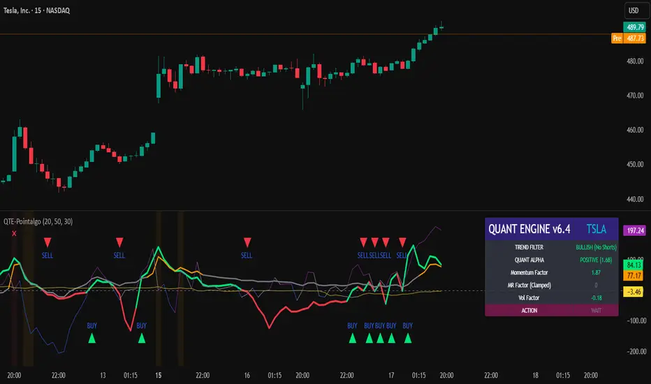
QUANT TRADING ENGINE [PointAlgo]Quant Trading Engine is a quantitative market-analysis indicator that combines multiple statistical factors to study trend behavior, mean reversion, volatility, execution efficiency, and market stability.
The indicator converts raw price behavior into standardized signals to help evaluate directional bias and risk conditions in a systematic way.
This script focuses on factor alignment and regime awareness, not prediction certainty.
Design Philosophy
Markets move through different regimes such as trending, ranging, volatile expansion, and instability.
This indicator attempts to model these regimes by blending:
Momentum strength
Mean-reversion pressure
Volatility risk
Trend filtering
Execution context (VWAP)
Correlation structure
Each component is normalized and combined into a single Quant Alpha framework.
Factor Construction
1. Momentum Factor
Measures directional strength using percentage price change over a rolling window.
Standardized using mean and standard deviation.
Represents trend continuation pressure.
2. Mean Reversion Factor
Measures deviation from a longer moving average.
Standardized to identify stretched conditions.
Designed to capture counter-trend behavior.
Directional Clamping
Mean-reversion signals are dynamically restricted:
No counter-trend buying during downtrends.
No counter-trend selling during uptrends.
Allows both sides only in neutral regimes.
This prevents conflicting signals in strong trends.
3. Volatility Factor
Uses realized volatility derived from price changes.
Penalizes environments where volatility deviates significantly from its norm.
Acts as a risk adjustment rather than a directional driver.
4. Composite Quant Alpha
The final Quant Alpha is a weighted blend of:
Momentum
Mean reversion (trend-clamped)
Volatility risk
The composite is standardized into a Z-score, allowing consistent interpretation across instruments and timeframes.
Signal Logic
Buy signal occurs when Quant Alpha crosses above zero.
Sell signal occurs when Quant Alpha crosses below zero.
Zero-cross logic is used to represent shifts from negative to positive statistical bias and vice versa.
Signals reflect statistical regime change, not trade instructions.
Volatility Smile Context
Measures price deviation from its statistical distribution.
Identifies skewed conditions where upside or downside volatility becomes dominant.
Highlights extreme deviations that may imply elevated derivative risk.
Exotic Risk Conditions
Detects sudden price expansion combined with volatility spikes.
Highlights environments where execution and risk become unstable.
Visual background cues are used for awareness only.
Execution Context (VWAP)
Measures price distance from VWAP.
Used to assess execution efficiency rather than direction.
Helps identify stretched conditions relative to average traded price.
Correlation Structure
Evaluates short-term return correlations.
Detects when price behavior becomes less predictable.
Flags structural instability rather than trend direction.
Visualization
The indicator plots:
Quant Alpha (scaled) with directional coloring
Volatility smile deviation
Price vs VWAP distance
Correlation structure
Signal markers indicate Quant Alpha zero-cross events and risk conditions.
Dashboard
A compact dashboard summarizes:
Trend filter state
Quant Alpha polarity and value
Individual factor readings
Current action state (Buy / Sell / Wait / Risk)
The dashboard provides a real-time snapshot of internal model conditions.
Usage Notes
Designed for analytical interpretation and research.
Best used alongside price action and risk management tools.
Factor behavior depends on instrument liquidity and volatility.
Not optimized for illiquid or irregular markets.
Disclaimer
This script is provided for educational and analytical purposes only.
It does not provide financial, investment, or trading advice.
All outputs should be independently validated before making any trading decisions.
Amihud Illiquidity Ratio [MarkitTick]💡This indicator implements the Amihud Illiquidity Ratio, a financial metric designed to measure the price impact of trading volume. It assesses the relationship between absolute price returns and the volume required to generate that return, providing traders with insight into the "stress" levels of the market liquidity.
Concept and Originality
Standard volume indicators often look at volume in isolation. This script differentiates itself by contextualizing volume against price movement. It answers the question: "How much did the price move per unit of volume?" Furthermore, unlike static indicators, this implementation utilizes dynamic percentile zones (Linear Interpolation) to adapt to the changing volatility profile of the specific asset you are viewing.
Methodology
The calculation proceeds in three distinct steps:
1. Daily Return: The script calculates the absolute percentage change of the closing price relative to the previous close.
2. Raw Ratio: The absolute return is divided by the volume. I have introduced a standard scaling factor (1,000,000) to the calculation. This resolves the issue of the values being astronomically small (displayed as roughly 0) without altering the fundamental logic of the Amihud ratio (Absolute Return / Volume).
- High Ratio: Indicates that price is moving significantly on low volume (Illiquid/Thin Order Book).
- Low Ratio: Indicates that price requires massive volume to move (Liquid/Deep Order Book).
3. Dynamic Regimes: The script calculates the 75th and 25th percentiles of the ratio over a lookback period. This creates adaptive bands that define "High Stress" and "Liquid" zones relative to recent history.
How to Use
Traders can use this tool to identify market fragility:
- High Stress Zone (Red Background): When the indicator crosses above the 75th percentile, the market is in a High Illiquidity Regime. Price is slipping easily. This is often observed during panic selling or volatile tops where the order book is thin.
- Liquid Zone (Green Background): When the indicator drops below the 25th percentile, the market is in a Liquid Regime. The market is absorbing volume well, which is often characteristic of stable trends or accumulation phases.
- Dashboard: A visual table on the chart displays the current Amihud Ratio and the active Market Regime (High Stress, Normal, or Liquid).
Inputs
- Calculation Period: The lookback length for the average illiquidity (Default: 20).
- Smoothing Period: The length of the additional moving average to smooth out noise (Default: 5).
- Show Quant Dashboard: Toggles the visibility of the on-screen information table.
● How to read this chart
• Spike in Illiquidity (Red Zones)
Price is moving on "thin air." Expect high volatility or potential reversals.
• Low Illiquidity (Green/Stable Zones)
The market is deep and liquid. Trends here are more sustainable and reliable.
• Divergence
Watch for price making new highs while liquidity is drying up—a classic sign of an exhausted trend.
Example:
● Chart Overview
The chart displays the Amihud Illiquidity indicator applied to a Gold (XAUUSD) 4-hour timeframe.
Top Pane: Price action with manual text annotations highlighting market reversals relative to liquidity zones.
Bottom Pane: The specific technical indicator defined in the logic. It features a Blue Line (Raw Illiquidity), a Red Line (Signal/Smoothed), and dynamic background coloring (Red and Green vertical strips).
● Deep Visual Analysis
• High Stress Regime (Red Zones)
Visual Event: In the bottom pane, the background periodically shifts to a translucent red.
Technical Logic: This event is triggered when the amihudAvg (the smoothed illiquidity ratio) exceeds the 75th percentile ( hZone ) of the lookback period.
Forensic Interpretation: The logic calculates the absolute price change relative to volume. A spike into the red zone indicates that price is moving significantly on relatively lower volume (high price impact). Visually, the chart shows these red zones aligning with local price peaks (volatility expansion), leading to the bearish reversal marked by the red box in the top pane.
• Liquid Regime (Green Zones)
Visual Event: The background shifts to a translucent green in the bottom pane.
Technical Logic: This triggers when the amihudAvg falls below the 25th percentile ( lZone ).
Forensic Interpretation: This state represents a period where large volumes are absorbed with minimal price impact (efficiency). On the chart, this green zone corresponds to the consolidation trough (green box, top pane), validating the annotated accumulation phase before the bullish breakout.
• Indicator Lines
Blue Line: This is the illiquidityRaw value. It represents the raw daily return divided by volume.
Red Line: This is the smoothedVal , a Simple Moving Average (SMA) of the raw data, used to filter out noise and define the trend of liquidity stress.
● Anomalies & Critical Data
• The Reversal Pivot
The transition from the "High Stress" (Red) background to the "Liquid" (Green) background serves as a visual proxy for market regime change. The chart shows that as the Red zones dissipate (volatility contraction), the market enters a Green zone (efficient liquidity), which acted as the precursor to the sustained upward trend on the right side of the chart.
● About Yakov Amihud
Yakov Amihud is a leading researcher in market liquidity and asset pricing.
• Brief Background
Professor of Finance, affiliated with New York University (NYU).
Specializes in market microstructure, liquidity, and quantitative finance.
His work has had a major impact on both academic research and practical investment models.
● The Amihud (2002) Paper
In 2002, he published his influential paper: “Illiquidity and Stock Returns: Cross-Section and Time-Series Effects” .
• Key Contributions
Introduced the Amihud Illiquidity Measure, a simple yet powerful proxy for market liquidity.
Demonstrated that less liquid stocks tend to earn higher expected returns as compensation for liquidity risk.
The measure became one of the most widely used liquidity metrics in finance research.
● Why It Matters in Practice
Used in quantitative trading models.
Applied in portfolio construction and risk management.
Helpful as a liquidity filter to avoid assets with excessive price impact.
In short: Yakov Amihud established a practical and robust link between liquidity and returns, making his 2002 work a cornerstone in modern financial economics.
Disclaimer: All provided scripts and indicators are strictly for educational exploration and must not be interpreted as financial advice or a recommendation to execute trades. I expressly disclaim all liability for any financial losses or damages that may result, directly or indirectly, from the reliance on or application of these tools. Market participation carries inherent risk where past performance never guarantees future returns, leaving all investment decisions and due diligence solely at your own discretion.

Ultimate Institutional Order Flow Pro [Pointalgo]Ultimate Institutional Order Flow (UIOF Pro)
Ultimate Institutional Order Flow (UIOF Pro) is a multi-component market analysis indicator designed to study order flow behavior, liquidity interaction, volatility structure, and session-based participation.
It integrates several commonly used market structure and order-flow concepts into a single visual framework.
This script focuses on context and alignment, not on isolated signals.
Core Objective
The indicator aims to identify areas where price, volume, liquidity, and structure appear aligned in the same direction.
It does this by combining:
VWAP behavior
Volume participation
Cumulative delta analysis
Liquidity pool interaction
Order blocks and fair value gaps
Market structure shifts
Session and higher-timeframe confirmation
VWAP & Volatility Framework
Calculates VWAP using session, weekly, or monthly anchors.
Optional VWAP standard-deviation bands visualize price dispersion.
VWAP slope and price position are used to classify directional bias.
VWAP is treated as a dynamic equilibrium reference rather than a signal.
Cumulative Volume Delta (CVD)
Estimates buy and sell pressure based on intrabar price movement.
Tracks cumulative delta and a smoothed delta average.
Uses delta change normalization to highlight abnormal activity.
Detects potential delta divergences when price and participation differ.
CVD is used to assess whether participation supports or contradicts price movement.
Liquidity Zones & Sweeps
Identifies recent swing highs and lows as potential liquidity pools.
Tracks buy-side and sell-side liquidity areas.
Flags conditions where price sweeps liquidity beyond recent extremes.
Liquidity interaction is treated as context, not prediction.
Order Blocks
1. Detects potential bullish and bearish order blocks using:
Candle structure
Volatility thresholds
Volume confirmation
2.Highlights areas where strong participation followed opposing price movement.
Order blocks are visual reference zones and do not imply guaranteed reactions.
Fair Value Gaps (FVG)
Identifies imbalance zones where price moves without overlapping structure.
Filters gaps using ATR-based size conditions.
Visual shading is used to highlight imbalance areas.
These zones may represent inefficient price movement requiring further interaction.
Volume Profile & Point of Control (POC)
Builds a simplified volume profile over a configurable lookback window.
Determines the price level with the highest traded volume (POC).
POC is used as a reference for acceptance or rejection behavior.
Market Structure
Evaluates recent highs and lows to identify structure breaks.
Classifies directional structure as bullish, bearish, or neutral.
Structure is used as a directional filter rather than a trigger.
Multi-Timeframe Confirmation
Optional higher-timeframe confirmation aligns lower-timeframe behavior with broader context.
Prevents analysis from relying on isolated timeframe conditions.
Session Filtering
1. Allows analysis to be limited to specific trading sessions.
2. Helps reduce signals during low-participation periods.
3. Session logic affects signal eligibility, not calculations.
Signal Logic
Signals are generated only when multiple independent conditions align, including:
Liquidity interaction
Order block presence
VWAP bias
Delta confirmation
Structure alignment
Volume participation
Optional higher-timeframe confirmation
Active trading session
Strong continuation conditions are also highlighted when price, volume, and participation remain aligned.
Signals represent confluence states, not trade instructions.
Dashboard Summary
A real-time dashboard summarizes:
VWAP bias and slope
CVD strength and direction
Delta behavior
Market structure state
Higher-timeframe context
Volume conditions
Liquidity pool counts
Session activity
This provides a high-level snapshot of market conditions without manual calculation.
Alerts are available for:
Institutional alignment conditions
Strong continuation pressure
Liquidity sweeps
Delta divergences
Alerts are informational and reflect internal indicator states only.
Usage Notes
Designed for analytical interpretation and market study.
Best used alongside price action and risk management methods.
Performance depends on instrument liquidity and volume quality.
All visual elements can be individually enabled or disabled.
Disclaimer
This script is provided for educational and analytical purposes only.
It does not provide financial, investment, or trading advice.
All outputs should be independently verified before making trading decisions.

Delta Strength (True TV Delta)Description
Delta Strength measures the intensity of aggressive trading activity using TradingView’s native Volume Delta engine (ta.requestVolumeDelta).
Volume Delta shows which side is aggressive (buyers or sellers).
Delta Strength answers a different question:
How strong is that aggression compared to recent market behavior?
This indicator converts true per-bar volume delta into a relative strength ratio, helping identify institutional participation, initiative moves, absorption, and potential traps at key price locations.
No candle-based approximation is used. The calculation relies on TradingView’s internal bid-ask volume classification from lower timeframes.
How It Is Calculated
• Per-bar delta is derived from the difference between cumulative delta at bar close and bar open
• Absolute delta is averaged over a user-defined lookback period
• Current delta is compared against this average to produce a normalized strength value
This makes the indicator adaptive across instruments, volatility regimes, and sessions.
How to Read Delta Strength
• Values below the lower threshold indicate normal or low-quality activity
• Rising values show increasing professional participation
• Very high values indicate strong imbalance or aggressive initiative orders
• Extreme values without price follow-through often signal absorption or trapping
Delta Strength measures intensity only, not direction.
How to Use (Important)
Always combine Delta Strength with price location and structure.
Best locations include:
• VWAP and VWAP bands
• Previous Day High / Low
• Session highs and lows
• Range boundaries or value edges
Interpretation logic:
• Strong delta with price acceptance supports continuation
• Strong delta with price rejection suggests absorption or exhaustion
What This Indicator Is NOT
• Not a directional signal
• Not a standalone entry tool
• Not a trend indicator
Using Delta Strength without context can lead to false conclusions.
Intended Use
This indicator is designed for:
• Order Flow Analysis
• Market microstructure study
• Institutional activity confirmation
• Advanced discretionary trading workflows
It works best when combined with Volume Delta, VWAP, and structure-based analysis.
Summary
Delta shows who is aggressive.
Delta Strength shows how aggressive they are.
Price reaction shows whether that aggression is accepted or absorbed.
Used together, they provide insight into market intent rather than just price movement.

Buy / Sell Volume + % (Classic + Pressure)Buy / Sell Volume % (Classic + Pressure)
Overview
Buy / Sell Volume (Classic + Pressure) is a volume decomposition and dominance indicator designed to help traders understand how trading volume is distributed between buying and selling pressure on each candle.
Instead of treating volume as a single number, this indicator splits total volume into estimated Buy Volume and Sell Volume, visualizes them symmetrically, and summarizes dominance using a compact on-chart dashboard.
The indicator is intended as a context and confirmation tool, not a trade signal generator.
Core Concepts
1. Buy / Sell Volume Decomposition
The indicator estimates buying and selling activity based on the position of the close within the candle’s high–low range:
Closes near the high → more buying pressure
Closes near the low → more selling pressure
Middle closes → balanced activity
This provides a clear visual view of demand vs supply on every bar.
2. Dual Calculation Modes
🔹 Classic Mode (Default)
Uses pure candle-range logic
Buy Volume + Sell Volume = Total Volume (exact conservation)
No smoothing or directional bias
Values closely match traditional volume behavior
Best for:
Structural analysis
Accumulation / distribution studies
Comparing against raw volume
🔹 Pressure Mode
Introduces a directional bias:
Bullish candles slightly favor buy volume
Bearish candles slightly favor sell volume
Optional EMA smoothing reduces noise
Still volume-conserving (Buy + Sell = Total Volume)
Best for:
Identifying dominance
Trend continuation confirmation
Absorption vs initiative activity
Visual Elements
Volume Bars
Buy Volume plotted above zero
Sell Volume plotted below zero
Optional Total Volume Envelope for context
Color by Dominance
Bright colors when one side dominates
Faded colors when dominance is weak
Helps instantly identify:
Accumulation
Distribution
Absorption
Dashboard (Optional)
A compact dashboard displays:
Buy %
Sell %
Dominance State
BUY DOM
SELL DOM
BALANCED
The dashboard can be toggled ON/OFF and switched between Normal and Compact size to suit multi-pane layouts.
How to Use This Indicator
This indicator works best as a confirmation layer, not a standalone system.
Common Use Cases
Confirming breakouts or breakdowns
Spotting accumulation or distribution near key levels
Identifying absorption during consolidations
Filtering false price moves
Examples
Price rising + strong Buy % → constructive demand
Price rising + strong Sell % → possible distribution
Flat price + balanced volume → absorption / compression
What This Indicator Is NOT
❌ Not true order-flow or bid/ask data
❌ Not a buy/sell signal generator
❌ Not predictive on its own
All calculations are candle-based estimations, designed for context and insight, not execution timing.
Best Use
Works on all timeframes
Most reliable on liquid instruments
Especially useful when combined with:
Support / resistance
Trend structure
Market regime or breadth indicators
Summary
Buy / Sell Volume (Classic + Pressure) helps traders go beyond raw volume by visualizing who is in control of each candle, how strong that control is, and whether volume behavior supports price action.
Used correctly, it can significantly improve trade selectivity, confidence, and risk awareness.

ORB Pro - NY Opening Range Breakout by Elev8+ORB Pro - NY Opening Range Breakout | Smart Support & Resistance
ORB Pro is a comprehensive, professional-grade toolkit designed for intraday traders who rely on the Opening Range Breakout (ORB) strategy.
Unlike standard ORB indicators that simply draw lines, this suite offers a complete dashboard-driven system that monitors four distinct sessions simultaneously, providing real-time status updates and precision alerts.
— — —
🎯 What is the Opening Range Breakout (ORB)?
The Opening Range is the price range established during the first period of the trading session (e.g., the first 15 or 30 minutes). This period represents the initial balance between buyers and sellers. A breakout from this range often signals the likely trend direction for the remainder of the session.
— — —
🚀 Key Features
1. Multi-ORB Monitoring
Stop switching settings constantly. This suite monitors four key ranges at once:
Pre-Market 15m (08:00 – 08:15 ET)
Pre-Market 30m (08:00 – 08:30 ET)
NY Cash Open 15m (09:30 – 09:45 ET)
NY Cash Open 30m (09:30 – 10:00 ET)
2. Smart Status Dashboard
A compact panel in the bottom-right corner gives you the live state of every session:
⏳ Waiting: The session has not started yet.
⚡ Forming: The range is currently being built.
↔️ Range: The range has formed, but price is still contained within the range.
🚀 BULL / 📉 BEAR: A confirmed breakout has occurred.
⛔ OFF: The session is disabled in settings.
3. "Dynamic Resolution" Technology
This is a unique pro feature.
Precision: The script always calculates the High/Low levels using 1-minute data , ensuring your support/resistance lines are pixel-perfect regardless of your chart timeframe.
Flexibility: Breakout signals (Alerts/Labels) are triggered based on your current chart timeframe. This allows you to trade a 5m or 15m breakout strategy while keeping 1m-level precision on your levels.
4. Visual Clarity
Breakout Labels: Automatically plots "BULL" or "BEAR" labels on the exact candle that confirms a breakout.
Profit Targets: Optional toggle to show 1x and 2x profit targets projected from the breakout level.
Time-Bound Signals: Signals are strictly time-bound to the active window to prevent late, low-quality alerts.
— — —
🛠️ How to Use
Add to Chart: Works best on intraday timeframes (1m, 5m, 15m).
Configure: Enable the sessions you trade (e.g., NY 15m) in the settings.
Wait for Forming: Watch the box form live. The dashboard will show "⚡ Forming".
Trade the Break: Wait for a candle Close outside the range. The dashboard will flip to "BULL" or "BEAR" and a label will appear.
Manage Risk: Use the opposite side of the range or the midline as your stop loss.
— — —
⚙️ Settings Overview
Global Settings: Toggle forming boxes, dashboard, and label visibility.
Breakout Method: Choose between Close (safer) or Wick (aggressive) for signal triggers.
Session Groups: Individually enable/disable the 4 distinct sessions and customize their colors/styles.
— — —
📝 Update Notes (Recent)
New PDH/PDL Levels: Added the ability to display Previous Day High and Previous Day Low lines on the chart.
Auto-Update & Cleanup: The PDH/PDL lines now automatically update daily and erase historical lines, ensuring only the current day's levels are visible to keep the chart clean.
Dashboard Positioning: Added a new setting to move the Status Dashboard to any corner of the screen.
Enhanced Customization: Added full styling options in settings for PDH/PDL lines and Dashboard positioning.
— — —
Disclaimer: This tool is for educational and analytical purposes only. Past performance of a strategy does not guarantee future results. Always manage your risk.

Elev8+ Impulse Levels | Smart Support & ResistanceElev8+ Impulse Levels | Smart Support & Resistance
Ever notice price rejecting “empty” areas on the chart—like it remembered something that isn’t obvious?
That “something” is often Institutional Impulse : footprints left behind by large, aggressive moves that get defended again days or weeks later .
Elev8+ Impulse Levels automatically detects these moments and projects the most important prices forward so you can see the structure most traders miss.
— — —
🧠 How It Works (The Logic)
This is not a typical support/resistance tool. It does not hunt swing highs/lows.
It looks for Market Intent —the “Perfect Storm” when two conditions align:
Volume Spike — buying/selling pressure significantly exceeds average volume (multiplier-based).
Volatility Expansion — the candle body is unusually large relative to recent ATR.
When both occur, the script marks the event and treats the impulse close as a key “line in the sand” that can influence future reactions.
— — —
🎯 How to Use These Levels
The script includes a Smart Line behavior that changes level styling based on how price interacts with it—so you can quickly separate two core setups:
1) The Defense (Bounce)
Visual: 🟢 Solid line (Fresh / Untouched)
What it means: Price has not yet traded through or “invalidated” the level.
What to look for: First return to the level → rejection / bounce behavior.
Why it matters: Large players often defend prior entries; first tests can react sharply.
2) The Flip (Break & Retest)
Visual: ◌ Dotted line (Broken / Re-priced)
What it means: A candle has closed through the level.
What to look for: Price returns to the dotted level from the other side (“kiss”) → continuation.
Why it matters: Broken support can act as resistance (and vice versa), similar to a breaker concept.
— — —
✨ Key Features
Smart Visualization — levels automatically transition from solid → dotted when broken to reduce chart noise.
Impulse Candle Highlighting — see the exact candle that created the level (origin clarity).
Fully Customizable Sensitivity — tune volume + size thresholds for Crypto, Forex, Futures, or Stocks.
— — —
🚀 The Elev8+ Workflow
Think of Impulse Levels as your map : it shows where reactions are most likely.
For entry timing, pair it with Elev8+ Pro Reversal to confirm the moment price reacts at these high-value zones.
— — —
Disclaimer: Trading involves risk. This tool is for educational/technical analysis purposes only and does not guarantee future results.

Elev8+ Impulse LevelsElev8+ Impulse Levels | Smart Support & Resistance
Ever notice price rejecting “empty” areas on the chart—like it remembered something that isn’t obvious?
That “something” is often Institutional Impulse : footprints left behind by large, aggressive moves that get defended again days or weeks later .
Elev8+ Impulse Levels automatically detects these moments and projects the most important prices forward so you can see the structure most traders miss.
— — —
🧠 How It Works (The Logic)
This is not a typical support/resistance tool. It does not hunt swing highs/lows.
It looks for Market Intent —the “Perfect Storm” when two conditions align:
Volume Spike — buying/selling pressure significantly exceeds average volume (multiplier-based).
Volatility Expansion — the candle body is unusually large relative to recent ATR.
When both occur, the script marks the event and treats the impulse close as a key “line in the sand” that can influence future reactions.
— — —
🎯 How to Use These Levels
The script includes a Smart Line behavior that changes level styling based on how price interacts with it—so you can quickly separate two core setups:
1) The Defense (Bounce)
Visual: 🟢 Solid line (Fresh / Untouched)
What it means: Price has not yet traded through or “invalidated” the level.
What to look for: First return to the level → rejection / bounce behavior.
Why it matters: Large players often defend prior entries; first tests can react sharply.
2) The Flip (Break & Retest)
Visual: ◌ Dotted line (Broken / Re-priced)
What it means: A candle has closed through the level.
What to look for: Price returns to the dotted level from the other side (“kiss”) → continuation.
Why it matters: Broken support can act as resistance (and vice versa), similar to a breaker concept.
— — —
✨ Key Features
Smart Visualization — levels automatically transition from solid → dotted when broken to reduce chart noise.
Impulse Candle Highlighting — see the exact candle that created the level (origin clarity).
Fully Customizable Sensitivity — tune volume + size thresholds for Crypto, Forex, Futures, or Stocks.
— — —
🚀 The Elev8+ Workflow
Think of Impulse Levels as your map : it shows where reactions are most likely.
For entry timing, pair it with Elev8+ Pro Reversal to confirm the moment price reacts at these high-value zones.
— — —
Disclaimer: Trading involves risk. This tool is for educational/technical analysis purposes only and does not guarantee future results.

Session VWAPsOVERVIEW
------------
This indicator automatically anchors VWAP lines at key trading session openings. By default, it calculates separate VWAPs starting at the London Open (03:00 EST) and New York Open (09:30 EST), allowing traders to track institutional price levels from these critical market sessions.
KEY FEATURES
------------
✓ Dual Session VWAPs - London and New York opens
✓ Fully Customizable Times - Set any session opening time
✓ Timezone Support - Choose from UTC-12 to UTC+14
✓ Color Customization - Personalize each VWAP line color
✓ Adjustable Line Width - Set line thickness (1-5)
✓ Visual Session Markers - Labels show "LDN" and "NY" at session starts
✓ Clean Chart Display - Minimal, professional appearance
HOW IT WORKS
------------
The indicator anchors a new VWAP calculation at the specified session opening times. Each VWAP continues to calculate throughout the day until the next session opening the following day, when it resets and starts fresh.
VWAP (Volume Weighted Average Price) is calculated using the typical price (HLC3) weighted by volume, providing dynamic support/resistance levels that reflect institutional trading activity.
DEFAULT SETTINGS
------------
• London Session: 03:00 UTC-5 (Blue line)
• New York Session: 09:30 UTC-5 (Red line)
• Timezone: UTC-5 / EST (adjustable)
CUSTOMIZATION
------------
All parameters are fully adjustable in the indicator settings:
- Session opening hours and minutes
- VWAP line colors
- Line width/thickness
- Timezone offset
USE CASES
------------
• Identify key institutional price levels
• Track session-specific support/resistance
• Monitor price action relative to session opens
• Combine with other strategies for confluence
• Observe how price reacts to VWAP during different sessions
IDEAL FOR
------------
• Intraday traders
• Scalpers
• Day traders focusing on London/New York sessions
• Traders using VWAP strategies
• Anyone tracking institutional order flow
NOTES
------------
- Works on all timeframes (recommended: 1min to 1hour)
- Best used on liquid instruments
- VWAPs reset daily at the specified session times
- Can be used standalone or combined with other indicators
SETTINGS GUIDE
------------
London Session Group:
- Hour: Session opening hour (0-23)
- Minute: Session opening minute (0-59)
- Color: VWAP line color
- Line Width: Thickness of the line
New York Session Group:
- Hour: Session opening hour (0-23)
- Minute: Session opening minute (0-59)
- Color: VWAP line color
- Line Width: Thickness of the line
Timezone:
- Select your local timezone (UTC-12 to UTC+14)
- Default: UTC-5 (EST)

Jin#10 HMA/OBV Pro Trader System (15m)HMA/OBV Pro Trader System Overview (15m Timeframe)
This system is designed to identify high-probability entry and exit points on the 15-minute chart by integrating multiple indicators for confirmation.
1. Trend and Confirmation
HMA Lines (Solid Lines): These are two Hull Moving Averages (HMA 8 and HMA 15).
Green/Red HMA 8 (Line 1): The faster HMA, showing short-term momentum.
Blue/Red HMA 15 (Line 3): The slower HMA, indicating the medium-term trend direction.
Trend Alignment: A strong trend requires the fast HMA (8) to be above the slow HMA (15) and both to be sloping favorably.
MTF Background Color (Candle Background): This represents the 30-minute trend filter.
Light Green/Teal: The 30-minute trend is upward and strong.
Light Orange/Red: The 30-minute trend is downward and strong.
This acts as a major confirmation filter for entries.
2. Trading Signals (Shapes)
🚀 BUY / 🔻 SELL: These are the Final Confirmation Signals. They appear when all conditions (HMA alignment, Stochastic, MACD, and the 30m MTF filter) are met.
⚠️ Pre-BUY / Pre-SELL: These are Warning/Early Signals indicating that most conditions on the 15m chart are aligned, but the 30m filter has not yet confirmed the trend direction.
🔥 Volatility Spike / 🧊 Volatility Crash (Small Circle): Alerts the user to an unusually large candle (ATR spike), signaling extreme volatility or a potential reversal.
3. Exit and Risk Management
ATR Trailing Stop (Dashed Line): This dynamic line serves as a Soft Exit or Stop-Loss Guide.
❌ Exit Long / Exit Short (X-Cross): This shape appears when the price crosses the ATR Trailing Stop, suggesting the existing position (Long or Short) should be closed immediately.
Dashed TP/SL Lines (Green/Red): These lines mark a calculated Take Profit (TP) and Stop Loss (SL) based on the entry price and the defined Risk-Reward Ratio (e.g., 1:1.5).

FVG BOS SMC Liquidity Analyzer - Ambrosia-Prime - Basic v1.0# 📘 USER GUIDE
# FVG BOS Volume Volatility Entry/TP/SL Liquidity Analyzer
## 🆓 FREE Basic v1.0 | by Ambrosia-Prime
---
## 📋 TABLE OF CONTENTS
1. (#what-is-this-indicator)
2. (#settings-explained)
3. (#understanding-the-tables)
4. (#your-first-trade)
5. (#free-vs-premium)
6. (#faq)
---
## 🎯 WHAT IS THIS INDICATOR?
The **FVG Analyzer** is a professional trading tool based on **Smart Money Concepts (SMC)** and **ICT strategies**. It automatically detects:
✅ **Fair Value Gaps (FVG)** - Market imbalances
✅ **Break of Structure (BOS)** - Trend confirmations
✅ **Multi-Timeframe Analysis** - 4H, 1H, 15m, 5m, 1m
✅ **Entry, Stop-Loss & Take-Profit** - Automatic level calculation
### The Debug Table shows you everything:
| TF | FVG | Touch | Exit | READY | Signal |
|-----|------|-------|------|-------|--------|
| ► 4H| BULL | ✓ | ↑ | ✓ | LONG |
| 1H | BULL | ✓ | ↑ | ✓ | LONG |
| 15m | BULL | ✓ | ↑ | ✓ | LONG |
When all timeframes show **READY** → **ENTRY SIGNAL!**
---
## ⚙️ SETTINGS EXPLAINED
### 👁 DISPLAY SETTINGS
| Setting | Description |
|---------|-------------|
| Show Bullish FVG | Display yellow FVG boxes |
| Show Bearish FVG | Display blue FVG boxes |
| Show BOS lines | Break of Structure lines |
| Show Session Stats | Statistics table (top right) |
| Show Debug Table | Cascade status (bottom left) |
| Show Entry/SL/TP | Entry lines on signals |
### 🎯 BASIC FILTER (Choose ONE)
In the **FREE Version** you can only activate **1 filter** at a time:
| Filter | What it does |
|--------|--------------|
| **None** | No filter active |
| **FVG Size** | Only FVGs larger than X × ATR |
| **Volume** | Only on above-average volume |
| **Volatility** | Only on normal volatility (not too wild) |
| **BOS only with FVG** | BOS only when open FVG exists |
| **Fill Delete** | FVG disappears when completely filled |
> 💎 **PREMIUM:** Use all 15+ filters simultaneously!
### 🔄 TOUCH + EXIT CASCADE
| Setting | Options | Recommendation |
|---------|---------|----------------|
| Cascade Parent TF | 4H, 1H, 15m | **4H** for Swing |
| Confirm EXIT by WICK | ON/OFF | **ON** for more signals |
| Entry Trigger Level | Lowest/Middle/Parent | **Parent TF** |
| Require ALL TFs | ON/OFF | **ON** for quality |
### 📊 TP SETTINGS
| Setting | Description |
|---------|-------------|
| TP Mode | TP1 only / TP1+TP2 / TP1+TP2+TP3 |
| TP1 Risk:Reward | e.g. 1.5 = 1.5× your risk |
| TP2 Multiplier | e.g. 2.0 = 2× TP1 |
| TP3 Multiplier | e.g. 3.0 = 3× TP1 |
---
## 📈 UNDERSTANDING THE TABLES
### 📍 Filter Status (Top Left)
```
┌─────────────────────────────────────┐
│ 💎 │ ALL FILTERS │ = PREMIUM │
├─────────────────────────────────────┤
│ Active Filter │ FVG Size │ ✅ │
│ Session │ EU 🔒 │ 💎 │
│ Status │ ⏳ WAIT │FREE v1.0│
└─────────────────────────────────────┘
```
- **Active Filter:** Your selected filter
- **Session:** Current trading session
- 🔒 = Locked (PREMIUM only)
- ✅ = Unlocked (No Market 22-01 CET)
- **Status:** WAIT / 🟢 LONG / 🔴 SHORT
### 📊 Session Stats (Top Right)
```
┌──────────────────────────────────────────────────────────┐
│ Session │Bull│Bear│Total│Entries│TP│SL│Win%│Profit│
├──────────────────────────────────────────────────────────┤
│ Asia 01-09 │173 │161 │ 334 │ 💎 │💎│💎│ 💎 │PREMIUM│
│ EU 09-15:30 │131 │146 │ 277 │ 💎 │💎│💎│ 💎 │PREMIUM│
│ EU+US 15:30-17:30│ 37 │ 42 │ 79 │ 💎 │💎│💎│ 💎 │PREMIUM│
│ US 17:30-22 │ 95 │106 │ 201 │ 💎 │💎│💎│ 💎 │PREMIUM│
│ No Mkt 22-01 ✅ │ 42 │ 52 │ 94 │ 14 │14│ 0│100%│ 9.8R │
└──────────────────────────────────────────────────────────┘
```
**In FREE you see:**
- ✅ Bull/Bear/Total FVGs for **ALL** sessions
- ✅ Complete stats only for **No Market (22-01 CET)**
- 💎 Other sessions = **PREMIUM**
### 🔍 Debug Table (Bottom Left)
Shows the **live status** of the cascade:
| Symbol | Meaning |
|--------|---------|
| ► | Parent timeframe (selected) |
| BULL/BEAR | FVG direction |
| ✓ (Touch) | Price touched the zone |
| ↑/↓ (Exit) | Price exited the zone |
| ✓ (READY) | Timeframe is ready |
| LONG/SHORT | Signal direction |
---
## 🚀 YOUR FIRST TRADE
### Preface - Why this Indicator is Different
This indicator can filter so **aggressively** that you receive few or almost no signals. **That was exactly my goal!**
I don't need 500 entries per day staring at a chart all day long.
**I only need 1-3 signals per day - and they should work.**
That was the goal. Quality over quantity.
---
### Step-by-Step Guide:
**1. Create a Watchlist**
- Create a watchlist in TradingView
- Add as many charts as your account allows
- Add the indicator to all charts
**2. Set up Alerts**
- Go to the **4H chart**
- Set up the alert:
- **FREE:** Only "No Market" session (22-01 CET)
- **PREMIUM:** All sessions available
- Select "Any Entry Signal"
**3. React to Alert Signal**
- When an alert comes → Switch to the chart
- Check the **Session Stats Table** (top right)
- There you see: Entry, TP, SL, Win%, Profit
**4. Optimize Entry**
- Open the **Settings** (gear icon)
- Adjust the **TP** until you win all trades
- *(Sometimes profit is higher when you lose one trade but have a higher TP)*
- When you've found the best profit result:
- **Take the set TP minus 10-20%**
- *(We don't want to be greedy, but we want to win!)*
**5. Manage Trade**
- The **SL price** is already provided
- The **TP price** adjusts to your settings
- Set your trade accordingly
**6. Done!**
- Start the trade
- Wait for the next signal on another chart
- Repeat!
---
### ⚠️ Important Note
> Remember: A trade can always hit SL!
> Only trade with money you can afford to lose.
>
> I wish you great success and let me know how successful you were.
> **I will read every comment and answer to the best of my ability.**
---
## 💎 FREE vs PREMIUM
### *Coming soon - Currently in Release Testing*
### What you get with FREE:
| Feature | FREE 🆓 |
|---------|---------|
| FVG Detection (all TFs) | ✅ |
| BOS Detection | ✅ |
| Cascade Logic | ✅ |
| Debug Table | ✅ |
| Session Stats Table | ✅ |
| Entry/SL/TP Lines | ✅ |
| Filters | **1 at a time** |
| Trading Sessions | **Only No Market (22-01)** |
| Alerts | **Only No Market** |
### What you get with PREMIUM:
| Feature | PREMIUM 💎 |
|---------|------------|
| Everything from FREE | ✅ |
| **15+ filters simultaneously** | ✅ |
| **All sessions unlocked** | ✅ |
| → Asia (01-09) | ✅ |
| → EU (09-15:30) | ✅ |
| → EU+US Overlap (15:30-17:30) | ✅ |
| → US (17:30-22) | ✅ |
| **Alerts for all sessions** | ✅ |
| **Session-based TP optimization** | ✅ |
| **HTF Zone Confluence Filter** | ✅ |
| **Structure Filter (HH/HL/LH/LL)** | ✅ |
| **RR Filter** | ✅ |
| **Trend EMA Filter** | ✅ |
| **Candle Quality Filter** | ✅ |
| **Cooldown Filter** | ✅ |
| **FVG Age Filter** | ✅ |
### 🚀 PREMIUM EDITION (Exclusive!)
The Premium version has **two different entry logics** - that's why the testing phase is still ongoing.
Finds setups with **10-100% potential!**
---
## ❓ FAQ
### "Why don't I see any entries?"
**Possible reasons:**
1. **Wrong session:** FREE only works 22:00 - 01:00 CET
2. **Cascade not READY:** All TFs must show ✓
3. **Filter blocking:** Check your active filter
4. **Already in trade:** "Single Trade" allows only 1 trade
### "What do the colors mean?"
| Color | Meaning |
|-------|---------|
| 🟡 Yellow | Bullish FVG / Entry line |
| 🔵 Blue | Bearish FVG |
| 🟢 Green | TP line / Positive |
| 🔴 Red | SL line / Negative |
| 🟣 Purple | EU+US Overlap Session |
### "Which timeframe should I use?"
| Your Style | Chart TF | Cascade Parent |
|------------|----------|----------------|
| Scalping | 1m - 5m | 15m |
| Daytrading | 5m - 15m | 1H |
| Swing | 15m - 1H | 4H |
### "Can I change the sessions?"
- **FREE:** No, only No Market (22-01) is available.
- **PREMIUM:** Yes, all sessions + session-based TP values!
---
## 📞 WANT MORE?
### Unlock PREMIUM:
- ✅ All Sessions
- ✅ All Filters
- ✅ 2 Entry Logics
- ✅ Priority Support
### Contact & Support:
📊 **TradingView:** (www.tradingview.com)
---
## 📜 CHANGELOG
### v1.0 FREE (December 2024)
- Initial Release
- Multi-TF FVG Detection
- BOS Detection
- Cascade Logic
- 1 Filter (Dropdown)
- No Market Session (22-01)
- Session Statistics
- Debug Table
---
## ⚠️ DISCLAIMER
This indicator is an **analysis tool** and not financial advice.
Trading involves risks. Past results do not guarantee future profits.
Only trade with capital you can afford to lose.
---
**Good luck with your trading! 🚀**
*Your Ambrosia-Prime*
---
*© 2024 Ambrosia-Prime. All rights reserved.*
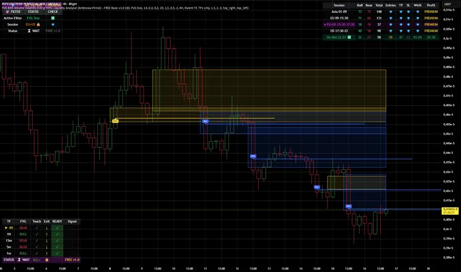
Anchored VWAP: Monthly / Weekly / SessionsPlots up to five VWAP lines using the chart’s exchange timezone:
Monthly anchored VWAP: resets on the first bar at/after your chosen month start day + time.
Weekly anchored VWAP: resets on the first bar at/after your chosen weekday + time.
Up to 3 session anchored VWAPs: each resets on the first bar that enters its configured TradingView session window; optionally hides the line outside the session).
All VWAPs are computed from a selectable price source (default hlc3) and traded volume.

Big Trades Whale Detector [Volume Anomalies] By HKOverview The "Big Trade Detector" helps you spot institutional footprints by identifying volume anomalies that act as outliers compared to recent history. It uses statistical analysis (Standard Deviation) to filter out noise and highlight only significant buying or selling pressure.
Features:
Volume Decomposition: Approximates buy/sell volume based on price action within the candle (Close vs. Range).
3-Tier Detection: Uses dynamic thresholds to categorize volume spikes into Small, Medium, and Extreme events.
Smart Calculation: Compares current volume against the previous average to detect sudden shifts in momentum.
Visuals:
Green Circles (Below Bar): Unusual Buying Pressure (Support defense or Breakout).
Red Circles (Above Bar): Unusual Selling Pressure (Resistance defense or Dump).
Size Matters: The larger the circle, the higher the standard deviation (Sigma) of that volume event.

Auto Harmonic PatternThis advanced harmonic pattern recognition system represents the pinnacle of algorithmic pattern detection, utilizing precision-engineered Fibonacci validation algorithms with institutional-grade accuracy 📊✨. Built with sophisticated multi-layered filtering logic, it automatically identifies and validates high-probability reversal structures in real-time across all market conditions and timeframes 🎯.
🔥 Complete Pattern Detection Arsenal
This is the ONLY TradingView harmonic indicator that integrates all 16 major harmonic patterns with mathematically validated Fibonacci ratios:
🦇 Gartley Pattern
🦇 Bat Pattern
🦋 Butterfly Pattern
🦀 Crab Pattern
🎨 Leonardo Pattern
🦀 Deep Crab Pattern
🦈 Shark Pattern
🔐 Cypher Pattern
🕊️ White Swan Pattern
🔁 Three Drives Pattern
🔄 AB=CD Pattern
🌊 Wolfe Waves Pattern
5️⃣-0️⃣ Pattern
⭐ Nen Star Pattern
🦢 Black Swan Pattern
⚔️ Anti-Gartley Pattern
💎 Professional-Grade Features
The indicator employs real-time pattern validation with strict ratio tolerance controls ⚡, customizable visual alerts for pattern completion 🔔, automated multiple take-profit target plotting with precision Fibonacci extensions 💰, and integrated volume analysis for trade confirmation 📊. Each detected pattern includes three clearly marked TP levels to maximize your profit potential while maintaining optimal risk management.
✅ Want access to this indicator? Simply boost this indicator 🚀 and you'll receive immediate access to the most comprehensive and accurate harmonic pattern detection tool available on TradingView! 💪📈
