OverUnder Yield Spread🗺️ OverUnder is a structural regime visualizer , engineered to diagnose the shape, tone, and trajectory of the yield curve. Rather than signaling trades directly, it informs traders of the world they’re operating in. Yield curve steepening or flattening, normalizing or inverting — each regime reflects a macro pressure zone that impacts duration demand, liquidity conditions, and systemic risk appetite. OverUnder abstracts that complexity into a color-coded compression map, helping traders orient themselves before making risk decisions. Whether you’re in bonds, currencies, crypto, or equities, the regime matters — and OverUnder makes it visible.
🧠 Core Logic
Built to show the slope and intent of a selected rate pair, the OverUnder Yield Spread defaults to 🇺🇸US10Y-US2Y, but can just as easily compare global sovereign curves or even dislocated monetary systems. This value is continuously monitored and passed through a debounce filter to determine whether the curve is:
• Inverted, or
• Steepening
If the curve is flattening below zero: the world is bracing for contraction. Policy lags. Risk appetite deteriorates. Duration gets bid, but only as protection. Stocks and speculative assets suffer, regardless of positioning.
📍 Curve Regimes in Bull and Bear Contexts
• Flattening occurs when the short and long ends compress . In a bull regime, flattening may reflect long-end demand or fading growth expectations. In a bear regime, flattening often precedes or confirms central bank tightening.
• Steepening indicates expanding spread . In a bull context, this may signal healthy risk appetite or early expansion. In a bear or crisis context, it may reflect aggressive front-end cuts and dislocation between short- and long-term expectations.
• If the curve is steepening above zero: the world is rotating into early expansion. Risk assets behave constructively. Bond traders position for normalization. Equities and crypto begin trending higher on rising forward expectations.
🖐️ Dynamically Colored Spread Line Reflects 1 of 4 Regime States
• 🟢 Normal / Steepening — early expansion or reflation
• 🔵 Normal / Flattening — late-cycle or neutral slowdown
• 🟠 Inverted / Steepening — policy reversal or soft landing attempt
• 🔴 Inverted / Flattening — hard contraction, credit stress, policy lag
🍋 The Lemon Label
At every bar, an anchored label floats directly on the spread line. It displays the active regime (in plain English) and the precise spread in percent (or basis points, depending on resolution). Colored lemon yellow, neither green nor red, the label is always legible — a design choice to de-emphasize bias and center the data .
🎨 Fill Zones
These bands offer spatial, persistent views of macro compression or inversion depth.
• Blue fill appears above the zero line in normal (non-inverted) conditions
• Red fill appears below the zero line during inversion
🧪 Sample Reading: 1W chart of TLT
OverUnder reveals a multi-year arc of structural inversion and regime transition. From mid-2021 through late 2023, the spread remains decisively inverted, signaling persistent flattening and credit stress as bond prices trended sharply lower. This prolonged inversion aligns with a high-volatility phase in TLT, marked by lower highs and an accelerating downtrend, confirming policy lag and macro tightening conditions.
As of early 2025, the spread has crossed back above the zero baseline into a “Normal / Steepening” regime (annotated at +0.56%), suggesting a macro inflection point. Price action remains subdued, but the shift in yield structure may foreshadow a change in trend context — particularly if follow-through in steepening persists.
🎭 Different Traders Respond Differently:
• Bond traders monitor slope change to anticipate policy pivots or recession signals.
• Equity traders use regime shifts to time rotations, from growth into defense, or from contraction into reflation.
• Currency traders interpret curve steepening as yield compression or divergence depending on region.
• Crypto traders treat inversion as a liquidity vacuum — and steepening as an early-phase risk unlock.
🛡️ Can It Compare Different Bond Markets?
Yes — with caveats. The indicator can be used to compare distinct sovereign yield instruments, for example:
• 🇫🇷FR10Y vs 🇩🇪DE10Y - France vs Germany
• 🇯🇵JP10Y vs 🇺🇸US10Y - BoJ vs Fed policy curves
However:
🙈 This no longer visualizes the domestic yield curve, but rather the differential between rate expectations across regions
🙉 The interpretation of “inversion” changes — it reflects spread compression across nations , not within a domestic yield structure
🙊 Color regimes should then be viewed as relative rate positioning , not absolute curve health
🙋🏻 Example: OverUnder compares French vs German 10Y yields
1. 🇫🇷 Change the long-duration ticker to FR10Y
2. 🇩🇪 Set the short-duration ticker to DE10Y
3. 🤔 Interpret the result as: “How much higher is France’s long-term borrowing cost vs Germany’s?”
You’ll see steepening when the spread rises (France decoupling), flattening when the spread compresses (convergence), and inversions when Germany yields rise above France’s — historically rare and meaningful.
🧐 Suggested Use
OverUnder is not a signal engine — it’s a context map. Its value comes from situating any trade idea within the prevailing yield regime. Use it before entries, not after them.
• On the 1W timeframe, OverUnder excels as a macro overlay. Yield regime shifts unfold over quarters, not days. Weekly structure smooths out rate volatility and reveals the true curvature of policy response and liquidity pressure. Use this view to orient your portfolio, define directional bias, or confirm long-duration trend turns in assets like TLT, SPX, or BTC.
• On the 1D timeframe, the indicator becomes tactically useful — especially when aligning breakout setups or trend continuations with steepening or flattening transitions. Daily views can also identify early-stage regime cracks that may not yet be visible on the weekly.
• Avoid sub-daily use unless you’re anchoring a thesis already built on higher timeframe structure. The yield curve is a macro construct — it doesn’t oscillate cleanly at intraday speeds. Shorter views may offer clarity during event-driven spikes (like FOMC reactions), but they do not replace weekly context.
Ultimately, OverUnder helps you decide: What kind of world am I trading in? Use it to confirm macro context, avoid fighting the curve, and lean into trades aligned with the broader pressure regime.
Yield

Yield Curve InversionThe Yield Curve Inversion indicator is a tool designed to help traders and analysts visualize and interpret the dynamics between the US 10-year and 2-year Treasury yields. This indicator is particularly useful for identifying yield curve inversions, often seen as a precursor to economic recessions.
Features and Interpretations
Display Modes: Choose between "Spread Mode" to visualize the yield spread indicating normal (green) or inverted (red) curves, or "Both Yields Mode" to view both yields.
Yield Spread: A plotted difference between 10-year and 2-year yields, with a zero line marking inversion. A negative spread suggests potential economic downturns.
Color Coding: Green for a normal yield curve (10Y > 2Y) and red for an inverted curve (2Y > 10Y).
Legend: Provides quick reference to yield curve states for easier interpretation.
This indicator is for educational and informational purposes only. It should not be considered financial advice or a recommendation to buy or sell any financial instruments. Users should conduct their own research and consult with a financial advisor before making investment decisions. The creator of this indicator is not responsible for any financial losses incurred through its use.

Treasury Yields Heatmap [By MUQWISHI]▋ INTRODUCTION :
The “Treasury Yields Heatmap” generates a dynamic heat map table, showing treasury yield bond values corresponding with dates. In the last column, it presents the status of the yield curve, discerning whether it’s in a normal, flat, or inverted configuration, which determined by using Pearson's linear regression coefficient. This tool is built to offer traders essential insights for effectively tracking bond values and monitoring yield curve status, featuring the flexibility to input a starting period, timeframe, and select from a range of major countries' bond data.
_______________________
▋ OVERVIEW:
______________________
▋ YIELD CURVE:
It is determined through Pearson's linear regression coefficient and considered…
R ≥ 0.7 → Normal
0.7 > R ≥ 0.35 → Slight Normal
0.35 > R > -0.35 → Flat
-0.35 ≥ R > -0.7 → Slight Inverted
-0.7 ≥ R → Inverted
_______________________
▋ INDICATOR SETTINGS:
#Section One: Table Setting
#Section Two: Technical Setting
(1) Country: Select country’s treasury yields data
(2) Timeframe: Time interval.
(3) Fetch By:
(3A) Date: Retrieve data by beginning of date.
(3B) Period: Retrieve data by specifying the number of time series back.
Enjoy. Please let me know if you have any questions.
Thank you.

Earnings Yield & Dividend Yield (vs SP500, treasury, IG)# What's this script?
I created this because I wanted to compare the Earnings/Dividend yield of SP500 and the symbol with the time period of the chart.
Plot the following yields.
Earnings Yield of S&P500.
Calculated using S&P 500 Earnings by Month provided by Nasdaq date link.
(data.nasdaq.com)
Dividend Yield of S&P500.
Calculated using S&P 500 Dividend by Month provided by Nasdaq date link.
(data.nasdaq.com)
Earnings Yield of the displayed symbol.
Dividend Yield of the displayed symbol.
Treasury constant maturity rate. default is 10Y(FRED:DGS10).
Investment grade corporate bond yields by Moody's.
Grades from Aaa to Baa are represented by color bands.
Investment grade bond yields by BofA.
Grades from AAA to BBB are represented by color bands.
-----------
◇これなに?
request.quandl()を用いてSP500の益回りと配当利回りが得られますが
月間データなのでチャートの時間間隔でみたかったのと、
SP500とシンボルの益回りや配当利回りを比較したかったのでつくりました。
下記を表示します
- SP500の益回りと配当利回り
- 表示シンボルの益回りや配当利回り
- 設定画面で指定した財務省債券(デフォルトは10年)
- 投資適格社債(MoodysとBofAでかなり違ったので両方)をカラーバンドで表示
かんたんなものですけど、おやくにたてればさいわいです

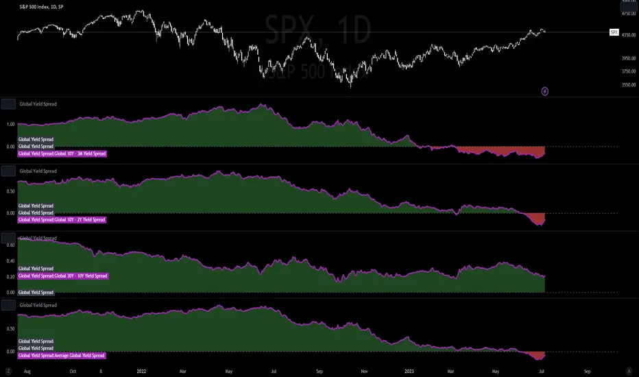
Global Yield SpreadThe Global Yield Spread is a simple indicator that can help to identify economic wellbeing and thus allows traders and investors alike to derive a rough estimation onto where the market is likely to go.
----------
Please note that things like Yield Spread generally influence the market only over longer time horizons of a couple weeks to many months.
Also be aware that the Yield Spread is only capable of measuring the Yields on Bonds and is thus limited to only changes that are reflected in the interest rates on the Bonds.
----------
The Normal Yield Spread is widely recognized for it's signal abilities for recessions or general economic well being...
However, since the rates have decreased drastically in the US something else has been proposed: The Global Yield Spread
As the normal US Yield Spread is loosing signal capacity because the US government can easily borrow money from overseas,
thus reducing the need to increase interest rates.
By monitoring and analyzing the Global Yield spread, traders and investors can gain insights into relative valuations, economic movements, market sentiment, and opportunities.
It can help inform their investment decisions and strategies, allowing them to allocate capital more effectively and potentially generate better returns.
You have options to visually represent a diversity of Countries and their according Yield Spreads.
Furthermore there are Global Yield Spreads for:
10Y-03MY
10Y-02Y
30Y-10Y
The Average Global Yield Spread encompasses the 3 options above to get an average reading.
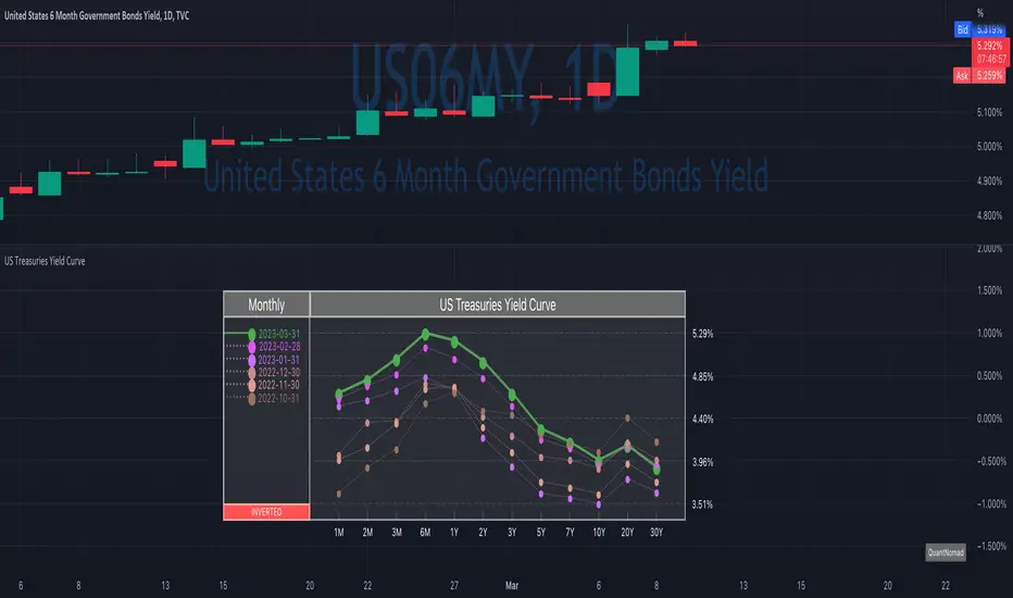
US Treasuries Yield CurveNews about the yield curve became pretty crucial for all the trades in the last year.
So in the team, we decided to implement a nice widget that will allow you to track the current yield curve in your chart directly.
It's possible to compare the current yield curve with past yield curves. You can choose to display the number of curves weeks, months, and years ago. So you can see the dynamics of the yield curve change.
When the Y2 > Y10 curve is considered invested, so you'll see an "Inverted" notification on the chart.
Thanks to @MUQWISHI for helping code it.
Disclaimer
Please remember that past performance may not indicate future results.
Due to various factors, including changing market conditions, the strategy may no longer perform as well as in historical backtesting.
This post and the script don’t provide any financial advice.
Equity Bond Currency DashboardDepicts demand-flow between Equities, Bonds and Currencies of 6 countries. Useful in tracking the flow of smart money and checking the dynamics of inter-connected markets.
Principle:
DXY lies at the heart of the diagram with usd-currency pairs of 5 countries connected to it. When demand for a currency increases it strengthens against Dollar. This is depicted by a line from DXY to the currency indicating demand flow from Dollar to the currency (DXY is only an indicative symbol for Dollar, the currency may not be part of the dollar index). Similarly when Dollar strengthens against the currency, demand flow is depicted by a line from the currency to DXY. Currency blocks are connected to Equity and Bond Yields of the respective countries. Equities and Bonds, when bought, takes the demand from the respective currencies and vice versa.
Overall, the demand flows in the direction of arrows. The flow is incomplete without commodities, import/export, interest/inflation rates of countries, however, the diagram most of the times explains why an asset class is performing the way it is.
Left side bar of each block is very similar to OHLC candles except for the following -
Instead of wicks, top and bottom of the bar represents high and low for the selected time-frame
Open and close are normalised for high and low
Bar border is red if close < prev.close, green if close >= prev.close
Other notes:
The diagram requires at least 200 bars in the chart to render. Please select the symbol and time-frame that contain at least 200 bars.
The diagram requires a live market to render the flow. To check flows on historical bars, set the option from settings.
Desired indices could be selected for countries of choice. Default settings point to futures wherever possible to have the markets live simultaneously across the countries.


Yield Curve (1-10yr)Yield curve of the 1-10 year US Treasury Bonds, with over 60 years of history.
The Yield Curve is the interest rate on the 10 year bond minus the 1 year bond.
When it inverts (crosses under 0) a recession usually follows 6-12 months later.
It's a great leading indicator to identify risk in the macroeconomic environment.
Yield curves can be constructed on varying durations. Using a 1-year as the short-term bond provides a slightly faster response than the 2-year bond; and the 1-year has more historical data on TradingView.
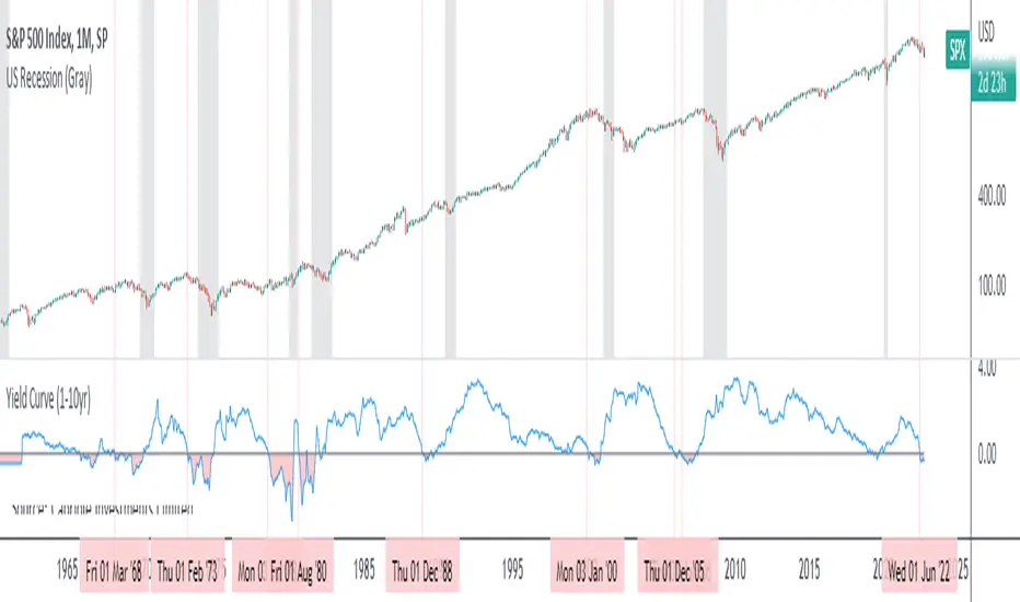
Yield Curve (2-10yr)Yield curve of the 2-10 year US Treasury Bonds, with over 50 years of history.
The Yield Curve is the interest rate on the 10 year bond minus the 2 year bond.
When it inverts (crosses under 0) a recession usually follows 6-12 months later.
It's a great leading indicator to identify risk in the macroeconomic environment.

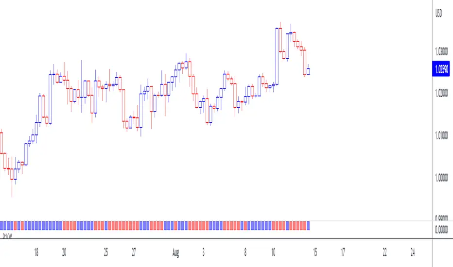
10-Year Bond Yields (Interest Rate Differential)With this little script, I have attempted to incorporate fundamental data (in this case, 10-year bond yields) into technical analysis . When pairing two currencies, the one with a higher bond interest rate usually appreciates when the interest rate differential widens, or, to use a simple example: in a currency pair A vs. B, with A showing a higher bond yield than B, a widening interest rate gap is likely to help A and create a buying opportunity (shown as a blue square at the bottom of the chart), while the opposite is true when the gap tightens (sell signal, red square).
While long-term investors know about and make use of the importance of bond yield fluctuations, most short-term traders tend to dismiss the idea of using fundamental data, mostly for lack of quantifiability and limited impact in an intraday environment. After extensive backtesting on daily and intraday charts (6-12 hours), however, I realized this indicator still managed to produce useful results (less useful than on monthly and yearly charts, to be fair, but still useful enough), especially when paired with simple price-driven indicators, such as Heikin Ashi or linear regression .
My personal (and thus subjective) thoughts: worth a try. Buy and sell signals frequently contradicted both more popular indicators and my gut feeling and managed to take out losing trades that I had considered trades with a high winning probability. In other words, when the market lures traders into seemingly promising trading decisions, this indicator might give you an early warning, especially when you manage to adjust period and continuity parameters to your trading strategy.
Currency pairs used in this script are all possible combinations of the eight majors. Each security has been assigned a name ("inst01" to "inst08" in the code) and a broker; if you make changes to the code, be sure not to mess with currency and broker names as this would render the entire script useless. Good luck trading, and feel free to suggest improvements!
Historical US Bond Yield CurvePreface: I'm just the bartender serving today's freshly blended concoction; I'd like to send a massive THANK YOU to all the coders and PineWizards for the locally-sourced ingredients. I am simply a code editor, not a code author. Many thanks to these original authors!
Source 1 (Aug 8, 2019):
Source 2 (Aug 11, 2019):
About the Indicator: The term yield curve refers to the yields of U.S. treasury bills, notes, and bonds in order from shortest to longest maturity date. The yield curve describes the shapes of the term structures of interest rates and their respective terms to maturity in years. The slope of the yield curve tells us how the bond market expects short-term interest rates to move in the future based on bond traders' expectations about economic activity and inflation. The best use of the yield curve is to get a sense of the economy's direction rather than to try to make an exact prediction. This indicator plots the U.S. yield curve as maturity (x-axis/time) vs yield (y-axis/price) in addition to historical yield curves and advanced data tickers . The visual array of historical yield curves helps investors visualize shifts in the yield curve that are useful when identifying & forecasting economic conditions. The bond market can help predict the direction of the economy which can be useful in crafting your investment strategy. An inverted 10y/2y yield curve for durations longer than 5 consecutive trading days signals an almost certain recession on the horizon. An inversion happens when short-term bonds pay better than longer-term bonds. There is Federal Reserve Board data that suggests the 10y3m may be a better predictor of recessions.
Features: Advanced dual data ticker that performs curve & important spread analysis, plus additional hover info. Advanced yield curve data labels with additional hover info. Customizable historical curves and color theme.
‼ IMPORTANT: Hover over labels/tables for advanced information. Chart asset and timeframe may affect the yield curve results; I have found consistently accurate results using BINANCE:BTCUSDT on 1d timeframe. Historical curve lookbacks will have an effect on whether the curve analysis says the curve is bull/bear steepening/flattening, so please use appropriate lookbacks.
⚠ DISCLAIMER: Not financial advice. Not a trading system. DYOR. I am not affiliated with the original authors, TradingView, Binance, or the Federal Reserve Board.
About the Editor: I am a former FINRA Registered Representative, inventor/patent holder, futures trader, and hobby PineScripter.

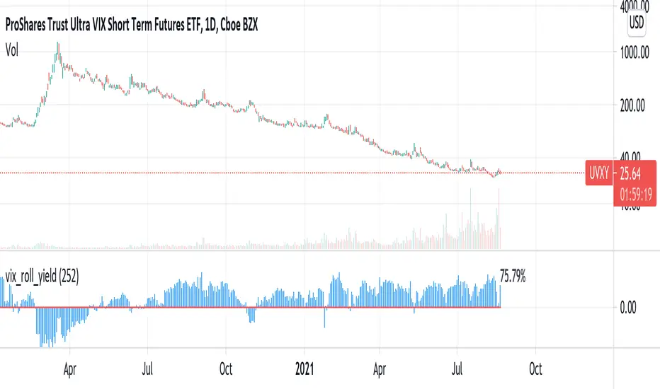
vix_roll_yieldShows the roll yield of the VX futures, which is the ratio of a continuously weighted average of the front two months to the VIX. The VX (VIX futures) contract expires on the third Tuesday of each month. On the next trading day, the front month will have full weighting, and the second month will have no weight. On the expiration day, the back month will have full weighting and the front month will have no weight. In between, the weight gradually shifts.
This weighted average is similar to the SPVIXSTR index that UVXY and several other funds track. When the average is below the VIX, the indicator is negative, and the front month contract will tend to gain value relatively more rapidly than the back month as it converges upward to the VIX spot price. Because funds whose NAV is tied up in VX contracts continuously roll from the (typically cheaper) front month to the back, in situations where the front month is more expensive than usual--or even more expensive than the back month--these products may have a "tailwind". In this case, they are selling expensive front month contracts to purchase cheap back month contracts.
Ordinarily, VIX funds have a "headwind." The roll yield is positive, the front month is cheap, and the back month is expensive. Day by day the funds sell cheap front month contracts and buy expensive back month contracts, which, in turn and over time, become the front month and converge with the VIX, losing value rapidly. This is a brief explanation about the decay of these products.
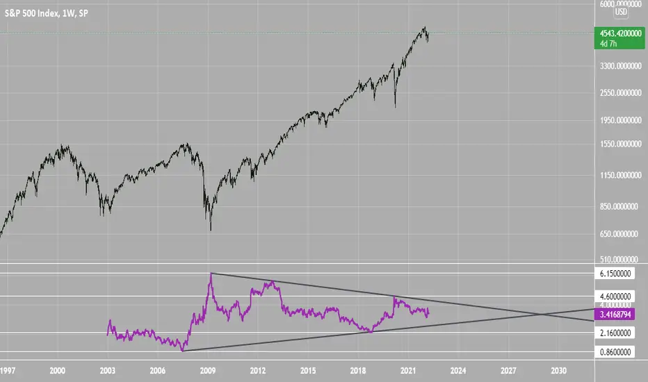
SPX Excess CAPE YieldHere we are looking at the Excess CAPE yield for the SPX500 over the last 100+ years
"A higher CAPE meant a lower subsequent 10-year return, and vice versa. The R-squared was a phenomenally high 0.9 — the CAPE on its own was enough to explain 90% of stocks’ subsequent performance over a decade. The standard deviation was 1.37% — in other words, two-thirds of the time the prediction was within 1.37 percentage points of the eventual outcome: this over a quarter-century that included an equity bubble, a credit bubble, two epic bear markets, and a decade-long bull market."
assets.bwbx.io
In December of 2020 Dr. Robert Shiller the Yale Nobel Laurate suggested that an improvement on CAPE could be made by taking its inverse (the CAPE earnings yield) and subtracting the us10 year treasury yield.
"His model plainly suggests that stocks will do badly over the next 10 years, and that bonds will do even worse. This was the way Shiller put it in a research piece for Barclays Plc in October, (which can be found on SSRN Below):
In summary, investors expect a certain return in equities as compensation for investing in a riskier asset class, and as interest rates have declined, the relative expected return for equities has increased dramatically. We believe this may quantitatively help to explain investors current preference for equities over bonds, and as such the quick recoveries we are observing (with the exception of the UK), whilst still in the midst of a pandemic. In the US in particular, we are once again observing stretched valuations and high CAPE ratios compared to history."
Sources:
papers.ssrn.com
www.bloomberg.com
The standard trading view disclaimer applies to this post -- please consult your own investment advisor before making investment decisions. This post is for observation only and has no warranty etc. www.tradingview.com
Best,
JM
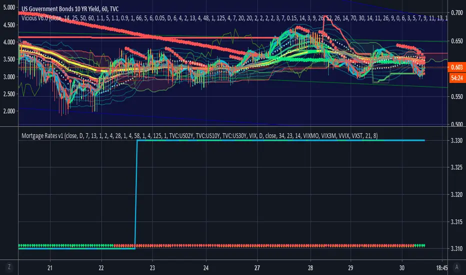
Vicious Mortgage Rates V1.0A script that contains real time mortgage rates from Wells Fargo using the QUANDL data link.
Use this lower indicator with US10Y or others on the top.
VIX will be added as well to help inform and predict.
List of Available Mortgage Interest Rates including APR or IR (Interest Rate)
*NOTE* : Not all indicators are up and running yet but will be very soon.
INDICATOR|CODE
Purchase Rate Conforming Loan 30-Year Fixed Rate Interest Rate|PR_CON_30YFIXED_IR
Purchase Rate Conforming Loan 30-Year Fixed Rate APR|PR_CON_30YFIXED_APR
Purchase Rate Government Loan 30-Year Fixed-Rate FHA Interest Rate|PR_GOV_30YFIXEDFHA_IR
Purchase Rate Government Loan 30-Year Fixed-Rate FHA APR|PR_GOV_30YFIXEDFHA_APR
Purchase Rate Conforming Loan 15-Year Fixed Rate Interest Rate|PR_CON_15YFIXED_IR
Purchase Rate Conforming Loan 15-Year Fixed Rate APR|PR_CON_15YFIXED_APR
*Purchase Rate Conforming Loan 7/1 ARM Interest Rate|PR_CON_71ARM_IR
*Purchase Rate Conforming Loan 7/1 ARM APR|PR_CON_71ARM_APR
*Purchase Rate Conforming Loan 5/1 ARM FHA Interest Rate|PR_CON_51ARM_IR
*Purchase Rate Conforming Loan 5/1 ARM FHA APR|PR_CON_51ARM_APR
Purchase Rate Government Loan 5/1 ARM FHA Interest Rate|PR_GOV_51ARMFHA_IR
Purchase Rate Government Loan 5/1 ARM FHA APR|PR_GOV_51ARMFHA_APR
Purchase Rate Larger Loan Amounts in Eligible Areas (Conforming Loan) 30-Year Fixed Rate Interest Rate|PR_LARGERCON_30YFIXED_IR
Purchase Rate Larger Loan Amounts in Eligible Areas (Conforming Loan) 30-Year Fixed Rate APR|PR_LARGERCON_30YFIXED_APR
Purchase Rate Larger Loan Amounts in Eligible Areas (Government Loan) 30-Year Fixed-Rate FHA Interest Rate|PR_LARGERGOV_30YFIXEDFHA_IR
Purchase Rate Larger Loan Amounts in Eligible Areas (Government Loan) 30-Year Fixed-Rate FHA APR|PR_LARGERGOV_30YFIXEDFHA_APR
Purchase Rate Larger Loan Amounts in Eligible Areas (Conforming Loan) 7/1 ARM Interest Rate|PR_LARGERCON_71ARM_IR
Purchase Rate Larger Loan Amounts in Eligible Areas (Conforming Loan) 7/1 ARM APR|PR_LARGERCON_71ARM_APR
Purchase Rate Jumbo Loan (Amounts that exceed conforming loan limits) 30-Year Fixed Rate Interest Rate|PR_JUMBO_30YFIXED_IR
Purchase Rate Jumbo Loan (Amounts that exceed conforming loan limits) 30-Year Fixed Rate APR|PR_JUMBO_30YFIXED_APR
Purchase Rate Jumbo Loan (Amounts that exceed conforming loan limits) 7/1 ARM Interest Rate|PR_JUMBO_71ARM_IR
Purchase Rate Jumbo Loan (Amounts that exceed conforming loan limits) 7/1 ARM APR|PR_JUMBO_71ARM_APR
Refinance Rate Conforming Loan 30-Year Fixed Rate Interest Rate|RR_CON_30YFIXED_IR
Refinance Rate Conforming Loan 30-Year Fixed Rate APR|RR_CON_30YFIXED_APR
Refinance Rate Government Loan 30-Year Fixed-Rate FHA Interest Rate|RR_GOV_30YFIXEDFHA_IR
Refinance Rate Government Loan 30-Year Fixed-Rate FHA APR|RR_GOV_30YFIXEDFHA_APR
Refinance Rate Conforming Loan 15-Year Fixed Rate Interest Rate|RR_CON_15YFIXED_IR
Refinance Rate Conforming Loan 15-Year Fixed Rate APR|RR_CON_15YFIXED_APR
*Refinance Rate Conforming Loan 7/1 ARM Interest Rate|RR_CON_71ARM_IR
*Refinance Rate Conforming Loan 7/1 ARM APR|RR_CON_71ARM_APR
*Refinance Rate Conforming Loan 5/1 ARM Interest Rate|PR_CON_51ARM_IR
*Refinance Rate Conforming Loan 5/1 ARM APR|PR_CON_51ARM_APR
Refinance Rate Government Loan 5/1 ARM FHA Interest Rate|RR_GOV_51ARMFHA_IR
Refinance Rate Government Loan 5/1 ARM FHA APR|RR_GOV_51ARMFHA_APR
Refinance Rate Larger Loan Amounts in Eligible Areas (Conforming Loan) 30-Year Fixed Rate Interest Rate|RR_LARGERCON_30YFIXED_IR
Refinance Rate Larger Loan Amounts in Eligible Areas (Conforming Loan) 30-Year Fixed Rate APR|RR_LARGERCON_30YFIXED_APR
Refinance Rate Larger Loan Amounts in Eligible Areas (Government Loan) 30-Year Fixed-Rate FHA Interest Rate|RR_LARGERGOV_30YFIXEDFHA_IR
Refinance Rate Larger Loan Amounts in Eligible Areas (Government Loan) 30-Year Fixed-Rate FHA APR|RR_LARGERGOV_30YFIXEDFHA_APR
Refinance Rate Larger Loan Amounts in Eligible Areas (Conforming Loan) 7/1 ARM Interest Rate|RR_LARGERCON_71ARM_IR
Refinance Rate Larger Loan Amounts in Eligible Areas (Conforming Loan) 7/1 ARM APR|RR_LARGERCON_71ARM_APR
Refinance Rate Jumbo Loan (Amounts that exceed conforming loan limits) 30-Year Fixed Rate Interest Rate|RR_JUMBO_30YFIXED_IR
Refinance Rate Jumbo Loan (Amounts that exceed conforming loan limits) 30-Year Fixed Rate APR|RR_JUMBO_30YFIXED_APR
Refinance Rate Jumbo Loan (Amounts that exceed conforming loan limits) 7/1 ARM Interest Rate|RR_JUMBO_71ARM_IR
Refinance Rate Jumbo Loan (Amounts that exceed conforming loan limits) 7/1 ARM APR|RR_JUMBO_71ARM_APR
QUANDL:FRED/MORTG
Feature to be Added:
Trending
Oscillators
Alerts
www.quandl.com
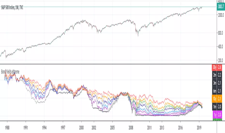
Yield Inversion Curve DifferenceDisplays the yield inversion difference on bonds between short term and long term bonds.


Inverted Yield Curve with VIX Fear IndexUS 2 year and US 10 year comparison, inverted yield curve with VIX. I use this on a weekly chart with 2 moving averages, the 40 week (ma200 daily) and the 520 week (10 year median).
The bottom histogram is the VIX and the plot is the yield curve. When the VIX is above a certain level (you can set it in settings) and the ýield curve is close to or at inversion the background goes red.
The last seven recessions were preceded by an inverted yield curve. Here I combined the two main fear indexes, the VIX and the run for safe US treasuries (Inverted Yield Curve).
This is preset to the 2 year and 10 year US bond, weekly, and the normal VIX ticker but you can set it to whatever you like.
Published with source code for anyone to modify. Please comment below if you do so! This is the second in a series of indicators I intend to publish as a package of economic recoverty/recession symptom indicators.
Follow me for updates, next one up is commodities with dr Copper and oil!
