Double Median ATR Bands | MisinkoMasterThe Double Median ATR Bands is a version of the SuperTrend that is designed to be smoother, more accurate while maintaining a good speed by combining the HMA smoothing technique and the median source.
How does it work?
Very simple!
1. Get user defined inputs:
=> Set them up however you want, for the result you want!
2. Calculate the Median of the source and the ATR
=> Very simple
3. Smooth the median with √length (for example if median length = 9, it would be smoothed over the length of 3 since 3x3 = 9)
4. Add ATR bands like so:
Upper = median + (atr*multiplier)
Lower = median - (atr*multiplier)
Trend Logic:
Source crossing over the upper band = uptrend
Source crossing below the lower band = downtrend
Enjoy G´s!
Average True Range (ATR)

2ATR / Close %Certainly. Here is the English version of the indicator description you requested.
---
### **2ATR Stop-Loss Ratio**
This indicator provides a straightforward calculation of **what percentage a 2ATR (Average True Range) move represents relative to the current price**. It's a specialized tool designed to help traders set dynamic, volatility-based stop-loss levels.
---
### **Purpose of the Indicator**
Many traders use a **2ATR** as their standard for setting a stop-loss, believing it's a good measure of a stock's typical movement. However, it can be difficult to quickly determine the exact percentage a 2ATR drop represents from the current price. This indicator solves that problem by giving you a clear, single number that shows the **anticipated percentage loss before you even enter a position**.
---
### **How It Works**
The indicator is calculated using a simple formula:
**(2 * ATR(20) / Current Price) * 100**
* `ATR(20)`: The Average True Range over the last 20 periods. This period can be customized in the indicator's settings.
* `Current Price`: The closing price at the time of calculation.
---
### **How to Use It**
* **Assess Risk**: A higher number on the indicator means greater volatility, indicating a wider stop-loss range.
* **Set a Stop-Loss**: If the indicator shows **3%**, it means a 2ATR move is roughly a 3% change from the current price. This gives you a clear understanding of the potential loss.
* **Adjust Position Size**: If the potential percentage loss is larger than you're comfortable with, you can use this information to reduce your position size, effectively managing your risk.
This tool is especially useful for trading highly volatile stocks, as it helps you establish a clear and effective risk management strategy.

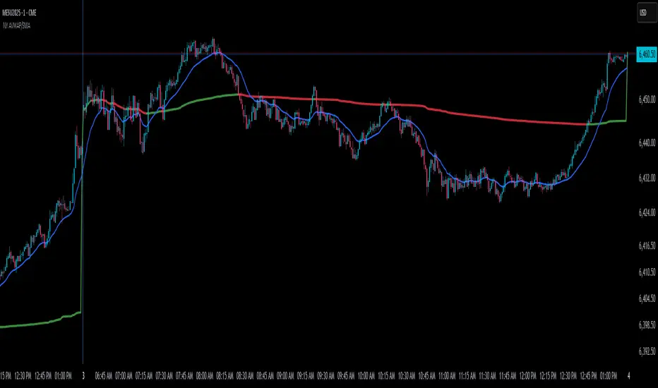
NY Anchored VWAP and Auto SMANY Anchored VWAP and Auto SMA
This script is a versatile trading indicator for the TradingView platform that combines two powerful components: a New York-anchored Volume-Weighted Average Price (VWAP) and a dynamic Simple Moving Average (SMA). Designed for traders who utilize VWAP for intraday trend analysis, this tool provides a clear visual representation of average price and volatility-adjusted moving averages, generating automated alerts for key crossover signals.
Indicator Components
1. NY Anchored VWAP
The VWAP is a crucial tool that represents the average price of a security adjusted for volume. This version is "anchored" to the start of the New York trading session, resetting at the beginning of each new session. This provides a clean, session-specific anchor point to gauge market sentiment and trend. The VWAP line changes color to reflect its slope:
Green: When the VWAP is trending upwards, indicating a bullish bias.
Red: When the VWAP is trending downwards, indicating a bearish bias.
2. Auto SMA
The Auto SMA is a moving average with a unique twist: its lookback period is not fixed. Instead, it dynamically adjusts based on market volatility. The script measures volatility using the Average True Range (ATR) and a Z-Score calculation.
When volatility is expanding, the SMA's length shortens, making it more sensitive to recent price changes.
When volatility is contracting, the SMA's length lengthens, smoothing out the price action to filter out noise.
This adaptive approach allows the SMA to react appropriately to different market conditions.
Suggested Trading Strategy
This indicator is particularly effective when used on a one-minute chart for identifying high-probability trade entries. The core of the strategy is to trade the crossover between the VWAP and the Auto SMA, with confirmation from a candle close.
The strategy works best when the entry signal aligns with the overall bias of the higher timeframe market structure. For example, if the daily or 4-hour chart is in an uptrend, you would look for bullish signals on the one-minute chart.
Bullish Entry Signal: A potential entry is signaled when the VWAP crosses above the Auto SMA, and is confirmed when the one-minute candle closes above both the VWAP and the SMA. This indicates a potential continuation of the bullish momentum.
Bearish Entry Signal: A potential entry is signaled when the VWAP crosses below the Auto SMA, and is confirmed when the one-minute candle closes below both the VWAP and the SMA. This indicates a potential continuation of the bearish momentum.
The built-in alerts for these crossovers allow you to receive notifications without having to constantly monitor the charts, ensuring you don't miss a potential setup.
Triple Tap Sniper Triple Tap Sniper v3 – EMA Retest Precision System
Triple Tap Sniper is a precision trading tool built around the 21, 34, and 55 EMAs, designed to capture high-probability retests after EMA crosses. Instead of chasing the first breakout candle, the system waits for the first pullback into the EMA21 after a trend-confirming cross — the spot where professional traders often enter.
🔑 Core Logic
EMA Alignment → Trend defined by EMA21 > EMA34 > EMA55 (bullish) or EMA21 < EMA34 < EMA55 (bearish).
Cross Detection → Signals are only armed after a fresh EMA cross.
Retest Entry → Buy/Sell signals fire only on the first retest of EMA21, with trend still intact.
Pro Filters →
📊 Higher Timeframe Confirmation: Aligns signals with larger trend.
📈 ATR Volatility Filter: Blocks weak signals in low-vol chop.
📏 EMA Spread Filter: Ignores tiny “fake crosses.”
🕯️ Price Action Filter: Requires a proper wick rejection for valid entries.
🚀 Why Use Triple Tap Sniper?
✅ Filters out most false signals from sideways markets.
✅ Focuses only on clean trend continuations after pullbacks.
✅ Beginner-friendly visuals (Buy/Sell labels) + alert-ready for automation.
✅ Flexible: works across multiple timeframes & asset classes (stocks, crypto, forex).
⚠️ Notes
This is a signal indicator, not a full strategy. For backtesting and optimization, convert to a strategy and adjust filters per market/timeframe.
No indicator guarantees profits — use with sound risk management.

Perfect Price-Anchored % Fib Grid This indicator generates support and resistance levels anchored to a fixed price of your choice.
You can also specify a percentage for the indicator to calculate potential highs and lows.
Commonly used values are 3.5% or 7%, as well as smaller decimal versions like 0.35% or 0.7%, depending on the volatility you expect.
In addition, the indicator can highlight potential stop-run levels in multiples of 27 — ranging from 0 up to 243. This automatically places the 243 GB range directly onto your chart.
The tool is versatile and can be applied not only to equities, but also to ES futures and Forex markets.
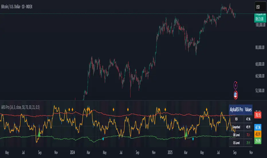
AlphaRSI Pro - Adaptive RSI with Trend AnalysisOverview
AlphaRSI Pro is a technical analysis indicator that enhances the traditional RSI by incorporating adaptive overbought/oversold levels, trend bias analysis, and divergence detection. This indicator addresses common limitations of standard RSI implementations through mathematical adaptations to market volatility.
Technical Methodology
1. Smoothed RSI Calculation
Applies weighted moving average smoothing to standard RSI(14)
Reduces noise while preserving momentum signals
Configurable smoothing period (default: 3)
2. Adaptive Level System
Mathematical Approach:
Calculates ATR-based volatility ratio: volatility_ratio = current_ATR / average_ATR
Applies dynamic adjustment: adaptive_level = base_level ± (volatility_ratio - 1) × 20
Bounds levels between practical ranges (15-35 for oversold, 65-85 for overbought)
Purpose: Adjusts RSI sensitivity based on current market volatility conditions rather than using fixed 70/30 levels.
3. Trend Bias Integration
Uses Simple Moving Average slope analysis over configurable period
Calculates trend strength: |slope / price| × 100
Provides visual background shading for trend context
Filters RSI signals based on underlying price trend direction
4. Signal Generation Logic
Entry Conditions:
Bullish: RSI crosses above adaptive oversold level
Bearish: RSI crosses below adaptive overbought level
Strong signals: Include trend bias confirmation
Enhancement over standard RSI: Reduces false signals in choppy markets by requiring trend alignment for "strong" signals.
5. Divergence Detection
Automated identification of regular bullish/bearish divergences
Uses 5-bar lookback for pivot detection
Compares price highs/lows with corresponding RSI highs/lows
Plots divergence markers when conditions are met
Key Features
Real-time adaptive levels based on volatility
Trend-filtered signals to improve reliability
Built-in divergence scanner
Information dashboard showing current values
Comprehensive alert system
Clean visual presentation with customizable colors
Usage Guidelines
This indicator works best when:
Combined with proper risk management
Used in conjunction with other technical analysis
Applied to liquid markets with sufficient volatility data
Configured appropriately for the selected timeframe
Input Parameters
RSI Period: Standard RSI calculation length (default: 14)
Smoothing Period: WMA smoothing for noise reduction (default: 3)
Volatility Lookback: Period for ATR volatility calculation (default: 50)
Base OB/OS Levels: Starting points for adaptive adjustment (70/30)
Trend Period: Moving average length for trend bias (default: 21)
Alert Conditions
Bullish Signal: RSI crosses above adaptive oversold
Bearish Signal: RSI crosses below adaptive overbought
Strong Bullish/Bearish: Signals with trend confirmation
Divergence Alerts: Automated divergence detection
Educational Value
This indicator demonstrates several advanced Pine Script concepts:
Dynamic level calculation using mathematical formulas
Multi-timeframe analysis integration
Conditional signal filtering based on market state
Table display for real-time information
Comprehensive alert system implementation
Limitations
Requires sufficient historical data for volatility calculations
May generate fewer signals in very low volatility environments
Trend bias effectiveness depends on selected MA period
Divergences may not always lead to immediate reversals
Disclaimer
This indicator is for educational and analysis purposes. Past performance does not guarantee future results. Always use proper risk management and consider multiple forms of analysis before making trading decisions.
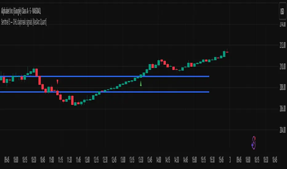
Sentinel 5 — OHL daybreak signals [KedArc Quant]Overview
Sentinel 5 plots the first-bar high/low of each trading session and gives clean, rules-based signals in two ways:
1) OHL Setups at the close of the first bar (Open equals/near High for potential short; Open equals/near Low for potential long).
2) Breakout Signals later in the session when price breaks the first-bar High/Low, with optional body/penetration filters.
Basic workflow
1. Wait for the first session bar to finish.
*If O≈H (optionally by proximity) → short setup. •
*If O≈L → long setup. • If neither happens, optionally allow later breakouts.
2. Optional: Act only on breakouts that penetrate a minimum % of that bar’s range/body.
3. Skip the day automatically if the first bar is abnormally large (marubozu-like / extreme ATR / outsized vs yesterday).
Signals & Markers
Markers on the chart:
▲ O=L (exact) / O near L (proximity) – long setup at first-bar close.
▼ O=H (exact) / O near H (proximity) – short setup at first-bar close.
▲ Breakout Long – later bar breaks above first-bar High meeting your penetration rule.
▼ Breakout Short – later bar breaks below first-bar Low meeting your penetration rule.
ATR% | Volatility NormalizerThis indicator measures true volatility by expressing the Average True Range (ATR) as a percentage of price. Unlike basic ATR plots, which show raw values, this version normalizes volatility to make it directly comparable across instruments and timeframes.
How it works:
Uses True Range (High–Low plus gaps) to capture actual market movement.
Normalizes by dividing ATR by the chosen price base (default: Close).
Multiplies by 100 to output a clean ATR% line.
Smoothing is flexible: choose from RMA, SMA, EMA, or WMA.
Optional Feature:
For comparison, you can toggle an auxiliary line showing the average absolute close-to-close % move, highlighting the difference between simplified and true volatility.
Why use it:
Track regime shifts: identify when volatility expands or contracts in % terms.
Compare volatility across different markets (equities, crypto, forex, commodities).
Integrate into risk management: position sizing, stop placement, or volatility filters for entries.
Interpretation:
Rising ATR% → expanding volatility, potential breakouts or unstable ranges.
Falling ATR% → contracting volatility, possible consolidation or range-bound conditions.
Sudden spikes → market “shocks” worth paying attention to.

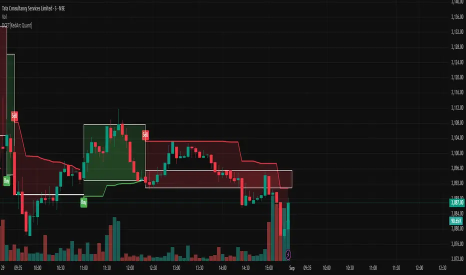
Dynamic Chandelier Exit Trader [KedArc Quant])Dynamic Chandelier Exit Trader (DCET)
The Dynamic Chandelier Exit Trader (DCET) builds upon the classical Chandelier Exit indicator by combining volatility-based stop placement with risk-reward exit logic. It is designed to provide clear buy/sell flip signals, making it adaptable across multiple trading environments.
Market Suitability
The DCET is most effective under the following market conditions:
1. Trending Markets (Upward or Downward)
- Strong performance when price is in a clear directional trend.
- Buy signals align with uptrends, sell signals align with downtrends.
- Works well on stocks, forex pairs, and crypto during trending phases.
2. Breakout Environments:
- Captures moves when price breaks out of consolidations.
- ATR-based stop dynamically adjusts to volatility expansion.
- Effective for traders who like catching the first move after breakouts.
3. Sideways / Range-Bound Markets:
- DCET tends to generate more frequent flip signals in sideways conditions.
- May lead to whipsaws, but can still be used with reduced ATR length or by combining with a trend filter (e.g., moving average direction).
4. All Markets (with Adjustments):
- Works universally but requires tuning.
- In highly volatile markets (e.g., crypto), a higher ATR multiplier may reduce false signals.
- In stable, slower-moving markets (e.g., large-cap equities), smaller ATR multipliers improve responsiveness.
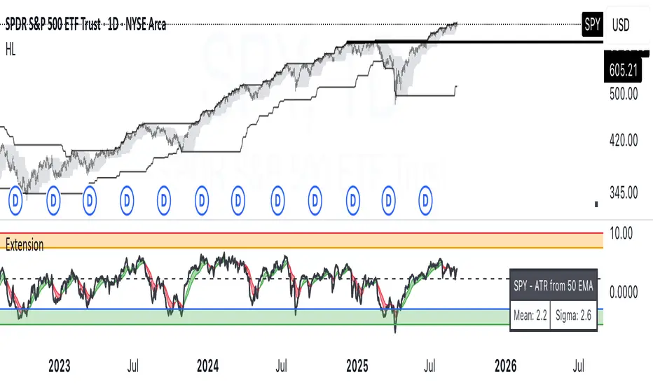
ATR Extension from Moving Average, with Robust Sigma Bands
# ATR Extension from Moving Average, with Robust Sigma Bands
**What it does**
This indicator measures how far price is from a selected moving average, expressed in **ATR multiples**, then overlays **robust sigma bands** around the long run central tendency of that extension. Positive values mean price is extended above the MA, negative values mean price is extended below the MA. The signal adapts to volatility through ATR, which makes comparisons consistent across symbols and regimes.
**Why it can help**
* Normalizes distance to an MA by ATR, which controls for changing volatility
* Uses the **bar’s extreme** against the MA, not just the close, so it captures true stretch
* Computes a **median** and **standard deviation** of the extension over a multi-year window, which yields simple, intuitive bands for trend and mean-reversion decisions
---
## Inputs
* **MA length**: default 50, options 200, 64, 50, 20, 9, 4, 3
* **MA timeframe**: Daily or Weekly. The MA is computed on the chosen higher timeframe through `request.security`.
* **MA type**: EMA or SMA
* **Years lookback**: 1 to 10 years, default 5. This sets the sample for the median and sigma calculation, `years * 365` bars.
* **Line width**: visual width of the plotted extension series
* **Table**: optional on-chart table that displays the current long run **median** and **sigma** of the extension, with selectable text size
**Fixed parameters in this release**
* **ATR length**: 20 on the daily timeframe
* **ATR type**: classic ATR. ADR percent is not enabled in this version.
---
## Plots and colors
* **Main plot**: “Extension from 50d EMA” by default. Value is in **ATR multiples**.
* **Reference lines**:
* `median` line, black dashed
* +2σ orange, +3σ red
* −2σ blue, −3σ green
---
## How it is calculated
1. **Moving average** on the selected higher timeframe: EMA or SMA of `close`.
2. **Extreme-based distance** from MA, as a percent of price:
* If `close > MA`, use `(high − MA) / close * 100`
* Else, use `(low − MA) / close * 100`
3. **ATR percent** on the daily timeframe: `ATR(20) / close * 100`
4. **ATR multiples**: extension percent divided by ATR percent
5. **Robust center and spread** over the chosen lookback window:
* Center: **median** of the ATR-multiple series
* Spread: **standard deviation** of that series
* Bands: center ± 1σ, 2σ, 3σ, with 2σ and 3σ drawn
This design yields an intuitive unit scale. A value of **+2.0** means price is about 2 ATR above the selected MA by the most stretched side of the current bar. A value of **−3.0** means roughly 3 ATR below.
---
## Practical use
* **Trend continuation**
* Sustained readings near or above **+1σ** together with a rising MA often signal healthy momentum.
* **Mean reversion**
* Spikes into **±2σ** or **±3σ** can identify stretched conditions for fade setups in range or late-trend environments.
* **Regime awareness**
* The **median** moves slowly. When median drifts positive for many months, the market spends more time extended above the MA, which often marks bullish regimes. The opposite applies in bearish regimes.
**Notes**
* The MA can be set to Weekly while ATR remains Daily. This is deliberate, it keeps the normalization stable for most symbols.
* On very short intraday charts, the extension remains meaningful since it references the session’s extreme against a higher-timeframe MA and a daily ATR.
* Symbols with short histories may not fill the lookback window. Bands will adapt as data accrues.
---
## Table overlay
Enable **Table → Show** to see:
* “ATR from \”
* Current **median** and **sigma** of the extension series for your lookback
---
## Recommended settings
* **Swing equities**: 50 EMA on Daily, 5 to 7 years
* **Index trend work**: 200 EMA on Daily, 10 years
* **Position trading**: 20 or 50 EMA on Weekly MA, 5 to 10 years
---
## Interpretation examples
* Reading **+2.7** with price above a rising 50 EMA, near prior highs
* Strong trend extension, consider pyramiding in trend systems or waiting for a pullback if you are a mean-reverter.
* Reading **−2.2** into multi-month support with flattening MA
* Stretch to the downside that often mean-reverts, size entries based on your system rules.
---
## Credits
The concept of measuring stretch from a moving average in ATR units has a rich community history. This implementation and its presentation draw on ideas popularized by **Jeff Sun**, **SugarTrader**, and **Steve D Jacobs**. Thanks to each for their contributions to ATR-based extension thinking.
---
## License
This script and description are distributed under **MPL-2.0**, consistent with the header in the source code.
---
## Changelog
* **v1.0**: Initial public release. Daily ATR normalization, EMA or SMA on D or W timeframe, robust median and sigma bands, optional table.
---
## Disclaimer
This tool is for educational use only. It is not financial advice. Always test on your own data and strategies, then manage risk accordingly.
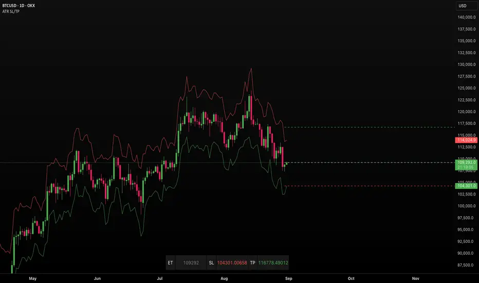
ATR SL/TPStop Loss Finder ATR
A Stop Loss Finder ATR indicator is a dynamic risk management tool leveraging the Average True Range (ATR) to identify and track optimal stop-loss levels based on current market volatility.
A stop hunt indicator is a technical tool designed to identify potential instances where large market participants, often referred to as "smart money," deliberately move the price to trigger a large number of stop-loss orders, creating a temporary price distortion before reversing the trend. These indicators aim to help traders detect these events to either avoid being stopped out or to enter trades in the direction of the anticipated reversal.
For example, a long wick below support with high volume may signal a bullish stop-hunt , indicating that the price has been driven down to trigger sell-stop orders before reversing upward. Conversely, a long wick above resistance with high volume may signal a bearish stop-hunt , suggesting the price was pushed up to trigger buy-stop orders before reversing downward. The presence of such wicks is often associated with candlestick patterns like hammers or shooting stars.
Unlike fixed stop-losses, this indicator adapts its distance from the current price using a customizable ATR multiplier, ensuring that stop-loss levels are neither too tight (prone to being triggered by normal market noise) nor too wide (exposing capital to excessive risk) . The core function calculates the true range—considering the current high-low range, gaps up, and gaps down—over a user-defined period (typically 14 bars), then applies a multiplier to generate a volatility-adjusted stop-loss distance . This approach allows the indicator to dynamically widen stops during high-volatility periods and tighten them during calm markets, providing a more responsive and context-aware exit strategy.
SMC Suite - OB . Breaker . Liquidity Sweep . FVGSMC Suite — Order Blocks • Breaker • Liquidity Sweep • FVG
What it does:
Maps institutional SMC structure (OB → Breaker flips, Liquidity Sweeps, and 3-bar FVGs) and alerts when price retests those zones with optional r ejection-wick confirmation .
Why this isn’t “just a mashup”?
This tool implements a specific interaction between four classic SMC concepts instead of only plotting them side-by-side:
1. OB → Breaker Flip (automated): When price invalidates an Order Block (OB), the script converts that zone into a Breaker of opposite bias (bullish ⇄ bearish), extends it, and uses it for retest signals.
2. Liquidity-Gated FVGs : Fair Value Gaps (3-bar imbalances) are optionally gated—they’re only drawn/used if a recent liquidity sweep occurred within a user-defined lookback.
3. Retest Engine with Rejection Filter : Entries are not whenever a zone prints. Signals fire only if price retests the zone, and (optionally) the candle shows a rejection wick ≥ X% of its range.
4. Signal Cooldown : Prevents spam by enforcing a minimum bar gap between consecutive signals.
These behaviors work together to catch the sequence many traders look for: sweep → impulse → OB/FVG → retest + rejection.
Concepts & exact rules
1) Impulsive move and swing structure
• A bar is “ impulsive ” when its range ≥ ATR × Impulsive Mult and it closes in the direction of the move.
• Swings use Pivot Length (lenSwing) on both sides (HH/LL detection). These HH/LLs are also used for sweep checks.
2) Order Blocks (OB)
• Bullish OB : last bearish candle body before an i mpulsive up-move that breaks the prior swing high . Zone = min(open, close) to low of that candle.
• Bearish OB : last bullish candle body before an impulsive down-move that breaks the prior swing low . Zone = high to max(open, close).
• Zones extend right for OB Forward Extend bars.
3) Breaker Blocks (automatic flip)
If price invalidates an OB (closes below a bullish OB’s low or above a bearish OB’s high), that OB flips into a Breaker of opposite bias:
• Invalidated bullish OB → Bearish Breaker (resistance).
• Invalidated bearish OB → Bullish Breaker (support).
Breakers get their own style/opacity and are used for separate Breaker Retest signals.
4) Liquidity Sweeps (decluttered)
• Bullish sweep : price takes prior high but closes back below it.
• Bearish sweep : price takes prior low but closes back above it.
Display can be tiny arrows (default), short non-extending lines, or hidden. Old marks auto-expire to keep the chart clean.
5) Fair Value Gaps (FVG, 3-bar)
• Bearish FVG : high < low and current high < low .
• Bullish FVG : low > high and current low > high .
• Optional gating: only create/use FVGs if a sweep occurred within ‘Recent sweep’ lookback.
6) Retest signals (what actually alerts)
A signal is true when price re-enters a zone and (optionally) the candle shows a rejection wick:
• OB Retest LONG/SHORT — same-direction retest of OB.
• Breaker LONG/SHORT — opposite-direction retest of flipped breaker.
• FVG LONG/SHORT — touch/fill of FVG with rejection.
You can require a wick ratio (e.g., bottom wick ≥ 60% of range for longs; top wick for shorts). A cooldown prevents back-to-back alerts.
How to use
1. Pick timeframe/market : Works on any symbol/TF. Many use 15m–4h intraday and 1D swing.
2. *Tune Pivot Length & Impulsive Mult:
• Smaller = more zones and quicker flips; larger = fewer but stronger.
3. Decide whether to gate FVGs with sweeps : Turn on “Require prior Liquidity Sweep” to focus on post-liquidity setups.
4. Set wick filter : Start with 0.6 (60%) for cleaner signals; lower it if too strict.
5. Style : Use the Style / Zones & Style / Breakers groups to set colors & opacity for OB, Breakers, FVGs.
6. Alerts : Add alerts on any of:
• OB Retest LONG/SHORT
• Breaker LONG/SHORT
• FVG LONG/SHORT
Choose “Once per bar close” to avoid intrabar noise.
Inputs (key)
• Swing Pivot Length — swing sensitivity for HH/LL and sweeps.
• Impulsive Move (ATR ×) — defines the impulse that validates OBs.
• OB/FVG Forward Extend — how long zones project.
• Require prior Liquidity Sweep — gate FVG creation/usage.
• Rejection Wick ≥ % — confirmation filter for retests.
• Signal Cooldown (bars) — throttles repeated alerts.
• Display options for sweep marks — arrows vs short lines vs hidden.
• Full color/opacity controls — independent palettes for OB, Breakers, and FVGs (fills & borders).
What’s original here
• Automatic OB → Breaker conversion with separate retest logic.
• Liquidity-conditioned FVGs (FVGs can be required to follow a recent sweep).
• Unified retest engine with wick-ratio confirmation + cooldown.
• Decluttered liquidity visualization (caps, expiry, and non-extending lines).
• Complete styling controls for zone types (fills & borders), plus matching signal label colors.
🔹 Notes
• This script is invite-only.
• It is designed for educational and discretionary trading use, not as an autotrader.
• No performance guarantees are implied — always test on multiple markets and timeframes.

EMA多空趋势信号The EMA multi-period moving average combination retains the Fibonacci sequence 144 for moving support and resistance. It also integrates 1ATR to facilitate users to set take-profit and stop-loss.
ATR - Daily vs CurrentThis script provides a comprehensive view of the Average True Range (ATR) for both the current trading day and a multi-day lookback, giving traders real-time insight into volatility and potential daily price movement. Key features include:
ATR Table:
- Average ATR: 14-day ATR, representing typical daily volatility.
- Today’s ATR: Current day ATR, showing how much the price has moved so far.
- % of Avg ATR Used: Calculates the percentage of the average ATR that has been realized today, helping assess if a move is near exhaustion.
Possible Daily ATR Range Lines:
- Horizontal lines drawn from today’s open representing ±50% and ±100% of the 14-day ATR, providing a visual guide for potential price extremes.
- Lines are updated once per day and extend from the right to the left, clearly marking possible intraday range limits.
Color-coded for clarity:
- Green = +50% ATR
- Red = -50% ATR
- Lime = +100% ATR
- Maroon = -100% ATR
Usage:
- Useful for day traders and intraday scalpers to track volatility and potential price targets.
- Helps in risk management, setting stops, and estimating realistic intraday moves.
- Provides visual cues for when price has consumed a significant portion of expected daily range.
Note: ATR is a statistical measure; the lines represent possible ranges, not guaranteed targets. Daily market conditions may prevent price from reaching full ATR.

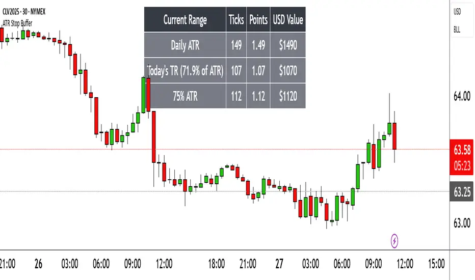
Range TableThe Range Table indicator calculates and displays the Daily Average True Range (ATR), the current day's True Range (TR), and two customizable ATR percentage values in a clean table format. It provides values in ticks, points, and USD, helping traders set stop-loss buffers based on market volatility.
**Features:**
- Displays the Daily ATR (14-period) and current day's True Range (TR) with its percentage of the Daily ATR.
- Includes two customizable ATR percentages (default: 75% and 10%, with the second disabled by default).
- Shows values in ticks, points, and USD based on the symbol's tick size and point value.
- Customizable table position, background color, text color, and font size.
- Toggle visibility for the table and percentage rows via input settings.
**How to Use:**
1. Add the indicator to your chart.
2. Adjust the table position, colors, and font size in the input settings.
3. Enable or disable the 75% and 10% ATR rows or customize their percentages.
4. Use the displayed values to set stop-loss or take-profit levels based on volatility.
**Ideal For:**
- Day traders and swing traders looking to set volatility-based stop-losses.
- Users analyzing tick, point, and USD-based risk metrics.
**Notes:**
- Ensure your chart is set to a timeframe that aligns with the daily ATR calculations.
- USD values are approximate if `syminfo.pointvalue` is unavailable.
Developed by FlyingSeaHorse.
[Top] Simple ATR TP/SLSimple TP/SL from ATR (Locked per Bar) - Advanced Position Management Tool
What This Indicator Does:
Automatically calculates and displays Take Profit (TP) and Stop Loss (SL) levels based on Average True Range (ATR)
Locks ATR values and direction signals at the start of each bar to prevent repainting and provide consistent levels
Offers multiple direction detection modes including real-time candle-based positioning for dynamic trading approaches
Displays entry, TP, and SL levels as clean horizontal lines that extend from the current bar
Original Features That Make This Script Unique:
Bar-Locked ATR System: ATR values are captured and frozen at bar open, ensuring levels remain stable throughout the bar's progression
Multi-Modal Direction Detection: Four distinct modes for determining TP/SL positioning - Trend Following (EMA-based), Bullish Only, Bearish Only, and real-time Candle Based
Real-Time Candle Flipping: In Candle Based mode, TP/SL levels flip immediately when the current candle changes from bullish to bearish or vice versa
Persistent Line Management: Uses efficient line object management to prevent ghost lines and maintain clean visual presentation
Flexible Base Price Selection: Choose between Open (static), Close (dynamic), or midpoint (H+L)/2 for entry level calculation
How The Algorithm Works:
ATR Calculation: Captures ATR value at each bar open using specified length parameter, maintaining consistency throughout the bar
Direction Determination: Uses different methods based on selected mode - EMA crossover for trend following, or real-time candle color for dynamic positioning
Level Calculation: TP level = Base Price + (Direction × TP Multiplier × ATR), SL level = Base Price - (Direction × SL Multiplier × ATR)
Visual Management: Creates persistent line objects once, then updates their positions every bar for optimal performance
Direction Modes Explained:
Trend Following: Uses 5-period and 12-period EMA relationship to determine trend direction (locked at bar open)
Bullish Only: Always places TP above and SL below entry (traditional long setup)
Bearish Only: Always places TP below and SL above entry (traditional short setup)
Candle Based: Dynamically adjusts based on current candle direction - flips in real-time as candle develops
Key Input Parameters:
ATR Length: Period for ATR calculation (default 14) - longer periods provide smoother volatility measurement
TP Multiplier: Take profit distance as multiple of ATR (default 1.0) - higher values target larger profits
SL Multiplier: Stop loss distance as multiple of ATR (default 1.0) - higher values allow more room for price movement
Base Price: Reference point for level calculations - Open for static entry, Close for dynamic tracking
Direction Mode: Method for determining whether TP goes above or below entry level
How To Use This Indicator:
For Position Sizing: Use the displayed SL distance to calculate appropriate position size based on your risk tolerance
For Entry Timing: Wait for price to approach the entry level before taking positions
For Risk Management: Set your actual stop loss orders at or near the displayed SL level
For Profit Taking: Use the TP level as initial profit target, consider scaling out at this level
Mode Selection: Choose Candle Based for scalping and quick reversals, Trend Following for swing trading
Visual Style Customization:
Line Colors: Customize TP line color (default teal) and SL line color (default orange) for easy identification
Line Widths: Adjust TP/SL line thickness (1-5) and entry line thickness (1-3) for visibility preferences
Clean Display: Lines extend 3 bars forward from current bar and update position dynamically
Best Practices:
Use on clean charts without multiple overlapping indicators for clearest visual interpretation
Combine with volume analysis and key support/resistance levels for enhanced decision making
Adjust ATR length based on your trading timeframe - shorter for scalping, longer for position trading
Test different TP/SL multipliers based on the volatility characteristics of your chosen instruments
Consider using Trend Following mode during strong trending periods and Candle Based during ranging markets


Supertrend -Mahesh Reddy same like in zeroda best one here all super trend doesnt work perfectly so made this one

TP/SL Dynamic (FIB,ATR,MULTIPLE,PERCENT)TP/SL Dynamic (FIB, ATR, MULTIPLE, PERCENT)
This indicator provides a flexible framework for managing Take Profit (TP) and Stop Loss (SL) levels using multiple calculation schemes. It is designed for traders who want dynamic or rule-based levels that adapt to volatility, market type, and custom input.
The script supports four TP/SL methodologies:
Pro Standards (Auto-Select): Adapts method based on asset type and volatility.
R Multiples: Risk-based reward multiples from ATR-derived stop distance.
Fibonacci R: Fibonacci extension levels projected from recent pivots.
Percent: Fixed percentage distance from entry, adjusted by volatility.
ATR Multiples: ATR-based calculations with configurable multipliers.
Features:
Up to 3 manual entries, each with configurable time, price, and position size.
Weighted entry price calculation across multiple positions.
Single or multiple TP targets (up to 4) with automatic scaling.
Dynamic ATR option: updates SL/TP levels with live volatility or fixes them at entry.
Pivot-based logic for Fibonacci extensions.
Symbol Locking to prevent mismatches between intended pair and chart symbol.
Table display with optional R-multiples, TP/SL values, and entry details.
Visual chart elements: lines, labels, price-scale markers for SL/TP, and zebra-style info tables.
Entry markers (E1, E2, E3) for clarity.
Alerts for TP and SL triggers (both long and short).
How to Use:
Define entry prices, times, and position sizes (up to 3 entries).
Select a TP method (Pro Standards, R Multiples, Fibonacci R, Percent, or ATR Multiples).
Choose single or multiple TP mode.
Optionally enable Dynamic ATR to update levels in real time.
Check the on-chart table for all calculated levels and alerts.
Author & Credit:
Developed from the ground up by me (no external code used outside The Pine public library).
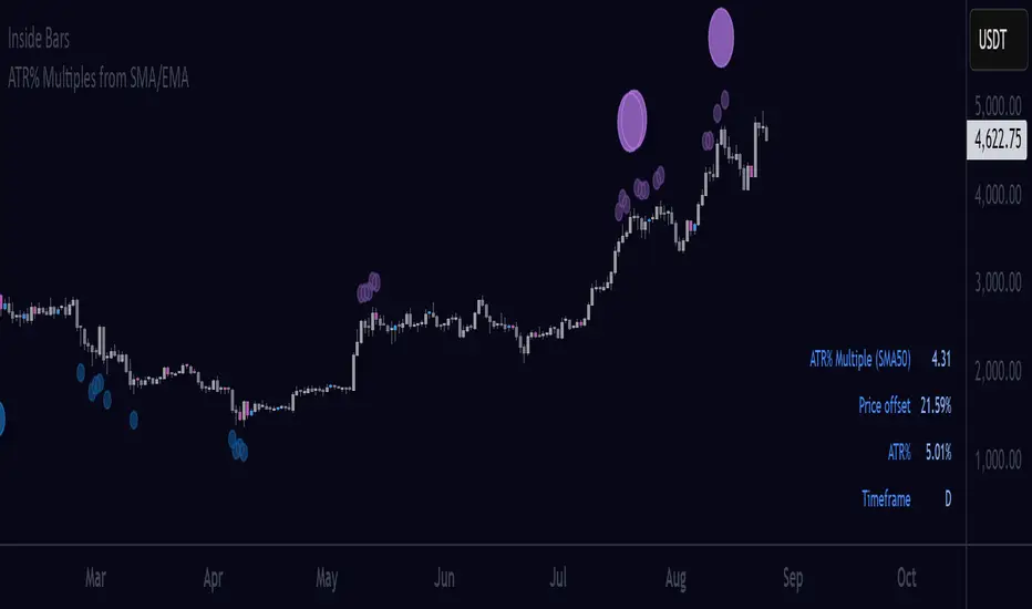
ATR% Multiples from SMA/EMAInspired by the indicator ATR% multiple from 50-MA by @jfsrev, this tool measures how far price is extended from a Moving Average using an ATR% multiple.
What’s added vs. ATR% multiple from 50-MA indicator:
Downside multiples — flags extensions below and above the MA.
Timeframe selection — compute on Daily/Weekly/Monthly or intraday, independent of your chart.
EMA/SMA toggle — choose the MA type (EMA/SMA).
Multi-thresholds — set several ATR% multiple levels.
How to use the indicator:
I find the ATR multiple to be a very versatile tool that can be used for profit taking, mean reverting, and to make better assumption about what market environment to expect.
Which thresholds should you use?
It's up to you really. Personally I use them in a quite discretionary manner where I will change inputs depending on market and it's current regime - E.g. if we are in a strong uptrend I might use higher multiples to the upside and lower multiples to the downside, and if the market is in a range I will use them in a different manner. Be creative, test things, and work out what makes sense to you and the market and timeframe you are trading in.
Skully ATR Stoploss LevelsA comprehensive ATR-based stop loss indicator designed for precise risk management across all trading styles.
✨ KEY FEATURES:
- Live Price Levels: Display up to 3 real-time stop loss lines above/below current candle
- Historical Analysis: Scroll back to see ATR levels at any historical candle
- Triple ATR System: Three customizable ATR multipliers (1.0x, 1.5x, 2.0x default)
- Long/Short Separation: Independent controls for bullish and bearish setups
- Clean Interface: Minimal visual clutter with smart default settings
🎯 PERFECT FOR:
- Swing traders setting daily/weekly stops
- Day traders needing quick, precise risk management
- Position sizing based on volatility
- Multi-timeframe stop analysis (customizable in settings)
📊 HOW IT WORKS:
The indicator calculates Average True Range over your chosen period and displays stop loss levels at 1x, 1.5x, and 2x ATR distances (also customizable). Toggle individual levels on/off, and use historical steplines to analyze/backtest past setups.
⚙️ SMART DEFAULTS:
- Only ATR1 Long Level (Live Price) visible by default (to keep charts clean)
- Historical data available but invisible until needed
- Works across any timeframe and asset class
- Default colors will display cleanly on both Dark and Light charts
Perfect for traders who want professional-grade stop placement without chart clutter.

ORB Dashboard for the TFLX Strategy# ORB Range/ATR Dashboard - Technical Indicator Description
## Main Function
This indicator analyzes Opening Range Breakout (ORB) patterns by calculating a defined time period and its relation to historical volatility. The indicator combines multiple technical analysis methods and presents results in a configurable dashboard format.
**Purpose:** This indicator automates the manual calculation steps of the TFLX analysis methodology, providing real-time computation of volatility ratios, trend filters, and risk management parameters that would otherwise require manual calculation and monitoring.
## Requirements and Limitations
**Additional Indicator Required:** This dashboard indicator works in conjunction with a separate ORB range visualization indicator that displays the actual high/low range levels on the chart. The dashboard provides analysis and calculations, while the range indicator provides visual reference points.
**Important Notice:** This indicator serves as an analytical tool and calculation assistant for the TFLX methodology. It does not execute trades automatically but provides data analysis to support manual decision-making processes.
## TFLX Analysis Methodology Framework
### Core Analysis Rules (Discretionary Implementation)
**Primary Conditions:**
- Market position relative to neutral zones (BB analysis)
- Volatility range between 15-60% of ATR(3)
- News event screening (high-impact economic releases)
- Market session timing constraints (before calculated session end)
- US Bank Holiday considerations
**Exception Conditions:**
- High-impact news with rebreak patterns
- Reversal patterns during neutral market conditions
### Technical Specifications of the Methodology
**Range Definition:**
- Time Period: First 15 minutes after market open
- Measurement: High-Low range calculation
- Breakout Trigger: 5-minute close outside established range
**Volatility Analysis:**
- Formula: (Range Points / ATR(3) Previous Day) × 100
- Threshold Ranges:
- <15%: Below minimum threshold
- 15-20%: Low volatility range
- 25-30%: Moderate volatility range
- 30-40%: Good volatility range
- 40-50%: High volatility range
- 50-60%: Very high volatility range
- >60%: Above maximum threshold
**News Event Categories:**
- Major Events: NFP, CPI, PPI, FOMC releases
- Minor Events: All significant economic releases during market hours
- Impact Assessment: Market reaction analysis framework
**Trend Analysis Framework (1H Bollinger Bands):**
- Base Calculation: EMA(200) with standard deviation bands
- Reference Points: Market Open, ORB Close, Trigger Bar
- Decision Logic: 2 out of 3 reference points determine bias
- Zone Classifications:
- Within 0.5 multiplier: Neutral zone
- Within 1.5 multiplier: Directional bias zone
- Outside 1.5 multiplier: Strong directional zone
**Timing Constraints:**
- Session Window: Market open to calculated session end (typically 4.5 hours)
- Retracement Analysis: Maximum adverse movement before breakeven or stop loss
**Manual Calculation Process (Automated by Indicator):**
1. Measure range in points using chart measurement tools
2. Switch to daily timeframe
3. Set ATR period to 3
4. Extract previous day's ATR value
5. Calculate: (Range Points ÷ ATR Value) × 100
6. Apply percentage thresholds for analysis
## Core Components and Calculation Methods
### 1. Opening Range Calculation
**Data Source:** High/Low/Close prices of current timeframe
**Calculation:**
- Defines a configurable time period (default: 15 minutes)
- Collects during this period: `range_high = max(high)` and `range_low = min(low)`
- Calculates Range Size: `range_size = range_high - range_low`
- Stores the last close price of the period: `final_orb_close`
### 2. ATR (Average True Range) Integration
**Data Source:** Daily True Range values
**Calculation:**
```
daily_atr = ta.atr(length) // Default 3 periods
atr_yesterday = daily_atr // Previous trading day
```
**Available Methods:** RMA (default), SMA, EMA, WMA
### 3. Volatility Ratio Calculation
**Formula:**
```
ratio = (range_size / atr_yesterday) * 100
```
**Purpose:** Normalization of current range against historical volatility
**Configurable Parameters:** Min/Max thresholds (default: 15-60%)
### 4. Bollinger Bands Integration (1H Timeframe)
**Data Source:** 1-hour chart data via `request.security()`
**Calculation:**
```
bb_ema = ta.ema(close, 200) // 1H timeframe
bb_std = ta.stdev(close, 200) // 1H timeframe
bb_upper = bb_ema + (bb_std * multiplier)
bb_lower = bb_ema - (bb_std * multiplier)
```
**Configurable Multipliers:**
- Neutral Zone: 0.5x standard deviation
- Strong Zone: 1.5x standard deviation
### 5. Trend Filter System (2/3 Method)
**Components:**
1. **NY Open Signal:** Compares 1H open price with BB levels
2. **ORB Close Signal:** Compares final ORB close with BB levels
3. **Trigger Signal:** Compares breakout price with BB levels
**Logic:**
```
if (bullish_signals >= 2) → "BULLISH"
if (bearish_signals >= 2) → "BEARISH"
else → "MIXED" or "NO TREND"
```
## Component Interaction
### Trade Signal Generation
**Algorithm:**
```
trade_allowed = (orb_ratio >= min_threshold AND orb_ratio <= max_threshold)
AND (bb_signal != "NEUTRAL")
AND (trend_filter_result contains "BULLISH" OR "BEARISH")
```
### Risk Management Calculation
**Entry Points:**
- Long Entry: `range_high`
- Short Entry: `range_low`
**Stop Loss Calculation:**
```
sl_level = range_low + (range_size * sl_position_percent / 100)
```
**Take Profit Calculation:**
```
tp_distance = range_size * tp_factor_percent / 100
long_tp = long_entry + tp_distance
short_tp = short_entry - tp_distance
```
**Position Sizing (CFD-optimized):**
```
risk_per_contract = avg_risk_points * contract_value * lot_size
max_contracts = max_risk_amount / risk_per_contract
```
**Margin Calculation (CFDs):**
```
position_value = total_units * entry_price
margin_required = position_value / leverage
```
## Dashboard Elements
### 1. Volatility Filter Section
- **ORB Range:** Current range in points
- **ATR Previous:** Yesterday's ATR values
- **ORB Ratio:** Calculated ratio with color coding
### 2. Trend Filter Section
- **NY Open vs BB:** Position of 1H open relative to BB
- **ORB Close vs BB:** Position of ORB close relative to BB
- **Trigger Bar vs BB:** Position of breakout price relative to BB
- **Trend Result:** Summary of 2/3 filter
### 3. Risk Management Section (optional)
- **R/R Ratio:** Calculated from TP/SL distances
- **Risk per Lot:** Based on instrument type
- **Max Lot Packages:** Automatic position sizing calculation
- **Margin Required:** For CFD instruments
### 4. Journal Section (optional)
- **Breakout Timing:** Categorization by bars (1-3, 4-6, 7-9, 10-12, 13+)
- **Direction Tracking:** Bullish/Bearish breakout direction
- **Position Analysis:** Distance of breakout to ORB range
## Automatic Instrument Detection
**CFD/Index Treatment:**
```
if (syminfo.type == "cfd" OR syminfo.type == "index")
contract_value = 1.0 * cfd_lot_size
```
**Forex Treatment:**
```
if (syminfo.type == "forex")
contract_value = syminfo.pointvalue * cfd_lot_size
```
**Futures/Stocks:**
```
contract_value = syminfo.pointvalue
```
## Timezone Handling
- All time calculations based on configurable timezone
- Session End Time: ORB Start + 4.5 hours
- Automatic overflow handling for 24h format
## Alert System
**ORB Formation Alert:**
- Triggered upon completion of ORB period
- Includes: Range size, high/low values
**Breakout Alert:**
- Triggered on close price outside ORB range
- Includes: Direction, trade status based on filters
## Configuration Options
- **ORB Period:** Start/end time in hours/minutes
- **ATR Parameters:** Period and calculation method
- **Volatility Thresholds:** Min/max percentage limits
- **BB Parameters:** Period and multipliers
- **Risk Management:** Risk amount, SL/TP positions
- **Dashboard Layout:** Position, size, colors, visibility
## Data Integrity
- State variables with `var` declaration for persistence
- Daily reset of all relevant variables
- Lookahead bias prevention through `barmerge.lookahead_off`
- Multi-timeframe safety through `request.security()` functions
This technical implementation provides a comprehensive analysis framework for Opening Range Breakout patterns with integrated volatility, trend, and risk management components.

Close Location Value (CLV)A script that calculates where price closes relative to its low range.
0.7-1= strong bullish
0.5 to -0.5 = mid range
-1 to -0.7 strong bearish
