SwRp - TWMA + Multi BBSwRp – TWMA + Multi Bands combines a Time-Weighted Moving Average with multi-standard-deviation bands to create a smooth, adaptive structure for tracking trend strength and volatility. The entire calculation is timeframe-aware, allowing you to shift the logic to any higher or lower timeframe while still viewing it on your chart.
This tool includes seven source modes, including a unique High + Low + HL2 option that plots three separate TWMA centres with their own deviation bands. You can switch between single-source, pair mode, or triple-source visualization depending on what you want to study.
Key Features
• TWMA smoothing: Adjustable weighted percentage for stronger trend clarity.
• Up to 5 deviation bands: Multi-level Bollinger-style bands for each source.
• Triple-source mode: High, Low, and HL2 each generate their own centres and bands.
• Pair mode controls: Show only centres, only a chosen σ level, or both.
• Flexible fills:
– Fill all levels up to a chosen deviation
– Or fill only one specific band
– Separate centre-fill when viewing TWMA pairs
• Timeframe-aware computing: Use any custom timeframe for the TWMA and band calculations.
Support & Resistance Visualization
The multiple deviation layers act as dynamic support and resistance zones.
Price often reacts, stalls, or reverses around these bands. The script makes it easy to see:
• Which band the price is respecting
• Whether volatility is compressing or expanding
• Where pullbacks are finding support
• Where rallies are facing resistance
• How the High, Low, and HL2 structures behave relative to each other
This makes it especially helpful for identifying high-probability entries, reversals, and continuation points.
Best For
• Intraday and swing traders
• Nifty, BankNifty, indices, futures.
Bande e canali


MA % Deviation ChannelMA % Deviation Channel — an indicator for measuring price deviation from the moving average
MA % Deviation Channel (MA%DC) is a visual analysis tool that shows how far the current price deviates from a selected moving average, expressed in percentages. The indicator builds dynamic channels based on historical percentage deviations, helping traders identify statistical extremes and use them as potential reversal or continuation zones.
How the indicator works
MA%DC calculates the percentage deviation of High and Low from the chosen MA and stores these values in arrays. Based on the average deviation values, the script plots four key levels:
Avg. High Dev. — average deviation of highs from the MA
Avg. Low Dev. — average deviation of lows from the MA
Avg. Extreme High Dev. — extreme (above-average) deviations of highs
Avg. Extreme Low Dev. — extreme (below-average) deviations of lows
The width of the channel automatically adapts to the selected MA period — the longer the period, the deeper the historical analysis.
Purpose and use cases
MA % Deviation Channel helps:
Evaluate volatility relative to the moving average
Identify overbought and oversold zones based on real price behavior
Filter breakouts and false impulses
Build trend-following and counter-trend strategies using statistical deviations
Advantages
Based on percentage deviation rather than fixed distances
Adaptive to changing market conditions
Supports 5 popular types of moving averages
Settings
MA Source — data source for the moving average
MA Type — moving average type (SMA, EMA, WMA, VWMA, RMA)
MA Length — smoothing period
Visual elements
The moving average line
Average deviation channels
Extreme deviation channels
Color fills between levels for improved readability

Multi EMAThis is a multiple EMA setup, EMA 5 to EMA 200. This is having color band with 20 and 50 EMA
SIGMA 0.21✨ Professional Description for the SIGMA 0.21 Script:
The code is a custom indicator built for the TradingView platform, written in Pine Script (version 6). It is an advanced technical analysis tool designed to intelligently interact with price action across multiple timeframes. The script provides entry and exit signals, dynamic support and resistance zones, linear regression channels, all supported by an informative dashboard and a rich visual interface.
✨ وصف احترافي للكود SIGMA 0.21:
الكود هو مؤشر مخصص لمنصة TradingView مكتوب بلغة Pine Script (الإصدار السادس)، وهو أداة تحليل فني متقدمة تركّز على التفاعل الذكي مع حركة السعر عبر عدة أطر زمنية. يوفر إشارات دخول وخروج، مناطق دعم ومقاومة ديناميكية، وانحدارات خطية، وكل ذلك مدعوم بلوحة معلومات وواجهة عرض بصرية غنية.
📌 إخلاء مسؤولية قانونية (Disclaimer):
هذا المؤشر لأغراض تعليمية وتحليلية فقط، ولا يُعد نصيحة استثمارية أو توصية بالشراء أو البيع.
يعتمد المستخدم على المؤشر تحت مسؤوليته الشخصية الكاملة. لا يتحمل مطوّر المؤشر أو أي جهة مرتبطة به أي مسؤولية عن أي خسائر مالية قد تنتج عن استخدام هذا المؤشر في التداول. يُنصح دائمًا باستخدام المؤشرات الفنية مع استراتيجيات إدارة المخاطر وعدم الاعتماد عليها بشكل منفرد في اتخاذ القرارات الاستثمارية.
📌 Legal Disclaimer:
This indicator is intended for educational and analytical purposes only and does not constitute financial advice or a recommendation to buy or sell any asset.
The user assumes full personal responsibility for any trading decisions made based on this indicator. The developer or any associated parties are not liable for any financial losses that may occur from the use of this tool. It is strongly recommended to use this indicator in combination with sound risk management strategies and not as a standalone decision-making tool.

NinKa• Regression Length (200)
This value represents the reference period used to identify the trend.
A higher value captures broader market movements,
while a lower value makes the indicator respond more sensitively for short-term scalping.
• Normalization (100)
This parameter adjusts how smooth the indicator’s movements appear.
If the value is too low, you will see more noise.
If it is too high, the response becomes slower.
• Signal Line (100)
This line is the threshold for buy and sell signals.
When the indicator crosses above or below this level,
it is interpreted as a signal.
The current settings are optimized for observing stable market trends.
If you prefer more sensitivity for fast scalping entries,
you can reduce the Length value.
Feel free to adjust the parameters according to your trading style,
but using the default settings is perfectly fine as well.

Vital Wave 20-50Simplicity is almost always the most effective approach, and here I’m giving you a trend-following system that exploits the bullish bias of traditional markets and their trending nature, with very basic rules.
Rules (long entries only)
• Market entry: When the EMA 20 crosses above the EMA 50 (from below)
• Main market exit: When the EMA 20 crosses below the EMA 50 (from above)
• Fixed Stop Loss: Placed at the price level of the Lower Bollinger Band at the moment the trade is entered.
In my strategy, the primary exit is when the EMA 20 crosses below the EMA 50. However, this crossover can sometimes take a while to occur, and in the meantime the price may have already dropped significantly. The Stop Loss based on the Lower Bollinger Band is designed to limit losses in case the market moves sharply against the position without giving the bearish crossover signal in time. Having two exit conditions makes the strategy much more robust in terms of risk management.
Risk Management:
• Initial capital: $10,000
• Position size: 10% of available capital per trade
• Commissions: 0.1% on traded volume
• Stop Loss: Based on the Lower Bollinger Band
• Take Profit / Exit: When EMA 20 crosses below EMA 50
Recommended Markets:
XAUUSD (OANDA) (Daily)
Period: January 3, 1833 – November 23, 2025
Total Profit & Loss: +$6,030.62 USD (+57.57%)
Maximum Drawdown: $541.53 USD (3.83%)
Total Trades: 136
Winning Trades (Win Rate): 36.03% (49/136)
Profit Factor: 2.483
XAUUSD (OANDA) (12-hour)
Period: March 19, 2006 – November 23, 2025
Total Profit & Loss: +$1,209.56 USD (+11.89%)
Maximum Drawdown: $384.58 USD (3.61%)
Total Trades: 97
Winning Trades (Win Rate): 35.05% (34/97)
Profit Factor: 1.676
XAUUSD (OANDA) (8-hour)
Period: March 19, 2006 – November 23, 2025
Total Profit & Loss: +$1,179.36 USD (+11.81%)
Maximum Drawdown: $246.88 USD (2.32%)
Total Trades: 147
Winning Trades (Win Rate): 31.97% (47/147)
Profit Factor: 1.626
Tesla (NASDAQ) (4-hour)
Period: June 29, 2010 – November 23, 2025
Total Profit & Loss (Absolute): +$11,687.90 USD (+116.88%)
Maximum Drawdown: $922.05 USD (6.50%)
Total Trades: 68
Winning Trades (Win Rate): 39.71% (27/68)
Profit Factor: 4.156
Tesla (NASDAQ) (3-hour)
Total Profit & Loss: +$11,522.33 USD (+115.22%)
Maximum Drawdown: $1,247.60 USD (8.80%)
Total Trades: 114
Winning Trades: 33.33% (38/114)
Profit Factor: 2.811
Additional Recommendations
(These assets have shown good trending behavior with the same strategy across multiple timeframes):
• NVDA (15 min, 30 min, 1h, 2h, 3h, 4h, 6h, 8h, 12h, Daily)
• NFLX (1h, 2h, 3h, 4h, 6h, 8h, 12h, Daily)
• MA (1h, 2h, 3h, 4h, 6h, 8h, 12h, Daily)
• META (1h, 2h, 3h, 4h, 6h, 8h, 12h, Daily)
• AAPL (1h, 2h, 3h, 4h, 6h, 8h, 12h, Daily)
• SPY (12h, Daily)
About the Code
The user can modify:
• EMA periods (20 and 50 by default)
• Bollinger Bands length (20 periods)
• Standard deviation (2.0)
Visualization
• EMA 20: Blue line
• EMA 50: Red line
• Green background when EMA20 > EMA50 (bullish trend)
• Red background when EMA20 < EMA50 (bearish trend)
Important Note:
We can significantly increase the profit factor and overall profitability by risking a fixed percentage per trade instead of a fixed amount. This would prevent losses from fluctuating with changes in volatility.
This could be implemented by reducing position size or adjusting leverage based on the volatility percentage required for each trade, but I’m not sure if this is fully possible in Pine Script. In my other script, “ Golden Cross 50/200 EMA ,” I go deeper into this topic and provide examples.
I hope you enjoy this contribution. Best regards!


RSI Hybrid + EMA Cloud + Swings(15m/2H)RSI Hybrid + EMA Cloud (15m Trend + 2H Momentum)
A dual-timeframe trading system combining fast 15-minute trend structure with higher-timeframe 2-Hour momentum, volume and structural levels.
🧩 What This Indicator Does
This tool blends:
🔹 15m Trend (EMA Cloud) – 2 Points
EMA 7 vs 21 → Short trend
EMA 30 vs 74 → Long trend
Cloud shading highlights bullish/bearish alignment
Faster, intraday trend sensitivity
🔹 2H Momentum (RSI Hybrid) – 3 Points
RSI > 50
RSI > SMA(4)
RSI > SMA(12)
Gives short / medium / long momentum confirmation from the higher timeframe.
🔹 2H Volume Pressure – 1 Point
Volume vs 20-SMA
Mild / Moderate / Strong Bull/Bear
Confirms true participation behind price moves
⭐ Score System (0–6 Total)
Component Points
15m EMA Trend 2
2H RSI Hybrid 3
2H Volume Power 1
Total 6
Interpretation:
5–6 → High-confluence direction
3–4 → Partial confluence
1–2 → Weak bias
0 → No reliable direction
Designed for discretionary and semi-systematic intraday traders.
📊 15m Structural Levels
Includes:
✔ Last confirmed 15m Swing High / Swing Low
Based on close-price pivots, not highs/lows.
✔ Live Running High since last Swing LOW
Tracks how far price has extended upward.
✔ Live Running Low since last Swing HIGH
Tracks downward extension after a swing high.
✔ ATR(15m)
Volatility reference for SL/TP or risk modeling.
These levels help in timing entries, managing stops, and identifying breakout/breakdown zones.
🖥 On-Chart Info Table
Summarizes:
15m EMA short & long trend
2H RSI short/medium/long momentum
RSI vs 50
2H volume power
Bull & Bear score (with breakdown)
Last 15m swing highs/lows
ATR(15m)
Color-coded for clarity
💡 Why Use This Indicator
High-speed 15m trend detection
Higher-TF 2H momentum & volume confirmation
Multi-layered bias presented in a simple score
Built-in structure for more intelligent entries/exits
Works on indices, stocks, FX, crypto
Ideal for intraday traders who want speed + reliability

Trend Reversal by George - Reversal ColorsTrend Reversal by George - Reversal Colors
This indicator is designed to visually identify major shifts in market trends and signal trend continuity. By analyzing dynamic price action, it detects when market sentiment flips between bullish and bearish control.
The tool focuses on relying entirely on candlestick coloring to communicate market state:
Reversal Signals: Highlights specific bars with unique colors at the exact moment a trend changes direction, serving as potential entry or exit points.
Trend Continuation: Uses distinct colors to indicate when a trend has been established and is currently active (holding a position).

Super momentum DBSISuper momentum DBSI: The Ultimate Guide
1. What is this Indicator?
The Super momentum DBSI is a "Consensus Engine." Instead of relying on a single line (like an RSI) to tell you where the market is going, this tool calculates 33 distinct technical indicators simultaneously for every single candle.
It treats the market like a democracy. It asks 33 mathematical "voters" (Momentum, Trend, Volume, Volatility) if they are Bullish or Bearish.
If 30 out of 33 say "Buy," the score is high (Yellow), and the trend is extremely strong.
If only 15 say "Buy," the score is low (Teal), and the trend is weak or choppy.
2. Visual Guide: How to Read the Numbers
The Scores
Top Number (Bears): Represents Selling Pressure.
Bottom Number (Bulls): Represents Buying Pressure.
The Colors (The Traffic Lights)
The colors are your primary signal. They tell you who is currently winning the war.
🟡 YELLOW (Dominance):
This indicates the Winning Side.
If the Bottom Number is Yellow, Bulls are in control.
If the Top Number is Yellow, Bears are in control.
🔴 RED (Weakness):
This appears on the Top. It means Bears are present but losing.
🔵 TEAL (Weakness):
This appears on the Bottom. It means Bulls are present but losing.
3. Trading Strategy
Scenario A: The "Strong Buy" (Long Entry)
The Setup: You are looking for a shift in momentum where Buyers overwhelm Sellers.
Watch the Bottom Number: Wait for it to turn Yellow.
Confirm Strength: Ensure the score is above 15 and rising (e.g., 12 → 18 → 22).
Check the Top: The Top Number should be Red and low (below 10).
Trigger: Enter on the candle close.
Scenario B: The "Strong Sell" (Short Entry)
The Setup: You are looking for Sellers to crush the Buyers.
Watch the Top Number: Wait for it to turn Yellow.
Confirm Strength: Ensure the score is above 15 and rising.
Check the Bottom: The Bottom Number should be Teal and low.
Trigger: Enter on the candle close.
Scenario C: The "No Trade Zone" (Choppy Market)
The Setup: The market is confused.
Visual: Top is Red, Bottom is Teal.
Meaning: NOBODY IS WINNING. There is no Yellow number.
Action: Do not trade. This usually happens during lunch hours, weekends, or right before big news. This filter alone will save you from many false breakouts.
4. What is Inside? (The 33 Indicators)
To give you confidence in the signals, here is exactly what the script is checking:
Group 1: Momentum (Oscillators)
Detects if price is moving fast.
RSI (Relative Strength Index)
CCI (Commodity Channel Index)
Stochastic
Williams %R
Momentum
Rate of Change (ROC)
Ultimate Oscillator
Awesome Oscillator
True Strength Index (TSI)
Stoch RSI
TRIX
Chande Momentum Oscillator
Group 2: Trend Direction
Detects the general path of the market.
13. MACD
14. Parabolic SAR
15. SuperTrend
16. ALMA (Moving Average)
17. Aroon
18. ADX (Directional Movement)
19. Coppock Curve
20. Ichimoku Conversion Line
21. Hull Moving Average
Group 3: Price Action
Detects where price is relative to averages.
22. Price vs EMA 20
23. Price vs EMA 50
24. Price vs EMA 200
Group 4: Volume & Force
Detects if there is money behind the move.
25. Money Flow Index (MFI)
26. On Balance Volume (OBV)
27. Chaikin Money Flow (CMF)
28. VWAP (Intraday)
29. Elder Force Index
30. Ease of Movement
Group 5: Volatility
Detects if price is pushing the outer limits.
31. Bollinger Bands
32. Keltner Channels
33. Donchian Channels
5. Pro Tips for Success
Don't Catch Knives: If the Bear score (Top) is Yellow and 25+, do not try to buy the dip. Wait for the Yellow score to break.
Exit Early: If you are Long and the Yellow Bull score drops from 28 to 15 in one candle, TAKE PROFIT. The momentum has died.
Use Higher Timeframes: This indicator works best on 15m, 1H, and 4H charts. On the 1m chart, it may be too volatile.

HTF EMA Ribbon Bias by HammerGeekThis indicator displays a higher-timeframe EMA-ribbon bias directly on any lower-timeframe chart. It uses four EMAs (5, 9, 13, 21) computed on the selected higher timeframe and detects the directional “stacking” of those EMAs to determine trend bias:
Bullish: EMAs are strictly stacked 5 > 9 > 13 > 21 (fully separated, no overlap)
Bearish: EMAs are strictly stacked 5 < 9 < 13 < 21
Neutral: Any overlap, crossing, or mixed order between the four EMAs
The indicator shades the background to show the bias: green for bullish, red for bearish, yellow for neutral. A built-in toggle lets you choose whether the bias should update live from the current higher-timeframe candle (faster, but may repaint) or only after the higher-timeframe candle closes (slower, but non-repainting).
Designed for traders who want clean, instantly readable higher-timeframe context—especially when working on lower-timeframe charts such as 30m, 15m, or 5m.
All settings can be modified to suit users' desires.
TDKM V.2There will be a sell signal when the sell price is reached. There will be a buy signal when the buy price is reached.
Average Volume//@version=5
indicator("Average Daily Volume", overlay=false)
// --- Inputs
lookback = input.int(20, "Lookback Period (Days)", minval=1)
// --- Convert chart timeframe to daily volume
// If you’re on intraday, TradingView aggregates intraday bars belonging to a single day
is_new_day = ta.change(time("D")) != 0
daily_volume = ta.valuewhen(is_new_day, volume, 0)
// --- Average daily volume
avg_daily_volume = ta.sma(daily_volume, lookback)
// --- Plot
plot(avg_daily_volume, title="Avg Daily Volume", color=color.new(color.blue, 0))

Hourly Volatility Bands (StdDev)real mathematical stdv based on research conducted by me. if you find that anything is wrong feel free to reach out to me and correct me.

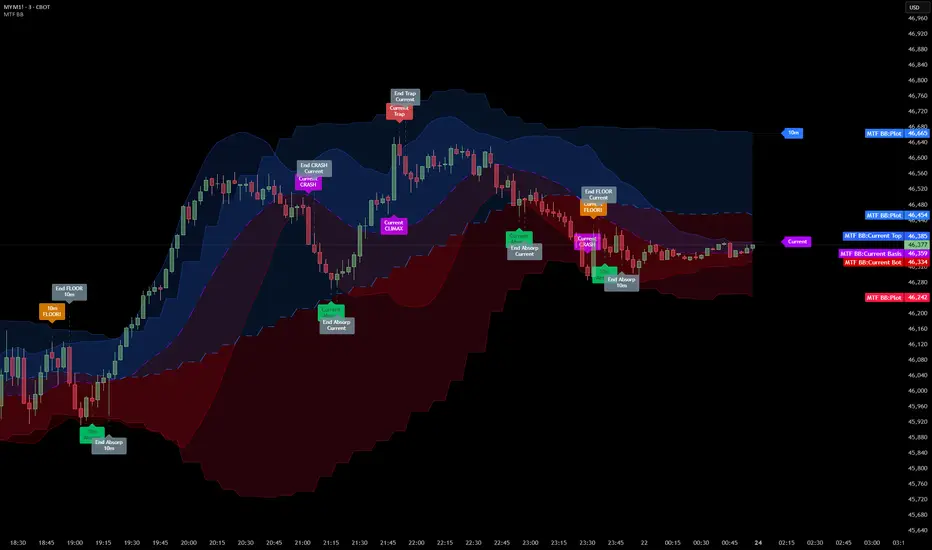
Multi Timeframe Bollinger Bands Spectrum [Ata]Multi-Timeframe Bollinger Bands Spectrum
Technical Overview
This script integrates multi-timeframe volatility analysis with volume-derived order flow estimation. By combining Bollinger Bands (statistical deviation) with internal candle volume logic, the indicator qualifies price movements to differentiate between sustained trends, reversals, and exhaustion events.
The system is designed to provide a structural context for price action, visualizing market regimes through a dual-zone spectrum and filtering signals based on the interaction between price location and specific volume thresholds.
Core Logic & Calculation
1. Volume Decomposition Algorithm
Instead of using total volume, the script estimates Buying Pressure vs. Selling Pressure based on the close position relative to the candle's High/Low range:
- Buying Volume (vb): Increases as the close approaches the High.
- Selling Volume (vs): Increases as the close approaches the Low.
This logic allows the detection of directional flow even within standard volume bars.
2. Statistical Spectrum
The indicator renders deviations from the Basis (SMA) as two distinct zones:
- Bullish Zone (Blue): Price positioning between the Basis and Upper Band.
- Bearish Zone (Red): Price positioning between the Basis and Lower Band.
This structure is applied across multiple timeframes (overlay) to visualize the macro trend context without noise.
3. Non-Repainting Execution
To ensure historical accuracy and reliability for backtesting, all higher-timeframe data is requested using "lookahead_off". Signals are confirmed only upon the closure of the respective timeframe's candle.
Signal Definitions
Signals are generated only when specific Volatility and Volume conditions intersect:
Reversal Setups (Reaction to Liquidity)
- WALL: Triggered when price rejects the Upper Band accompanied by Extreme Selling Volume (vs > Limit). This suggests active limit sell orders absorbing the rally.
- FLOOR: Triggered when price rejects the Lower Band accompanied by Extreme Buying Volume (vb > Limit). This suggests active limit buy orders absorbing the drop.
- ABSORP: Identifies absorption near the lower bands where selling pressure is met with passive buying (indicated by lower wicks and relative buy volume).
Momentum Setups (Trend Continuation)
- POWER: Validates a breakout above the Upper Band only if supported by Dominant Buying Volume and a strong candle body.
- PANIC: Validates a breakdown below the Lower Band only if supported by Dominant Selling Volume.
- TRAP: Marks failed breakouts where price exits the bands but volume analysis contradicts the move (e.g., low directional volume).
Exhaustion Setups (Statistical Extremes)
- CLIMAX/CRASH: Identifies anomalies where price deviates significantly from the mean (Extreme Deviation) or when volume reaches unsustainable levels relative to the average, often preceding a mean reversion.
Input Parameters
- Bollinger Logic: Configuration for Length and Standard Deviation Multiplier.
- Volume Thresholds: Adjustable factors for Minimum Volume (Trend) and Extreme Volume (Reversal/Climax).
- Timeframe Layers: Toggle visibility for up to 5 higher timeframes.
- Theme: Adjusts label contrast for Dark/Light backgrounds.
Disclaimer
This indicator is strictly for analytical purposes. It provides a visualization of past market data based on statistical and volumetric formulas. Users should apply their own risk management protocols.
COT Net Positions OTCCOT Net Positions Indicator Description
This is a TradingView Pine Script indicator that displays Commitment of Traders (COT) data for any trading instrument.
What it does:
Fetches COT Data - Uses the TradingView COT library to retrieve official CFTC (Commodity Futures Trading Commission) data for the current symbol
Calculates Net Positions for three trader categories:
Commercial (Blue) - Large hedging institutions; represents institutional long/short positioning
Non-Commercial (Yellow) - Large speculators and hedge funds; often considered "smart money"
Retail (Red) - Small individual traders; often considered contrarian indicators
Net Position Calculation - For each category:
Takes Long Positions minus Short Positions
Plots the result on a separate panel below the price chart
Special Symbol Handling - Includes custom mappings for specific commodities:
Copper (HG) → CFTC code 085692
Brazilian Real (LBR) → CFTC code 058644
Use Cases:
Market Bias Detection - See if institutions are mostly long or short
Contrarian Trading - When retail traders are extremely positioned one way, often the market reverses
Trend Confirmation - Non-commercial positioning often aligns with established trends
Support/Resistance - Extreme COT positions can signal market turning points

SELL TOP
Short TradingView Description
This indicator identifies potential exhaustion points in upward trends by combining multiple technical components into one weighted signal.
It evaluates price behavior, volatility structure, momentum shifts, volume pressure, and candle characteristics.
A SELL alert is triggered only when several conditions align and exceed a predefined threshold.
The indicator uses three core technical tools:
* **RSI** – to measure strength and potential overextension
* **MACD** – to confirm momentum weakness
* **Bollinger Bands (BB)** – to assess volatility and price deviation
Each signal is clearly marked on the chart, including a visual stop-level above the signal candle.
This tool does not execute trades or guarantee results; it serves as an analytical assistant to highlight areas where bullish momentum may be weakening.
Sensitivity and behavior can be adjusted through the indicator’s settings.
raziel arusi
### 🌟 Divine Master V10.1 - Ultimate Hybrid System (Stocks & Options)
**Description:**
The **Divine Master V10.1** is a comprehensive, "All-In-One" algorithmic trading system designed for both long-term investors and short-term traders who demand a complete market overview in a single glance. This system uniquely combines classic technical analysis, institutional trend tracking, and a real-time **Black-Scholes options calculator**.
The standout feature of this version is the **"Smart Portfolio Memory"**, which allows you to save entry prices for up to 12 different assets and track P&L for two separate portfolios simultaneously (e.g., Personal & Family) without re-entering data every time you switch charts.
---
### 🚀 Key Features:
#### 1. 💼 Smart Portfolio Manager
* **12-Asset Memory:** The system automatically detects the ticker you are viewing (e.g., QQQ, NVDA) and retrieves your pre-set entry prices.
* **Dual Tracking:** Calculate P&L (Profit & Loss) in real-time for two separate accounts simultaneously ("Raziel" & "Mom" / Primary & Secondary).
* **Performance Comparison:** A clear display comparing the return on the underlying stock vs. the leveraged return on the option.
#### 2. ⚡ Real-Time Options Simulator (Black-Scholes)
* **Live Pricing:** Calculates the theoretical value of an option (Call/Put) at any given moment based on stock price, DTE (Days to Expiration), and IV (Implied Volatility).
* **Expected Move:** Visualizes a "Purple Box" on the chart, indicating the statistical range the stock is expected to move within until expiration.
* **Smart Recommendations:** Provides textual actionable advice in real-time: "Hold", "Take Profit", "Cut Loss", or warnings about "Divergence".
#### 3. 🏛️ Long-Term Investment Analysis
* **Institutional View (MA 150):** Visual indication of whether the stock is supported by institutional investors (Price above/below the 150-day Moving Average).
* **Macro Trends:** Automatic detection of **Golden Cross** (Bull Market start) and **Death Cross** (Bear Market warning).
* **Drawdown:** Measures the percentage drop from the All-Time High (ATH) to identify value opportunities.
#### 4. 📉 Short-Term Trading Tools
* **Smart Money Filter (Volume):** Identifies abnormal capital inflows (high volume) to validate trade signals.
* **Divergence Hunter:** Alerts on RSI divergences (Bullish/Bearish) to spot potential trend reversals.
* **Squeeze Radar:** Detects low-volatility consolidation periods ("Squeezes") before explosive moves.
* **ATR (Volatility Meter):** Displays volatility levels in percentage (🔥 = High Risk/Expensive Premiums, 🌊 = Calm).
* **Earnings Countdown:** Counts down days to the next earnings report with a red alert warning when the date is near (Risk Management).
#### 5. 📊 Live Dashboard (HUD)
A high-contrast table located at the top-right corner, consolidating all critical data:
* **Weighted Score:** A dynamic score from 0-100 based on all indicators.
* **Win Rate:** Historical success rate of the strategy's signals.
* **Live P&L:** Real-time profit/loss tracking.
* **Actionable Signals:** Clear Buy/Sell/Hold instructions.
---
**Developed by Raziel Arusi.**
*A tool for smart decision-making, combining wisdom and financial practice.*

FancyITM💰-Honey DripFancyITM💰 – Honey Drip is an all-in-one trading toolkit built for members of the Honey Drip Network.
It combines smart-money style Order Blocks & Breaker Blocks with a full intraday framework:
Automatic bullish & bearish order blocks
Breaker blocks and polarity shifts
VWAP, 200 SMA, EMA 21 & EMA 9
Bollinger Bands (volatility and squeeze structure)
Premarket High/Low and Previous Day High/Low key levels
How to use it (Honey Drip style):
Use VWAP + MAs to define trend and intraday bias.
Mark liquidity zones with Order Blocks, Premarket H/L, and Previous Day H/L.
Watch Bollinger Bands for volatility expansions, squeezes, and extended moves.
Look for liquidity sweeps and retests of OBs or key levels in the direction of your bias.
Use the opposite OBs, VWAP, or prior day levels as logical targets/trim zones.
Everything is color-configurable and designed to be professional, readable, and friendly how FancyITM trades with the Honey Drip Network!
Learn more at honeydripnetwork.com and follow @fancyITM on instagram

