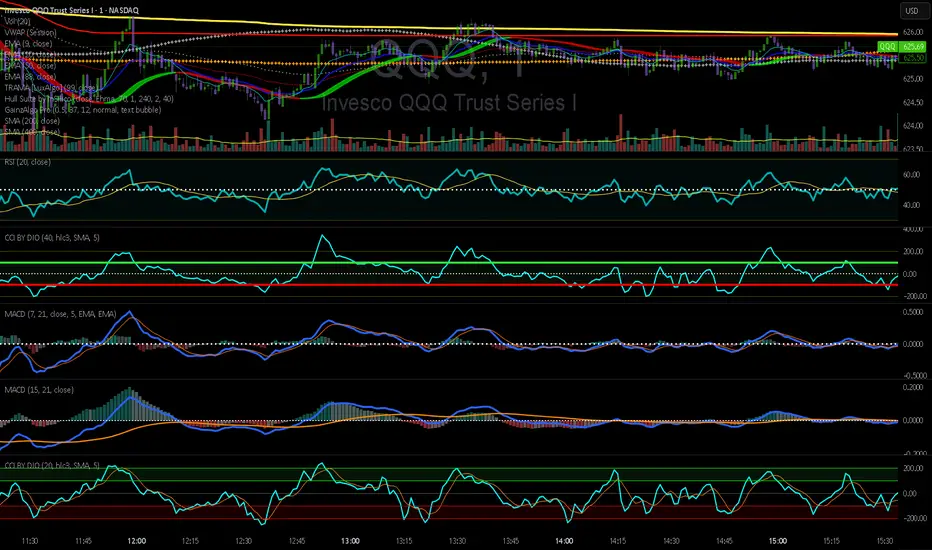
CCI by DioAdded background color to entry points of the channel for easy observation to levels I am looking at.
Bande e canali
Setup Keltner Banda 3 e 5 - MMS
⚙️ How It Works:
• Calculates a 20-period Simple Moving Average (SMA) as the central line.
• Uses the ATR (Average True Range) to build two volatility bands:
o 3x ATR Band (more sensitive)
o 5x ATR Band (more extreme)
• Detects potential reversals when the price closes outside a band and then re-enters it.
🔍 Signals Generated:
• 🔻 Bearish Reversal: Price re-enters from above the upper band.
• 🔺 Bullish Reversal: Price re-enters from below the lower band.
• Signals are displayed with colored arrows on the chart for easy visual recognition.
🔔 Alerts:
The script also triggers automatic alerts for each type of reversal, so you can be notified in real time.
🧱 Ideal For:
• Traders using Renko, Range, or traditional candlestick charts
• Scalping or swing trading strategies
• Anyone looking for visual confirmation of price exhaustion and potential reversals

SBT LEVELS with CR Daily time frame levels PDH/ PDL/ PDC. I managed to code day count directly into the indicator complete with a table to show you the trigger day as well as current day. Im measuring higher and lower closes. that being said it is up to the trader to realize when a FRD/FGD is a A+/A++/A+++ setup. BO is the designation to show when breakout traders are triggered into the market. CIB (close in breakout). FB- FALSE BREAK- INSIDE - inside day.

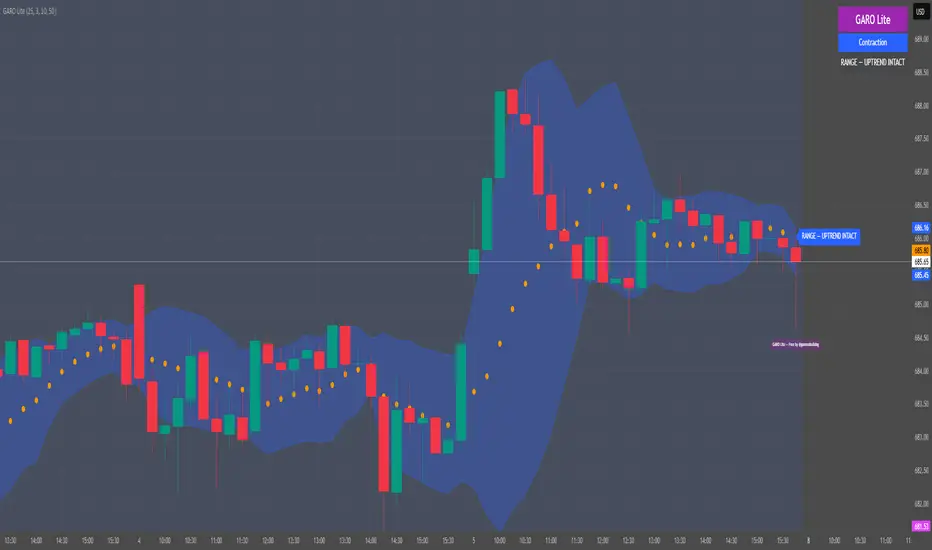
GARO Lite - Free Regime EngineGARO — Gamma Regime Engine
Overview
GARO (Gamma Regime Oscillator) is a visual regime engine that shows market conditions in real-time. This free edition is for educational and charting purposes only.
Key Features
Regime Detection: Highlights Expansion, Contraction, and Spike conditions using trend, volatility, and volume-based calculations.
Core and Bands: Central reference line with upper and lower bands.
Visual Alerts: Orange dots appear under candles during compressions; background colors indicate current regime.
Signal Labels: Labels provide visual guidance based on regime and trend slope.
Gamma Exposure (GEX) Proxy & Zero Gamma Flip: Optional visual overlays for contextual awareness.
User Inputs: Some settings are visible in the input panel but are disabled in this free edition.
How to Use
Regime Colors:
Expansion (green background): Market trending/expanding; core line indicates direction.
Contraction (blue background): Market range-bound; orange dots indicate compression.
Spike (red background): High volatility; visual alert only.
Labels & Signals:
Labels highlight potential regime moves; not trade advice.
Combine colors, core/band positions, and label cues with your own analysis.
Core Line & Bands:
Core line shows central reference per regime.
Upper/lower bands provide context for potential support/resistance zones.
Orange Dots:
Indicate compressions or regime-specific signals; visual only.
Gamma Exposure & Zero Gamma Flip (Optional):
Illustrates potential price sensitivity; charting/educational use only.
Important:
Protected code; underlying calculations are not visible.
For educational and visual guidance only; not financial or trading advice.
Works on any timeframe; free edition gives visual regime insights.
GridMap PRO by TradeAkademiGridMap PRO is a professional level-mapping framework built on the premise that price action tends to develop within repeatable percentage-based bands. Using mathematically derived projections, the indicator identifies potential support and resistance zones where the market is statistically more likely to react.
All calculations are anchored to the asset’s historical low; therefore, levels remain structurally stable unless a new low is formed.
To support different trading environments, GridMap PRO offers two calculation modes:
Long Term: Designed for high-volatility markets, macro structure assessments and broader trend inflection points.
Short Term: Optimized for shorter-term setups, providing precise reaction zones and tactical entry/exit levels.
Users are encouraged to validate the levels against historical price behavior. In some environments, price may respect a level multiple times with minimal deviation, while in others it may break through several levels without hesitation. GridMap PRO is not a standalone signal generator but an institutional-grade framework that enhances the decision-making process.
Primary use cases:
Identifying accurate buy/sell/SL/TP zones
Constructing optimal grid or DCA entry layers
Mapping pinpoint reaction levels for leveraged trades with tight stops
Note: Even though these structures have historically performed extremely well, no level guarantees a future reaction. Always consider broader market conditions, volatility, news flow, and complementary technical data. When using the levels in leveraged setups, apply reasonable stop distances or opt for a DCA-based entry approach rather than a single-point execution.

Trinity Supertrend EliteTrinity Supertrend Elite - the one line to rule them all!
This is the smoothest, most respected, and most adaptive super trend line on TradingView today in our humble opinion.
When price is above the line → only longs make sense.
When price is below the line → only shorts make sense.
When the line is solid color → the daily trend agrees (extra confidence).
When the line is faded → you are fighting the higher-timeframe (be careful).
That’s it. One line tells you the entire market bias.
Why this beats every standard SuperTrend and every EMA (34, 50, 200, etc.)
Standard SuperTrend flips too early and too often — you get chopped to death in sideways markets.
Classic EMAs (34, 50, 200) lag so much that by the time they turn, half the move is gone.
The Trinity Baseline fixes both problems at once:
It uses a long, smart ATR + double smoothing (WMA → EMA) so the line is silky smooth and almost never whipsaws.
It adapts itself in real time — tightens in explosive trends, widens in chop, and even listens to the daily chart before committing.
It adds two-candle confirmation so fake flips are virtually eliminated.
It can optionally weigh real volume, making it follow institutional money instead of random noise.
Result: the line price respects like a magnet, often for weeks at a time.
How to use it (simple rules)
Never fight the line
Cyan = long only
Magenta = short only
Flat/sideways line = sit on your hands
Best entries
Pullbacks or bounces directly off the line
Breakouts that happen while the line is solid color (daily agreement)
Best timeframes
<10mins use the scalping the Holy Trinity Line preset
15m–1H for scalping/swing (use “15m–1H God Mode Enabled” preset)
4H–Daily for swing/position (use “4H–Daily Swing King”)
Weekly for long-term holds (use “Weekly Master of the Universe”)
Custom Settings: do you dare change the presets. If you do then we wish you well...
Combine with anything you already like
RSI, MACD, order blocks, liquidity grabs, your own Trinity Impulse oscillator — everything works better when you only take trades in the direction of this line.
Bottom line
If you want the single highest-probability filter that exists in the public TradingView world — one line that removes 80-90 % of losing trades before you even press the button — this is it.
Add it once, pick your preset, and watch how clean your curve becomes.

Breakout PRO (B:Pro) v3.0Breakout PRO (B:Pro) v3.0 is a multi-filter breakout and trend suite designed for discretionary trading on any symbol and timeframe. It combines a custom EMA cloud, volatility and momentum filters, higher-timeframe trend, and quality scoring into one tool, instead of using multiple separate indicators.
Core concept
The script builds a three-layer EMA cloud around price. The relative position of fast, mid, and slow EMAs plus an ATR padding defines:
Bull regime: stacked EMAs with cloud acting as dynamic support
Bear regime: stacked EMAs with cloud acting as dynamic resistance
Neutral regime: mixed EMAs, cloud fades to neutral color
This cloud defines the main trend and the breakout levels (cloud upper / cloud lower).
A higher-timeframe 200 EMA (configurable timeframe) adds a long-term bias filter.
Support, resistance and structure
Last confirmed swing high and swing low are detected with pivot logic and plotted as dotted support / resistance lines.
These levels are invalidated with a small ATR buffer when price clearly breaks them.
Optional long-term EMA targets (T1 and T2, default 233 and 377) are plotted on the price scale as potential mean-reversion or trend-continuation targets.
Filters used in entries
Long and short breakout signals are only shown when multiple conditions agree. You can enable or disable each filter:
Volume: current volume vs volume SMA
MACD: direction and histogram momentum
RSI: classic OB/OS, with sentiment-adjusted levels
Stoch RSI: direction of K vs D in valid zones
Bollinger Bands + Keltner Channel: squeeze and BB breakouts
VWAP: price relative to VWAP
ADX: trend strength threshold
OBV and Ichimoku: optional extra trend confirmation
A separate Market Sentiment input (Standard, Bullish, Bearish, Consolidation) shifts RSI zones, ADX threshold, and volume requirements so the same logic adapts to different environments.
Signals and exits
The main entry logic:
Long signal: bull EMA stack, breakout above the last pivot resistance and above the upper cloud, plus all enabled long filters are satisfied.
Short signal: mirror conditions below support and below the lower cloud.
Trade state is tracked inside the script:
ATR-based stop level is set on entry using mode-dependent ATR multipliers.
Optional maximum trade duration (different for Short, Mid and Long modes).
Exit markers are plotted when stops are hit, the cloud / EMA stack flips against the trade, MACD or RSI contradict the position, or the time limit is exceeded.
Additional icons mark:
Strong breakouts / breakdowns with large ATR and volume
Squeeze releases after a volatility contraction
EMA cross signals
Continuation and potential reversal zones inside the cloud
Optional RSI divergence arrows based on a separate RSI tuned per trade mode.
Quality and safety scoring
For every entry the script computes:
Safety score (1–3): based mainly on volume, ADX trend strength, and alignment with the cloud regime.
Quality score (1–3): based on BB breakout, MACD and RSI agreement, and whether the signal matches the selected market sentiment.
You can:
Show small S/Q labels next to the entry signal
Use the fixed panel in the bottom-left corner to view the last 5 trade events (opens, closes, crosses) with their S and Q values.
Inputs and layout options
Key inputs:
Trade Mode: Short (e.g. 30 min), Mid (e.g. 4h), Long (e.g. 1D+). Adjusts EMA lengths, ATR settings and the RSI length used for divergences.
Market Sentiment: adjusts filters as described above.
Per-filter toggles for volume, MACD, RSI, Stoch RSI, BB, Ichimoku, ADX, OBV, VWAP, HTF levels.
Panel size: Desktop, Phone, or None for the signal history table.
Side labels: Desktop (full text labels on the price scale) or Phone (compact labels without text) for better compatibility on small screens.
Usage notes
This is a technical analysis tool, not a trading system or financial advice. Signals are calculated on closed data without intentional look-ahead, but values on the current forming bar can still change until the bar closes. Use the script as a structured framework for trend, breakout and confluence analysis, and always confirm signals with your own risk management and testing.

AlphaTrend | APEX [Singularity]This is a customized Trend Tracer style system designed to capture high-quality moves while filtering out noise. It combines three core "Engines":
1. Kinetic Trend Engine (The "Ribbon")
Logic: Uses a Dual-ALMA Ribbon (Arnaud Legoux Moving Average).
Fast Line (Leader): Responsive, hugs price.
Slow Line (Laggard): Smooth, validates structure.
Signals: "BUY" and "SELL" labels trigger exactly when the ribbon twists (Crossover/Crossunder).
Filters:
Entropy & Hurst: Measures market chaos. The ribbon turns Gray/Faded during choppy conditions to warn against trading.
2. Flow Engine (Whale Validation)
Whale Volume: Checks for relative volume spikes (> 1.2x average) and Money Flow intensity.
Confirmation: Signals are stronger when accompanied by the Whale Icon (🐋), indicating institutional participation.
3. Liquidity Magnets (Targets)
Logic: Automatically detects recent Swing Highs and Lows.
Visuals: Dashed lines extend forward to act as dynamic Support/Resistance levels or Take Profit targets.
Behavior: Lines disappear when price tests (breaks) them, indicating "Liquidity Taken".
Visuals
Cloud: Dynamic Green/Red fill between the ribbon lines.
HUD: Heads-Up Display showing current Trend, Market State (Clean/Chop), Flow Status, and Active Magnets.
Labels: Clean "Tag" style labels for entry signa

SmartDCA by TradeAkademiSmartDCA is an advanced position-management strategy built to deliver consistent results even as market conditions shift. Its price-action–driven structure, intelligent DCA scaling model, and multiple entry options provide a powerful automation framework suitable for both beginners and professional traders. With flexible TP/DCA configurations and safety modules such as Smart Take Profit, Risk Reset Exit, and Fail Safe Stop, positions scale more efficiently, risks are managed proactively, and capital remains protected at every stage. SmartDCA is a fully customizable, modern trading engine that offers high adaptability across different assets and timeframes.
The strategy supports five entry methodologies:
ta_default – Opens positions on breakout confirmations based on the selected period’s local highs and lows.
ta_volatility – Uses the same breakout logic while filtering entries that would place the target level outside the system’s defined safety zone.
ta_safety – Extends the volatility model with an additional candle-quality filter, avoiding structurally weak entries and behaving more conservatively.
rsi_based – Generates entries when RSI drops below 30 or rises above 70.
ema_based – Opens positions based on directional shifts in the moving average.
SmartDCA is fully configurable: entry logic, DCA percentage and multiplier, take-profit (TP) settings, maximum DCA steps, order-size mode, and directional preferences can all be tailored to fit any asset, market condition, or timeframe .
Default parameters are optimized for the 30-minute chart.
The strategy also includes three optional protective mechanisms:
Smart Take Profit – Closes profitable trades early when price approaches the target within a configurable proximity, reducing exposure to potential reversal signals.
Risk Reset Exit – After a defined DCA step, the position is closed at breakeven once price returns to the average entry level.
Fail Safe Stop – If the maximum DCA step is reached and recovery fails to occur, the trade is closed at a controlled loss.
All protection modules can be enabled individually and configured to activate only after specific DCA levels, allowing SmartDCA to remain adaptive yet controlled under varying market dynamics.

MTF Step EMA With ColorMTF Stepped EMA – Dynamic & Color-Coded (Green / Red / Yellow)
This indicator plots a higher-timeframe EMA as a stepped line (staircase style) directly on your current chart, with smart dynamic coloring:
- Green → The stepped EMA is actively rising (higher highs in the staircase) → bullish higher-timeframe momentum
- Red → The stepped EMA is actively falling (lower lows in the staircase) → bearish higher-timeframe momentum
- Yellow → The EMA has been flat (no new step) for a user-defined number of bars → consolidation / range phase
Features
• Fully dynamic – updates instantly when the higher-timeframe EMA changes
• Clean step-line style (plot.style_stepline) – no diagonal lines, pure staircase
• Automatic color switching based on the actual direction of the last step
• Yellow "flat" detection after X bars without movement (customizable)
• Thin reference line of the original smooth higher-timeframe EMA (optional)
• Very lightweight and repaints-free (uses proper request.security)
How to use
• Classic setup: Daily or Weekly EMA 50/200 on 1H or 4H charts
• Green steps → look for longs in lower timeframes
• Red steps → look for shorts
• Yellow → caution or stay out – higher timeframe is ranging
Perfect for multi-timeframe trend confirmation, pullback trading, and avoiding choppy markets.
Enjoy & trade safe!

Quantum Uncertainty by Kingshuk GhoshLet me explain this indicator in simple, practical terms, including the fascinating physics concept that inspired me.
This indicator helps to understand when the market is predictable (safe to trade) versus unpredictable (risky to trade). It shows the probability zones where price is likely to move and warns you when conditions are too chaotic for reliable trading.
The Physics Behind It: Heisenberg's Uncertainty Principle:-
This indicator is inspired by one of the most profound discoveries in physics: Heisenberg's Uncertainty Principle.
What Is The Uncertainty Principle?
In 1927, physicist Werner Heisenberg discovered something remarkable about the universe: you cannot simultaneously know both the exact position and exact momentum of a particle with perfect precision. The more accurately you know one, the less accurately you can know the other.
Simple Analogy:
Imagine trying to photograph a speeding bullet:
Use fast shutter speed → You see exactly WHERE it is (position), but the image is frozen, so you can't tell HOW FAST it's moving (momentum)
Use slow shutter speed → You see motion blur showing HOW FAST it's moving (momentum), but you can't pinpoint exactly WHERE it is (position)
You can never have both perfect clarity simultaneously - there's always a trade-off.
How This Applies To Trading
The indicator translates this principle to financial markets:
In Physics:
Position Uncertainty × Momentum Uncertainty = Always greater than a minimum value
High uncertainty in one means high uncertainty overall
In Trading:
Price Position Uncertainty = How much the price bounces around (volatility)
Price Momentum Uncertainty = How erratic the directional strength is
Total Market Uncertainty = Price Volatility × Momentum Volatility
The Trading Insight:
Just like in physics, when BOTH price position and momentum are uncertain (highly volatile), the market becomes fundamentally unpredictable. You can't reliably know where price will go next because the system is in high uncertainty state.
Why This Matters For You
Traditional indicators often look at price OR momentum separately. This indicator recognizes that both must be considered together to truly understand market predictability, just as Heisenberg showed that position and momentum must be considered together in physics.
When both uncertainties are high simultaneously:
Price could jump anywhere
Momentum could shift instantly
Predictions become unreliable
Trading becomes gambling
When both uncertainties are low:
Price behavior is more regular
Momentum is more stable
Patterns become clearer
Trading becomes strategic
This is why the indicator's core metric multiplies price volatility by momentum volatility - it's capturing that fundamental uncertainty relationship.
Market Uncertainty
The indicator calculates how unpredictable the market currently is by examining:
How much price is bouncing around (price volatility)
How erratic the momentum is (momentum instability)
When both are high simultaneously, the market becomes highly unpredictable. When both are calm, the market is more reliable for trading.
Think of it like driving:
Low uncertainty = Clear road, good visibility, safe to drive
High uncertainty = Fog, rain, poor visibility, dangerous conditions
Probability Bands
The indicator draws colored bands around a central average price line:
White Center Line (Basis)
The average price over your lookback period
Acts as a equilibrium point where price gravitates
Blue Bands (Inner Zone)
Covers about 68% of normal price behavior
Price spends most of its time here
This is the "normal operating range"
Purple Bands (Outer Zone)
Covers about 95% of all price behavior
Price rarely ventures here
When it does, it's unusual and noteworthy
Highway Lane Analogy:
Most drivers stay in center lanes (blue zone)
Few drivers use extreme outer lanes (purple zone)
When someone drives on the shoulder, it's abnormal and signals something is happening
Wave Function Collapse
Another physics concept applied here: In quantum mechanics, particles exist in multiple states simultaneously (superposition) until they're measured - then the "wave function collapses" to a single state.
In This Indicator:
The probability bands represent all the possible states price could be in. When price moves and settles at a specific level, it's like the wave function collapsing - probability becomes reality.
The indicator helps you see:
Where price is most likely to be (high probability zones - blue bands)
Where price rarely goes (low probability zones - purple bands)
When price is in an "impossible" state (outside bands - tunneling)
Price Position
The indicator tracks where current price sits within these bands:
Upper position = Price in the top half (bullish territory)
Lower position = Price in the bottom half (bearish territory)
Extreme positions = Price in outer 30% on either side (potential reversal zones)
Quantum Tunneling Signals
This is another physics concept: In quantum mechanics, particles can sometimes "tunnel" through barriers that classical physics says they shouldn't be able to cross.
In Trading:
When price breaks through the 95% probability barrier, it's "tunneling" into statistically improbable territory - these are marked by triangles:
Green Triangle Up
Price tunneled through the upper 95% barrier
This is statistically rare (happens only 5% of the time)
Often signals price exhaustion or coming reversal downward
Like a particle that tunneled too far and will snap back
Red Triangle Down
Price tunneled through the lower 95% barrier
Also statistically unusual
Often signals panic selling may be overdone
Like a spring compressed too far, ready to bounce
These "tunneling events" are significant because they represent extreme deviations from normal probability - and markets tend to revert to normal.
Entanglement Score
In quantum physics, "entanglement" means two particles are connected such that measuring one instantly affects the other, no matter the distance.
In Trading:
This measures whether price movements are "entangled" with trading volume - do they move together in a connected way?
High Entanglement (above 0.5)
Price and volume move together
Volume confirms the price action
More reliable, trustworthy moves
Like entangled particles - they're truly connected
Low Entanglement (below 0.3)
Price moves without volume support
Suspicious, unsupported movements
Less reliable, be cautious
Like particles that aren't entangled - the connection is weak
Negative Entanglement
Price and volume move in opposite directions
Often signals divergence or potential reversal
Requires careful interpretation
Information Dashboard:
1. Uncertainty Level
Shows current market unpredictability (the core Heisenberg principle calculation):
✓ Normal (Green) = Market is behaving predictably, safe to trade
⚠ High Risk (Red) = Market is chaotic, avoid trading
This is your first checkpoint - if uncertainty is high, don't proceed further.
2. Probability Score
Shows how normal or extreme the current price is:
Percentage shown = Where price sits in the probability distribution
✓ Safe (Green) = Price in normal range (middle 70%)
⛔ Extreme (Red) = Price at statistical outliers (outer 15%)
High percentage (>85%) = Price near the average, stable situation
Low percentage (<15%) = Price at extremes, unstable situation
3. Position Indicator
Tells you which side of the market you're on:
Upper/Lower = Basic location in the bands
→ Neutral (Gray) = Price in balanced middle zone
⚠ Reversal? (Orange) = Price at extremes, watch for turnaround
This helps you anticipate potential support or resistance levels.
4. Entanglement Confirmation
Shows the correlation number and interpretation:
✓ Confirmed (Green) = Volume strongly supports price (>0.5)
⚠ Weak (Orange) = Poor volume support (<0.5)
Always prefer trading when entanglement is confirmed - it means the move is "real" with participant backing.
5. Trade Status - YOUR MAIN SIGNAL
This is the indicator's final verdict combining all factors:
✓ TRADEABLE (Green)
Uncertainty is normal
Probability is safe
Entanglement is decent
Action: Market conditions favor trading
⛔ AVOID (Red)
One or more conditions are unfavorable
Market is too unpredictable
Action: Stay out, preserve capital.
Scenario A: Perfect Buy Setup
Red triangle appears (quantum tunneling down)
Position shows "Lower" with "⚠ Reversal?" warning
Entanglement shows "✓ Confirmed"
Trade Status: "✓ TRADEABLE"
Interpretation: Price hit extreme low with volume support, likely to bounce back to probability zone
Action: Consider long entry with stop below recent low
Scenario B: Perfect Sell Setup
Green triangle appears (quantum tunneling up)
Position shows "Upper" with "⚠ Reversal?" warning
Entanglement shows "✓ Confirmed"
Trade Status: "✓ TRADEABLE"
Interpretation: Price hit extreme high, exhaustion in high uncertainty zone
Action: Consider short entry or exit longs with stop above recent high
Scenario C: High Uncertainty - Stay Out
Uncertainty shows "⚠ High Risk"
Probability shows "⛔ Extreme"
Trade Status: "⛔ AVOID"
Interpretation: Both price and momentum uncertainties are high - market is fundamentally unpredictable (Heisenberg principle in action)
Action: No trading, wait for uncertainty to decrease
Scenario D: Trending Market
Price consistently stays in upper bands
No tunneling signals
Entanglement remains high
Trade Status stays "✓ TRADEABLE"
Interpretation: Strong trend with low uncertainty
Action: Trade with the trend, don't fight it
Scenario E: Choppy, Range-Bound
Price bounces between inner blue bands
Frequent status changes between TRADEABLE and AVOID
Entanglement fluctuates
Interpretation: Market lacks direction, uncertainty fluctuating
Action: Use bands as support/resistance for scalping, or wait for breakout.
Why The Uncertainty Principle Matters In Trading
Traditional technical analysis often looks at indicators in isolation:
"RSI is oversold, so buy"
"Price is volatile, so wait"
"Volume is high, so trade"
But Heisenberg's principle teaches us that multiple uncertainties interact and compound. This indicator recognizes that truth:
When price volatility is high AND momentum is erratic:
You can't reliably predict where price will go
You can't reliably predict how strong the move will be
The combination creates fundamental unpredictability
This is when the indicator says "AVOID"
When price volatility is low AND momentum is stable:
Price behavior becomes more regular
Directional moves become more reliable
The low combined uncertainty creates tradeable conditions
This is when the indicator says "TRADEABLE"
The Probability Wave Function
In quantum mechanics, until you measure a particle, it exists in all possible states simultaneously (superposition). The probability wave describes where it's most likely to be found.
The bands work the same way:
Blue bands = Where price has 68% probability of being (1 standard deviation)
Purple bands = Where price has 95% probability of being (2 standard deviations)
Outside bands = Less than 5% probability (quantum tunneling territory)
When price is in the blue zone, it's in its "natural" superposition state - normal behavior.
When price tunnels outside, it's in an "improbable" state - like a quantum particle appearing where it shouldn't be. Physics tells us this can't last - the wave function will collapse back to normal probability zones. In trading, this means reversion to the mean.
Entanglement and Market Correlation
Quantum entanglement shows us that connections matter - particles don't act in isolation.
In markets:
Price shouldn't move in isolation from volume
When they're "entangled" (moving together), the move is authentic
When they're not entangled (price moves without volume), the move is suspicious
This is why the indicator checks entanglement - it's verifying that the market components are properly connected and confirming each other.
Golden Rules for the indicator:
Never trade during high uncertainty states - When the indicator shows AVOID, it's telling you that fundamental unpredictability (Heisenberg's principle) has taken over. This is non-negotiable.
Reduce position size when entanglement is weak - Even if uncertainty is low, weak volume entanglement means the move may not be authentic.
Respect the quantum tunneling signals - They mark statistical extremes where price has entered improbable territory. Reversion to normal probability zones is likely.
Don't chase price outside the bands - If you missed the tunneling entry, wait for price to return to normal probability zones.
Use the white center line as equilibrium - Like particles gravitating toward lower energy states, price tends to revert to its average.
Heisenberg's Uncertainty Principle teaches us a profound lesson: some things are fundamentally unknowable. You cannot eliminate uncertainty - you can only measure it and decide whether it's low enough to act.
This indicator embraces that wisdom:
It doesn't claim to predict the future
It doesn't promise guaranteed wins
It simply measures current uncertainty
And tells you when conditions are favorable vs. unfavorable
The market, like quantum particles, is probabilistic, not deterministic. You're trading probabilities, not certainties. The indicator helps you identify when those probabilities are in your favor (low uncertainty) and when they're not (high uncertainty).
This is a more mature, realistic approach to trading than indicators that promise to "predict" moves. Instead, this indicator honestly assesses predictability itself.
Remember: Not trading during high uncertainty is just as important as trading during low uncertainty. Preservation of capital is the foundation of long-term success. As Heisenberg taught us, some moments are simply too uncertain to act - and that's okay.
Chart attached: -NSE Persistent, EoD 05/12/25, Day Time Frame.
DISCLAIMER: This information is provided for educational purposes only and should not be considered financial, investment, or trading advice. Please do boost if you like it. Happy Trading.

AlphaNatt | FINAL REVELATION [Visual God]AlphaNatt | The Final Revelation
"Where Information Theory meets Market Geometery."
The AlphaNatt is a comprehensive market structure and volumetric analysis suite designed for the institutional-grade trader. It merges advanced quantitative concepts—specifically Shannon Entropy and Neural Pattern Filtering—with a "Holographic" visual interface that prioritizes clarity over clutter.
This is not just an indicator; it is a complete decision-support system that answers three critical questions:
Is the market chaotic or ordered? (Entropy Engine)
Where is the liquidity? (Volumetric Heatmap)
What is the true structure? (Fractal Geometry)
🌌 The Gen 100 Math Engine
At the core of this script lies a unique implementation of Information Theory.
1. Shannon Entropy (The Chaos Filter)
Most indicators fail because they try to predict "Noise". This script calculates the Entropy (in Bits) of the recent price action.
High Entropy: The market is in a "Random Walk" state. Visuals fade out, transparency increases, and signals are suppressed.
Low Entropy: The market is "Ordered" and approaching a singularity/decision point. Visuals glow brightly to indicate a high-probability environment.
2. Neural Pattern Recognition
The diamond signals (Cyan/Magenta) are not simple simple crossovers. They are driven by a composite logic simulating a neural filter:
Inputs: Normalised RSI + Momentum Divergence + Volatility State.
Logic: Signals only trigger when the market is statistically overextended AND showing signs of momentum decay.
💎 Holographic Features
🔥 Volumetric Heatmap
The script scans historical price action to build a Volume Profile Heatmap on the right side of the chart.
Purple/Blue Zones: These represent High Volume Nodes (HVNs). These act as "Gravity Wells" for price—often stopping trends or acting as launchpads for reversals.
POC (Point of Control): The bright green line indicates the price level with the absolute highest volume in the lookback period.
🌀 Fractal Structure Lines
Price action is often noisy. The script uses a Fractal Pivot Algorithm (Length 5) to identify the "True Highs" and "True Lows".
It connects these points with dashed "Neural Lines" to show the naked market skeleton.
This instantly reveals if you are in a trend of Higher Highs or a breakdown of Lower Lows.
🖥️ The Heads-Up Display (HUD)
A minimalist dashboard keeps you informed of the math underneath:
ENTROPY: The raw bit-score of market chaos.
REGIME: Tells you instantly if you are in "ORDER" (Tradeable) or "CHAOS" (Sit out).
STRUCT: Real-time status of the fractal structure (Breakout/Breakdown/Ranging).
⚙️ Settings & Configuration
Theme: Choose between "Cyber" (Neon), "Aeon" (Deep Blue), or "Gold" (Luxury).
Max Entropy: Adjust the sensitivity of the Chaos Filter. Lower values = stricter filtering (fewer trades).
Heatmap Depth: Control how far back the volume profile scans.
⚠️ Disclaimer
This tool is designed for educational market analysis. "Entropy" and "Neural" refer to the mathematical algorithms used to process price data and do not guarantee future performance. Always manage risk responsible.

QuantMotions - TPR SentinelQuantMotions – TPR Sentinel
The TPR Sentinel Band is a full trade-assistant for discretionary traders.
It combines an adaptive trend engine, directional TPR logic, volume intelligence, ATR-based risk management, a brute-force parameter optimizer, and a modern on-chart UI (entries/TP/SL panel + stats). The goal: fewer fake flips, clearer trend shifts, and visually guided trade management.
1. Core Concept
The Sentinel Line is built from a blend of:
- SMA + EMA
- Midline of highest/lowest high/low (Kijun-style)
- Donchian-style mid close
On top of that, the script calculates a Directional TPR (Time-Price-Ratio):
- Short / medium / long slopes of price
- Normalized by ATR
- Converted into a trend state:
+1 = Uptrend
-1 = Downtrend
0 = Neutral / transition
Hysteresis (Flux) controls how easily the trend flips:
- Higher hysteresis → harder to reverse → fewer fake-outs in chop.
2. Signals, Filters & Volume Intelligence
Signals
- Trend Flip Long: TrendState changes from −1/0 → +1.
- Trend Flip Short: TrendState changes from +1/0 → −1.
Filters
- ADX Filter (optional):
- Only allows trades if ADX is above a chosen threshold.
- Avoids trading in flat, low-energy markets.
R:R Filter:
- Before any signal is accepted, the script checks whether the distance to TP1 is at least the configured Risk:Reward ratio relative to the distance to SL.
- Only if that minimum R:R is reached, a signal becomes valid.
Volume Intelligence & Clouds
- Aggregates up/down volume (optionally across multiple tickers you define).
- Builds Volume Clouds around the Sentinel Line:
a) Positive intensity → buying pressure (bullish cloud).
b) Negative intensity → selling pressure (bearish cloud).
Optional Volume Direction Filter:
- Long only when volume intensity ≥ 0.
- Short only when volume intensity ≤ 0.
3. Risk, Exits & Trailing Stop
The indicator includes a complete exit framework (for visual/manual trading):
Stop Loss Modes
- ATR Fixed: SL placed at a fixed ATR multiple from the entry.
- Trend Line (Dynamic): SL placed directly on the Sentinel Band (structural stop).
Take Profits
- TP1 – “safe target”:
a) Based on ATR distance.
b) Closes a configurable percentage of the position (e.g., 50%).
- TP2 (optional):
Second fixed target used only when Trailing Stop is OFF.
- Trend Runner Mode (Use TP = OFF):
Ignores fixed TP levels and rides the trend until the trend state flips.
Trailing Stop
- Activates after TP1 is hit (if enabled).
- Moves with price at a configurable ATR distance:
a) Long: trail creeps up under price.
b) Short: trail creeps down above price.
- Visually plotted as a purple trail line, dynamically replacing the original SL as the effective exit point.
Each trade is tracked internally and drawn as a green/red box with PnL labels between entry and exit.
4. UI & Stats
Candle Coloring (TRON Theme)
- Cyan = active uptrend & valid environment.
- Orange = active downtrend & valid environment.
Modern Trade Panel (on last bar)
- Live overlay of:
a) Entry
b) TP1
c) TP2
d) SL or active Trail (with dynamic label text: “SL (ATR)”, “SL (Struct)”, “TRAIL”)
Info label shows:
- Historical win rate in the current direction (Long/Short).
- Distance to SL, TP1, TP2 from current price.
- Box color blends from red → green depending on whether price is closer to SL or TP.
Stats Table (Bottom Right)
- Separate stats for Long and Short trades:
a) Win rate (%)
b) Cumulative PnL
Alerts
- Generates JSON alerts on signals, for example: {"side":"buy","ticker":"XYZ","price":123.45}
Perfect for webhooks, bots, or external automation.
5. Brute Force Optimizer (TPR Lab) – Important Limitations
The built-in Optimizer is a numerical helper, not a full strategy optimizer.
What it does:
- Runs brute-force simulations over a sliding window of historical data.
- Scans user-defined ranges for:
- Best Period (“Best Cycle”)
- Best Hysteresis (“Best Flux”)
Uses an efficiency score (average profit per trade) to rank combinations.
Displays results in the bottom-left TRON panel:
- Best Cycle
- Best Hysteresis
- Efficiency Score
What it does NOT optimize or take into account:
- It does not include your actual minimum R:R filter.
- It does not simulate or optimize your Stop Loss modes.
- It does not simulate Trailing Stops.
- It does not use the ADX filter.
- It does not use the Volume filters or Volume Clouds.
Because of this, the suggested “best” Period and Hysteresis are purely computational recommendations based on a simplified internal model.
In real trading, with your full setup (R:R filter, SL mode, Trailing, ADX, Volume confirmation, personal style), other parameter combinations can be superior to what the Optimizer suggests.
You should treat the Optimizer as:
A starting point or a research tool, not the final truth.
Always validate its suggestions visually, in the context of your full system and risk management.
6. Practical Usage
- Works on FX, indices, crypto, commodities – anything with decent liquidity.
- Scalping → use lower Period values, higher responsiveness.
- Swing → use higher Period values, more stability.
Recommended:
- Keep ADX filter ON to avoid dead markets.
- Use Volume Clouds as directional bias.
- Use the Info Panel and Stats to align with your own R:R and risk rules.
Disclaimer
This script is for educational/analytical purposes only and does not constitute financial advice. It does not execute trades or manage your risk automatically. Always combine it with your own strategy, money management, and independent decision-making.
Use the Info Panel and Stats to align with your own R:R and risk rules.
3 EMA TRONG 1-NTT CAPITALThe 3 EMA in 1 NTT CAPITAL indicator provides an overview of the market trend with three EMAs of different periods, helping to identify entry and exit points more accurately, thus supporting traders in making quick and effective decisions.

DS Gurukul round up Bank 75Roundup (Support & Resistance Indicator) For Bank Nifty
By DS Gurukul
Version : 2.0
To be used only for Bank Nifty.
Indicator Overview
The Round Figure Indicator identifies key psychological support and resistance levels based on round numbers. These levels often act as strong turning points in price action due to trader psychology and institutional order placement.
How It Works
Key Levels:
Mid Band (Black Solid Line): Major round number
Upper Band (Green Solid Line): Mid Band (resistance)
Lower Band (Red Solid Line): Mid Band (support)
Sub-Bands (Dotted Lines): ±0.10 levels for tighter zones
Alerts: Triggers when price touches any band, signaling potential reversals or breakouts.
Trading Strategy
✅ Bounce Trades:
Buy near Lower Band or Mid Sub-Lower with bullish confirmation (e.g., hammer candle).
Sell near Upper Band or Mid Sub-Upper with bearish rejection (e.g., shooting star).
✅ Breakout Trades:
Enter long on a close above Upper Band with volume.
Enter short on a close below Lower Band with momentum.
⚠️ Risk Management:
Place stops just beyond the opposite sub-band.
Avoid trading if price is stuck between mid/sub-bands (choppy market).
Why It Works
Round numbers attract limit orders (support/resistance).
Institutions use these levels for stop placements and profit targets.
Works across all timeframes (scalping to swing trading).
🔔 Tip: Combine with RSI/MACD for higher-probability trades!

range calculation and targetsrange calculation and targets for everyone with targets both bullish and bearish

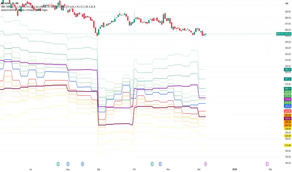
Weekly & Monthly Thresholds + VIX-Based Dynamic TargetsWeekly & Monthly Thresholds + VIX-Based Dynamic Targets
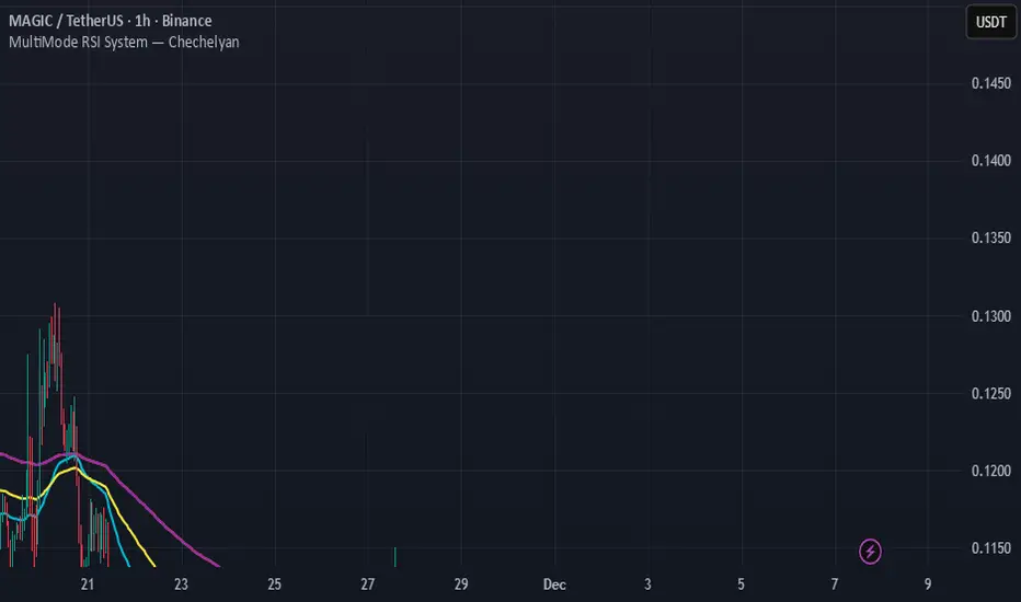
MultiMode RSI System — ChechelyanMultiMode RSI System is an advanced market analysis tool built on the classic RSI indicator.
The system includes multiple calculation modes, additional filters, and extended signal logic designed to help users evaluate market conditions in different phases of price movement.
The indicator provides:
several RSI calculation modes;
dynamic levels;
on-chart signal markers;
trend and range filters;
customizable visual settings.
This tool is intended solely for analytical and visual market assessment.
It is not a trading or financial advice.
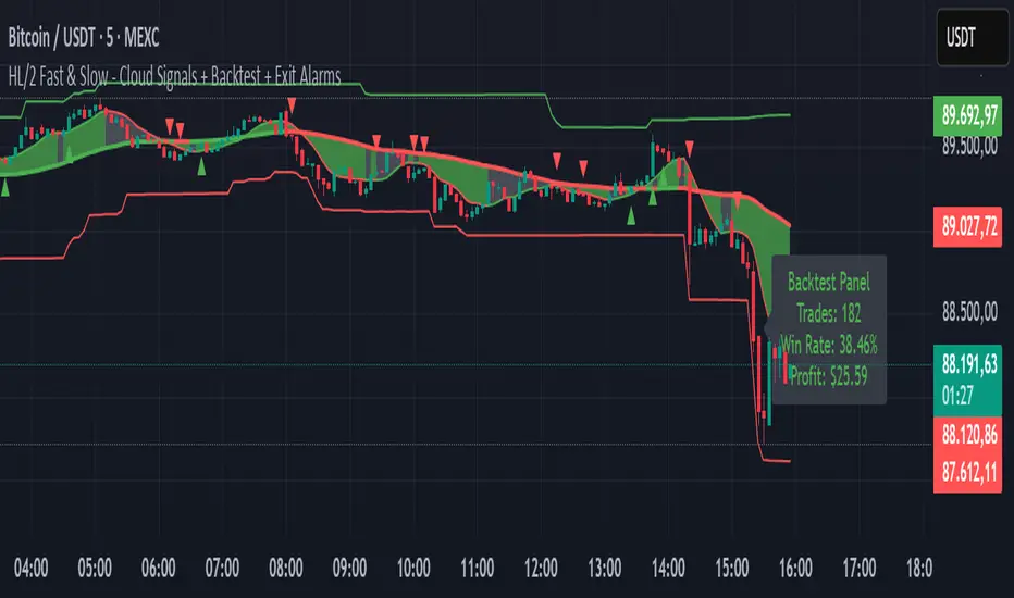
HL/2 Fast & Slow - Cloud Signals + Backtest + Exit AlarmsDescription:
This indicator plots two HL/2 moving averages—a fast and a slow line—on the chart, along with dynamic upper and lower bands based on the slow line and ATR. It features a colored cloud between the two averages to visualize trend direction, and it provides buy/sell signals based on the alignment of the two lines.
Key Features:
Fast & Slow HL/2 Averages
Fast and slow HL/2 lines calculated as simple moving averages.
Lines change color based on direction (up/down), configurable via style settings.
Dynamic Upper and Lower Bands
Bands calculated from the slow line using ATR to capture volatility.
Trend Cloud
Fills the area between fast and slow lines.
Green if both lines are rising, red if both are falling, gray if lines disagree.
Transparency adjustable for better visual clarity.
Buy/Sell Signals
Signals appear only when both lines align in the same direction.
Two modes available:
Series Signals: generates a signal whenever the cloud color changes.
Single Signal: generates a signal only when the slow line changes direction.
Signals are plotted as small triangles above/below bars.
Alerts can be set for both buy/sell signals.
Exit Modes and Alerts
Exit positions either on a reverse signal or when the cloud enters a neutral gray zone.
Exit alerts are available for both conditions.
Integrated Backtest Panel
Shows total trades, win rate, and cumulative profit in USD.
Considers position size and commission (configurable).
Panel color indicates profit (green) or loss (red).
Fixed position on chart for easy reference.
Inputs:
Fast and slow periods, ATR length, ATR multiplier.
Position size, commission percentage.
Signal mode (Series or Single).
Exit mode (Reverse Signal or Gray Area).
Style options for line colors and cloud colors.
Time window for backtesting (daily, weekly, monthly, or custom date range).
Usage:
Ideal for identifying trend direction and potential entry points.
Can be used for manual trading or as part of an automated strategy with alerts.
Provides a visual and statistical overview of trading performance via the backtest panel.
VV Moving Average Convergence Divergence # VMACDv3 - Volume-Weighted MACD with A/D Divergence Detection
## Overview
**VMACDv3** (Volume-Weighted Moving Average Convergence Divergence Version 3) is a momentum indicator that applies volume-weighting to traditional MACD calculations on price, while using the Accumulation/Distribution (A/D) line for divergence detection. This hybrid approach combines volume-weighted price momentum with volume distribution analysis for comprehensive market insight.
## Key Features
- **Volume-Weighted Price MACD**: Traditional MACD calculation on price but weighted by volume for earlier signals
- **A/D Divergence Detection**: Identifies when A/D trend diverges from MACD momentum
- **Volume Strength Filtering**: Distinguishes high-volume confirmations from low-volume noise
- **Color-Coded Histogram**: 4-color system showing momentum direction and volume strength
- **Real-Time Alerts**: Background colors and alert conditions for bullish/bearish divergences
## Difference from ACCDv3
| Aspect | VMACDv3 | ACCDv3 |
|--------|---------|---------|
| **MACD Input** | **Price (Close)** | **A/D Line** |
| **Volume Weighting** | Applied to price | Applied to A/D line |
| **Primary Signal** | Volume-weighted price momentum | Volume distribution momentum |
| **Use Case** | Price momentum with volume confirmation | Volume flow and accumulation/distribution |
| **Sensitivity** | More responsive to price changes | More responsive to volume patterns |
| **Best For** | Trend following, breakouts | Volume analysis, smart money tracking |
**Key Insight**: VMACDv3 shows *where price is going* with volume weight, while ACCDv3 shows *where volume is accumulating/distributing*.
## Components
### 1. Volume-Weighted MACD on Price
Unlike standard MACD that uses simple price EMAs, VMACDv3 weights each price by its corresponding volume:
```
Fast Line = EMA(Price × Volume, 12) / EMA(Volume, 12)
Slow Line = EMA(Price × Volume, 26) / EMA(Volume, 26)
MACD = Fast Line - Slow Line
```
**Benefits of Volume Weighting**:
- High-volume price movements have greater impact
- Filters out low-volume noise and false moves
- Provides earlier trend change signals
- Better reflects institutional activity
### 2. Accumulation/Distribution (A/D) Line
Used for divergence detection, measuring buying/selling pressure:
```
A/D = Σ ((2 × Close - Low - High) / (High - Low)) × Volume
```
- **Rising A/D**: Accumulation (buying pressure)
- **Falling A/D**: Distribution (selling pressure)
- **Doji Handling**: When High = Low, contribution is zero
### 3. Signal Lines
- **MACD Line** (Blue, #2962FF): The fast-slow difference showing momentum
- **Signal Line** (Orange, #FF6D00): EMA or SMA smoothing of MACD
- **Zero Line**: Reference for bullish (above) vs bearish (below) bias
### 4. Histogram Color System
The histogram uses 4 distinct colors based on **direction** and **volume strength**:
| Condition | Color | Meaning |
|-----------|-------|---------|
| Rising + High Volume | **Dark Green** (#1B5E20) | Strong bullish momentum with volume confirmation |
| Rising + Low Volume | **Light Teal** (#26A69A) | Bullish momentum but weak volume (less reliable) |
| Falling + High Volume | **Dark Red** (#B71C1C) | Strong bearish momentum with volume confirmation |
| Falling + Low Volume | **Light Pink** (#FFCDD2) | Bearish momentum but weak volume (less reliable) |
Additional shading:
- **Light Cyan** (#B2DFDB): Positive but not rising (momentum stalling)
- **Bright Red** (#FF5252): Negative and accelerating down
### 5. Divergence Detection
VMACDv3 compares A/D trend against volume-weighted price MACD:
#### Bullish Divergence (Green Background)
- **Condition**: A/D is trending up BUT MACD is negative and trending down
- **Interpretation**: Volume is accumulating while price momentum appears weak
- **Signal**: Smart money accumulation, potential bullish reversal
- **Action**: Look for long entries, especially at support levels
#### Bearish Divergence (Red Background)
- **Condition**: A/D is trending down BUT MACD is positive and trending up
- **Interpretation**: Volume is distributing while price momentum appears strong
- **Signal**: Smart money distribution, potential bearish reversal
- **Action**: Consider exits, avoid new longs, watch for breakdown
## Parameters
| Parameter | Default | Range | Description |
|-----------|---------|-------|-------------|
| **Source** | Close | OHLC/HLC3/etc | Price source for MACD calculation |
| **Fast Length** | 12 | 1-50 | Period for fast EMA (shorter = more sensitive) |
| **Slow Length** | 26 | 1-100 | Period for slow EMA (longer = smoother) |
| **Signal Smoothing** | 9 | 1-50 | Period for signal line (MACD smoothing) |
| **Signal Line MA Type** | EMA | SMA/EMA | Moving average type for signal calculation |
| **Volume MA Length** | 20 | 5-100 | Period for volume average (strength filter) |
## Usage Guide
### Reading the Indicator
1. **MACD Lines (Blue & Orange)**
- **Blue Line (MACD)**: Volume-weighted price momentum
- **Orange Line (Signal)**: Smoothed trend of MACD
- **Crossovers**: Blue crosses above orange = bullish, below = bearish
- **Distance**: Wider gap = stronger momentum
- **Zero Line Position**: Above = bullish bias, below = bearish bias
2. **Histogram Colors**
- **Dark Green (#1B5E20)**: Strong bullish move with high volume - **most reliable buy signal**
- **Light Teal (#26A69A)**: Bullish but low volume - wait for confirmation
- **Dark Red (#B71C1C)**: Strong bearish move with high volume - **most reliable sell signal**
- **Light Pink (#FFCDD2)**: Bearish but low volume - may be temporary dip
3. **Background Divergence Alerts**
- **Green Background**: A/D accumulating while price weak - potential bottom
- **Red Background**: A/D distributing while price strong - potential top
- Most powerful at key support/resistance levels
### Trading Strategies
#### Strategy 1: Volume-Confirmed Trend Following
1. Wait for MACD to cross above zero line
2. Look for **dark green** histogram bars (high volume confirmation)
3. Enter long on second consecutive dark green bar
4. Hold while histogram remains green
5. Exit when histogram turns light green or red appears
6. Set stop below recent swing low
**Example**:
```
Price: 26,400 → 26,450 (rising)
MACD: -50 → +20 (crosses zero)
Histogram: Light teal → Dark green → Dark green
Volume: 50k → 75k → 90k (increasing)
```
#### Strategy 2: Divergence Reversal Trading
1. Identify divergence background (green = bullish, red = bearish)
2. Confirm with price structure (support/resistance, chart patterns)
3. Wait for MACD to cross signal line in divergence direction
4. Enter on first **dark colored** histogram bar after divergence
5. Set stop beyond divergence area
6. Target previous swing high/low
**Example - Bullish Divergence**:
```
Price: Making lower lows (26,350 → 26,300 → 26,250)
A/D: Rising (accumulation)
MACD: Below zero but starting to curve up
Background: Green shading appears
Entry: MACD crosses signal line + dark green bar
Stop: Below 26,230
Target: 26,450 (previous high)
```
#### Strategy 3: Momentum Scalping
1. Trade only in direction of MACD zero line (above = long, below = short)
2. Enter on dark colored bars only
3. Exit on first light colored bar or opposite color
4. Quick in and out (1-5 minute holds)
5. Tight stops (0.2-0.5% depending on instrument)
#### Strategy 4: Histogram Pattern Trading
**V-Bottom Reversal (Bullish)**:
- Red histogram bars start rising (becoming less negative)
- Forms "V" shape at the bottom
- Transitions to light red → light teal → **dark green**
- Entry: First dark green bar
- Signal: Momentum reversal with volume
**Λ-Top Reversal (Bearish)**:
- Green histogram bars start falling (becoming less positive)
- Forms inverted "V" at the top
- Transitions to light green → light pink → **dark red**
- Entry: First dark red bar
- Signal: Momentum exhaustion with volume
### Multi-Timeframe Analysis
**Recommended Approach**:
1. **Higher Timeframe (15m/1h)**: Identify overall trend direction
2. **Trading Timeframe (5m)**: Time entries using VMACDv3 signals
3. **Lower Timeframe (1m)**: Fine-tune entry prices
**Example Setup**:
```
15-minute: MACD above zero (bullish bias)
5-minute: Dark green histogram appears after pullback
1-minute: Enter on break of recent high with volume
```
### Volume Strength Interpretation
The volume filter compares current volume to 20-period average:
- **Volume > Average**: Dark colors (green/red) - high confidence signals
- **Volume < Average**: Light colors (teal/pink) - lower confidence signals
**Trading Rules**:
- ✓ **Aggressive**: Take all dark colored signals
- ✓ **Conservative**: Only take dark colors that follow 2+ light colors of same type
- ✗ **Avoid**: Trading light colored signals during high volatility
- ✗ **Avoid**: Ignoring volume context during news events
## Technical Details
### Volume-Weighted Calculation
```pine
// Volume-weighted fast EMA
fast_ma = ta.ema(src * volume, fast_length) / ta.ema(volume, fast_length)
// Volume-weighted slow EMA
slow_ma = ta.ema(src * volume, slow_length) / ta.ema(volume, slow_length)
// MACD is the difference
macd = fast_ma - slow_ma
// Signal line smoothing
signal = ta.ema(macd, signal_length) // or ta.sma() if SMA selected
// Histogram
hist = macd - signal
```
### Divergence Detection Logic
```pine
// A/D trending up if above its 5-period SMA
ad_trend = ad > ta.sma(ad, 5)
// MACD trending up if above zero
macd_trend = macd > 0
// Divergence when trends oppose each other
divergence = ad_trend != macd_trend
// Specific conditions for alerts
bullish_divergence = ad_trend and not macd_trend and macd < 0
bearish_divergence = not ad_trend and macd_trend and macd > 0
```
### Histogram Coloring Logic
```pine
hist_color = (hist >= 0
? (hist < hist
? (vol_strength ? #1B5E20 : #26A69A) // Rising: dark/light green
: #B2DFDB) // Positive but falling: cyan
: (hist < hist
? (vol_strength ? #B71C1C : #FFCDD2) // Rising (less negative): dark/light red
: #FF5252)) // Falling more: bright red
```
## Alerts
Built-in alert conditions for divergence detection:
### Bullish Divergence Alert
- **Trigger**: A/D trending up, MACD negative and trending down
- **Message**: "Bullish Divergence: A/D trending up but MACD trending down"
- **Use Case**: Potential reversal or continuation after pullback
- **Action**: Look for long entry setups
### Bearish Divergence Alert
- **Trigger**: A/D trending down, MACD positive and trending up
- **Message**: "Bearish Divergence: A/D trending down but MACD trending up"
- **Use Case**: Potential top or trend reversal
- **Action**: Consider exits or short entries
### Setting Up Alerts
1. Click "Create Alert" in TradingView
2. Condition: Select "VMACDv3"
3. Choose alert type: "Bullish Divergence" or "Bearish Divergence"
4. Configure: Email, SMS, webhook, or popup
5. Set frequency: "Once Per Bar Close" recommended
## Comparison Tables
### VMACDv3 vs Standard MACD
| Feature | Standard MACD | VMACDv3 |
|---------|---------------|---------|
| **Price Weighting** | Equal weight all bars | Volume-weighted |
| **Sensitivity** | Fixed | Adaptive to volume |
| **False Signals** | More during low volume | Fewer (volume filter) |
| **Divergence** | Price vs MACD | A/D vs MACD |
| **Volume Analysis** | None | Built-in |
| **Color System** | 2 colors | 4+ colors |
| **Best For** | Simple trend following | Volume-confirmed trading |
### VMACDv3 vs ACCDv3
| Aspect | VMACDv3 | ACCDv3 |
|--------|---------|--------|
| **Focus** | Price momentum | Volume distribution |
| **Reactivity** | Faster to price moves | Faster to volume shifts |
| **Best Markets** | Trending, breakouts | Accumulation/distribution phases |
| **Signal Type** | Where price + volume going | Where smart money positioning |
| **Divergence Meaning** | Volume vs price disagreement | A/D vs momentum disagreement |
| **Use Together?** | ✓ Yes, complementary | ✓ Yes, different perspectives |
## Example Trading Scenarios
### Scenario 1: Strong Bullish Breakout
```
Time: 9:30 AM (market open)
Price: Breaks above 26,400 resistance
MACD: Crosses above zero line
Histogram: Dark green bars (#1B5E20)
Volume: 2x average (150k vs 75k avg)
A/D: Rising (no divergence)
Action: Enter long at 26,405
Stop: 26,380 (below breakout)
Target 1: 26,450 (risk:reward 1:2)
Target 2: 26,500 (risk:reward 1:4)
Result: High probability setup with volume confirmation
```
### Scenario 2: False Breakout (Avoided)
```
Time: 2:30 PM (slow period)
Price: Breaks above 26,400 resistance
MACD: Slightly positive
Histogram: Light teal bars (#26A69A)
Volume: 0.5x average (40k vs 75k avg)
A/D: Flat/declining
Action: Avoid trade
Reason: Low volume, no conviction, potential false breakout
Outcome: Price reverses back below 26,400 within 10 minutes
Saved: Avoided losing trade due to volume filter
```
### Scenario 3: Bullish Divergence Bottom
```
Time: 11:00 AM
Price: Making lower lows (26,350 → 26,300 → 26,280)
MACD: Below zero but curving upward
Histogram: Red bars getting shorter (V-bottom forming)
Background: Green shading (divergence alert)
A/D: Rising despite price falling
Volume: Increasing on down bars
Setup:
1. Divergence appears at 26,280 (green background)
2. Wait for MACD to cross signal line
3. First dark green bar appears at 26,290
4. Enter long: 26,295 (next bar open)
5. Stop: 26,265 (below divergence low)
6. Target: 26,350 (previous swing high)
Result: +55 points (30 point risk, 1.8:1 reward)
Key: Divergence + volume confirmation = high probability reversal
```
### Scenario 4: Bearish Divergence Top
```
Time: 1:45 PM
Price: Making higher highs (26,500 → 26,520 → 26,540)
MACD: Positive but flattening
Histogram: Green bars getting shorter (Λ-top forming)
Background: Red shading (bearish divergence)
A/D: Declining despite rising price
Volume: Decreasing on up bars
Setup:
1. Bearish divergence at 26,540 (red background)
2. MACD crosses below signal line
3. First dark red bar appears at 26,535
4. Enter short: 26,530
5. Stop: 26,555 (above divergence high)
6. Target: 26,475 (support level)
Result: +55 points (25 point risk, 2.2:1 reward)
Key: Distribution while price rising = smart money exiting
```
### Scenario 5: V-Bottom Reversal
```
Downtrend in progress
MACD: Deep below zero (-150)
Histogram: Series of dark red bars
Pattern Development:
Bar 1: Dark red, hist = -80, falling
Bar 2: Dark red, hist = -95, falling
Bar 3: Dark red, hist = -100, falling (extreme)
Bar 4: Light pink, hist = -98, rising!
Bar 5: Light pink, hist = -90, rising
Bar 6: Light teal, hist = -75, rising (crosses to positive momentum)
Bar 7: Dark green, hist = -55, rising + volume
Action: Enter long on Bar 7
Reason: V-bottom confirmed with volume
Stop: Below Bar 3 low
Target: Zero line on histogram (mean reversion)
```
## Best Practices
### Entry Rules
✓ **Wait for dark colors**: High-volume confirmation is key
✓ **Confirm divergences**: Use with price support/resistance
✓ **Trade with zero line**: Long above, short below for best odds
✓ **Multiple timeframes**: Align 1m, 5m, 15m signals
✓ **Watch for patterns**: V-bottoms and Λ-tops are reliable
### Exit Rules
✓ **Partial profits**: Take 50% at first target
✓ **Trail stops**: Use histogram color changes
✓ **Respect signals**: Exit on opposite dark color
✓ **Time stops**: Close positions before major news
✓ **End of day**: Square up before close
### Avoid
✗ **Don't chase light colors**: Low volume = low confidence
✗ **Don't ignore divergence**: Early warning system
✗ **Don't overtrade**: Wait for clear setups
✗ **Don't fight the trend**: Zero line dictates bias
✗ **Don't skip stops**: Always use risk management
## Risk Management
### Position Sizing
- **Dark green/red signals**: 1-2% account risk
- **Light signals**: 0.5% account risk or skip
- **Divergence plays**: 1% account risk (higher uncertainty)
- **Multiple confirmations**: Up to 2% account risk
### Stop Loss Placement
- **Trend trades**: Below/above recent swing (20-30 points typical)
- **Breakout trades**: Below/above breakout level (15-25 points)
- **Divergence trades**: Beyond divergence extreme (25-40 points)
- **Scalp trades**: Tight stops at 10-15 points
### Profit Targets
- **Minimum**: 1.5:1 reward to risk ratio
- **Scalps**: 15-25 points (quick in/out)
- **Swing**: 50-100 points (hold through pullbacks)
- **Runners**: Trail with histogram color changes
## Timeframe Recommendations
| Timeframe | Trading Style | Typical Hold | Advantages | Challenges |
|-----------|---------------|--------------|------------|------------|
| **1-minute** | Scalping | 1-5 minutes | Fast profits, many setups | Noisy, high false signals |
| **5-minute** | Intraday | 15-60 minutes | Balance of speed/clarity | Still requires quick decisions |
| **15-minute** | Swing | 1-4 hours | Clearer trends, less noise | Fewer opportunities |
| **1-hour** | Position | 4-24 hours | Strong signals, less monitoring | Wider stops required |
**Recommendation**: Start with 5-minute for best balance of signal quality and opportunity frequency.
## Combining with Other Indicators
### VMACDv3 + ACCDv3
- **Use**: Confirm volume flow with price momentum
- **Signal**: Both showing dark green = highest conviction long
- **Divergence**: VMACDv3 bullish + ACCDv3 bearish = examine price action
### VMACDv3 + RSI
- **Use**: Overbought/oversold with momentum confirmation
- **Signal**: RSI < 30 + dark green VMACD = strong reversal
- **Caution**: RSI > 70 + light green VMACD = potential false breakout
### VMACDv3 + Elder Impulse
- **Use**: Bar coloring + histogram confirmation
- **Signal**: Green Elder bars + dark green VMACD = aligned momentum
- **Exit**: Blue Elder bars + light colors = momentum stalling
## Limitations
- **Requires volume data**: Will not work on instruments without volume feed
- **Lagging indicator**: MACD inherently follows price (2-3 bar delay)
- **Consolidation noise**: Generates false signals in tight ranges
- **Gap handling**: Large gaps can distort volume-weighted values
- **Not standalone**: Should combine with price action and support/resistance
## Troubleshooting
**Problem**: Too many light colored signals
**Solution**: Increase Volume MA Length to 30-40 for stricter filtering
**Problem**: Missing entries due to waiting for dark colors
**Solution**: Lower Volume MA Length to 10-15 for more signals (accept lower quality)
**Problem**: Divergences not appearing
**Solution**: Verify volume data available; check if A/D line is calculating
**Problem**: Histogram colors not changing
**Solution**: Ensure real-time data feed; refresh indicator
## Version History
- **v3**: Removed traditional MACD, using volume-weighted MACD on price with A/D divergence
- **v2**: Added A/D divergence detection, volume strength filtering, enhanced histogram colors
- **v1**: Basic volume-weighted MACD on price
## Related Indicators
**Companion Tools**:
- **ACCDv3**: Volume-weighted MACD on A/D line (distribution focus)
- **RSIv2**: RSI with A/D divergence detection
- **DMI**: Directional Movement Index with A/D divergence
- **Elder Impulse**: Bar coloring system using volume-weighted MACD
**Use Together**: VMACDv3 (momentum) + ACCDv3 (distribution) + Elder Impulse (bar colors) = complete volume-based trading system
---
*This indicator is for educational purposes. Past performance does not guarantee future results. Always practice proper risk management and never risk more than you can afford to lose.*

BB/KC Squeeze Channels (v6)Technical Specification for the BB/KC Squeeze Volatility Indicator in Algorithmic Cryptocurrency Trading
I. Theoretical Foundations of Volatility Dynamics
The "Contraction-Expansion" Principle (Volatility Contraction/Expansion)
The fundamental analysis of market volatility dynamics relies on the principle popularized by John Bollinger: periods of low volatility are inevitably followed by periods of high volatility. This phenomenon, known as the cyclical nature of volatility, is the cornerstone of trading strategies based on range breakouts (Breakout Strategy). In the context of technical analysis, volatility contraction manifests as a consolidation phase where the trading range narrows, preceding a strong, directional price impulse.
The essence of volatility contraction lies in a phase of market equilibrium that is inherently unstable. Most often, this reflects the covert activities of large market participants who are either accumulating or distributing a significant volume of the asset. These actions occur within a narrow price corridor to avoid sharp price movements until the entire position is acquired. As a result, activity decreases, the range narrows, and the market accumulates "energy" for the subsequent large-scale expansion. For the cryptocurrency market, characterized by high impulsivity and a tendency toward sharp trending moves, accurately identifying the deep contraction phase becomes a powerful algorithmic predictor.
Identifying Prerequisites: Distinguishing Pre-Breakout Contraction
To build a reliable indicator, it is crucial to distinguish a true pre-breakout squeeze from other types of volatility reduction that do not lead to a strong impulse. Specifically, volatility, measured by the Average True Range (ATR), will always decline after the completion of a strong vertical movement, as the market enters a pullback or deceleration phase. Such a decline is post-impulse and does not necessarily signal an imminent breakout.
It is necessary to find signs of abnormally low volatility that occurs precisely in the consolidation phase. The optimal time to look for a Squeeze signal is the formation of a distinct sideways channel. In this phase, the middle line of the channel indicator (e.g., EMA or SMA) should be relatively horizontal. This confirms that the market is currently in a ranging state (absence of a strong current trend), not in a deceleration phase after a trend. Therefore, the Squeeze indicator algorithm must include a check for confirmed sideways movement (e.g., through analyzing the slope of the middle line or its statistical deviation from the horizontal over the last X periods). Only abnormally low volatility during a range can be classified as a high-confidence pre-breakout contraction.
II. Instrument Selection: Justification for the Composite BB/KC Squeeze Approach
For effective algorithmic determination of the extreme contraction phase, it is necessary to use an indicator that combines the advantages of the two most reliable methods for measuring volatility: Bollinger Bands and Keltner Channels.
Comparative Analysis of Volatility Indicators
| Indicator | Base Metric | Volatility Response | Primary Role in Squeeze |
|---|---|---|---|
| Bollinger Bands (BB) | Standard Deviation (SD) | Fast, Highly Sensitive | Contraction sensor, Early breakout signal |
| Keltner Channels (KC) | Average True Range (ATR) | Smooth, Noise Filtering | Defines stable range, Filters false signals |
Bollinger Bands (BB)
Bollinger Bands are based on the Standard Deviation (SD) of the price from a moving average. This statistical metric makes BB highly sensitive, as they quickly react to sudden changes in volatility. Due to this sensitivity, BB are ideal for early registration of a contraction and for generating the breakout signal. However, their high sensitivity is also a drawback, as it can lead to false signals and premature expansion during market noise.
Keltner Channels (KC)
Keltner Channels, in the modern version developed by Linda Raschke, use the Average True Range (ATR) to calculate the channel width. ATR represents the averaged true range of fluctuations, which provides a smoother and more stable measure of volatility. KC react to market changes slower than BB, but their smoothness allows for better filtering of false signals and determination of the true direction of movement. Unlike fixed-width price channels or percentage envelopes, which perform poorly in dynamic environments, BB and KC automatically adapt to market conditions.
The Squeeze Mechanism: Synergy of Instruments
The BB/KC Squeeze indicator uses the synergy of BB and KC to achieve maximum accuracy in identifying the accumulation phase.
The technical Squeeze condition (Squeeze ON) is defined when the fast and statistically-oriented Bollinger Bands (BB) are inside the wider and smoother Keltner Channels (KC). This state represents quantitative confirmation of extremely low volatility.
In standard settings, BB use a multiplier of 2.0 for Standard Deviation (SD), and KC use a multiplier of 1.5 for ATR. For the statistical width of BB (based on price deviation from the average) to narrow inside the width of KC (based on the averaged range), the current statistical deviation of the price must fall to abnormally low values relative to the historical average range of fluctuations. This is not just low volatility, but its extreme contraction, indicating maximum accumulation of potential energy before an impulse.
III. Quantitative Analysis: How Much, Why, and How Volatility Contracts
How Much: Mathematical Definition of the Degree of Contraction
The degree of volatility contraction before a breakout is measured through a strict mathematical condition that ensures the current volatility is significantly below its averaged historical value.
The Squeeze Condition (Squeeze ON) requires both of the following mathematical formulas to be true :
To understand how much the movement should contract, we must consider the channel width formulas:
* Bollinger Bands Width (\text{BB}_{\text{Width}}):
\text{KC}_{\text{Width}} = 2 \times (\text{ATR} \times 1.5) = 3.0 \times \text{ATR}$$
The Squeeze ON state means that \text{BB}_{\text{Width}} < \text{KC}_{\text{Width}}. This condition is equivalent to \text{SD} \times 4.0 < \text{ATR} \times 3.0. As a result, the current Standard Deviation (SD) must fall below 75% of the Average True Range (ATR) for the contraction to be registered. This requirement for SD to decrease to a level significantly below ATR is the criterion for identifying the deep market calm that serves as the energy base for the subsequent directional movement.
Why and How: Qualitative Signs
Volatility decreases because large market participants are slowly and covertly accumulating positions. They keep the price within a narrow range to fully acquire the necessary volume before allowing the price to impulsively exit consolidation. This creates a sideways movement phase, minimizing risks for the trader and enabling timely tracking of a bullish or bearish breakout.
To enhance the algorithm's reliability and prevent entry into false ranges, the following qualitative signs accompanying a true squeeze must be considered:
* Squeeze Duration: The longer the price remains in the Squeeze ON state, the more energy is accumulated. Experience suggests a minimum duration of 4–8 periods. Extended contraction periods (over 10–12 bars) often precede the strongest impulsive movements in the crypto market.
* Price Position: During the contraction phase, the price should remain close to the middle line (EMA/SMA). This confirms that the market is in equilibrium, and accumulation is occurring around the "fair" price of the current range.
* Momentum Context: The volatility indicator (BB/KC) determines when a move will happen, but not its direction. To predict the direction (prerequisite), a momentum component must be used (e.g., a histogram, as in the TTM Squeeze variant ). The appearance of positive momentum during the contraction, even without price movement, signals potential bullish strength, increasing the likelihood of an upward breakout.
Squeeze State Logic Table
| State | Mathematical Condition (BB vs KC) | Market Interpretation |
|---|---|---|
| Squeeze ON | (\text{BB}_{\text{Upper}} < \text{KC}_{\text{Upper}}) AND (\text{BB}_{\text{Lower}} > \text{KC}_{\text{Lower}}) | Extreme volatility contraction, accumulation phase, breakout pending. |
| Squeeze OFF | \text{BB}_{\text{Upper}} \ge \text{KC}_{\text{Upper}} OR \text{BB}_{\text{Lower}} \le \text{KC}_{\text{Lower}} | Normal volatility, trending movement, or unstable range. |
IV. Technical Specification: Step-by-Step Algorithm for the Squeeze Indicator (BB/KC)
This algorithm represents the sequence of steps required to code the indicator, which captures the contraction state and generates breakout signals.
1. Initialization and Calculation of Basic Values
* Define Period N: Determine the period N (recommended value N=20) for calculating the moving averages, ATR, and Standard Deviation (SD).
* Calculate True Range (TR): For each bar, calculate \text{TR} as the maximum value of three metrics: (High – Low), \text{Abs}(\text{High} - \text{Close}_{\text{prev}}), \text{Abs}(\text{Low} - \text{Close}_{\text{prev}}).
2. Calculation of Keltner Channel (KC) Components
* Calculate KC Middle Line (EMA): Calculate the Exponential Moving Average (EMA) of the closing price (\text{Close}) over period N.
* Calculate ATR: Calculate the Average True Range (ATR) as the moving average of \text{TR} over period N.
* Calculate KC Boundaries: Calculate the Upper and Lower KC lines, using the ATR multiplier Y (recommended Y=1.5 ):
* * 3. Calculation of Bollinger Band (BB) Components
* Calculate BB Middle Line (SMA): Calculate the Simple Moving Average (SMA) of the closing price (\text{Close}) over period N.
* Calculate SD: Calculate the Standard Deviation (SD) of the closing price over period N.
* Calculate BB Boundaries: Calculate the Upper and Lower BB, using the SD multiplier X (recommended X=2.0 ):
* * 4. Algorithm for Determining the "Squeeze" State
* Check Squeeze ON Condition: For the current bar, check if both conditions are met: \text{BB}_{\text{Upper}} < \text{KC}_{\text{Upper}} AND \text{BB}_{\text{Lower}} > \text{KC}_{\text{Lower}}.
* Assign State: IF both conditions in step 9 are true, THEN assign the variable \text{SqueezeState} the value \text{ON} (e.g., 1). ELSE assign the value \text{OFF} (e.g., 0).
5. Algorithm for Generating Breakout Signals
* Identify Trigger: Check if \text{SqueezeState} has changed from \text{ON} to \text{OFF} on the current bar. This signifies that volatility has expanded after the contraction period.
* Bullish Breakout Signal: IF \text{SqueezeState}_{\text{prev}} = \text{ON} AND \text{SqueezeState}_{\text{current}} = \text{OFF}, AND the closing price (\text{Close}) of the current bar is above \text{BB}_{\text{Upper}}, THEN generate a BUY (Breakout Long) signal.
* Bearish Breakout Signal: IF \text{SqueezeState}_{\text{prev}} = \tex (start_span) (end_span)t{ON} AND \text{SqueezeState}_{\text{current}} = \text{OFF}, AND the closing price (\text{Close}) of the current bar is below \text{BB}_{\text{Lower}}, THEN generate a SELL (Breakout Short) signal.
* Additional Momentum Filtering: To increase reliability, the breakout signal should be valid only IF the breakout occurs in the direction confirmed by a momentum indicator (e.g., if Momentum > 0 for a Bullish breakout, and Momentum < 0 for a Bearish breakout).
The Role of Momentum in the Algorithm
A key addition to the volatility indicator is the momentum component. Defining the Squeeze ON/OFF state helps understand the potential for movement, but not its direction. The momentum indicator (often implemented as a histogram, as in TTM Squeeze ) measures whether accumulation of buying or selling pressure occurs during the contraction phase. Therefore, the indicator must include a sub-component that measures this pressure. Using momentum in conjunction with the BB breakout ensures that entry occurs not just after volatility expansion, but after expansion in a confirmed direction, significantly reducing the number of false breakouts.
V. Parameters, Optimization, and Nuances for the Cryptocurrency Market
Adapting Standard Settings (20, 2.0, 1.5)
The standard parameters N=20, X_{\text{BB}}=2.0, and Y_{\text{KC}}=1.5 are designed for stock markets and provide a reliable starting point. However, the high volatility and dynamics of the cryptocurrency market require fine-tuning to optimize performance.
1. Optimization of Period N
Reducing the period N (e.g., to 18 or 14) on lower timeframes (1-hour and below) increases the indicator's sensitivity to local, fast contractions, which is useful for scalping. However, this may also generate more signals, including false ones. For medium-term trading strategies (4h, Daily), a period of N=20 or N=21 provides an optimal balance between sensitivity and noise filtering.
2. Optimization of Multiplier Y_{\text{KC}}
The Keltner Channel multiplier (Y) defaults to 1.5. KC are smoother and more stable due to the use of ATR. If backtesting shows the indicator generates too many false Squeeze ON signals, it may indicate that the KC channel is too narrow. In this case, a slight increase in multiplier Y (e.g., to 1.6 or 1.7) widens the KC. This requires an even more extreme drop in Standard Deviation for the BB to narrow inside the KC, thereby increasing the strictness and reliability of the Squeeze ON signal.
Importance of Timeframe Selection
While some indicators like KC and BB show higher effectiveness in trending conditions for trading off channel boundaries , the Squeeze Play strategy is fundamentally different. It deliberately seeks a range (volatility contraction) with the goal of catching the start of a new strong trend.
In the cryptocurrency market, false breakouts and market noise (chop) can be particularly intense on low timeframes. Therefore, for the Squeeze strategy, it is recommended to use timeframes where consolidation is cleanest: 4-hour, Daily, or Weekly charts for major crypto pairs like BTC/USD or ETH/USD. On lower timeframes, multi-timeframe confirmation must be implemented, for example, using a trend filter from a higher timeframe.
VI. Strategic Application of Squeeze Play and Filtering
Using Momentum for Direction Determination
As noted, the volatility indicator (BB/KC) is not a directional indicator. The squeeze function (Squeeze ON) only identifies a high probability of a strong movement. Therefore, successful trading requires the integration of Momentum.
The breakout should be used as a trigger, but the direction must be confirmed by Momentum. For example, a BUY signal should only be generated if two conditions are met:
* Exit from the Squeeze ON state and the closing price breaking above the upper BB (\text{Close} > \text{BB}_{\text{Upper}}).
* The momentum indicator confirms upward pressure (Momentum value is positive).
This approach prevents entries into false breakouts where volatility expands but not in the direction of the accumulated market pressure.
Risk and Position Management
Since the Keltner Channel is based on ATR, which is a dynamic measure of volatility , ATR should be used for setting the Stop-Loss (SL) in the algorithmic strategy.
* Stop-Loss (SL) Setting: It is recommended to set the SL at a level determined by 1 \times \text{ATR} below the middle line (EMA/SMA) or beyond the KC boundary opposite the breakout. Using ATR ensures that the SL dynamically adapts to the current volatility, avoiding overly tight stops during periods of normal range.
* Take-Profit (TP) Setting: Since the goal of Squeeze Play is to catch a strong directional movement, the take-profit can be set based on a fixed Risk/Reward ratio (e.g., 2:1 or 3:1) or based on the price exiting the KC boundaries. Breaking the KC often indicates an extreme price move and can serve as a point for partial or full profit taking.
Filtering Against False Signals in a Range
The main drawback of breakout trading is the high percentage of false signals in wide but non-directional ranges. Using the composite BB/KC Squeeze indicator effectively addresses this problem.
KC, being based on smoothed ATR, is less susceptible to short-term volatility spikes than BB. The Squeeze filter requires the sensitive BB to narrow inside the smoothed KC. This ensures that we enter only those breakouts that were preceded by a prolonged and abnormally low volatility phase. The breakout must be confirmed by the price breaking the BB after the Squeeze ON state ends, signaling a sustained volatility expansion rather than a brief price spike.
VII. Conclusion
The analysis confirms that the user's observation about the relationship between volatility contraction and subsequent strong movements is a fundamentally sound principle, the best implementation of which in the cryptocurrency market is achieved using the composite BB/KC Squeeze indicator.
This indicator provides a precise quantitative definition of "how much" volatility must contract (SD must fall below 75% of ATR) and includes the necessary qualitative prerequisites ("why and how" — consolidation, confirmed by momentum). The presented step-by-step algorithm provides the technical foundation for coding a highly effective tool that identifies accumulation phases and generates breakout signals, adapted to the dynamics of the crypto market. The inclusion of momentum-based filtering and proper risk management tied to ATR are key factors for transitioning from a pure indicator to a profitable trading strategy.
Техническая Спецификация Индикатора Волатильности BB/KC Squeeze для Алгоритмической Торговли Криптовалютами
I. Теоретические Основы Динамики Волатильности
Принцип "Сжатие-Расширение" (Volatility Contraction/Expansion)
Фундаментальный анализ динамики рыночной волатильности опирается на принцип, популяризированный Джоном Боллинджером: периоды низкой волатильности неизбежно сменяются периодами высокой волатильности. Это явление, известное как цикличность волатильности, является краеугольным камнем торговых стратегий, основанных на пробое диапазона (Breakout Strategy). В контексте технического анализа сжатие волатильности проявляется как фаза консолидации, в которой торговый диапазон сужается, предшествуя сильному, направленному ценовому импульсу.
Смысл контракции волатильности заключается в фазе рыночного равновесия, которое, однако, является неустойчивым. Чаще всего это отражает скрытую деятельность крупных участников, которые либо накапливают (аккумуляция), либо распределяют (дистрибуция) значительный объем актива. Эти действия происходят в узком ценовом коридоре, чтобы избежать резкого движения цены, пока позиция не будет полностью набрана. В результате активность падает, диапазон сужается, и рынок накапливает «энергию» для последующего масштабного расширения. Для криптовалютного рынка, который характеризуется высокой импульсивностью и склонностью к резким трендовым движениям, точная идентификация фазы глубокого сжатия становится мощным алгоритмическим предиктором.
Идентификация Предпосылок: Отличие Пред-пробойного Сжатия
Для построения надежного индикатора критически важно уметь отличать истинное пред-пробойное сжатие от других типов снижения волатильности, которые не ведут к сильному импульсу. В частности, волатильность, измеряемая, например, индикатором Average True Range (ATR), всегда будет снижаться после завершения сильного вертикального движения, поскольку рынок переходит в фазу отката или замедления. Такое снижение является пост-импульсным и не обязательно сигнализирует о скором пробое.
Требуется найти признаки аномально низкой волатильности, которая возникает именно в фазе консолидации. Оптимальный момент для поиска сигнала Сжатия — это возникновение четкого бокового канала. В этой фазе средняя линия канального индикатора (например, EMA или SMA) должна быть относительно горизонтальной. Это подтверждает, что рынок в данный момент находится в состоянии рейнджа (отсутствие сильного текущего тренда), а не в фазе замедления после тренда. Таким образом, в алгоритм индикатора Squeeze необходимо заложить проверку на подтверждение бокового движения (например, через анализ наклона средней линии или ее статистического отклонения от горизонтали за последние X периодов). Только аномально низкая волатильность в фазе рейнджа может быть квалифицирована как высоконадежное пред-пробойное сжатие.
II. Выбор Инструмента: Обоснование Композитного Подхода BB/KC Squeeze
Для эффективного алгоритмического определения фазы экстремального сжатия необходимо использовать индикатор, который комбинирует преимущества двух наиболее надежных методов измерения волатильности: Полос Боллинджера и Каналов Кельтнера.
Сравнительный Анализ Индикаторов Волатильности
Полосы Боллинджера (Bollinger Bands, BB)
Полосы Боллинджера основаны на Стандартном Отклонении (SD) цены от скользящей средней. Эта статистическая метрика делает BB высокочувствительными, поскольку они быстро реагируют на внезапные изменения волатильности. Благодаря этой чувствительности, BB идеально подходят для ранней регистрации начавшегося сжатия и для генерации сигнала пробоя. Однако их высокая чувствительность также является недостатком, так как она может приводить к ложным срабатываниям и преждевременному расширению в условиях рыночного шума.
Каналы Кельтнера (Keltner Channels, KC)
Каналы Кельтнера, в современной версии, разработанной Линдой Рашке, используют Average True Range (ATR) для расчета ширины канала. ATR представляет собой усредненный истинный диапазон колебаний, что обеспечивает более сглаженную и устойчивую меру волатильности. KC реагируют на изменения рынка медленнее, чем BB, но их плавность позволяет лучше фильтровать ложные сигналы и определять истинное направление движения. В отличие от ценовых каналов с фиксированной шириной или процентными конвертами, которые плохо работают в динамичных средах, BB и KC автоматически адаптируются к рыночным условиям.
Механизм Squeeze: Синергия Инструментов
Индикатор BB/KC Squeeze использует синергию BB и KC для достижения максимальной точности в идентификации фазы накопления.
Техническое условие Сжатия (Squeeze ON) определяется, когда быстрые и статистически ориентированные Полосы Боллинджера (BB) оказываются внутри более широких и сглаженных Каналов Кельтнера (KC). Это состояние представляет собой количественное подтверждение экстремально низкой волатильности.
В стандартных настройках BB используют множитель 2.0 от Стандартного Отклонения (SD), а KC используют множитель 1.5 от ATR. Для того чтобы статистическая ширина BB (основанная на отклонении цены от средней) сузилась внутрь ширины KC (основанной на усредненном диапазоне), текущее статистическое отклонение цены должно упасть до аномально низких значений по отношению к историческому среднему диапазону колебаний. Это не просто низкая волатильность, а ее экстремальное сокращение, указывающее на максимальное накопление потенциальной энергии перед импульсом.
Таблица Сравнения Ключевых Индикаторов Волатильности
| Индикатор | Базовая Метрика | Реакция на Волатильность | Основная Роль в Squeeze |
|---|---|---|---|
| Bollinger Bands (BB) | Стандартное Отклонение (SD) | Быстрая, Высокочувствительная | Датчик сжатия, Ранний сигнал пробоя |
| Keltner Channels (KC) | Average True Range (ATR) | Плавная, Фильтрация шума | Определение устойчивого диапазона, Фильтр ложных сигналов |
III. Количественный Анализ: На Сколько, Почему и Как Сокращается Волатильность
На Сколько: Математическое Определение Степени Сжатия
Степень сокращения волатильности перед пробоем измеряется через строгое математическое условие, которое обеспечивает, что текущая волатильность значительно ниже ее усредненного исторического значения.
Условие Сжатия (Squeeze ON) требует выполнения обеих следующих математических формул :
Для понимания того, на сколько должно сократиться движение, необходимо рассмотреть формулы ширины каналов:
* Ширина Полос Боллинджера (\text{BB}_{\text{Width}}):
\text{KC}_{\text{Width}} = 2 \times (\text{ATR} \times 1.5) = 3.0 \times \text{ATR}$$
Состояние Squeeze ON означает, что \text{BB}_{\text{Width}} < \text{KC}_{\text{Width}}. Это условие эквивалентно \text{SD} \times 4.0 < \text{ATR} \times 3.0. В результате, текущее стандартное отклонение (SD) должно упасть ниже 75% от усредненного истинного диапазона (ATR), чтобы сжатие было зарегистрировано. Такое требование к снижению SD до уровня, значительно ниже ATR, является критерием для идентификации глубокого покоя рынка, который служит энергетической базой для последующего направленного движения.
Почему и Как: Качественные Признаки
Снижение волатильности происходит потому, что крупные участники рынка медленно и скрытно накапливают позиции. Они поддерживают цену в узком диапазоне, чтобы полностью набрать необходимый объем, прежде чем позволить цене импульсивно выйти из консолидации. Это создает фазу бокового движения, минимизируя риски для трейдера и позволяя оперативно отследить «бычий» или «медвежий» прорыв.
Для повышения надежности алгоритма и предотвращения входа в ложные диапазоны, необходимо учитывать следующие качественные признаки, сопровождающие истинное сжатие:
* Длительность Сжатия: Чем дольше цена находится в состоянии Squeeze ON, тем больше энергии накапливается. Опыт показывает, что минимальная длительность должна составлять 4–8 периодов. Длительные периоды сжатия (более 10–12 баров) часто предшествуют наиболее сильным импульсным движениям на крипторынке.
* Положение Цены: Во время фазы сжатия цена должна находиться в непосредственной близости к средней линии (EMA/SMA). Это подтверждает, что рынок находится в состоянии равновесия, и накопление происходит вокруг "справедливой" цены текущего диапазона.
* Контекст Моментума: Индикатор волатильности (BB/KC) определяет когда произойдет движение, но не его направление. Для предсказания направления (признак) необходимо использовать компонент моментума (например, гистограмму, как в варианте TTM Squeeze ). Появление положительного моментума во время сжатия, даже при отсутствии движения цены, является признаком потенциальной бычьей силы, усиливающей вероятность пробоя вверх.
Логика Определения Состояния "Сжатия" (Squeeze State Logic)
| Состояние | Математическое Условие (BB vs KC) | Интерпретация Рынка |
|---|---|---|
| Squeeze ON | (\text{BB}_{\text{Upper}} < \text{KC}_{\text{Upper}}) И (\text{BB}_{\text{Lower}} > \text{KC}_{\text{Lower}}) | Экстремальная контракция волатильности, фаза накопления, ожидание прорыва. |
| Squeeze OFF | \text{BB}_{\text{Upper}} \ge \text{KC}_{\text{Upper}} ИЛИ \text{BB}_{\text{Lower}} \le \text{KC}_{\text{Lower}} | Нормальная волатильность, трендовое движение или неустойчивый диапазон. |
IV. Техническая Спецификация: Пошаговый Алгоритм Индикатора Squeeze (BB/KC)
Данный алгоритм представляет собой последовательность шагов, необходимых для кодирования индикатора, фиксирующего состояние сжатия и генерирующего сигналы пробоя.
1. Инициализация и Расчет Базовых Величин
* Определение Периода N: Определить период N (рекомендуемое значение N=20) для расчета скользящих средних, ATR и Стандартного Отклонения (SD).
* Расчет Истинного Диапазона (True Range, TR): Для каждого бара рассчитать \text{TR} как максимальное значение из трех метрик: (High – Low), \text{Abs}(\text{High} - \text{Close}_{\text{prev}}), \text{Abs}(\text{Low} - \text{Close}_{\text{prev}}).
2. Расчет Компонентов Канала Кельтнера (KC)
* Расчет Средней Линии KC (EMA): Рассчитать экспоненциальную скользящую среднюю (EMA) цены закрытия (\text{Close}) за период N.
* Расчет ATR: Рассчитать Средний Истинный Диапазон (ATR) как скользящую среднюю \text{TR} за период N.
* Расчет Границ KC: Рассчитать Верхнюю и Нижнюю линии KC, используя множитель ATR Y (рекомендуется Y=1.5 ):
* * 3. Расчет Компонентов Полос Боллинджера (BB)
* Расчет Средней Линии BB (SMA): Рассчитать простую скользящую среднюю (SMA) цены закрытия (\text{Close}) за период N.
* Расчет SD: Рассчитать Стандартное Отклонение (SD) цены закрытия за период N.
* Расчет Границ BB: Рассчитать Верхнюю и Нижнюю полосы BB, используя множитель SD X (рекомендуется X=2.0 ):
* * 4. Алгоритм Определения Состояния "Squeeze"
* Проверка Условия Squeeze ON: Для текущего бара проверить, выполняются ли оба условия: \text{BB}_{\text{Upper}} < \text{KC}_{\text{Upper}} И \text{BB}_{\text{Lower}} > \text{KC}_{\text{Lower}}.
* Присвоение Состояния: ЕСЛИ оба условия в шаге 9 истинны, ТО присвоить переменной \text{SqueezeState} значение \text{ON} (например, 1). ИНАЧЕ присвоить значение \text{OFF} (например, 0).
5. Алгоритм Генерации Сигналов Пробоя
* Идентификация Триггера: Проверить, что \text{SqueezeState} изменился с \text{ON} на \text{OFF} на текущем баре. Это означает, что волатильность расширилась после периода сжатия.
* Сигнал Бычьего Пробоя: ЕСЛИ \text{SqueezeState}_{\text{prev}} = \text{ON} И \text{SqueezeState}_{\text{current}} = \text{OFF}, И цена закрытия (\text{Close}) текущего бара выше \text{BB}_{\text{Upper}}, ТО генерировать сигнал ПОКУПКА (Breakout Long).
* Сигнал Медвежьего Пробоя: ЕСЛИ \text{SqueezeState}_{\text{prev}} (start_span) (end_span)= \text{ON} И \text{SqueezeState}_{\text{current}} = \text{OFF}, И цена закрытия (\text{Close}) текущего бара ниже \text{BB}_{\text{Lower}}, ТО генерировать сигнал ПРОДАЖА (Breakout Short).
* Дополнительная Фильтрация Моментумом: Для повышения надежности, сигнал пробоя должен быть действителен только ЕСЛИ пробой происходит в направлении, подтвержденном моментум-индикатором (например, если Моментум > 0 для Бычьего пробоя, и Моментум < 0 для Медвежьего пробоя).
Роль Моментума в Алгоритме
Ключевым дополнением к индикатору волатильности является компонент моментума. Определение состояния Squeeze ON/OFF позволяет понять потенциал движения, но не его направление. Моментум-индикатор (часто реализованный в виде гистограммы, как в TTM Squeeze ) позволяет измерить, происходит ли накопление давления покупателей или продавцов во время фазы сжатия. Следовательно, индикатор должен включать подкомпонент, который измеряет это давление. Использование моментума в сочетании с пробоем BB гарантирует, что вход в позицию происходит не просто после расширения волатильности, а после ее расширения в подтвержденном направлении, что существенно снижает количество ложных пробоев.
V. Параметры, Оптимизация и Нюансы для Криптовалютного Рынка
Адаптация Стандартных Настроек (20, 2.0, 1.5)
Стандартные параметры N=20, X_{\text{BB}}=2.0 и Y_{\text{KC}}=1.5 разработаны для фондовых рынков и являются надежной отправной точкой. Однако высокая волатильность и динамика криптовалютного рынка требуют тонкой настройки для оптимизации производительности.
1. Оптимизация Периода N
Уменьшение периода N (например, до 18 или 14) на более низких таймфреймах (1-часовой и ниже) увеличит чувствительность индикатора к локальным, быстрым сжатиям, что полезно для скальпинга. Однако, это также может привести к генерации большего количества сигналов, в том числе ложных. Для среднесрочных торговых стратегий (4h, Daily) период N=20 или N=21 обеспечивает оптимальный баланс между чувствительностью и фильтрацией шума.
2. Оптимизация Множителя Y_{\text{KC}}
Множитель Каналов Кельтнера (Y) по умолчанию равен 1.5. KC более плавные и устойчивые благодаря использованию ATR. Если в процессе тестирования индикатор генерирует слишком много ложных сигналов Squeeze ON, это может указывать на то, что канал KC слишком узок. В этом случае, небольшое увеличение множителя Y (например, до 1.6 или 1.7) расширит KC. Это потребует еще более экстремального падения Стандартного Отклонения, чтобы BB сузились внутрь KC, тем самым повышая строгость и надежность сигнала Squeeze ON.
Важность Выбора Таймфрейма
Хотя некоторые индикаторы, такие как KC и BB, показывают более высокую эффективность в трендовом состоянии для торговли отскоками от границ , стратегия Squeeze Play принципиально иная. Она целенаправленно ищет рейндж (контракцию волатильности) с целью поймать начало нового сильного тренда.
На рынке криптовалют ложные пробои и рыночный шум (chop) могут быть особенно интенсивными на низких таймфреймах. Поэтому для стратегии Squeeze рекомендуется использовать таймфреймы, на которых консолидация наиболее чиста: 4-часовой, Daily или Weekly графики для основных криптопар, таких как BTC/USD или ETH/USD. На более низких таймфреймах необходимо внедрять мультитаймфреймовое подтверждение, используя, например, фильтр тренда с более высокого таймфрейма.
VI. Стратегическое Применение Squeeze Play и Фильтрация
Использование Momentum для Определения Направления
Как уже было отмечено, индикатор волатильности (BB/KC) не является индикатором направления. Функция сжатия (Squeeze ON) лишь идентифицирует высокую вероятность сильного движения. Следовательно, для успешной торговли необходимо интегрировать Моментум.
Прорыв следует использовать как триггер, но направление должно быть подтверждено Моментумом. Например, сигнал ПОКУПКА должен быть сгенерирован, только если соблюдены два условия:
* Выход из состояния Squeeze ON и пробитие ценой закрытия верхней полосы BB (\text{Close} > \text{BB}_{\text{Upper}}).
* Моментум-индикатор подтверждает восходящее давление (значение Моментума положительно).
Такой подход предотвращает входы в ложные пробои, когда волатильность расширяется, но не в направлении накопленного рыночного давления.
Управление Рисками и Позицией
Поскольку Канал Кельтнера основан на ATR, который является динамической мерой волатильности , именно ATR следует использовать для установки стоп-лосса (SL) в алгоритмической стратегии.
* Установка Стоп-Лосса (SL): Рекомендуется устанавливать SL на уровне, определяемом 1 \times \text{ATR} ниже средней линии (EMA/SMA) или за границей канала KC, противоположной пробою. Использование ATR обеспечивает, что SL динамически адаптируется к текущей волатильности, избегая слишком узких стопов в периоды нормального диапазона.
* Установка Тейк-Профита (TP): Поскольку цель Squeeze Play — поймать сильное направленное движение, тейк-профит может быть установлен на основе фиксированного соотношения Риск/Прибыль (например, 2:1 или 3:1) или на основе выхода цены за пределы KC. Пробитие KC часто указывает на экстремальное ценовое движение и может служить точкой для частичной или полной фиксации прибыли.
Фильтрация Против Ложных Сигналов в Рейндже
Основной недостаток торговли на пробой — высокий процент ложных сигналов в широких, но не направленных диапазонах. Использование композитного индикатора BB/KC Squeeze эффективно решает эту проблему.
KC, будучи основанным на сглаженном ATR, менее подвержен краткосрочным всплескам волатильности, чем BB. Фильтр Сжатия требует, чтобы чувствительные BB сузились внутрь сглаженных KC. Это гарантирует, что мы входим только в те прорывы, которым предшествовала длительная и аномально низкая фаза волатильности. Пробой должен быть подтвержден тем, что цена пробивает BB после завершения состояния Squeeze ON, что сигнализирует об устойчивом расширении волатильности, а не о кратковременном ценовом всплеске.
VII. Заключение
Анализ подтверждает, что наблюдение пользователя о связи между сокращением волатильности и последующими сильными движениями является фундаментально верным принципом, наилучшая реализация которого на рынке криптовалют достигается с помощью композитного индикатора BB/KC Squeeze.
Этот индикатор предоставляет точное количественное определение "на сколько" волатильность должна сократиться (SD должно упасть ниже 75% от ATR) и включает необходимые качественные предпосылки ("почему и как" — консолидация, подтвержденная моментумом). Представленный пошаговый алгоритм обеспечивает техническую основу для кодирования высокоэффективного инструмента, который идентифицирует фазы аккумуляции и генерирует сигналы пробоя, адаптированные к динамике крипторынка. Включение фильтрации на основе моментума и надлежащее управление риском, привязанное к ATR, являются ключевыми факторами для перехода от чистого индикатора к прибыльной торговой стратегии.

1-Hour Trend Breakout Strategy (Scaled Entry Version)This strategy is a trend-following system on the Bitcoin 1-hour chart.
It enters in the direction of the market when price breaks an upward or downward trendline, using scaled (partial) entries.
Entry Rules
Go long when price breaks an upward trendline.
Go short when price breaks a downward trendline.
Position size is split into several parts and entered gradually.
Trade Management
When the first take-profit level (TP1) is reached, a portion of the position is closed.
The stop-loss on the remaining position is moved to break-even (entry price) to lock in profits and manage risk.
Performance
Period: 2019-12-16 to 2025-12-07
Total P&L: +2,385%
Maximum Drawdown (MDD): 28%
Win Rate: 79%
Profit Factor: 3.1

Daily Range Box (RIC)This indicator draws a blue-bordered box for each trading day, visible across all timeframes without alteration. The box's upper boundary is the day's highest price, the lower boundary is the day's lowest price, starting from the first trade of the day and ending at the last trade (including extended trading hours). A dashed horizontal line is drawn at the midpoint between the high and low within the box.
