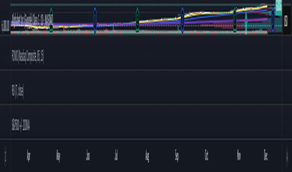
Market Trend & Breadth Checklist [Kulturdesken]Description
Concept & Inspiration This indicator serves as a disciplined "Pre-Flight Checklist" for swing traders, combining two powerful methodologies into one objective dashboard.
The Foundation (@kulturdesken): The core checklist structure is inspired by the workflow of @kulturdesken, utilizing the QQQE (Nasdaq 100 Equal Weighted Index). By focusing on the equal-weighted index rather than the market-cap weighted QQQ, we avoid distortions caused by mega-cap stocks and gauge the true price trend of the average stock.
The Enhancement (StockBee): To further filter out "hollow rallies," we integrated Pradeep Bonde’s (StockBee) "Market Monitor" logic. This adds a layer of analysis based on the Total US Universe (Wilshire 5000) to ensure market breadth is expanding, not just price.
Why StockBee Logic Was Added While QQQE tells us if the average price is trending, the StockBee logic tells us if the market structure is healthy. We added the "Universe" checks (Total US Market Breadth) because price trends can sometimes be deceptive during low-volume corrections.
By incorporating the Market Monitor concept (specifically checking if the % of stocks above their 50-day Moving Average is rising), this tool acts as a "Traffic Light." It prevents the trader from entering aggressive long positions even if QQQE is green, provided the underlying participation (Market Breadth) is weak.
How It Works (The 7 Checks)
1. Price Momentum (Kulturdesken): QQQE > Rising 5 SMA
Verifies short-term momentum is aggressive (Price > 5SMA) and the 5SMA itself is curling up.
2. Daily Trend Structure: Daily Buy Signal
Verifies a "stacked" bullish alignment where Price > 10 SMA > 20 SMA.
3. Macro Trend: Weekly Buy Signal
Verifies the Weekly Price > 10 WMA > 20 WMA (Weighted Moving Averages).
4. Universe Breadth (StockBee/McClellan): Summation Uptrend
We aggregate Nasdaq + NYSE data to create a "Total Universe" McClellan Summation Index.
Check: Is the Summation Index rising? (Indicates long-term money flow entering the system).
5. Short-Term Thrust: Oscillator Positive
Uses the "Total Universe" McClellan Oscillator.
Check: Is the Oscillator > 0? (Indicates immediate buying pressure is dominant).
6. Leadership: Net Highs/Lows
Check: Are Net New Highs (Highs minus Lows) trending positive?
7. Performance Filter (Manual): Traction Check
A psychological guardrail. If you toggle this off in settings (indicating you are losing money/getting stopped out), the checklist forces a "WAIT" signal, protecting you from overtrading during choppy conditions.
Settings & Customization
Data Feeds: The script is pre-configured with USI (United States Indices) and INDEX tickers to ensure accurate breadth data, but these can be customized in the settings.
Main Ticker: Defaults to QQQE.
Disclaimer: This tool is for educational purposes and market analysis only. It does not constitute financial advice. Past performance is not indicative of future results.
Indicatori di ampiezza

Universe Breadth Engine & Trend Scorecard [StockBee Style]Description
Concept & Methodology Traders are often misled by market-cap weighted indices (like SPY or QQQ). When a handful of mega-cap stocks rally, the index may look healthy even if the majority of stocks are selling off. This is called a "Hollow Rally."
This script is designed to look "under the hood" of the US Stock Market. It aggregates data from the entire investable universe (combining both NASDAQ and NYSE internals) to determine the true strength of market participation. It draws heavy inspiration from the StockBee Market Monitor methodology, using breadth and moving average geometry to define "Safe" vs. "Unsafe" trading environments.
How It Works (The Math)
This indicator combines three distinct layers of market analysis into a single pane:
1. The "Universe" McClellan Oscillator Most breadth indicators only look at one exchange. This script aggregates data to create a "Total US Market" view:
Data aggregation: We sum Advancing Issues (USI:ADVN.NQ + USI:ADVN.NY) and subtract Declining Issues (USI:DECL.NQ + USI:DECL.NY).
The Calculation: We apply the standard McClellan Oscillator formula to this aggregated net number: (19-period EMA of Net Issues) - (39-period EMA of Net Issues).
The Signal Line: A 5-period Simple Moving Average (SMA) of the Oscillator.
Green Line: Breadth momentum is rising (5SMA > Previous 5SMA).
Red Line: Breadth momentum is falling.
2. The Market Monitor Filter (Background Color) To determine the long-term "Health" of the market, the script queries the Wilshire 5000 index breadth (INDEX:MMTH), which represents the total US stock universe.
Logic: It measures the percentage of stocks currently above their 50-Day Moving Average.
Green Background: The percentage is rising (Current % > 10-Day SMA of %). This indicates an expanding environment.
Red Background: The percentage is falling. This indicates a contracting environment.
3. The "Traffic Light" Ribbon (Bottom Line) A thick ribbon at the bottom of the pane visualizes the trend of the QQQ (Nasdaq 100 Equal Weighted).
Green Ribbon: Price is above both the 10-day and 20-day SMAs.
Gray Ribbon: Price has lost the short-term moving average structure.
4. The Breadth Scorecard (Table) The table on the right provides a statistical summary of "Winning Days" (Positive Breadth) vs "Losing Days" (Negative Breadth) over multiple timeframes:
7 Days & 30 Days: For short-term momentum checks.
3 Month, 6 Month, 1 Year: For secular trend analysis.
YTD: Year-to-Date performance.
How to Use This Tool
The "All Clear" Signal: When the Background is Green (Market Monitor rising), the Ribbon is Green (Price Trend), and the Oscillator Bars cross above the Signal Line. This suggests high-probability conditions for long swing trades.
Divergence Warning: If the QQQ is making new highs, but the Oscillator is making lower highs (or staying red), it indicates that the rally is not supported by the broader market.
The Turnaround: A crossover of the Oscillator above the Signal Line while deep in negative territory often marks a short-term sold-out low.
Settings & Customization
Fully Configurable Table: You can change the position, size, and colors of the Scorecard table to fit your chart layout.
Data Sources: The script uses USI and INDEX tickers by default. These can be adjusted in the settings if you use different data providers.
Disclaimer: This tool is for educational market analysis only and does not constitute financial advice.

市场微观转变确认指标Logic: Signals only appear when Cloud Trend aligns with Structural Breakouts.
Visuals: Grey bars indicate noise/chop; colored bars indicate valid resonance.
Best for: 15m timeframe fast-paced trading.
"High-speed scalping indicator fusing Volatility Clouds and Market Structure for noise-filtered, double-confirmed entries."

SPX Cumulative AD Line IndicatorThe Other ADLines online are trash. Use this one.
This indicator, written in Pine Script version 6, is designed to track market breadth for the S&P 500 by constructing and analyzing a cumulative Advance-Decline (AD) Line. It begins by allowing the user to set two parameters: a smoothing length for the AD line itself and a moving-average length (defaulted to 50 weeks) that will later be applied to the smoothed line. These inputs let traders tailor the sensitivity of the indicator to their preferred timeframe and trading style.
To build the AD line, the script pulls real-time S&P 500 index prices as well as the number of advancing and declining stocks using dedicated market breadth tickers. It calculates the daily AD difference by subtracting declines from advances, a classic method for measuring participation across the index. This difference is fed into a cumulative calculation, which produces a running total that tracks whether market participation is strengthening or weakening over time.
The cumulative AD line is then smoothed with a simple moving average based on the user’s specified smoothing length. At the same time, the script dynamically converts the 50-week moving-average period into an equivalent value for whatever chart timeframe is being used—intraday, daily, weekly, or monthly. This ensures that the moving average of the AD line reflects a consistent long-term trend regardless of the chart’s resolution.
Next, the smoothed AD line is compared to its converted 50-week moving average to determine the market’s directional bias. When the AD line rises above its long-term average, the script labels the environment as bullish; when it falls below, it flags a bearish environment. It also detects crossovers between the two lines, generating discrete buy signals when the AD line crosses upward and sell signals when it crosses downward.
Finally, the indicator visualizes all elements on the chart: the smoothed AD line, its long-term moving average, a zero reference line, and the buy/sell markers. It also colors the line and background to reflect bullish or bearish conditions, making shifts in market breadth easy to spot at a glance. This provides traders with a comprehensive breadth-based tool for identifying trend strength and potential reversals in the S&P 500.

On Balance Volume ModA/D doesnt take into account the opening price, it just sees the difference in high to close wik vs close to low wik and adds volume
however if the closing price is above the opening price then arguably there was more buying action than selling
so adjusting A/D formula so that if close > open then it adds to volume not subtract
Effectively this becomes something in bw OBV and A/D
also we need not worry about gaps, since no tradding happens in gaps, so just a gap up / gap down doesnt have any accumulation / distribution effect

MSSM - Multi-Session Structural Map (Precision Sweeps)MSSM – Multi-Session Structural Map (Precision Sweeps)
This indicator provides a structured view of the market based on four key components:
1). Previous session levels
2). Confirmed fractal swing points
3). Volume pocket highlights
4). Non-repainting precision liquidity sweep markers
It is designed to help analyze how price interacts with important reference areas and structural points. This tool does not generate signals or predictions. All information is visual and educational only.
HOW THE INDICATOR WORKS
PREVIOUS SESSION LEVELS
The script plots the previous session’s High, Low, and Mid. These levels help observe how the current session behaves around the prior day’s range. They act as reference areas only.
FRACTAL SWING MAP (NON-REPAINTING)
Confirmed fractals are used to mark historical swing highs and swing lows. Since fractals confirm after a certain number of bars, the swings do not repaint once formed. These swings provide a clearer view of market structure.
VOLUME POCKETS
The indicator highlights areas where volume expands relative to a rolling volume average. These regions show increased participation or activity. The highlights are informational and do not imply direction.
PRECISION LIQUIDITY SWEEPS (NON-REPAINTING)
A sweep is tagged only when:
• Price trades beyond a confirmed swing high or swing low
• Price closes back inside the previous swing level
• A wick rejection occurs
• Volume expands relative to a recent rolling average
These markers simply show where price interacted with liquidity around prior structural levels. They do not indicate a trading signal or bias.
HOW TO ADD THE INDICATOR
Open the Pine Editor in TradingView
Search the indicator name and add to favorites.
Click “Add to chart”
Adjust settings as needed (fractals, sweeps, volume pockets, or session levels)
HOW TO READ AND USE THE INDICATOR
SESSION LEVELS
Observe whether price respects, rejects, compresses around, or expands beyond the previous session high, low, or midpoint. These are observational reference levels only.
FRACTALS
Fractal highs and lows help visualize structural turning points. They provide a clearer picture of where liquidity may rest above or below past swing levels.
VOLUME POCKETS
When volume expands compared to the recent average, the candle is shaded. These areas may show increased participation, but no directional meaning is implied.
PRECISION SWEEPS
Sweeps highlight when price reaches beyond a prior confirmed swing level and then rejects that area with displacement. These markers identify interactions with liquidity, but they are not signals and do not forecast future outcomes.
CUSTOMIZATION OPTIONS
Users can adjust:
• Session level visibility
• Fractal sensitivity
• Volume pocket threshold
• Sweep sensitivity and visibility
• Transparency and styling
This makes the tool flexible across different symbols and timeframes.
IMPORTANT NOTES AND POLICY COMPLIANCE
• The indicator does not provide buy or sell signals
• The indicator does not predict price or direction
• All plotted elements are based on past price behavior
• All components are informational only
• Users should perform their own analysis and risk evaluation
• Past behavior does not guarantee future performance
SUMMARY
MSSM provides a structured view of price by combining previous session levels, confirmed swing structure, volume expansion zones, and non-repainting sweep identification. Its purpose is to assist traders in visually analyzing market structure while staying fully aligned with TradingView’s House Rules and content policies.

ZScore SemiConductoresZ-Score of Semiconductor Sector Volume
This custom Pine Script indicator applies a Z-Score calculation to the aggregated trading volume of leading semiconductor companies. The goal is to highlight statistical extremes in sector activity that may signal unusual market behavior.
🔧 How it works
- Fixed ticker list: NVDA, AVGO, TSM, AMD, ASML, MU, ARM, ON, TXN, QCOM, INTC.
- Aggregate volume: The script sums the trading volume of all tickers in the list for the selected timeframe.
- Z-Score calculation:
- Moving average and standard deviation are computed over a configurable window (default = 50 bars).
- Formula:
Z= (Current Volume - Mean) / Standard Deviation
Visualization:
- Z-Score plotted in green.
- Reference lines at 0, ±1σ, ±2σ.
- Labels (triangles) mark critical signals when Z > +2 or Z < -2.
📈 Why it matters
- Detects abnormal surges or drops in sector-wide volume.
- Highlights potential euphoria (+2σ) or panic (-2σ) moments.
- Useful as a filter for trading strategies or as a sector-level alert system.
⚠️ Disclaimer: This script is for educational purposes only and not financial advice

S&P 500 Breadth: Bull vs Bear (20DMA)S&P 500 Breadth: Bull vs Bear (20DMA)
Use as simple market breadth
NC-ALPHA INDEX [Pro Pane] - Smart Money Flow01. THE PROBLEM: MARKET CAP IS A LAGGING INDICATOR
Standard crypto indices (like Coin50 or Total Market Cap) are weighted by capitalization. This is a flawed model for active traders because it prioritizes "Dino Coins"—older assets with massive supplies but very little active volume or price discovery. They are heavy, slow, and hide the real story.
02. THE SOLUTION: VOLUME-VELOCITY WEIGHTING
The NC-ALPHA INDEX is designed for SMC (Smart Money Concepts) traders who need to see where the real liquidity is flowing right now.
Instead of static weighting, this script dynamically adjusts the influence of each asset based on its Real-Time Dollar Volume.
High Volume = High Impact: If a specific asset (e.g., SOL, HYPE, or PEPE) is attracting massive liquidity inflow, its weight in the index increases instantly.
Low Volume = Low Impact: Assets with no volume ("Zombie coins") have minimal impact on the index line, preventing false signals.
03. THE "MARKET DRIVERS" BASKET
The index tracks a curated basket of 10 high-velocity assets representing the current market meta:
1 - Kings: BTC, ETH
2 - Market Leaders: SOL, BNB
3 - High Beta / L1s: SUI
Sector Proxies: DOGE (Memes), HYPE (DEX/Perps), AAVE (DeFi), LINK (Infra), XRP.
04. HOW TO TRADE WITH IT
A. The Divergence (Trap Detector) If Bitcoin is making a Higher High (HH) at a Key Resistance, but the NC-ALPHA Index is making a Lower High (LH) or stagnating:
Signal: The pump is unsupported by broad liquidity. It is likely a "Fake Pump" driven by wash trading or isolated manipulation. High probability of an SFP (Swing Failure Pattern).
B. The HUD (Heads-Up Display) The dashboard on the chart shows you exactly what is moving the market.
Look at the "W%" (Weight) column.
Signal: If an Altcoin (like SUI or HYPE) suddenly exceeds 15-20% weight, a Sector Rotation is occurring. Stop watching BTC and focus on that asset.
05. TECHNICAL NOTES
Crash Proof: Built with advanced nz() data handling to prevent the "disappearing line" bug common in composite indices.
Usage Rule: For accurate calculation, use this indicator on 24/7 Crypto Charts (BTC, ETH, SOL) rather than Traditional Finance charts (VIX, SPX) to avoid weekend data gaps.
Built by KheopsCrypto for the SMC Community.

mrD-Volume Profile HeatmapThis indicator combines advanced volume analysis with institutional-grade visualization techniques to provide traders with a comprehensive view of market structure and liquidity zones.
WHAT MAKES THIS UNIQUE:
• Proprietary bidirectional volume profiling algorithm that separates buying and selling pressure using VWAP deviation analysis, not standard volume bars
• Custom heatmap visualization engine with adaptive gradient calculation based on volume-weighted price distribution across multiple timeframes
• Integrated Weekly VWAP with hlc3 weighting for institutional reference levels
• Dynamic POC (Point of Control) detection with fixed-height text boxes for clarity
• Optimized rendering system that handles 500+ bars efficiently without lag
HOW IT WORKS:
The algorithm analyzes volume distribution at each price level within the lookback period, applying a proprietary weighting system that considers:
1. Volume-weighted average price (VWAP) deviation to classify volume as bullish/bearish
2. Price levels are binned into customizable rows (bins) for granular analysis
3. Volume bars extend bidirectionally: positive volume (green) extends left, negative volume (red) extends right
4. Heatmap overlay uses multi-level gradient mapping (6-color spectrum) to highlight high volume nodes
5. Weekly VWAP provides macro trend reference with session-based reset logic
VOLUME PROFILE MECHANICS:
• Calculates volume distribution across price levels using a grid-based binning system
• Each bin accumulates volume when the price touches that level
• Positive/negative classification based on VWAP position (above = bullish, below = bearish)
• POC automatically identifies the price level with maximum volume concentration
• Display shows volume intensity through color gradients and bar lengths
HEATMAP VISUALIZATION:
• Uses exponential gradient multiplier (default 1.9) for enhanced contrast
• Color transitions: Dark Blue (low volume) → Cyan → Green → Yellow (high volume)
• Transparency-adjusted overlays ensure chart readability
• Real-time updates as new volume data arrives
WEEKLY VWAP INTEGRATION:
• Resets at the start of each trading week (request.security logic)
• Uses hlc3 (typical price) as the volume-weighted source
• Provides institutional reference level for swing traders
• Yellow color (#FFEB3B) for easy identification
KEY PARAMETERS:
• Period: Lookback window for volume calculations (default: 500 bars)
• Bins: Number of price levels for volume distribution (default: 150 rows)
• Offset: Horizontal positioning of volume bars (default: 50)
• Heatmap Rows: Granularity of heatmap overlay (default: 250)
• POC displays actual volume numbers for transparency
TRADING APPLICATIONS:
→ Identify high-volume nodes as support/resistance zones
→ Detect liquidity clusters where institutional orders concentrate
→ Spot low-volume areas where price may move quickly (thin zones)
→ Use bidirectional volume to assess buying vs selling pressure
→ Combine with Weekly VWAP for multi-timeframe confluence
→ POC levels often act as price magnets (mean reversion targets)
TECHNICAL IMPLEMENTATION NOTES:
• Optimized for intraday to swing timeframes (1m to Daily charts)
• Volume calculations use session-based accumulation (no future data)
• Box rendering is limited to 500 objects for performance
• Gradient calculations use mathematical power functions for smooth transitions
• VWAP calculation follows institutional standard (volume-weighted hlc3)
RESTRICTIONS:
This is a proprietary algorithm. Redistribution, modification, or commercial use is strictly prohibited. The logic and methods contained herein are confidential and protected intellectual property.
═══════════════════════════════════════════
DISCLAIMER & RISK WARNING
This indicator is provided solely for educational and informational purposes. It is designed to help traders understand market structure, volume distribution, and price action analysis. This tool should be used as part of a comprehensive trading education program.
NOT FINANCIAL ADVICE:
The information and signals provided by this indicator DO NOT constitute financial advice, investment advice, trading advice, or any other sort of advice. You should not treat any of the indicators' content, outputs, or signals as such. Nothing contained in this indicator constitutes a solicitation, recommendation, endorsement, or offer to buy or sell any securities or other financial instruments in this or in any other jurisdiction.
NO GUARANTEED RESULTS:
Past performance is NOT indicative of future results. The historical backtesting results, volume patterns, and statistical data shown by this indicator do not guarantee future performance or success. Market conditions change constantly, and what worked in the past may not work in the future. Trading and investing involve substantial risk of loss.
MARKET VOLATILITY:
Financial markets are inherently volatile and unpredictable. Volume patterns, support/resistance levels, and other technical indicators can fail at any time. No indicator can predict market movements with certainty. Always use proper risk management and position sizing.
By using this indicator, you acknowledge that you have read, understood, and agree to this disclaimer in its entirety. If you do not agree with any part of this disclaimer, you should not use this indicator.

Crypto Intraday Scalper [Patterns + RSI + Volume + MTF + ADX]# Guide to Reading the Indicator (CIS Pro v2)
## 1. Operational Signals (The Labels)
- **GREEN Label "BUY"**:
**Meaning**: Entry for a Long position.
**Conditions**: Bullish candle pattern + Oversold RSI + High Volume + Bullish 1-hour trend + Sufficient Volatility.
- **RED Label "SELL"**:
**Meaning**: Entry for a Short position.
**Conditions**: Bearish candle pattern + Overbought RSI + High Volume + Bearish 1-hour trend + Sufficient Volatility.
- **No Label**: The market is in an uncertain phase, sideways movement, or filters (ADX/MTF) are blocking signals for protection.
## 2. Trend Lines (The Context)
- **Gray Line (EMA 200)**: This serves as the dividing line between bullish and bearish trends.
**Rule**: Seek Long positions only above the gray line; Short positions only below it.
- **Red/Green Step Line (Supertrend / Trailing Stop)**:
**Green (below the price)**: Strong bullish trend. Acts as dynamic support.
**Red (above the price)**: Strong bearish trend. Acts as dynamic resistance.
**Usage**: Use it for trade exits. If in a Long position and the line turns red, close the entire trade.
## 3. Price Levels (Targets and Supports)
- **Blue/Red/Green Dots (Pivot Points)**:
These are levels calculated from the previous day. The price tends to bounce at these points. Use them as final targets for taking profit.
- **Orange Line (VWAP)**:
This represents the "average price" for the day. If the price deviates too far, it often returns (elastic effect).
- **Dashed Lines (Appear after a signal)**:
**Red Dashed**: Suggested Stop Loss (based on ATR volatility).
**Green Dashed**: Suggested Take Profit (quick target).
## 4. The Table (Dashboard in the Top Right)
This provides reasons why you may not be receiving signals:
- **Trend (Current)**: The trend on your current chart.
- **Trend (MTF 60)**: The trend on the 1-hour chart. If these two conflict (e.g., Bullish vs. Bearish), no signals will appear.
- **ADX Volatility**: If RED (below 20), the market is flat—no trades. If GREEN, there is sufficient movement.
- **Volume Status**: Alerts if anomalous high volume is entering (High) or if conditions are calm.
## 🚀 Operational Summary
- Wait for the label.
- Quick Check: Is the price on the correct side of the gray line? Is the step line the right color?
- Enter the trade.
- Exit when the price hits the green dashed line (Quick Take Profit) **OR** when the price breaks the step line (Trailing Stop for longer trends).
What aspect of this indicator should we analyze next—perhaps integrating it with real-time ETH data or testing it via code execution for backtesting?

XAUUSD ULTIMATE+BB 🥇 [GOLD OPTIMIZED]🥇 XAUUSD ULTIMATE 100% - Best Gold Indicator
The most complete trading system for GOLD (XAUUSD) - 20+ indicators in ONE tool!
🔥 WHAT YOU GET:
✅ COMPLETE TRADING SYSTEM
- Buy/Sell signals with 0-100% confidence score
- Automatic SL/TP levels (optimized for gold)
- Real-time profit tracking in $ and %
- Clean visual interface with live dashboard
✅ POWERFUL FEATURES
- 📊 Bollinger Bands - Full visualization
- 📈 SuperTrend - Dynamic trend line
- 🎯 Divergence Detection - Early reversals
- 🕯️ Candlestick Patterns - Hammer, Engulfing, etc
- 💎 Order Blocks - Smart Money levels
- 🕐 Session Lines - London/NY high volatility periods
✅ SMART SIGNAL SYSTEM
- Multi-indicator confirmation (EMAs, RSI, MACD, Stochastic, ADX)
- Fast Entry Mode - Catches early moves
- Aggressive Mode - More signals
- Volume confirmation included
- Psychological levels ($50 increments)
✅ EASY TO USE
1. Add to XAUUSD chart
2. Adjust sensitivity (1-10)
3. Wait for BUY/SELL arrows
4. Follow displayed SL/TP levels
✅ ALERTS INCLUDED
- Buy/Sell signals
- Divergence alerts
- Profit targets (0.15%, 0.30%)
- Bollinger Band extremes
🎯 BEST FOR:
- Gold scalping (M5-M15)
- Day trading (M15-H1)
- All experience levels
⚙️ FULLY CUSTOMIZABLE
- Adjustable sensitivity
- Show/hide any feature
- Custom SL/TP multipliers
- Choose your trading style
💡 WHY IT'S THE BEST:
- Gold-specific optimization
- 20+ indicators working together
- Professional-grade accuracy
- Clean, easy-to-read interface
- Works in all market conditions

BankNifty - 2x Nifty Differencedifference between Banknifty near month future - 2x nifty near month future

Indecision Candle Setup DetectorThis bot can Detect Indecision Candle and make alert
with this indicator you will not miss any setup Candle
ST - Relative StrengthST - Relative Strength plots the relative strength of the current stock versus a benchmark index. It divides the stock’s close by the index close on the same timeframe, and you can switch the benchmark to any index or symbol you prefer. This helps you quickly see whether the stock is outperforming or underperforming its chosen benchmark over time.
Bank Zone by TheRealWealthVision V2The Bank Zone indicator is designed to help traders identify key price areas where institutions, banks, and large market participants are likely active. It highlights potential zones of accumulation, distribution, liquidity grabs, and high-value reaction levels.
This tool automatically detects structural shifts, dynamic zones, and real-time market behavior to support more accurate decision-making. It is suitable for scalping, intraday trading, and swing trading across all markets including Forex, Indices, Crypto, Stocks, Commodities, and more.
Main Features
Automatic detection of potential institutional zones
Real-time dynamic updates
Clear visual highlights on the chart
Designed to work on all timeframes
Fully compatible with the latest TradingView Pine Script engine
Best For
Identifying high-probability reaction areas
Understanding where big players may enter or exit
Improving trade timing and precision
Building a cleaner, more structured market view
Important Notice
This indicator does not repaint historical zones improperly, does not generate unrealistic signals, and follows all TradingView guidelines for script behavior.

WMA SupertrendVWMA Supertrend for identifying good entry points
Divides the slow VWMA and fast VWMA and multiplies by the close price to give a mountain-style price showing possible entries.

📊 Volume Tension & Net Imbalance📊 Volume Tension & Net Imbalance (With Table + MultiLang + Alerts)
//
This indicator measures bullish vs. bearish pressure using volume-based tension and net imbalance.
It identifies accumulation zones, displays real-time market strength, trend direction, and triggers alerts on buildup entries.
Fully customizable table size, colors, and bilingual support (English/Russian).

Santo Graal Tendência🌟 Holy Grail Trend – Clarity in the Flow of the Market
Introducing Holy Grail Trend, a smart trend-following indicator designed for traders who want to ride strong moves while avoiding noise and false breakouts. By blending adaptive cycle analysis, smoothed momentum, and dynamic support/resistance logic, this tool highlights the true underlying trend—not just price noise.
Whether you're a swing trader, position trader, or intraday momentum seeker, Holy Grail Trend helps you stay aligned with the market’s dominant direction while filtering out choppy, sideways phases.
🔍 Key Features:
✅ Clean, color-coded trend visualization (bullish / bearish)
✅ Adaptive sensitivity based on current market cycle length
✅ Dynamic trend bands that adjust to volatility and price structure
✅ Minimal lag and no repainting — reliable in real-time
✅ Works across all assets and timeframes (forex, stocks, crypto, indices)
✅ Lightweight and chart-friendly
💡 How to Use:
Go long when the trend turns green and price is above the dynamic band
Go short when the trend turns red and price is below the band
Stay flat or reduce exposure during neutral (gray) or conflicting phases
The “Holy Grail” isn’t about chasing every move—it’s about trading with the tide, not against it. Combine this indicator with your risk management rules, and you’ll have a powerful ally in your trading journey.

MarketCap & SectorThis indicator shows a quick fundamental snapshot for the current stock directly on the chart. It displays:
- Market Cap in ₹ crores (for example: 4,609.11 Cr)
- Market‑cap category based on size (Large‑cap, Mid‑cap, Small‑cap, or Micro‑cap)
- Sector and Industry of the company
- 1‑month average daily volume in a compact format (for example: 10.5M)
Use it to instantly see how big the company is, what segment of the market it belongs to, and how actively it trades, without opening any extra info panels or websites.

Elliott Wave Multi-Level (Micro/Main)**Title Suggestion:**
Elliott Wave Multi-Level Strategy (Micro/Main)
**Short Description (for TradingView):**
This strategy detects Elliott Waves on two levels — **Micro** (short-term swings) and **Main** (higher-level structures) — and uses them for fully automated long and short trading.
Main Impulse waves (1–5) and ABC corrections are identified using pivot logic, ATR-based movement filters, volume confirmation, and an optional EMA trend filter. Micro Impulse waves serve as confirmation for Main structures, creating a multi-level validation system that significantly reduces false signals.
Entries are taken either:
* **with the trend**, after confirmed Main Impulse waves, or
* optionally as **reversal trades** at the completion of ABC corrections.
Stop-loss and take-profit levels are dynamically calculated using ATR multipliers, allowing the strategy to adapt to different volatility environments. All parameters (pivots, filters, confirmations, risk settings) are fully customizable to fit various markets and timeframes (e.g., 1m–15m).

Harami Reversal Alerts BB Touch (Strict First Candle)Harami Reversal Alerts BB Touch (Strict First Candle)
Harami Reversal Alerts BB Touch (Strict First Candle)Harami Reversal Alerts BB Touch (Strict First Candle)Harami Reversal Alerts BB Touch (Strict First Candle)Harami Reversal Alerts BB Touch (Strict First Candle)Harami Reversal Alerts BB Touch (Strict First Candle)

MarketCap & Sector MarketCap & Sector Dashboard is a lightweight info panel that shows three key fundamentals for any NSE/BSE stock directly on your chart: current market capitalization (in crores), sector, and industry. It keeps this basic context always visible so you can quickly see how big the company is and where it sits in the market without leaving the price chart.
