MFM – Light Context HUD (Minimal)Overview
MFM Light Context HUD is the free version of the Market Framework Model. It gives you a fast and clean view of the current market regime and phase without signals or chart noise. The HUD shows whether the asset is in a bullish or bearish environment and whether it is in a volatile, compression, drift, or neutral phase. This helps you read structure at a glance.
Asset availability
The free version works only on a selected list of five assets.
Supported symbols are
SP:SPX
TVC:GOLD
BINANCE:BTCUSD
BINANCE:ETHUSDT
OANDA:EURUSD
All other assets show a context banner only.
How it works
The free version uses fixed settings based on the original MFM model. It calculates the regime using a higher timeframe RSI ratio and identifies the current phase using simplified momentum conditions. The chart stays clean. Only a small HUD appears in the top corner. Full visual phases, ratio logic, signals, and auto tune are part of the paid version.
The free version shows the phase name only. It does not display colored phase zones on the chart.
Phase meaning
The Market Framework Model uses four structural phases to describe how the market
behaves. These are not signals but context layers that show the underlying environment.
Volatile (Phase 1)
The market is in a fast, unstable or directional environment. Price can move aggressively with
stronger momentum swings.
Compression (Phase 2)
The market is in a contracting state. Momentum slows and volatility decreases. This phase
often appears before expansion, but it does not predict direction.
Drift (Phase 3)
The market moves in a more controlled, persistent manner. Trends are cleaner and volatility
is lower compared to volatile phases.
No phase
No clear structural condition is active.
These phases describe market structure, not trade entries. They help you understand the conditions you are trading in.
Cross asset context
The Market Framework Model reads markets as a multi layer system. The full version includes cross asset analysis to show whether the asset is acting as a leader or lagger relative to its benchmark. The free version uses the same internal benchmark logic for regime detection but does not display the cross asset layer on the chart.
Cross asset structure is a core part of the MFM model and is fully available in the paid version.
Included in this free version
Higher timeframe regime
Current phase name
Clean chart output
Context only
Works on a selected set of assets
Not included
No forecast signals
No ratio leader or lagger logic
No MRM zones
No MPF timing
No auto tune
The full version contains all features of the complete MFM model.
Full version
You can find the full indicator here:
payhip.com
More information
Model details and documentation:
mfm.inratios.com
Momentum Framework Model free HUD indicator User Guide: mfm.inratios.com
Disclaimer
The Market Framework Model (MFM) and all related materials are provided for educational and informational purposes only. Nothing in this publication, the indicator, or any associated charts should be interpreted as financial advice, investment recommendations, or trading signals. All examples, visualizations, and backtests are illustrative and based on historical data. They do not guarantee or imply any future performance. Financial markets involve risk, including the potential loss of capital, and users remain fully responsible for their own decisions. The author and Inratios© make no representations or warranties regarding the accuracy, completeness, or reliability of the information provided. MFM describes structural market context only and should not be used as the sole basis for trading or investment actions.
By using the MFM indicator or any related insights, you agree to these terms.
© 2025 Inratios. Market Framework Model (MFM) is protected via i-Depot (BOIP) – Ref. 155670. No financial advice.
Oscillatori centrati

Relative Volume EMA (RVOL)Relative Volume EMA (RVOL) measures the current bar’s volume relative to its typical volume over a selected lookback period.
It helps traders identify whether a price move is supported by real participation or if it’s occurring on weak, low-quality volume.
This version uses:
RVOL = Current Volume ÷ Volume EMA
Volume EMA Length: adjustable
Signal Threshold: a customizable horizontal line (default = 1.2)
How to Use
1. RVOL > 1.2 → High-Quality Momentum
A value above 1.2 indicates that the current bar has at least 20% more volume than normal, suggesting:
Strong conviction
Algorithmic activity
Momentum-backed breakout or breakdown
Higher probability trend continuation
These bars are ideal for confirming entries after a technical setup (e.g., pullback, engulfing pattern, Ichimoku trend confirmation, etc.).
2. RVOL < 1.0 → Weak or Low-Quality Move
When RVOL is below 1.0:
Volume is below average
Moves are more likely to fail or reverse
Breakouts are unreliable
Triggers lack institutional participation
These bars are best avoided for trade entries.
Why This Indicator Is Useful
In many strategies, price alone is not enough.
RVOL acts as a filter to ensure that your signals occur during times when the market is actually active and committed.
Typical use cases:
Confirm trend-following entries
Validate pullbacks and breakout candles
Filter out low-volume chop
Identify session-based volume surges
Improve risk-to-reward quality by entering only during true momentum
Recommended Settings
EMA Length: 20
Threshold Line: 1.2
Works well on Forex, Crypto, and Indices
Best used on 15m, 30m, 1H, and 4H charts

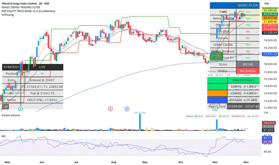
Magic Swing Suite: Trend, Pullback & Risk DashboardMagic Swing Suite: Trend, Pullback & Risk Dashboard
This indicator is a complete Swing Trading System designed to identify high-probability trend continuation setups. It combines classic trend-following principles with a unique "3-Bar Retest" logic and provides a real-time Strategy Dashboard to help you manage positions without needing a separate strategy script.
How it Works:
The system looks for a "Confluence" of factors before generating a signal. It scores every bar out of 140 points based on the following criteria:
Trend Alignment: Price must be above EMA 10, and EMA 10 must be above EMA 20.
Momentum (RSI): RSI must be in the "Bullish Control Zone" (60-80) and above its SMA.
Volume: Volume must be significantly higher than the average (1.5x by default).
The "Magic" Retest: The script checks the last 2-5 bars to see if the price has pulled back to "kiss" the EMA 10. This ensures we are buying a dip in a trend, not chasing a top.
Breakout Confirmation: Checks for Darvas Box breakouts and price position relative to Pivot R1.
Features:
🎯 Virtual Strategy Dashboard: A table that mimics a strategy tester. It tracks Entry, Stop Loss (Trailing), Target 1, and Target 2 in real-time.
📊 Confluence Scorecard: A detailed table showing exactly why a signal was (or wasn't) generated (Trend, Retest, RSI, Volume, etc.).
🛡️ Risk Management: automatically calculates a Trailing Stop (EMA 10) and fixed Risk:Reward targets based on recent highs.
📉 Multi-Layered Overlays: Includes Auto-Pivots (Traditional, Fib, Woodie, etc.) and Darvas Boxes to identify support/resistance levels.
How to Use:
Wait for a Signal:
"FULL BUY SIGNAL" (Green): All conditions are met, including a recent retest of the EMA. This is the highest probability setup.
"BUY - NO RETEST" (Orange): Trend and momentum are strong, but price hasn't pulled back recently. Use caution, as this may be a breakout trade.
Monitor the Dashboard: Once a trade is active, the dashboard will change to "IN POSITION." Follow the "Action" row.
If the trend weakens, the Trailing Stop (EMA 10) will move up to protect profits.
Targets:
T1: Previous Swing High (or 5% if no high found).
T2: 1:1.6 Risk/Reward extension.
Settings:
Volume Spike Factor: Adjust how much volume is needed to confirm a move. Default is 1.2.
Retest Tolerance: Adjust how close the price needs to get to the EMA 10 to count as a "retest."
Dashboard Toggles: You can hide the tables if you prefer a clean chart.
Pivot Timeframes: customizable lookback for S/R levels.
FAQ:
Does this repaint?
No. All signals trigger only on confirmed bars.
Can I use this intraday?
Yes. Works great from 5m to 1D.
Are exits manual or automated?
The indicator tracks SL, T1, and T2, and marks them on the chart.
Does retest affect the buy signal?
Retest is optional. The buy logic does not require it, but adds weight to the score.
Disclaimer: This tool is for educational purposes only. The "Strategy Dashboard" is a simulation based on script calculations and does not execute real trades. Always manage your own risk.
MFM - Light Context HUD (Free)Overview
MFM Light Context HUD is the free version of the Market Framework Model. It gives you a fast and clean view of the current market regime and phase without signals or chart noise. The HUD shows whether the asset is in a bullish or bearish environment and whether it is in a volatile, compression, drift, or neutral phase. This helps you read structure at a glance.
Asset availability
The free version works only on a selected list of five assets.
Supported symbols are
SP:SPX
TVC:GOLD
BINANCE:BTCUSD
BINANCE:ETHUSDT
OANDA:EURUSD
All other assets show a context banner only.
How it works
The free version uses fixed settings based on the original MFM model. It calculates the regime using a higher timeframe RSI ratio and identifies the current phase using simplified momentum conditions. The chart stays clean. Only a small HUD appears in the top corner. Full visual phases, ratio logic, signals, and auto tune are part of the paid version.
The free version shows the phase name only. It does not display colored phase zones on the chart.
Phase meaning
The Market Framework Model uses four structural phases to describe how the market behaves. These are not signals but context layers that show the underlying environment.
Volatile (Phase 1)
The market is in a fast, unstable or directional environment. Price can move aggressively with stronger momentum swings.
Compression (Phase 2)
The market is in a contracting state. Momentum slows and volatility decreases. This phase often appears before expansion, but it does not predict direction.
Drift (Phase 3)
The market moves in a more controlled, persistent manner. Trends are cleaner and volatility is lower compared to volatile phases.
No phase
No clear structural condition is active.
These phases describe market structure, not trade entries. They help you understand the conditions you are trading in.
Cross asset context
The Market Framework Model reads markets as a multi layer system. The full version includes cross asset analysis to show whether the asset is acting as a leader or lagger relative to its benchmark. The free version uses the same internal benchmark logic for regime detection but does not display the cross asset layer on the chart.
Cross asset structure is a core part of the MFM model and is fully available in the paid version.
Included in this free version
Higher timeframe regime
Current phase name
Clean chart output
Context only
Works on a selected set of assets
Not included
No forecast signals
No ratio leader or lagger logic
No MRM zones
No MPF timing
No auto tune
The full version contains all features of the complete MFM model.
Full version
You can find the full indicator here:
payhip.com
More information
Model details and documentation:
mfm.inratios.com
Disclaimer
The Market Framework Model (MFM) and all related materials are provided for educational and informational purposes only. Nothing in this publication, the indicator, or any associated charts should be interpreted as financial advice, investment recommendations, or trading signals. All examples, visualizations, and backtests are illustrative and based on historical data. They do not guarantee or imply any future performance. Financial markets involve risk, including the potential loss of capital, and users remain fully responsible for their own decisions. The author and Inratios© make no representations or warranties regarding the accuracy, completeness, or reliability of the information provided. MFM describes structural market context only and should not be used as the sole basis for trading or investment actions.
By using the MFM indicator or any related insights, you agree to these terms.
© 2025 Inratios. Market Framework Model (MFM) is protected via i-Depot (BOIP) – Ref. 155670. No financial advice.

Auto Div ADX STO RSI (Flip+P) v2This strategy combines multi-indicator divergence detection, momentum confirmation and adaptive position management into a unified automated trading framework.
It identifies regular bullish and bearish divergences using RSI and Stochastic (K), with configurable confirmation logic (RSI+STO, RSI only, or STO only). Divergences are validated only when price forms a lower low / higher high while the oscillator forms a higher low / lower high within a user-defined lookback window.
To filter low-quality setups, the strategy applies an ADX trend strength requirement, ensuring signals are taken only when market conditions reflect sufficient directional energy. Optional stochastic filters (oversold/overbought K levels) can further refine long and short entries.
Once a valid signal appears, the system supports Automatic Flip Logic:
If a bullish divergence forms during a short position, the strategy closes the short and flips long.
If a bearish divergence forms during a long position, it closes the long and flips short.
Position sizing uses adaptive pyramiding: the initial flip takes size proportional to the opposite side’s accumulated units, and new signals in the same direction can add incremental units (scale-in) if enabled. This models progressive conviction as new divergence signals occur.
All entries can optionally be required to confirm on bar close.
Alerts are included for both Long and Short entries.
Key Features
• Automatic detection of RSI and Stochastic divergences
• User-selectable confirmation rules (RSI, STO, or both)
• ADX-based strength filter
• Optional Stochastic K oversold/overbought filters
• Full flip logic between Long and Short
• Dynamic pyramiding and configurable scale-ins
• Bar-close confirmation option
• Alerts for Long/Short entries
• Status-line visualization of ADX, RSI, Stochastic, and unit cycles
This strategy is designed for traders who want a structured, divergence-based model enhanced with trend strength filtering and flexible position management logic, suitable for systematic discretionary trading or fully automated execution.

ZENADX Momentum FlowZENADX Momentum Flow คืออินดิเคเตอร์ที่ออกแบบมาเพื่อช่วยเทรดเดอร์จับ “ทิศทาง + จังหวะ” ของตลาดด้วยความเรียบง่ายแบบเซน แต่ทรงพลังด้วยแกนวิเคราะห์จาก ADX, DI และ Stochastic Momentum
อินดิเคเตอร์นี้ผสมผสาน โครงสร้างเทรนด์ (Trend Structure) ด้วย ADX/DI และ โมเมนตัม (Momentum Timing) ด้วย Stochastic เพื่อค้นหาจุดเข้าออกที่ “นิ่ง คม และมีสติ” ตามหลัก Zen Flow Trading
สิ่งที่ ZENADX Momentum Flow ทำให้คุณ:
1.จับเทรนด์หลักด้วย ADX ที่ผ่านเกณฑ์ความแข็งแรง
2.ฟิลเตอร์จังหวะด้วย Stochastic เพื่อหลีกเลี่ยงสัญญาณหลอก
3.แสดงสัญญาณ BUY/SELL เฉพาะเมื่อน้ำหนักเทรนด์ + โมเมนตัมสอดคล้องกัน
เหมาะทั้งสาย Trend Following และ Swing Entry ที่ต้องการ Flow ที่เป็นระบบ
เหมาะกับใคร?
สายเทรนด์, เทรดเดอร์แบบ Flow, คนที่ชอบระบบที่เรียบง่ายแต่ให้ “ความมั่นใจ” เวลาเข้าออก
หลักการ Zen:
ไม่ใช่แค่การตามเทรนด์… แต่คือการ ไหลไปตามตลาด อย่างมีสติและไม่ฝืนตลาด
-------------------------------------------------------------------------
ZENADX Momentum Flow is a trend–momentum hybrid indicator designed for traders who want clarity, simplicity, and precision. Inspired by Zen principles, this tool helps you align with the market’s natural flow—without noise or over-complication.
This indicator blends trend strength from ADX/DI with momentum confirmation from Stochastic, producing clean BUY/SELL signals only when both market structure and momentum agree.
What ZENADX Momentum Flow provides:
Detects strong trend directions using ADX threshold logic
Filters noise with Stochastic momentum alignment
Generates precise BUY/SELL signals based on DI crossovers + momentum confirmation
Ideal for Trend Following and Swing Entry traders who want a smooth, systematic flow
Perfect for:
Traders who seek a calm, disciplined, and structured way to follow the market’s movement—without forcing trades.
Zen Philosophy:
You don’t fight the trend…
You flow with it.


ORB [v1.1]ORB Strategy automatically establishes 2 ranges each day, from 9:30a and 2:30p EST. Useful for momentum continuation strategies.
2025 © TXL under the MIT license

Ghost Shadow [Bit2Billions]📌 Ghost Shadow — Adaptive Momentum & Divergence Engine
Ghost Shadow is an adaptive momentum analysis framework built on a normalized MACD model for consistent trend evaluation across all markets and timeframes. By converting MACD behavior into percentage-scaled zones and layering it with Heikin-Ashi–style MACD candles, the indicator provides a smooth, intuitive read of swing shifts and trend transitions.
It includes stochastic momentum analysis, real-time divergence detection, contextual candle-pattern recognition, supply/demand scoring, and a full multi-layer dashboard that organizes the entire market structure into one visual system.
🔹 Key Features
• Normalized Adaptive MACD
Percentage-based MACD with dynamic overbought/oversold shading for stable momentum context across assets.
• Heikin-Ashi MACD Candles
Smooth, noise-reduced candle representation for clearer swing identification.
• Stochastic Candles & Signals
OB/OS highlights, adaptive zone shifts, and real-time divergence detection.
• Divergence Engine
Flexible detection of:
* Regular Divergence (bull & bear – dashed lines)
* Hidden Divergence (bull & bear – dotted lines)
* Live developing divergences using past-data only (no lookahead)
• Multi-Module Dashboard
A structured overview of everything happening on the chart in one place.
📊 Dashboard Metrics
MACD Bias
Directional momentum & trend strength from the normalized MACD engine.
Stochastic Bias
Short-term momentum read with OB/OS sensitivity.
Candle Pattern Detection (70+ patterns)
Doji, Morning/Evening Star, Shooting Star, Hammer, Bearish/Bullish Engulfing, Harami, Piercing Line, Hanging Man, Spinning Top, Dark Cloud Cover, Raindrop/Doji, Tweezer Top/Bottom, Tower patterns, Inside/Outside Bar, Three Line Strike, Three White Soldiers, Three Black Crows, Marubozu, Tasuki patterns, Rising/Falling Three Methods — and many more.
Body/Wick/Volume Ratios
Automatic interpretation of candle sentiment through proportional body/wick/volume analysis.
Demand & Supply Strength
Real-time scoring of active candle pressure and MA-based supply/demand bias.
Directional Bias (Safe Term)
Aggregated long/short *lean* using combined momentum, divergence, and structure inputs.
*This is a contextual bias, not an automated signal.*
Higher-Timeframe Metrics
* HTF Trap Levels & Scoring
* HTF Volume Conditions
* HTF Price Action Alignment
* Quick HTF Bias Reads
Market Summary
Consolidated sentiment, structure, and volatility status into one panel.
🔹 How Modules Work Together (Conceptual Overview)
Ghost Shadow uses a structured pipeline:
1. Normalized MACD builds the base momentum landscape.
2. Swing Structure is read internally to anchor divergences and zone shifts.
3. Divergence Engine compares MACD/Stoch swings vs price swings using past pivots only.
4. Adaptive OB/OS Zones adjust to volatility using dynamic scaling.
5. Dashboard aggregates all module outputs into a unified directional lean for interpretation.
This ensures each module references the same internal logic rather than acting as separate uncorrelated tools.
🎨 Visual Design & Chart Clarity
* Only essential real-time labels shown.
* All historical/replayed labels disabled to maintain chart cleanliness.
* Consistent color-coded visuals for divergence, momentum zones, and pattern signals.
* Shapes, line-styles, and colors remain organized for fast interpretation.
Divergence Lines
* Regular Divergence: Dashed Green/Red
* Hidden Divergence: Dotted Green/Red
Usage Note
This indicator does not auto-trade or provide guaranteed entries.
All visuals represent contextual bias for trader interpretation only.
What Ghost Shadow Solves
*Reduces manual momentum and divergence analysis
*Removes chart clutter with adaptive visuals
*Provides fast, rules-based market interpretation
*Standardizes workflow across markets and timeframes
*Helps identify exhaustion, continuation, and swing bias instantly
⚙️ Inputs & Settings
* Clean layout with simple Show/Hide toggles
* Pre-configured defaults
* Minimal exposed fields for ease of use
* Designed to reduce setup time and improve workflow speed
🕒 Recommended Timeframes & Markets
* Best on 15m, 1H, 4H, Daily, Weekly
* Works across forex, crypto, indices, commodities, equities
* Pivot-based structures may show noise on illiquid assets
⚡ Performance & Limitations
* Heavy modules may draw many objects → disable unused sections
* If the chart stops loading objects, simply refresh
* All TradingView platform limitations handled internally
📄 License & Legal
* Proprietary © 2025
* Redistribution, resale, or sharing of internals is prohibited
* Independently developed; uses only public-domain trading concepts
* Any resemblance to other tools is coincidental and concept-based only
🤝 Respect & Transparency
* Built fully on public, widely known trading concepts
* No code reused or copied; all logic developed independently
* If any similarity is noticed, it can be addressed constructively
⚠️ Disclaimer
* For education and analysis only
* Not financial advice
* Market risk is real — always backtest and manage risk properly
❓ FAQs
* Source code is not public
* Works best on 15m, 1H, 4H, Daily, Weekly
* All modules individually toggleable
* Alerts can be set manually
* Compatible with forex, crypto, indices, commodities, and equities
About Ghost Trading Suite
Author: BIT2BILLIONS
Project: Ghost Trading Suite © 2025
Indicators: Ghost Matrix, Ghost Protocol, Ghost Cipher, Ghost Shadow
Strategies: Ghost Robo, Ghost Robo Plus
Pine Version: V6
The Ghost Trading Suite is designed to simplify and automate many aspects of chart analysis. It helps traders identify market structure, divergences, support and resistance levels, and momentum efficiently, reducing manual charting time.
The suite includes several integrated tools — such as Ghost Matrix, Ghost Protocol, Ghost Cipher, Ghost Shadow, Ghost Robo, and Ghost Robo Plus — each combining analytical modules for enhanced clarity in trend direction, volatility, pivot detection, and momentum tracking.
Together, these tools form a cohesive framework that assists in visualizing market behavior, measuring momentum, detecting pivots, and analyzing price structure effectively.
This project focuses on providing adaptable and professional-grade tools that turn complex market data into clear, actionable insights for technical analysis.
Crafted with 💖 by BIT2BILLIONS for Traders. That's All Folks!
Changelog
v1.0 – Core Release
* Introduced Normalized Adaptive MACD with percentage-based zones and overbought/oversold shading.
* Added Heikin-Ashi style MACD candles for smoother swing visualization.
* Implemented Stochastic Candles with dynamic zones and divergence detection.
* Added Real-Time Divergence Engine for MACD and Stochastic (regular, hidden, live).
* Integrated Automated Candle Pattern Recognition with 70+ patterns.
* Added Body/Wick/Volume Ratio Metrics for long/short market analysis.
* Implemented Demand & Supply Strength Analysis (current candle & moving average-based).
* Added Directional Predictions for long and short positions.
* Developed Higher-Timeframe Analysis Modules with traps, volume, alignment, and quick signals.
* Added Comprehensive Dashboard summarizing momentum, patterns, HTF traps, and actionable market status.

Structure Break Out + rsi divergence + alma SIMPLIFIED OBJECTIVE (dyor, nfa, test different assets and diff TF)
The goal of this script is to act as a Reversal Sniper. Most traders lose money by trying to guess the top or bottom of a market too early. This strategy solves that by waiting for two specific events to happen together:
First, a hidden shift in momentum (RSI Divergence).
Second, a confirmed change in price direction (Crossing the ALMA 20 Blue Line).
This ensures you only enter a trade when the market has confirmed it is ready to reverse.
TRADING RULES
BUY SIGNAL (Long Position)
Step 1: Look for a GREEN DIV label below the candles. This warns you that sellers are exhausted.
Step 2: Wait for a GREEN TRIANGLE with the text GO. This confirms the price has crossed above the Blue Line.
Step 3: Enter the Buy trade immediately when the candle with the GO signal closes.
SELL SIGNAL (Short Position)
Step 1: Look for a RED DIV label above the candles. This warns you that buyers are exhausted.
Step 2: Wait for a RED TRIANGLE with the text GO. This confirms the price has crossed below the Blue Line.
Step 3: Enter the Sell trade immediately when the candle with the GO signal closes.
EXIT RULES (How to Close the Trade)
The script draws lines on the chart to help you manage the trade.
Scenario A: The Perfect Win (Target Hit)
If price hits the Green Line, the trade is closed automatically for a profit. This is your Risk-Reward Target.
Scenario B: The Trend Change (Reversal)
If the price turns around and crosses the Blue Line in the wrong direction, close the trade immediately. Do not wait for the stop loss. This protects your profits or keeps losses small.
Scenario C: The Safety Net (Stop Loss)
If price hits the Red Line, the trade is closed for a loss. This is your safety guard to prevent a small loss from becoming a big one.
IMPORTANT NOTES
Never trade a DIV label without a GO signal. The DIV is just a warning; the GO is the trigger.
- This strategy works best on 15-Minute and 1-Hour timeframes.
- If t
he Blue Line is flat, be careful, as the market may be ranging. Ideally, you want to see the Blue Line angling up or down.

NAKED NINJA DOUBLE MACD SUPER STOC HELL 3just eye ball it on charts and you will see how it all works dedicatated to an OG

Smart MACD Divergence ScannerOriginal Base Indicator: "CM_MacD_Ult_MTF" by ChrisMoody
This indicator builds upon ChrisMoody's excellent multi-timeframe MACD foundation and transforms it into a professional divergence scanner with advanced quality assessment and filtering capabilities. The original MACD visualization and MTF functionality have been preserved while adding completely new divergence detection, scoring, and filtering systems.
🎯 What Makes This Indicator Unique:
Smart MACD Divergence Scanner is a professional tool for detecting MACD-based divergences with an advanced filtering system and signal quality assessment. Unlike standard divergence indicators, this version includes innovative features:
Adaptive Quality Scoring System — each signal receives a score from 0 to 100 based on multiple factors
Volatility Filter — automatic signal suppression during low market volatility periods
Multi-Timeframe Confirmation — divergence verification on higher timeframe for increased reliability
Divergence Strength Analysis — calculation of percentage difference between price and indicator movement
Information Dashboard — detailed real-time signal statistics
Cooldown System — prevention of multiple consecutive signals
💡 How It Works:
The indicator uses the classic divergence concept — the divergence between price movement and the MACD oscillator. However, instead of simple pivot detection, the algorithm:
Scans the market for local extremes (pivots) on price and MACD histogram
Searches for divergences — when price updates low/high while MACD shows opposite movement
Assesses quality — analyzes divergence strength, volatility, higher timeframe confirmation
Filters noise — eliminates weak signals through threshold system and cooldown
Generates signal — only when all quality criteria are met
🔧 Key Parameters:
MACD Settings: Fast Length (12), Slow Length (26), Signal Length (9)
Divergence Detection: Pivot Lookback (5), Max Lookback Range (60), Min Divergence Strength (15%)
Quality Filters: Min Quality Score (60), Volatility Filter, MTF Confirmation, Signal Cooldown (5)
📊 How to Use:
Add indicator to chart — it will automatically start scanning
Configure filters — start with default settings, then adapt to your trading style
Watch for signals: 🟢 Green "BUY" label = bullish divergence, 🔴 Red "SELL" label = bearish divergence
Check quality score on labels (Q: XX)
Use information panel to monitor statistics and current market conditions
⚙️ Settings Guide:
For swing trading (4H-Daily): Increase Pivot Lookback to 7-10, set Min Quality Score to 70+
For day trading (15m-1H): Keep default settings, enable all filters
For scalping (1m-5m): Decrease Min Quality Score to 50, disable MTF Confirmation
For volatile markets (crypto): Increase Min Divergence Strength to 20-25%, enable Volatility Filter
⚠️ Important Notes:
Divergences are probabilistic signals, not guaranteed reversals
Use additional confirmation (support/resistance levels, volume, price action)
Adjust parameters for specific asset and timeframe
Signals appear with Pivot Lookback bars delay (retrospective confirmation)
On volatile markets, increase Min Quality Score to reduce false signals

Multi Indicator Strategy with RSI Divergence - Voting SystemThe indicator works on any timeframe. It has a built-in trailing stop. It shows trend movements well. Adjustments are required for each asset. I recommend setting the trailing stop to 0.003, 0.002, and 0.1 for proper operation.

Divergence Scanner
Scanner and Indication (Divergence Scanner & Signal)An advanced experimental indicator designed to detect instances of Divergence between price action and key oscillator metrics (e.g., RSI or MACD).The primary function of this script is for Screener use. It plots a numerical value (a value greater than zero) on the chart when a confirmed bullish or bearish divergence signal appears."

Adaptive Trend Mapper-ATM (Arjo)Adaptive Trend Mapper (ATM) is a multi-factor trend, momentum, and compression-analysis tool designed to help traders visually map the strength and direction of market pressure.
Instead of simply combining existing indicators, ATM creates a new composite framework that blends momentum imbalance, directional strength, volatility contraction, and adaptive smoothing into a single, unified model.
Originality and usefulness
Adaptive Trend Mapper (ATM) does not replicate any one indicator.
It generates two custom indices— Bull Pressure Index and Bear Pressure Index —derived from a mathematical combination of RSI, inverse-RSI, and ADX. These indices behave differently from traditional oscillators:
They represent directional pressure on a 0–100 scale , not momentum.
They are designed to converge/diverge, forming a basis for the built-in Squeeze Detection Engine.
They can be optionally step-compressed , making the movement easier to read on fast or small charts.
The script also integrates a custom SuperSmoother trend model (not TradingView’s built-in function), which acts as an adaptive trend curve on the chart.
All calculations are combined intentionally—not as a mashup—to create a framework that allows traders to understand trend strength, compression phases, and micro-trend shifts in one place.
How the Indicator Works
1. Bull & Bear Pressure Indices:
These indices measure directional imbalance:
Bull Index = ADX strength weighted against inverse-RSI
Bear Index = ADX strength weighted against normal RSI
This produces two opposing pressure curves that rise or fall depending on whether buyers or sellers dominate.
You can optionally smooth these using:
SMA / EMA / WMA / RMA via the “Smoothing Settings” panel.
2. Squeeze & Compression Detection:
A squeeze is detected when:
ADX stays below a user-defined threshold
Bull–Bear Index difference shrinks
Average difference is falling (convergence)
This is a volatility-contraction model inspired by squeeze logic but applied to directional pressure, not Bollinger Bands/Keltner Channels .
3. Adaptive Trend Curve (SuperSmoother Engine)
The indicator applies a two-pole SuperSmoother filter to the price, then smooths it again using EMA.
The slope color flips between bullish and bearish and is displayed using:
A thin SuperSmoother curve
A thicker band for visual context
4. EMA-50 Trend Context:
An optional EMA-50 helps identify broad directional bias .
5. Step-Based Scaling
You can quantize the Bull/Bear indices using custom step intervals.
This makes the indicator easier to read on noisy intraday charts.
How to Use the Indicator
1. Trend Analysis
A rising Bull Index shows strengthening upward pressure
A rising Bear Index shows strengthening downward pressure
Wide divergence between the indices signals a strong trend
2. Compression / Squeeze Analysis
Yellow background = volatility compression + pressure convergence
Breakouts from this zone often precede directional expansion
3. Trendline Reading
SuperSmoother line color flip = micro trend shift
EMA-50 slope gives macro-trend direction
Perfect for combining trend and momentum maps on the same chart
4. Visual Interpretation
Cyan/teal → strong bullish pressure
Purple/red/orange → various levels of bearish control
Neutral/teal background → weak ADX
Yellow background → squeeze zone
Open-Source Notes
This script uses:
TradingView built-in RSI, ADX/DMI, and smoothing functions
A SuperSmoother implementation based on known DSP filter coefficients
All remaining logic, signal methods, composite indices, and compression model are original developments by ARJO .
The script is published open-source to comply with TradingView’s reuse policy.
Disclaimer
This tool is for educational and analytical purposes only.
It does not generate buy or sell signals.
Always use proper risk management.
Happy Trading (ARJO)

MACD Divergence Pro | Zero-Lag • No-Repaint中文介绍
MACD 背离 · 快速实时 / 不重绘 · 基于直方图(CN)
多数“MACD 背离”指标要么重绘严重(回测很漂亮、实盘不靠谱),要么触发很滞后(等几根 K 线后才给线/给提醒)。
这个脚本是我在十几版迭代中打磨出的方案(还是跟我的印度导师):在保持收盘级别不重绘的同时,尽可能把信号“提前到条内”,并且把“提前”和“稳健”两种需求拆开、让你按场景选择。
这款脚本为什么更好?
双模式,实盘&回测都可靠
确认模式(不重绘):只在枢轴成立时(上一根确认为顶/底)画线并提醒,收盘后不会改变,适合回测与稳健交易。
预判预览(零延迟,可选):条内一旦出现“价格创更高/更低而柱值更低/更高”的背离形态,就即时画“临时预判线”并提醒;如果形态被否定,会在本根内自动撤回。该模式给你“更早的入场观察”,但可能被取消。
基于 MACD 直方图:直接比较“柱值高/低”和“价格高/低”,不靠模糊的平滑线,背离定义清晰、可见性强。
多重背离/三背离:支持向前连接多段峰/谷,不是只找最近一段,把分层背离也抓出来。
分段规则可控
同侧最小间隔(柱):避免“同一段内频繁连线”。
可选“跨色分段(红→绿→红 / 绿→红→绿)”:只在真正换势后才允许下一段,显著减少“同色内伪背离”。
即时提醒,严格对齐
预判提醒:只有当图表上真的画出了“临时预判线”时才触发,不会“响了但没线”。
确认提醒:当正式背离线落地的那一刻触发,用于“信号确认”。
视觉简洁:顶背离线=红色,底背离线=绿色;标签可开关,不挡柱不抢视线。
通用:适配任意周期、任意交易品种;参数默认即可用,也可按策略微调。
如何使用(建议)
做回测/稳健交易:仅开“确认提醒”,并把“即时模式(条内)”关闭,得到严格不重绘的标注与提醒。
做超短线/埋伏:打开即时模式 + 零延迟预览,启用预判提醒;当预判线出现就会立马提醒(未确认时可能被撤回)。
如想减少“跨段过远”的连线,可调大同侧最小间隔或打开跨色分段。
需要三背离/多背离,可把“最多向前连接几段”设为 3 或更高。
提示:预判是“更早但可能被否定”,确认是“稳健且不重绘”。两者结合,既看得早,也落得稳。
English Description
MACD Divergence • Fast Live / No-Repaint • On Histogram
Most “MACD divergence” indicators either repaint heavily (great in hindsight, unreliable in live trading) or lag badly (you get lines/alerts several bars late).
This script has gone through 10+ iterations to strike the right balance: deliver earlier signals in real-time while keeping a truly no-repaint confirmation path. You decide when you need early preview or strict confirmation.
What makes it different?
Two operating modes—choose per scenario
Confirmation mode (No-Repaint): Lines/alerts are printed only when the pivot is confirmed (previous bar), and they never change after close. Perfect for backtesting and conservative trading.
Zero-Lag Preview (optional): As soon as an in-bar divergence forms on the histogram (price makes a higher high/lower low while the bar value fails), a temporary preview line is drawn immediately and an alert is fired; if invalidated before the bar closes, it’s removed. Earlier visibility with the right caveat.
Histogram-based logic: We compare bar heights against price highs/lows—clear definition and strong visual readability.
Multi-link divergences (incl. triple): Not limited to the nearest swing—you can extend lines across multiple prior pivots to capture stacked divergences.
Controllable segmentation
Minimum bars between same-side pivots to avoid noisy over-linking.
Optional cross-color segmentation (red→green→red / green→red→green) to reduce false divergences within a same-color run.
Alerts that match what you see
Preview alert fires only when a preview line is actually drawn—no more alerts without lines.
Confirmation alert fires when the final line is committed.
Clean visuals: Bearish lines = red, Bullish lines = green; labels are optional to keep the histogram unobstructed.
Works everywhere: Any symbol, any timeframe. Defaults are sensible; parameters can be tuned to your workflow.
Suggested workflow
Backtest / conservative execution: Use Confirmation alerts only, turn Live (in-bar) evaluation off to ensure strict no-repaint behavior.
Scalping / early entries: Turn Live mode + Zero-Lag Preview on and enable Preview alerts—you’ll be notified the moment a preview line appears (it may retract before close).
Increase Min same-side spacing or enable Cross-color segmentation to limit stretched links.
Raise Max links to capture double/triple divergences.
TL;DR: Preview = earlier but retractable. Confirmation = slower but rock-solid. Combine both to see early and act with confidence.

Confirmed Pivots + MACD Signals (with BOS Lines)Confirmed Pivots + MACD Signals
This indicator combines confirmed swing highs/lows (pivots) with MACD-based momentum signals to highlight key reversal and continuation points on the chart.
Core Logic
Confirmed Pivots:
The script identifies swing highs and lows using the user-defined pivot confirmation length.
Once a structure is broken beyond the last pivot, that level becomes a confirmed support (CL) or resistance (CH) line.
These levels are plotted as dashed horizontal rays and labeled directly on the chart.
MACD Integration:
The classic MACD crossover/under logic is used:
Bullish Crossover: MACD line crosses above the Signal line.
Bearish Crossunder: MACD line crosses below the Signal line.
Signal Filtering by Proximity:
A Proximity Zone (%) defines how close price must be to an active support or resistance to trigger a signal.
Buy Signal: When price is within the support zone and a bullish MACD crossover occurs.
Sell Signal: When price is within the resistance zone and a bearish MACD crossunder occurs.
Inputs
Pivot Confirmation Length: Bars used to confirm swing points.
MACD Fast/Slow/Signal Lengths: Standard MACD settings.
Proximity Zone (%): Defines zone width (e.g., 1% around active level).
Output
Labels: "CH" (Confirmed High) and "CL" (Confirmed Low) with color-coded dashed lines.
Signals: "BUY" and "SELL" markers appear when both pivot and MACD conditions align.
Tips
Works best on higher timeframes (H1 and above).
Combine with price action or trend filters for confirmation.
Use proximity percentage according to volatility (e.g., smaller % for low-vol assets).
⚠️ Disclaimer:
This script is provided for educational and informational purposes only.
It does not constitute financial or investment advice, and the author is not responsible for any financial losses that may occur from its use.
Always perform your own analysis and use this indicator together with other technical and risk management tools before making trading decisions.
---------------------------------------------------------------------------------------------
سقف و کف تاییدشده + سیگنالهای MACD
این اندیکاتور ترکیبی از شناسایی سقفها و کفهای تاییدشده (Pivot High/Low) به همراه سیگنالهای مومنتوم MACD است که نقاط برگشت یا ادامهی روند را روی چارت مشخص میکند.
🔹 منطق عملکرد
تایید سقف و کفها:
ابتدا سقف و کفهای محلی بر اساس تعداد کندلهای تنظیمشده شناسایی میشوند.
وقتی ساختار قیمتی از آخرین سقف یا کف عبور کند، آن سطح به عنوان حمایت یا مقاومت تاییدشده در نظر گرفته شده و با برچسبهای “CL” (کف تاییدشده) و “CH” (سقف تاییدشده) و خطوط نقطهچین رسم میشود.
ادغام با MACD:
از منطق کلاسیک کراساور/کراسآندر MACD استفاده شده است:
کراس صعودی: عبور خط MACD از بالای خط سیگنال.
کراس نزولی: عبور خط MACD از زیر خط سیگنال.
فیلتر سیگنال با ناحیه مجاور:
با استفاده از درصد ناحیه مجاور (Proximity Zone %)، فقط زمانی سیگنال صادر میشود که قیمت نزدیک حمایت یا مقاومت فعال باشد.
سیگنال خرید: وقتی قیمت در ناحیهی حمایت و همزمان MACD صعودی شود.
سیگنال فروش: وقتی قیمت در ناحیهی مقاومت و همزمان MACD نزولی شود.
تنظیمات ورودی
طول تأیید پیوتها
تنظیمات MACD (Fast, Slow, Signal)
درصد ناحیه مجاور برای فعال شدن سیگنالها
خروجیها
برچسبهای “CL” و “CH” برای سطوح تاییدشده
نشانگرهای “BUY” و “SELL” در محل صدور سیگنال
نکات کاربردی
بهترین عملکرد در تایمفریمهای بالاتر (۱ ساعته به بالا)
برای دقت بیشتر، آن را با فیلتر روند یا پرایساکشن ترکیب کنید
درصد ناحیه مجاور را با توجه به نوسانات دارایی تنظیم کنید

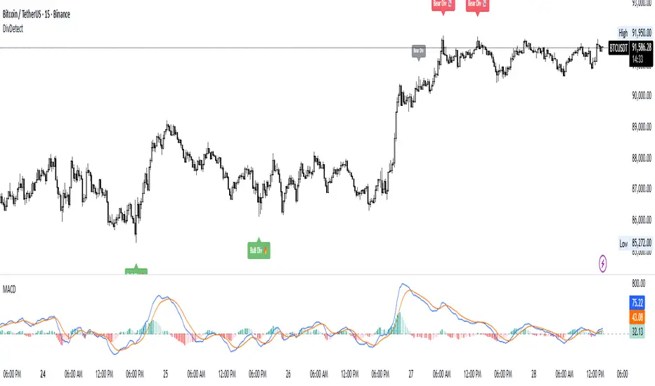
Divergence Detector (MACD + Volume)Divergence Detector (MACD + Volume Confirmation)
This indicator automatically detects bullish and bearish divergences between price and MACD, enhanced with volume confirmation to filter out weak signals.
🔹 Core Logic
Pivot Detection:
The script identifies swing highs and lows (pivots) using customizable left/right lookback values.
Bullish Divergence:
Occurs when price makes a lower low, but MACD makes a higher low.
A label "Bull Div" appears below the bar; if confirmed by high volume, it shows "Bull Div 🔥".
Bearish Divergence:
Occurs when price makes a higher high, but MACD makes a lower high.
A label "Bear Div" appears above the bar; if confirmed by high volume, it shows "Bear Div 📉".
Volume Confirmation:
The indicator checks whether the volume at the pivot bar is above the moving average of volume (customizable length).
This ensures that divergence signals are backed by strong market participation.
Inputs
MACD Fast/Slow/Signal Length – standard MACD parameters
Pivot Lookback Left/Right – defines the swing structure sensitivity
Volume MA Length – defines how volume strength is validated
Output
Labels:
🔹 Bull Div / Bull Div 🔥 → Bullish divergence (confirmed with volume)
🔹 Bear Div / Bear Div 📉 → Bearish divergence (confirmed with volume)
Tips
Works best on higher timeframes and trending markets.
Volume confirmation helps filter false divergences in low liquidity conditions.
Combine with trend or structure indicators for better trade setups.
----------------------------------------------------------------------------------------------
اندیکاتور شناسایی واگرایی MACD با تأیید حجم
این اندیکاتور بهصورت خودکار واگراییهای صعودی و نزولی بین قیمت و MACD را شناسایی کرده و با استفاده از تأیید حجم (Volume Confirmation) سیگنالهای ضعیف را فیلتر میکند.
🔹 منطق عملکرد
شناسایی پیوتها:
نقاط چرخش (سقف و کف) با استفاده از تعداد کندلهای قابل تنظیم در دو سمت شناسایی میشوند.
واگرایی صعودی (Bullish):
زمانی که قیمت کف پایینتر و MACD کف بالاتر میسازد.
برچسب "Bull Div" در زیر کندل نمایش داده میشود؛ اگر حجم بالا باشد، با علامت 🔥 مشخص میگردد.
واگرایی نزولی (Bearish):
زمانی که قیمت سقف بالاتر و MACD سقف پایینتر میسازد.
برچسب "Bear Div" در بالای کندل نمایش داده میشود؛ اگر حجم بالا باشد، با 📉 مشخص میگردد.
تأیید حجم:
اگر حجم در کندل پیوت بالاتر از میانگین متحرک حجم باشد، سیگنال معتبرتر در نظر گرفته میشود.
تنظیمات ورودی
تنظیمات MACD (Fast, Slow, Signal)
پارامترهای شناسایی پیوت (Left / Right)
طول میانگین متحرک حجم (Volume MA Length)
خروجیها
Bull Div 🔥 / Bear Div 📉 برای واگراییهای تأییدشده با حجم
Bull Div / Bear Div برای واگراییهای بدون تأیید حجم
نکات کاربردی
بهترین عملکرد در تایمفریمهای بالا و بازارهای دارای روند
تأیید حجم به حذف سیگنالهای اشتباه در شرایط حجم پایین کمک میکند
برای دقت بیشتر، آن را با اندیکاتورهای روند یا ساختار ترکیب کنید
⚠️ Disclaimer:
This script is provided for educational and informational purposes only.
It does not constitute financial advice, and the author is not responsible for any financial losses caused by its use.
Always confirm signals with your own analysis and other tools before making trading decisions.
⚠️ توجه:
این اسکریپت صرفاً جهت آموزش و اطلاعرسانی طراحی شده و توصیه مالی یا سرمایهگذاری محسوب نمیشود.
نویسنده مسئول هیچگونه ضرر یا زیان احتمالی ناشی از استفاده از آن نیست.
لطفاً پیش از هر تصمیم معاملاتی، تحلیل شخصی خود را انجام داده و از این ابزار در کنار سایر ابزارهای تحلیل و مدیریت ریسک استفاده کنید.
Dual MACD AccelerationDual MACD Acceleration Indicator – Synopsis
Purpose:
This indicator identifies early momentum shifts in the market by comparing a fast MACD (8/20/6) with a slower MACD (12/26/9). It highlights potential strong buy and sell signals when the faster MACD crosses the slower MACD, allowing traders to catch trend accelerations before the full move develops.
Components
Fast MACD (8/20/6)
Responds quickly to short-term price changes.
Detects early momentum shifts.
Slow MACD (12/26/9)
Captures the dominant trend.
Provides a smoother reference for comparison.
Acceleration Signals
Long (▲): Fast MACD crosses above Slow MACD → potential bullish acceleration.
Short (▼): Fast MACD crosses below Slow MACD → potential bearish acceleration.
Zero Line
Optional visual reference for overall trend direction.
Crosses above zero = bullish trend, below zero = bearish trend.
Key Features
Clean, minimal chart display.
Optional toggles to show/hide each MACD line.
Label markers indicate crossovers.
Built-in alert conditions for automated notifications.
Trading Use
Trend Confirmation:
Best used with higher timeframe filters (VWAP or EMAs) to avoid fakeouts.
Entry Timing:
Enter on the first pullback after a crossover signal.
Only trade in the direction of the dominant trend.
Stops & Risk:
Use recent swing lows/highs for stop placement.
TP levels can be structure-based or trailing with price momentum.
Synopsis Summary:
The Dual MACD Acceleration Indicator is a lightweight, early-momentum tool designed for scalpers and short-term traders. It captures fast shifts in trend by comparing a faster and slower MACD, highlighting strong buy and sell opportunities while remaining clean and easy to read. For higher accuracy, combine with trend filters like VWAP or EMAs.

Dual MACD📘 Dual MACD — Synopsis
The Dual MACD indicator displays two separate MACD systems inside the same pane, allowing traders to compare fast and slow momentum behavior simultaneously.
What It Includes
Two fully adjustable MACDs
MACD 1 default: 12 / 12 / 9
MACD 2 default: 8 / 20 / 6
Show/Hide Toggles so each MACD can be viewed independently or together.
MACD Lines, Signal Lines, and Histograms for both systems.
Clean layout with a compact panel title: “MACD x2”
What It Helps You See
Short-term vs. longer-term momentum shifts
Faster MACD reacting to quick trend changes
Slower MACD confirming or filtering signals
Trend strength, momentum acceleration, and crossover behavior in a single pane
Why It’s Useful
The Dual MACD gives you momentum confirmation, fakeout filtering, and multi-speed trend insight—making it valuable for scalpers, intraday traders, and swing traders who want to reduce noise and improve signal quality.
Smart Accumulation Pro – US SmallCap Edition v2
Smart Accumulation Pro v2 — US SmallCap Edition
Institutional Footprint and Structural Behavior Engine
Overview
Smart Accumulation Pro v2 detects structural behavior, internal liquidity shifts, and multi-phase accumulation footprints that are not visible through momentum or volatility indicators. The engine focuses on underlying institutional habits rather than reacting to price alone.
ULTRA — High-Threshold Structural Trigger
ULTRA appears only when multiple internal phases align simultaneously. It is not a momentum spike or volume anomaly. It represents compression pressure, phase readiness, and structural alignment. ULTRA does not repaint. When this signal appears, internal liquidity has already transitioned into an acceleration phase.
PRE — Early Structural Drift (Not a Buy Signal)
PRE should not be interpreted as a buy signal. It indicates gradual accumulation or controlled liquidity positioning. PRE usually appears during stable or quiet phases but rarely appears during panic drops or disorderly downtrends.
ACC — Transitional Footprint Signal
ACC identifies late-stage structural footprints. It is not intended as a standalone buy trigger. ACC highlights that structural preparation is underway, but direction and timing require user validation. ACC often precedes larger institutional behavior.
Philosophy
This engine does not attempt to cover every market pattern. It focuses on the highest-probability institutional habits. Exit timing, risk management, and execution remain user responsibility. The tool minimizes noise and emphasizes rare, high-impact structural zones.
Preset Modes
1) Conservative
For ETFs or stable large-cap instruments. Minimal noise and lower signal frequency.
2) Normal
Optimized for US mid-cap and small-cap behavior. Balanced and recommended as the default mode.
3) Aggressive
For volatile or thematic instruments. Higher frequency, higher risk.
Usage Notes
This indicator does not provide financial advice. It highlights structural conditions that often precede institutional movement. Execution and risk decisions depend on the user.
License Notice
Unauthorized copying, redistribution, or sharing is prohibited. Invite-Only access requires your TradingView username. One purchase equals one user license.
------------------------------------------------------------
Korean Summary (한국어 요약본)
------------------------------------------------------------
Smart Accumulation Pro v2는 세력의 습관, 유동성 이동, 압축 단계 등의 “보이지 않는 내부 구조”를 추적하는 지표다. 기존 모멘텀 기반 지표로는 포착되지 않는 패턴을 분석한다.
ULTRA 신호는 여러 내부 단계가 동시에 정렬될 때만 등장하는 극히 희귀한 트리거다. 페인팅이 없으며, 신호가 뜰 때 이미 내부 구조는 가속 단계에 진입한 상태다.
PRE는 매수 신호가 아니다. 세력이 서서히 움직이기 시작하거나 유동성을 재정렬할 때 나타나는 미세한 초기 흔적이다.
ACC는 본격 움직임 전에 나타나는 마지막 흔적이다. 단독 매수 신호가 아니며, 이후 더 큰 구조적 변화로 이어질 가능성을 나타내는 정도로 해석해야 한다.
이 지표는 모든 패턴을 잡지 않는다. 세력이 반복적으로 사용해 온 고확률 구조만 좁게 추적한다. 출구 전략과 리스크 관리는 사용자의 몫이다.
프리셋은 Conservative, Normal, Aggressive의 3가지 모드로 구성되며, 각각 안정형·균형형·변동성형 종목에 맞춰 설계되었다.
본 지표는 금융 조언을 제공하지 않으며, 무단 공유 또는 재배포는 금지된다. Invite-Only 기반이며 1인 1라이선스 방식이다.

QuantMotions - TPR Sentinel LineTPR Sentinel Line is an advanced adaptive Support/Resistance system that combines multi-layered trend analysis with a directional Time-Price Ratio (TPR) engine. The indicator dynamically builds a stabilized support or resistance line that adjusts to market volatility, trend strength, ATR expansion and contraction, and real-time slope changes.
This creates a high-precision, self-adjusting trend barrier that acts as support in uptrends, resistance in downtrends, and a neutral anchor during sideways phases.
Key Features
✔ Adaptive Trend Base
- A composite trend model blending:
- Kijun-style midpoint
- Donchian midline
- SMA & EMA smoothing
This creates a stable baseline that reacts smoothly but reliably to structural trend shifts.
✔ Directional TPR Calculation
The indicator measures slope across short, medium, and long trend windows, normalizes it with ATR, and determines:
- Trend direction
- Trend strength
- Momentum quality
✔ Dynamic Support/Resistance Line
Depending on trend direction:
- In uptrends → the line becomes adaptive support
- In downtrends → the line becomes adaptive resistance
- In neutral phases → the line centers around the smoothed trend base
A built-in lag factor prevents unrealistic jumps and keeps the level stable.
✔ Automatic Support/Resistance Zones
The indicator expands the main line into upper and lower zones based on ATR and trend strength, creating a dynamic volatility envelope around the trend structure.
✔ Signals & Alerts
- Support bounce
- Resistance rejection
- Breakouts above/below the dynamic line
These events help identify high-probability continuation or reversal moments.
✔ Information Panel
A real-time status table displays:
- Trend direction
- Trend strength
- Current S/R level
🎯 Ideal For
- Precision entries on pullbacks
- Detecting trend shifts earlier
- Identifying strong or weak trend phases
- Adaptive take-profit and stop-loss zones
- Filtering false breakouts
💡 Summary
TPR Sentinel Line gives you a living, breathing support/resistance structure that evolves with the market.
Instead of relying on static levels, you get a continuously adapting trend barrier that reflects real strength, real volatility, and real momentum.
A powerful tool for traders who want structure, clarity, and trend confidence.

EGGY SIGNALEGGY SIGNAL is a custom trading system designed to eliminate market noise and provide clean, high-probability entry signals. Unlike standard indicators that often give conflicting information, this script uses a Triple Confirmation Algorithm that works in the background.
The script combines three essential market elements:
Trend Filter: Determines the overall market direction to prevent counter-trend trading.
Momentum Detector: Identifies the speed of price movement.
Strength Validator: Confirms the power of the current candle.
How it Works: This indicator utilizes a "Clean Chart" philosophy. You will not see messy lines or clouds.
BUY Signal: Appears only when the Trend is Bullish, Momentum is shifting upwards, and Market Strength is confirmed.
SELL Signal: Appears only when the Trend is Bearish, Momentum is shifting downwards, and Market Strength is confirmed.
Features:
No Repaint: Signals are permanent once the candle closes.
False Signal Filtering: The algorithm automatically filters out signals during choppy/sideways markets.
Proprietary Settings: The input parameters are hardcoded and optimized for specific market conditions to ensure strategy integrity.
How to Use: Simply wait for the "BUY" or "SELL" label to appear. If no label is present, the market is considered neutral or too risky for entry.
