TradeChartist Drifter Lite™TradeChartist Drifter Lite is an adeptly designed, functional and a visual indicator that plots trend-following Auto-Fibs , based on user defined lookback length, and includes the Ichimoku Cloud to help visualize the Price action in relation to the Support and Resistance limits of the Auto-Fibs.
What are the Drifter limits and Drifter Auto-fibs based on?
Drifter limits are based on the highest and lowest of the open/close values of the user defined Drifter Length (Default - 144).
These limits form the 0% and 100% Fib retracements, which help derive the 23.6%, 38.2%, 50%, 61.8% and 76.4% Auto-Fib plots of the Drifter.
Why is the Kumo of the Ichimoku included in the Drifter?
When the price enters the oversold/overbought zones of the Auto-Fibs towards the 100% retracement zones, the price could either come back to test the mean or follow the trend which becomes hard to predict without a secondary confirmator. Kumo cloud helps visualize the trend in relation to it and helps traders make an informed trade decision.
Users can use any of their favourite secondary confirmator like RSI, Stoch, MACD in addition to the cloud to further strengthen their decision.
How does the coloured bars help visualize the price action?
Drifter includes optional coloured bars which paint the price bars with the Bull/Bear strength based on the Drifter length.
The coloured bars help visualise the Bull/Bear power hold and also helps spot visible exhaustion which is a useful feature and acts as a good confirmator too.
Coloredbars

Bollinger Band Color BarsThis is a simple addition to the built in Bollinger Bands script. All it does is replaces the traditional plotting of Bollinger Bands with color bars.

Simple Hull MAA simple code to plot Hull MA with colour coding of plot fill and price bars based on strength.

Heatmap Volume [xdecow]This indicator colors the volume bars and candles according to the volume traded. The calculation of the heat map zones is done as follows:
how many standard deviations the volume are distant from the average volume?
For a better visual experience, place the borders and wicks of the candles in a neutral color.

TradeChartist Spotter ™TradeChartist Spotter is a extremely well designed Trader's toolkit that packs a range of trading indicators like MACD, RSI, MA/MA-Crosses and Price-Volume Trend Oscillator, along with visual trade spotting tools like Symbol Tracker, MACD Trend Shadow plot and Coloured Bars, including a handy information Dashboard.
===================================================================================================================
™TradeChartist Spotter Features:
1. MACD
MACD is an essential indicator for any trader to track trend strength and momentum of asset prices. Spotter offers 3 MACD options - SMA, EMA and Zero-Lag EMA . Since MACD is based on moving averages, it is inherently a lagging indicator and may not work well when there is no trend strength or when the market is choppy. It is for this reason Spotter offers the option of Overall Trend Shadow and also the option to display Zero-Lag Trend Shadow on normal MACD based on SMA or EMA. This is based on the average of MACD and Signal plots.
Spotter's default MACD settings are 13/34/13, but this can be changed to the classic settings of 12/26/9 and the user can enable or disable the various elements of the MACD based on their preference.
The Dashboard on the MACD Spotter offers information on the symbol tracked, settings used and also the close price of the asset. This is really useful especially when tracking a different symbol than the current price chart symbol. Note that the actual MACD plot also will be of the symbol tracked if it is not the same as price chart symbol.
Using Zero-Lag Trend Shadow on normal SMA/EMA MACD histogram helps spot trend changes early. It is recommended to test different MACD settings on asset traded to suit trading style and frequency.
If MACD Histogram is disabled to see the Overall Trend better, make sure to switch back on as it should not be confused with the main MACD histogram which tracks the distance between the MACD and Signal plots.
2. RSI
RSI is the classic technical indicator that helps track the price magnitude and velocity of the asset's price movement. It helps spot Oversold and Overbought areas easily as it oscillates between 0 and 100, even though values below 10 and values above 90 are almost never seen. By using a upper band and a lower band plot, it is possible to track the strength of the up or down move.
Spotter's default RSI settings are ohlc4/14/5. EMA smoothing of 5 is used to eliminate the noise, but these can be changed to suit user's preference. The default Upper Band is 60 and Lower Band is 40 in the settings, as price moves above 60 RSI tend to be bullish and price moves below 40 tend to be bearish. This can be changed to 70/30 or 80/20 etc. based on how RSI is being used by the user.
RSI strength can also be visualised on the price bars using Spotter's Coloured Bars. The bar colours can be inverted to help traders see the price action differently.
RSI Dashboard also helps track another symbol, it's RSI value and close price to help the user track another symbol on the same chart. Note that the actual RSI plot also will be of the symbol tracked if it is not the same as price chart symbol.
3. MA/MA-Crosses
Two Moving averages (SMA, EMA or Zero-Lag EMA) can be plotted with MA Crosses using the MA/MA-Crosses Spotter.
The MACD input of Fast MA Length and Slow MA Length is used to plot the MA's. To plot just one MA, same value can be entered in both MA length boxes in the settings.
The plots can be merged with the main price chart by using Move Pane Above and by merging the scales into one.
The Dashboard also helps track another symbol, it's MA plots and close price to help the user track another symbol on the same chart. Note that the actual MA plots also will be of the symbol tracked if it is not the same as price chart symbol.
4. Price-Volume Trend Oscillator
Spotter converts the Price Volume Trend (PVT) into an Oscillator, as it helps spot divergences and makes it easy to plot PVT strength as coloured bars on main price chart.
No user input required for this Oscillator plot. Note: Some Symbols don't have volume information and hence PVT Oscillator will not work on them.
PVT Oscillator Dashboard displays current bar volume (if available) along with the close price. Similar to other plots in the Spotter, the Oscillator is of the symbol tracked if its not the same as price chart symbol.
5. Useful Extras
Coloured Bars - Paints price bars with strength and intensity based on indicator used. Bar Colours can be inverted by enabling Invert Bar Colors option from Spotter settings.
Five Colour Themes - Classic, Acute Classic, Effulgence, Firefly and Hallucination
Background colour - Same as bar colour strength, but painted subtly in the indicator background.
===================================================================================================================
Note:
Alerts can be created using the name of the plot under Alert Condition for Spotter - ™TradeChartist crossing above/below etc based on the type of alert the user wants to get.
The indicator does not repaint. Alerts may display potential repaint warning, but this is because the code uses bar index for the Dashboard. For confidence in the indicator, it can be tested using bar replay to make sure the real-time and bar replay trade entries and plots stay on the same bar/timestamp.
™TradeChartist Spotter can be connected to ™TradeChartist Plug and Trade (Premium Script - not free) to generate Trade Entries, Targets, Sop Loss plots etc and to create all types of alerts. Example chart below using LINK-USDT.
===================================================================================================================
Example Charts
1. BTC-USDT 1 hr chart showing MACD with classic settings 12/26/9 on top pane with normal Overall Trend Shadow and the bottom pane with exact same settings with Zero-Lag Overall Trend Shadow.
2. XAU-USD 4 hr chart showing MACD (13/55/34) using Zero-Lag EMA.
3.ADA-USDT 1 hr chart with Price-Volume Trend Oscillator - Useful for confirming divergences and trade decisions based on volume.
4. SPX 15m chart with RSI (ohlc4,14,5) in bottom pane and 5/34 MA cross Spotter on Price Chart with Dashboard.
5. GBP-USD 1 hr chart with Spotter tracking MACD (13/89/34) of DXY (Different Symbol from GBP-USD on chart)
===================================================================================================================
Best Practice: Test with different settings first using Paper Trades before trading with real money
This is a free to use indicator.
===================================================================================================================
Simple RSI Spotter™TradeChartist Simple RSI Spotter is an elegant version of the classic RSI indicator and helps spot price trends using visually engaging and appealing RSI plot and background. The Bull and the Bear background fills are highly useful for traders who like to visually understand areas of entry and exit based on RSI .
===================================================================================================================
What does Simple RSI Spotter do?
Plots RSI with visually engaging colours for Bull and Bear zones (Green and Red) with optional background fill.
Plots RSI coloured bars on main chart based on user preferred Upper and Lower RSI band.
Plots RSI based on Zero-Lag EMA smoothing (1 for Regular RSI without smoothing).
Plots Heikin Ashi RSI if enabled from indicator settings.
Plots RSI highs of Bull Zone and RSI lows of Bear Zone. Helps visually spot divergences.
===================================================================================================================
Note:
Default Settings:
5 period EMA Smoothed Heikin Ashi RSI.
For normal RSI, uncheck, Heikin Ashi RSI and change EMA RSI Smoothing to 1.
===================================================================================================================
This is a free to use indicator.
===================================================================================================================
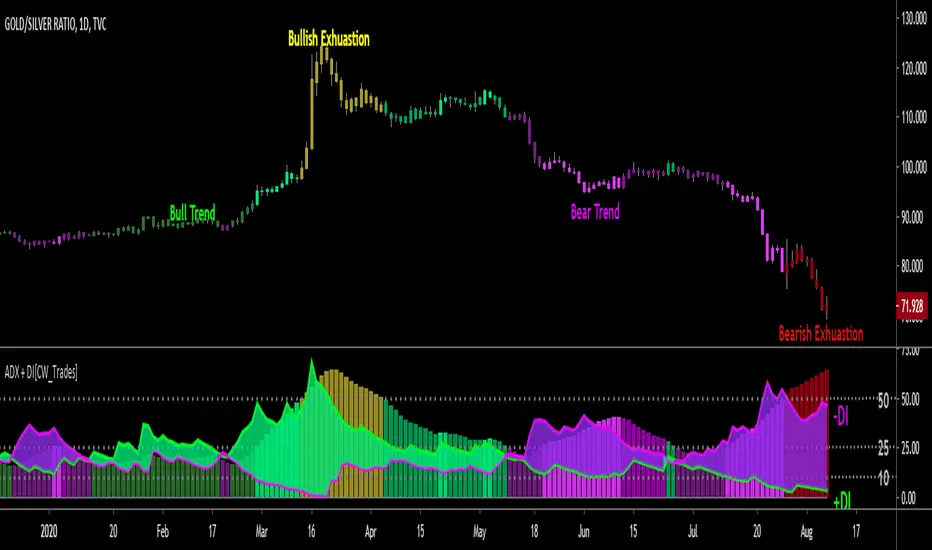
ADX + DI w/ Colored Candles [CW_Trades]The Average Directional Index (ADX) is a technical analysis indicator used to determine price trend and price strength by comparing current price to recent price history. The price trend can be either up or down(bullish/bearish), and this is shown by two accompanying indicators, the Negative Directional Indicator (-DI, purple line) and the Positive Directional Indicator (+DI, green line) which compare price highs to price lows on a 14-period lookback. The strength of the trend is shown by the histogram in the background and also utilizes a 14-period lookback in its calculation.
When the +DI is trending above the -DI it indicates a short-term bullish trend in price. If the histogram is rising while the +DI is above the -DI it indicates strength in the bullish trend. If the histogram is declining while the +DI is above the -DI it indicates weakness in the bullish trend.
When the -DI is trending above the +DI it indicates a short-term bullish trend in price. If the histogram is rising while the -DI is above the +DI it indicates strength in the bearish trend. If the histogram is declining while the -DI is above the +DI it indicates weakness in the bearish trend.
When the +DI is above the -DI the histogram will be colored shades of green. When the -DI is above the +DI the histogram will be colored shades of purple.
The ADX has 3 key levels to watch, and they are 10, 25 and 50.
-When the ADX histogram bars are below 10 it indicates no identifiable strength in the price trend, or neutral. The histogram bars will be colored gray when the ADX is below 10.
-When the ADX histogram bars are between 10 and 25 it indicates a weak trend in price. The histogram bars will be shades of dark green or dark purple when in this zone.
-When the ADX histogram bars are above 25 and below 50 it indicates a strong trend in price. The histogram bars will be shades of medium green/purple or bright green/purple when the ADX is between 25
and 50. Bright green or bright purple indicate that the current histogram bar is higher than the preceding histogram bar, medium shades of either green or purple indicate that the current histogram bar is
lower than the preceding histogram bar. The brighter the shade of green or purple, the stronger the trend.
-When the ADX histogram bars are above 50 it indicates potential trend exhaustion. When the +DI is above the -DI and the ADX is above 50 the histogram will be colored yellow which indicates a potential
end of the bull trend. When the -DI is above the +DI and the histogram bars are above 50 the histogram will be colored red which indicates a potential end of the bearish trend.
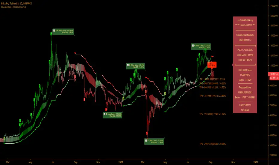
TradeChartist Chameleon™TradeChartist Chameleon is an exceptionally beautiful trend following indicator (visualised using Chameleon plot) based on Momentum and Volatility using User input of Chameleon Mode and Risk factor (ATR multiple) to generate Trade Opportunities.
===================================================================================================================
™TradeChartist Chameleon Features
Minimal user input of Chameleon Mode Selection from (Aggressive, Normal and Laid Back) and Chameleon Risk Factor (Min - 1, Max - 5 of ATR Multiple).
---> For Higher Timeframes, lower Risk Factor is recommended (Max - 3) as the trading range can be high based on Volatility.
---> For Lower Timeframes, higher Risk Factor can be used (Normal or Laid Back Mode) based on asset price volatility.
Comprehensive Chameleon Dashboard with useful information like Real-time Gains Tracker , User settings and general trade information. Dashboard can be customised based on user preference from Chameleon Settings.
Automatic Targets based on Trade.
Option to paint Price Bars to help identify Price Trend.
Option to display Profit Taking Bars (enabling this from settings will paint $ signs where Profit taking is recommended).
Option to color background based on trade type.
Alerts can be created for Long and Short Entry Signals using "Once per Bar" as Trade Entries are generated only upon confirmation (previous candle close below/above Chameleon Trigger line).
===================================================================================================================
How to create Alerts for ™TradeChartist Chameleon Long and Short Entries?
Alerts can be created for Long or Short entries using Once Per Bar as BUY and SELL labels appear with entries only on confirmation after bar close.
Does the indicator include Stop Loss and Take Profit plots?
This script doesn't have Stop Loss and Take Profit plots, but it can be connected to ™TradeChartist Plug and Trade as Oscillatory signal (" Chameleon ") to set StopLoss and Take Profit plots and to create all types of alerts too.
Does this indicator repaint?
No. This script doesn't repaint as it confirms its signals only after close above/below Chameleon Trigger line and also uses security function to call higher time-frame values in the right way to avoid repainting. This can be verified using Bar Replay to check if the plots and fills stay in the same bar in real time as the Bar Replay.
===================================================================================================================
Best Practice: Test with different settings first using Paper Trades before trading with real money
===================================================================================================================
This is not a free to use indicator. Get in touch with me (PM me directly if you would like trial access to test the indicator)
Premium Scripts - Trial access and Information
Trial access offered on all Premium scripts.
PM me directly to request trial access to the scripts or for more information.
===================================================================================================================
Ultimate VolumeThis script can display a lot of different volume statistics. It also colours bars depending on a chosen, customisable criterion. Most options are disabled by default and can be reenabled in the settings menu.
FAQ
Why are the bars slightly higher than the default volume bars?
Due to the limitations of Pinescript.
What are the two last values (including the one in white?)
They're there due to the limitations of Pinescript. It used to be possible to prevent certain values from being plotted, but still display them as indicator values, but the functionality of that option was changed and is now WIP so until it's restored, these values are necessary to scale the bars properly.
Why are the percentages formatted as volume?
Due to the limitations of Pinescript.
Why are there so many options?
I don't know. They sort of happened. But you don't have to switch them on.
What is money volume?
It's an average of the bar price multiplied by the bar volume .
Why does the daily average volume display different values than the standard sma volume?
Because mine doesn't take into account the current day. So it doesn't fluctuate intraday. Which, I think, makes more sense.
What is total volume?
It's a sum of the total volume for that day and is reset on the next. This option only works with intraday timeframes.
What is average 1 bar intraday volume?
It's the average volume for 1 intraday bar, based on the current day's values only. Obviously, it only works intraday and changes dynamically. It's not an SMA , it's a simple average of all bars for a given day.
What is all-time 1 bar intraday volume?
It's the average volume for 1 intraday bar, but based on the whole chart's history. It's impossible to select a length for this, again, because of certain limitations.
What is short volume?
It is approximately 1/3rd of the actual short volume , due to the limitations of FINRA. It's multiplied by 3 in the script and it may be not entirely accurate. The short volume % is calculated differently, using the 1/3rd of short and total volume from FINRA.
What are the default threshold values?
They are 150%, 200%, 1000% of the average for the average bar volume and all-time average bar volume options, 10%, 50%, 100% for the average daily volume option and 100K, 500K and 1M for the volume option.

RSI & Volume Coloured BarsCandles get darker when volume is high, and brighter when volume is low. They are red or green depending on whether the RSI is above or below a threshold value, or alternatively you can pick a more vanilla coloring based on current close vs last close or last open.
For personal use as I enjoy the aesthetics of it. The more solid RSI coloring helps highlight the brightness variations from changing volume and makes trends crystal clear.
Inspired by "Volume Based Coloured Bars" by KivancOzbilgic:
and by and by RSI bars chart by taskman9:
TradeChartist Plug and Trade™TradeChartist Plug and Trade is an extremely useful indicator that can be connected to almost any Study script (not a Strategy) on Trading View (with an Oscillatory or Non-Oscillatory Signal plot) to generate Trade Signals with Stop Loss plot, user set or automatic Target plots and create Alerts based on Past Performance, determined by Past Gains/Drawdowns for each Trade. The indicator is packed with a lot of features including TradeChartist's signature Dashboard and Real-time Gains Tracker, Automatic Targets Generator, Take Profit recommendation, option to paint price bars based on Trade/Price Trend, 3 types of Stop Loss plots to choose from, with option for user to set fixed Target to take profits.
1. How does ™TradeChartist Plug and Trade connect to another Study script/indicator signal?
Plug and Trade is elegantly designed with simplicity in mind, without compromising on functionality, so any trader - beginner to advanced, can just plug an external signal to the indicator with ease by just following these simple steps.
Add to price chart, the Indicator along with the signal plot to be tested and assessed for performance.
Plug the signal into ™TradeChartist Plug and Trade by choosing it from the Plug Signal Here drop-down.
Choose Signal type as Oscillatory if signal oscillates between set values or crosses a certain value periodically (Example: RSI, CCI, TRIX etc that are mostly not overlayed on Price chart and may be in a separate pane from price chart as it may not fit on Price scale), Choose Signal Type as Non Oscillatory if the signal can be plotted on price scale and Trades are normally generated when price crosses above or below it (Moving Averages, SAR indicators like SuperTrend, etc.).
For oscillators, default Oscillator value for Trade Signals is 0 as most Oscillators have 0 as their mid point. The value can be changed if the Signal doesn't oscillate with 0 as its mid point. For example, if the connected Signal is RSI, the values can be changed to Upper and Lower band values to generate Trade Signals.
Plot the Signal on chart if the signal is Non Oscillatory.
2. How can the plugged Signal's performance be assessed using ™TradeChartist Plug and Trade and subsequently used for generating Trade Entries and to create Alerts?
Once the Signal is plugged into the indicator based on steps above, Plug and Trade automatically plots the Trade entries based on the Signal type.
Plot Trade Entries after Bar Close from settings can be checked for signals that do not confirm until bar close. By doing this, repainting can be avoided for most signals and true performance can be assessed. Also, alerts can be created using Once Per Bar rather than Once Per Bar Close .
The real-time Gains Tracker and Dashboard are useful in tracking gains and other useful indicator values like RSI, Stoch, ATR and EMA in real-time with price movement.
Enabling Past Performance from settings will plot Maximum Gains achieved and Maximum Drawdown for each trade as labels . Trading View only plots finite number of labels and old labels are deleted automatically. But to access past performance beyond the last available label, bar replay can be used.
User can choose from 3 types of Stop Losses from the settings - Fixed %, Trailing % and ATR Stop Loss namely and a Fixed TP % to create plots on price chart and to create alerts.
If the user prefers automatic targets based on Trade entries, Recommend Targets can be enabled from the settings. The automatic targets are generated at the time of Trade Entry, along with Target prices and % which turn green when hit.
Each BUY and SELL Trade are tracked in its entirety and the highest high since BUY and lowest low since SELL are plotted on the price chart and also displayed on the Plug and Play Dashboard
Choppiness can be easily spotted if there are numerous Past Performance labels or several Trade Entries around a short timeframe on chart. This may mean that the signal needs smoothing or may not be suitable for the asset to trade on the chart timeframe. Suitability of a Study script for the asset can be determined in many ways using this indicator.
3. What other features are included in ™TradeChartist Plug and Trade?
Enabling Spot Price Bars to take Profit option from settings automatically plots $ sign above/below candles where Profit taking is recommended or Stop Loss moved to secure profits/reduce loss.
Enabling Paint Price Bars with Trade Trend paints price bars with colors that help picture Trade/Price trend. Trend spotting using this works best with (bars/hollow candles/candles with no border) on dark background.
Both features work on Price chart even without any Signal plugged in.
===================================================================================================================
Example Charts using different Signals plugged into ™TradeChartist Plug and Trade
1. RSI Signal (Oscillatory) plugged in with >60 for BUYs and <40 for SELLs - BTC-USDT on 1hr
2. PowerTracer Signal (Oscillatory) plugged in - GBP-USD 1hr
3. 55 period VWMA Signal (Non Oscillatory) plugged in - ADA-USDT 4hr
4. RSI Signal (Oscillatory) plugged in with >70 for BUYs and <30 for SELLs - SPX 1hr with Trailing SL - 3% and TP - 2%
===================================================================================================================
This is not a free to use indicator. Get in touch with me (PM me directly if you would like trial access to test the indicator)
Premium Scripts - Trial access and Information
Trial access offered on all Premium scripts.
PM me directly to request trial access to the scripts or for more information.
===================================================================================================================

BEST Cloud ALL MAHello traders
Hope you're all doing well
This script is a generic cloud generator using a pre-selected set of moving averages (I probably forgot a lot but listed all the ones I used at least once).
A cloud is a visual representation of the gap between two moving averages - it shows right away how big in that gap (=how far they are from each other)
The challenge is to find a cloud such as the price often stay stuck between those 2 MA - and when it's getting finally out (up or down), it would be strong enough to signal a beginning of a trend.
This is a cool intellectual challenge for all aspiring traders
For that script, I defined a trend according to how the 2 MAs are located relative to each other (MA1 > MA2 or MA1 < MA2) and if the price gets out of the cloud.
You'll get :
- the option to color the candles based on a trend
- cool triangles entry signals
- and alerts on those triangles
All the BEST
Dave

Chop FilterIt is common knowledge that most traders lose money by leaving trends too early and not letting profits run. Chop Filter attempts to paint over wrong-colored candles which might psychologically cause traders to bail off the trend. It also tries to detect potential trend reversals (experimental).
How it works. Chop Filter highlights wicks with a shaded background based on close relative to a volume-weighted moving average (vwma). If it closes up, or if there are higher lows, it shades the background blue. If it closes down, or there are lower highs, it colors the background red. Finally, it shows a big arrow indicating the direction prices are headed, based on the vwma. The arrow helps me to consider where prices might go, and play out different scenarios, rather than being a true prediction. In fact, it is often wrong when there is a lot of volatility, which can also be a good thing.
I find the shaded background has a calming effect that reduces stress. It also helps identify trends in the wicks that are otherwise difficult to see.
There are some other options to play with, such as highlighting narrowing or widening price action in yellow or optionally showing the vwma .
Have fun!


Trend Channel [Gu5]SMA 200 determines the trend
Bullish trend, green candles. Down trend, red candles.
If the market value is narrow to the SMA200 channel, yellow candles.
Setting recommended for SMA Range
BTCUSD = 100
EURUSD = 1000
SPX = 100
ETHUSD = 10
nTrend ULTIMATEHello traders
With this fabulous script, you can color the candles based on the indicator and timeframe you want
You can only apply one indicator at a given time obviously
The list of indicators are the following:
- Price vs Moving Average : if price is above, bullish color, if price is below, bearish color
- Trend Signal : if the Trend signal is pointing upwards, bullish color, if the Trend signal is point downwards, bearish color
- Supertrend : if supertrend is below the price, bullish color, if supertrend is above the price, bearish color
- MACD : if MACD is positive, bullish color, if MACD is negative, bearish color
- MACD ZERO LAG : if MACD ZERO LAG is positive, bullish color, if MACD ZERO LAG is negative, bearish color
- MM Cross : if MM cross is bullish , bullish color, if MM cross is bearish , bearish color
- Ichimoku: if price is above the cloud, bullish color, if price is below the cloud, bearish color
Hope you'll like it
Please feel free to comment to ask me to add any other indicator you like or simply to say how much you love it.
Positive vibes are always appreciated and will encourage me to give you more free content.
Dave

CCI Highlighted [ankit4349]>> This script is purely based on Commodity Channel Index (CCI) with multiple CCI instances being used within one oscillator.
>> User can use as much as 5 CCI instances/plot within one oscillator.
> How to use :
1. When Bullish :
Whenever CCI length 14 crosses above -100(negative 100) that means bullish momentum is supported.
Best bullish/long entry would be when CCI length 14 crosses above -100(negative 100) as mentioned above and at the same time CCI length
200 is bouncing on top of +100(positive 100).
2. When Bearish :
Whenever CCI length 14 crosses below +100(positive 100) that means bearish momentum is supported .
Best bearish/short entry would be when CCI length 14 crosses below +100(positive 100) as mentioned above and at the same time CCI length
200 is bouncing at bottom of -100(negative 100) .
> Color Clarity :
a. Bullish support is highlighted GREEN and bearish support is highlighted RED within the oscillator background with respect to
Length 1 (i.e 14 by default) .
b. PURPLE is highhighted when Length 5(i.e 200 by default) is bouncing either on top of +100(for bullish) or at bottom of -100(for bearish).
c. AQUA is highlighted when Length 3(i.e 50 by default) is bouncing on top or at bottom of 0 from either side respectively.
d. Best entry in both cases i.e bullish or bearish as mentioned above('How to use') is highlighted WHITE by default.
> Tip:
Just observe the color outputs on any timeframe in a chart as it works fractally on every timeframe , it will help you understand better with
clarity.
> You are always free to experiment with the CCI lengths, change highlighted color and hide/unhide the Lengths as per your requirements in
setting/format .

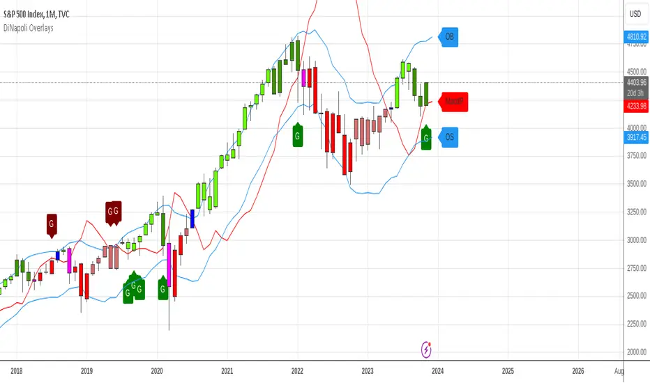
DiNapoli Bundle Overlay (4-in-1)DiNapoli Overlays 4-in-1 is a Bundle that includes the 4 studies used by DiNapoli in the price chart in just 1 single indicator :
DiNapoli Color Candles
DiNapoli MACD Predictor (MacdP)
DiNapoli Oscillator Predictor (OscP)
DiNapoli DMAs
This Bundle version includes the following features :
Ability to select multiple Overlay Studies to be plotted: Colored Candles, MacdP, OscP, DMAs
Show/Hide each indicator
Show/Hide each DMA
Plot Stop Grabbers
Set OB/OS Oscillation Period
Set OB/OS Factor Ratio to each Market
Show OB/OS Levels
Show Preceding OB/OS Cloud
For convenience it also includes Custom Alerts . Now it is possible to get alerts on:
Signal DiNapoli Cycle Shift
New DiNapoli Bull Cycle
New DiNapoli Bear Cycle
Signal DiNapoli Cycle Strength
DiNapoli Bull Cycle Strength
DiNapoli Bear Cycle Strength
Signal DiNapoli Cycle Weakness
DiNapoli Bull Cycle Weakness
DiNapoli Bear Cycle Weakness
MACDP Cross
MACDP Bullish Cross
MACDP Bearish Cross
Stop Grabber
Bullish Stop Grabber
Bearish Stop Grabber
OverBought Condition
Entering OverBought Condition
Exiting OverBought Condition
OverSold Condition
Entering OverSold Condition
Exiting OverSold Condition
DMA Cross
Bullish DMA Cross
Bearish DMA Cross
This indicator is meant to be used by professional traders.
If you would like to subscribe , please send me a private message.
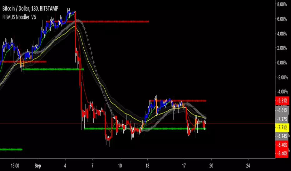
FIBAUS Noodler V6Named by my daughter, because of its early look like a bowl of noodles,the noodle analysis does a Harmonic and Fibonacci Analysis on price as it moves through time.
FEATURES
1.RESISTANCE AND SUPPORT - Finds Hidden and Fibonacci based R&S Levels, to assist with buying and selling targets.
2.SENTIMENT INDICATOR-A measure of human confidence and fear as it relates to price.
3.BANKERS GOLDEN NOODLE - A very specific institutional (banks, investment firms etc) calculation.
4.COLORED BARS - To show uptrend, uncertainty and downtrend.
Blue - Up-Trend/Breakout -(BUY/LONG)
Orange - Potential Trend reversal
Red - Downtrend (SELL/SHORT)
5.ALL markets anytime timeframe-(stocks, crypto, forex, futures ) application
FOR TRIAL ACCESS - 1. Follow me, 2. Like the script 3. Message me the words “I WANT IN NOW”.
BUY SIGNALS - 1.When Rapid Price Direction line crosses up the Sentiment Indicator
2.When Rapid Price Direction line crosses up the Bankers Golden Noodle
3. Candles Turn From Orange to Blue
SELL SIGNALS - 1.When Rapid Price Direction line crosses down the Sentiment Indicator
2.When Rapid Price Direction line crosses down the Bankers Golden
Noodle.
3. Candles Turn From Orange to RED
PRO Tips: 1. Remove candle borders for better visual of colored candles.
2. Make the Sentiment Line Transparent for less color on the chart
(Step 1:Double click on the script after applied to chart)
(Step 2:Click Inputs at the top of the menu and check the Color box)
3. Two more PRO BUY and SELL Techniques for free private chat members only.
FOR TRIAL ACCESS - 1. Follow me, 2. Like the script 3. Message me the words “I WANT IN NOW”
Happy Trading,
FIBAUS
Kozlod - Heikin-Ashi Bar Color Change AlertsYou can use this script to setup alerts on Heikin-Ashi bar color change.
You have to apply this script to usual candles and not Heikin-Ashi!!!
Background color indicates HA bar color. On change you'll see green/red arrows and alert will be fired.
Also you can find in the code calculations of all HA OHLC values.

CCI Colored Candles / Bars w/ HistogramColor of your candles matches your CCI with Histogram indicator and trend line. CCI EMA or SMA based option, traditional or modern formula calculation options ect. Can change Length, source, Trigger Lines, colors of candles and histogram and more
The CCI compares the current price to an average price over a period of time. The indicator fluctuates above or below zero, moving into positive or negative territory. While most values, approximately 75%, will fall between -100 and +100, about 25% of the values will fall outside this range, indicating a lot of weakness or strength in the price movement.
A basic CCI strategy is used to track the CCI for movement above +100, which generates buy signals, and movements below -100, which generates sell or short trade signals. Investors may only wish to take the buy signals, exit when the sell signals occur, and then re-invest when the buy signal occurs again.
The CCI compares the current price to an average price over a period of time. The indicator fluctuates above or below zero, moving into positive or negative territory. While most values, approximately 75%, will fall between -100 and +100, about 25% of the values will fall outside this range, indicating a lot of weakness or strength in the price movement.
When the CCI is above +100, this means the price is well above the average price as measured by the indicator. When the indicator is below -100, the price is well below the average price.
1 CCI strategy is used to track the CCI for movement above +100, which generates buy signals, and movements below -100, which generates sell or short trade signals. Investors may only wish to take the buy signals, exit when the sell signals occur, and then re-invest when the buy signal occurs again.
Long-term chart is used to establish the dominant trend, short-term chart establishing pullbacks and entry points into that trend. A multiple timeframe strategy is commonly used by more active traders and can even be used for day trading, as the "long term" and "short term" is relative to how long a trader wants their positions to last.
When the CCI moves above +100 on your longer-term chart, this indicates an upward trend, and you only watch for buy signals on the shorter-term chart. The trend is considered up until the longer-term CCI dips below -100.
When using a daily chart as the shorter timeframe, traders often buy when the CCI dips below -100 and then rallies back above -100. It would then be prudent to exit the trade once the CCI moves above +100 and then drops back below +100. Alternatively, if the trend on the longer-term CCI turns down, that indicates a sell signal to exit all long positions.
When the CCI is below -100 on the longer-term chart, only take short sale signals on the shorter-term chart. The downtrend is in effect until the longer-term CCI rallies above +100. The chart indicates that you should take a short trade when the CCI rallies above +100 and then drops back below +100 on the shorter-term chart. Traders would then exit the short trade once the CCI moves below -100 and then rallies back above -100. Alternatively, if the trend on the longer-term CCI turns up, exit all short positions.
Make the strategy more stringent by only taking long positions on the shorter time frame when the longer-term CCI is above +100. This will reduce the number of signals, but will ensure the overall trend is very strong.
Entry and exit rules on the shorter timeframe can also be adjusted. if the longer-term trend is up, you may allow the CCI on the shorter-term chart to dip below -100 and then rally back above zero (instead of -100) before buying. This will likely result in a paying a higher price, but offers more assurance that the short-term pullback is over and the longer-term trend is resuming.

Volume Strength Candles / Colored BarsIs Price Action Higher or Lower on STRONG or WEAK VOLUME from lookback
(Strong or Weak Bulls // Strong or Weak Bears)
Candles / Bars Indicate the Following (default 13 period lookback / Length)
MAROON Bear Candle with STRONG VOLUME more than 150% of the lookback / length (13 default), STRONG Bear Candle Confirmed With Volume
RED Bear Candle while VOLUME is BETWEEN 50% & 150% of the Lookback / Length (13 default), Neutral Bear Volume Neither strong or weak
ORANGE Bear Candle with WEAK VOLUME (Less than 50% of the Length / Lookback)
DARK GREEN Bull Candle with STRONG VOLUME MORE than 150% of lookback
GREEN Bull Candle with Neutral VOLUME BETWEEN 50% & 150% of the lookback / Length
AQUA Bull Candle with WEAK VOLUME less than 50% of the Lookback
Is price confirmed by volume?
Can Change the Lookback / Length from 13
Can Change the Colors and Transparency to easily see based off your chart background colors I recommend ZERO Transparency to easily identify volume strength (i use white background but many use black or other)

[MV] %B with SMA + Volume Based Colored Bars
Entry Signal when %B Crosses with SMA and this is more meaningful if it supports colored bars.
Black Bar when prices go down and volume is bigger than 150% of its average, that indicates us price action is supported by a strong bearish volume
Blue Bar when prices go up and volume bigger than 150% of its average, that indicates us price action is supported by a strong bullish volume
VBC author @KIVANCfr3762