Expansion Finder by nnamWhat this Indicator Does
This indicator helps the trader locate expansion and contraction areas in an easy visual way.
When the asset moves from a contraction phase into an expansion phase, the bars change color (customizable). This allows the trader to recognize areas of contraction and avoid trading them. Once a Bar Range moves outside of the average range as specified by the user, the bar will change color informing the trader that the current bar and by default the market, is moving into an expansion phase from a contraction phase.
The indicator works well for those traders that use the Forex Master Pattern to locate Value Lines and Value Areas on the chart giving them an opportunity to draw in these areas with ease.
As shown in the screenshot below, the boxes are manually drawn after the trader locates an easily identifiable area of contraction.
The Indicator makes it easy to find longer areas of contraction and ignore the noise of smaller contractions.
Customizable Settings allow the trader to define the lookback range that determines the number of bars to base the average.
A "multiplier" setting allows the trader to easily adjust the Average by changing the average using a simple calculation.
Example, if the average multiplier is set to "1", the average will be used.
Using the standard average is not always the best way to define these contractions, so traders can set the average to a higher or lower number by using the multiplier, thus changing the calculation but maintaining a consistent number across the chart.
Example: If the average is not plotting the contraction correctly, the trader can manually adjust the multiplier down to 0.5 thus adjusting the average in half or increase the multiplier to 2 thus doubling the average.
As seen in the screenshot below, this changes the number of expansion bars visible on the chart.
Below you can see Value Areas and Value Lines drawn in. These lines assist the trader in defining important levels for future trading.
I hope this Indicator helps you locate value areas and value lines on charts in an easy way.
Any questions or concerns or suggestions, please do not hesitate to reach out.
Happy Trading !!!!
Expansion
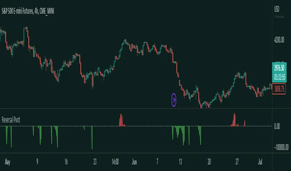
Reversal Pivot
Overview
Introducing the Reversal Pivot indicator - a tool for identifying potential reversal points in price. This algorithm takes into account multiple factors, including price action, volume, and pivot points, to give you a clear and accurate picture of where the market is heading to.
How it works
The indicator gets expansions and the highs and lows and uses the conditions along with pivots to determine whether a reversal is possible or not. Then it gets the volume to determine how strong this chance of reversal is.
How to use
The Reversal Pivot indicator alone shouldn't be used to find reversal points but it helps you get a clear insight on where possible reversals could happen for example, you could use it with mean reversion strategies to find the best entries.
Red bars signal a bearish reversal
Green bars signal a bullish reversal
This here is an example of a long entry if you are trading lets say the mean. You can wait for a bullish reversal on the Histogram plot and then enter, a reversal could happen.
This is an example of a short entry if you are also trading the mean.
Other features
This indicator allows you to customize the colors, and the histogram. If you don't like the histogram then you can change its plot style to whatever you would like.
Try the Reversal Pivot indicator today and find more possible reversal points!
Stockbee Momentum BurstThis is a script to color code bars based on the bullish- and bearish combination.
Bullish Combination
Percent: Price >= 4% from yesterday and Volume today > Yesterday
Dollar: Price >= 0.9 dollar from open
Base Requirements
- Price > Yesterday's close
- Price > Open
- Price is within 30% of high
- Todays price range >= Yesterdays price range
- Yesterday's move <= 2%
- Volume >= 100 000
Bearish Combination
Percent: Price <= 4% from yesterday and Volume today > Yesterday
Dollar: Price <= 0.9 dollar from open
Base Requirements
- Price < Yesterday's close
- Price < Open
- Price is within 30% of low
- Todays price range >= Yesterdays price range
- Yesterday's move >= -2%
- Minimum volume for each of last 3 days >= 100 000
Momentum Filter
These are based on the 10 and 20 EMA crossover, where the former above would indicate upward momentum and below downward momentum. This can help to narrow down the color code to continuation phases. The linked option will override all other momentum filters, bullish candles will be displayed when EMA 10 > 20 and bearish candles when EMA 10 < 20.
BE- InsideOut Explosion - Trade the Benefit Of DoubtDear Traders,
Here with presenting the new Indicator which is primarily built based on the the concept Contraction & Explosion.
Idea behind this Indicator: I am sure every trader would have heard about consolidation and Expansion. When we we look deep inside the consolidation zone it leaves a mark
on the direction most of the time and just explode breaking the consolidation zone. What if the explosion is to trap the retailers like me!!. That's why I call this as Benefit of doubt. If the direction of is right I just sail with the trade right inside the consolidation zone. If I am on the wrong side ! No worries My Money management rules and Protection Legs kicks in and saves my capital.
This Indicator Analyses the Volume, and Chart Patterns inside the Zones and if the price breaks the patterns, initiate the trades. You can trade with Dhan HQ or Algoji.
What this indicator is providing:
Based on the chart patterns and using the inputs provided for RISK and Money Management options, Indicator continuously scans for trading opportunities and provides alerts for possible trades. I have tried to capture some analytical inputs for one to think and take control over the Reward, Risk and Money management parameters to tweak the indicator accordingly.
Note: Indicated PNL is calculated on the Futures Chart with 2 Lots taken per trade.
If you are a Options Traders:
1. Auto Strike is inbuilt and can be traded only if you are trading via AlgoJi.
You will constantly be informed about trade summary, PNL and SL updates as per your preferred choice.
Enjoy!
DISCLAIMER: No sharing, copying, reselling, modifying, or any other forms of use are authorized for our documents, script / strategy, and the information published with them. This informational planning script / strategy is strictly for individual use and educational purposes only. This is not financial or investment advice. Investments are always made at your own risk and are based on your personal judgement. I am not responsible for any losses you may incur. Please invest wisely.
Happy to receive suggestions and feedback in order to improve the performance of the indicator better.

[CBB] Volatility Squeeze ToyThe main concept and features of this script are adapted from Mark Whistler's book "Volatility Illuminated". I have deviated from the use cases and strategies presented in the book, but the 3 Bollinger Bands use his optimized settings as the default length and standard deviation multiplier. Further insights into Mark's concepts and volatility research were gained by reading and watching some of TV user DadShark's materials (www.tradingview.com).
This script has been through many refinements and feature cycles, and I've added unrelated complimentary features not present in the book. The indicator is better studied than described, and unless you have read the book, any short summary of the material will just make you squint and think about the wrong things.
Here is a limited outline of features and concepts:
1. 3 Bollinger Bands of different length and/or deviation multiplier. Perhaps think of them as representing the various time frames that compression and expansion cycles and events manifest in, and also the expression of range, speed and price distribution within those time frames. You can gain insight into the magnitude of events based on how the three bands interact and stay contained, or not. If volatility is significant enough, all "time frames" represented by the bands will eventually record the event and subsequent price action, but the early signals will come from the spasms of the shortest, most volatile band. Many times the short band will contract again before, or just as it reaches a longer band, but in extreme cases, volatility will explode and all bands at all time frames will erupt in succession. In these cases you will see additional color representing shorter bands (lower time frame volatility in concept) traveling outside of longer bands. It is worth taking a look at the price levels and candles where these volatility bands cross each other.
2. In addition to the mean of the bands, there are a variety of other moving averages available to gauge trend, range, and areas of interest. This is accomplished with variable VWAP, ATR, smoothing, and a special derived loosely from the difference between them.
3. The bands are also used to derive conditions under which volatility is considered compressed, or in "squeeze" . Under these conditions the candles will turn yellow. Depending on your chart settings and indicator settings, these zones can be completely useless or drag on through fairly significant price action. Or, the can give you fantastic levels to watch for breakouts. The point is that volatility is compressed during these conditions, and you should expect the inevitable once this condition ends. Sometimes you can find yourself in a nice fat trend straight away, other times you may blow an account because you gorged your position based on arbitrary bar color. It's not like that. Pay attention to the highest and lowest bars of these squeeze ranges, and carefully observe future price action when it returns to these squeeze ranges. This info is more and more valuable at higher time frames.
The 3 bands, a smoothed long trend VWAP, and the squeeze condition colored bars are all active by default. All features can be shown or hidden on the control panel.
There are some deep market insights to mine if you live with this one for a while. As with any indicator, blunt "buy/sell here" approaches will lead to loss and frustration. however , if you pay attention to squeeze range, band/moving average confluence, high volume and/or large range candles their open/close behavior around these areas and squeeze ranges, you will start to catch the beginning of some powerful momentum moves.
Enjoy!

ATR Volume DivergenceThe indicator measures ATR relative to VOLUME of each candle, marks the candles where there is more volume than in the previous one, but a lower ATR - signifying a compression in price movement - resistance. It also marks the candle where there is a greater ATR than in the previous candle, but lower volume - signifying an expansion in price movement - vacuum.
P.S. Bring indicator to FRONT to see the colored candles clearly

Bollinger Bands with Customizable Expansion DetectorJapanese below / 日本語説明は下記
Bollinger bands with customizable expansion signals
What’s new in this indicator?
This indicator allows users to customize Bollinger bands expansion signal with the conditions below.
1. Target bands
Which bands should be considered as expansion when price crossing?
Available options are plus/minus 1-3 σ.
2. Price
Which price should be considered as bands breakout
Available options are high, low and close
3. Band width increment(volatility)
When band width is N times wider than previous bar. N = ?
This parameter is regarded as volatility expansion, measuring how much band width gets wider than previous bar.
Band width is distance between each band and middle line(SMA).
Expansion signals are displayed when 1, 2 and 3 are all met.
For example, if you select parameters as follows, expansion signals are appeared when;
Bullish expansion:
When prices(highs) cross over plus 2 σ band with band width of the current candle is 1.15 times wider than previous bar.
Bearish expansion:
When prices(lows) cross under minus 2 σ band with band width of the current candle is 1.15 times wider than previous bar.
Selected parameters(Example)
1. 2σ
2. High/low
3. 1.15
Alert can be set when conditions above are met.
You can customize them to be best fit for you!
————————————————————
エクスパンションの発生条件をユーザが独自にカスタマイズし、シグナル表示できるボリンジャーバンドです。
以下の3つの要素を組み合わせることでユーザ独自のエクスパンションシグナルをカスタマイズすることができます。
1. 対象バンド
どのバンドをブレイクした時にエクスパンションの条件の一つとするかを選択
選択可能オプションはプラスマイナス1-3シグマ
2. 価格
どの価格でバンドをブレイクした時にエクスパンションとみなすかを選択
上方ブレイクは高値·終値から、下方ブレイクは安値·終値から選択可能
3. バンドの広がり(ボラティリティ)
現在ローソク足のバンド幅が一つ前のローソク足のバンド幅のN倍の時、エクスパンションとみなすための数値
Nは0.1-10の間で設定可能
バンド幅は各バンドとミドルライン(SMA)の距離です。
エクスパンションのシグナルは上記1-3全てを満たした時に表示されます。
例: 以下のようにパラメーター設定した場合、エクスパンションシグナルは下記の時に表示されます。
選択パラメーター(例)
1. 2σ
2. High/low
3. 1.15
上方エクスパンション:
高値がプラス2シグマバンドを上に抜き、かつ現在ローソク足のバンド幅が一つ前のローソク足のバンド幅の1.15倍を超える場合
下方エクスパンション:
安値がマイナス2シグマバンドを下に抜き、かつ現在ローソク足のバンド幅が一つ前のローソク足のバンド幅の1.15倍を超える場合
上記条件が揃った場合のアラート設定も可能です。

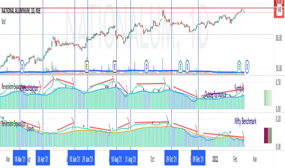
Price - Mean Reversion ExpansionA simple indicator, to plot the quantitatively the reversion and expansion of price from a set of means.
A green bar plots prices above the set of means. A bar plots prices below the set of means. A blue bar plots price entangled in the means. The height of the bars denotes the far-ness from the set of means.
A blue envelope over the bars is the average of this reversion/expansion. A "crossover" of any bar (red/green) over this envelope is indicated by a "green dot" a "crossunder" of any bar (red/green) under this envelope is indicated by a "red dot".
The small trend strength table (when enabled) on the right side below show in a easy manner the data presented in the " Mean Angles " indicator. Refer to description there for more details.
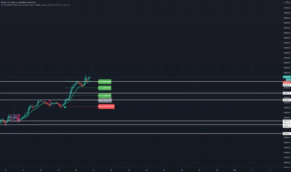
OG Take OffThis indicator is put in place to help you identify the 3 market phases.
Consolidation can be indicated by either dots or color coded candlesticks . You can use both. Consolidation zones are represented by the dotted lines.
A green arrow indicates a buy signal. A red arrow indicates a sell signal.
Theme allows you to change the color of the background to whatever you like.
To change the color of the moving average, you must uncheck "Modern Theme Trend MA Color" under 'Style'.
When price is above 50 moving average on the higher timeframe and the color of the candle is green on the higher time frame, you are in a long market. When price is below the 50 moving average and the color of the candle is red on the higher timeframe, you are in a short market.
Trend puts a trend cloud on the chart. When green and above the 50 moving average, you can assume the market is long. Look for buys on the smaller time frame. When red and below the 50 moving average, you can assume the market is short on the smaller time frame. You can also draw an average price line through the middle of the consolidation box to tell you the directional bias.
The moving average is set to 50 by default but can be changed. You can also add 2 more moving averages to the chart. (Options: SMA , EMA , SWMA , WMA , VWMA , HMA )
Consolidation on the inputs page allows you to see when the market is consolidating with dots and color change of the candlesticks . Opacity of the dots can be changed under 'Style' (Upper Band Dots/Lower Band Dots) You can assume when the dots are below the candlestick , price is buying; when the dots ae above the candlesticks , price is selling.
't' and 'b' represent tops and bottoms and can help you recognize finding the top and bottom on the daily when doing top down analysis. It can also help you recognize double tops, double bottoms, triple tops, etc.
This indicator is best used on the 1 hr or 4 hr time frame. If you zoom out on the chart, you can notice when the market is consolidating, when the market is in expansion phase, and when the market is trending. When the market is in expansion phase, you may see a lot of 'swing low/swing high' action. When the market is trending, it takes off and doesn't look back.
If you enter on the 5 min and ride the 1 hr trend, that is a great idea. If you enter on the 15 min and ride the 4 hr trend, that is an even better idea.
The TP levels can be changed according to your risk reward ratio.
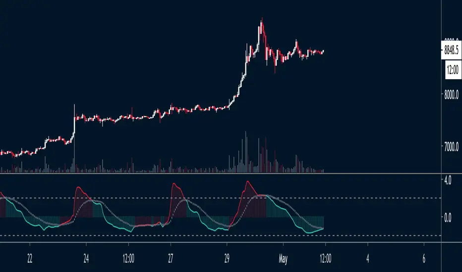
Volume Contraction and ExpansionA simple indicator that shows volume expansion and contraction of a trend through colorization of the candles. It indicates the underlying volume support of a trend. This indicator might come in handy for any Elliott Wave analyst trying to incorporate volume into his analysis.

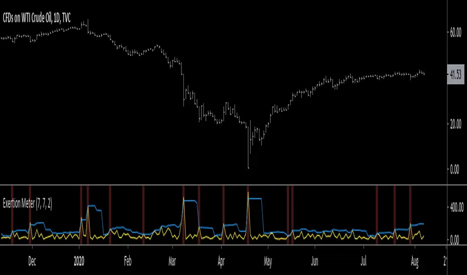
Exertion MeterHello traders, today I wanted to present you something special. I present you the Exertion Meter!
Created from scratch, this idea is based on a theory of mine called "Exertion".
Exertion occurs when price moves beyond the previous bar's range thus it has "exerted itself".
The idea is that when price moves a lot, it exerts a lot of energy which eventually leads to calmer motion, usually in the direction price has exerted itself.
Now, when price has exerted itself a lot in a particular direction, it's telling you that it will likely continue in that direction.
Once this happens, it will gradually calm down until price begins the cycle again, exerting itself in either the same or opposite direction.
This theory is similar to the theory of expansion & contraction phases.
This indicator attempts to show you where price has exerted itself by giving you a two lines cross signal.
The default settings are recommended, but experimentation is encouraged to fit your own personal system.
Both settings control the standard deviation line ( aka . Upper Bollinger Band ).
Enjoy, and hit the follow button to get easy access to all my indicators and to follow my latest publications!
Pascal's Market Compression OscillatorThe indicator uses a standardized measure of volume and volatility to visualize the compression state of the market.
- Green: Market is currently compressing
- Red: Market is currently expanding
When the oscillator flips from Green to Red, the market is likely to enter a phase of expansion. This opens a window of opportunity for momentum strategies.
When the oscillator flips from Red to Green, the market is likely to enter a phase of compression. This makes it a favorable regime for mean reversion strategies.
Finally, please note that the indicator is NOT meant for directional analysis. e.g. when the oscillator signals "expansion", that can be up OR down.
Keltner Channels WidthSimilar to bollinger bands width, but for keltner channels, designed to recognize when a move is exhausted and contraction is to be expected.
Would use it as a filter to stay out of any trades if the indicator peaks (red color).
R100 Volatility Combo Bands v1 (*v*)The Volatility Combo Bands are made from 4 separate volatility bands- two Bollinger Bands (10 and 20 period) and two Price Headley Acceleration Bands (10 and 20 period). The Volatility Combo Bands plot the innermost upper and lower points from these bands and then plots a mid-line. By default, only the standard 20 period Bollinger Bands and Combo Bands with mid-line are displayed, but can be configured however you want.
Try it out- see squeezes earlier, ride the bands earlier in trending markets, trade pullbacks to the Combo Bands and mid-line, trade the range of the band or use them to help identify potential support and resistance levels. Hopefully they can add another dimension to identifying volatility contraction patterns or whatever you currently use these things for!
I hope you get some value out of it. Only conditions of use are that if you improve it, let me know and if you publish something that uses it, don't hide the code! Enjoy!
Code for the Price Headley Acceleration Bands pinched and modified from LazyBear - thankyou.
[Marvin] Concentración/Expasión de volatilidadUn interesante indicador que te da los niveles de concentración, debes analizar en gráficos de H4 luego podrás notar que romperá dependiendo de la tendencia en corto o largo, dando en promedio unos 20 a 100 pips.
Deja en tu comentarios que te parece.


Compression Period Tracker (600 Max) [SharkCharts.live]Compression Period Tracker is the companion script to Compression MA to read out the period length that is actually being tracked. It is analogous to Mean Reversion Period Tracker, and makes sense to use in the same indicator window when using the two sets of indicators together on the same chart.
This version caps the maximum period length at 600, an empirically-chosen number based on some testing of Mean Reversion MA to try to avoid picking overly distant targets and which dramatically improves stability. In practice, it should be extraordinarily rare for compression MA to need to track something longer than 600, small TFs notwithstanding.
My volatility indicators are available by subscription in several packages through SharkCharts.live - and this is planned to be the first new one ready to add. I plan to release a video explaining how to use this indicator coinciding with launch, as there's a lot to talk about. Videos on my other indicators are currently hosted on DadShark's YouTube channel.
Current pricing and subscription details will be kept up-to-date on SharkCharts.live

Compression MA (600 Max) [acatwithcharts]Compression MA is an experimental indicator which modifies Mean Reversion MA with a twist: it instead tracks the most compressed period on a given timeframe as a target for eventual mean reversion. This is a twist on the logic for trading volatility mean reversions in that here we work from the assumption that a period of compression means that there's volatility overhead that should provide resistance to a breakout. The compression MA should therefore help define range-bound areas and help predict intermediate resistances.
This required some tweaking of Mean Reversion MA rather than just making a modification to enable more features on that script, but much of the logic and settings are similar. I've also added an option on this script to turn off tracking and just give the current most compressed period, if any, which creates an entirely different chart and is great for identifying and defining areas of sideways, strongly range-bound compression, which should be scalpable.
This version caps the maximum period length at 600, an empirically-chosen number based on some testing of Mean Reversion MA to try to avoid picking overly distant targets and which dramatically improves stability. In practice, it should be extraordinarily rare for compression MA to need to track something longer than 600, small TFs notwithstanding.
My volatility indicators are available by subscription in several packages through SharkCharts.live - and this is planned to be the first new one ready to add. I plan to release a video explaining how to use this indicator coinciding with launch, as there's a lot to talk about. Videos on my other indicators are currently hosted on DadShark's YouTube channel.
Current pricing and subscription details will be kept up-to-date on SharkCharts.live

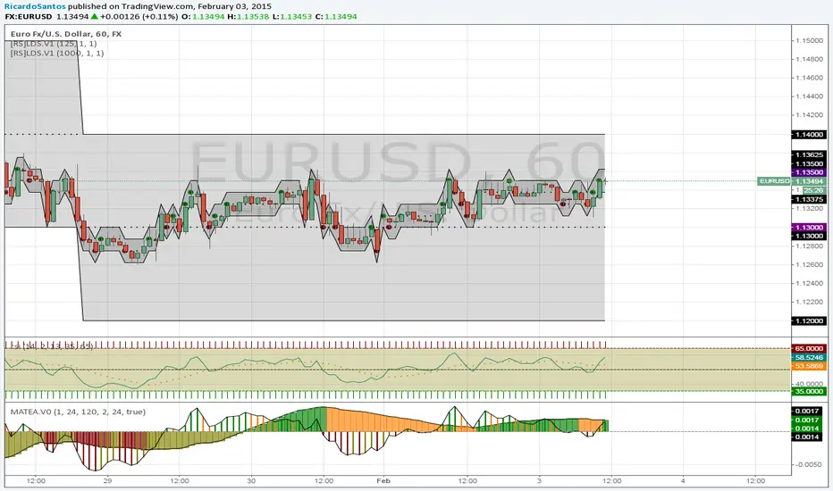
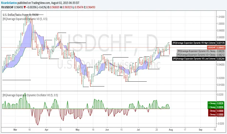
[RS]Average Expansion Dynamic Oscillator V0EXPERIMENTAL:
Oscillator Version.
calculation of extremes and price range for averaging movement.
while price is above market is rising, when bellow market is falling. also can discern strength from the gap of the averages.

[RS]Average Expansion Dynamic V0EXPERIMENTAL: calculation of extremes and price range for averaging movement.
while price is above market is rising, when bellow market is falling. also can discern strength from the gap of the averages.
[RS]Moving Average Trend Expansion Analysis V0experimental: analyzing the differences between price closure and multiple moving averages to discern movement and direction of market.
upper signal is the long trend, while the lower signal symbolizes faster movements within the trend.