Yong Fin Growth on ChartBridge the gap between Fundamental Analysis and Technical Price Action.
Yong Fin Growth on Chart is the ultimate tool for "Hybrid Traders" and investors who need to visualize financial performance directly alongside price movements. Stop switching tabs between news sites and your charts—get the full context of why a stock is moving, right where it happens.
This indicator overlays key financial metrics onto your chart, triggered precisely by Earnings Announcements. It allows you to instantly correlate price reactions with fundamental catalysts like Revenue Growth, Margin Expansion, or EPS surprises.
Key Features:
🔹 1. Smart Earnings Trigger The indicator automatically detects Earnings Announcement dates and plots a data label on the exact bar.
Stocks: Aligns with the specific earnings release date to show immediate price reaction.
Funds/ETFs: Supports Fiscal Period End dates for broader instrument analysis.
Includes a vertical line option to visually separate fiscal periods for easy backtesting.
🔹 2. 5 Fully Customizable Data Slots Configure up to 5 independent slots to track the metrics that matter to your strategy. Choose from a comprehensive list including:
Growth: Revenue, Net Income, EBITDA, EPS.
Efficiency: Gross Margin (GPM), Net Margin (NPM), ROE, ROA.
Valuation: P/E, P/S, P/BV, EV/EBITDA, and Implied P/E.
Health: Cash, Debt, Net Debt, Free Cash Flow (FCF).
🔹 3. Dynamic Growth Coloring & Thresholds Instantly identify trend changes with intelligent color coding.
Comparison Modes: Toggle between YoY (Year-over-Year) or QoQ (Quarter-over-Quarter) growth logic.
Custom Thresholds: Define your own standards. For example, set the label to turn Green only if growth exceeds +15%, or Red if it falls below -5%. This helps filter out noise and highlights significant fundamental shifts.
🔹 4. Flexible Period Selection Analyze data across different timeframes to suit your trading style:
FQ: Fiscal Quarter (Short-term momentum)
FY: Fiscal Year (Long-term trend)
TTM: Trailing Twelve Months (Ideal for smooth Valuation ratios)
FH: Fiscal Half (For securities reporting semi-annually)
How to Use:
Add to Chart: Apply the indicator to any stock symbol.
Configure Slots: Go to settings and select the 5 metrics you want to monitor (e.g., Rev, Net Profit, GPM, NPM, P/E).
Set Color Logic: Choose whether you want to color-code based on YoY or QoQ growth.
Analyze: Look for the labels.
Are margins expanding while price is consolidating?
Did the price drop despite a "Green" label? (Market expectations vs. Reality)
Use the vertical lines to see how the trend changed after previous earnings reports.
"Stop guessing. Let the fundamentals guide your technical entries."
Disclaimer: This tool is for educational and analytical purposes only. Past performance does not guarantee future results. Please conduct your own due diligence.
---------------------------------
เชื่อมช่องว่างระหว่างการวิเคราะห์ปัจจัยพื้นฐาน (Fundamental) และกราฟราคาทางเทคนิค (Technical Price Action)
Yong Fin Growth on Chart คือเครื่องมือที่ดีที่สุดสำหรับ "นักลงทุนสายผสม (Hybrid Traders)" และนักลงทุนที่ต้องการเห็นผลประกอบการทางการเงินซ้อนทับไปกับการเคลื่อนไหวของราคาโดยตรง หยุดเสียเวลาสลับหน้าจอไปมาระหว่างเว็บข่าวและกราฟของคุณ—รับรู้บริบททั้งหมดว่าทำไมหุ้นถึงวิ่ง ได้ทันทีบนหน้าจอนี้
อินดิเคเตอร์นี้จะวางค่าทางการเงินที่สำคัญลงบนกราฟ โดยถูกกระตุ้น (Trigger) อย่างแม่นยำด้วย วันประกาศงบ (Earnings Announcements) ช่วยให้คุณเชื่อมโยงปฏิกิริยาของราคา เข้ากับปัจจัยพื้นฐานที่เป็นตัวขับเคลื่อนได้ทันที เช่น การเติบโตของรายได้, การขยายตัวของอัตรากำไร (Margin), หรือกำไรต่อหุ้น (EPS) ที่เซอร์ไพรส์ตลาด
ฟีเจอร์หลัก:
🔹 1. Smart Earnings Trigger (ตัวระบุวันงบออกอัจฉริยะ) อินดิเคเตอร์จะตรวจจับวันประกาศงบอัตโนมัติและพลอตป้ายข้อมูล (Label) ลงบนแท่งเทียนนั้นเป๊ะๆ
หุ้นรายตัว: ตรงกับวันประกาศผลประกอบการจริง เพื่อดูปฏิกิริยาราคาทันที
กองทุน/ETFs: รองรับวันปิดรอบบัญชี (Fiscal Period End) สำหรับการวิเคราะห์สินทรัพย์ประเภทอื่นๆ
มีออปชั่นเส้นแนวตั้ง เพื่อแบ่งช่วงเวลางบแต่ละรอบ ให้ดูย้อนหลัง (Backtest) ได้ง่าย
🔹 2. 5 Fully Customizable Data Slots (ช่องข้อมูลปรับแต่งได้ 5 ช่อง) ตั้งค่าได้ถึง 5 ช่องอิสระ เพื่อติดตามตัวเลขที่สำคัญต่อกลยุทธ์ของคุณ เลือกจากรายการที่ครอบคลุม เช่น:
การเติบโต (Growth): Revenue, Net Income, EBITDA, EPS
ประสิทธิภาพ (Efficiency): Gross Margin (GPM), Net Margin (NPM), ROE, ROA
มูลค่า (Valuation): P/E, P/S, P/BV, EV/EBITDA, และ Implied P/E (ค่าพิเศษที่คุณใส่สูตรไว้)
สุขภาพการเงิน (Health): Cash, Debt, Net Debt, Free Cash Flow (FCF)
🔹 3. Dynamic Growth Coloring & Thresholds (ระบบสีและการตั้งเกณฑ์) ระบุการเปลี่ยนเทรนด์ได้ทันทีด้วยรหัสสีอัจฉริยะ
โหมดเปรียบเทียบ: เลือกสลับได้ระหว่าง YoY (เทียบปีก่อน) หรือ QoQ (เทียบไตรมาสก่อน)
เกณฑ์ที่กำหนดเอง (Custom Thresholds): กำหนดมาตรฐานของคุณเอง ตัวอย่างเช่น ตั้งค่าให้ป้ายเป็น สีเขียว เฉพาะเมื่อโตเกิน +15% หรือเป็น สีแดง เมื่อต่ำกว่า -5% สิ่งนี้ช่วยกรอง Noise และเน้นเฉพาะการเปลี่ยนแปลงพื้นฐานที่มีนัยสำคัญ
🔹 4. Flexible Period Selection (เลือกช่วงเวลาได้ยืดหยุ่น) วิเคราะห์ข้อมูลในกรอบเวลาที่แตกต่างกันตามสไตล์การเทรด:
FQ: รายไตรมาส (Fiscal Quarter) - ดูโมเมนตัมระยะสั้น
FY: รายปี (Fiscal Year) - ดูเทรนด์ระยะยาว
TTM: 12 เดือนย้อนหลัง (Trailing Twelve Months) - เหมาะสำหรับดูค่า Valuation Ratio ให้สมูท
FH: ครึ่งปี (Fiscal Half) - สำหรับหลักทรัพย์ที่ส่งงบแบบครึ่งปี
วิธีใช้งาน:
Add to Chart: ใส่อินดิเคเตอร์ลงในกราฟหุ้นตัวใดก็ได้
Configure Slots: ไปที่การตั้งค่าและเลือก 5 ค่าที่คุณต้องการเฝ้าดู (เช่น Rev, Net Profit, GPM, NPM, P/E)
Set Color Logic: เลือกตรรกะสี ว่าจะให้อิงตามการเติบโตแบบ YoY หรือ QoQ
Analyze: สังเกตป้ายข้อมูล
อัตรากำไร (Margin) ขยายตัวในขณะที่ราคากำลังพักตัวอยู่หรือเปล่า?
ราคาดิ่งลงทั้งๆ ที่ป้ายเป็น "สีเขียว" หรือไม่? (ความคาดหวังตลาด vs ความจริง)
ใช้เส้นแนวตั้งเพื่อดูว่าเทรนด์เปลี่ยนไปอย่างไรหลังจากงบออกในรอบก่อนๆ
"เลิกเดา ให้ปัจจัยพื้นฐานนำทางจุดเข้าซื้อทางเทคนิคของคุณ"
คำเตือน: เครื่องมือนี้มีไว้เพื่อการศึกษาและวิเคราะห์ข้อมูลเท่านั้น ผลการดำเนินงานในอดีตไม่การันตีผลลัพธ์ในอนาคต โปรดศึกษาข้อมูลด้วยตนเอง
Analisi fondamentale

RoseTree M2 IndexM2 Money Supply Indicator with 10-Week Offset
This indicator tracks the expansion and contraction of M2 money supply with a 10-week offset, revealing strong correlation with Bitcoin price action. While other traders rely on standard 108/80 day offsets, our modified approach helps front-run market participants as this relationship has become widely recognized alpha.
Use this in combination with our systematic indicators to:
Project potential medium-term market trends
Position before major liquidity-driven moves
Identify divergences that signal potential trend changes
The indicator provides valuable insight into how expanding/contracting liquidity environments affect crypto markets, giving you a meaningful edge in anticipating broader market direction.
Pulse by RoseTreePulse by RoseTree is a dynamic stock/cash allocation indicator that answers the essential question: "How much should I have in stocks right now?"
It outputs a percentage from 0-100% representing suggested equity exposure—a reading of 75% means 75% stocks and 25% cash/bonds. The indicator synthesizes five key market dimensions: Regime (trend strength and market structure), Risk (volatility and drawdown management), Valuation (P/E, equity risk premium, shareholder yield), Sentiment (VIX term structure and fear/greed dynamics), and Macro (yield curves, credit spreads, financial stability). Each factor is weighted and blended into a single actionable signal. A built-in Crisis Detection System automatically reduces exposure when multiple stress indicators trigger—including VIX spikes, rapid drawdowns, credit spread blowouts, and correlated stock/bond selloffs. The indicator classifies markets into six regimes: Strong Bull, Bull Market, Neutral, Correction, Bear Market, and Crisis. Four approach modes (Conservative, Balanced, Aggressive, Adaptive) let you match the signal to your risk personality. The on-chart dashboard displays real-time metrics including VIX, market drawdown, P/E ratio, equity risk premium, ROE, and individual component scores. Built-in alerts notify you of allocation threshold crossings, regime changes, and crisis events. Data is pulled automatically from SPY, VIX, Treasury yields, credit ETFs (HYG/LQD), TLT, gold, and dollar index. Eight color themes are included with dark/light mode support. Best used on daily timeframe for strategic allocation decisions.

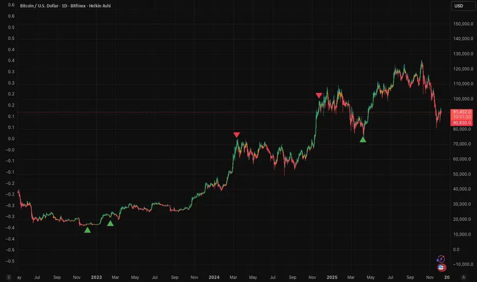
RoseTree BTC Macro LiquidityThis indicator identies good entry and exit points for Bitcoin by comparing its market cap to the total global M2 money supply, while also factoring in macroeconomic trends.
Why It's Unique
- Combines macro liquidity (M2) with BTC valuation.
- Not price-based — more about where BTC stands in the bigger economic picture.
- Useful for long-term, macro-aware investors looking for timing signals aligned with monetary expansion.
✅ Buy Signal (Green Triangle Below Bar)
M2 is expanding (liquidity increasing), AND
Bitcoin is undervalued compared to its historical relationship to M2
→ Suggests potential upside, triggers a green triangle below the bar.
❌ Sell Signal (Red Triangle Above Bar)
Bitcoin is significantly above its historical average share of M2
→ Suggests overvaluation or a short-term top, triggers a red triangle above the bar.
What is Global M2 Money Supply? (GLM2)
M2 is a measure of money supply, including cash, checking deposits, and easily convertible near money.
This indicator manually aggregates M2 values from numerous countries and converts them into USD equivalents using exchange rates.
The countries include the US, EU, UK, China, India, Japan, Brazil, and many others — totaling over 20.
This tells you how large Bitcoin is relative to the global money supply, giving a sense of its macroeconomic footprint or potential room to grow.
Risk Management Console Pro by ShogunRisk Management Console Pro - Professional Trading Analytics
⚠️ CRITICAL LIQUIDATION DISCLAIMER ⚠️
The liquidation price calculated by this indicator is an approximation based on MEXC perpetual futures methodology and serves as a guide only. This level represents a catastrophic threshold and should never be approached in live trading. Actual liquidation prices vary by exchange, position size, market conditions, and fee structures. It is the trader's sole responsibility to diligently monitor risk exposure, maintain adequate margin buffers, and manage positions appropriately. This tool does not replace proper risk management protocols or real-time exchange data.
---
Overview
The Risk Management Console Pro is institutional-grade risk architecture I've built for futures traders who need precision capital deployment and surgical risk management. After a decade working across institutional finance and fintech, I developed this tool to bridge the gap between professional trading desks and retail execution.
Core Functionality
When you load the indicator, it prompts you to set three critical price anchors using a simple drag-and-drop interface: Entry Price, Stop Loss, and Take Profit. The system calculates an approximate liquidation threshold using MEXC perpetual futures methodology, so you can visualize your catastrophic risk boundary. All levels appear as horizontal reference lines with visual labels - a much cleaner approach than standard long/short tools.
The console automatically detects whether you're going long or short based on where your entry sits relative to your take profit. No manual configuration needed. The liquidation calculations adapt correctly for both directions.
Capital Allocation Framework
You configure two key parameters:
- Maintenance Margin (default $1,000 USD) - the collateral required to open and maintain your leveraged position
- Leverage (default 50x) - your position multiplier that determines capital efficiency and risk exposure
These inputs drive all the real-time calculations, letting you model position sizing with institutional precision before you commit capital.
Dashboard Analytics
The on-chart console displays comprehensive trade metrics in a clean, modern interface built for quick decision-making:
- Position Architecture: Margin, Leverage, Position Size, Quantity
- Risk/Reward Ratio: Real-time R:R calculation showing your trade asymmetry
- Price Levels: Entry, Stop Loss, Take Profit, Liquidation (color-coded as blue/red/green/orange)
- Live Performance: Unrealized P/L updating tick-by-tick with percentage of margin exposure (green for profit, red for loss)
- Projected Outcomes: Maximum loss and profit potential with margin-relative percentages
Display Customization
You have full control over visual elements through Display Settings:
- Toggle horizontal price lines
- Show/hide price level labels
- Toggle dashboard visibility
- Adjust table position (6 locations available)
- Modify color scheme (title, data, text, accent colors)
Professional Design
I went with an institutional dark theme using a slate/charcoal palette. The interface delivers Wall Street-caliber aesthetics with functional clarity. Every element is built for traders operating in high-stakes environments where milliseconds and basis points matter. The dashboard footer carries the Kaizen Systems signature, representing our commitment to continuous improvement in trading methodology.
Key Features Summary
- Automatic long/short detection
- MEXC-based liquidation calculation
- Real-time unrealized P/L tracking
- Draggable price level inputs
- Color-coded risk visualization
- Institutional-grade interface
- Fully customizable display options
- Position size optimization
- R:R ratio analysis
Risk Management Philosophy
This tool embodies a principle I've learned over the years: professional traders quantify risk before entering positions. By visualizing entry, exit, and catastrophic thresholds simultaneously, the Risk Management Console Pro enforces disciplined capital allocation and eliminates emotional decision-making during live market conditions.
Intended Use
I designed this for futures traders using leverage on perpetual contracts, particularly those trading on MEXC or similar platforms. It's ideal for intraday scalpers, swing traders, and position traders who need precise risk calculations across varying timeframes. The console transforms abstract concepts like "position sizing" and "risk/reward" into tangible, actionable data.
About Me
I'm Shogun, and I've spent the last decade deep in quantitative analysis, algorithmic strategy development, and institutional trading operations. As Founding Director of Kaizen Systems - a fintech platform I built to democratize institutional-grade tools for retail traders - I've created multiple proprietary indicators including the Katana strategy series. My focus is translating complex quantitative frameworks into accessible, actionable tools that empower traders at every level to execute with professional discipline.
The Risk Management Console Pro represents my commitment to elevating retail trading standards by providing the same caliber of risk analytics used by professional trading desks. Through continuous refinement and trader feedback, Kaizen Systems delivers tools that merge technical sophistication with practical usability.
Technical Notes
- Compatible with all timeframes and instruments
- Lightweight execution with minimal CPU overhead
- Updates in real-time on every tick
- No repainting or future data leakage
- Pure Pine Script v5 implementation
Support and Updates
For questions, feature requests, or trading strategy consultation, connect with me through TradingView messaging or visit Kaizen Systems for comprehensive trading resources and community support.
---
© 2025 Shogun for Kaizen Systems | All Rights Reserved
Trade responsibly. Past performance does not guarantee future results. Leverage amplifies both gains and losses.

Seasonality by Novatrix CapitalThe Seasonality Indicator calculates the average historical yearly performance of the selected asset by analyzing multiple user-defined lookback periods. Up to four seasonal windows (e.g., 5, 10, 15, and Max years) can be displayed simultaneously, and the year 2020 can be excluded to remove distortion from extreme market conditions.
Based on this data, the indicator generates a smooth seasonal curve that highlights typical market behavior throughout the year. This helps traders identify periods with historically higher probabilities of bullish or bearish movement.
The indicator is designed exclusively for the Daily timeframe, as all calculations rely on daily candle data.
Seasonality by Novatrix Capital provides a clean, data-driven view of recurring annual patterns and supports traders in making informed, seasonality-based decisions.

Seasonality Evaluation Tool by Novatrix CapitalThis tool is designed to analyze the strength and reliability of seasonal patterns detected by the Seasonality Indicator. While the indicator displays the historical seasonal curve, this tool goes a step further by evaluating how consistent and meaningful the pattern actually is.
It checks whether a seasonal pattern is robust, distorted by outlier years, or statistically relevant. The tool calculates the average returns within the selected seasonal window and shows how reliable the pattern has been over the analyzed period.
For improved verification, the seasonal windows can be visualized directly on the chart. This allows traders to review past occurrences, perform their own backtests, and confirm the quality of the signal.
The tool serves as an ideal complement to the Seasonality Indicator by helping traders identify high-quality, data-driven seasonal trends and avoid misleading or weak patterns.
Usage:
This script is designed for the daily timeframe, as all calculations are based on daily candle data. The settings are easy to adjust, allowing any seasonal period displayed by the indicator to be evaluated quickly.

CapitalFlowsResearch: CB LevelsCapitalFlowsResearch: CB Levels — Policy Path Mapping for STIR & Rates Traders
CapitalFlowsResearch: CB Levels provides a structured, policy-anchored framework for interpreting short-term interest rate futures. Instead of treating STIR pricing as an abstract number, the indicator converts central bank settings—such as the official cash rate, expected hike/cut increments, and basis adjustments—into a clear ladder of explicit rate levels. These levels are then projected directly onto the price chart as horizontal reference bands.
The tool automatically builds a series of future policy steps (e.g., +25bp, +50bp, –25bp, etc.) based on user-defined increments and direction, allowing traders to visualise where the current contract sits relative to hypothetical central bank actions. By plotting settlement levels and multiple forward steps, the script creates a transparent “policy grid” that traders can anchor against when evaluating mispricings, risk/reward asymmetry, or scenario outcomes.
Discreet labels—placed periodically to avoid clutter—identify each policy step in bp terms, making the chart readable even when zoomed out. Whether the mode is set to Cuts or Hikes, the tool instantly recalibrates the entire ladder, offering a consistent structure for comparing different contracts or central bank paths.
In practice, CB Levels acts as a policy-path overlay for futures traders, helping them contextualise market pricing relative to central bank intent, quantify potential repricing ranges, and understand where key inflection levels lie—without revealing the underlying calculation methods that generate the steps.

Asset Comparison Oscillator by Novatrix CapitalThe Asset Comparison Oscillator compares the currently selected asset with a user-defined reference symbol to identify periods of relative overvaluation and undervaluation.
The concept is based on the idea that markets tend to revert to fair value. When an asset is mispriced relative to a meaningful benchmark, there is a higher likelihood of price correction.
This indicator converts this relationship into an easy-to-read oscillator:
Green Zone (Undervalued) – The asset is cheap relative to the reference symbol, indicating potential upward pressure.
Red Zone (Overvalued) – The asset is expensive relative to the reference symbol, indicating a higher likelihood of downward movement.
Users can choose any relevant reference instrument, such as indices, commodities, or currency pairs. The calculation uses a configurable cycle (default: 10 days).
This indicator is designed for the daily timeframe only, as shorter intervals may not accurately reflect fundamental value relationships.
The Asset Comparison Oscillator provides a clear, data-driven view of relative valuations and helps traders make informed directional decisions.

Altcoin Relative Macro StrengthAltcoin Relative Macro Strength
Overview
The Altcoin Relative Macro Strength indicator measures the altcoin market's price performance relative to global macroeconomic conditions. By comparing TOTAL3ES (total altcoin market capitalization excluding Bitcoin, Ethereum and stable coins) against a composite macro trend, the indicator identifies periods of relative overvaluation and undervaluation.
Methodology
Global Macro Trend Calculation:
The macro trend synthesizes three primary components:
- ISM PMI – A proxy for the business cycle phase
- Global Liquidity – An aggregate measure of major central bank balance sheets and broad money supply
- IWM (Russell 2000) – Small-cap equity exposure, reflecting risk-on/risk-off market sentiment
Global Liquidity is calculated as:
Fed Balance Sheet - Reverse Repo - Treasury General Account + U.S. M2 + China M2
The final Global Macro Trend is:
ISM PMI × Global Liquidity × IWM
Theoretical Framework:
The global macro trend integrates liquidity expansion/contraction with business cycle dynamics and small-cap equity performance. The inclusion of IWM reflects altcoins' tendency to behave as high-beta risk assets, exhibiting sensitivity similar to small-cap equities. This composite exhibits strong directional correlation with altcoin market movements, capturing the risk-on/risk-off dynamics that drive altcoin performance.
Interpretation
Primary Signal:
The histogram displays the rolling percentage change of TOTAL3ES relative to the global macro trend (default: 21-period average). Positive divergence indicates altcoins are outperforming macro conditions; negative divergence suggests underperformance relative to the underlying economic and risk environment.
Data Tables:
Alts/Macro Change – Percentage deviation of the altcoin market's average value from the Global Macro Trend's average over the specified period
Macro Trend – Directional assessment of the macro trend based on slope and trend agreement:
🔵 BULLISH ▲ – Positive slope with upward trend
⚪ NEUTRAL → – Slope and trend direction disagree
🟣 BEARISH ▼ – Negative slope with downward trend
Macro Slope – Percentage rate of change in the global macro trend
Altcoin Valuation – Relative valuation category based on TOTAL3/Macro deviation:
🟢 Extreme Discount / Deep Discount / Discount
🟡 Fair Value
🔴 Premium / Large Premium / Extreme Premium
TOTAL3ES Mcap – Current total altcoin market capitalization (in billions)
Visual Components:
📊 Histogram: Alts/Macro Change
🟢 Green = Positive deviation (altcoins outperforming)
🔴 Red = Negative deviation (altcoins underperforming)
📈 Macro Slope Line
Color-coded to match trend assessment
Scaled for visibility (adjustable in settings)
Application
This indicator is designed to identify mean reversion opportunities by highlighting periods when the altcoin market materially diverges from fundamental macro and risk conditions. Extreme positive values may indicate overvaluation; extreme negative values may signal undervaluation relative to the prevailing economic and risk appetite backdrop.
Strategy Considerations:
- Identify extremes: Look for periods when the histogram reaches elevated positive or negative levels
- Assess valuation: Use the Altcoin Valuation reading to gauge relative over/undervaluation
Confirm with risk sentiment: Check whether macro conditions and risk appetite support or contradict current price levels
- Mean reversion: Consider that significant deviations from trend historically tend to revert
Note: This indicator identifies relative valuation based on macro conditions and risk sentiment—it does not predict price direction or timing.
Settings
Lookback Period – 21 bars (default) – Number of bars for calculating rolling averages
Macro Slope Scale – 3.0 (default) – Multiplier for macro slope line visibility

Moving Average + Count Candles Number - DiLeViThis indicator can add Moving Averages and candles number within same indicator and can be personalised.

CG.8 - LONG & SHORTAccurately detects Pivot High / Pivot Low from a higher timeframe (HTF) and displays them directly on your current chart.
Key Highlights:
Draws clean horizontal lines + “LONG” / “SHORT” labels, extendable to the right
Two completely independent alerts: simply select “LONG SIGNAL” or “SHORT SIGNAL” when creating an alert (never mixed)
Full alert message: symbol + timeframe + exact price level
No repaint, no bugs, runs smoothly on all markets (crypto, forex, stocks, futures…)
Easy customization: choose HTF, Left/Right strength, toggle labels and line extension
How to use (super simple):
Paste → Add to Chart → Add Alert → choose “LONG SIGNAL” or “SHORT SIGNAL” → done!
From now on, every “beep” means a fresh higher-timeframe structure is confirmed – perfect entry timing.
Ideal for Price Action, Smart Money Concept (SMC), and ICT traders – catches tops and bottoms like textbook examples!
Author: Chinh CG
2025 Perfect Edition – zero errors, zero repaint, zero missed signals.
Wishing you all green candles and heavy profits! 🍜🚀


FAIRPRICE_VWAP_RDFAIRPRICE_VWAP_RD
This script plots an **anchored VWAP (Volume Weighted Average Price)** that resets
based on the user-selected anchor period. It acts as a dynamic “fair value” line
that reflects where the market has actually transacted during the chosen period.
FEATURES
- Multiple anchor options: Session, Week, Month, Quarter, Year, Decade, Century,
Earnings, Dividends, or Splits.
- Intelligent handling of the “Session” anchor so it works correctly on both 1m
(resets each new day) and 1D (continuous, non-resetting VWAP).
- Manual VWAP calculation using cumulative(price * volume) and cumulative(volume),
ensuring the line is stable and works on all timeframes.
- Optional hiding of VWAP on daily or higher charts.
- Offset input for horizontal shifting if desired.
- VWAP provides a true “fair price” reference for trend, mean-reversion,
and institutional-level analysis.
PURPOSE
This indicator solves the common problem of VWAP behaving incorrectly on higher
timeframes, on synthetic data, or with unusual anchors. By implementing VWAP
manually and allowing flexible reset conditions, it functions reliably as
an institutional-style fair value benchmark across any timeframe.

BTC - LEVR: Leverage Efficiency & Volume RatioLEVR: Leverage Efficiency & Volume Ratio
Observation-only. Data: IntoTheBlock.
Overview
The Leverage Efficiency & Volume Ratio (LEVR) is a market structure oscillator designed to detect "Paper Bubbles" and "Organic Bottoms" by separating speculative greed from network utility. While most indicators analyze price action, LEVR analyzes market fragility. It operates on the thesis that Sustainable Rallies are driven by Spot/Network Activity, while Fragile Rallies are driven by Derivatives Leverage.
Synergy
How it works with VERI
LEVR is designed to be the tactical counterpart to the fundamental VERI Indicator (Valuation & Entity Ratio Index).
Use VERI for Strategy: To identify Value. (Is Bitcoin cheap? Are Whales buying?)
Use LEVR for Risk: To identify Structure. (Is the current price move real, or is it a leverage bubble about to pop?)
The "Perfect Setup"
The strongest buy signals occur when VERI is in the Accumulation Zone (Whales buying) AND LEVR is in the Organic Zone (Leverage is flushed out) (as it was the case in the Dec 2022 Bear Market Bottom).
Why LEVR is Unique
Standard indicators often fail to contextualize Open Interest:
vs. Raw Open Interest: Raw OI always trends up over time as the market grows. LEVR solves this by normalizing OI against Active Addresses. This reveals when leverage is outpacing actual adoption.
vs. ELR (Estimated Leverage Ratio): Classic ELR divides Open Interest by Exchange Reserves. However, Exchange Reserves are notoriously difficult to track accurately. LEVR uses Active Addresses (Network Utility) as a cleaner, more reliable denominator for network health.
Methodology
The Mathematics: The indicator calculates a normalized Z-Score ratio between two IntoTheBlock datasets:
The Numerator (Greed): Perpetual Open Interest. The total dollar value of all open futures contracts. This represents the "Gambling" capital.
The Denominator (Utility): Active Addresses. The number of unique addresses transacting on-chain. This represents the "Real" user base.
The Formula : LEVR = Z-Score ( Perpetual Open Interest / Active Addresses )
How to Interpret the Visuals
The line color changes dynamically to reflect the current risk regime:
🟥 Speculative Premium (Red Line > 2.0) :
Signal: "Leverage Bubble."
Context: Open Interest is rising significantly faster than User Growth. The rally is fueled by debt.
Risk: High probability of a "Long Squeeze" or liquidation cascade.
🟦 Organic Base (Blue Line < -1.5) :
Signal: "Spot Driven Market."
Context: Speculators have been flushed out, but active network usage remains high. The line turns Blue to signal a healthy opportunity zone.
Risk: Low. Historically marks robust bottoms where hands are strong.
🟧 Neutral (Orange Line) :
The market is in a transition phase between organic growth and speculation.
Settings & Inputs
Users can customize the sensitivity of the Z-Score to fit their trading style (in brackets their current standard value):
Lookback Period (365) : The rolling window used to establish the "Baseline." A 365-day window captures the yearly trend.
Signal Smoothing (7) : A short moving average to reduce daily data noise.
Bubble Zone Top/Bottom (3.0 / 2.0) : The thresholds for the Red Zone. Raising the "Top" value will only show the most extreme, generational leverage bubbles.
Organic Zone Top/Bottom (-1.5 / -2.5) : The thresholds for the Green Zone. Lowering these values requires a deeper "flush" to trigger a signal.
Optimization
This indicator is mathematically optimized for the Daily (1D) timeframe. Using it on lower timeframes may result in noise due to the daily resolution of on-chain data.
Important Note on Historical Data
Please be aware that aggregated global Perpetual Open Interest data only becomes reliable and widely available starting around 2020-2021.
Pre-2021: The indicator will show a flat line or empty values. This is not a bug; it reflects the lack of historical derivatives market data for that period.
2021-Present: The indicator functions fully as intended.
Credits
Concept inspired by the "Estimated Leverage Ratio" (ELR) popularised by CryptoQuant and analysts like Willy Woo. LEVR adapts this concept for TradingView by substituting Exchange Reserves with Network Activity for better reliability.
Disclaimer
This tool is for research purposes only. It visualizes market structure data and does not constitute financial advice.
Tags
bitcoin, btc, open interest, leverage, on-chain, intotheblock, risk, derivatives, levr, veri

BTC - VERI - Valuation & Entity Ratio IndexVERI: Valuation & Entity Ratio IndexObservation-only.
Data: IntoTheBlock.
Overview & Philosophy
The name VERI is derived from the Latin Veritas (Truth). In a crypto market often driven by deceptive speculative noise, this indicator seeks to establish the "On-Chain Truth" of a price trend.
It operates on the thesis that price action is only sustainable when verified by high-conviction capital flows.VERI is a fundamental composite oscillator that fuses Entity Behavior (Who is holding?) with Network Valuation (Is the price fair?) to identify Bitcoin market cycle extremes.
The "Alpha"
Why this Composite stands out: on-chain metrics often tell only half the story.
MVRV tells you if the price is cheap, but not if anyone is actually buying.
Whale Activity tells you if large players are moving, but not if they are accumulating at a value discount.
VERI fuses these two dimensions into a single Z-Score. It identifies the rare, high-probability moments where Smart Money Conviction intersects with Deep Value.
Methodology
The Mathematics of VERI: The indicator constructs a composite index using three fundamental metrics from IntoTheBlock:
The "Who" (Entity Ratio) : We calculate the flow ratio between Whales (>1% supply holders) and Retail (<0.1% supply holders). A rising ratio indicates supply is transferring from weak hands to strong hands.
The "Why" (Valuation Multiplier) : We utilize the MVRV (Market Value to Realized Value) ratio. To isolate value opportunities, we use the inverse (1 / MVRV).
The Fusion : These factors are multiplied to create the raw VERI index.
Normalization & Inversion
We apply a rolling Z-Score (standard deviation from the mean) and invert the result.
How to Interpret the Indicator
Because the output is inverted, the visual logic matches price action intuitively:
🟥 Distribution Zone (High Values > 1.5):
The Signal: "Low Conviction Overvaluation."
Context: The price is historically expensive relative to the cost basis (High MVRV), and Whales are distributing coins to Retail.Implication: Historically precedes macro tops or deep corrections.
🟩 Accumulation Zone (Low Values < -1.5):
The Signal: "High Conviction Undervaluation."Context: The price is historically cheap (Low MVRV), and Whales are aggressively accumulating relative to Retail.
Implication: Historically precedes macro bottoms and generational entry points.
Zero Line : Represents the historical baseline. A crossover of the zero line often confirms a regime shift (e.g., from Bear to Bull).
Visual Guide & Features
Dynamic Coloring: The line turns Red in the Distribution Zone, Blue in the Accumulation Zone, and Orange during neutral trends.
Zone Labels: Static labels are pinned to the left side of the chart for immediate context.
The "Data Check" Monitor (Status Table): Since this indicator relies on third-party fundamental data, we have included a diagnostic table in the bottom-right corner.
Data Check Monitor Guide
STATUS: LIVE (Green): The indicator is functioning correctly. All data feeds (Whales, Retail, MVRV) are being retrieved successfully.
STATUS: WAIT (Red): The indicator cannot retrieve data. This might happen for some reasons, e.g. your TradingView plan may not support IntoTheBlock integration.
Settings
Lookback Period (Default: 365): The window used for Z-Score normalization. We use a full year to smooth out seasonal volatility.
Smoothing (Default: 7): A 7-day smoothing is applied to the signal to filter out daily noise.
Zone Thresholds: Users can customize the specific Z-Score levels for the Distribution and Accumulation bands.
Disclaimer
This script is for research and educational purposes only. It uses historical on-chain data to visualize market structure and does not constitute financial advice. Past performance of whale entities does not guarantee future results.
Tags
bitcoin, btc, on-chain, mvrv, whales, valuation, fundamentals, cycle, oscillator, veri

BTC / XAU Calculator/Hesaplayıcı
USER GUIDE
BTC/XAU Calculator is a table-based indicator that displays Bitcoin price, Gold price (XAU/USD), and the BTC/XAU ratio simultaneously. It pulls real-time market data and calculates values based on your manual inputs.
⸻
Features
• Automatically fetches live BTCUSD and XAUUSD prices.
• Supports two-way manual calculations:
• BTC price → Ratio calculation
• Ratio → BTC price calculation
• Clear table layout showing Market vs Calculated values.
• Compatible with Binance, OANDA, and all brokers.
⸻
1. Settings
Gold Price (XAU/USD)
• When “Use live XAU price” is enabled, the indicator uses real-time XAU/USD.
• If disabled, you can enter your own gold price manually.
⸻
2. Calculation Modes
A) Calculate BTC from Ratio
BTC = Ratio × Gold price
Example:
XAU = 4200
Ratio = 19.08
→ BTC = 4200 × 19.08 = 80,136 USD
⸻
B) Calculate Ratio from BTC
Ratio = BTC price ÷ Gold price
Example:
BTC = 90,000
XAU = 4250
→ Ratio = 90,000 / 4,250 = 21.18
3. Suggested Uses
• Evaluate BTC as cheap/expensive relative to gold
• BTC target projections based on gold
• Macro hedge and correlation analysis
• BTC/XAU ratio-based scenario modeling
⸻
Notes
• This indicator does not generate trading signals.
• It is intended for numerical comparison and scenario building only.
Source: The design and calculation logic of this indicator were created in collaboration with OpenAI’s ChatGPT model.

MCX GOLD1! SpotHelps convert MCX gold rolling contract symbol to spot price.
Note: It cant accurately infer the contract role date, so it makes some assumptions, use the rolldays to adjust where needed

Deviaton Tracker - QuantSyDeviation Tracker - QuantSy
An adaptive volatility band system that maps price behavior across statistical deviation zones. Provides visual context for market extremes and tracks duration patterns for probabilistic mean reversion analysis.
What it offers:
Dynamic bands that adjust to current volatility conditions, creating clear visual zones for price action. The system continuously monitors time spent in each zone and builds a statistical profile of typical duration patterns, helping identify when price may be overextended.
Best for:
Spotting potential reversal areas at volatility extremes
Understanding current price positioning relative to recent behavior
Timing entries and exits based on statistical probabilities
Risk management and position sizing decisions
Clean gradient visualization provides immediate context while the underlying statistical engine tracks behavioral patterns across all market conditions.
**⚠️ Disclaimer**
Educational tool only - does not constitute investment advice. The developer assumes no liability for any trading profits or losses incurred through the use/misuse of this indicator.
This indicator does not include any features related to interest, leverage, or gambling. Users are fully responsible for making sure their assets and trading practices align with Islamic guidelines.

Universal Heatmap - QuantSyUniversal Heatmap - QuantSy
A sophisticated market valuation tool that synthesizes multiple on-chain and technical metrics into a single, intuitive heat-mapped visualization. Provides probabilistic assessment of market extremes through dynamic gradient coloring.
What it does:
Analyzes various dimensions of market behavior including value metrics, profit/loss ratios, momentum signals, and risk-adjusted performance. Converts complex data into a simple visual spectrum where blue indicates undervalued conditions and red signals overvalued territory.
Best for:
Identifying potential reversal zones
Gauging relative market positioning
Risk management and allocation decisions
Multi-timeframe valuation analysis
The percentile-based color scaling adapts to each asset's unique history, making it applicable across different markets and timeframes. Get an at-a-glance read on where current conditions stand relative to historical norms.
**⚠️ Disclaimer**
Educational tool only - does not constitute investment advice. The developer assumes no liability for any trading profits or losses incurred through the use/misuse of this indicator.
This indicator does not include any features related to interest, leverage, or gambling. Users are fully responsible for making sure their assets and trading practices align with Islamic guidelines.

Pristine Adaptive Alpha ScreenerThe Pristine Adaptive Alpha Screener allows users to screen for all of the trading signals embedded in our premium suite of TradingView tools🏆
▪ Pristine Value Areas & MGI - enables users to perform comprehensive technical analysis through the lens of the market profile in a fraction of the time!
▪ Pristine Fundamental Analysis - enables users to perform comprehensive fundamental stock analysis in a fraction of the time!
▪ Pristine Volume Analysis - organizes volume, liquidity, and share structure data, allowing users to quickly gauge the relative volume a security is trading on, and whether it is liquid enough to trade
💠 How is this Screener Original?
▪ The screener allows users to screen for breakouts, breakdowns, bullish and bearish trend reversals, and allows users to narrow a universe of stocks based purely on fundamentals, or purely on technicals. One screening tool to support an entire technofundamental workflow!
💠 Signals Overview
Each of the below signals serves one of two purposes:
1) A pivot point to be used as a long or short entry
2) A tool for narrowing a universe of stocks to a shorter list of stocks that have a higher potential for superperformance
▪ HVY(highest volume in a year) -> Featured in Pristine Volume Analysis -> Entry signal
▪ Trend Template -> Inspired by Mark Minervini's famous trend filters -> Tool for narrowing a universe of stocks to a shorter list with a higher potential for superperformance
▪ Rule of 100 -> Metrics from Pristine Fundamental Analysis -> Tool for narrowing a universe of stocks to a shorter list with a higher potential for superperformance
▪ Bullish 80% Rule -> Featured in Pristine Value Areas & MGI -> Long entry signal -> Trend Reversal
▪ Bearish 80% Rule -> Featured in Pristine Value Areas & MGI -> Short entry signal -> Trend Reversal
▪ Break Above VAH -> Featured in Pristine Value Areas & MGI -> Long entry signal -> Trend Continuation
▪ Break Below VAL -> Featured in Pristine Value Areas & MGI -> Short entry signal -> Trend Continuation
💠 Signals Decoded
▪ HVY(highest volume in a year)
Volume is an important metric to track when trading, because abnormally high volume tends to occur when a new trend is kicking off, or when an established trend is hitting a climax. Screen for HVY to quickly curate every stock that meets this condition.
▪ Trend Template
Mark Minervini's gift to the trading world. Via his book "Think and Trade Like a Stock Market Wizard". Stocks tend to make their biggest moves when they are already in uptrends, and the Minervini Trend template provides criteria to assess whether a stock is in a clearly defined uptrend. Filter for trend template stocks using our tool.
▪ Rule of 100
Pristine Capital's gift to the trading world. The rule of 100 filters for stocks that meet the following condition: YoY EPS Growth + YoY Sales Growth >= 100%. Stocks that meet this criteria tend to attract institutional investors, making them strong candidates for swing trading to the long side.
💠 Market Profile Introduction
A Market Profile is a charting technique devised by J. Peter Steidlmayer, a trader at the Chicago Board of Trade (CBOT), in the 1980's. He created it to gain a deeper understanding of market behavior and to analyze the auction process in financial markets. A market profile is used to analyze an auction using price, volume, and time to create a distribution-based view of trading activity. It organizes market data into a bell-curve-like structure, which reveals areas of value, balance, and imbalance.
💠 How is a Value Area Calculated?
A value area is a distribution of 68%-70% of the trading volume over a specific time interval, which represents one standard deviation above and below the point of control, which is the most highly traded level over that period.
The key reference points are as follows:
Value area low (VAL) - The lower boundary of a value area
Value area high (VAH) - The upper boundary of a value area
Point of Control (POC) - The price level at which the highest amount of a trading period's volume occurred
If we take the probability distribution of trading activity and flip it 90 degrees, the result is our Pristine Value Area!
Market Profile is our preferred method of technical analysis at Pristine Capital because it provides an objective and repeatable assessment of whether an asset is being accumulated or distributed by institutional investors. Market Profile levels work remarkably well for identifying areas of interest, because so many institutional trading algorithms have been programmed to use these levels since the 1980's!
The benefits of using Market Profile include better trade location, improved risk management, and enhanced market context. It helps traders differentiate between trending and consolidating markets, identify high-probability trade setups, and adjust their strategies based on whether the market is in balance (consolidation) or imbalance (trending). Unlike traditional indicators that rely on past price movements, Market Profile provides real-time insights into trader behavior, giving an edge to those who can interpret its nuances effectively.
▪ Bullish 80% Rule
If a security opens a period below the value area low , and subsequently closes above it, the bullish 80% rule triggers, turning the value area green. One can trade for a move to the top of the value area, using a close below the value area low as a potential stop!
In the below example, HOOD triggered the bullish 80% rule after it reclaimed the monthly value area!
HOOD proceeded to rally through the monthly value area and beyond in subsequent trading sessions. Finding the first stocks to trigger the bullish 80% rule after a market correction is key for spotting the next market leaders!
▪ Bearish 80% Rule
If a security opens a period above the value area high , and subsequently closes below it, the bearish 80% rule triggers, turning the value area red. One can trade for a move to the bottom of the value area, using a close above the value area high as a potential stop!
ES proceeded to follow through and test the value area low before trending below the weekly value area
▪ Break Above VAH
When a security is inside value, the auction is in balance. When it breaks above a value area, it could be entering a period of upward price discovery. One can trade these breakouts with tight risk control by setting a stop inside the value area! These breakouts can be traded on all chart timeframes depending on the style of the individual trader. Combining multiple timeframes can result in even more effective trading setups.
RBLX broke out from the monthly value area on 4/22/25👇
RBLX proceeded to rally +62.78% in 39 trading sessions following the monthly VAH breakout!
▪ Break Below VAL
When a security is inside value, the auction is in balance. When it breaks below a value area, it could be entering a period of downward price discovery. One can trade these breakdowns with tight risk control by setting a stop inside the value area! These breakouts can be traded on all chart timeframes depending on the style of the individual trader. Combining multiple timeframes can result in even more effective trading setups.
CHWY broke below the monthly value area on 7/20/23👇
CHWY proceeded to decline -53.11% in the following 64 trading sessions following the monthly VAL breakdown!
💠 Metric Columns
▪ %𝚫 - 1-day percent change in price
▪ YTD %𝚫 - Year-to-date percent change in price
▪ MTD %𝚫 - Month-to-date percent change in price
▪ MAx Moving average extension - ATR % multiple from the 50D SMA -Inspired by Jeff Sun
▪ 52WR - Measures where a security is trading in relation to it’s 52wk high and 52wk low. Readings near 100% indicate close proximity to a 52wk high and readings near 0% indicate close proximity to a 52wk low
▪ Avg $Vol - Average volume (50 candles) * Price
▪ Vol RR - Candle volume/ Avg candle volume
💠 Best Practices
Monday -> Friday Post-market Analysis
1) Begin with a universe of stocks. I use the following linked universe screen as a starting point: www.tradingview.com
2) Screen for the HVY signal -> Add those stocks to a separate flagged (colored) watchlist
3) Screen for the Bullish 80% Rule signal -> Add those stocks to a separate flagged (colored) watchlist
4) Screen for the Break Above VAH Signal -> Add those stocks to a separate flagged (colored) watchlist
5) Screen for the Break Below VAL Signal -> Add those stocks to a separate flagged (colored) watchlist
6) Screen for the Bearish 80% Rule Signal -> Add those stocks to a separate flagged (colored) watchlist
7) Screen for the Bearish 80% Rule Signal -> Add those stocks to a separate flagged (colored) watchlist
8) Screen for the Trend Template Signal -> Add those stocks to a separate flagged (colored) watchlist
9) Toggle through each list and analyze each stock chart using the Supercharts tool in TradingView
10)Record the number of stocks in each list as a way of analyzing market conditions
Weekend Analysis
1) Begin with a universe of stocks. I use the following linked universe screen as a starting point: www.tradingview.com
2) Screen for the Rule of 100 Signal. Use this as a starting point for deeper fundamental and/or thematic and/or technical research
3) Screen for stocks that meet specific performance thresholds, such as YTD %𝚫 > 100% etc
💠 Get Creative
▪Users have the ability to layer signals on top of each other when screening. To do so, filter for a signal, and then filter your new list by another signal! Play around with the screener, and find what works best for you!

FDL Horizontal Levels + EMAs (US30 & YM1)What this indicator does
This tool automatically plots institutional horizontal levels so traders don’t need to draw them manually. These levels are commonly used in the FIPS Don’t Lie methodology and frequently act as areas of respect or reaction, especially on lower timeframes.
Along with the levels, the indicator includes the 100 EMA and 200 EMA, which serve as higher-probability trend and confluence references. Using institutional levels together with EMAs allows traders to quickly identify trend direction, potential high-probability reaction zones, and areas where price may seek liquidity or show reversals.
Why this is original / useful
• The indicator removes the manual process of drawing institutional levels on every session or chart.
• The levels are calculated programmatically and updated automatically.
• All tools used in the FIPS Don’t Lie methodology (institutional levels + 100/200 EMAs) are combined into one place for convenience and price-action clarity.
• Helps traders speed up charting, maintain consistency, and focus on reading market structure.
How to use
• Best performance is on lower timeframes: 3-minute, 5-minute, or 30-minute charts.
• The institutional levels act as potential reaction zones, liquidity areas, or targets based on how price interacts with them.
• The 100 EMA and 200 EMA help identify overall trend direction.
• When price aligns with both EMAs and institutional levels, this forms a clean confluence setup within the FIPS Don’t Lie strategy.
Recommended timeframes
✔ 3m
✔ 5m
✔ 30m
Not recommended
✘ Daily
✘ 4H
✘ 3H
Higher timeframes do not reflect the intended intraday institutional behavior used in this methodology.
Notes
• This indicator was created by a Fibs Don’t Lie student, for the Fibs Don’t Lie community and for anyone who wants to apply the same confluence-based approach without manually drawing the levels.
• The goal is to provide an all-in-one price-action tool so traders can focus on reading structure without constantly re-adding EMAs or redrawing levels.
• The script does not generate signals or entries, it is strictly a price-action and confluence tool.

Sylwia 9.1 Ultimate – Full MTF + TDI (mobile-flat)Pour tester le script de nombreux réglages dans les options
