MS - Çoklu Onay Stratejisi (AL-SAT)"VOLUME, MA50, RSI, DMI, ATR
5 conditions, all turning positive at the same time gives a buy signal; one of them turning negative gives a sell signal. This should be evaluated with weekly data. Not financial advice."
Analisi fondamentale

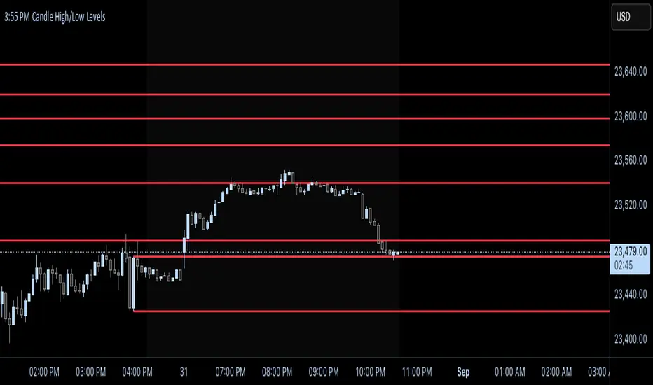
CLEAN SESSION LEVELS This indicator provides all the key levels of the market. What sets it apart is how clean and clear the levels are—no clutter, just precise markings. You can extend the levels to the right, have them highlighted, and labeled, so there’s no confusion about their location.
I’m considering adding an alert system that notifies you when a key level is swept. Looking forward to seeing you all use it!

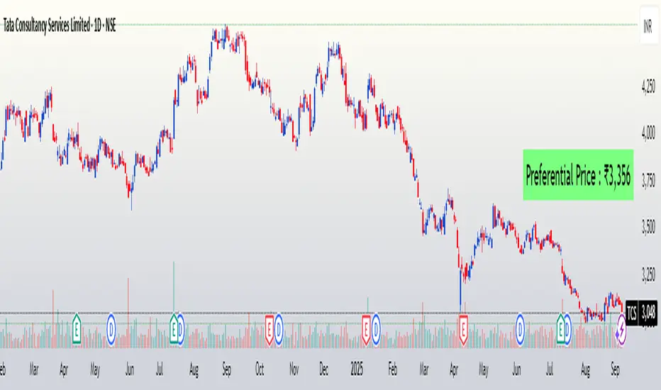
FuTech : Preferential Price📌 First Ever Indicator : FuTech : Preferential Price
💡 What if you could instantly know the Preferential Price — as if the company announced a preferential issue in today’s meeting surprisingly?
Normally, you’d be stuck with tedious valuation spreadsheets and SEBI formula checks 🧮📑…
✨ But not anymore — this tool does the hard work for you!
With just one click, it auto-calculates the Preferential Issue Floor Price under SEBI ICDR Regulations, 2018 - Regulation 164 (as amended), directly from your chart symbol.
✅ How it works ?
📅 Relevant Date = 30 days prior to either:
• Today’s date (default mode)
• Or your chosen EGM date (user input)
📊 For the Relevant Date, the indicator automatically computes:
• VWAP (90 trading days preceding Relevant Date)
• VWAP (10 trading days preceding Relevant Date)
🔎 As per SEBI Reg.164, the higher of these two VWAPs is selected as the Minimum Issue Price (Preferential Price).
💰 Price is neatly formatted in Indian style (e.g. ₹1,00,000).
✅ Key Features:
⚡ Auto-calculates from chart symbol — no manual entry.
🎛️ Option to input EGM date for accurate floor price compliance.
🎨 Fully customizable: text color, size, background, position.
🪄 Clean display → shows only the final Preferential Price (Reg.164).
📌 Usage:
This indicator is built for analysts, fund managers, and corporate professionals dealing with Preferential Allotment pricing compliance.
It ensures quick visibility of the floor price under SEBI ICDR rules, directly on your chart.
⚠️ Disclaimer:
📌 The calculated Preferential Price is an approximation based on SEBI ICDR Reg.164 methodology.
📊 Actual price determined by the company / merchant banker may vary slightly (±5) due to rounding, data source differences, or timing adjustments.
📅 Ensure to verify with official exchange data and SEBI filings before relying on these numbers.
📝 This tool is meant for analytical and educational purposes only, not a substitute for regulatory or professional advice.

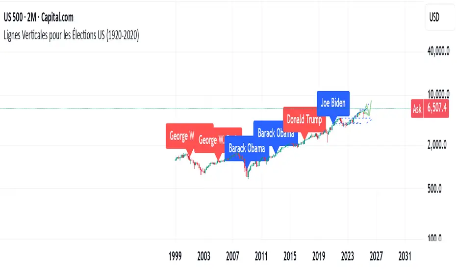
US Elections Democrate-Republicain (1920-2025)This script shows the different U.S. presidents and indicates whether each was Democratic or Republican. It allows users to analyze the market based on the president in office.
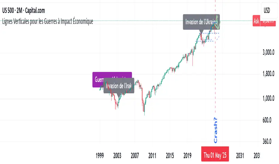
Major Wars with a signifiant economic impactThis indicator highlights major wars that have had a significant economic impact worldwide. It allows users to easily see their effects on the charts.
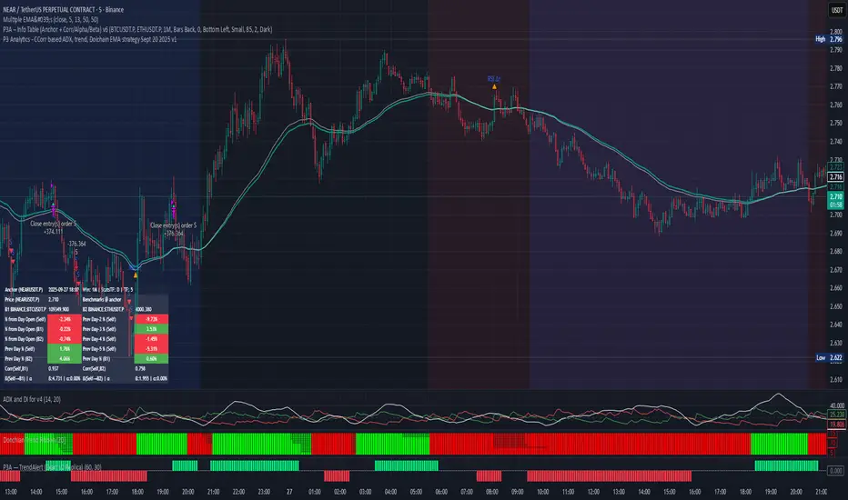
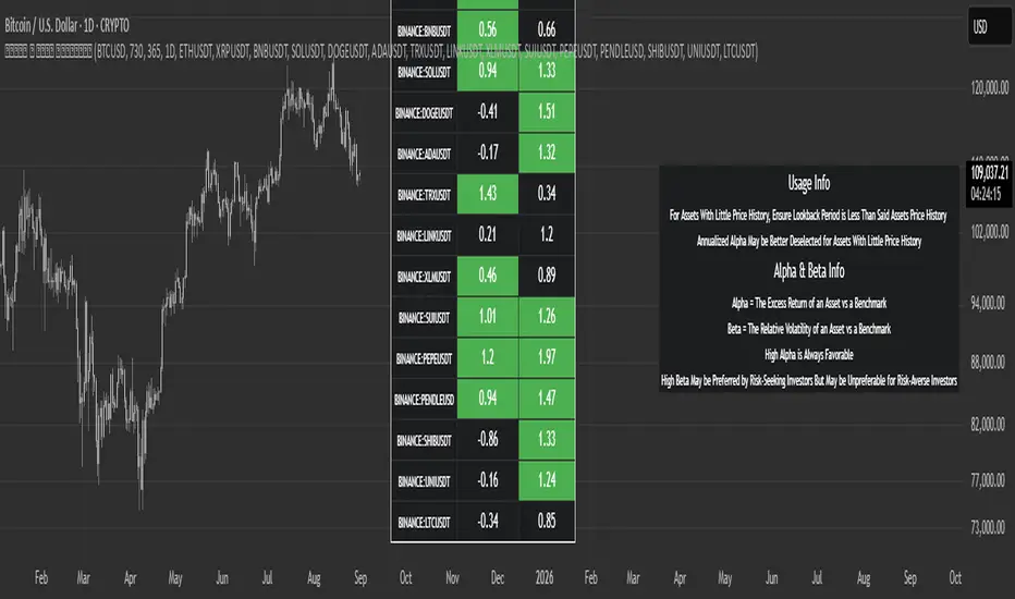
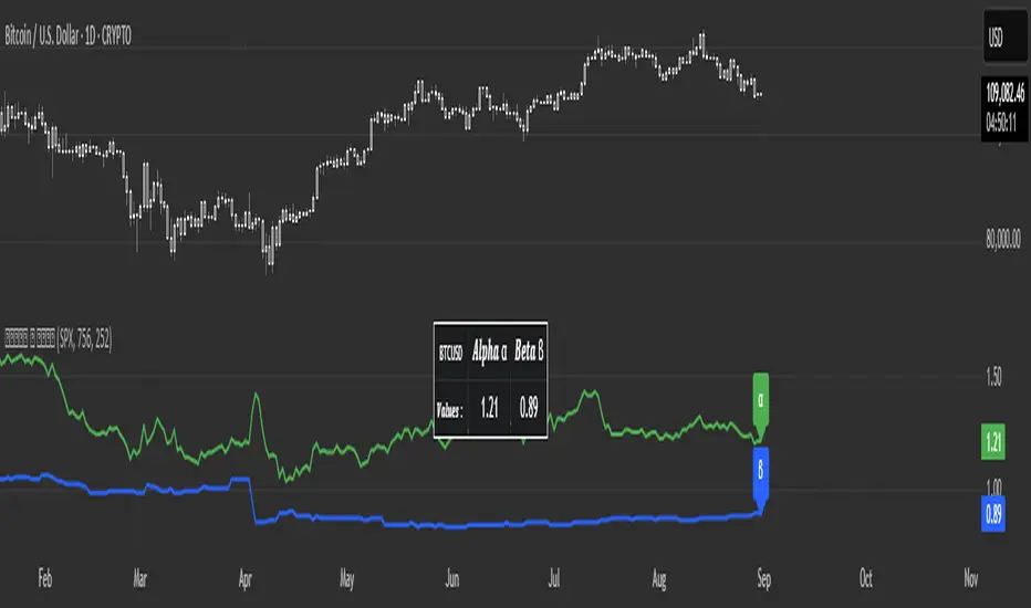
PPP – Info Table (Anchor + Corr/Alpha/Beta) v3PPP – Info Table (Anchor + Corr/Alpha/Beta)
- By P3 Analytics, run by Puranam Pradeep Picasso Sharma
🔎 Overview
This indicator creates a clean, dynamic information table on your chart that lets you quickly analyze how your chosen asset is performing relative to BTC, ETH, or any other benchmarks.
With a single glance, you can see:
% change from today’s open (for the anchor asset, BTC, and ETH)
Previous day % change (self + benchmarks)
Correlation, Beta, and Alpha statistics for the selected window (1W, 1M, 1Y)
Anchor values at any bar you choose (via Bars Back or Anchor Time)
Perfect for traders who want to measure coin strength vs benchmarks and make better rotation, risk, or hedging decisions.
📊 Key Metrics
Correlation (Corr): How closely the asset moves with the benchmark.
+1 = moves together, 0 = no relation, -1 = moves opposite.
Beta (β): Sensitivity of returns vs the benchmark.
β = 1 → moves 1:1 with BTC.
β > 1 → more volatile (amplifies BTC moves).
β < 1 → less volatile (defensive).
Alpha (α): Excess return beyond what Beta predicts.
Positive α = outperforming benchmark-adjusted expectation.
Negative α = underperforming.
⚙️ Features
Flexible Anchor Mode:
Bars Back → quickly step through bars.
Time → pin analysis to a specific historical candle.
Customizable Benchmarks: Default BTC & ETH (futures), but replaceable with any ticker.
Adjustable Stats Window:
1 Week, 1 Month, 1 Year (auto-scales if using chart timeframe).
Compact Mode for a smaller table layout.
Dark/Light Theme, font size, corner placement, transparency, and decimal control.
Runs efficiently with minimal chart clutter.
🧑💻 About P3 Analytics
This indicator is developed under P3 Analytics, a research & trading technology initiative led by Puranam Pradeep Picasso Sharma.
P3 Analytics builds tools that merge machine learning, statistics, and trading strategy into accessible products for traders across crypto, equities, forex, and commodities.
✅ How to Use
Add indicator to your chart.
In settings:
Pick your benchmarks (default = BTCUSDT.P, ETHUSDT.P).
Choose your anchor (Bars Back or Time).
Set window length for correlation/alpha/beta.
Read the table:
Left side = your asset.
Right side = benchmarks.
Colors: Green = positive % change, Red = negative.
🚀 Why Use This?
Quickly compare your asset vs BTC/ETH without juggling multiple charts.
Spot whether a coin is truly leading or just following BTC.
Identify outperformance (alpha) coins for rotation or trend plays.
Manage risk by knowing which assets are high beta (high leverage-like moves).
✦ Indicator by P3 Analytics
✦ Created & published by Puranam Pradeep Picasso Sharma
Sectoral Stock Top-to-Down Screener : ⭐ Sectoral Stock Top-to-Down Screener Analysis ⭐
This Screener indicator provides a bird's-eye view of the Market's important indices, sectors and Stocks listed in those sectors.
1: It represents a Screener Table that shows the (%) percentage change of the market, Sectors and all the Stocks (listed via input) . The color represents the Trend of the Previous day and the current day compared to Nifty50 Index.
2: The %percentage change is dependent on the Time-Frame selection:
This Input allows users to look at the Major Index > sectors > stocks in their specific time frame.
3: It has a alert function, which can trigger for all symbols/securities in the table.
Irrespective of Trading View Free or Paid user, this alert works for all .
4: Compatible with All Devices (Laptop / Mobile / Tablet / PC)

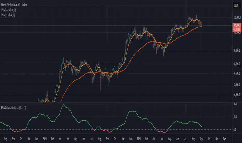
Distance Between EMA'sThis indicator measures the distance between any two EMA's you choose. You can change the EMA's by clicking settings and change the inputs to the two that you choose
Futures Multi-Asset Open Distance Table## Multi-Asset Open Distance Table - Quick Description
This Pine Script indicator displays a **real-time table** that tracks how far **three user-selected assets** are from their key opening price levels.
**What it shows:**
- **Three customizable assets** (default: NQ!, ES!, YM!)
- **Distance from 3 key opens** for each asset:
- **1800 ET Open** (Electronic trading session start)
- **0930 ET Open** (Regular market hours start)
- **Weekly Open** (Beginning of trading week)
**Visual features:**
- **Percentage changes** from each open level
- **Color coding**: Green for gains above opens, red for losses below opens
- **Direction arrows**: ▲ (above), ▼ (below), ■ (unchanged)
- **Customizable table position** and size
**Perfect for:**
- **Intraday traders** monitoring key session levels
- **Multi-timeframe analysis** across different market opens
- **Quick reference** to see which assets are performing relative to major opening levels
- **Session-based trading strategies** using 6PM and 9:30AM opens
The table updates in real-time and provides an at-a-glance view of where your chosen assets stand relative to these critical price reference points throughout the trading day.

Artharjan NSE Sectors Relative Strength DashboardArtharjan NSE Sectors Relative Strength Dashboard
This script provides a comprehensive dashboard for analyzing the relative strength of NSE sectors compared to a benchmark index (default: NIFTY). It is designed to give traders and investors a consolidated snapshot of sector performance, momentum, and short-term trend strength — all in one visual table.
Core Purpose
The goal is to simplify sector rotation analysis by combining relative strength, rate of change, momentum, and trend classification into a sortable, color-coded dashboard. Instead of scanning multiple charts, users can rely on this single panel for quick decision-making.
Key Features
Benchmark Comparison
Every sector is measured against the benchmark index (default: NIFTY). This allows users to spot outperforming or underperforming sectors relative to the market.
Multiple Performance Metrics
LTP % Change: Last traded price percentage change from the prior close.
RS Score: Relative strength score over a user-defined lookback.
Momentum (ROC Difference): Convergence/divergence between two ROC values for added confirmation.
ROC1 / ROC2: Short- and medium-term rate-of-change measures.
Trend Classification Engine
Each sector is tagged as Ultra Bullish, Bullish Breakout, Strong/Moderate Bullish, Neutral, Moderate/Strong Bearish, Bearish Breakdown, or Ultra Bearish. This classification is based on sectoral price behavior and candlestick relationships.
Sorting & Customization
Users can sort the dashboard by any metric (e.g., RS Score, % Change, Momentum), in ascending or descending order, to highlight what matters most for their strategy.
Table Presentation
Adjustable text size, thickness, and positioning on the chart.
Optional color-coded cells for visual cues — green shades for strength, red shades for weakness, neutral shades for sideways trends.
“Last Updated” timestamp for clarity on when the snapshot was generated.
How It Helps
This tool reduces the noise of flipping through individual sector charts. Traders can identify sector leadership, monitor momentum shifts, and catch early signs of rotation without leaving a single chart window. It acts as both a macro lens (sector overview) and a micro tool (spotting exact strength/weakness transitions).
Closing Note
This dashboard was built with a simple goal: to bring clarity to complex sectoral movements. Use it as a guiding compass while respecting your broader trading or investing framework.
With Thanks,
Rrahul Desai
@Artharjan

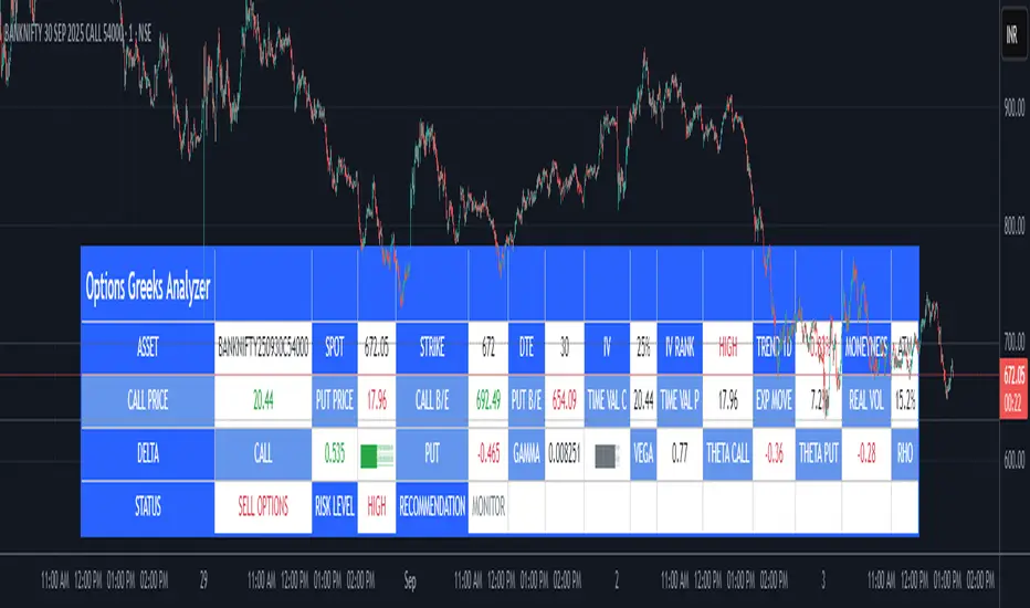
Options Greeks AnalyzerOptions Greeks Analyzer (Training & Learning Guide)
________________________________________
1. Introduction
Options trading is advanced compared to regular stock trading, and one of the most important aspects is Options Greeks. Greeks are mathematical values that measure how the price of an option will react to changes in various factors such as the underlying asset’s price, volatility, interest rates, and time to expiry.
This Options Greeks Analyzer tool is built using TradingView Pine Script v5. It serves as a real time training and analysis dashboard that helps learners visualize how options greeks behave, how option prices change, and how traders can make informed decisions.
📌 Educational Disclaimer:
This tool is only for training and learning purposes. It is not a financial advice tool nor to be used for live trading decisions. The data shown is theoretical Black Scholes model calculations, which may differ from actual option market prices.
________________________________________
2. How the Tool Works
The Options Greeks Analyzer is divided into different modules. Below is a step by step walkthrough:
________________________________________
Step 1: User Inputs
• Implied Volatility (IV%) — You can manually enter volatility, which is the most important factor in option pricing. Higher IV = higher option premium.
• Expiry Selection — Choose from preset durations like 7D, 14D, 30D etc. Days to expiry directly affect time decay (Theta).
• Strike Price Mode — You can select either:
o ATM (At-the-Money = Current price of stock/index)
o Custom strike (Enter your own strike price)
• Risk-Free Rate (%) — A small interest rate factor (like government bond yield) used for theoretical valuation.
• Table Customization — Choose table size, position, and whether to show price lines for easy visibility.
________________________________________
Step 2: Market Data & Volatility
• The tool takes the current market price (Spot Price) as input.
• It calculates realized volatility from historical price fluctuations (using past 30 bars/log returns).
• Implied Volatility (manual input) is then compared to realized vol:
o If IV > Historical Volatility → Market pricing is “expensive” (HIGH IV RANK).
o If IV < Historical Volatility → Market is “cheap” (LOW IV RANK).
o Otherwise, it’s MEDIUM.
📌 Why it matters?
Traders can decide whether buying or selling options is favorable. Beginners learn that timing entry with volatility is more critical than just looking at market direction.
________________________________________
Step 3: Black-Scholes Formula
The core engine uses the Black-Scholes model, a mathematical formula widely used to compute option fair prices.
It uses the following inputs:
• Current price (Spot)
• Strike Price
• Time to Expiry (T)
• Risk Free Rate (r)
• Implied Volatility (σ)
This produces:
• Call Option Price
• Put Option Price
📌 This teaches learners how premiums are derived theoretically and why the same strike can have different values depending on IV and time.
________________________________________
Step 4: Option Greeks Calculation
The tool computes the first order Greeks:
• Delta → Measures how much the option price changes when the underlying stock moves by 1 point.
(Call Delta ranges 0–1, Put Delta ranges -1 to 0).
• Gamma → Sensitivity of Delta to price change. A measure of volatility risk.
• Theta → Time decay. Shows how much value option loses as each day passes. Calls and Puts have negative Theta (decay).
• Vega → Measures how sensitive option price is to volatility changes.
• Rho → Interest rate sensitivity. Mostly minor in equity options but important for training.
📌 New traders learn how each factor impacts profits/losses. Instead of random guessing, they see mathematical impact in numbers.
________________________________________
Step 5: Dashboard & Visualization
The tool builds a professional dashboard table on the chart.
It shows categories such as:
1. Asset Info — Spot, Strike, DTE (days to expiry), IV%, IV Rank, 1-Day Trend, Moneyness (ATM/OTM/ITM).
2. Option Prices — Call, Put, Break-even levels, Time Value, Expected Move (%), Realized vs Implied Vol.
3. Greeks with Visual Progress Bars — Easily shows Delta, Gamma, Vega, Theta, Rho in intuitive graphical representations.
4. Status Bar — Suggests theoretical bias like:
o HIGH IV → Favor Option Selling
o LOW IV → Favor Option Buying
o MEDIUM → Neutral observation
5. Recommendation Line — Offers training-based suggestions like “Buy Straddles”, “Sell Call Spreads”, etc. These are not signals, but scenarios to learn strategies.
________________________________________
3. How It Helps Beginners
1. Learn Greeks in Action:
Beginners often memorize formulas but never see real-time changes. This dashboard updates every bar to show how Greeks change dynamically.
2. Compare Volatilities:
Traders understand difference between historical vs implied volatility and why option premiums behave differently.
3. Understand Risk Levels:
The tool highlights when Gamma risk is high (danger for sellers) or when Theta is most favorable.
4. Training Mode for Strategies:
Helps beginners experiment by changing IV, strike, expiry and seeing how straddles, spreads, naked options would behave theoretically.
5. Prepares Before Live Trading:
Safe environment to practice option analysis without risking capital.
________________________________________
4. Educational Use Cases
• Scenario 1: Change expiry from 7D to 30D — see how Theta becomes slower for longer expiries.
• Scenario 2: Increase IV from 25% to 80% — watch how option premiums inflate, and recommendation changes from “Buy” to “Sell”.
• Scenario 3: Select OTM vs ITM strikes — check how delta moves from near 0 to near 1.
By running these scenarios, learners understand why professional traders hedge Greeks instead of directional gambling.
________________________________________
5. Disclaimer
This Options Greeks Analyzer is built strictly for educational and training purposes.
• It uses theoretical formulas (Black-Scholes) that may not match actual option market prices.
• The recommendations are for learning strategy logic only, not real-world execution signals.
• Trading in options carries significant risks and may result in capital loss.
📌 Always consult with a financial advisor before applying real strategies.
________________________________________
✅ Summary
This Options Greeks Analyzer:
• Teaches how Greeks, IV, and premiums work.
• Provides a real-time interactive dashboard for training.
• Helps beginners practice option scenarios safely.
• Is meant strictly for learning and not live trading execution.
________________________________________
________________________________________
Disclaimer from aiTrendview
This script and its trading signals are provided for training and educational purposes only. They do not constitute financial advice or a guaranteed trading system. Trading involves substantial risk, and there is the potential to lose all invested capital. Users should perform their own analysis and consult with qualified financial professionals before making any trading decisions. aiTrendview disclaims any liability for losses incurred from using this code or trading based on its signals. Use this tool responsibly, and trade only with risk capital.
Ultimate Fundamental FortressScript Overview
This script provides a comprehensive Fundamental Health Scorecard for stocks, calculating a normalized score out of 100 based on key financial metrics fetched from TradingView's fundamental data. It displays the results in an elegant table with customizable colors, a dynamic plot for visualization, and a scorecard label for quick insights. The scorecard helps users assess a stock's value, profitability, and financial strength at a glance.
Purpose
The primary goal is to simplify fundamental analysis by aggregating essential ratios into a single, easy-to-interpret score. Inspired by value investing principles (e.g., low P/E and P/B for undervalued stocks, high ROE for efficiency), it empowers traders and investors to identify strong fundamentals quickly. It's especially useful for screening undervalued opportunities or comparing stocks within sectors.
Principles
Metrics Selection: Focuses on core fundamentals: Price-to-Book (P/B), Price-to-Earnings (P/E), Return on Equity (ROE), Debt-to-Equity (D/E), Free Cash Flow (FCF normalized by market cap), EBITDA (normalized by market cap), and Net Profit Margin. These are chosen for their balance of valuation, profitability, and risk assessment.
Scoring Philosophy: Each metric is scored based on thresholds (e.g., low ratios for valuation metrics indicate better value). If manual sector averages are provided, scoring becomes relative (e.g., stock P/B below sector average gets higher points), reducing subjectivity and adapting to industry norms. Without averages, absolute thresholds apply.
Normalization: Scores are summed and scaled to 100, ignoring missing data to ensure robustness. This allows fair comparison across stocks with varying data availability.
Customization: Users can adjust thresholds, colors, and sector averages for personalized analysis, making it flexible for different markets or strategies.
Calculation Methodology
Data Fetching: Uses request.financial() to pull quarterly (FQ) or trailing twelve months (TTM) data for metrics like BVPS, EPS, ROE, etc.
Ratio Computations:
P/B = Close Price / BVPS
P/E = Close Price / EPS
ROE = Directly fetched
D/E = Total Liabilities / Equity
Net Margin = Net Income / Revenue
Normalized FCF = FCF / Market Cap (as percentage)
Normalized EBITDA = EBITDA / Market Cap (as percentage)
Scoring:
For each metric, compare to thresholds or relative to sector averages (if provided >0).
Example for P/B: If relative (sector avg >0), stock P/B < avg * high factor → 15 pts; < avg * med factor → 10 pts; etc.
For ROE/Net Margin (higher is better): Reverse logic (stock > avg / factor).
FCF/EBITDA: Always absolute (normalized thresholds).
Minimum score per metric: 2-5 pts if poor.
Total Score: Sum valid scores, divide by max possible for those metrics, multiply by 100.
Output: Table shows components, values, scores, and sector avgs.
Plot visualizes score with color-coding.
Label categorizes (e.g., "Buffett Approved" for 85+).
User Inputs and Benefits
Thresholds (Absolute/Relative Factors): Customize scoring rules (e.g., change P/E low threshold from 10 to 12).
Benefit: Adapt to personal strategy or market conditions – e.g., stricter for growth stocks.
Manual Sector Averages: Enter averages (e.g., sector P/B = 2.5).
Benefit: Makes scoring industry-specific, reducing bias (e.g., tech's high P/E normal, banking's low ROE risky). If not entered (≤0), falls back to absolute for simplicity.
Color Customizations: Adjust table colors (header, scores).
Benefit: Personalize visuals for dark/light themes, improving readability and user experience.
Normalized FCF/EBITDA Thresholds: Set as % of market cap. Benefit: Size-independent comparison – small caps won't be disadvantaged.
Usage Notes Add to chart via Indicators menu.
Data relies on TradingView fundamentals – may be limited for some exchanges (e.g., BIST, international). Use manual averages for accuracy.
For screener: High request count (10) may exceed limits; use reduced version if needed.
Not financial advice – always verify with external sources.
Feedback welcome – let's improve together!

Molina Prob-Score + FVG + S/R (v1.2)it computes a weighted bull/bear score (0–100%), highlights ICT-style FVGs, marks pivot S/R, and gives simple entry flags. tune the weights to your style.

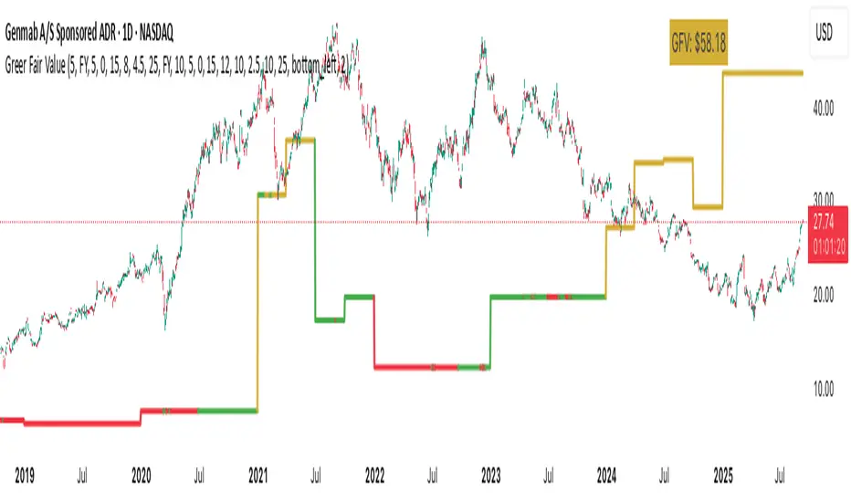
Greer Fair Value✅ Greer Fair Value
Greer Fair Value: Graham intrinsic value + Buffett-style DCF with auto EPS/FCF and auto growth (CAGR of FCF/share), defaulting to a simple GFV badge that color-codes opportunity at a glance.
📜 Full description
Greer Fair Value is inspired by the valuation frameworks of Benjamin Graham and Warren Buffett. It combines Graham’s rate-adjusted intrinsic value with a two-stage, per-share DCF. The script auto-populates EPS (TTM) and Free Cash Flow per share (FY/FQ/TTM) from request.financial(), and can auto-estimate the near-term growth rate (g₁) using the CAGR of FCF/share over a user-selected lookback (with sensible caps). All assumptions remain editable.
Default view: only the GFV badge is shown to keep charts clean.
Badge color logic:
Gold — both DCF and Graham fair values are above the current price
Green — exactly one of them is above the current price
Red — the current price is above both values
Show more detail (optional):
Toggle “Show Graham Lines” and/or “Show DCF Lines” to plot fair values (and optional MoS bands) over time.
Toggle “Show Dashboard” for a compact data table of assumptions and outputs.
Optional summary label can be enabled for a quick on-chart readout.
Inputs you can customize: EPS source/manual fallback, FCF/share source (FY/FQ/TTM), g₁ auto-CAGR lookback & caps, terminal growth gT, discount rate r, MoS levels, step-style plots, table position, and decimals.
Note: TradingView’s UI controls whether “Inputs/Values in Status Line” are shown. If you prefer a clean status line, open the indicator’s settings and uncheck those options, then Save as default.
Disclaimer: For educational/informational purposes only; not financial advice. Markets involve risk—do your own research.
MomentumScriptThis is Momentum Tracker based on Richard Driehaus' research:
1) 12–1 momentum (return from t-12 months to t-1 month
2) FIP / path efficiency (many small up days > one big gap)
3) Proximity to 52-week high/low

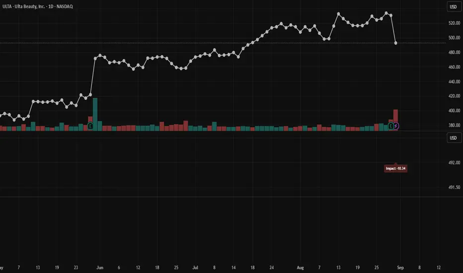
Impact Score (ATR% × RVOL)Calculates Impact Score (ATR% × RVOL). This number helps determine if a movement in price is a "thin drop" meaning the drop had relatively low volume and is likely to bounce back, or if it's heavy drop, meaning that it had high volume and less likely to rebound as soon e.g., results from earnings report.
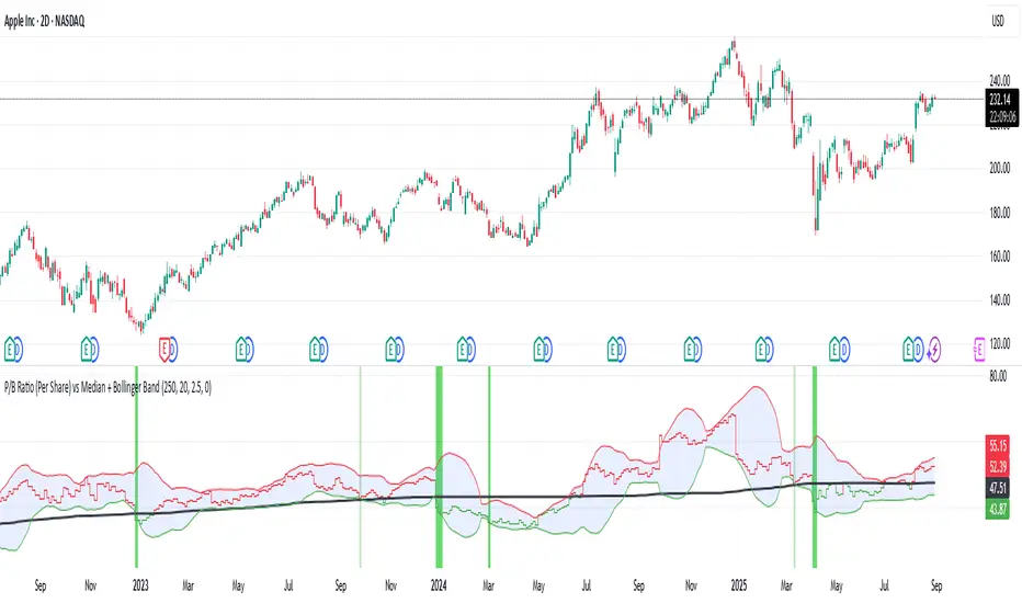
P/B Ratio (Per Share) vs Median + Bollinger Band- 📝 This indicator highlights potential buying opportunities by analyzing the Price-to-Book (P/B) ratio in relation to Bollinger Bands and its historical median.
- 🎯 The goal is to provide a visually intuitive signal for value-oriented entries, especially when valuation compression aligns with historical context.
- 💡 Vertical green shading is applied when the P/B ratio drops below the lower Bollinger Band, which is calculated directly from the P/B ratio itself — not price. This condition often signals the ticker may be oversold.
- 🟢 Lighter green appears when the ratio is below the lower band but above the median, suggesting a possible shorter-term entry with slightly more risk.
- 🟢 Darker green appears when the ratio is both below the lower band and below the median, pointing to a potentially stronger, longer-term value entry.
- ⚠️ This logic was tested using 1 and 2-day time frames. It may not be as helpful in longer time frames, as the financial data TradingView pulls in begins in Q4 2017.
- ⚠️ Note: This script relies on financial data availability through TradingView. It may not function properly with certain tickers — especially ETFs, IPOs, or thinly tracked assets — where P/S ratio data is missing or incomplete.
- ⚠️ This indicator will not guarantee successful results. Use in conjunction with other indicators and do your due diligence.
- 🤖 This script was iteratively refined with the help of AI to ensure clean logic, minimalist design, and actionable signal clarity.
- 📢 Idea is based on the script "Historical PE ratio vs median" by haribotagada
- 💬 Questions, feedback, or suggestions? Drop a comment — I’d love to hear how you’re using it or what you'd like to see changed.
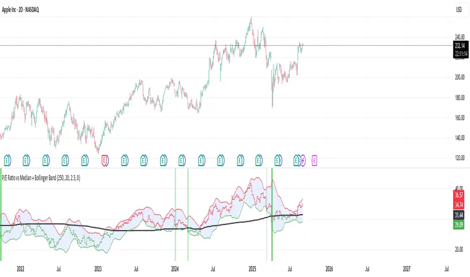
P/E Ratio vs Median + Bollinger Band- 📝 This indicator highlights potential buying opportunities by analyzing the Price-to-Earnings (P/E) ratio in relation to Bollinger Bands and its historical median.
- 🎯 The goal is to provide a visually intuitive signal for value-oriented entries, especially when valuation compression aligns with historical context.
- 💡 Vertical green shading is applied when the P/E ratio drops below the lower Bollinger Band, which is calculated directly from the P/E ratio itself — not price. This condition often signals the ticker may be oversold.
- 🟢 Lighter green appears when the ratio is below the lower band but above the median, suggesting a possible shorter-term entry with slightly more risk.
- 🟢 Darker green appears when the ratio is both below the lower band and below the median, pointing to a potentially stronger, longer-term value entry.
- ⚠️ This logic was tested using 1 and 2-day time frames. It may not be as helpful in longer time frames, as the financial data TradingView pulls in begins in Q4 2017.
- ⚠️ Note: This script relies on financial data availability through TradingView. It may not function properly with certain tickers — especially ETFs, IPOs, or thinly tracked assets — where P/S ratio data is missing or incomplete.
- ⚠️ This indicator will not guarantee successful results. Use in conjunction with other indicators and do your due diligence.
- 🤖 This script was iteratively refined with the help of AI to ensure clean logic, minimalist design, and actionable signal clarity.
- 📢 Idea is based on the script "Historical PE ratio vs median" by haribotagada
- 💬 Questions, feedback, or suggestions? Drop a comment — I’d love to hear how you’re using it or what you'd like to see changed.
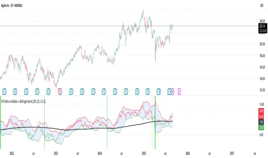
P/S Ratio vs Median + Bollinger Band- 📝 This indicator highlights potential buying opportunities by analyzing the Price-to-Sales (P/S) ratio in relation to Bollinger Bands and its historical median.
- 🎯 The goal is to provide a visually intuitive signal for value-oriented entries, especially when valuation compression aligns with historical context.
- 💡 Vertical green shading is applied when the P/S ratio drops below the lower Bollinger Band, which is calculated directly from the P/S ratio itself — not price. This condition often signals the ticker may be oversold.
- 🟢 Lighter green appears when the ratio is below the lower band but above the median, suggesting a possible shorter-term entry with slightly more risk.
- 🟢 Darker green appears when the ratio is both below the lower band and below the median, pointing to a potentially stronger, longer-term value entry.
- ⚠️ This logic was tested using 1 and 2-day time frames. It may not be as helpful in longer time frames, as the financial data TradingView pulls in begins in Q4 2017.
- ⚠️ Note: This script relies on financial data availability through TradingView. It may not function properly with certain tickers — especially ETFs, IPOs, or thinly tracked assets — where P/S ratio data is missing or incomplete.
- ⚠️ This indicator will not guarantee successful results. Use in conjunction with other indicators and do your due diligence.
- 🤖 This script was iteratively refined with the help of AI to ensure clean logic, minimalist design, and actionable signal clarity.
- 📢 Idea is based on the script "Historical PE ratio vs median" by @haribotagada
- 💬 Questions, feedback, or suggestions? Drop a comment — I’d love to hear how you’re using it or what you'd like to see changed.