E9 MACD
The E9 MACD (Moving Average Convergence Divergence) indicator is a powerful tool used in technical analysis to help traders identify potential buy and sell signals based on price action. It is designed to provide clear visual cues and alerts for trading decisions. Here’s how it applies to price action and its key functionalities:
Key Features and Functionality
MACD Line and Signal Line:
MACD Line: Represents the difference between a fast and a slow moving average of the price. It helps in identifying the momentum of the price movement.
Signal Line: A smoothed average of the MACD Line, used to generate trading signals when the MACD Line crosses above or below it.
Histogram: The histogram shows the difference between the MACD Line and the Signal Line. It visually represents the strength of the trend, with positive values indicating bullish momentum and negative values indicating bearish momentum.
Trend Coloring:
Uptrend: When the MACD Line is above the Signal Line, the bars can be colored green to indicate a potential buying opportunity.
Downtrend: When the MACD Line is below the Signal Line, the bars can be colored red to signal a potential selling opportunity.
Timeframe Flexibility:
The E9 MACD can be adjusted to different timeframes, allowing traders to analyze short-term or long-term trends based on their trading strategy. This flexibility helps in tailoring the indicator’s analysis to different market conditions.
Visual Alerts and Highlights:
The indicator includes options to highlight price bars and background colors when significant crossovers occur, making it easier to spot key trading signals.
Circles can be plotted on the MACD Line to indicate cross events, enhancing visual clarity.
Customizable Appearance:
Traders can customize the appearance of the MACD Line, Signal Line, and Histogram, including color and line width, to suit their personal preferences and improve readability.
Alerts for Trading Signals:
The E9 MACD can generate alerts for crossovers of the MACD Line and Signal Line, helping traders stay informed of potential trading opportunities even when they are not actively monitoring the charts.
Application in Trading
The E9 MACD is particularly useful for:
Identifying potential entry and exit points based on the crossing of the MACD Line and Signal Line.
Gauging the strength of the current trend through the histogram.
Adjusting to different timeframes to align the indicator with various trading strategies, from day trading to long-term investing.
By providing clear visual indicators and alerts, the E9 MACD helps traders make more informed decisions and better understand the momentum and direction of price movements.
M-oscillator

Power MarketPower Market Indicator
Description: The Power Market Indicator is designed to help traders assess market strength and make informed decisions for entering and exiting positions. This innovative indicator provides a comprehensive view of the evolution of Simple Moving Averages (SMA) over different periods and offers a clear measure of market strength through a total score.
Key Features:
Multi-Period SMA Analysis:
Calculates Simple Moving Averages (SMA) for 10 different periods ranging from 10 to 100.
Provides detailed analysis by comparing the current closing price with these SMAs.
Market Strength Measurement:
Assesses market strength by calculating a total score based on the relationship between the closing price and the SMAs.
The total score is displayed as a histogram with distinct colors for positive and negative values.
Smoothed Curve for Better View:
A smoothing of the total score is applied using a 5-period Simple Moving Average to represent the overall trend more smoothly.
Dynamic Information Table:
Real-time display of the maximum and minimum values among the SMAs, as well as the difference between these values, providing valuable insights into the variability of moving averages.
Visual Reference Lines:
Horizontal lines at zero, +50, and -50 for easy evaluation of key score levels.
How to Use the Indicator:
Position Entries: Use high positive scores to identify buying opportunities when market strength is strong.
Position Exits: Negative scores may signal market weakness, allowing you to exit positions or wait for a better opportunity.
Data Analysis: The table helps you understand the variability of SMAs, offering additional context for your trading decisions.
This powerful tool provides an in-depth view of market dynamics and helps you navigate your trading strategies with greater confidence. Embrace the Power Market Indicator and optimize your trading decisions today!
Connors RSI with Down GapThe Connors RSI with Down Gap indicator is a technical tool designed to support Larry Connors' Terror Gap Strategy, which is part of his broader framework outlined in the book "Buy the Fear, Sell the Greed: 7 Behavioral Quant Strategies for Traders." This specific indicator integrates the ConnorsRSI calculation with a focus on detecting down gaps in price, providing insights into moments when panic selling may occur.
The ConnorsRSI
ConnorsRSI is a composite indicator developed by Larry Connors that combines three core components:
RSI: A short-term relative strength index measuring the speed and magnitude of price changes.
Streak RSI: Tracks consecutive up or down closes to assess momentum.
Percent Rank: Evaluates how the current close ranks in relation to past prices.
When combined, these three elements provide a nuanced view of short-term overbought or oversold conditions. ConnorsRSI readings below a certain threshold (commonly 30 or lower) suggest that the asset has been heavily sold, indicating potential exhaustion of selling pressure.
Behavioral Finance Insights
The Terror Gap Strategy is grounded in principles from behavioral finance, which studies how psychological factors affect market participants' decision-making. Specifically, the indicator exploits the fear and irrational behavior that often arise when traders face persistent losses, especially after a down gap. According to behavioral finance theories like prospect theory (Kahneman & Tversky, 1979), people tend to overreact to losses, leading to panic selling. This creates opportunities for contrarian traders who understand the psychology behind these market movements.
The ConnorsRSI with Down Gap indicator works because it identifies:
Overextended selling through the ConnorsRSI, where persistent price declines result in low RSI values (indicating panic).
Gap down days, where the opening price is below the previous day’s close, typically amplifying the sense of loss and fear for traders already in losing positions.
Why This Indicator Works
The psychology of losses makes traders more prone to selling during periods of fear, especially when confronted with a gap down after sustained price declines. This indicator, by combining ConnorsRSI with down gaps, offers a quantitative way to spot these moments of panic. Traders can take advantage of these signals to enter positions when the market is in a state of fear, often when there is potential for a reversion to the mean.
Indicator Mechanics
In the current implementation:
The ConnorsRSI is calculated using three components: a short-term RSI, streak RSI, and percent rank.
When the ConnorsRSI drops below a user-defined lower threshold, the indicator highlights oversold conditions.
If there is a down gap (open price lower than the previous close) and the ConnorsRSI is below the threshold, a label is displayed, signaling a potential opportunity to buy.
Practical Use and Application
For traders looking to implement the Terror Gap Strategy, this indicator provides a clear visual cue (via background coloring and labels) when conditions are ripe for a contrarian trade. It can be particularly useful for traders who thrive on taking advantage of fear-driven sell-offs.
However, to fully understand and apply this strategy effectively, it is recommended to purchase Larry Connors' book "Buy the Fear, Sell the Greed." The book provides detailed explanations of how to execute the strategy with precision, including insights into exit conditions, scaling into positions, and managing risk.
Conclusion
The ConnorsRSI with Down Gap indicator combines quantitative analysis with behavioral finance principles to exploit fear-driven market behavior. By utilizing this tool within a disciplined trading strategy, traders can potentially profit from temporary market inefficiencies caused by panic selling.
References
Kahneman, D., & Tversky, A. (1979). Prospect theory: An analysis of decision under risk. Econometrica, 47(2), 263-291.
Connors, L. (2013). Buy the Fear, Sell the Greed: 7 Behavioral Quant Strategies for Traders.
This indicator can be a valuable asset, but understanding its proper use within a broader strategy framework is essential. Purchasing Connors' book is a recommended step toward mastering the approach.

Median Kijun-Sen [InvestorUnknown]The Median Kijun-Sen is a versatile technical indicator designed for both trend-following strategies and long-term market valuation. It incorporates various display modes and includes a backtest mode to simulate its performance on historical price action.
Key Features:
1. Trend-Following and Long-Term Valuation:
The indicator is ideal for trend-following strategies, helping traders identify entry and exit points based on the relationship between price and the Kijun-Sen calculated from median price (customizable price source).
With longer-term settings, it can also serve as a valuation tool (in oscillator display mode), assisting in identifying potential overbought or oversold conditions over extended timeframes.
2. Display Modes:
The indicator can be displayed in three main modes, each serving a different purpose:
Overlay Mode : Plots the Median Kijun-Sen directly over the price chart, useful for visualizing trends relative to price action.
Oscillator Mode : Displays the oscillator that compares the current price to the Median Kijun-Sen, providing a clearer signal of trend strength and direction
Backtest Mode : Simulates the performance of the indicator with different settings on historical data, offering traders a way to evaluate its reliability and effectiveness without needing TradingView's built-in strategy tool
3. Backtest Functionality:
The inbuilt backtest mode enables users to evaluate the indicator's performance across historical data by simulating long and short trades. Users can customize the start and end dates for the backtest, as well as specify whether to allow long & short, long only, or short only signals.
This backtest functionality mimics TradingView's strategy feature, allowing users to test the effectiveness of their chosen settings before applying them to live markets.
equity(series int sig, series float r, startDate, string signals, bool endDate_bool) =>
if time >= startDate and endDate_bool
float a = 0
if signals == "Long & Short"
if sig > 0
a := r
else
a := -r
else if signals == "Long Only"
if sig > 0
a := r
else if signals == "Short Only"
if sig < 0
a := -r
else
runtime.error("No Signal Type found")
var float e = na
if na(e )
e := 1
else
e := e * (1 + a)
float r = 0.0
bool endDate_bool = use_endDate ? (time <= endDate ? true : false) : true
float eq = 1.0
if disp_mode == "Backtest Mode"
r := (close - close ) / close
eq := equity(sig, r, startDate, signals, endDate_bool)
4. Hint Table for Pane Suggestions:
An inbuilt hint table guides users on how to best visualize the indicator in different display modes:
For Overlay Mode, it is recommended to use the same pane as the price action.
For Oscillator and Backtest Modes, it is advised to plot them in a separate pane for better clarity.
This table also provides step-by-step instructions on how to move the indicator to a different pane and adjust scaling, making it user-friendly.
Potential Weakness
One of the key drawbacks is the indicator’s tendency to produce false signals during price consolidations, where price action lacks clear direction and may trigger unnecessary trades. This is particularly noticeable in markets with low volatility.
Alerts
The indicator includes alert conditions for when it crosses above or below key levels, enabling traders to receive notifications of LONG or SHORT signals.
Summary
The Median Kijun-Sen is a highly adaptable tool that serves multiple purposes, from trend-following to long-term valuation. With its customizable settings, backtest functionality, and built-in hints, it provides traders with valuable insights into market trends while allowing them to optimize the indicator to their specific strategy.
This versatility, however, comes with the potential weakness of false signals during consolidation phases, so it's most effective in trending markets.

RishiMoney RSIRishiMoney RSI
The "RishiMoney RSI" indicator is designed for traders who want to leverage the power of the Relative Strength Index (RSI) across multiple timeframes.
In addition to regular RSI, this script allows the users to select custom timeframes for two additional RSI calculations, making it easier to identify trends, reversals, and potential entry or exit points.
USAGE
While Returning the same information as a regular RSI the RishiMoney RSI provides two more RSI calculations One for Lagrgest Timeframe and one for middle Timeframe so that the users need not to check for higher timeframes separately Which is very Time consuming. This script solves the problem of time taking process of checking different timeframes RSI calculations.
This script is ideal for traders who want to confirm their analysis across multiple timeframes. By comparing the main RSI with larger and intermediate timeframes, traders can better understand the market's momentum and make more informed decisions.
The RishiMoney RSI crossing above the overbought level can be indicative of a strong uptrend which is highlighted as a green gradient area, while when RishiMoney RSI is crossing under the oversold level can be indicative of a strong downtrend which is highlighted as a red area.
Key Features:
Customizable RSI Period: Set your preferred RSI period for precise calculation and analysis.
Multi-Timeframe RSI:
Largest RSI Timeframe: Choose the largest timeframe for your analysis (Monthly, Weekly, Daily, Hourly, 15 minutes, or 5 minutes).
Middle RSI Timeframe: Select an intermediate timeframe for comparison with the main RSI.
Overbought and Oversold Levels: The indicator includes customizable overbought and oversold levels, which are clearly marked on the chart with dynamic bands.
Alerts: Set up alerts for when the RSI crosses into overbought or oversold territory, so you never miss a potential trading opportunity.
Visual Clarity: The script plots the RSI for your selected timeframes with distinct colors, helping you quickly identify trends across different timeframes.
This script is provided for educational purposes only and should not be considered financial advice. Always conduct your own research and consult with a financial advisor before making any trading decisions.

Ultra Money FlowIntroduction
The Ultra Money Flow script is a technical indicator for analyzing stock trends. It highlights buying and selling power, helping you identify bullish (rising) or bearish (falling) market trends.
Detailed Description
The Ultra Money Flow script calculates and visually displays two main components: Fast and Slow money flow. These components represent short-term and long-term trends, respectively.
Here's how it works:
.........
Inputs
You can adjust the speed of analysis (Fast Length and Slow Length) and the type of smoothing applied (e.g., Simple Moving Average, Exponential Moving Average).
Choose colors for visualizing the trends, with blue for bullish (positive) and orange for bearish (negative) movements.
.....
Money Flow Calculation
The script analyzes price changes (delta) over specified periods.
It separates upward price movements (buying power) from downward ones (selling power).
It then calculates the difference between these powers for both Fast and Slow components.
The types of smoothing methods range from traditional ones like the Simple Moving Average (SMA) to advanced ones like the Double Expotential Moving Average (DEMA) or the Triple Exponential Moving Average (TEMA) or the Recursive Moving Average (RMA) or the Weigthend Moving Average (WMA) or the Volume Weigthend Moving Average (VWMA) or Hull Moving Average (HMA).
Very Special ones are the Triple Weigthend Moving Average (TWMA) wich created RedKTrader .
I created the Multi Weigthend Moving Average (MWMA) wich is a simple signal line to the TWMA.
.....
Divergence
This indicator can show divergence by comparing the direction of price movements with the indicator value.
If the price and the indicator move in opposite directions, you can use these signals to help decide when to buy or sell.
.....
Auto Scaling
The script adjusts its calculations based on the time frame you are viewing, whether it's minutes, hours, or days, ensuring accurate representation across different time scales.
.....
Plotting
The script plots the Fast component as a histogram and the Slow component as a line, using the chosen colors to indicate bullish or bearish trends.
The thickness and transparency of these plots give additional clues about the strength of the trend.
.........
By using this indicator, traders can easily spot shifts in buying and selling power, allowing for better-informed decisions in the market.
Special Thanks
I use the TWMA-Function created from RedKTrader to smooth the values.
Special thanks to him for creating and sharing this function!
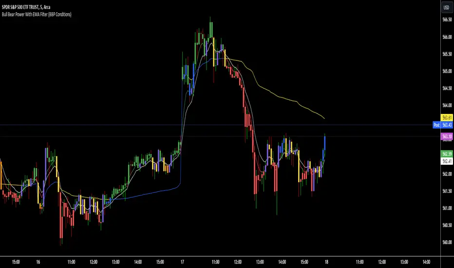
Bull Bear Power With EMA FilterDescription of Indicator:
This Pine Script indicator colors price bars based on the open price in relation to custom moving averages (EMA/SMA), Bull/Bear Power (BBPower), and an optional VWAP filter. The bar colors help identify bullish and bearish conditions with added visual cues for price positioning relative to VWAP.
Key Features:
Customizable Moving Averages (EMA/SMA):
The user can select between EMA or SMA for both short-term and long-term moving averages.
Default moving averages are set to 5 (short-term) and 9 (long-term) but can be adjusted by the user.
Bullish Condition (Blue or Purple Bars):
A bar is colored blue if the following conditions are met:
The open price is above both the short-term and long-term moving averages.
The short-term moving average (MA 1) is above the long-term moving average (MA 2).
BBPower (open price minus the 13-period EMA) is positive, indicating bullish strength.
If the VWAP filter is enabled and the price opens below VWAP, the bullish bars will turn purple.
Bearish Condition (Yellow or Orange Bars):
A bar is colored yellow if the following conditions are met:
The open price is below both the short-term and long-term moving averages.
The short-term moving average (MA 1) is below the long-term moving average (MA 2).
BBPower is negative or zero, indicating bearish market conditions.
If the VWAP filter is enabled and the price opens above VWAP, the bearish bars will turn orange.
VWAP Filter (Optional):
An optional filter allows the user to add VWAP (Volume-Weighted Average Price) to the bar coloring logic.
When the VWAP filter is enabled, it provides additional information about price positioning relative to VWAP, turning bullish bars purple and bearish bars orange depending on whether the price opens above or below VWAP.
Usage:
Bullish Trend: Look for blue or purple bars to identify potential bullish momentum.
Bearish Trend: Look for yellow or orange bars to spot bearish conditions in the market.
The indicator allows users to customize the length and type of moving averages (EMA or SMA), as well as decide whether to apply the VWAP filter.
This indicator provides traders with clear visual signals to quickly assess the strength of bullish or bearish conditions based on the price's position relative to custom moving averages, BBPower, and VWAP, helping with trend identification and potential trade setups.
Dynamic Jurik RSX w/ Fisher Transform█ Introduction
The Dynamic Jurik RSX with Fisher Transform is a powerful and adaptive momentum indicator designed for traders who seek a non-laggy view of price movements. This script is based on the classic Jurik RSX (Relative Strength Index). It also includes features such as the dynamic overbought and oversold limits, the Inverse Fisher Transform, trend display, slope calculations, and the ability to color extremes for better clarity.
█ Key Features:
• RSX: The Relative Strength Index (RSX) in this script is based on Jurik’s RSX, which is smoother than the traditional RSI and aims to reduce noise and lag. This script calculates the RSX using an exponential smoothing technique and adaptive adjustments.
• Inverse Fisher Transform: This script can optionally apply the Inverse Fisher Transform to the RSX, which helps to normalize the RSX values, compressing them between -1 and 1. The inverse transformation makes it easier to spot extreme values (overbought and oversold conditions) by enhancing the visual clarity of those extremes. It also smooths the curve over a user-defined period in hopes of providing a more consistent signal.
• Dynamic Limits: The dynamic overbought and oversold limits are calculated based on the RSX's recent high and low values. The limits adjust dynamically depending on market conditions, making them more relevant to current price action.
• Slope Display: The slope of the RSX is calculated as the rate of change between the current and previous RSX value. The slope is displayed as dots when the slope exceeds the threshold designated by the user, providing visual cues for momentum shifts.
• Trend Coloring: Optionally, the user can also enable a trend-based display. It is simply based on current value of RSX versus the previous one. If RSX is rising then the trend is bullish, if not, then the trend is bearish.
• Coloring Extremes: Users can configure the RSX to color the chart when prices enter extreme conditions, such as overbought or oversold zones, providing visual cues for market reversals.
█ Attached Chart Notes:
• Top Panel: Enabled dynamic limits, Trend display, standard Jurik RSX with 20 lookback period, and Slope display.
• Middle Panel: Enabled dynamic limits, Extremes display, and standard Jurik RSX with 20 lookback period.
• Bottom Panel: Enabled dynamic limits, Trend display, Inverse Fisher Transform with 14 lookback period and 9 smoothing period. and Slope display.
█ Credits:
Special thanks to Everget for providing the original script. The script was also slightly modified based on updates from outside sources.
█ Disclaimer:
This script is for educational purposes only and should not be considered financial advice. Always conduct your own research and consult a professional before making any trading decisions.

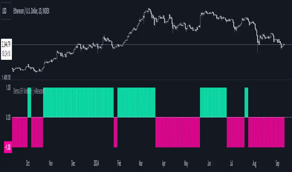
Dema EFI Volume | viResearchDema EFI Volume | viResearch
Conceptual Foundation and Innovation
The "Dema EFI Volume" indicator from viResearch integrates the Double Exponential Moving Average (DEMA) with the Elder Force Index (EFI), providing a dynamic approach to analyzing both price trends and volume strength. The DEMA is applied to smooth out price fluctuations while minimizing lag, which enhances the ability to detect trend direction. The EFI, developed by Dr. Alexander Elder, measures the power behind price movements by incorporating both price change and volume. This indicator, when combined with DEMA smoothing, gives traders a more accurate understanding of whether the current price movements are supported by significant volume, helping them make more informed trading decisions. The combination of DEMA and EFI allows traders to track trend strength while assessing the market’s volume dynamics, offering a more reliable method for identifying potential trend continuations or reversals.
Technical Composition and Calculation
The "Dema EFI Volume" script consists of two key components: the Double Exponential Moving Average (DEMA) and the Elder Force Index (EFI). The DEMA is applied to the selected source price over a user-defined length, providing a smoothed representation of price movements while reducing the noise that can occur with traditional moving averages. The EFI is calculated by multiplying the change in the DEMA by the volume over a user-defined period, which indicates whether the price movement is being driven by strong or weak volume. The script monitors the EFI values and volume data to generate trend signals. If the EFI is positive and volume increases, this indicates bullish pressure, while a negative EFI with decreasing volume suggests bearish conditions. The combination of these signals helps traders determine whether a price move is backed by sufficient volume, making it easier to identify trend continuations or potential reversals.
Features and User Inputs
The "Dema EFI Volume" script offers several customizable inputs, allowing traders to adapt the indicator to their specific strategies. The DEMA Length controls the smoothing applied to the price data, while the EFI Length defines the period over which the force index is calculated. Additionally, traders can set alert conditions for when a bullish or bearish EFI signal occurs, enabling them to react quickly to changing market conditions.
Practical Applications
The "Dema EFI Volume" indicator is designed for traders who want to combine price trend analysis with volume dynamics in a single tool. This makes it particularly effective for identifying trend continuations, as rising volume alongside a positive EFI suggests that the market move is supported by strong momentum. Conversely, decreasing volume and a negative EFI may indicate a weakening trend, giving traders early warning of potential reversals. The combination of DEMA and EFI also makes this indicator valuable for detecting trend strength by measuring whether price movements are backed by strong volume, confirming trend reversals by comparing price changes with volume activity, and improving trade entries and exits by analyzing both price and volume for more robust signals.
Advantages and Strategic Value
The "Dema EFI Volume" script offers significant advantages by combining the DEMA’s smoothing power with the EFI’s volume analysis. This integration allows traders to filter out noise in price data while ensuring that trend signals are backed by meaningful volume. The result is a more reliable tool for trend-following and reversal detection, making it easier for traders to stay aligned with strong market moves while avoiding false signals caused by low-volume fluctuations. The dual focus on price and volume makes the "Dema EFI Volume" an ideal tool for traders who value a comprehensive approach to market analysis.
Alerts and Visual Cues
The script includes alert conditions that notify traders when a significant EFI signal occurs. The "EFI Volume Long" alert is triggered when the EFI is positive and volume increases, indicating a potential upward trend. The "EFI Volume Short" alert signals a possible downward trend when the EFI turns negative and volume decreases. Visual cues, such as the color and direction of the plotted EFI line, help traders quickly identify trend shifts and make timely decisions.
Summary and Usage Tips
The "Dema EFI Volume | viResearch" indicator provides traders with a powerful tool for analyzing both price trends and volume strength. By incorporating this script into your trading strategy, you can improve your ability to detect trend continuations and reversals, making more informed decisions based on a combination of price movement and volume dynamics. Whether you are focused on identifying trend strength or looking for early reversal signals, the "Dema EFI Volume" offers a reliable and customizable solution for traders of all levels.
Note: Backtests are based on past results and are not indicative of future performance.
Bitcoin Thermocap [InvestorUnknown]The Bitcoin Thermocap indicator is designed to analyze Bitcoin's market data using a variant of the "Thermocap Multiple" concept from BitBo. This indicator offers several modes for interpreting Bitcoin's historical block and price data, aiding investors and analysts in understanding long-term market dynamics and generating potential investing signals.
Key Features:
1. Thermocap Calculation
The core of the indicator is based on the Thermocap Multiple, which evaluates Bitcoin's value relative to its cumulative historical blocks mined.
Thermocap Formula:
Source: Bitbo
btc_price = request.security("INDEX:BTCUSD", "1D", close)
BTC_BLOCKSMINED = request.security("BTC_BLOCKSMINED", "D", close)
// Variable to store the cumulative historical blocks
var float historical_blocks = na
// Initialize historical blocks on the first bar
if (na(historical_blocks))
historical_blocks := 0.0
// Update the cumulative blocks for each day
historical_blocks += BTC_BLOCKSMINED * btc_price
// Calculate the Thermocap
float thermocap = ((btc_price / historical_blocks) * 1000000) // the multiplication is just for better visualization
2. Multiple Display Modes:
The indicator can display data in four different modes, offering flexibility in interpretation:
RAW: Displays the raw Thermocap value.
LOG: Applies the logarithm of the Thermocap to visualize long-term trends more effectively, especially for large-value fluctuations.
MA Oscillator: Shows the ratio between the Thermocap and its moving average (MA). Users can choose between Simple Moving Average (SMA) or Exponential Moving Average (EMA) for smoothing.
Normalized MA Oscillator: Provides a normalized version of the MA Oscillator using a dynamic min-max rescaling technique.
3. Normalization and Rescaling
The indicator normalizes the Thermocap Oscillator values between user-defined limits, allowing for easier interpretation. The normalization process decays over time, with values shrinking towards zero, providing more relevance to recent data.
Negative values can be allowed or restricted based on user preferences.
f_rescale(float value, float min, float max, float limit, bool negatives) =>
((limit * (negatives ? 2 : 1)) * (value - min) / (max - min)) - (negatives ? limit : 0)
f_max_min_normalized_oscillator(float x) =>
float oscillator = x
var float min = na
var float max = na
if (oscillator > max or na(max)) and time >= normalization_start_date
max := oscillator
if (min > oscillator or na(min)) and time >= normalization_start_date
min := oscillator
if time >= normalization_start_date
max := max * decay
min := min * decay
normalized_oscillator = f_rescale(x, min, max, lim, neg)
Usage
The Bitcoin Thermocap indicator is ideal for long-term market analysis, particularly for investors seeking to assess Bitcoin's relative value based on mining activity and price dynamics. The different display modes and customization options make it versatile for a variety of market conditions, helping users to:
Identify periods of overvaluation or undervaluation.
Generate potential buy/sell signals based on the MA Oscillator and its normalized version.
By leveraging this Thermocap-based analysis, users can gain a deeper understanding of Bitcoin's historical and current market position, helping to inform investment strategies.

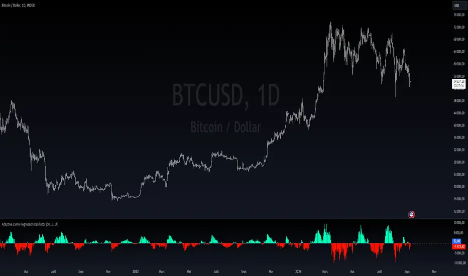
Adaptive LSMA Regression OscillatorOverview:
The Adaptive LSMA Regression Oscillator is an open-source technical analysis tool designed to reflect market price deviations from an adaptive least squares moving average (LSMA). The adaptive length of the LSMA changes dynamically based on the volatility of the market, making the indicator responsive to different market conditions.
Key Features:
Adaptive Length Adjustment : The base length of the LSMA is adjusted based on market volatility, measured by the Average True Range (ATR). The more volatile the market, the longer the adaptive length, and vice versa.
Oscillator : The indicator calculates the difference between the closing price and the adaptive LSMA. This difference is plotted as a histogram, showing whether prices are above or below the LSMA.
Color-Coded Histogram:
Positive values (where price is above the LSMA) are colored green.
Negative values (where price is below the LSMA) are colored red.
Debugging Information: The adaptive length is plotted for transparency, allowing users to see how the length changes based on the multiplier and ATR.
How It Works:
Inputs:
Base Length : This defines the starting length of the LSMA. It is adjusted based on market conditions.
Multiplier : A customizable multiplier is used to control how much the adaptive length responds to changes in volatility.
ATR Period : This determines the lookback period for the Average True Range calculation, a measure of market volatility.
Dynamic Adjustment:
The length of the LSMA is dynamically adjusted by multiplying the base length by a factor derived from ATR and the average close price.
This helps the indicator adapt to different market conditions, staying shorter during low volatility and longer during high volatility.
Example Use Cases:
Trend Analysis: By observing the oscillator, traders can see when prices deviate from a dynamically adjusted LSMA. This can be used to evaluate potential trend direction or changes in market behavior.
Volatility-Responsive Indicator: The adaptive length ensures that the indicator responds appropriately in both high and low volatility environments.
Ema Z-score | viResearchEma Z-score | viResearch
Conceptual Foundation and Innovation
The "Ema Z-score" indicator introduces a novel method of analyzing price deviations from the mean by combining the Exponential Moving Average (EMA) with a Z-score calculation. The Z-score is a statistical measure that quantifies how far a value deviates from the mean in terms of standard deviations. By applying the Z-score to an EMA, this indicator provides traders with insights into the strength and momentum of price movements relative to a smoothed average. This enables better detection of overbought and oversold conditions, as well as potential trend reversals.
The use of the Z-score helps filter out noise and provides more robust signals by highlighting extreme deviations from the mean, allowing traders to make more informed decisions in both trending and ranging markets.
Technical Composition and Calculation
The "Ema Z-score" script consists of two main components: the Exponential Moving Average (EMA) and the Z-score calculation. The EMA is calculated over a user-defined length, smoothing price movements to provide a clearer trend line. The Z-score is then derived by measuring the deviation of the current EMA value from the mean of the EMA over a lookback period, divided by the standard deviation of the EMA during that same period.
For the Z-score calculation, the script first computes the mean EMA over the lookback period using the ta.ema function. It then calculates the standard deviation of the EMA over the same period using the ta.stdev function. The Z-score is determined by subtracting the mean EMA from the current EMA value and dividing by the standard deviation, producing a normalized measure of deviation from the average.
Features and User Inputs
The "Ema Z-score" script offers several customizable inputs that allow traders to adjust the indicator according to their strategies. The EMA Length controls the smoothing period of the EMA, while the Lookback Period defines how far back the script looks when calculating the mean and standard deviation for the Z-score. Customizable thresholds allow traders to define when the Z-score signals potential uptrends or downtrends, based on their chosen levels of deviation.
Practical Applications
The "Ema Z-score" indicator is designed for traders who want to better understand price deviations from the mean and use those insights to identify potential trading opportunities. This tool is particularly effective for:
Identifying Overbought and Oversold Conditions: The Z-score provides a quantitative measure of how far the price has deviated from the mean, helping traders spot extreme conditions that could lead to reversals. Detecting Trend Reversals: By monitoring when the Z-score crosses certain thresholds, traders can identify potential trend reversals early and adjust their positions accordingly. Confirming Trend Strength: The Z-score can help confirm whether a price move is backed by momentum or is likely to revert to the mean, providing additional context for trade entries and exits.
Advantages and Strategic Value
The "Ema Z-score" script offers a significant advantage by combining the smoothing effect of the EMA with the precision of Z-score analysis. This approach reduces the impact of market noise while highlighting meaningful deviations from the norm. The ability to quantify deviations in terms of standard deviations gives traders a statistical edge in identifying overbought or oversold conditions and potential trend shifts. This makes the "Ema Z-score" an effective tool for both trend-following and contrarian strategies.
Alerts and Visual Cues
The script includes alert conditions to notify traders of key Z-score threshold crossings. The "Ema Z-score Long" alert is triggered when the Z-score exceeds the upper threshold, signaling a potential upward trend. Conversely, the "Ema Z-score Short" alert signals a possible downward trend when the Z-score falls below the lower threshold. Visual cues such as color changes in the bar chart and Z-score plot help traders easily identify these conditions on the chart.
Summary and Usage Tips
The "Ema Z-score | viResearch" indicator offers a unique combination of EMA smoothing and Z-score analysis, giving traders a statistical measure of price deviations and improving their ability to detect overbought or oversold conditions, trend reversals, and trend confirmations. By incorporating this script into your trading strategy, you can better quantify price extremes and make more informed decisions in both volatile and stable markets. Whether you're focused on spotting early reversals or confirming ongoing trends, the "Ema Z-score" provides a reliable and customizable solution.
Note: Backtests are based on past results and are not indicative of future performance.

Median For Loop | viResearchMedian For Loop | viResearch
Conceptual Foundation and Innovation
The "Median For Loop" indicator provides an innovative approach to analyzing market data by combining the power of the Median Price with a dynamic scoring system based on a for loop mechanism. This unique script evaluates the median price of the market over a user-defined period, then applies a loop function to generate a score that helps traders detect trends, reversals, and market momentum.
The median, being a robust measure of central tendency, helps filter out noise and better represent the middle of a price range. By applying a loop function that compares the current median to historical values, this script offers a detailed view of price momentum, allowing traders to detect potential trend changes with improved accuracy.
Technical Composition and Calculation
The "Median For Loop" script is composed of two primary components:
Median Calculation: The indicator calculates the median price of the market based on the chosen input source (default is HLC3: the average of high, low, and close) and the specified length. This creates a central value around which market movements can be evaluated.
For Loop Scoring System: This system compares the current median value with past values within a user-defined range, generating a score that reflects how the market is trending. The loop mechanism dynamically sums the score based on whether the current median is higher or lower than historical medians, providing a clear signal of trend strength and direction.
Key Calculations:
Median Calculation: The median is calculated using the percentile_nearest_rank function, providing the 50th percentile of the selected price data over the given length.
For Loop Scoring:
The loop evaluates the median over a defined range (from and to), comparing the current median to historical values.
If the current median is higher than a previous value, a positive score is added; if it is lower, a negative score is added. This forms the final total score, indicating the trend strength.
Features and User Inputs
The "Median For Loop" script offers flexibility and customization options for traders to adapt it to various market conditions and trading strategies:
Median Length: Control the period over which the median price is calculated, affecting the responsiveness of the indicator to price changes.
Loop Range (From and To): Define the range over which the loop evaluates historical median values, allowing traders to adjust how far back the script looks when assessing momentum.
Thresholds: User-defined thresholds are available to specify when the score indicates an uptrend or downtrend. This provides traders with control over the sensitivity of the trend signals.
Practical Applications
The "Median For Loop" indicator is ideal for traders seeking a balanced, noise-filtered approach to trend detection. It is particularly effective for:
Detecting Early Trend Reversals: The loop-based scoring system offers early signals of potential reversals by comparing the current median with past medians, giving traders an advantage in volatile markets.
Confirming Trend Strength: By analyzing the median over time, the script helps confirm whether trends are gaining or losing momentum, improving the accuracy of trade entries and exits.
Strategic Positioning: The customizable parameters allow traders to adapt the script to various market conditions, enhancing their ability to position themselves effectively in both trending and ranging markets.
Advantages and Strategic Value
The key advantage of the "Median For Loop" script is its ability to reduce market noise by focusing on the median price while providing a dynamic scoring system for trend detection. The combination of median calculation and loop-based evaluation offers a more refined view of market momentum, reducing false signals and increasing the reliability of trend identification. This makes it a valuable tool for traders aiming to enhance their market timing and strategy development.
Alerts and Visual Cues
The script includes built-in alerts to notify traders of potential trend changes:
Median For Loop Long: Triggers when the score exceeds the upper threshold, indicating a possible upward trend.
Median For Loop Short: Triggers when the score falls below the lower threshold, signaling a potential downward trend.
Visual cues are also provided, with background colors highlighting potential trend shifts when the score crosses certain levels, offering traders an easy-to-read signal on the chart.
Summary and Usage Tips
The "Median For Loop | viResearch" indicator provides a powerful combination of median price smoothing and dynamic trend scoring, allowing traders to gain a clearer understanding of market momentum. By incorporating this script into your trading strategy, you can improve your ability to detect trends and reversals while reducing the noise that often affects price data. Whether you're focusing on early reversals or confirming the strength of existing trends, this indicator offers a reliable and customizable solution.
Note: Backtests are based on past results and are not indicative of future performance.

Lsma For Loop | viResearchLsma For Loop | viResearch
Conceptual Foundation and Innovation
The "Lsma For Loop" indicator offers a unique combination of the Least Squares Moving Average (LSMA) with a dynamic scoring system based on a loop function. By comparing the current LSMA value with historical values over a user-defined range, this indicator generates a detailed score that helps detect trend strength and potential reversals. This approach provides traders with a more nuanced analysis of price action, allowing them to identify trends earlier and with more accuracy.
The LSMA, which minimizes lag compared to traditional moving averages, is ideal for detecting trends as it provides a smooth and quick-to-respond line. When combined with the loop-based scoring system, traders can benefit from a powerful tool for analyzing market momentum and capturing profitable trends.
Technical Composition and Calculation
The "Lsma For Loop" script features two essential components:
Least Squares Moving Average (LSMA): The LSMA is calculated over a user-defined length using a linear regression model. It provides a smooth line that follows price trends more closely, reducing the noise that is often present in simple moving averages.
For Loop Scoring System: This system evaluates the LSMA over a range of previous values, generating a score based on whether the current LSMA is higher or lower than its previous values within the specified range. The resulting score reflects the strength of the trend, with higher scores indicating a stronger uptrend and lower scores signaling a downtrend.
Key Calculations:
LSMA Calculation: The LSMA is derived from the closing price over the selected period (len), providing a smooth moving average that fits the price data closely.
For Loop Scoring:
The loop iterates over a range of previous LSMA values, comparing the current LSMA to each past value.
If the current LSMA is higher than a previous value, a positive score is added; if it is lower, a negative score is added. The sum of these comparisons forms the overall score.
Features and User Inputs
The "Lsma For Loop" script offers a range of customization options, allowing traders to tailor the indicator to their specific trading strategies and market conditions:
LSMA Length: Adjust the length of the LSMA, controlling the smoothness of the indicator and how quickly it reacts to price changes.
Loop Range (From and To): Define the range over which the for loop evaluates LSMA values. This provides flexibility in assessing momentum over different timeframes.
Thresholds: Customizable threshold levels are used to define when the score indicates an uptrend or downtrend. This allows traders to fine-tune the sensitivity of the indicator to market movements.
Practical Applications
The "Lsma For Loop" is a versatile tool for traders who want to leverage the advantages of LSMA smoothing while gaining a more detailed view of trend strength. This indicator is particularly useful for:
Identifying Trend Reversals: The loop-based scoring system provides an early indication of potential trend reversals, allowing traders to react before major market movements.
Confirming Trend Strength: By evaluating the LSMA against a range of previous values, the script helps confirm whether a trend is strengthening or weakening.
Enhanced Market Positioning: The customizable range and thresholds enable traders to adapt the script to different market conditions, whether they are day trading or swing trading.
Advantages and Strategic Value
The primary advantage of the "Lsma For Loop" script lies in its ability to provide a more granular analysis of LSMA behavior through the use of the for loop. This dynamic approach reduces the likelihood of false signals and offers greater accuracy in detecting trends. The indicator’s versatility makes it a valuable tool for both short-term and long-term trading strategies.
Alerts and Visual Cues
The script includes built-in alert conditions to notify traders of key trend changes:
Lsma For Loop Long: Indicates a potential upward trend when the score exceeds the upper threshold.
Lsma For Loop Short: Signals a potential downward trend when the score falls below the lower threshold.
Additionally, visual cues such as background color changes highlight when the score crosses certain key levels, providing an easy-to-read representation of market trends directly on the chart.
Summary and Usage Tips
The "Lsma For Loop | viResearch" indicator provides traders with a powerful tool that combines LSMA smoothing with a dynamic loop-based scoring system for trend detection. Incorporating this script into your trading strategy can help improve trend identification and enhance decision-making around entries and exits. Whether you are trading in trending markets or looking for early reversal signals, this script offers a reliable and flexible solution.
Note: Backtests are based on past results and are not indicative of future performance.

Composite Momentum█ Introduction
The Composite Momentum Indicator is a tool we came across that we found to be useful at detecting implied tops and bottoms within quick market cycles. Its approach to analyzing momentum through a combination of moving averages and summation techniques makes it a useful addition to the range of available indicators on TradingView.
█ How It Works
This indicator operates by calculating the difference between two moving averages—one fast and one slow, which can be customized by the user. The difference between these two averages is then expressed as a percentage of the fast moving average, forming the core momentum value which is then smoothed with an Exponential Moving Average is applied. The smoothed momentum is then compared across periods to identify directional changes in direction
Furthermore, the script calculates the absolute differences between consecutive momentum values. These differences are used to determine periods of momentum acceleration or deceleration, aiming to establish potential reversals.
In addition to tracking momentum changes, the indicator sums positive and negative momentum changes separately over a user-defined period. This summation is intended to provide a clearer picture of the prevailing market bias—whether it’s leaning towards strength or weakness.
Finally, the summed-up values are normalized to a percentage scale. This normalization helps in identifying potential tops and bottoms by comparing the relative strength of the momentum within a given cycle.
█ Usage
This indicator is primarily useful for traders who focus on detecting quick cycle tops and bottoms. It provides a view of momentum shifts that can signal these extremes, though it’s important to use it in conjunction with other tools and market analysis techniques. Given its ability to highlight potential reversals, it may be of interest to those who seek to understand short-term market dynamics.
█ Disclaimer
This script was discovered without any information about its author or original intent but was nonetheless ported from its original format that is available publicly. It’s provided here for educational purposes and should not be considered a guaranteed method for market analysis. Users are encouraged to test and understand the indicator thoroughly before applying it in real trading scenarios.
Uptrick: Dual Moving Average Volume Oscillator
Title: Uptrick: Dual Moving Average Volume Oscillator (DPVO)
### Overview
The "Uptrick: Dual Moving Average Volume Oscillator" (DPVO) is an advanced trading tool designed to enhance market analysis by integrating volume data with price action. This indicator is specially developed to provide traders with deeper insights into market dynamics, making it easier to spot potential entry and exit points based on volume and price interactions. The DPVO stands out by offering a sophisticated approach to traditional volume analysis, setting it apart from typical volume indicators available on the TradingView platform.
### Unique Features
Unlike traditional indicators that analyze volume and price movements separately, the DPVO combines these two critical elements to offer a comprehensive view of market behavior. By calculating the Volume Impact, which involves the product of the exponential moving averages (EMAs) of volume and the price range (close - open), this indicator highlights significant trading activities that could indicate strong buying or selling pressure. This method allows traders to see not just the volume spikes, but how those spikes relate to price movements, providing a clearer picture of market sentiment.
### Customization and Inputs
The DPVO is highly customizable, catering to various trading styles and strategies:
- **Oscillator Length (`oscLength`)**: Adjusts the period over which the volume and price difference is analyzed, allowing traders to set it according to their trading timeframe.
- **Fast and Slow Moving Averages (`fastMA` and `slowMA`)**: These parameters control the responsiveness of the DPVO. A shorter `fastMA` coupled with a longer `slowMA` can help in identifying trends quicker or smoothing out market noise for more conservative approaches.
- **Signal Smoothing (`signalSmooth`)**: This input helps in reducing signal noise, making the crossover and crossunder points between the DVO and its smoothed signal line clearer and easier to interpret.
### Functionality Details
The DPVO operates through a sequence of calculated steps that integrate volume data with price movement:
1. **Volume Impact Calculation**: This is the foundational step where the product of the EMA of volume and the EMA of price range (close - open) is calculated. This metric highlights trading sessions where significant volume accompanies substantial price movements, suggesting a strong market response.
2. **Dynamic Volume Oscillator (DVO)**: The heart of the indicator, the DVO, is derived by calculating the difference between the fast EMA and the slow EMA of the Volume Impact. This result is then normalized by dividing by the EMA of the volume over the same period to scale the output, making it consistent across various trading environments.
3. **Signal Generation**: The final output is smoothed using a simple moving average of the DVO to filter out market noise. Buy and sell signals are generated based on the crossover and crossunder of the DVO with its smoothed version, providing clear cues for market entry or exit.
### Originality
The DPVO's originality lies in its innovative integration of volume and price movement, a novel approach not typically observed in other volume indicators. By analyzing the product of volume and price change EMAs, the DPVO captures the essence of market dynamics more holistically than traditional tools, which often only reflect volume levels without contextualizing them with price actions. This dual analysis provides traders with a deeper understanding of market forces, enabling them to make more informed decisions based on a combination of volume surges and significant price movements. The DPVO also introduces a unique normalization and smoothing technique that refines the oscillator's output, offering cleaner and more reliable signals that are adaptable to various market conditions and trading styles.
### Practical Application
The DPVO excels in environments where volume plays a crucial role in validating price movements. Traders can utilize the buy and sell signals generated by the DPVO to enhance their decision-making process. The signals are plotted directly on the trading chart, with buy signals appearing below the price bars and sell signals above, ensuring they are prominent and actionable. This setup is particularly useful for day traders and swing traders who rely on timely and accurate signals to maximize their trading opportunities.
### Best Practices
To maximize the effectiveness of the DPVO, traders should consider the following best practices:
- **Market Selection**: Use the DPVO in markets known for strong volume-price correlation such as major forex pairs, popular stocks, and cryptocurrencies.
- **Signal Confirmation**: While the DPVO provides powerful signals, confirming these signals with additional indicators such as RSI or MACD can increase trade reliability.
- **Risk Management**: Always use stop-loss orders to manage risks associated with trading signals. Adjust the position size based on the volatility of the asset to avoid significant losses.
### Practical Example + How to use it
Practical Example1: Day Trading Cryptocurrencies
For a day trader focusing on the highly volatile cryptocurrency market, the DPVO can be an effective tool on a 15-minute chart. Suppose a trader is monitoring Bitcoin (BTC) during a period of high market activity. The DPVO might show an upward crossover of the DVO above its smoothed signal line while also indicating a significant increase in volume. This could signal that strong buying pressure is entering the market, suggesting a potential short-term rally. The trader could enter a long position based on this signal, setting a stop-loss just below the recent support level to manage risk. If the DPVO later shows a crossover in the opposite direction with decreasing volume, it might signal a good exit point, allowing the trader to lock in profits before a potential pullback.
- **Swing Trading Stocks**: For a swing trader looking at stocks, the DPVO could be applied on a daily chart. If the oscillator shows a consistent downward trend along with increasing volume, this could suggest a potential sell-off, providing a sell signal before a significant downturn.
You can look for:
--> Increase in volume - You can use indicators like 24-hour-Volume to have a better visualization
--> Uptrend/Downtrend in the indicator (HH, HL, LL, LH)
--> Confirmation (Buy signal/Sell signal)
--> Correct Price action (Not too steep moves up or down. Stable moves.) (Optional)
--> Confirmation with other indicators (Optional)
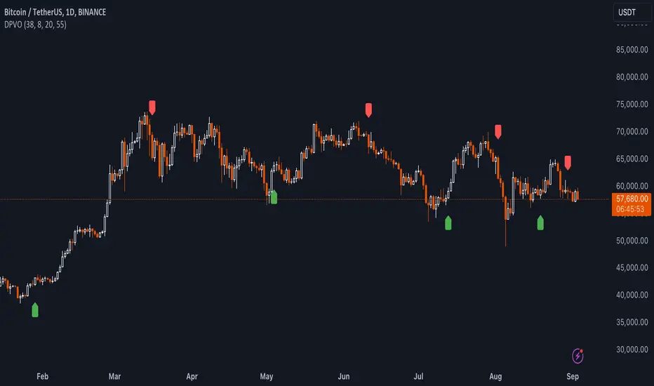
Quick image showing you an example of a buy signal on SOLANA:
### Technical Notes
- **Calculation Efficiency**: The DPVO utilizes exponential moving averages (EMAs) in its calculations, which provides a balance between responsiveness and smoothing. EMAs are favored over simple moving averages in this context because they give more weight to recent data, making the indicator more sensitive to recent market changes.
- **Normalization**: The normalization of the DVO by the EMA of the volume ensures that the oscillator remains consistent across different assets and timeframes. This means the indicator can be used on a wide variety of markets without needing significant adjustments, making it a versatile tool for traders.
- **Signal Line Smoothing**: The final signal line is smoothed using a simple moving average (SMA) to reduce noise. The choice of SMA for smoothing, as opposed to EMA, is intentional to provide a more stable signal that is less prone to frequent whipsaws, which can occur in highly volatile markets.
- **Lag and Sensitivity**: Like all moving average-based indicators, the DPVO may introduce a slight lag in signal generation. However, this is offset by the indicator’s ability to filter out market noise, making it a reliable tool for identifying genuine trends and reversals. Adjusting the `fastMA`, `slowMA`, and `signalSmooth` inputs allows traders to fine-tune the sensitivity of the DPVO to match their specific trading strategy and market conditions.
- **Platform Compatibility**: The DPVO is written in Pine Script™ v5, ensuring compatibility with the latest features and functionalities offered by TradingView. This version takes advantage of optimized functions for performance and accuracy in calculations, making it well-suited for real-time analysis.
Conclusion
The "Uptrick: Dual Moving Average Volume Oscillator" is a revolutionary tool that merges volume analysis with price movement to offer traders a more nuanced understanding of market trends and reversals. Its ability to provide clear, actionable signals based on a unique combination of volume and price changes makes it an invaluable addition to any trader's toolkit. Whether you are managing long-term positions or looking for quick trades, the DPVO provides insights that can help refine any trading strategy, making it a standout choice in the crowded field of technical indicators.
Nothing from this indicator or any other Uptrick Indicators is financial advice. Only you are ultimately responsible for your choices.