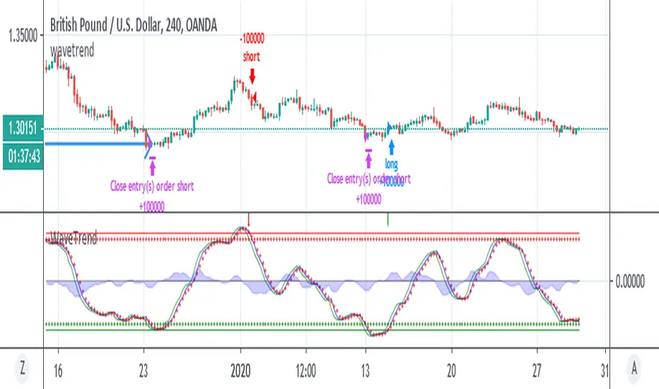
WaveTrendnel Oscillator [UAlgo]🔶Description:
The WaveTrendnel Oscillator, is a technical analysis tool designed for traders to identify potential trend reversals and overbought/oversold conditions in the market. It combines the concepts of wave analysis and trend analysis to generate signals based on the current market conditions. This indicator aims to provide traders with insights into the strength and direction of the prevailing trend, facilitating better decision-making in trading strategies.
🔶Key Features:
Customizable Parameters: Users can customize various parameters including the source data, channel length, average length, and signal length according to their trading preferences and market conditions.
Signal Display: The indicator offers the option to display buy and sell signals on the chart, helping traders to visually identify potential entry and exit points.
Wave and Kernel Analysis: The WaveTrendnel Oscillator utilizes a rational quadratic kernel function, which applies a mathematical approach known as the kernel method. This method analyzes historical price data by assigning weights to each data point based on its proximity to the current period, providing a smoother and more accurate representation of market trends.
Overbought/Oversold Levels: Traders can define overbought and oversold levels using customizable threshold parameters, enabling them to identify potential reversal points in the market.
🔶Credit:
The WaveTrendnel Oscillator indicator is a modification of the original WaveTrend Oscillator developed by @LazyBear on TradingView.
🔶Disclaimer:
Use with Caution: This indicator is provided for educational and informational purposes only and should not be considered as financial advice. Users should exercise caution and perform their own analysis before making trading decisions based on the indicator's signals.
Not Financial Advice: The information provided by this indicator does not constitute financial advice, and the creator (UAlgo) shall not be held responsible for any trading losses incurred as a result of using this indicator.
Backtesting Recommended: Traders are encouraged to backtest the indicator thoroughly on historical data before using it in live trading to assess its performance and suitability for their trading strategies.
Risk Management: Trading involves inherent risks, and users should implement proper risk management strategies, including but not limited to stop-loss orders and position sizing, to mitigate potential losses.
No Guarantees: The accuracy and reliability of the indicator's signals cannot be guaranteed, as they are based on historical price data and past performance may not be indicative of future results.
Cerca negli script per "wave"

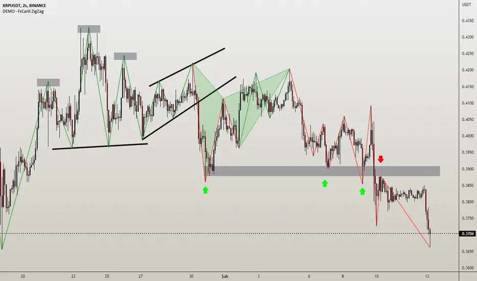
DEMO - FxCanli ZigZagEN - You can spot current trend and lots of patterns with FxCanli ZigZag indicator EASLY
DEMO VERSION of FXCANLI ZIGZAG Indicator works on only GBPNZD and XRPUSDT charts
TR - FxCanli ZigZag indikatörü mevcut trendi ve birçok formasyonu KOLAYCA bulmanızda size yardımcı olacaktır.
FXCANLI ZIGZAG indikatörünün DEMO VERSİYONU sadece GBPNZD ve XRPUSDT grafiklerinde çalışır
EN - Market Structure (At the Current time frame you can choose different colors for UpTrend and DownTrend)
TR - Market Yapısı (Mevcut zaman diliminde, Yukarı Trend ve Aşağı trendin rengini seçebilirsiniz.)
Harmonic Patterns / Harmonik Formasyonları
Elliott Wave / Elliott Dalgaları
AB=CD Pattern / AB=CD Formasyonu
EN - By activating the lower timeframe from the settings, you can see the lower timeframe waves.
TR - Ayarlardan alt zaman dilimini aktif ederek, alt zaman dilimi dalgalarını görebilirsiniz.
EN - By activating the higher timeframe from the settings, you can see the higher timeframe waves.
TR - Ayarlardan üst zaman dilimini aktif ederek, üst zaman dilimi dalgalarını görebilirsiniz.
Wavechart v2 ##Wave Chart v2##
For analyzing Neo-wave theory
Plot the market's highs and lows in real-time order.
Then connect the highs and lows
with a diagonal line. Next, the last plot of one day (or bar) is connected with a straight line to the
first plot of the next day (or bar).
.236 FIB Extension ToolThis is a simple FIB extension tool that pulls from the start of a wave to the end of the wave. It extends FIB levels beyond the first wave making the assumption that the first wave was between 0.0 and .236 FIB levels. This often works as support and resistance in a multi-wave move. I see the price get to .65 or .786 often after clearing the initial .236 level. This works on any timeframe.

+ WaveTrend Oscillator OverlayAn overlay version of pertinent signals from my version of LazyBear's Wavetrend Oscillator.
Shows momentum of long period WTO as either background colors or symbols.
Shows continuation and reversal trade signals.
If Secondary WTO is above the center line (momentum is long), then symbols print across the top of the chart when the primary (faster) WTO comes into "oversold," a number associated with a horizontal line on the off-chart indicator. This number is selectable via a drop-down menu. Same thing for bearish momentum.
Conversely, reversal signals are printed along the bottom when conditions are met. Ex: if the Secondary WTO is showing momentum is bullish, then symbols will print along the bottom when the primary WTO is at "overbought" (or whatever number you deem overbought--again, via a similar drop-down menu).
Also, symbols are printed above and below candles for when the moving average of the primary WTO is crossed.
You could use these for taking profits, exiting a trade, or entering a trade.
Includes a moving average that is an average of the 200 EMA, SMA and Kijun.
Alerts.
Enjoy.
//p.s. I recommend using this in conjunction with my "+ Wavetrend Oscillator" at least starting out. Helps to have a visual
//reference when picking reversal and continuation numbers.
+ WaveTrend OscillatorI'm guessing most of you are familir with LazyBear's adaptation of the Wavetrend Oscillator; it's one of the most popular indicators on TradingView. I know others have done adaptations of it, but I thought I might as well, because that's kind of a thing I like doing.
In this version I've added a second Wavetrend plot. This is a thing I like to do. The longer plot gives you a longer timeframe momentum bias, and the shorter plot gives you entries and/or exits. Here we have one plot with a lookback period of 55, and another with the default set to 6 (change this to 14 if you think you might prefer something slower and that will plot similarly to the default RSI settings). With the traditional Wavetrend Oscillator there is a simple moving average on the WTO that is to help provide entries and exits. I've done away with this as there are already two plots, and I felt more would just clutter the indicator. Instead of plotting the SMA I've plotted the crosses along the bottom and top of the indicator. Also, as is not the case in LazyBear's version, this SMA length is adjustable. By default it is set to 3, which is the default setting on the original indicator.
I've also plotted background colors for when there is what I call a momentum shift. If one or the other oscillators crosses the centerline a colored bar is plotted. By default it is turned on for both WTOs, though in practice you might only want it on for the longer one.
I would say use of the indicator is similar to the original WTO or many other oscillators. Buying oversold and selling overbought, but being mindful of the momentum of the market. If the longer WTO is above the centerline it's best to be looking for dips to the centerline, or for an overbought signal by the faster WTO, and vice versa if the longer WTO is below the centerline. That said, you can also adjust the length of the SMA on the faster WTO to fine tune entries or exits, which is kind of how you would trade LazyBear's version. In this case you have that additional confirmation of market momentum.
You can set colored candles to either of the WTO plots via a dropdown menu.
There are alerts for overbought and oversold situations, centerline crosses, and Wavetrend crosses.
That's about it. Hope you enjoy this particular implementation of LazyBear's well known indicator.
Ah yes, last thing: Original version the source is set to hlc3. I've given you the opportunity to change that, so if you prefer using close you can, or whatever you want.

Wavetrend strategy with trading session for any time chartHello there
Today I am glad to provide you a strategy based on the wave trend oscillator. If you want to use it as an indicator, just disable long and short to not make any shops.
It works on all time frames.
The way it works its like an RSI .
We have overbought and oversold levels, and together with a channel and length we calculate the wave trend.
And then like in RSI, when we cross those lines we buy or sell depending on which lines we cross.
For risk management, so far its not implemented, but it can be done in many ways.
The only thing I applied is to always close a trade at the end of friday day. At the same time it can be applied the rule to sell when % of equity is lost, or at the end of a trading session like london,neywork and so on.
For any questions or doubts, let me know.
Hope you enjoy it :)

Stochastic Heat MapA series of 28 stochastic oscillators plotted horizontally and stacked vertically from bottom to top as the oscillator background.
Each oscillator has been interpreted and the value has been used to colour the lines in.
Lower lines are shorter term stochastics and higher lines are longer term stochastics.
The average of the 28 stochastics has been taken and then used to plot the fast oscillator line, which also has a slow oscillator line to follow.
The oscillator line can be used to colour in the candles.
Inputs:
MA: multiple smoothing methods
Theme: multiple colours
Increment: stochastic length start and increments
Smooth Fast: smooth fast length
Smooth Slow: smooth slow length
Paint Bars: colour candles
Waves: toggle method to weight/increment stochastics
Heat map shows momentum extremes:

WaveTrend By LimaIndicator packing both WaveTrend and RSI.
Source code for the WaveTrend belongs to LazyBear and RSI well, it is a Pinescript method.

WaveTrend Chart {Momentum} [NinjaDawgz]This is just a default set of settings i feel are best suited for Momentum trading.
it is the same code as the original
-----------------------------------------------------------------------------------------------------------------
Icon Descriptions:
Triangles (▼/▲): These are confirmations that the trend has changed. Trading in direction of the the trend is conservative but reliable and relatively profitable.
Pluses (+): These are points for re-entry and/or accumulating addition positions to trade the trend (Triangles above). If you missed the trend change, this is best place to get in.
Crosses (x): Picking the top and bottom is hard, like catching falling knife. This will show you possible tops/bottoms as they happen. Can be noisy, should not be used in isolation.
Diamonds (♦): NEW! Wish the trend confirmation (triangles) was quicker? This does
Works on any time frame, any security (Stocks, Forex, Crypto's, etc.)
Green for Long, Red for Short.
All icons can be used for Alerts!
New Alert (Alt + A) > Change Condition to WaveTrend_Chart > Choose from the list of icons.

WaveTrend Chart And Signal v1 [NinjaDawgz]Custom Wave Trend Code used to spot, confirm and trade cyclical peaks and troughs.
Can be used in isolation but extremely powerful in conjunction with extra analysis, like Wave Theory.
Icon Descriptions:
Triangles (▼/▲): These are confirmations that the trend has changed. Trading in direction of the the trend is conservative but reliable and relatively profitable.
Pluses (+): These are points for re-entry and/or accumulating addition positions to trade the trend (Triangles above). If you missed the trend change, this is best place to get in.
Crosses (x): Picking the top and bottom is hard, like catching falling knife. This will show you possible tops/bottoms as they happen. Can be noisy, should not be used in isolation.
Diamonds (♦): NEW! Wish the trend confirmation (triangles) was quicker? This does
Works on any time frame, any security (Stocks, Forex, Crypto's, etc.)
Green for Long, Red for Short.
All icons can be used for Alerts!
New Alert (Alt + A) > Change Condition to WaveTrend_Chart > Choose from the list of icons.

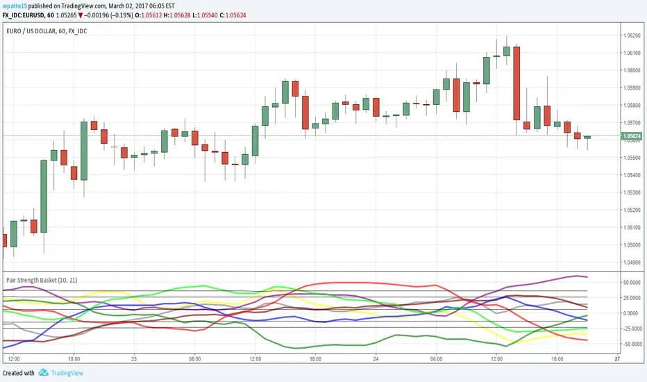
Pair Strength BasketAgain thanks to LazyBear for bringing over the wavetrend indicator and glaz for the idea of the basket of currencies. This is a power index based on the wavetrend indicator, I cut it down to 5 securities per currency since the limit of securities I could call was 40. I like to use to see which pair is the most OB/OS as it likely presents the best profit potential.
AUD = Yellow
CAD = Gray
CHF = Maroon
EUR = Blue
GBP = Red
JPY = Purple
NZD = Lime
USD = Green
STEEMSBD WaveTrendWaveTrend-Oscillator over synthetic STEEM/SBD based on STEEM/BTC and SBD/STB from Poloniex.
WaveTrend part is based on LazyBear's port of TS/MT indicator.

WaveTrend with Crosses [LazyBear]LazyBear's wavetrend oscillator enhanced with wavetrend cross visualization on the indicator as well as with bar color highlights.

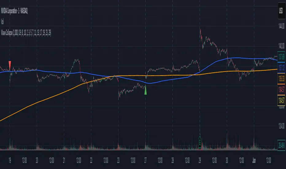
Wave Collapse Simulation - Confirmation of New TrendThis Pine Script, titled "Wave Collapse Simulation - Confirmation of New Trend," is an advanced indicator designed to identify high-conviction trend changes. It operates on the principle of a "wave collapse," a metaphor for a moment when market uncertainty resolves into a new, confirmed direction. It identifies these moments by combining signals from market structure, trend-following moving averages, and a spike in volatility. The indicator plots its signals directly on the price chart
The core idea is that a stable trend (making higher highs and higher lows, or vice-versa) will eventually fail. This script pinpoints the exact moment this failure is confirmed by a significant price move that breaks key levels, signaling the start of a new trend.
Key Components
1. Multi-Length Pivot Analysis
Instead of relying on a single lookback period, the script analyzes market structure using up to ten different pivot lengths (e.g., 2, 3, 5, 7, 11...).
Structural Failure: It constantly monitors these pivots to see if the market fails to make a new higher high in an uptrend (higherHighsFailed) or a new lower low in a downtrend (lowerLowsFailed). A failure in this pattern is the first sign that the prevailing trend is weakening.
2. Trend Context and Volatility Trigger
The script uses two additional components to validate a potential trend change:
Long-Term Trend: Two slow-moving averages (999 and 3000 periods) are used to establish the dominant, long-term trend direction. A signal can only occur if it aligns with a break of this established trend.
Volatility Spike: It uses the Average True Range (ATR) to detect a sudden, powerful price movement. A "collapse" is only considered valid if the price moves more than a specified multiple of the ATR, ensuring the signal is backed by significant market force and not just noise.
3. The "Collapse" Event
This is the central logic of the indicator. A bullish or bearish collapse is a high-probability signal triggered only when three specific conditions are met simultaneously:
Bullish Collapse (New Uptrend):
Structure: The market has failed to make new lower lows.
Trend Break: The price breaks above the short-term moving average during a long-term downtrend.
Volatility: The move is accompanied by a significant volatility spike.
Bearish Collapse (New Downtrend):
Structure: The market has failed to make new higher highs.
Trend Break: The price breaks below the short-term moving average during a long-term uptrend.
Volatility: The move is accompanied by a significant volatility spike.
4. Gaussian Probability Simulation
The script includes a Gaussian (normal distribution) function to model market certainty.
Sigma (σ): This variable represents the standard deviation, or "uncertainty." After a collapse event, sigma is reset to a very small value, representing a moment of high certainty about the new trend.
Decay: If no new collapse occurs, sigma gradually increases with each bar, representing the return of uncertainty to the market. While the script calculates the probabilities for a price distribution (the "wave"), its primary function is to use the state of sigma to define the collapse event itself, rather than plotting a visual wave.
How It Appears on the Chart
Moving Averages: The long-term maShort (blue) and maLong (orange) are plotted to show the underlying trend context.
Collapse Signals:
A green triangle is plotted below the price bar to signal a Bullish Collapse.
A red triangle is plotted above the price bar to signal a Bearish Collapse.
Collapse Price: A horizontal red line appears at the price where the collapse was triggered, serving as a key reference level for the new trend.
Wave Smoother [WS]The Wave Smoother is a unique FIR filter built from the interaction of two trigonometric waves. A cosine carrier wave is modulated by a sine wave at half the carrier's period, creating smooth transitions and controlled undershoot. The Phase parameter (0° to 119°) adjusts the modulating wave's phase, affecting both response time and undershoot characteristics. At 30° phase the impulse response starts at 0.5 and exhibits gentle undershoot, providing balanced smoothing. Higher phase values reduce ramp-up time and increase undershoot - this undershoot in the impulse response creates overshooting behavior in the filter's output, which helps reduce lag and speed up the response. The default 70° phase setting provides maximum speed while maintaining stability, though practical settings can range from 30° to 70°. The filter's impulse response consists entirely of smooth curves, ensuring consistent behavior across all settings. This design offers traders flexible control over the smoothing-speed trade-off while maintaining reliable signal generation.

[Excalibur][Pandora][Mosaic] Ultra Spectrum Analyzer@veryfid, you will always be remembered eternally...
ANCIENT MYTHOS AND LORE:
The retellings of "Pandora's Box" serve as a cautionary metaphor depicting an opened container (pithos - jar) that once held profound perils and evils — sufferings that are experienced around the world in various forms. The known and vague mythical box contents actually represent manifestation of evils, situational adversities, and human disparities that have been encountered throughout life for aeons. In contemporary times, a meager list of ordeals would include incidents of deceit, betrayal, corruption, oppression, greed, envy, depravity, conflict, mania, affliction, plague, and mortality. However, as the tale is told, kept and remaining inside the box was the essence of expectant hope (elpis), which may represent the optimism and resilience to overcome immense hardships.
There are other versions of the classic story where Pandora isn't actually the culprit, being her husband Epimetheus was the lid lifting perpetrator and the one who always and actually received the gift(s). Curiously, the interpreted Greek word ‘Pandora’ translated to English, can mean either "all-endowed" or "all-gifting". Much like Pandora herself, who was formed from clay of the earth, the jar also would have been most likely crafted from clay. Conceived as a made-to-order maiden for an arranged marriage, Pandora was given qualities of exquisite beauty, persuasive charm, all while being adorned with jewelry and fine clothing. Olympian premeditated preparations in the didactic fable of 'Works and Days' by Hesiod had blamable intent and would be later used for centuries as denigration of women/mothers. The rest of Hesiod's tale is even worse.
In reality, the entire contrived exploit of incarnating Pandora as a trojan temptress was solely intended as an instrument of infiltration and entrapment for delivery to Epimetheus as an arranged seductive snare. Being a man myself, I find it appalling how the antiquated writings of ancient morphological men have repeatedly ostracized women for many of the ailments of mankind. When in truth, it is far more often that despicable men are the recorded all time winning historical harbingers of global abysmal darkness by means of ideological treachery. Vast historical chronicles since antiquity have frequently recorded who the typical real-world villains truly are and are not. As the stories are told in the first place, it was dictator Zeus along with his Olympian conspirators, who intently implanted malicious spirits into a gifted receptacle to orchestrate planetary suffering and carnage on humankind.
PROLOGUE:
I believe, it is way past overdue to restore Pandora's name to a place of better standing. As I have been peaking into a theoretical pitcher of mathematic mysteria for years now, where no one else dares to look. Once upon a time, I pondered an opposite notion: What if Pandora was originally conceived to solve global problems instead of creating them? Maybe Pandora could have been wielded into existence to wage unrelenting and avenging retribution on every dominance hierarchy and each diabolical enemy intently hostile to humankind. My hypothetical version of Pandora would take the notion of "mors omnibus tyrannis" to a whole other fearsome magnitude. She would cause evil arrogant men to tremble with sheer horror... the kind of fear ALL false gods, despotic kings, tyrannical dictators, controligarchies, and criminal syndicates truly worry about at night. In my opinion, that would be a better fictional story worthy of retelling for aeons.
One unique goliath 21st century adversary is LAG and it must be subdued or minimized. This unyielding nemesis is also known as group delay, processing delay, and algorithmic latency. My eyes are locked onto this opponent with fixation that will never surrender a staring contest. The formidable creature lag is my daily arch enemy destined for defeat in battle. It's losing time after time and bar by bar during the past year of 2023. In my attempts to peer through the murky darkness of useless and deceptive information, I am confident that I have found more suitable answers to many current dilemmas of algorithmic lag.
The internet, using mathematics and the speed of light as a planetary beneficial advantage, has already performed wonders by drastically reducing the delay of dissemination of knowledge. This has garnered a mostly positive rapid acceleration of economic evolution. However, hierarchies of dark forces of chaos and subversion by the thousands lurking in the global shadows are not thrilled about well informed populations. In the present era, new spectrums of strife within planetary societies are being waged, one of the worst forms taking the hideous form of censorship. Other nefarious tactics are hindering economic progress with substantial negativity using heavily funded penetration and infiltration operations. Those sinister operational varieties are spanning psychological, cultural, educational, digital, financial, electoral, scientific, medical, biological, commercial, infrastructural, institutional, and organizational domains.
They are mistakenly meddling with the entire primordial order of planetary natural dynamics. The miscalculations from these malevolent CAUSES will be countered with EFFECTS of immense retaliatory primal veracity having equal or exceedingly more powerful opposition with overwhelming numbers in mass. It is a law embedded within the universe that supersedes ALL laws, known as 'causality'. Everyone, especially programmers, know exactly what to do with predatory infiltrating cockroaches... When tyranny becomes enforced law by agendized policies in any land, order = abs(DUTY) * pow(RIGHT) * exp(PEOPLE).
FUTURE ECONOMIC ADVERSARIAL CHALLENGES:
Just as programmers have to critically analyze our code for BUGS, a scrutinized analysis of the current world around us is at times necessary. It is an empirical statistical fact that a few percent of captains at the helm of industry, commerce, institutes, and governance are monetarily psychopathic. They are often hidden bugs operating within national systems. The subsequent economic consequences result in effects that aren't always clearly obvious to all. Here are a few global economic security issues...
Corrupted immoral code in national operation is an inevitable breakdown waiting to happen. In the harsh future to follow, old degenerate interdependent control systems will need to be dismantled and discarded, eventually succeeded by having resilient parallel arrangements with robust independent fidelity. The coming successive paradigm shifts would include future hardware and the hefty novel algorithms that will run on them afterwards. Evolution is inevitable! The internet must be upgraded and continually programmed securely to the near hardness of diamonds at multiple layers within the operational code to retain peaceful global integrity between international collaborations.
DigitalID is never going to fix an insecure vulnerable titanic network of devices full of holes taking in megatons of water from every direction. Weaponized digital mucking ID dead on arrival is certainly NOT a one size fits all solution and it still doesn't do diddly-squat to secure the internet's DNA as executable code. DigID's real purpose is to manage servitude digitally and keep citizens right where they want them, as subservient slaves.
There is a very specific reason why we have key chain rings in OUR pockets with numerous private keys evolving technologically over time to robustly safeguard individual locks we use every day, duh. AI becoming an artificial sentient hyper intelligence may sooner or later become a potential hazard, especially if it breaks AES192 into a thousand shards of glass. Perilous aspects from artilects will emerge and are coming swiftly. AI is already being weaponized and tasked to mind muzzle expressions of human consciousness.
Also, EMPs from the sun ARE an imminent planetary threat, and no amount of carbon taxation schemes inciting anthropomorphic climate hysteria originating from falsified modeling hocus-pocus is going to protect against extreme solar cycle related X-class phenomena. Our solar system candle called the sun, is not consistently energy irradiation stable if you just glance at SOHO images/video. There are very obvious cyclical frequencies within the dynamics of the sun's energetic activity that affect planets far beyond earth. The earth already has a built-in natural thermometer indicating that oceans have been rising very linearly for thousands of years since the last ice age, submerging entire ancient cities under coastal water dozens of meters.
BEAR with me and pardon my French translation, but I have the option to call major league climate BULLshite. There is no hardcore "anthropomorphic climate crisis" proof. It is a crisis in failed modeling that is insufficient to properly estimate colossal computations with dircet limited empirical data with enough accuracy to anticipate higly probable future outcomes. People deserve solid science instead of slanderous smackdowns and slighted statistics. 400ppm of atmospheric CO2 is nothing compared to previously existing 1600ppm concentrations acquired from ancient indirect historical observations at a time when early humans were hunter gatherers driving gas guzzlers.
Western climate-monger fortune tellers are scamming every nation on earth, betraying the collective human species worldwide by climate hype strangulation. Wait until the sheeple with dinner forks turn on the rabid wolves in shepherds's clothing; it has already begun. What these predatory profiteering fraudsters are not telling you is WATER (H2O) in earth's atmosphere is the all time dominating and potent greenhouse gas, always has been, not CO2. Dr. Willie Soon has explained it in the best of ways with clarity. Misleaders, banksterCorpses, and mediaPresstitutes are immensely involved in this hot model scheme and like keeping people right where they want them, force fed with mental filth with regularly scheduled socially engineered programming.
Beware of agendas and isms. The ESGovernanceAgenda is ready made economic coffin nails. I'll explain this very simply, a future green war on carbon is a silent war on carbon lifeforms and economies. Many of the smiling faces you can actually see on the world stage pulling levers are often the coldest blooded deceivers beyond anything you can ever imagine. In truth, corporate agents and policies are the greatest devastators to ecologies, while in concert, they are incessantly waging blame campaign agendas with subversive narratives by targeting consumers as the wrongdoers.
Why am I mentioning all these adversarial difficulties? Well, the intertangling myriads of tomorrow's "bundle of burdens" in a future box ALL have to be thoroughly analyzed, sifted through, and dealt with tenaciously now and in the future by generations to come in every nation state. Some days I wonder if Hesiod's fiction was taken from reality over 2000 years ago to WARN future world inhabitants. In the scope of economics, the series of incidents that have or will lead up to major world events, will need to have the frequency of related occurrences examined that lead up to crucial points in time historically. In order to prevent future disparities, our progeny will look backwards into history with ultra clarity and vigilance to see how corrupted society once was by hordes of overlords twisted by obsessive delusions of absolute power over the entire human species. There is no human race, only diverse genetic multiformity expressed from the DNA code of humankind exists.
We can't simply put the lid back on low entropy hydroCarbons and a broadband globalNet without having an implemented proven replacement or upgrade. It's far too late, leaving only wiser security chess moves forward as the only viable options. Nikola Tesla was dreaming of this daily in order to build every foundation of modern civilization that we now enjoy today and take for granted. Humanity still has to evolve by unlocking hidden secrets of mother nature. For instance, nations powered by endless geothermal electricity and deuterium fusion WILL solve a lot of the world's problems. Imagine our world dominantly powered by extreme abundant amounts of heavy water... Lady destiny awaits and begs for the future to be built securely, by eventual abandonment of antiquated wheelworks that eventually deserve to be hurled into the annihilatory dustbin of history.
SPECTRAL BURDENS:
Ephemeral 'spectral contents' are extremely difficult to decipher with the least amount of lag, especially while they reside within a noise ridden non-stationary environment. When 'lifting the lid off' of series analysis to peek with quick discernment, distinguishing between real-time relevant signals differing from intertwining undesirable randomness in a crowded information space, requires special kinds of intricate extraction. Due to the nature of fractal chaos, any novel spectral method is better than the scanty few we have now. Firstly, let's comprehend agilities of interpreting a spectrum's structure...
SPECTRAL ANALYSIS PURPOSE AND INTENTION:
Frequency Analysis - Spectral analysis serves a crucial purpose in unraveling the frequency composition of a signal. Its primary intention is to explore the intricacies of a dataset by identifying dominant frequencies and unveiling inherent cyclical patterns. This foundational understanding forms the basis for improving analyses.
Power Spectrum Visualization - The visualization of a signal's power spectrum is a key objective in spectral analysis. By portraying how power is distributed across different frequencies, the goal is to provide a visual representation of the signal's energy landscape. This insight aids with grasping the significance of various frequency components obtained from a larger whole.
Signal Characteristics - Understanding the traits of a signal is another vital goal. Spectral analysis seeks to characterize the nature of the signal, unveiling its periodicity, trends, or irregularities. This knowledge is instrumental in deciphering the behavior of the signal over time, fostering a deeper comprehension.
Algorithmic Adaptation - Spectral analyzer estimation can play a pivotal role in algorithmic development. By assisting with the creation of algorithms sensitive to specific frequency ranges, one possible advantage is to enable real-time adaptability. This adaptability approach may allow algorithms to respond dynamically to variations in different spectral components, potentially enhancing their efficacy.
Market Analysis - In the realm of trading systems and financial markets, spectral analysis methods can serve as applicable functions when studying market dynamics. By 'uncovering' trends, cycles, and anomalies within financial instruments, this analytical proficiency can aid traders and algorithm developers with making better informed decisions based on the spectral attributes of market data.
Noise/Interference Detection - Another purpose of spectral analysis is to identify and scrutinize undesirable elements within a signal, such as noise or interference. One benefit would be to facilitate the development of strategies to mitigate or eliminate these unwanted components, ultimately refining the quality of a given signal with filtration.
INTRODUCTION:
Allow me to introduce Pandora! What you see in the demonstration above, I've named it "Pandora Periodogram", which is also referred to as 'Ultra Spectrum Analyzer' (USA) for technical minds. Firstly, this is NOT technically speaking an indicator like most others. I would describe it as an avant-garde cycle period detector obtaining accurate spectral estimates on market data with Pine Script v5.0. USA is a spectral analysis cryptid that I can only describe as being an alien saber in nature. It is my rendering of spectral wrath unleashed. With time and history to come, my HOPE is this instrument will reveal Excalibur like aspects capable of slicing up a spectrum craftily, traits long thought to be a mythical enigma.
It is not modified forms of either Autocorrelation Periodogram (ACP) or MESA. Pandora's Periodogram embodies an entirely distinct design, adorned with glamourous color, by incorporating several of my most profound, highly refined technological innovations that I have poetically composed into being. What I have forged in Pine, has essentially manifested as a zero lag spectrum analyzer. Pandora easily peeks inside a single signal source more effectively to inspect for hidden spectres, revealing invisible apparitions inside data with improved clarity...
My 'Ultra Spectrum Analyzer' bears an eerie likeness to Autocorrelation Periodogram, but it possesses no autocorrelation and the other small hindrances of ACP that I formerly encountered. While ACP does have a few shortcomings, a few bars of lag, and high frequency bias, it is still phenomenal code. ACP is one answer to spectral enigmas, but not the only one. Developers can utilize this detector by creating scripts that employ a "Dominant Cycle Source" input to adaptively govern algorithms. If you are capable of building suitable algorithms for direct tethering to Autocorrelation Periodogram, then this is your next step in evolutionary application to tether to when you are ready. ACP is a good place to start building upon as an exploratory vessel, before you might ponder using USA. Once you do obtain dynamic ACP sweetness with only a few pesky bars of dominant cycle induced lag, USA may be your tool chest choice without the burden of subtle ACP lag.
USA is possibly the end of my quest for spectral bliss, for the time being. However, I still suspect there is more room for upgrades to Pandora in the future. I must mention, as an overture, this won't be the last of Pandora tech that you will witness, as my literal "out of the box thinking" will unleash many additional creations upon this Earth. The "Power of Pine" merely serves as the beginning foundational phase... Some of my futuristic dreams and daydreams of TradingView are droplets in a wavy ocean of economic providence and potential.
What I am crafting in poetic form is born out of raw curiosity. Future creations are probably best kept private for now, but I will present my future tech with beauty and elegance as it should rightfully be. There's one catch, I have absolutely no idea what this and my future marvels may do to the future of digital signal processing (DSP) and markets. I do fear any insane AI or MALEficent entity ever seeing this code. My innermost hopes and ambitions are always focused on achieving the best result obtainable. What the future can hold, may be absolutely exquisite to gaze upon, maybe even monstrous, or possibly a combination of both.
Notice: Unfortunately, I will not provide any integration support into member's projects at all. My own projects demand too much of my day to day time. I hope you understand. Meanwhile, I'll be applying this on future indication until Mr. Mortality sneaks up behind me.
FEATURES AND CHARACTERISTICS:
I have included as much ultra adjustability as I can humanly muster. Those features being the following and more...
Color Preferences - Four vivid color schemes are available in the original release. The "Ultra Violet" color scheme, in particular, contributes to the indicator's technical title, as it seems to me to reveal the greatest detail of my various spectral color schemes. Color inversion of the four color schemes is also possible, yielding eight schemes in total with predator style visuals. Heatmap transparency control is also provided.
Lag Control - Pandora achieves zero lag spectral approximations, with the added capability to control lag using an input for selectable delay. Note, however, that testing less than zero lag has not been assessed thoroughly due to potential unforeseen instability concerns. Adjustments are provided in either direction for further testing.
Spectral Bias Mitigation - Options for mitigating high OR low-frequency spectral biases are present. One interesting tweak made during development was a subtle form of spectral manipulation, involving a partial reduction of frequency amplitudes influencing either the highest or lowest periodicities. This slightly reduces the impact on the upper and lower portions of the spectrogram and the dominant cycle measurement. What initially surfaced as an unexpected discovery, may now be considered worthy of experimental utility.
Adjustable Periodogram Window Size - The periodogram is adjustable for various window sizes of periodic operation. Exploration up to a periodicity of 59 is obtainable for curiosity's sake. This flexibility challenges the notion that curiosity isn't always a negative trait, contrasting with Hesiod's ancient perspective.
Dominant Cycle Filtration - Filtration of the dominant cycle is achieved with a novel smoother having reduced lag, easily surpassing SuperSmoother's performance. However, defeating lag completely on that one plot() function was elusive.
Tooltips for Control Intention - The settings commonly include handy and informative tooltips that provide information eluding to the intention behind the various controls provided.
Initialization Advantages - Initialization of USA accomplishes what Autocorrelation Periodogram (ACP) didn't. Spectral analysis begins on the earliest visible bars, starting at period 2. Users need to ensure their algorithm's integrity from period 2 upwards to beyond 40ish, establishing a viable operational range for dynamically governing those algorithms. It's notable that stochastics and correlations have a minimum operable critical period of 2, distinct from most low-pass filters that can actually achieve a period of 1 (which is the raw signal itself). Proper initialization of complex IIR filters is particularly effective, especially with smaller initialization periods.
Remaining options and features are comparable to my Enhanced Autocorrelation Periodogram in terms of comprehension, and other upgrades may be added in the future upon discovery.
PERIODOGRAM INTERPRETATION:
The periodogram heatmap renders a power spectrum of a signal visually by color, where the y-axis represents periodicity (frequencies/wavelengths) and the x-axis is delineating time. The y-axis is divided into periods, with each elevation portraying demarcation of periodicity. In this periodogram, the y-axis ranges from 4 at the very bottom to 49 (or greater) at the top, with intermediary values in between, all conveying power of the corresponding frequency component by color. The higher the position ascends on the y-axis, the longer the cycle period or lower the frequency. The x-axis of the periodogram signifies time and is partitioned into equal chart intervals, where each vertical column corresponds to the time interval when the signal was measured. Most recent values/colors are on the right side of the periodogram.
Intensity of the colors on the periodogram signify the power level of the corresponding frequency or cycle period. For example, the "Fiery Embers" color scheme is distinctly like heat intensity from any casual flame witnessed in a small fire from a lighter, match, or campfire. The most intense power exhibited would be represented by the brightest of yellow, while the lowest power would be indicated by the darkest shade of red or just black. By analyzing the pattern of colors across different periods, one may gain insights into the dominant frequency components of the signal and visually identify recurring cycles/patterns of periodicity.

Wave Generator Library (WGL)Library "WaveGenerator"
Wave Generator Library
max(source)
max
Parameters:
source : is the input to take the maximum.
Returns: foat
min(source)
min
Parameters:
source : is the input to take the minimum.
Returns: foat
min_max(src, height)
min_max
Parameters:
src : is the input for the min/max
height
Returns: float
sine_wave(_wave_height, _wave_duration, _phase_shift, _phase_shift_2)
sine_wave
Parameters:
_wave_height : Maximum output level
_wave_duration : Wave length
_phase_shift : Number of harmonics
_phase_shift_2
Returns: float
triangle_wave(_wave_height, _wave_duration, _num_harmonics, _phase_shift)
triangle_wave
Parameters:
_wave_height : Maximum output level
_wave_duration : Wave length
_num_harmonics : Number of harmonics
_phase_shift : Phase shift
Returns: float
saw_wave(_wave_height, _wave_duration, _num_harmonics, _phase_shift)
saw_wave
Parameters:
_wave_height : Maximum output level
_wave_duration : Wave length
_num_harmonics : Number of harmonics
_phase_shift : Phase shift
Returns: float
ramp_saw_wave(_wave_height, _wave_duration, _num_harmonics, _phase_shift)
ramp_saw_wave
Parameters:
_wave_height : Maximum output level
_wave_duration : Wave length
_num_harmonics : Number of harmonics
_phase_shift : Phase shift
Returns: float
square_wave(_wave_height, _wave_duration, _num_harmonics, _phase_shift)
square_wave
Parameters:
_wave_height : Maximum output level
_wave_duration : Wave length
_num_harmonics : Number of harmonics
_phase_shift : Phase shift
Returns: float
wave_select(style, _wave_height, _wave_duration, _num_harmonics, _phase_shift)
wave_select
@peram style Select the style of wave. "Sine", "Triangle", "Saw", "Ramp Saw", "Square"
Parameters:
style
_wave_height : Maximum output level
_wave_duration : Wave length
_num_harmonics : Number of harmonics
_phase_shift : Phase shift
Returns: float
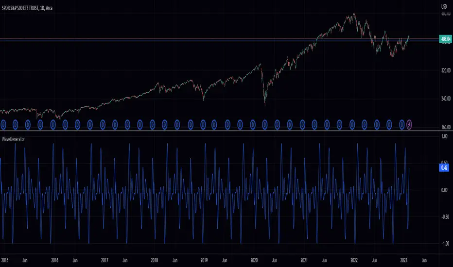
Wave Generator (WG)Pine Script Wave Generator Utility
Introduction:
The Pine Script Wave Generator Utility is a versatile tool that creates different wave patterns. The script provides the user with four different wave styles to choose from (Sine, Triangle, Saw, Square) with customizable parameters for the wave height, duration, number of harmonics, and phase shift.
Technical Details:
The script utilizes the mathematical functions sin, pi, and array.avg to generate wave patterns. The wave height and duration are the main inputs, and the number of harmonics and phase shift are additional inputs that add fine-tuning to the wave pattern.
The wave styles are created using different combinations of sine waves and are normalized so that the resulting wave always lies within a range of -1 to 1.
Usage:
The user can adjust the wave parameters using the input options in the script. The user can choose the wave style from the “Wave Select” option and set the wave height, wave duration, number of harmonics and phase shift by adjusting the corresponding input options.
Conclusion:
The Pine Script Wave Generator Utility is an efficient and effective tool for generating wave patterns. It can be used for a variety of purposes such as creating wave patterns for technical analysis, simulation, and testing purposes. The user can easily adjust the wave parameters to create custom wave patterns, making it a flexible and valuable tool.

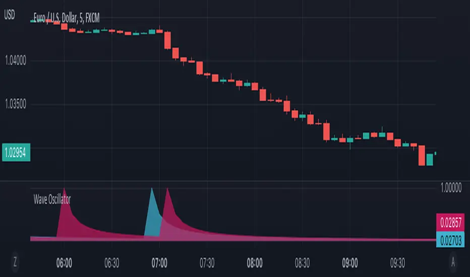
Wave OscillatorWaves Oscillator is a tool that makes it easier to spot potential reversal zones.
When the market is likely to change direction you will get a pink wave as an indication that the market is about to make a bearish move and a blue wave when the market is about to make a bullish move.
This oscillator works best in confluence with other indicators and should not be used as a signal.
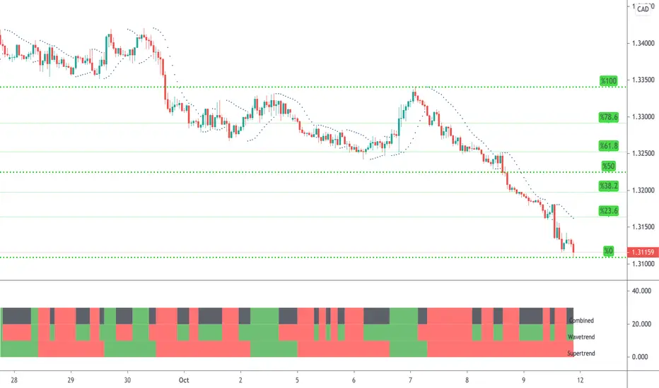
WaveTrend & Supertrend Comparison/CombinedThis compares two reasonably reliable strategies and shows where they are in agreement.
When the top line is GREEN - Then consider BUYing
When the top line is RED - Then consider SELLing
There are also alerts available.
WaveTrend High Risk StrategyI am looking for critique on this strategy based on LazyBear's Wavetrend indicator. The drawdown is high but profits are pretty impressive.
WaveTrend with Crosses [LazyBear]Optical Change
Source from LazyBear
With big Hugs for this Indicator
