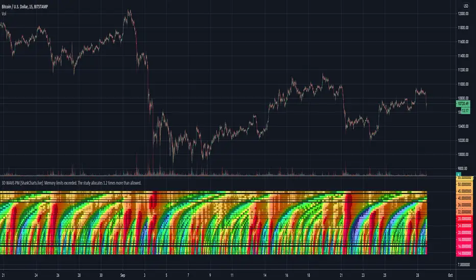
3D WAVE-PM Meow Mix [acatwithwithcharts]This is an (il)logical extreme adaptation of Mark Whistler's WAVE-PM script, originally published in his book Volatility Illuminated as a MetaTrader script. Instead of displaying WAVE-PM as several oscillator lines oscillating within a range, it plots 32 different period lengths at height equal to their length and reads out colors based on their value. The period lengths are spaced out such that it makes a relatively continuous heatmap when displayed on log scale. It has the same customization options as my regular WAVE-PM Meow Mix script.
(It may be necessary to move the scale around to see the indicator - it ranges from 14 to 600 and the scale on the chart seems to default to a range below it.)
It's experimental, it's a proof of concept for heatmap versions of indicators, it has a tendency to freeze up, and it gives a great deal of information in one snapshot (mcuh of which I'm still working out how best to use). It is particularly good at presenting a bird's eye view of the significance of a given movement relative to how much of an impact it has on higher period volatility expansions.
I'm publishing this as Invite-Only with a few specific people already in mind to help experiment with the concept, and do not have immediate plans for opening broad access to it.
Cerca negli script per "wave"
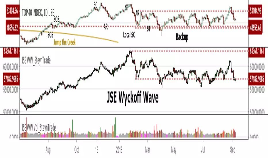
JSE Wyckoff WaveThe Stock Market Institute (SMI) describes an propriety indicator the "SMI Wyckoff Wave" for US Stocks. This code is an attempt to make a Wyckoff Wave for the Johannesburg Stock Exchange (JSE). Once the wave has been established the volume can also be calculated. Please see code for the JSE Wyckoff Wave Volume which goes with this indicator.
The Wave presents a normalized price for the 10 selected stocks (An Index for the 10 stocks). The theory is to select stocks that are widely held, market leaders, actively traded and participate in important market moves. This is only my attempt to select 10 stocks and a different selection can be made. I am not certain how SMI determine their weightings but what I have done it to equalize the Rand value of the stock so that moves are of equal magnitude. The then provides a view of the overall condition of the market and volume flow in the market.
I have used the September 2018 price to normalize the stock price for the 10 selected stocks based. The stocks and weightings can be changed periodically depending on the performance and leadership.
Most Indecies when constructed assume that all high prices and all low prices happen at the same time and therefor inflate the wicks of the bars. To make the wave more representatives for the SMI Wyckoff Wave the price is determined on the 5 minute timeframe which removes this bias. However, TradingView does not calculate properly when selecting a lower timeframe than in current period. A work around is to call the sma of the highs and add these which provides more realistic tails. Please, let me know if there is a better work around this.
The stocks and their weightings are:
"JSE:BTI"*0.79
"JSE:SHP"*2.87
"JSE:NPN"*0.18
"JSE:AGL"*1.96
"JSE:SOL"*1.0
"JSE:CFR"*4.42
"JSE:MND"*1.40
"JSE:MTN"*7.63
"JSE:SLM"*7.29
"JSE:FSR"*8.25
Sim-Wave-DNA A nice script that helps finding tradable market conditions.
The Sim-Wave-DNA consist of 3 parts.
Volume
Money Flow
Advisor
Volumen bars > 0 show the Normalized Volume where the volume exceeding the pink line (exceeding the average of vol) is plotted in solide color
Money Flow bars < 0 show the amount of capital flowing in and out of the market, red is negative and green positive moneyflow.
The advisory (arrows) shows areas of caution, this are likely reversal areas.
Happy Trading

Weis Wave Volume-v1This is lazy bear Weis Wave Volume when we make it little different
the crossing is higlighted

3x EMA / VEGAS WAVEmade changes on the 3x EMA of AREAY to suit the TD's vegas wave since free trading view only allows limited indicators.

Elliot Wave Oscillator [River]Based on the usual Elliot Wave Oscillator but divided by price so it scales with history better, added the 4 colours and a signal line.

CryptoVN - Double Sine Wave
This is the Even Better Sinewave indicator with two cycle:
Cycle=9: to find out the signals entry/exit points and reversals.
Cycle=36: to be analyzed, tells us where the dominant cycle is heading.
The Even Better Sinewave indicator as described in the book Cycle Analysis for Traders by John F. Ehlers.
It uses a simple variant of the roofing filter and normalization to the short term power in the wave to provide unambiguous long and short indications.
Thanks to @Madrid for the example code.
SMA WaveSMA Wave with the important SMA's another color.
SMA 10
SMA 20 - Color RED
SMA 30
SMA 40
SMA 50 - Color Orange
SMA 60
SMA 70
SMA 80
SMA 90
SMA 100 - Color Green
SMA 110
SMA 120
SMA 130
SMA 140
SMA 150
SMA 160
SMA 170
SMA 180
SMA 190
SMA 200 - Color Black
ICC WAVE STRATEGY SCRIPTwww.inflow-crypto.club
Proprietary developed, cutting-edge, scalping/swing trading hybrid >ICC< WAVE strategy.
This approach, developed in 2015 has been proven across different financial markets. Bringing together the best of both worlds for a risk-averse person with a tendency to look for minimal drawdown and a person with high-risk tolerance that is more oriented to maximize profits. The strategy can be applied to day trading on small time frames or/and swing trading on 4H and Daily time frame.
>ICC< WAVE and >ICC< TREND CONDITIONS indicators show you when suitable trend conditions are in place for high probability trades in the direction of 1-hour down to 5-minute trend (you can change the parameters for higher time frames).
- Red color indicates a bearish trend
- Blue color indicates a bullish trend
- 1st row (starting on top) is >1-h< trend, Blue = long, Red = short
- 2nd row (starting on top) is >15-min< trend, Blue = long, Red = short
- 3rd row (starting on top) is >5-min< trend, Blue = long, Red = short
- 4th row (starting on top) is a combination of rows 1-3. It shows when row 1-3 are in line for high probability long or short trades.
- When the 4th row is colored RED, it means that the conditions for sell (short) trades are in place.
- When the 4th row is colored BLUE, it means that the conditions for buy (long) trades are in place.
- When the 4th row is colored GRAY, it means that there is indecision between buyers and sellers, the market is in process of rolling over or consolidating. This means that there are no favorable conditions for >ICC< WAVE strategy trading and you should stay out of the market until there is a clear direction.

Sine Wave This is John F. Ehlers, Hilbert Sine Wave with barcolor and bgcolor.
When fast line red crosses down slow line blue that is a zone of resistance in the price chart, and when fast line crosses up slow line blue that is a zone of support.
When close of the bar is equal or greater than the zone of resistance there is a trend up mode in place and trending instruments like Hull moving average should be used, and when the close of the bar is equal or greater than the zone of resistance there is a trend down in place and trending instruments should be used too.
When none of the preceeding conditions are valid there is a cycle mode, and cycle instruments like oscillators, stochastics and the Sine Wave itself should be used. Note that the Sine Wave is almost always a leading indicator when in a cycle mode.
Barcolor and bgcolor mean: Green = Trend Up , Red = Trend Down, Yellow= Cycle mode
BullTrading Elliot Wave OscillatorThis alert friendly oscillator is useful to count Elliott Wave and alert zero crossovers.
Momentum is displayed with colors.

Price Wave V.1.0The Price Wave Indicator is very good add-on to the Volume wave which is an important tool in the Wyckoffian Analysis of the stocks. Along with the Volume wave it helps to understand the effort and result ratios and the consequent effect on the stocks. It has to be used in conjunction with the Volume wave and not useful on a standalone basis

Volume Wave V.1.0Volume wave Indicator is an important tool in the Wyckoffian Analysis of the stocks. It helps to understand the changing / continuation of bullish and bearish sentiment or the Buying and selling pressure. It also helps to understanding the waxing and waning buying and selling pressure and forewarns the changing sentiment. Along with the Price wave it helps to understand the effort and result ratios and the consequent effect on the stocks.


Revistochmanic Wave İndicator Revistochmanic Wave is a stock tracking trends indicator & strategy for medium & long term investing.
Stochastic 34 period
smoothK 5 period (ema/red line)
smoothD 13 period (stochastic/black line)

BullTrading Chaos Trend WaveHave you ever wonder how the Elliott Wave looks like?
If you trade with price action you are going to love this stuff... It is based on the same Mandelbrot Chaos Theory principles in order to trade with Bill Williams fractals. Chaos Trend Wave indicator displays in your chart the different Elliott wave layers making price action trading very intuitive.
The standard settings are 126, 1, 5, 21 displaying the immediate bigger wave from your current layer, display settings for your current layer and "balance point" are: 126, 1, 3, 13. Use Fib sequence in the last two numbers in order to correctly change between wave layers: 126, 1, 8, 34 and 126, 1, 13, 55 (This is the higher setting, it is very useful to spot and trade trending markets).

Hilbert Sine Wave Support and ResistanceSupport and Resistance plotted to match John Ehler's Hilbert Sine Wave
[RS]Swing Charts V0 Trend Counter V0EXPERIMENTAL:
wave counting using swing charts, use at your own discretion.
[RS]Neo Wave V0EXPERIMENTAL: Request for IvanLabrie.
Method for reading Neo Wave's.
note: some issues arent possible to work around/fix due to limitations in pinescript.
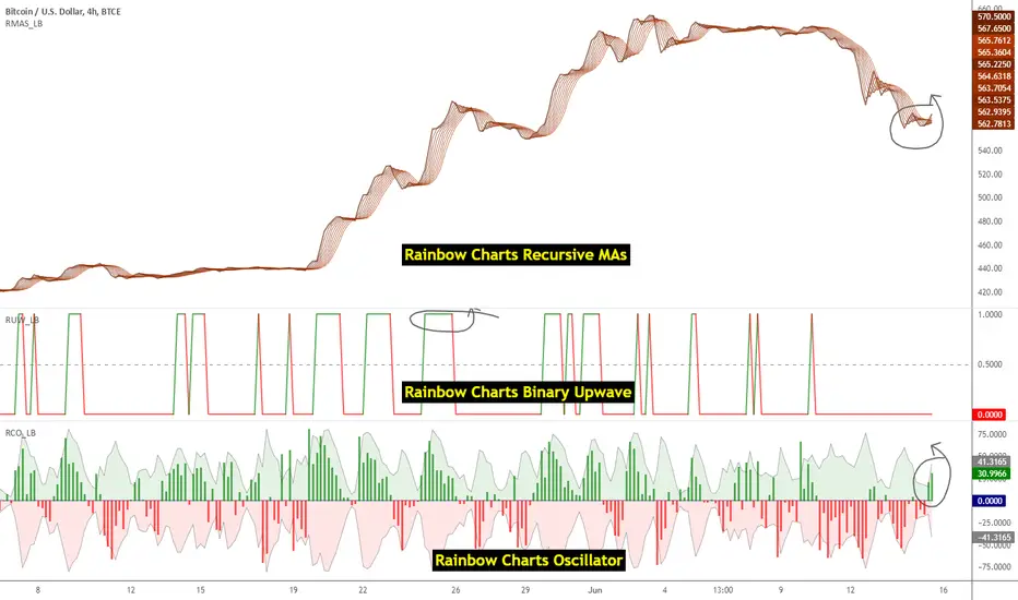
Indicators: Rainbow Charts Oscillator, Binary Wave and MAsRainbow Charts, by Mel Widner, is a trend detector. It uses recursively smoothed MAs (remember, this idea was proposed back in 1997 -- it was certainly cool back then!) and also builds an oscillator out of the MAs. Oscillator bands indicate the stability range.
I have also included a simple binary wave based on whether all the MAs are in an upward slope or not. If you see any value above 0.5 there, the trend is definitely up (all MAs pointing up).
More info:
www.traders.com
Here's my complete list of indicators (With these 3, the total count should be above 100 now...will update the list later today)
Candle Density Indicator_SH_v1This indicator visually highlights the price zones where candlesticks have most frequently passed, using box shapes.
Unlike a standard volume profile, it focuses soley on the areas most visited by candlestick bodies, displayed as gray boxes, and marks the highest and lowest prices within each zone. Additionally, it features a highlight function:
The number displayed inside the gray box represents the average trading volume of the most recent supply zone.
candlestick bodies that exceed the zone's average trading volume are emphasized in yellow.

WaveMacBollI wanted to see the two indicators in the candle chart, not in a separate window. And within the Bollinger band, it seemed to put it fine.
Important Note on Line Styles
Due to TradingView's multi-timeframe environment restrictions (timeframe = '', timeframe_gaps = true), I couldn't implement dotted or dashed line styles programmatically. The indicator uses solid lines by default.
If you prefer dotted/dashed lines for better visual distinction:
Add the indicator to your chart
Click on the indicator settings (gear icon)
Go to "Style" tab
Manually change line styles for each plot
Unfortunately, PineScript doesn't support line.new() or similar drawing functions in multi-timeframe mode, limiting our styling options to basic plot styles.
If you know a good solution for implementing dotted/dashed lines in multi-timeframe indicators without using drawing objects, please share it in the comments! I'd love to improve this aspect of the indicator
20 Day Moving Average with Profit TargetsThis Pine Script indicator plots a 20-day simple moving average (SMA) on the chart and displays profit target labels relative to an initial buy price.
The script allows the user to input a custom buy price and calculates profit levels at 10%, 20%, 30%, and 50% above the buy price. Labels are shown on the last bar of the chart for each profit level and the buy price, with the labels offset to the right to avoid overlapping with the price action.
The labels are color-coded based on the profit levels, and the buy price label is blue.
