Strings and formatting
How can I place text on the chart?
Scripts can display text using the following methods:
- The plotchar() or plotshape() functions for static text, which doesn’t change.
- Labels and boxes for dynamic text, which can vary bar to bar.
- Tables for more complex text (static or dynamic) that stays in the same region of the chart.
Plotting text
The plotchar() and plotshape() functions can display fixed text on bars:
- A single plotchar() function call can print a string using the
textparameter, but only one character using thecharparameter. To plot only the text and not the character, setcharto"". - A plotshape() function call can print a string using the
textparameter. To plot only the text and not the shape, set thecolor(for the shape) to na and thetextcolorto something visible.
Plots appears on the bar where the script calls the function, by default, but scripts can offset a plot by a dynamic number of bars to the left or right. On the Y axis, the plots appear above/below the bar, at the top/bottom of the chart, or at an arbitrary price level. Scripts can call a plotchar() or plotshape() function on any number of bars and it counts as a single plot towards the plot limit.
When using these functions, the text cannot change during the execution of the script. The text parameter accepts an argument of type “const string”, which means it cannot cannot change from bar to bar and cannot be supplied by an input.
This script, for example, does not compile, because the argument to the text parameter is a “series string”:
To print different text depending on a logical condition, use two function calls and control them using the series parameter. Note that even if the series for one or both of the function calls is never true during a script’s execution, and so no shape, character or text is ever plotted, both functions still count towards the plot limit.
The following script corrects the earlier example, and shows the use of both plotchar() and plotshape() to display text:
Labels
Labels are particularly useful for displaying text that can change from one bar to another. The text parameter of the label.new() function takes a “series string”, so it can change whenever necessary.
Labels do not count towards the plot limit, but there is a separate limit of how many labels can display on the chart. By default, up to approximately 50 of the most recent labels appear on the chart. Programmers can adjust this limit up to 500 by setting the max_labels_count parameter in the indicator() or strategy() functions.
The parameters to the label.new() function for text, color, etc., take “series” arguments. This makes labels much more flexible than plots.
The following example script displays the same information as the previous script, but using labels. The background to the labels is transparent (set to na) in this example, to more closely match the style of the previous scripts.
As well as showing historical information, labels can also be used to show only the latest information on the current bar. The following example script displays the value of RSI in a different color depending on whether it is above or below 50, for the most recent bar only. This is not possible using plotchar() or plotshape(), because the text is fixed, and too many plots would be required to plot every value separately.
Note that:
- We create the label once, on the first bar, with all its unchanging properties such as style and background color already set.
- We do nothing with the label for all historical bars.
- We update the changing properties of the label such as text and position on the most recent bar and on every realtime bar. This method is more performant than updating the label on all bars or creating and deleting it each bar.
Boxes
Boxes can also display text on the chart, by providing the text to the text parameter of the box.new() function. Boxes work with text in a similar way to labels, but with some additional features.
Labels exist specifically to display text — and so the label adjusts to the size of the text. Labels always resize so that all of the text is visible inside of the label.
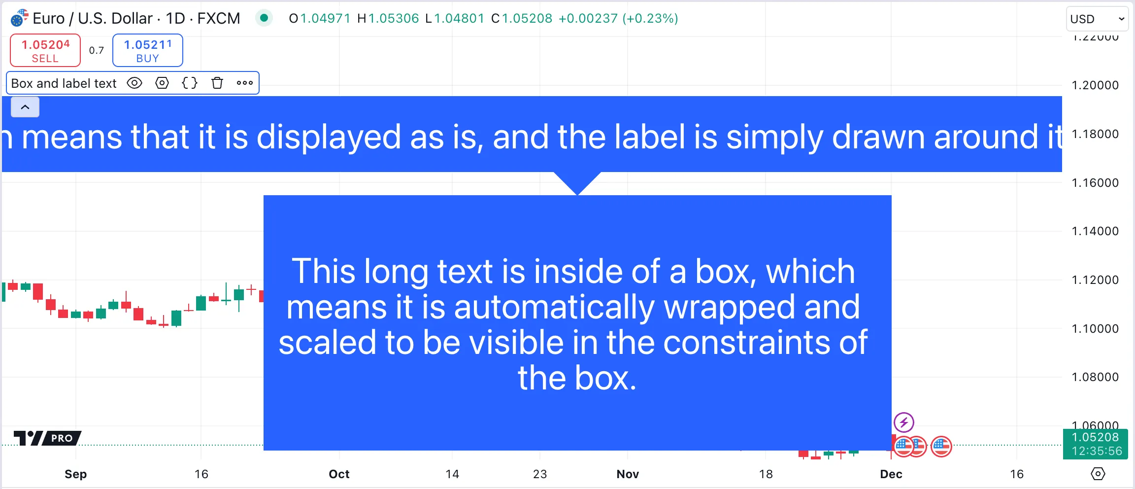
The main use of boxes is to display the drawing itself. A box attaches to specific points on the chart, and its text might or might not fit into it. To ensure that the text displays in the best possible way, boxes provide some additional features that can not be used in labels: text wrapping and text alignment.
Text contained in the box can automatically wrap if it reaches the border of the box, if the text_wrap parameter is set to text.wrap_auto. Additionally, scripts can align the text inside the box along the vertical and horizontal axes. Using the text_halign and text_valign parameters of box.new(), text can display at one of the nine possible positions inside of the box.
In the example below, we draw a box that spans the last 50 historical bars on the chart, and a label. We add long text to both. With text_wrap = text.wrap_auto, the text inside the box automatically wraps to fit the box itself, while the text inside of the label stays unchanged:

Tables
Tables are useful to display information in a fixed position on the chart. Whereas plots and labels can easily show historical information because they are, or can be, linked to specific bars, table contents do not change as users move the cursor over past chart bars. This makes tables best suited for showing current information.
The following example script displays the value of RSI in a different color depending on whether it is above or below 50, for the most recent bar only.
Note that:
- We create the table and its single cell only once, and update the text and color on the most recent bar and on every realtime bar, for performance.
- This script displays the same information as the preceding example did using a label.
- Although this is a simple example, for more complex information, tables are easier to organise and read than labels.
How can I position text on either side of a single bar?
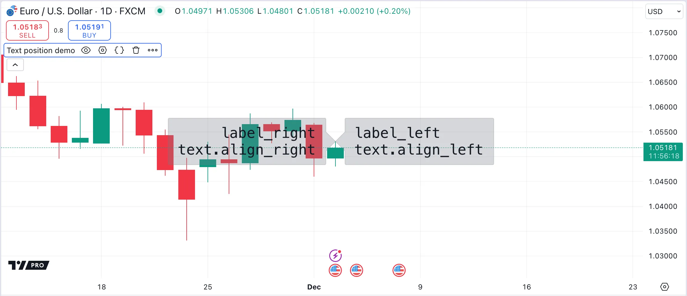
Scripts can position a label to the right of a bar by using style = label.style_label_left. This style points the label to the right and places it to the left. Likewise, a label with style = label.style_label_right displays to the right of the bar, pointing left.
To manage the alignment of the text within the label, use the textalign parameter.
The following example script draws three labels on the chart’s last bar, with different style and textalign values. User inputs control whether individual labels appear, and the central label is off by default for readability. If the input to hide the background is enabled, the color is set to na so that it does not appear. Note that the proper way to do this is to cast it to a color by using color(na).

How can I stack plotshape() text?
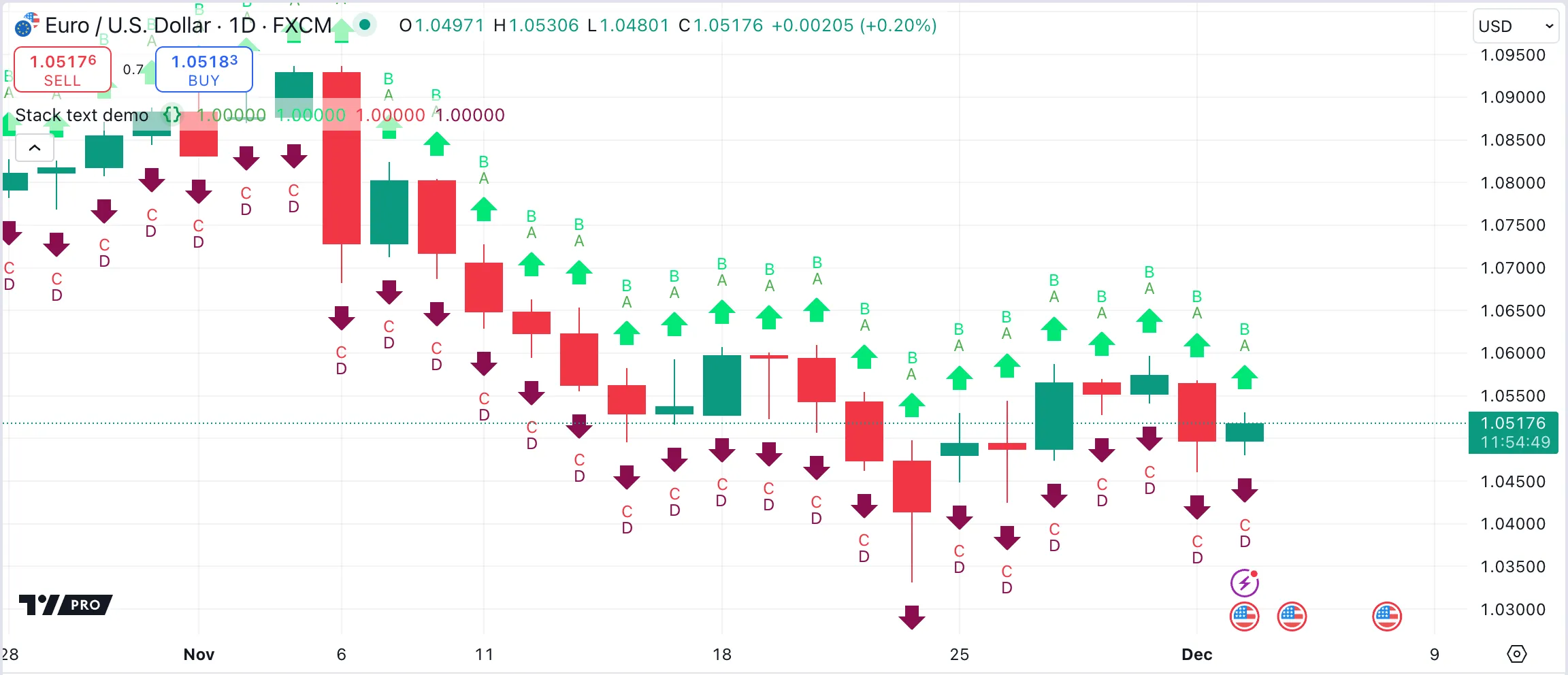
To make multiple text plots visible on the same bar, the text on one plot must be raised or lowered so that it does not overlap with another plot.
To add a blank line in a plotchar() or plotshape() call, add the newline character \n. Text above the bar or at the top of the chart can only be raised, by adding a newline after the text. Newlines added before the text are ignored. Likewise, text below the bar or at the bottom of the chart can only be lowered, by adding a newline before the text.
The following example script shows how to correctly stack text by inserting a blank line over or under other text:

How can I print a value at the top right of the chart?
Refer to the Placing a single value in a fixed position section of the Tables page. The example in that section uses a single-cell table to display a string representation of a value in the top-right corner of the chart.
How can I split a string into characters?
The str.split() function splits a string into parts and stores the parts in an array.
To split a string into individual characters, use an empty string "" as the separator argument. Here is a code example: