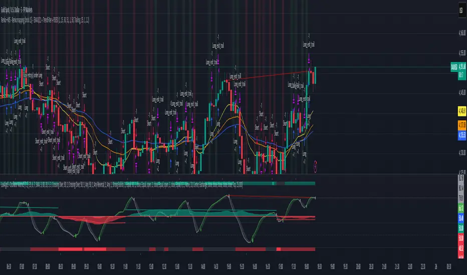
UT Bot (Combo)UT Bot (Combo), SoniR" can either stand for Sonic R, a technical indicator in trading, or Sonic, a new layer 1 blockchain platform developed from Fantom. Depending on the context, sonic R is a technical indicator used to analyze gold price trends based on EMAs (like EMA 34, 89, and 200). In contrast, Sonic is an EVM-compatible blockchain, capable of fast transaction processing.
Indicatori di Bill Williams


Key Levels by ROMKey Levels Pro — Long Description
Key Levels Pro is a precision-built market structure indicator designed to instantly identify the most influential price zones driving intraday and swing-level movement. Using adaptive algorithms that track liquidity pockets, volume concentration, volatility shifts, and historical reaction points, the indicator automatically plots dynamic support and resistance levels that institutions consistently respect.
Unlike static horizontal lines or manually drawn zones, Key Levels Pro continuously updates as new order-flow and volatility data comes in. This ensures the indicator reflects the real-time balance of buyers and sellers, not outdated swing points.
The system classifies levels by strength, frequency of reaction, and current market interest. This helps traders instantly see which levels are likely to produce continuation, reversals, or liquidity grabs. High-probability zones are clearly highlighted, allowing you to plan entries, scale-outs, stop placements, and invalidations with confidence.
Whether you trade futures, equities, crypto, or forex, Key Levels Pro becomes the backbone of your strategy. It simplifies complex price action into clean, actionable zones—and makes it easy to anticipate where momentum pauses, accelerates, or completely shifts.

Stablecoin Total Index V4**Stablecoin Total Index V4 - Full History + Full Coverage**
This indicator provides the **best of both worlds**: long historical data AND complete stablecoin coverage.
**How it works:**
- **Before May 2025:** Manual sum of 35 major stablecoins (~90% coverage)
- **After May 2025:** Switches to STABLE.C index (100 stablecoins, 100% coverage)
**Why this approach?**
TradingView's official STABLE.C index was only created on May 19, 2025. This indicator gives you **years of historical data** going back to 2017-2018, then seamlessly transitions to the official index for complete accuracy.
**Note:** There is a ~$30B jump at the May 2025 transition point. This is NOT an error - it represents the ~65 smaller stablecoins that are included in STABLE.C but don't have individual CRYPTOCAP symbols for manual tracking.
**Pre-May 2025 Coverage (35 stablecoins):**
- **Tier 1:** USDT, USDC
- **Tier 2:** DAI, USDe, USDS, FDUSD
- **Tier 3:** TUSD, USDP, GUSD, FRAX, PYUSD, LUSD, BUSD
- **Tier 4 (2024-2025):** USD1, RLUSD, GHO, crvUSD, sUSDe, USDY, USDM
- **Tier 5 (Euro):** EURC, EURT, EURS
- **Tier 6 (DeFi):** USDD, MIM, DOLA, OUSD, alUSD, sUSD, cUSD
- **Tier 7:** HUSD, USDX, USTC
- **Gold-Backed:** PAXG, XAUT
**Post-May 2025:** Full STABLE.C (100 stablecoins)
**Features:**
- Green/Red color based on direction
- 20-period SMA
- Reference lines at $100B, $200B, $300B
**Best used on Daily timeframe or higher.**

Stablecoin Total Index V3**Stablecoin Total Index V4 - Full History + Full Coverage**
This indicator provides the **best of both worlds**: long historical data AND complete stablecoin coverage.
**How it works:**
- **Before May 2025:** Manual sum of 35 major stablecoins (~90% coverage)
- **After May 2025:** Switches to STABLE.C index (100 stablecoins, 100% coverage)
**Why this approach?**
TradingView's official STABLE.C index was only created on May 19, 2025. This indicator gives you **years of historical data** going back to 2017-2018, then seamlessly transitions to the official index for complete accuracy.
**Note:** There is a ~$30B jump at the May 2025 transition point. This is NOT an error - it represents the ~65 smaller stablecoins that are included in STABLE.C but don't have individual CRYPTOCAP symbols for manual tracking.
**Pre-May 2025 Coverage (35 stablecoins):**
- **Tier 1:** USDT, USDC
- **Tier 2:** DAI, USDe, USDS, FDUSD
- **Tier 3:** TUSD, USDP, GUSD, FRAX, PYUSD, LUSD, BUSD
- **Tier 4 (2024-2025):** USD1, RLUSD, GHO, crvUSD, sUSDe, USDY, USDM
- **Tier 5 (Euro):** EURC, EURT, EURS
- **Tier 6 (DeFi):** USDD, MIM, DOLA, OUSD, alUSD, sUSD, cUSD
- **Tier 7:** HUSD, USDX, USTC
- **Gold-Backed:** PAXG, XAUT
**Post-May 2025:** Full STABLE.C (100 stablecoins)
**Features:**
- Green/Red color based on direction
- 20-period SMA
- Reference lines at $100B, $200B, $300B
**Best used on Daily timeframe or higher.**


jg ndog/nwogthis is an indicator for new week opening gaps along with daily opening gaps marking out potential liq zones

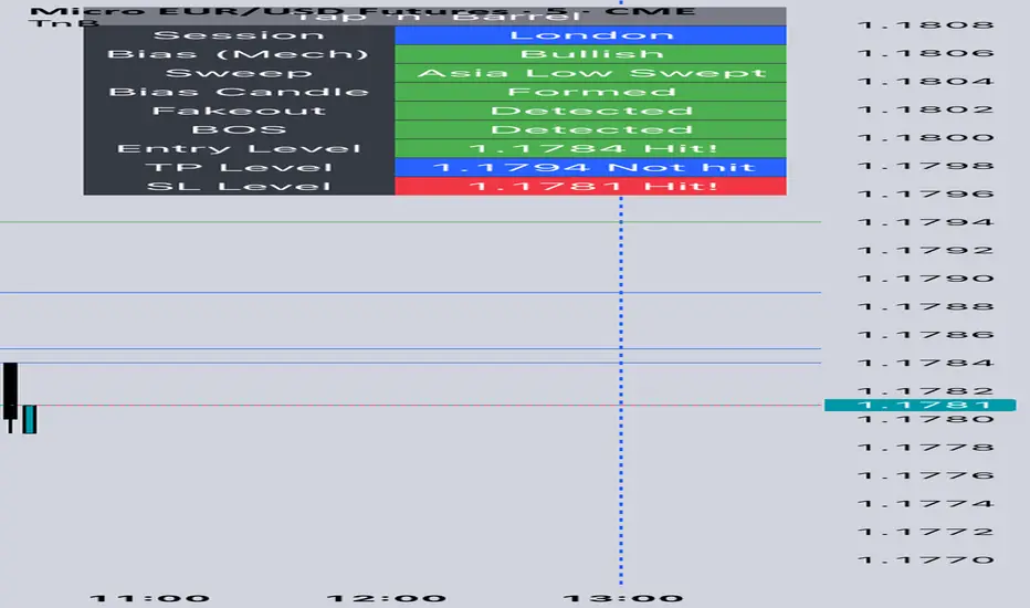
Tap n Barrel
This indicator implements the Tap n Barrel model.
The model is fully mechanical and follows a defined sequence of steps, removing discretionary ambiguity for the trader.
Instead of reacting to events after they occur, the model identifies a future price level where an entry may be placed. Its logic is based on the 5-minute and 15-minute timeframes and incorporates liquidity concepts, fakeouts, market structure, and Fibonacci OTE levels.
Both the directional bias and the entry criteria are rule-based, and the model targets a fixed 1:3 risk-to-reward ratio. Each element of the framework is informed by data collected across multiple currency pairs, representing over 40 years of combined historical testing.
Indicator features
Automatic market bias detection, or you can input your own
Customise your entry level and RR
Alerts for each stage of the model
Customisable entry and take out alerts for users looking to automate placing trades
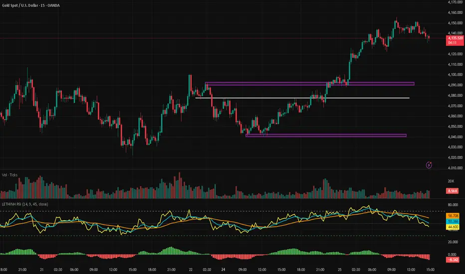
LETHINH RSITitle:
RSI + EMA9 + WMA45 Strength Flow Indicator
Description:
This indicator enhances the traditional RSI by combining it with two dynamic moving averages (EMA9 and WMA45) applied directly to the RSI line. The goal is to help traders visually identify momentum strength, trend confirmation, and potential reversal points with greater accuracy.
How It Works:
• RSI (14): Measures market momentum and identifies overbought/oversold conditions.
• EMA9 on RSI: A fast-response signal line that tracks short-term shifts in buyer/seller strength.
• WMA45 on RSI: A slower, smoother indication of long-term momentum flow and trend bias.
Key Signals:
1. EMA9 crosses above WMA45: Momentum turning bullish → potential buy signal.
2. EMA9 crosses below WMA45: Momentum turning bearish → potential sell signal.
3. RSI above 50 + EMA9 above WMA45: Strong bullish environment.
4. RSI below 50 + EMA9 below WMA45: Strong bearish environment.
5. RSI approaching 70/30: Warning zones for exhaustion or potential reversals.
Use Cases:
• Spot momentum reversals earlier than RSI alone.
• Confirm entries when price structure and momentum agree.
• Filter out false breakouts during low-volatility or choppy conditions.
• Strength-based scalping, swing trading, or trend following.
Best Timeframes:
Works on all timeframes, especially effective on M1–M15 for scalping and H1–H4 for swing trading.

PA + Volatility + Volume Confluence (3/3) — v5Volume price action and volatility. It gives you early warning when market is about to move.

AkdakTrading1Script using M5 Order Blocks with an FVG and the first blocks of an impulse to take trades with a 1:1 risk-reward.

WPR Dot PlotterWPR = williams percent range dot plotter.
I put my settings at tiny and yellow dot when WPR is between -20 and 0.
Red dot on top when WPR is -80 to -100
Entertainment purposes only.

RSIT1. What is this indicator?
RSIT is a hybrid momentum indicator that combines the classic RSI (Relative Strength Index) . Its goal is to provide a smoother, "noise-free" picture of market movement, filtering out false signals while remaining reactive to price changes.
2. Interpreting the Main Line (RSIT)
The indicator window draws a main line that changes color based on the trend direction:
Green Line: Rising momentum (Buying pressure dominates).
Red Line: Falling momentum (Selling pressure dominates).
Zones and Levels
The indicator uses fixed levels to define overbought and oversold conditions:
Extreme Overbought (180+): Price is very high; a downward reversal is expected (indicated by a red fill).
Overbought (150): Warning that the market is "hot."
Midline (100): The neutral zone of the trend.
Oversold (50): The start of the buying zone.
Extreme Oversold (Below 20): Price is very low; an upward reversal is expected (indicated by a green fill).
3. Information Dashboard
On the right side of the screen, there is a small table that helps align trends across multiple timeframes (Multi-Timeframe):
It lists the timeframes: 1m, 15m, 1H, 4H, 8H, 1D.
Green (U - Up): RSIT is rising on that timeframe.
Red (D - Down): RSIT is falling on that timeframe.
Tip: The strongest signals occur when the majority of the timeframes in the table share the same color.
4. Visual Aids on the Chart
The indicator can color the candles and the background of your main chart so you don't have to constantly look at the bottom pane.
Candle Coloring (Barcolor): You can set the candle colors to change based on the trend of a specific timeframe (e.g., if you are on a 15-minute chart but want to see the 4-hour trend).
How to enable: In the settings under the "Use ... Candle Coloring?" options.
Background Coloring: Works similarly; it tints the chart background faint green or red based on the trend of the selected timeframe.
5. RGWaves (Optional)
In the settings, you can enable the "Show RGWaves" feature.
This is a histogram (bars) that functions similarly to MACD.
It confirms momentum: If the bars are green and growing, the trend is strong. If they are red, selling pressure is strong.
6. Divergences
The indicator automatically detects divergences (when price and the indicator move in opposite directions).
Bullish (White line below price): Price hits a new low, but RSIT is already rising. → Buy Signal.
Bearish (White line above price): Price hits a new high, but RSIT is already falling. → Sell Signal.
Settings
By clicking the gear icon, you can modify the following:
Divergence: Toggle the drawing of divergence lines on/off.
Candle Coloring: Choose which timeframe determines the candle colors (e.g., check "Use 4H Candle Coloring" to see the 4-hour trend while trading on a lower timeframe).
Show RGWaves: Toggle the histogram display.
Summary – How to Trade with It?
Trend Direction: Check the main line color and the dashboard. If everything is Green, look primarily for buy opportunities.
Entry: Wait for the RSIT to return from an extreme zone (e.g., crossing back up from below 20) or when a divergence appears.
Exit: If the indicator reaches the opposite extreme zone (e.g., goes above 180), consider closing the position or taking profit.

RRE HARSI4951✅ Buy Signal
RSI crosses above 49
Heikin Ashi green (ha_close > ha_open)
✅ Sell Signal
RSI crosses below 51
Heikin Ashi red (ha_close < ha_open)
Everything else in your code remains unchanged.

SuperEMA RSI Strategy [wjdtks255]Indicator Description and Trading Guide for “SuperEMA RSI Strategy ”
Indicator Name: SuperEMA RSI Strategy
Description
The SuperEMA RSI Strategy combines fast and slow Exponential Moving Averages (EMA) to identify key trend changes, enhanced with the Relative Strength Index (RSI) to filter momentum strength. It plots clear buy and sell signals based on EMA crossovers while highlighting trend zones with colored backgrounds for quick visual reference. This multi-timeframe compatible indicator is suitable for stocks, cryptocurrencies, and other markets.
How to Use the SuperEMA RSI Strategy
Buy Signal:
Enter a long position when the short-term EMA crosses above the long-term EMA, indicated by a green circle below the price bar. Confirm the trend with a green background and consider RSI values showing sufficient momentum (typically RSI above 50).
Sell Signal:
Enter a short position when the short-term EMA crosses below the long-term EMA, indicated by a red circle above the price bar. Confirm the bearish trend with a red background and verify momentum weakening (typically RSI below 50).
Trend Confirmation:
Use the background color-shaded zones to identify prevailing trend strength and avoid counter-trend trades.
RSI Application:
Optionally enable RSI display to avoid overbought/oversold entries by watching for levels above 70 (overbought) or below 30 (oversold).
Additional Tips
Adjust EMA and RSI parameters to suit different timeframes or asset volatility.
Combine this indicator with volume analysis and other technical tools for enhanced signal reliability.
Implement well-defined stop-loss and take-profit levels to manage risk effectively.

Breakout Condition Indicator - Long - V2 - Mega 86Script used for swing trading - contains certain adjustable metrics that I use for scanning and day or entry

BT Strateji Asistanı (S/R + Trend)BT Strateji Asistanı (S/R + Trend) aistanı ile trend belirleme, destek ve direnç tespit etme

Powerful Zone Detector (V19 - Hibrit)With the Powerful Zone Detector, you can easily identify support and resistance zones close to the price zone.


