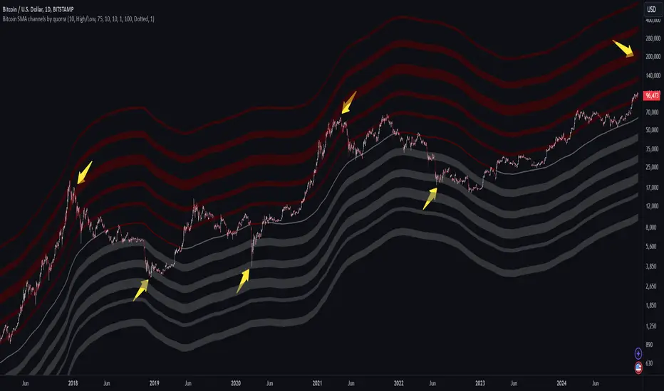
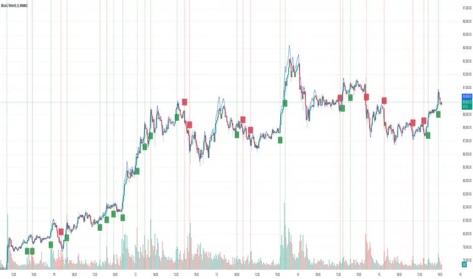
Bitcoin SMA channels - quorraThis indicator is specifically designed to identify potential Bitcoin bottom zones based on historical data and market trends. By analyzing price cycles and key support levels, it helps traders and investors make informed decisions. This tool is tailored for optimal use on higher timeframes like the daily chart. (Don't forget to ensure your chart is set to logarithmic)
1. Simple Moving Average (SMA) Calculation and Gradient Coloring
The script begins by calculating the 350-period SMA (sma350), which serves as the foundation for identifying the market's overall trend. To make the SMA visually intuitive, a gradient color function is implemented. This function changes the SMA's color based on whether the current price (close) is above or below the SMA.
If the price is above the SMA, the line appears in gray.
If the price is below the SMA, the line takes on a darker red shade.
This gradient coloring helps traders quickly gauge market sentiment and momentum, as the SMA effectively acts as a dynamic trend line.
2. Fibonacci-Based Multipliers for SMA Levels
The indicator computes several levels based on Fibonacci multipliers of the 350-period SMA. These levels provide additional layers of insight into potential support and resistance zones. The multipliers range from small values like 0.144 (indicating closer proximity to the SMA) to larger values like 9 (representing distant extensions).
These Fibonacci levels are plotted using hidden lines, ensuring that the chart remains uncluttered while still allowing for strategic visualization through filled zones. For instance:
Levels like SMA x 0.144 to SMA x 0.355 are closer to the SMA and are categorized as potential buy zones.
Levels like SMA x 2 to SMA x 9 extend further and are considered sell zones.
3. Filling Areas to Visualize Zones
To enhance the visual representation, the script uses fill() functions to color the regions between specific Fibonacci levels:
Buy Zones: These areas are filled with a semi-transparent gray color (#5a5a5a) to indicate levels where prices are likely to bounce upward.
Sell Zones: Conversely, these areas are filled with a semi-transparent red color (#5f0000), signaling regions where prices may encounter resistance and reverse downward.
This layered approach helps traders identify actionable price ranges without overwhelming them with excessive visual elements.
4. Pivot Points and Their Visualization
The script includes a pivot point system for identifying local highs and lows. Depending on the selected source (High/Low or Close/Open), it calculates pivot highs and lows over a specified period (prd).
Pivot highs (ph) are marked above bars using downward-facing labels.
Pivot lows (pl) are marked below bars using upward-facing labels.
The pivot points are adjustable via user inputs, allowing traders to fine-tune the detection of significant price swings.
5. Support and Resistance Channel Analysis
A key feature of this indicator is its ability to identify and display support and resistance (S/R) levels. The script calculates the maximum allowable width of an S/R channel as a percentage of the price range over a 300-bar window. It then groups pivot points within these channels to derive high and low boundaries.
Resistance Levels: Represented by the upper bounds of channels and highlighted with a red color.
Support Levels: Represented by the lower bounds of channels and highlighted with a gray color.
These levels are dynamically adjusted based on user-defined parameters such as channel width, maximum S/R levels, and strength.
6. Advanced Input Customization
The indicator provides several user-configurable inputs to adapt it to different trading strategies:
Pivot Period (prd): Determines the sensitivity of pivot point calculations.
Channel Width: Controls the percentage width of S/R zones.
Maximum S/R Levels: Sets the maximum number of S/R zones displayed.
Line Style and Color Settings: Allows customization of the visual appearance of lines and labels.
7. Strength Filtering for S/R Levels
To ensure the reliability of identified S/R levels, the script incorporates a filtering mechanism based on strength. Strength is determined by the number of pivot points that fall within a channel. Levels with insufficient strength are excluded, ensuring that only significant S/R zones are displayed.
8. Practical Applications
This indicator can be applied in various trading strategies:
Trend Identification: The SMA and its gradient coloring provide a clear indication of the market's prevailing trend.
Support/Resistance Trading: The Fibonacci levels and S/R zones help traders identify potential entry and exit points.
Risk Management: By visualizing key levels, the indicator assists traders in setting stop-loss and take-profit levels effectively.
This script combines multiple technical analysis techniques into a single, visually intuitive tool. It is particularly useful for Bitcoin traders seeking to enhance their decision-making process by leveraging both trend and level-based analysis.
Although this indicator is specifically designed for Bitcoin, it can also be applied to stocks or altcoins. It works best on longer timeframes, such as the daily chart. When the price reaches specific support levels, it may be wise to activate a DCA bot or confirm the bottom using other indicators. This approach helps enhance decision-making and ensures a more strategic entry or exit from positions.
Btc!
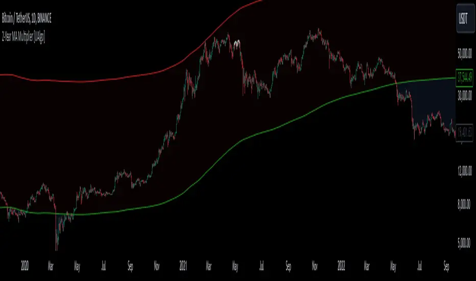
2-Year MA Multiplier [UAlgo]The 2-Year MA Multiplier is a technical analysis tool designed to assist traders and investors in identifying potential overbought and oversold conditions in the market. By plotting the 2-year moving average (MA) of an asset's closing price alongside an upper band set at five times this moving average, the indicator provides visual cues to assess long-term price trends and significant market movements.
🔶 Key Features
2-Year Moving Average (MA): Calculates the simple moving average of the asset's closing price over a 730-day period, representing approximately two years.
Visual Indicators: Plots the 2-year MA in forest green and the upper band in firebrick red for clear differentiation.
Fills the area between the 2-year MA and the upper band to highlight the normal trading range.
Uses color-coded fills to indicate overbought (tomato red) and oversold (cornflower blue) conditions based on the asset's closing price relative to the bands.
🔶 Idea
The concept behind the 2-Year MA Multiplier is rooted in the cyclical nature of markets, particularly in assets like Bitcoin. By analyzing long-term price movements, the indicator aims to identify periods of significant deviation from the norm, which may signal potential buying or selling opportunities.
2-year MA smooths out short-term volatility, providing a clearer view of the asset's long-term trend. This timeframe is substantial enough to capture major market cycles, making it a reliable baseline for analysis.
Multiplying the 2-year MA by five establishes an upper boundary that has historically correlated with market tops. When the asset's price exceeds this upper band, it may indicate overbought conditions, suggesting a potential for price correction. Conversely, when the price falls below the 2-year MA, it may signal oversold conditions, presenting potential buying opportunities.
🔶 Disclaimer
Use with Caution: This indicator is provided for educational and informational purposes only and should not be considered as financial advice. Users should exercise caution and perform their own analysis before making trading decisions based on the indicator's signals.
Not Financial Advice: The information provided by this indicator does not constitute financial advice, and the creator (UAlgo) shall not be held responsible for any trading losses incurred as a result of using this indicator.
Backtesting Recommended: Traders are encouraged to backtest the indicator thoroughly on historical data before using it in live trading to assess its performance and suitability for their trading strategies.
Risk Management: Trading involves inherent risks, and users should implement proper risk management strategies, including but not limited to stop-loss orders and position sizing, to mitigate potential losses.
No Guarantees: The accuracy and reliability of the indicator's signals cannot be guaranteed, as they are based on historical price data and past performance may not be indicative of future results.
Bitcoin Events HistoryWith this tool, you can travel back to Bitcoin’s very first price quote and retrace its entire history directly on your chart. Major events are plotted as labels or markers, providing context for how significant moments shaped Bitcoin’s journey.
Key Features
Comprehensive Event Coverage: From Bitcoin’s inception to the most recent updates.
Custom View: Change label colors, styles, sizes, and fonts using the script’s settings.
Regular Updates: New events are added regularly to keep the history current.
Replay History
Use Bar Replay Mode to step through Bitcoin’s price history and see events unfold in sequence.
Follow the on-screen instructions for a more immersive experience.
Community Contributions
If you notice a significant event missing or misplaced on a particular date, feel free to leave a comment! Your suggestions will be considered for the next update.
To all Bitcoin enthusiasts, traders, and anyone eager to explore the history of cryptocurrency from its inception, I hope you enjoy this indicator :)

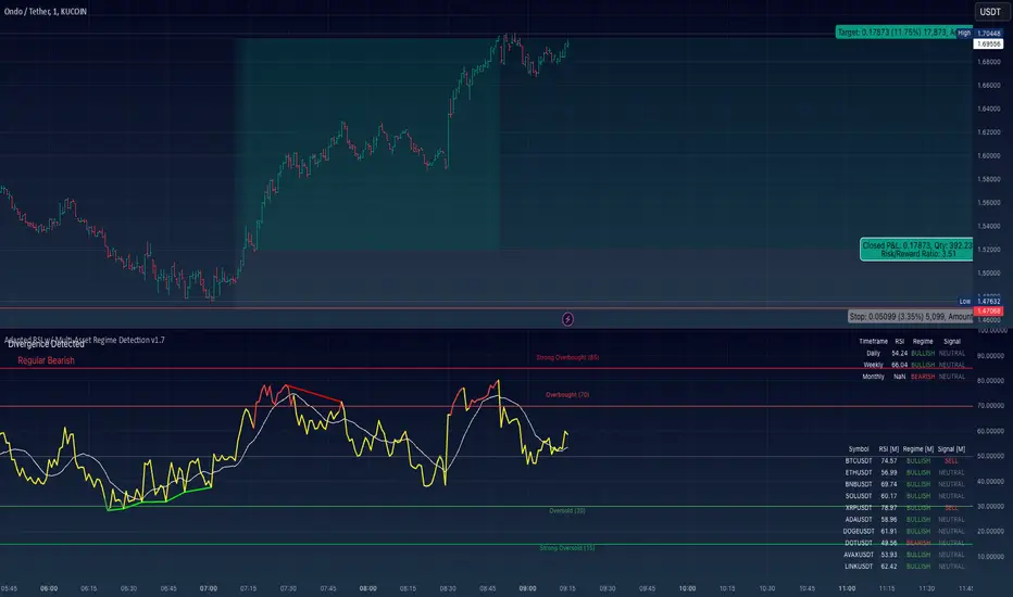
Adapted RSI w/ Multi-Asset Regime Detection v1.1The relative strength index (RSI) is a momentum indicator used in technical analysis. RSI measures the speed and magnitude of an asset's recent price changes to detect overbought or oversold conditions in the price of said asset.
In addition to identifying overbought and oversold assets, the RSI can also indicate whether your desired asset may be primed for a trend reversal or a corrective pullback in price. It can signal when to buy and sell.
The RSI will oscillate between 0 and 100. Traditionally, an RSI reading of 70 or above indicates an overbought condition. A reading of 30 or below indicates an oversold condition.
The RSI is one of the most popular technical indicators. I intend to offer a fresh spin.
Adapted RSI w/ Multi-Asset Regime Detection
Our Adapted RSI makes necessary improvements to the original Relative Strength Index (RSI) by combining multi-timeframe analysis with multi-asset monitoring and providing traders with an efficient way to analyse market-wide conditions across different timeframes and assets simultaneously. The indicator automatically detects market regimes and generates clear signals based on RSI levels, presenting this data in an organised, easy-to-read format through two dynamic tables. Simplicity is key, and having access to more RSI data at any given time, allows traders to prepare more effectively, especially when trading markets that "move" together.
How we calculate the RSI
First, the RSI identifies price changes between periods, calculating gains and losses from one look-back period to the next. This look-back period averages gains and losses over 14 periods, which in this case would be 14 days, and those gains/losses are calculated based on the daily closing price. For example:
Average Gain = Sum of Gains over the past 14 days / 14
Average Loss = Sum of Losses over the past 14 days / 14
Then we calculate the Relative Strength (RS):
RS = Average Gain / Average Loss
Finally, this is converted to the RSI value:
RSI = 100 - (100 / (1 + RS))
Key Features
Our multi-timeframe RSI indicator enhances traditional technical analysis by offering synchronised Daily, Weekly, and Monthly RSI readings with automatic regime detection. The multi-asset monitoring system allows tracking of up to 10 different assets simultaneously, with pre-configured major pairs that can be customised to any asset selection. The signal generation system provides clear market guidance through automatic regime detection and a five-level signal system, all presented through a sophisticated visual interface with dynamic RSI line colouring and customisable display options.
Quick Guide to Use it
Begin by adding the indicator to your chart and configuring your preferred assets in the "Asset Comparison" settings.
Position the two information tables according to your preference.
The main table displays RSI analysis across three timeframes for your current asset, while the asset table shows a comparative analysis of all monitored assets.
Signals are colour-coded for instant recognition, with green indicating bullish conditions and red for bearish conditions. Pay special attention to regime changes and signal transitions, using multi-timeframe confluence to identify stronger signals.
How it Works (Regime Detection & Signals)
When we say 'Regime', a regime is determined by a persistent trend or in this case momentum and by leveraging this for RSI, which is a momentum oscillator, our indicator employs a relatively simple regime detection system that classifies market conditions as either Bullish (RSI > 50) or Bearish (RSI < 50). Our benchmark between a trending bullish or bearish market is equal to 50. By leveraging a simple classification system helps determine the probability of trend continuation and the weight given to various signals. Whilst we could determine a Neutral regime for consolidating markets, we have employed a 'neutral' signal generation which will be further discussed below...
Signal generation occurs across five distinct levels:
Strong Buy (RSI < 15)
Buy (RSI < 30)
Neutral (RSI 30-70)
Sell (RSI > 70)
Strong Sell (RSI > 85)
Each level represents different market conditions and probability scenarios. For instance, extreme readings (Strong Buy/Sell) indicate the highest probability of mean reversion, while neutral readings suggest equilibrium conditions where traders should focus on the overall regime bias (Bullish/Bearish momentum).
This approach offers traders a new and fresh spin on a popular and well-known tool in technical analysis, allowing traders to make better and more informed decisions from the well presented information across multiple assets and timeframes. Experienced and beginner traders alike, I hope you enjoy this adaptation.
MicroStrategy Bitcoin Premium v2 [Kendrick_Chan]In 2020, MicroStrategy, under the leadership of CEO Michael Saylor, began purchasing large amounts of Bitcoin to hedge against inflation and diversify its corporate treasury. This move transformed MicroStrategy into one of the largest corporate holders of Bitcoin, with the company continually increasing its holdings through additional purchases funded by issuing new shares and convertible bonds.
The MicroStrategy Bitcoin Premium indicator is a dynamic tool that underscores the enthusiasm of equity market investors to gain Bitcoin exposure through MicroStrategy's (MSTR) stock. This indicator measures the premium investors are willing to pay for MSTR shares relative to the company's Bitcoin and cash holdings, reflecting the traditional market's eagerness to hold Bitcoin indirectly.
How Does It Work:
When MicroStrategy issues convertible bonds, cash level increases and all CB are assumed to convert to stocks diluting the shares.
In case of sales of MSTR new shares, cash level increases and diluted shares are adjusted tentatively before the quarterly financial reports.
In the event of Bitcoin purchases, the Bitcoins holding increases while cash level decreases.
Premium = Assumed Diluted Market Cap / ( Bitcoins Value + Cash and Cash Equivalents ) - 100%
How To Use:
By understanding and utilizing the MicroStrategy Bitcoin Premium indicator, traders and investors can make more informed decisions, whether they are swing trading MSTR, gauging Bitcoin demand, or seeking arbitrage opportunities.
1. MSTR Swing Traders
Swing traders can leverage the indicator to identify potential MSTR entry and exit points based on the overbought or oversold conditions of the stock.
2. Bitcoin Investors and Traders
The premium indicator can serve Bitcoin investors as a proxy for gauging overall market demand. A high premium indicates strong demand for Bitcoin exposure through MSTR, reflecting broader market enthusiasm for Bitcoin. A low premium suggests reduced demand.
Bitcoin traders may also anticipate the Bitcoin demand driven by MicroStrategy:
a) Shen the premium is high, MicroStrategy could issue new shares or convertible bonds to raise funds and buy more Bitcoins.
b) Arbitrageurs might also short sell MSTR and buy the equivalent Bitcoins.
3. MSTR-Bitcoin Arbitrageurs
Arbitrage traders can use the premium indicator to exploit price discrepancies between MSTR stock and Bitcoin. This strategy profits from any convergence between the stock price and the value of the underlying Bitcoin holdings.
The indicator helps identify optimal times to enter and exit arbitrage positions, minimizing risk and maximizing potential returns by capitalizing on market inefficiencies.

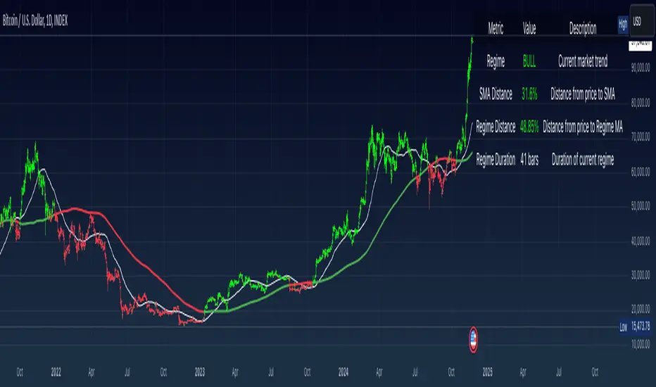
Simple Moving Average with Regime Detection by iGrey.TradingThis indicator helps traders identify market regimes using the powerful combination of 50 and 200 SMAs. It provides clear visual signals and detailed metrics for trend-following strategies.
Key Features:
- Dual SMA System (50/200) for regime identification
- Colour-coded candles for easy trend visualisation
- Metrics dashboard
Core Signals:
- Bullish Regime: Price < 200 SMA
- Bearish Regime: Price > 200 SMA
- Additional confirmation: 50 SMA Cross-over or Cross-under (golden cross or death cross)
Metrics Dashboard:
- Current Regime Status (Bull/Bear)
- SMA Distance (% from price to 50 SMA)
- Regime Distance (% from price to 200 SMA)
- Regime Duration (bars in current regime)
Usage Instructions:
1. Apply the indicator to your chart
2. Configure the SMA lengths if desired (default: 50/200)
3. Monitor the color-coded candles:
- Green: Bullish regime
- Red: Bearish regime
4. Use the metrics dashboard for detailed analysis
Settings Guide:
- Length: Short-term SMA period (default: 50)
- Source: Price calculation source (default: close)
- Regime Filter Length: Long-term SMA period (default: 200)
- Regime Filter Source: Price source for regime calculation (default: close)
Trading Tips:
- Use bullish regimes for long positions
- Use bearish regimes for capital preservation or short positions
- Consider regime duration for trend strength
- Monitor distance metrics for potential reversals
- Combine with other systems for confluence
#trend-following #moving average #regime #sma #momentum
Risk Management:
- Not a standalone trading system
- Should be used with proper position sizing
- Consider market conditions and volatility
- Always use stop losses
Best Practices:
- Monitor multiple timeframes
- Use with other confirmation tools
- Consider fundamental factors
Version: 1.0
Created by: iGREY.Trading
Release Notes
// v1.1 Allows table overlay customisation
// v1.2 Update to v6 pinescript
Adaptive Range Breakout (ARB) IndicatorTitle: Adaptive Range Breakout (ARB) Indicator – Enhanced Mean Reversion with Dynamic Support/Resistance
Overview: The Adaptive Range Breakout (ARB) Indicator is designed to help traders identify potential mean reversion and breakout opportunities by leveraging a dynamic range based on recent price action and volatility. This script combines key elements such as Volume Profile analysis, ATR-based volatility adjustments, and an EMA trend filter to create a robust and adaptive trading tool. It aims to capture both trend continuations and reversals while filtering out noise in choppy markets.
Justification for Combining Components:
HVN (High Volume Node):
The core of this indicator is built around a custom VWAP calculation over a defined lookback period, which serves as the HVN line (High Volume Node). The HVN represents a volume-weighted average price, highlighting key levels where significant trading activity has occurred. These levels often act as areas of support or resistance, providing a reliable reference point for traders.
ATR-Based Dynamic Support and Resistance:
The Average True Range (ATR) is used to adjust the adaptive support and resistance levels around the HVN line. This ensures that the levels dynamically respond to changes in market volatility. The use of ATR helps filter out insignificant price movements and focuses on significant shifts in momentum, making the indicator adaptive to different market conditions.
EMA Trend Filter:
An Exponential Moving Average (EMA) is applied as a trend filter to distinguish between trending and range-bound market conditions. This filter helps in identifying whether the price movement is in line with the overall trend or if a potential reversal is more likely. By using the EMA crossover signals, the indicator can provide additional confirmation before generating buy or sell signals.
Adaptive Breakout and Mean Reversion Signals:
The indicator generates buy and sell signals based on the interaction between the price and the adaptive support/resistance levels. It incorporates a volatility filter to ensure that signals are only triggered when the market is sufficiently volatile, reducing the likelihood of false signals during low-volatility periods. Additionally, a cooldown period is implemented to prevent consecutive signals in quick succession, enhancing signal reliability.
Key Features:
Dynamic Range Levels: The adaptive support and resistance levels adjust based on recent price action and volatility, providing reliable areas for potential reversals or breakouts.
Volume-Weighted Analysis: The HVN line, derived from a custom VWAP calculation, highlights key price levels with significant trading activity, helping identify zones of support/resistance.
Trend Confirmation: The EMA trend filter helps differentiate between trend-following and mean-reversion signals, providing context for the generated buy and sell signals.
Volatility Filtering: The indicator uses ATR to gauge market volatility, ensuring signals are only generated during active market conditions.
Signal Cooldown: A customizable cooldown period reduces noise by spacing out signals, especially in choppy market environments.
Use Case:
The Adaptive Range Breakout (ARB) Indicator is suitable for traders looking to capitalize on both breakouts and mean-reversion opportunities. It is particularly useful in:
Range-Bound Markets: The adaptive support and resistance levels help capture reversals in range-bound conditions.
Trending Markets: The trend filter and breakout logic allow traders to follow momentum when the price breaks through key adaptive levels.
Intraday and Swing Trading: The dynamic nature of the indicator makes it applicable across different timeframes, catering to both intraday and swing traders.
Important Considerations:
This indicator does not guarantee future performance or provide an infallible prediction of price movements. It is a tool intended to support traders in their decision-making process based on historical price action and market conditions.
The effectiveness of the signals may vary depending on the asset, market conditions, and timeframe used. It is recommended to backtest the indicator and use it alongside other analysis techniques.
Always exercise caution and use appropriate risk management strategies when trading based on signals generated by this indicator.
Alerts: The indicator includes built-in alerts for:
Buy Signal Alert: Triggered when the price crosses above the adaptive support level, suggesting a potential reversal or continuation in an uptrend.
Sell Signal Alert: Triggered when the price crosses below the adaptive resistance level, indicating a potential reversal or continuation in a downtrend.
EMA Crossover Alerts: Alerts for EMA crossover signals, providing additional trend confirmation.
This script is a comprehensive tool designed to adapt to market conditions dynamically, combining multiple techniques to create a well-rounded approach to identifying trading opportunities. We encourage users to integrate it into their broader trading strategy and apply it with caution, understanding its strengths and limitations.

TimeFlow Momentum IndicatorThe “TimeFlow Momentum Indicator” is a thoughtfully crafted tool that integrates multiple analytical components to deliver a unique perspective on market momentum. It is not a mere combination of existing indicators, but rather a purposeful integration where each element plays a specific role, enhancing the overall functionality and reliability of the script. The primary aim is to provide traders with a more comprehensive and accurate analysis by leveraging time-based divergence, volume validation, and trend filtering.
1. Time-Based Momentum Divergence: The Core Innovation
• The heart of the indicator is the Time Divergence Line, which introduces a unique approach to analyzing momentum by focusing on the time spent in uptrends versus downtrends. Unlike traditional momentum indicators that rely purely on price movements (e.g., RSI, MACD), the Time Divergence Line captures the duration of market trends, offering a different perspective on momentum shifts.
• This method counts consecutive bars where the price closes higher (uptrend) or lower (downtrend) and calculates the difference between these counts. By measuring the time spent in different trend directions, the indicator can detect early signs of trend exhaustion or potential reversals, which are often missed by price-based indicators.
2. EMA Smoothing: Enhancing Signal Clarity
• The raw time divergence data is smoothed using an Exponential Moving Average (EMA) to filter out noise and provide a clearer, more reliable signal. The EMA helps to capture the underlying trend in the divergence data, making it easier for traders to identify meaningful shifts in momentum without being misled by short-term price fluctuations.
• This smoothing technique is crucial because it reduces false signals, ensuring that the divergence line reflects the true momentum of the market.
3. Overlay Plotting for Better Visualization
• The smoothed Time Divergence Line is directly plotted on the main price chart, offering traders a visual overlay that correlates directly with price action. This design choice enhances the usability of the indicator by allowing traders to see the divergence line’s relationship with the price in real-time, making it easier to spot potential buy and sell signals.
• By overlaying the divergence line on the main chart, the indicator provides a visual representation of momentum divergence, which is more intuitive and actionable compared to separate oscillators.
4. Trend Confirmation Using VWAP and EMA
• To increase the reliability of signals, the indicator incorporates a trend filter using both VWAP (Volume Weighted Average Price) and EMA (50-period). This filter ensures that signals are generated only when they align with the prevailing market trend:
• The VWAP is used to gauge the average price considering the volume, acting as a dynamic support/resistance level. It helps to confirm whether the market sentiment is bullish or bearish.
• The EMA (50-period) acts as a trend-following indicator, smoothing out price action and providing a clear signal of the overall trend direction.
• This dual-filter approach helps to eliminate false signals that may occur during choppy or sideways market conditions, ensuring that the generated signals are more aligned with the broader market trend.
5. Volume Correlation for Signal Validation
• The indicator integrates a volume filter to confirm the validity of momentum signals. It checks whether the current volume exceeds a threshold based on the average volume, ensuring that signals are only generated when there is strong market participation.
• This volume correlation check is vital because it validates price movements by confirming that they are backed by significant trading activity, reducing the likelihood of false signals in low-volume conditions.
6. Cooldown Mechanism: Controlling Signal Frequency
• To prevent excessive signals, especially during volatile or sideways market conditions, the indicator implements a cooldown period. This feature enforces a minimum number of bars between consecutive signals, reducing noise and preventing traders from being overwhelmed by frequent alerts.
• The cooldown mechanism enhances the signal quality, ensuring that each buy or sell signal is meaningful and not just a result of short-term fluctuations.
How the Components Work Together
The TimeFlow Momentum Indicator is a cohesive tool where each component plays a specific and complementary role:
1. Time Divergence Line identifies shifts in market momentum by analyzing the duration of trends.
2. EMA Smoothing refines the divergence data, providing a clearer signal by filtering out noise.
3. Trend Filter (VWAP + EMA) ensures that signals are generated in alignment with the prevailing market trend, reducing the risk of false signals.
4. Volume Filter validates signals based on trading activity, confirming that price movements are backed by strong volume.
5. Cooldown Mechanism controls the frequency of signals, preventing overtrading and reducing noise.
Conclusion
The “TimeFlow Momentum Indicator” is an innovative tool that offers a new way of analyzing market momentum by focusing on time-based divergence. It combines this original approach with trend and volume filters to create a reliable, user-friendly indicator that can help traders identify high-probability entry and exit points. This is not a simple mashup of existing indicators but a well-designed integration where each component enhances the overall functionality, providing traders with a unique edge in market analysis.
Directional Sentiment IndicatorThe Directional Sentiment Indicator is a versatile tool designed to capture price movements by combining several key technical elements, providing traders with actionable insights in volatile and trending markets. This script intelligently integrates price action analysis with the Average True Range (ATR) for precise target zones and directional signals.
Key Components & Their Roles:
1. Moving Averages and ATR Zones: The script utilizes custom high, low, open, and close averages over the selected period to gauge directional bias. By combining these averages with ATR, we define potential high and low targets dynamically, making it easier to visualize potential reversals.
2. Buy/Sell Signals Based on Price Proximity to Extremes: Using calculated price distances from highest/lowest points, the indicator identifies long and short signals when prices reach statistically significant deviations. This is designed to capture trend reversals or continuations at critical junctures, reducing noise from insignificant movements.
3. Highlighting Price Crossovers and Zones: The script plots boxes when price crosses above or below critical ATR levels, providing clear visual zones where price may experience increased resistance or support. This functionality helps users identify areas where market direction may shift.
4. Dynamic Plotting of Highs/Lows: With options to plot crossover and undershoot signals, traders can visually assess momentum shifts with green and red arrows for bullish and bearish crossovers respectively. This visual overlay enhances the trader’s ability to make quicker decisions.
This unique combination not only marks direction and key reversal areas but also provides context with ATR-based range boxes, making it an essential tool for traders seeking both clarity and precision in market movements.

Dynamic Linear CandlesDynamic Linear Candles is a unique and versatile indicator that reimagines traditional candlestick patterns by integrating customizable moving averages directly into candle structures. This dynamic approach smooths the appearance of candlesticks to better highlight trends and suppress minor market noise, allowing traders to focus on essential price movements.
Key Features:
1. Dynamic Candle Smoothing: Choose between popular smoothing types (SMA, EMA, WMA, HMA) to apply directly to each candle’s Open, High, Low, and Close values. This adaptive smoothing reveals hidden trends by refining price action into simplified, flowing candles, ideal for spotting subtle changes in market sentiment.
2. Signal Line Overlay: The signal line provides an additional layer of trend confirmation. Select from SMA, EMA, WMA, or HMA smoothing to match your trading style. The line dynamically changes color based on the price’s relative position, helping traders quickly identify bullish or bearish shifts.
3. Enhanced Candle Visualization: Candles adjust in color and opacity based on bullish or bearish trends, providing immediate visual cues about market momentum. The customized color and opacity settings allow for clearer distinction, especially in noisy markets.
Why This Combination?
This script is more than just an aesthetic adjustment; it’s a purposeful combination of moving averages and candle smoothing designed to enhance readability and actionable insights. Traditional candles often suffer from excessive noise in volatile markets, and this mashup addresses that by creating a smooth, flowing chart that adapts to the underlying trend. The Signal Line adds confirmation, acting as a filter for potential entries and exits. Together, these elements serve as a concise toolset for traders aiming to capture trend-based opportunities with clarity and precision.

Pulse DPO: Major Cycle Tops and Bottoms█ OVERVIEW
Pulse DPO is an oscillator designed to highlight Major Cycle Tops and Bottoms .
It works on any market driven by cycles. It operates by removing the short-term noise from the price action and focuses on the market's cyclical nature.
This indicator uses a Normalized version of the Detrended Price Oscillator (DPO) on a 0-100 scale, making it easier to identify major tops and bottoms.
Credit: The DPO was first developed by William Blau in 1991.
█ HOW TO READ IT
Pulse DPO oscillates in the range between 0 and 100. A value in the upper section signals an OverBought (OB) condition, while a value in the lower section signals an OverSold (OS) condition.
Generally, the triggering of OB and OS conditions don't necessarily translate into swing tops and bottoms, but rather suggest caution on approaching a market that might be overextended.
Nevertheless, this indicator has been customized to trigger the signal only during remarkable top and bottom events.
I suggest using it on the Daily Time Frame , but you're free to experiment with this indicator on other time frames.
The indicator has Built-in Alerts to signal the crossing of the Thresholds. Please don't act on an isolated signal, but rather integrate it to work in conjunction with the indicators present in your Trading Plan.
█ OB SIGNAL ON: ENTERING OVERBOUGHT CONDITION
When Pulse DPO crosses Above the Top Threshold it Triggers ON the OB signal. At this point the oscillator line shifts to OB color.
When Pulse DPO enters the OB Zone, please beware! In this Area the Major Players usually become Active Sellers to the Public. While the OB signal is On, it might be wise to Consider Selling a portion or the whole Long Position.
Please note that even though this indicator aims to focus on major tops and bottoms, a strong trending market might trigger the OB signal and stay with it for a long time. That's especially true on young markets and on bubble-mode markets.
█ OB SIGNAL OFF: EXITING OVERBOUGHT CONDITION
When Pulse DPO crosses Below the Top Threshold it Triggers OFF the OB signal. At this point the oscillator line shifts to its normal color.
When Pulse DPO exits the OB Zone, please beware because a Major Top might just have occurred. In this Area the Major Players usually become Aggressive Sellers. They might wind up any remaining Long Positions and Open new Short Positions.
This might be a good area to Open Shorts or to Close/Reverse any remaining Long Position. Whatever you choose to do, it's usually best to act quickly because the market is prone to enter into panic mode.
█ OS SIGNAL ON: ENTERING OVERSOLD CONDITION
When Pulse DPO crosses Below the Bottom Threshold it Triggers ON the OS signal. At this point the oscillator line shifts to OS color.
When Pulse DPO enters the OS Zone, please beware because in this Area the Major Players usually become Active Buyers accumulating Long Positions from the desperate Public.
While the OS signal is On, it might be wise to Consider becoming a Buyer or to implement a Dollar-Cost Averaging (DCA) Strategy to build a Long Position towards the next Cycle. In contrast to the tops, the OS state usually takes longer to resolve a major bottom.
█ OS SIGNAL OFF: EXITING OVERSOLD CONDITION
When Pulse DPO crosses Above the Bottom Threshold it Triggers OFF the OS signal. At this point the oscillator line shifts to its normal color.
When Pulse DPO exits the OS Zone, please beware because a Major Bottom might already be in place. In this Area the Major Players become Aggresive Buyers. They might wind up any remaining Short Positions and Open new Long Positions.
This might be a good area to Open Longs or to Close/Reverse any remaining Short Positions.
█ WHY WOULD YOU BE INTERESTED IN THIS INDICATOR?
This indicator is built over a solid foundation capable of signaling Major Cycle Tops and Bottoms across many markets. Let's see some examples:
Early Bitcoin Years: From 0 to 1242
This chart is in logarithmic mode in order to properly display various exponential cycles. Pulse DPO is properly signaling the major early highs from 9-Jun-2011 at 31.50, to the next one on 9-Apr-2013 at 240 and the epic top from 29-Nov-2013 at 1242.
Due to the massive price movements, the OB condition stays pinned during most of the exponential price action. But as you can see, the OB condition quickly vanishes once the Cycle Top has been reached. As the market matures, the OB condition becomes more exceptional and triggers much closer from the Cycle Top.
With regards to Cycle Bottoms, the early bottom of 2 after having peaked at 31.50 doesn’t get captured by the indicator. That is the only cycle bottom that escapes the Pulse DPO when the bottom threshold is set at a value of 5. In that event, the oscillator low reached 6.95.
Bitcoin Adoption Spreading: From 257 to 73k
This chart is in logarithmic mode in order to properly display various exponential cycles. Pulse DPO is properly signaling all the major highs from 17-Dec-2017 at 19k, to the next one on 14-Apr-2021 at 64k and the most recent top from 9-Nov-2021 at 68k.
During the massive run of 2017, the OB condition still stayed triggered for a few weeks on each swing top. But on the next cycles it started to signal only for a few days before each swing top actually happened. The OB condition during the last cycle top triggered only for 3 days. Therefore the signal grows in focus as the market matures.
At the time of publishing this indicator, Bitcoin printed a new All Time High (ATH) on 13-Mar-2024 at 73k. That run didn’t trigger the OB condition. Therefore, if the indicator is correct the Bitcoin market still has some way to grow during the next months.
With regards to Cycle Bottoms, the bottom of 3k after having peaked at19k got captured within the wide OS zone. The bottom of 15k after having peaked at 68k got captured too within the OS accumulation area.
Gold
Pulse DPO behaves surprisingly well on a long standing market such as Gold. Moving back to the 197x years it’s been signaling most Cycle Tops and Bottoms with precision. During the last cycle, it shows topping at 2k and bottoming at 1.6k.
The current price action is signaling OB condition in the range of 2.5k to 2.7k. Looking at past cycles, it tends to trigger on and off at multiple swing tops until reaching the final cycle top. Therefore this might indicate the first wave within a potential gold run.
Oil
On the Oil market, we can see that most of the cycle tops and bottoms since the 80s got signaled. The only exception being the low from 2020 which didn’t trigger.
EURUSD
On Forex markets the Pulse DPO also behaves as expected. Looking back at EURUSD we can see the marketing triggering OB and OS conditions during major cycle tops and bottoms from recent times until the 80s.
S&P 500
On the S&P 500 the Pulse DPO catched the lows from 2016 and 2020. Looking at present price action, the recent ATH didn’t trigger the OB condition. Therefore, the indicator is allowing room for another leg up during the next months.
Amazon
On the Amazon chart the Pulse DPO is mirroring pretty accurately the major swings. Scrolling back to the early 2000s, this chart resembles early exponential swings in the crypto space.
Tesla
Moving onto a younger tech stock, Pulse DPO captures pretty accurately the major tops and bottoms. The chart is shown in logarithmic scale to better display the magnitude of the moves.
█ SETTINGS
This indicator is ideal for identifying major market turning points while filtering out short-term noise. You are free to adjust the parameters to align with your preferred trading style.
Parameters : This section allows you to customize any of the Parameters that shape the Oscillator.
Oscillator Length: Defines the period for calculating the Oscillator.
Offset: Shifts the oscillator calculation by a certain number of periods, which is typically half the Oscillator Length.
Lookback Period: Specifies how many bars to look back to find tops and bottoms for normalization.
Smoothing Length: Determines the length of the moving average used to smooth the oscillator.
Thresholds : This section allows you to customize the Thresholds that trigger the OB and OS conditions.
Top: Defines the value of the Top Threshold.
Bottom: Defines the value of the Bottom Threshold.

Trend IdentifierThe “Trend Identifier” indicator is designed to help traders quickly identify trending and sideways market conditions, allowing them to adapt their strategies based on the prevailing market sentiment. By combining several technical analysis tools—ATR (Average True Range), ADX (Average Directional Index), EMA (Exponential Moving Average), and RSI (Relative Strength Index)—this script provides insights into the market’s strength, direction, and volatility to improve trade decision-making.
How It Works
1. ATR (Average True Range):
• ATR measures market volatility. In this script, ATR is used in combination with a moving average to identify periods of rising or falling volatility, which helps differentiate between trending and non-trending conditions.
2. ADX (Average Directional Index):
• ADX is a key component in identifying the strength of a trend. The script uses a threshold system to classify market conditions:
• If ADX is low (below a specified threshold plus a buffer) and ATR indicates low volatility, the market is likely in a sideways condition.
• If ADX is high (above a threshold minus a buffer) with increasing ATR, the market is likely in a trending condition.
3. EMA (Exponential Moving Average):
• A 20-period EMA is used instead of a simple moving average to enhance trend detection speed. The close price’s position relative to the EMA helps identify bullish or bearish trends when combined with ADX and ATR data.
4. RSI (Relative Strength Index):
• RSI acts as a confirmation tool for trend strength. A bullish trend is confirmed if RSI is above 50 and the price is above the EMA, whereas a bearish trend is confirmed if RSI is below 50 and the price is below the EMA.
Market Condition Signals
• Sideways Signal:
• When ADX and ATR indicate a low-volatility, sideways market, the indicator changes the background color to gray, signaling potential low-trend movement or consolidation. A “S” symbol appears above the bars, making it easier to spot this condition.
• Bullish Trend:
• When conditions favor a strong upward trend, the background changes to green. A “B” symbol is displayed below the bar, indicating the onset of a bullish market condition.
• Bearish Trend:
• Conversely, if conditions indicate a downward trend, the background color changes to red. A “S” symbol is displayed below the bar, showing a bearish trend condition.
Using the Indicator
This indicator helps traders understand the current market structure in a glance:
• Sideways (Gray): Low-volatility consolidation period, ideal for range-bound strategies or waiting for a breakout.
• Bullish (Green): Confirmed uptrend, potentially suitable for buying or long entries.
• Bearish (Red): Confirmed downtrend, ideal for short selling or exiting long positions.
The “Trend Identifier” is a powerful tool for traders who seek a clear view of the market structure, using a balanced approach of volatility, trend strength, and momentum. By combining the power of ATR, ADX, EMA, and RSI, this indicator provides a nuanced picture of the market’s behavior, assisting traders in making more informed decisions.

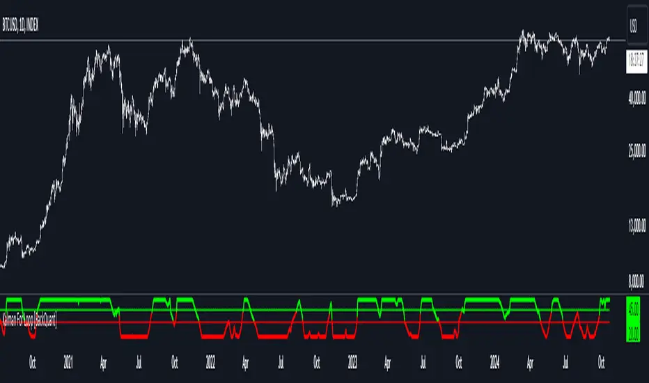
Kalman For Loop [BackQuant]Kalman For Loop
Introducing BackQuant's Kalman For Loop (Kalman FL) — a highly adaptive trading indicator that uses a Kalman filter to smooth price data and generate actionable long and short signals. This advanced indicator is designed to help traders identify trends, filter out market noise, and optimize their entry and exit points with precision. Let’s explore how this indicator works, its key features, and how it can enhance your trading strategies.
Core Concept: Kalman Filter
The Kalman Filter is a mathematical algorithm used to estimate the state of a system by filtering noisy data. It is widely used in areas such as control systems, signal processing, and time-series analysis. In the context of trading, a Kalman filter can be applied to price data to smooth out short-term fluctuations, providing a clearer view of the underlying trend.
Unlike moving averages, which use fixed weights to smooth data, the Kalman Filter adjusts its estimate dynamically based on the relationship between the process noise and the measurement noise. This makes the filter more adaptive to changing market conditions, providing more accurate trend detection without the lag associated with traditional smoothing techniques.
Please see the original Kalman Price Filter
In this script, the Kalman For Loop applies the Kalman filter to the price source (default set to the closing price) to generate a smoothed price series, which is then used to calculate signals.
Adaptive Smoothing with Process and Measurement Noise
Two key parameters govern the behavior of the Kalman filter:
Process Noise: This controls the extent to which the model allows for uncertainty in price changes. A lower process noise value will make the filter smoother but slower to react to price changes, while a higher value makes it more sensitive to recent price fluctuations.
Measurement Noise: This represents the uncertainty or "noise" in the observed price data. A higher measurement noise value gives the filter more leeway to ignore short-term fluctuations, focusing on the broader trend. Lowering the measurement noise makes the filter more responsive to minor changes in price.
These settings allow traders to fine-tune the Kalman filter’s sensitivity, adjusting it to match their preferred trading style or market conditions.
For-Loop Scoring Mechanism
The Kalman FL further enhances the effectiveness of the Kalman filter by using a for-loop scoring system. This mechanism evaluates the smoothed price over a range of periods (defined by the Calculation Start and Calculation End inputs), assigning a score based on whether the current filtered price is higher or lower than previous values.
Long Signals: A long signal is generated when the for-loop score surpasses the Long Threshold (default set at 20), indicating a strong upward trend. This helps traders identify potential buying opportunities.
Short Signals: A short signal is triggered when the score crosses below the Short Threshold (default set at -10), signaling a potential downtrend or selling opportunity.
These signals are plotted on the chart, giving traders a clear visual indication of when to enter long or short positions.
Customization and Visualization Options
The Kalman For Loop comes with a range of customization options to give traders full control over how the indicator operates and is displayed on the chart:
Kalman Price Source: Choose the price data used for the Kalman filter (default is the closing price), allowing you to apply the filter to other price points like open, high, or low.
Filter Order: Set the order of the Kalman filter (default is 5), controlling how far back the filter looks in its calculations.
Process and Measurement Noise: Fine-tune the sensitivity of the Kalman filter by adjusting these noise parameters.
Signal Line Width and Colors: Customize the appearance of the signal line and the colors used to indicate long and short conditions.
Threshold Lines: Toggle the display of the long and short threshold lines on the chart for better visual clarity.
The indicator also includes the option to color the candlesticks based on the current trend direction, allowing traders to quickly identify changes in market sentiment. In addition, a background color feature further highlights the overall trend by shading the background in green for long signals and red for short signals.
Trading Applications
The Kalman For Loop is a versatile tool that can be adapted to a variety of trading strategies and markets. Some of the primary use cases include:
Trend Following: The adaptive nature of the Kalman filter helps traders identify the start of new trends with greater precision. The for-loop scoring system quantifies the strength of the trend, making it easier to stay in trades for longer when the trend remains strong.
Mean Reversion: For traders looking to capitalize on short-term reversals, the Kalman filter's ability to smooth price data makes it easier to spot when price has deviated too far from its expected path, potentially signaling a reversal.
Noise Reduction: The Kalman filter excels at filtering out short-term price noise, allowing traders to focus on the broader market movements without being distracted by minor fluctuations.
Risk Management: By providing clear long and short signals based on filtered price data, the Kalman FL helps traders manage risk by entering positions only when the trend is well-defined, reducing the chances of false signals.
Alerts and Automation
To further assist traders, the Kalman For Loop includes built-in alert conditions that notify you when a long or short signal is generated. These alerts can be configured to trigger notifications, helping you stay on top of market movements without constantly monitoring the chart.
Final Thoughts
The Kalman For Loop is a powerful and adaptive trading indicator that combines the precision of the Kalman filter with a for-loop scoring mechanism to generate reliable long and short signals. Whether you’re a trend follower or a reversal trader, this indicator offers the flexibility and accuracy needed to navigate complex markets with confidence.
As always, it’s important to backtest the indicator and adjust the settings to fit your trading style and market conditions. No indicator is perfect, and the Kalman FL should be used alongside other tools and sound risk management practices for the best results.
Order Flow / Delta Volume IndicatorOrder Flow / Delta Volume Indicator
The Order Flow / Delta Volume Indicator is designed to give traders a comprehensive view of market activity by combining delta volume analysis, order flow imbalances, and momentum filters. This indicator is not just a mashup of components, but a carefully crafted tool that enhances decision-making by integrating various layers of market analysis into one powerful system.
How the Components Work Together:
1. Delta Volume Bars: The core of this indicator, delta volume shows the difference between buy and sell orders, allowing traders to see real-time shifts in market sentiment. Green bars indicate buy-side pressure, while red bars show sell-side dominance. By visualizing this in bar form, traders can easily spot significant shifts in order flow that could signal trend changes or momentum shifts.
2. Cumulative Delta Line (Rescaled): The cumulative delta is rescaled to plot under the price candles, giving traders a clear, contextualized view of how net buyer or seller dominance is developing over time. This line helps identify potential market reversals when price moves diverge from cumulative delta trends.
3. Order Flow Imbalance Detection: Imbalances in buy and sell volumes are automatically detected using a threshold, ensuring that traders are alerted to significant market moves. These imbalances provide insight into aggressive buying or selling behavior, which is crucial for identifying points of high trading activity or potential breakout/reversal zones.
4. VWAP Filter: Volume Weighted Average Price (VWAP) is included as a filter to confirm trend direction. The VWAP ensures that buy signals are only triggered when price action is above the VWAP (indicating strength), and sell signals are triggered when price is below the VWAP (indicating weakness). This ensures that signals are not just based on volume, but also on where price is relative to a critical benchmark.
5. RSI Filter: The inclusion of the Relative Strength Index (RSI) adds a momentum check to the signals. By using RSI, traders can avoid taking trades during low-momentum periods, ensuring they only act when market conditions favor a stronger move.
6. Signal Cooldown Feature: To avoid clutter and noise from frequent signals, this indicator includes a cooldown period between signals, ensuring that traders don’t receive excessive alerts in a short timeframe. This feature prevents overtrading and helps focus on high-quality signals.
Why This Combination is Useful:
• Comprehensive Market Insight: By combining delta volume analysis with order flow imbalance detection, this indicator provides a deep understanding of market sentiment, showing not only price movement but the underlying volume dynamics driving those moves.
• Signal Accuracy: The VWAP and RSI filters ensure that signals are only generated in strong market conditions, filtering out weak or false signals that often occur in choppy markets.
• Divergence Detection: The cumulative delta line provides traders with a tool for spotting divergences between price action and underlying volume, allowing for earlier detection of potential reversals.
This indicator is more than a simple combination of existing tools—it’s a strategic fusion of volume analysis, order flow, and momentum filters designed to provide traders with a clearer view of market activity and to generate more reliable buy/sell signals.
This description explains how the components work together and highlights the indicator’s usefulness, which should address TradingView’s concerns about originality and purpose.

Crypto Volatility Bitcoin Correlation Strategy Description:
The Crypto Volatility Bitcoin Correlation Strategy is designed to leverage market volatility specifically in Bitcoin (BTC) using a combination of volatility indicators and trend-following techniques. This strategy utilizes the VIXFix (a volatility indicator adapted for crypto markets) and the BVOL7D (Bitcoin 7-Day Volatility Index from BitMEX) to identify periods of high volatility, while confirming trends with the Exponential Moving Average (EMA). These components work together to offer a comprehensive system that traders can use to enter positions when volatility and trends are aligned in their favor.
Key Features:
VIXFix (Volatility Index for Crypto Markets): This indicator measures the highest price of Bitcoin over a set period and compares it with the current low price to gauge market volatility. A rise in VIXFix indicates increasing market volatility, signaling that large price movements could occur.
BVOL7D (Bitcoin 7-Day Volatility Index): This volatility index, provided by BitMEX, measures the volatility of Bitcoin over the past 7 days. It helps traders monitor the recent volatility trend in the market, particularly useful when making short-term trading decisions.
Exponential Moving Average (EMA): The 50-period EMA acts as a trend indicator. When the price is above the EMA, it suggests the market is in an uptrend, and when the price is below the EMA, it suggests a downtrend.
How It Works:
Long Entry: A long position is triggered when both the VIXFix and BVOL7D indicators are rising, signaling increased volatility, and the price is above the 50-period EMA, confirming that the market is trending upward.
Exit: The strategy exits the position when the price crosses below the 50-period EMA, which signals a potential weakening of the uptrend and a decrease in volatility.
This strategy ensures that traders only enter positions when the volatility aligns with a clear trend, minimizing the risk of entering trades during periods of market uncertainty.
Testing and Timeframe:
This strategy has been tested on Bitcoin using the daily timeframe, which provides a longer-term perspective on market trends and volatility. However, users can adjust the timeframe according to their trading preferences. It is crucial to note that this strategy does not include comprehensive risk management, aside from the exit condition when the price crosses below the EMA. Users are strongly advised to implement their own risk management techniques, such as setting appropriate stop-loss levels, to safeguard their positions during high volatility periods.
Utility:
The Crypto Volatility Bitcoin Correlation Strategy is particularly well-suited for traders who aim to capitalize on the high volatility often seen in the Bitcoin market. By combining volatility measurements (VIXFix and BVOL7D) with a trend-following mechanism (EMA), this strategy helps identify optimal moments for entering and exiting trades. This approach ensures that traders participate in potentially profitable market moves while minimizing exposure during times of uncertainty.
Use Cases:
Volatility-Based Entries: Traders looking to take advantage of market volatility spikes will find this strategy useful for timing entry points during market swings.
Trend Confirmation: By using the EMA as a confirmation tool, traders can avoid entering trades that go against the trend, which can result in significant losses during volatile market conditions.
Risk Management: While the strategy exits when price falls below the EMA, it is important to recognize that this is not a full risk management system. Traders should use caution and integrate additional risk measures, such as stop-losses and position sizing, to better manage potential losses.
How to Use:
Step 1: Monitor the VIXFix and BVOL7D indicators. When both are rising and the Bitcoin price is above the EMA, the strategy will trigger a long entry, indicating that the market is experiencing increased volatility with a confirmed uptrend.
Step 2: Exit the position when the price drops below the 50-period EMA, signaling that the trend may be reversing or weakening, reducing the likelihood of continued upward price movement.
This strategy is open-source and is intended to help traders navigate volatile market conditions, particularly in Bitcoin, using proven indicators for volatility and trend confirmation.
Risk Disclaimer:
This strategy has been tested on the daily timeframe of Bitcoin, but users should be aware that it does not include built-in risk management except for the below-EMA exit condition. Users should be extremely cautious when using this strategy and are encouraged to implement their own risk management, such as using stop-losses, position sizing, and setting appropriate limits. Trading involves significant risk, and this strategy does not guarantee profits or prevent losses. Past performance is not indicative of future results. Always test any strategy in a demo environment before applying it to live markets.

Leonid's Bitcoin Sharpe RatioThe Sharpe ratio is an old formula used to value the risk-adjusted return of an asset. It was developed by Nobel Laureate William F. Sharpe. In this case, I have applied it to Bitcoin with an adjustable look-back date.
The Sharpe Ratio shows you the average return earned after subtracting out the risk-free rate per unit of volatility (I've defaulted this to 0.02 ).
Volatility is a measure of the price fluctuations of an asset or portfolio. Subtracting the risk-free rate from the mean return allows you to understand what the extra returns are for taking the risk.
If the indicator is flashing red, Bitcoin is temporarily overbought (expensive).
If the indicator is flashing green, Bitcoin is temporarily oversold (cheap).
The goal of this indicator is to signal out local tops & bottoms. It can be adjusted as far as the lookback time but I have found 25-26 days to be ideal.

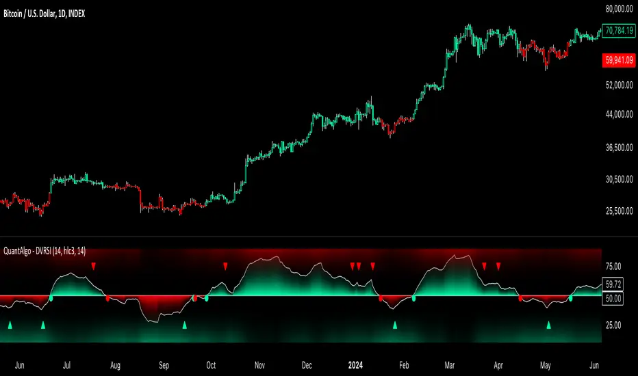
Dynamic Volume RSI (DVRSI) [QuantAlgo]Introducing the Dynamic Volume RSI (DVRSI) by QuantAlgo 📈✨
Elevate your trading and investing strategies with the Dynamic Volume RSI (DVRSI) , a powerful tool designed to provide clear insights into market momentum and trend shifts. This indicator is ideal for traders and investors who want to stay ahead of the curve by using volume-responsive calculations and adaptive smoothing techniques to enhance signal clarity and reliability.
🌟 Key Features:
🛠 Customizable RSI Settings: Tailor the indicator to your strategy by adjusting the RSI length and price source. Whether you’re focused on short-term trades or long-term investments, DVRSI adapts to your needs.
🌊 Adaptive Smoothing: Enable adaptive smoothing to filter out market noise and ensure cleaner signals in volatile or choppy market conditions.
🎨 Dynamic Color-Coding: Easily identify bullish and bearish trends with color-coded candles and RSI plots, offering clear visual cues to track market direction.
⚖️ Volume-Responsive Adjustments: The DVRSI reacts to volume changes, giving greater significance to high-volume price moves and improving the accuracy of trend detection.
🔔 Custom Alerts: Stay informed with alerts for key RSI crossovers and trend changes, allowing you to act quickly on emerging opportunities.
📈 How to Use:
✅ Add the Indicator: Set up the DVRSI by adding it to your chart and customizing the RSI length, price source, and smoothing options to fit your specific strategy.
👀 Monitor Visual Cues: Watch for trend shifts through the color-coded plot and candles, signaling changes in momentum as the RSI crosses key levels.
🔔 Set Alerts: Configure alerts for critical RSI crossovers, such as the 50 line, ensuring you stay on top of potential market reversals and opportunities.
🔍 How It Works:
The Dynamic Volume RSI (DVRSI) is a unique indicator designed to provide more accurate and responsive signals by incorporating both price movement and volume sensitivity into the RSI framework. It begins by calculating the traditional RSI values based on a user-defined length and price source, but unlike standard RSI tools, the DVRSI applies volume-weighted adjustments to reflect the strength of market participation.
The indicator dynamically adjusts its sensitivity by factoring in volume to the RSI calculation, which means that price moves backed by higher volumes carry more weight, making the signal more reliable. This method helps identify stronger trends and reduces the risk of false signals in low-volume environments. To further enhance accuracy, the DVRSI offers an adaptive smoothing option that allows users to reduce noise during periods of market volatility. This adaptive smoothing function responds to market conditions, providing a cleaner signal by reducing erratic movements or price spikes that could lead to misleading signals.
Additionally, the DVRSI uses dynamic color-coding to visually represent the strength of bullish or bearish trends. The candles and RSI plots change color based on the RSI values crossing critical thresholds, such as the 50 level, offering an intuitive way to recognize trend shifts. Traders can also configure alerts for specific RSI crossovers (e.g., above 50 or below 40), ensuring that they stay informed of potential trend reversals and significant market shifts in real-time.
The combination of volume sensitivity, adaptive smoothing, and dynamic trend visualization makes the DVRSI a robust and versatile tool for traders and investors looking to fine-tune their market analysis. By incorporating both price and volume data, this indicator delivers more precise signals, helping users make informed decisions with greater confidence.
Disclaimer:
The Dynamic Volume RSI is designed to enhance your market analysis but should not be used as a sole decision-making tool. Always consider multiple factors before making any trading or investment decisions. Past performance is not indicative of future results.
ATR+Order Block IndicatorThe ATR+Order Block Indicator is a unique and comprehensive tool designed to combine volatility-based analysis with key price action levels to provide traders with reliable entry and exit points. This indicator merges the Average True Range (ATR) for dynamic trailing stop calculation with order block detection to identify significant support and resistance zones on the chart. This combination offers traders a powerful blend of trend-following and price level analysis for improved trading decisions.
How the Components Work Together:
1. ATR-Based Trailing Stop:
• The Average True Range (ATR) is a widely used volatility indicator that measures the degree of price movement over a specified period. In this indicator, the ATR is used to create a trailing stop that dynamically adjusts to market conditions.
• How It Works: The ATR value is multiplied by a user-defined multiplier (ATR Multiplier) to set the distance of the trailing stop from the current price. This trailing stop moves with the price:
• If the price moves upwards, the trailing stop adjusts higher, ensuring it only moves in the direction of the trade.
• If the price moves downwards, the trailing stop adjusts lower accordingly.
• Purpose: This trailing stop helps traders manage risk by automatically adjusting to market volatility, ensuring that stops are not too tight in volatile conditions or too wide in quieter markets. It also helps lock in profits while maintaining a position in the market’s direction.
2. Order Block Detection:
• Order blocks are areas on the chart where significant buying (accumulation) or selling (distribution) has occurred. These zones often act as potential support or resistance levels due to the presence of unfilled buy or sell orders by large institutions or traders.
• How It Works: The indicator identifies the highest high (seller order block) and the lowest low (buyer order block) within a user-defined lookback period. These are plotted on the chart:
• Buyer Order Block: Represents a potential support area where buying interest is likely to reappear.
• Seller Order Block: Represents a potential resistance area where selling interest may reemerge.
• Purpose: By identifying these order blocks, traders can anticipate potential price reversals or continuations, aligning their trades with key market levels where significant buying or selling has occurred.
Justification for Combining These Components:
1. Enhanced Signal Accuracy and Context:
• The combination of ATR-based trailing stops with order block detection provides a dual-layered approach to trade decisions:
• ATR Trailing Stop offers trend-following signals based on volatility, helping traders capture market momentum.
• Order Blocks provide context to these signals by highlighting critical price levels where market participants have previously shown strong interest.
• This fusion allows traders to filter signals more effectively, ensuring trades are aligned with both market trends and key support/resistance zones.
2. Dynamic Risk Management:
• Using the ATR to set a dynamic trailing stop ensures that the stop-loss level adapts to the changing volatility of the market. When combined with order block detection, traders gain an additional layer of risk management:
• Stop Loss Placement: Traders can place stops just outside identified order blocks to protect against sudden price reversals while maintaining a tight stop aligned with current market volatility.
3. Reducing Market Noise and Avoiding False Signals:
• The indicator includes a mechanism to avoid repetitive signals, requiring a minimum gap between signals. This reduces noise and helps traders avoid multiple false entries in choppy market conditions.
• Order Blocks provide additional validation: For example, a buy signal generated near a Buyer Order Block carries more weight, as it aligns both with the ATR-based momentum and a key support area.
4. Improving Entry and Exit Strategies:
• Entry Points: The indicator generates buy (long) signals when the price crosses above the ATR trailing stop and sell (short) signals when it crosses below. These signals are enhanced by considering their proximity to order blocks, ensuring trades are initiated at strategic price levels.
• Exit Points: The ATR trailing stop provides a dynamic exit strategy, allowing trades to run while adjusting to market volatility. Traders can also use order blocks as targets or potential reversal points to exit trades.
5. Providing a Comprehensive Trading Tool:
• This indicator is unique in its integration of volatility and price level analysis, offering a well-rounded approach to trading. It combines the best of both worlds: trend-following momentum with the ATR and price action sensitivity through order blocks, making it suitable for different market conditions and trading styles.
How to Use the Indicator:
• Set the Parameters:
• Choose an ATR Period (default is 10) to define the number of bars for ATR calculation.
• Set the ATR Multiplier (default is 1.5) to adjust the sensitivity of the trailing stop.
• Define the Order Block Lookback Period (default is 20) to determine how many bars back the script will search for order blocks. Recommended 50.
• Interpret the Signals:
• BUY Signal: When the price crosses above the ATR trailing stop, indicating upward momentum. Confirm this signal by checking if it is near a Buyer Order Block.
• SELL Signal: When the price crosses below the ATR trailing stop, indicating downward momentum. Look for proximity to a Seller Order Block for added confidence.
• Monitor and Manage Trades:
• Use the ATR trailing stop for dynamic stop-loss placement.
• Watch for price action around the order blocks to make informed decisions about taking profits or cutting losses.
Conclusion:
The ATR+Order Block Indicator combines volatility and price action analysis in a unique way that offers traders a comprehensive tool for making informed trading decisions. By leveraging the strengths of both ATR-based dynamic stops and order block detection, it provides a balanced approach to trend-following and support/resistance trading, enhancing overall trading effectiveness and confidence.

Bitcoin PivotFind [BTC Cycle Tops & Bottoms Finder]What is PivotFind?
PivotFind is a custom indicator designed to track 30+ data points of different nature (technical, sentiment, macro, on-chain), and across multiple timeframes (from 1D to 60D), to detect the market conditions that may indicate the formation of potential Cycle Tops and Bottoms .
PivotFind's goal is to help you navigate Bitcoin's price movements and key happenings over its approximately 4-year cycles to help you craft a mid-term investment plan focused on the larger swings, rather than the shorter-term fluctuations.
What Does PivotFind Show/Do?
Market Phase Assessment and Visualization:
- Uses color-coded backgrounds (green for bull, red for bear, yellow for trend reversal) to show the current (assessed) market phase. Note that the price line itself changes color to reinforce the current phase identification.
- Helps you understand if we're in a uptrend, downtrend, or potentially changing direction (reversal), often an open question for traders, with a mid-term horizon
Cycle Top and Bottom Warnings:
- Places red dots above the price line to warn of potential cycle peaks.
- Shows green dots below the price line to indicate possible cycle bottoms.
These markers appear when multiple indicators reach certain thresholds, which historically have often coincided with significant market pivots (from bull to bear, or viceversa). Clusters of tops and bottom warnings are expected to appear at truly pivotal moments.
Parabolic Growth Signals:
- Displays upward arrows when conditions suggest potential for the rapid price increases that historically anticipated blow-off tops
- These signals are based on a combination of technical indicators and market sentiment reaching certain thresholds.
Altcoin Season Indicators:
- Marks with white diamonds the conditions that have historically led to "altseasons" (i.e. Altcoins overperforming BTC's growth rate).
- Based on factors like Bitcoin dominance decrease and certain altcoin performance metrics.
Fibonacci Retracement Bands:
Plots long-term support and resistance zones based on Fibonacci retracement levels.
These bands are calculated from previous major market highs and lows and shed light on the nature of short-term retracements in the context of major trends.
Price Scenario
PivotFind also provides reference price levels for the upcoming halving cycle, including potential thresholds for increased market interest (retail FOMO), possible overvaluation, and theoretical cycle peak ranges. These projections are based on historical data and should be considered as points of reference rather than definitive predictions.
Comprehensive Data Tables:
Right-side Table: Shows current cycle stage, Bitcoin/Altcoin market dominance percentages, and evaluates key economic factors (like inflation and interest rates) for their potential impact.
Bottom Table: Displays real-time values of over 30 key indicators, including RSI, MVRV ratio, and Fear & Greed Index.
Alerts
PivotFind offers you the ability to set up custom alerts (via the standard TradingView alert functionality) or receive automated notifications for significant market events. Despite its sophisticated analysis, PivotFind is designed to be user-friendly, with pre-set parameters that don't require complex adjustments.
How Does It Work?
PivotFind analyzes over 30 different indicators across multiple timeframes (from 1 day to 60 days), grouped into four main categories:
1. Technical Analysis:
Uses standard indicators like RSI, Stochastic RSI, Williams %R, Elliot Oscillator, TDI, and mean reversion concepts.
Looks for divergences between price and multiple indicators (like OBV, MFI, CCI, RSI, SRSI, MACD and others) to spot potential reversals.
2. Market Sentiment:
Incorporates the Crypto Fear & Greed Index (0-100 scale).
Tracks social media trends and influencer follower counts as a gauge of public interest.
3. Macroeconomic Factors:
Monitors inflation rates, interest rates, US rate yields, and money supply (M2) figures.
Tracks the U.S. Dollar Index (DXY) and bond market health through ETFs like TLT and HYG.
4. On-Chain Analytics:
Analyzes MVRV (Market Value to Realized Value) ratio to spot potential over/undervaluation.
Examines NUPL (Net Unrealized Profit/Loss) and active Bitcoin addresses.
PivotFind analyzes these indicators collectively, looking for significant correlations and confluences, to provide a view of the market's position within the 4-year cycle and spot the conditions for potential Cycle tops and bottoms (cycle pivots).
Who Is This For?
PivotFind may be particularly useful for:
- Long-term investors looking to optimize entry and exit points within the 4-year cycle
- Individuals who want to understand mid-term trends without engaging in daily analysis of multiple charts (due to lack of time and/or financial knowledge)
- Bitcoin Holders and miners planning their decisions around critical market pivot points
It's less suitable for scalpers, day-traders or those focused on short-term price movements.
Value Proposition
PivotFind simplifies market analysis by bringing together a wide range of indicators and data sources across different timeframes. It uses built-in logic to interpret these inputs within the context of Bitcoin's cycles, giving users an efficient way to spot potential major market shifts. This all-in-one approach helps make sense of complex market conditions and supports more informed decision-making.
Since Bitcoin’s broader cycle strongly influences the entire crypto market, PivotFind can also be useful for investors who are focused on Altcoins, not just Bitcoin.
Important Note (Disclaimer)
Past performance, and patterns, do not guarantee future results. Therefore, PivotFind should be used as one of many tools in your analysis. While the indicator provides a multi-faceted and multi-timeframe analysis of factors historically correlated with pivotal price shifts, it cannot predict future prices with certainty. It's a tool to help inform your decisions, not make them for you. Always conduct your own research and remember that all investments, especially in cryptocurrencies, involve risk.
Recommended Settings
PivotFinds works best on the 1D INDEX:BTCUSD chart (dark-mode, logarithmic scale).
This indicator is not publicly available and requires special access.

EMA+ATR Scalping Indicator by TradeTechIndicator Description: “EMA+ATR Scalping Indicator by Tradetech”
The “EMA+ATR Scalping Indicator” is a powerful tool designed to help traders identify optimal entry and exit points in the market, focusing on high-probability scalping opportunities. This indicator combines the strength of the Exponential Moving Average (EMA) with the Average True Range (ATR) to generate precise signals, aiming to maximize profits while minimizing risk.
Key Features:
• Sensitivity Key Value: Allows customization of the ATR multiplier, fine-tuning the trailing stop level for different market conditions.
• ATR Calculation: Measures market volatility over a specified period, dynamically adjusting the trailing stop to capture significant price moves while reducing noise.
• EMA for Confirmation: The 20-period EMA is used as a trend filter, ensuring that trades are aligned with the prevailing market direction.
• Trade Cooldown Period: Prevents over-trading by enforcing a minimum number of bars between consecutive trades, reducing the likelihood of whipsaws.
• Flat ATR Threshold: Identifies periods of low volatility (flat ATR), during which trading is avoided to protect against false signals.
Trading Logic:
• Entry Signals: The indicator generates long signals when the price crosses above the ATR trailing stop or breaks out consecutively in an uptrend, with the EMA confirming the bullish trend. Short signals are generated when the price crosses below the ATR trailing stop or consecutively breaks out in a downtrend, with the EMA confirming the bearish trend.
• Exit Signals: The exit points are defined by the ATR trailing stop, which adjusts dynamically with market conditions, ensuring that profits are locked in as the trend evolves.
• No Trading Zone: When the ATR is flat, indicating low volatility, the indicator displays a “No Trading Zone” to prevent taking positions in uncertain market conditions.
Why Combine EMA + ATR?
The combination of EMA and ATR in this indicator is crucial for several reasons:
1. Trend Identification (EMA): The EMA acts as a reliable trend filter, ensuring that trades are taken in the direction of the prevailing trend. By doing so, the indicator avoids taking trades against the momentum, which could result in lower probability setups.
2. Volatility-Based Trailing Stop (ATR): The ATR provides a volatility-adjusted stop-loss level, which is essential in scalping strategies where market conditions can change rapidly. This allows the trailing stop to widen during periods of high volatility and tighten during low volatility, optimizing the trade management process.
3. Enhanced Accuracy: By combining the EMA and ATR, the indicator filters out noise and avoids entering trades during flat market conditions, where the probability of false signals is higher. This synergy between trend and volatility creates a more robust and accurate scalping tool.
4. Dynamic Trade Management: The use of ATR for setting trailing stops ensures that the trade exits are dynamic and adaptable to current market conditions, maximizing the potential for capturing significant moves while minimizing drawdowns.
Overall, the EMA + ATR combination within the “EMA+ATR Scalping Indicator” provides a well-rounded approach to scalping, balancing trend-following with volatility management for more consistent trading results.
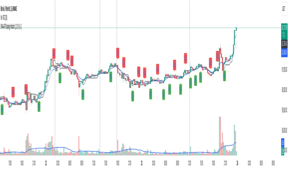
Rsi Long-Term Strategy [15min]Hello, I would like to present to you The "RSI Long-Term Strategy" for 15min tf
The "RSI Long-Term Strategy " is designed for traders who prefer a combination of momentum and trend-following techniques. The strategy focuses on entering long positions during significant market corrections within an overall uptrend, confirmed by both RSI and volume. The use of long-term SMAs ensures that trades are made in line with the broader market trend. The stop-loss feature provides risk management by limiting losses on trades that do not perform as expected. This strategy is particularly well-suited for longer-term traders who monitor 15-minute charts but look for substantial trend reversals or continuations.
Indicators and Parameters:
Relative Strength Index (RSI):
- The RSI is calculated using a 10-period length. It measures the magnitude of recent price changes to evaluate overbought or oversold conditions. The script defines oversold conditions when the RSI is at or below 30 and overbought conditions when the RSI is at or above 70.
Volume Condition:
-The strategy incorporates a volume condition where the current volume must be greater than 2.5 times the 20-period moving average of volume. This is used to confirm the strength of the price movement.
Simple Moving Averages (SMA):
- The strategy uses two SMAs: SMA1 with a length of 250 periods and SMA2 with a length of 500 periods. These SMAs help identify long-term trends and generate signals based on their crossover.
Strategy Logic:
Entry Logic:
A long position is initiated when all the following conditions are met:
The RSI indicates an oversold condition (RSI ≤ 30).
SMA1 is above SMA2, indicating an uptrend.
The volume condition is satisfied, confirming the strength of the signal.
Exit Logic:
The strategy closes the long position when SMA1 crosses under SMA2, signaling a potential end of the uptrend (a "Death Cross").
Stop-Loss:
A stop-loss is set at 5% below the entry price to manage risk and limit potential losses.
Buy and sell signals are highlighted with circles below or above bars:
Green Circle : Buy signal when RSI is oversold, SMA1 > SMA2, and the volume condition is met.
Red Circle : Sell signal when RSI is overbought, SMA1 < SMA2, and the volume condition is met.
Black Cross: "Death Cross" when SMA1 crosses under SMA2, indicating a potential bearish signal.
to determine the level of stop loss and target point I used a piece of code by RafaelZioni, here is the script from which a piece of code was taken
I hope the strategy will be helpful, as always, best regards and safe trades
;)
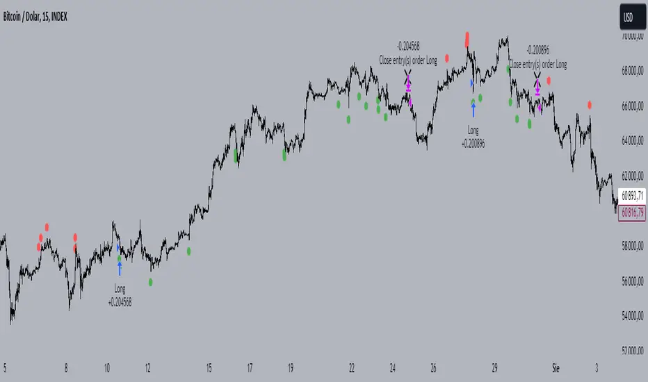
Combined Bitcoin CME Gaps and Weekend DaysScript Description: Combined Bitcoin CME Gaps and Weekend Days
Author: NeoButane (Bitcoin CME Gaps), JohnIsTrading (Day of Week),
Contributor : MikeTheRuleTA (Combined and optimizations)
This Pine Script indicator provides a combined view of Bitcoin CME gaps and customizable weekend day backgrounds on your chart. It’s designed to help traders visualize CME gaps along with customizable weekend day highlights.
Features:
CME Gaps Visualization:
Enable CME Gaps: Toggle the display of CME gaps on your chart.
Show Real vs. CME Price: Choose whether to display chart prices or CME prices for gap analysis.
Weekend Gaps Only: Filter to show only weekend gaps for a cleaner view (note: this may miss holidays).
CME Gaps Styling:
Weekend Background Highlighting:
Enable Weekend Background: Toggle the weekend day background highlight on or off.
Timezone Selection: Choose the relevant timezone for accurate weekend highlighting.
Customizable Weekend Colors: Define colors for Saturday and Sunday backgrounds.
How It Works:
CME Gaps: The script identifies gaps between CME and chart prices when the CME session is closed. It plots these gaps with customizable colors and line widths.
You can choose to see gaps based on CME prices or chart prices and decide whether to include only weekends.
Weekend Backgrounds: The script allows for background highlighting of weekends (Saturday and Sunday) on your chart. This can be enabled or disabled and customized with specific colors.
The timezone setting ensures that the background highlights match your local time settings.
Inputs:
CME Gaps Settings:
Enable CME Gaps
Show Real vs. CME Price
Only Show Weekend Gaps
CME Gaps Style:
Gap Fill Color Up
Gap Fill Color Down
Gap Fill Transparency
Weekend Settings:
Enable Weekend Background
Timezone
Enable Saturday
Saturday Color
Enable Sunday
Sunday Color
Usage:
Add this script to your TradingView chart to overlay CME gaps and weekend highlights.
Adjust the settings according to your preferences for a clearer view of gaps and customized weekend backgrounds.
This indicator provides a comprehensive tool for tracking CME gaps and understanding weekend market behaviors through visual enhancements on your trading charts.
BTC Coinbase PremiumThis script is designed to compare the price of Bitcoin on two major exchanges: Coinbase and Binance. It helps you see if there’s a difference in the price of Bitcoin between these two exchanges, which is known as a “premium” or “discount.”
Here’s how it works in simple terms:
Getting the Prices:
The script first fetches the current price of Bitcoin from Coinbase and Binance. It looks at the closing price, which is the price at the end of the selected time period on your chart.
Calculating the Difference:
It then calculates the difference between these two prices. If Bitcoin is more expensive on Coinbase than on Binance, this difference will be positive, indicating a “premium.” If it’s cheaper on Coinbase, the difference will be negative, indicating a “discount.”
Visualizing the Difference:
The script creates a visual chart that shows this price difference over time. It uses green bars to show when there’s a premium (Coinbase is more expensive) and red bars to show when there’s a discount (Coinbase is cheaper).
Optional Table Display:
If you choose to, the script can also show this price difference in a small table at the top right corner of your chart. The table displays the words “Coinbase Premium” and the exact dollar amount of the premium or discount.
Why does it matter?
Traders and investors have spotted a correlation between bullish strength on BTC and a strong Coinbase premium along with the inverse of a strong Coinbase discount and BTC price weakness.
