IV vs Realised Volatility (VIX/HV Comparator)VIX / HV Comparator – Implied vs Realised Volatility
This indicator compares Implied Volatility (IV) from a volatility index (VIX, India VIX, etc.) with the Realised / Historical Volatility (HV) of the current chart symbol.
It helps you see whether options are pricing volatility as rich or cheap relative to what the underlying is actually doing.
What it does
Pulls IV from any user-selected vol index symbol (e.g. CBOE:VIX for SPX, NSEINDIA:INDIAVIX for Nifty).
Calculates realised volatility from the chart’s price data using returns over a user-defined lookback.
Annualises HV so IV and HV are displayed on the same percentage scale, on any timeframe (intraday or higher).
Optionally shows an IV/HV ratio in a separate pane to highlight when options are rich or cheap relative to realised volatility.
How to read it
Main panel:
Orange line – Implied Volatility (IV) from your chosen vol index.
Aqua line – Realised / Historical Volatility (HV) of the current chart symbol.
Fill between lines:
Green shading -> IV > HV -> options are priced richer than what the underlying is currently realising.
Red shading -> HV > IV -> realised vol is higher than the options market is implying.
Sub-panel (optional):
IV / HV ratio
- Above 1 -> IV > HV (vol rich).
- Below 1 -> IV < HV (vol cheap).
- Horizontal guides (for example 1.2 / 0.8) help frame “significantly rich/cheap” zones.
A small label on the latest bar displays the current IV, HV and their difference in vol points.
Inputs (key ones)
IV Index Symbol – choose the volatility index that corresponds to your underlying (VIX, India VIX, etc.).
Realised Vol Lookback – number of bars used to compute HV (for example 20).
Trading Days per Year and Active Hours per Day – used for annualising HV so it stays consistent across timeframes.
IV Scale Factor – adjust if your IV index is quoted in decimals (0.15) instead of points (15).
Practical uses
Context for options trades – Quickly see if current IV is high or low relative to realised volatility when deciding on strategies (premium selling vs buying, spreads, hedges).
Vol regime analysis – Track shifts where HV starts to rise above IV (real stress building) or IV spikes far above HV (fear premium / insurance bid).
Cross-timeframe checks – Use on intraday charts for short-term trading context, or on daily/weekly charts for bigger picture vol regimes.
This tool is not a stand-alone signal generator. It is meant to be a volatility dashboard you combine with your usual price action, trend, and options strategy rules to understand how the options market is pricing risk vs what the underlying is actually delivering.
Historical

SimpleRange ProSimpleRange Pro is a comprehensive range analysis indicator that calculates historical Open-Close (OC) and Low-High (LH) ranges for specific hours and days, helping traders understand market volatility patterns and optimize their trading strategies.
Core Functionality
This indicator analyzes historical price data to calculate average ranges in pips for user-selected time periods. It processes up to 6 months of historical data to provide statistically relevant insights into market behavior during specific hours and days of the week.
Key Calculations:
Open-Close Range (OC): Measures the average distance between opening and closing prices
Low-High Range (LH): Calculates the full candle range from low to high
Mean Range (M): Provides the average of OC and LH ranges for balanced analysis
Advanced Features
Multi-Asset Compatibility: The script automatically detects and applies appropriate pip values for:
Major Forex pairs (EUR/USD, GBP/USD, etc.)
JPY pairs with adjusted calculations
Precious metals (Gold/XAU, Silver/XAG)
Cryptocurrencies (Bitcoin, Ethereum)
Indices and other instruments
Flexible Time Analysis: Users can select any combination of:
7 days of the week
24 hours per day (displayed in NY time)
Data periods from 1 to 6 months
Professional Table Display: Clean, customizable data table showing:
Hourly breakdown of selected time periods
Multiple theme options (Light/Dark mode)
Adjustable positioning and text sizes
Why This Script is Worth Using
Unlike basic range indicators that show current or simple historical ranges, SimpleRange Pro provides:
Statistical Depth: Processes thousands of historical data points to calculate meaningful averages
Time-Specific Analysis: Identifies which hours and days historically show higher or lower volatility
Multi-Timeframe Intelligence: Optimized for 1-hour charts but processes data across extended periods
Asset-Aware Calculations: Automatically adjusts pip calculations for different instrument types
Professional Presentation: Enterprise-grade table formatting with customizable themes
Practical Applications
For Day Traders: Identify high-volatility hours for scalping and breakout strategies
For Swing Traders: Understand daily patterns to time entries and exits
For Risk Management: Set appropriate stop losses based on historical range data
For Strategy Development: Use historical volatility data to optimize trading parameters
Technical Implementation
The script employs advanced Pine Script techniques including:
Dynamic lookback calculations with memory optimization
Multi-dimensional data processing for day/hour combinations
Automatic reset system when parameters change
Real-time table updates with minimal resource usage
The calculations are performed using a sliding window approach that ensures accuracy while maintaining performance, even when processing large datasets.
Important Considerations
This indicator analyzes historical price patterns and should be used as part of a comprehensive trading strategy. Past performance patterns may not repeat in future market conditions. The script works best on liquid markets during active trading sessions.
Range analysis is most effective when combined with other technical analysis tools and fundamental market understanding. Users should consider market conditions, news events, and overall market sentiment when interpreting the data.
SimpleRange Pro transforms raw historical data into actionable insights, providing traders with the statistical foundation needed to make informed decisions about market timing and risk management.

Leola Lens SignalPro📌 Leola Lens SignalPro — Structure-Aware Momentum Overlay (Invite-Only)
This script is designed for traders who prioritize clear structure, liquidity trap zones, and momentum transitions. It provides adaptive visual overlays that align with key decision points — emphasizing structure over lagging indicators.
________________________________________
⚙️ Core Operating Modes
✅ Momentum Shift Mode (Always Active)
Tracks microstructure shifts using volatility compression, imbalance reactions, and adaptive logic for directional bias.
⚡ Scalper Mode (Optional)
Activates fast-response overlays for 1m–15m charts — tuned for crypto, indices, and intraday setups.
🛡 Safeguard Mode (Optional)
Applies volume and exhaustion filters for higher timeframe or conservative entries, ideal for swing traders.
________________________________________
📦 Liquidity Control Box (LCB) Logic
🔵 Blue Box = Bullish Control
• Break above → continuation likely
• Break below → caution for reversal
🟧 Orange Box = Bearish Control
• Break below → continuation likely
• Break above → caution for squeeze
Use the last visible box for bias.
Box edges = confluence zones.
Box overlaps = consolidation → avoid impulsive trades.
________________________________________
🧠 Signal Logic & Concept
Built using a custom structural engine, not derived from public scripts like RSI, MACD, or WaveTrend.
The overlays aim to capture price behavior often aligned with institutional concepts, such as:
• Order Blocks
• Liquidity Sweeps
• Trap Reversals
• Mitigation Moves
Pairs well with SMC-style analysis and order-flow-based trading.
________________________________________
🟡 Visual Signal Layers
• BUY / SELL Labels → Appear near structure flips and trap zones
• Yellow Label → High-risk trend shift zone
• LCB Boxes → Real-time market control zones
• Green/Red Liquidity Zones → Absorption or rejection
• MA Overlays → Adaptive slope-based guidance (optional)
• Pink Lines → High-reactivity reversal zones
• Yellow Line → Soft S/R (psychological pivot)
________________________________________
🎯 Suggested Entry & Exit Cues (Educational Use Only)
✅ Entry
• BUY near Blue LCB + liquidity reaction
• SELL after extended rallies into Orange LCB + trap behavior
• ⚠ Avoid trades directly at Yellow Labels unless other context supports
✅ Exit
• On opposite label after structure break
• On formation of opposite LCB
• Near major liquidity zones or pink levels
🧪 Always backtest label behavior to fit your strategy before use.
________________________________________
🔍 Originality Justification
This script introduces a non-indicator-based approach to structure detection — combining real-time volatility response, adaptive liquidity logic, and multi-mode filtering. It avoids conventional oscillators in favor of clarity-driven visual overlays, offering a novel experience especially useful to discretionary traders.
________________________________________
⚠️ Disclaimer
This script is for educational and informational purposes only. It does not constitute financial advice or a trading signal. Always validate performance with backtesting and forward testing before live use.
________________________________________

Leola Lens Footprint📌 Leola Lens Footprint — Market Memory Overlay (Invite-Only)
This invite-only script is built to visualize market memory by identifying historically reactive zones — where price previously encountered resistance, support, or decision-making friction.
Unlike predictive models or indicator-driven systems, Footprint focuses only on price behavior that has already occurred, using confirmed reaction clusters to highlight likely areas of future influence.
________________________________________
🔍 What It Does
• Detects zones where price has reacted multiple times, showing clear rejection, breakout, or consolidation behavior
• Plots these levels only after market confirmation — no projections or lagging indicators
• Designed for clean structural reading across all timeframes and asset classes (crypto, stocks, forex, commodities)
________________________________________
🟡 Visual Elements
• 🟣 Purple Zones → High-impact memory zones with consistent historical rejection
• 🟤 Brown Zones → Fresh rejection clusters (recent demand/supply zones)
• 🟡 Yellow Line → Psychological pivot zone/Key decision points formed from repeated reactions.
• 🩷 Pink Lines → Pullback or reversal zones (support/resistance traps)
• Adaptive zone shading and slope-based logic enhances readability
________________________________________
📊 Best Suited For:
• Price-action traders who focus on confirmed historical behavior, not speculative levels
• Scalpers and swing traders looking to trade retests and rejection entries
• Discretionary traders wanting a stable visual map of structure without noise
________________________________________
🔧 Originality & Logic
This script uses original rule-based logic to cluster and validate levels only after real-world confirmation.
It does not use RSI, MACD, MAs, volume, or any traditional indicator input.
Instead, it tracks zone memory based on how price respects or invalidates key levels over time — making it adaptive to both trending and ranging environments.
There is no repainting or forward projection — all levels appear only after market structure confirms relevance.
________________________________________
⚠️ Disclaimer
This tool is for educational and informational purposes only. It does not constitute trading advice or a financial recommendation. Always validate visual overlays with your own risk framework and backtesting before live use.
________________________________________

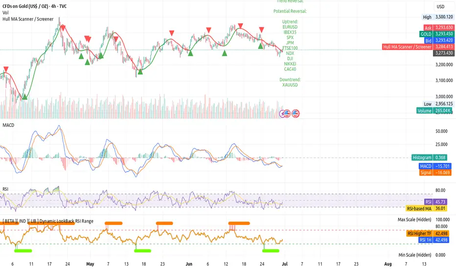
[ BETA ][ IND ][ LIB ] Dynamic LookBack RSI RangeGet visual confirmation with this indicator if the current range selected had been oversold or overbough in the latest n bars
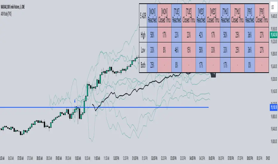
ADR Study [TFO]This indicator is focused on the Average Daily Range (ADR), with the goal of collecting data to show how often price reaches/closes through these levels, as well as a look at historical moves that reached ADR and at similar times of day to study how price moved for the remainder of the session.
The ADR here (blue line) is calculated using the difference between a day's highest and lowest points. If our ADR length is 5, then we are taking this difference from the last 5 days and averaging them together. At the following day's open, we take half of this average and plot it above and below the daily opening price to place theoretical limits on how far price may move according to the lookback period. The triangles indicate when price has reached ADR (either +ADR or -ADR), and alerts can be created for these events.
The Scale Factor is an optional parameter to scale the ADR by a certain amount. If set to 2 for example, then the ADR would be 2x the average daily range. This value will be reflected in the statistics options so that users can see how different values affect the outcomes.
Show Table will display data collected on how often price reaches these levels, and how often price closes through them, for each day of the week. By default, these are colored as blue and red, respectively. From the following chart of NQ1!, we can see for example that on Mondays, price reached +ADR 38% of the time and closed through it 23% of the time. Note that the statistics for closing through the ADR levels are derived from all instances, not just those that reached ADR.
Show Sample Sizes will display how many instances were collected for all given sets of data. Referring to the same example of NQ1!, we can see that this particular chart has collected data from 109 Mondays. From those Mondays, 41 reached +ADR (38%, verifying our initial claim) and 25 closed through it (23%). This is important to understand the scope of the data that we're working with, as percentages can be misleading for smaller sample sizes.
Show Histogram will plot the same exact data as the table, just in a histogram form to visually emphasize the differences on a day-by-day basis. On this chart of RTY1!, we can see for example from the top histogram that on Wednesdays, 40% reached +ADR and only 22% closed through it. Similarly if we look at the bottom histogram, we can see that Wednesdays reached -ADR 46% of the time and closed through it only 28% of the time.
We can also use Show Sample Sizes to display the same information that would be in the table, showing how many instances were collected for each event. In this case we can see that we observed 175 Fridays, where 76 reached +ADR (43%) and 44 closed above it (25%).
Show Historical Moves is an interesting feature of this script. When enabled, if price has reached +/- ADR in the current session, the indicator will plot the evolution of the close prices from all past sessions that reached +/- ADR to see how they traded for the remainder of the session. These calculations are made with respect to the ADR range at the time that price traded through these levels.
Historical Proximity (Bars) allows the user to observe historical moves where price reached ADR within this many bars of the current session (assuming price has reached an ADR level in the current session). In the above chart, this is set to 1000 so that we can observe each and every instance where price reached an ADR level. However, we can refine this a bit more.
By limiting the Historical Proximity to something like 20, we are only considering historical moves that reached ADR within 20 bars of todays +ADR reach (9:50 am EST, noted by the blue triangle up). We can enable Show Average Move to display the average move by the filtered dataset, and Match +/-ADR to only observe moves inline with the current day's price action (in this case, only moves that reached +ADR, since price has not reached -ADR).
We can add one more filter to this data with the setting Only Show Days That: closed through ADR; closed within ADR; or either. The option either is what you see above, as we are considering both days that closed through ADR and days that closed within it (note that in this case, closing within ADR simply means that price reached +ADR and closed the day below it, and vice versa for -ADR; this does not mean that price must have closed in between +ADR and -ADR). If we set this to only show instances that closed within ADR, we see the following data.
Alternatively, we can choose to Only Show Days That closed through ADR, where we would see the following data. In this case, the average move very much resembles the price action that occurred on this particular day. This is in no way guaranteed, but it makes an interesting case for how we could use this data in our analysis by observing similar, historical price action.
Please note that this data will change over time on a rolling basis due to TradingView's bar lookback, and that for this same reason, lower timeframes will yield less data than larger timeframes.
Historical Price Projection [LuxAlgo]The Historical Price Projection tool aims to project future price behavior based on historical price behavior plus a user defined growth factor.
The main feature of this tool is to plot a future price forecast with a surrounding area that exactly matches the price behavior of the selected period, with or without added drift.
Other features of the tool include:
User-selected period up to 500 bars anywhere on the chart within 5000 bars
User selected growth factor from 0 (no growth) to 100, this is the percentage of drift to be used in the forecast.
User selected area wide
Show/hide forecast area
🔶 USAGE
This tool generates a price projection with exactly the same price behavior over the period selected by the user, plus a growth factor .
The user must confirm the selection of the anchor point in order for the tool to be executed; this can be done directly on the chart by clicking on any bar, or via the date field in the settings panel.
As we can see on this chart, the four phases of the market cycle are clearly defined and marked, so we choose the distribution phase as our anchor point because in our analysis, we want to see how the market would behave if we were currently at the same point in the cycle.
In the image above, the growth factor parameter is set to 0 so that the projection matches the selection. The tool will use up to 500 bars after the selection point.
The growth factor is defined as the percentage of drift that the tool will use.
Drift is defined as follows:
For periods with a positive return: average negative return within the period
For negative return periods: average positive return within the period
On the chart above, we have selected the same period but added a growth factor of 10, so that the tool uses a 10% drift in its calculations of future prices.
As the return in the selected period is negative, the added drift will make the projection more bearish than the prices from the selection.
On this chart we have changed the selected period, we have chosen the accumulation phase of the last cycle as the anchor point, again with a growth factor of 10%.
As we can see, prices explode higher, making the projection very bullish, as the added effect of both the bullish selected period and the 10% drift is taken into account.
This last chart is a long-term chart, a quarterly chart of the Dow, and it will serve as a review exercise.
What if... everything goes south and the crash of '29 is repeated?
The answer is in the chart, and it is not for the faint of heart
In this case we have chosen a growth factor of 0 to see exactly the same price behaviour projected into the future.
🔶 SETTINGS
🔹 Data Gathering
Anchor point: Starting point for data collection, up to 500 bars will be used.
🔹 Data Transformation
Growth Factor: Values from 0 to 100, is the amount of drift used to calculate the next price in the series.
Area Width: Values from 0 to 100, controls the width of the area around the forecast as an increment/decrement of the growth factor.
🔹 Style
Price line width: Size of the price line.
Bullish color
Bearish color
Show Area: Show forecast area.
Area color

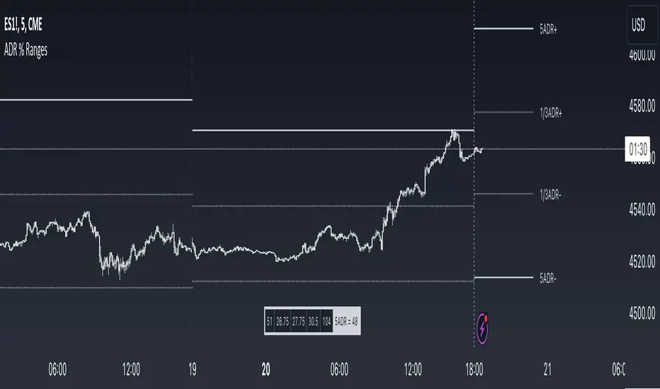
ADR % RangesThis indicator is designed to visually represent percentage lines from the open of the day. The % amount is determined by X amount of the last days to create an average...or Average Daily Range (ADR).
1. ADR Percentage Lines: The core function of the script is to apply lines to the chart that represent specific percentage changes from the daily open. It first calculates the average over X amount of days and then displays two lines that are 1/3rd of that average. One line goes above the other line goes below. The other two lines are the full "range" of the average. These lines can act as boundaries or targets to know how an asset has moved recently. *Past performance is not indicative of current or future results.
The calculation for ADR is:
Step 1. Calculate Today's Range = DailyHigh - DailyLow
Step 2. Store this average after the day has completed
Step 3. Sum all day's ranges
Step 4. Divide by total number of days
Step 5. Draw on chart
2. Customizable Inputs: Users have the flexibility to customize the script through various inputs. This includes the option to display lines only for the current trading day (`todayonly`), and to select which lines are displayed. The user can also opt to show a table the displays the total range of previous days and the average range of those previous days.
3. No Secondary Timeframe: The ADR is computed based on whatever timeframe the chart is and does not reference secondary periods. Therefore the script cannot be used on charts greater than daily.
This script is can be used by all traders for any market. The trader might have to adjust the "X" number of days back to compute a historical average. Maybe they only want to know the average over the past week (5 days) or maybe the past month (20 days).
Historic Volume/Market ProfilesHistoric Volume/Market Profile is a Periodic Volume Profile with all of the improvements known in the original Volume/Market Profile.
VMP is a 2 in 1 Volume and Market Profile Indicator.
HVMP uses the base of VMP to offer a quick and simple view at multiple historic profiles at the same time.
This includes:
Cluster Identification for High Volume and Low Volume Areas.
Maximizing granularity by utilizing boxes and lines to get up to 1000 rows.
New Inclusions in HVMP vs VMP:
HVMP granularity is determined by the # of profiles on display. By doing this, each profile will get an even amount of allocated rows to use and granularity is scaled per-profile, to fit within the row allowance.
For Example: 1000/(# of profiles) = Maximum # of rows per profile.
HVMP introduces the "Auto-Scale" Option (on by Default), this automatically fits each profile within the defined timeframe period to provide a consistent display when switching timeframes.
Even with "Auto-Scale" enabled, "Display Size" dictates which direction the profile is displayed.
Below is a Negative Display Size (Displays from right to left, starting at the end of the period)
Below is a Positive Display Size (Displays from left to right, starting at the beginning of the period)
HVMP is only for historical data, you can get a live profile with the same Node Identification using VMP (Volume Market/Profile). The indicator that this one is based on.
Find it Here: Volume/Market Profile
Enjoy!

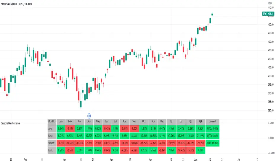
Seasonal Performance for Stocks & CryptoThe Seasonal Performance indicator quickly allows you to see if you are in a bullish or bearish time of year for an underlying security and where the current performance stacks up compared to the same time of year historically. Table is fully customizable from colors to what data to see.
Table Displays
Average Performance
Best Performance
Worst Performance
Last Performance
Current Performance
Note this indicator will only work with Stocks, ETF's, Index's or Crypto.
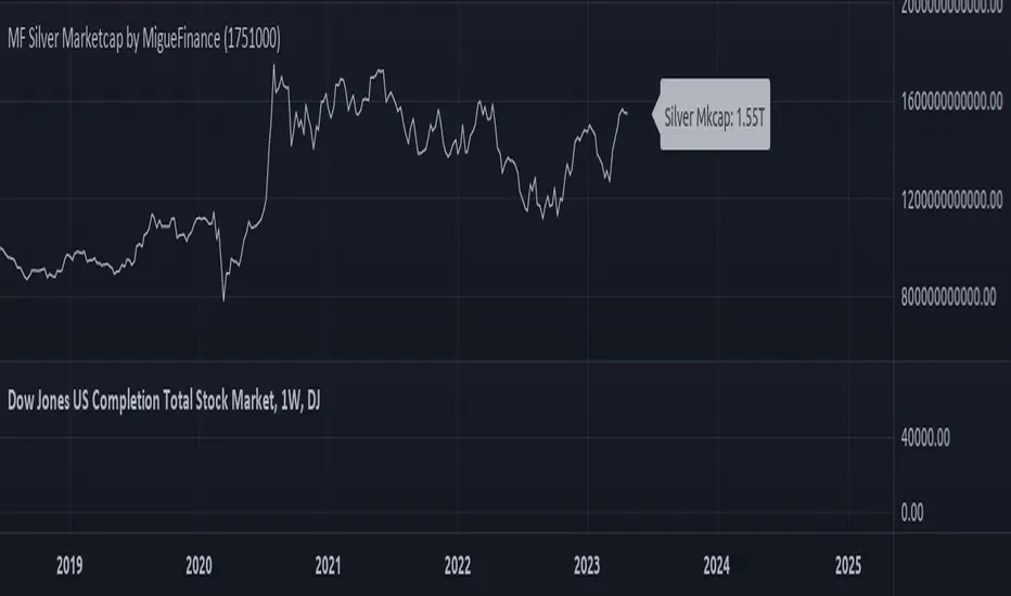
MF Total Silver Market Capitalization by MigueFinanceThis is the Current Market Capitalization and Historical Chart of Silver
There might be discrepancies in the future on the current market capitalization of silver due to the number of silver ever mined which is always increasing.
So as to update it when necessary, one of the sites you can check to get the most up to date amount is: "https://companiesmarketcap.com/silver/marketcap/" and then edit the amount of tonnes on the settings of this indicator.
Statistics: High & Low timings of custom session; 1yr historyGet statistics of the Session High and Session Low timings for any custom session; based on around 1yr of data.
//Purpose:
-To get data on the 'time of day' tendencies of an asset.
-Narrow in on a custom defined session and get statistics on that session.
//Notes:
-Input times are always in New York time (but changing the timezone after setting WILL adust both table stats and background highlight correctly.
-For particularly long sessions, make sure text size is set to 'tiny' (very long vertical table), or adjust table to display horizontally.
-You'll notice most assets show higher readings around NY equities open (9:30am NY time). Other assets will have 'hot-spots' at other times too.
-Timings represent the beginning of a 15m candle. i.e. reading for 15:45 represents a high occurring between 15:45 and 1600.
-Premium users should get 20k bars => around 1year's worth of data on a 15minute chart. Days of history is displayed in the top left corner of the table.
//Limitations
-only designed and working on 15minute timeframe (to gather a full year of meaningful/comparable % stats, need 15minute 'buckets' of time.
-sessions cannot cross through midnight, or start at midnight (00:15 is ok). 00:15 >> 23:45 is the max session length. On BTC, same applies but 01:00 instead of midnight (all in NY time).
-if your session crosses through 'dead time' (e.g. 17:00-18:00 S&P NY time); table will correctly omit these non-existent candles, but it will add on the missing hour before the start time.
//Cautionary note:
-Since markets are not uncommonly in a trending state when your defined session starts or ends, the high/low timings % readings for start and end of session may be misleadingly high. Try to look for unusually high readings that are not at the start/end of your session.
Wheat (ZW1!) 15min chart; Table displayed vertically:
Nasdaq (NQ1!) 15m chart; Table displayed horizontally and with smaller text to view a very long custom session:

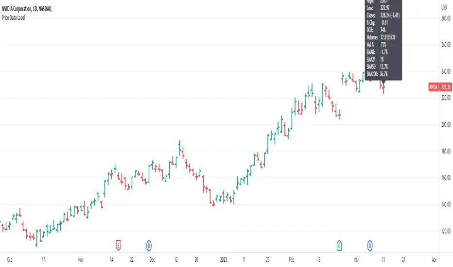
Price Data LabelThis indicator gives you the ability to see historical data for each bar on the chart by simply hovering over the high of the bar, similar to the functionality of MarketSmith.
Data for each bar includes:
Open
High
Low
Close + Change
Percentage Change
Closing Range
Volume
Volume Percent based on 50 day average
Distance to 4 selectable moving averages
Example of stats on a historical bar:
* Note this only works on the last 500 historical bars. If you use bar replay it will work with 500 historical bars from the last bar.
* If you have multiple indicators on your chart, in order to see the data you will need to use visual order to bring to front. This can be done by clicking the three dots next to the indicator name and selecting visual order.
Volatility Gap TrackerThe Volatility Gap Tracker ( *VGT ) indicator calculates the historical volatility of an asset using the standard deviation of the natural logarithm of the closing price relative to the previous period's closing price. *VGT visualizes the HV with gap lines to highlight when the current HV has increased or decreased significantly compared to the previous period, and adds labels to show the HV value for each of those bars.
Low HV calculated by *VGT can potentially signify a potential move up or down in the price of an asset. When HV is low, it indicates that the price of the asset has been relatively stable or range-bound over the specified period of time. This can sometimes be a precursor to a significant move in either direction, as the price may be building up energy to break out of its range.
*VGT can be used for any market that TradingView supports, including stocks, forex, and cryptocurrencies. It is especially useful for traders who want to identify periods of high volatility or sudden changes in volatility , which can indicate potential trading opportunities or risks. However, it's important to note that HV is a historical measure and may not always accurately predict future volatility .
The indicator can be used under various market conditions, but is especially useful during periods of high volatility , such as market crashes or major news events. It can also be useful for traders who want to monitor the volatility of specific stocks or assets over a longer period of time.
*VGT is provided for informational purposes only and is not a guarantee of future performance or accuracy. Traders should use multiple indicators and analysis methods to make informed trading decisions. Trading involves risks and traders should always conduct their own research and analysis before making any investment decisions.

Multi-Asset Month/Month % change 10yr Averages10 Year Averages of Month-on-Month % change: Shows current asset, and 3x user input assets
-For comparing seasonal tendencies among different assets.
-Choose from a variety of monthly average measures as source: sma(close, length), sma(ohlc4, length); as well as sma's of vwap, vwma, volume, volatility. (sma = simple moving average).
-Averages based on month cf previous month: i.e. Feb % = Feb compared to Jan; Jan % = Jan compared to prev year's Dec. Average of the last 10yrs of these values is the printed value.
-Plot on current year (2023), or previous year (2022). If Plotting on current year, and a month of year has not yet occured, a 9yr average will be printed.
/// notes ///
-daily bars in month is a global setting; so choose assets which have similar trading days per month. i.e. Crypto: length = 30 (days per month); Stocks/FX/Indices: length = 21 (days per month).
-only plots on Daily timeframe.
10yr Avgs; Plotting with Year = 2022; using sma(close, 21) as source for average M/M change

Percent ResearchPercent Research is an indicator that will plot a color / column on the chart in case custom requirements are met.
The requirements are:
- Price : Price requirement (equal or above input).
- Change % Up : Amount the price have moved up in percent (equal or above input).
- Change % Down : Amount the price have moved down in percent (equal or below input).
- Change Interval : Amount of bars the above move happened over.
- Volume : Volume requirement (equal or above input).
- Volume Interval : Amount of bars in a row that each require the above volume.
Example: In case one wants to plot whenever price has made a 20 percent move up or down in a week with minimum 100 000 volume for each of the last 2 days one can use.
Change % Up: 20
Change % Down: -20
Change Interval: 5
Volume: 100 000
Volume Interval: 2
The indicator will plot a color on the chart whenever the requirements are met, which then can be used to look into price action for each colored time period.
The values can be customized dependent on preference, example 100% movers over a month or 20% movers over a week etc.

Historical Crypto Conference DatesJust a basic list date script to display various conference dates from the crypto sector. Updates to add more conferences.
Red - BTC Miami
Blue - Consensus

FUNCTION: Limited Historical Data WorkaroundFUNCTION: Limited Historical Data Workaround
If you are working with bitcoin weekly charts, or any other ticker with a low amount of price history this function may help you out. For example you want to apply indicators to some shitcoin that just launched? This can help you.
It can be frustrating to use certain built-ins since they will only give an output once the full lookback length is available. This function allows you to avoid that situation and start plotting things with almost no history whatsoever!
In this example code we do it by utilizing a replacement for the built in pine SMA function. This function allows us to pass a series instead of just a simple int to the length variable of the SMA. This can be achieved with all the pine built ins and I believe @pinecoders has a publication already detailing many of them with full coded examples.
Then we replace the length of the SMA with the custom history function. It checks to see if the current bar index is less than the length of the function. Then if it is, it changes the length to the bar index allowing us to get plots and series earlier than otherwise possible.

Previous Range Values, BasicOur P.R.V (Previous Range Values)(Basic) indicator is pretty simple; it plots the previous ranges of the high/low for the structured timeframes. This helps to quickly identify the primary Historical supports and resistances according to the Gregorian time structure. Additionally, a 'custom' field allows for a wider selection other than the scripts default, however the custom selection uses the pre-defined timeframes opposed to manual inputs since the conversion is in minutes and would limit/cap the available range. The plotted lines are designed to remain "out of the way" from the current candle.
To disable a range, simply change the opacity to 0%
Additional script features allow for fully adjustable settings and configurations:
• Adjustable; Range Colors
• Adjustable; Toggles

10yr, 20yr, 30yr Averages: Month/Month % Change; SeasonalityCalculates 10yr, 20yr and 30yr averages for month/month % change
~shows seasonal tendencies in assets (best in commodities). In above chart: August is a seasonally bullish month for Gold: All the averages agree. And January is the most seasonally bullish month.
~averages represent current month/previous month. i.e. Jan22 average % change represents whole of jan22 / whole of dec21
~designed for daily timeframe only: I found calling monthly data too buggy to work with, and I thought weekly basis may be less precise (though it would certainly reduce calculation time!)
~choose input year, and see the previous 10yrs of monthly % change readings, and previous 10yrs Average, 20yr Average, 30yr Average for the respective month. Labels table is always anchored to input year.
~user inputs: colors | label sizes | decimal places | source expression for averages | year | show/hide various sections
~multi-yr averges always print, i.e if only 10yrs history => 10yr Av = 20yr Av = 30yr Av. 'History Available' label helps here.
Based on my previously publised script: "Month/Month Percentage % Change, Historical; Seasonal Tendency"
Publishing this as seperate indicator because:
~significantly slower to load (around 13 seconds)
~non-premium users may not have the historical bars available to use 20yr or 30yr averages =>> prefer the lite/speedier version
~~tips~~
~after loading, touch the new right scale; then can drag the table as you like and seperate it from price chart
##Debugging/tweaking##
Comment-in the block at the end:
~test/verifify specific array elements elements.
~see the script calculation/load time
~~other ideas ~~
~could tweak the array.slice values in lines 313 - 355 to show the last 3 consecutive 10yr averages instead (i.e. change 0, 10 | 0,20 | 0, 30 to 0, 10 | 10, 20 | 20,30)
~add 40yr average by adding another block to each of the array functions, and tweaking the respective labels after line 313 (though this would likely add another 5 seconds to the load time)
~use alternative method for getting obtaining multi-year values from individual month elements. I used array.avg. You could try array.median, array.mode, array.variance, array.max, array.min (lines 313-355)
Month/Month Percentage % Change, Historical; Seasonal TendencyTable of monthly % changes in Average Price over the last 10 years (or the 10 yrs prior to input year).
Useful for gauging seasonal tendencies of an asset; backtesting monthly volatility and bullish/bearish tendency.
~~User Inputs~~
Choose measure of average: sma(close), sma(ohlc4), vwap(close), vwma(close).
Show last 10yrs, with 10yr average % change, or to just show single year.
Chose input year; with the indicator auto calculating the prior 10 years.
Choose color for labels and size for labels; choose +Ve value color and -Ve value color.
Set 'Daily bars in month': 21 for Forex/Commodities/Indices; 30 for Crypto.
Set precision: decimal places
~~notes~~
-designed for use on Daily timeframe (tradingview is buggy on monthly timeframe calculations, and less precise on weekly timeframe calculations).
-where Current month of year has not occurred yet, will print 9yr average.
-calculates the average change of displayed month compared to the previous month: i.e. Jan22 value represents whole of Jan22 compared to whole of Dec21.
-table displays on the chart over the input year; so for ES, with 2010 selected; shows values from 2001-2010, displaying across 2010-2011 on the chart.
-plots on seperate right hand side scale, so can be shrunk and dragged vertically.
-thanks to @gabx11 for the suggestion which inspired me to write this

Average Daily Pip Ranges by monthShows historical average daily pip ranges for specific months for FOREX pairs
useful for guaging typical seasonal volatility; or rough expected daily pip ranges for different months
works on both DXY and foreign currencies
option to plot 10yrs worth of data; with 10yr average of the average daily range for specific months
cast back to any previous 10yrs of your choosing
@twingall
ATR Report & Tool█ OVERVIEW
This indicator reports the historical probabilities of the price trading past its Average True Range (ATR).
█ CONCEPTS
It is common knowledge that the market is not likely to trade past 1x ATR. Is this true? How much unlikely exactly? The indicator reports the data in a table and tells you precisely how often the price made it past x times ATR.
You have identified two plausible entries at different price structures or two targets at significant projections; which one should you choose? While is it possible to reach them, is this indeed probable? The indicator complements your analysis for making sounds trading decisions.
█ FEATURES
Price Selection Tool
The indicator has a price selection tool embedded. You can select a price on the chart and it will show the distance relative to the ATR so you can easily refer to the historical probability table.
Multi-Timeframe
By default, the indicator uses the daily timeframe for analyzing how much price moves compared to its average volatility during a day. To the same extent, you can set it to any other timeframe.
Configurable ATR
• Pick your preferred smoothing between the Simple Moving Average (SMA) or the Relative Moving Average (RMA).
• Set the length for getting the average price movement. For example, you can set it to 20 for the daily ATR (20 trading days in a month), 12 for the weekly ATR (3 months), or 6 for the monthly ATR.
• Select the reference between “previous” or “current” ATR value (default set on previous).
Data Window
The indicator provides additional volatility-related values and reporting data.
Others
Automatically hides the indicator when the chart’s timeframe is higher than the indicator’s one.
█ NOTES
Calculation
The volatility is calculated from the selected period's low to high. It may use the previous close when the market gaps up/down.
