Smart Money Flow TrackerSmart Money Flow Tracker - Liquidity & Fair Value Gap Indicator
Overview
The Smart Money Flow Tracker is a comprehensive Pine Script indicator designed to identify and analyze institutional trading patterns through liquidity prints and Fair Value Gaps (FVGs). This advanced tool combines multiple analytical approaches to help traders understand where smart money is operating in the market, providing crucial insights for better trade timing and market structure analysis.
Core Functionality
1. Liquidity Prints Detection
The indicator identifies liquidity prints by analyzing pivot highs and lows that represent potential areas where institutional orders may be resting. Key features include:
Pivot-Based Analysis: Uses configurable pivot lengths (default 5) to identify significant highs and lows
Volume Confirmation: Optional volume filter ensures liquidity prints occur during periods of significant trading activity
Dynamic Labeling: Visual markers on chart showing liquidity print locations with customizable colors
Success Rate Tracking: Monitors how often liquidity prints lead to meaningful price reactions
2. Fair Value Gap (FVG) Analysis with Volume Integration
Advanced FVG detection that goes beyond basic gap identification:
Three-Bar Pattern Recognition: Identifies gaps where the high of bar 1 is below the low of bar 3 (bullish) or low of bar 1 is above high of bar 3 (bearish)
Volume-Enhanced Detection: Incorporates comprehensive volume analysis including:
Average volume calculation over configurable periods
Total volume across the 3-bar FVG pattern
Dominant volume bar identification
Volume ratio calculations for strength assessment
Volume Threshold Filtering: Optional minimum volume requirements to filter out low-conviction FVGs
Visual Enhancement: FVG boxes with volume-based coloring and detailed volume labels
3. Comprehensive Statistics Dashboard
Real-time statistics table displaying:
Total liquidity prints detected
Success rate percentage with dynamic color coding
Volume filter status
Total Fair Value Gaps identified
High-volume FVG count and percentage
All metrics update in real-time as new data becomes available
4. Advanced Alert System
Multiple alert conditions for different scenarios:
Standard liquidity print detection
Volume-confirmed liquidity prints
Bullish and bearish FVG formation
High-volume FVG alerts for institutional-grade setups
Key Input Parameters
Display Controls
Show Liquidity Prints: Toggle main functionality on/off
Show Statistics Table: Control visibility of the analytics dashboard
Show Fair Value Gaps: Enable/disable FVG detection and display
Technical Settings
Pivot Length: Adjusts sensitivity of liquidity print detection (1-20 range)
Volume Confirmation: Requires above-average volume for liquidity print validation
Volume Lookback: Period for calculating average volume (5-50 bars)
FVG Volume Settings
Show FVG Volume Info: Display detailed volume metrics on FVG labels
FVG Volume Threshold: Minimum volume multiplier for high-volume FVG classification
FVG Volume Average Period: Lookback period for FVG volume calculations
Visual Customization
Bullish/Bearish Colors: Separate color schemes for different market directions
Text Colors: Bright lime green for optimal visibility on all background types
Table Positioning: Flexible placement options for the statistics dashboard
Trading Applications & Use Cases
1. Institutional Order Flow Analysis
Liquidity Hunting: Identify areas where institutions may be targeting retail stops
Smart Money Tracking: Follow institutional footprints through volume-confirmed liquidity prints
Market Structure Understanding: Recognize key levels where large orders are likely resting
2. Fair Value Gap Trading Strategies
Gap Fill Trading: Trade the statistical tendency of FVGs to get filled
Volume-Confirmed Entries: Use high-volume FVGs as higher-probability trade setups
Institutional FVG Recognition: Focus on FVGs with dominant volume bars indicating institutional participation
3. Multi-Timeframe Analysis
Higher Timeframe Context: Use on daily/weekly charts to identify major institutional levels
Intraday Precision: Apply to lower timeframes for precise entry and exit timing
Cross-Timeframe Confirmation: Combine signals across multiple timeframes for enhanced accuracy
4. Risk Management Applications
Stop Loss Placement: Use liquidity print levels as logical stop loss areas
Position Sizing: Adjust position sizes based on volume confirmation and success rates
Trade Filtering: Use statistics dashboard to assess current market conditions
Technical Logic & Methodology
Liquidity Print Algorithm
Pivot Identification: Scans for pivot highs/lows using the specified lookback period
Volume Validation: Optionally confirms prints occur during above-average volume periods
Success Tracking: Monitors subsequent price action to calculate effectiveness rates
Dynamic Updates: Continuously updates statistics as new data becomes available
FVG Detection Process
Pattern Recognition: Identifies 3-bar patterns with qualifying gaps
Volume Analysis: Calculates comprehensive volume metrics across the pattern
Strength Assessment: Determines volume ratios and dominant bars
Classification: Categorizes FVGs based on volume thresholds and characteristics
Visual Representation: Creates boxes and labels with volume-based styling
Statistical Framework
Real-time Calculations: All metrics update with each new bar
Percentage-based Metrics: Success rates and volume confirmations shown as percentages
Color-coded Feedback: Visual indicators for quick assessment of current conditions
Historical Tracking: Maintains running totals throughout the session
Best Practices for Usage
1. Parameter Optimization
Start with default settings and adjust based on market conditions
Lower pivot lengths for more sensitive detection on volatile instruments
Higher volume thresholds for cleaner signals in high-volume markets
2. Market Context Consideration
Combine with broader market structure analysis
Consider economic events and news that may affect institutional flow
Adjust expectations based on market volatility and liquidity conditions
3. Integration with Other Analysis
Use alongside support/resistance levels for confluence
Combine with momentum indicators for timing confirmation
Integrate with volume profile analysis for additional context
Conclusion
The Smart Money Flow Tracker represents a sophisticated approach to institutional flow analysis, combining traditional liquidity concepts with modern volume analytics. By providing both visual signals and comprehensive statistics, it enables traders to make more informed decisions based on where smart money is likely operating in the market. The indicator's flexibility and customization options make it suitable for various trading styles and timeframes, from scalping to position trading.
Cerca negli script per "smart"

Smart Money Volume Execution Footprint @MaxMaserati 2.0 Smart Money Volume Execution Footprint @MaxMaserati 2.0
Volume and Price Execution Tracker · Volume Delta · VWAP · POC · DOM Simulation
Overview
This volume and price tool high grade tool reveals **where** smart money is actually executing within each candle — not just how much volume traded, but the **exact price levels** where large buy/sell orders hit the tape.
By simulating Depth of Market (DOM) logic, it breaks each candle into price levels (default: 8–20) and reconstructs intra-candle volume pressure to identify:
• Institutional execution zones
• Buy vs Sell dominance
• Volume-weighted positioning
• Smart money flow bias (bullish / bearish / neutral)
Think of it as a powerful X-ray footprint to spot real-time volume/price behavior.
Core Features
Execution Dots (Smart Money Signatures)
• Plots dots at key institutional execution prices
• Color-coded: 🟢 Green = dominant buy volume · 🔴 Red = dominant sell volume
• Dot size = Volume Intensity (relative to average):
– tiny < 1.0x avg
– small 1.0x–1.5x
– normal 1.5x–2.5x
– large 2.5x–4.0x
– huge > 4.0x (massive positioning)
Volume Modes (Buy/Sell Breakdown)
• Total Volume Mode: Combined buy + sell volume at each price level
• Volume Delta Mode: Net buy/sell pressure (buy − sell)
Dot Placement Modes
• Volume POC: Dot at level with highest volume (Point of Control)
• VWAP: Dot at intra-candle volume-weighted average price
• Highest Volume Level: Similar to POC, simplified for fast bias detection
Smart Money Bias Detection
Real-time consensus calculation based on buy/sell volume ratio:
🟢 Bullish Consensus (>60% Buy Volume): Smart money buying → Long bias
🔴 Bearish Consensus (<40% Buy Volume): Smart money selling → Short bias
⚪ Neutral Market (40–60%): Market in balance → Wait for breakout
This logic powers the volume execution table, showing institutional sentiment per candle.
Dot Placement Example (How It Works)
Let’s say you break a candle into 10 price levels:
• Volume POC Mode → Dot at \$4,297.50, where volume was highest
• VWAP Mode → Dot around \$4,275, the volume-weighted average
• Volume Delta Mode → Dot where net buying/selling pressure peaked
Dot sizes based on volume intensity:
Level 1 (400K): size.huge — heavy institutional execution
Level 10 (300K): size.normal — passive accumulation
Level 5 (250K): size.normal — potential battle zone
🔗 Optional Visual Enhancements
• Zigzag Lines: Connects execution dots to highlight flow direction
• Labels: Toggle to show volume and/or execution price directly on dots
• Execution Table: Real-time snapshot of volume ratio, delta, and institutional bias
Option to see the volume and/or exact Price level
Ideal Use Cases
Institutional Flow Strategy
1. Look for large dots (size.large or size.huge)
2. Confirm direction with bias table (bullish or bearish consensus)
3. Align entries with institutional execution zones
4. Use retests of large dot prices as entries or exits
Option to only see huge buying and selling area to solely focus on them for retest
Volume Divergence Signals
• Price making new highs, but dot size shrinking → Weak breakout
• Price making new lows, but weak dot volume → Potential bounce
• Huge dot + rejection wick → Institutional defense zone
Configurable Settings
• Dot Placement: VWAP · POC · Delta
• Volume Mode: Total vs Delta
• Price Granularity: 5 to 50 levels per candle
• Dot Labels: Volume / Price
• Table Size, Position, and Color Themes
Important Notes
• Best used on high-volume markets (futures, indices, major FX pairs)
• Ideal timeframe: 1m–15m for precision, 1h–4h for position setups
• Integrates well with VWAP, session levels, or structure-based trading

Smart Money Trap SignalSmart Money Trap Signal – Indicator Description
The Smart Money Trap Signal is a precision-based trading tool designed to identify areas where institutional traders (smart money) are likely to trap retail traders through false breakouts and liquidity grabs. These traps often occur near key highs and lows, where retail traders are lured into trades just before price reverses sharply.
🔍 Key Features:
Liquidity Sweep Detection
Identifies false breakouts of recent swing highs or lows, signaling potential liquidity grabs by large players.
Reversal Confirmation
Confirms the trap using a classic price action reversal pattern (bullish or bearish engulfing), helping filter out weak signals.
Optional Volume Spike Filter
Allows additional confirmation based on a significant spike in volume, indicating potential institutional involvement.
Buy and Sell Trap Signals
🔴 Smart Money Short (SMT↓) – Triggered when price sweeps a high and reverses down.
🟢 Smart Money Long (SMT↑) – Triggered when price sweeps a low and reverses up.
Alerts & Labels
Real-time alert conditions and on-chart labels to help you catch setups without missing opportunities.
📈 How to Use:
Apply on Higher Timeframes (1H, 4H, Daily) for cleaner signals.
Look for SMT signals at key supply/demand zones or market structure points.
Combine with your existing trading strategy, such as order blocks or break of structure (BoS), for higher accuracy.
Use volume filter only if you're analyzing markets where volume data is reliable.
⚠️ Disclaimer:
This tool is meant to assist with trade identification, not trade execution. Always use proper risk management and validate setups with your trading plan.
Smart LevelsSmart Levels - Professional Support & Resistance Indicator
🔥 ADVANCED TRUE OPENS & HIGH/LOW DETECTION SYSTEM
Smart Levels is a comprehensive technical analysis tool designed for professional traders who demand precision in identifying key market levels across multiple timeframes. This indicator automatically detects and displays critical support and resistance levels based on institutional trading concepts.
🎯 KEY FEATURES
TRUE OPENS DETECTION
Annual True Open: April 1st market opening (Q2 institutional cycle start)
Monthly Q1 & Q2 True Opens: First and second Monday of each month (customizable hours: 18:00 NY or 00:00 NY)
Weekly True Open: Every Monday at 18:00 NY (institutional week start)
Daily True Open: Midnight NY time (00:00 NY)
HIGH/LOW LEVELS IDENTIFICATION
Daily Highs & Lows: Previous day's extreme levels
Weekly Highs & Lows: Previous week's extreme levels
Monthly Highs & Lows: Previous month's extreme levels
Quarterly Highs & Lows: Previous quarter's extreme levels
Annual Highs & Lows: Previous year's extreme levels
ADVANCED CUSTOMIZATION
Master Controls: Enable/disable entire groups with one click
⚙️ Auto Scale Adjustment: Keep chart focused on price action (lines don't compress the view)
Individual Control: Each level can be configured independently
Line Styles: Solid, dashed, or dotted lines
Extension Types: Fixed displacement or last candle alignment
Color Coding: Fully customizable colors for each timeframe
PROFESSIONAL DISPLAY
Information Table: Live quarterly cycle status with color coding
Smart Labels: Price levels clearly marked with descriptive text
Multiple Positioning: Table can be positioned anywhere on chart
Clean Interface: Professional appearance with customizable text sizes
📊 INSTITUTIONAL CONCEPTS
This indicator is built on institutional trading principles:
Q1 (Accumulation): Smart money accumulation phase
Q2 (Manipulation): Price manipulation and liquidity hunting
Q3 (Distribution): Smart money distribution phase
Q4 (Continuation/Reversal): Trend continuation or major reversal
⚡ MASTER CONTROLS
🔥 DISPLAY ALL TRUE OPENS
Toggle all True Open levels on/off with a single click
📊 DISPLAY ALL HIGHS & LOWS
Toggle all High/Low levels on/off with a single click
⚙️ AUTO SCALE ADJUSTMENT (NEW FEATURE)
ON: Lines extend but don't affect chart scaling (maintains focus on price action)
OFF: Traditional behavior (lines may compress chart view)
Default: ENABLED for optimal trading experience
🛠 CONFIGURATION OPTIONS
True Open Settings (Per Timeframe)
Enable/Disable individual True Opens
Hour selection for monthly levels (18:00 NY or 00:00 NY)
Extension type: Fixed displacement or last candle alignment
Line appearance: Color, style, and width
Maximum number of lines displayed
High/Low Settings (Per Timeframe)
Enable/Disable individual High/Low pairs
Extension configuration
Separate colors for highs and lows
Line styling options
Information Table
Show/Hide information panel
Detailed view toggle
Position selection (6 options)
Text and background color customization
Text size adjustment
🎨 VISUAL FEATURES
Color-Coded Quarters: Each quarterly phase has distinct colors
Smart Positioning: Lines extend 20 candles beyond current price for clarity
Professional Labels: Clean price level identification
Memory Efficient: Automatic cleanup of old levels
Multi-Timeframe: Works on all timeframes from 1-minute to monthly
💡 TRADING APPLICATIONS
Support & Resistance
Previous High/Low levels act as natural S&R zones
True Opens often become significant pivot points
Institutional Analysis
Track quarterly cycles for macro trend analysis
Identify accumulation and distribution phases
Entry & Exit Points
Use level breaks for entry signals
Set targets at next timeframe levels
Risk Management
Place stops beyond key institutional levels
Size positions based on level confluence
🔧 TECHNICAL SPECIFICATIONS
Pine Script Version: v6
Overlay: Yes (displays directly on price chart)
Max Objects: 500 lines, 500 labels, 500 boxes
Timezone: America/New_York (institutional standard)
Performance: Optimized for all chart timeframes
Compatibility: Works with all TradingView accounts
📈 RECOMMENDED USAGE
Enable Master Controls for full functionality
Keep Auto Scale ON for optimal chart viewing
Customize colors to match your trading style
Use Information Table to track current quarterly phase
Combine with price action for high-probability setups
Smart Levels transforms complex institutional concepts into clear, actionable visual information. Whether you're scalping intraday moves or analyzing long-term trends, this indicator provides the precision levels professional traders depend on.
📊 Trade with institutional precision. Trade with Smart Levels.Tentar novamenteO Claude pode cometer erros. Confira sempre as respostas.Pesquisa Sonnet 4

Smart Money IndicatorSmart Money Indicator
Overview:
The "Smart Money Indicator" is a custom Pine Script indicator designed to help traders identify potential instances of "smart money" or institutional activity in the financial markets. The concept of "smart money" suggests that institutional investors or sophisticated market participants may have an edge due to their access to resources, information, and analytical tools.
Indicator Features:
Volume Moving Average: The indicator calculates a simple moving average (SMA) of the trading volume over a specified length (default is 20 bars). This moving average serves as a baseline for evaluating current trading volume.
Smart Money Signals: The indicator plots green triangles below the price bars when the current trading volume is significantly higher (50% above) than the moving average. This is intended to highlight potential instances of "smart money" activity.
Dumb Money Signals: Conversely, the indicator plots red triangles above the price bars when the current trading volume is significantly lower (50% below) than the moving average. This is meant to indicate potential "dumb money" activity.
How to Use:
Traders can use this indicator to identify potential shifts in market sentiment driven by institutional activity. When the green "Smart Money" triangles appear, it may suggest increased institutional interest or significant trading volume, potentially signaling a noteworthy market event. Conversely, red "Dumb Money" triangles may indicate periods of reduced institutional activity.
Disclaimer:
It's important to note that this indicator is a simplified representation of the concept of "smart money" and should be used in conjunction with other technical and fundamental analysis tools. Trading decisions should not be based solely on this indicator, and thorough research and due diligence are essential before making trading or investment decisions.
Customization:
Traders can customize the indicator by adjusting the length of the volume moving average to match their trading preferences and strategies. Experimentation and fine-tuning may be necessary to optimize its performance for specific markets and timeframes.

Smart Divergence Engine Overlay [ChartNation]SMART DIVERGENCE ENGINE OVERLAY — CANDLE-ANCHORED RSI DIVERGENCE VISUALIZATION
═══════════════════════════════════════════
TECHNICAL OVERVIEW
═══════════════════════════════════════════
Smart Divergence Engine Overlay renders pivot-confirmed RSI divergences directly on the price chart with candle-anchored lines and labels. This companion overlay shares the identical detection logic as the panel version but visualizes signals at their exact price levels rather than in oscillator space.
The overlay implements repainting-proof divergence detection through pivot-locked RSI evaluation at historical bars (rsi ), ensuring all lines and labels remain stable as new bars form. Visual elements anchor to xloc.bar_index coordinates, maintaining precise positioning across zoom levels and timeframe changes.
═══════════════════════════════════════════
CORE ARCHITECTURE
═══════════════════════════════════════════
PIVOT-LOCKED DETECTION SYSTEM
The overlay evaluates RSI at confirmed pivot bars, not at the current bar:
Technical implementation:
Price pivots detected via ta.pivotlow() / ta.pivothigh() with configurable Left/Right parameters
RSI value captured at the pivot bar: rsi (historical bar offset)
Divergence comparison performed between stored pivot values (lowRsiPrev vs lowRsiCurr)
State management via var floats prevents recalculation across bars
Result: Once a divergence line prints, it never moves or disappears. Historical stability is guaranteed because RSI evaluation occurs at a locked bar index (bar_index - pivotR), not at the moving present.
Bullish divergence logic:
if not na(lowPricePrev) and lowPriceCurr < lowPricePrev and lowRsiCurr > lowRsiPrev
→ Price made lower low, RSI made higher low
→ Divergence confirmed at lowIdxCurr (pivot bar index)
Bearish divergence logic:
if not na(highPricePrev) and highPriceCurr > highPricePrev and highRsiCurr < highRsiPrev
→ Price made higher high, RSI made lower high
→ Divergence confirmed at highIdxCurr (pivot bar index)
RSI ENGINE
The overlay uses the same RSI calculation as the panel version to ensure signal synchronization:
Base calculation: ta.rsi(src, 14) — standard RSI momentum window
Smoothing layer: ta.rma(rsiRaw, 2) — reduces high-frequency noise
Volatility bands: 34-period SMA basis with 1.618 standard deviation multiplier
Purpose: Bands define adaptive overbought/oversold context (not plotted on overlay)
The volatility framework exists in the calculation layer to maintain logic parity with the panel version, ensuring divergences trigger at identical bars across both implementations.
CANDLE-ANCHORED RENDERING
All visual elements use xloc.bar_index positioning:
Line rendering:
line.new(x1=lowIdxPrev, y1=lowPricePrev, x2=lowIdxCurr, y2=lowPriceCurr,
xloc=xloc.bar_index, color=bullCol, width=lineW)
This anchors lines to specific bar indices and price levels, not to time coordinates. Result: Lines maintain exact positioning when zooming, panning, or switching timeframes.
Label rendering:
label.new(x=lowIdxCurr, y=lowPriceCurr, text="BUY",
xloc=xloc.bar_index, style=label.style_label_up)
Labels attach to the second pivot's bar index and price level, scaling naturally with chart transformations.
═══════════════════════════════════════════
VISUAL IMPLEMENTATION
═══════════════════════════════════════════
DIVERGENCE LINES
Bullish divergence: Connects two price swing lows with upward-sloping line
Color: Configurable (default lime green)
Width: 1-6 pixels (configurable)
Endpoint 1: Previous swing low (lowPricePrev at lowIdxPrev)
Endpoint 2: Current swing low (lowPriceCurr at lowIdxCurr)
Requirement: Current price lower than previous, current RSI higher than previous
Bearish divergence: Connects two price swing highs with downward-sloping line
Color: Configurable (default red)
Width: 1-6 pixels (configurable)
Endpoint 1: Previous swing high (highPricePrev at highIdxPrev)
Endpoint 2: Current swing high (highPriceCurr at highIdxCurr)
Requirement: Current price higher than previous, current RSI lower than previous
Lines extend between pivot bars only (extend.none), never projecting into future.
DIVERGENCE LABELS
Optional BUY/SELL markers render at the second pivot:
BUY label (bullish divergence):
Position: Below current swing low (label.style_label_up)
Text: "BUY"
Color: Matches bullish line color
Size: Normal (size.normal)
SELL label (bearish divergence):
Position: Above current swing high (label.style_label_down)
Text: "SELL"
Color: Matches bearish line color
Size: Normal (size.normal)
Labels can be toggled independently of lines via showLabels input.
═══════════════════════════════════════════
CONFIGURATION PARAMETERS
═══════════════════════════════════════════
RSI CALCULATION SETTINGS:
Price Source: close (configurable to any price field)
RSI Length: 14 (standard momentum window)
Volatility Band Length: 34 (SMA period for RSI basis)
Band Multiplier: 1.618 (standard deviation expansion)
Note: Bands calculate internally but don't plot (logic parity with panel)
DIVERGENCE DETECTION SETTINGS:
Pivot Left: 10 bars (left-side swing confirmation)
Pivot Right: 10 bars (right-side swing confirmation)
Overbought Level: 68 (reference, does not affect logic)
Oversold Level: 32 (reference, does not affect logic)
Pivot parameters control strictness:
Higher values = fewer, more significant divergences (requires wider swings)
Lower values = more frequent divergences (detects smaller swings)
VISUAL SETTINGS:
Show Divergence Lines: true/false toggle
Show BUY/SELL Labels: true/false toggle (independent of lines)
Line Width: 1-6 pixels
Bull Color: Configurable (default lime green)
Bear Color: Configurable (default red)
═══════════════════════════════════════════
ALERT SYSTEM
═══════════════════════════════════════════
Two alert conditions trigger at identical timing as visual signals:
"Bullish Divergence (Overlay)"
Triggers when: Bullish divergence confirms at second pivot
Timing: Fires AFTER Pivot Right bars complete (delayed but stable)
Message: "TDI: Bullish divergence"
Reliability: Never repaints (confirmation locked at rsi )
"Bearish Divergence (Overlay)"
Triggers when: Bearish divergence confirms at second pivot
Timing: Fires AFTER Pivot Right bars complete (delayed but stable)
Message: "TDI: Bearish divergence"
Reliability: Never repaints (confirmation locked at rsi )
Alert configuration:
Set once on any chart/timeframe
Fires only when divergence condition evaluates true
Synchronized with visual rendering (alert = line + label appear)
═══════════════════════════════════════════
TRADING IMPLEMENTATION
═══════════════════════════════════════════
VISUAL ANALYSIS WORKFLOW
The overlay provides direct price-level context for divergence signals:
Bullish divergence interpretation:
Identify two connected swing lows with upward-sloping line
Lower price low indicates selling pressure weakening
Higher RSI low indicates momentum refusing to confirm price weakness
BUY label marks the second swing low (divergence confirmation point)
Bearish divergence interpretation:
Identify two connected swing highs with downward-sloping line
Higher price high indicates buying pressure weakening
Lower RSI high indicates momentum refusing to confirm price strength
SELL label marks the second swing high (divergence confirmation point)
CONFLUENCE WITH PRICE STRUCTURE
Overlay enables direct correlation with chart elements:
Support/Resistance alignment:
Bullish divergence at major support level = higher probability reversal
Bearish divergence at major resistance level = higher probability reversal
Divergence in middle of range = lower conviction signal
Volume confirmation:
Divergence with decreasing volume = confirms momentum exhaustion
Divergence with increasing volume = mixed signal, proceed with caution
Multi-timeframe context:
Higher timeframe trend alignment increases signal reliability
Counter-trend divergences (against HTF trend) require additional confirmation
ENTRY/EXIT FRAMEWORK
The overlay marks divergence confirmation points, not entry triggers:
Entry consideration process:
Divergence line appears → structure-confirmed momentum divergence detected
Wait for price confirmation (engulfing candle, break of structure, rejection wick)
Validate with additional confluence (volume, support/resistance, HTF trend)
Enter with predefined stop below/above divergence pivot
Size position according to distance to invalidation level
Exit planning:
Initial target: Previous swing high (bullish) / swing low (bearish)
Trail stop: Move to breakeven after initial profit target
Invalidation: Close below divergence low (bullish) / above divergence high (bearish)
═══════════════════════════════════════════
PANEL VS OVERLAY USAGE
═══════════════════════════════════════════
IDENTICAL DETECTION LOGIC
Both versions implement the same pivot-locked RSI evaluation:
Same RSI calculation (14-length with 2-period RMA smoothing)
Same volatility band framework (34-SMA + 1.618σ)
Same pivot confirmation (10 Left + 10 Right)
Same divergence comparison (rsi at locked bar indices)
Result: Divergences trigger at identical bars across both implementations.
RENDERING DIFFERENCES
Panel version (overlay=false):
Renders in separate pane below price chart
Displays RSI line, volatility bands, 50-line midline
Divergence lines drawn in oscillator space (RSI value coordinates)
Optional Shark Fin exhaustion visualization
Labels positioned relative to RSI levels
Overlay version (overlay=true):
Renders directly on price chart
No RSI line or bands visible (calculate internally for logic only)
Divergence lines drawn in price space (actual price coordinates)
No Shark Fin visualization (price chart remains clean)
Labels positioned at actual swing high/low prices
COMPLEMENTARY WORKFLOW
Recommended usage pattern:
Panel version: Monitor RSI regime (above/below 50), band interactions, Shark Fin exhaustion
Overlay version: Identify exact divergence price levels, correlate with support/resistance
Combined analysis: Use panel for momentum context, overlay for entry/exit precision
Alternative workflow (overlay only):
If RSI analysis not required, overlay version provides clean divergence detection
Pair with external RSI indicator if separate momentum visualization needed
Focuses chart space on price action and divergence markers only
═══════════════════════════════════════════
TECHNICAL SPECIFICATIONS
═══════════════════════════════════════════
RESOURCE ALLOCATION:
max_lines_count: 500 (divergence connector lines)
max_labels_count: 500 (BUY/SELL markers)
Suitable for most chart configurations and timeframes
RENDERING STABILITY:
xloc.bar_index positioning ensures visual stability across zoom/pan operations
Historical divergences never move once printed
Lines and labels scale proportionally with chart transformations
TIMEFRAME COMPATIBILITY:
Functions on any timeframe (1m to 1M)
Pivot detection adapts to bar spacing automatically
Lower timeframes generate more frequent signals (smaller swings)
Higher timeframes generate fewer signals (larger swings)
SYMBOL COMPATIBILITY:
Works on all asset classes (stocks, forex, crypto, futures, indices)
No symbol-specific logic or calculations
Universal RSI-based divergence detection
PERFORMANCE CHARACTERISTICS:
Lightweight calculation overhead (RSI + pivot detection + state management)
Visual rendering occurs only on divergence confirmation (not every bar)
No continuous repainting or historical recalculation
═══════════════════════════════════════════
USE CASE SCENARIOS
═══════════════════════════════════════════
SCENARIO 1: Support/Resistance Divergence
Setup: Price tests major support level twice, second test makes lower low
Signal: Bullish divergence line appears, RSI makes higher low at support
Interpretation: Momentum refusing to confirm price weakness at critical level
Action: Consider long entry on next bullish candle above divergence low
SCENARIO 2: Trend Exhaustion
Setup: Strong uptrend, price makes new high but momentum slowing
Signal: Bearish divergence line appears, RSI makes lower high
Interpretation: Buying pressure weakening despite higher price high
Action: Consider profit-taking on longs, watch for reversal confirmation
SCENARIO 3: Range-Bound Reversal
Setup: Price oscillating in horizontal range, tests lower boundary
Signal: Bullish divergence at range support
Interpretation: Oversold bounce opportunity within defined range
Action: Long entry targeting range midpoint or upper boundary
SCENARIO 4: Failed Breakout
Setup: Price breaks resistance but momentum doesn't confirm
Signal: Bearish divergence forms immediately after breakout
Interpretation: Breakout lacks momentum conviction, likely false breakout
Action: Consider fade setup (short) with stop above divergence high
═══════════════════════════════════════════
LIMITATIONS & CONSIDERATIONS
═══════════════════════════════════════════
SIGNAL TIMING:
Divergences print AFTER Pivot Right bars complete. This delay is intentional:
Ensures structure confirmation (full swing formation)
Prevents real-time repaint issues
Trades confirmation reliability for signal speed
Users requiring instant signals should use real-time divergence detectors (with repaint risk).
Users requiring reliable, stable signals should accept the confirmation delay.
LINE CLUTTER:
On lower timeframes with sensitive pivot settings:
High signal frequency may create visual clutter
Solution: Increase Pivot Left/Right values to filter smaller swings
Alternative: Use panel version for primary analysis, overlay for key divergences only
FALSE SIGNALS:
Divergences indicate momentum divergence, not guaranteed reversals:
Strong trends can maintain divergent conditions for extended periods
Divergence in isolation is a warning sign, not a trade trigger
Requires confluence with price action, volume, structure for high-probability setups
VOLATILITY BAND CONTEXT:
Bands calculate internally but don't visualize on overlay:
Users lose visual context of RSI overbought/oversold zones
Solution: Use panel version alongside overlay for complete RSI regime awareness
Alternative: Add separate RSI indicator to chart for band visualization
═══════════════════════════════════════════
Smart Divergence Engine Overlay provides candle-anchored, repainting-proof RSI divergence visualization directly on price charts. Lines and labels render at exact pivot price levels using xloc.bar_index positioning, maintaining stability across all chart transformations. Divergence detection uses pivot-locked RSI evaluation (rsi ) to ensure historical signals never move or disappear.
The overlay shares identical detection logic with the panel version but renders in price space rather than oscillator space, enabling direct correlation with support/resistance levels and price structure. All visual elements trigger only after full pivot confirmation (Pivot Left + Pivot Right bars), trading signal speed for absolute reliability.

Smart Money Concepts Pro Smart Money Concepts Pro
A professional-grade framework for visualizing institutional price behavior through key Smart Money Concepts. It automatically maps structure shifts, imbalances, and liquidity events so traders can study how price develops around supply and demand.
Core Components
Market Structure (BOS / CHoCH) — Detects continuation and reversal breaks using pivot-based logic with a close-beyond threshold and configurable cooldown.
Order Blocks — Highlights institutional footprints validated by volume and distance filters; zones extend until mitigation.
Fair Value Gaps — Marks three-bar inefficiencies that meet a minimum gap size and optionally auto-remove once filled by a user-defined percentage.
Liquidity Sweeps — Identifies stop-hunt wicks exceeding a configurable extension beyond recent highs or lows.
Premium / Discount Zones — Defines equilibrium and price positioning within recent swing ranges.
Confluence Entries (optional) — Generates neutral BUY / SELL markers only when structure, zone, and directional context align.
Dashboard — Summarizes current structure bias, recent events, zone counts, and directional alignment in real time.
Why it’s distinct
All detections are governed by explicit thresholds—volume multipliers, minimum distances, and fill-percent logic—so each signal results from quantifiable structure rather than heuristic pattern matching. Automatic cleanup ensures charts remain clear as zones are mitigated or gaps filled.
Best use
Applicable across Forex, indices, crypto, and equities. Designed for study on 15 m – 1 D timeframes.
For optimal alignment, pin plots to the Right Scale after adding the script.
Disclaimer: This script is provided for educational and analytical purposes only. It does not constitute financial or investment advice.

Smart Adaptive Double Patterns [The_lurker]Smart Adaptive Double Patterns
This is an advanced technical indicator that combines two of the strongest and most renowned classical price reversal patterns:
✅ Double Bottom Pattern — a bullish reversal pattern that forms after a downtrend
✅ Double Top Pattern — a bearish reversal pattern that forms after an uptrend
The indicator does not merely detect patterns — it provides a fully integrated, intelligent system that includes:
✅ Precise quality scoring for each pattern using 5 technical criteria
✅ Automatic price target calculation at three levels (Conservative, Balanced, Aggressive)
✅ Multi-layer dynamic filtering to avoid false signals
✅ Live pattern tracking from formation to target achievement or failure
✅ Comprehensive alert system covering all possible trading scenarios
🎯 Why Is This Indicator Unique?
1️⃣ High Detection Accuracy
Unlike traditional indicators that rely on simple rules, this one applies 5 strict structural conditions to confirm pattern validity:
A clear trend must precede the pattern
High symmetry between the two bottoms or two tops
No break of critical price levels during formation
Logical spacing between key points
Technical confirmation from ADX, ATR, and Volume
2️⃣ Advanced Quality Scoring System
Each pattern is scored out of 100 based on 5 weighted criteria:
Symmetry (30%): How closely the two bottoms or tops match
Trend Strength (20%): Strength of the prior trend
Volume Behavior (20%): Trading activity at critical points
Pattern Depth (15%): Vertical distance between neckline and bottom/top
Structural Integrity (15%): Full compliance with structural rules
3️⃣ Smart Target Management
Separate targets for bullish (Double Bottom) and bearish (Double Top) patterns
Separate projections for success and failure cases
Multiple options: Conservative (0.618) / Balanced (1.0) / Aggressive (1.618)
Live tracking with dynamic moving lines
4️⃣ Professional Failure Handling
Failed patterns are not ignored — they are turned into counter-trend opportunities:
Failed Double Bottom → triggers a bearish signal with downside targets
Failed Double Top → triggers a bullish signal with upside targets
Automatic color change for clear visual distinction
5️⃣ Full Customization Flexibility
Enable/disable each pattern independently
22+ adjustable settings
Unique colors for each pattern and quality level
Full bilingual support (Arabic / English)
📐 Pattern Details
🟦 Double Bottom Pattern
Sequence of points:
🔹 Point 1: Peak marking the start of a strong downtrend
🔹 Point 2 (Bottom 1): First low — first key bounce
🔹 Point 3: Intermediate high — forms the neckline (resistance)
🔹 Point 4 (Bottom 2): Second low — should closely match Bottom 1
🔹 Point 5: Breakout point — pattern confirmation
Mandatory Conditions:
✅ Clear downtrend before Point 2
✅ Bottoms 2 & 4 nearly identical (≤1.5% difference by default)
✅ Point 3 higher than both bottoms
✅ Neither bottom is broken during formation
✅ Sufficient time between points (≥10 candles by default)
✅ Success Scenario
→ Price breaks above the neckline (Point 3)
→ Point 5 is plotted at breakout candle
→ Dashed vertical line drawn from Point 5 to target
→ Horizontal dashed line tracks price toward target
→ Dashboard shows: Pattern Type | Quality | Rating | Target | Status
→ When target hits: line turns green + ✅ appears
🎯 Target Calculation
Pattern Height = Point 3 − Point 4
• Conservative: Point 3 + (Height × 0.618 × Quality Factor)
• Balanced: Point 3 + (Height × 1.0 × Quality Factor)
• Aggressive: Point 3 + (Height × 1.618 × Quality Factor)
❌ Failure Scenario
→ Price breaks below both Bottom 1 or Bottom 2 before neckline breakout
Visual Changes:
All lines turn red
Red ✖ appears at breakdown candle
Neckline stops expanding
Red dashed vertical line from breakdown point to bearish target
Red horizontal tracking line follows price
Dashboard updates to:
⚠ Failed Bottom – Bearish
→ Shows new bearish target
→ Indicates target mode for failure case
→ Status: Bearish Reversal
→ Fully red display
🟥 Double Top Pattern
Sequence of points:
🔹 Point 1: Trough marking the start of a strong uptrend
🔹 Point 2 (Top 1): First peak — first key resistance
🔹 Point 3: Intermediate low — forms the neckline (support)
🔹 Point 4 (Top 2): Second peak — should closely match Top 1
🔹 Point 5: Breakdown point — pattern confirmation
Mandatory Conditions:
✅ Clear uptrend before Point 2
✅ Tops 2 & 4 nearly identical (≤1.5% difference by default)
✅ Point 3 lower than both tops
✅ Neither top is breached during formation
✅ Sufficient time between points (≥10 candles by default)
✅ Success Scenario
→ Price breaks below the neckline (Point 3)
→ Point 5 is plotted at breakdown candle
→ Dashed vertical line drawn to target
→ Horizontal tracking line moves with price
→ Dashboard updates accordingly
→ Green line + ✅ on hit
🎯 Target Calculation
Pattern Height = Point 4 − Point 3
• Conservative: Point 3 − (Height × 0.618 × Quality Factor)
• Balanced: Point 3 − (Height × 1.0 × Quality Factor)
• Aggressive: Point 3 − (Height × 1.618 × Quality Factor)
❌ Failure Scenario
→ Price breaks above either Top 1 or Top 2 before neckline breakdown
Visual Changes:
All lines turn cyan (light blue)
Cyan ✖ appears at breakout candle
Neckline stops expanding
Cyan dashed vertical line to bullish target
Cyan horizontal tracking line follows price
Dashboard updates to:
⚠ Failed Top – Bullish
→ Shows new bullish target
→ Indicates target mode for failure case
→ Status: Bullish Reversal
→ Fully cyan display
🎯 Upside Target (after Double Top failure)
Max Top = max(Point 2, Point 4)
Height = Max Top − Point 3
• Conservative: Max Top + (Height × 0.618)
• Balanced: Max Top + (Height × 1.0)
• Aggressive: Max Top + (Height × 1.618)
📊 Quality Scoring System (0–100)
1️⃣ Symmetry (30%)
Measures price match between the two bottoms or two tops.
High score (25–30): Near-perfect symmetry → very strong pattern
Medium (15–24): Good match → reliable signal
Low (5–14): Weak symmetry → use caution
Zero: No symmetry → invalid pattern
2️⃣ Trend Strength (20%)
Uses ADX and DI indicators.
20 pts: Strong trend confirmed (e.g., ADX ≥ 20 + correct DI alignment)
10 pts: Trend filter disabled
6 pts: Weak or sideways trend
3️⃣ Volume Behavior (20%)
Declining volume on second touch is a positive sign (shows exhaustion).
15–20 pts: Clear volume drop → strong signal
10 pts: Neutral volume
6 pts: Rising volume → higher risk of continuation
4️⃣ Pattern Depth (15%)
Deeper patterns = stronger reversals.
12–15 pts: Deep → high reversal power
8–11 pts: Medium → acceptable
<8 pts: Shallow → weak signal
5️⃣ Structural Integrity (15%)
Checks logical structure (e.g., Point 1 > Point 3 in Double Bottom).
12–15 pts: Ideal structure
8–11 pts: Minor flaws
<8 pts: Poor setup
📈 Final Quality Rating & Colors
• 85–100 → ⭐ Excellent
→ Double Bottom: Cyan #00BCD4
→ Double Top: Light Red #FF5252
• 75–84 → ✨ Very Good
• 65–74 → ✓ Good
• 60–64 → ○ Acceptable
→ All use Amber #FFC107
• <60 → ❌ Rejected (not shown)
→ Gray #9E9E9E
🔧 Dynamic Filters
1️⃣ ATR Filter (Volatility Check)
Rejects patterns in abnormally high volatility periods.
→ If current ATR > 1.8 × 50-period ATR MA → pattern rejected
✅ Recommended for crypto, small caps
❌ Optional for calm markets (gold, bonds)
2️⃣ ADX Filter (Trend Confirmation)
Ensures a real trend exists before the pattern.
→ If ADX < 14 (70% of default 20) → pattern rejected
✅ Strongly recommended (keep ON)
3️⃣ Volume Filter (Behavior Validation)
Not used to reject patterns, but strongly affects quality score.
✅ Best for liquid markets (Forex majors, large stocks)
❌ Optional for illiquid assets
⚙️ Key Settings Explained
🔘 General Settings
• Language: Arabic / English
• Show Previous Patterns: Yes / No
→ “No” keeps chart clean; “Yes” for historical review
🔘 Pattern Selection
• Enable Double Bottom: ✅ / ❌
• Enable Double Top: ✅ / ❌
→ Use combinations:
✅✅ → Full reversal scanning
✅❌ → Long setups only
❌✅ → Short setups only
❌❌ → Indicator OFF
🔘 Detection Parameters
• Pivots Left (1–20): Higher = more reliable, fewer patterns
• Pivots Right (1–20): Lower = faster signals
• Min Width (5–100): Min candles between Bottom/Top 1 & 2
• Tolerance % (0.1%–5%): Max allowed price difference
• Min Arm (5–50): Min candles between pivot & neckline
• Min Trend (5–50): Min candles in prior trend
• Trend Lookback (50–500): How far back to detect trend start
• Extension Multiplier (1.0–5.0): How long to wait for breakout
🔘 Quality Settings
• Min Quality Score (0–100):
→ Conservative: 75–85
→ Balanced: 60–70
→ Flexible: 50–55
• Custom Weights: Adjust based on market (e.g., increase Volume weight in Forex)
🔘 Target Settings
• Bottom Bullish Target: Conservative / Balanced / Aggressive
• Bottom Bearish Target: (used on failure)
• Top Bearish Target: Conservative / Balanced / Aggressive
• Top Bullish Target: (used on failure)
🔘 Visual Settings
• Label Size: Small / Normal / Large / Huge
• Pattern Colors: Fully customizable
• Table: Show/Hide + Size (Small/Normal/Large) + Position (Top-Right / Top-Left / Bottom-Right / Bottom-Left)
• Fill Transparency: 70%–95% (default: 85%)
🔔 Alert System (8 Independent Alerts)
📌 Double Bottom Alerts
Bullish Breakout → “Double Bottom Breakout – Bullish!”
Bullish Target Hit → “Bullish Target Achieved!”
Failure (Bearish) → “Double Bottom Failed – Bearish!”
Bearish Target Hit → “Bearish Target Achieved (Failure)!”
📌 Double Top Alerts
Bearish Breakdown → “Double Top Breakdown – Bearish!”
Bearish Target Hit → “Bearish Target Achieved!”
Failure (Bullish) → “Double Top Failed – Bullish!”
Bullish Target Hit → “Bullish Target Achieved (Failure)!”
Each alert can be enabled/disabled independently and supports pop-ups, emails, or webhooks.
⚠️ Disclaimer:
This indicator is for educational and analytical purposes only. It does not constitute financial, investment, or trading advice. Use it in conjunction with your own strategy and risk management. Neither TradingView nor the developer is liable for any financial decisions or losses.

Smart Accumulation Lite – US SmallCap EditionSmart Accumulation Lite — US SmallCap Edition
A simplified, footprint-based accumulation indicator designed for small- and mid-cap U.S. stocks.
No Ultra mode. No predictions. Pure structural reading.
🔹 What the Lite version does
The Lite version focuses only on PRE (Pre-Accumulation) and ACC (Accumulation) footprints.
By removing Ultra mode and advanced filters, the script becomes lighter, faster, and easier to interpret.
PRE dots act as the earliest structural signs that prior sponsorship is still present.
ACC marks periods of stronger, more active participation under favorable structural conditions.
(← 여기 ACC만 변경됨 / “매집 흔적” 대신 “활발한 활동”)
🔹 Why PRE behaves the way it does
PRE is not a buy signal — it is a structural continuity marker.
It tends to keep printing during sustained healthy uptrends because structural footprints remain on the tape.
But when a trend breaks — forced selling, panic flushes, heavy unloading —
the underlying flow no longer matches accumulation conditions, so PRE naturally stops printing.
→ If PRE keeps showing up, structure remains healthy.
→ If PRE dries up while price is pushing or stalling, it is an early structural warning.
This makes PRE useful as a “structural context tool” rather than a classic signal generator.
🔹 Who is this version for?
Traders who want an uncomplicated version without Ultra.
Investors who want to visually track structural health, not time entries.
Users who prefer a clean footprint map rather than predictive signals.
Anyone who wants a low-cost, lightweight edition.
🔹 Important Notes
Lite version does not include Ultra footprints.
No predictive components; only structural footprint reading.
PRE/ACC are not buy/sell signals.
Best used with small-cap or mid-cap U.S. equities.
Summary
Smart Accumulation Lite tracks structural sponsorship footprints without Ultra mode.
It is meant to read structure, not predict reversals — helping you visually confirm whether structural footprints remain active during a move.

Smart Accumulation Pro – US SmallCap Edition v2
Smart Accumulation Pro v2 — US SmallCap Edition
Institutional Footprint and Structural Behavior Engine
Overview
Smart Accumulation Pro v2 detects structural behavior, internal liquidity shifts, and multi-phase accumulation footprints that are not visible through momentum or volatility indicators. The engine focuses on underlying institutional habits rather than reacting to price alone.
ULTRA — High-Threshold Structural Trigger
ULTRA appears only when multiple internal phases align simultaneously. It is not a momentum spike or volume anomaly. It represents compression pressure, phase readiness, and structural alignment. ULTRA does not repaint. When this signal appears, internal liquidity has already transitioned into an acceleration phase.
PRE — Early Structural Drift (Not a Buy Signal)
PRE should not be interpreted as a buy signal. It indicates gradual accumulation or controlled liquidity positioning. PRE usually appears during stable or quiet phases but rarely appears during panic drops or disorderly downtrends.
ACC — Transitional Footprint Signal
ACC identifies late-stage structural footprints. It is not intended as a standalone buy trigger. ACC highlights that structural preparation is underway, but direction and timing require user validation. ACC often precedes larger institutional behavior.
Philosophy
This engine does not attempt to cover every market pattern. It focuses on the highest-probability institutional habits. Exit timing, risk management, and execution remain user responsibility. The tool minimizes noise and emphasizes rare, high-impact structural zones.
Preset Modes
1) Conservative
For ETFs or stable large-cap instruments. Minimal noise and lower signal frequency.
2) Normal
Optimized for US mid-cap and small-cap behavior. Balanced and recommended as the default mode.
3) Aggressive
For volatile or thematic instruments. Higher frequency, higher risk.
Usage Notes
This indicator does not provide financial advice. It highlights structural conditions that often precede institutional movement. Execution and risk decisions depend on the user.
License Notice
Unauthorized copying, redistribution, or sharing is prohibited. Invite-Only access requires your TradingView username. One purchase equals one user license.
------------------------------------------------------------
Korean Summary (한국어 요약본)
------------------------------------------------------------
Smart Accumulation Pro v2는 세력의 습관, 유동성 이동, 압축 단계 등의 “보이지 않는 내부 구조”를 추적하는 지표다. 기존 모멘텀 기반 지표로는 포착되지 않는 패턴을 분석한다.
ULTRA 신호는 여러 내부 단계가 동시에 정렬될 때만 등장하는 극히 희귀한 트리거다. 페인팅이 없으며, 신호가 뜰 때 이미 내부 구조는 가속 단계에 진입한 상태다.
PRE는 매수 신호가 아니다. 세력이 서서히 움직이기 시작하거나 유동성을 재정렬할 때 나타나는 미세한 초기 흔적이다.
ACC는 본격 움직임 전에 나타나는 마지막 흔적이다. 단독 매수 신호가 아니며, 이후 더 큰 구조적 변화로 이어질 가능성을 나타내는 정도로 해석해야 한다.
이 지표는 모든 패턴을 잡지 않는다. 세력이 반복적으로 사용해 온 고확률 구조만 좁게 추적한다. 출구 전략과 리스크 관리는 사용자의 몫이다.
프리셋은 Conservative, Normal, Aggressive의 3가지 모드로 구성되며, 각각 안정형·균형형·변동성형 종목에 맞춰 설계되었다.
본 지표는 금융 조언을 제공하지 않으며, 무단 공유 또는 재배포는 금지된다. Invite-Only 기반이며 1인 1라이선스 방식이다.

Smart Money [Voron Trade]Smart Money- t.me
- is capital managed by large, experienced players in financial markets, such as institutional investors, banks, and hedge funds. This concept is also used in trading to describe trading strategies based on analyzing the actions of major market participants, with the goal of predicting their movements and profiting from them by following these "smart creatures" rather than against them.

Smart Trend Signals# Smart Trend Signals - Universal Adaptive Trend Indicator
## 🌟 Professional-Grade Trend Detection for All Markets
Smart Trend Signals is an advanced technical analysis tool that combines proven methodologies into one powerful, easy-to-use indicator. Whether you trade stocks, forex, crypto, or futures, this indicator adapts to your market with intelligent trend detection and noise reduction technology.
### 🧠 HOW IT WORKS: CORE TECHNOLOGY
This indicator uses a proprietary **Multi-Layer Confirmation System** to ensure signals align with Trend Direction, Volatility, and Momentum.
* **Adaptive Volatility Trail (TrendBand):** Acts as a dynamic support/resistance that adjusts to real-time volatility (ATR) and momentum. Signals only fire when price closes conclusively outside this trail.
* **SFI Noise Reduction Engine:** A proprietary filter that eliminates market "noise" and small fluctuations, ensuring signals reflect true price action.
* **6-Layer Entry Confluence:** Every signal is validated across a strict, six-layer filtering sequence:
1. **TrendBand Alignment** - Core trend direction
2. **SMA Confirmation** - Medium-term trend validation
3. **ADX Strength Filter** - Trend momentum measurement
4. **Pivot Proximity Protection** - Avoids reversal zones near recent structure
5. **Anti-Whip Confirmation** - Reduces false signals in choppy markets
6. **Volume Confirmation** - Validation of institutional activity
### ⚙️ COMPREHENSIVE PARAMETER GUIDE
#### 🎯 TREND & MOMENTUM (ADX)
- **Align Signals with TrendBand**: When enabled, filters signals to appear only in the direction of the main TrendBand.
- **SMA Confirmation Length**: Sets the smoothing period for trend confirmation (15 = medium-term).
- **ADX Length**: Adjusts the sensitivity of the ADX trend strength measurement (10 = balanced).
- **ADX Threshold (25)**: **(Use $\ge 25$ for clear trends; set to $0$ to disable filtering out weak/sideways markets.)**
#### 🔧 SFI NOISE REDUCTION ENGINE (SFI CORE)
- **Sensitivity (3.0)**: **(Controls the threshold for noise reduction. Use lower values for high-frequency scalping; higher values for swing trades.)**
- **TrendBand ATR Length** (10): Volatility measurement period for the adaptive bands.
- **TrendBand Multiplier** (3.0): Band width adjustment to fit different market volatility regimes.
#### 🛡️ RISK MANAGEMENT (ATR Multiples)
- **TP Multiplier (2.0)**: **(Take Profit distance in ATR multiples.
- **SL Multiplier (1.5)**: **(Stop Loss distance in ATR multiples, adapting to current market volatility.)**
- **Use Stop Loss**: Enables/disables TP/SL visualization on the chart. *"disable by default"
- **Anti-Whip**: Enables the final confirmation logic to reduce signal flipping.
### ⚠️ IMPORTANT DISCLAIMER
**EDUCATIONAL PURPOSE ONLY**
This indicator is designed for technical analysis education and strategy development. It is NOT financial advice. The current default setting doesn't use stop loss. the stop loss will be the opposite of the signal. Example; if you see a BUY signal followed by a SELL signal, it means the trade is closed in loss. Highly recommended to use the stop loss.
**NO PERFORMANCE GUARANTEES**
- Past performance is not predictive of future results.
- Always test in simulation before live trading.
- You are responsible for parameter optimization, risk management, and final trading decisions.
ETH/USD using default setting without stop loss
ES1! using default settings without stop loss.
XAU/USD using default settings without stop loss.

Smart Trail Signals NO CONDITIONSSmart Trail Signals Indicator
Overview
This is a trend-following indicator that uses a dynamic trailing stop system to identify bullish and bearish trends. It adapts to market volatility using ATR (Average True Range) and provides visual signals when the trend direction changes.
Core Components
Smart Trail System:
Calculates dynamic support (trail_up) and resistance (trail_down) levels
Adjusts trail levels based on price movement and volatility
Maintains trend direction until price crosses the opposite trail level
Key Parameters:
Length (14): Period for ATR calculation
Multiplier (2.0): Distance of trail from price relative to ATR
Sensitivity (1-5): Fine-tunes how quickly the trail adapts to price changes
How It Works
Trend Detection: Monitors whether price is above the support trail (bullish) or below the resistance trail (bearish)
Trail Movement:
In uptrends: Support trail rises with price but never decreases
In downtrends: Resistance trail falls with price but never increases
Signals: Diamond shapes appear when trend flips:
Green diamond below bar = bullish trend change
Red diamond above bar = bearish trend change
Visual Aids:
Trail line changes color (lime for uptrend, red for downtrend)
Candles colored green (bullish), red (bearish), or gray (neutral)
Best Use Cases
Identifying trend reversals on any timeframe
Following strong directional moves
Setting dynamic stop-loss levels
Works 24/7 on all instruments (stocks, crypto, forex)
RetryClaude can make mistakes. Please double-check responses. Sonnet 4.5

Liquidity + Order-Flow Exhaustion (Smart-Money Logic)Liquidity + Order-Flow Exhaustion (Smart-Money Logic) is a visual tool that helps traders recognize where big market participants (“smart money”) are likely accumulating or distributing positions.
It identifies liquidity sweeps (stop-hunts above or below previous swing levels) and market structure shifts (reversals confirmed by price closing back in the opposite direction).
In simple terms, it shows where price “tricks” retail traders into chasing breakouts — right before reversing.
How it works:
The script scans recent highs and lows to find when price breaks them and quickly rejects — a sign of stop-hunts or liquidity grabs.
It then checks for a close back inside the previous range to confirm a possible Market Structure Shift (MSS).
When this happens, the chart highlights the zone and optionally adds directional labels (🔹 or 🔸) to mark where the liquidity event occurred.
How to read the signals:
🟢 Bullish shift — Price takes out a previous low, then closes higher. This often marks the end of a short-term down-move.
🔴 Bearish shift — Price sweeps a previous high, then closes lower. This often marks the end of a short-term rally.
Colored backgrounds and labels help visualize these key reversals directly on the chart.
How to use it:
Apply to any timeframe; 15-minute to 4-hour charts work best.
Use it to confirm reversals near major swing points or liquidity zones.
Combine with volume spikes, displacement candles, or Fair-Value Gaps (FVGs) for stronger confirmation.
What makes it original:
Simple, self-contained logic inspired by Smart Money Concepts (SMC).
Automatically detects both liquidity sweeps and the subsequent structural shift.
Visual and alert-ready design — perfect for discretionary or algorithmic strategies.
Tip: For even better accuracy, align detected shifts with higher-timeframe bias or VWAP deviations.

Smart Money vs Retail (COT Flow) 0213Smart Money vs Retail (COT Flow) 0213
Smart Money vs Retail (COT Flow) 0213
Smart Money vs Retail (COT Flow) 0213
Smart Money vs Retail (COT Flow) 0213Smart Money vs Retail (COT Flow) 0213
Smart Money vs Retail (COT Flow) 0213
Smart Money vs Retail (COT Flow) 0213

Smart Money Concepts ProSmart Money Concepts Pro
A professional-grade framework for visualizing institutional price behavior through key Smart Money Concepts. It automatically maps structure shifts, imbalances, and liquidity events so traders can study how price develops around supply and demand.
Core Components
Market Structure (BOS / CHoCH) — Detects continuation and reversal breaks using pivot-based logic with a close-beyond threshold and configurable cooldown.
Order Blocks — Highlights institutional footprints validated by volume and distance filters; zones extend until mitigation.
Fair Value Gaps — Marks three-bar inefficiencies that meet a minimum gap size and optionally auto-remove once filled by a user-defined percentage.
Liquidity Sweeps — Identifies stop-hunt wicks exceeding a configurable extension beyond recent highs or lows.
Premium / Discount Zones — Defines equilibrium and price positioning within recent swing ranges.
Confluence Entries (optional) — Generates neutral BUY / SELL markers only when structure, zone, and directional context align.
Dashboard — Summarizes current structure bias, recent events, zone counts, and directional alignment in real time.
Why it’s distinct
All detections are governed by explicit thresholds—volume multipliers, minimum distances, and fill-percent logic—so each signal results from quantifiable structure rather than heuristic pattern matching. Automatic cleanup ensures charts remain clear as zones are mitigated or gaps filled.
Best use
Applicable across Forex, indices, crypto, and equities. Designed for study on 15 m – 1 D timeframes.
For optimal alignment, pin plots to the Right Scale after adding the script.
Access
This indicator is public invite-only. Click Request Access on this page to apply. Access requests are manually reviewed.
Disclaimer: This script is provided for educational and analytical purposes only. It does not constitute financial or investment advice.
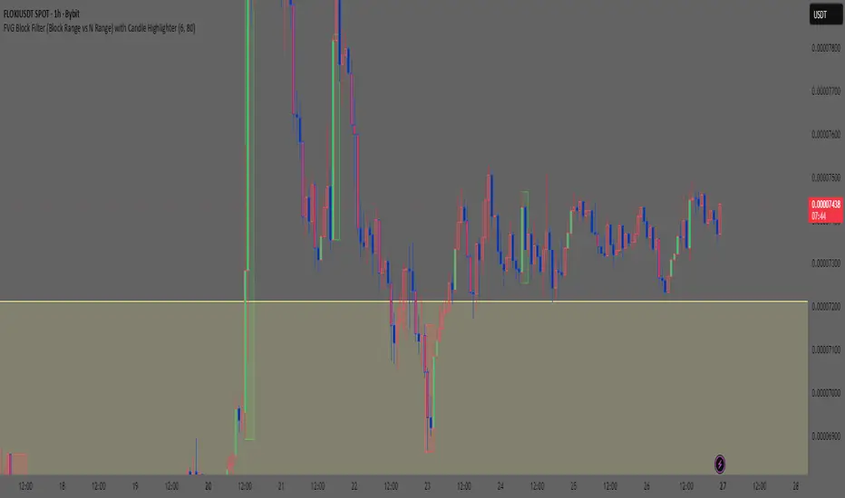
Smart Money Concept: FVG Block Filter Smart Money Concept: FVG Block Filter (FVG Block Range vs N Range) with Candle Highlighter
Summary:
Smart Money Concept (SMC): An advanced indicator designed to visualize and filter Fair Value Gaps (FVG) blocks based on their size (Range) compared to the preceding N Range candle movement. It also includes a customizable Candle Highlighter function that marks the specific candle responsible for creating the FVG. The indicator allows full color customization for both blocks and the highlighter, and features clean, label-free charts by default.
Key Features:
FVG Block Detection: Automatically identifies and groups sequential FVG imbalances to form consolidated FVG blocks.
FVG Block Filtering (N Range): Filters blocks based on a user-defined rule, comparing the block's size (Range) to the range of the preceding N candles (e.g., requiring the FVG block to be larger than the range of the previous 6 candles).
Customizable Candle Highlighter: Marks the central candle (B) within the FVG structure (A-B-C) to highlight the source of the price imbalance. Highlighter colors are fully adjustable via inputs.
Visualization Control: Labels are turned OFF by default to keep the chart clean but can be easily enabled via the indicator settings.
Full Color Customization: Allows independent customization of Bullish and Bearish FVG Block colors, Block Transparency, and Bullish/Bearish Highlighter colors.
Keywords:
Smart Money Concept, SMC, Fair Value Gap, FVG, Imbalance, Block Filter, Candle Highlighter, Range.
Smart Money Concept v1Smart Money Concept Indicator – Visual Interpretation Guide
What Happens When Liquidity Lines Are Broken
🟩 Green Line Broken (Buy-Side Liquidity Pool Swept)
- Indicates price has dipped below a previous swing low where sell stops are likely placed.
- Market Makers may be triggering these stops to accumulate long positions.
- Often followed by a bullish reversal.
- Trader Actions:
• Look for a bullish candle close after the sweep.
• Confirm with nearby Bullish Order Block or Fair Value Gap.
• Consider entering a Buy trade (SLH entry).
- If price continues falling: Indicates trend continuation and invalidation of the buy-side liquidity zone.
🟥 Red Line Broken (Sell-Side Liquidity Pool Swept)
- Indicates price has moved above a previous swing high where buy stops are likely placed.
- Market Makers may be triggering these stops to accumulate short positions.
- Often followed by a bearish reversal.
- Trader Actions:
• Look for a bearish candle close after the sweep.
• Confirm with nearby Bearish Order Block or Fair Value Gap.
• Consider entering a Sell trade (SLH entry).
- If price continues rising: Indicates trend continuation and invalidation of the sell-side liquidity zone.
Chart-Based Interpretation of Green Line Breaks
In the provided DOGE/USD 15-minute chart image:
- Green lines represent buy-side liquidity zones.
- If these lines are broken:
• It may be a stop hunt before a bullish continuation.
• Or a false Break of Structure (BOS) leading to deeper retracement.
- Confirmation is needed from candle structure and nearby OB/FVG zones.
Is the Pink Zone a Valid Bullish Order Block?
To validate the pink zone as a Bullish OB:
- It should be formed by a strong down-close candle followed by a bullish move.
- Price should have rallied from this zone previously.
- If price is now retesting it and showing bullish reaction, it confirms validity.
- If formed during low volume or price never rallied from it, it may not be valid.
Smart Money Concept - Liquidity Line Breaks Explained
This document explains how traders should interpret the breaking of green (buy-side) and red (sell-side) liquidity lines when using the Smart Money Concept indicator. These lines represent key liquidity pools where stop orders are likely placed.
🟩 Green Line Broken (Buy-Side Liquidity Pool Swept)
When the green line is broken, it indicates:
• - Price has dipped below a previous swing low where sell stops were likely placed.
• - Market Makers have triggered those stops to accumulate long positions.
• - This is often followed by a bullish reversal.
Trader Actions:
• - Look for a bullish candle close after the sweep.
• - Confirm with a nearby Bullish Order Block or Fair Value Gap.
• - Consider entering a Buy trade (SLH entry).
🟥 Red Line Broken (Sell-Side Liquidity Pool Swept)
When the red line is broken, it indicates:
• - Price has moved above a previous swing high where buy stops were likely placed.
• - Market Makers have triggered those stops to accumulate short positions.
• - This is often followed by a bearish reversal.
Trader Actions:
• - Look for a bearish candle close after the sweep.
• - Confirm with a nearby Bearish Order Block or Fair Value Gap.
• - Consider entering a Sell trade (SLH entry).
📌 Additional Notes
• - If price continues beyond the liquidity line without reversal, it may indicate a trend continuation rather than a stop hunt.
• - Always confirm with Higher Time Frame bias, Institutional Order Flow, and price reaction at the zone.

Smart Money — Volume Panel + OBV Smart Money — Volume Panel + Scaled OBV
This indicator combines classic volume analysis with a scaled On-Balance Volume (OBV) line, helping spot smart money activity:
Volume bars – color changes dynamically:
🟢 green = high volume & OBV rising
🔴 red = high volume & OBV falling
🟠 orange = high volume but OBV neutral
⚪ gray = low volume
Yellow line – volume moving average (MA)
Purple line – high-volume threshold (MA × multiplier)
OBV line (green/red) – scaled OBV plotted in the same range as volume for easier comparison.

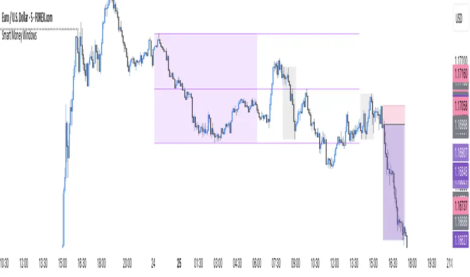
Smart Money Windows X6Smart Money Windows 📊💰 – See where the pros hide their orders! Spot liquidity traps, smart money zones, and session kill zones before price flips. 🚀🔥
Smart Money Windows- X7Smart Money Windows 📊💰
Unlock the secret moves of the big players! This indicator highlights key liquidity traps, smart money zones, and market kill zones for the Asian, London, and New York sessions. See where the pros hide their orders and spot potential price flips before they happen! 🚀🔥
Features:
Visual session boxes with high/low/mid levels 🟪🟫
NY session shifted 60 mins for precise timing 🕒
Perfect for spotting traps, inducements & smart money maneuvers 🎯
Works on Forex, crypto, and stocks 💹
Get in the “Smart Money Window” and trade like the pros! 💸🔑
By HH