IsAlgo - Manual TrendLine► Overview:
Manual TrendLine is a strategy that allows traders to manually insert a trendline and opens trades when the trendline is retested or when the price hits a new highest high or lowest low. It provides flexibility in trendline configuration and trading behavior, enabling responsive and adaptable trading strategies.
► Description:
The Manual TrendLine strategy revolves around using manually defined trendlines as the primary tool for making trading decisions. Traders start by specifying two key points on the chart to establish the trendline. Each point is defined by a specific time and price, enabling precise placement according to the trader’s analysis and insights. Additionally, the strategy allows for the adjustment of the trendline’s width, which acts as a buffer zone around the trendline, providing flexibility in how closely price movements must align with the trendline to trigger trades.
Once the trendline is established, the strategy continuously monitors price movements relative to this line. One of its core functions is to execute trades when the price retests the trendline. A retest occurs when the price approaches the trendline after initially diverging from it, indicating potential continuation of the prevailing trend. This behavior is often seen as a confirmation of the trend’s strength, and the strategy takes advantage of these moments to enter trades in the direction of the trend.
Beyond retests, the strategy also tracks the formation of new highest highs and lowest lows in relation to the trendline. When the price reaches a new highest high or lowest low, it signifies strong momentum in the trend’s direction. The strategy can be configured to open trades at these critical points.
Another key feature of the strategy is its response to trendline breaks. A break occurs when the price moves through the trendline, potentially signaling a reversal or a significant shift in market sentiment. The strategy can be set to open reverse trades upon such breaks, enabling traders to quickly adapt to changing market conditions. Additionally, traders have the option to stop opening new trades after a trendline break, helping to avoid trades during periods of uncertainty or increased volatility.
↑ Up Trend Example:
↓ Down Trend Example:
► Features and Settings:
⚙︎ TrendLine: Define the time and price of the two main points of the trendline, and set the trendline width.
⚙︎ Entry Candle: Specify the minimum and maximum body size and the body-to-candle size ratio for entry candles.
⚙︎ Trading Session: Define specific trading hours during which the strategy operates, restricting trades to preferred market periods.
⚙︎ Trading Days: Specify active trading days to avoid certain days of the week.
⚙︎ Backtesting: backtesting for a selected period to evaluate strategy performance. This feature can be deactivated if not needed.
⚙︎ Trades: Configure trade direction (long, short, or both), position sizing (fixed or percentage-based), maximum number of open trades, and daily trade limits.
⚙︎ Trades Exit: Set profit/loss limits, specify trade duration, or exit based on band reversal signals.
⚙︎ Stop Loss: Choose from various stop-loss methods, including fixed pips, ATR-based, or highest/lowest price points within a specified number of candles. Trades can also be closed after a certain number of adverse candle movements.
⚙︎ Break Even: Adjust stop loss to break even once predefined profit levels are reached, protecting gains.
⚙︎ Trailing Stop: Implement a trailing stop to adjust the stop loss as the trade becomes profitable, securing gains and potentially capturing further upside.
⚙︎ Take Profit: Set up to three take-profit levels using methods such as fixed pips, ATR, or risk-to-reward ratios. Alternatively, specify a set number of candles moving in the trade’s direction.
⚙︎ Alerts: Comprehensive alert system to notify users of significant actions, including trade openings and closings. Supports dynamic placeholders for take-profit levels and stop-loss prices.
⚙︎ Dashboard: Visual display on the chart providing detailed information about ongoing and past trades, aiding users in monitoring strategy performance and making informed decisions.
► Backtesting Details:
Timeframe: 30-minute EURUSD chart
Initial Balance: $10,000
Order Size: 500 units
Commission: 0.05%
Slippage: 5 ticks
This strategy opens trades around a manually drawn trendline, which results in a smaller number of closed trades.
Cerca negli script per "trendline"

RSI - trendlines - div[vn]This is an indicator for traders of trendline analysis with RSI (the formula for calculating RSI I don't mention here anymore because every trader knows it)
-
The Pine Script strategy plots pivot points and trendlines on the RSI chart.
This strategy allows the user to specify the interval for calculating the pivot points and the number of pivot points used to generate the RSI trendlines.
As all traders know, the RSI line closely follows the actual price line, it is an indicator of momentum, the RSI often tells us the direction of the price line in advance, it often precedes and goes along with the price.
RSI is one of the indicators that predicts price trends very well when it crosses its trendline (except in case of divergence).
On the chart of the RSI indicator, I only show 2 trendlines closest to the RSI (1 increase, 1 decrease) and the trend lines far away from me are hidden so that traders can focus on observing better.
When an uptrend line of RSI (or a decrease of RSI) is drawn according to the settings in the settings of the indicator, then that line is support and resistance so that we can proceed to make a BUY or SELL point according to the indicator. RSI support and resistance strategy
When the RSI line breaks above the definitive uptrend line or breaks below the trendline definitively, the price signals a reversal to the nearest trendline.
When the RSI breaks the downtrend line of the RSI (definitively), it signals that the price has a high probability of reversing or approaching the nearest resistance area or possibly reversing from bearish to bullish.
When the RSI breaks the uptrend line of the RSI (definitively), it signals that the price is likely to reverse or reach the nearest resistance area or it may reverse from bullish to bearish.
In addition, I have integrated the normal divergence function of RSI for traders to use in case of divergence - combined with trendline to identify trend reversal more clearly.
-------------------------------------------------------------------------------------------------------
Vietnamese
-Đây là chỉ báo dành cho các trader thuộc trường phái phân tích đường xu hướng với RSI(công thức tính RSI tôi không nhắc ở đây nữa vì mọi trader đều biết)
-Chiến lược Pine Script vẽ các điểm trục và đường xu hướng trên biểu đồ RSI.
-Chiến lược này cho phép người dùng chỉ định khoảng thời gian tính toán các điểm xoay và số điểm xoay được sử dụng để tạo các đường xu hướng của RSI.
-Như các Trader đều biết đường RSI bám sát thực tế với đường giá, nó là chỉ báo về động lượng ,RSI nhiều khi cho chúng ta "biết trước" được hướng đi của đường giá, nó thường đi trước và đi cùng với giá
-RSI là một trong những chỉ báo dự đoán xu hướng giá rất tốt khi cắt đường xu hướng của nó (chỉ trừ trường hợp phân kì)
-Trên biểu đồ của chỉ báo RSI tôi chỉ đưa ra 2 đường trendline gần với đường RSI nhất (1 tăng , 1 giảm)còn các đường xu hướng cách xa tôi đều để ẩn để các Trader tập chung quan sát tốt hơn
-Khi đường xu hướng tăng của RSI (hoặc giảm của RSI) được vẽ ra theo các thiết lập trong cài đặt của chỉ báo,thì đường đó là hỗ trợ,kháng cự để ta có thể tiến hành thực hiện điểm BUY hoặc SELL theo chiến lược hỗ trợ và kháng cự của RSI
-Khi đường RSI mà phá vỡ lên trên đường xu hướng tăng dứt khoát hoặc phá xuống dưới đường xu hướng cách dứt khoát thì giá báo hiệu sắp đảo chiều ngược với đường xu hướng gần nhất
-Khi RSI phá vỡ đường xu hướng giảm của RSI (cách dứt khoát) thì báo hiệu sắp tới giá có khả năng cao sẽ đảo chiều hay tiến tới vùng kháng cự gần nhất hay có thể đảo chiều từ giảm thành tăng
-Khi RSI phá vỡ đường xu hướng tăng của RSI (cách dứt khoát) thì báo hiệu sắp tới giá có khả năng cao sẽ đảo chiều hay tiến tới vùng kháng cự gần nhất hay có thể đảo chiều từ tăng thành giảm
-ngoài ra tôi có tích hợp thêm vào công cụ chức năng phân kì thường của RSI để trader dùng trong trường hợp phân kì - kết hợp với đường trendline để xác định xu hướng đảo chiều rõ ràng hơn

Auto Trendlines (Finviz Style)Oculus Auto Trendlines
Version 1.0 | Pine Script v6
Overview
Oculus Auto Trendlines automatically identifies and plots the most significant support and resistance trendlines by connecting the two most recent swing highs (resistance) and swing lows (support) over a user-defined pivot lookback. Each line extends dynamically to the right, recalculates in real time, and self-invalidates when price decisively breaks beyond it by a configurable tolerance.
Key Features
Automatic Pivot Detection
Uses ta.pivothigh and ta.pivotlow over your chosen bar span to pinpoint significant market turning points.
Dynamic Trendline Drawing
Connects the last two valid pivots to form support and resistance lines that update and extend to the right each bar.
Break-Triggered Refresh
When price closes beyond a drawn trendline by more than the break tolerance, that line is removed and a new one is drawn from the next valid pivots.
Configurable Sensitivity
Pivot Lookback: Number of bars on each side to define swings.
Break Tolerance: Percentage buffer to prevent false invalidations on minor wicks.
Clean Overlay
Minimal code and plotting ensures your chart remains uncluttered—only one support and one resistance line are visible at any time.
How to Use
Add to Chart: Apply “Oculus Auto Trendlines” to any symbol and timeframe.
Set Inputs:
Pivot Lookback: Larger values produce smoother, longer-term lines; smaller values react faster to recent price.
Break Tolerance (%): Adjust to allow for minor wicks or noise without resetting lines.
Read Trendlines:
The red resistance line connects the two most recent swing highs.
The green support line connects the two most recent swing lows.
Lines automatically redraw when invalidated by a clean break beyond tolerance.
Combine with Other Analysis: Use these auto-drawn trendlines alongside indicators like moving averages, volume, or price patterns for stronger confluence.
Inputs
Pivot Lookback: 10 (bars each side)
Break Tolerance (%): 0.2%
Version History
1.0 – Initial release with real-time pivot detection, auto-updating trendlines, and break validation.
Disclaimer
This indicator is provided for educational purposes. Always backtest settings on historical data, verify trendline relevance, and apply proper risk management before trading live.

ZigZag with Trend, EMA & TrendlinesIntroduction to the "ZigZag with Trend, EMA & Trendlines" Indicator
The "ZigZag with Trend, EMA & Trendlines" indicator is a comprehensive tool designed to assist traders in identifying market trends, key turning points, and dynamic price movements. By combining ZigZag patterns, Trendline analysis, and Exponential Moving Averages (EMA), this indicator offers multiple perspectives to help traders spot trend reversals, support/resistance zones, and potential buy/sell signals.
Key Features:
ZigZag Pattern Identification:
The ZigZag algorithm captures significant price swings, filtering out smaller price movements. This highlights the most relevant highs and lows, allowing traders to visualize the market's broader trend and anticipate reversals.
Customizable Swing Length: Traders can adjust the sensitivity of the ZigZag pattern by modifying the swing length, offering flexibility in detecting both short-term and long-term price patterns.
Adjustable ZigZag Color: You can change the color of the ZigZag line in the settings, making it easy to customize for visual preference.
Trend Analysis:
Trend Calculation: The indicator calculates the average trend by using a maximum and minimum price-based algorithm. This highlights whether the market is trending upwards (bullish) or downwards (bearish).
Buy/Sell Signals: Automatic buy and sell signals are plotted based on the crossing of trend lines, making it easier for traders to act on trend reversals.
The indicator uses dynamic colors—green for bullish and red for bearish trends.
Exponential Moving Averages (EMA):
The indicator includes three important EMAs—34, 89, and 200 periods—commonly used by traders to gauge the overall direction and momentum of the market.
EMA 34 (green) is suited for short-term trends, EMA 89 (yellow) for mid-term trends, and EMA 200 (red) for long-term market direction.
These EMAs are plotted on the chart, making it easy to determine potential crossover points and trend continuation signals.
Trendlines:
Automatic Trendline Drawing: Based on significant pivot highs and pivot lows, the indicator automatically draws trendlines on the chart. This visual representation of support and resistance helps traders anticipate future price movements.
Customizable Trendline Color: Uptrend and downtrend lines are plotted with customizable colors, providing clarity when the market is shifting between bullish and bearish conditions.
Trendline Period Setting: The trendline drawing period can be adjusted, allowing for more flexibility depending on the market's volatility.
How to Use:
Trend Confirmation: Use the combination of ZigZag patterns and EMAs to confirm the current trend direction. The ZigZag line will show the major swing highs and lows, while the EMAs will provide a broader understanding of trend strength and potential reversals.
Buy/Sell Signals: Look for crossovers between the average trend and the price to receive automatic buy (green) and sell (red) signals.
Support/Resistance: The automatically drawn trendlines based on pivot points offer valuable support and resistance levels that traders can use to set stop losses or take profits.
Conclusion:
The "ZigZag with Trend, EMA & Trendlines" indicator offers a unique combination of price action and trend-following tools. This all-in-one solution allows traders to visualize market structure, identify key price points, and confirm trends. It's a powerful tool for traders looking to capitalize on both short-term and long-term market movements, making it an essential addition to any trading strategy.

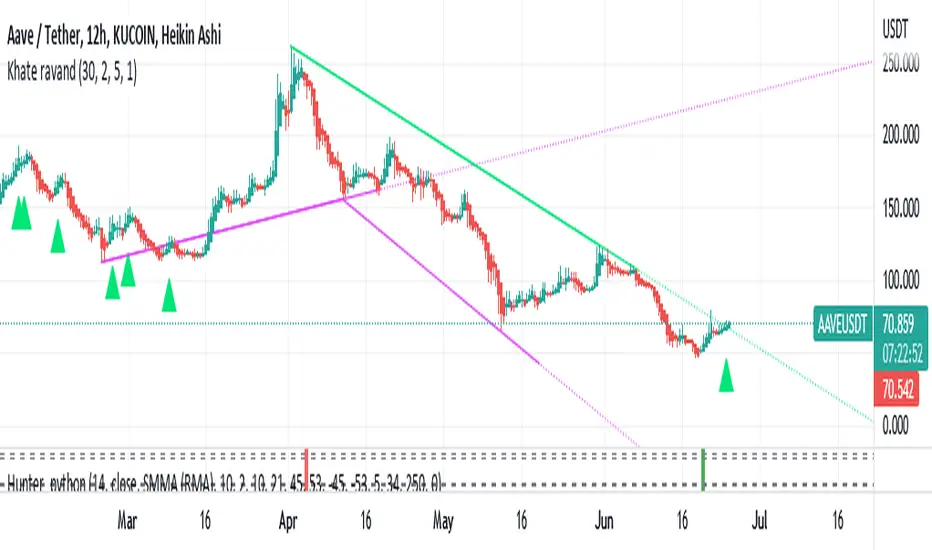
Khate ravandThis script draws trendlines from the pivot points in the price chart.
//
// The input for the function that draws the trendlines is any calculation or function
// (here this is pivot points, but the core of the script can be used in other implementations too),
// that most of the time and occasionally produces a 'non n/a' value.
// The trendline function then connects the non n/a values and extends the connections of those points in a trendline.
//
// There is an option to draw the lines from the wicks or from the 'real bodies' of the candles.
// The trendlines can either extend infinitely or only run for an adjustable amount of bars.
//
// There's an option to display trendline breaks
// And the option to display trendlines in color or monochrome
//
RSI Trendline Pro - Multi Confirmation
Overview
RSI Trendline Pro is an advanced Pine Script indicator that automatically draws trendlines on the RSI (Relative Strength Index) to detect support and resistance breakouts. It generates high-quality trading signals through a multi-confirmation system.
Key Features
Auto Trendlines: Detects pivot points on RSI to create intelligent support and resistance lines
Multi-Confirmation System: Combines Volume, Stochastic RSI, ADX, and Divergence filters to reduce false signals
RSI Divergence Detection: Automatically identifies bullish/bearish divergences between price and RSI
Live Dashboard: Displays RSI value, active trendlines, ADX strength, and last signal info on a visual panel
Smart Breakout Detection: Identifies trendline breaks and generates LONG/SHORT signals
How to Use
Add to TradingView: Paste code into Pine Editor and add to chart
Configure Parameters:
RSI Length: RSI period (default: 14)
Pivot Strength: Trendline sensitivity (lower = more lines)
Filters: Enable/disable Volume, Divergence, Stoch RSI, and ADX confirmations
Follow Signals:
LONG (Green): When RSI breaks resistance upward
SHORT (Red): When RSI breaks support downward
Divergence: "D" markers indicate potential trend reversals
Alert Setup
Script offers 4 alert types:
LONG Breakout: Resistance break
SHORT Breakout: Support break
Bullish/Bearish Divergence: Divergence detection
Any Signal: Combined alert for all signals
Best Practices
Prioritize high-volume breakouts (Volume Filter enabled)
Trends are stronger when ADX > 25
Confirm divergence signals with price action
Trade when 2-3 confirmations align

Multipower Entry SecretMultipower Entry Secret indicator is designed to be the ultimate trading companion for traders of all skill levels—especially those who struggle with decision-making due to unclear or overwhelming signals. Unlike conventional trading systems cluttered with too many lines and confusing alerts, this indicator provides a clear, adaptive, and actionable guide for market entries and exits.
Key Points:
Clear Buy/Sell/Wait Signals:
The script dynamically analyzes price action, candle patterns, volume, trend strength, and higher time frame context. This means it gives you “Buy,” “Sell,” or “Wait” signals based on real, meaningful market information—filtering out the noise and weak trades.
Multi-Timeframe Adaptive Analysis:
It synchronizes signals between higher and current timeframes, ensuring you get the most reliable direction—reducing the risk of getting caught in fake moves or sudden reversals.
Automatic Support, Resistance & Liquidity Zones:
Key levels like support, resistance, and liquidity zones are auto-detected and displayed directly on the chart, helping you make precise decisions without manual drawing.
Real-Time Dashboard:
All relevant information, such as trend strength, market intent, volume sentiment, and the reason behind each signal, is neatly summarized in a dashboard—making monitoring effortless and intuitive.
Customizable & Beginner-Friendly:
Whether you’re a newcomer wanting straightforward guidance or a professional needing advanced customization, the indicator offers flexible options to adjust analysis depth, timeframes, sensitivity, and more.
Visual & Clutter-Free:
The design ensures that your chart remains clean and readable, showing only the most important information. This minimizes mental overload and allows for instant decision-making.
Who Will Benefit?
Beginners who want to learn trading logic, avoid common traps, and see the exact reason behind every signal.
Advanced traders who require adaptive multi-timeframe analytics, fast execution, and stress-free monitoring.
Anyone who wants to save screen time, reduce analysis paralysis, and have more confidence in every trade they take.
1. No Indicator Clutter
Intent:
Many traders get confused by charts filled with too many indicators and signals. This often leads to hesitation, missed trades, or taking random, risky trades.
In this Indicator:
You get a clean and clutter-free chart. Only the most important buy/sell/wait signals and relevant support/resistance/liquidity levels are shown. These update automatically, removing the “overload” and keeping your focus sharp, so your decision-making is faster and stress-free.
2. Exact Entry Guide
Intent:
Traders often struggle with entry timing, leading to FOMO (fear of missing out) or getting trapped in sudden market reversals.
In this Indicator:
The system uses powerful adaptive logic to filter out weak signals and only highlight the strongest market moves. This not only prevents you from entering late or on noise, but also helps avoid losses from false breakouts or whipsaws. You get actionable suggestions—when to enter, when to hold back—so your entries are high-conviction and disciplined.
3. HTF+LTF Logic: Multitimeframe Sync Analysis
Intent:
Most losing trades happen when you act only on the short-term chart, ignoring the bigger market trend.
In this Indicator:
Signals are based on both the current chart timeframe (LTF) and a higher (HTF, like hourly/daily) timeframe. The indicator synchronizes trend direction, momentum, and structure across both levels, quickly adapting to show you when both are aligned. This filtering results in “only trade with the bigger trend”—dramatically increasing your win rate and market confidence.
4. Auto Support/Resistance & Liquidity Zones
Intent:
Drawing support/resistance and liquidity zones manually is time-consuming and error-prone, especially for beginners.
In this Indicator:
The system automatically identifies and plots the most crucial support/resistance levels and liquidity zones on your chart. This is based on adaptive, real-time price and volume analysis. These zones highlight where major institutional activity, trap setups, or real breakouts/reversals are most likely, removing guesswork and giving you a clear reference for entries, exits, and stop placements.
5. Clear Action/Direction
Intent:
Traders need certainty—what does the market want right now? Most indicators are vague.
In this Indicator:
Your dashboard always displays in plain words (like “BUY”, “SELL”, or “WAIT”) what action makes sense in the current market phase. Whether it’s a bull trap, volume spike, wick reversal, or exhaustion—it’s interpreted and explained clearly. No more confusion—just direct, real-time advice.
6. For Everyone (Beginner to Pro)
Intent:
Most advanced indicators are overwhelming for new traders; simple ones lack depth for professionals.
In this Indicator:
It is simple enough for a beginner—just add it to the chart and instantly see what action to consider. At the same time, it includes advanced adaptive analysis, multi-timeframe logic, and customizable settings so professional traders can fine-tune it for their strategies.
7. Ideal Usage and User Benefits
Instant Decision Support:
Whenever you’re unsure about a trade, just look at the indicator’s suggestion for clarity.
Entry Learning:
Beginners get real-time “practice” by not only seeing signals, but also the reason behind them—improving your chart reading and market understanding.
Screen Time & Stress Reduction:
Clear, relevant information only; no noise, less fatigue, faster decisions.
Makes Trading Confident & Simple:
The smart dashboard splits actionable levels (HTF, LTF, action) so you never miss a move, avoid traps, and stay aligned with high-probability trades.
8. Advanced Input Settings (Smart Customization)
Explained with Examples:
Enable Wick Analysis:
Finds candles with strong upper/lower wicks (signs of rejection/buying/selling force), alerting you to hidden reversals and protecting from FOMO entries.
Enable Absorption:
Detects when heavy order flow from one side is “absorbed” by the other (shows where institutional buyers/sellers are likely active, helps spot fake breakouts).
Enable Unusual Breakout:
Highlights real breakouts—large volatility plus high volume—so you catch genuine moves and avoid random spikes.
Enable Range/Expansion:
Smartly flags sudden range expansions—when the market goes from quiet to volatile—so you can act at the start of real trends.
Trend Bar Lookback:
Adjusts how many bars/candles are used in trend calculations. Short (fast trades, more signals), long (more reliability, fewer whipsaws).
Bull/Bear Bars for Strong Trend Min:
Sets how many candles in a row must support a trend before calling it “strong”—prevents flipping signals, keeps you disciplined.
Volume MA Length:
Lets you adjust how many bars back volume is averaged—fine-tune for your asset and trading style for best volume signals.
Swing Lookback Bars:
Set how many bars to use for swing high/low detection—short (quick swing levels), long (stronger support/resistance).
HTF (Bias Window):
Decide which higher timeframe the indicator should use for big-picture market mood. Adjustable for any style (scalp, swing, position).
Adaptive Lookback (HTF):
Choose how much HTF history is used for detecting major extremes/zones. Quick adjust for more/less sensitivity.
Show Support/Resistance, Liquidity Zones, Trendlines:
Toggle them on/off instantly per your needs—keeps your chart relevant and tailored.
9. Live Dashboard Sections Explained
Intent HTF:
Shows if the bigger timeframe currently has a Bullish, Bearish, or Neutral (“Chop”) intent, based on strict volume/price body calculations. Instant clarity—no more guessing on trend bias.
HTF Bias:
Clear message about which side (buy/sell/sideways) controls the market on the higher timeframe, so you always trade with the “big money.”
Chart Action:
The central action for the current bar—Whether to Buy, Sell, or Wait—calculated from all indicator logic, not just one rule.
TrendScore Long/Short:
See how many candles in your chosen window were bullish or bearish, at a glance. Instantly gauge market momentum.
Reason (WHY):
Every time a signal appears, the “reason” cell tells you the primary logic (breakout, wick, strong trend, etc.) behind it. Full transparency and learning—never trade blindly.
Strong Trend:
Shows if the market is currently in a powerful trend or not—helping you avoid choppy, risky entries.
HTF Vol/Body:
Displays current higher timeframe volume and candle body %—helping spot when big players are active for higher probability trades.
Volume Sentiment:
A real-time analysis of market psychology (strong bullish/bearish, neutral)—making your decision-making much more confident.
10. Smart and User-Friendly Design
Multi-timeframe Adaptive:
All calculations can now be drawn from your choice of higher or current timeframe, ensuring signals are filtered by larger market context.
Flexible Table Position:
You can set the live dashboard/summary anywhere on the chart for best visibility.
Refined Zone Visualization:
Liquidity and order blocks are visually highlighted, auto-tuning for your settings and always cleaning up to stay clutter-free.
Multi-Lingual & Beginner Accessible:
With Hindi and simple English support, descriptions and settings are accessible for a wide audience—anyone can start using powerful trading logic with zero language barrier.
Efficient Labels & Clear Reasoning:
Signal labels and reasons are shown/removed dynamically so your chart stays informative, not messy.
Every detail of this indicator is designed to make trading both simpler and smarter—helping you avoid the common pitfalls, learn real price action, stay in sync with the market’s true mood, and act with discipline for higher consistency and confidence.
This indicator makes professional-grade market analysis accessible to everyone. It’s your trusted assistant for making smarter, faster, and more profitable trading decisions—providing not just signals, but also the “why” behind every action. With auto-adaptive logic, clear visuals, and strong focus on real trading needs, it lets you focus on capturing the moves that matter—every single time.

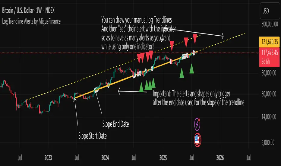
MF Logarithmic Log Trendline with Alerts by MigueFinanceWhat is Unique on This Indicator?
It allows you to set alerts for logarithmic trendlines including cross and touches and it works!
Not even tradingview has alerts for drawn logarithmic trendlines !
When on Logaritmic scale it looks like a normal trendline but when on the linear scale it looks like a real logarithmic curve!
And is free to use!
Overview
Finally an Indicator that has alerts/alarms that works with Logarithmic trendlines!
A- This indicator plots a customizable logarithmic (or linear) trendline based on user-defined start/end dates, extending forward to highlight support/resistance.
B- It shows green upward triangles for bullish breakouts and red downward triangles for bearish breakdowns or dots for touches that are not effective crosses of the trendline
C- It is also possible to set alert conditions with custom message for helping to trade the signals above/bellow the trendline
How to Use
1. Apply indicator to chart.
2. Adjust inputs: log/linear, price source, start/end dates, custom prices , label/triangle visibility.
3. Setting -1 for the price source adjusts the trendline automatically to the height of the chart for the specified date based on high, low, close or open of the candle for that date.
4. Watch for triangle signals on bar close.
5. Set alerts for breakouts/breakdowns or touches via TradingView.
Multiple Logarithmic Trendlines are possible!
You can put many logarithmic trendlines in your chart with alerts!, just as many as many alerts your current tradingview plan allows you to.
How to?
- Just use this indicator, get the logaritmic trendline you desire, set the alert, make sure is well set, and after setting the alert draw yourself on tradingview the logarithmic trendline that you are setting the alarm to (a new manual drawing).
- Then modify the settings of your indicator to create a new trendline, the previous one exists even if not visible as long as you have correctly set the alert, and if you did a drawing you can see your previous alert trendline.
Custom Messages on Alerts
- There are different options for the alerts, the one named "Any alert() function call" allows you to put custom messages that could be used on platforms like Wundertrade in order to set and execute automatic trades on buy/sell.
- The other options for the alerts give you fix messages and allows you to decide if get you an alert on a cross over or under or on a touch of the trendline.
Notes
- Signals on confirmed closes (no repainting).
- Designed for log-scaled charts but also works on linear charts.
- Tested on stocks, crypto, and more.
- Make sure that this indicator and your plotted chart are on the same scale, otherwise will look like floating, will move and would seem like it does not matches the chart.
Important Note
- The alerts and shapes only trigger after the "End Date" of the slope, not before or between them
You are welcome to follow me on my socials!
MigueFinance.
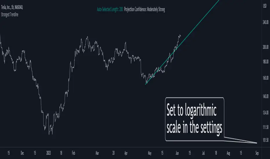
Strongest TrendlineUnleashing the Power of Trendlines with the "Strongest Trendline" Indicator.
Trendlines are an invaluable tool in technical analysis, providing traders with insights into price movements and market trends. The "Strongest Trendline" indicator offers a powerful approach to identifying robust trendlines based on various parameters and technical analysis metrics.
When using the "Strongest Trendline" indicator, it is recommended to utilize a logarithmic scale . This scale accurately represents percentage changes in price, allowing for a more comprehensive visualization of trends. Logarithmic scales highlight the proportional relationship between prices, ensuring that both large and small price movements are given due consideration.
One of the notable advantages of logarithmic scales is their ability to balance price movements on a chart. This prevents larger price changes from dominating the visual representation, providing a more balanced perspective on the overall trend. Logarithmic scales are particularly useful when analyzing assets with significant price fluctuations.
In some cases, traders may need to scroll back on the chart to view the trendlines generated by the "Strongest Trendline" indicator. By scrolling back, traders ensure they have a sufficient historical context to accurately assess the strength and reliability of the trendline. This comprehensive analysis allows for the identification of trendline patterns and correlations between historical price movements and current market conditions.
The "Strongest Trendline" indicator calculates trendlines based on historical data, requiring an adequate number of data points to identify the strongest trend. By scrolling back and considering historical patterns, traders can make more informed trading decisions and identify potential entry or exit points.
When using the "Strongest Trendline" indicator, a higher Pearson's R value signifies a stronger trendline. The closer the Pearson's R value is to 1, the more reliable and robust the trendline is considered to be.
In conclusion, the "Strongest Trendline" indicator offers traders a robust method for identifying trendlines with significant predictive power. By utilizing a logarithmic scale and considering historical data, traders can unleash the full potential of this indicator and gain valuable insights into price trends. Trendlines, when used in conjunction with other technical analysis tools, can help traders make more informed decisions in the dynamic world of financial markets.
Fishing The Trend - Setup Classic v7.5.5FTT Classic v7.5.5
HOW Does it work ?
It is the classic version of Fishing The Trend-Setup for ease of trading & for getting the most from the market.
i.e. Combining the most useful indicators and making a whole setup under one roof...
FTT Classic comprises of following --
* IntraDay Range.
* Fishing The Trend.
* Custom VWAP.
* Baseband for Trend.
* Trendlines.
* Support & Resistance Lines.
* BreakOut Area.
* Technical Analysis table.
* Custom alerts.
1) HOW Does Intraday Range work ?
# For calculating the average most probable range for any symbol, it plots two areas - higher range and a lower range.
# This indicator is on - as default.
# Upper and Lower areas act as support and resistance, user may see a reversal in trend from these areas.
# If the price breaks these bands, breakout be considered.
# These bands are calculated by averaging the previous x number of days' high and low of the security.
3) HOW Does Fishing The Trend work ?
# When the market trend may try to reverse, the first signal/label will come showing Stop loss figure, and then if the trend reversal is confirmed, the supporting triangle in the next opening price will be placed at upper or lower side. along with these
there is a trailing stop-loss line, which will help user to trail their profits in-live.
# The CE-PE can be seen through the table with date and time.
# 2nd table also can be placed below the first one, showing the CE-PE Values for different symbol.
# Signals can be controlled by more or less as optioned in the settings.
# CE-PE strike price can be selected from ATM - ITM - OTM.
4) HOW Does Custom VWAP work ?
# VWAP will be placed having a line and current price of VWAP.
# One can have vwap in index chart also, the colour changes as the market goes above or below vwap or at vwap.
5) HOW Does Baseband for Trend work ?
# Baseband will be plotted for least 2 days on 3 min and gradually increases on increase of timeframe.
# If the market is above band, we may consider it a positive side and if market is below it, we may consider a negative side.
# Type 1 band is for trending market and type 2 is for rangebound market.
# Colour intensity also changes as market picks-up momentum or leaves momentum.
6) HOW Does Trendlines work ?
# Most nearest to most touching trendlines are placed for better understanding the trend.
# Easy to understand with the help of colour combinations.
7) HOW Does Support & Resistance Lines work ?
# The support & resistance lines will be drawn when market movement slows down or momentum decrease.
# The Support lines becomes resistance when market falls below it, and vice-versa for other conditions.
# Range development can be easily detected and can be used as range breakout for better understanding the market.
8) HOW Does BreakOut Area work ?
# Market Consolidates at most of the time, where the bulls and bears fight becomes more aggressive, at this point
of time the area will be formed or area will be formed when market trend reverses suddenly, leaving behind the previous
breakout area.
# Ease of trend reversal, previous supports / resistances can be seen easily.
9) HOW Does Technical Analysis table work ?
# There will be RSI displayed and for the better range detection, range area with price can be seen.
# The GAP of the opening market is seen with gap points (Down or Up)
10) HOW Does Custom alerts work ?
# Alerts can enabled for the CE-PE Strike Price through alerts management from Tradingview.
# Alerts can also be set when the Traffic Signal Comes.
Where to use?
# If the chart is of Index or equity, extended trading hours to be selected, time shall be exchange.
# Indicator wont work on timeframes lower than minutes or higher than or equal to day.
# can be used in every type of market.
# Extended to be selected for Index or Equities/Stocks, Regular be selected for futures, etc.
# At every part / portion the tooltip is placed showing the quick reference for that option.
# The main use of this indicator is quick scalping and Intra-day trading.
# Colour Theme can be selected if the chart theme is dark or light.
# The indicator shows a very useful option for early detection of the ongoing trend whether there will be reversal of trend or not ? Stop Loss - That should be done by following ones risk appetite, Ideally the High of the Previous Candle should be the stop loss for the Long / Short but everyone has their own Risk Management Strategies based on the capital deployed.
How to Take entry ?
# Time Frame shall be more than 2 min and less than day for better outcome.
# If buy signal comes and the market is below the baseband then wait for the market to cross and close above the baseband, also look for the immediate support or resistances which are seen in chart and those nearby the current signal.
# The data for the indicator will be very restricted, most of the parts in indicator wont work when the market closes.
# Pre-Opening or Post -Market data is tried to be ignored.
# Utmost Care is taken to implement the suggestions of users and also tried to keep the chart neat and clean.
** N.B.:- There may be cases where warning may come during setting the alert, this because
of alert conditions are taken ONLY when the current candle is CLOSED, real-time alerts are
considered as not feasible to get it.
Disclaimer
# The indicator to be used for understanding / learning the markets.
# User is responsible for his / her profits/losses, that may occur during the markets.

Constant Auto Trendlines (Extended Right)📈 Constant Auto Trendlines (Extended Right)
This indicator automatically detects market structure by connecting swing highs and lows with permanent, forward-projecting trendlines.
Unlike standard trendline tools that stop at the last pivot, this version extends each trendline infinitely into the future — helping traders visualize where price may react next.
🔍 How It Works
The script identifies pivot highs and lows using user-defined left/right bar counts.
When a new lower high or higher low appears, the indicator draws a line between the two pivots and extends it forward using extend.right.
Each new confirmed trendline stays fixed, creating a historical map of structure that evolves naturally with market action.
Optional filters:
Min Slope – ignore nearly flat trendlines
Show Latest Only – focus on the most relevant trendline
Alerts – get notified when price crosses the most recent uptrend or downtrend line
🧩 Why It’s Useful
This tool helps traders:
Spot emerging trends early
Identify dynamic support/resistance diagonals
Avoid redrawing trendlines manually
Backtest structure breaks historically
⚙️ Inputs
Pivot Left / Right bars
Min slope threshold
Line color, width, and style
Show only latest line toggle
Alert options

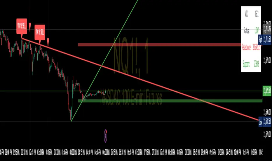
SPX Trendlines with VIX Levels By- Profit gang
This comprehensive technical analysis tool combines SPX trendline analysis with VIX volatility levels to help identify potential market turning points. The indicator is specifically designed with non-repainting logic to ensure reliability for both backtesting and live trading.
🔧 KEY FEATURES:
Non-Repainting Design: All signals and lines are drawn only on confirmed bars using barstate.isconfirmed
Dynamic Trendlines: Automatically draws support and resistance lines connecting recent pivot points
VIX Integration: Displays current VIX levels with customizable thresholds for market sentiment analysis
Multiple Visual Elements: Includes diagonal trendlines, horizontal level lines, and an information table
Comprehensive Alerts: Configurable alert system for both buy and sell signals
Clean Interface: Organized inputs and customizable colors for all elements
📊 TRADING CONCEPT:
The indicator utilizes the inverse relationship between VIX and SPX:
High VIX at pivot lows may indicate oversold conditions (potential buying opportunities)
Low VIX at pivot highs may signal complacency at market tops (potential caution zones)
🎛️ CUSTOMIZATION OPTIONS:
Toggle trendlines, VIX labels, and level lines independently
Adjust VIX thresholds (default: 25 high, 18 low)
Customize pivot length for sensitivity (default: 15)
Choose line styles (solid, dashed, dotted) and widths
Personalize all colors and alert preferences
📈 VISUAL COMPONENTS:
Red Lines: Resistance levels and trendlines
Green Lines: Support levels and trendlines
Information Table: Real-time VIX status and current levels
Signal Shapes: Triangle markers for confirmed buy/sell signals
Background Highlighting: Optional signal emphasis
⚠️ EDUCATIONAL PURPOSE:
This indicator is designed for educational and informational purposes. Past performance does not guarantee future results. Always conduct your own research and consider risk management before making trading decisions.
🔔 ALERT SYSTEM:
Separate alerts for buy and sell signals
All alerts trigger only on confirmed bars
Customizable alert messages with price and VIX data
Multiple alert condition options for flexible setup
Perfect for traders who want to combine technical analysis with volatility sentiment in a reliable, non-repainting format.
VoluTrend | Auto Trendlines + VolumeVoluTrend is a trendline tool that combines pivot detection with volume validation to help traders see only meaningful market structures.
How it works:
Pivot Detection: The script scans for local swing highs and lows using a customizable number of left and right bars. This ensures that each pivot reflects a significant turning point in price action.
Volume Filter: Each pivot is checked against a simple volume filter: the pivot is only valid if its associated bar has higher volume than a user-defined multiple of the average volume over a configurable period. This prevents weak or irrelevant pivots from cluttering the chart.
Automatic Trendlines: Once a valid pivot is found, the script automatically draws a trendline from the previous pivot to the new one. It keeps only a limited number of lines to avoid overcrowding the chart. This creates a dynamic, real-time trendline system that updates as price action evolves.
Why combine these elements?
Many auto trendline tools draw lines for every swing, but not all swings are significant. By combining pivot detection with a volume filter, VoluTrend focuses on price levels where notable participation occurred, helping traders better interpret real support/resistance and trend continuation or reversal points.

Trend and Trendline DetectorTrend and Trendline Detector
Overview
The Trend and Trendline Detector indicator provides both major and minor trend analysis using Simple Moving Averages (SMA) and automatically plots dynamic support and resistance trendlines based on pivot highs and lows.
Key Features
Major Trend Detection: Uses a configurable SMA to determine primary market direction.
Minor Trend Visualization: Optional minor SMA with color-coded line segments to mark smaller trend fluctuations.
Dynamic Pivot Trendlines: Automatically detects pivot highs/lows and draws major (solid) and minor (dashed) trendlines, with user-controlled extension modes.
Customizable Inputs: User can adjust SMA lengths, pivot look back/look forward periods, line extend mode, and toggle features on/off.

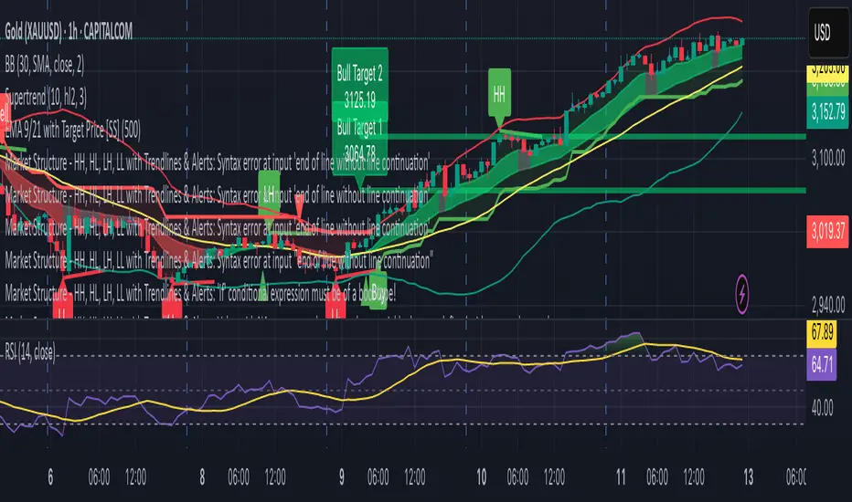
Market Structure - HH, HL, LH, LL with Trendlines & AlertsMarket Structure Script – HH, HL, LH, LL with Trendlines & Alerts
This Pine Script is designed to help identify key market structure patterns such as Higher Highs (HH), Higher Lows (HL), Lower Highs (LH), and Lower Lows (LL) on price charts. It also draws trendlines connecting the respective swing points and provides alerts when these important price patterns occur.
Key Features:
Swing High and Low Detection:
The script uses the ta.pivothigh and ta.pivotlow functions to identify significant swing highs and swing lows based on the pivot length (pivotLen). These points mark local peaks and troughs in the price action.
Dynamic Pivot Length:
The script adjusts the pivotLen (which defines the number of bars used to calculate swing points) based on the current timeframe of the chart. For example, for a 15-minute chart, it uses a pivot length of 5 bars, while for a daily chart, it uses 10 bars. This dynamic adjustment ensures that the script works across different timeframes.
Higher Highs (HH), Higher Lows (HL), Lower Highs (LH), Lower Lows (LL):
Higher High (HH): Identifies a price peak that is higher than the previous swing high, indicating an uptrend.
Higher Low (HL): Identifies a price trough that is higher than the previous swing low, supporting the idea of an ongoing uptrend.
Lower High (LH): Identifies a price peak that is lower than the previous swing high, suggesting a potential reversal or downtrend.
Lower Low (LL): Identifies a price trough that is lower than the previous swing low, indicating a downtrend.
Trendlines:
For each identified Higher High, Higher Low, Lower High, or Lower Low, the script automatically draws a trendline connecting the corresponding swing points. These trendlines provide a visual representation of the market’s price structure, showing support and resistance levels.
Labels:
The script places labels on the chart next to the respective swing points. These labels mark whether the point is a Higher High (HH), Higher Low (HL), Lower High (LH), or Lower Low (LL). This helps traders easily visualize the price pattern at a glance.
Alerts:
Alert conditions are set for when a Higher High (HH), Higher Low (HL), Lower High (LH), or Lower Low (LL) is detected. Users can set up alerts to be notified whenever one of these key market structure patterns forms. Alerts are an essential feature for traders who want to act quickly when important trend changes are happening.
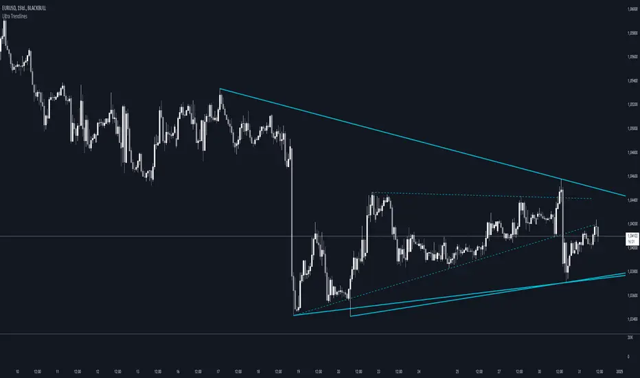
Ultra TrendlinesThis indicator automatically draws trendlines based on every pivot point, helping traders visualize key support and resistance levels. It dynamically adjusts as new pivots are detected and validates the trendlines against price movement.
Introduction
The Ultra Trendlines indicator is designed to help traders identify and track significant trendlines on their charts. By automatically detecting pivot points (both highs and lows), it draws trendlines that highlight key market movements. These trendlines are valuable for understanding the broader trend and for making informed trading decisions.
Detailed Description
The indicator analyzes price data to find pivot points highs and lows over a user-defined lookback period. Once a pivot is detected, it draws trendlines between the pivot points.
.........
Accuracy
To ensure accuracy, the indicator only keeps trendlines that are confirmed by price action. It checks if the price crosses the trendline and deletes invalid lines.
Additionally, it checks if the trendlines stay within predefined price thresholds, filtering out irrelevant lines that are too far from current price action.
The indicator also has an option to only show "rising lows" and "falling highs" trendlines, offering further precision in trend direction.
As new pivots are detected, older trendlines that fall outside the lookback period are removed, ensuring the chart remains clean.
.....
Style
The trendlines can extend forward (infinite and userdefined), backward, both or none. The lines are drawn with a customizable style (solid, dotted, or dashed), color, and width.
.........
Summary of Key Points
The indicator automatically detects pivot points (highs and lows) and draws trendlines based on them. It allows you to customize the style, color, and width of the trendlines. The indicator filters out invalid trendlines by checking if they are still relevant based on price action and price thresholds. Additionally, you can choose to only display rising lows and falling highs for more accurate trend analysis. It also removes outdated trendlines to keep the chart clean.
Price-Volume w Trendline - Strategy [presentTrading]█ Introduction and How it is Different
The Price-Volume with Trendline Strategy is an innovative strategy that combines volume profile analysis, price-based Z-scores, and dynamic trendline filtering to identify optimal entry and exit points in the market. What sets this strategy apart is the integration of volume concentration (Point of Control or PoC) with dynamic volatility thresholds. Additionally, this strategy introduces a multi-step take profit (TP) mechanism that adjusts based on predefined levels, allowing traders to exit trades progressively while capitalizing on market momentum.
BTCUSD 6hr LS Performance
█ Strategy, How it Works: Detailed Explanation
The combination of multiple indicators and methodologies serves to create a more robust and reliable trading system. Each element is carefully chosen for its complementary role in providing accurate signals while minimizing false entries and exits. Here’s why the different components were chosen and how they work together:
- PoC and Z-Scores: The volume profile identifies key price areas, while the Z-score measures deviations from the mean. Together, they highlight points where the market is likely to react. For example, when the Z-score indicates an oversold condition near a PoC support level, it increases the probability of a reversal, providing a clear entry signal.
- Trendlines and Z-Scores: Trendlines serve as a secondary filter to ensure that price deviations identified by Z-scores align with broader market trends. This ensures that trades are only entered when the price has both deviated from its average and broken through a significant trendline level, reducing the likelihood of false signals.
- Multi-Step TP and Risk Management: Finally, the multi-step take profit logic works in tandem with the entry signals generated by the PoC, Z-scores, and trendlines. As the price moves in favor of the trade, profits are gradually locked in, ensuring the trader captures gains while still leaving room for further upside.
🔶 Point of Control (PoC) and Volume Profile Analysis
The PoC identifies the price level with the highest volume concentration within a specified lookback period. This price level represents where the most trading activity has occurred, often acting as a strong support or resistance. By breaking down the range into several rows (bins), the strategy identifies how much volume was traded at each price level.
🔶 Z-Score Calculation
The Z-score is a statistical metric that measures how far the current price is from its mean, expressed in terms of standard deviations. This is calculated both for price deviation and PoC-based deviation.
🔶 Trendline Breakout Filtering
The trendline filtering is a crucial aspect that refines entry signals by confirming trend continuation or reversals. It calculates trendlines based on pivot highs and lows using the selected method (e.g., ATR or standard deviation).
🔶 Multi-Step Take Profit
The multi-step take profit mechanism allows the strategy to take partial profits at several predefined levels. For example, when the price reaches 3%, 8%, 14%, or 21% above (or below) the entry price, it exits portions of the position. This is a useful technique for locking in profits as the market moves favorably.
Local
█ Usage
The Price-Volume with Trendline Strategy can be applied to various asset classes, including stocks, cryptocurrencies, and commodities. It is particularly effective in volatile markets where price deviations and volume concentrations signal potential reversals or trend continuations. By adjusting the settings for volatility and the lookback period, this strategy can be tailored to both short-term intraday trades and longer-term swing trades.
█ Default Settings
The default settings in the strategy play a vital role in shaping its performance.
- POC_lookbackLength (144): This defines the number of bars used to calculate the PoC. A longer lookback captures more data, leading to a more stable PoC, but may result in delayed signals. A shorter lookback increases responsiveness but may introduce noise.
- priceDeviationLength (200): This determines the period for calculating the standard deviation of price. A higher length smooths out the volatility, reducing the likelihood of false signals. Shorter lengths make the strategy more sensitive to sudden price movements.
- TL_length (14): Controls the swing detection period for trendline calculation. A shorter length will generate more frequent trendline breakouts, while a longer length captures only significant moves.
- Stop Loss and Take Profit: The strategy offers both fixed and SuperTrend-based stop losses. SuperTrend is adaptive to volatility, while fixed stop losses provide simpler risk control. The multi-step take profit ensures that profits are secured progressively, which can improve performance in trending markets by reducing the risk of full reversals.
Each of these settings can significantly affect the strategy’s risk-reward balance. For instance, increasing the stop loss level or the take profit percentages allows the strategy to stay in trades longer, potentially increasing profit per trade but at the cost of larger drawdowns. Conversely, tighter stops and smaller profit targets result in more frequent trades with lower average profit per trade.

𝕋𝕣𝕖𝕟𝕕𝕝𝕚𝕟𝕖𝕤[𝕧𝕟]-This is an indicator for trendline traders
-Pine Script strategy draws pivot points and trendlines on the chart.
-This strategy allows the user to specify the interval to calculate the pivot points and the number of pivot points used to generate the trend lines .
-when an up (or down) trendline is drawn according to the settings in the indicator's settings, that line is support and resistance so we can proceed to make BUY or SELL points according to the support strategy. and resistance
-when the price line breaks above or below the trendline, the price has reversed to the nearest trendline (like the examples in the pictures below.)
-The horizontal lines of the trend line , after being broken, it will form a support or resistance area , and it is likely that the price will retest that area to continue following the broken trend.
-----------------------------------------------------------------------------------
Vietnamese
-Đây là chỉ báo dành cho các trader thuộc trường phái phân tích đường xu hướng
-Chiến lược Pine Script vẽ các điểm trục và đường xu hướng trên biểu đồ.
-Chiến lược này cho phép người dùng chỉ định khoảng thời gian tính toán các điểm xoay và số điểm xoay được sử dụng để tạo các đường xu hướng .
-khi đường xu hướng tăng(hoặc giảm) được vẽ ra theo các thiết lập trong cài đặt của chỉ báo,thì đường đó là hỗ trợ,kháng cự để ta có thể tiến hành thực hiện điểm BUY hoặc SELL theo chiến lược hỗ trợ và kháng cự
-khi đường giá mà phá vỡ lên trên hoặc xuống dưới đường xu hướng thì giá đã đảo chiều ngược với đường xu hướng gần nhất (như các ví dụ trong các hình dưới đây.)
-Những đường nằm ngang của đường xu hướng sau khi bị phá vỡ nó sẽ hình thành cho ta là vùng hỗ trợ hoặc kháng cự mà rất có thể giá sẽ kiểm tra lại vùng đó để tiếp tục theo xu hướng bị phá vỡ.
here are some pictures when using this trendline indicator(dưới đây là một số hình ảnh khi dùng với chỉ báo trendline này)
---------------------------------------------------------------------------------------------------------------------------------------------------
*break above trendline to form an uptrend(phá vỡ đường trendline bên trên để hình thành xu hướng tăng giá)
*Break the below trendline to form a downtrend(phá vỡ đường trendline bên dưới để hình thành xu hướng giảm giá)
*Support and resistance areas are created by two rising and falling trendlines(Vùng hỗ trợ,kháng cự được tạo ra bởi 2 đường trendline tăng và giảm)
*price is stuck between 2 up and down trendlines (wedge pattern)
giá đang bị kẹt giữa 2 đường trendline tăng và giảm(mô hình cái nêm)
*Adjust the length ,short parameters of the trendline(điều chỉnh độ dài ,ngắn các thông số của đường xu hướng)
- for the "Full Trend Lines" script, please visit the following page🎯🎯🎯:

MTF TrendLines [Private]As the name suggests, the Multi-Timeframe (MTF) Trendlines indicator allows you to extrapolate trendlines from a higher timeframe into your chart timeframe. A maximum of one upper trendline and one lower trendline will be plotted per indicator instance. You can load multiple copies of the indicator into your chart and manually set each copy to operate in a different higher timeframe.
The trendlines are based on the two most recent upper and lower qualifying pivots found in the higher timeframe, and you can adjust the pivot size via the settings menu. In order to qualify, an upper trendline must have a flat to downward slope and a lower trendline must have a flat to upward slope. In both cases there should not be any breach of the trendline between the two pivots. A tolerance factor is provided so you can introduce some leeway in terms of what constitutes a breach.
As mentioned above, the trendlines are actually extrapolated into the chart timeframe. By that we mean that the cluster of bars that comprise each individual pivot in the higher timeframe are located in the chart timeframe, and the bar with the highest-high/lowest-low is used as the actual pivot point. This is necessary because, for example, the high of a daily pivot bar may not always exactly match the highest-high found in the pivot cluster in the chart timeframe.
In terms of selecting the higher timeframe, there are two modes of operation which can be selected via the settings dialog. In Auto Mode the indicator will automatically select the higher timeframe to use based on your chart timeframe. In Manual Mode you select the higher timeframe to use. In either case the selected higher timeframe must always be greater than or equal to the chart timeframe.
Along with each trendline you can also elect to plot pivot markers as well as price labels. Each can be customized and/or toggled on or off via the settings dialog.
The pivot markers will display as up or down triangle shapes plotted below (for lower trendline) or above (for upper trendline) the two price bars that represent the two pivots used in generating the trendline. You have the option to display just the marker, or display the marker plus the timeframe.
The price labels will display on the most current price bar (an offset is provided) and can be configured to display the trendline value as of that bar, the trendline timeframe, or both. You can also adjust the orientation of the price labels.
For the trendlines themselves, you can adjust the color, thickness, and line type. You can also toggle upper and lower trendlines on or off independently.
Please visit the link in our Signature for pricing.

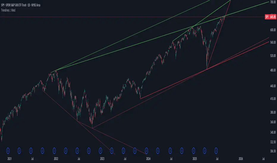
Algo + Trendlines :: Medium PeriodThis indicator helps me to avoid overlooking Trendlines / Algolines. So far it doesn't search explicitly for Algolines (I don't consider volume at all), but it's definitely now already not horribly bad.
These are meant to be used on logarithmic charts btw! The lines would be displayed wrong on linear charts.
The biggest challenge is that there are some technical restrictions in TradingView, f. e. a script stops executing if a for-loop would take longer than 0.5 sec.
So in order to circumvent this and still be able to consider as many candles from the past as possible, I've created multiple versions for different purposes that I use like this:
Algo + Trendlines :: Medium Period : This script looks for "temporary highs / lows" (meaning the bar before and after has lower highs / lows) on the daily chart, connects them and shows the 5 ones that are the closest to the current price (=most relevant). This one is good to find trendlines more thoroughly, but only up to 4 years ago.
Algo + Trendlines :: Long Period : This version looks instead at the weekly charts for "temporary highs / lows" and finds out which days caused these highs / lows and connects them, Taking data from the weekly chart means fewer data points to check whether a trendline is broken, which allows to detect trendlines from up to 12 years ago! Therefore it misses some trendlines. Personally I prefer this one with "Only Confirmed" set to true to really show only the most relevant lines. This means at least 3 candle highs / lows touched the line. These are more likely stronger resistance / support lines compared to those that have been touched only twice.
Very important: sometimes you might see dotted lines that suddenly stop after a few months (after 100 bars to be precise). This indicates you need to zoom further out for TradingView to be able to load the full line. Unfortunately TradingView doesn't render lines if the starting point was too long ago, so this is my workaround. This is also the script's biggest advantage: showing you lines that you might have missed otherwise since the starting bars were outside of the screen, and required you to scroll f. e back to 2015..
One more thing to know:
Weak colored line = only 2 "collision" points with candle highs/lows (= not confirmed)
Usual colored line = 3+ "collision" points (= confirmed)
Make sure to move this indicator above the ticker in the Object Tree, so that it is drawn on top of the ticker's candles!
More infos: www.reddit.com
Algo + Trendlines :: Long PeriodThis indicator helps me to avoid overlooking Trendlines / Algolines. So far it doesn't search explicitly for Algolines (I don't consider volume at all), but it's definitely now already not horribly bad.
These are meant to be used on logarithmic charts btw! The lines would be displayed wrong on linear charts.
The biggest challenge is that there are some technical restrictions in TradingView, f. e. a script stops executing if a for-loop would take longer than 0.5 sec.
So in order to circumvent this and still be able to consider as many candles from the past as possible, I've created multiple versions for different purposes that I use like this:
Algo + Trendlines :: Medium Period : This script looks for "temporary highs / lows" (meaning the bar before and after has lower highs / lows) on the daily chart, connects them and shows the 5 ones that are the closest to the current price (=most relevant). This one is good to find trendlines more thoroughly, but only up to 4 years ago.
Algo + Trendlines :: Long Period : This version looks instead at the weekly charts for "temporary highs / lows" and finds out which days caused these highs / lows and connects them, Taking data from the weekly chart means fewer data points to check whether a trendline is broken, which allows to detect trendlines from up to 12 years ago! Therefore it misses some trendlines. Personally I prefer this one with "Only Confirmed" set to true to really show only the most relevant lines. This means at least 3 candle highs / lows touched the line. These are more likely stronger resistance / support lines compared to those that have been touched only twice.
Very important: sometimes you might see dotted lines that suddenly stop after a few months (after 100 bars to be precise). This indicates you need to zoom further out for TradingView to be able to load the full line. Unfortunately TradingView doesn't render lines if the starting point was too long ago, so this is my workaround. This is also the script's biggest advantage: showing you lines that you might have missed otherwise since the starting bars were outside of the screen, and required you to scroll f. e back to 2015..
One more thing to know:
Weak colored line = only 2 "collision" points with candle highs/lows (= not confirmed)
Usual colored line = 3+ "collision" points (= confirmed)
Make sure to move this indicator above the ticker in the Object Tree, so that it is drawn on top of the ticker's candles!
More infos: www.reddit.com

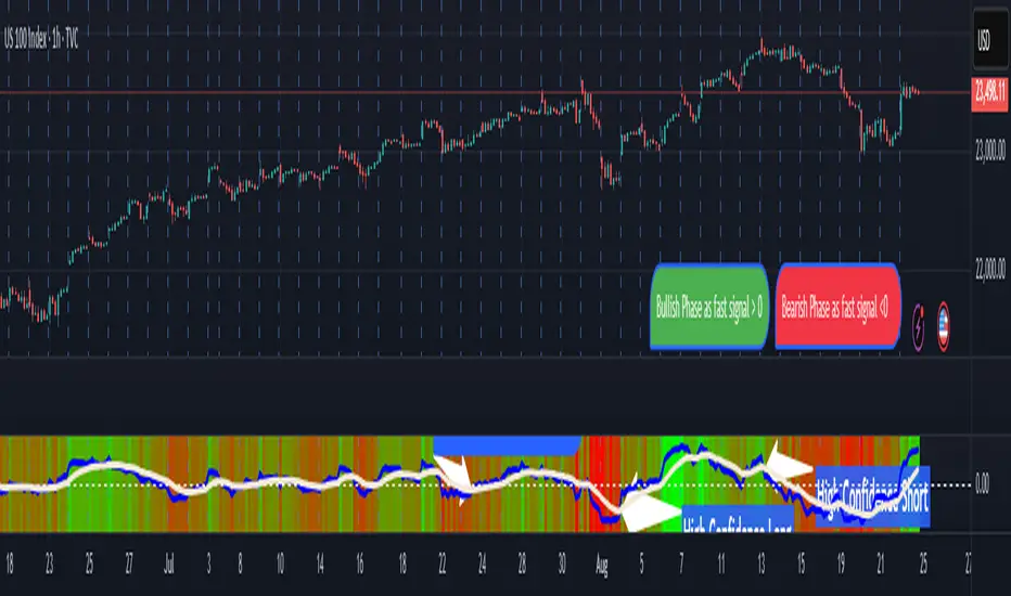
Pasrsifal.RegressionTrendStateSummary
The Parsifal.Regression.Trend.State Indicator analyzes the leading coefficients of linear and quadratic regressions of price (against time). It also considers their first- and second-order changes. These features are aggregated into a Trend-State background, shown as a gradient color. In addition, the indicator generates fast and slow signals that can be used as potential entry- or exit triggers.
This tool is designed for advanced trend-following strategies, leveraging information from multiple trendline features.
Background
Trendlines provide insight into the state of a trend or the “trendiness” of a price process. While moving averages or pivot-based lines can serve as envelopes and breakout levels, they are often too lagging for swing traders, who need tools that adapt more closely to price swings, ideally using trendlines, around which the price process swings continuously.
Regression lines address this by cutting directly through the data, making them a natural anchor for observing how price winds around a central trendline within a chosen lookback period.
Regression Trendlines
• Linear Regression:
o Minimizes distance to all closing values over the lookback period.
o The slope represents the short-term linear trend.
o The change of slope indicates trend acceleration or deceleration.
o Linear regression lags during phases of rapid market shifts.
• Quadratic Regression:
o Fits a second-degree polynomial to minimize deviation from closing prices.
o The convexity term (leading coefficient) reflects curvature:
Positive convexity → accelerating uptrend or fading downtrend.
Negative convexity → accelerating downtrend or fading uptrend.
o The change of convexity detects early shifts in momentum and often reacts faster than slope features.
Features Extracted
The indicator evaluates six features:
• Linear features: slope, first derivative of slope, second derivative of slope.
• Quadratic features: convexity term, first derivative of the convexity term, second derivative of the convexity term.
• Linear features: capture broad, background trend behavior.
• Quadratic features: detect deviations, accelerations, and smaller-scale dynamics.
Quadratic terms generally react first to market changes, while linear terms provide stability and context.
Dynamics of Market Moves as seen by linear and quadratic regressions
• At the start of a rapid move:
The change of convexity reacts first, capturing the shift in dynamics before other features. The convexity term then follows, while linear slope features lag further behind. Because convexity measures deviation from linearity, it reflects accelerating momentum more effectively than slope.
• At the end of a rapid move:
Again, the change of convexity responds first to fading momentum, signaling the transition from above-linear to below-linear dynamics. Even while a strong trend persists, the change of convexity may flip sign early, offering a warning of weakening strength. The convexity term itself adjusts more slowly but may still turn before the price process does. Linear features lag the most, typically only flipping after price has already reversed, thereby smoothing out the rapid, more sensitive reactions of quadratic terms.
________________________________________
Parsifal Regression.Trend.State Method
1. Feature Mapping:
Each feature is mapped to a range between -1 and 1, preserving zero-crossings (critical for sign interpretation).
2. Aggregation:
A heuristic linear combination*) produces a background information value, visualized as a gradient color scale:
o Deep green → strong positive trend.
o Deep red → strong negative trend.
o Yellow → neutral or transitional states.
3. Signals:
o Fast signal (oscillator): ranges from -1 to 1, reflecting short-term trend state.
o Slow signal (smoothed): moving average of the fast signal.
o Their interactions (crossovers, zero-crossings) provide actionable trading triggers.
How to Use
The Trend-State background gradient provides intuitive visual feedback on the aggregated regression features (slope, convexity, and their changes). Because these features reflect not only current trend strength but also their acceleration or deceleration, the color transitions help anticipate evolving market states:
• Solid Green: All features near their highs. Indicates a strong, accelerating uptrend. May also reflect explosive or hyperbolic upside moves (including gaps).
• Fading Solid Green: A recently strong uptrend is losing momentum. Price may shift into a slower uptrend, consolidation, or even a reversal.
• Fading Green → Yellow: Often appears as a dirty yellow or a rapidly mixing pattern of green and red. Signals that the uptrend is weakening toward neutrality or beginning to turn negative.
• Yellow → Deepening Red: Two possible scenarios:
o Coming from a strong uptrend → suggests a sharp fade, though the trend may still technically be up.
o Coming from a weaker uptrend or sideways market → suggests the start of an accelerating downtrend.
• Solid Red: All features near their lows. Indicates a strong, accelerating downtrend. May also reflect crash-type conditions or downside gaps.
• Fading Solid Red: A recently strong downtrend is losing strength. Market may move into a slower decline, consolidation, or early reversal upward.
• Fading Red → Yellow : The downtrend is weakening toward neutral, with potential for a bullish shift.
• Yellow → Increasing Green: Two possible scenarios:
o Coming from a strong downtrend, it reflects a sharp fade of bearish momentum, though the market may still technically be trending down.
o Coming from a weaker downtrend or sideways movement, it suggests the start of an accelerating uptrend.
Note: Market evolution does not always follow this neat “color cycle.” It may jump between states, skip stages, or reverse abruptly depending on market conditions. This makes the background coloring particularly valuable as a contextual map of current and evolving price dynamics.
Signal Crossovers:
Although the fast signal is very similar (but not identical) to the background coloring, it provides a numerical representation indicating a bullish interpretation for rising values and bearish for falling.
o High-confidence entries:
Fast signal rising from < -0.7 and crossing above the slow signal → potential long entry.
Fast signal falling from > +0.7 and crossing below the slow signal → potential short entry.
o Low-confidence entries:
Crossovers near zero may still provide a valid trigger but may be noisy and should be confirmed with other signals.
o Zero-crossings:
Indicate broader state changes, useful for conservative positioning or option strategies. For confirmation of a Fast signal 0-crossing, wait for the Slow signal to cross as well.
________________________________________
*) Note on Aggregation
While the indicator currently uses a heuristic linear combination of features, alternatives such as Principal Component Analysis (PCA) could provide a more formal aggregation. However, while in the absence of matrix algebra, the required eigenvalue decomposition can be approximated, its computational expense does not justify the marginal higher insight in this case. The current heuristic approach offers a practical balance of clarity, speed, and accuracy.
Candle #40 Sentinel – A Simple Visual Marker for Chart ContextWhat it is:
Candle #40 Sentinel is a minimalistic visual aid that marks the candle from exactly 40 bars ago on your chart. It creates a clear reference point to help you assess whether your trendline is based on enough price history to be considered reliable.
What it does:
Draws a frame marker on the candle 40 bars before the current one.
Gives you an instant sense of how much historical data your trendline or setup is working with.
Helps prevent decisions based on short-term patterns with little statistical weight.
Why use it:
Context is key: Many trendlines look strong but are based on too few candles to be meaningful. This tool helps you visually gauge that.
Stay disciplined: Only act on setups with enough data behind them.
Save time: No need to count candles manually – the chart tells you instantly.
Who it's for:
Traders who use trendlines and want a quick way to assess data depth.
Anyone looking to bring more structure and discipline to visual chart analysis.
Note:
This tool does not generate signals, does not calculate trends, and uses no classic indicators. It simply draws a reference at the 40th candle back – giving you a visual anchor point to work with.
Candle #40 Sentinel – Let your setups breathe before you trust them.
Because trendlines drawn over 10 candles aren’t trendlines – they’re guesses.
