NQ 55 LEVELSlevels to top and bottom tick
These levels top and bottom tick a lot of the times, use your own confluences to make them work
Sentiment

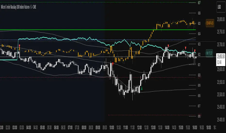
ES VIX on MNQ🧭 ES + VIX Overlay on MNQ
This indicator overlays the ES (S&P 500 futures) and VIX (Volatility Index) directly on the MNQ (Micro Nasdaq Futures) chart, allowing traders to visualize in real time the correlation, divergence, and volatility influence between the three instruments.
⸻
⚙️ How It Works
• The VIX is dynamically rescaled to the MNQ’s daily open, so its moves appear on the same price scale.
• The ES line is projected based on its percentage move relative to the session open (18:00 NY).
• Both are plotted in sync with MNQ to expose relative strength and divergence zones that often precede strong directional moves.
⸻
🧩 Inputs
• VIX Symbol: choose between VIX, CBOE:VIX, TVC:VIX
• Invert VIX Correlation: flips the VIX line for inverse-correlation setups
• VIX Step: controls how sensitively the VIX moves on the MNQ scale
• ES Symbol: defines the ES contract (e.g. ES1!)
• Show Signals: toggles on/off buy & sell markers
• Step (points): minimum distance between MNQ and VIX for a valid signal
• Block Signals: disables signals between 16:15 – 03:15 (illiquid hours)
⸻
💡 Signal Logic
The system tracks crossings between MNQ and the projected VIX line:
• Buy signal → when MNQ crosses above the VIX and expands upward by ≥ X points.
• Sell signal → when MNQ crosses below the VIX and expands downward by ≥ X points.
A time filter avoids noise during low-volume sessions.
⸻
📊 Visual Guide
• Cyan line = VIX on MNQ scale
• Orange line = ES on MNQ scale
• Labels on the right = current VIX / ES values
• BUY/SELL markers = potential volatility-based reversals
⸻
🚀 Practical Use
Perfect for traders who monitor:
• VIX–price divergence
• ES vs MNQ momentum confirmation
• Early volatility expansions before trend moves
⸻
💬 Core Idea:
“Volatility leads — price confirms.”
ES on MNQES on MNQ — ES percent-move overlay on the MNQ price scale.
Overview
This indicator projects the ES’s intraday percent change since session open onto the MNQ price scale. At the session start (18:00 chart time), it stores the ES open and the MNQ open, tracks ES’s percentage move from that anchor, and applies the same percent move to the MNQ open. The result is a single line that behaves like ES but is plotted in MNQ points—useful for spotting convergence/divergence, failed breaks, and mean-reversion setups between ES and MNQ.
How it works
1. Detects session open (18:00 on your chart).
2. Saves ES_open and MNQ_open.
3. Computes pct = (ES_close - ES_open) / ES_open.
4. Plots MNQ_open * (1 + pct) as the ES-on-MNQ line.
A label on the last bar shows the current ES value for quick reference.
Inputs
• ES Symbol: default ES1! (change if you use a different continuous).
• Line Color: color of the overlaid ES-on-MNQ line.
Works best on intraday timeframes and when your chart’s session aligns with ES.
Why it’s useful
• Highlights divergences (MNQ decoupling from ES baseline).
• Aids confirmation on pullbacks/breakouts when MNQ’s move disagrees with the ES-based projection.
• Helps risk control by flagging stretches likely to revert toward the ES-anchored path.
Notes & limitations
• This is a percent-rebasing overlay, not a hedge ratio, fair value, or spread model.
• Session/timezone settings matter; if your feed doesn’t print exactly at 18:00 on a higher timeframe, use a smaller TF or adjust session settings.
• Minor differences between ES (full) and MNQ (micro) and data latency can create small offsets.
Disclaimer
For educational use only. Not financial advice. Use proper risk management.
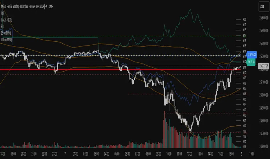
VIX on MNQVIX on MNQ — VIX percent-move overlay on the MNQ price scale (daily-open anchor, optional inversion)
Overview
This indicator projects the VIX’s intraday percent change from the daily open onto the MNQ price scale. It takes today’s open for both VIX and MNQ, measures the VIX’s percentage move since that open, optionally inverts it (given the typical inverse relationship), and applies a scale factor to fit that move onto MNQ’s price axis. The result is a single line that reflects VIX dynamics but is plotted in MNQ points—great for reading risk-on/risk-off tone, spotting divergences, and timing mean-reversion around volatility spikes.
How it works
• Fetches VIX close on your chart timeframe and today’s open for VIX and MNQ.
• Computes pct = (VIX_close − VIX_open) / VIX_open.
• Optionally multiplies by −1 (invert) and then by a Scale Factor to compress amplitude.
• Plots MNQ_open * (1 + pct * (invert? −1 : 1) * scaleFactor) as the VIX-on-MNQ line.
• Adds a last-bar label with the current VIX value and a small info panel (VIX, % change, scaled level).
Inputs
• VIX Symbol: VIX, CBOE:VIX, or TVC:VIX (pick the one that matches your data feed).
• VIX Line Color: color of the overlay line.
• Invert VIX: flip the sign to reflect inverse correlation with MNQ.
• Scale Factor (default 0.05): tune how much of the VIX move is mapped onto MNQ points.
Why it’s useful
• Surfaces volatility-led divergences: when MNQ’s path disagrees with VIX’s risk signal.
• Helps confirm/fade breakouts and pullbacks during volatility expansions/compressions.
• Provides a quick, visual “volatility baseline” directly on the MNQ chart without juggling two panes.
Notes & limitations
• This is a percent-rebased overlay, not a hedge ratio, fair value, or spread model.
• It anchors to the current day’s open; session/timezone settings and your VIX symbol choice (CBOE:VIX vs TVC:VIX) can affect exact prints.
• The scale factor is intentionally manual—adjust until the overlay’s swings are visually informative for your setup.
Disclaimer
For educational use only. Not financial advice. Always manage risk.

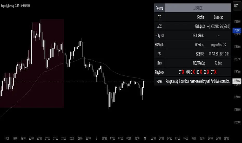
Reddington Regime Panel + PlaybookReddington Regime Panel + Playbook
On-chart market regime panel and strategy playbook for use with ReddingtonBotAdaptive Signal.
Shows the current regime (Trend / Correction / Range), key metrics (TF, ADX, +DI/−DI, BB Width, RSI), directional bias, and a Playbook with live recommendations for the ReddingtonBotAdaptive Signal strategies ST / MACD / BB / SC / CT:
✅ Use
⚠ Use with caution / extra condition
❌ Avoid
This script is a context filter. Pair it with ReddingtonBotAdaptive Signal to decide when its entries are most appropriate.
What it does
Classifies the market on your chosen timeframe into:
TREND UP / TREND DOWN / CORRECTION UP / CORRECTION DOWN / RANGE.
Guides strategy selection for ReddingtonBotAdaptive Signal via a compact on-chart table.
Multi-timeframe & multi-asset: works on any symbol and exchange; calculations are performed on the selected timeframe via request.security.
Clean UI: table only (top-right). No lines, no shapes, no price-scale impact.
How it works (logic)
Uses standard, transparent components:
EMA(20) / EMA(34) — directional structure and mean.
DMI/ADX(14) — trend strength and side dominance (+DI vs −DI).
Bollinger Band Width(20) — volatility compression/expansion.
ATR(14) — normalizes EMA “confluence/flatness”.
RSI(14) — “healthy pullback” bands in corrections.
Regime definitions (summary):
TREND UP/DOWN — ADX ≥ trend threshold, +DI/−DI confirm direction, EMA20/34 aligned, not in heavy squeeze.
CORRECTION UP/DOWN — price between EMA20 and EMA34 within a trend, ADX between range/trend thresholds, RSI in pullback band.
RANGE — ADX ≤ range threshold and/or EMAs “confluent” (flat) with low BB Width.
Playbook mapping for ReddingtonBotAdaptive Signal
The panel renders a line like: ST ✅ MACD ✅ BB ⚠ SC ✅ CT ❌
TREND UP / TREND DOWN
ST ✅, MACD ✅, SC ✅, BB ⚠, CT ❌
Trade with trend. For BB, prefer confirmed expansion (BB Width ↑ & ADX ↑).
CORRECTION UP / CORRECTION DOWN
ST ✅, SC ✅, MACD ⚠, BB ⚠, CT ❌
Wait for impulse resumption (ADX uptick / BBW expansion) after EMA20/VWAP retest.
RANGE
SC ✅, CT ⚠, ST ❌, MACD ❌, BB ❌/⚠
Mean-reversion/scalps inside the corridor; BB only if early expansion emerges.
✅/⚠/❌ are heuristics. Tune thresholds per asset/timeframe if needed.
Inputs (essentials)
Regime timeframe — empty = use chart TF.
ADX Trend/Range Thresholds — default 25 / 20.
EMA Fast/Slow — 20 / 34.
BB Width Length — 20.
ATR Length — 14.
EMA confluence vs ATR (×ATR) — flatness sensitivity (default 0.20).
BBW squeeze factor (vs BBW SMA) — compression sensitivity (default 0.90).
Correction RSI bands — pullback zones for up/down trends.
Show Playbook — toggle recommendations row.
How to use with ReddingtonBotAdaptive Signal
Filter first, then act: take Adaptive entries only when the Playbook shows ✅ for that strategy in the current regime.
Confirm at bar close on the regime timeframe to avoid MTF “in-bar” fluctuations.
Best practice:
Trading TF: 5–15m
Regime filter TF: 15m–1h
Raise ADX Trend to 28–30 on noisy assets; set BBW squeeze to 1.0 on volatile alts.
Notes & limitations
This is an analytical tool, not an entry/exit system.
No alerts by design (panel only). You can add alerts in your entry script.
MTF values update until the higher-TF bar closes; for strict discipline, use confirmed bars.
Disclaimer
This script is for educational purposes only and is not financial advice. Trading involves risk, including the loss of capital. Past performance does not guarantee future results. By using this script, you acknowledge that you are solely responsible for your trading decisions.
Magnificent 7 Basket This indicator is engineered for traders focused specifically on the seven most influential technology stocks (At the time of writing). It moves beyond single-asset analysis by establishing a sophisticated multi-factor validation system. Its primary mission is to filter out the noise and transient volatility of the local chart you are observing by determining whether the price action is fundamentally aligned with the coordinated capital flow driving Market Leadership (the Magnificent 7) and Global Risk Appetite (the U.S. Dollar Index, DXY).
The indicator achieves this by integrating three distinct data streams—local momentum, Mag 7 synchronized flow, and DXY context—into one final, powerful metric: the Self-Confirming Line (the Combined Plot). This line is a statistically refined score that provides the ultimate signal. It tells you, with high conviction, if the local move you are observing is merely an isolated event or is genuinely supported by coordinated capital deployment across the most influential assets in the market: Apple (AAPL), Microsoft (MSFT), Alphabet (GOOGL), Amazon (AMZN), Nvidia (NVDA), Tesla (TSLA), and Meta Platforms (META). This validation is crucial because trades that lack systemic backing are often high-risk, low-reward propositions.
Part I: The Alignment Philosophy – Systemic Context in Modern Markets
1. Market Leadership: The Magnificent 7 Index as a Capital Flow Barometer
The Mag 7 basket is not simply an aggregate of large stocks; it is the thermometer of risk appetite for the highest-value technology companies. Their collective momentum serves as a real-time proxy for the conviction of institutional capital managers.
The Necessity of Validation: When one of the seven stocks flashes a buy signal, the movement must be checked against the collective health of the Mag 7. If one stock is rising while the basket is stagnating or declining, the local move is likely based on short-term news or a temporary enthusiasm spike. Such moves often lack the institutional commitment required for sustained follow-through.
High-Conviction Bullish Confirmation: Imagine one of the seven stocks is completing a bullish pattern breakout. If the indicator confirms that the Mag 7 basket is simultaneously exceeding its adaptive volatility threshold (M7s signal), it signifies a coordinated "risk-on" movement. This confirms that the market leaders are validating the sentiment on your chart, greatly increasing the probability that the breakout will continue. The Self-Confirming Line will reflect this powerful alignment by spiking higher than the local Raw Line.
Contradiction and Caution (Bearish Warning): Conversely, if one of the seven stocks shows a deep, alarming pullback, but the Mag 7 basket is holding firm or showing synchronized positive inertia, the indicator issues a warning. The local pullback is likely a shallow, temporary correction that will quickly be bought up by liquidity flowing among the leaders. By identifying this contradiction, the Self-Confirming Line warns against premature bearish entries that are swimming against the overwhelming systemic current.
2. Global Risk Appetite: The DXY as the Inverse Barometer
The DXY (U.S. Dollar Index) measures the value of the dollar relative to a basket of six major foreign currencies. Because the Dollar is the world's primary reserve currency and a dominant component of global liquidity, its strength or weakness profoundly impacts risk assets, particularly the globally operating Magnificent 7 technology companies.
DXY Strength (The Headwind): A rising DXY signals a tightening of global liquidity, a shift toward safer assets, or the repatriation of capital. For U.S.-based technology giants with substantial international revenue, a strong DXY acts as a systemic Headwind. This structural drag can suppress equity prices even if local earnings news is good. The indicator uses this relationship to penalize the final sentiment score, cautioning you to reduce leverage or size.
DXY Weakness (The Tailwind): A falling DXY suggests greater risk tolerance and capital moving out of safe havens. This creates a powerful systemic Tailwind for the technology sector. The indicator magnifies the conviction score when the local price movement is aligned with this liquidity flow, validating the strength of the bullish move.
Part II: Core Mechanics and Calculation Detail – The Engine Room
The indicator is built upon a layered system of filters and adaptive calculations to produce a reliable, filtered signal.
1. The Basket Calculation and The Adaptive Threshold
The Mag 7 basket's external validation score is generated through a rigorous, multi-step calculation. This process ensures the signal is based on the aggregate quality of momentum, not just raw price movement.
A. Calculating the Basket Total Score (BTS)
Individual Component Fetch: The script first makes seven distinct request.security calls to simultaneously fetch the price data for each of the seven Magnificent 7 stocks, ensuring they are all synchronized to the current bar's close time.
Individual Quality Scoring: For each of the seven stocks, the system calculates a proprietary Momentum Quality Score. This score is based on the stock’s closing strength, its raw Moving Average divergence, and most importantly, its current RSI Strike Batch (detailed below). This step ensures poor-quality moves (e.g., short-lived, high-volume spikes that immediately reverse) do not contribute meaningfully to the basket’s total conviction.
Aggregation: The seven Individual Quality Scores are summed up to create the Basket Total Score (BTS). This BTS represents the instantaneous, aggregated momentum quality of the entire market leadership group.
Standard Deviation Context: The script then calculates the historical standard deviation (volatility) of the BTS over the user-defined Basket Adaptive Lookback. This provides the essential context: How significant is the current BTS movement relative to recent systemic volatility?
B. The M7 Labels (Statistical Significance + Quality Filter)
The M7 confirmation labels (M7s, M7m, M7w) that appear on the price bars are generated only when two conditions are met, acting as a two-factor authentication system for systemic strength: on the left of the labels is a number representing how many of the 7 stocks reached RSI on the viewable timeframe. These labels appear in blue below for buying and orange above in selling pressure.
Statistical Significance (Standard Deviation Check): The current Basket Total Score (BTS) must exceed its historical standard deviation by a defined multiple:
M7w (Weak/Initial): BTS > 1.0 Standard Deviation
M7m (Medium/Confirmation): BTS > 1.5 Standard Deviations
M7s (Strong/High Conviction): BTS > 2.0 Standard Deviations
RSI Quality Check (Accumulation Filter): The collective RSI Strike Batch Count (explained below) for the Mag 7 must indicate a measured accumulation rather than an exhaustion spike. The M7 label will only print on the bar if the combined RSI quality of the basket is within the desirable RSI Strike Batches (55-75). If the BTS is statistically significant (Condition 1) but the underlying RSI profile of the components suggests exhaustion (RSI > 80), the M7 label is suppressed, filtering out false-breakout signals.
The M7 label is thus a powerful confirmation: the move is statistically massive and structurally healthy.
2. RSI Strike Batches and Identifying "Hot Periods"
The core of the "Accumulation Filter" relies on proprietary RSI target ranges, called RSI Strike Batches, designed to find measured, persistent institutional flow as opposed to retail-driven extremes.
A. Defining RSI Strike Batches
Instead of treating the Relative Strength Index (RSI) as a binary overbought/oversold signal, the system uses distinct bands that correlate with different phases of large capital deployment:
RSI Range (Batch)
Interpretation
Momentum Quality
55-65
Early Accumulation/Distribution
The first phase of clear directional bias. Large capital actively establishing positions. This is the highest momentum zone.
65-75
Sustained Trend/Mid-Cap Deployment
Strong follow-through. Trend continuation is confirmed, but liquidity is starting to thin.
75-80
Late-Stage Euphoria/Liquidity Trap
Price is nearing exhaustion. The risk of quick reversal is high. This range penalizes the score.
B. The "Hot Period" Confirmation
A Hot Period is identified when a significant number of Mag 7 components are simultaneously operating within the highest quality momentum zones (RSI 55-65 or 65-75).
Detection: The indicator counts how many of the seven stocks fall into these bullish or bearish strike batches on the current bar.
Conviction Magnification: When, for example, four or more of the Mag 7 stocks are simultaneously in the RSI 55-65 Bullish Strike Batch, it signals synchronized, coordinated capital deployment across the sector. This is a true "Hot Period" of high institutional conviction.
Signal Output: When a Hot Period is detected, the external validation score (which feeds into the Self-Confirming Line) is magnified significantly. This prevents the system from generating high-conviction signals during periods when all the leaders are simply exhibiting exhausted overbought (RSI > 80) conditions, ensuring trades are entered during the measured, sustained phase of accumulation.
Part III: Interpreting the Sentiment Plot Lines – Alignment and Divergence
The indicator plots two distinct lines at the bottom of the chart. Mastering the interplay between these two plots is the key to trading with the indicator.
Sentiment Line
Data Source
Interpretation Focus
Key Use Case
AAI Sentiment Index (The Raw Line)
Internal to the current chart only.
Local Momentum. Measures the asset's own strength, volatility, and internal MA crosses.
Identifying early, pre-validated trade setups, confirming local divergences (e.g., price higher, Raw Line lower).
Self-Confirming Line (The Combined Plot)
Raw Line + Mag 7 Score + DXY Weight.
Systemic Alignment. The final, filtered score validated by external market leadership and global risk context.
The primary signal for trade entry/exit confirmation, position sizing, and determining true conviction.
A. High-Conviction Alignment (The Trade Confirmation)
High-conviction trades occur when the two lines move in synchronized fashion, with the Self-Confirming Line leading or sustaining a level significantly higher than the Raw Line.
Example: High-Conviction Long Entry:
Raw Line Fires: Your local chart begins to move up, and the Raw Line (local momentum) breaks above the centerline. This is your initial setup alert.
Self-Confirming Line Confirms: The Self-Confirming Line immediately follows, not just crossing the centerline, but often exceeding the Raw Line's initial height. This powerful action confirms the Mag 7 leaders are providing a strong synchronized push (M7s signal likely fired, confirming a Hot Period).
Action: This is the ideal moment for a confirmed trade entry, allowing for larger position sizing and a higher expectation of follow-through.
B. Cautionary Divergence (The Risk Filter)
Divergence occurs when the two lines fail to agree, signaling a disconnect between the local price action and the systemic market support.
Example: Bearish Trap Divergence (A Long Warning):
Raw Line Fires Strongly: Your local asset is rocketing up, and the Raw Line spikes to an extreme high (e.g., +80).
Self-Confirming Line Lags: Despite the local spike, the Self-Confirming Line remains flat, moves only slightly, or—critically—starts declining.
Interpretation: This is a severe warning. The local spike is likely a short-term liquidity event. The other six Mag 7 leaders are not confirming this move, or the DXY is suddenly acting as a Headwind. The system is telling you: "The market is not buying this move."
Action: Avoid entering long, or significantly reduce position size. This pattern often precedes a sharp reversal or a failed breakout.
Part IV: Deep Dive into Setting Customization – Adapting to Your Asset
1. AAI Sentiment Weight (% - Balance Slider)
This controls the balance of importance between the local chart's internal momentum and the external indices' input.
Focusing on Individual Stock Volatility (TSLA, NVDA):
Goal: Focus primarily on the local chart's own volatile swings, using the external data as a soft, contextual filter.
Action: Increase the AAI Sentiment Weight (e.g., 70-80%). This forces the Self-Confirming Line to closely track the Raw AAI Line.
Trading Stable, High-Cap Leaders (AAPL, MSFT):
Goal: Demand strong external validation for every signal. Ensure that movement is overwhelmingly validated by the other Mag 7 members.
Action: Decrease the AAI Sentiment Weight (e.g., 20-30%). The Self-Confirming Line becomes heavily influenced by the Mag 7 Basket Momentum Score.
2. Individual Stock MA Weight (% - Basket Importance)
This setting determines the proportional importance of the Mag 7 basket score within the total external component of the calculation.
High Weight: When trading one of the Mag 7 stocks that is highly sensitive to the overall basket flow. This ensures signals fire with high conviction only when the leadership stocks are aligned.
Lower Weight: When focusing on stock-specific news events that temporarily decouple one stock from the other six. The Mag 7 momentum will still be measured, but its influence on the Self-Confirming Line will be significantly reduced, allowing the local momentum to be more dominant in the final validated score.
Part V: Execution and Auxiliary Tools
1. The Dynamic Strike Price Line
This line is calculated as a function of the current Self-Confirming Line's magnitude and the user-defined Target Price Multiplier (%). It does not represent a static resistance level, but rather a dynamic projection of where price should travel given the current level of confirmed, systemic momentum.
2. Adaptive Brightness Range Lines (Dynamic Support/Resistance)
These dynamic support and resistance zones are derived from recent high-volume pivots and short-term volatility envelopes. Their key innovation is a visual cue tied to volatility: the closer the price approaches a range boundary, the brighter the line becomes. This provides an immediate visual warning that the asset is entering a high-probability reversal, consolidation, or test zone.
3. PoS Trend Projection (Probability of Success Filter)
This is a forward-looking trend line that is governed by the internal Probability of Success (PoS) filter. The line uses the validated sentiment to project the likely path of price over the next few bars. The line disappears when conditions are uncertain or contradictory.
Part VI: Screen Clarity and Toggling Features for Focused Analysis
The indicator provides granular visibility controls to ensure the raw price action is never obscured. You can toggle off auxiliary features to allow the trader to focus solely on the primary instrument and the final, most crucial signal: the Self-Confirming Line.
Achieving a Minimalist View by Toggling Features Off
For a clean chart, you can disable the following:
Show Adaptive Brightness Range Lines: Removes the dynamic support/resistance lines.
Show Strike Price Line: Removes the dynamic take-profit/invalidation line.
Show PoS Trend Projection: Removes the forward-looking trend line.
Show M7 Confirmation Labels: Removes the M7s, M7m, and M7w labels that appear directly above or below the price candles. By toggling these off, you rely purely on the magnitude of the Self-Confirming Line in the bottom pane for your M7 confirmation.
This leaves you with a focused view of the price action and the Self-Confirming Line, which is the final, validated, systemic conviction score.
This is a request for access script.
Always trade with risk control, do your own research, exercise market awareness.

Cumulative Delta_Effort vs Result_immy**Cumulative Delta Oscillator\_effort**
This script creates a “Cumulative Delta Effort vs Result” oscillator, a custom indicator designed to measure the balance between buying and selling pressure (Effort) versus actual price movement (Result).
**How It Works**
Delta Volume: Measures aggressive buying vs selling per candle.
Cumulative Delta: Tracks net buying/selling pressure over time.
Effort vs Result: Compares volume delta (effort) to price movement (result).
Oscillator: Highlights divergence between effort and result, useful for spotting absorption (high effort, low result) and exhaustion (low effort, high result).
Histogram: Visual cue for accumulation/distribution zones.
----------------------------
This indicator combines volume delta (effort) and price movement (result), so it tells you how efficiently volume is moving price — a concept sometimes called effort vs. result analysis in Wyckoff or volume–spread analysis (VSA).
🔍 Concept Summary
Effort (delta volume) = how much buying/selling pressure is there (volume side).
Result (price change) = how much that effort moves price (price side).
Oscillator (Effort − Result) = how much “extra” effort is not producing movement — often showing absorption or exhaustion.
📈 How to Interpret the Signals
1\. Oscillator above Signal line → Bullish Momentum
When osc > signal, histogram turns green.
Means buying effort is stronger than price reaction — often early sign of accumulation or rising demand.
This can signal:
Possible bullish continuation if confirmed by rising prices.
Or early absorption if prices aren’t yet breaking out (smart money absorbing supply).
✅ Bullish Entry Signal:
When the oscillator crosses above the signal line (green cross) and price is near support or consolidating → potential long setup.
2\. Oscillator below Signal line → Bearish Momentum
When osc < signal, histogram turns red.
Selling effort dominates; can mean increasing supply or price exhaustion.
This often appears before:
Bearish continuation (trend strengthening)
Or upthrust/exhaustion (price rising on weak volume)
❌ Bearish Entry Signal:
When the oscillator crosses below the signal line (red cross), especially if near resistance → potential short setup.
3\. Crossovers
The alert is triggered when: ta.cross(osc, signal)
That means:
Bullish crossover: oscillator line crosses above signal → potential buy momentum shift.
Bearish crossover: oscillator line crosses below signal → potential sell momentum shift.
These work like MACD crossovers, but volume-adjusted.
4\. Zero Line
The zero line is the neutral point.
When osc crosses above zero, overall buying effort exceeds price change — market gaining strength.
When osc crosses below zero, selling pressure increases — market weakening.
→ Combining signal line crosses with zero-line crosses gives stronger confirmation.
5\. Histogram Analysis (Absorption \& Exhaustion)**
Tall green bars: rising momentum (buyers dominate)
Tall red bars: falling momentum (sellers dominate)
Shrinking bars: momentum fading — possible reversal zone.
If volume increases but price stalls, oscillator may spike while price stays flat — absorption (big players taking the opposite side).
If price surges but oscillator weakens, exhaustion — move running out of volume support.
------------------------------------------------------------------------
🧠 Practical Strategy Example
Situation What It Might Mean Possible Action
Oscillator crosses above signal near support Buyer effort increasing, price may rise Go long / close shorts
Oscillator crosses below signal near resistance Seller effort rising, price may drop Go short / take profits
Oscillator high but price flat Absorption (big players absorbing supply) Wait for breakout confirmation
Oscillator low but price flat Absorption (demand absorbing supply) Look for bullish reversal
Oscillator diverges from price Volume–price divergence Early warning of reversal
⚙️ Best Practice
Works best on volume-sensitive assets (futures, crypto, forex tick data).
**Combine with:**
Price structure (support/resistance)
Volume profile / delta footprint
Candle confirmation
We’ll go through both bullish and bearish examples so you can see how to trade with it in real market context.
---------------------------------------------------------------------------------
🟩 Example 1 — Bullish Setup (Long Trade)
Step 1. Context: Identify Potential Support Zone
Before relying on any indicator, find support using:
Previous swing low
Demand zone
VWAP / volume profile node
Trendline or moving average
👉 You’re looking for a place where buyers might step in.
Step 2. Wait for Oscillator Signal
Watch the oscillator panel:
The oscillator (green line) has been below the signal line (orange) → bearish phase.
Then it crosses above the signal line and the histogram turns green.
This means:
➡️ Buying “effort” is increasing faster than price reaction — momentum shift upward.
Step 3. Confirm with Price
On your chart:
Candle closes above short-term resistance or above previous candle high
Ideally volume confirms (green candle with increasing volume)
✅ Bullish Entry Condition
osc crosses above signal
price closes above local resistance
Step 4. Entry \& Stop
Entry: Next candle open after confirmation cross
Stop-loss: Below recent swing low or support zone
Take profit:
2R or 3R target
or near next resistance level
🧠 Optional filter: Only take the trade if oscillator is rising from below zero (coming out of weakness).
Step 5. Manage Trade
If oscillator flattens or starts curling down → tighten stop
If it crosses below the signal again → consider exit
Example Interpretation:
Oscillator crosses above signal from -200 to +100, histogram turns green, price breaks a resistance line → strong bullish reversal → enter long.
🟥 Example 2 — Bearish Setup (Short Trade)
Step 1. Context: Find Resistance
Look for: Prior swing high
Supply zone
Major moving average
Trendline top
Step 2. Wait for Oscillator Cross Down
The oscillator (green) crosses below the signal line (orange).
Histogram turns red.
This means:
➡️ Selling effort is rising relative to price movement — bearish pressure.
Step 3. Confirm with Price
Price fails to make higher highs, or
Forms a bearish engulfing candle near resistance.
✅ Bearish Entry Condition
osc crosses below signal
price confirms with bearish candle
Step 4. Entry \& Stop
Entry: On next candle open
Stop-loss: Above resistance or recent swing high
Take profit: 2R or more or at next major support
Step 5. Exit on Opposite Signal
If oscillator crosses back above signal → momentum shift → exit short.
⚙️ Pro Tips
Tip Why It Matters
Use on 15m–4H+ charts More reliable delta signal
Combine with volume or OBV Confirms “effort” strength
Watch divergences Early reversals
Align with higher timeframe trend Avoid countertrend traps
-------------------------------------------------------------------------------------------------
🧩 Quick Checklist
Step Condition Action
1 Identify zone (support/resistance) Mark area
2 Oscillator crossover Prepare order
3 Candle confirmation Enter
4 Stop-loss \& target Manage risk
5 Opposite cross Exit
Please follow and like if you appreciate my work. thank you.

Relative Strength vs Benchmark SPYRelative Strength vs Benchmark (SPY)
This indicator compares the performance of the charted symbol (stock or ETF) against a benchmark index — by default, SPY (S&P 500). It plots a Relative Strength (RS) ratio line (Symbol / SPY) and its EMA(50) to visualize when the asset is outperforming or underperforming the market.
Key Features
📈 RS Line (blue): Shows how the asset performs relative to SPY.
🟠 EMA(50): Smooths the RS trend to highlight sustained leadership.
🟩 Green background: Symbol is outperforming SPY (RS > EMA).
🟥 Red background: Symbol is underperforming SPY (RS < EMA).
🔔 Alerts: Automatic notifications when RS crosses above/below its EMA — signaling new leadership or weakness.
How to Use
Apply to any stock or ETF chart.
Keep benchmark = SPY, or switch to another index (e.g., QQQ, IWM, XLK).
Watch for RS crossovers and trends:
Rising RS → money flowing into the asset.
Falling RS → rotation away from the asset.
Perfect for sector rotation, ETF comparison, and momentum analysis workflows.
nOI + Funding + CVD • strategynOI + Funding + CVD Strategy
Overview
This strategy is designed for cryptocurrency trading on platforms like TradingView, focusing on perpetual futures markets. It combines three key indicators—Normalized Open Interest (nOI), Funding Rate, and Cumulative Volume Delta (CVD)—to generate buy and sell signals for long and short positions. The strategy aims to capitalize on market imbalances, such as overextended open interest, funding rate extremes, and volume deltas, which often signal potential reversals or continuations in trending markets.
The script supports pyramiding (up to 10 positions), uses percentage-based position sizing (default 10% of equity per trade), and allows customization of trade directions (longs and shorts can be enabled/disabled independently). It includes multiple signal systems for entries, various exit mechanisms (including stop-loss, take-profit, time-based exits, and conditional closes based on indicators), a Martingale add-on system for averaging positions during drawdowns, and handling of opposite signals (ignore, close, or reverse).
This strategy is not financial advice; backtest thoroughly and use at your own risk. It requires data sources for Open Interest (OI) and Funding Rates, which are fetched via TradingView's security functions (e.g., from Binance for funding premiums).
Key Indicators
1. Normalized Open Interest (nOI)
Group: Open Interest
Purpose: Measures the relative level of open interest over a lookback window to identify overbought (high OI) or oversold (low OI) conditions, which can indicate potential exhaustion in trends.
Calculation:
Fetches OI data (close) from the symbol's standard ticker (e.g., "{symbol}_OI").
Normalizes OI within a user-defined window (default: 500 bars) using min-max scaling: (OI - min_OI) / (max_OI - min_OI) * 100.
Upper threshold (default: 70%): Signals potential short opportunities when crossed from above.
Lower threshold (default: 30%): Signals potential long opportunities when crossed from below.
Visualization: Plotted as a line (teal above upper, red below lower, gray in between). Horizontal lines at upper, mid (50%), lower, and a separator at 102%.
Notes: Handles non-crypto symbols by adjusting timeframe to daily if intraday. Errors if no OI data available.
2. Funding Rate
Group: Funding Rate
Purpose: Tracks the average funding rate (premium index) to detect market sentiment extremes. Positive funding suggests bull bias (longs pay shorts), negative suggests bear bias.
Calculation:
Fetches premium index data from Binance (e.g., "binance:{base}usdt_premium").
Supports lower timeframe aggregation (default: enabled, using 1-min TF) for smoother data.
Averages open and close premiums, clamps values, and scales/shifts for plotting (base: 150, scale: 1000x).
Upper threshold (default: 1.0%): Overheat for shorts.
Lower threshold (default: 1.0%): Overcool for longs.
Ultra level (default: 1.8%): Extreme for additional short signals.
Smoothing: Uses inverse weighted moving average (IWMA) or lower-TF aggregation to reduce noise.
Visualization: Shifted plot (green positive, red negative) with filled areas. Horizontal lines for overheat, overcool, base (0%), and ultra.
Notes: Custom ticker option for non-standard symbols.
3. Cumulative Volume Delta (CVD)
Group: CVD (Cumulative Volume Delta)
Purpose: Measures net buying/selling pressure via volume delta, normalized to identify divergences or confirmations with price.
Calculation:
Delta: +volume if close > open, -volume if close < open.
Cumulative: Rolling cumsum over a window (default: 500 bars), smoothed with EMA (default: 20).
Normalized: Scaled by absolute max in window (-1 to 1 range).
Scaled/shifted for plotting (base: 300 or 0 if anchored, scale: 120x).
Upper threshold (default: 1.0%): Over for shorts.
Lower threshold (default: 1.0%): Under for longs.
Visualization: Shifted plot (aqua positive, purple negative) with filled areas. Horizontal lines for over, under, and separator (default: 252).
Filter Options (for Signal A):
Enable filter (default: false).
Require sign match (Long ≥0, Short ≤0).
Require extreme zones.
Require momentum (rising/falling over N bars, default: 3).
Signal Logics for Entries
Entries are triggered by buy/sell signals from multiple systems (A, B, C, D), filtered by direction toggles and entry conditions.
Signal System A: OI + Funding (with optional CVD filter)
Enabled: Default true.
Sell (Short): nOI > upper threshold, falling over N bars (default: 3), delta ≥ threshold (default: 3%), funding > overheat, and CVD filter OK.
Buy (Long): nOI < lower threshold, rising over N bars (default: 3), delta ≥ threshold (default: 3%), funding < overcool, and CVD filter OK.
Signal System B: Short - Funding Crossunder + Filters
Enabled: Default true.
Sell (Short): Funding crosses under overheat level, optional: CVD > over, nOI < upper.
Signal System C: Short - Ultra Funding
Enabled: Default false.
Sell (Short): Funding crosses ultra level (up or down, both default true).
Signal System D: Long - Funding Crossover + Filters
Enabled: Default true.
Buy (Long): Funding crosses over overcool level, optional: CVD < under, nOI > lower.
Combined: Sell if A/B/C active; Buy if A/D active.
Entry Filters
Cooldown: Optional pause between entries (default: false, 3 bars).
Max Entries: Limit pyramiding (default: true, 6 max).
Entries only if both filters pass and direction allowed.
Opposite Signal Handling
Mode: Ignore (default), Reverse (close and enter opposite), or Close (exit only).
Processed before regular entries.
Position Management
Martingale (3 Steps):
Enabled per step (default: all true).
Triggers add-ons at loss levels (defaults: 5%, 8%, 11%) by adding % to position (default: 100% each).
Resets on position close.
Break Even:
Enabled (default: true).
Activates at profit threshold (default: 5%), sets SL better by offset (default: 0.1%).
Exit Systems
Multiple exits checked in sequence.
Exit 1: SL/TP
Enabled: Separate for long/short (default: true).
SL: % from avg price (defaults: 1% long/short).
TP: % from avg price (defaults: 2% long/short).
Exit 2: Funding
Enabled: Separate for long (up) / short (down) (default: true).
Long Exit: Funding > upper exit threshold (default: 0.8%).
Short Exit: Funding < lower exit threshold (default: 0.8%).
Exit 3: nOI
Enabled: Separate for long (up) / short (down) (default: true).
Long Exit: nOI > upper exit (default: 85%).
Short Exit: nOI < lower exit (default: 15%).
Exit 4: Global SL
Enabled: Default true.
Exit: If position loss ≥ % (default: 7%).
Exit 5: Break Even (integrated in position block)
Exit 6: Time Limit
Enabled: Separate for long/short (default: true).
Exit: After N bars in trade (defaults: 30 each).
Timer updates on add-ons if enabled (default: true).
Visual Elements
Buy/Sell Labels: Small labels ("BUY"/"SELL") on bars with signals, limited to last 30.
All indicators plotted on a separate pane (overlay=false).
Usage Notes
Backtesting: Adjust parameters based on asset/timeframe. Test on historical data.
Data Requirements: Works best on crypto perps with OI and funding data.
Risk Management: Incorporates SL/TP and global SL; monitor drawdowns with Martingale.
Customization: All thresholds, enables, and scales are inputs for fine-tuning.
Version: Pine Script v6.
For questions or improvements, contact the author. Happy trading!

5-min Strat Strategy V2 (With Stop Loss)README: 5-min Strat Strategy V2 – $7,500 Stop Loss Version
✅ Description
This is a rules-based intraday trading strategy developed for use on futures contracts like MNQ (Micro Nasdaq) or MES (Micro S&P). It focuses on momentum-based breakout entries above pre-market highs, during regular trading hours, and uses EMAs to define trend alignment.
⚙️ Strategy Components
✅ Trade Type
Long-Only strategy
Entry and exit based on EMAs, price position, and time windows
✅ Time Frame
Built for 5-minute charts
✅ Symbols
Optimized for MNQ (Micro Nasdaq Futures)
Works on MES or other U.S. index futures with similar structure
📅 Time Windows
Pre-Market Hours (PMH/PML): 04:00 – 09:30 AM EST
Regular Trading Hours (RTH): 09:30 AM – 4:00 PM EST
Auto Exit Time: 4:59 PM EST (to comply with prop firm rules)
📌 Entry Conditions (Long)
48 EMA > 200 EMA (Bullish alignment)
Price > Locked Pre-Market High
Green Candle (close > open)
During RTH (9:30–16:00 EST)
Cooldown: Must wait 4 candles after last entry
Max Trades per Day: 3
💥 Exit Conditions
Primary Exit: Close below the 48 EMA
Max Loss Exit: Stop loss set to $7,500 per trade
EOD Exit: All positions are closed at 4:59 PM EST
💰 Risk Management
Contracts: 6 Micro contracts per trade
Stop Loss: Dynamic point-based SL calculated based on:
MNQ point value = $20/point per contract
30 contracts = $120/point
Max SL points = $7,500 / $120 = 62.5 points
📊 Key Variables for Logging
Parameter Value
Max Stop Loss $7,500
Position Size 30 Micro Contracts - ***Varies depending on account size***
Cooldown Bars 4 (20 min)
Max Daily Trades 3
Strategy Version V2 – $7.5K SL

Option Selling Indicator @mybullandbearThe Option Selling Indicator is designed to help traders identify high-probability buy and sell zones based on market momentum and trend conditions. It provides a simple yet powerful visual cue system to make trading decisions clear and intuitive.
🎯 How It Works:
When the background turns green and the price moves above the black trend line, it signals bullish strength — a good condition to go for BUY or sell PUT options.
When the background turns red and the price moves below the black trend line, it signals bearish strength — a good condition to go for SELL or sell CALL options.
⚙️ Key Features:
Clear color-coded background for instant trend visualization.
Dynamic black trend line acts as a support/resistance guide.
Simple setup suitable for both beginners and experienced option sellers.
Works effectively across multiple timeframes and instruments.
💡 Usage Tip:
Combine this indicator with volume or volatility filters for more accurate entries, and always confirm signals with your trading strategy and risk management rules.

RSI Heatmap (≤35 Highlight)Highlights when RSI is less than or equal to 35 which can signal a potential reversal soon.

Risk-On / Risk-Off Toolkit [SB1] (NQ, RTY, YM) VIXDescription:
The Risk-On / Risk-Off Toolkit is a professional-grade market context indicator designed to help traders quickly identify broad market sentiment shifts and gauge risk appetite. By combining major US equity futures (NQ, RTY, YM) with VIX dynamics, this toolkit provides clear visual signals of “Risk-On” (bullish, lower volatility environment) and “Risk-Off” (bearish, higher volatility environment) conditions. This is ideal for traders using discretionary analysis, swing strategies, intraday scalping, or portfolio positioning decisions.
My Personal Thoughts: Utilize all 3 charts to Identify which is Leading and who is lagging between the 3 (NQ, RTY, YM) Key Features:
Futures Trend Analysis:
Monitors the Nasdaq 100 (NQ), Russell 2000 (RTY), and Dow Jones (YM) futures in real-time.
Determines bullish/bearish bias based on each futures contract’s current close relative to its open.
Identifies when all three indices are moving in sync, highlighting broad market directional alignment.
VIX Confirmation:
Integrates the CBOE Volatility Index (VIX) to gauge market risk sentiment.
Confirms Risk-On conditions when VIX is falling while all three futures are bullish.
Confirms Risk-Off conditions when VIX is rising while all three futures are bearish.
Optional background shading visually highlights Risk-On (green) and Risk-Off (red) conditions for quick, intuitive assessment.
Strong Body Candle Signals:
Detects high conviction candlestick moves where the body represents at least 85% of the total range.
Confirms whether the candle closes near its extreme (top for bullish, bottom for bearish) within 15% of the range.
Plots arrows for strong bullish or bearish candles:
Green triangle-up for bullish strong candles
Red triangle-down for bearish strong candles
Provides a visual cue for intraday or swing traders to confirm trend momentum without cluttering the chart with labels.
Alert System:
Alerts can be set for Risk-On alignment: all monitored futures are bullish and VIX is falling.
Alerts can also be set for Risk-Off alignment: all monitored futures are bearish and VIX is rising.
Ensures traders never miss shifts in broad market sentiment, suitable for both intraday and end-of-day review.
Table Summary:
Provides a top-right summary table of each monitored market and VIX:
Displays Index Name and Current Bias (Bullish/Bearish/Neutral).
Highlights bullish conditions in green and bearish conditions in red.
Includes VIX status as “↓ Falling”, “↑ Rising”, or “Flat”, providing a quick visual reference of volatility trends.
Customizable Visuals:
Control the visibility of strong candle arrows.
Maintains dynamic bar coloring for strong candle moves (green for bullish, red for bearish).
How to Use the Risk-On / Risk-Off Toolkit:
Trend Confirmation: Use the alignment of NQ, RTY, and YM to determine whether the overall market environment is bullish or bearish.
Risk Sentiment Filter: Use VIX confirmation to identify if traders are in a risk-on or risk-off sentiment. This is especially useful for adjusting position sizing, hedging, or timing entries.
Momentum Validation: Strong candle arrows indicate decisive moves, providing additional confirmation for trade entries, breakouts, or trend continuation.
Alerts & Visual Cues: Set alerts to be notified whenever Risk-On or Risk-Off conditions are met, helping you act in real-time.
Quick Reference: Use the summary table for a bird’s-eye view of market alignment across indices and VIX, avoiding the need to track multiple charts simultaneously.
Why This Indicator is Unique:
Combines three major US indices with volatility confirmation to identify true macro market sentiment shifts.
Provides both visual and alert-based signals for actionable insights.
The inclusion of strong candle arrows gives intraday and swing traders a clear, low-latency cue for high-probability moves.
Perfect for multi-timeframe analysis and adaptable to both short-term and long-term strategies.
Indicator Name Justification:
The name “Risk-On / Risk-Off Toolkit ” accurately reflects the core function: identifying broad market risk appetite and sentiment alignment across key indices with volatility confirmation. It communicates instantly that the tool helps traders understand when the market is favoring risk-taking (Risk-On) versus risk-aversion (Risk-Off).

Price Action Scanner (v1)Price Action Scanner 1st addition, This indicator is begging developed using many combination and basing signal in price action and market volume. After years of trading I'm trying to make something simple to trade SPY, IWM and QQQ.

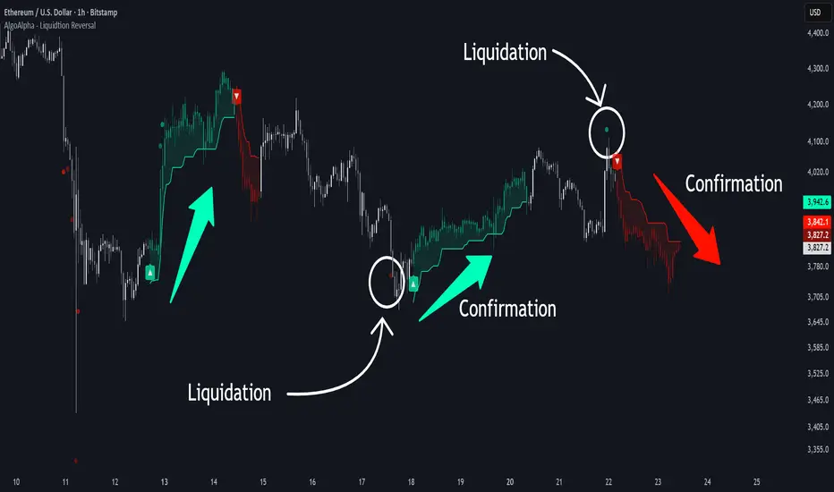
Liquidation Reversal Signals [AlgoAlpha]🟠 OVERVIEW
This tool detects potential liquidation-driven reversals by combining z-score analysis of up/down volume with the classic Supertrend. It watches for abnormal surges in directional volume (on a lower timeframe) and links them to trend flips on the main chart. When both align within a short window, it flags a probable reversal caused by forced liquidations. The goal is to help traders identify exhaustion points where aggressive liquidation moves may mark the end of a trend leg.
🟠 CONCEPTS
The logic revolves around Z-score normalization of up and down volume to locate statistical extremes. When up-volume z-scores exceed a threshold during a bearish Supertrend, it implies trapped shorts being squeezed; the opposite applies for long liquidations. The script tracks these liquidation spikes and monitors whether a Supertrend regime change follows soon after. If confirmed within the allowed timeout, a colored signal marks the event.
In essence:
Z-score outliers = potential forced liquidations.
Supertrend = structural regime context.
Combined = statistically confirmed reversal signals, not random flips.
This pairing reduces false positives by ensuring that both volatility structure and order-flow extremes agree before flagging a reversal.
🟠 FEATURES
Z-score detection for liquidation spikes with adjustable lookback and threshold.
Confirmation logic linking liquidations to Supertrend flips.
Alerts for liquidation spikes and confirmed reversal starts.
On-chart “No Volume” warning to avoid misreads on illiquid assets.
🟠 USAGE
Setup : Add the script to your main chart. Choose a lower timeframe (default 15m) to capture more granular liquidation flows. Adjust Z-Score Length to control how far back the script measures normal behavior and Threshold to decide what counts as extreme. Keep Timeout Bars low (e.g. 20–50) for faster reversals, or higher for slower markets.
Read the chart :
• Circles appear below bars when long liquidations occur; above bars for short liquidations.
• A Supertrend flip with a recent liquidation spike will display an arrow and color shift.
• Fills between candles and trend lines show which side dominates: green for bullish reversal, red for bearish.
• Candle color fades based on the magnitude of liquidation pressure.
Settings that matter :
• Z-Score Length : Longer smooths noise but delays signal; shorter reacts faster.
• Z-Score Threshold : Higher means only extreme liquidations trigger; lower finds smaller squeezes.
• Timeout Bars : Defines how long after a liquidation the Supertrend flip remains valid.
• Lower Timeframe : Determines the precision of volume readings; too low may increase noise.
MTF RSI+EMA Trend Dashboard🧭 MTF RSI + EMA Trend Dashboard
📌 Overview
The MTF RSI + EMA Trend Dashboard is a powerful multi-timeframe trend analyzer designed to help traders instantly identify bullish, bearish, and neutral trends across multiple timeframes — all in one compact dashboard.
It combines two of the most reliable momentum and trend indicators — RSI (Relative Strength Index) and EMA (Exponential Moving Average) — to provide a clear and color-coded view of market direction and strength.
⚙️ How It Works
For each selected timeframe (default: 4H, 1D, 1W, 1M, 3M), the indicator calculates:
RSI to measure momentum
EMA to track the prevailing trend
Price position vs. EMA to confirm trend bias
A timeframe is classified as:
🟢 Bullish → RSI > 60 and Price > EMA
🔴 Bearish → RSI < 40 and Price < EMA
🟡 Neutral → Otherwise
These conditions are displayed in a clean table format for quick visual analysis.
📊 Dashboard Details
Column 1: Timeframe
Column 2: RSI value (with dynamic color for overbought/oversold zones)
Column 3: Trend status (Bullish / Bearish / Neutral)
At the bottom-right corner, the indicator shows the Overall Trend Summary:
✅ “Overall: Bullish” → All timeframes are bullish
❌ “Overall: Bearish” → All timeframes are bearish
⚖️ “Overall: Mixed” → Mixed trends across timeframes
🔔 Built-in Alerts
You’ll receive alerts when:
All timeframes turn Bullish → Possible long opportunity
All timeframes turn Bearish → Possible short opportunity
(You can customize RSI thresholds and EMA period in the input settings.)
✨ Key Features
✅ Multi-timeframe RSI + EMA alignment
✅ Clear visual dashboard for quick decision-making
✅ Adjustable RSI and EMA parameters
✅ Fully customizable timeframes
✅ Auto color-coded RSI and trend cells
✅ Optional alerts for strong trend alignment
📈 Ideal For
Swing traders identifying momentum across higher timeframes
Day traders confirming trend bias
Position traders aligning entries with macro trends
⚠️ Disclaimer
This indicator is intended for educational and informational purposes only.
It does not constitute financial advice. Always use proper risk management and confirm signals with other analyses before making trading decisions.

CPR Scenario and 2 days CPR relationship Analysis -Here’s a detailed explanation of the CPR (Central Pivot Range) relationships :
1. Higher Value Relationship
Definition: Today’s entire CPR (from BC to TC) is completely above yesterday’s entire CPR.
Indicates: Strongly Bullish Bias
Today’s BC (Bottom Central) > Yesterday’s TC (Top Central)
Implies the market sentiment is much more bullish than the previous day.
Trading Insight: Look for long trades, especially if the opening price is above CPR.
2. Overlapping Higher Value Relationship
Definition: Today’s CPR is higher than yesterday’s, but partially overlaps with it.
Indicates: Moderate Bullish Bias
Pivot shifted up, but some overlap exists between the ranges.
Trading Insight: Bias is positive; confirm trade with open above CPR or price action.
3. Lower Value Relationship
Definition: Today’s entire CPR is completely below yesterday’s CPR.
Indicates: Strong Bearish Bias
Today’s TC < Yesterday’s BC
Trading Insight: Look for short trades, especially if opening is below CPR.
4. Overlapping Lower Value Relationship
Definition: Today’s CPR is lower than the previous day’s, with partial overlap.
Indicates: Moderate Bearish Bias
Pivot shifted down, but ranges still overlap partly.
Trading Insight: Initial bias negative, look for shorting opportunities.
5. Unchanged Value Relationship
Definition: Today’s CPR is virtually unchanged (locations very close) compared to yesterday’s CPR.
Indicates: Sideways or Potential Breakout Day
Range and pivot nearly the same.
Trading Insight: Watch for breakout trades if price emerges out of the range.
6. Outside Value Relationship
Definition: Today’s CPR engulfs or completely surrounds yesterday’s CPR.
Indicates: Range-bound/Sideways Bias
Today’s BC < Yesterday’s BC and Today’s TC > Yesterday’s TC.
Trading Insight: Expect sideways action, mean reversion trades, or range trading.
7. Inside Value Relationship
Definition: Today’s CPR is completely inside yesterday’s CPR.
Indicates: Breakout Expected
Both TC and BC are within yesterday’s TC and BC.
Trading Insight: Watch for sharp breakout moves; trade in the direction of the breakout.
How to Use These Relationships
Initial Bias: Where today’s CPR sits relative to yesterday’s gives a directional clue.
Confirmation: How today’s market opens relative to CPR adds confidence.
Strategy: Align your trades (long or short) with the dominant CPR relationship and price’s position relative to the CPR band.

Latest Up/Down StreakThis indicator allows following the latest streak of ups and downs according to clos price. It is made as a tool for investors wanting to time their buy/sell according to streaks.
The indicator allows for creating alerts to notify when a certain streak has reached.

QuantumFlowTraderQuantumFlowTrader
Adaptive Flow Visualizer with Multi-ATR Volatility Engine and Multi-EMA Clouds
Overview
QuantumFlowTrader is an adaptive market flow visualizer that integrates multiple EMA clouds, a session VWAP framework, and a tested multi-ATR volatility engine.
It is built to help traders interpret directional strength, institutional balance, and volatility synchronization across any asset and timeframe available on TradingView.
How It Works
1. Multi-EMA Clouds — Trend Structure and Flow Context
QuantumFlowTrader employs several EMA-based cloud layers to represent short-, medium-, and long-term structure simultaneously.
Each cloud adapts dynamically to price movement, revealing trend alignment and momentum stacking across depths of the market.
When all EMA clouds align in the same direction, the color gradient intensifies (green for bullish, red for bearish).
When structure conflicts, transparency increases, signaling mixed or transitional phases.
This multi-cloud approach allows traders to see structure, flow, and trend shifts at a glance, eliminating guesswork and highlighting transitions between trend and consolidation.
2. Session VWAP — Institutional Equilibrium and Reaction Zones
The Session VWAP represents the real-time mean price that institutional participants often reference.
QuantumFlowTrader enhances it with tested adaptive deviation envelopes, which highlight zones where price frequently reacts or pauses.
These deviation zones dynamically expand or contract with volatility, defining institutional fair-value regions and potential continuation or mean-reversion boundaries.
VWAP color automatically changes based on whether price trades above or below the equilibrium, giving immediate visual feedback on session bias.
3. QuantumFlow ATR Engine — Core Innovation
At the heart of QuantumFlowTrader is its proprietary multi-ATR engine, a deeply tested system that runs multiple ATR calculations and deviation layers at the same time.
Unlike single-metric approaches, this composite engine merges several ATRs with different sensitivities and deviations to identify synchronized volatility alignment.
When all ATR layers align bullish, a green up-arrow appears below the bar.
When all align bearish, a red down-arrow appears above the bar.
This configuration has been tested for many years across market types and volatility regimes.
Its goal is to detect moments when price action, volatility, and structure converge, which historically coincide with the start or continuation of strong directional flows.
This multi-ATR architecture is what makes QuantumFlowTrader genuinely unique among volatility-based systems.
Adaptability Across Assets and Timeframes
QuantumFlowTrader is universally adaptable:
Works effectively on any timeframe, from scalping to swing or position trading.
Performs consistently across Forex, Stocks, Indices, Commodities, and Crypto.
The internal algorithms automatically adjust their sensitivity and scaling to the selected chart’s behavior, ensuring smooth adaptation to different volatility environments.
This makes it suitable for traders who want a consistent analytical framework adaptable to both short-term and long-term contexts.
Customization and Alerts
EMA Clouds: adjust colors, transparency, and visibility for each structural layer.
VWAP Zones: toggle the equilibrium line and deviation visualization.
ATR Arrows: control arrow appearance and size for bullish/bearish events.
Dynamic Scaling: built-in adaptive multiplier auto-balances volatility response.
Built-in alerts:
Buy Condition: all ATR layers bullish and price above VWAP.
Sell Condition: all ATR layers bearish and price below VWAP.
These alerts identify situations where both directional flow and volatility alignment agree.
Originality and Value
QuantumFlowTrader is not a mash-up of public indicators.
Its originality lies in how it integrates:
Multiple EMA clouds for layered structural analysis.
Session VWAP with adaptive deviation zones to reveal institutional equilibrium and price reactions.
A proprietary multi-ATR engine that combines several ATR and deviation configurations simultaneously for volatility confirmation.
Together, these systems produce a unified, adaptive visualization of market structure, volatility, and flow — helping traders stay aligned with dynamic directional conditions while filtering out low-efficiency noise.
Example — Multi-Timeframe Integration (Optional Use)
While QuantumFlowTrader works effectively on any single chart, many traders use a three-screen workflow to synchronize trend, momentum, and execution:
1 Screen: 15-minute, Defines dominant trend direction (multi-EMA cloud + VWAP bias).
2 Screen: 5-minute, Confirms flow alignment and momentum coherence.
3 Screen: 1-minute, Executes entries when ATR arrows appear in the same direction as the 15-minute trend.
Example workflow:
1. Identify overall direction from 15m cloud and VWAP structure.
2. Wait for 5m confirmation.
3. Time entries on 1m using ATR arrows aligned with the higher timeframe.
This structure enhances precision and reduces counter-trend exposure.
Best Practices and Limitations
Always use proper risk management and forward testing before applying live.
Author’s Instructions:
To request access, please contact the author through the TradingView profile.

AUD/USD Optimized Sentiment Pro By Revan BlezinskyAUD/USD Global Sentiment Pro is an advanced trading indicator that combines both technical and fundamental analysis to provide comprehensive sentiment signals for the AUD/USD currency pair.
Key Features:
Multi-Timeframe Analysis: Utilizes daily data from key financial instruments including DXY (US Dollar Index), XAU/USD (Gold), CNY/USD (Chinese Yuan), SPX (S&P 500 Index), and AUD/CAD for a holistic view.
Dynamic Scoring System:
Fundamental Score: Weighted changes in DXY, Gold, CNY, SPX, and AUD/CAD.
Technical Score: Based on EMA crossovers (13, 48, 89), RSI with dynamic levels, and trend direction.
Momentum Confirmation: MACD for additional momentum insight.
Adaptive Thresholds: Uses moving average and standard deviation of the total score to generate dynamic buy/sell thresholds.
Risk Management: Includes ATR-based stop loss and take profit levels, and limits the number of signals per day to avoid overtrading.
Advanced Filtering:
Volume spike detection
Volatility filter (high/low/normal)
Trend filter (using 89 EMA)
Parameters:
EMA Lengths: Fast (13), Slow (48), Trend (89)
RSI Length: 14
Dynamic Lookback: 55 periods
Risk/Reward Ratio: 1.5
Max Signals Per Day: 3
Signals:
Bullish: Total score above dynamic threshold and above zero, with trend and volume confirmation.
Bearish: Total score below dynamic threshold and below zero, with trend and volume confirmation.
This indicator is designed for traders who want to incorporate both technical and fundamental factors into their trading decisions, providing a systematic approach to trading the AUD/USD pair.


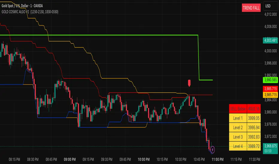
GOLD COSMIC ALGO V1### Cosmic Gold Trading Algorithm
- **Overview**: Cosmic Gold is an advanced, invite-only Pine Script indicator optimized for trading Gold (XAUUSD), blending trend analysis, market structure detection, and predictive modeling to generate reliable buy/sell signals across scalping, intraday, and swing strategies.
- **Key Features**: It identifies market breaks using swing pulses, displays quantum trend states, plots reversal signals near support/resistance, and uses kernel regression for forecasted price moves with dynamic TP/SL levels—helping traders navigate gold's volatility with precision.
- **Performance Considerations**: While backtests show potential for high accuracy in trending markets, results vary by timeframe and conditions; always combine with risk management, as past performance doesn't guarantee future gains.
#### Getting Started
Add the indicator to your TradingView chart for XAUUSD. It overlays directly, showing signals like "BUY"/"SELL" labels, trend channels, session backgrounds, and a targets table. Default settings suit most users, but adjust visuals (e.g., colors) via inputs for personalization.
#### Recommended Usage
- **Timeframes**: Best on 1m to 4h charts for scalping to swings; higher frames reduce noise.
- **Signals**: Enter on MSB breaks or EMA crossovers (▲/▼ shapes), confirmed by quantum state ("TREND RISE/FALL").
- **Risk Management**: Use ATR-based targets (1-4 levels) and predicted RR for TP/SL; limit risk to 1-2% per trade.
- **Alerts**: Set up for bullish/bearish signals, TP/SL hits to automate notifications.
#### Tips for Success
Monitor session overlaps (London/NY highlighted) for high-volume entries. Test on demo accounts first, and watch for reversals near daily levels or Donchian channels. For optimal results, pair with fundamental gold news.
---
Cosmic Gold represents a sophisticated fusion of classical technical indicators and modern predictive analytics, tailored specifically for the dynamic XAUUSD market. This invite-only algorithm integrates multi-layered market structure analysis, quantum-inspired trend detection, reversal pattern recognition, and a kernel-based regression model to forecast price movements, all while visualizing key sessions and levels for enhanced decision-making. Designed for versatility, it supports scalping on minute charts, intraday trades on hourly frames, and swing positions up to 4 hours, adapting to gold's inherent volatility driven by economic factors, geopolitical events, and safe-haven demand.
At the heart of Cosmic Gold lies a dual swing detection system. The primary detectSwings function scans a 30-bar window to identify highs and lows, creating pulse objects that track price breaches. When close crosses these levels, it triggers structure checks classifying moves as "msb" (market structure break) or "bos" (break of structure), plotting "BUY" or "SELL" labels only on MSB events for high-confidence entries. Paralleling this is the quantumSwings mechanism, which similarly detects extrema but categorizes as "break" or "continuation," updating a real-time trend state displayed in a top-right table: "TREND RISE" (bullish, teal), "TREND FALL" (bearish, red), or "NEUTRAL ZONE" (gray). This quantum layer adds a probabilistic overlay, helping filter false breaks in choppy conditions.
Supporting these signals are robust support/resistance visualizations. Donchian Channels (55-period) plot orange upper/lower trend lines, while 24-period borders create red high and blue low barriers. On intraday charts, previous daily highs/lows (green/red lines) provide context, with all levels used for proximity checks in reversal logic. Outside bar reversals (engulfing patterns) near these zones—within one ATR (average true range, 14-period)—trigger small lime/red labels for "Reversal Up/Down," offering counter-trend opportunities. Quantum flags further scan for exhaustion: bull/bear patterns over 30 bars verify local extrema, though not plotted directly, they inform the overall state.
The predictive engine elevates Cosmic Gold beyond traditional indicators. Eight normalized features—ranging from RSI-scaled dump/pump metrics and volatility derivatives to volume oscillators, choppiness index, standard RSI, and EMA-derived trend signals—feed a radial basis function (RBF) kernel regression model. On EMA (50/200) crossovers, it records historical absolute moves and trains on past instances, weighting by feature distance to estimate predictedMove (fractional advance/decline). Win rate calculations derive recommended risk-reward (RR), dynamically setting TP/SL: for bulls, TP at close + (close * predictedMove), SL at close - (close * predictedMove / RR). Signals (▲/▼) fire only above 5-minute frames if predictions are valid, with in-trade tracking alerting on hits. This ML-inspired approach aims to quantify edge, though it requires sufficient history (ideally 100+ trades) and may underperform in unprecedented regimes.
Visual and utility elements enhance usability. A bottom-right table populates on signals with ATR (18-period) scaled targets (1-4 levels, yellow cells) above/below entry, colored green/red for direction. Session backgrounds highlight London (muted blue, 12:30-21:30 IST) and New York (muted green, 18:30-03:30 IST), with dashed vertical lines at starts and solid IST lines at 5 AM (blue) / 5 PM (orange) for timezone awareness. Alerts cover signals, TP/SL, ensuring hands-off monitoring.
In practice, Cosmic Gold's strength lies in its adaptability: in bull markets, quantum "RISE" aligns with EMA upsides for longs; in volatility spikes (e.g., Fed announcements), reversals near channels provide quick scalps. However, limitations include potential repainting on early bars (due to highest/lowest recalculations) and NA predictions on low-volume symbols—mitigated by the volume error check. Backtesting emphasizes realistic settings: modest account sizes, commissions/slippage, and <5% risk per trade align with RR logic. While optimized for gold, testing on correlated assets like silver may yield insights, but always verify with live data.
| Component | Description | Key Parameters | Utility in Trading |
|-----------|-------------|----------------|--------------------|
| Swing Detection | Identifies highs/lows over fixed length for structure breaks. | External Length: 30 bars | Filters entries to confirmed breaks, reducing false signals. |
| Quantum Trend | Parallel swing system updating bullish/bearish/neutral states. | Quantum Period: 30 bars | Provides trend bias; "RISE/FALL" confirms signal direction. |
| Reversal Signals | Engulfing patterns near S/R within ATR. | ATR Length: 14 | Spots counter-trends; ideal for scalps near daily levels. |
| Kernel Regression | RBF model predicts moves from 8 features. | Bandwidth: 5; Features: RSI, volatility, etc. | Forecasts TP/SL; enhances RR for sustainable trading. |
| Visual Aids | Channels, sessions, targets table. | Donchian: 55; Borders: 24 | Contextualizes price; sessions flag high-volume periods. |
| Alerts & Risk | Dynamic TP/SL, win rate tracking. | Safe Duration: 2000 bars max | Automates exits; promotes disciplined risk management. |
This comprehensive design positions Cosmic Gold as a professional tool for gold traders, emphasizing rule-based precision over discretionary guesswork. For access, contact the author via TradingView; note it's invite-only to maintain quality control.
**Key Citations:**
- (tropicalglitz.net)
- (www.cnn.com)
- (www.forbes.com)
- (auronum.co.uk)
- (www.prismaticpowders.com)
- (cosmicgoldmusic.com)
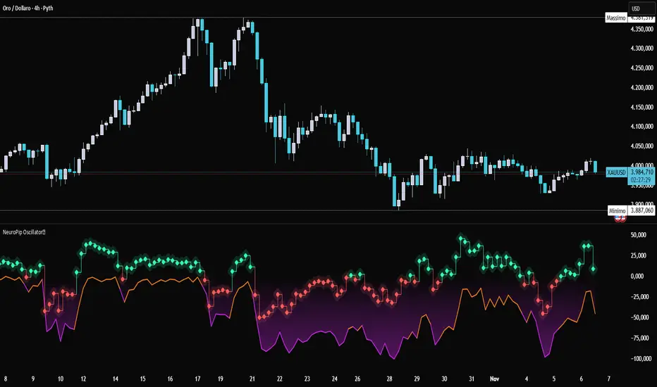
NeuroPip OscillatorNeuroPip Oscillator – Adaptive Momentum Oscillator with Deviation “Bursts”
Indicator published by PipGuard.
NeuroPip Oscillator is an adaptive momentum oscillator displayed in a separate panel , designed to read market momentum and regime shifts through a dynamically adjusted signal line.
The main signal ( NeuroPulse ) changes color according to the active regime, while the Synapse Burst line highlights real-time deviations and momentum acceleration phases.
How it Works
• Non-Classical Logic:
Unlike conventional 3-candle swing models, NeuroPip uses a custom adaptive mechanism that blends trend behavior , volatility , and closing dynamics over a dynamic bar range .
This allows the oscillator to filter noise and focus on true structural impulses , rather than random fluctuations, producing smoother and more reliable regime detection.
• Color Shift & Waves:
The NeuroPulse line turns orange in bullish phases and violet in bearish phases.
A Colour fill between the signal and baseline visually represents the intensity and direction of momentum in real time.
• Synapse Burst (Active Deviation):
The Synapse Burst line measures the distance between the momentum curve and its adaptive baseline, revealing acceleration "bursts" or momentum drops as they occur.
How to Use
1. Add the oscillator to your chart (separate panel).
2. Read the color of the signal to determine the current market regime (bullish/bearish).
3. Observe the wave strength to gauge momentum continuity and pressure .
4. Use Synapse Burst spikes to confirm acceleration or deceleration in price movement.
5. Combine its insights with your risk management and main chart analysis.
EXAMPLE OF USE
EXAMPLE OF USE
Settings
• All parameters are internally preconfigured for stability and visual consistency.
• Colors and waves are optimized and not user-editable.
• Works on all markets and timeframes (panel overlay=false ).
Alerts (Recommended to Enable)
Two built-in alerts trigger on bar close when the regime changes:
• Bullish Cross → signal turning bullish .
• Bearish Cross → signal turning bearish .
Each alert includes the symbol and timeframe , ensuring you never miss a regime shift even when you’re away from the screen.
Limitations
• The oscillator confirms regime changes; it does not predict them.
• In low-volatility environments, transitions may appear more frequent.
• Past performance does not guarantee future results .
Access
This script is available under invite-only access .
To request access, use the link provided in the Signature below the publication.
Note: Technical analysis tool designed to study price momentum and structure. It does not constitute financial advice or guarantee performance.
Indicator published by PipGuard.