Kalman Hull Kijun [BackQuant]Kalman Hull Kijun
A trend baseline that merges three ideas into one clean overlay, Kalman filtering for noise control, Hull-style responsiveness, and a Kijun-like Donchian midline for structure and bias.
Context and lineage
This indicator sits in the same family as two related scripts:
Kalman Price Filter
This is the foundational building block. It introduces the Kalman filter concept, a state-estimation algorithm designed to infer an underlying “true” signal from noisy measurements, originally used in aerospace guidance and later adopted across robotics, economics, and markets.
Kalman Hull Supertrend
This is the original script made, which people loved. So it inspired me to create this one.
Kalman Hull Kijun uses the same core philosophy as the Supertrend variant, but instead of building a Supertrend band system, it produces a single structural baseline that behaves like a Kijun-style reference line.
What this indicator is trying to solve
Most trend baselines sit on a bad trade-off curve:
If you smooth hard, the line reacts late and misses turns.
If you react fast, the line whipsaws and tracks noise.
Kalman Hull Kijun is designed to land closer to the middle:
Cleaner than typical fast moving averages in chop.
More responsive than slow averages in directional phases.
More “structure aware” than pure averages because the baseline is range-derived (Kijun-like) after filtering.
Core idea in plain language
The plotted line is a Kijun-like baseline, but it is not built from raw candles directly.
High level flow:
Start with a chosen price stream (source input).
Reduce measurement noise using Kalman-style state estimation.
Add Hull-style responsiveness so the filtered stream stays usable for trend work.
Build a Kijun-like baseline by taking a Donchian midpoint of that filtered stream over the base period.
So the output is a single baseline that is intended to be:
Less jittery than a simple fast MA.
Less laggy than a slow MA.
More “range anchored” than standard smoothing lines.
How to read it
1) Trend and bias (the primary use)
Price above the baseline, bullish bias.
Price below the baseline, bearish bias.
Clean flips across the baseline are regime changes, especially when followed by a hold or retest.
2) Retests and dynamic structure
Treat the baseline like dynamic S/R rather than a signal generator:
In uptrends, pullbacks that respect the baseline can act as continuation context.
In downtrends, reclaim failures around the baseline can act as continuation context.
Repeated back-and-forth around the line usually means compression or chop, not clean trend.
3) Extension vs compression (using the fill)
The fill is meant to communicate “distance” and “pressure” visually:
Large separation between price and baseline suggests expansion.
Price compressing into the baseline suggests rebalancing and decision points.
Inputs and what they change
Kijun Base Period
Controls the structural memory of the baseline.
Higher values track broader swings and reduce flips.
Lower values track tighter swings and react faster.
Kalman Price Source
Defines what data the filter is estimating.
Close is usually the cleanest default.
HL2 often “feels” smoother as an average price.
High/Low sources can become more reactive and less stable depending on the market.
Measurement Noise
Think of this as the main smoothness knob:
Higher values generally produce a calmer filtered stream.
Lower values generally produce a faster, more reactive stream.
Process Noise
Think of this as adaptability:
Higher values adapt faster to changing conditions but can get twitchy.
Lower values adapt slower but stay stable.
Plotting and UI (what you see on chart)
1) Adaptive line coloring
Baseline turns bullish color when price is above it.
Baseline turns bearish color when price is below it.
This makes the state readable without extra panels.
2) Gradient “energy” fill
Bull fill appears between price and baseline when above.
Bear fill appears between price and baseline when below.
The goal is clarity on separation and control, not decoration.
3) Rim effect
A subtle band around price that only appears on the active side.
Helps highlight directional control without hiding candles.
4) Candle painting (optional)
Candles can be colored to match the current bias.
Useful for scanning many charts quickly.
Disable if you prefer raw candles.
Alerts
Long state alert when price is above the baseline.
Short state alert when price is below the baseline.
Best used as a bias or regime notification, not a standalone entry trigger.
Where it fits in a workflow
This is a context layer, it pairs well with:
Market structure tools, BOS/MSB, OBs, FVGs.
Momentum triggers that need a regime filter.
Mean reversion tools that need “do not fade trends” context.
Limitations
No baseline eliminates chop whipsaws, tuning only manages the trade-off.
Settings should not be copy pasted across assets without checking behavior.
This does not forecast, it estimates and smooths state, then expresses it as a structural baseline.
Disclaimer
Educational and informational only, not financial advice.
Not a complete trading system.
If you use it in any trading workflow, do proper backtesting, forward testing, and risk management before any live execution.
Statistics

CCI Standard DeviationCCI Standard Deviation – Asymmetric Volatility-Adjusted Trend Filter (CCI SD)
The Commodity Channel Index (CCI), created by Donald Lambert in 1980, measures how far the typical price deviates from its statistical average to identify cyclical momentum and trend strength.
The standard formula is:
CCI = (Typical Price − SMA(Typical Price, n)) / (0.015 × Mean Deviation)
where Typical Price = (High + Low + Close)/3.
CCI is unbounded and centered around zero: sustained readings above zero indicate bullish momentum, below zero bearish. Classic interpretations often use zero-line crosses or fixed levels (±100, ±200, ±250), but these can be unreliable when CCI volatility changes across market regimes.
This indicator was developed to create a more disciplined trend-following tool that aligns with my core risk principle: “always protect to the downside.”
Starting from the standard CCI zero-line concept for trend direction, I experimented with standard deviation bands to make the oscillator volatility-adjusted. I then applied deliberate asymmetry: requiring the lower 1σ envelope (CCI − stdev) to cross above a positive threshold for bullish confirmation (high-probability entry only in robust trends), while exiting immediately on any raw CCI weakness below a negative threshold (quick downside protection). User inputs for both thresholds were added to allow fine-tuning and adaptability across different assets and timeframes.
An optional DEMA-smoothed version of the lower envelope provides additional clarity when desired.
Extreme zones
raw CCI ±240 and lower envelope > 200 or < –200 - are highlighted with background shading to flag rare acceleration or capitulation phases.
How it works
Standard CCI calculated on typical price (default length 38).
Rolling standard deviation of the CCI itself (default length 13) measures the oscillator’s recent volatility.
Lower envelope = CCI − stdev (dn).
Optional DEMA smoothing (default length 12) can be toggled.
Trend logic:
Bullish regime only when lower envelope
→ Long Threshold (default +10)
→ statistical proof of strength
Bearish/neutral immediately when raw CCI
→ Short Threshold (default –25)
→ fast downside protection
Origin and development
The indicator emerged from wanting a cleaner, more reliable CCI for trend direction. After testing volatility-adjusted versions, the asymmetric design proved superior:
it enters only high-conviction uptrends and exits rapidly on weakness, significantly reducing whipsaws while preserving trend capture.
Parameters were optimized through extensive backtests on major assets (BTC, ETH, SOL and many more Cryptos; Magnificent 7 stocks, QQQ, SPX, gold).
The defaults were selected for the best average Sortino ratio and lowest maximum drawdown across this broad universe, ensuring robustness and avoiding single-asset overfitting.
How to use it
Green triangle below bar
→ lower envelope crosses above Long Threshold
→ high-conviction bullish trend confirmed
→ enter or add to longs
Magenta triangle above bar
→ CCI crosses below Short Threshold
→ exit longs or go cash/short
While lower envelope remains above Long Threshold
→ hold bullish positions
Extreme background shading (dn >200 or CCI ±240)
→ rare high-attention zones (potential acceleration or exhaustion)
Recommended defaults
CCI length: 38
SD length: 13
Long threshold: +10
Short threshold: –25
Optional MA length: 12 (DEMA of lower envelope)
All visual elements (bar coloring, signals, background, smoothed line) are toggleable for personal preference.
This indicator is designed as a trend-strength and risk-management filter and is not intended as a standalone trading system.
Disclaimer:
This is not financial advice. Backtests are based on past results and are not indicative of future performance.

SMC Post-Analysis Lab [PhenLabs]📊 SMC Post-Analysis Lab
Version: PineScript™ v6
📌 Description
The SMC Post-Analysis Lab is a dedicated hindsight analysis tool built for traders who want to understand what really happened during any historical trading period. Unlike forward-looking indicators, this tool lets you scroll back through time and instantly receive algorithmic classification of market states using Smart Money Concepts methodology.
Whether you’re reviewing a losing trade, studying a successful session, or building your pattern recognition skills, this indicator provides immediate context. The expansion-aware algorithm processes price action within your selected window and outputs clear, actionable classifications ranging from Parabolic Expansion to Consolidation Inducements.
Stop relying on subjective post-trade analysis. Let the algorithm objectively tell you whether institutional players were accumulating, distributing, or running inducements during your trades.
🚀 Points of Innovation
First indicator specifically designed for SMC-based post-trade review rather than live signal generation
Dual-mode analysis system allowing both dynamic scrollback and precise date selection
Expansion-aware classification algorithm that weighs range position against net displacement
Real-time efficiency metrics calculating directional quality of price movement
Integrated visual FVG detection within the analysis window only
Interactive table with clickable date range adjustment via chart interface
🔧 Core Components
Pivot Detection Engine: Uses configurable pivot length to identify significant swing highs and lows for structure break detection
Window Calculator: Determines active analysis zone based on either bar offset or timestamp boundaries
Data Aggregator: Tracks window open, high, low, close and counts bullish/bearish structure break events
State Classification Algorithm: Applies hierarchical logic to determine market state from six possible classifications
Visual Renderer: Draws structure breaks, FVG boxes, and window highlighting within the active zone
🔥 Key Features
Sliding Window Mode: Use the Scroll Back slider to dynamically move your analysis zone backwards through history bar-by-bar
Date Range Mode: Select specific start and end timestamps for precise session or trade review
Six Market State Classifications: Parabolic Expansion (Bull/Bear), Bullish/Bearish Order Flow, Accumulation/Distribution Reversal, and Consolidation/Inducement
Range Position Percentile: See exactly where price closed relative to the window’s high-low range as a percentage
Bull/Bear Event Counter: Quantified count of structure breaks in each direction during the analysis period
Efficiency Calculation: Net move divided by total range reveals trending quality versus chop
🎨 Visualization
Blue Window Highlight: Active analysis zone is clearly marked with blue background shading on the chart
Structure Break Lines: Dashed lines appear at each bullish or bearish structure break within the window
FVG Boxes: Fair Value Gaps automatically render as semi-transparent boxes in bullish or bearish colors
Dashboard Table: Top-right positioned table displays State, Analysis description, and Metrics in real-time
Color-Coded States: Each classification uses distinct coloring for immediate visual recognition
Interactive Tip Row: Optional help text guides users on clicking the table to adjust date range
📖 Usage Guidelines
General Configuration
Analysis Mode: Default is Sliding Window. Choose Date Range for specific timestamp analysis.
Sliding Window Settings
Scroll Back (Bars): Default 0. Increase to move window backwards into history.
Window Width (Bars): Default 100. Range 20-50 for scalping, 100+ for swing analysis.
Date Range Settings
Start Date: Select the beginning timestamp for your analysis period.
End Date: Select the ending timestamp for your analysis period.
Visual Settings
Show Help Tip: Default true. Toggle to hide instructional row in dashboard.
Bullish Color: Default teal. Customize for bullish elements.
Bearish Color: Default red. Customize for bearish elements.
SMC Parameters
Pivot Length: Default 5. Lower values (3-5) catch minor breaks. Higher values (10+) focus on major swings.
✅ Best Use Cases
Post-trade review to understand why entries succeeded or failed
Session analysis to identify institutional activity patterns
Trade journaling with objective algorithmic classifications
Pattern recognition training through historical scrollback
Identifying whether stop hunts were inducements or legitimate breaks
Comparing your real-time read versus what the algorithm detected
⚠️ Limitations
Designed for historical analysis only, not live trade signals
Classification accuracy depends on appropriate pivot length for the timeframe
FVG detection uses simple gap logic without mitigation tracking
State classification is based on window data only, not broader context
Requires manual scrolling or date input to review different periods
💡 What Makes This Unique
Purpose-Built for Review: Unlike most indicators focused on live signals, this is designed specifically for post-trade analysis
Expansion-Aware Logic: Algorithm weighs both position in range AND directional efficiency for accurate state detection
Interactive Date Control: Click the dashboard table to reveal draggable anchors for window adjustment directly on chart
🔬 How It Works
1. Window Definition:
User selects either Sliding Window or Date Range mode
System calculates which bars fall within the active analysis zone
Active zone receives blue background highlighting
2. Data Collection:
Algorithm captures window open, running high, running low, and current close
Structure breaks are detected when price crosses above last pivot high or below last pivot low
Bullish and bearish events are counted separately
3. State Classification:
Range Position calculates where close sits as percentage of high-low range
Efficiency calculates net move divided by total range
Hierarchical logic applies priority rules from Parabolic states down to Consolidation
4. Output Rendering:
Dashboard table updates with State title, Analysis description, and Metrics
Visual elements render within window only to keep chart clean
Colors reflect bullish, bearish, or neutral classification
💡 Note:
This indicator is intended for educational and review purposes. Use it to develop your understanding of Smart Money Concepts by analyzing what institutional order flow looked like during historical periods. Combine insights with your own analysis methodology for best results.

QuantLabs MASM Correlation TableThe Market is a graph. See the flows:
The QuantLabs MASM is not a standard correlation table. It is an Alpha-Grade Scanner architected to reveal the hidden "hydraulic" relationships between global macro assets in real-time.
Rebuilt from the ground up for Version 3, this engine pushes the absolute limits of the Pine Script™ runtime. It utilizes a proprietary Logarithmic Math Engine, Symmetric Compute Optimization, and a futuristic "Ghost Mode" interface to deliver a 15x15 real-time correlation matrix with zero lag.
Under the Hood: The Quant Architecture
We stripped away standard libraries to build a lean, high-performance engine designed for institutional-grade accuracy.
1. Alpha Math Engine (Logarithmic Returns) Most tools calculate correlation based on Price, which generates spurious signals (e.g., "Everything is correlated in a bull run").
The Solution: Our engine computes Logarithmic Returns (log(close/close )) by default. This measures the correlation of change (Velocity & Vector), not price levels.
The Result: A mathematically rigorous view of statistical relationships that filters out the noise of general market drift.
Dual-Core: Toggle seamlessly between "Alpha Mode" (Log Returns) for verified stats and "Visual Mode" (Price) for trend alignment.
Calculation Modes: Pearson (Standard), Euclidean (Distance), Cosine (Vector), Manhattan (Grid).
2. Symmetric Compute Optimization Calculating a 15x15 matrix requires evaluating 225 unique relationships per bar, which often crashes memory limits.
The Fix: The V3 Engine utilizes Symmetric Logic, recognizing that Correlation(A, B) == Correlation(B, A).
The Gain: By computing only the lower triangle of the matrix and mirroring pointers to the upper triangle, we reduced computational load by 50%, ensuring a lightning-fast data feed even on lower timeframes.
3. Context-Aware "Ghost Mode" The UI is designed for professional traders who need focus, not clutter.
Smart Detection: The matrix automatically detects your current chart's Ticker ID. If you are trading QQQ, the matrix will visually highlight the Nas100 row and column, making them opaque and bright while dimming the rest.
Dynamic Transparency: Irrelevant data ("Noise" < 0.3 correlation) fades into the background. Only significant "Alpha Signals" (> 0.7) glow with full Neon Saturation.
Key Features
Dominant Flow Scanner: The matrix scans all 105 unique pairs every tick and prints the #1 Strongest Correlation at the bottom of the pane (e.g., DOMINANT FLOW: Bitcoin ↔ Nas100 ).
Streak Counter: A "Stubbornness" metric that tracks how many consecutive days a strong correlation has persisted. Instantly identify if a move is a "flash event" or a "structural trend."
Neon Palette: Proprietary color mapping using Electric Blue (+1.0) for lockstep correlation and Deep Red (-1.0) for inverse hedging.
Usage Guide
Placement: Best viewed in a bottom pane (Footer).
Assets: Pre-loaded with the Essential 15 Macro Drivers (Indices, BTC, Gold, Oil, Rates, FX, Key Sectors). Fully editable via settings (Ticker|Name).
Reading the Grid:
🔵 Bright Blue: Assets moving in lockstep (Risk-On).
🔴 Bright Red: Assets moving perfectly opposite (Hedge/Risk-Off).
⚫ Faded/Black: No statistical relationship (Decoupled).
Key Improvements Made:
Formatting: Added clear bullet points and bolding to make it scannable.
Clarity: Clarified the "Logarithmic Returns" section to explain why it matters (Velocity vs. Price Levels).
Tone: Maintained the "high-tech/quant" vibe but removed slightly clunky phrases like "spurious signals" (unless you prefer that academic tone, in which case I left it in as it fits the persona).
Structure: Grouped the "Modes" under the Math Engine for better logic.
Created and designed by QuantLabs

Account GuardianAccount Guardian: Dynamic Risk/Reward Overlay
Introduction
Account Guardian is an open-source indicator for TradingView designed to help traders evaluate trade setups before entering positions. It automatically calculates Risk-to-Reward ratios based on market structure, displays visual Stop Loss and Take Profit zones, and provides real-time position sizing recommendations.
The indicator addresses a fundamental question every trader should ask before entering a trade: "Does this setup make mathematical sense?" Account Guardian answers this question visually and numerically, helping traders avoid impulsive entries with poor risk profiles.
Core Functionality
Account Guardian performs four primary functions:
Detects swing highs and swing lows to identify logical stop loss placement levels
Calculates Risk-to-Reward ratios for both long and short setups in real-time
Displays visual SL/TP zones on the chart for immediate trade planning
Computes position sizing based on your account size and risk tolerance
The goal is to provide traders with instant feedback on whether a potential trade meets their minimum risk/reward criteria before committing capital.
How It Works
Swing Detection
The indicator uses pivot point detection to identify recent swing highs and swing lows on the chart. These swing points serve as logical areas for stop loss placement:
For Long Trades: The most recent swing low becomes the stop loss level. Price breaking below this level would invalidate the bullish thesis.
For Short Trades: The most recent swing high becomes the stop loss level. Price breaking above this level would invalidate the bearish thesis.
The swing detection lookback period is configurable, allowing you to adjust sensitivity based on your trading timeframe and style.
It automatically adjusts the tp and sl when it is applied to your chart so it is always moving up and down!
Risk/Reward Calculation
Once swing levels are identified, the indicator calculates:
Entry Price: Current close price (where you would enter)
Stop Loss: Recent swing low (for longs) or swing high (for shorts)
Risk: Distance from entry to stop loss
Take Profit: Entry plus (Risk × Target Multiplier)
R:R Ratio: Reward divided by Risk
The R:R ratio is then evaluated against your configured thresholds to determine if the setup is valid, marginal, or poor.
Visual Elements
SL/TP Zones
When enabled, the indicator draws colored boxes on the chart showing:
Red Zone: Stop Loss area - the region between your entry and stop loss
Green/Gold/Red Zone: Take Profit area - colored based on R:R quality
The color coding provides instant visual feedback:
Green: R:R meets or exceeds your "Good R:R" threshold (default 3:1)
Gold: R:R meets minimum threshold but below "Good" (between 2:1 and 3:1)
Red: R:R below minimum threshold - setup should be avoided
Swing Point Markers
Small circles mark detected swing points on the chart:
Green circles: Swing lows (potential support / long SL levels)
Red circles: Swing highs (potential resistance / short SL levels)
Dashboard Panel
The dashboard in the top-right corner displays comprehensive trade planning information:
R:R Row: Current Risk-to-Reward ratio for long and short setups
Status Row: VALID, OK, BAD, or N/A based on R:R thresholds
Stop Loss Row: Exact price level for stop loss placement
Take Profit Row: Exact price level for take profit placement
Pos Size Row: Recommended position size based on your risk parameters
Risk $ Row: Dollar amount at risk per trade
Position Sizing Logic
The indicator calculates position size using the formula:
Position Size = Risk Amount / Risk per Unit
Where:
Risk Amount = Account Size × (Risk Percentage / 100)
Risk per Unit = Entry Price - Stop Loss Price
For example, with a $10,000 account risking 1% per trade ($100), if your entry is at 100 and stop loss at 98 (risk of 2 per unit), your position size would be 50 units.
Input Parameters
Swing Detection:
Swing Lookback: Number of bars to look back for pivot detection (default: 10). Higher values find more significant swing points but may be slower to update.
Target Multiplier: Multiplier applied to risk to calculate take profit distance (default: 2). A value of 2 means TP is 2× the distance of SL from entry.
Risk/Reward Thresholds:
Minimum R:R: Minimum acceptable Risk-to-Reward ratio (default: 2.0). Setups below this show as "BAD" in red.
Good R:R: Threshold for excellent setups (default: 3.0). Setups at or above this show as "VALID" in green.
Account Settings:
Account Size ($): Your trading account size in dollars (default: 10,000). Used for position sizing calculations.
Risk Per Trade (%): Percentage of account to risk per trade (default: 1.0%). Professional traders typically risk 0.5-2% per trade.
Display:
Show SL/TP Zones: Toggle visibility of the colored zone boxes on chart (default: enabled)
Show Dashboard: Toggle visibility of the information panel (default: enabled)
Analyze Direction: Choose to analyze Long only, Short only, or Both directions (default: Both)
How to Use This Indicator
Basic Workflow:
Add the indicator to your chart
Configure your account size and risk percentage in the settings
Set your minimum and good R:R thresholds based on your trading rules
Look at the dashboard to see current R:R for potential long and short entries
Only consider trades where the status shows "VALID" or at minimum "OK"
Use the displayed SL and TP levels for your order placement
Use the position size recommendation to determine lot/contract size
Interpreting the Dashboard:
VALID (Green): Excellent setup - R:R meets your "Good" threshold. This is the ideal scenario for taking a trade.
OK (Gold): Acceptable setup - R:R meets minimum but isn't optimal. Consider taking if other confluence factors align.
BAD (Red): Poor setup - R:R below minimum threshold. Avoid this trade or wait for better entry.
N/A (Gray): Cannot calculate - usually means no valid swing point detected yet.
Best Practices:
Use this indicator as a filter, not a signal generator. It tells you IF a trade makes sense, not WHEN to enter.
Combine with your existing entry strategy - use Account Guardian to validate setups from other analysis.
Adjust the swing lookback based on your timeframe. Lower timeframes may need smaller lookback values.
Be honest with your account size input - accurate position sizing requires accurate inputs.
Consider the target multiplier carefully. Higher multipliers mean larger potential reward but lower probability of hitting TP.
Alerts
The indicator includes four alert conditions:
Good Long Setup: Triggers when long R:R reaches or exceeds your "Good R:R" threshold
Good Short Setup: Triggers when short R:R reaches or exceeds your "Good R:R" threshold
Bad Long Setup: Triggers when long R:R falls below your minimum threshold
Bad Short Setup: Triggers when short R:R falls below your minimum threshold
These alerts can help you monitor multiple charts and get notified when favorable setups appear.
Technical Implementation
The indicator is built using Pine Script v6 and includes:
Pivot-based swing detection using ta.pivothigh() and ta.pivotlow()
Dynamic box drawing for visual SL/TP zones
Table-based dashboard for clean information display
Color-coded visual feedback system
Persistent variable tracking for swing levels
Code Structure:
// Swing Detection
float swingHi = ta.pivothigh(high, swingLen, swingLen)
float swingLo = ta.pivotlow(low, swingLen, swingLen)
// R:R Calculation for Long
float longSL = recentSwingLo
float longRisk = entry - longSL
float longTP = entry + (longRisk * targetMult)
float longRR = (longTP - entry) / longRisk
// Position Sizing
float riskAmount = accountSize * (riskPct / 100)
float posSize = riskAmount / longRisk
Limitations
The indicator uses historical swing points which may not always represent optimal SL placement for your specific strategy
Position sizing assumes you can trade fractional units - adjust accordingly for instruments with minimum lot sizes
R:R calculations assume linear price movement and don't account for gaps or slippage
The indicator doesn't predict price direction - it only evaluates the mathematical viability of a setup
Swing detection has inherent lag due to the lookback period required for pivot confirmation
Recommended Settings by Trading Style
Scalping (1-5 minute charts):
Swing Lookback: 5-8
Target Multiplier: 1-2
Minimum R:R: 1.5
Good R:R: 2.0
Day Trading (15-60 minute charts):
Swing Lookback: 8-12
Target Multiplier: 2
Minimum R:R: 2.0
Good R:R: 3.0
Swing Trading (4H-Daily charts):
Swing Lookback: 10-20
Target Multiplier: 2-3
Minimum R:R: 2.5
Good R:R: 4.0
Why Risk/Reward Matters
Many traders focus solely on win rate, but profitability depends on the combination of win rate AND risk/reward ratio. Consider these scenarios:
50% win rate with 1:1 R:R = Breakeven (before costs)
50% win rate with 2:1 R:R = Profitable
40% win rate with 3:1 R:R = Profitable
60% win rate with 1:2 R:R = Losing money
Account Guardian helps ensure you only take trades where the math works in your favor, even if you're wrong more often than you're right.
Disclaimer
This indicator is provided for educational and informational purposes only. It is not intended as financial, investment, trading, or any other type of advice or recommendation.
Trading involves substantial risk of loss and is not suitable for all investors. The calculations provided by this indicator are based on historical price data and mathematical formulas that may not accurately predict future price movements.
Position sizing recommendations are estimates based on user inputs and should be verified before placing actual trades. Always consider factors such as leverage, margin requirements, and broker-specific rules when determining actual position sizes.
The Risk-to-Reward ratios displayed are theoretical calculations based on swing point detection. Actual trade outcomes will vary based on market conditions, execution quality, and other factors not captured by this indicator.
Past performance does not guarantee future results. Users should thoroughly test any trading approach in a demo environment before risking real capital. The authors and publishers of this indicator are not responsible for any losses or damages arising from its use.
Always consult with a qualified financial advisor before making investment decisions.

ETF-Futures Opening Ratio (Table)This indicator calculates the opening price ratio between an ETF and its corresponding futures contract using the 9:30 AM New York (RTH) opening price.
The ratio is locked at the official market open and remains fixed throughout the session, providing a stable reference for:
Translating ETF price levels into futures equivalents
Comparing relative value and premium/discount behavior
Maintaining consistent cross-instrument analysis during the trading day
The output is displayed in a simple on-chart table for quick reference and minimal chart clutter.

Xbirch_Turtle_ Crypto_CalcМодернизированная стратегия Черепах.
Вход/выход по каналу Дончиана, стопы по величине ATR, возможность выбора лонг/шорт/всё. Имеется пирамидинг - добавление по +0,5ATR от первого бая, не более 4х входов. Модернизированный стоп - по ATR от первого бая.
Не финансовый совет.
A modernized Turtle strategy.
Entry/exit based on the Donchian Channel, stops based on the ATR value, and the ability to choose long/short/all options. Pyramiding is available – adding +0.5 ATR from the first buy, with a maximum of four entries. The modernized stop is based on the ATR value from the first buy.
This is not financial advice.

Portfolio P&L Table 10 SlotsOverview
This indicator displays a compact, Excel-style position P&L table directly on your TradingView chart. It is designed to help traders track unrealized profit/loss for a manually-entered position and ensure the calculations only apply to the symbols you actually trade, preventing confusion when switching between tickers.
The script is symbol-aware: it checks the current chart symbol against up to 10 user-defined position slots and shows P&L only when a match is found.
Core Concept
Most P&L scripts on TradingView rely on a single set of inputs (average price, quantity), which remains active even when the user changes chart symbols. That can lead to incorrect P&L displays on instruments where no position exists.
This indicator solves that by combining:
Symbol matching logic (ticker / exchange:ticker / base ticker normalization)
Slot-based position storage (up to 10 positions)
Dynamic real-time P&L calculations driven by the chart’s live price
As a result, the table behaves like a “position panel” that follows the chart, while respecting your actual holdings list.
Matching & Display Logic
Symbol Detection
The indicator compares the current chart symbol to each slot’s symbol using multiple matching methods to reduce false mismatches:
Full symbol (EXCHANGE:TICKER)
Ticker only (TICKER)
Normalized “base ticker” extraction (useful when your chart format differs from inputs)
Position Selection
The first matching slot is selected and displayed.
If no slot matches, the table shows “No position for this symbol” and does not output P&L values.
P&L Calculation Logic
When a valid slot is matched and its values are valid:
Unrealized Gross P&L
Long: (Last Price − Avg Price) × Quantity
Short: (Avg Price − Last Price) × Quantity (handled via direction multiplier)
Unrealized Net P&L (optional)
If fees are enabled, the script subtracts the slot’s total fees from gross P&L.
P&L %
Calculated relative to average price, direction-adjusted for long/short positions.
Breakeven Price
Without fees: breakeven = average price
With fees: breakeven is adjusted using fees / quantity and direction.
The table updates automatically with market movement because all values are recalculated from the chart’s current price.
Inputs and Defaults
General
Include Fees? (default: Off)
Text Size
Table Position (Top/Bottom, Left/Right)
Slots (1 → 10)
Each slot contains:
Symbol (example formats: NVTS, NASDAQ:NVTS, NYSE:PATH)
Side (Long / Short)
Average Price
Quantity
Total Fees (optional; applied only when “Include Fees” is enabled)
Colors (Fully Customizable)
The table supports user-defined colors for:
Header text/background
Body text/background
Positive P&L color
Negative P&L color
Neutral/no-position color
This allows you to match the table visually to any chart theme.
The indicator is intended for :
Quick P&L visibility while charting
Avoiding accidental P&L “carry over” when switching symbols
Tracking a shortlist of positions without external spreadsheets
If you trade more than 10 tickers regularly, the script can be extended further using the same slot architecture.
Limitations
Values are unrealized and based on the chart’s price (close/last available feed).
The script does not track multiple lots per symbol automatically; each slot represents a single consolidated position (avg + total qty).
Disclaimer
This script is provided for educational and analytical purposes only. It does not constitute financial advice, investment recommendations, or an invitation to trade. Trading involves risk, and past performance does not guarantee future results. Always verify your position data and calculations independently before making trading decisions.

TechDash+Deliv: EMA+RSI+Supertrend + Delivery Volume Dashboar Strategy Logic
This dashboard combines 6 key conditions to generate a BUY signal:
Price above EMA 21 – Short‑term uptrend.
Price above EMA 50 – Medium‑term uptrend.
Price above EMA 200 – Long‑term uptrend.
RSI between 45–65 – Not overbought, not oversold (sweet spot).
Volume > 1.25× 5‑bar average – Strong participation.
Supertrend bullish – Trend in favor of longs.
A BUY signal is generated when 4 or more conditions are satisfied (configurable).
📊 Dashboard Features
The top‑right table shows:
Technical Signals
EMA 21 / 50 / 200
RSI 45–65
Volume > 1.25× avg
Supertrend direction
Delivery Volume (proxy)
Delivery Qty (K)
Avg Delivery Qty (K)
Delivery Qty × Avg
Sector & Market Context
Sector, Industry
Sector Index % Change (e.g., NIFTY, BANKNIFTY, etc.)
🚨 Delivery Volume Highlight
Delivery Qty × Avg is highlighted in light green when:
Delivery Qty > 2× Avg Delivery Qty
This helps quickly spot stocks with unusually high delivery volume, which often indicates strong accumulation.
🎯 How to Use
Apply on daily or higher timeframes for swing/position trading.
Use the BUY arrow as a trigger, but always confirm with:
Price action (support / breakout)
Sector strength
Risk management (SL, position size).
⚠️ Important Notes
Delivery Qty is a proxy based on volume (since TradingView does not provide real delivery data).
You can later replace volume with real delivery data if you have access to it (e.g., via screener or broker).
This is a dashboard + signal, not a fully automated trading bot. Use it as a decision‑support tool.

Wickless Candle Revisit TrackerWickless Candle Revisit Tracker
Identifies wickless candles (strong momentum candles) and tracks whether price revisits their opening level, providing statistical insights into price behavior patterns.
WHAT ARE WICKLESS CANDLES?
• Green wickless: Open = Low (no lower wick) - opened at the low and moved only upward
• Red wickless: Open = High (no upper wick) - opened at the high and moved only downward
These candles represent strong directional momentum, and their opening levels often act as support/resistance zones that price may revisit.
KEY FEATURES:
• Automatic Detection: Identifies wickless candles with configurable tolerance for broker spread
• Real-time Tracking: Monitors each wickless candle until price revisits its opening level
• Visual Indicators:
- Labels show "WL↑" or "WL↓" with bars count when revisited (or "N/A" if pending)
- Horizontal lines mark price levels (gray dashed = pending, green solid = revisited)
• Comprehensive Statistics Table:
- Total wickless candles detected
- Revisit rate percentage
- Min/Max/Average bars until revisit
- Pending count
• History Limit: Configure how far back to analyze (default: 500 bars)
• Customizable: Adjust colors, toggle labels/lines/table, reposition statistics
USE CASES:
• Identify potential support/resistance levels from momentum candles
• Measure how often price fills "fair value gaps" or inefficiencies
• Track mean reversion patterns after strong momentum moves
• Backtest the reliability of wickless candle levels as trading zones
SETTINGS:
• Wick Tolerance: Allow small wicks due to broker spread (e.g., 0.0001 for forex)
• History Limit: Number of bars to analyze (older candles are hidden)
• Visual Controls: Toggle labels, lines, and statistics table
• Color Customization: Adjust line colors for pending/revisited states
ALERTS:
Built-in alerts for wickless candle detection (green, red, or both).
Perfect for traders analyzing price inefficiencies, fair value gaps, and momentum-based support/resistance levels.

Interest Zones ScannerThis indicator automatically scans a user-defined price range (on current or higher timeframe) to detect and plot the strongest horizontal support/resistance zones based on validated price reactions. It intelligently identifies levels where price has repeatedly bounced without breaking for a specified number of bars, prioritizing high-probability reaction areas.
How It Works (Technical Methodology)
Range Calculation
The script determines the high/low range using a configurable method:
"Lookback Bars": User-defined number of bars (default 400) on the target timeframe.
"Fixed Start Date": Bars since a specified date (default dynamic).
Data is fetched via request.security() from a selectable timeframe (default current chart TF) for multi-timeframe alignment.
Auto Mode Scanning
When enabled:
Scans the entire range in small percentage steps (default 1.0%, adjustable down to 0.5%).
For each potential level, creates a thin volatility-adjusted zone (height % of price, default 0.07%).
Counts "valid hits": Instances where price touches the zone and holds (no break) for user-defined bars (default 10).
Break detection: Configurable "Close" (strict) or "Wick" (sensitive).
Assumes support/resistance direction based on close relative to zone center.
Level Selection and Filtering
Ranks candidates by hit count (highest first).
Applies minimum distance filter (% apart, default 8%) to avoid clustering.
Limits to user-defined max zones (default 9) for clean display.
Sorts final zones from low to high price.
Manual Mode Alternative
When auto disabled: Directly uses user-input percentages (e.g., classic Fibo levels like 23.6, 50, 61.8) applied to the range – no validation/scoring.
Zone Construction
Horizontal boxes centered on validated levels, with dynamic height (% of price).
Colored by position: Supply (above close, default light gray), Demand (below close, default cyan).
Optional full extension (both sides) or right-only.
Labeled with percentage from range low.
Dashboard and Visuals
Table (positionable) shows:
% Level, Exact Price, Hit Count (green if >3).
Header with validation details and lookback info.
Vertical line marks range start for reference.
How to Use
This scanner excels at finding statistically validated horizontal zones where price has shown respect – ideal for support/resistance, mean reversion, or breakout setups.
Auto Mode: Best for discovering hidden/non-obvious levels. Higher hit counts = stronger zones (expect reactions/retests).
Validation Bars: Increase (e.g., 20+) for stricter, higher-quality zones in trending markets; lower for more sensitive detection.
Min Distance: Higher % for fewer, separated zones; lower for denser grids.
Multi-Timeframe: Set target TF higher (e.g., Daily) for major structural levels on lower charts.
Supply Zones (Above Price): Potential resistance – shorts or take-profits.
Demand Zones (Below Price): Potential support – longs or stops below.
Confluence: Combine with volume, order blocks, or fibo for entries. Watch for multiple hits + confluence.
Manual Mode: Quick plotting of custom % (e.g., fibo retracements/extensions).
Fine-tune scan step smaller for precision (slower on large lookbacks) or larger for speed.
Disclaimer
This indicator is a technical analysis tool and should be used in conjunction with other forms of analysis. Past performance does not guarantee future results. Always use proper risk management.

Macro Pulse 30 Ultimate
👑 Macro Pulse 30 Ultimate
🎁 Currently FREE during the launch period!
ℹ️ Descriptions in Español and 日本語 are available at the bottom of this page.
── Professional Quant Dashboard Tracking 30 Market Pulses
Macro Pulse 30 Ultimate is more than just an indicator; it is a high-end environment recognition tool that scans 30 critical assets and macro drivers in real-time (tick-by-tick) to quantify the "true bias" of the market.
By integrating 30 interconnected data points—Forex, Indices, Bonds, Commodities, and Crypto—using 28 request.security calls, this tool supports quantitative decision-making that individual chart analysis cannot reach.
💎 30 Perspectives: Massive Data Sources
8 Global Bond Yields: US (10Y/2Y), Germany, UK, Australia, Japan, Switzerland, and Canada. Calculates real value based on yield spreads.
4 Major Equity Indices: S&P 500, Nasdaq 100, Nikkei 225, and DAX. Measures market heat and risk tolerance.
5 Macro Indices: Gold, Crude Oil, DXY (Dollar Index), JXY (Yen Index), and VIX (Fear Index).
3 Core Economic Indicators: US CPI (Inflation), Unemployment, and Consumer Confidence. Note: Monthly data updates around the 15th and is automatically integrated into the logic.
10+ Precision Scored Pairs: Real-time calculation of expected values for USDJPY, EURUSD, BTCUSD, XAUUSD, etc.
🛠 4 Pillars of Pro Intelligence Logic
Dynamic Regime Detection: Automatically identifies 15+ scenarios from "Goldilocks" to "Stagflation" and "Liquidity Crisis," showing if price action is a "healthy rise" or "panic."
Statistical Normalization (Z-Score): Converts all assets into "deviations from the mean (±σ)." Identifies statistical extremes beyond simple percentage changes.
Adaptive Correlation Weights: When the correlation between yields and USD is strong (> 0.6), yield data weight is auto-adjusted to 1.1x+. The logic self-adapts to what drives the market "now."
Volatility Squeeze Detection: Distinguishes between energy accumulation (💣 icon) and overextension (🔥 icon). A pro-grade leading indicator for explosive moves.
⚙️ Operational Modes
Intraday Mode
Recommended TF: 15m to 1h
Focus: Optimized for trades closed within the same day based on 24-hour volatility
Swing Mode
Recommended TF: 4h to Daily
Focus: Optimized for multi-day trends based on 5-day macro shifts
📖 Parameter & Customization Guide
⚙️ LOGIC
Score Threshold: Minimum score for the Strategy list (Default: 1.0). Custom: Lower to 0.5 for more opportunities; raise to 1.5+ for higher precision.
Smoothing: Smoothes scores. Pros raise this to filter noise; use 1 or 2 for faster reaction.
✅ WATCHLIST
Gold, BTC, Nasdaq, USDJPY, and EURUSD are enabled by default. You can toggle other JPY crosses or pairs as needed.
🔍 Glossary & Icon Legends
Market Regimes
Regime Description
Goldilocks "Sweet spot"—strong growth with stable yields. Bullish for risk assets.
Monetary Policy Mistake High rates vs. rising unemployment. A sign of a central bank error and potential reversal.
USD Dominance Extreme USD strength where all other currencies collapse.
Icon Reference
Icon Name Condition Meaning
🚀 Rocket Z-Score ≤ 1.5 High statistical probability of trend continuation
💣 Bomb Vol Ratio < 0.8 Volatility Squeeze—energy building for explosive move
🔥 Fire Vol Ratio > 1.5 High Volatility—watch for profit-taking or pullbacks
⚠️ Warning ±3.5σ, SMA200 deviation, or High Volatility Price at statistical limits or overextended
⚠️ Technical Note
This script synchronizes with real-time ticks. As a heavy quant tool using 28 security calls, we recommend using this as your primary dashboard and minimizing other heavy indicators for optimal performance.
Macro Pulse 30 Ultimate Capture the 30 pulses of the market. Trade with evidence.
---------------------------------------------------------------------------------------------------------
👑 Macro Pulse 30 Ultimate (Español)
🎁 ¡Actualmente GRATIS durante el período de lanzamiento!
── Rastreo de 30 Pulsos de Mercado con Inteligencia Quant
Macro Pulse 30 Ultimate es un motor de reconocimiento de entorno de alto nivel que escanea 30 activos críticos e indicadores macro en tiempo real (tick-a-tick). Utilizando 28 llamadas de request.security, esta herramienta cuantifica el "sesgo real" del mercado basándose en datos cuantitativos.
💎 Fuentes de Datos: 30 Perspectivas
8 Rendimientos de Bonos: EE. UU. (10Y/2Y), Alemania, Reino Unido, Australia, Japón, Suiza y Canadá.
4 Índices Bursátiles: S&P 500, Nasdaq 100, Nikkei 225 y DAX.
5 Índices Macro: Oro, Petróleo, DXY, JXY y VIX.
Indicadores Económicos: IPC (Inflación), Desempleo y Confianza. Actualizados cerca del día 15.
Puntuación de 10+ Pares: Valor esperado en tiempo real para USDJPY, EURUSD, BTCUSD, XAUUSD, etc.
🛠 Inteligencia Quant: 4 Pilares
Detección de Régimen Dinámico: Identifica más de 15 escenarios, desde "Goldilocks" hasta "Stagflation" y "Crisis de Liquidez."
Normalización Estadística (Z-Score): Identifica extremos estadísticos midiendo la desviación de la media (±σ).
Pesos de Correlación Adaptativos: Si la correlación entre tasas y USD es fuerte (> 0.6), el peso de las tasas se ajusta a 1.1x+.
Detección de Squeeze: Identifica acumulación de energía (💣) y sobreextensión (🔥).
⚙️ Modos de Operación
Modo TF Recomendado Enfoque
Intraday 15m a 1h Basado en volatilidad de 24 horas
Swing 4h a Diario Basado en cambios macro de 5 días
📖 Guía de Parámetros
Score Threshold: Mínimo para lista de estrategia (Defecto: 1.0). Ajustar a 0.5 para más señales o 1.5 para más precisión.
Smoothing: Suavizado de puntuación. Usar 1 o 2 para reacción rápida.
🔍 Glosario e Iconos
Regímenes de Mercado
Régimen Descripción
Goldilocks Crecimiento fuerte con tasas estables. Favorable para el riesgo.
Monetary Policy Mistake Tasas altas con desempleo creciente. Error de la FED y posible reversión.
USD Dominance Dominio absoluto del USD; otras divisas colapsan.
Referencia de Iconos
Icono Nombre Condición Significado
🚀 Rocket Z-Score ≤ 1.5 Probabilidad estadística de continuación de tendencia
💣 Bomb Vol Ratio < 0.8 Squeeze de volatilidad—movimiento explosivo inminente
🔥 Fire Vol Ratio > 1.5 Volatilidad extrema—alerta de sobreextensión
⚠️ Warning ±3.5σ, desviación SMA200, o alta volatilidad Límites estadísticos o sobreextensión
⚠️ Nota Técnica
Esta herramienta utiliza 28 llamadas security. Se recomienda usarla como panel principal y minimizar otros indicadores pesados para un rendimiento óptimo.
Macro Pulse 30 Ultimate Captura los 30 pulsos del mercado. Opera con evidencia.
---------------------------------------------------------------------------------------------------------
👑 Macro Pulse 30 Ultimate (日本語)
🎁 現在、ローンチ記念として無料公開中!
── 30の市場脈拍を捉える、プロフェッショナル・クオンツダッシュボード
Macro Pulse 30 Ultimate は、単なるインジケーターではありません。その名の通り、30系統の重要資産・マクロ指標をティック単位(リアルタイム)でスキャンし、相場の背景にある「真のバイアス」を数値化する究極の環境認識ツールです。
FX、株価指数、債券、コモディティ、仮想通貨──。これら相互に影響し合う30のデータを28個のSecurity関数で統合。個別のチャート分析だけでは到達できない、クオンツ(数量的)な根拠に基づいた意思決定をサポートします。
💎 圧倒的な解析データソース:30の視点
本スクリプトは、以下のデータを多角的に解析し、マネーフローの全容を解明します。
世界8カ国の国債利回り: 米国(10Y/2Y), ドイツ, イギリス, 豪州, 日本, スイス, カナダ。 金利差から通貨の真の価値を算出。
主要4大株価指数: S&P500, Nasdaq100, 日経平均, DAX。 市場の過熱感とリスク許容度を計測。
5大マクロ・インデックス: ゴールド, 原油, DXY(ドル指数), JXY(円指数), VIX(恐怖指数)。
3大マクロ指標: 米CPI(インフレ), 失業率, 消費者信頼感指数。 ※月次データは毎月15日前後に更新され、ロジックに自動反映されます。
厳選10ペアのスコアリング: USDJPY, EURUSD, BTCUSD, XAUUSD等の期待値をリアルタイム算出。
🛠 プロが信頼する「4つのインテリジェンス・ロジック」
ダイナミック・レジーム検出(環境認識の自動化) 「Goldilocks(適温相場)」から「Stagflation」「Liquidity Crisis(流動性危機)」まで、15種類以上の相場シナリオを自動判別。価格変動が「健全な上昇」か「パニック」かを提示します。
統計的正規化(Z-Score) すべての資産をボラティリティに基づいた「平均からの乖離(±σ)」に変換。統計的に「異常な買われすぎ・売られすぎ」を特定します。
相関ベースの動的ウェイト(疑似MLロジック) 金利とドルの相関が強い(相関係数 > 0.6)場合、金利データの重みを**1.1倍〜**に自動調整。市場の関心事に計算式が自己適応します。
ボラティリティ・スクイーズ検出 エネルギーの蓄積(💣アイコン)と過熱(🔥アイコン)を識別。ボラティリティの爆発前夜を捉える、プロ仕様の先行指標です。
⚙️ 実戦的な運用モード
モード 推奨足 用途
Intraday 15分足 ~ 1時間足 直近24時間のボラティリティを基準に、その日のうちに完結するトレードに最適化
Swing 4時間足 ~ 日足 直近5営業日のマクロ環境を重視。大きなトレンドの波を捉える戦略に最適化
📖 パラメータ設定・カスタマイズガイド
⚙️ LOGIC(ロジック設定)
Score Threshold: 推奨リストへの掲載基準(デフォルト: 1.0)。 推奨カスタム: チャンスを増やしたい場合は 0.5 へ、精度を高めたい場合は 1.5 以上へ調整。
Smoothing: スコアの平滑化。ノイズを嫌うプロは値を上げ、初動重視なら 1 または 2 を推奨。
✅ WATCHLIST(監視銘柄)
主要5銘柄(ゴールド、BTC、ナスダック、ドル円、ユーロドル)を標準搭載。 好みに合わせてその他のペアをONにできます。
🔍 用語・アイコン完全解説
相場レジーム(市場環境)
レジーム 説明
Goldilocks 景気が良く金利も安定。リスク資産買いの「スイートスポット」。
Monetary Policy Mistake 金利高止まり×失業率上昇。中銀のミスを突く、トレンド転換の兆し。
USD Dominance ドル一極集中。他通貨が総崩れになる強いトレンド状態。
アイコン一覧
アイコン 名称 条件 意味
🚀 Rocket Z-Score ≤ 1.5 統計的に理想的な押し目、またはトレンド開始のシグナル
💣 Bomb Vol Ratio < 0.8 ボラティリティ・スクイーズ(大相場の前兆)
🔥 Fire Vol Ratio > 1.5 ボラティリティ異常拡大(利確検討・突っ込み警戒)
⚠️ Warning ±3.5σ、SMA200乖離、または高ボラティリティ 統計的限界または過熱状態
⚠️ テクニカル・ノート
本スクリプトはティックに完全同期します。28個のSecurity関数を使用する重量級ツールの特性上、本ボードを主軸に据え、他の重い指標との併用は最小限にすることをお勧めします。
Macro Pulse 30 Ultimate 30の市場脈拍を捉える。根拠あるトレードを。

[TA] Sessions OHLC# TA Sessions OHLC
TA Sessions OHLC is a session-based market structure indicator that maps Regular Trading Hours (RTH) and Globex / Extended Hours (ETH) levels directly onto your chart.
It provides a clear, consistent framework for understanding where price is trading relative to session structure , so you can make better decisions around context, bias, and execution.
This indicator does not generate signals. It defines the map.
---
## What TA Sessions OHLC Plots
### 🔹 Regular Trading Hours (RTH)
* Session High
* Session Low
* Session Mid
* RTH Open
* Optional Previous RTH High / Low
### 🔹 Globex / Extended Trading Hours (ETH)
* Session High
* Session Low
* Session Mid
* Globex Open
* Globex Close
* Optional Previous Globex High / Low
### 🔹 Additional References
* Previous Open / Previous Close
* Week Open / Previous Week Open
* Optional RTH range extension levels (projected above and below the session range)
### 🔹 Session Table (Optional)
An on-chart table showing:
* Open, High, Low, Mid, Close, Range
For both RTH and ETH , with configurable layout and styling.
---
## How Traders Use This Indicator
TA Sessions OHLC is designed to answer one core question:
“Where are we trading relative to the session?”
Below are common, practical use cases.
---
## 1️⃣ Session Bias & Context
* Price above RTH Mid → bullish session context
* Price below RTH Mid → bearish session context
* Price rotating around mid → balanced / rotational session
Many traders use the session mid as a bias filter , not an entry signal.
---
## 2️⃣ RTH vs Globex Behavior
Globex often sets the range , and RTH decides acceptance or rejection .
Common observations:
* RTH breaking and holding above Globex High → acceptance
* RTH failing at Globex High/Low → rejection / fade opportunity
* RTH trading back into Globex range → balance / chop risk
TA Sessions OHLC makes these relationships explicit.
---
## 3️⃣ Previous Session Levels as Reaction Zones
Previous RTH and Globex highs/lows frequently act as:
* Support / resistance
* Liquidity targets
* Decision points during trend continuation or reversal
Use them to:
* Define areas to take profits
* Avoid chasing trades into known reference levels
* Frame risk (what happens if this level fails?)
---
## 4️⃣ Opens & Closes as Anchors
* RTH Open often defines early bias
* Globex Close often acts as an overnight reference
* Previous Close is frequently defended or tested early in the session
These levels help identify:
* Early trend days
* Failed opens
* Range-bound sessions
---
## 5️⃣ Range Expansion & Extension Levels
Optional extension levels project potential expansion beyond the RTH range.
Typical use:
* Price breaks RTH High → extension levels become contextual upside zones
* Price breaks RTH Low → downside extensions frame potential continuation
These are reference zones , not targets.
---
## How NOT to Use This Indicator
* Do not treat levels as automatic buy/sell signals
* Do not assume every level must hold
* Do not trade every touch
This tool defines structure , not entries.
---
## Best Practices
* Use on intraday charts (1–30 minute recommended)
* Combine with:
* Order flow
* Price action
* Volume / VWAP
* Your existing execution model
* Disable levels you don’t use to keep charts clean
---
## Supported Sessions
Preconfigured for:
* CME
* NYSE
* London
* Tokyo
Higher-timeframe session modes (weekly/monthly) are not included in this version and may be added later.
---
## Who This Indicator Is For
TA Sessions OHLC is built for traders who:
* Care about session behavior
* Trade futures, indices, or liquid intraday markets
* Want objective structure without signals or bias
* Prefer understanding context before execution
---
🎄 Released free as part of a Christmas giveaway.
Invite-only access.
Merry Christmas 🎅

[iQ]PRO O.M.N.I. APEX [Institutional]+O.M.N.I. APEX Institutional Strategy
By integrating advanced signal processing with probabilistic modeling, this strategy aims to isolate high-conviction trend movements while filtering out the "noise" typically found in retail indicators.
Theoretical Methodology
This strategy operates on the principle that market data is inherently noisy and subject to shifting regimes. To combat this, the script utilizes a three-tiered mathematical approach:
State-Space Data Cleansing: Before any analysis occurs, the raw price data is processed through a Kalman Filter. This recursive algorithm estimates the "true" price of an asset by minimizing the mean squared error of noisy measurements, resulting in a cleaner signal that reacts faster than a standard EMA.
Adaptive Fractal Efficiency: Instead of using fixed lookback periods, the strategy employs an Adaptive Laguerre Filter. The sensitivity of this filter (Gamma) is dynamically adjusted based on the market's "Fractal Efficiency." In trending markets, the filter becomes more reactive; in range-bound markets, it increases smoothing to prevent whipsaws.
Markovian Regime Detection: The core "filter" for entering trades is a Hidden Markov Model (HMM). This logic treats market movements as a series of transition probabilities. It continuously calculates the probability of the market sustaining a bullish state. Signals are only validated when the mathematical probability of a continuing regime exceeds a specific institutional threshold.
Key Features
Kalman Core: Reduces lag while maintaining high-frequency smoothing for precise entry points.
Dynamic Laguerre Gamma: Automatically adapts to market volatility and "chop" using fractal efficiency metrics.
HMM Regime Filter: Utilizes transition matrices to identify the underlying market state (Bullish/Bearish) before allowing entries.
Lorentzian Classification Logic: Incorporates multi-dimensional distance metrics to evaluate the relationship between price and trend baseline.
Institutional Dashboard: A real-time data table providing transparency into market efficiency, gamma levels, and regime probabilities.
How to Use
Identify the Regime: Observe the background color and the HMM Bull Prob on the dashboard. A bullish regime is indicated by a green background and a probability score above the user-defined threshold (default 50%).
Wait for the Signal:
Long Entry: Occurs when the yellow Kalman-smoothed price crosses above the fuchsia Laguerre trend line while the HMM confirms a bullish regime.
Short Entry: Occurs when price breaks below the Laguerre trend line (and optionally when the regime shifts to bearish).
Confirming Volatility: Check the Market Efficiency metric. Higher values indicate a strong trending environment, while lower values suggest a transitioning or ranging market.
Risk Management: It is recommended to place stop losses at the recent swing low for longs or swing high for shorts, or use the Laguerre trend line as a trailing stop.
Settings & Configuration
Quant Core (Kalman): Adjust the "Gain" for tighter tracking or "Measurement Noise" for increased smoothing.
Trend Logic (Laguerre): Toggle between Adaptive Gamma (automated) or Manual Gamma for fixed sensitivity.
Regime (HMM): Customize the "Transition Matrix Lookback" to define how much historical data influences the current probability calculation.
Signal (ML): Fine-tune the K-Nearest Neighbors and training window for the pattern recognition components.
Backtests are purely educational and parameter testing research, no guarantees of future results.
MMiQ

IDS - Institutional Dip Sniper (Mean Reversion)Concept & Originality: Standard Mean Reversion strategies (buying the dip) often fail in Crypto because algorithms cannot distinguish between a healthy pullback (Golden Pit) and a market crash (Falling Knife). IDS (Institutional Dip Sniper) is a sophisticated counter-trend system designed for high-beta assets like SOL. Its proprietary edge lies in its "Falling Knife Filter." instead of relying solely on technical indicators like RSI, this script analyzes the Coinbase Premium (USD vs USDT spread) to verify if the dip is being bought up by US Institutions.
Key Features & Logic:
Panic Detection (Micro-Structure): The script utilizes a tuned, high-velocity oscillator (Larry Connors modified logic) to detect extreme short-term oversold conditions. It waits for moments of pure retail panic.
Institutional Verification (The Safety Net): A buy signal is FORBIDDEN unless the proprietary Cross-Exchange Flow Monitor confirms that Institutions are accumulating (Positive Premium). This is the key difference between this script and a standard RSI bot.
Logic: We only buy when Smart Money provides a "floor" to the price.
Trend & Exit Mechanics:
Macro Filter: Trades are only taken in the direction of the long-term trend (EMA 200).
Snap-Back Exit: The strategy employs a quick mean-reversion exit logic (Yellow Line) to capture the immediate bounce and release capital, minimizing exposure time.
Usage:
Target Asset: SOL/USDT (Optimized for SOL's volatility profile).
Visuals:
Green Triangle: Buy Signal (Confirmed by Institutions).
Green Background: Institutional Accumulation Zone.
Yellow Line: Mean Reversion Target (Take Profit).
策略核心與原創性: 傳統的均值回歸策略(抄底)在加密貨幣市場常因無法分辨「良性回調與「市場崩盤」而導致鉅額虧損。 IDS 是一套專為 SOL 等高波動資產設計的逆勢交易系統。其獨家的優勢在於**「過濾器」**。不同於單純依賴 RSI 等技術指標,本策略深入分析 Coinbase 溢價(USD 與 USDT 之價差),以確認該次下跌是否有美國機構資金進場護盤。
主要功能與邏輯:
恐慌偵測 (微觀結構): 使用經過改良的高速震盪指標 (Larry Connors 優化邏輯) 來偵測極短線的超賣狀態。系統專門捕捉散戶恐慌拋售的瞬間。
機構確認 (安全網): 除非獨家的**「跨交易所資金流監測」確認機構正在吸籌(正溢價),否則禁止**執行買入訊號。這正是本腳本與普通 RSI 機器人最大的區別。
邏輯: 我們只在聰明錢 (Smart Money) 進場打底時,才跟隨進場。
趨勢與出場機制:
宏觀濾網: 僅在長線趨勢向上 (EMA 200) 時操作。
反彈快出: 採用快速均值回歸出場邏輯(黃金線),捕捉瞬間反彈並快速釋放資金,將持倉風險降至最低。
用法:
適用標的: SOL/USDT (已針對 SOL 的波動特性優化)。
圖表說明:
綠色三角形: 買入訊號 (機構確認)。
綠色背景: 機構吸籌區。
黃線: 均值回歸目標價 (止盈線)。

Position Avg Line + P/L Table - SightLine LabsPosition Avg – SLL is a lightweight position-tracking indicator designed to display a persistent average price level on the chart along with a real-time position summary table.
This script is non-trading and does not generate signals, entries, or exits. It is intended strictly for position awareness and visual reference.
What this indicator does:
Plots a persistent horizontal average price line (dashed by default)
Displays a live position statistics table showing:
Shares owned
Average price
Current price
Unrealized profit/loss in dollars
Unrealized profit/loss in percent
Updates automatically as price changes
Works across all timeframes
Does not depend on broker integration or strategy logic
Key features:
Average Price Line:
User-defined average price input
Persistent across the entire chart
Adjustable color and width
Visibility toggle
Position Table:
Six selectable table positions:
Top Left, Top Center, Top Right, Bottom Left, Bottom Center, Bottom Right
Adjustable text size (Tiny through Huge)
Optional table background fill
Optional inner grid lines
Optional outer frame border
Independent color control for:
Header background
Header text
Value text
Positive and negative P/L values
Chart Overlay Options:
Optional chart background tint
Does not modify the global chart theme
Inputs overview:
Position Settings:
Shares Owned
Average Price
Visual Settings:
Show or hide average price line
Line color and width
Table Settings:
Table position
Table text size
Color Settings:
Header background and text colors
Value text color
Positive and negative P/L colors
Optional table background, grid, and frame colors
How to use:
Add the indicator to a chart
Open the settings panel
Enter the number of shares and the average price
Adjust table position, size, and colors as desired
Use the average price line and table as a visual reference for trade and risk management
Notes and limitations:
This indicator does not place trades
It does not connect to any broker
All values are manually entered
Unrealized P/L is calculated using the chart’s current price
Commissions, fees, and slippage are not included
Disclaimer:
This script is provided for educational and informational purposes only. It does not constitute financial advice, investment recommendations, or trade signals. All trading decisions are the sole responsibility of the user.
Developed by SightLine Labs.

Luis-Enrico Mag7 PerformanceTracks daily & weekly performance (1-4W) of Magnificent 7 stocks (GOOG, AAPL, AMZN, META, MSFT, NVDA, TSLA) in a compact table.
Key Features:
Daily chart only (uses 5 trading days = 1 week)
Day % + 1/2/3/4 Week returns
Color-coded (green/red)
Bottom-left position
Optimized (7 security calls only)

Quantum Elasticity Overview: Quantum Elasticity is a sophisticated Mean Reversion Engine based on the law of statistical probability. It models market price action as an elastic system that revolves around a dynamic equilibrium point (Linear Regression).
The Core Logic: Markets are rarely efficient. When price deviates significantly from its historical mean, it creates "Statistical Tension." This script measures that tension using dynamic standard deviation envelopes (Sigma Bands).
Equilibrium: The center line represents the fair value of the asset.
Elasticity Zones: When price enters the "Extreme" bands, the probability of a snap-back towards the mean increases exponentially.
Unique Features:
Non-Lagging Linear Regression: Unlike SMA/EMA, our equilibrium line adapts to the slope of the trend without the heavy lag of traditional indicators.
Dynamic Tension Index: The built-in HUD displays the real-time elasticity of the market, helping traders identify exhaustion points.
Reversion Alerts: "REVERT" signals appear when the market reaches a 1.5x Sigma deviation, indicating a critical oversold/overbought state.
How to obtain access: This is an "Invite-only" script. To gain access, please visit my profile or send a private message for subscription details.

StratyPro Signal + ExitStratyPro Signal + Exit — Description
StratyPro is an intraday market-flow framework built around liquidity behavior, session timing and structural shifts. Instead of combining public indicators, StratyPro uses its own unified engine that monitors:
• Accumulation ranges formed during the early session
• Liquidity events when price reaches key levels and rejects
• Structural shifts based on pivot swings
• Momentum confirmation after structural breaks
• Higher-timeframe inefficiency zones (price speed / imbalance areas)
• Session-specific conditions for Core Session and Expansion Session
The objective is to provide a logical roadmap of how price transitions from accumulation → manipulation → expansion during the trading day.
--------------------------------------------------------------------
1. Session Framework
StratyPro operates using three phases:
1. Asia Accumulation Phase
- Builds the core accumulation range
- Builds an extended reference range used later by the Expansion Session
2. Pre-Core Phase
- Tracks a local intraday range before the main session
- Detects liquidity taps or sweeps of this range
3. Core Session (London)
- Primary signal window where the engine evaluates directional intent
4. Expansion Session (New York)
- Secondary session logic for continuation or reversal during the afternoon
--------------------------------------------------------------------
2. Liquidity Events and Key Levels
StartyPro identifies multiple types of liquidity behavior:
• Sweeps of the Asia accumulation range
• Sweeps of the extended reference range
• Sweeps of the pre-session intraday range
• Equal-high and equal-low clusters that attract price and later reject
A liquidity event is confirmed when price trades beyond a key level and then returns back into the range.
Users can decide whether:
• Liquidity events are required for signals
• Only the side where liquidity was taken should be traded
• Both sides can be considered
--------------------------------------------------------------------
3. Structural Shifts and Momentum Confirmation
The engine monitors local structure using pivot-based swing points. A directional shift occurs when price closes beyond a previous swing level.
This shift is validated only if accompanied by a momentum candle (a body significantly larger than recent average).
The user can select aggressive, standard, or defensive confirmation modes.
These momentum-based signals are independent from zone-based signals.
--------------------------------------------------------------------
4. Inefficiency / Imbalance Zones (Higher Timeframe Mapping)
StratyPro maps areas where price moved too quickly (inefficiency zones) on a higher timeframe.
These zones:
• Are detected using multiple gap-based models
• Have a maximum lifetime
• Are invalidated if price fully trades through
• Are visualized with dynamic boxes extended forward
Optional signal conditions allow:
• Tap + rejection within an active zone
• Session window confirmation
• Liquidity-based directional filters
--------------------------------------------------------------------
5. Equilibrium
StratyPro calculates an equilibrium level for each session based on the midpoint of either:
• The Asia accumulation range, or
• The most recent structural swing range
Users can restrict signals so that:
• Shorts only trigger above equilibrium
• Longs only trigger below equilibrium
This helps avoid entries in the inefficient half of the range.
--------------------------------------------------------------------
6. Signal Types
There are two main signal types inside each session:
1. Zone-Based Signals
- Price interacts with an active inefficiency zone
- Liquidity event is confirmed
- Price rejects the zone
- Session window is active
2. Momentum-Based Signals
- A structural shift is confirmed
- A momentum candle supports the move
- Liquidity/equilibrium conditions are met
- Session window is active
Long and short signals are plotted clearly on the chart with directional labels.
--------------------------------------------------------------------
7. Alerts
SP includes alerts for:
• Zone-based long/short signals
• Momentum-based long/short signals
• Core Session events
• Expansion Session events
Each alert matches the exact visual signal on chart.
--------------------------------------------------------------------
Recommended workflow:
1. Observe how the Asia range forms initial liquidity.
2. Watch for liquidity grabs before the main session.
3. Use inefficiency zones as primary interest areas.
4. Use session timing as the main filter.
5. Apply your own risk management alongside the signals.
Stratypro is a structural mapping tool intended for experienced traders. It does not constitute financial advice.

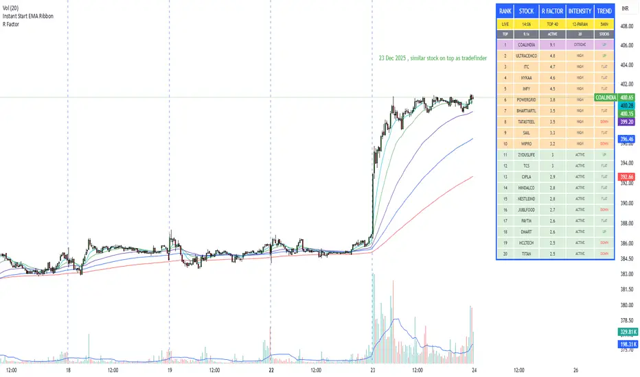
R Factor Advanced Stock Activity Ranking (Experimental) R Factor (relative factor) is a custom logic based 'momentum ranking' parameter, which measures intensity of intraday momentum and volatility. This parameter compared today's activity from last 20 days activity and ranks the stocks according to the intensity of the momentum.
Why momentum ranker?
Because traditional %change sorts intraday stock which show momentum in ascending order of value of % change, for example 3%, 2.5 %, 1% etc. But momentum ranker does not use % change as a sorting parameter for top gainers, or losers. It ranks the stocks, regardless of the direction, according to the intensity it is showing. The value of the momentum ranking has no meaning of itself, just understand that higher the value of momentum ranker, the more intensity the stock is showing.
In this indicator we can only scan 40 F&O stock of Indian Stock Market. This indicator is to be used only on 5 min timeframe.
Tip: Do not change any values in the settings otherwise, the indicator won't work as expected.
Also after applying the indicator, your canvas will shrink, manually fix it by stretching from Y axis, a table will appear showing top 20 stocks. Some times the indicator will glitch & show incorrect names of stocks, refresh the Tradingview website to fix this. Best used on a PC.
Disclaimer/Warning:
This parameter is inspired by TradeFinder and is an attempt to study the momentum of the stocks. This indicator in no way attempts to copy features of the TradeFinder software, this is purely an experimental Indicator, for the people who cannot afford to buy a trading software. This indicator does not provide Buy/Sell signals or nor is an investment advice. This indicator solely for the purpose of study of price and its momentum. Users are responsible for their own actions, profit/loss of the users is not the liability of author.