MTF Scalper - alemicihanMulti-Timeframe Scalper Strategy: Aligning the Big Picture for Quick Gains
This article presents a robust futures trading strategy designed for high-frequency scalping in the crypto market. It’s built on the principle of minimizing risk by ensuring that short-term entries are always aligned with the dominant, higher-timeframe trend.
The Core Concept: Alignment is Key
A Balanced Trend Follower approach, now refined for rapid scalping, uses a Multi-Timeframe (MTF) confirmation system to filter out market noise and increase the probability of a successful trade.
The strategy operates on a Low Timeframe (LTF) chart (e.g., 3m, 5m, or 15m) but only executes trades if the direction is validated by three Higher Timeframes (HTF).
ComponentPurposeFunctionHTF (D, 4h, 1h) EMA => Trend Confirmation =>Checks if the current price is above/below all three Exponential Moving Averages (EMA 20). This provides a strong directional bias.
LTF (5m) Stochastic RSI => Momentum Entry => Generates the actual buy/sell signal by spotting a swift crossover, indicating fresh momentum in the direction of the confirmed HTF trend.
How The Signal Is Generated
Trend Alignment: The system first confirms the trend. If the price is trading above the Daily, 4-Hour, and 1-Hour EMAs, the market is deemed to be in a Strong LONG Trend. Only LONG signals are permitted.
Momentum Trigger: Once the trend is confirmed, a Long Signal is generated only when the Stochastic K-Line crosses above the D-Line, indicating a momentum shift (a pullback ending) towards the main trend direction.
Short Signal: The inverse logic applies to the Short Trend confirmation and entry signal.
Mandatory Risk Management: ATR-Based Exit
Given the high leverage nature of futures and scalping, static Stop-Loss (SL) and Take-Profit (TP) levels are inefficient. This strategy uses the Average True Range (ATR) indicator to dynamically set profit and loss targets based on current market volatility.
Stop Loss (SL): Set dynamically at 1.5 x ATR below (for long) or above (for short) the entry price. This gives the trade enough room to breathe without risking excessive capital.
Take Profit (TP): Set dynamically at 3.0 x ATR, establishing a robust Risk-to-Reward Ratio of 1:2.
Final Thoughts on Testing
This sophisticated approach combines the reliability of MTF analysis with the speed of momentum indicators. However, data analysis is key. Backtesting these parameters (EMA, ATR Multipliers, RSI/Stochastic lengths) on your chosen asset (like BTC/USDT or ETH/USDT) and timeframe is crucial to achieving optimal performance.
Statistics
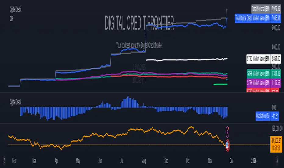
Digital Credit Market ValueDigital Credit Frontier
Script for tracking total notional value and total market value for the Digital Credit Market. Needs be manually updated. You can open it twice to get the total value in one pane and the oscillator in the other pane.
Uptrick: Dynamic Z-Score DivergenceIntroduction
Uptrick: Dynamic Z-Score Divergence is an oscillator that combines multiple momentum sources within a Z-Score framework, allowing for the detection of statistically significant mean-reversion setups, directional shifts, and divergence signals. It integrates a multi-source normalized oscillator, a slope-based signal engine, structured divergence logic, a slope-adaptive EMA with dynamic bands, and a modular bar coloring system. This script is designed to help traders identify statistically stretched conditions, evolving trend dynamics, and classical divergence behavior using a unified statistical approach.
Overview
At its core, this script calculates the Z-Score of three momentum sources—RSI, Stochastic RSI, and MACD—using a user-defined lookback period. These are averaged and smoothed to form the main oscillator line. This normalized oscillator reflects how far short-term momentum deviates from its mean, highlighting statistically extreme areas.
Signals are triggered when the oscillator reverses slope within defined inner zones, indicating a shift in direction while the signal remains in a statistically stretched state. These mean-reversion flips (referred to as TP signals) help identify turning points when price momentum begins to revert from extended zones.
In addition, the script includes a divergence detection engine that compares oscillator pivot points with price pivot points. It confirms regular bullish and bearish divergence by validating spacing between pivots and visualizes both the oscillator-side and chart-side divergences clearly.
A dynamic trend overlay system is included using a Slope Adaptive EMA (SA-EMA). This trend line becomes more responsive when Z-Score deviation increases, allowing the trend line to adapt to market conditions. It is paired with ATR-based bands that are slope-sensitive and selectively visible—offering context for dynamic support and resistance.
The script includes configurable bar coloring logic, allowing users to color candles based on oscillator slope, last confirmed divergence, or the most recent signal of any type. A full alert system is also built-in for key signals.
Originality
The script is based on the well-known concept of Z-Score valuation, which is a standard statistical method for identifying how far a signal deviates from its mean. This foundation—normalizing momentum values such as RSI or MACD to measure relative strength or weakness—is not unique to this script and is widely used in quantitative analysis.
What makes this implementation original is how it expands the Z-Score foundation into a fully featured, signal-producing system. First, it introduces a multi-source composite oscillator by combining three momentum inputs—RSI, Stochastic RSI, and MACD—into a unified Z-Score stream. Second, it builds on that stream with a directional slope logic that identifies turning points inside statistical zones.
The most distinctive additions are the layered features placed on top of this normalized oscillator:
A structured divergence detection engine that compares oscillator pivots with price pivots to validate regular bullish and bearish divergence using precise spacing and timing filters.
A fully integrated slope-adaptive EMA overlay, where the smoothing dynamically adjusts based on real-time Z-Score movement of RSI, allowing the trend line to become more reactive during high-momentum environments and slower during consolidation.
ATR-based dynamic bands that adapt to slope direction and offer real-time visual zones for support and resistance within trend structures.
These features are not typically found in standard Z-Score indicators and collectively provide a unique approach that bridges statistical normalization, structure detection, and adaptive trend modeling within one script.
Features
Z-Score-based oscillator combining RSI, StochRSI, and MACD
Configurable smoothing for stable composite signal output
Buy/Sell TP signals based on slope flips in defined zones
Background highlighting for extreme outer bands
Inner and outer zones with fill logic for statistical context
Pivot-based divergence detection (regular bullish/bearish)
Divergence markers on oscillator and price chart
Slope-Adaptive EMA (SA-EMA) with real-time adaptivity based on RSI Z-Score
ATR-based upper and lower bands around the SA-EMA, visibility tied to slope direction
Configurable bar coloring (oscillator slope, divergence, or most recent signal)
Alerts for TP signals and confirmed divergences
Optional fixed Y-axis scaling for consistent oscillator view
The full setup mode can be seen below:
Input Parameters
General Settings
Full Setup: Enables rendering of the full visual system (lines, bands, signals)
Z-Score Lookback: Lookback period for normalization (mean and standard deviation)
Main Line Smoothing: EMA length applied to the averaged Z-Score
Slope Detection Index: Used to calculate directional flips for signal logic
Enable Background Highlighting: Enables visual region coloring in
overbought/oversold areas
Force Visible Y-Axis Scale: Forces max/min bounds for a consistent oscillator range
Divergence Settings
Enable Divergence Detection: Toggles divergence logic
Pivot Lookback Left / Right: Defines the structure of oscillator pivot points
Minimum / Maximum Bars Between Pivots: Controls the allowed spacing range for divergence validation
Bar Coloring Settings
Bar Coloring Mode:
➜ Line Color: Colors bars based on oscillator slope
➜ Latest Confirmed Signal: Colors bars based on the most recent confirmed divergence
➜ Any Latest Signal: Colors based on the most recent signal (TP or divergence)
SA-EMA Settings
RSI Length: RSI period used to determine adaptivity
Z-Score Length: Lookback for normalizing RSI in adaptive logic
Base EMA Length: Base length for smoothing before adaptivity
Adaptivity Intensity: Scales the smoothing responsiveness based on RSI deviation
Slope Index: Determines slope direction for coloring and band logic
Band ATR Length / Band Multiplier: Controls the width and responsiveness of the trend-following bands
Alerts
The script includes the following alert conditions:
Buy Signal (TP reversal detected in oversold zone)
Sell Signal (TP reversal detected in overbought zone)
Confirmed Bullish Divergence (oscillator HL, price LL)
Confirmed Bearish Divergence (oscillator LH, price HH)
These alerts allow integration into automation systems or signal monitoring setups.
Summary
Uptrick: Dynamic Z-Score Divergence is a statistically grounded trading indicator that merges normalized multi-momentum analysis with real-time slope logic, divergence detection, and adaptive trend overlays. It helps traders identify mean-reversion conditions, divergence structures, and evolving trend zones using a modular system of statistical and structural tools. Its alert system, layered visuals, and flexible input design make it suitable for discretionary traders seeking to combine quantitative momentum logic with structural pattern recognition.
Disclaimer
This script is for educational and informational purposes only. No indicator can guarantee future performance, and trading involves risk. Always use risk management and test strategies in a simulated environment before deploying with live capital.

Now PDC ±0.5% & ±0.7% Levels (Custom Lines)Net Change of Instrument movement for the day. Enhances perception of price action

Pair Cointegration & Static Beta Analyzer (v6)Pair Cointegration & Static Beta Analyzer (v6)
This indicator evaluates whether two instruments exhibit statistical properties consistent with cointegration and tradable mean reversion.
It uses long-term beta estimation, spread standardization, AR(1) dynamics, drift stability, tail distribution analysis, and a multi-factor scoring model.
1. Static Beta and Spread Construction
A long-horizon static beta is estimated using covariance and variance of log-returns.
This beta does not update on every bar and is used throughout the entire model.
Beta = Cov(r1, r2) / Var(r2)
Spread = PriceA - Beta * PriceB
This “frozen” beta provides structural stability and avoids rolling noise in spread construction.
2. Correlation Check
Log-price correlation ensures the instruments move together over time.
Correlation ≥ 0.85 is required before deeper cointegration diagnostics are considered meaningful.
3. Z-Score Normalization and Distribution Behavior
The spread is standardized:
Z = (Spread - MA(Spread)) / Std(Spread)
The following statistical properties are examined:
Z-Mean: Should be close to zero in a stationary process
Z-Variance: Measures amplitude of deviations
Tail Probability: Frequency of |Z| being larger than a threshold (e.g. 2)
These metrics reveal whether the spread behaves like a mean-reverting equilibrium.
4. Mean Drift Stability
A rolling mean of the spread is examined.
If the rolling mean drifts excessively, the spread may not represent a stable long-term equilibrium.
A normalized drift ratio is used:
Mean Drift Ratio = Range( RollingMean(Spread) ) / Std(Spread)
Low drift indicates stable long-run equilibrium behavior.
5. AR(1) Dynamics and Half-Life
An AR(1) model approximates mean reversion:
Spread(t) = Phi * Spread(t-1) + error
Mean reversion requires:
0 < Phi < 1
Half-life of reversion:
Half-life = -ln(2) / ln(Phi)
Valid half-life for 10-minute bars typically falls between 3 and 80 bars.
6. Composite Scoring Model (0–100)
A multi-factor weighted scoring system is applied:
Component Score
Correlation 0–20
Z-Mean 0–15
Z-Variance 0–10
Tail Probability 0–10
Mean Drift 0–15
AR(1) Phi 0–15
Half-Life 0–15
Score interpretation:
70–100: Strong Cointegration Quality
40–70: Moderate
0–40: Weak
A pair is classified as cointegrated when:
Total Score ≥ Threshold (default = 70)
7. Main Cointegration Panel
Displays:
Static beta
Log-price correlation
Z-Mean, Z-Variance, Tail Probability
Drift Ratio
AR(1) Phi and Half-life
Composite score
Overall cointegration assessment
8. Beta Hedge Position Sizing (Average-Price Based)
To provide a more stable hedge ratio, hedge sizing is computed using average prices, not instantaneous prices:
AvgPriceA = SMA(PriceA, N)
AvgPriceB = SMA(PriceB, N)
Required B per 1 A = Beta * (AvgPriceA / AvgPriceB)
Using averaged prices results in a smoother, more reliable hedge ratio, reducing noise from bar-to-bar volatility.
The panel displays:
Required B security for 1 A security (average)
This represents the beta-neutral quantity of B required to hedge one unit of A.
Overview of Classical Stationarity & Cointegration Methods
The principal econometric tools commonly used in assessing stationarity and cointegration include:
Augmented Dickey–Fuller (ADF) Test
Phillips–Perron (PP) Test
KPSS Test
Engle–Granger Cointegration Test
Phillips–Ouliaris Cointegration Test
Johansen Cointegration Test
Since these procedures rely on regression residuals, matrix operations, and distribution-based critical values that are not supported in TradingView Pine Script, a practical multi-criteria scoring approach is employed instead. This framework leverages metrics that are fully computable in Pine and offers an operational proxy for evaluating cointegration-like behavior under platform constraints.
References
Engle & Granger (1987), Co-integration and Error Correction
Poterba & Summers (1988), Mean Reversion in Stock Prices
Vidyamurthy (2004), Pairs Trading
Explanation structured with assistance from OpenAI’s ChatGPT
Regards.

GVI – Guendogan Valuation IndexGlobalization-adjusted valuation indicator modeling rising international revenue exposure since 1990. Includes a long-term fair-value framework.

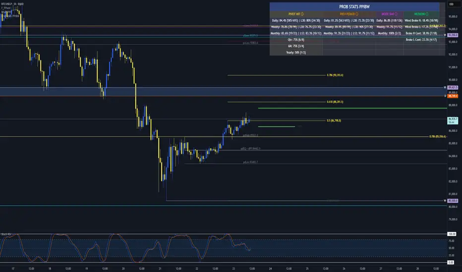
Prob Stats PPIBW Prob Stats PPIBW - Data-Driven Trading Decisions
Transform historical price patterns into actionable probabilities. This indicator analyzes thousands of periods to show you the real odds behind pivot hits, range
expansions, inside bars, and weekend breakouts.
What It Tracks
Pivot Hit Rates (D/W/M/Q/6M/Y)
What percentage of pivot points get touched during their period? Includes recent period comparison to spot regime changes.
Example: "Daily: 82.3% (450/547) | L30: 76.7% (23/30)"
Previous Period Levels (D/W/M)
How often does current period break previous period's high or low? Only counts actual range expansion, not equilibrium crossings. Helps gauge breakout probability.
Inside Bar Analysis (D/W/M)
When price consolidates inside previous period's range, what are the odds of a breakout? Only appears when currently in an inside bar.
Weekend Breakdown
When Sat/Sun breaks Mon-Fri range, does the following week continue? Critical for crypto traders and weekend gap analysis.
Key Features
- Recent Period Comparison: See if recent behavior differs from historical averages
- Self-Documenting: Hover over any header for instant explanations
- Color-Coded Sections: Yellow (Pivots), Orange (Prev Period), Pink (Inside Bar), Green (Weekend)
- Blue Background: Recent stats highlighted for easy identification
- Dynamic Layout: Adapts based on market conditions
- Real-Time Updates: Includes current period for live probability tracking
How To Use
1. Add to any chart (best on Daily+ for maximum historical data)
2. Hover over column headers to understand each statistic
3. Compare historical vs recent probabilities
4. Use probabilities to inform position sizing and expectations
Example: Weekly pivot shows 78% historical hit rate but only 60% in last 30 weeks. Recent regime change suggests lower probability of test.
Technical Details
- Pine Script v6
- Rolling window arrays track last 30/30/12 periods for D/W/M
- Previous Period excludes EQ crossings for accurate stats
- Works on all timeframes, optimized for Daily+
- Configurable table position
Perfect For
Traders seeking data-driven confirmation, those wanting to quantify probability vs guessing, regime change detection, and crypto traders analyzing weekend patterns.
Note: Past performance doesn't guarantee future results. Use these statistics as one input in your overall trading strategy.
FVG – (auto close + age) GR V1.0FVG – Fair Value Gaps (auto close + age counter)
Short Description
Automatically detects Fair Value Gaps (FVGs) on the current timeframe, keeps them open until price fully fills the gap or a maximum bar age is reached, and shows how many candles have passed since each FVG was created.
Full Description
This indicator automatically finds and visualizes Fair Value Gaps (FVGs) using the classic 3-candle ICT logic on any timeframe.
It works on whatever timeframe you apply it to (M1, M5, H1, H4, etc.) and adapts to the current chart.
FVG detection logic
The script uses a 3-candle pattern:
Bullish FVG
Condition:
low > high
Gap zone:
Lower boundary: high
Upper boundary: low
Bearish FVG
Condition:
high < low
Gap zone:
Lower boundary: high
Upper boundary: low
Each detected FVG is drawn as a colored box (green for bullish, red for bearish in this version, but you can adjust colors in the inputs).
Auto-close rules
An FVG remains on the chart until one of the following happens:
Full fill / mitigation
A bullish FVG closes when any candle’s low goes down to or below the lower boundary of the gap.
A bearish FVG closes when any candle’s high goes up to or above the upper boundary of the gap.
Maximum bar age reached
Each FVG has a maximum lifetime measured in candles.
When the number of candles since its creation reaches the configured maximum (default: 200 bars), the FVG is automatically removed even if it has not been fully filled.
This keeps the chart cleaner and prevents very old gaps from cluttering the view.
Age counter (labels inside the boxes)
Inside every FVG box there is a small label that:
Shows how many bars have passed since the FVG was created.
Moves together with the right edge of the box and stays vertically centered in the gap.
This makes it easy to distinguish fresh gaps from older ones and prioritize which zones you want to pay attention to.
Inputs
FVG color – Main fill color for all FVG boxes.
Show bullish FVGs – Turn bullish gaps on/off.
Show bearish FVGs – Turn bearish gaps on/off.
Max bar age – Maximum number of candles an FVG is allowed to stay on the chart before it is removed.
Usage
Works on any symbol and any timeframe.
Can be combined with your own ICT / SMC concepts, order blocks, session ranges, market structure, etc.
You can also choose to only display bullish or only bearish FVGs depending on your directional bias.
Disclaimer
This script is for educational and informational purposes only and is not financial advice. Always do your own research and use proper risk management when trading.

Average Daily Range by EleventradesThis indicator calculates the Average Daily Range based on any number of past candles you choose, and it shows you the projected expansion for the current daily candle. You can also enable features like mean-reversion for large-range days, reversal thresholds, and filters for candles with big wicks. The full guide is already posted on YouTube along with a PDF.

HPAS mean reversion strategy testerTakes Krown HPAS values hardcoded and simulates longs and short with configurable standard deviation multiplier TP/SL. Best used on lower timeframes

Intraday Close Price VariationShows in the graph the intraday variation, being useful when using the replay feature.

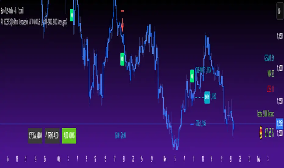
PIP BOOSTER (Desktop) DemoversionThe PIP BOOSTER from underground-traders.com is a very intelligent indicator with integrated win-rate tracking (%), which can be used on all markets and timeframes. Thanks to its two fundamentally different algorithms, the PIP BOOSTER is able to find a profitable setup in over 80% of all charts. The win-rate tracking (%) is highly detailed and can be applied to up to 5,000 candles.
It updates after every single signal, ensuring that performance monitoring is always up to date. Additionally, PIP BOOSTER users can apply different time filters, which can further optimize performance.
There is both a desktop version and a mobile version, which can be used with the TradingView mobile app. All signals are displayed clearly in the mobile app, making it possible to trade directly from your smartphone.
Please note that the demo version does not include any live signals. The demo version is only for you to evaluate the performance (win-rate %) of the two algorithms.
We guarantee that there are no repaint signals, and the signals in the demo version are 100% identical to those in the full version.
For any questions, please visit:
underground-traders.com
Or contact us at:
help@underground-traders.com
PIP BOOSTER (Mobile) DemoversionThe PIP BOOSTER from underground-traders.com is a very intelligent indicator with integrated win-rate tracking (%), which can be used on all markets and timeframes. Thanks to its two fundamentally different algorithms, the PIP BOOSTER is able to find a profitable setup in over 80% of all charts. The win-rate tracking (%) is highly detailed and can be applied to up to 5,000 candles.
It updates after every single signal, ensuring that performance monitoring is always up to date. Additionally, PIP BOOSTER users can apply different time filters, which can further optimize performance.
There is both a desktop version and a mobile version, which can be used with the TradingView mobile app. All signals are displayed clearly in the mobile app, making it possible to trade directly from your smartphone.
Please note that the demo version does not include any live signals. The demo version is only for you to evaluate the performance (win-rate %) of the two algorithms.
We guarantee that there are no repaint signals, and the signals in the demo version are 100% identical to those in the full version.
For any questions, please visit:
underground-traders.com
Or contact us at:
help@underground-traders.com

PIP BOOSTER (Desktop) FullversionThe PIP BOOSTER from underground-traders.com is a very intelligent indicator with integrated win-rate tracking (%), which can be used on all markets and timeframes. Thanks to its two fundamentally different algorithms, the PIP BOOSTER is able to find a profitable setup in over 80% of all charts. The win-rate tracking (%) is highly detailed and can be applied to up to 5,000 candles.
It updates after every single signal, ensuring that performance monitoring is always up to date. Additionally, PIP BOOSTER users can apply different time filters, which can further optimize performance.
There is both a desktop version and a mobile version, which can be used with the TradingView mobile app. All signals are displayed clearly in the mobile app, making it possible to trade directly from your smartphone.
Please note that the demo version does not include any live signals. The demo version is only for you to evaluate the performance (win-rate %) of the two algorithms.
We guarantee that there are no repaint signals, and the signals in the demo version are 100% identical to those in the full version.
For any questions, please visit:
underground-traders.com
Or contact us at:
help@underground-traders.com

PIP BOOSTER (Mobile) FullversionThe PIP BOOSTER from underground-traders.com is a very intelligent indicator with integrated win-rate tracking (%), which can be used on all markets and timeframes. Thanks to its two fundamentally different algorithms, the PIP BOOSTER is able to find a profitable setup in over 80% of all charts. The win-rate tracking (%) is highly detailed and can be applied to up to 5,000 candles.
It updates after every single signal, ensuring that performance monitoring is always up to date. Additionally, PIP BOOSTER users can apply different time filters, which can further optimize performance.
There is both a desktop version and a mobile version, which can be used with the TradingView mobile app. All signals are displayed clearly in the mobile app, making it possible to trade directly from your smartphone.
Please note that the demo version does not include any live signals. The demo version is only for you to evaluate the performance (win-rate %) of the two algorithms.
We guarantee that there are no repaint signals, and the signals in the demo version are 100% identical to those in the full version.
For any questions, please visit:
underground-traders.com
Or contact us at:
help@underground-traders.com

VWAP ±2σ Entry Signals (volume Weighted)This indicator builds a session based VWAP and plots the upper and lower 2nd standard deviation bands around it. These bands act as dynamic volatility edges for the session. When price reaches these outer bands, it often represents an extreme stretch away from fair value a place where mean reversion or exhaustion can occur.
The indicator generates trade signals only when price approaches the band from the correct direction, which filters out a lot of noise and reduces false touches.
How It Works
VWAP is calculated from the start of each session.
Standard deviation is computed using volume weighted prices, so the bands expand and contract with real market activity.
The upper and lower 2σ bands form natural "overextended" zones around VWAP.
Most VWAP band strategies fire signals every time price touches a band which produces a lot of junk signals.
This version avoids that by requiring direction based touches, meaning:
If price is already above the band, no sell signal appears.
If price is already below the band, no buy signal appears.

BTC Macro Heatmap (Fed Cuts & Hikes)🔴 1. Red line – Fed Funds Rate (policy trend)
This line tells you what stage of the monetary cycle we’re in.
Rising red line = the Fed is hiking → liquidity is tightening → money leaves risk assets like BTC.
Flat = pause → markets start pricing in the next move (often sideways BTC).
Falling = easing / cutting → liquidity returns → bullish environment builds.
The rate of change matters more than the level. When the slope turns down, capital starts seeking yield again — BTC benefits first because it’s the most volatile asset.
💚 2. Dim green zones – detected cuts
These are data-based easing events pulled directly from FRED.
They show when the actual effective rate began moving down, not necessarily the exact meeting day.
Think of them as the Fed’s “foot off the brake” — that’s when risk markets begin responding.
🟩 3. Bright green lines – official FOMC cuts
These are the real policy shifts — the Fed formally changed direction.
After these appear, BTC historically transitions from accumulation → markup phase.
Look at 2020: the bright green lines came right before BTC’s full reversal.
You’re seeing the same thing now with the 2025 lines — early-stage liquidity return.
🟠 4. Orange line – DXY (US Dollar Index)
DXY is your “risk-off” gauge.
When DXY rises, global investors flock to dollars → BTC usually weakens.
When DXY peaks and starts dropping, it means risk appetite is coming back → BTC rallies.
BTC and DXY are inversely correlated about 70–80% of the time.
Watch for DXY lower highs after rate cuts — that’s your macro confirmation of a BTC-friendly environment.
🟦 5. Aqua line – BTC (normalized)
You’re not looking for the price itself here, but its shape relative to DXY and the Fed line.
When BTC curls up as the red line flattens and DXY rolls over → that’s historically the start of a major bull phase.
BTC tends to bottom before the first cut and explode once DXY decisively breaks down.
🧠 Putting it together
Here’s the rhythm this chart shows over and over:
Fed hikes (red line rising) → BTC weakens, DXY climbs.
Fed pauses (red line flat) → BTC stops falling, DXY tops.
Fed cuts (dim + bright green) → DXY turns down → BTC begins long recovery → bull cycle starts.

RLSR logreg_support_libLibrary "logreg_support_lib"
sigmoid(z)
Parameters:
z (float)
prng01(seed1, seed2)
Parameters:
seed1 (float)
seed2 (float)
normalize(value, minval, maxval)
Parameters:
value (float)
minval (float)
maxval (float)
calcpercentilefast(arr, percentile)
Parameters:
arr (array)
percentile (float)
calcpercentile_series_sampled(s, length, percentile, stride)
Parameters:
s (float)
length (int)
percentile (float)
stride (int)
calcRangeWithLog(value, minval, maxval, uselog)
Parameters:
value (float)
minval (float)
maxval (float)
uselog (bool)
calcMomentumAdvanced(src, length, momType)
Parameters:
src (float)
length (simple int)
momType (string)
normalizeMomentumByType(rawMom, momType, momMin, momMax, momNorm)
Parameters:
rawMom (float)
momType (string)
momMin (float)
momMax (float)
momNorm (float)
normalizeMomentumByTypeExt(rawMom, momType, momMin, momMax, momNorm, bouncingdecay)
Parameters:
rawMom (float)
momType (string)
momMin (float)
momMax (float)
momNorm (float)
bouncingdecay (float)
calcrollingstddev(src, length)
Parameters:
src (float)
length (int)
addlog(buffer, level, msg)
Parameters:
buffer (string)
level (string)
msg (string)
calcfeaturecorrelation(x1, x2)
Parameters:
x1 (array)
x2 (array)
calcnoiseratio(src, lookback)
Parameters:
src (float)
lookback (int)
calccompatibilityscore(x1, x2)
Parameters:
x1 (array)
x2 (array)
getfuturereturn(offset, returnlookback)
Parameters:
offset (int)
returnlookback (int)
calculatema(source, length, matype)
Parameters:
source (float)
length (simple int)
matype (string)
adaptive_trigger_for_source(src, enabled, freeze, lookback, threshold, volahistory)
Parameters:
src (float)
enabled (bool)
freeze (bool)
lookback (int)
threshold (float)
volahistory (array)
checkadaptivetrigger5(s1, enabled1, freeze1, hist1, s2, enabled2, freeze2, hist2, s3, enabled3, freeze3, hist3, s4, enabled4, freeze4, hist4, s5, enabled5, freeze5, hist5, lookback, threshold)
Parameters:
s1 (float)
enabled1 (bool)
freeze1 (bool)
hist1 (array)
s2 (float)
enabled2 (bool)
freeze2 (bool)
hist2 (array)
s3 (float)
enabled3 (bool)
freeze3 (bool)
hist3 (array)
s4 (float)
enabled4 (bool)
freeze4 (bool)
hist4 (array)
s5 (float)
enabled5 (bool)
freeze5 (bool)
hist5 (array)
lookback (int)
threshold (float)
ring_start_index(rb_write_idx, rb_count, rb_cap)
Parameters:
rb_write_idx (int)
rb_count (int)
rb_cap (int)

reversalLibrary "reversals"
psar(af_start, af_increment, af_max)
Calculates Parabolic Stop And Reverse (SAR)
Parameters:
af_start (simple float) : Initial acceleration factor (Wilder's original: 0.02)
af_increment (simple float) : Acceleration factor increment per new extreme (Wilder's original: 0.02)
af_max (simple float) : Maximum acceleration factor (Wilder's original: 0.20)
Returns: SAR value (stop level for current trend)
fractals()
Detects Williams Fractal patterns (5-bar pattern)
Returns: Tuple with fractal values (na if no fractal)
swings(lookback, source_high, source_low)
Detects swing highs and swing lows using lookback period
Parameters:
lookback (simple int) : Number of bars on each side to confirm swing point
source_high (float) : Price series for swing high detection (typically high)
source_low (float) : Price series for swing low detection (typically low)
Returns: Tuple with swing point values (na if no swing)
pivot(tf)
Calculates classic/standard/floor pivot points
Parameters:
tf (simple string) : Timeframe for pivot calculation ("D", "W", "M")
Returns: Tuple with pivot levels
pivotcam(tf)
Calculates Camarilla pivot points with 8 levels for short-term trading
Parameters:
tf (simple string) : Timeframe for pivot calculation ("D", "W", "M")
Returns: Tuple with pivot levels
pivotdem(tf)
Calculates d-mark pivot points with conditional open/close logic
Parameters:
tf (simple string) : Timeframe for pivot calculation ("D", "W", "M")
Returns: Tuple with pivot levels (only 3 levels)
pivotext(tf)
Calculates extended traditional pivot points with R4-R5 and S4-S5 levels
Parameters:
tf (simple string) : Timeframe for pivot calculation ("D", "W", "M")
Returns: Tuple with pivot levels
pivotfib(tf)
Calculates Fibonacci pivot points using Fibonacci ratios
Parameters:
tf (simple string) : Timeframe for pivot calculation ("D", "W", "M")
Returns: Tuple with pivot levels
pivotwood(tf)
Calculates Woodie's pivot points with weighted closing price
Parameters:
tf (simple string) : Timeframe for pivot calculation ("D", "W", "M")
Returns: Tuple with pivot levels

Weekday Close vs Open — Last N (per weekday)# Weekday Close vs Open - Last N Occurrences
This indicator distills every weekday's historical open-to-close behavior into a compact table so you can see how "typical" the current session is before the day even closes. It runs independently of your chart timeframe by pulling daily OHLCV data under the hood, tracking the last **N** completed occurrences for each weekday, and refreshing only when a daily bar closes. On daily charts you can also shade every past bar that matches today's weekday (excluding the in-progress session) to reinforce the pattern visually while the table remains non-repainting.
## What It Shows
- **Win/Loss/Tie counts** - how many of the last `N` occurrences closed above the open (wins), below (losses), or inside the tie threshold you define as "flat".
- **Win % heatmap** - the win column is color-coded (deep green > deep red) so you immediately recognize strong or weak weekdays.
- **Advanced metrics (optional)** - average daily volume plus the average percentage excursion above/below the open (`AvgUp%`, `AvgDn%`) for that weekday.
- **Totals row** - aggregates every weekday into one row to estimate overall hit rate and average stats across the entire data set.
- **Weekday shading (optional)** - on daily charts you can tint every bar that matches today's weekday (all Mondays, all Fridays, etc.) for instant pattern recognition.
## How It Works
1. The script requests daily OHLCV data (non-repainting) regardless of the chart timeframe.
2. When a new daily bar confirms, it packs that day's data into one of seven arrays (one per weekday). Each day contributes five floats (O/H/L/C/V) so trimming and statistics stay in lockstep.
3. A helper function (`f_dayMetrics`) scans daily history to compute average volume, average excursion above/below the open, and win/loss/tie counts for the requested weekday.
4. The table populates on the last bar of the chart session, respecting your advanced/totals toggles and keeping text at `size.normal`.
## Reading the Table
- **Win/Loss/Tie columns**: raw counts taken from your chosen `N`.
- **Win %***: excludes ties from the denominator so it reflects only decisive closes.
- **AvgUp% / AvgDn%**: typical intraday extension (high vs open, open vs low) in percent.
- **Avg Vol**: arithmetic mean of daily volume for that weekday.
- **TOTAL row**: provides a global win rate plus volume/up/down averages weighted by how many samples each weekday contributed.
## Practical Uses
- Spot weekdays that historically trend higher or lower before entering a trade.
- Compare current price action against the typical intraday range (`AvgUp%` vs today's move).
- Filter mean-reversion vs breakout setups based on the most reliable weekday patterns.
- Quickly gauge whether today is behaving "in character" by referencing the highlighted row or the optional whole-chart weekday shading.
> **Tip:** Use smaller `N` values (e.g., 10-20) for adaptive, recent behavior and larger values (50+) to capture longer-term seasonality. Tighten the tie threshold if you want almost every candle to register as win/loss, or widen it to focus only on meaningful moves.

Forward Returns – (Next Month Start)This indicator calculates 1-month, 3-month, 6-month, and 12-month forward returns starting from the first trading day of the month following a defined price event.
A price event occurs when the selected asset drops below a user-defined threshold over a chosen timeframe (Day, Week, or Month).
For monthly conditions, the script evaluates the entire performance of the previous calendar month and triggers the event only at the first trading session of the next month, ensuring accurate forward-return alignment with historical monthly cycles.
The forward returns for each detected event are displayed in a paginated performance table, allowing users to navigate through large datasets using a page selector. Each page includes:
Entry Date
Forward returns (1M, 3M, 6M, 12M)
Average forward return
Win rate (percentage of positive outcomes)
This tool is useful for studying historical performance after major drawdowns, identifying seasonal patterns, and building evidence-based risk-management or timing models.

Frank Strategy V2.06 Quantum FilterThe Frank Strategy indicator version 2.06 is designed to:
Identify high-probability entries
Filter out false signals typical of XAUUSD (especially M1–M5)
Enter only when trend + momentum + market coherence are aligned
Provide automatic TP/SL based on volatility
Get additional confirmation with the quant filter
It is a strategy for short and medium-term trends, not for impulsive scalping or excessively long cycles.
The Frank Strategy aims to:
Do not chase the price
Do not enter sideways
Do not trade without momentum
Do not trade without coherence between trend + strength + volatility
Avoid impulsive and noisy entries
It is a strategy designed to be:
selective
precise
repeatable
disciplined

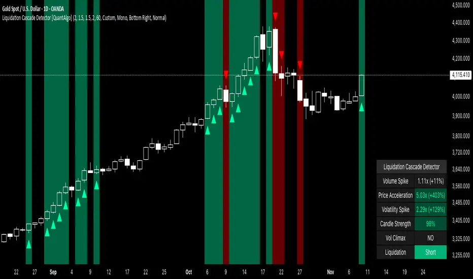
Liquidation Cascade Detector [QuantAlgo]🟢 Overview
The Liquidation Cascade Detector employs multi-dimensional microstructure analysis to identify forced liquidation events by synthesizing volume anomalies, price acceleration dynamics, and volatility regime shifts. Unlike conventional momentum indicators that merely track directional bias, this indicator isolates the specific market conditions where leveraged positions experience forced unwinding, creating asymmetric opportunities for mean reversion traders and market makers to take advantage of temporary liquidity imbalances.
These liquidation cascades manifest through various catalysts: overwhelming spot selling coupled with leveraged long liquidation forced unwinding creates downward spirals where organic sell pressure triggers margin calls, which generate additional selling that triggers more margin calls. Conversely, sudden large buy orders or coordinated buying can squeeze overleveraged shorts, forcing buy-to-cover orders that push price higher, triggering additional short stops in a self-reinforcing feedback loop. The indicator captures both scenarios, regardless of whether the initial catalyst is organic flow or forced liquidation.
For sophisticated traders/market makers deploying amplification strategies, this indicator serves as an early warning system for distressed order flow. By detecting the moments when cascading stop-losses and margin calls create self-reinforcing price movements, the system enables traders to: (1) identify forced participants experiencing capital pressure, (2) strategically add liquidity in the direction of panic flow to amplify displacement, (3) accumulate contra-positions during the overshoot phase, and (4) capture mean reversion profits as equilibrium pricing reasserts itself. This approach transforms destructive liquidation events into potential profit opportunities by systematically front-running and then fading coordinated forced selling/buying.
🟢 How It Works
The detection engine operates through a three-tier confirmation framework that validates liquidation events only when multiple independent market stress indicators align simultaneously:
► Tier 1: Volume Anomaly Detection
The system calculates bar-to-bar volume ratios to identify abnormal participation spikes characteristic of forced liquidations. The Volume Spike threshold filters for transactions where current volume significantly exceeds previous bar volume. When leveraged positions hit stop-losses or margin requirements, their simultaneous unwinding creates distinctive volume signatures absent during organic price discovery. This metric isolates moments when market makers face one-sided order flow from distressed participants unable to control execution timing, whether triggered by whale orders absorbing liquidity or cascading margin calls creating relentless directional pressure.
► Tier 2: Price Acceleration Measurement
By comparing current bar's absolute body size against the previous bar's movement, the algorithm quantifies momentum acceleration. The Price Acceleration threshold identifies scenarios where price velocity increases dramatically, a hallmark of cascading liquidations where each stop-loss triggers additional stops in a feedback loop. This calculation distinguishes between gradual trend development (irrelevant for amplification attacks) and explosive moves driven by forced order flow requiring immediate liquidity provision. The metric captures both panic selling scenarios where spot sellers overwhelm bid liquidity triggering long liquidations, and short squeeze dynamics where aggressive buying exhausts offer-side depth forcing short covering.
► Tier 3: Volatility Expansion Analysis
The indicator measures bar range expansion by computing the current high-low range relative to the previous bar. The Volatility Spike threshold captures regime shifts where intrabar price action becomes erratic, evidence that market depth has evaporated and order book imbalance is driving price. Combined with body-to-range analysis indicating strong directional conviction, this metric confirms that volatility expansion reflects genuine liquidation pressure rather than random noise or low-volume chop.
*Supplementary Confirmation Metrics
Beyond the three primary detection tiers, the system analyzes additional candle characteristics that distinguish genuine liquidation events from ordinary volatility:
► Candle Strength: Measures the ratio of candle body size to total bar range. High readings (above 60%) indicate strong directional conviction where price moved decisively in one direction with minimal retracement. During liquidations, distressed traders execute market orders that drive price aggressively without the normal back-and-forth of balanced trading. Strong-bodied candles with minimal wicks confirm forced participants are accepting any available price rather than attempting to minimize slippage, validating that observed volume and price acceleration stem from liquidation pressure rather than routine trading.
► Volume Climax: Identifies when current volume reaches the highest level within recent history. Climax volume events mark terminal liquidation phases where maximum panic or squeeze intensity occurs. These extreme participation spikes typically represent the final wave of forced exits as the last remaining stops are triggered or the final shorts capitulate. For mean reversion traders, volume climax signals provide optimal reversal entry timing, as they mark maximum displacement from equilibrium when all forced sellers/buyers have been exhausted.
*Directional Classification
The system categorizes cascades into two actionable classes:
1. Short Liquidation (Bullish Cascade): Upward price movement combined with cascade patterns equals forced short covering. This occurs when aggressive spot buying (often from whales placing large market orders) or coordinated buy programs exhaust available offer liquidity, spiking price upward and triggering clustered short stop-losses. Short sellers experiencing margin pressure must buy-to-close regardless of price, creating artificial demand spikes that compound the initial buying pressure. The combination of organic buying and forced covering creates explosive upward moves as each liquidated short adds buy-side pressure, triggering additional shorts in a self-reinforcing loop. Market makers can amplify this by lifting offers ahead of forced buy orders, then selling into the exhaustion at elevated levels.
2. Long Liquidation (Bearish Cascade): Downward price movement combined with cascade patterns equals forced long liquidation. This manifests when heavy spot selling (panic sellers, large institutional unwinds, or coordinated distribution) overwhelms bid-side liquidity, breaking through support levels where long stop-losses cluster. Over-leveraged longs facing margin calls must sell-to-close at any price, generating artificial supply waves that compound the initial selling pressure. The dual force of organic selling coupled with forced long liquidation creates downward spirals where each margin call triggers additional margin calls through further price deterioration. Amplification opportunities exist by hitting bids ahead of panic selling, accumulating long positions during the capitulation, and reversing as sellers exhaust.
🟢 How to Use
1. For Mean Reversion Traders
When the indicator highlights a short liquidation cascade (green background), this signals that shorts are experiencing forced buy-to-cover pressure, often initiated by whale bids or aggressive spot buying that triggered the squeeze. Mean reversion traders can interpret this as a temporary upward dislocation from fair value. As the dashboard shows declining momentum metrics and the cascade highlighting stops, this represents a potential fade opportunity. Enter short positions expecting price to revert back toward pre-cascade levels once the forced buying exhausts and the initial large buyer completes their accumulation.
When a long liquidation cascade triggers (red background), longs are undergoing forced sell-to-close liquidation, typically catalyzed by overwhelming spot selling that breached key support levels. This creates artificial downward pressure disconnected from fundamental value, as margin-driven forced selling compounds organic sell flow. Mean reversion traders wait for the cascade to complete (dashboard transitions from active liquidation status to neutral), then enter long positions anticipating snap-back toward equilibrium pricing as panic subsides and forced sellers are exhausted.
You can also monitor the dashboard's Volume Climax indicator. When it displays "YES" during an active cascade, this suggests the liquidation is reaching its terminal phase, whether driven by the final shorts being squeezed out or the last leveraged longs capitulating. Mean reversion entries become highest probability at this point, as maximum displacement from fair value has occurred. Wait for the next 1-3 bars after climax confirmation, then enter contra-trend positions with tight stops.
The Candle Strength metric also helps validate entry timing. When candle strength readings drop significantly after maintaining elevated levels during the cascade, this divergence indicates absorption is occurring. Market makers are stepping in to provide liquidity, supporting your mean reversion thesis. Strong candle bodies during the cascade followed by weaker bodies signal the forced flow is diminishing.
2. For Momentum & Trend Following Traders
When price breaks through a significant resistance level and immediately triggers a short liquidation cascade (green background), this confirms breakout validity through forced participation. Shorts positioned against the breakout are now experiencing margin pressure from the combination of breakout momentum and potential whale buying, creating self-reinforcing buying that propels price higher. Enter long positions during the cascade or immediately after, as the forced covering provides fuel for extended momentum continuation.
Conversely, when price breaks below key support and triggers a long liquidation cascade (red background), the breakdown is validated by forced selling from trapped longs. Heavy spot selling coupled with margin liquidations creates accelerated downside momentum as liquidations cascade through clustered stop-loss levels. Enter short positions as the cascade develops, riding the combined force of organic selling and forced liquidation for extended trend moves.
3. For Sophisticated Traders & Market Makers
► Amplification Attack Execution
Sophisticated operators can exploit cascades through systematic amplification positioning. When a short liquidation is detected (green highlight activating), often initiated by whale bids absorbing offer liquidity, place aggressive buy orders to front-run and amplify the forced short covering. This exacerbates upward pressure, pushing price further from equilibrium and triggering additional clustered stops. Simultaneously begin accumulating short positions at these artificially elevated levels. As dashboard metrics indicate cascade exhaustion (volume spike declining, climax signal appearing, candle strength weakening), flatten amplification longs and hold accumulated shorts into the mean reversion.
For long liquidations (red highlight), typically catalyzed by heavy spot selling overwhelming bid depth, execute the inverse strategy. Place aggressive sell orders to compound the panic selling, amplifying downward displacement and accelerating margin call triggers. Layer long entries at depressed prices during this amplification phase as forced liquidation selling creates artificial supply. When dashboard signals cascade completion (metrics normalizing, volume climax passing), exit amplification shorts and maintain long positions for the reversal trade.
► Market Making During Liquidity Crises
During detected cascades, temporarily adjust quote placement strategy. When dashboard shows all three confirmation metrics activating simultaneously with strong candle bodies, this indicates the highest probability liquidation event, whether from whale order flow or cascading margin calls. Widen spreads dramatically to capture enhanced edge during the liquidity vacuum. Alternatively, step away from quote provision entirely on your natural inventory side (stop offering during short cascades driven by aggressive buying, stop bidding during long cascades driven by overwhelming selling) to avoid adverse selection from forced flow.
Use cascade detection to inform inventory management. During short cascades initiated by large buy orders or short squeezes, reduce existing short inventory exposure while allowing the forced buying to push price higher. Rebuild short inventory only at the inflated levels created by liquidation pressure. During long cascades where spot selling compounds leveraged liquidation, reduce long inventory and use the forced selling to reaccumulate at artificially depressed prices rather than providing stabilizing liquidity too early.
► Sequential Positioning Strategy
Advanced traders can structure trades in phases: (1) Initial amplification orders placed immediately upon cascade detection to front-run forced flow, (2) Contra-position accumulation scaled in as displacement extends and dashboard readings intensify, (3) Amplification trade exit when metrics show deceleration or candle strength weakens, (4) Contra-position hold through mean reversion, targeting pre-cascade price levels. This sequential approach extracts profit from both the dislocation phase and the subsequent equilibrium restoration.
► Risk Monitoring
If cascade highlighting persists across many consecutive bars while dashboard volume readings remain extremely elevated with sustained strong candle bodies, this suggests sustained institutional deleveraging or persistent whale activity rather than simple retail liquidation. Reduce amplification position sizing significantly, as these extended events can exhibit delayed mean reversion. Professional counter-parties may be establishing dominant positions, limiting your edge.
When volatility spike metrics decline while cascade highlighting continues, professional absorption is occurring. Proceed cautiously with amplification strategies, as intelligent liquidity providers are already positioning for the reversal, potentially front-running your intended reversal trade. Similarly, if large liquidation wicks appear during cascades, this indicates partial absorption is happening, suggesting more sophisticated players are taking the opposite side of distressed flow.