AP Capital – Volatility + High/Low Projection v1.1📌 AP Capital – Volatility + High/Low Projection v1.1
Predictive Daily Volatility • Session Logic • High/Low Projection Indicator
This indicator is designed to help traders visually understand daily volatility conditions, identify session-based turning points, and anticipate potential highs and lows of the day using statistical behavior observed across thousands of bars of intraday data.
It combines intraday session structure, volatility regime classification, and context from the previous day’s expansion to highlight high-probability areas where the market may set its daily high or daily low.
🔍 What This Indicator Does
1. Volatility Regime Detection
Each day is classified into:
🔴 High Volatility (trend continuation & expansion likely)
🟡 Normal Volatility
🔵 Low Volatility (chop, false breaks, mean-reversion common)
The background color automatically adapts so you always know what environment you're trading in.
2. Session-Based High/Low Identification
Different global sessions tend to create different market behaviors:
Asia session frequently sets the LOW of day
New York & Late US sessions frequently set the HIGH of day
This indicator uses those probabilities to highlight potential turning points.
3. Potential High / Low of Day Projections
The script plots:
🟢 Potential LOW of Day
🔴 Potential HIGH of Day
These appear only when:
Price hits the session-statistical turning zone
Volatility conditions match
Yesterday’s expansion or compression context agrees
This keeps signals clean and prevents over-marking.
4. Clean Visuals
Instead of cluttering the chart, highs and lows are marked only when conditions align, making this tool ideal for:
Session scalpers
Day traders
Gold / NAS100 / FX intraday traders
High-probability reversal traders
🧠 How It Works
The engine combines:
Daily range vs 20-day average
Real-time intraday high/low formation
Session-specific probability weighting
Previous day expansion and volatility filters
This results in highly reliable signals for:
Fade trades
Reversal setups
Timing entries more accurately
✔️ Best Uses
Identifying where the day’s range is likely to complete
Avoiding trades during low-volatility compression days
Detecting where the market is likely to turn during major sessions
Using potential HIGH/LOW levels as take-profit zones
Enhancing breakout or reversal strategies
⚠️ Disclaimer
This indicator does not repaint, but it is not a standalone entry tool.
It is designed to provide context, session awareness, and volatility-driven turning points to assist your existing strategy.
Always combine with sound risk management.
Candlestick analysis

Advanced Supply and DemandThe Supply and Demand Visible Range indicator displays areas & levels on the user's chart for the visible range using a novel volume-based method. The script also makes use of intra-bar data to create precise Supply & Demand zones.
🔶 SETTINGS
Threshold %: Percentage of the total visible range volume used as a threshold to set supply/demand areas. Higher values return wider areas.
Resolution: Determines the number of bins used to find each area. Higher values will return more precise results.
Intra-bar TF: Timeframe used to obtain intra-bar data.
The supply/demand areas and levels displayed by the script are aimed at providing potential supports/resistances for users. The script's behavior makes it recalculate each time the visible chart interval/range changes, as such this script is more suited as a descriptive tool.
Price reaching a supply (upper) area that might have been tested a few times might be indicative of a potential reversal down, while price reaching a demand (lower) area that might have been tested a few times could be indicative of a potential reversal up.
The width of each area can also indicate which areas are more liquid, with thinner areas indicating more significant liquidity.
The user can control the width of each area using the Threshold % setting, with a higher setting returning wider areas. The precision setting can also return wider supply/demand areas if very low values are used and has the benefit of improving the script execution time at the cost of precision.
The Supply and Demand Zones indicator returns various levels. The solid-colored levels display the average of each area, while dashed colored lines display the weighted averages of each area. These weighted averages can highlight more liquid price levels within the supply/demand areas.
Central solid/dashed lines display the average between the areas' averages and weighted averages.
🔶 DETAILS
Each supply/demand area is constructed from volume data. The calculation is done as follows:
The accumulated volume within the chart visible range is calculated.
The chart visible range is divided into N bins of equal width (where N is the resolution setting)
Calculation start from the highest visible range price value for the supply area, and lowest value for the demand area.
The volume within each bin after the starting calculation level is accumulated, once this accumulated volume is equal or exceed the threshold value (p % of the total visible range volume) the area is set.
Each bin volume accumulation within an area is displayed on the left, this can help indicate how fast volume accumulates within an area.
🔶 LIMITATIONS
The script execution time is dependent on all of the script's settings, using more demanding settings might return errors so make sure to be aware of the potential scenarios that might make the script exceed the allowed execution time:
Having a chart's visible range including a high number of bars.
Using a high number of bins (high resolution value) will increase computation time, this can be worsened by using a high threshold %.
Using very low intra-bar timeframe can drastically increase computation time but can also simply throw an error if the chart timeframe is high.

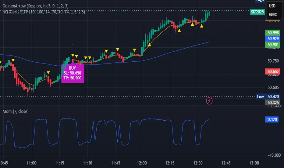
bows//@version=5
indicator("NQ EMA+RSI+ATR Alerts with SL/TP", overlay=true, shorttitle="NQ Alerts SLTP")
// === Inputs ===a
fastLen = input.int(9, "Fast EMA", minval=1)
slowLen = input.int(21, "Slow EMA", minval=1)
rsiLen = input.int(14, "RSI Length", minval=1)
rsiLongMax = input.int(70, "Max RSI to allow LONG", minval=50, maxval=90)
rsiShortMin = input.int(30, "Min RSI to allow SHORT", minval=10, maxval=50)
atrLen = input.int(14, "ATR Length", minval=1)
atrMultSL = input.float(1.5, "ATR Stop-Loss Multiplier", step=0.1)
atrMultTP = input.float(2.5, "ATR Take-Profit Multiplier", step=0.1)
// === Indicator calculations ===
price = close
fastEMA = ta.ema(price, fastLen)
slowEMA = ta.ema(price, slowLen)
rsiVal = ta.rsi(price, rsiLen)
atr = ta.atr(atrLen)
// === Entry signals ===
longSignal = ta.crossover(fastEMA, slowEMA) and rsiVal < rsiLongMax
shortSignal = ta.crossunder(fastEMA, slowEMA) and rsiVal > rsiShortMin
// === SL/TP Levels ===
longSL = price - atr * atrMultSL
longTP = price + atr * atrMultTP
shortSL = price + atr * atrMultSL
shortTP = price - atr * atrMultTP
// === Plotting ===
plot(fastEMA, color=color.orange, title="Fast EMA")
plot(slowEMA, color=color.blue, title="Slow EMA")
plotshape(longSignal, title="Buy Signal", style=shape.triangleup, color=color.new(color.green, 0), location=location.belowbar, size=size.tiny)
plotshape(shortSignal, title="Sell Signal", style=shape.triangledown, color=color.new(color.red, 0), location=location.abovebar, size=size.tiny)
// Optional visualization of SL/TP
plot(longSignal ? longSL : na, "Long Stop-Loss", color=color.new(color.red, 50), style=plot.style_linebr)
plot(longSignal ? longTP : na, "Long Take-Profit", color=color.new(color.green, 50), style=plot.style_linebr)
plot(shortSignal ? shortSL : na, "Short Stop-Loss", color=color.new(color.red, 50), style=plot.style_linebr)
plot(shortSignal ? shortTP : na, "Short Take-Profit", color=color.new(color.green, 50), style=plot.style_linebr)
// === Alerts with SL/TP info ===
alertcondition(longSignal, title="BUY Signal",
message="BUY Alert — NQ LONG: Entry @ {{close}} | SL: {{plot_1}} | TP: {{plot_2}} | {{ticker}}")
alertcondition(shortSignal, title="SELL Signal",
message="SELL Alert — NQ SHORT: Entry @ {{close}} | SL: {{plot_3}} | TP: {{plot_4}} | {{ticker}}")
// === Visual labels ===
if (longSignal)
label.new(bar_index, low, "BUY SL: " + str.tostring(longSL, format.mintick) + " TP: " + str.tostring(longTP, format.mintick),
style=label.style_label_up, color=color.new(#be14c4, 0), textcolor=color.white)
if (shortSignal)
label.new(bar_index, high, "SELL SL: " + str.tostring(shortSL, format.mintick) + " TP: " + str.tostring(shortTP, format.mintick),
style=label.style_label_down, color=color.new(color.red, 0), textcolor=color.white)
Volume Divergence(FULLAUTO)MINHPHUOCKBVolume Divergence( 5 COLOR)
BB50
AUTO TIME
bullishDivergence = color.lime
bearishDivergence =color.red
volSpike =color.rgb
volContraction = color.aqua
incVolTrend =color.new
decVolTrend =color.new
color.rgb

Structural Liquidity ZonesTitle: Structural Liquidity Zones
Description:
This script is a technical analysis system designed to map market structure (Liquidity) using dynamic, volatility-adjusted zones, while offering an optional Trend Confluence filter to assist with trade timing.
Concept & Originality:
Standard support and resistance indicators often clutter the chart with historical lines that are no longer relevant. This script solves that issue by utilizing Pine Script Arrays and User-Defined Types to manage the "Lifecycle" of a zone. It automatically detects when a structure is broken by price action and removes it from the chart, ensuring traders only see valid, fresh levels.
By combining this structural mapping with an optional EMA Trend Filter, the script serves as a complete "Confluence System," helping traders answer both "Where to trade?" (Structure) and "When to trade?" (Trend).
Key Features:
1. Dynamic Structure (The Array Engine)
Pivot Logic: The script identifies major turning points using a customizable lookback period.
Volatility Zones: Instead of thin lines, zones are projected using the ATR (Average True Range). This creates a "breathing room" for price, visualizing potential invalidation areas.
Active Management: The script maintains a memory of active zones. As new bars form, the zones extend forward. If price closes beyond a zone, the script's garbage collection logic removes the level, keeping the chart clean.
2. Trend Confluence (Optional)
EMA System: Includes a Fast (9) and Slow (21) Exponential Moving Average module.
Signals: Visual Buy/Sell labels appear on crossover events.
Purpose: This allows for "Filter-based Trading." For example, a trader can choose to take a "Buy" bounce from a Support Zone only if the EMA Trend is also bullish.
Settings:
Structure Lookback: Controls the sensitivity of the pivot detection.
Max Active Zones: Limits the number of lines to optimize performance.
ATR Settings: Adjusts the width of the zones based on volatility.
Enable Trend Filter: Toggles the EMA lines and signals on/off.
Usage:
This tool is intended for structural analysis and educational purposes. It visualizes the relationship between price action pivots and momentum trends.

Second chartThis is a trend-following momentum confirmation indicator designed to filter trades in the direction of the dominant trend while timing entries using RSI momentum shifts.
Best suited for:
✅ Forex & Crypto
✅ 5m – 1H timeframes
✅ Trend continuation strategies
⚙ Inputs Explained
▸ Trend MA Length
Controls the EMA trend filter
Lower value (20–30) → faster, more signals
Higher value (50–100) → slower, stronger trend filter
▸ RSI Length
Controls responsiveness of momentum
Standard setting: 14
Lower → aggressive entries
Higher → conservative entries
▸ Show Buy/Sell Signals
ON → Displays BUY/SELL labels
OFF → Hides all trade signals
▸ Trend Background
ON → Green = Bullish / Red = Bearish
OFF → Clean chart mode
🧠 Signal Logic Breakdown

GK BOS ultimateGK BOS ultimate is a structured Break of Structure tool designed to highlight major shifts in the market structure.
The script identifies when price breaks above a significant previous high or below a significant low, using a defined lookback period and a ATR filter to reduce weak or minor breakouts
When a major bullish or bearish structure breaks occurs, the indicator marks the chart with a GK BUY or GK SELL label.
It also plots a TP1 level based on ATR(14) multiplied by a user-selected factor.
This provides a consistent volatility-based reference point that helps traders analyse potential follow-through areas after a structure break.
HOW IT WORKS
the script calculates the highest high and lowest low over the chosen lookback period
A break of structure is confirmed only if the close moves beyond these levels with enough strength relative to ATR, When this happens the indicator
Prints GK BUY for bullish structure breaks
Prints GK SELL for bearish structure breaks
Plots a corresponding TP1 PRINT derived from recent volatility
no repainting occurs because calculations are based on confirmed closes
this TOOL is intended for educational and analytical purposes only

Delta Signals NO REPINTA (FINAL)📢 New Indicator: Delta Signals NO REPAINT 🔥
Introducing my new indicator based on Order Flow Delta, designed to provide buy and sell signals with absolutely NO repainting — perfect for scalping, day trading, or swing trading.
This tool combines two powerful components:
✅ Order Flow Delta — Measures the real strength between buyers and sellers
✅ Smart Trend Filter — Only shows signals in the direction of the dominant trend
Together, they deliver cleaner, more accurate and more reliable signals, with clear entry markers on the chart and a delta histogram revealing real market pressure.
🚀 What’s Included?
🔹 Buy/Sell signals with NO repaint
🔹 Intelligent delta calculation
🔹 Trend filter using moving average
🔹 Clear labels on entry points
🔹 Visual delta histogram
🔹 Works great on Crypto, Forex, Indices & Stocks
🔹 Very lightweight and fast on TradingView
🎯 Why is it powerful?
Because it doesn't rely on lagging indicators — it reads the actual imbalance between buyers and sellers, often detecting strong moves before traditional indicators do.
This type of analysis is used by professional order flow traders, but now you have it on your TradingView chart in a simple, visual format.
🔥 Perfect for:
Scalpers who need precision
Day traders working breakouts and pullbacks
Swing traders seeking strong confirmations
Traders who want clean, NO-repaint signals
If you want a version with automatic TP/SL, alerts, or full backtesting, I can publish that as well.
Just let me know. 🚀📈


Probabilistic Panel - COMPLETE VERSION📘 Probabilistic Panel — User Manual
________________________________________
INTRODUCTION
The Probabilistic Panel is an advanced TradingView indicator that merges multiple technical-analysis components to provide a probabilistic evaluation of market direction. It is composed of several sections that assess trend, volume, price zones, support and resistance, multiple timeframes, and candle distribution.
________________________________________
PANEL STRUCTURE
1. HEADER
• PROBABILISTIC PANEL: Indicator name.
• FULL VERSION: Indicates that all functionalities are enabled.
________________________________________
2. GENERAL INFORMATION
• ASSET: Displays the asset symbol being analyzed.
• LIMITS: Shows score thresholds for classifying setups (A+, B, C).
________________________________________
3. DIRECTION PROBABILITIES
• PROB: Displays probability of upward movement (upPct) and downward movement (downPct) in percentage.
o Importance: Indicates the direction with the highest probability based on weighted factors.
________________________________________
4. CONTINUATION BIAS
• BIAS: Shows the probability of continuation of the current trend (intrProbCont).
o Importance: Evaluates whether the market is likely to continue in the same direction.
________________________________________
5. MULTI-TIMEFRAME ANALYSIS (MTF)
• MTF: Shows trend direction across multiple timeframes (1D, 1H, 15M, 5M, 1M) using arrows (↑ uptrend, ↓ downtrend, → sideways).
o Importance: Helps identify convergence or divergence between timeframes.
• ALIGNED MTF: Displays the percentage of alignment between timeframes.
o Importance: Higher alignment indicates stronger trends.
________________________________________
6. VOLUME
• VOLUME: Indicates whether volume is “INCREASING”, “DECREASING”, or “STABLE.”
o Importance: Increasing volume confirms trend strength.
________________________________________
7. TECHNICAL INDICATORS
• RSI/ROC: Displays RSI (Relative Strength Index) and ROC (Rate of Change).
o Importance:
RSI > 65 → Overbought
RSI < 35 → Oversold
ROC → Momentum strength indicator
________________________________________
8. PRICE ZONE
• ZONE: Classifies current price as “PREMIUM” (above average), “DISCOUNT” (below average), or “EQUILIBRIUM.”
o Importance: Helps identify buying/selling opportunities based on mean-reversion logic.
________________________________________
9. CANDLE ANALYSIS
• AMPLITUDE: Shows current candle size in percentage and ticks.
o Importance: Candles above minimum amplitude threshold are considered trade-valid.
• FORMATION: Classifies candle as:
o HIGH INDECISION
o TOP REJECTION
o BOTTOM REJECTION
o CONVICTION
o MIXED
o Importance: Reflects market sentiment and psychology.
• WICKS: Displays upper and lower wick size in percentage.
o Importance: Longer wicks suggest rejection or indecision.
• RATIO: Ratio between total wick size and candle body.
o Importance: High ratio = indecision; low ratio = conviction.
________________________________________
10. TRENDS
• AMPLITUDE TREND: Indicates if amplitude is “INCREASING,” “DECREASING,” or “STABLE.”
o Importance: Increasing amplitude may signal rising volatility.
• CONVICTION TREND: Indicates recent candle conviction:
o STRONG UP
o STRONG DOWN
o INDECISIVE
o MIXED
o Importance: Measures the strength of recent candles.
________________________________________
11. PROBABILITY DIFFERENCE (DIF PROB)
• Shows the percentage difference between upward and downward probabilities, classified as:
o EXCELLENT: Very favorable
o GOOD: Significant
o MEDIUM: Moderate (avoid entering)
o MARKET LOSING STRENGTH: Small difference (avoid entering)
o UNSTABLE MARKET: Very small difference (do not trade)
o Importance: Higher difference = more directional clarity.
________________________________________
12. CONFIRMATIONS
• Shows how many consecutive confirmations of the current signal were achieved relative to the configured requirement.
o Importance: More confirmations increase reliability.
________________________________________
13. SCORE & CLASSIFICATION
• SCORE: Final score from 0 to 100, calculated based on multiple factors.
o Higher scores = better setups.
• CLASSIFICATION: Setup categorized as:
o A+ SETUP
o B SETUP
o C SETUP
o DO NOT TRADE
o Importance: Defines whether conditions are favorable.
________________________________________
14. ACTION
• ACTION: Suggests “BUY,” “SELL,” or “WAIT.”
o Importance: Final actionable signal.
________________________________________
DECISION LOGIC
The indicator uses a weighted combination of multiple factors:
1. Trend (wTrend): Based on the price relative to EMA50.
2. Volume (wVol): Based on recent volume vs. its average.
3. Zone (wZona): Based on price position within recent price range.
4. Support/Resistance (wSR): Based on strength of S/R levels.
5. MTF (wMTF): Timeframe alignment.
6. Distribution (wDist): Distribution of bullish, bearish, and neutral candles.
The final score integrates:
• Probability of upward movement
• Continuation bias
• MTF conflict
• Moving-average alignment
• Volume
• Extreme RSI conditions
________________________________________
FALSE-SIGNAL FILTERS
• Close-Only Mode: Updates calculations only on candle close.
• Minimum Candle Size: Ignores very small candles.
• Consecutive Confirmations: Requires repeated signal confirmation.
• Minimum Probability Difference: Enforces a minimum separation between bullish and bearish probabilities.
________________________________________
CONCLUSION
The Probabilistic Panel is a comprehensive tool that integrates multiple technical-analysis dimensions to deliver more reliable trading signals. Parameters must be adjusted according to the asset and timeframe.
Remember: no indicator is infallible.
Always combine it with risk management and additional confirmations.


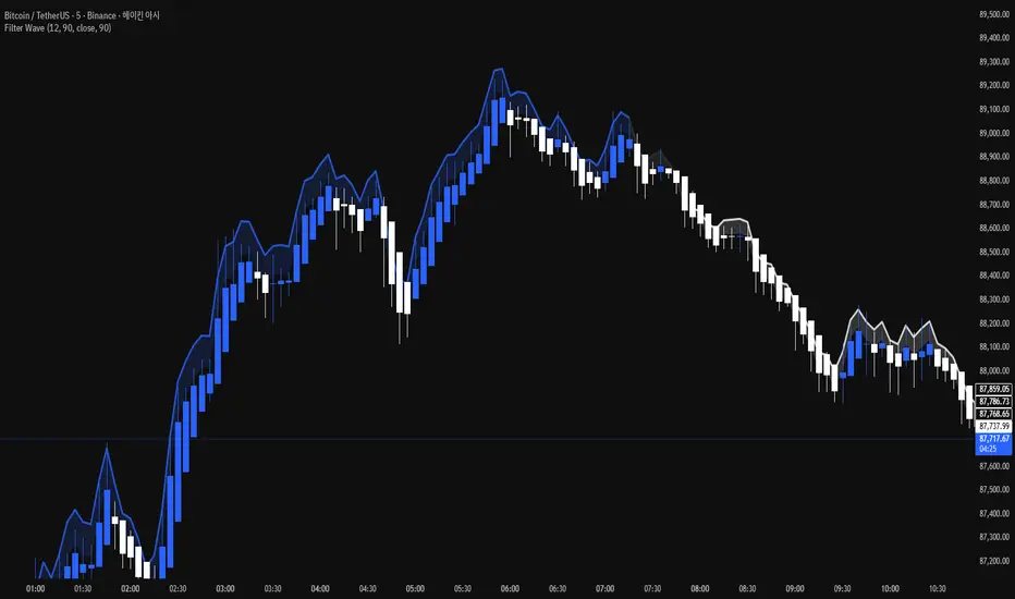
Filter Wave1. Indicator Name
Filter Wave
2. One-line Introduction
A visually enhanced trend strength indicator that uses linear regression scoring to render smoothed, color-shifting waves synced to price action.
3. General Overview
Filter Wave+ is a trend analysis tool designed to provide an intuitive and visually dynamic representation of market momentum.
It uses a pairwise comparison algorithm on linear regression values over a lookback period to determine whether price action is consistently moving upward or downward.
The result is a trend score, which is normalized and translated into a color-coded wave that floats above or below the current price. The wave's opacity increases with trend strength, giving a visual cue for confidence in the trend.
The wave itself is not a raw line—it goes through a three-stage smoothing process, producing a natural, flowing curve that is aesthetically aligned with price movement.
This makes it ideal for traders who need a quick visual context before acting on signals from other tools.
While Filter Wave+ does not generate buy/sell signals directly, its secure and efficient design allows it to serve as a high-confidence trend filter in any trading system.
4. Key Advantages
🌊 Smooth, Dynamic Wave Output
3-stage smoothed curves give clean, flowing visual feedback on market conditions.
🎨 Trend Strength Visualized by Color Intensity
Stronger trends appear with more solid coloring, while weak/neutral trends fade visually.
🔍 Quantitative Trend Detection
Linear regression ordering delivers precise, math-based trend scoring for confidence assessment.
📊 Price-Synced Floating Wave
Wave is dynamically positioned based on ATR and price to align naturally with market structure.
🧩 Compatible with Any Strategy
No conflicting signals—Filter Wave+ serves as a directional overlay that enhances clarity.
🔒 Secure Core Logic
Core algorithm is lightweight and secure, with minimal code exposure and strong encapsulation.
📘 Indicator User Guide
📌 Basic Concept
Filter Wave+ calculates trend direction and intensity using linear regression alignment over time.
The resulting wave is rendered as a smoothed curve, colored based on trend direction (green for up, red for down, gray for neutral), and adjusted in transparency to reflect trend strength.
This allows for fast trend interpretation without overwhelming the chart with signals.
⚙️ Settings Explained
Lookback Period: Number of bars used for pairwise regression comparisons (higher = smoother detection)
Range Tolerance (%): Threshold to qualify as an up/down trend (lower = more sensitive)
Regression Source: The price input used in regression calculation (default: close)
Linear Regression Length: The period used for the core regression line
Bull/Bear Color: Customize the color for bullish and bearish waves
📈 Timing Example
Wave color changes to green and becomes more visible (less transparent)
Wave floats above price and aligns with an uptrend
Use as trend confirmation when other signals are present
📉 Timing Example
Wave shifts to red and darkens, floating below the price
Regression direction down; price continues beneath the wave
Acts as bearish confirmation for short trades or risk-off positioning
🧪 Recommended Use Cases
Use as a trend confidence overlay on your existing strategies
Especially useful in swing trading for detecting and confirming dominant market direction
Combine with RSI, MACD, or price action for high-accuracy setups
🔒 Precautions
This is not a signal generator—intended as a trend filter or directional guide
May respond slightly slower in volatile reversals; pair with responsive indicators
Wave position is influenced by ATR and price but does not represent exact entry/exit levels
Parameter optimization is recommended based on asset class and timeframe
纳斯达克涨2.5%以上//@version=5
indicator("纳斯达克大涨标记", shorttitle="NASDAQ+2.5%", overlay=true)
// 纳斯达克综合指数的符号
// 如果您想使用 E-mini 纳斯达克 100 期货 (NQ!) 或其他相关工具,请更改此符号
symbolName = "NASDAQ:IXIC"
// 目标涨幅百分比
targetPercentage = 2.5
// 获取纳斯达克指数的数据
// 使用 security() 函数获取不同品种的数据
nasdaq_close = request.security(symbolName, "D", close )
nasdaq_prev_close = request.security(symbolName, "D", close )
// 确保我们有足够的数据进行计算
isDataAvailable = not na(nasdaq_close) and not na(nasdaq_prev_close)
// 计算当天的涨幅百分比
// (今日收盘价 - 昨日收盘价) / 昨日收盘价 * 100
changePercentage = isDataAvailable ? (nasdaq_close - nasdaq_prev_close) / nasdaq_prev_close * 100 : na
// 检查条件:涨幅是否大于或等于目标百分比
isBigUpDay = changePercentage >= targetPercentage
// 绘制粉红色的点
plotshape(isBigUpDay,
title="大涨日",
location=location.belowbar, // 绘制在 K 线的下方
color=color.rgb(255, 0, 255, 0), // 纯粉红色
style=shape.circle,
size=size.small,
text="")
// 可以在图表底部显示涨幅百分比作为确认
plot(isBigUpDay ? changePercentage : na,
title="当日涨幅%",
color=color.rgb(255, 0, 255, 50),
style=plot.style_stepline,
trackprice=false)
// 警报示例 (可选)
// if isBigUpDay
// alert("纳斯达克当日涨幅达到 " + str.tostring(targetPercentage) + "% 或以上!", alert.freq_once_per_bar_close)

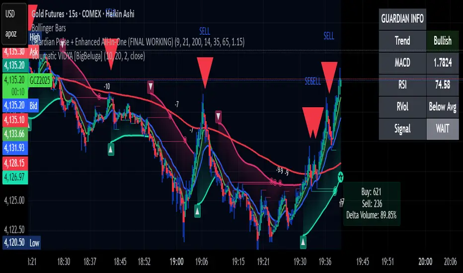
Guardian Pulse + Enhanced All-In-One (FINAL WORKING)GUARDIAN BUY SIGNAL (Lime Candle + Big Green Arrow)
All 4 must happen on the same candle:
RSI (14) crosses above 35 from below (bouncing out of oversold)
Price is above the blue 21 EMA (short-term trend filter)
Candle closes green (close > open)
Volume is at least 15% above its 20-period average (real buying pressure)
→ When all four line up = lime candle + huge green “BUY” arrow
→ That’s your master entry. Buy shares, calls, whatever.
GUARDIAN SELL / EXIT SIGNAL (Red Down Arrow)
RSI (14) crosses below 65 from above
→ That’s your “take profits or get out” signal (red down-triangle appears above the bar)
Optional Trend Filter (for safety)
Only take BUY signals when the overall trend is Bullish (9 EMA > 21 EMA > 200 EMA)
The info box in the top-right will say “Bullish” in green when it’s safe.
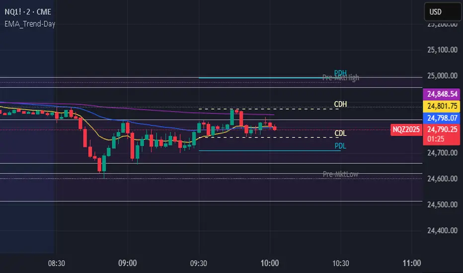
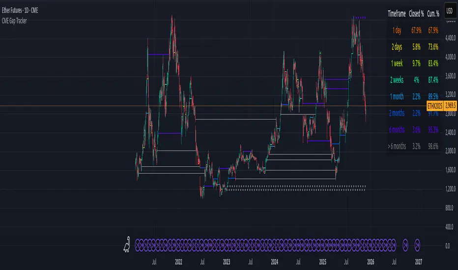
CME Gap Tracker + Live StatisticsThis script automatically finds the gaps inherent in the time data of any given chart, and displays them in color-coated buckets of how long it takes for the close of the gap to get filled. Add it on any CME Futures chart on the daily, and it will find all the weekend gaps. Set your period to an hour, and it will find the intraday gaps. Also displays a statistical calculation for each bucket.
Silent 60pt Volatility Trigger (60pt Range in 5min)This alert triggers when a 5 minute candle reaches a range of 60pts in a 5 min candle /MNQ. Good for a mid day vol alert
BifaneiroSinaleiro V3 ULTIMATEBifaneiroSinaleiro V3 ULTIMATE - Complete ICT Analysis System & Signal Generator
This isn't just an indicator - it's your 24/7 ICT analyst that does the manual work for you.
━━━━━━━━━━━━━━━━━━━━━━━━━━━━━━━━━━━━━━
🔥 WHAT IT DOES FOR YOU:
━━━━━━━━━━━━━━━━━━━━━━━━━━━━━━━━━━━━━━
✅ Marks ALL ICT Concepts Automatically:
- Fair Value Gaps (LTF + HTF with priority)
- Market Structure (BOS/CHoCH in real-time)
- Breaker Blocks (validated with volume + killzone)
- Liquidity Sweeps (Asian High/Low runs)
- Premium/Discount Arrays + OTE Zones
- Institutional Sessions (London, NY Silver Bullets)
✅ Advanced Pattern Recognition:
- Turtle Soup (sweep + reversal)
- Unicorn Model (sweep → BOS → FVG)
- SMT Divergences (monitors correlated pairs)
- PO3/AMD Phases (Accumulation → Manipulation → Distribution)
✅ Intelligent Scoring System:
- 12+ confluence factors analyzed
- Minimum score 12 for signals (configurable)
- Score 20+ = EXTREME (enables 2nd trade in session)
- Visual score display on every signal
✅ Professional Trade Management:
- 1 trade per session (London, NY AM, NY PM) = max 3/day
- EXTREME mode: 2 trades per session = max 6/day
- Automatic stop loss (session range-based)
- Dynamic take profit (score-adjusted multiplier)
- Auto breakeven after 2.5x move
- EOD close (23:59) with P&L label
- Weekend close (Fri 23:55) with P&L label
✅ 100% ICT Pure Methodology:
- NO EMAs, NO ATR, NO lagging indicators
- Pure price action: High/Low/Range only
- HTF confirmation via Premium/Discount (not EMAs!)
- Stop loss via Asian Range (not ATR!)
━━━━━━━━━━━━━━━━━━━━━━━━━━━━━━━━━━━━━━
⚡ WHY IT'S DIFFERENT:
━━━━━━━━━━━━━━━━━━━━━━━━━━━━━━━━━━━━━━
Traditional indicators show 1-2 concepts. This shows 10+ simultaneously.
Manual ICT takes 2-3 hours per session. This does it in milliseconds.
Other systems guess. This scores with objective confluence.
You save hours daily. You trade better. You profit more consistently.
━━━━━━━━━━━━━━━━━━━━━━━━━━━━━━━━━━━━━━
📊 WHAT YOU GET:
━━━━━━━━━━━━━━━━━━━━━━━━━━━━━━━━━━━━━━
- Real-time dashboard (scores, confluences, structure)
- Precision signals (only in killzones, only with confluences)
- Trade tracking (win rate, RR, P&L by session)
- Multi-timeframe analysis (automatic)
- News block filter (configurable)
- Full customization (colors, thresholds, sessions)
- Comprehensive alerts (8+ types)
Works on: Forex, Indices, Commodities, Crypto
Best on: 1m-5m for execution, 15m+ for swing
Timezone: Configured for CET (UTC+1), easily adjustable
⚠️ This is a professional tool requiring ICT/SMC understanding.
Not magic - it's methodology, automated.
🚀 Stop drawing. Start trading. Add to chart now.

Filter Bar1. Indicator Name
Filter Bar
2. One-line Introduction
A trend-aware bar coloring system that visualizes market direction and strength through adaptive transparency based on regression scoring.
3. General Overview
Filter Bar+ is a minimalist but powerful trend visualization tool that colors chart bars according to market direction and momentum strength.
It analyzes the linear regression trend alignment over a specified lookback period and uses a pairwise comparison algorithm to determine whether the market is in a bullish, bearish, or neutral state.
The result is a "trend score" that gets normalized to reflect trend intensity (0~1).
Bar colors are then dynamically updated using the specified bullish or bearish base colors, where higher intensity results in more opaque (darker) bars, and weaker trends lead to lighter, faded tones.
If no strong trend is detected, bars are shown in gray, signaling indecision or neutrality.
The strength of this indicator lies in its simplicity—it doesn’t draw lines, waves, or shapes, but overlays insight directly onto the chart through smart color cues.
It’s particularly effective as a background filter for price action traders, scalpers, and anyone who prefers clean charts but still wants embedded directional context.
4. Key Advantages
🎨 Adaptive Bar Coloring
Bar color opacity increases with trend strength, offering instant visual confirmation without clutter.
📊 Quantified Trend Direction
Uses a regression-based scoring system to reliably detect uptrends, downtrends, or sideways markets.
⚖️ Customizable Sensitivity
Parameters like lookback period and tolerance percentage give users full control over signal responsiveness.
🧼 Clean Chart Presentation
No lines, shapes, or overlays—just color-coded bars that blend into your existing chart setup.
🚀 Lightweight & Fast
Minimal computational load ensures it works smoothly even on lower-end devices or multiple chart setups.
🔒 Secure Internal Logic
Algorithm is neatly encapsulated and optimized, with no critical logic exposed.
📘 Indicator User Guide
📌 Basic Concept
Filter Bar+ evaluates trend direction and strength using a pairwise comparison of linear regression values.
The result determines whether the market is bullish, bearish, or neutral, and adjusts bar colors accordingly.
It visually amplifies the current market state without drawing any indicators on the chart.
⚙️ Settings Explained
Lookback Period: Number of bars used to compare regression values
Range Tolerance (%): Minimum score required to label a trend as bullish or bearish
Regression Source: Data input used for regression (default: close)
Linear Regression Length: Period for generating the base regression line
Bull/Bear Base Colors: Choose colors to represent bullish or bearish bars
📈 Buy Timing Example
Bars are green (or user-set bullish color) and becoming more vivid
Indicates a strengthening bullish trend; helpful when used alongside breakout confirmation or support zones
📉 Sell Timing Example
Bars turn red (or your custom bearish color) with increasing opacity
Signals growing bearish pressure; acts as confirmation during short setups or breakdowns
🧪 Recommended Use Cases
Combine with volume, RSI, or price action setups for direction filtering
Ideal for clean chart strategies where visual simplicity is preferred
Use as a confirmation layer to reduce noise in sideways markets
🔒 Precautions
This is a visual filter, not a signal generator—use alongside other strategies for entries/exits
In choppy markets, bars may flicker between colors—adjust sensitivity as needed
Works best when you already have a directional thesis and want to validate it visually
Always test settings for your asset/timeframe before applying in live trades
The Strat Lite [rdjxyz]◆ OVERVIEW
The Strat Lite is a stripped down version of the Strat Assistant indicator by rickyzcarroll—focusing on visual simplicity and script performance. If you're new to The Strat, you may prefer the Strat Assistant as a learning aid.
◇ FEATURES REMOVED FROM THE ORIGINAL SCRIPT
Candle Numbering & Up/Down Arrows
Previous Week High & Low Lines
Previous Day High & Low Lines
Action Wick Percentage
Actionable Signals Plot
Strat Combo Plots
Extensive Alerts
◇ FEATURES KEPT FROM THE ORIGINAL SCRIPT
Full Timeframe Continuity
Candle Coloring
◇ FEATURES ADDED TO THE ORIGINAL SCRIPT
Failed 2 Down Classification
Failed 2 Up Classification
◆ DETAILS
The Strat is a trading methodology developed by Rob Smith that offers an objective approach to trading by focusing on the 3 universal scenarios regarding candle behavior:
SCENARIO ONE
The 1 Bar - Inside Bar: A candle that doesn't take out the highs or the lows of the previous candle; aka consolidation.
These are shown as gray candles by default.
SCENARIO TWO
The 2 Bar - Directional Bar: A candle that takes out one side of the previous candle; aka trending (or at least attempting to trend).
SCENARIO THREE
The 3 Bar - Outside Bar: A candle that takes out both sides of the previous candle; aka broadening formation.
In addition to Rob's 3 universal scenarios, this indicator identifies two variations of 2 bars:
Failed 2 up: A candle that takes out the high of the previous candle but closes bearish.
Failed 2 down: A candle that takes out the low of the previous candle but closes bullish.
◆ SETTINGS
◇ INPUTS
FTC (FULL TIMEFRAME CONTINUITY)
Show/hide FTC plots
Offset FTC plots from current bar
◇ STYLE
STRAT COLORS
Color 0 (Failed 2 Up) - Default is fuchsia
Color 1 (Failed 2 Down) - Default is teal
Color 2 (Inside 1) - Default is gray
Color 3 (Outside 3) - Default is dark purple
Color 4 (2 up) - Default is aqua
Color 5 (2 down) - Default is white
◆ USAGE
It's recommended to use The Strat Lite with a top down analysis so you can find lower timeframe positions with higher timeframe context.
◇ TOP DOWN ANALYSIS
MONTHLY LEVELS
Starting on a monthly chart, the previous month's high and low are manually plotted.
WEEKLY LEVELS
Dropping down to a weekly chart, the previous week's high and low are manually plotted.
DAILY LEVELS
Dropping down to a daily chart, the previous day's high and low are manually plotted.
12H LEVELS
Dropping down to a 12h chart, the previous 12h's high and low are manually plotted.
ANALYSIS
The monthly low was broken, creating a lower low (aka a broadening formation), signalling potential exhaustion risk, which can be a catalyst for reversals. The daily candle that tested the monthly low closed as a Failed 2 Down—potentially an early sign of a reversal. With these 2 confluences, it's reasonable to expect the next daily candle to be a 2 Up. Now it's time to look for a lower timeframe entry.
◇ LOWER TIMEFRAME POSITION
HOURLY PRICE ACTION
Dropping down to an hourly chart, we're anticipating a 2 Up on the daily timeframe, so we're looking for a bullish pattern to enter a position long. I personally like the 6:00 AM UTC-5 hourly candle, as it's the midpoint of the day (for futures).
In this specific example, we see the opening gap was filled and there's a potential 2-1-2 bullish reversal set up.
At this point, price can either do one of 5 things:
Form another 1 (inside) candle
Form a 2 up (directional) candle
Form a 2 down (directional) candle
Form a 2 up, fail, and potentially flip to form a bearish 3 (outside) candle
Form a 2 down, fail, and potentially flip to form a bullish 3 (outside) candle
Knowing the finite potential outcomes helps us set up our positions, manage them accordingly, and flip bias if needed.
POSITION SETUP
Here we can set up a position long AND short. To go long, we set a buy stop at the 1h high and stop loss just below the 50% level of the inside candle; to go short, we set a sell stop at 1h low and stop loss just above the 50% level of the inside candle.
If the short gets triggered first, we can wait for price to move in our favor before cancelling the buy order. If the short becomes a failed 2 down, potentially reversing to become a bullish 3, we can either wait for the stop loss to trigger and for the long position to trigger OR we can move the buy stop to our short stop loss and move the long stop loss to the low of the 1h candle.
POSITION REFINEMENT
For an even tighter risk-to-reward, we can drop to a lower timeframe and look for setups that would be an early trigger of the 1h entry. Just know, the lower you go the more noise there is—increasing risk of getting stopped out before the 1h trigger.
Above are 30m refined entries.
In this example, the long buy stop was triggered. It closed bullish, so the sell stop order can be cancelled.
◇ TARGETS & POSITION MANAGEMENT
TARGETS
These depend on whether you intend to scalp, day trade, or swing trade, but targets are typically the highs of previous candles (when bullish) and lows of previous candles (when bearish). It's advised to be cautious of swing pivots as there's a risk of exhaustion and reversal at these levels.
In this example, the nearest target was the previous 12h high and the next target was the previous day high; if you're a swing trader, you could target previous week's high and previous month's high.
POSITION MANAGEMENT
This largely depends on your risk tolerance, but it's common to either:
Move stop loss slightly into profit
Trail stop loss behind higher highs (bullish) or lower lows (bearish)
Scale out of positions at potential pivot points, leaving a runner
Scale into positions on pullbacks on the way to target
◆ WRAP UP
As demonstrated, The Strat Lite offers a stripped down version of the Strat Assistant—making it visually simple for more experienced Strat traders. By following a top-down approach with The Strat methodology, you can find high probability setups and manage risk with relative ease.
◆ DISCLAIMER
This indicator is a tool for visual analysis and is intended to assist traders who follow The Strat methodology. As with any trading methodology, there's no guarantee of profits; trading involves a high degree of risk and you could lose all of your invested capital. The example shown is of past performance and is not indicative of future results and does not constitute and should not be construed as investment advice. All trading decisions and investments made by you are at your own discretion and risk. Under no circumstances shall the author be liable for any direct, indirect, or incidental damages. You should only risk capital you can afford to lose.

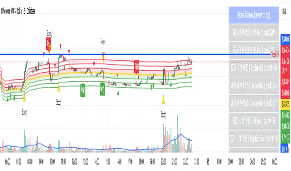
Day-Type Detector — Rejection / FNL / Outside / StopRun (Clean)Day-Type Detector — Rejection / FNL / Outside / Stop-Run (Clean Version)
This indicator identifies four high-impact candlestick day-types commonly used in professional price-action and auction-market trading: Rejection Days, Failed New Low (FNL) Days, Outside Days, and Stop-Run Days. These patterns often precede major directional moves, reversals, and absorption events, making them particularly valuable for swing traders, positional traders, and short-term discretionary traders.
The script is designed to work across all timeframes and is built around volatility-adjusted measurements using Average Daily Range (ADR) for accuracy and consistency.
What This Indicator Detects
1. Rejection Day (Bullish & Bearish)
A Rejection Day is a wide-range bar that rejects a previous extreme.
The indicator identifies rejection based on:
Range > ADR × threshold
Long lower wick (for bullish) or long upper wick (for bearish)
Close located in the strong zone of the day’s range
These conditions highlight areas where aggressive counter-orderflow entered the market.
2. Failed New Low (FNL) / Failed New High
An FNL day traps traders who attempted breakout selling or buying.
The indicator checks for:
A break beyond the previous session’s low or high
Immediate rejection back inside
Midpoint recapture conditions
ADR-normalized range requirements
These days often trigger powerful directional reversals.
3. Outside Day (Bullish & Bearish)
An Outside Day is a statistically significant expansion day that breaks both the previous high and low.
The script validates:
High > previous high and low < previous low
Range > ADR threshold
Close beyond prior session extreme to complete the rejection sequence
Outside Days often represent stop runs, shakeouts, or trend accelerations.
4. Stop-Run Day (Bullish & Bearish)
Stop-Run Days are aggressive volatility expansions and tend to be the largest ranges within short windows.
This detector identifies them using:
Range > ADR × multiplier
Close located near the extreme of the day (top for bullish, bottom for bearish)
Strong body relative to total range
Break above/below previous session extreme
These patterns indicate capitulation or forced liquidation and are often followed by continuation or sharp counter-rotation.
Key Features
✔ Historical Pattern Marking
All qualifying bars are marked on the chart using plotshape() in global scope, ensuring full historical visibility.
✔ Event Logging & Table Display
A table (top-right of the chart) displays the most recent pattern detections, including:
Timestamp
Pattern type
Bar index
This allows users to monitor and study past pattern occurrences without scanning the chart manually.
✔ ADR-Adjusted Detection
Volatility uncertainty is removed by anchoring all thresholds to ADR.
This ensures consistency across:
Different symbols
Different timeframes
Different market regimes
✔ Alerts Included
Alerts are preconfigured for:
Rejection Day Bull / Bear
FNL Bull / Bear
Outside Day Bull / Bear
Stop-Run Bull / Bear
This allows the user to receive real-time notifications when major day-type structures develop.
How to Use
Add the indicator to any timeframe chart.
Enable or disable:
Historical markers
History table
ADR diagnostics
Watch for shape markers or use alerts for real-time signals.
Use the history table to review recent occurrences.
Combine these day-types with:
Market structure levels
High/low volume nodes (LVNs)
Support/resistance zones
Trend context
These day-types are most effective when they occur near meaningful structural levels because they show where strong order-flow entered the market.
Best Practices
Use higher timeframes (1H–1D) for swing entries.
Confirm signals with market structure or volume profile.
Treat these day-types as context, not standalone signals.
Observe follow-through behavior in the next 1–3 bars after detection.
Credits
This script is based on concepts commonly seen in auction-market theory and professional price-action frameworks, such as Rejection Days, Failed New Lows, Outside Days, and Stop-Run behaviors.
All calculations and logic have been rebuilt from scratch to ensure clean, reliable, and optimized Pine Script v6 execution.