Liquidity Hunter + ShortLiquidity Hunter + Short
Version with Short Trade Signals by Cihan Culha
This indicator is based on the original Liquidity Hunter by ChartPrime (MPL 2.0 license).
It detects potential Long and Short liquidity hunts by analyzing candle body, wick percentages, ATR bands, and slope direction.
Features:
Long signals (original) based on lower wick, body %, slope, and ATR bands
Short signals (added) based on upper wick, body %, negative slope, and ATR bands
Target (TP), Stop Loss (SL), CHOCH, and BOS levels plotted dynamically
Visual boxes highlight potential liquidity zones
Risk/Reward (RR) configurable via input
Usage Notes:
This modified version adds Short trade signals while preserving the original Long logic
Original author ChartPrime is credited; modifications by Cihan Culha
Adjust Body %, Wick %, and RR multiplier to suit your trading timeframe and style
For educational purposes; always use proper risk management
Candlestick analysis


bar color changeThis Pine v5 code allows you to distinguish between candles on the chart. The body/wick/frame of the "live" candle that hasn't yet closed is colored white. When a live candle is present, the body of the immediately preceding candle is colored green with offset = -1. All other candles remain gray (#2e2e2e). plotcandle fixes the wick/frame so that the live and previous candles are selected when following the trend. If there are other conflicting scripts, the most recently added one quickly takes precedence.

PLANBXPRESS PSYCHOLOGICAL LEVEL ENTRY MODELThis Indicator merges multiple professional trading concepts into one visual tool — helping traders identify momentum shifts, entry zones, and daily trading plans with volume confirmation.
It automatically detects trend direction, generates dynamic take-profit & stop-loss levels, and overlays key daily reference points such as VWAP, pivot, support, and resistance zones based on ATR and trend context.
⚙️ Main Components
1️⃣ Signal System
Detects trend bias using SMA-based logic.
Generates entry price, TP1–TP3, and SL dynamically from recent impulse ranges.
Updates signals automatically when trend bias changes or previous targets are hit.
Visual levels are drawn directly on the chart.
2️⃣ Volume Analysis
Compares current volume against a moving average (SMA).
Classifies volume as:
🟢 Strong (above 1.5× average)
🟡 Average
🔴 Weak (below 0.8× average)
Displays the current volume strength and trend bias in an on-chart table.
3️⃣ Auto Day Plan
Uses multi-timeframe ATR calculations to define:
Support / Resistance zones
Pivot & Balance areas
Daily VWAP
Auto Targets (ATR-based expansion levels)
Adapts automatically to selected base timeframe (1H, 4H, or Daily).
4️⃣ Trend Context
Dual EMA system (50 & 200) to confirm bullish/bearish structure.
Aligns expected direction with VWAP & pivot location for context-aware bias.
🎯 What You Get on Chart
📈 Automatic LONG/SHORT signals
🎯 TP1, TP2, TP3, and SL levels
📊 Volume strength meter
🧭 VWAP, pivot, support/resistance & balance zones
🎨 Clean visual layout for intraday and swing traders
🧩 Inputs
Parameter Description
lenImpulse Impulse range length
smaLen SMA length for trend bias
levelRatio SL/TP ratio multiplier
volLen Volume SMA length
baseTF Base timeframe for zones/VWAP
atrMult1 / atrMult2 ATR multipliers for target levels
fwdBars Extension range for future projection
💡 How to Use
Add the script to your chart and choose your preferred timeframe.
Observe signal direction (📈 LONG / 📉 SHORT) and TP/SL levels.
Confirm entries when:
Trend aligns with VWAP direction, and
Volume category shows Strong or Average.
Use Auto Day Plan levels (pivot, balance, VWAP) as intraday reaction zones.

Sessions High & Low LevelsAutomatically plots high & low levels for multiple sessions. Clear session structure for intraday traders using price action, liquidity concepts, or session-based strategies.
Automatically plots the High & Low, for sessions such as London, New York, and Asia, with full customization for any custom session or timezone. These levels extend forward and adapt in real time, giving you a clear view of session-based structure and liquidity behavior.
Perfect for traders using ICT concepts, session narratives, or intraday market structure. Session ranges often act as key liquidity pools, breakout zones, and directional guides, this tool makes them easy to see at a glance.
Features:
Auto-plots High & Low for NY, London, and Asia sessions (customizable)
Fully customizable session times, colors, labels, and visibility options
Works across any assets

Previous Day OHLC with Fib LevelThe Previous Day OHLC indicator is designed to help traders identify key price levels from the previous trading session. These levels often act as important zones of support, resistance, and market reaction points during the current day’s price action.
This indicator automatically plots the Previous Day’s Open, High, Low, and Close on any intraday timeframe, making it a powerful tool for day traders, scalpers, and swing traders who rely on market structure and session behavior.

PLANBXPRESS ENTRYThe Combined Signal + Auto Day Plan + Volume indicator merges multiple professional trading concepts into one visual tool — helping traders identify momentum shifts, entry zones, and daily trading plans with volume confirmation.
It automatically detects trend direction, generates dynamic take-profit & stop-loss levels, and overlays key daily reference points such as VWAP, pivot, support, and resistance zones based on ATR and trend context.
⚙️ Main Components
1️⃣ Signal System
Detects trend bias using SMA-based logic.
Generates entry price, TP1–TP3, and SL dynamically from recent impulse ranges.
Updates signals automatically when trend bias changes or previous targets are hit.
Visual levels are drawn directly on the chart.
2️⃣ Volume Analysis
Compares current volume against a moving average (SMA).
Classifies volume as:
🟢 Strong (above 1.5× average)
🟡 Average
🔴 Weak (below 0.8× average)
Displays the current volume strength and trend bias in an on-chart table.
3️⃣ Auto Day Plan
Uses multi-timeframe ATR calculations to define:
Support / Resistance zones
Pivot & Balance areas
Daily VWAP
Auto Targets (ATR-based expansion levels)
Adapts automatically to selected base timeframe (1H, 4H, or Daily).
4️⃣ Trend Context
Dual EMA system (50 & 200) to confirm bullish/bearish structure.
Aligns expected direction with VWAP & pivot location for context-aware bias.
🎯 What You Get on Chart
📈 Automatic LONG/SHORT signals
🎯 TP1, TP2, TP3, and SL levels
📊 Volume strength meter
🧭 VWAP, pivot, support/resistance & balance zones
🎨 Clean visual layout for intraday and swing traders
🧩 Inputs
Parameter Description
lenImpulse Impulse range length
smaLen SMA length for trend bias
levelRatio SL/TP ratio multiplier
volLen Volume SMA length
baseTF Base timeframe for zones/VWAP
atrMult1 / atrMult2 ATR multipliers for target levels
fwdBars Extension range for future projection
💡 How to Use
Add the script to your chart and choose your preferred timeframe.
Observe signal direction (📈 LONG / 📉 SHORT) and TP/SL levels.
Confirm entries when:
Trend aligns with VWAP direction, and
Volume category shows Strong or Average.
Use Auto Day Plan levels (pivot, balance, VWAP) as intraday reaction zones.

300/200 EMA Spread HeatmapHighlights the difference between 300 and 200 EMA to indicated potential over extensions in breakout structures.


Fibonacci 3H Personalizada - NYIndicador desenvolvido para tracar fibos a cada 3 horas. utilizar para confluencia

5m FVGs Lorem Ipsum is simply dummy text of the printing and typesetting industry. Lorem Ipsum has been the industry's standard dummy text ever since the 1500s, when an unknown printer took a galley of type and scrambled it to make a type specimen book. It has survived not only five centuries, but also the leap into electronic typesetting, remaining essentially unchanged. It was popularised in the 1960s with the release of Letraset sheets containing Lorem Ipsum passages, and more recently with desktop publishing software like Aldus PageMaker including versions of Lorem Ipsum.

First Historical Candle Date daily intervalIndicator that displays a first historical candle on daily interval as a table at a top-right corner

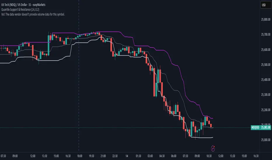
Quantile Support & ResistanceThis indicator plots dynamic support and resistance zones based on quantile logic — a statistically grounded method for identifying structural price boundaries.
Support Level: The price below which only a small percentage of lows fall (default: 10%). This approximates a strong demand zone.
Resistance Level: The price above which only a small percentage of highs rise (default: 10%). This approximates a strong supply zone.
Volatility-Adaptive: Levels adjust automatically to changing market conditions using a configurable lookback window.
Quantile Interpolation: Uses sorted price data and fractional indexing to estimate percentile thresholds with precision.
This tool is ideal for traders who want to visualize statistically significant price zones without relying on subjective drawing or fixed levels. It pairs well with breakout strategies, retest logic, and compression overlays.
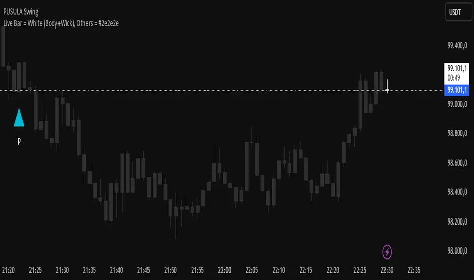
Live Bar = White (Body+Wick), Others = #2e2e2eThis script turns all candles gray, except for the last bar, which is the candle that hasn't closed and whose price is changing live. It makes that candle white so you can always spot the last candle on the chart more clearly. Enjoy!
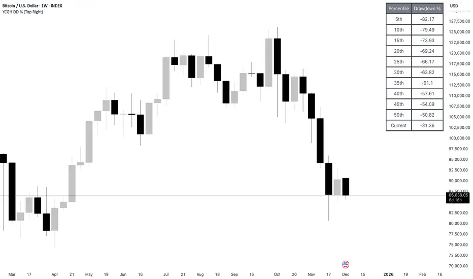
YCGH ATH DrawdownHow the Indicator Measures Drawdown from ATH
The indicator continuously tracks and calculates the percentage decline from the all-time high (ATH) using a systematic approach.
ATH Tracking Mechanism
Dynamic ATH Calculation: The script maintains a persistent variable that stores the highest price ever reached. On each bar, it compares the current high with the stored ATH using ath := math.max(ath, high), updating the ATH whenever a new peak is reached.

YCGH Drawdown PercentilesWhat This Indicator Does?
The Drawdown Percentiles indicator tracks how far below the all-time high (ATH) a stock or asset is currently trading, then displays statistical percentiles of historical drawdowns in a customizable table.
Percentile Analysis: It collects up to 5,000 historical bars of drawdown data, sorts them, and calculates user-selected percentiles (default: 10th, 30th, 50th) to show where current drawdowns rank historically.
Visual Display: A table shows each percentile threshold with color-coded drawdown values, helping you quickly assess whether the current drawdown is typical or extreme compared to historical patterns.
Practical Use Cases
Risk Assessment: Identify if current drawdowns fall within normal ranges or represent extreme conditions requiring position adjustments.
Entry/Exit Timing: Use percentile rankings to time entries during historically shallow drawdowns (better conditions) and reduce exposure during deep drawdowns.
Strategy Comparison: Compare drawdown patterns across different assets or trading strategies to evaluate risk-adjusted performance.
Taiwan Pagoda Chart (Triple)The code is open-source.
======================
Indicator Name
Taiwan Pagoda Chart
This is a technical analysis charting method similar to candlesticks but with different logic, designed to filter market noise and identify trend reversal points.
Key Features
Dynamic Pagoda Line Plotting
Unlike traditional candlesticks that plot every bar, the Pagoda line only updates when the price breaks above the previous high or below the previous low by a certain threshold.
Bullish (rising) bars are shown in green; bearish (falling) bars in red.
Multiple Optional Filters
T-value filter: Sets a minimum price change threshold to avoid signals from minor fluctuations.
Price percentage filter: Dynamically adjusts sensitivity based on a percentage of the previous Pagoda bar’s range.
ATR volatility filter: Uses Average True Range (ATR) to widen the threshold during high volatility and tighten it during low volatility.
Visual Design
Semi-transparent Pagoda structure for better visual context.
A bold central trend line to clearly show the underlying market direction.
Trading Signal Alerts
Bullish reversal (turning green): Potential buy signal.
Bearish reversal (turning red): Potential sell signal.
Optional on-chart labels (B / S) and support for TradingView alert notifications.
Highly Customizable
Users can freely adjust colors, line width, filtering rules, and signal visibility—making it adaptable to various trading styles.
Ideal Use Cases
Trend following
Reducing false breakouts
Helping medium-to-long-term traders identify high-probability entry and exit points
X Trade Plan [asset]A precision-structured execution framework designed to identify, map, and visualize targeted areas of interest derived from prior end-of-day AVWAP levels. These areas represent historically important zones where order flow has previously rotated, absorbed, or redistributed—making them highly relevant for future intraday decision-making.
This tool is intended to work in direct combination with the X Tail that Wags indicator, which calculates and projects the previous session’s ending AVWAP forward into the next trading day. The projected end-of-day AVWAP levels serve as a backbone for this Trade Plan: each level is wrapped, extended, and visually organized into a standardized zone structure that the trader can interpret quickly and consistently.
Purpose and Core Concept
Markets consistently respond to prior session value. The end-of-day AVWAP reflects the final consensus price where volume and time-weighted participation reached equilibrium before the session closed. When carried forward, these levels often act as real-world:
Reversion points
Liquidity pockets
Control centers
Continuation or rejection pivots
Absorption shelves and distribution tops
By framing these AVWAP-derived levels into controlled ranges—each with a slight configurable margin—the indicator transforms abstract numbers into objective, visually actionable trading zones.
How This Indicator Works
The user inputs up to fifteen prior AVWAP levels that came from X Tail that Wags’ “Previous End-of-Day AVWAP” readouts. For each active level, X Trade Plan automatically:
Builds a structured zone around the AVWAP using a user-defined ± margin
Draws a filled box from the anchor bar forward a customizable distance
Adds optional top/bottom price labels for precision
Optionally draws a mid-line representing the core of the zone
Displays custom text labels for classification, notes, or tiering
Refreshes anchor points at user-selected higher-timeframe boundaries (e.g., Daily) so zones “reset cleanly” at each new session
Everything is designed to ensure consistent, non-overlapping, visually efficient zones that maintain chart clarity even when multiple levels are active.
Intended Use in a Trade Plan
This indicator is not a signal generator.
It is a structural mapping tool designed for traders who build a daily plan around:
1. Prior Value → Future Reaction
Price commonly retests, respects, or rejects previous session AVWAP levels. These zones act as tactical reference points to evaluate:
Whether price is accepting value
Rejecting value
Targeting inefficiencies
Passing through low-resistance channels
2. Defining Areas of Interest (AOIs)
Each zone identifies where:
Positioning from previous sessions may still exist
Liquidity may sit
Algorithmic systems often pivot
High-volume traders previously accumulated or distributed
3. Enhancing Bias and Scenario Planning
When used with X Tail that Wags, traders can combine:
Current session AVWAP direction
Prior session ending AVWAP levels
The constructed Trade Plan zones
to produce:
Meaningful upside/downside targets
Control-center ranges
Lean / location for entries
Expected reaction points
This synergy turns raw historical AVWAP data into actionable structure.
Why These Levels Matter
End-of-day AVWAP levels are powerful because they encapsulate:
The final “fair value” of the prior session
Where the most volume-weighted agreement occurred
Where institutional inventory was likely set or hedged
The price many algos and funds benchmark against
When the next session opens, these prior value levels serve as magnets and decision boundaries, helping traders anticipate:
High-probability pullback zones
Reversals off previous value
Break-and-go continuation levels
Failure points where trapped participants are forced to exit
Summary
X Trade Plan
𝑎
𝑠
𝑠
𝑒
𝑡
asset transforms prior AVWAP levels—sourced from X Tail that Wags—into a structured visual map of the market’s most relevant historical value areas. These zones are used to shape a deliberate, rules-based Trade Plan that identifies where the market is likely to react, pause, rotate, or accelerate during the current session.
When paired with X Tail that Wags, this indicator provides a powerful, integrated workflow for traders who rely on value-based context, precise levels, and scenario-driven preparation.
BTC 1H Momentum + Near-Setup Alerts bigbeeukthis alert, sets up on 1h chart of BTC only. it alerts you to price action and when its close to a setup. it will then trigger again once the setup is ready

1m EMA Scalper + Lot Size HUD [DIMS]1m EMA Scalper w/ Pre-Alert + Lot Size HUD
Purpose:
A short-term (1-minute) scalping strategy for assets like XAUUSD, GBPJPY, and GER30/GER40, showing precise buy/sell signals, stop-loss, take-profit, breakeven levels, and a dynamic lot size HUD for risk management.
Key Features:
Signals:
Buy/Sell signals generated using EMA crossover (fast vs slow) + RSI filter + optional candle/volume filter.
Signals only appear during selected trading sessions (London & NY).
Pre-alert signals appear 30 seconds before the candle closes, so you can prepare to enter.
Stop Loss / Take Profit / Breakeven:
SL calculated using ATR × multiplier and adjustable for spread.
TP follows a configurable risk:reward ratio.
Breakeven can be toggled on/off and uses a custom multiplier.
Lines have customizable length, width, and style.
Lot Size HUD:
Automatically calculates lot size based on account balance, risk % or fixed amount, and leverage.
Shows stop distance in pips/points.
HUD retains the value for 5 minutes after the signal candle.
Flashes 30 seconds before the candle closes to prepare for the trade.
Auto-adjusts for XAUUSD, GBPJPY, GER30/GER40.
Alerts:
Alerts for pre-alert signals and confirmed signals.
Can toggle alerts on/off for both types.
Customization & Display:
Toggle buy/sell signals, SL/TP/BE lines, and pre-alert arrows.
Works entirely on-chart, displaying only the essential arrows, lines, and HUD.
Summary:
It’s a ready-to-trade scalping tool that combines fast technical signal detection with risk management, pre-alert timing, and visual trade guidance — letting you focus on execution without manually calculating lot size or monitoring every candle.
12 Band Volume matched Candles📌 12 Band Volume matched Candles (Official Description)
12 Band Volume matched Candles is a next-generation volume-strength visualisation tool designed for traders who rely on precision, speed, and clarity.
Instead of colouring candles by price action or relative indicators, this script maps every candle to one of 12 absolute-volume strength bands, using real contract/share volume thresholds that you define.
No guessing.
No subjective smoothing.
No repainting.
Just pure, clean, calibrated volume pressure — visualised instantly.
🔥 Why This Indicator Exists
Traditional volume colouring is vague, delayed, or tied to assumptions (like moving averages).
Scalpers, orderflow watchers, and tape-readers all know the truth:
👉 The raw size of volume matters more than relative volume.
This tool removes all ambiguity and lets you define exact thresholds that match the behaviour of your market:
5k volume
10k volume
20k
35k
50k
70k
… all the way to
200k+ (or whatever instrument volume you want)
Those thresholds map to a 12-band spectrum, ranging from the coldest low-volume purples to the hottest high-volume reds.
The result?
A visual system that lets you read volume pressure instantly, the same way our RSI 12-band spectrum lets you read momentum immediately.
🎨 Premium 12-Band Colour Spectrum
This indicator uses the same refined colour spectrum as the In The Zone RSI – 12 Band script:
Weak Volume (Bands 1–6) – Cold Side
Ultra-dark violet
Deep purples
Cool blues
Light icy blue
Strong Volume (Bands 7–12) – Hot Side
Warm yellows
Oranges
Orange-reds
Deep maroons
Ultra-dark red for max volume
You instantly know:
When volume is dying
When volume is building
When a trend is being pushed
When a breakout has REAL participation
When a reversal is weak or strong
Your brain doesn’t need to “interpret” numbers — just read the colours.
⚙️ Key Features
✔ 12 Custom Volume Thresholds
Set exact volume values that match your instrument.
A perfect companion for multi-indicator visual alignment.
✔ Borders-Only Mode
Keep your chart clean and still read volume strength.
✔ Adjustable Brightness & Opacity
Fine-tune the aesthetic for dark or light chart themes.
✔ Legend Placement Options
Display the volume band legend in any corner of the chart.
✔ Zero Lag – Zero Repaint
Everything is based on historical volume — no tricks.
🚀 Who It’s For
This tool is extremely powerful for:
Scalpers
Momentum traders
Orderflow readers
Breakout traders
Reversal hunters
Algo / quant-style chart readers
Anyone who trades with candle-flow awareness
If you rely on the “feel” of a chart, volume rhythm, or momentum pressure — this indicator becomes a cheat-code.
🎯 Practical Uses
Spot when large players enter a move
Filter weak vs strong pullbacks
Confirm breakout candles
See exhaustion before reversals
Separate noise from real interest
Pair with IZ RSI + price structure for elite scalp precision
⭐ Why Traders Love It
Because it's clear.
Instant.
And it treats volume as the truth, not something to smooth or average.
This is how scalpers and tape-readers naturally think — now in a visual form.
🔥 Final Line
12 Band Volume matched Candles turns raw volume into a crystal-clear language.
Once you see volume this way, you will never go back to traditional colouring again.

J&C indicator📊 Indicators Used
10 MA (Fast) - Short-term trend direction
40 MA (Slow) - Long-term trend direction
🟢 LONG Signal Conditions (ALL must be true)
10 MA is rising (uptrend)
40 MA is rising (strong uptrend)
10 MA > 40 MA (fast above slow = bullish)
Price action: Low touched below 10 MA, but close is above 40 MA
This means price dipped but found support
