Support & Resistance Zone Hunter [BOSWaves]Support & Resistance Zone Hunter - Dynamic Structural Zones with Real-Time Breakout Intelligence
Overview
The Support & Resistance Zone Hunter is a professional-grade structural mapping framework designed to automatically detect high-probability support and resistance areas in real time. Unlike traditional static levels or manually drawn zones, this system leverages pivot detection, range thresholds, and optional volume validation to create dynamic zones that reflect the true structural architecture of the market.
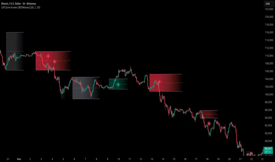
Zones evolve as price interacts with their boundaries. The first touch of a zone determines its bias - bullish, bearish, or neutral - and the system tracks the full lifecycle of each zone from formation, testing, and bias establishment to potential breakout events. Diamond-shaped breakout signals highlight structurally significant price expansions while filtering noise using a configurable cooldown period.
By visualizing market structure in this way, traders gain a deeper understanding of price behavior, trend momentum, and areas where liquidity and reactive forces are concentrated.
Theoretical Foundation
The Support & Resistance Zone Hunter is built on the premise that meaningful structural zones arise from two core principles:
Pivot-Based Turning Points : Only significant highs and lows that represent actual swings in price are considered.
Contextual Validation : Zones must pass minimum range criteria and optional volume thresholds to ensure their relevance.
Markets naturally generate numerous micro-pivots that do not carry predictive significance. By filtering out minor swings and validating zones against volume and range, the system isolates levels that are more likely to attract future price interaction or act as catalysts for breakout moves.
This framework captures not only where price is likely to react but also the direction of potential pressure, providing a statistically grounded, visually intuitive representation of market structure.
How It Works
The Support & Resistance Zone Hunter constructs zones through a multi-layered process that blends pivot logic, range validation, and real-time bias determination:
1. Pivot Detection Core
The indicator identifies pivot highs and pivot lows using a configurable lookback period. Zones are only considered valid when both a top and bottom pivot are present.
2. Zone Qualification Engine
Prospective zones must satisfy two conditions:
Range Threshold : The distance between pivot high and low must exceed the minimum percentage set by the user.
Volume Requirement : If enabled, the current volume must exceed the 50-period moving average.
Only zones meeting these criteria are drawn, reducing noise and emphasizing high-probability structural levels.
3. Zone Lifecycle
Once a valid top and bottom pivot exist:
The zone is created starting from the pivot formation bar.
Zones remain active until both boundaries have been touched by price.
The first boundary touched establishes bias: resistance first → bullish bias ,support first → bearish bias, neither → neutral.
Inactive zones stop expanding but remain visible historically to maintain a clear structural context.
4. Visual Rendering
Active zones are displayed as filled boxes with color corresponding to their bias. Top, bottom, and midpoint lines are drawn for reference. Once a zone becomes inactive, its lines are removed while the filled box remains as a historical footprint.
5. Breakout Detection
Breakout signals occur when price closes above the top boundary or below the bottom boundary of an active zone. The system applies a cooldown period and requires price to return to the zone since the previous breakout to prevent signal spam. Bullish and bearish breakouts are visually represented by diamond-shaped markers with configurable colors.
Interpretation
The Support & Resistance Zone Hunter provides a structural view of market balance:
Bullish Zones : Form when resistance is tested first, indicating upward pressure and potential continuation.
Bearish Zones : Form when support is tested first, reflecting downward pressure and continuation risk.
Neutral Zones : Fresh zones that have not yet been interacted with, representing undiscovered liquidity.
Breakout Diamonds : Highlight significant structural price expansions, helping traders identify confirmed continuation moves while filtering noise.
Zones do not simply indicate past levels; they dynamically reflect the evolving battle between buyers and sellers, providing actionable context for both trend continuation and reversion strategies.
Strategy Integration
The Support & Resistance Zone Hunter is versatile and can be applied across multiple trading approaches:
Trend Continuation : Use bullish and bearish zones to confirm directional bias. Breakout diamonds indicate structural continuation opportunities.
Reversion Entries : Neutral zones often act as magnets in ranging markets, allowing for high-probability mean-reversion setups.
Breakout Trading : Diamonds mark true structural expansions, reducing false breakout risk and guiding stop placement or momentum entries.
Liquidity Zone Alignment : Combining the indicator with order block, breaker, or volume-based tools helps validate zones against broader market participation.
Technical Implementation Details
Pivot Engine : Two-sided pivot detection based on configurable lookback.
Zone Qualification : Minimum range requirement and optional volume filter.
Bias Logic : Determined by the first boundary touched.
Zone Lifecycle : Active until both boundaries are touched, historical visibility retained.
Breakout Signals : Diamond markers with cooldown filtering and price-return validation.
Visuals : Transparent filled zones with live top, bottom, and midpoint lines.
Suggested Optimal Parameters
Pivot Lookback : 10 - 30 for intraday, 20 - 50 for swing trading.
Minimum Range % : 0.5 - 2% for crypto or indices, 1 - 3% for metals or forex.
Volume Filter : Enable for assets with inconsistent liquidity; disable for consistently liquid markets.
Breakout Cooldown : 5 - 20 bars depending on volatility.
These suggested parameters should be used as a baseline; their effectiveness depends on the asset and timeframe, so fine-tuning is expected for optimal performance.
Performance Characteristics
High Effectiveness:
Markets with clear pivot structure and reliable volume.
Trending symbols with consistent retests.
Assets where zones attract repeated price interaction.
Reduced Effectiveness:
Random walk markets lacking structural pivots.
Low-volatility periods with minimal price reaction.
Assets with irregular volume distribution or erratic price action.
Integration Guidelines
Use zone color as contextual bias rather than a standalone signal.
Combine with structural tools, order blocks, or volume-based indicators for confluence.
Validate zones on higher timeframes to refine lower timeframe entries.
Treat breakout diamonds as confirmation of continuation rather than independent triggers.
Disclaimer
The Support & Resistance Zone Hunter provides structural zone mapping and breakout analytics. It does not predict price movement or guarantee profitability. Success requires disciplined risk management, proper parameter calibration, and integration into a comprehensive trading strategy.
Cerca negli script per "zone"
Multi-Timeframe Pivot ZonesThis indicator plots dynamic support and resistance levels from higher timeframes onto your current chart. It calculates the high, low, midpoint, and quartile (25%, 75%) levels from up to four different higher timeframes, projecting them forward as potential reaction zones.
🔍 **KEY FEATURES:**
• **Multi-Timeframe Analysis:** View key levels from 4 different timeframes simultaneously
• **Smart Visibility:** Levels only appear on timeframes equal to or lower than their source
• **Customizable Styles:** Choose colors, line widths, and styles (solid, dashed, dotted) for each timeframe
• **Projected Zones:** Levels extend into the future to show potential support/resistance areas
⚙ **HOW TO USE:**
1. Enable/disable timeframes in the settings
2. Set each timeframe to match your trading strategy (e.g., 1H, 4H, D, W)
3. Watch for price reactions at these levels for entry/exit signals
4. Use the quartile levels (25%, 75%) as secondary support/resistance areas
The indicator helps traders identify confluence areas where multiple timeframes align, increasing the significance of potential reversal or breakout points.

Institutional Levels (CNN) - [PhenLabs]📊Institutional Levels (Convolutional Neural Network-inspired)
Version : PineScript™v6
📌Description
The CNN-IL Institutional Levels indicator represents a breakthrough in automated zone detection technology, combining convolutional neural network principles with advanced statistical modeling. This sophisticated tool identifies high-probability institutional trading zones by analyzing pivot patterns, volume dynamics, and price behavior using machine learning algorithms.
The indicator employs a proprietary 9-factor logistic regression model that calculates real-time reaction probabilities for each detected zone. By incorporating CNN-inspired filtering techniques and dynamic zone management, it provides traders with unprecedented accuracy in identifying where institutional money is likely to react to price action.
🚀Points of Innovation
● CNN-Inspired Pivot Analysis - Advanced binning system using convolutional neural network principles for superior pattern recognition
● Real-Time Probability Engine - Live reaction probability calculations using 9-factor logistic regression model
● Dynamic Zone Intelligence - Automatic zone merging using Intersection over Union (IoU) algorithms
● Volume-Weighted Scoring - Time-of-day volume Z-score analysis for enhanced zone strength assessment
● Adaptive Decay System - Intelligent zone lifecycle management based on touch frequency and recency
● Multi-Filter Architecture - Optional gradient, smoothing, and Difference of Gaussians (DoG) convolution filters
🔧Core Components
● Pivot Detection Engine - Advanced pivot identification with configurable left/right bars and ATR-normalized strength calculations
● Neural Network Binning - Price level clustering using CNN-inspired algorithms with ATR-based bin sizing
● Logistic Regression Model - 9-factor probability calculation including distance, width, volume, VWAP deviation, and trend analysis
● Zone Management System - Intelligent creation, merging, and decay algorithms for optimal zone lifecycle control
● Visualization Layer - Dynamic line drawing with opacity-based scoring and optional zone fills
🔥Key Features
● High-Probability Zone Detection - Automatically identifies institutional levels with reaction probabilities above configurable thresholds
● Real-Time Probability Scoring - Live calculation of zone reaction likelihood using advanced statistical modeling
● Session-Aware Analysis - Optional filtering to specific trading sessions for enhanced accuracy during active market hours
● Customizable Parameters - Full control over lookback periods, zone sensitivity, merge thresholds, and probability models
● Performance Optimized - Efficient processing with controlled update frequencies and pivot processing limits
● Non-Repainting Mode - Strict mode available for backtesting accuracy and live trading reliability
🎨Visualization
● Dynamic Zone Lines - Color-coded support and resistance levels with opacity reflecting zone strength and confidence scores
● Probability Labels - Real-time display of reaction probabilities, touch counts, and historical hit rates for active zones
● Zone Fills - Optional semi-transparent zone highlighting for enhanced visual clarity and immediate pattern recognition
● Adaptive Styling - Automatic color and opacity adjustments based on zone scoring and statistical significance
📖Usage Guidelines
● Lookback Bars - Default 500, Range 100-1000, Controls the historical data window for pivot analysis and zone calculation
● Pivot Left/Right - Default 3, Range 1-10, Defines the pivot detection sensitivity and confirmation requirements
● Bin Size ATR units - Default 0.25, Range 0.1-2.0, Controls price level clustering granularity for zone creation
● Base Zone Half-Width ATR units - Default 0.25, Range 0.1-1.0, Sets the minimum zone width in ATR units for institutional level boundaries
● Zone Merge IoU Threshold - Default 0.5, Range 0.1-0.9, Intersection over Union threshold for automatic zone merging algorithms
● Max Active Zones - Default 5, Range 3-20, Maximum number of zones displayed simultaneously to prevent chart clutter
● Probability Threshold for Labels - Default 0.6, Range 0.3-0.9, Minimum reaction probability required for zone label display and alerts
● Distance Weight w1 - Controls influence of price distance from zone center on reaction probability
● Width Weight w2 - Adjusts impact of zone width on probability calculations
● Volume Weight w3 - Modifies volume Z-score influence on zone strength assessment
● VWAP Weight w4 - Controls VWAP deviation impact on institutional level significance
● Touch Count Weight w5 - Adjusts influence of historical zone interactions on probability scoring
● Hit Rate Weight w6 - Controls prior success rate impact on future reaction likelihood predictions
● Wick Penetration Weight w7 - Modifies wick penetration analysis influence on probability calculations
● Trend Weight w8 - Adjusts trend context impact using ADX analysis for directional bias assessment
✅Best Use Cases
● Swing Trading Entries - Enter positions at high-probability institutional zones with 60%+ reaction scores
● Scalping Opportunities - Quick entries and exits around frequently tested institutional levels
● Risk Management - Use zones as dynamic stop-loss and take-profit levels based on institutional behavior
● Market Structure Analysis - Identify key institutional levels that define current market structure and sentiment
● Confluence Trading - Combine with other technical indicators for high-probability trade setups
● Session-Based Strategies - Focus analysis during high-volume sessions for maximum effectiveness
⚠️Limitations
● Historical Pattern Dependency - Algorithm effectiveness relies on historical patterns that may not repeat in changing market conditions
● Computational Intensity - Complex calculations may impact chart performance on lower-end devices or with multiple indicators
● Probability Estimates - Reaction probabilities are statistical estimates and do not guarantee actual market outcomes
● Session Sensitivity - Performance may vary significantly between different market sessions and volatility regimes
● Parameter Sensitivity - Results can be highly dependent on input parameters requiring optimization for different instruments
💡What Makes This Unique
● CNN Architecture - First indicator to apply convolutional neural network principles to institutional-level detection
● Real-Time ML Scoring - Live machine learning probability calculations for each zone interaction
● Advanced Zone Management - Sophisticated algorithms for zone lifecycle management and automatic optimization
● Statistical Rigor - Comprehensive 9-factor logistic regression model with extensive backtesting validation
● Performance Optimization - Efficient processing algorithms designed for real-time trading applications
🔬How It Works
● Multi-timeframe pivot identification - Uses configurable sensitivity parameters for advanced pivot detection
● ATR-normalized strength calculations - Standardizes pivot significance across different volatility regimes
● Volume Z-score integration - Enhanced pivot weighting based on time-of-day volume patterns
● Price level clustering - Neural network binning algorithms with ATR-based sizing for zone creation
● Recency decay applications - Weights recent pivots more heavily than historical data for relevance
● Statistical filtering - Eliminates low-significance price levels and reduces market noise
● Dynamic zone generation - Creates zones from statistically significant pivot clusters with minimum support thresholds
● IoU-based merging algorithms - Combines overlapping zones while maintaining accuracy using Intersection over Union
● Adaptive decay systems - Automatic removal of outdated or low-performing zones for optimal performance
● 9-factor logistic regression - Incorporates distance, width, volume, VWAP, touch history, and trend analysis
● Real-time scoring updates - Zone interaction calculations with configurable threshold filtering
● Optional CNN filters - Gradient detection, smoothing, and Difference of Gaussians processing for enhanced accuracy
💡Note
This indicator represents advanced quantitative analysis and should be used by traders familiar with statistical modeling concepts. The probability scores are mathematical estimates based on historical patterns and should be combined with proper risk management and additional technical analysis for optimal trading decisions.
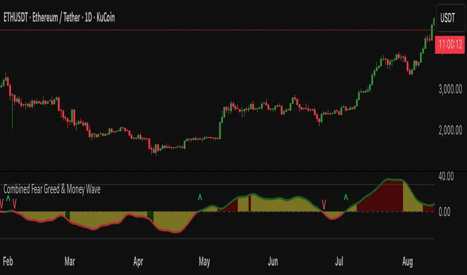
Fear Greed zones and Money Waves FusedThis indicator, named "Fear Greed zones and Money Waves" combines a smoothed Money Flow Index (MFI)-based wave and the Relative Strength Index (RSI) to visualize market sentiment through fear and greed zones and generate buy/sell signals.
Core Functions
- It calculates a zero-centered and smoothed version of the MFI (MoneyWave) using configurable smoothing methods (SMA, EMA, RMA) with parameters for length and smoothing intensity.
- It uses RSI to define fear and greed zones based on user-defined thresholds (e.g., RSI below 30 indicates fear, above 70 indicates greed).
- The MoneyWave area is color-coded based on these fear/greed RSI zones: dark green for fear, dark red for greed, and yellow neutral.
- The edge line of the MoneyWave shows bullish (lime) when above zero and bearish (red) when below zero.
Visual Elements
- Plots the MoneyWave as a colored area with an edge line.
- Displays horizontal lines representing the zero line and upper/lower bounds derived from MFI thresholds.
- Optionally shows direction change arrows when the MoneyWave sign changes and labels indicating BUY or SELL signals based on MoneyWave crossing zero combined with fear/greed conditions.
Trading Signals and Alerts
- Buy signal triggers when MoneyWave crosses upward through zero while in the fear zone (RSI low).
- Sell signal triggers when MoneyWave crosses downward through zero while in the greed zone (RSI high).
- Alerts can be generated for these buy/sell events.
In summary, this indicator provides a combined measure of money flow momentum (MoneyWave) with market sentiment zones (fear and greed from RSI), helping identify potential market entry and exit points with visual markers and alerts .
Dynamic Value Zone Oscillator (DVZO) - @CRYPTIK1Dynamic Value Zone Oscillator (DVZO) @CRYPTIK1
Introduction: What is the DVZO?
The Dynamic Value Zone Oscillator (DVZO) is a powerful momentum indicator that reframes the classic "overbought" and "oversold" concept. Instead of relying on a fixed lookback period like a standard RSI or Stochastics, the DVZO measures the current price relative to a significant, higher-timeframe Value Zone (e.g., the previous week's entire price range).
This gives you a more contextual and structural understanding of price. The core question it answers is not just "Is the price moving up or down quickly?" but rather, "Where is the current price in relation to its recently established area of value?"
This allows traders to identify true "premium" (overbought) and "discount" (oversold) levels with greater accuracy, leading to higher-probability reversal and trend-following signals.
The Core Concept: Price vs. Value
The market is constantly trying to find equilibrium or "fair value." The DVZO is built on the principle that the high and low of a significant prior period (like the previous day, week, or month) create a powerful area of perceived value.
The Value Zone: The range between the high and low of the selected higher timeframe. The midpoint of this zone is the equilibrium (0 line on the oscillator).
Premium Territory (Distribution Zone): When price breaks above the Value Zone High (+100 line), it is trading at a premium. This is an area where sellers are more likely to become active and buyers may be over-extending.
Discount Territory (Accumulation Zone): When price breaks below the Value Zone Low (-100 line), it is trading at a discount. This is an area where buyers are more likely to see value and sellers may be exhausted.
By anchoring its analysis to these significant structural levels, the DVZO filters out much of the noise from lower-timeframe price fluctuations.
Key Features
The Oscillator:
The main blue line visualizes exactly where the current price is within the context of the Value Zone.
+100: The high of the Value Zone.
0: The midpoint/equilibrium of the Value Zone.
-100: The low of the Value Zone.
Automatic Divergence Detection:
The DVZO automatically identifies and plots bullish and bearish divergences on both the price chart and the oscillator itself.
Bullish Divergence: Price makes a new low, but the DVZO makes a higher low. This is a strong signal that downside momentum is fading and a reversal to the upside is likely.
Bearish Divergence: Price makes a new high, but the DVZO makes a lower high. This indicates that upside momentum is waning and a pullback is probable.
Value Migration Histogram:
The purple histogram in the background visualizes the width of the Value Zone.
Expanding Histogram: Volatility is increasing, and the accepted value range is getting wider.
Contracting Histogram: Volatility is decreasing, and the price is coiling in a tight range, often in anticipation of a major breakout.
How to Use the DVZO: Trading Strategies
1. Reversion Trading
This is the most direct way to use the indicator.
Look for Buys: When the DVZO line drops below -100, the price is in the "Accumulation Zone." Wait for the price to show signs of strength (e.g., a bullish candle pattern) and the DVZO line to start turning back up towards the -100 level. This is a high-probability mean reversion setup.
Look for Sells: When the DVZO line moves above +100, the price is in the "Distribution Zone." Look for signs of weakness (e.g., a bearish engulfing candle) and the DVZO line to start turning back down towards the +100 level.
2. Divergence Trading
Divergences are powerful confirmation signals.
Entry Signal: When a Bullish Divergence appears, it provides a strong entry signal for a long position, especially if it occurs within the Accumulation Zone (below -100).
Exit/Short Signal: When a Bearish Divergence appears, it can serve as a signal to take profit on long positions or to look for a short entry, especially if it occurs in the Distribution Zone (above +100).
3. Best Practices & Settings
Timeframe Synergy: The DVZO is most effective when your chart timeframe is lower than your selected Value Zone Source.
For Day Trading (e.g., 1H, 4H chart): Use the "Previous Day" Value Zone.
For Swing Trading (e.g., 1D, 12H chart): Use the "Previous Week" or "Previous Month" Value Zone.
Confirmation is Key: The DVZO is a powerful tool, but it should not be used in isolation. Always combine its signals with other forms of analysis, such as market structure, support/resistance levels, and candlestick patterns, for confirmation.
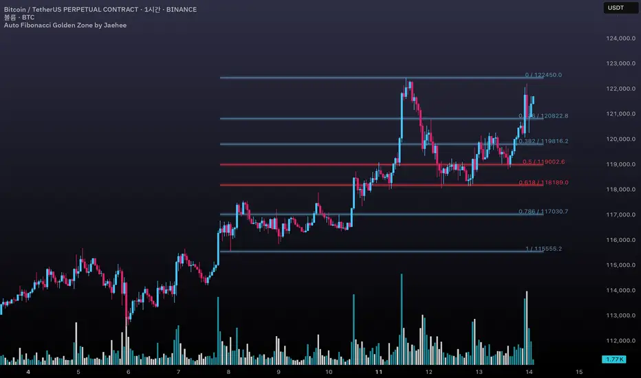
Auto Fibonacci Golden Zone by Jaehee📌 AUTO FIBONACCI GOLDEN ZONE — Auto Swing Detection with Key Level Highlights
WHAT THIS DOES
• Automatically detects the latest swing high and swing low within your chosen lookback range.
• Plots Fibonacci retracement levels: 1.000, 0.786, 0.618, 0.500, 0.382, 0.236, 0.000.
• Highlights 0.618 (“golden pocket”) and 0.500 as high-interest zones.
• Displays ratio + price labels to the right for quick reference without moving the cursor.
HOW IT WORKS
• Scans the last N bars (default 150) to locate the highest high and lowest low.
• Determines swing direction automatically: if the low forms first → up-leg, if the high forms first → down-leg.
• Calculates retracement prices and plots each level with a thin core line plus two glow layers (opacity adjustable).
• Clears and redraws lines and labels whenever a new swing is found — keeping the chart clean.
WHY THIS SETUP
• Saves time compared to manually anchoring Fib tools for each new swing.
• Highlights the golden pocket (0.618) and midpoint (0.500) — zones many traders watch for pullbacks or reactions.
• Positions labels to the right so they never overlap active candles.
HOW IT’S DIFFERENT FROM THE STANDARD FIB TOOL
• Automatic swing detection — no manual point selection.
• Built-in highlight logic for key levels.
• Clean redraw to prevent leftover lines or labels.
• Right-side label offset for readability in volatile price zones.
HOW TO READ IT (CONTEXT ONLY)
• In an up-leg, the 0.382–0.618 zone is often monitored for pullback reactions; 0.500 can act as a midpoint marker.
• In a down-leg, retracements into the 0.382–0.618 zone can be watched for selling pressure.
• Always confirm with structure, volume, and momentum tools — this indicator is not a standalone trade signal.
INPUTS
• Lookback Bars — swing detection range.
• Fib Line Color / Highlight Line Color — control standard vs. key level colors.
• Label Offset Bars — shift labels away from current price.
• Glow 1 & Glow 2 Opacity — adjust background glow visibility.
DESIGN NOTES
• Thin lines for precision, glow layers for visibility without overpowering candles.
• Overlay display — no extra panel needed.
• All elements clear and redraw automatically to avoid clutter.
LIMITATIONS & BEST PRACTICES
• Levels update whenever a new swing forms within the lookback range — historical lines are not fixed.
• Fib retracements are reference zones only, not guarantees of reversal.
• Best used with confluence factors like S/R flips, market structure, and volume analysis.
• No alerts, no performance claims — purely a market context tool.
DEFAULTS & SCOPE
• Works on all OHLCV instruments and timeframes.
• No repainting after swing confirmation.
AUTHOR’S NOTE FOR REVIEW
This is not a repackaged Fib tool. It combines automatic swing detection, golden pocket highlighting, and a clean redraw process to make retracement analysis faster and clearer. It provides context only, with no predictive or performance claims.
Mig Trade Model - Kill Zones
Key features:
Liquidity Hunt Detection: Spots aggressive moves that "hunt" stops beyond recent swing highs/lows.
Consolidation Filter: Requires 1-3 small-range candles after a hunt before confirming with a strong candle.
Bias Application: Uses daily open/close to auto-detect bias or allows manual override.
Kill Zone Restriction: Limits signals to London (default: 7-10 AM UTC) and NY (default: 12-3 PM UTC) sessions for better relevance in active markets.
This strategy is inspired by smart money concepts (SMC) and ICT (Inner Circle Trader) methodologies, aiming to capture venom-like "stings" in price action where liquidity is grabbed before reversals.
How It Works
ATR Calculation: Uses a user-defined ATR length (default: 14) to measure volatility, which scales candle body and range thresholds.
Bias Determination:
Auto: Compares daily close to open (bullish if close > open).
Manual: User selects "Bullish" or "Bearish."
Strong Candles:
Bullish: Green candle with body > 2x ATR (configurable).
Bearish: Red candle with body > 2x ATR.
Small Range Candles:
Candles where high-low < 0.5x ATR (configurable).
Liquidity Hunt:
Bullish Hunt: Strong bearish candle making a new low below the past swing low (default: 10 bars).
Bearish Hunt: Strong bullish candle making a new high above the past swing high.
Signal Generation:
After a hunt, counts 1-3 small-range candles.
Confirms with a strong candle in the opposite direction (e.g., strong bullish after bearish hunt).
Resets if >3 small candles or an opposing strong candle appears.
Kill Zone Filter:
Checks if the current bar's time (in UTC) falls within London or NY Kill Zones.
Only allows final "Buy" (bullish entry) or "Sell" (bearish entry) if bias matches and in Kill Zone.
Plots:
Yellow circle (below): Bullish liquidity hunt.
Orange circle (above): Bearish liquidity hunt.
Blue diamond (below): Raw bullish signal.
Purple diamond (above): Raw bearish signal.
Green triangle up ("Buy"): Filtered bullish entry.
Red triangle down ("Sell"): Filtered bearish entry.
Inputs
Bias: "Auto" (default), "Bullish", or "Bearish" – Controls signal direction based on daily trend.
ATR Length: 14 (default) – Period for ATR calculation.
Swing Length for Liquidity Hunt: 10 (default) – Bars to look back for swing highs/lows.
Strong Candle Body Multiplier (x ATR): 2.0 (default) – Threshold for strong candle bodies.
Small Range Multiplier (x ATR): 0.5 (default) – Threshold for small-range candles.
London Kill Zone Start/End Hour (UTC): 7/10 (default) – Customize London session hours.
NY Kill Zone Start/End Hour (UTC): 12/15 (default) – Customize New York session hours.
Usage Tips
Timeframe: Best on lower timeframes (e.g., 5-15 min) for intraday trading, especially forex pairs like EURUSD or GBPUSD.
Timezone Adjustment: Inputs are in UTC. If your chart is in a different timezone (e.g., EST = UTC-5), adjust hours accordingly (e.g., London: 2-5 AM EST → 7-10 UTC).
Risk Management: Use with stop-loss (e.g., beyond the hunt low/high) and take-profit based on ATR multiples. Not financial advice—backtest thoroughly.
Customization: Tweak multipliers for different assets; higher for volatile cryptos, lower for stocks.
Limitations: Relies on historical data; may generate false signals in ranging markets. Combine with other indicators like volume or support/resistance.
This indicator is for educational purposes. Always use discretion and proper risk management in live trading. If you find it useful, feel free to share feedback or suggestions!

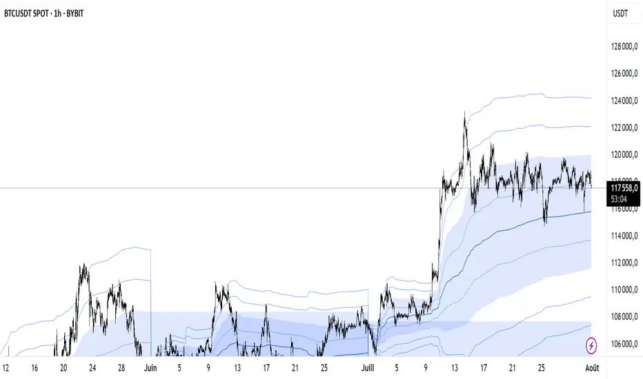
VWAP Multi-Period with SD & Value ZonesVWAP Multi-Period with SD & Value Zones
A dynamic VWAP indicator that works on Weekly, Monthly, Quarterly (3M) and Yearly (12M) timeframes.
VWAP line: true volume-weighted average price
±1, ±2, ±3 SD bands: volume-weighted volatility levels
Value Zone: filled area between ±1 SD
Prior Value Zone: last period’s ±1 SD area extended into the new period
Usage: Add to chart, select your period (W/M/3M/12M), and use the bands and zones as volume-weighted support/resistance and risk boundaries.
Demander à ChatGPT
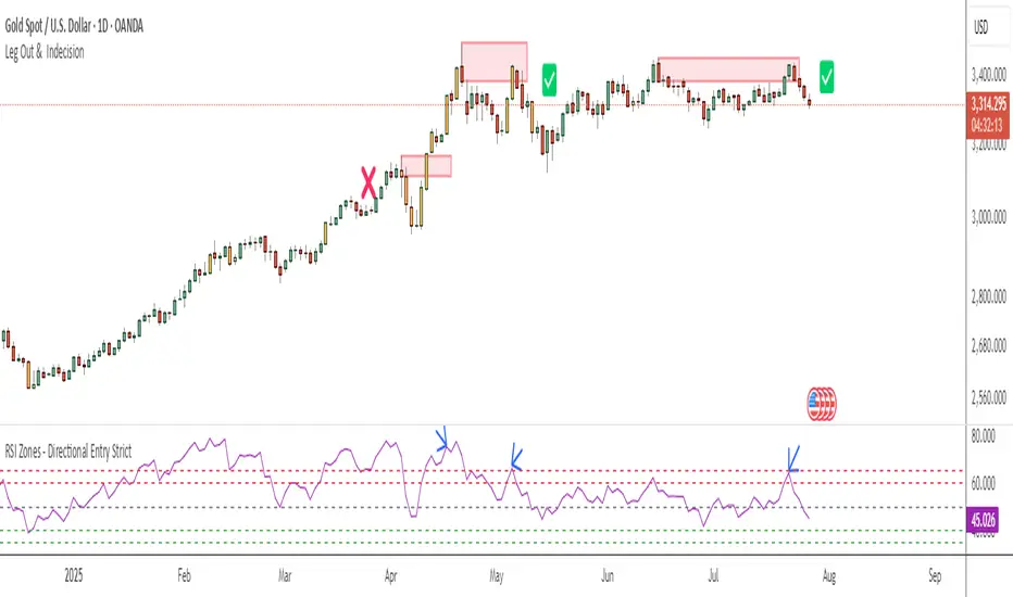
RSI Zones - Directional Entry Strict RSI Zones – Directional Entry Tool (Modified RSI)
This is a simple modification of the standard RSI indicator. I’ve added two custom horizontal lines at the 60–65 and 35–40 zones to help spot momentum shifts and potential reversal points.
60–65 zone: When RSI returns here from above 65, it often signals weakening bullish momentum — useful for spotting short opportunities.
35–40 zone: When RSI returns here from below 35, it can indicate momentum loss on the downside — good for potential long setups.
This version helps traders filter out weak signals and avoid chasing extreme moves.
It works best when combined with price action, structure, or divergence.
Only 2 lines were added to the default RSI for better zone awareness. Everything else remains unchanged.
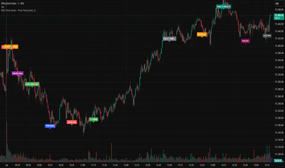
F&O Time Zones – Final Fixed📌 This indicator highlights high-probability intraday time zones used in Indian F&O (Futures & Options) strategies. Ideal for scalping, breakout setups, and trap avoidance.
🕒 Covered Time Zones:
• 9:15 – 9:21 AM → Flash Trades (first 1-minute volatility)
• 9:21 – 9:30 AM → Smart Money Trap (VWAP fakeouts)
• 9:30 – 9:50 AM → Fake Breakout Zone
• 9:50 – 10:15 AM → Institutional Entry Timing
• 10:15 – 10:45 AM → VWAP Range Scalps
• 10:45 – 11:15 AM → Second Trap Zone
• 11:15 – 1:00 PM → Trend Continuation Window
• 1:00 – 1:45 PM → Volatility Compression
• 1:45 – 2:15 PM → Institutional Exit Phase 1
• 2:15 – 2:45 PM → Trend Acceleration / Reversals
• 2:45 – 3:15 PM → Expiry Scalping Zone
• 3:15 – 3:30 PM → Dead Zone (square-off time)
🔧 Features:
✓ Clean vertical lines per zone
✓ Optional label positions (top or bottom)
✓ Adjustable line style, width, and color
🧠 Best used on: NIFTY, BANKNIFTY, FINNIFTY (5-min or lower)
---
🔒 **Disclaimer**:
This script is for **educational purposes only**. It is not financial advice. Trading involves risk. Please consult a professional or do your own research before taking any positions.
—
👤 Script by: **JoanJagan**
🛠️ Built in Pine Script v5
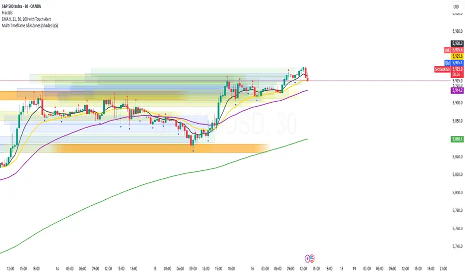
Multi-Timeframe S&R Zones (Shaded)This indicator automatically plots support and resistance zones based on recent price action across multiple timeframes:
🟥 Daily
🟧 4-Hour
🟨 1-Hour
🟩 30-Minute
🟦 5-Minute
Each zone is color-coded by timeframe and represented as a shaded region instead of a hard line, giving you a clearer and more dynamic view of key market levels. The zones are calculated from recent swing highs (resistance) and swing lows (support), and each zone spans ±5 pips for precision.
Only the most recent levels are displayed—up to 3 per timeframe—and are limited to the last 48 hours to avoid chart clutter and keep your workspace clean.
✅ Key Benefits:
Price Action Based: Zones are drawn from actual market structure (swings), not arbitrary levels.
Multi-Timeframe Clarity: View confluence across major intraday and higher timeframes at a glance.
Color-Coded Zones: Instantly distinguish between timeframes using intuitive colour coordination.
Clean Charts: Only shows the latest relevant levels, automatically expires old zones beyond 48 hours.
Flexible & Lightweight: Built for Tradingview Essential; optimized for performance.
MissedPrice Volume Method[KiomarsRakei]█ Core Concept:
This script detects price zones that are highly likely to be revisited — areas where price moved too quickly to fully fill market activity. Using sharp volume shifts and volatility filters, the script identifies these “missed” levels and generates signals pointing toward them.
Signals are generated before price reaches the zone, allowing you to analyze price behavior both before and after the zone is touched. These zones often act like magnets for price, making them ideal for short-term.
Examples of signals and high hit rate of Missed zones
█ How It Works:
The script monitors 3-candle volume and price behavior to detect moments where volume accelerates abnormally compared to recent averages. When a potential missed zone is found and price hasn’t revisited it yet, a signal is created in advance, pointing to that zone as a likely future target.
█ Features:
Zone Visualization: Dynamic boxes show price targets based on missed volume areas.
Pre-Zone Signals: Alerts fire before price returns, offering early trade setups.
Stat Tracking System: Automatically logs signals, win rate, and average profit.
Live Performance Table: On-chart stats including hit/miss breakdown and late-return analysis.
Works on All Markets: Compatible with any chart that provides volume — crypto, forex, indices, or stocks.
A signal is considered successful when price touches the zone. However, not all zones are guaranteed to be revisited.
█ Key Inputs & Stats Table:
Volume Filters: Control signal sensitivity using min/max relative volume shift.
Zone & Line Settings: Adjust how long the zone stays visible and whether entry lines are drawn.
Custom Colors: Choose colors for buy/sell zones, lines, and visuals.
📊 Table Metrics:
Total Signals: Count of all generated signals.
Win Rate: % of signals where price returned to the zone (hit = touched the zone, regardless of timing).
Bad Signals: Signals that took too long to hit or were never hit.
Bad but Hit: Signals marked bad but eventually touched the zone.
Bad signals are marked in red. These indicate zones that price failed to reach within the expected time window, showing where the script identified a target that remained unfulfilled.

ICT Macro Zone Boxes w/ Individual H/L Tracking v3.1ICT Macro Zones (Grey Box Version
This indicator dynamically highlights key intraday time-based macro sessions using a clean, minimalistic grey box overlay, helping traders align with institutional trading cycles. Inspired by ICT (Inner Circle Trader) concepts, it tracks real-time highs and lows for each session and optionally extends the zone box after the session ends — making it a precision tool for intraday setups, order flow analysis, and macro-level liquidity sweeps.
### 🔍 **What It Does**
- Plots **six predefined macro sessions** used in Smart Money Concepts:
- AM Macro (09:50–10:10)
- London Close (10:50–11:10)
- Lunch Macro (11:30–13:30)
- PM Macro (14:50–15:10)
- London SB (03:00–04:00)
- PM SB (15:00–16:00)
- Each zone:
- **Tracks high and low dynamically** throughout the session.
- **Draws a consistent grey shaded box** to visualize price boundaries.
- **Displays a label** at the first bar of the session (optional).
- **Optionally extends** the box to the right after the session closes.
### 🧠 **How It Works**
- Uses Pine Script arrays to define each session’s time window, label, and color.
- Detects session entry using `time()` within a New York timezone context.
- High/Low values are updated per bar inside the session window.
- Once a session ends, the box is optionally closed and fixed in place.
- All visual zones use a standardized grey tone for clarity and consistency across charts.
### 🛠️ **Settings**
- **Shade Zone High→Low:** Enable/disable the grey macro box.
- **Extend Box After Session:** Keep the zone visible after it ends.
- **Show Entry Label:** Display a label at the start of each session.
### 🎯 **Why This Script is Unique**
Unlike basic session markers or colored backgrounds, this tool:
- Focuses on **macro moments of liquidity and reversal**, not just open/close times.
- Uses **per-session logic** to individually track price behavior inside key time windows.
- Supports **real-time high/low tracking and clean zone drawing**, ideal for Smart Money and ICT-style strategies.
Perfect — based on your list, here's a **bundle-style description** that not only explains the function of each script but also shows how they **work together** in a Smart Money/ICT workflow. This kind of cross-script explanation is exactly what TradingView wants to see to justify closed-source mashups or interdependent tools.
---
📚 ICT SMC Toolkit — Script Integration Guide
This set of advanced Smart Money Concept (SMC) tools is designed for traders who follow ICT-based methodologies, combining liquidity theory, time-based precision, and engineered confluences for high-probability trades. Each indicator is optimized to work both independently and synergistically, forming a comprehensive trading framework.
---
First FVG Custom Time Range
**Purpose:**
Plots the **first Fair Value Gap (FVG)** that appears within a defined session (e.g., NY Kill Zone, Custom range). Includes optional retest alerts.
**Best Used With:**
- Use with **ICT Macro Zones (Grey Box Version)** to isolate FVGs during high-probability times like AM Macro or PM SB.
- Combine with **Liquidity Levels** to assess whether FVGs form near swing points or liquidity voids.
---
ICT SMC Liquidity Grabs and OB s
**Purpose:**
Detects **liquidity grabs** (stop hunts above/below swing highs/lows) and **bullish/bearish order blocks**. Includes optional Fibonacci OTE levels for sniper entries.
**Best Used With:**
- Use with **ICT Turtle Soup (Reversal)** for confirmation after a liquidity grab.
- Combine with **Macro Zones** to catch order blocks forming inside timed macro windows.
- Match with **Smart Swing Levels** to confirm structure breaks before entry.
ICT SMC Liquidity Levels (Smart Swing Lows)
**Purpose:**
Automatically marks swing highs/lows based on user-defined lookbacks. Tracks whether those levels have been breached or respected.
**Best Used With:**
- Combine with **Turtle Soup** to detect if a swing level was swept, then reversed.
- Use with **Liquidity Grabs** to confirm a grab occurred at a meaningful structural point.
- Align with **Macro Zones** to understand when liquidity events occur within macro session timing.
ICT Turtle Soup (Liquidity Reversal)
**Purpose:**
Implements the classic ICT Turtle Soup model. Looks for swing failure and quick reversals after a liquidity sweep — ideal for catching traps.
Best Used With:
- Confirm with **Liquidity Grabs + OBs** to identify institutional activity at the reversal point.
- Use **Liquidity Levels** to ensure the reversal is happening at valid previous swing highs/lows.
- Amplify probability when pattern appears during **Macro Zones** or near the **First FVG**.
ICT Turtle Soup Ultimate V2
**Purpose:**
An enhanced, multi-layer version of the Turtle Soup setup that includes built-in liquidity checks, OTE levels, structure validation, and customizable visual output.
**Best Used With:**
- Use as an **entry signal generator** when other indicators (e.g., OBs, liquidity grabs) are aligned.
- Pair with **Macro Zones** for high-precision timing.
- Combine with **First FVG** to anticipate price rebalancing before explosive moves.
---
## 🧠 Workflow Example:
1. **Start with Macro Zones** to focus only on institutional trading windows.
2. Look for **Liquidity Grabs or Swing Sweeps** around key highs/lows.
3. Check for a **Turtle Soup Reversal** or **Order Block Reaction** near that level.
4. Confirm confluence with a **Fair Value Gap**.
5. Execute using the **OTE level** from the Liquidity Grabs + OB script.
---
Let me know which script you want to publish first — I’ll tailor its **individual TradingView description** and flag its ideal **“Best Used With” partners** to help users see the value in your ecosystem.

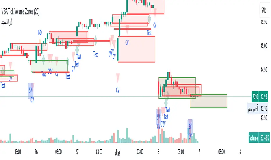
VSA Tick Volume Zones0
مؤشر VSA Tick Volume مع مناطق العرض والطلب (إصدار تجريبي)
مؤشر مخصص لمنصة TradingView يعتمد على تحليل الحجم والسعر (VSA - Volume Spread Analysis)، ويقوم تلقائيًا بتحديد مناطق الطلب والعرض استنادًا إلى إشارات VSA القوية. يهدف المؤشر إلى كشف تحركات المتداولين المحترفين وتحديد نقاط الانعكاس الذكية.
---
✅ الميزات الأساسية:
1. إشارات VSA:
المؤشر يتعرف تلقائيًا على أبرز إشارات تحليل VSA:
- *Climactic Volume (CV):* حجم تداول مرتفع بشكل استثنائي يشير لنهاية الاتجاه الحالي.
- *No Demand (ND):* شموع صعودية ضعيفة الحجم، تشير إلى غياب اهتمام المشترين.
- *No Supply (NS):* شموع هبوطية ضعيفة الحجم، تشير إلى غياب اهتمام البائعين.
- *Stopping Volume (SV):* ارتفاع مفاجئ في الحجم بعد اتجاه هابط، يشير لتدخل المشترين.
- *UpThrust (UT):* اختراق كاذب للسعر نحو الأعلى مع حجم كبير وإغلاق منخفض.
- *Test (T):* شموع اختبارية بحجم منخفض للتحقق من غياب البائعين استعدادًا للصعود.
2. تلوين الشموع:
- كل إشارة تُلوَّن تلقائيًا على الشارت لتسهيل المتابعة البصرية:
- CV باللون الأحمر
- ND باللون البرتقالي
- NS باللون الأخضر
- SV باللون الأزرق
- UT باللون الأرجواني
- Test باللون السماوي
3. رسم مناطق العرض والطلب تلقائيًا:
- يتم تحديد المناطق بناءً على إشارات *UT* و*SV* و*Test*، حيث تعتبر مناطق تمركز ذكي للمؤسسات (Smart Money Zones).
🎯 الهدف من المؤشر:
يساعد هذا المؤشر:
- المتداول اليومي على اتخاذ قرارات مدروسة.
- المحلل الفني على فهم السياق المؤسساتي للسوق.
- دعم استراتيجيات الدخول والخروج بدقة أعلى من خلال الدمج بين إشارات VSA والمناطق الفعلية للعرض والطلب.
---
🧪 ملاحظات:
- المؤشر لا يعتبر توصية شراء أو بيع.
- الإشارات تحتاج إلى تأكيد من خلال حركة السعر أو مؤشرات مساعدة.
- يمكن استخدامه مع أدوات إضافية مثل RSI أو Moving Averages.
---
⚙ الاقتراحات المستقبلية:
- دمج أدوات تدفق السيولة (مثل OBV أو VWAP).
- تنبيه صوتي وإشعار عند ظهور إشارات محددة.
- تخصيص أكبر للمستخدم من حيث الألوان ونوع الإشارات.
---
للتواصل أو المساهمة في تطوير المؤشر، يرجى مراسلتي.
VSA Tick Volume Indicator with Supply and Demand Zones (Beta Version)
A custom indicator for the TradingView platform based on Volume and Price Analysis (VSA - Volume Spread Analysis), it automatically identifies supply and demand zones based on strong VSA signals. The indicator aims to uncover the movements of professional traders and identify smart reversal points.
✅ Key Features:
VSA Signals: The indicator automatically detects key VSA analysis signals:
Climactic Volume (CV): Exceptionally high trading volume indicating the end of the current trend.
No Demand (ND): Bullish candles with weak volume, indicating a lack of buyer interest.
No Supply (NS): Bearish candles with weak volume, indicating a lack of seller interest.
Stopping Volume (SV): A sudden volume spike after a downtrend, indicating buyer intervention.
UpThrust (UT): A false price breakout upwards with high volume and a low close.
Test (T): Low-volume test candles to check for the absence of sellers, signaling readiness for an upward move.
Candle Coloring:
Each signal is automatically color-coded on the chart for easy visual tracking:
CV in red
ND in orange
NS in green
SV in blue
UT in purple
Test in cyan
Automatic Supply and Demand Zone Drawing:
Zones are determined based on the UT, SV, and Test signals, which are considered smart money zones.
🎯 Purpose of the Indicator:
This indicator helps:
The day trader make informed decisions.
The technical analyst understand the market's institutional context.
Enhance entry and exit strategies with more accuracy by combining VSA signals and actual supply and demand zones.
🧪 Notes:
The indicator is not a buy or sell recommendation.
Signals need confirmation through price action or additional indicators.
Can be used alongside other tools such as RSI or Moving Averages.
⚙ Future Suggestions:
Integration of liquidity flow tools (such as OBV or VWAP).
Sound alerts and notifications when specific signals appear.
Greater customization options for users regarding colors and signal types.
For inquiries or contributions to the indicator's development, please contact me.
Multi-Timeframe Liquidity Zones V6 (Table)Multi-Timeframe Liquidity Zones V6 (Table) Indicator: Functionality and Uses
Overview: The Multi-Timeframe Liquidity Zones V6 (Table) indicator is a technical analysis tool that highlights key volume-based support and resistance levels across multiple timeframes. It leverages volume profile concepts – specifically the Point of Control (POC) and Value Area High/Low (VAH/VAL) – to identify “liquidity zones” where trading activity was heaviest . Unlike a standard single-timeframe volume profile, this indicator compiles data from several timeframes (e.g. monthly, weekly, daily, intraday) and displays the results in a convenient table format on the chart. The goal is to give traders a consolidated view of important price levels (derived from volume concentrations) across different horizons, helping them plan trades with a broader market perspective.
Purpose and Functionality of the Indicator
Multi-Timeframe Analysis: The primary objective of this indicator is to simplify multi-timeframe analysis of volume distribution. Rather than manually checking volume profiles on separate charts for each timeframe, the tool automatically calculates the key levels for each selected timeframe and presents them together. This includes higher-level perspectives (like monthly or weekly volume hotspots) alongside shorter-term levels (daily or hourly), ensuring that traders don’t miss significant zones from any timeframe . By offering a broader perspective on support and resistance levels, multi-timeframe tools help improve risk management and signal confirmation , and this indicator is designed to provide that volume-based perspective at a glance.
Table Format Display: Multi-Timeframe Liquidity Zones V6 (Table) specifically presents the information as a table (as opposed to plotting lines on the chart). Each row in the table typically corresponds to a timeframe (for example, Monthly, Weekly, Daily, 4H, 1H, 30M, 15M), and the columns list the calculated POC, VAH, VAL, and possibly the average volume for that timeframe’s look-back period. By structuring the data in a table, traders can quickly read off the exact price levels of these liquidity zones without having to visually trace lines. This format makes it easy to compare levels across timeframes or note where multiple timeframes’ levels cluster near the same price – a sign of especially strong support/resistance. The indicator uses a user-defined number of bars or length of history for each timeframe to calculate these values (so you can adjust how far back it looks to define the volume profile for each period).
Objective: In summary, the functionality is geared toward identifying high-liquidity price zones across multiple time scales and presenting them clearly. These high-liquidity zones often coincide with areas where price reacts (stalls, reverses, or accelerates) because a lot of trading activity (hence, orders and volume) took place there in the past. The indicator’s objective is to alert the trader to those areas in advance. It effectively answers questions like: “Where are the major volume concentration levels on the 1-hour, daily, and weekly charts right now?” and “Are there overlapping volume-based support/resistance levels from different timeframes around the current price?” By compiling this information, the indicator helps traders incorporate context from multiple timeframes in their decision-making, without needing to flip through numerous charts.
Identifying Liquidity Zones with POC, VAH, and VAL
Liquidity Zones Defined: In market terms, a “liquidity zone” is an area of the chart where a significant amount of trading occurred, meaning high liquidity (many buyers and sellers exchanged volume there). These zones often act as support or resistance because past heavy trading indicates consensus or interest around those price levels. This indicator identifies liquidity zones through volume profile analysis on each timeframe’s recent price action. Essentially, it looks at the distribution of trading volume at different prices over the specified period and finds the value area – the range of prices that encompassed the majority of that volume (commonly around 70% of the total volume ). Within that value area, it pinpoints the Point of Control (POC), which is the single price level that had the highest traded volume (the peak of the volume profile) . The upper and lower boundaries of that high-volume range are marked as Value Area High (VAH) and Value Area Low (VAL) respectively . Together, the VAH and VAL define the liquidity zone where the market spent most of its time and volume, and POC highlights the most traded price in that zone.
• Point of Control (POC): The POC is the price level with the greatest volume traded for the given period. It represents the price at which the most liquidity was exchanged – effectively the market’s “center of gravity” for that timeframe’s trading activity . The indicator calculates the POC for each selected timeframe by scanning the volume at each price; the price with maximum volume is flagged as that timeframe’s POC. In the table, the POC might be highlighted or listed as a key level (sometimes traders color-code it or mark it for emphasis). Because so many positions were opened or closed at the POC, it often serves as a strong support/resistance. For example, if price falls to a major POC from above, traders expect buyers may step in there (since it was a popular buy/sell level historically), potentially causing a bounce. Conversely, if price breaks through a POC decisively, it may signal a significant shift in market acceptance.
• Value Area High (VAH) and Low (VAL): The VAH and VAL are the price boundaries of the value area, which is typically defined to contain about 70% of the total traded volume for the period . In other words, between VAH and VAL is where the “bulk” of trading occurred, and outside this range is where relatively less volume traded. The indicator derives VAH/VAL by accumulating volume from the highest-volume price (POC) outward until ~70% of volume is covered (this is a common method for volume profile value area). VAH is the top of this high-volume region and VAL is the bottom. These levels are important because they often act like support/resistance boundaries: when price is inside the value area, it’s in a high-liquidity zone and tends to oscillate between VAH and VAL; when price moves above VAH or below VAL, it’s leaving the high-volume zone, which can indicate a potential trend or imbalance (price entering a lower-liquidity area where it might move faster until finding the next liquidity zone). Traders watch VAH/VAL for signs of rejection or acceptance: for instance, a price rally that falters at VAH suggests that level is acting as resistance (sellers defending that high-volume area), whereas if price pushes above VAH, it may continue until the next timeframe’s zone or until it finds new interest. The Multi-Timeframe Liquidity Zones V6 indicator gives the VAH and VAL for each timeframe, essentially mapping out the upper and lower bounds of key liquidity zones at those scales.
How the Indicator Identifies These: Under the hood, the indicator likely uses historical price and volume data for each timeframe’s lookback window. For each timeframe (say the last 20 weekly bars for a weekly profile, last 100 daily bars for a daily profile, etc.), it constructs a volume profile (a histogram of volume at each price). From that distribution, it finds the POC (highest volume bin) and calculates VAH/VAL around it. The output is a set of numbers (price levels) that mark where those zones lie. In practice, if using the Lines version of this indicator, those levels are drawn as horizontal lines on the chart and labeled by timeframe (e.g., a line at 1.2345 labeled “D POC” for Daily POC) . In the Table version, those values are instead listed in text form. Either way, the identification process is the same – it’s finding the high-volume price regions on each timeframe and calling them out. By doing this for multiple timeframes concurrently, the indicator reveals how these liquidity zones from different periods relate to each other. For example, you might discover that a daily-chart value area overlaps with a weekly-chart POC, creating a particularly strong zone of interest. This kind of insight is hard to get from a single timeframe analysis alone.
Volume Profile Data Across Multiple Timeframes
Multiple Timeframes in One View: One of the biggest advantages of this indicator is the ability to see volume profile information from various timeframes side by side. Traders often perform multiple timeframe analysis to get a fuller picture — for instance, checking monthly or weekly levels for long-term context while planning a trade on a 4-hour chart. This indicator automates that process for volume-based levels. The table will typically list each chosen timeframe (which could be preset or user-selected). For each timeframe, you get the POC, VAH, VAL, and possibly an average volume metric. The “average volume” likely refers to the average volume per bar or the average volume traded over the profile’s duration for that timeframe, which gives a sense of how significant that period’s activity is. For example, a weekly profile might show an average volume of say 500k per week, versus a daily profile average of 80k per day – indicating the scale of trading on weekly vs daily. High average volume on a timeframe means its liquidity zones were formed with a lot of participation, possibly making them more reliable support/resistance. By comparing these, traders can gauge which timeframes had unusually high or low activity recently. The table format makes such comparisons straightforward.
Identification of Confluence: Because all the data is presented together, traders can quickly spot confluence or overlaps between timeframes. If two different timeframes show liquidity zones at similar price levels, that price becomes extremely noteworthy. For instance, suppose the indicator shows: a 1-hour POC at 1.1300, a 4-hour VAL at 1.1280, and a daily VAL at 1.1290. These are all in a tight range – effectively indicating a multi-timeframe liquidity zone around 1.1280–1.1300. A trader seeing this cluster in the table will recognize that as a strong support area, since multiple profiles from intraday to daily all suggest heavy trading interest there. Similarly, overlaps of VAH (resistance zone) from different timeframes could signal a strong ceiling. The multi-timeframe view prevents a trader from, say, going long into a major weekly POC above, or shorting when there’s a huge monthly value-area low just below – situations where awareness of higher timeframe volume structure can make the difference between a good and bad trade.
User Customization: The indicator is flexible in that you can typically adjust which timeframes to include and how many bars to use for each timeframe’s calculation. For example, one might configure it to calculate monthly levels using the past 12 monthly bars (1 year of data), weekly levels using the past 20 weeks, daily using 100 days, etc., depending on preference. By tuning the “bars count” or period length , the trader can focus on recent liquidity zones or incorporate more history if desired. Shorter lookback might catch more recent shifts in volume distribution (important if the market structure changed recently), while longer lookback gives more established levels. This customization ensures the indicator’s output can be tailored to different trading styles (short-term vs swing vs long-term investing). Regardless of settings, the multi-timeframe table allows simultaneous visibility of the chosen timeframes’ volume landscape. This comprehensive view is the core strength: it consolidates data that normally requires flipping through multiple charts.
Using the Liquidity Zones Data for Trading Decisions
Traders can use the information from the MTF Liquidity Zones V6 (Table) indicator in several practical ways to enhance their decision-making:
• Identify Support and Resistance: Each liquidity zone acts as a potential support or resistance area. For example, if the table shows a daily VAH at a certain level above the current price, that level might serve as resistance if the price rallies up to it (since it marks the top of a high-volume region where sellers might step in). Conversely, a weekly VAL below current price could act as support on a dip. By noting these levels in the table, a trader planning an entry or exit can anticipate where the price might stall or reverse. Essentially, you get a map of high-interest price levels from different timeframes, which you can mark on your trading chart for guidance.
• Plan Entries and Exits Around Key Levels: Many traders incorporate volume profile levels into their strategies, for instance: buying near VAL (betting that the value area will hold and price will revert upward), or selling/shorting near VAH (expecting the top of value to hold as resistance), or trading breakouts when price moves outside the value area. With the multi-timeframe table, one can refine these tactics by also considering higher timeframe levels. Suppose you see that on the 1-hour chart the price is just above its 1H POC, but the table indicates that just slightly above, there’s also the daily POC. You might delay a long entry until price clears that daily POC, because that could be a stronger intraday barrier. Or if you intend to take profit on a long trade, you might choose a target just below a weekly VAH since price may struggle to climb past that on the first attempt. The indicator thus acts as a guide for precision in entry/exit decisions, aligning them with where liquidity is high.
• Gauge Trend Strength and Directional Bias: By observing where current price is relative to these volume zones, traders can infer certain market conditions. For instance, if price is trading above the VAH of multiple timeframes’ value areas, it suggests the market is in a more bullish or overextended territory (price accepted above prior value), whereas if price is below multiple VALs, it’s in bearish or undervalued territory relative to recent history. If the price stays around a POC, it indicates consolidation or equilibrium (market comfortable at that price). Traders can use this context for bias – e.g., if price is above the weekly VAH, you might lean bullish but watch for potential pullbacks to that VAH level (now a support). If price is below the monthly VAL, you might avoid longs until it re-enters that value area. In essence, the liquidity zones provide context of value vs. price: is price trading within the high-volume areas (implying range-bound behavior) or outside them (implying a breakout or trending move)? This can prevent chasing trades at poor locations.
• Combine with Other Indicators/Analysis: It’s generally advised to not use any single indicator in isolation, and this holds true here. The liquidity zones from this indicator are best used alongside price action or other technical signals for confirmation . For example, if a bullish candlestick reversal pattern forms right at a confluence of a 4H VAL and Daily POC, that’s a stronger buy signal than the pattern alone. Or if an oscillator shows overbought exactly as price hits a weekly VAH, it adds conviction to a possible short. The indicator’s table basically gives you a shortlist of critical price levels; you can then watch how price behaves at those levels (via candlesticks, order flow, etc.) to make the final trade decision. Traders might set alerts for when price approaches one of the listed levels, or they might drop down to a lower timeframe to fine-tune an entry once a key zone is reached. By integrating this volume-based insight with trend analysis, chart patterns, or momentum indicators, one can make more informed and high-probability decisions rather than trading in the dark.
• Risk Management and Stop Placement: High-liquidity zones can also inform stop-loss placement. Ideally, you want your stop on the other side of a strong support/resistance. If you go long near a VAL, you might place your stop just below the VAL (since a move beyond that suggests the high-volume zone didn’t hold). If you short near a VAH, a stop just above the VAH or POC could be logical. Moreover, if multiple timeframes show overlapping zones, a stop beyond all of them could be even safer (albeit at the cost of a wider stop). The indicator helps identify those spots. It also warns you of where not to put a stop – for example, placing a stop-loss right at a POC might be unwise because price could gravitate to that POC repeatedly (due to its magnetic effect as a high-volume price). Instead, a trader might choose a stop beyond the far side of the value area. By using the table’s information, you can align your risk management with areas of high liquidity, reducing the chance of being whipsawed by normal volatility around heavily traded levels .
Benefits of the Multi-Timeframe Liquidity Zones Indicator
Using the Multi-Timeframe Liquidity Zones V6 (Table) indicator offers several key benefits for traders, ultimately aiming to streamline analysis and improve decision quality:
• Consolidated Key Levels: It provides a clear, consolidated view of crucial volume-driven levels from multiple timeframes all at once . This saves time and ensures you always account for major support/resistance zones that come from higher or lower timeframe volume clusters. You won’t accidentally overlook a significant weekly level while focused on a 15-minute chart, for example.
• Enhanced Multi-Timeframe Insight: By aligning information from long-term and short-term periods, the indicator helps traders see the “bigger picture” while still operating on their preferred timeframe. This multi-scale awareness can improve trade timing and confidence. You’re effectively doing multi-timeframe analysis with volume profiles in an efficient manner, which can confirm or caution your trade ideas (e.g., a trend looks strong on the 1H, but the table shows a huge monthly VAH just overhead – a reason to be cautious or take profit early).
• Improved Decision Making and Precision: Knowing where liquidity zones lie allows for more precise entries, exits, and stop placements. Traders can make informed decisions such as waiting for a pullback to a value area before entering, or taking profits before price hits a major POC from a higher timeframe. These decisions are grounded in objectively important price levels, potentially leading to higher probability trades and better risk-reward setups. It essentially enhances your strategy by adding a layer of volume context – you’re trading with an awareness of where the market’s interest is heaviest.
• Volume-Based Confirmation: Price alone can sometimes be deceptive, but volume tells the true story of participation. The liquidity zones indicator provides volume-based confirmation of support/resistance. If a price level is identified by this tool, it’s because significant volume happened there – adding weight to that level’s importance. This can help filter out false support/resistance levels that aren’t backed by volume. In other words, it highlights high-quality levels that many traders (and possibly institutions) have shown interest in.
• Adaptable to Different Trading Styles: Whether one is a scalper looking at intraday (15M, 5M charts) or a swing trader focusing on daily/weekly, the indicator can be configured to those needs. You choose which timeframes and how much data to consider. This means the concept of liquidity zones can be applied universally – from spotting intraday pivot levels with volume, to seeing long-term value zones on an investment. The consistent methodology of POC/VAH/VAL across scales provides a common framework to analyze any market and timeframe.
• Informed Risk Management: As discussed, the knowledge of multi-timeframe volume zones aids in risk management. By placing stops beyond major liquidity areas or avoiding trades that run into strong volume walls, traders can reduce the likelihood of whipsaw losses. It’s an extra layer of defense to ensure your trade plan accounts for where the market has historically found lots of interest (hence likely friction). This level of informed planning can be the difference between a well-managed trade and an avoidable loss.
In conclusion, the Multi-Timeframe Liquidity Zones V6 (Table) indicator serves as a powerful analytical aid, giving traders a structured view of where price is likely to encounter support or resistance based on volume concentrations across timeframes. Its functionality centers on identifying those liquidity zones (via POC, VAH, VAL) and presenting them in an easy-to-read format, while its ultimate purpose is to help traders make more informed decisions. By integrating this tool into their workflow, traders can more confidently navigate price action, knowing the objective volume-based landmarks that lie ahead. Remember that while these volume levels often coincide with strong S/R zones, it’s best to use them in conjunction with other technical or fundamental analysis for confirmation . When used appropriately, the indicator can streamline multi-timeframe analysis and enhance your overall trading strategy , giving you an edge in identifying where the market’s liquidity (and opportunity) resides.
Double Zone High/Low with FillThis indicator, "Double Zone High/Low with Fill", identifies two specific time zones during the trading day and marks their high and low levels. It extends these levels until a user-defined stop time. Additionally, the indicator visually fills the area between the high and low levels for better clarity.
Key Features:
Two Time Zones:
Zone 1: From 00:00 to 00:30 (configurable).
Zone 2: From 09:30 to 10:00 (configurable).
Custom Stop Time:
Users can define the time at which the lines and fills stop (e.g., 16:00 by default).
Visual Fill:
The space between the high and low lines is filled with a transparent color for each zone, improving chart readability.
Dynamic Levels:
The high and low are dynamically updated during the respective time zones and stay fixed after the zone ends.
This indicator is helpful for traders who want to monitor key price levels during specific periods and observe their behavior throughout the trading session.

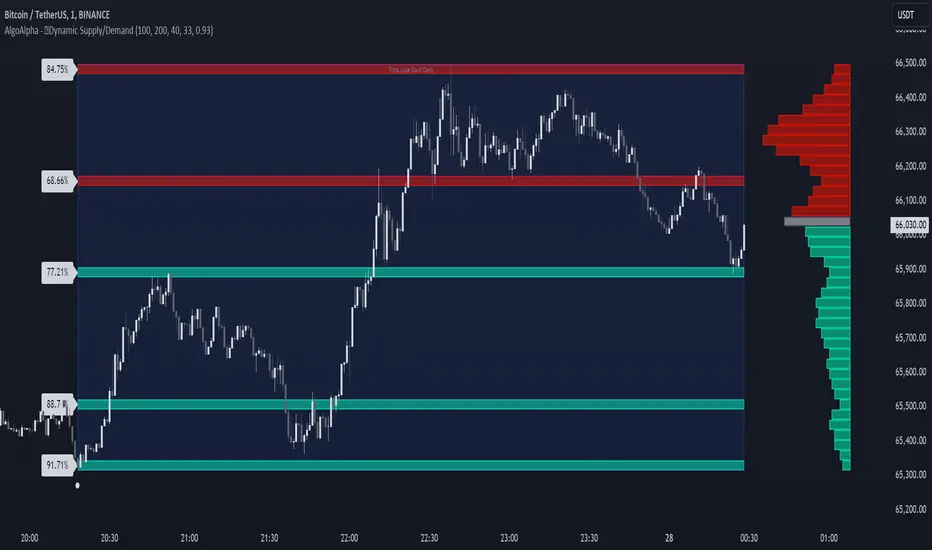
Dynamic Supply and Demand Zones [AlgoAlpha]Introducing the Dynamic Supply and Demand Zones by AlgoAlpha. This indicator is designed to automatically identify and visualize dynamic supply and demand zones on your chart, helping traders pinpoint potential reversal areas and assess market sentiment with enhanced clarity. It adapts to market conditions using a dynamic look-back mechanism, making it more responsive to recent price movements. 📈💡
Key Features
📊 Dynamic Look-Back : Automatically adjusts the look-back period based on the most recent pivot point, ensuring the most relevant data is analyzed.
🎯 Pivot Point Detection : Utilizes a user-defined period to detect significant pivot highs and lows, marking potential reversal points with precision.
🛠 Customizable Parameters : Offers extensive customization options including look-back period, pivot detection sensitivity, resolution, and zone tolerance.
🗺 Visual Display : Shows supply and demand zones as boxes on the chart, with optional profiles and background highlighting to differentiate between bullish and bearish zones.
🖍 Color-Coded Zones : Zones are color-coded for easy identification: green for bullish, red for bearish, and gray for neutral levels.
🔔 Alert Conditions : Triggers alerts when new pivot points are detected, ensuring you never miss a key market movement.
How to Use
🚀 Adding the Indicator : Press the star icon and add the indicator to favorites. Add it to your chart and adjust settings to fit your trading strategy.
🔍 Zone Analysis : Observe the color-coded zones on the chart. Bullish zones indicate potential support areas, while bearish zones suggest resistance. Monitor price interactions with these zones for potential entry and exit signals.
🔔 Alerts : Activate alert conditions for new pivot detections to stay ahead of market reversals.
How It Works
The indicator starts by detecting pivot highs and lows over a specified period. These pivots serve as reference points for determining the analysis range. If the Dynamic Look-Back feature is enabled, the look-back range dynamically adjusts from the most recent pivot to the current bar. Otherwise, a fixed look-back period is used. The price range is divided into multiple bins based on a specified resolution, and each bin’s volume is calculated by accumulating the volume of candles that fall within its price range. A zone is defined as significant if its volume is less than the adjacent bins, and the difference meets the Zone Tolerance criteria, indicating a potential area of support or resistance. These zones are then plotted on the chart as boxes. Bullish zones are shown in green, and bearish zones in red, helping traders visually identify key levels where supply and demand imbalances may cause price reversals.
Uptrick: FVG Market Zones**Uptrick: FVG Market Zones**
---
### Introduction
**Uptrick: FVG Market Zones** is a cutting-edge technical analysis tool designed to identify and visualize Fair Value Gaps (FVGs) within financial markets. This indicator focuses on pinpointing critical price levels where significant gaps occur, which can act as potential support and resistance zones. By integrating advanced volatility analysis and user-configurable parameters, the **Uptrick: FVG Market Zones** provides traders with a robust framework for understanding market dynamics and making informed trading decisions.
### Purpose and Functionality
The primary purpose of the **Uptrick: FVG Market Zones** indicator is to detect and highlight Fair Value Gaps, which are areas on a price chart where there is a significant price movement without any trading activity in between. These gaps can provide critical insights into market behavior, as they often indicate areas where the market has not fully accounted for the supply and demand dynamics. Traders use these zones to anticipate potential reversals, breakouts, or consolidations, making this tool highly valuable for both short-term and long-term trading strategies.
### Unique Features and Originality
The **Uptrick: FVG Market Zones** indicator is distinguished by its focus on FVGs and its ability to integrate this concept into a broader market analysis framework. Unlike other indicators that may offer generalized support and resistance levels, this tool specifically identifies and visualizes gaps based on volatility-adjusted criteria. This precision allows traders to focus on the most relevant market zones, improving their ability to anticipate market movements.
One of the standout features of this indicator is its user-configurable settings, which provide a high degree of customization. This flexibility ensures that traders can tailor the indicator to suit their specific trading style and the particular market they are analyzing. Additionally, the indicator's visualization capabilities are enhanced with customizable colors and gap-filling options, making it easier for traders to interpret and act on the information presented.
### Inputs and Configurations
**Uptrick: FVG Market Zones** comes with several user inputs that allow traders to customize the indicator's behavior and appearance. Each input plays a crucial role in determining how the indicator identifies and visualizes FVGs on the chart. Here’s a detailed breakdown of each input:
1. **FVG Analysis Period (fvgPeriod):**
- **Description:** This input determines the period over which the indicator analyzes the chart for identifying FVGs. By adjusting this value, traders can control how far back in time the indicator looks to detect significant gaps.
- **Default Value:** 25
- **Purpose:** A shorter period may focus on more recent market activity, making the indicator more sensitive to recent price movements. In contrast, a longer period allows the indicator to identify gaps that have remained unfilled for an extended time, potentially acting as stronger support or resistance levels.
2. **Analysis Mode (mode):**
- **Description:** The Analysis Mode input allows traders to choose between different methods of analyzing the chart for FVGs.
- **Options:** "Recent Gaps" and "Extended View"
- **Default Option:** "Recent Gaps"
- **Purpose:**
- **Recent Gaps:** Focuses on the latest significant gaps, providing traders with up-to-date information on the most relevant market zones.
- **Extended View:** Considers a broader range of gap patterns, which can be useful in markets where historical gaps may still influence current price action.
3. **Volatility Sensitivity (volatilityFactor):**
- **Description:** This input adjusts the sensitivity of the indicator to market volatility. It is used in calculating the threshold for identifying FVGs.
- **Default Value:** 0.3
- **Step Size:** 0.1
- **Purpose:** A higher sensitivity will cause the indicator to detect smaller gaps, which might be more frequent but less significant. Lower sensitivity focuses on larger, more impactful gaps, which are less frequent but potentially more powerful in predicting market behavior.
4. **Highlight Market Gaps (showGaps):**
- **Description:** A boolean input that determines whether the identified FVGs should be highlighted on the chart.
- **Default Value:** True
- **Purpose:** This input allows traders to toggle the visualization of FVGs. When enabled, the indicator highlights gaps using colored boxes, making them visually prominent on the chart.
5. **Bullish Highlight Color (bullColor):**
- **Description:** Sets the color used to highlight bullish FVGs (gaps that may indicate support).
- **Default Value:** #00FF7F (a shade of green)
- **Purpose:** The color choice is crucial for quickly distinguishing bullish zones from bearish ones. Green is typically associated with upward price movement, making it intuitive for traders to identify potential support areas.
6. **Bearish Highlight Color (bearColor):**
- **Description:** Sets the color used to highlight bearish FVGs (gaps that may indicate resistance).
- **Default Value:** #FF4500 (a shade of red)
- **Purpose:** Red is commonly associated with downward price movement, making it easy for traders to identify potential resistance areas. This color coding helps in quickly assessing the chart.
7. **Fill Gap Areas (fillGaps):**
- **Description:** A boolean input that determines whether the FVGs should be filled with a color on the chart.
- **Default Value:** True
- **Purpose:** Filling the gap areas provides a more solid visual cue for traders. It enhances the visibility of the gaps, making it easier to spot these zones during fast-paced trading sessions.
8. **Hidden Color (hidden):**
- **Description:** A color input that is used when certain elements should be hidden from the chart.
- **Default Value:** color.rgb(0,0,0,100) (a semi-transparent black)
- **Purpose:** This input is useful for controlling the visibility of certain plots or elements on the chart, ensuring that the indicator remains clean and uncluttered.
### Market Gap Detection
The core functionality of the **Uptrick: FVG Market Zones** indicator lies in its ability to detect Fair Value Gaps. These gaps occur when the price makes a significant jump from one level to another without any trading activity in between. The indicator uses a combination of price action analysis and volatility thresholds to identify these gaps.
- **Volatility Measurement:** The indicator begins by measuring market volatility using the Average True Range (ATR). This volatility measurement is then adjusted by the user-defined sensitivity factor, which determines the threshold for identifying significant gaps.
- **Gap Identification:** The indicator checks for instances where the current low is higher than the high two bars ago (bullish gap) or where the current high is lower than the low two bars ago (bearish gap). These conditions signify a potential FVG.
- **Gap Storage and Management:** Once a gap is identified, it is stored in an array. The indicator also manages the size of these arrays based on the selected analysis mode, ensuring that only the most relevant gaps are considered in the analysis.
### Visualization
Visualization is a key component of the **Uptrick: FVG Market Zones** indicator. By providing clear and customizable visual cues, the indicator ensures that traders can quickly and easily interpret the information it provides.
- **Gap Highlighting:** When enabled, the indicator highlights the identified FVGs on the chart using colored boxes. Bullish gaps are highlighted in green, while bearish gaps are highlighted in red. This color coding helps traders instantly recognize potential support and resistance zones.
- **Gap Filling:** The indicator can also fill the identified gaps with a semi-transparent color. This option enhances the visibility of the gaps, making them more prominent on the chart. Filled gaps are particularly useful for traders who want to keep track of these zones over multiple trading sessions.
- **Gap Averages:** The indicator calculates the average level of the identified gaps and plots these averages as lines on the chart. These lines represent the general area of support or resistance based on the detected gaps, providing traders with a reference point for setting their stop losses or profit targets.
- **Text Labels:** The indicator also labels each FVG with the text "FVG" inside the highlighted area. This feature ensures that traders can easily identify these zones even in charts with dense price action.
### Practical Applications
The **Uptrick: FVG Market Zones** indicator is versatile and can be applied to a wide range of trading strategies across different markets and timeframes. Here are a few examples of how this indicator can be used in practice:
1. **Support and Resistance Trading:**
- Traders can use the identified FVGs as dynamic support and resistance levels. By placing their trades based on these levels, they can take advantage of potential reversals or continuations at key market zones.
2. **Gap Filling Strategy:**
- Some traders focus on the concept of gap filling, where the market eventually returns to "fill" the gap created by rapid price movements. The **Uptrick: FVG Market Zones** indicator can
help identify such gaps and anticipate when the market might return to these levels.
3. **Breakout Trading:**
- The indicator can be used to identify breakouts from significant gaps. When the price moves beyond the identified FVGs, it may signal a strong trend continuation, providing an opportunity for breakout traders.
4. **Reversal Trading:**
- By monitoring the signals generated by the indicator, traders can identify potential market reversals. A sell signal after a prolonged uptrend or a buy signal after a downtrend may indicate a reversal, allowing traders to position themselves accordingly.
5. **Risk Management:**
- The average levels of the FVGs can be used to set stop-loss and take-profit levels. By aligning these levels with the FVG zones, traders can improve their risk management practices and enhance their trading discipline.
### Customization and Flexibility
One of the standout features of the **Uptrick: FVG Market Zones** indicator is its high level of customization. Traders can adjust various parameters to tailor the indicator to their specific needs and preferences.
- **Customizable Colors:** The indicator allows traders to choose their preferred colors for highlighting bullish and bearish gaps. This flexibility ensures that the indicator can be integrated seamlessly into any trading setup, regardless of the trader's color scheme preferences.
- **Adjustable Periods and Sensitivity:** By allowing traders to adjust the analysis period and volatility sensitivity, the indicator can be fine-tuned to suit different market conditions. For example, a trader might use a shorter analysis period and higher sensitivity in a volatile market, while opting for a longer period and lower sensitivity in a more stable market.
- **Toggling Visual Elements:** Traders can choose to enable or disable various visual elements of the indicator, such as gap highlighting, gap filling, and text labels. This level of control allows traders to declutter their charts and focus on the information that is most relevant to their trading strategy.
### Advantages and Benefits
The **Uptrick: FVG Market Zones** indicator offers several key advantages that make it a valuable tool for traders:
1. **Precision:** By focusing on Fair Value Gaps, the indicator provides highly precise levels of support and resistance, which are often more reliable than traditional horizontal levels.
2. **Clarity:** The clear visual representation of FVGs, along with the text labels and color coding, ensures that traders can quickly interpret the indicator's signals and incorporate them into their trading decisions.
3. **Adaptability:** The indicator's customizable settings allow it to be adapted to different markets, timeframes, and trading styles. Whether you are a day trader, swing trader, or long-term investor, this indicator can be tailored to meet your needs.
4. **Enhanced Decision-Making:** The trading signals generated by the indicator provide actionable insights that can help traders make more informed decisions. By aligning their trades with the identified FVG zones, traders can improve their chances of success.
5. **Risk Management:** The use of FVG zones as reference points for stop-loss and take-profit levels enhances risk management practices, helping traders protect their capital while maximizing their profit potential.
### Conclusion
The **Uptrick: FVG Market Zones** indicator is a powerful and versatile tool for traders seeking to enhance their market analysis and improve their trading outcomes. By focusing on Fair Value Gaps and providing a high level of customization, this indicator offers a unique blend of precision, clarity, and adaptability. Whether you are looking to identify key market zones, generate trading signals, or improve your risk management practices, the **Uptrick: FVG Market Zones** indicator is a valuable addition to any trader's toolkit.
With its innovative approach to market analysis and user-friendly design, **Uptrick: FVG Market Zones** stands out as an essential tool for traders who want to stay ahead of the market and make more informed trading decisions. Whether you are trading stocks, forex, commodities, or cryptocurrencies, this indicator provides the insights you need to navigate the markets with confidence and success.

SMC Fake Zones + InsideBarThis indicator is useful for whom trade with "Smart Money Concept (SMC)" strategy.
It helps SMD traders to identify fake or weak zones in the chart, So they can avoid taking position in this zones.
This indicator marks "Asia session" as well as "London and New York's Lunch Time (one hour before London and NY session starts)" zones.
It also marks Inside Bar candles which SMC trades consider as order flow. You can mark every Inside Bar or only those with opposite color via setting options.
*** As we know in SMC rules
1- Supply and Demand zones in "Asia session and Lunch Times" are fake zones for SMC trading and price will engulf them in most of times.
2- "Asia session high and low" has huge liquidity and usually price sweep that in London session.
This indicator will helps traders to visually identify those Fake zones and Asia session liquidity.
* You can change session times based on your time zone in settings.
* You can set options to show all Inside Bars or only with Opposite color in settings.

Institutional Supply and Demand ZonesThis indicator aims to identify price levels where institutional investors have positioned their buy or sell orders. These buy orders establish "demand zones," while sell orders create "supply zones." Identifying these zones enables us to anticipate potential reversals in price trends, allowing us to profitably engage in these significant market movements alongside major institutions. These zones are formed when price action goes from balanced to imbalanced. These zones are based on orders. Unlike standard support and resistance levels, when price breaks below a demand zone or above a supply zone, these zones disappear from the chart.
Supply is formed by a green candle followed by a major red candle that is at least double the size of previous green candle. The zone is then charted from the open of the green candle to the highest point in the candle. Vice versa for a demand zone (red into green).
These zones are traded by:
1. Look for a volume spike in a zone
2. A trend/trendline break out of the zone

Price Strength Index + RSI Buy/Sell ZonesThe Price Strength Index + RSI Buy/Sell Zones indicator is a technical analysis tool designed to evaluate the strength of a financial asset's price movement by comparing it with a series of Volume Weighted Moving Averages (VWMAs) of different lengths calculated from historical data.
Hypothesis :
The core hypothesis behind this indicator is that assessing the relationship between the current price and a range of VWMAs with varying lengths can provide valuable insights into the strength and direction of a price trend. Additionally, it incorporates Relative Strength Index (RSI) conditions to further refine potential buy and sell signals.
How It Works :
Multiple VWMA Calculation: The indicator calculates multiple VWMAs, each with a different length, using historical price data and volume. These VWMAs represent weighted moving averages over various periods, helping to capture different aspects of the price trend.
Comparison with Current Price : For each of these VWMAs, the indicator compares the current bar's price with the VWMA value. This comparison is crucial in understanding how the current price relates to historical averages, shedding light on the strength and direction of the prevailing trend.
SMA of Percentage Above VWMA : The indicator calculates the Simple Moving Average (SMA) of the percentage of prices above the various VWMAs over a specified period. This moving average smoothens out the percentage data, providing a clearer trend signal.
Buy and Sell Zones : User-defined upper and lower thresholds for the percentage of prices above the VWMAs are used to define buy and sell zones. When the percentage falls below the lower threshold, it signals a potential buy zone, suggesting a weakening trend. Conversely, when it exceeds the upper threshold, it signifies a potential sell zone, indicating a strengthening trend.
RSI Integration : The RSI is calculated for the selected price source with a specified length. When the SMA of the percentage above VWMAs falls within the buy zone and the RSI is below the lower RSI threshold, it indicates an oversold condition, potentially signaling a buy opportunity. Conversely, when the SMA falls within the sell zone and the RSI is above the upper RSI threshold, it suggests an overbought condition, possibly signaling a sell opportunity.
Color Coding : The indicator employs color-coding to visually represent the buy and sell zones, as well as extreme RSI conditions. Green color denotes the buy zone, red represents the sell zone, and orange lines indicate the median and potential reversal points.
In summary, the Price Strength Index + RSI Buy/Sell Zones indicator leverages multiple VWMAs of different lengths to assess the relationship between current prices and historical moving averages. This comprehensive analysis, coupled with RSI conditions, aids traders in identifying potential buy and sell zones, as well as extreme RSI points within those zones, enhancing the evaluation of price strength and potential trend reversals.

Smooth Trail V1Please, enjoy your new game changing tradingview indicator, may I present you: the Smooth Trail (first version).
The Smooth Trail is an indicator that works just like a super trend, but it has a completely different usage and potential.
The super trend works following the price and displaying a line that uses the ATR to determine how far it has to be from the actual price, and many new trader like to use the indicator thanks to his easy readability and the buy sell signals that it shows, unfortunately this is not the best usage of the indicator and it often leads to lose money on the markets.
The main characteristics that this indicator has is that, not like the normal super trend, it follow the trend the better adapting itself in the retracement phases.
The second feature that dictate the best usage of this indicator, is that it shows a zone in which to buy or sell to have the best risk to reward ratio.
The indicator also works as dynamic level of support and resistance and can be used the best for trend following strategies to maximize the profits.
The first input, the multiplier, is used to determine how many times the ATR has to be added or subtracted in order to plot the indicator.
The second input, the length, is used to determine how many candle the indicator and the ATR have to consider for the calculation.
The third and last input, the zone width, is used to calculate the width of the zone displayed by the indicator, and is the factor that will be multiplied to the ATR, this means that if you leave the settings as default, the zone will be 1 ATR or 34 candle width.
This indicator is great to use in confluence with other indicator or with various candlestick pattern.
VWAP Supply and Demand ZonesThis is my 1st indicator enjoy.
Description of the VWAP Supply and Demand Zones indicator:
This indicator uses the Volume Weighted Average Price (VWAP) to identify potential supply and demand zones in the market. The VWAP is a popular indicator that shows the average price of a security weighted by volume over a specified period of time. It can be used as a benchmark to measure the efficiency of trading and to identify trends and price levels.
The indicator plots the VWAP as a blue line on the chart, and also plots two other lines above and below it, which represent the upper and lower bounds of the supply and demand zones. The width of these zones can be adjusted by changing the “Zone Width” input parameter.
The indicator also plots shapes on the chart to mark when a supply or demand zone is formed. A supply zone is formed when the price crosses above the VWAP and then falls back below it, indicating that there is more selling pressure than buying pressure at that level. A red triangle is plotted above the bar where this happens, and a red zone is drawn between the previous close and previous VWAP values.
A demand zone is formed when the price crosses below the VWAP and then rises back above it, indicating that there is more buying pressure than selling pressure at that level. A green triangle is plotted below the bar where this happens, and a green zone is drawn between the previous close and previous VWAP values.
The supply and demand zones can be used as potential areas of support and resistance, where traders can look for reversal or continuation signals. For example, if the price enters a supply zone from below, it may indicate that sellers are willing to sell at higher prices, which could lead to a bearish reversal. Conversely, if the price enters a demand zone from above, it may indicate that buyers are willing to buy at lower prices, which could lead to a bullish reversal.
The indicator can be applied to any timeframe or market, but it may work better on higher timeframes where volume data is more reliable. It can also be combined with other indicators or tools to confirm or filter signals.
