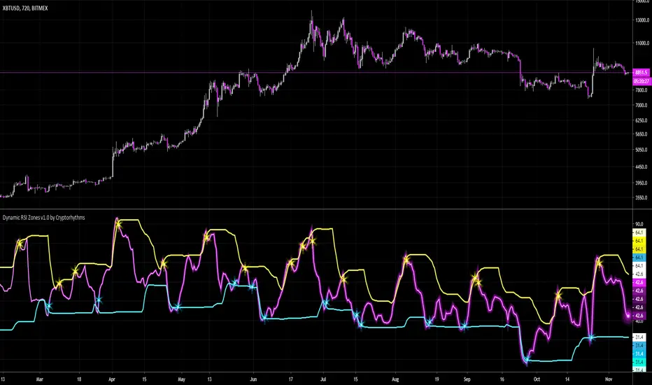
🧬Dynamic RSI Zones v1.0 by Cryptorhythms🧬Dynamic RSI Zones v1.0 by Cryptorhythms
Intro
There are a few adaptive RSI indicators already out there, and they got me thinking. They didn't really do what I desired, or do it profitably. So I had some hunches on how I could create my own and here it is!
Description
It is setup for all major timeframes, though for now its best on 30m or higher. Supported timeframes include: 1m, 3m, 5m, 15m, 30m, 1h, 2h, 4h, 12h, and daily. I am working on settings for 2 day, 3 day and weekly as well for a future update.
This way no more entering settings when changing timeframes, which can mean a lot when seconds matter.
You can however disable the automatic settings if you wish to experiment on a different timeframe or coin/market.
Instructions
Detailed instructions will follow in a separate post for brevity.
Future Updates
There will be many upcoming updates and improvements. These will include some graphical improvements, better performance on lower timeframes, additional timeframes added for XBTUSD, support for additional coins (ETH, LTC, XRP, etc are all coming).
Remember the settings are currently adapted for XBTUSD only!
👍 Enjoying this indicator or find it useful? Please give me a like and follow! I post crypto analysis, price action strategies and free indicators regularly.
💬 Questions? Comments? Want to get access to an entire suite of proven trading indicators? Come visit us on telegram and chat. We make timely posts about the market, news, and strategy everyday. Our community isn't open only to subscribers - everyone is welcome to join.
Cerca negli script per "zone"
Multiple EMAs with marked zones and custom timeframe supportThis script plots 10 exponential moving averages and marks the areas between them.
The lengths are Fibonacci numbers starting from 5 and ending with 377.
The colors indicate the length of the moving average, green for the shortest and purple for the longest.
The zones between consecutive EMA's (e.g. 5 and 8 ema ) are market according to the color of the greater one in value.
By default the script plots values for the current time frame, but supports custom time frames.
I'm releasing this script with an open visibility. Feel free to suggest improvements!
Enjoy,
s0ullight

REKT ZONES w/ Signal & AlertsBitmex XBTUSD REKT ZONES with entry signal, stop, target, and alerts! Only use on a 15min charts


Bitcoin Kill Zones v2 |7Day| [oscarvs] [xeno]This edit adds weekends to Bitcoin Kill Zones v2 by oscarvs and other contributors. Bit of an experiment. Enjoy.
Dynamic Support/Resistance Zones Mono ResolutionThis script is identical to:
but it hasn't the multi-resolution functionality, which sometimes happens to be very glitchy

Chop Zone 9000 Chop Zone 9000 is based off Chop Zone by E.W Dreiss. Unlike the original Chop Zone, the main use for this iteration is support and resistance. There are 5 bars and each one represents a line of resistance. There will be areas where all red bars seem to clear up magically— this is due to gap ups or breakouts. The greatest benefit from this indicator is the ability to see if breakout attempts are successful. If the indicator sinks back into the red, then it is obvious that the trade should be abandoned.
I have implemented several alerts in this script. The most important alerts are the level 5 break, where the 5th bar is blue. It is common for price to stagnate if only the first few rows are blue. Therefore, I suggest it is certainly valuable to simply wait for all levels to clear before entering a trade.

Volume Zone Oscillator and Price Zone (VZO/PZO) [NeoButane]" Volume Precedes Price is the conceptual idea for the oscillator."
"The main idea of the VZO was to try to change the OBV to look like an oscillator rather than an indicator, also to include time; primarily to identify which zone the volume is located in during a specific period "
How to read this indicator:
Positive reading -> bullish
Negative reading -> bearish
-60 or 60 is seen as the limit of the oscillator range, and a pullback should be expected from there.
Plus and minus signs have been added to the top and bottom for VZO and PZO, with an adjustable threshold to trigger.
Alert conditions have been added to this indicator for ease of use.
Volume Zone Oscillator, write-up by the author (recommended reading)
http:capitalsynergy.com/resources/IFTA09VZO.pdf
Volume Zone Oscillator, uses and formula
https:www.investopedia.com/articles/active-trading/072815/how-interpret-volume-zone-oscillator.asp
Price Zone Oscillator, uses and formula
https:www.investopedia.com/terms/p/price-zone-oscillator.asp

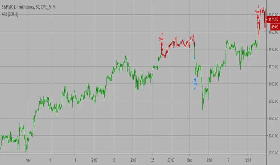
Adaptive Price Zone Backtest The adaptive price zone (APZ) is a volatility-based technical indicator that helps investors
identify possible market turning points, which can be especially useful in a sideways-moving
market. It was created by technical analyst Lee Leibfarth in the article “Identify the
Turning Point: Trading With An Adaptive Price Zone,” which appeared in the September 2006 issue
of the journal Technical Analysis of Stocks and Commodities.
This indicator attempts to signal significant price movements by using a set of bands based on
short-term, double-smoothed exponential moving averages that lag only slightly behind price changes.
It can help short-term investors and day traders profit in volatile markets by signaling price
reversal points, which can indicate potentially lucrative times to buy or sell. The APZ can be
implemented as part of an automated trading system and can be applied to the charts of all tradeable assets.
WARNING:
- For purpose educate only
- This script to change bars colors.
Adaptive Price Zone Strategy The adaptive price zone (APZ) is a volatility-based technical indicator that helps investors
identify possible market turning points, which can be especially useful in a sideways-moving
market. It was created by technical analyst Lee Leibfarth in the article “Identify the
Turning Point: Trading With An Adaptive Price Zone,” which appeared in the September 2006 issue
of the journal Technical Analysis of Stocks and Commodities.
This indicator attempts to signal significant price movements by using a set of bands based on
short-term, double-smoothed exponential moving averages that lag only slightly behind price changes.
It can help short-term investors and day traders profit in volatile markets by signaling price
reversal points, which can indicate potentially lucrative times to buy or sell. The APZ can be
implemented as part of an automated trading system and can be applied to the charts of all tradeable assets.
Green color is long.
Red color is short.
WARNING:
- For purpose educate only
- This script to change bars colors.

Adaptive Price Zone Indicator The adaptive price zone (APZ) is a volatility-based technical indicator that helps investors
identify possible market turning points, which can be especially useful in a sideways-moving
market. It was created by technical analyst Lee Leibfarth in the article “Identify the
Turning Point: Trading With An Adaptive Price Zone,” which appeared in the September 2006 issue
of the journal Technical Analysis of Stocks and Commodities.
This indicator attempts to signal significant price movements by using a set of bands based on
short-term, double-smoothed exponential moving averages that lag only slightly behind price changes.
It can help short-term investors and day traders profit in volatile markets by signaling price
reversal points, which can indicate potentially lucrative times to buy or sell. The APZ can be
implemented as part of an automated trading system and can be applied to the charts of all tradeable assets.

EMA ZoneIndicator to fill the ZONE between two EMAs (9 and 21 is the default)
RULES of completion:
CLOSE above "EMAs" and "EMA SLOW", and "EMA FAST" > "EMA SLOW" = green fill
CLOSE below "EMAs" and "EMA SLOW" ,and "EMA FAST" < "EMA SLOW" = red fill
CLOSE between EMAs = white fill
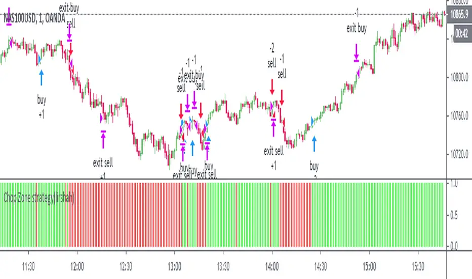
Chop Zone strategy(lirshah)This is a visual indicator designed to identify trends and choppiness.
the Chop Zone illustrates the difference between close price and its EMA by converting its values to colors.
this strategy has best performance on H1 timeframe and has a good results on several crypto pair.

Zones DetectorThis indicator highlights supply and demand zones.
Method to detect the zones:
1.- The body of the candle is calculated and it is checked how many times it can be repeated in its highest or lowest wick. If the body of the candle is repeated N number of times (Min. Factor) in any of its wicks, it is taken as an indecision zone.
2.- The subsequent candles are reviewed (Confirmation Bars) to determine if the zone is of supply or demand. For demand zones, subsequent prices must be above the minimum price of the indecision zone and for supply zones, subsequent prices must be below the maximum price of the indecision zone.
3.- The previous average volume of N periods (Periods) to the indecision zone is calculated and check that has a minimum percentage change (Min. Volume Change) with respect to the indecision zone and its subsequent candles (Confirmation Bars).
If the previous steps are met, the zone will be highlighted with a green color for demand (Zones/Demand) and red for supply (Zones/Supply), for the indecision zones (identified by point 1) they will be highlighted in gray (Zones/Indecision)
Invalid zones are automatically hidden from the chart, using methods such as: "wick" and "close".
Settings
Indecision
Min. Factor: Set the number of times that the body of the candle must be repeated in its wicks. High values will be stronger indecision zones, but fewer will be found, low values will find more zones.
Invalidation Method: Method used to automatically invalidate zones. It can be "wick" or "close".
Confirmation Bars: Defines the number of candles used to confirm an indecision zone found
Volume
Min. Volume Change(%): Percentage of minimum change in volume (+/-) that the zone must have to be displayed
Previous Periods: Number of previous periods to be used to calculate the average volume prior to the indecision zone.
Zones
Show Last.- Number of zones (demand, supply, indecision) to be shown.
Demand.- Color to highlight the demand zones
Supply.- Color to highlight the supply zones
Indecision.- Color to highlight the indecision zones
Use
The highlighted supply and demand zones can be used as support or resistance to place orders.

Zones + Trendlines (raphii7)Here you go — in English, simple and clear:
Designed for a clear read of worked zones and trend paths on any timeframe.
-Zones: rectangles where price has touched multiple times = support/resistance zones.
-Trendlines: lines that connect two highs (H–H) or two lows (B–B), with a dotted extension.
Settings
Zones
-Minimum candles between highs/lows (minSepBars): minimum spacing between pivots. Larger = cleaner pivots.
-Show highs/lows (showHBZones): shows small H/B labels on the chart.
-Max highs/lows used (maxPivotsUsed): cap on stored pivots.
-Minimum contacts in the zone (minContacts): minimum touches required to draw a zone.
-Zone size unit (sizeMode):
-Pips = fixed thickness.
-ATR = thickness adapts to volatility.
-Zone size (zoneSize): zone thickness (in Pips or ATR).
-Max candles back (lookbackBars): how far back to scan.
-Max zones to draw (maxZonesDraw): prevents too many rectangles.
-Border / fill color (borderCol / fillCol): zone styling.
Trendlines
-Pivot Length (pivotLen): “size” of the pivot. Higher = more reliable lines, fewer of them.
-Pivot Type (pivotType):
Normal = cleaner, slower.
Fast = very reactive, can move more.

zone trading stratThis only works for DOGEUSD , I made it for the 8cap chart so only use it for that.
If you want this for other symbols/charts you need to comment below or msg me.
# Price Zone Trading System: Technical Explanation
## Core Concept
The Price Zone Tracker is built on the concept that price tends to respect certain key levels or "zones" on the chart. These zones act as support and resistance areas where price may bounce or break through. The system combines zone analysis with multiple technical indicators to generate high-probability trading signals.
## Zone Analysis
The system tracks 9 predefined price zones. Each zone has both a high and low boundary, except for Zone 5 which is represented by a single line. When price enters a zone, the system monitors whether it stays within the zone, breaks above it (bullish), or breaks below it (bearish).
This zone behavior establishes the foundational bias of the system:
- When price closes above its previous zone: Zone State = Bullish
- When price closes below its previous zone: Zone State = Bearish
- When price remains within a zone: Zone State = Neutral
## Trend Analysis Components
The system performs multi-timeframe analysis using several technical components:
1. **Higher Timeframe Analysis** (±3 points in scoring)
- Uses 15-minute charts for sub-5-minute timeframes
- Uses 30-minute charts for 5-minute timeframes
- Uses 60-minute charts for timeframes above 5 minutes
- Evaluates candlestick patterns and EMA crossovers on the higher timeframe
2. **EMA Direction** (±1 point in scoring)
- Compares 12-period and 26-period EMAs
- Bullish when fast EMA > slow EMA
- Bearish when fast EMA < slow EMA
3. **MACD Analysis** (±1 point in scoring)
- Uses standard 12/26/9 MACD settings
- Bullish when MACD line crosses above signal line with positive histogram
- Bearish when MACD line crosses below signal line with negative histogram
4. **Price Action** (±2 points in scoring)
- Evaluates whether price is making higher highs/higher lows (uptrend)
- Or lower highs/lower lows (downtrend)
- Also considers ATR-based volatility and strength of movements
## Trend Score Calculation
All these components are weighted and combined into a trend score:
- Higher timeframe components have stronger weights (±2-3 points)
- Current timeframe components have moderate weights (±1 point)
- Price action components have varied weights (±0.5-2 points)
The final trend state is determined by thresholds:
- Score > +3: Trend Analysis State = Bullish
- Score < -3: Trend Analysis State = Bearish
- Score between -3 and +3: Trend Analysis State = Neutral
## Signal Generation Logic
The system combines the Zone State with the Trend Analysis State:
1. If Zone State and Trend Analysis State are both bullish:
- Combined State = Bullish
- Line Color = Green
2. If Zone State and Trend Analysis State are both bearish:
- Combined State = Bearish
- Line Color = Red
3. If Zone State and Trend Analysis State contradict each other:
- Combined State = Neutral
- Line Color = Black
This implements a safety mechanism requiring both zone analysis and technical indicators to agree before generating a directional signal.
## Trading Signals
Trading signals are generated based on changes in the Combined State:
- When Combined State changes from neutral/bearish to bullish:
- Trading Signal = LONG (green triangle appears on chart)
- When Combined State changes from neutral/bullish to bearish:
- Trading Signal = SHORT (red triangle appears on chart)
- When Combined State changes from bullish/bearish to neutral:
- Trading Signal = EXIT (yellow X appears on chart)
- When Combined State remains unchanged:
- Trading Signal = NONE (no new marker appears)
## Reversal Warning
The system also monitors for potential reversal conditions:
- When Combined State is bullish but both RSI and MFI are overbought (>70)
- When Combined State is bearish but both RSI and MFI are oversold (<30)
In these cases, a yellow diamond appears on the chart as a warning that a reversal might be imminent.
## Visual Elements
The indicator provides multiple visual elements:
1. Zone boundaries as translucent orange areas
2. A single colored line below price (green/red/black) showing the current signal
3. Trading signals as shapes on the chart
4. An information panel showing all relevant indicator values and signals
## Usage Limitations
The indicator is designed to work optimally on timeframes below 30 minutes. On higher timeframes, a warning appears and analysis is disabled.

Zone Tap Counter: Support & Resistance StrengthWhat is this indicator?
This script is designed to help traders objectively monitor the strength and significance of price zones by counting and visualizing how many times price “taps” confirmed support and resistance levels. The indicator leverages swing high/low detection to automatically plot relevant zones and uses price tap frequency as an objective strength metric.
How does it work?
Zone Identification:
The script uses the Pine Script functions ta.pivothigh and ta.pivotlow to detect confirmed swing highs and lows on your chart. Each swing high establishes a resistance zone, and each swing low establishes a support zone.
Only confirmed pivots are used, ensuring all signals are strictly non-repainting.
Tap Counting Logic:
For every candle, the indicator checks whether price touches (comes within a small, user-set tolerance) of any currently tracked support or resistance zone. To avoid counting repeated taps in the same move, the script ensures only unique bar taps are registered.
Each time price taps a zone, a counter for that zone is incremented.
Both the tolerance for taps (percentage-based), and the depth/history of zones tracked are fully adjustable in settings.
Visual Feedback:
Zones with more taps are drawn darker (lower transparency), making it easy to spot the strongest/hardest-tested levels on the chart.
A label on each zone displays the current tap count (e.g., "3x"), giving direct feedback about which support/resistance are most significant in the current view.
Only recent zones (user-configurable) are shown to keep charts clear and useful.
How to use it:
Add the indicator to your TradingView chart.
Set the swing length and tap tolerance in settings to match your market or timeframe (short swing length for scalping, longer swings for bigger structure).
Watch for zones with high tap counts and darker lines: These zones represent areas where price has repeatedly reacted, suggesting they may be important for your trading decisions.
You can adjust the minimum number of taps needed for a zone to be highlighted and the number of zones to display for your preferred visual clarity.
Combine this tool with other analysis for confirmation—tap counts should not be seen as trading signals, but as supporting information.
Originality & Calculation Details:
This script does NOT simply merge or overlay existing indicators. The calculation method is original: it uses swing-based support/resistance and applies unique tap-count logic, designed for objective zone strength visualization.
No repainting logic is present.
All code and visualization methods are documented and transparent.
Disclaimer:
This indicator is for educational and analytical purposes only. It does not predict future price movement, guarantee profits, or recommend specific trades. Always use your own analysis and risk management. See TradingView’s House Rules for more details.

Zone Levels (Range + ZoneHeight)This is a Template for drawing out zones from one ankerpoint zone.Just mark out the distance from one leveledge to the next and it will give you infinte more zoneedges in the same distance. You can also adjust the zone height if wanted (i used 10 as example).
I hope youll enjoy it
AJ

Zone TP SL [By Gone]It creates a price zone for TP 3 Level, increasing from the price by 500 points and setting an SL zone of 500 points of the price.
You must enter the price range yourself, recommended to be 500 points apart.
1. select Type Bay And Sell
2. Input Price Start And End
suitable for gold
Made to help with hitting the price zone. For use in making decisions about trading.
