Mingo Smart Entry Master 1H-15M - HTF BOS Zones + TP/SL📛 Script Title:
Smart Entry Master 1H–15M – HTF BOS Zones + TP/SL + Dashboard
🧠 What This Script Does:
This script is a higher-timeframe smart entry strategy designed to:
Detect Break of Structure (BOS) on the 1-hour timeframe
Draw Buy/Sell zones automatically on the chart
Provide clear SL & TP lines for trades
Use optional Smart Sell Detection to improve signal quality
Show a dashboard with live signal status
Keep the chart clean by removing old zones and labels
Ideal for intraday swing traders and confirmation-based scalpers looking to trade based on HTF structure + clean zone visualization.
📊 How the Strategy Works:
1. 🧱 Break of Structure (BOS) Detection (1H)
Script uses 1-hour swing highs/lows (swingLen) to define structure
If the 1H candle closes above a swing high → Buy Setup
If the 1H candle closes below a swing low → Sell Setup
🧠 Optional: Smart Sell Detection
Adds a buffer: compares close to lowest low in a lookback window (to reduce fake sells)
🔥 How to Use This Script in Real Trading:
Use on 15M chart to trade, but zones are based on 1H structure
When a Buy or Sell zone appears, check:
Is price tapping into the zone?
Did a clean BOS occur?
SL/TP lines give a ready-made trade plan
Wait for confirmation (price reaction, candle pattern, volume spike)
Set your alert for auto-trading or manual entry
Cerca negli script per "zone"

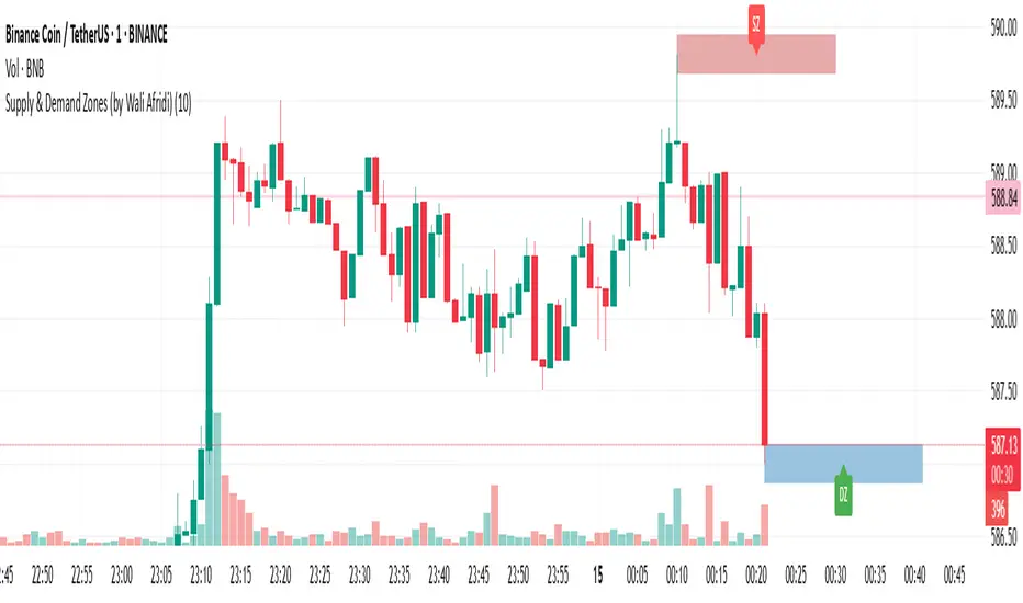
Supply & Demand Zones (by Wali Afridi)Description:
🚀 This indicator accurately detects Supply & Demand Zones by identifying swing highs and lows. It plots a single clean line for each zone and labels them as "SZ" (Supply Zone) and "DZ" (Demand Zone), ensuring a clear and minimalistic chart.
🔹 Features:
✅ Auto-detects recent Supply & Demand Zones
✅ Plots clean horizontal lines for the latest zones
✅ Displays "SZ" above the supply line & "DZ" below the demand line
✅ No duplicate labels—only one label per zone
✅ Minimal & clutter-free visualization
How to Use:
1️⃣ Add the indicator to your chart
2️⃣ Watch for Supply Zones (SZ) appearing above red lines – These indicate potential resistance areas where price may reverse or consolidate.
3️⃣ Watch for Demand Zones (DZ) appearing below green lines – These indicate strong support areas where price may bounce.
4️⃣ Use with other confirmations (Price Action, SMC, Volume) for better accuracy.
⚠️ Disclaimer:
This script is for educational purposes only and should not be considered financial advice. Always backtest and use risk management before applying it to live trading.
Consolidation Zones [ActiveQuants]The Consolidation Zones indicator is an innovative tool designed to help traders pinpoint periods of low volatility and market balance . By dynamically plotting zones where price action remains confined within an ATR-defined range around a simple moving average (SMA), this indicator highlights periods of consolidation that often precede breakouts or reversals .
█ KEY FEATURES
Dynamic Zone Detection : Automatically identifies consolidation zones when the price remains within a tight range defined by the SMA and ATR over a specified number of bars, signaling balanced market conditions.
Customizable Parameters : Adjust key inputs such as Minimum Zone Length , ATR Length , the number of bars to display, and zone color, enabling you to tailor the indicator to various market conditions and trading styles.
Automated Zone Management : Efficiently plots consolidation zones and cleans up older ones to maintain a clear and focused chart, ensuring you always have an up-to-date view of recent market behavior.
Enhanced Market Analysis : By visualizing areas of price stability, the indicator aids in spotting potential breakout or reversal points, which can be critical for fine-tuning entry and exit strategies.
█ CONCLUSION
The Consolidation Zones indicator is an essential tool for traders who value volatility analysis and precision timing. By marking key periods of price consolidation, it enhances your market analysis, helping you anticipate potential moves and refine your trading strategy.
█ IMPORTANT
⚠ Consolidation signals should be used alongside other technical indicators or analysis techniques such as trend lines, support/resistance levels, or volume to confirm trading decisions.
⚠ Adjust the indicator’s settings based on your preferred timeframe and asset class to achieve the best results.
█ RISK DISCLAIMER
Trading involves significant risk, and you may lose capital. Past performance is not indicative of future results. This tool provides informational signals only and does not constitute financial advice. Use it at your own risk and consult a qualified financial professional before making trading decisions.
Incorporate this indicator into your trading workflow to improve market timing and optimize your entry and exit strategies.
📈 Happy trading! 🚀

Nen Star Harmonic Pattern [TradingFinder] NenStar Reversal Auto🔵 Introduction
The Nen-Star Harmonic Pattern is an advanced reversal pattern in technical analysis, designed to identify market trend changes and predict key price reversal points. This pattern is defined by a combination of Fibonacci ratios and critical concepts such as Potential Reversal Zones (PRZ), market structure, and corrective waves.
The key points of this pattern include X, A, B, C, and D, and it appears in both bullish and bearish forms. In its bullish form, the pattern resembles the letter M, while in its bearish form, it takes the shape of W. The critical Fibonacci ratios for this pattern are 0.382 to 0.786 for the XA wave, 1.13 to 1.414 for the AB wave, and 1.272 to 2.618 for the BC wave.
The Nen-Star Harmonic Pattern is one of the most precise tools for identifying market reversals and executing reversal trades. Traders can use it to pinpoint optimal entry and exit points and benefit from high risk-to-reward ratios.
By emphasizing Fibonacci retracement levels, XABCD waves, the formation of bullish and bearish patterns, and precise trade entry points, this pattern has become a practical tool in advanced technical analysis.
Bullish Nen-Star Pattern :
Bearish Nen-Star Pattern :
🔵 How to Use
The Nen-Star Harmonic Pattern indicator allows traders to automatically identify the bullish and bearish structures of this pattern and locate optimal entry and exit points. By accurately analyzing Fibonacci ratios and determining points X, A, B, C, and D, the indicator highlights Potential Reversal Zones (PRZ) on the chart. Traders can rely on the generated signals to manage their trades with greater precision.
🟣 Bullish Nen-Star Pattern
The bullish Nen-Star pattern begins with a price increase from point X to point A, followed by a retracement to point B, which lies between 0.382 and 0.786 of the XA wave.
After this retracement, the price moves to point C, located between 1.13 and 1.414 of the AB wave. The final movement is a price decline to point D, which is between 1.272 and 2.618 of the BC wave and 1.13 to 1.272 of the XA wave.
Point D : Serves as the key Potential Reversal Zone (PRZ).
Entry : A buy trade is initiated at point D, signaling the end of the corrective movement and the beginning of a price increase.
Price Targets :
61.8% retracement of the CD wave
Point A
Point C
1.272 and 1.618 extensions of the CD wave if resistance at point C is broken
Stop Loss : Placed slightly below point D.
🟣 Bearish Nen-Star Pattern
The bearish Nen-Star pattern starts with a price decrease from point X to point A, followed by a retracement to point B, which lies between 0.382 and 0.786 of the XA wave.
After this retracement, the price moves to point C, located between 1.13 and 1.414 of the AB wave. The final movement is a price increase to point D, which is between 1.272 and 2.618 of the BC wave and 1.13 to 1.272 of the XA wave.
Point D : Serves as the key Potential Reversal Zone (PRZ).
Entry : A sell trade is initiated at point D, signaling the end of the corrective movement and the beginning of a price decline.
Price Targets :
61.8% retracement of the CD wave
Point A
Point C
1.272 and 1.618 extensions of the CD wave if support at point C is broken
Stop Loss : Placed slightly above point D.
🔵 Setting
🟣 Logical Setting
ZigZag Pivot Period : You can adjust the period so that the harmonic patterns are adjusted according to the pivot period you want. This factor is the most important parameter in pattern recognition.
Show Valid Forma t: If this parameter is on "On" mode, only patterns will be displayed that they have exact format and no noise can be seen in them. If "Off" is, the patterns displayed that maybe are noisy and do not exactly correspond to the original pattern.
Show Formation Last Pivot Confirm : if Turned on, you can see this ability of patterns when their last pivot is formed. If this feature is off, it will see the patterns as soon as they are formed. The advantage of this option being clear is less formation of fielded patterns, and it is accompanied by the latest pattern seeing and a sharp reduction in reward to risk.
Period of Formation Last Pivot : Using this parameter you can determine that the last pivot is based on Pivot period.
🟣 Genaral Setting
Show : Enter "On" to display the template and "Off" to not display the template.
Color : Enter the desired color to draw the pattern in this parameter.
LineWidth : You can enter the number 1 or numbers higher than one to adjust the thickness of the drawing lines. This number must be an integer and increases with increasing thickness.
LabelSize : You can adjust the size of the labels by using the "size.auto", "size.tiny", "size.smal", "size.normal", "size.large" or "size.huge" entries.
🟣 Alert Setting
Alert : On / Off
Message Frequency : This string parameter defines the announcement frequency. Choices include: "All" (activates the alert every time the function is called), "Once Per Bar" (activates the alert only on the first call within the bar), and "Once Per Bar Close" (the alert is activated only by a call at the last script execution of the real-time bar upon closing). The default setting is "Once per Bar".
Show Alert Time by Time Zone : The date, hour, and minute you receive in alert messages can be based on any time zone you choose. For example, if you want New York time, you should enter "UTC-4". This input is set to the time zone "UTC" by default.
🔵 Conclusion
The Nen-Star Harmonic Pattern is a highly effective analytical tool in global financial markets, playing a crucial role in identifying reversal points and market trend changes. By leveraging Fibonacci principles and price structure, this pattern enables precise analysis across various assets, including stocks, cryptocurrencies, forex, and commodities.
Traders operating in global markets can use this pattern to identify high risk-to-reward trading opportunities. Its clear entry and exit points, defined Potential Reversal Zones (PRZ), and accurate price targets make it an excellent tool for risk management and profitability enhancement.
In the global context, the Nen-Star pattern is widely used by professional analysts in both advanced and emerging markets due to its versatility in analyzing long-term and short-term charts. Beyond trend prediction, it enhances trading strategies and optimizes investment decisions.
Combining this pattern with complementary tools such as volume analysis, technical indicators, and macroeconomic conditions can provide traders with deeper market insights, helping them capitalize on global opportunities.

Turtle ZoneTurtle Zone indicator helps to visually determine support and resistance zones of the price movement.
Displays a channel with zones located symmetrically around the moving average of the price.
Width of the channel is determined by the current volatility computed as average true range which makes the channel width adaptable to the volatility.
Touching of the zones from inside of the channel can be interpreted as a signal of potential reversal.
Breaking outside of the outer boundary of the zones can be interpreted as a signal of a potential continuation of price movement.
Parameters
• Price Source - Component of the bar for computation. Default is ‘hlc3’. Other reasonable values, such as ‘ohlc4’, ‘open’ or’ close’ can be used by advanced users.
• Lookback period - Amount of bars used in moving average computation. Default is 200.
• Inner Amplitude - Relative width of the inner channel. Default is 5.6.
• Outer Amplitude - Relative width of the outer channel. Default is 9.6.
Available plots for notifications
There are five plots on the graph comprising the channel: four boundaries of the channel bands and one hidden mean line of the channel:
Upper Zone Upper Line
Upper Zone Lower Line
Mean
Lower Zone Upper Line
Lower Zone Lower Line
All of the plots can be used to set up notifications.
Notes
All computations are performed in logarithmic price scale which makes this indicator useful on large timeframes.
Credits
This script uses Ehlers_Super_Smoother library by KevanoTrades

Pin Bar with Adaptive Zones and Price LevelsThis indicator is designed to simplify the identification and analysis of pin bar formations (commonly called "tail bars"), offering traders an adaptable and efficient tool for market insights. With added visual and numerical precision, it aids in spotting potential trade setups with clarity.
Key Features:
Dynamic Pin Bar Detection:
Highlights bullish pin bars with a customizable color (default: white).
Highlights bearish pin bars with a customizable color (default: yellow).
Price-Level Zones for Clarity:
Automatically draws a zone from the high to the low of each pin bar.
Displays the highest and lowest prices for the pin bar within the zone, making it easy to visualize potential entry, exit, or stop-loss levels.
Customizable Display Options:
Toggle visibility for bullish and bearish pin bars independently.
Option to enable or disable zones for a cleaner chart view.
Fully Adjustable Aesthetics:
Customize the colors, zone styles, and text display to suit your personal preferences or chart theme.
Purpose:
This indicator enhances chart analysis by combining pattern recognition with actionable visual and numerical data. By focusing on customizable zones and price levels, traders can efficiently identify key areas of interest and refine their strategies for better trade execution.
How It Adds Value:
Unique Utility: The inclusion of zones showing the pin bar's highest and lowest prices adds practical value, as traders can immediately see potential entry and exit prices without manually inspecting the bar.
Adaptable Features: With options to customize and toggle elements, the indicator caters to both minimalists and detailed-focused traders.
Precision in Trade Execution: The visual clarity provided by the zones supports more precise placement of entries, exits, and stop-losses, making it highly useful for both discretionary and systematic traders.

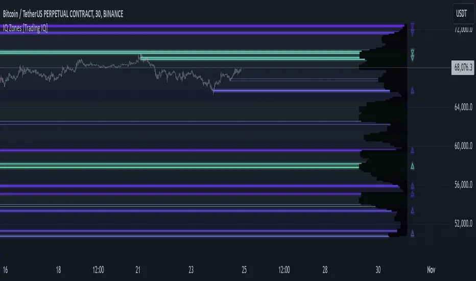
IQ Zones [TradingIQ]Hey Traders!
Introducing "IQ Zones".
"IQ Zones" is an indicator that combines support and resistance identification with volume, the "value area" of a candlestick to be exact. IQ Zones identifies turning points in the market; however, the candlestick high or low that formed the key turning point is not necessarily distinguished as the support/resistance area. Instead, the script looks into the bar at lower timeframes and calculates the value area of the candlestick that formed the support or resistance level. Therefore, any lines protruding from a candlestick reflect the value area of that candlestick. These levels (value area high and value area low) are marked on the candlestick as a support/resistance level. If the level formed on high volume it's marked as an "IQ Zone".
Additionally, IQ Zones presents a heat map to show volume intensity at nearby price areas. The heatmap is a product of the Volume Profile (IQ Profile) located on the right of the chart.
The IQ Profile is a segmented volume profile. Recent price is split into fifths (customizable), and individual volume profiles are calculated for all segmented price areas. Price is split into more than one segment to avoid a situation where volume in a ranging price zone far surpasses all other recent price areas - creating an "unusable" volume profile that doesn't offer helpful insights. If desired, you can set the segmenting option to "1" to calculate one unified volume profile for the entire price range.
The image above shows IQ Zones in action!
Core Features of IQ Zones
Value Area Support and Resistance Levels
Segmented volume profile for the recent trading period
Volume intensity heatmap
Support and resistance levels in high volume intensity may be more significant as price stoppers
The image above explains the labels marked along the y-axis of the IQ Profile.
The "more green" a price area/label is, the higher the volume intensity at the marked support/resistance area.
The image above further explains line lines protruding from the IQ Profile.
For this example, the value area of the candlestick (where most trading action occurred) is quite far from the high price of the candlestick that formed a resistance level! Using the value area of a candlestick that marks a key turning point to draw support/resistance offers insight into where the majority of trading action took place when the support/resistance level was forming!
Additionally, you can hover your mouse over the IQ Zone labels (triangles pointing up or down) to see the prices of the value area for the support/resistance level, including the total buying volume and total selling volume at the price area!
The image above further explains the IQ Profile!
You can segment the recent price area anywhere from 1 - 15 times.
The image above further explains IQ Zones and the IQ Profile!
That will be all for this indicator - a fun project to share with the community.
Thank you!
Time Zone CorrectorThe Time Zone Corrector library provides a utility function designed to adjust time based on the user's current time zone. This library supports a wide range of time zones across the Americas, Europe, Asia, and Oceania, making it highly versatile for traders around the world. It simulates a switch-case structure using ternary operators to output the appropriate time offset relative to UTC.
Whether you're dealing with market sessions in New York, Tokyo, London, or other major trading hubs, this library helps ensure your trading algorithms can accurately account for time differences. The library is particularly useful for strategies that rely on precise timing, as it dynamically adjusts the time zone offset depending on the symbol being traded.

Liquidity Zone DetectorLiquidity Zone Detector User Guide
Liquidity Zone Detector is a powerful tool designed to identify high liquidity zones in the market. This indicator highlights areas where trading volume is significantly higher than average, but price movement remains limited. Such zones are often indicative of strong support or resistance levels, where substantial buying or selling activity occurs without a corresponding large price change.
Key Features:
Volume Analysis: Uses a configurable moving average to analyze volume and identify spikes in trading activity.
Body Length Analysis: Calculates the average body length of candlesticks to detect periods of low price movement.
Customizable Parameters: Adjust the analysis period, volume factor, and moving average length to suit your trading strategy.
Color-Coded Heatmap: Visualizes different volume levels with a gradient color scheme, from very low to peak volume.
Liquidity Highlight: Marks high liquidity zones with a distinct green color for easy identification.
How to Use:
1. Analysis Period
Setting: Analysis Period
Description: Sets the number of bars to use for calculating the average body length of candlesticks.
Recommendation: Use shorter periods (e.g., 10-20) for short-term analysis, and longer periods (e.g., 50-100) for long-term analysis.
2. Volume Factor
Setting: Volume Factor
Description: Determines the multiplier for average volume to identify high volume candles.
Recommendation: Start with values like 1.5-2.0 and adjust according to market conditions.
3. Volume Moving Average Length
Setting: Volume MA Length
Description: Sets the period for calculating the moving average of volume.
Recommendation: Use shorter periods (e.g., 20-50) for short-term analysis, and longer periods (e.g., 100-200) for long-term analysis.
4. Volume Factor Settings
Settings: Peak, High, Medium, Base Volume Factors
Description: Customizes thresholds for peak, high, medium, and base volume levels.
Recommendation: Start with default settings and adjust according to your trading strategy.
5. Visualization
Description: The indicator plots volume bars with color coding based on the configured thresholds. High liquidity zones are marked in green for quick recognition.
Recommendation: Configure the color coding and visualization options to suit your trading platform.
Conclusion
Liquidity Zone Detector is an essential tool for traders looking to spot potential areas of accumulation or distribution. It helps you make more informed decisions and enhances your overall trading performance.
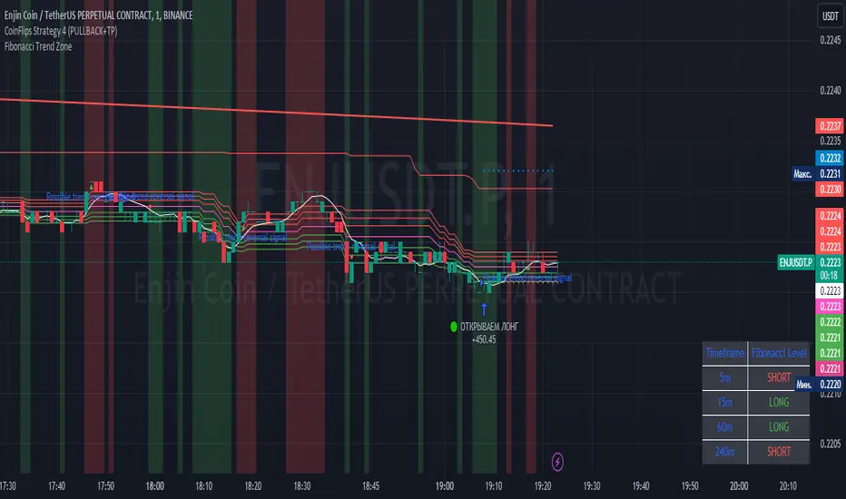
Fibonacci Trend Zone The "Fibonacci Trend Zone" indicator is a supplementary tool that helps identify the current trend based on Fibonacci zones. It utilizes Fibonacci levels (0.62, 0.705, and 0.79) to define long-term trend zones. The green zone indicates potential long trades, while the red zone suggests potential short trades. The indicator also includes the Triple Exponential Moving Average (TEMA), which helps confirm trend reversals. When the TEMA crosses the Fibonacci level of 0.5, it may signal a possible trend reversal. Use this indicator in conjunction with your primary trading strategy to make more informed trading decisions. Additionally, the indicator provides flexibility in customizing the styles, allowing you to change the color scheme or disable the display of certain elements to suit your preferences and requirements.
Индикатор "Fibonacci Trend Zone" является вспомогательным инструментом, который помогает определить текущий тренд на основе зон фибоначчи. Он использует уровни фибоначчи (0,62, 0,705 и 0,79) для определения зон долгосрочного тренда. Зеленая зона указывает на возможность лонг-сделок, а красная зона - на возможность шорт-сделок. Индикатор также включает Triple Exponential Moving Average (TEMA), который помогает подтвердить смену тренда. Когда TEMA пересекает уровень фибоначчи 0,5, это может сигнализировать о возможной смене тренда. Используйте данный индикатор в сочетании с вашей основной торговой стратегией для принятия более информированных решений. Индикатор также предоставляет гибкость в настройке стилей, позволяя вам изменить цветовую схему или отключить отображение некоторых элементов, чтобы соответствовать вашим предпочтениям и требованиям.
Price Average ZonesThis indicator shows the areas where LONGS or SHORTS can be made, the areas are calculated based on the mathematical averages of the high and low peaks of the price.
It also has a line that shows the average of the price movement. you can make shorts when the price enters the orange zone called the "Short Zone".
You can make longs when the price enters the orange zone called the sell zone.
It works in all timeframes, personally I use it in 1 min and in 1 hour.

Caleb's Supply and Demand ZonesThis script takes predetermined levels and plots them as supply and demand zones. These zones are automatically colored as supply or demand based on price action. Additionally, two EMAs and a VWAP are included to help make intraday trading decisions. This script is written to intuitively deduce between SPY, SPX, ES, US500, QQQ, and NQ to plot the zones in their proper corresponding price levels.

ICT Sessions (Kill Zones)Inspired by the work of ICT (Inner Circle Trader - @ICT_MHuddleston)
What are ICT KillZones:
All ICT students know that certain moments of the day are more indicated to search for good frameworks. These moments are indicated like "Kill Zones".
The best kill zones to search for profittable tradings are during the London session and during the New York session.
How This Indicator Can Help You:
With this indicator you'll see plotted in the charts the London Kill Zone and the New York Kill Zone, you'll see exactly when they start and finish, so you'll be able to understand better the price action and recognize if there are ICT framework to trade. You'll also will see when the New York lunch hour happen (this moment is not favorable for searching frameworks) and you'll see also 2 very important moments of the day, the 8.30 New York Time and the 9.30 New York Time, infact in these 2 particular moments it is most likely that some very profittable framework will appear as there are alway important economic news released in these 2 hours.
Also you'll see the New York Midnight Open, that always forms a very important level for the day trading, you could see the New York Midnight open as a real opening for markets.
Why This Indicator:
I looked for indicators working with these concepts and I could not find one that offered the kill zones sections in the way are showed in my indicator, also they just had the kill zones without showing the 8.30 and 9.30 hours and without the Ney York midnight opening, and these are very important time frames for who works with ICT concepts.
About The Indicator:
In this indicator you'll have displayed:
The regular trading sessions displayed, that is: Asian Session, London Session, New York Session.
The London Kill Zone
The New York Kill Zone
The New York Midnight Open
The New York Lunch Hour
The 8:30 News Release Hour
The 9:30 News Release Hour
All these level can be adjusted and changed as you prefer.

Linear Regression ChannelsThese channels are generated from the current values of the linear regression channel indicator, the standard deviation is calculated based off of the RSI . This indicator gives an idea of when the linear regression model predicts a change in direction.
You are able to change the length of the linear regression model, as well as the size of the zone. A negative zone size will make the zone stretch away from the center, and a positive zone size will make it stretch towards the centerline.

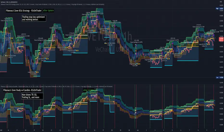
Fibonacci Zone DCA Strategy - R3c0nTraderCredits:
Thank you "eykpunter" for granting me permission to use "Fibonacci Zones" to create this strategy
Thank you "junyou0424" for granting me permission to use "DCA Bot with SuperTrend Emulator" which I used for adding bot inputs, calculations, and strategy
Pre-requisites:
You can use this script without a 3Commas account and see how 3Commas DCA Bot would perform. However, I highly recommend signing up for their free account, going through their training, and testing this strategy with a paper bot. This would give you a base understanding of the settings you will see in this strategy and why you will need to know them.
What can this do?
First off, this is a Long only strategy as I wrote it with DCA in mind. It cannot be used for shorting. Shorting defeats the purpose of a DCA bot which has a goal that is Long a position not Short a position. If you want to short, there are plenty of free scripts out there that do this.
I created this script out of curiosity and I wanted to see how a strategy based on “Fibonacci” levels would work with a 3Commas DCA bot. I came across "eykpunter’s" "Fibonacci Zones" study and in TradingView and I found it to be a very interesting concept. The "Fib Zones" in his study are basically a "Donchian Channel" of 4 Fibonacci lines. These are the High @ 0.236, Center High @ 0.382, Center Low @ 0.618, and Low @ 0.764.
The Fib Zones in this strategy can be used as conditions to open a trade as well as closing a trade. There is also the option to close a trade based on a Target Take Profit (%).
Advanced Fibonacci trading is also supported by specifying additional parameters for Trade Entry and Exit.
For example, for order entry, you can increase the minimum trend strength to open an order via the "minimum ADX value" option. You can also further limit order entry by selecting the option to "Only open trades on bullish +DI" (Positive Directional Index).
Or you can play the contrarian. For example, I would look for "buying the dip" opportunities by doing the following under "Trade Entry Settings":
Set the "Min ADX value to open trade" to zero
Set the option "Open a trade when the price moves" to "1-To the bottom of Downtrend Fib zone" or "2-Higher than the top of the Downtrend Fib zone"
Uncheck option "Only open trades on bullish +DI"
Set the 'Min ADX value to open trade' to Zero
Set the 'Max +DI value to open trade' to a value between 10-20.
For Trade Exit settings, I can use a "Target Take Profit (%)" or one of the High Fib levels to close the trade.
Here's an example result when using a Contrarian-Fibonacci-Zone-DCA strategy:
Explanation of Chart lines and colors on chart
Six Options for Entering a Fibonacci Trade
Open a trade when the price moves:
1-To the bottom of Downtrend Fib zone
2-Higher than the top of the Downtrend Fib zone
3-Higher than the bottom of Ranging Fib Zone
4-Higher than the top of Ranging Fib Zone
5-Higher than the bottom of Uptrend Fib Zone
6-To the top of Uptrend Fib Zone
Three Options for Exiting a Fibonacci Trade
Take profit using:
"Target Take Profit (%)"
"High Fibonacci Border-1"
"High Fibonacci Border-2"
Demand & Supply Zones [eyes20xx]Demand & Supply Zones
This indicator helps to identify large moves driven by institutions.
What qualifies as a zone?
If the price moves (open to close) by more than a certain % in one candle or in a bullish / bearish run of candles, the zone is marked as a Demand or Supply zone .
0.8% is good for Crypto and Forex might be better with 0.4%. Play around with the % to match your requirements.
Active zones
A zone remains active until it is hit by the price. When it becomes inactive, the zone background becomes transparent.
Zone lines
Lines are displayed if the zone is active and within a certain % of the close. 3% is a good setting for Crypto.
A maximum of two lines are displayed for each zone type.

TSI in Dynamic Zones with Divergence and Pivot PointsTrue Strength Index , or TSI is considered a "leading indicator" - in contrast to a "lagging indicator" just as Moving Averages it does not show a confirmation what already happened, but it shows what can happen in the future. For example: The chart is climbing while the TSI oscillator is slowly declining, gets weaker and weaker, maybe even prints bearish divergences? That means that a reversal might be occurring soon. Leading indicators are best paired with Stop and Resistance Lines, General Trendlines , Fib Retracements etc. Your chart is approaching a very important Resistance Trendline but the TSI shows a very positive signal? That means there is a high probability that the Resistance is going to be pushed through and becomes Support in the future.
What are those circles?
-These are Divergences. Red for Regular-Bearish. Orange for Hidden-Bearish. Green for Regular-Bullish. Aqua for Hidden-Bullish.
What are those triangles?
- These are Pivots . They show when the TSI oscillator might reverse, this is important to know because many times the price action follows this move.
What are these blue or orange areas?
- Those are dynamic zones. For the analysis of the TSI its important to know if the indicator is in a state of oversold or overbought to filter out ranging price movement. Normally those zones are static, in this version of the TSI oscillator dynamic zones were added to show a dynamic calculation whether the TSI oscillator is oversold, overbought or ranging.
Please keep in mind that this indicator is a tool and not a strategy, do not blindly trade signals, do your own research first! Use this indicator in conjunction with other indicators to get multiple confirmations.

Fib Convection Zone88Labeled Auto Fibonacci Retracament Levels. The color of fibo levels is green when the trend is upward and the color of fibo levels is red when the trend is downward. Also, you can see the highest and lowest values related with your period.
Added the Convection Zone 886 the banks sweet spot.
Source @borserman
Mod @LaMonicaRobinson
PT Crypto Kill ZonesVersion 1.0 of our PT Crypto Kill Zones indicator helps create a visual of specific times throughout the trading day, which we can expect volatility. The market moves within particular sessions. These sessions are broken up as such in three segments, NY, London & Asia.
Toggles -
Market Open highlights the opening of each market.
Daily Zone – highlights a period around the daily crypto candle close.
NY Open Zone – highlights a period around the NY market open.
NY Close Zone – highlights a period around the NY market close.
London Open Zone – highlights a period around the London market open.
London Open Zone – highlights a period around the London market close.
Asia Zone – highlights a period around the Asia market open.
Preferred zones are settings we came up with by running backtests to figure out which periods are close to the kill zones, which offer a better reaction.
Strategy: Use the sub 1h time-frame (30m is ideal) and scalp the London & NY zones with the PT Liquidity & PT Buy/Sell indicator.
This Oscillator was built around our buy sell & Liquidity indicator for scalping. It is included as part of the library. Just message us for access!

Price Action - Level/Zone (Expo)Price Action - Level/Zone (Expo) indicator identifies buying and selling pressure that has an impact on the price movement. This is visualized by a Zone, or Levels or with Barcolors depending on which settings are used.
Depending on the selected settings the indicator can identify buying and selling pressure which pushes the price further in the trend direction and it can show exhausted buyers/sellers which is seen in reversal points.
HOW TO USE
1. Use the indicator to identify buying and selling pressure.
2. Use the indicator to identify exhausted buyers and sellers.
3. Use the indicator to identify reversal points, pullbacks, or trend shifts.
4. Use the indicator to buy/short-sell breakouts of the zones.
5. Use the indicator to buy/short-sell when the price re-test the zones.
-> Try the indicator on Heikin Ashi Candles , but it works as good at any type of candlestick, bars, Renko, or line break.
INDICATOR IN ACTION
4 hour chart
4 hour chart
I hope you find this indicator useful , and please comment or contact me if you like the script or have any questions/suggestions for future improvements. Thanks!
I will continually work on this indicator, so please share your experience and feedback as it will enable me to make even better improvements. Thanks to everyone that has already contacted me regarding my scripts. Your feedback is valuable for future developments!
ACCESS THE INDICATOR
• Contact me on TradingView or use the links below
-----------------
Disclaimer
Copyright by Zeiierman.
The information contained in my scripts/indicators/ideas does not constitute financial advice or a solicitation to buy or sell any securities of any type. I will not accept liability for any loss or damage, including without limitation any loss of profit, which may arise directly or indirectly from the use of or reliance on such information.
All investments involve risk, and the past performance of a security, industry, sector, market, financial product, trading strategy, or individual’s trading does not guarantee future results or returns. Investors are fully responsible for any investment decisions they make. Such decisions should be based solely on an evaluation of their financial circumstances, investment objectives, risk tolerance, and liquidity needs.
My scripts/indicators/ideas are only for educational purposes!
KBL PLAY-ZONE PLOTTERHow to Use This Indicator ?
1 : When a price candle closes above the RED zone indicated on the chart, then it is considered as a Break Out Buy with target and stoploss points same
as the difference between the top and bottom of the Red Zone.
Or When a price candle closes below the GREEN zone indicated on the chart, then it is considered as a Break Out Sell with target and stoploss points
same as the difference between the top and bottom of the Green Zone.
2 : When Price candle enters the green zone from upside down and then again when it go out above the green zone, then at that point we put a buy
order with target and stoploss points same as the difference between the top and bottom of the Green Zone.
Or When Price candle enters the Red zone from downside to up and then again when it go out below the Red zone, then at that point we put a Sell
order with target and stoploss points same as the difference between the top and bottom of the Red Zone.
PM us to obtain access.

AO and AC Zones (Bill Williams)The colored Zones is the combination of the Awesome Oscillator (AO) and Accelerator Oscillator (AC) indicator by Bill Williams.
If both AO and AC bars are uptrending, the zone is blue
If both AO and AC bars are downtrending, the zone is red
If AO and AC have different colors, the zone is gray
Blue and red zones
This zones allows you to trade more aggressively, you could also add to current positions
Gray zone
You should avoid those flat (or choppy) market and don't open new positions or add to your current ones
You could use this indicator also in combination with MACD.
Please always remember, there is no holy grail indicator!
Multi-Confirmation Fib Zones This indicator combines **dynamic Fibonacci-style price zones** with a **multi-signal confirmation layer** to highlight areas where reactions are more likely to matter.
Core purpose
* Map out **contextual price areas** derived from recent market ranges.
* Provide a structured way to read potential **reaction / continuation zones** without relying on a single input.
Zone framework
* The tool continuously tracks the market’s recent extremes and builds **adaptive reference zones** around them.
* It can display both **bullish-context** and **bearish-context** zones, depending on the current market behavior.
Confirmation layer (confluence concept)
Instead of treating any zone touch as a signal, it evaluates **multiple market perspectives**, such as:
* momentum pressure,
* momentum shifts,
* short-term oscillation balance,
* participation / activity confirmation.
Signals are intended to be interpreted only when **several views align**, helping reduce false positives.
Practical use
* Useful for traders who want **structured levels + confirmation** in one visual workflow.
* Can support both **trend continuation** and **reaction-based setups**, depending on broader context.
* Best treated as a **decision support system** (a “dashboard”), not a standalone trade trigger.
Best conditions
* Works best when markets are **respecting ranges and reacting at obvious areas**.
* In extremely noisy, thin, or news-driven spikes, confirmations may desync and require more discretion.
*For educational and analytical purposes only. Always validate across different instruments and timeframes.*