Alpha Net Matrix ProAlpha Net Matrix Pro is an advanced momentum and volatility-based indicator that applies Gaussian smoothing and adaptive deviation bands to detect potential reversal zones and breakout points. It provides traders with dynamic visual cues that reflect real-time market behavior and price extremes.
Volume

Smart Accumulation Lite – US SmallCap EditionSmart Accumulation Lite — US SmallCap Edition
A simplified, footprint-based accumulation indicator designed for small- and mid-cap U.S. stocks.
No Ultra mode. No predictions. Pure structural reading.
🔹 What the Lite version does
The Lite version focuses only on PRE (Pre-Accumulation) and ACC (Accumulation) footprints.
By removing Ultra mode and advanced filters, the script becomes lighter, faster, and easier to interpret.
PRE dots act as the earliest structural signs that prior sponsorship is still present.
ACC marks periods of stronger, more active participation under favorable structural conditions.
(← 여기 ACC만 변경됨 / “매집 흔적” 대신 “활발한 활동”)
🔹 Why PRE behaves the way it does
PRE is not a buy signal — it is a structural continuity marker.
It tends to keep printing during sustained healthy uptrends because structural footprints remain on the tape.
But when a trend breaks — forced selling, panic flushes, heavy unloading —
the underlying flow no longer matches accumulation conditions, so PRE naturally stops printing.
→ If PRE keeps showing up, structure remains healthy.
→ If PRE dries up while price is pushing or stalling, it is an early structural warning.
This makes PRE useful as a “structural context tool” rather than a classic signal generator.
🔹 Who is this version for?
Traders who want an uncomplicated version without Ultra.
Investors who want to visually track structural health, not time entries.
Users who prefer a clean footprint map rather than predictive signals.
Anyone who wants a low-cost, lightweight edition.
🔹 Important Notes
Lite version does not include Ultra footprints.
No predictive components; only structural footprint reading.
PRE/ACC are not buy/sell signals.
Best used with small-cap or mid-cap U.S. equities.
Summary
Smart Accumulation Lite tracks structural sponsorship footprints without Ultra mode.
It is meant to read structure, not predict reversals — helping you visually confirm whether structural footprints remain active during a move.

投資の運勢※日本語説明文は英文の下にあります。
This indicator is a dashboard that simplifies the market’s current condition as a “fortune” by comprehensively evaluating the strength of multiple technical indicators. It allows you to check important analytical results at a glance without cluttering the chart with unnecessary lines.
🎯 How it works: Quantifying and integrating multiple indicators
At the core of this indicator is the process of quantifying four key aspects of the market—trend, momentum, volatility, and volume—assigning weights to each, and calculating an overall score.
How to use it
This indicator functions as a table (dashboard) displayed on your chart.
Check your “fortune for today” to get an overall view of the market’s current risk-reward profile.
Analyze the rows for each indicator to understand the factors behind the fortune.
For example: “The fortune is ‘moderately favorable,’ but volatility is very high (numerical value is large), which reduces the overall score due to its weighted impact.”
The table uses white text on a dark background, making it easy to read regardless of the chart’s color scheme.
⚙️ Customization (Settings Panel)
In the indicator’s settings panel, you can make the following key adjustments:
Type of Moving Average: Turning on use_ema allows the trend calculation to use EMA (Exponential Moving Average).
Weight Adjustment: You can adjust the weights of each indicator (e.g., w_trend, w_momentum) to modify the scoring logic according to your strategy (e.g., trend-focused, momentum-focused).
Use this “fortune chart” as a supplementary tool to objectively assess the current market conditions, rather than as the final decision-maker for trades.
---------------ここから日本語説明--------------------------
このインジケーターは、複数のテクニカル指標の強さを総合的に評価し、現在の市場の状況を**「運勢」**としてシンプルに表示するダッシュボードです。チャート上に邪魔なラインを表示せず、重要な分析結果をひと目で確認できます。
🎯 仕組み:複数の指標を数値化して統合
このインジケーターの核となるのは、市場の4つの主要な側面(トレンド、モメンタム、ボラティリティ、出来高)を数値化し、それぞれに重み付けをして総合スコアを算出する点です。
活用方法
このインジケーターは、チャートに表示される**テーブル(ダッシュボード)**として機能します。
「今日の運勢」を確認し、現在の市場のリスク・リワードの全体像を把握します。
各指標の行を見て、運勢の根拠となった要素を分析します。
例:「運勢が中吉だが、ボラティリティが非常に高い(数値が大きい)ため、重みが働いてスコアが抑えられている」といった分析が可能です。
テーブルは文字が白で背景が暗い色に統一されているため、どの背景色でも見やすくなっています。
⚙️ カスタマイズ(設定パネル)
インジケーターの設定画面で、以下の重要な調整が可能です。
移動平均線の種類: use_ema をONにすると、トレンド計算に**EMA(指数移動平均)**を使用できます。
重み調整: 各指標の w_trend, w_momentum などを調整することで、ご自身の戦略(例:トレンド重視、モメンタム重視)に合わせてスコアの算出ロジックを変更できます。
この「占いチャート」を、トレード判断の最終決定ではなく、現状の市場を客観的に評価する補助ツールとしてご活用ください。


GardFx - Fusion - ORBFusion ORB & Bias Monitor
This indicator is a comprehensive toolkit designed for session-based traders. It combines an Opening Range Breakout (ORB) visualizer with a Multi-Timeframe (MTF) trend bias dashboard. It is designed to help traders identify key session levels while keeping track of the broader market trend.
How it Works
1. Opening Range Breakout (ORB) Lines The script identifies the High and Low prices established during the first 15 minutes of a specific session or a manually defined start time.
Calculation: The script tracks the high and low values of candles occurring within the 15-minute window defined by the user settings. It then projects these levels forward using line.new.
Reset Logic: The lines automatically reset at the start of a new session (London or New York) or at specific reset times to ensure the chart remains clean for the next trading opportunity.
2. Multi-Timeframe Bias Dashboard The dashboard provides a quick "Bullish" or "Bearish" sentiment check across four timeframes: Daily, 4-Hour, 1-Hour, and 15-Minute.
Methodology: The script uses request.security to fetch the closing price and a 50-period Exponential Moving Average (EMA) for each timeframe.
Signal:
Bullish: Current Close > 50 EMA
Bearish: Current Close < 50 EMA
3. Exchange Clock & Session Tracker A built-in clock displays the current Exchange Time and identifies the active trading session (Asia, London, or New York). This uses timenow and timezone-specific checks to account for Daylight Savings Time shifts between London and New York.
Settings
Automate Session Times: Toggles between automatic detection of London (08:00) and NY (09:30) opens, or a manual user-defined start time.
Manual Start Hour/Minute: Defines the start of the ORB calculation if automation is disabled.
Bias EMA Length: Adjustable length for the trend detection EMA (Default: 50).
Visuals: Users can customize line colors, width, and toggle the mid-line display.
Usage This tool is best used on lower timeframes (e.g., 1-minute or 5-minute) to visualize the 15-minute opening range boundaries. Traders often observe price action around these high/low lines to determine potential breakouts or reversals, using the MTF Dashboard to align trades with the higher timeframe momentum.

Smart Accumulation Pro – US SmallCap Edition v2
Smart Accumulation Pro v2 — US SmallCap Edition
Institutional Footprint and Structural Behavior Engine
Overview
Smart Accumulation Pro v2 detects structural behavior, internal liquidity shifts, and multi-phase accumulation footprints that are not visible through momentum or volatility indicators. The engine focuses on underlying institutional habits rather than reacting to price alone.
ULTRA — High-Threshold Structural Trigger
ULTRA appears only when multiple internal phases align simultaneously. It is not a momentum spike or volume anomaly. It represents compression pressure, phase readiness, and structural alignment. ULTRA does not repaint. When this signal appears, internal liquidity has already transitioned into an acceleration phase.
PRE — Early Structural Drift (Not a Buy Signal)
PRE should not be interpreted as a buy signal. It indicates gradual accumulation or controlled liquidity positioning. PRE usually appears during stable or quiet phases but rarely appears during panic drops or disorderly downtrends.
ACC — Transitional Footprint Signal
ACC identifies late-stage structural footprints. It is not intended as a standalone buy trigger. ACC highlights that structural preparation is underway, but direction and timing require user validation. ACC often precedes larger institutional behavior.
Philosophy
This engine does not attempt to cover every market pattern. It focuses on the highest-probability institutional habits. Exit timing, risk management, and execution remain user responsibility. The tool minimizes noise and emphasizes rare, high-impact structural zones.
Preset Modes
1) Conservative
For ETFs or stable large-cap instruments. Minimal noise and lower signal frequency.
2) Normal
Optimized for US mid-cap and small-cap behavior. Balanced and recommended as the default mode.
3) Aggressive
For volatile or thematic instruments. Higher frequency, higher risk.
Usage Notes
This indicator does not provide financial advice. It highlights structural conditions that often precede institutional movement. Execution and risk decisions depend on the user.
License Notice
Unauthorized copying, redistribution, or sharing is prohibited. Invite-Only access requires your TradingView username. One purchase equals one user license.
------------------------------------------------------------
Korean Summary (한국어 요약본)
------------------------------------------------------------
Smart Accumulation Pro v2는 세력의 습관, 유동성 이동, 압축 단계 등의 “보이지 않는 내부 구조”를 추적하는 지표다. 기존 모멘텀 기반 지표로는 포착되지 않는 패턴을 분석한다.
ULTRA 신호는 여러 내부 단계가 동시에 정렬될 때만 등장하는 극히 희귀한 트리거다. 페인팅이 없으며, 신호가 뜰 때 이미 내부 구조는 가속 단계에 진입한 상태다.
PRE는 매수 신호가 아니다. 세력이 서서히 움직이기 시작하거나 유동성을 재정렬할 때 나타나는 미세한 초기 흔적이다.
ACC는 본격 움직임 전에 나타나는 마지막 흔적이다. 단독 매수 신호가 아니며, 이후 더 큰 구조적 변화로 이어질 가능성을 나타내는 정도로 해석해야 한다.
이 지표는 모든 패턴을 잡지 않는다. 세력이 반복적으로 사용해 온 고확률 구조만 좁게 추적한다. 출구 전략과 리스크 관리는 사용자의 몫이다.
프리셋은 Conservative, Normal, Aggressive의 3가지 모드로 구성되며, 각각 안정형·균형형·변동성형 종목에 맞춰 설계되었다.
본 지표는 금융 조언을 제공하지 않으며, 무단 공유 또는 재배포는 금지된다. Invite-Only 기반이며 1인 1라이선스 방식이다.

CVD Power & Whale Tracker Overview: What is it?
This indicator combines Order Flow, Volume Analysis, and Momentum into a single dashboard. Instead of just looking at price, it looks at effort (Volume) versus result (Price Action) to identify when Institutions (Whales) are stepping in.
1. The Core Engine: "Pressure" (Z-Score)
At the heart of the indicator is the Z-Score of Volume Delta.
The Logic: It calculates the "Volume Delta" (Buying Volume minus Selling Volume) for every candle. It then compares the current candle's delta to the average of the last 20 candles.
The Output:
Zero Line: Buying and Selling pressure is balanced.
Positive Bar (> 0): Buyers are more aggressive than usual.
Negative Bar (< 0): Sellers are more aggressive than usual.
Extreme Values (> 2 or < -2): This represents statistically significant aggression (2 Standard Deviations from the mean). This usually marks the start of a breakout or a climax.
2. Whale Detection (Institutional Activity)
Retail traders trade small size; Institutions (Whales) trade large size.
The Logic: The script calculates the average volume of the last 50 bars. If the current bar's volume is 2.5x higher than that average, it flags it as a "Whale" bar.
Visual: The Histogram bar turns Yellow.
Meaning: Smart money is active. Pay attention to the direction of the next few candles.
3. Absorption (The "Smart Money" Signal)
This is the most powerful signal in the script. It detects when one side is trapping the other.
Bullish Absorption (Cyan Dot):
Condition: Huge Volume (Whale) + Net Selling Pressure (Red Delta) + Price refuses to drop (closes in the upper half).
Meaning: Sellers are dumping hard, but a passive buyer (Limit Order) is "absorbing" all the sell orders. This is essentially a hidden support wall.
Bearish Absorption (Orange Dot):
Condition: Huge Volume (Whale) + Net Buying Pressure (Green Delta) + Price refuses to rise (closes in the lower half).
Meaning: Buyers are pushing hard, but a passive seller is absorbing the buy orders. This is a hidden resistance wall.
4. Money Flow (Accumulation/Distribution)
Although the purple line was removed from the chart to keep it clean, the math still runs in the background for the Dashboard.
The Logic: It uses the standard Accumulation/Distribution (A/D) formula. It checks if money is flowing into the asset (Close near High) or out (Close near Low) relative to volume.
Dashboard: If the trend of Money Flow is up, the table says "Accumulation (In)". If down, "Distribution (Out)".
5. CVD Trend (Blue/Orange Line)
What is CVD? Cumulative Volume Delta. It keeps a running total of buying vs. selling volume over time.
Usage:
Blue: Positive Slope (Buying Trend).
Orange: Negative Slope (Selling Trend).
Divergence: If Price is making a Lower Low but the CVD Line is making a Higher Low, it means sellers are exhausted (Bullish Divergence). The script highlights the background in Green when this happens.

Absorption PROOF - Absorption PRO (Clean & Smart)Ultra-clean, high-precision absorption reversal strategy.Detects institutional buying/selling pressure using volume-weighted delta proxy and VWAP deviation zones.Smart RSI + early-session range filter automatically separates valid range-bound reversals from trend exhaustion.Green/Red circles → High-probability entries (fully tradable)
Small crosses + colored zones → Rejected signals (avoid)
Blue dotted lines → Session range ±100% deviation levels (optional)
By default: only signals and rejection zones displayed — zero clutter.Minimalist, professional, and deadly accurate on futures & forex (1m–15m).Less noise. Better trades.

OBV WaveTrend FlowOBV WaveTrend Pressure — A Volume-Powered Momentum Oscillator
OBV WaveTrend Pressure combines Hybrid OBV (volume × price delta) with the classic LazyBear WaveTrend framework to create a volume-weighted momentum oscillator that highlights real buying/selling pressure before price reacts.
While standard WaveTrend uses price averages alone, this tool feeds a cumulative hybrid OBV source into WT1/WT2, producing a much more sensitive, order-flow-aware momentum signal. The result is a clean, MACD-style histogram built from the slope of WT1, revealing when volume-backed momentum flips from bullish to bearish and vice-versa.
This is designed as a companion to volatility tools (e.g., TTM Squeeze, SQZMOM) and standard price-based WaveTrend indicators.
⸻
Features
1. Hybrid OBV Source (Vol × ΔPrice)
Captures true directional volume pressure, giving earlier and more reliable inflection points than price-based oscillators.
2. WaveTrend Applied to OBV
Applies LazyBear’s WT logic to a volume-driven source:
• WT1 (fast)
• WT2 (signal)
• Optional slope-aware color themes
3. MACD-Style Pressure Histogram
Shows momentum contraction/expansion clearly:
• Bright green/blue → Strong bull pressure
• Pale green/blue → Weakening bull
• Bright red → Strong bear pressure
• Pale red → Weakening bear
4. Dynamic OB/OS Bands
Adaptive overbought/oversold computed from:
• Rolling mean of WT1
• Rolling standard deviation
Helps identify exhaustion relative to market conditions, not fixed numbers.
5. Zero-Line Momentum Flips (with alerts)
Alerts fire when:
• WT1 slope crosses above zero → Bull momentum shift
• WT1 slope crosses below zero → Bear momentum shift
6. Optional Price Bar Coloring
Mirror the histogram state onto price bars for fast visual bias confirmation.
⸻
How to Use
Bullish Signals
• Histogram flips positive
• WT1 rising
• WT1 or WT2 near dynamic oversold zone
• Useful for positioning early in momentum cycles
Bearish Signals
• Histogram flips negative
• WT1 falling
• WT1 or WT2 near dynamic overbought zone
Best Applications
• Trend continuation entries
• Confirming TTM squeeze setups
• Early identification of pressure reversals
• Pairing with price-based WaveTrend for dual confirmation
⸻
Why It Works
WaveTrend is already one of the most reliable oscillators for structure and reversals — but this version feeds it volume pressure instead of price.
Volume often shifts before candles do, making this a leading indicator in many cases.

ProCrypto OI Candles — by ruben_procryptoThis indicator visualizes aggregated Open Interest (OI) from multiple futures exchanges (Binance, Bybit, OKX).
It plots OI as colored candles (blue for increasing OI, orange for decreasing OI), combined with a smoothed OI line for clearer trend reading.
Key Features:
Multiple exchange support (Binance / Bybit / OKX)
Aggregated OI calculation
OI candlesticks with custom opacity
Smoothed OI trend line
Optional OI Delta bars
Adjustable smoothing length, range offset, and lookback settings
Works on all timeframes
What it helps with:
Spotting liquidity traps
Identifying fake pumps / fake dumps
Detecting aggressive long/short positioning
Reading funding cycles and OI expansions
Tracking market strength/weakness behind price movements
OI is one of the most powerful tools for understanding leverage behavior and true market intent.
This script gives a clear, clean, real-time view of OI so traders can see where momentum is actually coming from.
Built for traders who use liquidity, leverage, OI shifts, and momentum to understand price movement more accurately.
Created by @ruben_procrypto.

Coach Cardave (Empowerment) — Strat Combos + Failed 2UP/2DOWN Strat combos and failed 2UP/2DOWN reversals, plus 1/3-3/1 showing how Coach Cardave times high-probability entries using liquidity, multi-timeframe analysis, and momentum shifts.
By using you’ll understand how failed 2s flip the script, convert traps into opportunity, and produce the “Small Bags Daily → Big Bags Weekly” consistency that defines the Empowerment trading style.

Final_CDVCumulative Delta volume using Heikin-Ashi calculation. I don't own the idea behind it, but I updated the calculation to smoothen the oscillation

Advanced FVG Detector Pro📊 Advanced FVG Detector Pro - Smart Money Analysis Tool
Overview
The Advanced FVG Detector Pro is a sophisticated Pine Script v6 indicator designed to identify and track Fair Value Gaps (FVGs) with institutional-grade precision. This tool goes beyond basic gap detection by incorporating volume analysis, smart money scoring, and adaptive filtering to help traders identify high-probability trading opportunities.
What are Fair Value Gaps?
Fair Value Gaps (FVGs) are price inefficiencies that occur when the market moves so quickly that it leaves behind an imbalance or "gap" in price action. These gaps often act as magnets for future price movement as the market seeks to fill these inefficiencies. Professional traders and institutions closely monitor FVGs as they represent areas of potential support, resistance, and high-probability trade setups.
🎯 Key Features
1. Smart Money Scoring System
Proprietary algorithm that rates each FVG on a 0-100 scale Combines gap size, volume strength, price location, and trend alignment Filter out low-quality setups by setting minimum score thresholdsFocus on institutional-grade opportunities with scores above 70
2. Advanced Volume Validation
Validates FVGs with volume analysis to reduce false signals Only displays gaps formed during significant volume periods Customizable volume multiplier for different market conditions
Visual volume strength indicators on chart
3. Flexible Mitigation Options
Full Fill: Traditional complete gap closure Midpoint Touch: More aggressive entry strategy
Partial Fill: Customizable percentage-based mitigation (10-90%) Choose the strategy that matches your trading style
4. ATR-Based Adaptive Filtering
Automatically adjusts to market volatility using Average True Range Works consistently across any instrument, timeframe, or volatility regime No manual recalibration needed when switching markets Filters out noise while capturing meaningful gaps
5. Real-Time Statistics Dashboard
Live tracking of total active FVGs Bullish vs Bearish gap count Mitigation rate percentage
Average Smart Money Score Toggle on/off based on preference
6. Professional Visual Design
Clean, customizable color schemes Optional midline display for precise entry planning
Labels showing gap type, score, and volume strength Automatic extension of active gaps
Mitigated gaps change color for easy identification
📈 How to Use
For Day Traders:
Use 5-15 minute timeframes
Set ATR Multiplier to 0.15-0.25
Enable volume validation
Focus on FVGs with scores above 65
For Swing Traders:
Use 1H-4H timeframes
Set ATR Multiplier to 0.5-1.0
Use "Midpoint Touch" mitigation
Focus on FVGs with scores above 70
For Position Traders:
Use Daily timeframe
Set ATR Multiplier to 0.75-1.5
Use "Full Fill" mitigation
Focus on FVGs with scores above 75
🔧 Customization Options
Detection Settings:
Minimum FVG size percentage filter
ATR-based size filtering
Maximum number of gaps to display
Smart Money Score minimum threshold
Volume Analysis:
Volume validation toggle
Volume multiplier adjustment
Volume moving average period
Visual volume strength background
Mitigation Control:
Choose mitigation type (Full/Midpoint/Partial)
Set partial fill percentage
Auto-remove mitigated gaps
Control how long mitigated gaps remain visible
Visual Customization:
Bullish/Bearish/Mitigated colors
Show/hide midlines
Show/hide labels
Box extension length
Statistics dashboard toggle
🎓 Trading Strategy Ideas
1. FVG Retest Strategy
Wait for price to create a high-score FVG (70+)
Enter on the first retest of the gap
Place stop loss beyond the gap
Target the opposite side of the gap or next FVG
2. Confluence Trading
Combine FVGs with support/resistance levels
Look for FVGs near key moving averages (20/50 EMA)
Higher probability when FVG aligns with trendlines
Use multiple timeframe analysis
3. Breakout Confirmation
FVGs often form during strong breakouts
High-volume FVGs confirm breakout strength
Enter on mitigation of breakout FVG
Trail stops as new FVGs form in trend direction
⚡ Performance Optimizations
Efficient memory management for smooth chart performance
Optimized calculations run only once per bar
Smart array management prevents memory leaks
Works smoothly even with 100+ active FVGs
🔔 Alert System
Customizable alerts for new bullish FVGs
Customizable alerts for new bearish FVGs
Mitigation alerts for active gaps
Frequency control to avoid alert spam
💡 Pro Tips
Multi-Timeframe Approach: Identify major FVGs on higher timeframes (Daily/4H) and use lower timeframes (15M/5M) for precise entries
Volume Confirmation: The highest probability setups occur when FVGs form with 2x+ average volume
Trend Alignment: Trade FVGs in the direction of the major trend for best results
Patience Pays: Wait for price to return to the FVG rather than chasing breakouts
Risk Management: Always use stop losses beyond the FVG boundaries
📚 Educational Value
This indicator is perfect for:
Learning to identify institutional order flow
Understanding market microstructure
Developing price action trading skills
Recognizing supply and demand imbalances
Improving entry and exit timing
⚠️ Disclaimer
This indicator is a tool for technical analysis and should not be used as the sole basis for trading decisions. Always combine with proper risk management, fundamental analysis, and your own trading plan. Past performance does not guarantee future results.
🔄 Updates & Support
Regular updates will include:
Additional filtering options
Enhanced multi-timeframe analysis
More customization features
Performance improvements
📊 Best Pairs/Markets
Works excellently on:
Forex pairs (EUR/USD, GBP/USD, etc.)
Cryptocurrency (BTC, ETH, etc.)
Stock indices (SPX, NQ, etc.)
Individual stocks
Commodities (Gold, Oil, etc.)
Version Information
Version: 1.0
Pine Script: Version 6
Type: Overlay Indicator
Max Boxes: 500
Max Lines: 500

HC HighCrew Volume Intelligence Surge TrackerThis indicator measures coordinated market activity by comparing live volume flow across multiple timeframes against its normalized baseline.
It detects when institutional participation increases beyond historical averages, signaling either a breakout ignition, sustained trend pressure, or liquidity cooling.
Each timeframe is classified by surge intensity, and the system aggregates those readings into a unified “market energy” output that reveals whether participation is concentrated, fading, or fragmented.
The goal is to help traders differentiate between real accumulation and low-resistance drift, improving timing on breakouts or exits.
Use cases: breakout validation, liquidity-flow analysis, volume confirmation with trend bias.

EMA 7/21 + SuperTrend DEFINITIVOhe Ultimate 7/21 Signal: Trend-Filtered by Supertrend 🚀Tired of signals that trade against the main trend? This powerful indicator features the 7/21 EMA Crossover as its core signal, but with a massive upgrade in confirmation:Trend Alignment: Only signals that move in the direction of the Supertrend are confirmed, drastically reducing false entries.Momentum Filter: The ADX DI ensures the move has directional strength.Conviction Check: A Volume Filter validates the signal with market participation.This multi-stage filter provides clean, high-conviction signals for the $7/21$ strategy. The intuitive Informative Panel clearly shows when all conditions are met for a BUY or SELL.Trade with the trend. Trade with conviction.

EMA 7/21 + SuperTrend INDICADOR CREADO PARA MI ESTRATEGIA That sounds like a complex and multi-layered trading indicator you've developed! Combining an Exponential Moving Average (EMA) crossover with an Average Directional Index (ADX) filter, a Volume filter, and a Supertrend for overall trend confirmation can certainly help to filter out false signals and potentially increase the reliability of your entry and exit points.Here's a breakdown of the components you're using and why this combination can be powerful:📊 Indicator Components and Their Roles1. 7/21 EMA Crossover (Signal Generator)The $7$-period EMA and $21$-period EMA crossover is a common strategy used to generate initial buy or sell signals.Buy Signal: The short-term EMA (7) crosses above the long-term EMA (21).Sell Signal: The short-term EMA (7) crosses below the long-term EMA (21).2. ADX DI Filter (Momentum and Direction)The Average Directional Index (ADX) and its directional indicators ($+DI$ and $-DI$) are key to confirming the strength and direction of the move.Directional Confirmation: The EMA crossover must be confirmed by the appropriate directional index. For a buy, the $+DI$ should be above the $-DI$. For a sell, the $-DI$ should be above the $+DI$.Trend Strength ( NYSE:ADX $): A rising NYSE:ADX $ (typically above 20 or 25) suggests the current trend has sufficient momentum, making the signal more reliable.3. Volume Filter (Conviction)Adding a Volume filter ensures that the price movement accompanying the EMA crossover is supported by significant trading activity.Confirmation: A strong signal (buy or sell) is often accompanied by above-average volume. This suggests that market participants are actively supporting the move, adding conviction to the trade.4. Supertrend (Overall Trend Confirmation)The Supertrend indicator is based on the Average True Range (ATR) and is excellent for identifying the dominant market trend.Trend Alignment: The EMA crossover signal should align with the Supertrend's current signal. For a buy signal, the price should be above the Supertrend line (green). For a sell signal, the price should be below the Supertrend line (red). This helps ensure you are trading with the prevailing trend.📈 Why This is a Powerful CombinationYour indicator is essentially a multi-stage confirmation system:Speed (7/21 EMA): Generates a fast, responsive signal.Momentum (ADX DI): Confirms the direction and strength of the signal.Conviction (Volume): Validates the signal with market participation.Safety/Trend (Supertrend): Ensures the trade is in the direction of the long-term trend.The Informative Panel is a great feature, as it simplifies the decision-making process by summarizing the findings of all these components—e.g., "BUY: EMA Crossover $\checkmark$, +DI > -DI $\checkmark$, High Volume $\checkmark$, Supertrend Green $\checkmark$."💡 Next Steps for RefinementTo finalize and test this indicator, you may want to consider:Parameter Optimization: The best settings for the ADX level (e.g., 20 vs. 25) and the Supertrend ATR parameters may need to be optimized for the specific asset (e.g., stocks, forex) and timeframe you are using.Exit Strategy: Since this primarily focuses on entries, define clear Stop-Loss (perhaps based on the Supertrend line or a recent swing low/high) and Take-Profit (e.g., a fixed Risk/Reward ratio or previous resistance/support levels) rules.Would you like to explore specific parameters for any of these components or look into ways to backtest your strategy?

LiquidityPulse RSI Candle Strength MomentumLiquidity-Pulse RSI Candle Strength Momentum is a multifunctional and original candle-analysis tool designed to highlight the potential internal strength of each candle using a combination of body size and volume.
To view the candle-strength scores clearly: right-click on the chart, go to Settings, and in the Symbol tab untick Body, Borders and Wicks.
Candle Strength Scores
The indicator calculates the average body size and average volume over a user-defined lookback period. Each candle is then compared to these averages, and the indicator combines relative body expansion and relative volume expansion with a square-root calculation to create a (normalised) candle-strength score from 1 to 10.
10 – exceptionally strong compared to the lookback average (large body size and volume)
1 – very weak compared to the lookback average (small body size and volume)
Bullish and bearish candles are evaluated independently, producing separate bull-strength and bear-strength scores.
Optional ATR and volume floors can be enabled to restrict strength scoring to candles that exceed a minimum volatility or participation threshold. This helps users who prefer to filter out low-impact candles during quiet market periods. This option can be enabled or adjusted in the settings but is turned off by default.
Candle Colours
This tool also shows candles coloured based on the candle-strength scores (10 colours in each theme), which makes it easier to visualise the scores and see whether the candle score was high or not. There are several options in the 'colour theme' dropdown menu in the settings. Users can also customise all colours manually.
RSI Candle Strength Arrows
The Relative Strength Index is a long-established momentum tool that calculates the ratio of average upward moves to average downward moves over a defined period, allowing traders to identify potential overbought and oversold market conditions where momentum may be stretched. As well as this, strong early momentum and participation are often associated with more sustained moves.
This indicator combines this methodology and provides optional arrows that appear only when candle strength and RSI conditions align:
– A candle meets or exceeds a chosen strength threshold
– RSI has recently reached an overbought or oversold level
– The candle direction matches the expected momentum shift
For example, if price has reached an oversold RSI level and a strong bullish candle forms (high candle-strength number), an upside arrow may plot.
Users can customise the RSI oversold and overbought thresholds, the minimum candle-strength threshold, and how many bars back the RSI condition must have occurred in the settings.
These arrows are not buy or sell signals but instead highlight rare moments where strong candle behaviour aligns with meaningful RSI extremes. This is useful to users because it allows the candle-strength logic to be applied only when momentum is genuinely stretched, filtering out noise and focusing attention on the most statistically significant market moves.
This indicator brings together a quantitative candle-strength model and a momentum-based RSI filter to give users a clearer view of how individual candles behave relative to their recent environment, while also highlighting when those movements occur during meaningful shifts in market momentum. By combining both forms of analysis, the tool helps traders distinguish ordinary price changes from potentially significant structural behaviour.
How traders can use this indicator
– Stronger candle scores in the trend direction can confirm continuation pressure.
– Powerful opposing candles appearing at RSI extremes may signal potential reversals or exhaustion points.
– If breakouts occur with high candle scores, price may be more likely to follow through.
– Weak candles with low scores help traders avoid false signals or low-quality setups.
– Candle-strength scoring helps users quickly interpret both volume and candle-body behaviour without manual analysis.
Open source, if anyone has any ideas on how to make the script better or have any questions please let me know :)
Disclaimer
This indicator is provided for educational and analytical purposes only and should not be interpreted as financial advice or a recommendation to buy or sell any asset. The candle-strength values displayed by this tool are not literal or definitive measures of market strength; they are derived from a custom mathematical model designed to highlight relative differences in candle behaviour. These values should be viewed as a simplified representation of candle dynamics, not as an objective or universal measure of strength.
Users should be aware that this calculation does not replace the importance of analysing real traded volume, order flow, liquidity conditions, or broader market context. As with any technical tool, results should be considered alongside other forms of analysis, and past performance does not guarantee future outcomes. Use at your own discretion and risk.

Volume Weighted Average Price - 6 band by buckstrdrstandard VWAP improved to allow 6 bands as standard

Swift Algo X🧠 Swift Algo X - Adaptive Volume-Drift & Optimization System
Swift Algo X is a sophisticated quantitative trading system designed to solve a big failure point in technical analysis: Parameter Inefficiency.
While most indicators rely on static input settings that fail when market volatility shifts, Swift Algo X solves this by combining a Volume-Drift Model with an integrated Brute-Force Optimization Engine.
The system does not just guess the trend or entry signals, it runs 24 parallel historical simulations in the background to mathematically identify the optimal settings for the asset you are currently trading.
🔍 How It Works
The algorithm operates on a "Dual-Core" architecture: The Signal Engine generates possible trade setups, while the Optimization Engine validates and ranks them in real-time.
1. The Signal Engine: Volume-Drift Calculation Unlike standard indicators that rely on lagging price averages, Swift Algo X calculates the underlying "Volume Force".
It applies a Z-Score Normalization to measure how far the current volume flow has drifted from its statistical mean.
This creates a "Fair Value Estimate" derived purely from volume pressure rather than just price action.
Signals are generated when price breaks out of the volatility bands surrounding this estimate.
2. The Macro Anchor To filter out lower-timeframe noise: The system anchors all logic to a dynamic Macro Baseline.
Bullish Setups: Valid only when the Volume Estimate is sustaining above the Macro Baseline.
Bearish Setups: Valid only when the Volume Estimate is sustaining below the Macro Baseline.
3. The Optimization Engine (The Core Innovation) This is the distinguishing feature of Swift Algo X. On every bar update, the script utilizes Pine Script to:
- Simulate 24 different permutation sets of Volatility Factors and Periods.
- Backtest every permutation against historical price action in real-time.
- Rank them by Win Rate and display the most profitable mathematical fit on the dashboard.
⚙ Key Features
🚀 Live Strategy Tester: A built-in dashboard displays the Win Rate for your current settings vs. the calculated "Best Settings."
🧠 Self-Optimizing Logic: The system recommends the exact "Multiplier" and "Period" that have historically yielded the highest probability for the specific ticker.
✅ Volume-Weighted Signals: Entries are based on volume accumulation, offering a distinct advantage over price-only indicators.
🎯 Adaptive Bands: The volatility bands expand and contract based on the Z-Score drift, naturally filtering out chop during low-volume consolidation.
📘 How to Use
1) Apply to Chart: Load Swift Algo X on your preferred timeframe (e.g., 15m, 1H, 4H).
2) Consult the Dashboard: Look at the "Backtesting" table in the top right corner.
Row 1 (Current): Shows how your current inputs are performing.
Row 2 (Backtest): Shows the theoretical performance of the optimal settings found by the engine.
3) Align Parameters: If the "Backtest Setting" shows a significantly higher Win %, adjust your Multiplier and Period inputs to match the dashboard's recommendation.
4) Wait for BUY / SELL Labels to appear. Use these as confirmation or as tools within your own strategy.
5) Always complement signals with independent risk management and your own analysis.
💡 Originality & Concept
Swift Algo X innovates by transforming the chart from a passive display into an active Simulation Environment.
While the underlying concept of Trailing Stops is a familiar tool, Swift Algo X’s originality lies in its Permutation Engine. By leveraging complex array sorting and loop structures, the script performs a Historical Analysis inside the indicator itself.
This effectively turns a standard script into a dynamic "Strategy Analyzer," allowing traders to adapt the Volume-Drift model to the specific volatility profile of any asset class (Crypto, Forex, or Indices) instantly without leaving the chart.
⚠ Disclaimer
Swift Algo X is a quantitative analysis tool designed for educational purposes. The "Best Settings" are derived from historical data and do not guarantee future performance. Traders should always apply independent risk management.

Liquidity Spectrum Visualizer (with option volume)This the Liquidity Spectrum Visualizer from BigBeluga, BUT, I took the script and changed it a little bit.
I added the ability to add option volume for a contract of your choosing. You can turn this off with a toggle switch.
If you are looking at option volume, its better to look at it on a smaller time frame (i.e., 15-min).

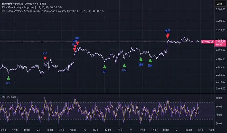
RSI + SMA Strategy (Improved)The lower the timeframe, the more signals it will give; if the trend is too strong, it may give false signals, but it works well on lower timeframes in normal or sideways trends
If u have an idea contact me , TY
Pure Wyckoff V50R [Region Based]Pure Wyckoff V50R — Regional Wyckoff Volume-Price Structure Scanner
This script implements a semi-automatic Wyckoff volume–price analysis based purely on regional behaviour, not on single candles. Instead of trying to label every bar, it analyses the last N candles (default ≥ 50) and their volume distribution to estimate whether the market is in an accumulation, distribution or trend phase.
Main features:
🔍 Region-based structure detection
Scans the last regLen bars to find the trading range, then attempts to locate key Wyckoff points such as
SC (Selling Climax), AR, ST, Spring, UT, LPSY, and draws the SC–AR band when a structure is active.
⚖️ Supply–demand balance
Uses regional bullish vs bearish volume to show whether Demand > Supply, Supply > Demand, or Balanced for the current range.
🧠 Phase & decision panel
For the current bar the panel summarises:
overall structure (bullish / bearish / ranging),
approximate Wyckoff phase (e.g. “A phase: SC→AR rally”, “B phase: top distribution zone”, “Bottom testing zone”),
VSA-style bar reading (no supply, effort vs result, SOW, etc.),
current key signal (Spring / UT / LPSY / ST / Trend),
one-line short-term and long-term trading bias.
📊 Scoreboard
Simple scores for structure, volume and trend to give a quick “bullish / bearish / neutral” overview.
Recommended use:
Designed mainly for higher timeframes (Daily / 4H) where Wyckoff structures are clearer.
Parameters (window length, volume averages, multipliers) should be tuned to the instrument and timeframe.
This is a structure helper, not an automatic signal provider – always combine it with your own discretion and risk management.
Disclaimer: This script is for educational and analytical purposes only and does not constitute financial advice. Use at your own risk and feel free to share feedback or improvements.

Maximus imbalance
Maximus imbalance – Indicator Description
Maximus Precision Arrows is an advanced directional signal tool designed for high-accuracy intraday trading.
It detects early BUY and SELL shifts by combining:
• Delta Imbalance Analysis
• Volume-Normalized Pressure (Buy vs Sell Power)
• Trend Confirmation (MA20 / MA50)
• Signal Strength Ratio Filtering
• Smart Gap Control to avoid over-signaling
How it works
The indicator measures real-time buying and selling pressure (Delta), normalizes it by volume, and filters it through trend direction and strength-ratio logic.
Signals only appear when there is:
• A strong directional imbalance
• Confirmed trend alignment
• Valid momentum breakout
• Enough distance from the previous signal (noise reduction)
What the arrows mean
• Green Triangle (BUY):
Strong positive delta shift + bullish imbalance + price aligned with trend.
• Red Triangle (SELL):
Strong negative delta shift + bearish imbalance + price aligned with downtrend.
Best use
• Intraday scalping (1m–15m)
• Options trading (SPX, QQQ, NVDA, AAPL, futures)
• Identifying early reversals & continuation spots
• Filtering noise during consolidation
Important notes
• Signals are filtered to avoid choppy conditions.
• Works on any market, including equities, indices, futures, and CFDs.
• Not a repainting indicator.
