Yest/PreMkt H/LI published this Tradingview script to allow you to see pre-market and previous day highs/lows for directional trading. This works with stocks, ETFs and indexes. To see pre-market highs/lows, you MUST enable "extended" session in the TV charts. You can change colors to your liking. Enjoy!
Volume

FVG/IFVG Indicator (Blastoise's 85% Win-Rate Model)📈 Blastoise Trading Model — Liquidity + FVG + MSS
This indicator automates Blastoise's 85% Win-Rate Trading Strategy, built around high-probability intraday setups on NQ and ES using Draw on Liquidity (DOL), Market Structure Shifts (MSS), and Fair Value Gaps (FVG)
🔍 What It Does:
- Auto-Identifies All DOLs:
Marks Internal/External Highs & Lows, Asia High/Low, London High/Low, and News Data High/Low
- NY Session Logic (9:30 AM):
Activates only during the NY session to ensure volume and trend reliability
Waits for the first nearby DOL to get swept, then reads market reaction to generate a bias
- Automatic Bias Detection:
Example: If price takes out a DOL high and holds below = Bearish Bias
Example: If price takes out a DOL high and holds above = Bullish Bias into Next DOL
- Smart Entry Model with FVGs/IFVGs:
Once bias is set, the indicator scans all timeframes for valid FVG setups with the given bias
Once it finds the setup, it'll display the complete entry setup, including entry zone, stop loss, and price targets so you know EXACTLY when to get in
- Real-Time Setup Checklist:
Confirms DOL sweep, bias, volume, FVG/IFVG entry model, and MSS status.
Setup Rating Score (1–10) based on how many confirmations are present
- MSS Integration (Optional but Powerful):
Confirms Market Structure Shifts for reversals after DOL sweeps and updates the setup rating

QPulseQPulse - A Volume-Normalized RSI Indicator
WHAT THIS IS
QPulse Pro is an RSI-based momentum indicator that solves a major problem most traders face: false signals during low volume periods. You know those overnight spikes or pre-market moves that look extreme but mean nothing? This indicator dampens those signals by normalizing them against actual volume participation.
At its core, it combines volume-weighted RSI with ATR-adaptive RSI in a hybrid calculation that automatically adjusts based on market conditions. The result is an RSI that responds more intelligently to what the market is actually doing, not just price movement alone.
HOW IT WORKS
The indicator calculates RSI in three ways and blends them based on current market regime. When volume is high and confirming price action, it leans into volume-weighted calculations. When volatility is spiking, it adapts the lookback period using ATR. The hybrid mode automatically switches between these approaches depending on what matters most in the current market environment.
The volume normalization is the key differentiator. Every signal gets scaled by volume participation. If volume is at 30 percent of normal, the indicator dampens that signal strength accordingly. Statistically insignificant moves get filtered out so you are not chasing noise.
The heatmap shows historical RSI intensity over time, making it easy to spot when momentum is building or fading across multiple bars rather than just looking at the current reading.
HOW TO USE IT
The indicator displays as a histogram oscillating around a zero line. Positive values indicate bullish momentum, negative values indicate bearish momentum. The dynamic overbought and oversold zones adjust based on volatility and trend strength, so they are not just static 70 and 30 levels that get ignored in strong trends.
For entries, watch for the histogram crossing the zero line with confirmation from volume participation. If the indicator shows extreme readings but volume participation is weak, treat it skeptically. The divergence markers will automatically appear when price makes new highs or lows but RSI does not confirm.
The quant features add additional context. Intermarket divergence alerts you when your asset is behaving differently from correlated markets. CVD proxy tracks cumulative buying versus selling pressure. Volatility of volatility helps predict when breakouts are more likely.
PROS
Honest assessment of what this does well. The volume normalization actually works and eliminates a ton of false signals during illiquid periods. I have tested this across futures, stocks, and crypto and the filtering is consistent.
The hybrid calculation is genuinely adaptive. It does not just use a fixed formula. The indicator monitors market regime in real-time and shifts weighting between volume and volatility factors.
This means it performs reasonably well in both choppy ranges and strong trends.
The divergence detection is more reliable than standard RSI divergences because it is working with volume-adjusted data. You get fewer fake divergence signals.
All the calculations are optimized and cached where possible so it does not lag your charts. The code runs efficiently even with all features enabled.
Multiple timeframe thinking is built in through the advanced ATR calculations which look at efficiency and volatility across different periods.
CONS
Let me be straight about the limitations. This is still an RSI indicator. It is not magic. In extremely strong trending markets, it will stay pegged at extremes just like any momentum oscillator. The dynamic levels help but they do not solve the fundamental issue that RSI is not a great tool in runaway trends.
The volume normalization works great for filtering out noise but it also means you might miss legitimate moves that happen on lower volume. Early trend changes often start quietly before volume kicks in. This indicator will be slower to signal those.
The quant features like intermarket divergence and VoV are sophisticated but they add complexity. If you do not understand what they are measuring, you will probably ignore them or misuse them. They are not magic bullets.
The indicator has a lot of settings. You can tune it for your specific markets and timeframes but that means you need to put in the work to understand what each parameter does. Default settings are reasonable but not optimized for every use case.
It works best on liquid instruments with consistent volume patterns. If you trade low volume altcoins or illiquid options, the volume normalization might not have enough data to work properly.
BEST USE CASES
Futures traders will get the most out of this. The volume normalization shines during overnight sessions and the intermarket divergence features are built specifically for ES, NQ, and RTY traders.
Day traders and scalpers benefit from the real-time volume filtering. You can trust the signals more during regular trading hours.
Swing traders can use the divergence detection and volatility signature features to time entries and exits around multi-day setups.
It works across timeframes but I would say 5-minute to 1-hour charts are the sweet spot. On very low timeframes the volume data gets too noisy. On daily charts you lose some of the intraday volume context.
WHAT YOU SHOULD KNOW
This is not a standalone system. It is a tool that gives you better information about momentum and volume relationship. You still need price action context, support and resistance, and your own trading plan.
The alerts are extensive. There are alerts for overbought, oversold, zero line crosses, divergences, volume spikes, volatility events, and quant signals. You will want to be selective about which ones you enable or you will get alert fatigue.
The indicator performs best when you understand what type of market you are in. Ranging, trending, or volatile. The hybrid mode tries to auto-detect this but you should still be aware of the bigger picture context.
Volume normalization means the indicator will be quieter during low participation periods. This is by design. If you prefer indicators that always give signals regardless of volume, this is not for you.
FINAL THOUGHTS
This is a serious tool for serious traders who understand that volume and price need to be analyzed together. It is not going to make trading easy but it will give you better quality information to make decisions with. The learning curve is real but if you put in the time to understand how it works, it genuinely adds value.
Use it as part of a complete trading approach. Combine it with your price action analysis, risk management, and market structure awareness. The indicator will tell you when momentum is legitimate and when it is just noise. What you do with that information is still up to you.

Volume–Phase Analyzer ProVolume–Phase Analyzer Pro – Trend & Institutional Volume Phases
This indicator analyzes how volume behaves relative to price movement to detect whether the market is in Accumulation, Markup, Distribution, or Markdown — the same phases institutions track in professional trading.
Unlike regular volume/MA mashups, this tool combines:
• Institutional volume classification (HighVol Up/Down, LowVol, Confused Vol)
• Price–volume efficiency and wick dominance
• Multi-Timeframe directional filters
• Volatility compression signals using Bollinger Width
• Volume mapped directly into the price chart as candles
• Smart signal engine with cooldown (prevents repeated signal spam)
This helps reveal w hen Smart Money is accumulating, pushing trends, unloading positions, or flushing liquidity.
────────────────────────────────────
How It Works
1️⃣ Volume Strength vs Average Volume
Identifies whether a move is backed by genuine buying/selling power.
2️⃣ Wick & Body Analysis
Confirms whether volume produced meaningful directional pressure — not just noise.
3️⃣ Trend Alignment
Fast EMA vs Slow EMA ensures signals align with active trend.
4️⃣ Higher-Timeframe Confirmation
Confirms if current movement agrees with a larger directional bias.
5️⃣ Compression Detection
When price volatility contracts while high-volume bars appear → phase shift often ahead.
────────────────────────────────────
Signals
BUY → Confirmed bullish demand with trend backing
SELL → Confirmed bearish supply taking control
TRAP → Likely stop-hunt or absorption — often before reversal
Signals only appear when multiple institutional conditions align.
A cooldown prevents repetitive signals like BUY-BUY-BUY.
────────────────────────────────────
Background shading helps visually locate these phases.
Markup phase:
• Meaning: Buyers are in control and the market is trending up
• Background color: Light green
Markdown phase:
• Meaning: Sellers are in control and the market is trending down
• Background color: Light red
Accumulation phase:
• Meaning: Smart Money quietly buying near the bottom before an uptrend
• Background color: Teal (blue-green)
Distribution phase:
• Meaning: Smart Money quietly selling near the top before a downtrend
• Background color: Light orange/yellow
Consolidation phase:
• Meaning: Sideways movement with low conviction
• Background color: Very light grey
Transition phase:
• Meaning: Market has not picked a direction yet
• Background color: No shading (clear background)
⸻
Quick Usage Notes
• Best trades are Buy signals during Markup and Sell signals during Markdown
• Accumulation and Distribution often come before reversals
• Consolidation is a low-quality trading zone
────────────────────────────────────
How to Trade It
• Take BUY signals during Markup
• Take SELL signals during Markdown
• Expect reversals near Trap signals, especially when phase is changing
• Avoid over-trading Consolidation zones
• Volume candles below price reveal when momentum is increasing or fading
Best applied on 5m–1H for intraday and swing confirmation.
────────────────────────────────────
Why This Indicator Is Unique
• It uses p rice-volume efficiency , not standard lagging signals
• It detects S mart Money intent , not retail reactions
• It avoids spam signals using an internal cooldown logic
• It gives context, not just entries — via live market-phase analysis
This makes it a multi-purpose tool for trend trading, breakout trading, and reversal anticipation.
────────────────────────────────────
Alerts Included
• Buy/Sell/Trap Signals
• Phase Change Alerts
────────────────────────────────────
This is a free tool and meant for educational use only.
Always use proper risk management.
────────────────────────────────────

TradeBeard Larry Williams A/D + Classic DivergenceName: TradeBeard – Larry Williams A/D + Classic Divergence
What it does:
This indicator plots a classic Larry Williams Accumulation/Distribution (A/D) line, using:
(Close−Open)/(High−Low)×Volume
It then looks at price swings vs. A/D swings and marks true Larry-style divergences:
Bull Div – Price makes a lower low, but the A/D line makes a higher low → buying pressure/accumulation.
Bear Div – Price makes a higher high, but the A/D line makes a lower high → selling pressure/distribution.
Lines are drawn between the two pivots on the A/D line, with a label at the most recent pivot.
How to use / read it:
Use on any timeframe; the logic is the same.
Look for Bull Div near potential bottoms as confirmation that smart money is quietly buying.
Look for Bear Div near potential tops as confirmation that smart money is unloading.
Settings:
Pivot left bars (price) / Pivot right bars (price)
Controls how “wide” a swing high/low must be.
1 / 1 ≈ very sensitive (ICT/Larry-style 3-bar swings).
Higher values = fewer but cleaner swings and fewer signals.
Show bullish divergences / Show bearish divergences
Turn each signal type on or off.
Bullish color (line + label) / Bearish color (line + label)
Color of the divergence lines and label background.
Bullish label text color / Bearish label text color
Text color inside the Bull Div / Bear Div labels.
That’s it: pure Larry Williams A/D flow, price-based pivots, and clean visual divergence signals, wrapped in a TradeBeard skin.
I hope this will help you in your trading.
// Disclaimer:
// This script is for educational and informational purposes only.
// Trading and investing involve risk. You are fully responsible for your own decisions,

CVD TrendlineHere's a natural description for TradingView:
CVD-Enhanced Multi-Filter Trendline - Institutional Grade Trend System
WHAT IT DOES
This is an institutional-grade trend indicator that combines Cumulative Volume Delta analysis with advanced signal processing filters. It plots a dynamic trendline on your chart that adapts to buying and selling pressure in real-time, surrounded by a pressure-sensitive cloud that changes opacity based on order flow intensity.
The core innovation here is the integration of CVD (the difference between buying and selling volume) directly into the trend calculation. This means the trendline doesn't just follow price - it follows the money. When smart money is accumulating or distributing, you'll see it in the line movement and cloud behavior before it's obvious in price action.
KEY FEATURES
Three Professional Filter Modes - Choose between Standard (Ehlers filters), Kalman (predictive HFT-style), or Butterworth (signal processing). Each has different characteristics for lag versus smoothness.
Advanced CVD Calculation - Uses intrabar analysis when available to accurately measure buying versus selling pressure within each candle. Falls back to basic CVD on higher timeframes.
Laguerre Integration - Combines Laguerre RSI with CVD momentum for a unique blend that catches both momentum shifts and volume flow changes.
Pressure Heatmap Cloud - The cloud around the trendline darkens when buying or selling pressure intensifies. Think of it as a visual intensity meter.
Divergence Detection - Automatically spots when price makes a new high but CVD doesn't confirm, or vice versa. These are your early warning signals.
Zero-Lag Options - Multiple tools to reduce lag including Ehlers Instantaneous Trendline and Super Smoother filters.
UNDERSTANDING THE FILTER MODES
This is where the indicator gets interesting. You have three completely different approaches to smoothing and processing the signal.
Standard Mode - Uses the original Ehlers-based filters. This is proven and reliable. Good balance between smoothness and responsiveness. If you're new to this indicator, start here.
Kalman Filter Mode - This is what high-frequency trading firms use. It's a 2-state filter that tracks both position and velocity, which means it can actually predict where price is headed. It catches turns AS they happen, not after. The tradeoff is it can be a bit twitchy in choppy conditions. Best for active trading and scalping.
Butterworth Filter Mode - Borrowed from professional signal processing. This filter has a "maximally flat" frequency response, which means it removes noise without distorting the signal. Think of it like a high-quality audio filter. Best for swing trading and higher timeframes where you want maximum noise rejection.
HOW THE CVD INTEGRATION WORKS
Traditional trendlines only look at price. This one incorporates CVD, which measures the battle between buyers and sellers. When CVD is positive and rising, it adds upward pressure to the trendline. When CVD is negative and falling, it adds downward pressure.
The result is a trendline that can start turning before price does. If smart money is selling into a rally, CVD goes negative and the trendline will start to flatten or turn down even if price is still rising. That's your early exit signal.
The indicator uses intrabar analysis when possible, which means on lower timeframes it can see the buying and selling that happens within each candle. This is way more accurate than just looking at whether the candle closed green or red.
HOW TO USE IT
The Trendline - When it's lime green and rising, look for long opportunities. When it's purple and falling, look for shorts. The color changes based on slope direction with hysteresis, so it won't flip back and forth on every minor wiggle.
The Cloud - This is your volatility and pressure buffer. In strong trends, price will bounce off the cloud edges. When price breaks through the cloud against the trend, that's often a reversal warning.
Cloud Opacity - This is unique and important. When the cloud is dark and opaque, pressure is intense. When it's faded and transparent, pressure is weak. Dark cloud in a trend = strong conviction. Faded cloud = weak trend or transition zone.
Divergences - The indicator automatically detects when price and CVD disagree. These divergence points are often where reversals start. Watch for price making new highs with the cloud fading and CVD showing weakness.
The Dashboard - Upper right corner shows you what mode you're in, CVD status, volume pressure percentage, trend direction, and intensity tier. Glance at this before taking any trade.
SETTINGS BREAKDOWN
Filter Mode - This is your first decision. Standard for balanced, Kalman for aggressive/scalping, Butterworth for smooth/swing trading.
Laguerre Gamma - Lower values (0.2-0.4) are more responsive, higher values (0.6-0.8) are smoother. Default 0.5 is a good starting point.
CVD Lookback - How many bars to use for CVD normalization. Lower values (10-15) for faster markets, higher values (25-30) for slower markets.
ATR Multiplier - Controls cloud width. Higher values give you more breathing room, lower values keep the cloud tight.
Cloud Width Multiplier - Another way to control cloud size. 0.5 is default. Increase if the cloud is too tight, decrease if it's too wide.
Pressure Amplification - Makes the heatmap effect more dramatic. Higher values mean you'll see darker clouds sooner. Default 1.5 is good.
Heatmap Tiers - How many distinct opacity levels. Lower numbers (3-5) make transitions more visible, higher numbers (7-10) make it smoother.
KALMAN FILTER SETTINGS EXPLAINED
If you choose Kalman mode, you get extra controls:
Measurement Noise - This is your responsiveness dial. Lower (0.2-0.3) for scalping and fast response. Higher (0.4-0.5) for swing trading and stability.
Process Noise - Model uncertainty. Higher values let it adapt faster to volatility. Use 0.03-0.04 in crypto or volatile markets, 0.02-0.025 in stocks.
Velocity Prediction - This is the magic. It's how far ahead the Kalman filter looks. 0.6 means it's showing you where price is likely to be 60% of the way into the next bar. For scalping, 0.5-0.7 is optimal. For swing trading, drop it to 0.3-0.4.
Show Velocity Vector - Turn this on to see a small line showing where the Kalman filter thinks price is heading. Useful for learning how it works.
BEST PRACTICES
Start with Standard mode and default settings. Get comfortable with how the indicator behaves before experimenting with Kalman or Butterworth.
Watch the intensity tier in the dashboard. Trades taken when intensity is 4/5 or 5/5 tend to have better follow-through than trades at 1/5 or 2/5.
Use the cloud as your stop loss guide. If you're long and price closes through the lower cloud boundary, consider exiting or tightening stops.
Pay attention to cloud color transitions. When the cloud is dark purple in a downtrend or dark lime in an uptrend, that's high-conviction movement. Faded clouds mean weak hands.
Don't ignore divergences. When the dashboard shows CVD negative but price is rising, or CVD positive but price is falling, be cautious. The trend might be running on fumes.
In Kalman mode, watch the velocity indicators in the dashboard. Double up arrows (⬆⬆) mean strong acceleration. That's momentum you can trade.
PROS
Multi-dimensional analysis - Combines price, volume, momentum, and pressure in one clean visual.
Professional-grade filters - You're using the same math that HFT firms and aerospace engineers use.
Early turn detection - The CVD integration lets you spot reversals before they're obvious in price.
Highly customizable - Three completely different filter modes plus dozens of settings to dial it in for your style.
Intrabar precision - When available, the advanced CVD calculation gives you institutional-level order flow data.
Visual clarity - The pressure heatmap makes it obvious when conviction is high versus when it's weak.
Works on all markets - Stocks, crypto, forex, futures. The math is universal.
CONS
Complexity overload - There are a lot of settings. It can be overwhelming for beginners. Start with defaults and change one thing at a time.
Kalman can be twitchy - In Kalman mode with aggressive settings, you might get false signals in choppy conditions. It's optimized for trending markets.
Requires volume data - The CVD calculations need reliable volume. On some forex pairs or exotic instruments, volume data is unreliable or unavailable.
Computational load - With advanced CVD and Kalman filtering running, this indicator does a lot of math. You might see lag on older devices or with many indicators loaded.
Learning curve - Understanding the difference between the filter modes and how to optimize settings takes time and experimentation.
Not a standalone system - This shows you the trend and pressure, but you still need to decide entries, exits, and risk management.
TIPS FROM MY TESTING
The indicator shines on the 5-minute to 1-hour timeframes for day trading. For swing trading, it works well on 4-hour to daily.
In Kalman mode with velocity prediction at 0.6, I've found the best entries are when the trendline turns AND the intensity tier is at least 3/5. Those setups have conviction.
Standard mode is actually excellent for beginners despite being called "standard." It's stable and reliable.
Butterworth mode is underrated for swing trading. The noise rejection is phenomenal on daily charts.
The CVD intrabar precision setting matters. On 5-minute charts, use "Covering less chart bars" for precision. On hourly charts, use "Covering some chart bars" for coverage.
Watch for cloud squeezes. When the cloud gets very narrow and then starts expanding with darkening opacity, that's often the start of a big move.
Divergence detection is most reliable on 15-minute and above timeframes. Below that, you get too many false divergences.
COMBINING WITH OTHER TOOLS
This pairs beautifully with any oscillator. Use this for trend direction and the cloud for context, then use RSI or MACD to time exact entries.
Volume profile works great with this. The CVD shows you buying versus selling pressure, volume profile shows you where the fighting is happening.
Use a higher timeframe version for bias. If the 1-hour chart is lime with 5/5 intensity, take only longs on the 5-minute chart.
Support and resistance zones become more powerful when combined with cloud bounces. If price bounces off the cloud AT a key level, that's a high-probability setup.
UNDERSTANDING THE DASHBOARD
Filter - Shows which mode you're in. Kalman displays as KALMAN in aqua, Butterworth as BUTTER in yellow, Standard in gray.
CVD Mode - Shows ADVANCED if intrabar analysis is working, BASIC if it's using fallback. Advanced is more accurate.
CVD - Shows whether cumulative volume delta is positive or negative. This is your order flow direction.
Vol Pressure - Percentage showing buying versus selling pressure right now. Positive means more buying, negative means more selling.
Trend - Current trend direction. BULL or BEAR.
Intensity - Shows the current pressure tier and, in Kalman mode, velocity arrows. This is your conviction meter.
ALERT SYSTEM
The indicator fires alerts when the trend changes from bullish to bearish or vice versa. These are clean alerts with hysteresis built in, so you won't get spammed during sideways chop.
This indicator represents a significant amount of research into institutional-level trend detection. It's not simple, but it's powerful. The combination of CVD integration and professional filter modes gives you an edge that basic moving averages can't provide.
The key is choosing the right filter mode for your trading style and timeframe. Kalman for aggressive scalping, Butterworth for smooth swinging, Standard for reliable balance.
Take the time to understand how the pressure heatmap works. That fading and darkening of the cloud is telling you something important about market conviction. Strong trends have dark clouds. Weak trends or reversals have faded clouds.
Backtest it thoroughly on your markets. Every instrument has its own personality. What works on ES futures might need adjustment for Bitcoin or EUR/USD.
This is a professional tool. Treat it seriously, learn it properly, and it can give you insights that most retail traders never see.

Volume CandleThis Volume Candle Strategy indicator highlights the areas where the volume is acting against the prevailing trend.
It is a reliable indicator for identifying locations where big market players are likely to be liquidated or forced to change their positioning due to an ongoing trend.

ProEdge Strategy's — Structure ReclaimWhat it does
ProEdge Indicator — Fib Reclaim Pro (Signals Only) finds “reclaim” setups of the active Time-Based Fib (TBF) leg and confirms them with weekly gates, optional POC alignment, and light OB proximity. When conditions line up, it prints a one-shot BUY/SELL triangle and can fire alerts—no auto-trading, no repainting tricks.
Best use / timeframes
HTF bias & swing trades: run your chart on 1D or 12H (default TBF = 12H). Great for swing positioning and “let it trend” moves.
Intraday: 4H / 1H for cleaner entries while keeping the 12H/1D bias.
Scalping: 15m / 5m with the higher-timeframe bias. Consider increasing Pivot Strength and Min Confluence Score, enable Require POC, and reduce Max bars to fill.
Alerts & Other Settings
Add alert → ProEdge BUY or ProEdge SELL → Once per bar close. Works with webhooks/Discord/Telegram.
Key settings (tune to your market)
TBF Timeframe (anchor leg, e.g., 12H/1D) & Pivot Strength.
Weekly gates: W 0.25 reclaim (longs) / W 0.75 loss (shorts), plus optional 0.50 bias.
Min Confluence Score, Require POC, OB band (ATR), Retest style (wick vs close), Cooldown, Max bars to fill.
All options live in settings - flip chart timeframes freely and adjust inputs to suit each symbol’s personality (crypto, FX, indices, stocks).
Trading notes
Use HTF for direction, LTF for execution. Let alerts bring you to the chart; still apply risk, invalidations, and position sizing. Educational tool - not financial advice.

Smart Money Concepts [Riz]Smart Money Concepts is a comprehensive technical analysis tool for identifying institutional trading patterns and market structure. This indicator combines Smart Money Concepts (SMC), ICT methodology, and Wyckoff principles into one professional tool.
✨ KEY FEATURES
📊 VOLUMETRIC ORDER BLOCKS
• Visual representation of supply/demand zones with volume distribution
• Horizontal volume bars showing buy/sell composition inside each Order Block
• Automatic mitigation tracking
• Breaker Block detection (invalidated OBs acting as reversal zones)
• Strength rating system: ★ Weak, ★★ Medium, ★★★ Strong
• ATR-based size filtering to show only significant zones
📈 MARKET STRUCTURE DETECTION
• Break of Structure (BOS) and Change of Character (CHoCH) identification
• Higher Highs (HH), Higher Lows (HL), Lower Highs (LH), Lower Lows (LL) labels
• Internal structure pivots (iH/iL) for intraday analysis
• Auto-adjusting swing length based on timeframe
• Configurable confirmation methods (Close vs Wick-based)
💎 FAIR VALUE GAPS (FVG)
• Automatic detection of bullish and bearish imbalances
• Configurable mitigation percentage (default 50%)
• Visual tracking until gaps are filled
• Separate color schemes for clarity
💧 LIQUIDITY ANALYSIS
• Buy Side Liquidity (BSL) identification at swing highs
• Sell Side Liquidity (SSL) identification at swing lows
• Automatic sweep detection with visual confirmation
• Real-time alerts when liquidity is taken
⚖️ PREMIUM & DISCOUNT ZONES
• Dynamic range calculation based on configurable lookback period
• Equilibrium (EQ) level identification
• Previous Day High (PDH) and Previous Day Low (PDL) levels
• Helps identify favorable entry zones
📊 REAL-TIME DASHBOARD
• Live statistics on all detected patterns
• Active Order Blocks and FVGs count
• BOS/CHoCH occurrence tracking
• Liquidity sweep counters
• Recent market activity indicators
• Current trend bias display
• Fully customizable position and size
⚙️ CUSTOMIZATION OPTIONS
All aspects are fully customizable:
• Swing Length (1-50 bars) with auto-adjust for timeframe
• Max Active Order Blocks (10-100)
• Volume bar position (Left/Right) with mirror option
• Volume bar width percentage (10-50%)
• ATR size filter for Order Blocks
• Strength rating method (Touches/Age/Distance/Volume/Combined)
• All colors and transparency levels
• Dashboard position (9 locations available)
• Comprehensive alert system for all events
🎓 HOW IT WORKS
ORDER BLOCKS: Identified at the last candle before a Break of Structure. These represent institutional supply and demand zones. Volume is estimated based on candle characteristics and displayed as horizontal bars.
MARKET STRUCTURE: Tracks pivot highs and lows to determine if price is making Higher Highs/Higher Lows (bullish structure) or Lower Highs/Lower Lows (bearish structure). BOS indicates trend continuation, while CHoCH signals potential trend reversal.
LIQUIDITY: Swing highs represent Buy Side Liquidity where short positions have their stop losses. Swing lows represent Sell Side Liquidity where long positions have stop losses. The indicator tracks when these levels are "swept" by price.
FAIR VALUE GAPS: Three-candle patterns where the current candle's range doesn't overlap with the candle two bars ago, creating price imbalances that often get filled later.
📚 BEST PRACTICES
• Use on all timeframes - Auto-adjust feature optimizes settings automatically
• Look for confluence - Best setups occur when multiple concepts align (e.g., Order Block + liquidity sweep + discount zone)
• Consider risk/reward - Use Premium/Discount zones to identify favorable entry areas
• Respect market context - Order Blocks in the direction of overall trend tend to be more reliable
• Volume matters - Higher volume percentages in the expected direction may indicate stronger zones
⚠️ IMPORTANT NOTES
EDUCATIONAL TOOL: This indicator is designed for analysis and education, not as trading signals or investment advice.
VOLUME ESTIMATION: Buy/sell volume distribution is estimated based on candle characteristics since true buy/sell volume data is not available in Pine Script.
NO GUARANTEES: Past performance is not indicative of future results. All trading involves substantial risk.
RISK MANAGEMENT: Always use proper risk management and seek additional confirmation before making trading decisions.
OBJECT LIMITS: On very fast timeframes (1m, 5m) in highly volatile markets, the indicator may approach Pine Script's 500-object limit. Reduce max OBs/FVGs in settings if needed.
🔧 TECHNICAL SPECIFICATIONS
• Pine Script Version: v6
• Indicator Type: Overlay (displays on price chart)
• Maximum Objects: Optimized to stay within Pine Script limits
• Performance: Efficient rendering with configurable history management
• Updates: Real-time on every bar close
📖 METHODOLOGY
This indicator combines concepts from:
• Inner Circle Trader (ICT) methodology
• Smart Money Concepts (SMC) framework
• Wyckoff market analysis principles
• Order flow and volume spread analysis
⚖️ DISCLAIMER
This indicator is for educational and informational purposes only. It is not financial advice. Trading financial instruments carries substantial risk and may not be suitable for all investors. Past performance is not indicative of future results. Always conduct your own research and consult with a licensed financial advisor before making any investment decisions. The author assumes no responsibility for any losses incurred from using this indicator.

Day Trading Astra by Pooja📌 Day Trading Astra by Pooja
Day Trading Astra by Pooja is specily designed for F&O Traders, a clean and fast momentum-shift indicator designed to support day traders with clear entry signals and structured filtering.
It uses a refined RSI–MA crossover engine, allowing traders to visualize momentum transitions directly on the price chart with minimal clutter.
✨ Key Features
🔶 1. RSI–MA Crossover Engine
Identifies potential momentum shifts using a fast RSI and smoothed RSI-MA baseline.
🔶 2. Clean BUY/SELL Chart Signals
Markers appear directly on the candle chart—easy to read, no extra panes.
🔶 3. Smart Filtering System (Optional)
To help reduce low-quality signals in uncertain conditions:
ADX trend-strength filter
ATR volatility check
Slope validation
Minimum bars between two signals
🔶 4. Alert + Webhook Ready
Supports TradingView alerts and webhook integration for automation tools.
Each alert includes symbol, direction, price, timestamp, unique ID, and an optional secret key for secure execution.
🔶 5. Multi-Timeframe Flexible
Works across all timeframes; users can apply it according to their day-trading style.
📝 How to Use
Add indicator to chart.
Select your preferred filters or use default settings.
Enable alerts if automated notifications are needed.
Combine with your own risk management and trading framework.
This tool is meant to support analysis, not replace personal judgment.
⚠️ Disclaimer
This script is a technical analysis tool and not financial advice.
Results vary depending on market conditions and user settings.
No indicator can guarantee profits or eliminate risk.
Always test settings before applying them in live markets.
The user is fully responsible for all trading decisions.
⭐ Summary
A clean, fast, and structured momentum-entry tool designed to help day traders identify potential intraday shifts with clarity and alert support.

Huli (Reversal) PatternsThis indicator identifies and highlights specific candlestick patterns that commonly appear at potential reversal points in price action. The indicator scans for five distinct pattern types and visually marks them on your chart with customizable colors and optional signal shapes.
Pattern Detection:
Doji - Identifies candles with minimal body size relative to their range
Outside Bars - Detects engulfing patterns where the current bar completely contains the previous bar's range
Pin Bars - Recognizes candles with long wicks and small bodies at potential swing points
212 Pattern - Marks three-bar reversal formations with specific high/low relationships
222 Pattern - Identifies more complex three-bar reversal structures
Key Features:
Individual Pattern Controls - Enable/disable each pattern type independently
Volume Filtering - Optional volume increase requirement for each pattern (can be toggled on/off per pattern type)
Lookback Period - Adjustable lookback bars for each pattern to confirm swing highs/lows (default: 30 bars)
Visual Customization - Choose how patterns are highlighted:
Body only coloring
Body + wick coloring
Body + border coloring
Full candle coloring (body, wick, and border)
Signal Shapes - Optional arrows, triangles, diamonds, or dots to mark pattern occurrences
Custom Candle Colors - Apply custom colors to non-pattern candles for better visual organization
Pattern Priority System - When multiple patterns occur simultaneously, the indicator displays only the highest priority pattern (222 > 212 > Pin > Outside > Doji)
Configuration:
Each pattern type includes its own settings group where you can adjust colors, enable/disable volume requirements, and set lookback periods. The indicator allows for precise tuning to match your analysis preferences without cluttering the chart.
All patterns are evaluated using price structure and optionally volume, providing visual cues where multiple technical factors align. The indicator serves as a pattern recognition tool to assist in identifying areas of interest for further analysis.

Defended Price Levels (DPLs) — Melvin Dickover ConceptThis indicator identifies and draws horizontal “Defended Price Levels” (DPLs) exactly as originally described by Melvin E. Dickover in his trading methodology.
Dickover observed that when extreme relative volume and extreme “freedom of movement” (volume-to-price-movement ratio) occur on the same bar, especially on bars with large gaps or unusually large bodies, the closing price (or previous close) of that bar very often becomes a significant future support/resistance level that the market later “defends.”
This script automates the detection of those exact coincident spikes using two well-known public indicators:
Relative Volume (RVI)
• Original idea: Melvin Dickover
• Pine Script implementation used here: “Relative Volume Indicator (Freedom Of Movement)” by LazyBear
Link:
Freedom of Movement (FoM)
• Original idea and calculation: starbolt64
• Pine Script: “Freedom of Movement” by starbolt64
Link:
How this indicator works
Calculates the raw (possibly negative) LazyBear RVI and starbolt64’s exact FoM values
Normalizes and standardizes both over the user-defined lookback
Triggers only when both RVI and FoM exceed the chosen number of standard deviations on the same bar (true Dickover coincident-spike condition)
Applies Dickover’s original price-selection rules (uses current close on big gaps or 2× body expansion candles, otherwise previous close)
Draws a thin maroon horizontal ray only when the new level is sufficiently far from all previously drawn levels (default ≥0.8 %) and the maximum number of levels has not been reached
Keeps the chart clean by limiting the total number of significant defended levels shown
This is not a republish or minor variation of the two source scripts — it is a faithful automation of Melvin Dickover’s specific “defended price line” concept that he manually marked using the coincidence of these two indicators.
Full credit goes to:
Melvin E. Dickover — creator of the Defended Price Levels concept
LazyBear — author of the Relative Volume (RVI) implementation used here
starbolt64 — author of the Freedom of Movement indicator and calculation
Settings (all adjustable):
Standard Deviation Length (default 60)
Spike Threshold in standard deviations (default 2.0)
Minimum distance between levels in % (default 0.8 %)
Maximum significant levels to display (15–80)
Use these horizontal maroon lines as potential future support/resistance zones that the market has previously shown strong willingness to defend.
Thank you to Melvin, LazyBear, and starbolt64 for the original work that made this automation possible.

Open Interest Anomaly DetectorOpen Interest Anomaly Indicator
This indicator is designed to detect anomalies in Open Interest (OI) and highlight moments when capital is aggressively entering or exiting the market.
The indicator plots raw Open Interest values as a column histogram. A moving average is applied to establish the baseline behavior of OI, while standard deviation bands define thresholds for abnormal deviations. These deviation levels can be customized in the settings.
When Open Interest rises above the upper deviation band, the indicator marks these events in green, signaling positive anomalies, often associated with sudden inflows of capital.
When Open Interest falls below the lower deviation band, it highlights these points in red, indicating negative anomalies, which may reflect capital leaving the market due to stop-loss triggers, take-profit executions, or liquidations.
It is important to note that Open Interest alone does not generate entry signals. Instead, it serves as a contextual layer, helping traders understand market dynamics and confirm other tools. For cleaner signals with reduced noise, we recommend using the indicator on the 15-minute timeframe.
Using Open Interest Together With Delta
The indicator becomes even more powerful when combined with Delta, providing clear insight into who is entering or exiting the market:
Delta > 0 and Open Interest rising → Long positions are entering the market.
Delta < 0 and Open Interest rising → Short positions are entering the market.
Open Interest falling (regardless of Delta) → Money is leaving the market; long or short positions are being closed, either by profit-taking or by forced exits.
This synergy between Open Interest and Delta offers a deeper understanding of market flow and can produce highly informative signals when used together.

Daily & Average Dollar VolumeCalculates the daily and average (20D) $ volume.
Fully customizable appearence and can be placed in any corner.

Smart Money Concepts [Dau_tu_hieu_goc]Credits to LuxAlgo for the SMC Parts.
Edited by Dau_Tu_Hieu_Goc

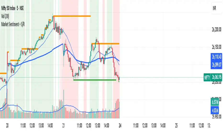
Market Sentiment + S/R KPRThis script is having VWAP and moving average cross overs. and also support and resistence.
20/50/200 EMA with RVOL Filter Hariss 369Understanding to trade with this indicator is very simple. 20 EMA acts as dynamic support and resistance. 50 EMA is best for intraday/short term trend filter and 200 EMA is best for long term trend filter. One should always trade with the trend. Combination of all threes entails safe trading with trend. Undoubtedly, volume plays vital role to move the price up or down. The volume indicator used here is Relative Volume (RVOL) rather simple volume. 1.5 RVOL is considered as strong trend to trade considering other factors intact. You can tick/untick RVOL and you can also change the level of RVOL from input section.
You can also change the color of EMAs and pattern of buy and sell signal. Place this indicator over the chart. You can choose any type of asset and any time frame.
Though buy and sell signals are there. The concept of trading is buy when price closes above 20 ema and 20 ema >50ema>200 ema. Place stop loss below the low of last candle or just below 20 ema. Target 1.5/2 times of stop loss. You can also trail it with 20 ema or 50 ema depending upon your trading style and risk appetite. You can also take positional trade, in that case 200 ema to be considered as stop loss. Sell when price closes below 20 ema, 20 ema<50ema<200 ema. For intraday trading, 20 ema is best to enter and exit. Taking RVOL into consideration is best way in order to trade with high liquidity-safer way to entry and exit.

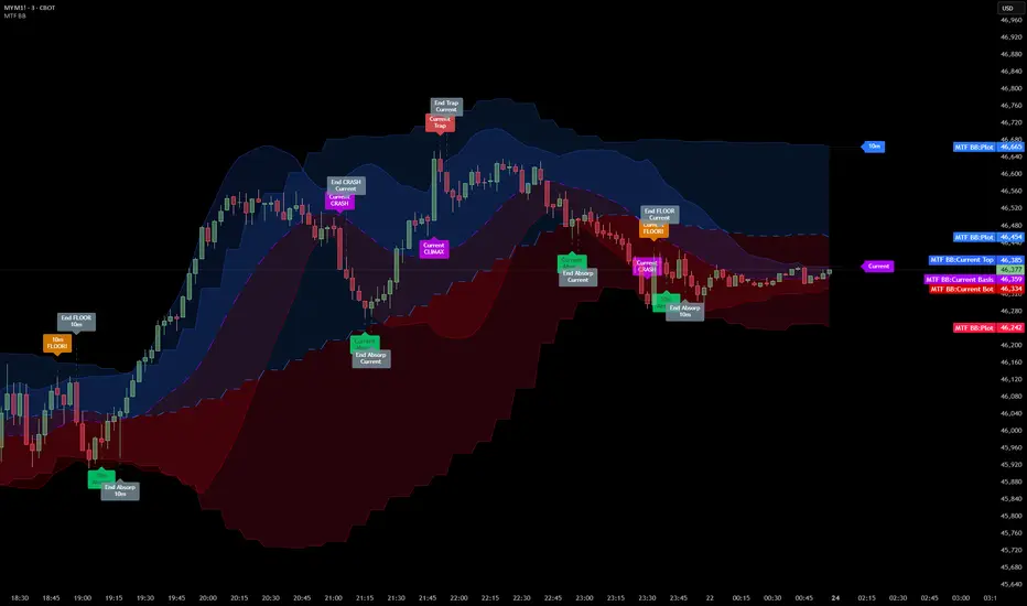
Multi Timeframe Bollinger Bands Spectrum [Ata]Multi-Timeframe Bollinger Bands Spectrum
Technical Overview
This script integrates multi-timeframe volatility analysis with volume-derived order flow estimation. By combining Bollinger Bands (statistical deviation) with internal candle volume logic, the indicator qualifies price movements to differentiate between sustained trends, reversals, and exhaustion events.
The system is designed to provide a structural context for price action, visualizing market regimes through a dual-zone spectrum and filtering signals based on the interaction between price location and specific volume thresholds.
Core Logic & Calculation
1. Volume Decomposition Algorithm
Instead of using total volume, the script estimates Buying Pressure vs. Selling Pressure based on the close position relative to the candle's High/Low range:
- Buying Volume (vb): Increases as the close approaches the High.
- Selling Volume (vs): Increases as the close approaches the Low.
This logic allows the detection of directional flow even within standard volume bars.
2. Statistical Spectrum
The indicator renders deviations from the Basis (SMA) as two distinct zones:
- Bullish Zone (Blue): Price positioning between the Basis and Upper Band.
- Bearish Zone (Red): Price positioning between the Basis and Lower Band.
This structure is applied across multiple timeframes (overlay) to visualize the macro trend context without noise.
3. Non-Repainting Execution
To ensure historical accuracy and reliability for backtesting, all higher-timeframe data is requested using "lookahead_off". Signals are confirmed only upon the closure of the respective timeframe's candle.
Signal Definitions
Signals are generated only when specific Volatility and Volume conditions intersect:
Reversal Setups (Reaction to Liquidity)
- WALL: Triggered when price rejects the Upper Band accompanied by Extreme Selling Volume (vs > Limit). This suggests active limit sell orders absorbing the rally.
- FLOOR: Triggered when price rejects the Lower Band accompanied by Extreme Buying Volume (vb > Limit). This suggests active limit buy orders absorbing the drop.
- ABSORP: Identifies absorption near the lower bands where selling pressure is met with passive buying (indicated by lower wicks and relative buy volume).
Momentum Setups (Trend Continuation)
- POWER: Validates a breakout above the Upper Band only if supported by Dominant Buying Volume and a strong candle body.
- PANIC: Validates a breakdown below the Lower Band only if supported by Dominant Selling Volume.
- TRAP: Marks failed breakouts where price exits the bands but volume analysis contradicts the move (e.g., low directional volume).
Exhaustion Setups (Statistical Extremes)
- CLIMAX/CRASH: Identifies anomalies where price deviates significantly from the mean (Extreme Deviation) or when volume reaches unsustainable levels relative to the average, often preceding a mean reversion.
Input Parameters
- Bollinger Logic: Configuration for Length and Standard Deviation Multiplier.
- Volume Thresholds: Adjustable factors for Minimum Volume (Trend) and Extreme Volume (Reversal/Climax).
- Timeframe Layers: Toggle visibility for up to 5 higher timeframes.
- Theme: Adjusts label contrast for Dark/Light backgrounds.
Disclaimer
This indicator is strictly for analytical purposes. It provides a visualization of past market data based on statistical and volumetric formulas. Users should apply their own risk management protocols.
Flux-Tensor Singularity [FTS]Flux-Tensor Singularity - Multi-Factor Market Pressure Indicator
The Flux-Tensor Singularity (FTS) is an advanced multi-factor oscillator that combines volume analysis, momentum tracking, and volatility-weighted normalization to identify critical market inflection points. Unlike traditional single-factor indicators, FTS synthesizes price velocity, volume mass, and volatility context into a unified framework that adapts to changing market regimes.
This indicator identifies extreme market conditions (termed "singularities") where multiple confirming factors converge, then uses a sophisticated scoring system to determine directional bias. It is designed for traders seeking high-probability setups with built-in confluence requirements.
THEORETICAL FOUNDATION
The indicator is built on the premise that market time is not constant - different market conditions contain varying levels of information density. A 1-minute bar during a major news event contains far more actionable information than a 1-minute bar during overnight low-volume trading. Traditional indicators treat all bars equally; FTS does not.
The theoretical framework draws conceptual parallels to physics (purely as a mental model, not literal physics):
Volume as Mass: Large volume represents significant market participation and "weight" behind price moves. Just as massive objects have stronger gravitational effects, high-volume moves carry more significance.
Price Change as Velocity: The rate of price movement through price space represents momentum and directional force.
Volatility as Time Dilation: When volatility is high relative to its historical norm, the "information density" of each bar increases. The indicator weights these periods more heavily, similar to how time dilates near massive objects in physics.
This is a pedagogical metaphor to create a coherent mental model - the underlying mathematics are standard financial calculations combined in a novel way.
MATHEMATICAL FRAMEWORK
The indicator calculates a composite singularity value through four distinct steps:
Step 1: Raw Singularity Calculation
S_raw = (ΔP × V) × γ²
Where:
ΔP = Price Velocity = close - close
V = Volume Mass = log(volume + 1)
γ² = Time Dilation Factor = (ATR_local / ATR_global)²
Volume Transformation: Volume is log-transformed because raw volume can have extreme outliers (10x-100x normal). The logarithm compresses these spikes while preserving their significance. This is standard practice in volume analysis.
Volatility Weighting: The ratio of short-term ATR (5 periods) to long-term ATR (user-defined lookback) is squared to create a volatility amplification factor. When local volatility exceeds global volatility, this ratio increases, amplifying the raw singularity value. This makes the indicator regime-aware.
Step 2: Normalization
The raw singularity values are normalized to a 0-100 scale using a stochastic-style calculation:
S_normalized = ((S_raw - S_min) / (S_max - S_min)) × 100
Where S_min and S_max are the lowest and highest raw singularity values over the lookback period.
Step 3: Epsilon Compression
S_compressed = 50 + ((S_normalized - 50) / ε)
This is the critical innovation that makes the sensitivity control functional. By applying compression AFTER normalization, the epsilon parameter actually affects the final output:
ε < 1.0: Expands range (more signals)
ε = 1.0: No change (default)
ε > 1.0: Compresses toward 50 (fewer, higher-quality signals)
For example, with ε = 2.0, a normalized value of 90 becomes 70, making threshold breaches rarer and more significant.
Step 4: Smoothing
S_final = EMA(S_compressed, smoothing_period)
An exponential moving average removes high-frequency noise while preserving trend.
SIGNAL GENERATION LOGIC
When the tensor crosses above the upper threshold (default 90) or below the lower threshold (default 10), an extreme event is detected. However, the indicator does NOT immediately generate a buy or sell signal. Instead, it analyzes market context through a multi-factor scoring system:
Scoring Components:
Price Structure (+1 point): Current bar bullish/bearish
Momentum (+1 point): Price higher/lower than N bars ago
Trend Context (+2 points): Fast EMA above/below slow EMA (weighted heavier)
Acceleration (+1 point): Rate of change increasing/decreasing
Volume Multiplier (×1.5): If volume > average, multiply score
The highest score (bullish vs bearish) determines signal direction. This prevents the common indicator failure mode of "overbought can stay overbought" by requiring directional confirmation.
Signal Conditions:
A BUY signal requires:
Extreme event detection (tensor crosses threshold)
Bullish score > Bearish score
Price confirmation: Bullish candle (optional, user-controlled)
Volume confirmation: Volume > average (optional, user-controlled)
Momentum confirmation: Positive momentum (optional, user-controlled)
A SELL signal requires the inverse conditions.
INPUTS EXPLAINED - Core Parameters:
Global Horizon (Context): Default 20. Lookback period for normalization and volatility comparison. Higher values = smoother but less responsive. Lower values = more signals but potentially more noise.
Tensor Smoothing: Default 3. EMA period applied to final output. Removes "quantum foam" (high-frequency noise). Range 1-20.
Singularity Threshold: Default 90. Values above this (or below 100-threshold) trigger extreme event detection. Higher = rarer, stronger signals.
Signal Sensitivity (Epsilon): Default 1.0. Post-normalization compression factor. This is the key innovation - it actually works because it's applied AFTER normalization. Range 0.1-5.0.
Signal Interpreter Toggles:
Require Price Confirmation: Default ON. Only generates buy signals on bullish candles, sell signals on bearish candles. Reduces false signals but may delay entry.
Require Volume Confirmation: Default ON. Only signals when volume > average. Critical for stocks/crypto, less important for forex (unreliable volume data).
Use Momentum Filter: Default ON. Requires momentum agreement with signal direction. Prevents counter-trend signals.
Momentum Lookback: Default 5. Number of bars for momentum calculation. Shorter = more responsive, longer = trend-following bias.
Visual Controls:
Colors: Customizable colors for bullish flux, bearish flux, background, and event horizon.
Visual Transparency: Default 85. Master control for all visual elements (accretion disk, field lines, particles, etc.). Range 50-99. Signals and dashboard have separate controls.
Visibility Toggles: Individual on/off switches for:
Gravitational field lines (trend EMAs)
Field reversals (trend crossovers)
Accretion disk (background gradient)
Singularity diamonds (neutral extreme events)
Energy particles (volume bursts)
Event horizon flash (extreme event background)
Signal background flash
Signal Size: Tiny/Small/Normal triangle size
Signal Offsets: Separate controls for buy and sell signal vertical positioning (percentage of price)
Dashboard Settings:
Show Dashboard: Toggle on/off
Position: 9 placement options (all corners, centers, middles)
Text Size: Tiny/Small/Normal/Large
Background Transparency: 0-50, separate from visual transparency
VISUAL ELEMENTS EXPLAINED
1. Accretion Disk (Background Gradient):
A three-layer gradient background that intensifies as the tensor approaches extremes. The outer disk appears at any non-neutral reading, the inner disk activates above 70 or below 30, and the core layer appears above 85 or below 15. Color indicates direction (cyan = bullish, red = bearish). This provides instant visual feedback on market pressure intensity.
2. Gravitational Field Lines (EMAs):
Two trend-following EMAs (10 and 30 period) visualized as colored lines. These represent the "curvature" of market trend - when they diverge, trend is strong; when they converge, trend is weakening. Crossovers mark potential trend reversals.
3. Field Reversals (Circles):
Small circles appear when the fast EMA crosses the slow EMA, indicating a potential trend change. These are distinct from extreme events and appear at normal market structure shifts.
4. Singularity Diamonds:
Small diamond shapes appear when the tensor reaches extreme levels (>90 or <10) but doesn't meet the full signal criteria. These are "watch" events - extreme pressure exists but directional confirmation is lacking.
5. Energy Particles (Dots):
Tiny dots appear when volume exceeds 2× average, indicating significant participation. Color matches bar direction. These highlight genuine high-conviction moves versus low-volume drifts.
6. Event Horizon Flash:
A golden background flash appears the instant any extreme threshold is breached, before directional analysis. This alerts you to pay attention.
7. Signal Background Flash:
When a full buy/sell signal is confirmed, the background flashes cyan (buy) or red (sell). This is your primary alert that all conditions are met.
8. Signal Triangles:
The actual buy (▲) and sell (▼) markers. These only appear when ALL selected confirmation criteria are satisfied. Position is offset from bars to avoid overlap with other indicators.
DASHBOARD METRICS EXPLAINED
The dashboard displays real-time calculated values:
Event Density: Current tensor value (0-100). Above 90 or below 10 = critical. Icon changes: 🔥 (extreme high), ❄️ (extreme low), ○ (neutral).
Time Dilation (γ): Current volatility ratio squared. Values >2.0 indicate extreme volatility environments. >1.5 = elevated, >1.0 = above average. Icon: ⚡ (extreme), ⚠ (elevated), ○ (normal).
Mass (Vol): Log-transformed volume value. Compared to volume ratio (current/average). Icon: ● (>2× avg), ◐ (>1× avg), ○ (below avg).
Velocity (ΔP): Raw price change. Direction arrow indicates momentum direction. Shows the actual price delta value.
Bullish Flux: Current bullish context score. Displayed as both a bar chart (visual) and numeric value. Brighter when bullish score dominates.
Bearish Flux: Current bearish context score. Same visualization as bullish flux. These scores compete - the winner determines signal direction.
Field: Trend direction based on EMA relationship. "Repulsive" (uptrend), "Attractive" (downtrend), "Neutral" (ranging). Icon: ⬆⬇↔
State: Current market condition:
🚀 EJECTION: Buy signal active
💥 COLLAPSE: Sell signal active
⚠ CRITICAL: Extreme event, no directional confirmation
● STABLE: Normal market conditions
HOW TO USE THE INDICATOR
1. Wait for Extreme Events:
The indicator is designed to be selective. Don't trade every fluctuation - wait for tensor to reach >90 or <10. This alone is not a signal.
2. Check Context Scores:
Look at the Bullish Flux vs Bearish Flux in the dashboard. If scores are close (within 1-2 points), the market is indecisive - skip the trade.
3. Confirm with Signals:
Only act when a full triangle signal appears (▲ or ▼). This means ALL your selected confirmation criteria have been met.
4. Use with Price Structure:
Combine with support/resistance levels. A buy signal AT support is higher probability than a buy signal in the middle of nowhere.
5. Respect the Dashboard State:
When State shows "CRITICAL" (⚠), it means extreme pressure exists but direction is unclear. These are the most dangerous moments - wait for resolution.
6. Volume Matters:
Energy particles (dots) and the Mass metric tell you if institutions are participating. Signals without volume confirmation are lower probability.
MARKET AND TIMEFRAME RECOMMENDATIONS
Scalping (1m-5m):
Lookback: 10-14
Smoothing: 5-7
Threshold: 85
Epsilon: 0.5-0.7
Note: Expect more noise. Confirm with Level 2 data. Best on highly liquid instruments.
Intraday (15m-1h):
Lookback: 20-30 (default settings work well)
Smoothing: 3-5
Threshold: 90
Epsilon: 1.0
Note: Sweet spot for the indicator. High win rate on liquid stocks, forex majors, and crypto.
Swing Trading (4h-1D):
Lookback: 30-50
Smoothing: 3
Threshold: 90-95
Epsilon: 1.5-2.0
Note: Signals are rare but high conviction. Combine with higher timeframe trend analysis.
Position Trading (1D-1W):
Lookback: 50-100
Smoothing: 5-7
Threshold: 95
Epsilon: 2.0-3.0
Note: Extremely rare signals. Only trade the most extreme events. Expect massive moves.
Market-Specific Settings:
Forex (EUR/USD, GBP/USD, etc.):
Volume data is unreliable (spot forex has no centralized volume)
Disable "Require Volume Confirmation"
Focus on momentum and trend filters
News events create extreme singularities
Best on 15m-1h timeframes
Stocks (High-Volume Equities):
Volume confirmation is CRITICAL - keep it ON
Works excellently on AAPL, TSLA, SPY, etc.
Morning session (9:30-11:00 ET) shows highest event density
Earnings announcements create guaranteed extreme events
Best on 5m-1h for day trading, 1D for swing trading
Crypto (BTC, ETH, major alts):
Reduce threshold to 85 (crypto has constant high volatility)
Volume spikes are THE primary signal - keep volume confirmation ON
Works exceptionally well due to 24/7 trading and high volatility
Epsilon can be reduced to 0.7-0.8 for more signals
Best on 15m-4h timeframes
Commodities (Gold, Oil, etc.):
Gold responds to macro events (Fed announcements, geopolitical events)
Oil responds to supply shocks
Use daily timeframe minimum
Increase lookback to 50+
These are slow-moving markets - be patient
Indices (SPX, NDX, etc.):
Institutional volume matters - keep volume confirmation ON
Opening hour (9:30-10:30 ET) = highest singularity probability
Strong correlation with VIX - high VIX = more extreme events
Best on 15m-1h for day trading
WHAT MAKES THIS INDICATOR UNIQUE
1. Post-Normalization Sensitivity Control:
Unlike most oscillators where sensitivity controls don't actually work (they're applied before normalization, which then rescales everything), FTS applies epsilon compression AFTER normalization. This means the sensitivity parameter genuinely affects signal frequency. This is a novel implementation not found in standard oscillators.
2. Multi-Factor Confluence Requirement:
The indicator doesn't just detect "overbought" or "oversold" - it detects extreme conditions AND THEN analyzes context through five separate factors (price structure, momentum, trend, acceleration, volume). Most indicators are single-factor; FTS requires confluence.
3. Volatility-Weighted Normalization:
By squaring the ATR ratio (local/global), the indicator adapts to changing market regimes. A 1% move in a low-volatility environment is treated differently than a 1% move in a high-volatility environment. Traditional indicators treat all moves equally regardless of context.
4. Volume Integration at the Core:
Volume isn't an afterthought or optional filter - it's baked into the fundamental equation as "mass." The log transformation handles outliers elegantly while preserving significance. Most price-based indicators completely ignore volume.
5. Adaptive Scoring System:
Rather than fixed buy/sell rules ("RSI >70 = sell"), FTS uses competitive scoring where bullish and bearish evidence compete. The winner determines direction. This solves the classic problem of "overbought markets can stay overbought during strong uptrends."
6. Comprehensive Visual Feedback:
The multi-layer visualization system (accretion disk, field lines, particles, flashes) provides instant intuitive feedback on market state without requiring dashboard reading. You can see pressure building before extreme thresholds are hit.
7. Separate Extreme Detection and Signal Generation:
"Singularity diamonds" show extreme events that don't meet full criteria, while "signal triangles" only appear when ALL conditions are met. This distinction helps traders understand when pressure exists versus when it's actionable.
COMPARISON TO EXISTING INDICATORS
vs. RSI/Stochastic:
These normalize price relative to recent range. FTS normalizes (price change × log volume × volatility ratio) - a composite metric, not just price position.
vs. Chaikin Money Flow:
CMF combines price and volume but lacks volatility context and doesn't use adaptive normalization or post-normalization compression.
vs. Bollinger Bands + Volume:
Bollinger Bands show volatility but don't integrate volume or create a unified oscillator. They're separate components, not synthesized.
vs. MACD:
MACD is pure momentum. FTS combines momentum with volume weighting and volatility context, plus provides a normalized 0-100 scale.
The specific combination of log-volume weighting, squared volatility amplification, post-normalization epsilon compression, and multi-factor directional scoring is unique to this indicator.
LIMITATIONS AND PROPER DISCLOSURE
Not a Holy Grail:
No indicator is perfect. This tool identifies high-probability setups but cannot predict the future. Losses will occur. Use proper risk management.
Requires Confirmation:
Best used in conjunction with price action analysis, support/resistance levels, and higher timeframe trend. Don't trade signals blindly.
Volume Data Dependency:
On forex (spot) and some low-volume instruments, volume data is unreliable or tick-volume only. Disable volume confirmation in these cases.
Lagging Components:
The EMA smoothing and trend filters are inherently lagging. In extremely fast moves, signals may appear after the initial thrust.
Extreme Event Rarity:
With conservative settings (high threshold, high epsilon), signals can be rare. This is by design - quality over quantity. If you need more frequent signals, reduce threshold to 85 and epsilon to 0.7.
Not Financial Advice:
This indicator is an analytical tool. All trading decisions and their consequences are solely your responsibility. Past performance does not guarantee future results.
BEST PRACTICES
Don't trade every singularity - wait for context confirmation
Higher timeframes = higher reliability
Combine with support/resistance for entry refinement
Volume confirmation is CRITICAL for stocks/crypto (toggle off only for forex)
During major news events, singularities are inevitable but direction may be uncertain - use wider stops
When bullish and bearish flux scores are close, skip the trade
Test settings on your specific instrument/timeframe before live trading
Use the dashboard actively - it contains critical diagnostic information
Taking you to school. — Dskyz, Trade with insight. Trade with anticipation.

Turnover (Volume * HLC/3)Let's get the elephant out of the room. Everyone knows volume is the key to validate price movement, but you can't compare two volume candles of the same stock when the price is 3 times different you need to account for that. So here it is, Turnover chart, to replace volume entirely, because why would you look at volume when you can look at turnover instead?

Hull VWMA Crossover StrategyA simple variation on the Hull Moving Average which reacts faster to high volume events, making it more responsive in those cases than even the standard Hull average -- CREDIT GOES TO Saolof - -- Edited into a strategy with some more options that im going to continue to refine. LMK if theres any features or confluence you want me to add -- cheers!

Current Year OHLMV Pro+Current Year OHLV + Anchored VWAP – Professional Edition
OVERVIEW
Real-time display of the current calendar year’s developing Open, High, Low, Close (live), and anchored VWAP with a full-size current-year candle in the right margin.
IMPLEMENTATION & VALUE ADDED
• Live anchored VWAP as a major yearly fair-value line
• Full current-year candle rendered in the right margin
• All levels as exportable plots
• Comprehensive alerts on every level and VWAP interaction
HOW TO USE
Apply to weekly or daily charts. The live VWAP and right-margin candle provide macro-level bias and yearly anchor points.
CREDIT & TRANSPARENCY
Core methodology: public domain (Current Year OHLC + Anchored VWAP).
Independent implementation with original live candle display and features.
DISCLAIMER
For educational and informational purposes only. Not financial advice. Test thoroughly.
