Financial Intelligent Eval [Fundamental] (MYTRIC)█ OVERVIEW
Financial Algorithm is a system to quickly understanding company fundamental, and judge the company type based on their financial condition.
All evaluation from the system is the result of combination with Balancing Calculation and Company Historical Financial Data(Financial Report) by using over than 30 financial ratios.
This indicator are classified into 5 level (Very Weak, Weak, Moderate, Good, Excellent)
Advantages of Financial Algorithm
• By combining and calculating company's latest 4 quarterly report, provide rating to help investor quickly know about company's fundamentals and financial performance.
• Able to identify company have what kind of strength, weakness, chance and threat. For instance, according to current economic situation, is it an advantages or a threat for a company, investor can identify it via Financial Algorithm.
• Able to identify which company have better business management by keep following the company rating, observe the improvement level of company's.
Application
*When notice there are not improvement on a company's fundamentals or financial performance which is profitable without further developing, it usually reveals the lack of management capability to generate more value, company unable to fully utilise its profit, reinvest and expanding its business to become more competitive. Sometimes this kind of company may be suspected accounting fraud.
█ BENEFITS
• Avoid investing in companies suspected of financial fraud.
• To quickly understanding company's fundamental and financial structure.
• Able to analyze whether the company build profit after it is used to optimize the company's internal
█ FEATURES
You can configure the following attributes of the display:
• Table position on your chart.
• The size and colour of text.
• Language between English and Chinese.
• Rating bar chart colour.
• On / Off Statement Review Helper Function
• On / Off 3 Years Evaluation Function
• On / Off Basic Information
• Full descriptions of each evaluation and content are included in the settings
█ LIMITATIONS
• When changing the indicator's inputs, allow around 20 seconds calculation for the change to be reflected in the display.
• This system only able to evaluate non-financial industry.
• This system is based on company's historical financial report data to generate the results and rating, it does not includes prediction from any external factor.
(External Factor: Business Model, Business Distribution & Geography, Corporate Structure, Competitor and Peer company's, Prospect, Costing Breakdown, Disaster and etc)
• Any results calculated by this system all is based on data provided by Tradingview, Data may have some tolerance, we recommend that users pay attention to the official quarterly/annual report.
█ FINANCIALS INTELLIGENT ALGORITHM FUNCTION
This lists all combination calculate financials.
01. Total Revenue
02. Earnings before interest and tax
03. Net Income
04. Property, Plant, and Equipment
05. Total Receivables
06. Cash and short-term Investments
07. Cash & Cash equivalents
08. Total Liability
09. Working Capital
10. Total Debt
11. Total Equity
12. Retained Earnings
13. Total Asset
14. Cash From Operating Activities
15. Income before extraordinary items
16. Total depreciation and amortization
17. Free Cash Flow
18. Altman Z-score
19. Cash to Debt Ratio
20. Current Ratio
21. Debt to Assets Ratio
22. Debt to Equity ratio
23. EBITDA Margin
24. Free Cash Flow Margin
25. Grahams Number
26. Net Margin
27. Price Book Ratio
28. Piotroski-F Score
29. Quick Ratio
30. Return on Assets
31. Return on Equity
32. Return on Invested Capital
33. Float Shares Outstanding
34. Total Common Shares Outstanding
35. Cash to Revenue
36. Cash to Market Capital
37. Cash to Debt
38. Receivable Turnover
39. Quality of Earning
40. Market Capital
8 financial evaluation :
3 years financial evaluation tracking :
Statement Review Helper :
█ HOW TO MAKE THE RIGHT INVESMENT OR TREND TRADING DECISION BASED ON OUR EVALUATION
Avoid mid/long term invest in companies with poor financial evaluation, only suite for trend trading. The below following assessments need to be focused.
• Comprehensive rating is poor or below.
• Quality of Earning is very poor or below.
• Receivability is very poor or below (Total Receivable is too high)
• Before : Poor Financial Strength with revenue growth
• After : The price dropped by about -80% within 2 months
███████████████████████████████████████████████████████████████████████████████████████████
• Before : Poor Financial Strength with revenue growth
• After : The price dropped by about -90% within 1 year
███████████████████████████████████████████████████████████████████████████████████████████
• Before : Excellent Financial Strength
• After : Steady growth
Steady growth
• Conclusion :
Do not judge it as a good company just because it has continuous income.
When we analyze the company's financial report, we should not only look at the company's revenue,
we should pay more attention to the company's finances and weaknesses.
Only companies with strong financial strength that can expand their business in a stable manner.
Disclaimer :
*The following conclusion are purely based on my personal opinions and views, it’s only for study and research, without any trading and investment advice.
Analysis

Key Financials on ChartA simple table with a couple of key financials
The metrics are (top to bottom and left to right):
- Market cap
- P/S-ratio and forward P/S-ratio
- P/E-ratio and P/FCF-ratio
- Debt/Equity and Assets/Equity ratios
- Price/Book-ratio and Operating Margin
- Pietrosky F-Score and current Dividend Yield
should be enough to get a first idea about fundamentals of growth or value-stocks...

TradingGroundhog - Fundamental Analysis - Multiple RSI Ema(Script Available Version of my previous Fundamental Analysis - Multiple RSI Ema )
As the number of crypto currencies is expanding, we need to find the one which will boom in the next months, weeks or even days.
Therefore, I present to you a Fundamental Analysis tool based on RSI built in order to compare the RSI between the diverse cryptocurrencies.
When cryptocurrencies start to trend, become active, minable and especially "buyable", people are investing their money into them.
As a result,the Daily RSI rises and the price of the crypto in question increases steadily.
With "Fundamental Analysis - Multiple RSI EMA" you can :
Follow up to 20 RSI from different exchanges at the same time.
Find easily Increasing/Decreasing RSI as the lines get transparent if their RSI decrease.
You can also select market with high potential of booming as :
Booming Market : 60 < Daily RSI <= 100 (Strong green background)
Potent Market : 55 < Daily RSI <= 60 (Light green background)
Sleepy Market : 50 < Daily RSI <= 55 (Light red background)
Dying Market : 0 < Daily RSI <= 50 (Strong red background)
Futur booming crypto will go from the Potent Market to the Booming Market
Can be used with the following time frames depending on the necessity:
4H
Daily (Preferred)
Weekly
Monthly
Good trades !
Disclaimer (As it should always be one to any script)
***
This script is intended for and only to be used for personal purposes only. No such information provided by it constitutes advice or a recommendation for any investment or trading strategy for any specific person. There is no guarantee presented or implied as to the accuracy of specific forecasts, projections, or predictive statements offered by the script. Users of the script agree that its original developer does not take responsibility for any of your investment decisions. Please seek professional advice before trading.
***

Fibonacci Moving AverageThe Fibonacci Moving Average is a powerful indicator that takes into account many underlying moving averages to give out an approximate short-term/long-term view of the markets. Its strength lies with dynamic support and resistance levels. I have created this indicator in order to improve trend-following entry positions.

Fundamental Analysis - Multiple RSI EMAAs the number of crypto currencies is expanding, we need to find the one which will boom in the next months, weeks or even days.
Therefore, I present to you a Fundamental Analysis tool based on RSI built in order to compare the RSI between the diverse cryptocurrencies.
When cryptocurrencies start to trend, become active, minable and especially "buyable", people are investing their money into them.
As a result,the Daily RSI rises and the price of the crypto in question increases steadily.
With "Fundamental Analysis - Multiple RSI EMA" you can :
Follow up to 20 RSI from different exchanges at the same time.
Find easily Increasing/Decreasing RSI as the lines get transparent if their RSI decrease.
You can also select market with high potential of booming as :
Booming Market : 60 < Daily RSI <= 100 (Strong green background)
Potent Market : 55 < Daily RSI <= 60 (Light green background)
Sleepy Market : 50 < Daily RSI <= 55 (Light red background)
Dying Market : 0 < Daily RSI <= 50 (Strong red background)
Futur booming crypto will go from the Potent Market to the Booming Market
Can be used with the following time frames depending on the necessity:
4H
Daily (Preferred)
Weekly
Monthly
Good trades !
Disclaimer (As it should always be one to any script)
***
This script is intended for and only to be used for personal purposes only. No such information provided by it constitutes advice or a recommendation for any investment or trading strategy for any specific person. There is no guarantee presented or implied as to the accuracy of specific forecasts, projections, or predictive statements offered by the script. Users of the script agree that its original developer does not take responsibility for any of your investment decisions. Please seek professional advice before trading.
***

© AlpHay : SECURITY FUNDAMENTAL TABLE// Equity Fundamental Data Report Table:
// Data Provider: Tradingview
// I am not a financial advisor or expert.
// This is my interpretation of this data. Consider this data doesn't represent the whole picture of what is going on!
// If you find some fundamentally wrong thinking about this approach, please inform me.
// I am open to suggestions. I am also looking for answers.
// Use it with a daily timeframe for data consistency.
// You can change or customize the threshold values whatever you want.
// www.tradingview.com

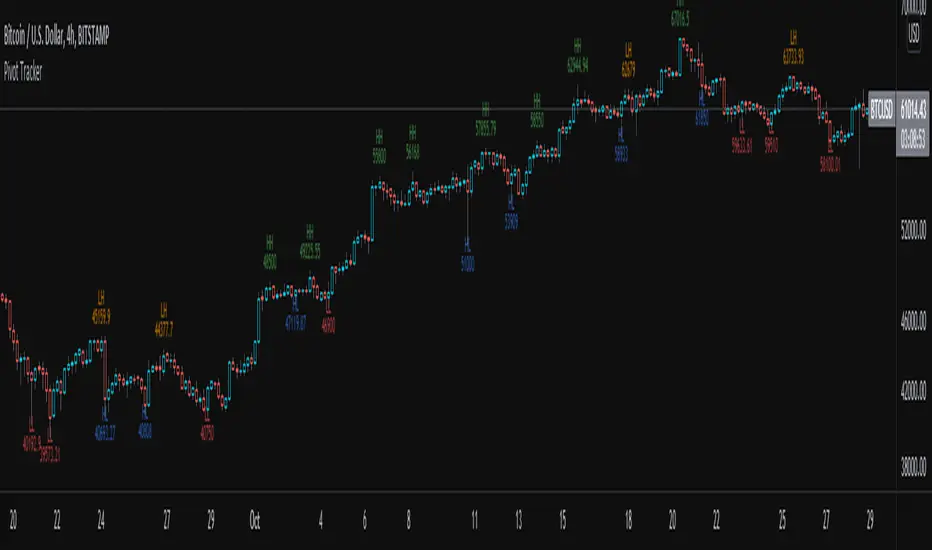
Pivot TrackerThis script finds swing lows and swing highs based on input criteria for lookback and lookforward periods, and plots letters accordingly.
Helps identify trend or lacktherof
HH = higher high
LH = lower high
HL = higher low
LL = lower low
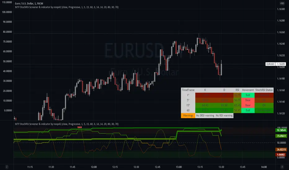
Multi timeframe Stochastic RSI Screener by noop42Here is a custom x4 timeframes Stochastic RSI screener to add on your charts.
Options
Repaint mode : if enabled: values are updated in live, if disabled: values are updated once the concerned candle is closed
Default parameters
Timeframes: 1, 5, 15, 60
Repaint mode: enabled
Notes
Use the lowest timeframe configured on the screener to get real values
A classic x3 multi-timeframe Stochastic RSI indicator is also available
Volume Pressure AnalysisVolume Pressure Analysis is a new concept I have been working on designed to show the effort required to move price. An ideal tool for confirming trends or locating reversals early. This indicator can highlight whale action and market manipulation. It calculates volume vs volatility and displays the results as a meter:
Above 0 shows how easy price action is traveling, the bigger these bars the less volume and effort is required to push price. These are indicated with a teal or red arrows and can confirm the beginning or continuation of a trend. This is the natural direction the chart wants to travel at that time.
Below 0 shows how hard price is to move. The bigger these bars the more volume and effort is required to push price. When whales and market makers push price against its will these bars will get bigger.
Yellow arrows signal pressure in that direction and excessive amounts of volume is required to move price. These signals can lead to reversal/ pivot points as price action struggles to continue its trend. These signals can be turned on in settings or use the overlay version of this script to display signals on chart. This is a very powerful tool when used with relative volume.
Volume Pressure Analysis - OverlayVolume Pressure Analysis is designed to show effort required to move price. This script is the overlay version that displays signals on the candles as well as changes the bar colors. Yellow arrows signal pressure in that direction and excessive amounts of volume is required to move price. These signals can lead to reversal/pivot points as price action struggles to continue its trend. Red and teal arrows indicate free flowing price action where very little effort or volume is needed to push price. These signals can confirm the beginning or continuation of a trend and is the natural direction the chart wants to travel at that time. For more information please check out the main Volume Pressure Analysis indicator.

Percentile - Price vs FundamentalsThis is done in the same lines of below scripts
Drawdown-Price-vs-Fundamentals
Drawdown-Range
Instead of using drawdown, here we are only plotting percentile of drawdown. Also added few more fundamental stats to the indicator. Also using part of the code from Random-Color-Generator/ to automatically generate colors. This in turn uses code from @RicardoSantos for convering color based on HSL to RGB
This is how the study can be used:
Study plots percentile of price and each of the listed fundamentals based on history. History can be chose All time or particular window. If any fundamental or price is near 100 - which means it is nearer to its peak. And if something is near its bottom, it is nearer to its 0th percentile.
Price of the stock is considered undervalued based on historical levels when it is below most of the fundamentals. Price is considered overvalued based on historical levels when it is above all the fundamentals. Please note, being undervalued does not guarantee immediate mean reversion. Stocks can stay undervalued for prolonged time and can go further down. Similarly overvalued stock can stay overvalued for prolonged time before correcting itself or justifying the position. Hence, further discretion needs to be used while using this study.
Few examples:
AMZN seems to be trading in range and so are the fundamentals:
MSFT at peak along with half of the fundamentals. But, debt levels are going up along with margins reducing.
LPX is trading at 15% discount whereas most of the fundamentals are at the peak.
FLGT price seems to have gone down further whereas fundamentals look pretty healthy.

Drawdown RangeHello death eaters, presenting a unique script which can be used for fundamental analysis or mean reversion based trades.
Process of deriving this table is as below:
Find out ATH for given day
Calculate the drawdown from ATH for the day and drawdown percentage
Based on the drawdown percentage, increment the count of basket which is based on input iNumber of ranges . For example, if number of ranges is 5, then there will be 5 baskets. First basket will fit drawdown percentage 0-20% and each subsequent ones will accommodate next 20% range.
Repeat the process from start to last bar. Once done, table will plot how much percentage of days belong to which basket.
For example, from the below chart of NASDAQ:AAPL
We can deduce following,
Historically stock has traded within 1% drawdown from ATH for 6.59% of time. This is the max amount of time stock has stayed in specific range of drawdown from ATH.
Stock has traded at the drawdown range of 82-83% from ATH for 0.17% of time. This is the least amount of time the stock has stayed in specific range of drawdown from ATH.
At present, stock is trading 2-3% below ATH and this has happened for about 2.46% of total days in trade
Maximum drawdown the stock has suffered is 83%
Lets take another example of NASDAQ:TSLA
Stock is trading at 21-22% below ATH. But, historically the max drawdown range where stock has traded is within 0-1%. Now, if we make this range to show 20 divisions instead of 100, it will look something like this:
Table suggests that stock is trading about 20-25% below ATH - which is right. But, table also suggests that stock has spent most number of days within this drawdown range when we divide it by 20 baskets instad of 100. I would probably wait for price to break out of this range before going long or short. At present, it seems a stage ranging stage. I might think about selling PUTs or covered CALLs outside this range.
Similarly, if you look at AMEX:SPY , 36% of the time, price has stayed within 5% from ATH - makes it a compelling bull case!!
NYSE:BABA is trading at 50-55% below ATH - which is the most it has retraced so far. In general, it is used to be within 15-20% from ATH
NOW, Bit of explanation on input options.
Number of Ranges : Says how many baskets the drawdown map needs to be divided into.
Reference : You can take ATH as reference or chose a time window between which the highest need to be considered for drawdown. This can be useful for megacaps which has gone beyond initial phase of uncertainity. There is no point looking at 80% drawdown AAPL had during 1990s. More approriate to look at it post 2000s where it started making higher impact and growth.
Cumulative Percentage : When this is unchecked, percentage division shows 0-nth percentage instad of percentage ranges. For example this is how it looks on SPY:
We can see that SPY has remained within 6% from ATH for more than 50% of the time.
Hope this is helpful. Happy trading :)
PS: this can be used in conjunction with Drawdown-Price-vs-Fundamentals to pick value stocks at discounted price while also keeping an eye on range tendencies of it.
Thanks to @mattX5 for the ideas and discussion today :)

Drawdown - Price vs FundamentalsIn this study, we are trying to compare drawdown from ATH of price and fundamentals to understand if price drawdown is really justifyable or if this is the buying opportunity.
For example, NYSE:BABA in the chart below shows that price has come down by more than 50%. But, the fundamentals has not changed upto this extent.
This may be viewed as buying opportunity from the eyes of fundamental based trader.
Similarly NYSE:LPX is trading at 15% below ATH whereas fundamentals are at peak. This again can be considered as buying opportunity.
NASDAQ:AAPL on the other hand is trading almost near ATH whereas fundamentals are having higher drawdown.
Well, this is just one factor to consider. I am about to release another script which can demonstrate amount of time (in terms of percentage) instrument trades at certain drawdown range. This looks something like this:
These two scripts can be used in conjunction to define your fundamental based trade.
I can add more funcamentals to the list. But, the higher value of fundamental should correlate to better position. Hence we cannot use things such as PE (which inversely correlates to value). Also need to keep the factor which includes total number of shares in it so that it is not affected by share dilution. Hence, have considered Total Revenue per Share instead of Total Revenue in this script.
Thanks to @mattX5 for suggesting fundamental based ideas in this line :)

Fundamnetals + Strength + RiskManagementCreated indicator to help investors by providing fundamental, technical and Risk Management information on screen for better decision making
you can see
Fundamentals
- Solvency,
- Liquidity
- Growth,
- Profitability
- Patrioski Score
- Altman Z-Score
Technicals
- MAs
- Oscillators
Risk Management
- Position Size
- Stop Loss
- Total Investment
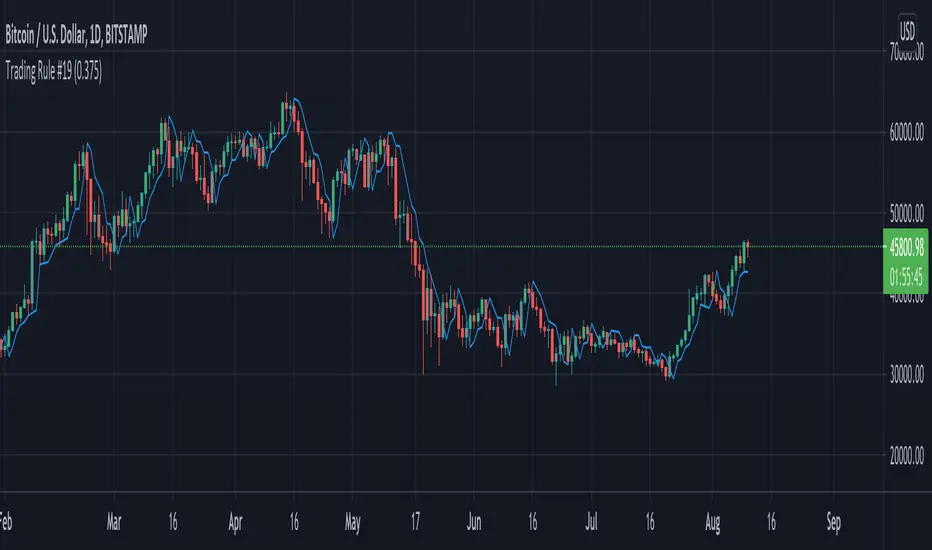
Trading Rule #19This script is based on Trading Rule #19 from Chester Keltner's book How To Make Money On Commodities. It is best applied to candlestick charts with longer time frames and plans with minimal losses (i.e. swing trades). The rule is based on "Key" trend days (this is applied to daily charts in the book).
An initial Key-Up day is established on the third day of 3 consecutive new highs. Subsequent key-up days are determined as follows:
1. The first day following an initial key-up day trades 0.375% above the previous key-up day
2. The second day or any following day trades 0.125% above the previous key-up day
An initial Key-Down day is established on the third day of 3 consecutive new lows. Subsequent key-down days are determined as follows:
1. The first day following an initial key-up day trades 0.375% below the previous key-down day
2. The second day or any following day trades 0.125% below the previous key-down day
Green candles are considered up-trend, red candles are down-trend. Gray candles are undecided - when there is a new high and low in the same time frame, when there is no new high or low in that time frame, or the order price was cleared.
Order prices are represented as a blue line, with some days being "na" when order prices remain unchanged. On key-up days, orders are placed 0.375% below the low of the previous key-up day or the day previous (whichever is lower). Order prices on key-down days are placed 0.375% above the high of the previous key-down day or the day previous (whichever is higher).
The tolerance setting mainly effects the plot point of order price, at a certain point key-trend rules will take priority over order price (meaning if tolerance is high enough, order price will have no effect on determining key-trends).
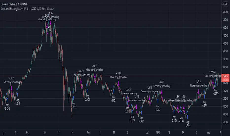
Supertrend LSMA long StrategyThis is a long strategy which combines Super trend indicator with LSMA moving average.
In general it tends to works better with long trending markets such as stocks and cryptos using a big timeframe.
The rules are simple
Long entry:
Supertrend is telling us to go long and close of a candle is above moving average
Long exit:
Supertrend is telling us to go short
IF you have any questions, let me know !
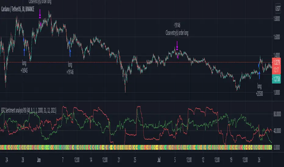
BTC Sentiment analysis RSI 2xEMAThis is a CRYPTO correlation strategy, which is using BTC sentiment with BITFINEX long and short ratios.
WIth them we are making from one side 2 RSI, one for long and another for short. And from another side, we are going to make multiple EMA's, using the ratios for long and short.
Rules for entry
For this scenario I created a long only strategy.
The long entry condition is : we have a crossover of the rsi long ratio with rsi short ratio and long ratio from BITFINEX is above the long EMA and short ratio from BITFINEX is below short EMA.
We exit when we get the opposite condition, in this case we have a crossunder of the rsi long ratio with rsi short ratio and long ratio from BITFINEX is below the long EMA and short ratio from BITFINEX is above short EMA.
If you have any questions, let me know !
Relative Fundamental ComparisonWhen dealing with stocks, I like to review basic fundamentals of the company. This script displays the fundamental ratios of base chart stock with three other stocks (I can’t increase the number due to security function limitations). I found it particularly important when dealing with an unknown company. I quickly compare the company with other industry leaders to get a comparative fundamental review.
I am very new to Pinescript, so waiting for your comments and review.

Climatic Volume indicator Buy/Sell ENGLISH
this indicator is contrarian and it's use in my strategy
Strategy: when price falls the graph show as two moments with panic during the downtrend: two candlesticks of panic
Both candlesticks are associating with two Volume climatic bars (when volumen double the average volume of last 10 bars). In that moment the institutions buy (remember, the institutions only buy during panic and sell in the euphoria moment because they generate a new trend in the market)
Buy Signal: Bear candlestick with climatic volume in downtrend (first institutions buying) + a few candlesticks more with low volume (lower than average volume of last 10 bars) + second candlestick climatic volume in downtrend (last institutions buying before the new trend)
Moving Stop Loss to break even or first sell of us: bull candlestick with climatic volume associated in uptrend (first take profit of institutions)
Sell Signal: Second bull candlestick with climatic volume associated in uptrend (in this moment the institutions take profit in the timeframe where we are operating and wait for a future new swing)
ESPAÑOL
El indicador es un indicador contratendencial
Estrategia: Cuando el precio cae el grafico nos muestra dos momentos de pánico durante la tendencia bajista: dos velas japonesas de panic
ambas velas japonesas están asociadas a dos barras de volumen climático (un volumen que supera en un 100% el volumen promedio de las ultimas 10 barras). En ese momento las instituciones compran (recuerden que las instituciones compran durante el pánico y venden durante la euforia porque ellos generan una nueva tendencia en el mercado)
Señal de compra: vela japonesa bajista con un volumen climático asociado en una tendencia bajista (primera compra de instituciones) + algunas velas japonesas con bajo volumen + una segunda vela japonesa con volumen climático en una tendencia bajista (la ultima compra de institucionales antes de la nueva tendencia)
Mover stop loss a precio de entrada o hacer nuestra primera venta: vela japonesa alcista con volumen climático asociado en una tendencia alcista (primera toma de ganancias de institucionales)
Señal de venta: Segunda vela japonesa con volumen climático asociado en una alcista (en ese momento las instituciones toman ganancias en el timeframe donde estamos operando y esperan un nuevo swing futuro)

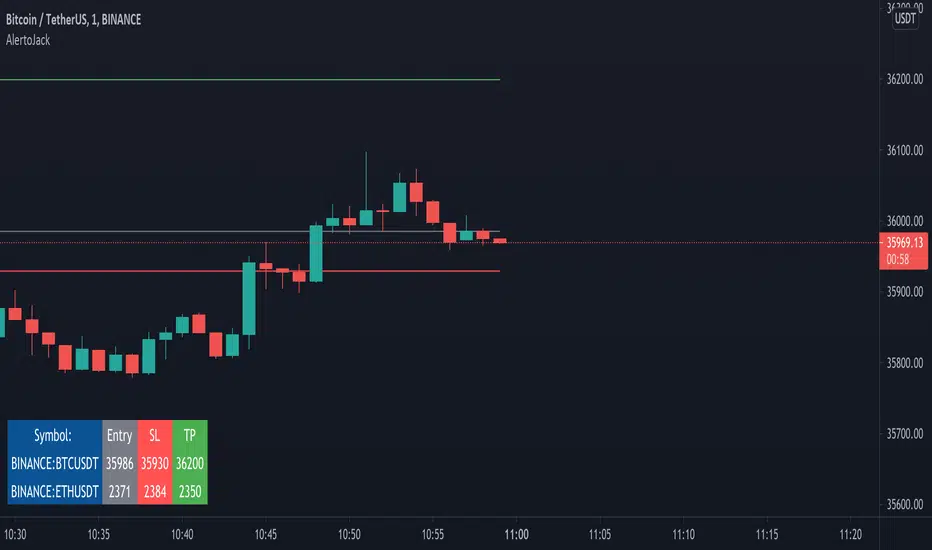
AlertoJack AlertoJack
v0.1a
coded by Bogdan Vaida
This indicator was created to provide easily defined alerts on multiple symbols.
It's still POC code.
Usage:
- Add it on any coin,
- The chart timeframe will be the timeframe for the alerts;
- Configure it with the symbols you want to be alerted on,
- Add the prices to be alerted for,
- Use Add Alert -> condition AlertoJack -> "Any alert() function call"
- Check the Alerts log.
Notes:
- Alert happens when candle crosses the price.
- Because of how Trading View functions, if you modify the indicator settings
you'll need to add the alerts again (because an alert uses the code version
it was created from).
- The alert runs once per current bar's timeframe (e.g. once per minute
if you're on the 1m).
Relative Growth ScreenBased on the Growth Range indicator published here:
Instead of plotting, they are printed in color coded table. Colors say whether the growth rate of these factors are relatively higher or lower.
Similar to quality screen, table positions can be customized.
If you have big enough screen, you can fit both quality and growth screens this way:
s3.tradingview.com

Moving Average Slope AnalysisThis is a simple script which allows to do slope analysis on any kind of Moving Average. Simply change the moving average function that you wish to work with , in the script.
Slope analysis may be required for fine-tuning trade automation software , which uses Moving Average for determining optimum enter/exit point.
Read code comments for instructions!
Value RangeHere is another attempt to chase value based on technical analysis.
This is extended version of PE range script published earlier.
Instead of just PE, this script contains several other factors which defines value. You can chose which factor to look at from input dialog:
Possible value factors included in this script are:
Price to Earnings
Price to Sales
Price to Book
PE - Forwarding
PS - Forwarding
Price to Cashflow
Enterprise Value to EBITDA
Enterprise Value to Cashflow
Some of these can be added to chart directly from financials. But, the script also calculate range based on donchian channel or bollinger bands. Instead of short periods, we are looking for periods in terms of years. Rest of things remain same.
