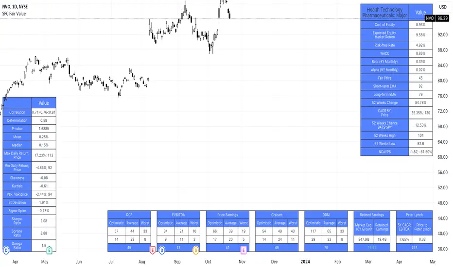
SFC Valuation Model - Fair ValueValuation is the analytical process of determining the current (or projected) worth of an asset or a company. There are many techniques used for doing a valuation. An analyst placing a value on a company looks at the business's management, the composition of its capital structure, the prospect of future earnings, and the market value of its assets, among other metrics.
Fundamental analysis is often employed in valuation, although several other methods may be employed such as the capital asset pricing model (CAPM) or the dividend discount model (DDM), Discounted Cash Flow (DCF) and many others.
A valuation can be useful when trying to determine the fair value of a security, which is determined by what a buyer is willing to pay a seller, assuming both parties enter the transaction willingly. When a security trades on an exchange, buyers and sellers determine the market value of a stock or bond.
There is no universal standard for calculating the intrinsic value of a company or stock. Financial analysts attempt to determine an asset's intrinsic value by using fundamental and technical analyses to gauge its actual financial performance.
Intrinsic value is useful because it can help an investor understand whether a potential investment is overvalued or undervalued.
This indicator allows investors to simulate different scenarios depending on their view of the stock's value. It calculates different models automatically, but users can define the fair value manually by changing the settings.
For example: change the weight of the model; choose how conservatively want to evaluate the stock; use different growth rate or discount rate and so on.
The indicator shows other useful metrics in order to help investors to evaluate the stock.
This indicator can save users hours of searching financial data and calculating fair value.
There are few valuation methods/steps
- Macroeconomics - analyse the current economic;
- Define how the sector is performing;
- Relative valuation method - compare few stocks and find the Outlier;
- Absolute valuation method historically- define how the stock performed in the past;
- Absolute valuation method - define how the stock is performed now and find the fair value;
- Technical analysis
How to use:
1. Once you have completed the initial evaluation steps, simply load the indicator.
2. Check the default settings and see if they suit you.
3. Find the fair value and wait for the stock to reach it.
Analysis
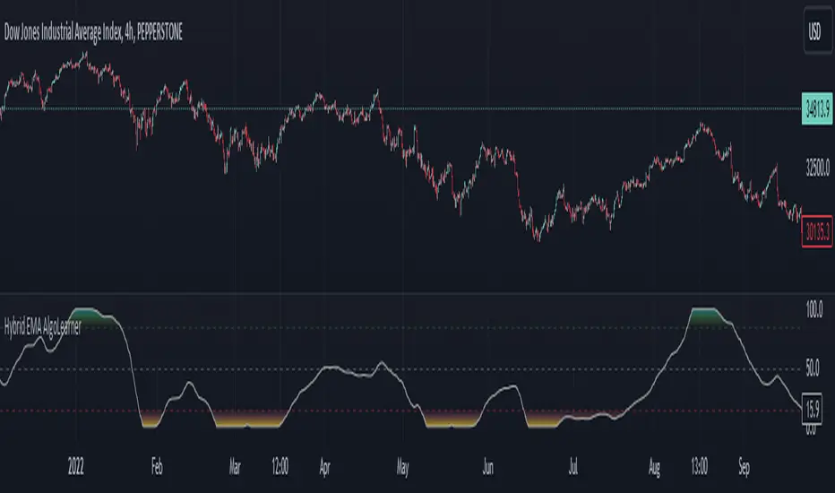
Hybrid EMA AlgoLearner⭕️Innovative trading indicator that utilizes a k-NN-inspired algorithmic approach alongside traditional Exponential Moving Averages (EMAs) for more nuanced analysis. While the algorithm doesn't actually employ machine learning techniques, it mimics the logic of the k-Nearest Neighbors (k-NN) methodology. The script takes into account the closest 'k' distances between a short-term and long-term EMA to create a weighted short-term EMA. This combination of rule-based logic and EMA technicals offers traders a more sophisticated tool for market analysis.
⭕️Foundational EMAs: The script kicks off by generating a 50-period short-term EMA and a 200-period long-term EMA. These EMAs serve a dual purpose: they provide the basic trend-following capability familiar to most traders, akin to the classic EMA 50 and EMA 200, and set the stage for more intricate calculations to follow.
⭕️k-NN Integration: The indicator distinguishes itself by introducing k-NN (k-Nearest Neighbors) logic into the mix. This machine learning technique scans prior market data to find the closest 'neighbors' or distances between the two EMAs. The 'k' closest distances are then picked for further analysis, thus imbuing the indicator with an added layer of data-driven context.
⭕️Algorithmic Weighting: After the k closest distances are identified, they are utilized to compute a weighted EMA. Each of the k closest short-term EMA values is weighted by its associated distance. These weighted values are summed up and normalized by the sum of all chosen distances. The result is a weighted short-term EMA that packs more nuanced information than a simple EMA would.
OrderBlock [kyleAlgo]The principle of this indicator
ATR (Average True Range) Setting: The code uses ATR to help calculate the Supertrend indicator.
Supertrend Trend Direction: Identify bullish and bearish trends with the Supertrend method.
Order Block Recognition: This part of the code recognizes and creates order blocks, visualizing them as boxes on the chart. If the number of blocks exceeds the maximum limit, old blocks will be deleted.
Function to prevent overlapping: check whether the new order block overlaps with the existing order block through the isOverlapping function.
Order block color setting: The code sets the color according to whether the block is bullish or bearish, and whether it breaks above or below. Afterwards the color of the existing order blocks will be updated.
Sensitivity settings: Through the input settings of factor and atrPeriod, the sensitivity of Supertrend and the detection of order blocks can be affected.
Visualization: Use TradingView's box.new function to draw and visualize order blocks on the chart.
Practicality:
Support and Resistance Levels: Order blocks may represent areas of support and resistance in the market. By visualizing these areas, traders can better understand when price reversals are likely to occur.
Trading Signals: Traders may be able to identify trading signals based on the color changes of blocks and price breakouts. For example, if the price breaks above a bullish block, this could be a signal to buy.
Risk Management: By using ATR to adjust the sensitivity of Supertrend, the symbol helps traders to adjust their strategies according to market volatility. This can be used as a risk management tool to help identify stop loss and take profit points.
Multi-timeframe analysis: Although the code itself does not implement multi-timeframe analysis directly, it can be done by applying this indicator on different timeframes. This helps to analyze the market from different angles.
Flexibility and Customization: Through sensitivity settings, traders can customize the indicator according to their needs and trading style.
Reduced screen clutter: By removing overlapping order blocks and limiting the maximum number of order blocks, this code helps reduce clutter on charts, allowing traders to analyze the market more clearly.
Overall, this "Pine Script" can be a powerful analytical tool for trend traders and those looking to improve their trading decisions by visualizing key market areas. It can be used alone or combined with other indicators and trading systems for enhanced functionality.

External Indicator Analysis Overlay | Buy/Sell | HTF Heikin-AshiThis chart overlay offers multiple candlestick display options. The Regular (Japanese) and the Heikin-Ashi candles are well known. The Mari-Ashi (or Renko) option is something special as it should be timeframe independent, so that sideways action should be represented in one candle. That is difficult to realize as an overlay on the normal candlestick structure, but perhaps the chosen implementation is useful nonetheless. The Velocity option is experimental and is designed to show if the price has accelerated too much in a trend direction. In this case, the highs and lows do not reflect the actual highs and lows, but indicate the overshooting velocity. The opening of the candle also depends on the inherent velocity, but the close of the candle is always the actual close. Anyway, it doesn't look very useful, but the option is there.
All options can be applied to higher timeframes. A usable setting is obtained by disabling only the body of the TradingView candles in regular mode and enabling this overlay.
A large part of this overlay consists of buy/sell indication settings. For activation it is necessary to select an external source. For example the “Relative Bi-Directional Volatility Range”, specifically the Trend Shift Signal (TSS). This signal switches from 0 to 1, if the trend becomes bullish or from 0 to -1, if the trend becomes bearish. It will be automatically detected without specifying the Indication Type. Alternatively, the Volatility Moving Average (VMA) would meet the requirements for the Indication Type “Buy = positive | Sell = negative”. The Moving Average Convergence Divergence (MACD) also fulfills these conditions. Another example is to use any Moving Average with the Indication Type “Buy = rising | Sell = falling”. In the chart above the Hull Moving Average (HMA) is used. In addition, it is possible to reverse the signal, so that positive signals become negative and vice versa. The signals will be labeled as Buy or Sell on the chart.
The user can analyze whether the provided signals are good or bad indications for going long or short or simply for rebalancing a portfolio. Therefore, it is possible to set a starting point for the analysis and choose a weighting for the investments from 0% to 100% of the portfolio. To avoid sleepless nights, a very reliable (and conservative) setting seems to be Rebalancing with 50% (very similar to the well-known 60/40 portfolio). The calculation results are shown in a table.
As a small addition there is the possibility to label the peaks by setting the distance between the highs/lows. This will make the quality of the buy and sell signals even more clear.

[Camarilla Pivots] Signal Clean Up Analysis with Backtest (TSO)Camarilla Pivots NEW GEN Indicator!
This is a full-cycle trading system indicator, which uses Camarilla Pivots for generating signals using a custom developed algorithm, TP (Take Profit) and SL (Stop Loss) levels. There are 3 SOURCES for signals (each can be used separately or in combination or all 3 can be used at the same time, each signal SOURCE is using Camarilla Pivots levels to open optimal trade direction) with chained (NOTE: There are many potential profitable setups available, by combining clean up features availabe in the indicator settings!) signal cleanup and analysis approach with scheduling and alerting capabilities. Works best with shorter timeframes: 1M, 5M, 15M, 1H.
NOTE: Every calculation is done on a confirmed closed candle bar state, so the indicator will never repaint!
NOTE: At position open - there will be calculated Take-Profit and Stop-Loss targets, however each target is considered hit, when candle bar closes breaking that target, so Take-Profit and Stop-Loss when hit will slightly differ then what you see at position open!
===========================================================================
Explanation of all the Features | Configuration Guide | Indicator Settings | Signal Cleanup Analysis
---------------------------------------------------------------------------
>>> Customizable Backtesting for a specific date range, results via TradingView strategy, which includes “Deep Backtesting” for largest amounts of data on trading results.
>>> Trading Schedule with customizable trading daily time range, automatic closing/alert trades before Power Hour or right before market closes or leave it open until next day.
>>> 3 Trading Systems.
>>> Multiple Signal SOURCEs for opening trades, either SOURCE can be used or both at the same time!
>>> Static/Dynamic Stop-Loss setups (HIGHLIGHT: Stop-Loss will be moved to Entry after TP1 is taken, which minimizes risk).
>>> Single or Multiple profit targets (up to 5).
>>> Take-Profit customizable offset feature (set your Take-Profit targets slightly before everyone is expecting it!).
>>> Candle bar signal analysis (matching candle color, skip opposite structured and/or doji candle uncertain signals).
>>> Additional analysis of VWAP/EMA/ATR/EWO (Elliot Wave Oscillator)/Divergence MACD+RSI/Volume signal confirmation (clean up your chart with indicator showing only the best potential signals!).
>>> Advanced Alerts setup, which can be potentially setup with a trading bot over TradingView Webhook (NOTE: This will require advanced programming knowledge).
===========================================================================
Labels, plots, colors explanations:
---------------------------------------------------------------------------
>>>>> LONG open: green "house" looking arrow below candle bar.
>>>>> SHORT open: red "house" looking arrow above candle bar.
>>>>> LONG/SHORT take-profit target: green/red circles (multi-profit > TP2/3/4/5 smaller circles).
>>>>> LONG/SHORT stop-loss target: green/red + crosses.
>>>>> LONG/SHORT take-profit hits: green/red diamonds.
>>>>> LONG/SHORT stop-loss hits: green/red X-crosses.
>>>>> LONG/SHORT EOD (End of Day | Intraday style) close (profitable trade): green/red squares.
>>>>> LONG/SHORT EOD (End of Day | Intraday style) close (loss trade): green/red PLUS(+)-crosses.
===========================================================================
Date Range and Trading Schedule Settings
---------------------------------------------------------------------------
>>>>> Date Range: Select your start and/or end dates (uncheck “End” for indicator to show results up to the very moment and to use for LIVE trading) for backtesting results, if not using backtesting – uncheck “Start”/“End” to turn it off.
>>>>> Use TradingView “Strategy Tester” to see backtesting results
NOTE: If Strategy Tester does not show any results with Date Ranged fully unchecked, there may be an issue where a script opens a trade, but there is not enough TradingView power to set the Take-Profit and Stop-Loss and somehow an open trade gets stuck and never closes, so there are “no trades present”. In such case you will need to manually check “Start”/“End” dates or use “Depp Backtesting” feature!
>>>>> Trading Schedule: This is where you can setup Intraday Session or any custom session schedule you wish. Turn it ON. Select trading hours. Select EOD (End of Day) setting (NOTE: If it will be OFF, the indicator will assume you are holding your position open until next day!). Please note the EOD trade closure times with the 2 different Intraday close settings when turned on:
At Market Close:
1/3/5min > will close at 15:55pm ET
15min > will close at 15:45pm ET
30min > will close at 15:30pm ET
45min > will close at 15:45pm ET
60min > will close at 15:00pm ET
Before Power Hour:
1/3/5min > will close at 15:00pm ET
15min > will close at 15:00pm ET
30min > will close at 15:00pm ET
45min > will close at 15:00pm ET
60min > will close at 15:00pm ET
>>> Trading Systems: 1) "Open Until Closed by TP or SL": the signal will only open a trade if no trades are currently open/trunning, a trade can only be closed by Take Profit, Stop Loss or End of Day close (if turned on) | 2) "Open Until Closed by TP or SL + OCA": Same as 1), but if there is an opposite signal to the trade which is currently open > it will immediately be closed with new trade open or End of Day close (if turned on) | 3) "OCA (no TP or SL)": There are is Take Profit or Stop Loss, only an opposite signal will close current trade and open an opposite one or End of Day close (if turned on).
>>> Position Open sources:
>>>>> Position Open - SOURCE1 | LONG: S3, SL: S4, TP1: R3, TP2: R4, TP3: R5, TP4/5: Smart Formula | SHORT: R3, SL: R4, TP1: S3, TP2: S4, TP3: S5, TP4/5: Smart Formula
>>>>> Position Open - SOURCE2 | LONG: R4, SL: R3, TP1: R5, TP2/3/4/5: Smart Formula | SHORT: S4, SL: S3, TP1: S5, TP2/3/4/5: Smart Formula
>>>>> Position Open - SOURCE3 | LONG: R5, SL: R4, TP1/2/3/4/5: Smart Formula | SHORT: S5, SL: S4, TP1/2/3/4/5: Smart Formula
>>> Turn On/Off: Current Position SL + Opposite Position Open Signal on the same closing candle bar (If current trade hits Stop-Loss and at that same closing candle bar there is a signal for an opposite direction trade > indicator will close current position as Stop-Loss and immediately open an opposite position). NOTE: With this option turned on, there will be more trades, but not necessarily better results, since after Stop-Loss is hit, it may make sense to wait a little before opening an opposite trade, even if it matches the condition at the same time when Stop-Loss is hit, but sometimes it shows great results, so this setting/feature is included.
>>> Turn On/Off: Turn On/Off: Current Position REGULAR SL | Only the SL + Opposite Position Open will trigger if turned on, IF NOT - THERE WILL BE NO STOP-LOSS AT ALL!!! NOTE: It is very dangerous to trade without Stop-Loss!
>>>>> Signal Candle Bar consuming Take-Profits - position/trade signal candle bar is big enought to "consume"/close ahead the first TP setting > the signal can either be skipped, or all Take-Profit areas pushed ahead using smart formula)
>>>>> MULTIPROFIT | TP (Take-Profit) System: Once the trade is open, all Take-Profit target(s) are immediately calculated and set for the trade > once the target(s) is hit > trade will be partially closed (if candle bar closes beyond several Take-Profit targets > trade will be reduced accordingly to the amount of how many Take-Profit targets were hit)
>>>>> MULTIPROFIT | SL (Stop-Loss) System: 1) Static – Once the trade is open, Stop-Loss is calculated and set for the remaining of the trade ||| 2) Dynamic – At trade open, Stop-Loss is calculated and set the same way, however once 1st Take-Profit is taken > Stop-Loss is moved to Entry, reducing the risk.
>>>>> # of TPs (number of take profit targets): Just like it is named, this is where you select the number of Take-Profit targets for your trading system (NOTE: If "OCA (no TP or SL)" Trading System is selected, this setting won’t do anything, since there are no TP or SLs for that system).
>>>>> TP(s) offset: This is a special feature for all Take-Profit targets, where you can turn on a customizable offset, so that if the price is almost hitting the Take-Profit target, but never actually touches it > you will capture it. This is good to use with HHLL (Highest High Lowest Low), which is pretty much a Support/Resistance as often the price will nearly touch these strong areas and turn around…
===========================================================================
Signal Analysis and Cleanup Settings
---------------------------------------------------------------------------
>>>>> Candle Analysis | Candle Color signal confirmation: If closed candle bar color does not match the signal direction > no trade will be open.
>>>>> Candle Analysis | Skip opposite candle signals: If closed candle bar color will match the signal direction, but candle structure will be opposite (for example: bearish green hammer, long high stick on top of a small green square) > no trade will be open.
>>>>> Candle Analysis | Skip doji candle signals: If closed candle bar will be the uncertain doji > no trade will be open.
>>>>> Divergence/Oscillator Analysis | EWO (Elliot Wave Oscillator) signal confirmation: LONG will only be open if at signal, EWO is green or will be at bullish slope (you can select which setting you desire), SHORT if EWO is red or will be at bearish slope.
>>>>> Divergence/Oscillator Analysis | VWAP signal confirmation: LONG will only be open if at signal, the price will be above VWAP, SHORT if below.
>>>>> Divergence/Oscillator Analysis | Moving Average signal confirmation: LONG will only be open if at signal, the price will be above selected Moving Average, SHORT if below.
>>>>> Divergence/Oscillator Analysis | ATR signal confirmation: LONG will only be open if at signal, the price will be above ATR, SHORT if below.
>>>>> Divergence/Oscillator Analysis | RSI + MACD signal confirmation: LONG will only be open if at signal, RSI + MACD will be bullish, SHORT if RSI + MACD will be bearish.
>>>>> Volume signal confirmation: LONG/SHORT will only be opened with strong Volume matching the signal direction, by default, strong Volume percentage is set to 150% and weak to 50%, but you can change it as you desire.
===========================================================================
||||||||||||||||||||||||||||||||||| *** ||||||||||||||||||||||||||||||||||| *** |||||||||||||||||||||||||||||||||||
||||||||||||||||||||||||||||||||||| *** ||||||||||||||||||||||||||||||||||| *** |||||||||||||||||||||||||||||||||||
TP System - VERY IMPORTANT INFO!
-------------------------------------------------------------------------------------------------------------------
"TP PERCENTAGE" - amount by which current trade/position needs to be reduced/partially closed/sold.
-------------------------------------------------------------------------------------------------------------------
TP System: Dynamic
"TP PERCENTAGE" - will always be the same amount (trade/position size divided by the # of take-profit(TP) targets) and percentage to be closed will always be of the ORIGINAL trade/position.
-------------------------------------------------------------------------------------------------------------------
TP System: Static
"TP PERCENTAGE" - will always be the same amount IF take-profit(TP) targets are hit 1-by-1 (TP1 > TP2 > TP3 > TP4 > TP5), otherwise it will vary and unless it is a 1st take-profit(TP1), the REMAINING trade/position size will always be smaller than original and therefore the percentage to be closed will always be of the REMAINING trade/position and NOT the original one!
-------------------------------------------------------------------------------------------------------------------
"TP PERCENTAGE" CheatSheet (these are the only percentages you may see)
-----------------------------------------------------------------------
TP PERCENTAGE---Close/Sell Amount-------------Example (trade size: 50 stocks)
20%-------------trade size * 0.2--------------50 * 0.2 = 10 stocks
25%-------------trade size * 0.25-------------50 * 0.25 = 12.5(~13) stocks
34%-------------trade size * 0.34-------------50 * 0.34 = 17 stocks
40%-------------trade size * 0.4--------------50 * 0.4 = 20 stocks
50%-------------trade size * 0.5--------------50 * 0.5 = 25 stocks
60%-------------trade size * 0.6--------------50 * 0.6 = 30 stocks
66%-------------trade size * 0.66-------------50 * 0.66 = 33 stocks
75%-------------trade size * 0.75-------------50 * 0.75 = 37.5(~38) stocks
80%-------------trade size * 0.8--------------50 * 0.8 = 40 stocks
100%------------trade size--------------------50 = 50 stocks
-----------------------------------------------------------------------
If for any reason a portion of the current/remaining trade closed at such occurrence was slightly wrong, it is not an issue. Such occurrences are rare and with slight difference in partial TP closed is not significant to overall performance of our algorithms.
||||||||||||||||||||||||||||||||||| *** ||||||||||||||||||||||||||||||||||| *** |||||||||||||||||||||||||||||||||||
||||||||||||||||||||||||||||||||||| *** ||||||||||||||||||||||||||||||||||| *** |||||||||||||||||||||||||||||||||||
Alert Settings (you don’t have to touch this section unless you will be using TradingView alerts through a Webhook to use with trading bot)
---------------------------------------------------------------------------
Here is how a LONG OPEN alert looks like.
NOTE: Each label , , etc. is customizable, you can change the text of it within indicator Input settings.
ALERT >>>>>>>>>>>>>>>>>>>>>>>>>>>>>>>>>>>>>>>>>>>>>>>
COIN: BTCUSD
TIMEFRAME: 15M
LONG: OPEN
ENTRY: 20000
TP1: 20500
TP2: 21000
TP3: 21500
TP4: 22500
TP5: 23500
SL: 19000
Leverage: 0
---------------------------------------------------------------------------
Here is how a TP1 alert will look with 5 TPs breakdown of the trade.
NOTE1: Next to TP1 taken it will show at which price it was triggered.
NOTE2: Next to "TP Percentage" it shows how much of the CURRENT/ACTIVE/REMAINING trade needs to be closed.
NOTE2: If TP2/3/4/5 comes before TP1 - the alert will tell you exactly how many percent of the trade needs to be closed!
ALERT >>>>>>>>>>>>>>>>>>>>>>>>>>>>>>>>>>>>>>>>>>>>>>>
COIN: BTCUSD
TIMEFRAME: 15M
LONG: TP1
TP1: 20500
TP Percentage: 20%
---------------------------------------------------------------------------
Here is how an alert will look for LONG - STOP-LOSS.
ALERT >>>>>>>>>>>>>>>>>>>>>>>>>>>>>>>>>>>>>>>>>>>>>>>
COIN: BTCUSD
TIMEFRAME: 15M
ENTRY: 20000
LONG: SL
SL: 19000
---------------------------------------------------------------------------
Here is how an alert will look for LONG - EOD (End of Day) In Profit close.
ALERT >>>>>>>>>>>>>>>>>>>>>>>>>>>>>>>>>>>>>>>>>>>>>>>
COIN: BTCUSD
TIMEFRAME: 15M
LONG: EOD-Close (profit)
ENTRY: 20000
EOD-Close: 21900
===========================================================================
Adding Alerts in TradngView
---------------------------------------------------------------------------
-Add indicator to chart and make sure it is configured (check back-testing results)
-Right-click anywhere on the TradingView chart
-Click on Add alert
-Condition: Select this indicator by it’s name
-Alert name: Whatever you want
-Hit “Create”
-Note: If you change ANY Settings within the indicator – you must DELETE the current alert and create a new one per steps above, otherwise it will continue triggering alerts per old Settings!
===========================================================================
If you have any questions or issues with the indicator, please message me directly via TradingView.
---------------------------------------------------------------------------
Good Luck! (NOTE: Trading is very risky, past performance is not necessarily indicative of future results, so please trade responsibly!)
---------------------------------------------------------------------------
NOTE: There seems to be a strange glitch when strategy is running live, it will show "double-take" take-profits labels on the chart. This is not affecting the script logic and backtesting results, if you will remove/re-add the script afterwards, it will no longer show the duplicate orders... this must be some sort of a glitch as every alert was thoroughly tested to make sure everything is working!

Price by Volume ColumnsThis indicator allows you to identify how price changes for a given time period are sensitive to the volume. You will identify these changes as bars in the bottom of the chart. You may see the changes in bars for better understanding of price movements, identify trends. Please take trades at your own risk and discretion

Extreme Fundamental PricesExtreme Fundamental Prices is developed for Stock Markets to see the optimum, estimated and extreme estimated prices of any stocks on any markets. It works globally. Every country has different inflation, interest and deposit interest rates. The indicator consider these difference and it adopts itself automatically for chosen stock. Only the "Deposit Interest Rate" is manual because tradingview does not support this value for every country or value is wrong. If you know the deposit interest rate of your country enter the value manually. This is priority. Otherwise switch to "Interest Rate" on the menu. However the Optimum P/E line is not developed to work perfectly with this option. The Extreme Fundamental Prices indicator consists three lines which are,
-Optimum P/E
-Estimated 1Y Price
-Extreme Estimated 1Y Price
Optimum P/E line consists the financial data of chosen stock and economic data of country; which are financials of the stocks, inflation rate, deposit interest rate and interest rate(if "Interest Rate" option chosen).
Estimated 1Y Price line consists the financial data of chosen stock.
Extreme Estimated 1Y Price line consists the financial data of chosen stock.
This indicator does not tell you to buy or sell the stock. If stock price above these lines, the stock is fundamentally overpriced. If stock price below these lines, the stock is not fundamentally overpriced. Logically, price can tend to meet these lines.
For Instance, default value 33.00 is the current Deposit Interest Rate of Turkey. I am using this rate to look stocks on BIST. If you are looking on NASDAQ, just simply enter the deposit interest rate value of USA, looking for DAX enter the Euro Zone deposit interest rate.

Pro ScalperOverview
The Pro Scalper indicator is a powerful day trading tool designed specifically for the 30-minute timeframe, catering to stock and cryptocurrency markets. It provides traders with buy and sell signals, dynamic overbought/oversold zones, and reversal signal indicators. By combining a Kalman-adapted Supertrend calculation for buy and sell signals, and VWMA bands to determine overbought/oversold zones, this indicator aims to assist traders in identifying potential trading opportunities for scalping and day trading strategies using trend-following and mean-reverting methods. This combination of Kalman Filtering with an adapted Supertrend seeks to mitigate false signals, filter out market noise, and aims to provide traders with more reliable buy and sell indications.
Features
Buy and Sell Signals: Pro Scalper generates buy and sell signals based on a Kalman-adapted Supertrend calculation. These signals help traders identify potential entry and exit points in the market.
Dynamic Overbought/Oversold Zones: The indicator dynamically calculates overbought and oversold zones using VWMA bands. These zones provide valuable insights into potential price exhaustion levels, aiding traders in managing risk and identifying potential reversals.
Reversal Signals (R Labels): The indicator includes "R" labels that indicate potential reversal signals. These signals are based on the overbought/oversold zones calculated with VWMA bands. The appearance of an "R" label suggests a possible price reversal, offering traders an additional tool for decision-making.
Calculations
This indicator stands out as a unique tool due to unique Kalman filtering and altered Supertrend calculation, as well as its combination of specific features. This indicator combines the following calculations to provide its features:
Kalman Filter: The indicator employs a Kalman Filter to adapt the Supertrend calculation. This calculation was based on mathematical equations derived from Rudolf E. Kalman. This Kalman Filter helps smooth out price data, reducing noise and removing outliers from data.
Supertrend Calculation: This particular supertrend possesses alterations to price series data and ATR calculations in an aim to improve signal accuracy. Additionally, the calculation uses Kalman-filtering within the calculation to provide a powerful framework to handle uncertainties, noise, and changing conditions.
VWMA Bands: VWMA (Volume-Weighted Moving Average) bands are calculated using the highest high and lowest low values with specified multipliers. These bands are used to determine the dynamic overbought and oversold zones, giving traders insights into potential price exhaustion levels. These are included with the aim to adapt to changing market conditions and price data. This adaptability allows the zones to accurately reflect the current price volatility and trend.
Utility
This tool provides traders with valuable information for scalping and day trading strategies in the 30-minute timeframe. It helps traders by:
Generating buy and sell signals, indicating potential entry and exit points.
Calculating dynamic overbought/oversold zones, enabling traders to identify potential price exhaustion levels.
Displaying "R" labels to highlight potential reversal signals.
Offering optional alerts for reversal signals, buy/sell signals, allowing traders to stay updated even when they're not actively monitoring the charts.
Remember, past performance does not guarantee future performance. Traders should utilize this indicator as part of a comprehensive trading strategy and exercise their own judgment when making trading decisions.

[Volume Profile] Signal Clean Up Analysis with Backtest (TSO) This is a full-cycle trading system indicator, which uses Volume Profile for generating signals using a custom developed algorithm, TP (Take Profit) and SL (Stop Loss) levels. There are 2 SOURCES for signals (each can be used separately or both can be used at the same time, each signal SOURCE is using Volume Profile levels to open optimal trade direction) with chained (NOTE: You can select several or ALL of the features, this is not limited to either one) signal cleanup and analysis approach with scheduling and alerting capabilities. Works with most popular timeframes: 1M, 5M, 15M, 1H, 4H, D, great for intraday trading!
NOTE: Every calculation is done on a confirmed closed candle bar state, so the indicator will never repaint!
===========================================================================
Explanation of all the Features | Configuration Guide | Indicator Settings | Signal Cleanup Analysis
---------------------------------------------------------------------------
>>> Customizable Backtesting for a specific date range, results via TradingView strategy, which includes “Deep Backtesting” for largest amounts of data on trading results.
>>> Trading Schedule with customizable trading daily time range, automatic closing/alert trades before Power Hour or right before market closes or leave it open until next day.
>>> 3 Trading Systems.
>>> Multiple Signal SOURCEs for opening trades, either SOURCE can be used or both at the same time!
>>> Static/Dynamic Stop-Loss setups (HIGHLIGHT: Stop-Loss will be moved to Entry after TP1 is taken, which minimizes risk).
>>> Single or Multiple profit targets (up to 3).
>>> Take-Profit customizable offset feature (set your Take-Profit targets slightly before everyone is expecting it!).
>>> Candle bar signal analysis (matching candle color, skip opposite structured and/or doji candle uncertain signals).
>>> Additional analysis of VWAP/EMA/ATR/EWO (Elliot Wave Oscillator)/Divergence MACD+RSI/Volume signal confirmation (clean up your chart with indicator showing only the best potential signals!).
>>> Advanced Alerts setup, which can be potentially setup with a trading bot over TradingView Webhook (NOTE: This will require advanced programming knowledge).
===========================================================================
Labels, plots, colors explanations:
---------------------------------------------------------------------------
>>>>> Signal SOURCE(s): Green/Red arrows, which will be shown unconditionally, outside of trade engine and can be hidden if desired.
>>>>> LONG open: green "house" looking arrow below candle bar.
>>>>> SHORT open: red "house" looking arrow above candle bar.
>>>>> LONG/SHORT take-profit target: green/red circles (multi-profit > TP2/3/4/5 smaller circles).
>>>>> LONG/SHORT take-profit hits: green/red diamonds.
>>>>> LONG/SHORT stop-loss target: green/red + crosses.
>>>>> LONG/SHORT stop-loss hits: green/red X-crosses.
>>>>> LONG/SHORT EOD close (profitable trade): green/red squares.
>>>>> LONG/SHORT EOD close (loss trade): green/red PLUS(+)-crosses.
===========================================================================
Date Range and Trading Schedule Settings
---------------------------------------------------------------------------
>>>>> Date Range: Select your start and/or end dates (uncheck “End” for indicator to show results up to the very moment and to use for LIVE trading) for backtesting results, if not using backtesting – uncheck “Start”/“End” to turn it off.
>>>>> Use TradingView “Strategy Tester” to see backtesting results
NOTE: If Strategy Tester does not show any results with Date Ranged fully unchecked, there may be an issue where a script opens a trade, but there is not enough TradingView power to set the Take-Profit and Stop-Loss and somehow an open trade gets stuck and never closes, so there are “no trades present”. In such case you will need to manually check “Start”/“End” dates or use “Depp Backtesting” feature!
>>>>> Trading Schedule: This is where you can setup Intraday Session or any custom session schedule you wish. Turn it ON. Select trading hours. Select EOD (End of Day) setting (NOTE: If it will be OFF, the indicator will assume you are holding your position open until next day!).
>>> Trading Systems: 1) "Open Until Closed by TP or SL": the signal will only open a trade if no trades are currently open/trunning, a trade can only be closed by Take Profit, Stop Loss or End of Day close (if turned on) | 2) "Open Until Closed by TP or SL + OCA": Same as 1), but if there is an opposite signal to the trade which is currently open > it will immediately be closed with new trade open or End of Day close (if turned on) | 3) "OCA (no TP or SL)": There are is Take Profit or Stop Loss, only an opposite signal will close current trade and open an opposite one or End of Day close (if turned on)
>>>>> MULTIPROFIT | TP (Take-Profit) System: Once the trade is open, all Take-Profit target(s) are immediately calculated and set for the trade > once the target(s) is hit > trade will be partially closed (if candle bar closes beyond several Take-Profit targets > trade will be reduced accordingly to the amount of how many Take-Profit targets were hit)
>>>>> MULTIPROFIT | SL (Stop-Loss) System: 1) Static – Once the trade is open, Stop-Loss is calculated and set for the remaining of the trade ||| 2) Dynamic – At trade open, Stop-Loss is calculated and set the same way, however once 1st Take-Profit is taken > Stop-Loss is moved to Entry, reducing the risk.
>>>>> # of TPs (number of take profit targets): Just like it is named, this is where you select the number of Take-Profit targets for your trading system (NOTE: If "OCA (no TP or SL)" Trading System is selected, this setting won’t do anything, since there are no TP or SLs for that system).
>>>>> TP(s) offset: This is a special feature for all Take-Profit targets, where you can turn on a customizable offset, so that if the price is almost hitting the Take-Profit target, but never actually touches it > you will capture it. This is good to use with HHLL (Highest High Lowest Low), which is pretty much a Support/Resistance as often the price will nearly touch these strong areas and turn around…
===========================================================================
Take-Profit and Stop-Loss visual example:
---------------------------------------------------------------------------
1) A simply nice intraday trading day for SPY (S&P500 ETF TRUST) with a single Take-Profit target on each trade.
See how Take-Profit distances increase with price momentum and how Stop-Loss is following the trade reducing the risk!
2) Same intraday trading day for SPY (S&P500 ETF TRUST) with 3 Take-Profit targets with static Stop-Loss.
3) Same intraday trading day for SPY (S&P500 ETF TRUST) with 3 Take-Profit targets with dynamic Stop-Loss.
You can see how Stop-Loss was moved once TP1 is taken!
===========================================================================
Trade Analysis and Cleanup Settings
---------------------------------------------------------------------------
>>>>> Candle Analysis | Candle Color signal confirmation: If closed candle bar color does not match the signal direction > no trade will be open.
>>>>> Candle Analysis | Skip opposite candle signals: If closed candle bar color will match the signal direction, but candle structure will be opposite (for example: bearish green hammer, long high stick on top of a small green square) > no trade will be open.
>>>>> Candle Analysis | Skip doji candle signals: If closed candle bar will be the uncertain doji > no trade will be open.
>>>>> Divergence/Oscillator Analysis | EWO (Elliot Wave Oscillator) signal confirmation: LONG will only be open if at signal, EWO is green or will be at bullish slope (you can select which setting you desire), SHORT if EWO is red or will be at bearish slope.
>>>>> Divergence/Oscillator Analysis | VWAP signal confirmation: LONG will only be open if at signal, the price will be above VWAP, SHORT if below.
>>>>> Divergence/Oscillator Analysis | Moving Average signal confirmation: LONG will only be open if at signal, the price will be above selected Moving Average, SHORT if below.
>>>>> Divergence/Oscillator Analysis | ATR signal confirmation: LONG will only be open if at signal, the price will be above ATR, SHORT if below.
>>>>> Divergence/Oscillator Analysis | RSI + MACD signal confirmation: LONG will only be open if at signal, RSI + MACD will be bullish, SHORT if RSI + MACD will be bearish.
>>>>> Volume signal confirmation: LONG/SHORT will only be open if closing candle volume is 150% above average Volume based on the Volume Length.
===========================================================================
Alert Settings (you don’t have to touch this section unless you will be using TradingView alerts through a Webhook to use with trading bot)
---------------------------------------------------------------------------
Here is how a LONG OPEN alert looks like (each label is customizable + I can add up more items/labels if needed):
COIN: BTCUSD
TIMEFRAME: 15M
LONG: OPEN
ENTRY: 20000
TP1: 20500
TP2: 21000
TP3: 21500
SL: 19000
Leverage: 0
===========================================================================
Adding Alerts in TradngView
---------------------------------------------------------------------------
-Right-click anywhere on the TradingView chart
-Click on Add alert
-Condition: Select this indicator by it’s name
-Alert name: Whatever you want
-Hit “Create”
-Note: If you change ANY Settings within the indicator – you must DELETE the current alert and create a new one per steps above, otherwise it will continue triggering alerts per old Settings!
===========================================================================
If you have any questions or issues with the indicator, please message me directly via TradingView.
---------------------------------------------------------------------------
Good Luck! (NOTE: Trading is very risky, past performance is not necessarily indicative of future results, so please trade responsibly!)

Volume Change Indicator 0.1 [PATREND]
(Volume Change Indicator)
It is an analytical tool that studies the trading volume and its changes.
This indicator uses the Simple Moving Average (SMA) to calculate the average volume for a specific period of time.
Only candles that meet the required conditions are determined when the trading volume is greater than or equal to the calculated average.
This means that the indicator identifies a volume candle only when there is a significant change in trading volume compared to the average.
This indicator is distinguished from other similar indicators in that it allows the user to determine the required percentage of change as an additional condition for determining the volume candle.
If the conditions are correct, the indicator will display a diamond below the candle that meets the requirements specified by the user.
The indicator also displays lines above and below the candle and places "A" and "B" marks next to them to determine the start and end points.
__________________________________
(Volume Change Indicator)
It is a useful analytical tool for traders who rely on volume analysis strategies in their trading decisions.
This indicator helps traders identify important volume candles and search for trading opportunities more accurately.
Traders can use this indicator to determine trends and search for potential entry and exit points.
The indicator helps determine when there is a significant change in trading volume compared to the average, indicating a possible change in direction.
In general
This indicator benefits traders who use volume analysis strategies in their trading decisions and who want additional information about trading volume and its changes.
It can also be used for all markets and on different time frames.
_________________________________
Settings:
1. The user is allowed to determine whether they want to display the indicator through the "Show Indicator" box.
2. The user is allowed to determine the required percentage of change through the "Percent Change" box.
3. The user is allowed to determine the type of candles they want to display (Bearish, Bullish, both) through the "Candle Type" box.
4. The user is allowed to calculate the average candle volume using the "Average Vol" box.
5. The user is allowed to determine the length of lines and number of lines they want to display through "Max Lines" and "Line Length" boxes.
_________________________________
We hope you find (Volume Change Indicator) useful in your analysis.
Feel free to try this indicator and customize its settings to meet your trading needs.
We look forward to seeing your opinions and comments on this indicator.
______________________________________________________________________________________________________
(Volume Change Indicator)
هو أداة تحليلية تعمل على دراسة حجم التداول وتغيراته.
يستخدم هذا المؤشر متوسط الحجم المتحرك (SMA) لحساب متوسط الحجم لفترة زمنية معينة.
يتم تحديد الشموع التي تلبي الشروط المطلوبة فقط عندما يكون حجم التداول أكبر من أو يساوي المتوسط المحسوب.
هذا يعني أن المؤشر يحدد شمعة الكميات فقط عندما يكون هناك تغير كبير في حجم التداول مقارنة بالمتوسط.
يتميز هذا المؤشر عن غيره من موشرات الممثاله بأنه يتيح للمستخدم تحديد النسبة المئوية المطلوبة للتغيير كشرط إضافي لتحديد شمعة الكميات.
إذا كانت الظروف صحيحة، فسيعرض المؤشر ماسًا أسفل الشمعة التي تلبي المتطلبات المحددة من قبل المستخدم.
كما يعرض المؤشر خطوطًا فوق وتحت الشمعة ويضع علامتي "A" و "B" بجانبهما لتحديد نقاط البداية والنهاية.
________________________________________
(Volume Change Indicator)
هو أداة تحليلية مفيدة للمتداولين الذين يعتمدون على استراتيجيات تحليل الحجم في قراراتهم التداولية.
يساعد هذا المؤشر المتداولين على تحديد شموع الكميات المهمة والبحث عن فرص تداولية بشكل أكثر دقة.
يمكن للمتداولين استخدام هذا المؤشر لتحديد الاتجاهات والبحث عن نقاط الإدخال والخروج المحتملة.
يساعد المؤشر على تحديد متى يكون هناك تغير كبير في حجم التداول مقارنة بالمتوسط، مما يشير إلى احتمالية حدوث تغير في الاتجاه.
In general
يستفيد من هذا المؤشر المتداولون الذين يستخدمون استراتيجيات تحليل الحجم في قراراتهم التداولية والذين يرغبون في الحصول على معلومات إضافية حول حجم التداول وتغيراته.
كما يمكن استخدامة لجميع الاسواق وعلى مختلف الفواصل الزمنية .
_________________________________________
Settings:
1. يُتيح للمستخدم تحديد ما إذا كان يرغب في عرض المؤشر من خلال خانة "Show Indicator".
2. يُتيح للمستخدم تحديد النسبة المئوية المطلوبة للتغير من خلال خانة "Percent Change".
3. يُتيح للمستخدم تحديد نوع الشموع التي يرغب في عرضها (Bearish, Bullish, both) من خلال خانة "Candle Type".
4. يُتيح للمستخدم حساب متوسط حجم الشموع باستخدام خانة "Average Vol".
5. يُتيح للمستخدم تحديد طول الخطوط وعدد الخطوط التي يرغب في عرضها من خلال خانات "Max Lines" و "Line Length".
_________________________________________
نأمل أن تجدواه مفيدًا في تحليلاتكم .
لا تترددوا في تجربة هذا المؤشر وتخصيص إعداداته لتلبية احتياجاتكم التداولية.
نتطلع إلى رؤية آرائكم وتعليقاتكم حول هذا المؤشر.

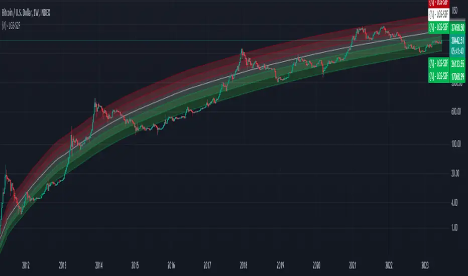
Bitcoin Limited Growth ModelThe Bitcoin Limeted Growth is a model proposed by QuantMario that offers an alternative approach to estimating Bitcoin's price based on the Stock-to-Flow (S2F) ratio. This model takes into account the limitations of the traditional S2F model and introduces refinements to enhance its analysis.
The S2F model is commonly used to analyze Bitcoin's price by considering the scarcity of the asset, measured by the stock (existing supply) relative to the flow (new supply). However, the LGS-S2F Bitcoin Price Formula recognizes the need for improvements and presents an updated perspective on Bitcoin's price dynamics.
Invalidation of the Normal S2F Model:
The normal S2F model has faced criticisms and challenges. One of the limitations is its assumption of a linear relationship between the S2F ratio and Bitcoin's price, overlooking potential nonlinearities and other market dynamics. Additionally, the normal S2F model does not account for external influences, such as market sentiment, regulatory developments, and technological advancements, which can significantly impact Bitcoin's price.
Addressing the Issues:
The LGS-S2F Bitcoin Price Formula introduces refinements to address the limitations of the traditional S2F model. These refinements aim to provide a more comprehensive analysis of Bitcoin's price dynamics:
Nonlinearity: The LGS-S2F model recognizes that the relationship between the S2F ratio and Bitcoin's price may not be linear. It incorporates a logistic growth function that considers the diminishing returns of scarcity and the saturation of market demand.
Data Analysis: The LGS-S2F model employs statistical analysis and data-driven techniques to validate its predictions. It leverages historical data and econometric modeling to support its analysis of Bitcoin's price.
Utility:
The LGS-S2F Bitcoin Price Formula offers insights for traders and investors in the cryptocurrency market. By incorporating a more refined approach to analyzing Bitcoin's price, this model provides an alternative perspective. It allows market participants to consider various factors beyond the S2F ratio alone, potentially aiding in their decision-making processes.
Key Features:
Adjustable Coefficients
Sigma calculation methods: Normal or Stdev
Credit:
The LGS-S2F Bitcoin Price Formula was developed by QuantMario, who has contributed to the field of cryptocurrency analysis through their research and modeling efforts.
NGL - Bar PatternsThe NGL - Bar Patterns Indicator is a user-friendly and intuitive tool designed for traders of all experience levels. It brings to the fore a unique approach to visualizing the price trends and identifying potential market zones.
This indicator paints the bars on your chart in a variety of colors, representing different price zones.
The changing colors offer an easy-to-understand visual representation of where the price is situated within a range derived from historical highs and lows.
This can help to quickly identify market conditions and potential trading opportunities.
Here's a quick rundown on how to interpret the colors:
Lime: Represents the price zones with the highest bullish momentum. A lime-colored bar indicates that the closing price is well above the historical range. It might be interpreted as a strong bullish momentum.
Green: Slightly less bullish than lime, but still signifies an upward momentum in the price.
Black: Indicates that the price is trending towards the middle of the historical range, possibly indicating a neutral market condition.
Navy: The price is below the middle but not exceedingly bearish.
Red: This color represents an area where the price is starting to show bearish momentum.
Orange: Indicates a stronger bearish momentum than red.
Purple: Represents the area where the price has strong bearish momentum.
Lime (at the bottom): This is the area with the most bearish momentum.
Please note, this indicator should not be used as a standalone decision-making tool, but in combination with other technical analysis methods or indicators. Always consider your risk tolerance and financial situation before entering trades.
Disclaimer: Past performance does not guarantee future results. The information provided by this indicator is for educational purposes only and should not be considered as financial advice. Always do your own research before making investment decisions.

The Z-score The Z-score, also known as the standard score, is a statistical measurement that describes a value's relationship to the mean of a group of values. It's measured in terms of standard deviations from the mean. If a Z-score is 0, it indicates that the data point's score is identical to the mean score. Z-scores may be positive or negative, with a positive value indicating the score is above the mean and a negative score indicating it is below the mean.
The concept of Z-score was introduced by statistician Carl Friedrich Gauss as part of his "method of the least squares," which was an important step in the development of the normal distribution and Z-score tables. It's a key concept in statistics and is used in various statistical tests.
In financial analysis, Z-scores are used to determine whether a data point is usual or unusual. You can think of it as a measure of how many standard deviations an element is from the mean. For instance, a Z-score of 1.0 would denote a value that is one standard deviation from the mean. Z-scores are also used to predict probabilities, with Z-scores having a distribution that is expected to be normal.
In trading, a Z-score is used to determine how often a trading system may produce a string of winners or losers. It can help a trader to understand whether the losses or profits they see are something that the system would most likely produce, or if it's a once in a blue moon situation. This helps traders make decisions about when to start or stop a system.
I just wanted to play a bit with the Z-score I guess.
Feel free to share your findings if you discover additional applications for this strategy or identify timeframes where it appears to perform more optimally.
How it works:
This strategy is based on a statistical concept called Z-score, which measures the number of standard deviations a data point is from the mean. In other words, it helps determine how unusual or usual a data point is.
In the context of this strategy, Z-score is applied to a 10-period EMA (Exponential Moving Average) of Heikin-Ashi candlestick close prices. The Z-score is calculated over a look-back period of 25 bars.
The EMA of the Z-score is then calculated over a 20-bar period, and the upper and lower thresholds (bounds for buy and sell signals) are defined using the 90th and 10th percentiles of this EMA score.
Long positions are taken when the Z-score crosses above the lower threshold or crosses above the mid-line (50th percentile). An additional long entry is made when the Z-score crosses above the highest value the EMA has been in the past 100 periods.
Short positions are initiated when the EMA crosses below the upper threshold, lower threshold or the highest value the EMA has been in the past 100 periods.
Positions are closed when opposing entry conditions are met, for example, a long position is closed when the short entry condition is true, and vice versa.
Set your desired start date for the strategy. This can be modified in the timestamp("YYYY MM DD") function at the top of the script.

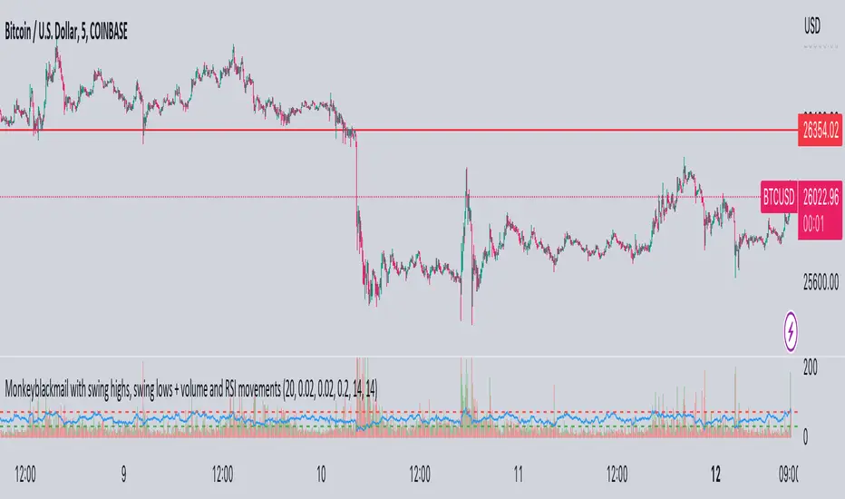
MonkeyblackmailThis script consists of several sections. test it and tell me your concerns. a lot of more works will be done
Volume Accumulation : The first part of the script checks for a new 5-minute interval and accumulates the volume of the current interval. It separates the volume into buying volume and selling volume based on whether the closing price is closer to the high or low of the bar.
Volume Normalization and Pressure Calculation : The script then normalizes the volume with a 20-period EMA, and calculates buying pressure, selling pressure, and total pressure. These calculations provide insight into the underlying demand (buying pressure) and supply (selling pressure) conditions in the market.
RSI Calculation and Overbought/Oversold Conditions : The script calculates the RSI (Relative Strength Index) and checks whether it is in an overbought (RSI > 70) or oversold (RSI < 30) state. The RSI is a momentum indicator, providing insights into the speed and change of price movements.
Volume Condition Check and Wondertrend Indicator : The script checks if the volume is high for the past five bars. If it is, it applies the Wondertrend Indicator, which uses a combination of the Parabolic SAR (Stop and Reverse) and Keltner Channel to identify potential trends in the market.
Swing High/Low and Fibonacci Retracement : The script identifies swing high and swing low points using a specified pivot length. Then, it draws Fibonacci retracement levels between these swing high and swing low points.
he monkeyblackmail script works well in the 5 minutes chart and combines several elements of technical analysis, including volume analysis, momentum indicators, trend-following indicators, volatility channels, and Fibonacci retracements. It aims to provide a comprehensive view of the market condition, highlighting key levels and potential trends in an easily understandable format. Don’t be too quick to start trading with it, first study how it work and you will blackmail the market.
[SMA Cross + HHLL] Signal Clean Up Analysis with Backtest (TSO) This is a DEMO indicator with a simple 2 SMAs cross for signals + HHLL for TP/SL. It mainly demonstrates chained (NOTE: You can select several or ALL of the features, this is not limited to either one) signal cleanup and analysis approach with scheduling and alerting capabilities. Works with most popular timeframes: 1M, 5M, 15M, 1H, 4H, D.
===========================================================================
Here are some pre-set examples with nice Backtesting results (try em out!):
---------------------------------------------------------------------------
>>> Indexes – SPY (INTRADAY SETUP ): Timeframe: 5M | Trading Schedule: ON, 10:00-15:45 ET, EOD: At Market Close | Trading System: Open Until Closed by TP or SL | MULTIPROFIT: TP (take profit) System: Dynamic | MULTIPROFIT: SL (stop loss) System (This is only for “Dynamic” TP System ONLY!!!): Dynamic | # of TPs: 5 | Skip opposite candle types in signals, which are opposite to direction of candle color (for example: bearish green hammer) | Everything else: Default
>>> Bitcoin – BTCUSD (24/7 SETUP): Timeframe: 1H | Trading Schedule: OFF, End of Day (EOD): OFF | Trading System: Open Until Closed by TP or SL | MULTIPROFIT: TP (take profit) System: Dynamic | MULTIPROFIT: SL (stop loss) System (This is only for “Dynamic” TP System ONLY!!!): Dynamic | # of TPs: 3 | TP(s) Offset: on, TP(s) offset amount: 50 | ATR confirmation | Everything else: Default
===========================================================================
Explanation of all the Features | Configuration Guide | Indicator Settings
---------------------------------------------------------------------------
---------------------------------------------------------------------------
Signal cleanup analysis:
---------------------------------------------------------------------------
>>> Customizable Backtesting for a specific date range, results via TradingView strategy, which includes “Deep Backtesting” for largest amounts of data on trading results.
>>> Trading Schedule with customizable trading daily time range, automatic closing/alert trades before Power Hour or right before market closes or leave it open until next day.
>>> 3 Trading Systems.
>>> Static/Dynamic Take-Profit setups (HILIGHT: momentum catch dynamic Take-Profit approach).
>>> Static/Dynamic Stop-Loss setups (HIGHLIGHT: smart trailing Stop-Loss which minimizes risk).
>>> Single or Multiple profit targets (up to 5).
>>> Take-Profit customizable offset feature (set your Take-Profit targets slightly before everyone is expecting it!).
>>> Candle bar signal analysis (skip opposite structured and/or doji candle uncertain signals).
>>> Additional analysis of VWAP/EMA/ATR/EWO (Elliot Wave Oscillator)/Divergence MACD+RSI signal confirmation (clean up your chart with indicator showing only the best potential signals!).
>>> Advanced Alerts setup, which can be potentially setup with a trading bot over TradingView Webhook (NOTE: This will require advanced programming knowledge).
>>> Customize your signal SOURCE and your Take-Profit/Stop-Loss SOURCES as you desire.
===========================================================================
Labels, plots, colors explanations:
---------------------------------------------------------------------------
>>>>> Signal SOURCE: SMA crossings (green and red BIG circles) .
>>>>> Take-profit/Stop-loss SOURCE: HHLL (Highest High Lowest Low) .
>>>>> LONG open: green arrow below candle bar.
>>>>> SHORT open: red arrow above candle bar.
>>>>> LONG/SHORT take-profit target: green/red circles (multi-profit > TP2/3/4/5 smaller circles).
>>>>> LONG/SHORT take-profit hits: green/red diamonds.
>>>>> LONG/SHORT stop-loss target: green/red + crosses.
>>>>> LONG/SHORT stop-loss hits: green/red X-crosses.
>>>>> LONG/SHORT EOD close (profitable trade): green/red squares.
>>>>> LONG/SHORT EOD close (loss trade): green/red PLUS(+)-crosses.
===========================================================================
Date Range and Trading Schedule Settings
---------------------------------------------------------------------------
>>>>> Date Range: Select your start and/or end dates (uncheck “End” for indicator to show results up to the very moment and to use for LIVE trading) for backtesting results, if not using backtesting – uncheck “Start”/“End” to turn it off.
---------------------------------------------------------------------------
>>>>> Use TradingView “Strategy Tester” to see backtesting results
---------------------------------------------------------------------------
NOTE: If Strategy Tester does not show any results with Date Ranged fully unchecked, there may be an issue where a script opens a trade, but there is not enough TradingView power to set the Take-Profit and Stop-Loss and somehow an open trade gets stuck and never closes, so there are “no trades present”. In such case you will need to manually check “Start”/“End” dates or use “Depp Backtesting” feature!
---------------------------------------------------------------------------
>>>>> Trading Schedule: This is where you can setup Intraday Session or any custom session schedule you wish. Turn it ON. Select trading hours. Select EOD (End of Day) setting (NOTE: If it will be OFF, the indicator will assume you are holding your position open until next day!).
>>>>> Trading System: 1) Open Until Closed by TP or SL – once the trade is open, it can only be closed by Take-Profit, Stop-Loss or at EOD (if turned on) ||| 2) OCA – Opposite Trade will Open Closing Current Trade – Same as 1), except that when and if an OPPOSITE signal is received > indicator will close current trade immediately (profit or loss) and open a new one(NOTE: This will only happen with an OPPOSITE direction trade!) ||| 3) Open Until Opposite Signal or EOD (if turned on) – This approach is the simplest one, there are no Take-Profits or Stop-Losses, the trade is open until an OPPOSITE signal is received or until EOD (if turned on).
Take-Profit, Stop-Loss and Multi-Profit Settings
>>>>> MULTIPROFIT | TP (Take-Profit) System: 1) Static – Once the trade is open, all Take-Profit target(s) are immediately calculated and set for the trade > once the target(s) is hit > trade will be partially closed (if candle bar closes beyond several Take-Profit targets > trade will be reduced accordingly to the amount of how many Take-Profit targets were hit) ||| 2) Dynamic – Once the trade is open, only the 1st Take-Profit target is calculated, once the 1st Take-Profit is hit > next Take-Profit distance is calculated based on the distance from trade Entry to where 1st Take-Profit was taken, once 2nd Take-Profit is taken > 3rd Take-Profit is calculated per same logic, these are good for price momentum as with price speeding up – profits increase as well!
NOTE: Below 2 settings, each correspond to only 1 setting of the TP (Take-Profit) System, please pay attention to the above TP system setting before changing SL settings!
>>>>> MULTIPROFIT | SL (Stop-Loss) System : 1) Static – Once the trade is open, Stop-Loss is calculated and set for the remaining of the trade ||| 2) Dynamic – At trade open, Stop-Loss is calculated and set the same way, however once 1st Take-Profit is taken > Stop-Loss is moved to Entry, reducing the risk.
>>>>> MULTIPROFIT | SL (Stop-Loss) System : 1) Static - Once the trade is open, Stop-Loss is calculated and set for the remaining of the trade ||| 2) Dynamic – At trade open, Stop-Loss is calculated and set the same way, however with each Take-Profit taken, Stop-Loss will be moved to previous Take-Profit (TP1 taken > SL:Entry | TP2 taken > SL:TP1 | TP3 taken > SL:TP2 | TP4 taken > SL:TP3 | TP5 taken > trade closed), this is basically a smart Stop-Loss trailing system!
>>>>> # of TPs (number of take profit targets): Just like it is named, this is where you select the number of Take-Profit targets for your trading system (NOTE: If “3) Open Until Opposite Signal or EOD (if turned on)” Trading System is selected, this setting won’t do anything, since there are no TP or SLs for that system).
>>>>> TP(s) offset: This is a special feature for all Take-Profit targets, where you can turn on a customizable offset, so that if the price is almost hitting the Take-Profit target, but never actually touches it > you will capture it. This is good to use with HHLL (Highest High Lowest Low), which is pretty much a Support/Resistance as often the price will nearly touch these strong areas and turn around…
---------------------------------------------------------------------------
Dynamic/Static Take-Profit and Stop-Loss visual examples:
1) Fully Dynamic Take-Profit and Stop-Loss setup for BTCUSD
See how Take-Profit distances increase with price momentum and how Stop-Loss is following the trade reducing the risk!
2) Static/Dynamic, Static Take-Profit and Dynamic Stop-Loss setup for SPY (S&P500 ETF TRUST)
You can see a static Take-Profit set at position open, while Stop-Loss is semi-dynamic adjusting to Entry once TP1 target is taken!
3) Fully Static Take-Profit and Stop-Loss setup for SPY (S&P500 ETF TRUST)
This one is a fully static setup for both Take-Profit and Stop-Loss, you can also observe how trade is closed right before the Power Hour (trade can be closed right before Power Hour or right before Market Closes or left overnight as you desire).
---------------------------------------------------------------------------
Trade Analysis and Cleanup Settings
>>>>> Candle Analysis | Candle Color signal confirmation: If closed candle bar color does not match the signal direction > no trade will be open.
>>>>> Candle Analysis | Skip opposite candle signals: If closed candle bar color will match the signal direction, but candle structure will be opposite (for example: bearish green hammer, long high stick on top of a small green square) > no trade will be open.
>>>>> Candle Analysis | Skip doji candle signals: If closed candle bar will be the uncertain doji > no trade will be open.
>>>>> Divergence/Oscillator Analysis | EWO (Elliot Wave Oscillator) signal confirmation: LONG will only be open if at signal, EWO is green or will be at bullish slope (you can select which setting you desire), SHORT if EWO is red or will be at bearish slope.
>>>>> Divergence/Oscillator Analysis | VWAP signal confirmation: LONG will only be open if at signal, the price will be above VWAP, SHORT if below.
>>>>> Divergence/Oscillator Analysis | Moving Average signal confirmation: LONG will only be open if at signal, the price will be above selected Moving Average, SHORT if below.
>>>>> Divergence/Oscillator Analysis | ATR signal confirmation: LONG will only be open if at signal, the price will be above ATR, SHORT if below.
>>>>> Divergence/Oscillator Analysis | RSI + MACD signal confirmation: LONG will only be open if at signal, RSI + MACD will be bullish, SHORT if RSI + MACD will be bearish.
===========================================================================
Alert Settings (you don’t have to touch this section unless you will be using TradingView alerts through a Webhook to use with trading bot)
---------------------------------------------------------------------------
Here is how a LONG OPEN alert looks like (each label is customizable + I can add up more items/labels if needed):
COIN: BTCUSD
TIMEFRAME: 15M
LONG: OPEN
ENTRY: 20000
TP1: 20500
TP2: 21000
TP3: 21500
SL: 19000
Leverage: 0
===========================================================================
Trade Open Signal SOURCE + Take-Profit/Stop-Loss SOURCE
---------------------------------------------------------------------------
>>> Customize your signal SOURCE, Take-Profit and Stop-Loss SOURCE as desired (NOTE: These are pre-configured and should be usable on majority of markets, however feel free to play around with these settings as there is nearly an infinite amount of setups out there!
===========================================================================
Adding Alerts in TradngView
---------------------------------------------------------------------------
-Right-click anywhere on the TradingView chart
-Click on Add alert
-Condition: Select this indicator by it’s name
-Alert name: Whatever you want
-Hit “Create”
-Note: If you change ANY Settings within the indicator – you must DELETE the current alert and create a new one per steps above, otherwise it will continue triggering alerts per old Settings!
===========================================================================
If you have any questions or issues with the indicator, please message me directly via TradingView.
---------------------------------------------------------------------------
Good Luck! (NOTE: Trading is very risky, so please trade responsibly!)
Valuation Metrics Table (P/S, P/E, etc.)This table gives the user a very easy way of seeing many valuation metrics. I also included the 5 year median of the price to sales and price to earnings ratios. Then I calculated the percent difference between the median and the current ratio. This gives a sense of whether or not a stock is over valued or under valued based on historical data. The other ratios are well known and don't require any explanation. You can turn off the ones you don't want in the settings of the indicator. Another thing to mention is that diluted EPS is used in calculations
Output7The "Output7" indicator is designed to guide traders in identifying potential buy and sell signals. This is achieved through the calculation of a custom indicator named `output7` and its derived moving averages. `output7` is defined as `c_1 - c_20 * (ohlcSq / hlSq)`. Here, `ohlcSq` stands for the square of the average of open, high, low, and close prices, while `hlSq` signifies the square of the average of high and low prices. `c_20` and `c_1` correspond to the closing price 20 periods ago and the current closing price, respectively.
**Interpreting the Indicator:**
**1. Support and Resistance**: This indicator calculates the support and resistance levels for the `output7` over a predefined lookback period. These levels are essential in the identification of potential price reversals in the market. When the `output7` line approaches or crosses these levels, it may suggest significant market shifts.
**2. Moving Averages of `output7`**: The indicator also generates short-term (5 periods by default) and long-term (10 periods by default) simple moving averages (SMAs) of the `output7` value. These SMAs can be helpful in determining market trends. When the short-term SMA lies above the long-term SMA, it indicates an upward trend. Conversely, when it falls below, it suggests a downward trend.
**3. Buy and Sell Signals**: The Output7 indicator generates two types of buy and sell signals based on the crossover of different moving averages. Yellow signals are produced when the simple moving average of close prices (7 periods by default) crosses the exponential moving average of close prices (14 periods by default). The blue signals are generated when the short-term SMA of `output7` crosses the long-term SMA of `output7`.
It is important to note that like all technical analysis tools, the Output7 indicator should not be used in isolation. Instead, it should be combined with other forms of analysis and indicators to validate its signals and minimize the likelihood of false signals. Factors such as the overall market trend, price patterns, volume, and fundamental analysis can provide additional context to the signals provided by the Output7 indicator. The interpretation of these signals should align with a trader's overall trading strategy, risk tolerance, and financial goals.
And finally. If you discover something else regarding this indicator. Please let me know in the comment section.

Script TimerWanna know how long your script takes to execute.
Just put this function at the end of your code and it will tell you how much time it takes to run your algo from start to end.
Data will show in the data window panel measured in seconds
Source CorrelationIn this small indicator I make it possible for the user to set two different input sources. Then, the indicator displays the correlation of these two input sources. It's a very small script, but I think it could be helpful to somebody to find uncorrelated indicators for his trading strategy. To use uncorrelated indicators is in general recommended.
Enjoy this small, but powerful tool. 🧙♂️

[TTI] NDR 63-Day QQQ-QQEW ROC% SpreadWelcome to the NDR 63-Day QQQ-QQEW ROC% Spread script! This script is a powerful tool that calculates and visualizes the 63-day Rate of Change (ROC%) spread between the QQQ and QQEW tickers. This script is based on the research conducted by Ned Davis Research (NDR), a renowned name in the field of investment strategy.
⚙️ Key Features:
👉Rate of Change Calculation: The script calculates the 63-day Rate of Change (ROC%) for both QQQ and QQEW tickers. The ROC% is a momentum oscillator that measures the percentage price change over a given time period.
👉Spread Calculation: The script calculates the spread between the ROC% of QQQ and QQEW. This spread can be used to identify potential trading opportunities.
👉Visual Representation: The script plots the spread on the chart, providing a visual representation of the ROC% spread. This can help traders to easily identify trends and patterns.
👉Warning Lines: The script includes warning lines at +600 and -600 levels. These lines can be used as potential thresholds for trading decisions.
Usage:
To use this script, simply add it to your TradingView chart. The script will automatically calculate the ROC% for QQQ and QQEW and plot the spread on the chart. You can use this information to inform your trading decisions.
🚨 Disclaimer:
This script is provided for educational purposes only and is not intended as investment advice. Trading involves risk and is not suitable for all investors. Please consult with a financial advisor before making any investment decisions.
🎖️ Credits:
This script is based on the research conducted by Ned Davis Research (NDR). All credit for the underlying methodology and concept goes to NDR.

Rainbow IndicatorName of the indicator: Rainbow indicator
A brief description of the indicator:
Using this indicator, you can see the "margin of safety" for opening a position in shares of fundamentally strong companies with an acceptable P/E level, as well as the price range for closing a position.
The background to the creation of the indicator:
I got the idea to create this indicator thanks to the concept of the "margin of safety", which was invented by the father of value investing - Benjamin Graham. According to his idea, it is reasonable to buy shares of a company only when the price offered by the market is lower than the "intrinsic value" calculated on the basis of financial statements. The value of this difference is the "margin of safety”. At the same time, the indicator does not copy Graham's idea but develops it relying on my own methodology.
So, according to Graham, the "margin of safety" is a good discount to the intrinsic value of the company. That is, if a company's stock is trading at prices that are well below the company's intrinsic value (on a per-share basis), it's a good opportunity to consider buying it. In this case, you will have a certain margin of safety in case the company is in financial distress and its stock price goes down. Accordingly, the greater the discount, the better.
When it comes to the intrinsic value of a company, there are many approaches to determining it - from calculating the Price-to-book value financial ratio to the discounted cash flow method. As for my approach, I am not trying to find the cherished intrinsic value, but I am trying to understand how fundamentally strong the company is in front of me, and in how many years the investment in it will pay off. To determine fundamental strength, I use the appropriate Fundamental Strength Indicator . To estimate the payback period, I use the P/E ratio (*). If I am satisfied with both of these indicators, I move on to the Rainbow Indicator.
(*) If you want to learn more about the P/E ratio, I suggest reading my two articles on TradingView:
Price / Earnings: Interpretation #1
Price/Earnings: amazing interpretation #2
Indicator calculation methodology:
The Rainbow indicator starts with a simple moving average of one year (this is the thick red line in the center). Hereinafter a year will mean the last 252 trading days.
Applying a moving average of this length - is a good way to smooth out sharp price fluctuations which can happen during a year as much as possible, keeping the trend direction as much as possible. Thus, the moving average becomes for me the center of fluctuations of the imaginary pendulum of the market price.
Then the deviations are calculated from the center of fluctuations. To do this, a certain amount of earnings per share is subtracted from and added to the moving average. This is the diluted EPS of the last year.
Deviations with a "-" sign form the Lower Rainbow of four colors:
- The blue spectrum of the lower rainbow begins with a deflection of -4 EPS and ends with a deflection of -8 EPS.
- Green spectrum of the lower rainbow begins with a deflection of -8 EPS and ends with a deflection of -16 EPS.
- The orange spectrum of the lower rainbow begins with a deflection of -16 EPS and ends with a deflection of -32 EPS.
- Red spectrum of the lower rainbow begins with a deflection of -32 EPS and goes to infinity.
The Lower Rainbow is used to determine the price ranges that can be considered for buying stocks. It is in the spectra of the Lower Rainbow that the very "margin of safety" according to my methodology is located. The Lower Rainbow has the boundaries between the spectra as a solid line . And only the red spectrum of the Lower Rainbow has only one boundary.
Deviations with a "+" sign form the Upper Rainbow of four similar colors:
- The red spectrum of the upper rainbow begins with a deflection of 0 EPS and ends with a deflection of +4 EPS.
- The orange spectrum of the upper rainbow begins with a deflection of +4 EPS and ends with a deflection of +8 EPS.
- Green spectrum top rainbow begins with a deflection of +8 EPS and ends with a deflection of +16 EPS.
- The blue spectrum of the upper rainbow begins with a deflection of +16 EPS and goes to infinity.
The Upper Rainbow is used to determine the price ranges that can be considered for selling stocks already purchased. The top rainbow has boundaries between the spectra in the form of crosses . And only the blue spectrum of the upper rainbow has only one boundary.
The presence of the Empty Area (the size of 4 EPS) above the Lower Rainbow creates some asymmetry between the two rainbows - the Lower Rainbow looks wider than the Upper Rainbow. This asymmetry is deliberate because the market tends to fall much faster and deeper than it grows . Therefore, a wider Lower Rainbow is conducive to buying stocks at a good discount during a period of massive "sell-offs.
The situation, when the Lower Rainbow is below the center of fluctuations (the thick red line) and the Upper Rainbow, is above the center of fluctuations is called an Obverse . It is only possible to buy a stock in an Obverse situation .
The situation when the Lower Rainbow is above the center of fluctuations and the Upper Rainbow is below the center of fluctuations is called Reverse . In this situation, the stock cannot be considered for purchase , according to my approach.
Selling a previously purchased stock is possible in both situations: Reverse and Obverse. After loading the indicator, you can see a hint next to the closing price - Reverse or Obverse now.
Due to the fact that the size of the deviation from the center of fluctuation depends on the size of the diluted EPS, several important conclusions can be made:
- The Obverse situation is characteristic of companies that show a profit over the last year.
- The Reverse situation is typical for companies that show a loss over the last year.
- An increase in the width of both rainbows in the Obverse situation tells us about an increase in profits for the company.
- A decrease in the width of both rainbows in the Obverse situation tells us about a decrease in the company's profits.
- An increase in the width of both rainbows in the Reverse situation tells us about an increase in the company's losses.
- A decrease in the width of both rainbows in the Reverse situation tells us about a decrease in the company's losses.
- The higher the profit level of the company, the greater your "margin of safety" should be. This will provide the necessary margin of safety in case you go into a cycle of declining financial results. The appropriate width of the Lower Rainbow will just create this "margin".
- Increased profits in the company (after buying its stock) will allow you to stay in position longer by widening the Upper Rainbow.
- A decrease in profits in the company (after buying its stock) will allow you to close your position more quickly by narrowing the Upper Rainbow.
Conditions for opening and closing positions:
So, the Lower Rainbow has four differently colored spectra: blue, green, orange, and red. Each one highlights the desired range of prices acceptable for buying in an Obverse situation. The blue spectrum is upper with respect to the green spectrum, and the green spectrum is lower with respect to the blue spectrum, etc.
- If the current price is in the Blue Spectrum of the Lower Rainbow, that is a reason to consider that company for buying the first portion (*) of the stock.
- If the current price has fallen below (into the Green Spectrum of the Lower Rainbow), that is a reason to consider this company to buy a second portion of the stock.
- If the current price has fallen below (into the Orange Spectrum of the Lower Rainbow), it is a reason to consider this company to buy a third portion of the stock.
- If the current price has fallen below (into the Red Spectrum of the Lower Rainbow), that is a reason to consider that company to buy a fourth portion of the stock.
(*) The logic of the Rainbow Indicator implies that no more than 4 portions of one company's stock can be purchased. One portion refers to the number of shares you can consider buying at the current price (depending on your account size and personal diversification ratio - see information below).
The Upper Rainbow also has four differently colored spectra: blue, green, orange, and red. Each of them highlights the appropriate range of prices acceptable for closing an open position.
- If the current price is in the red spectrum of the Upper Rainbow, I close one portion of an open position bought in the red spectrum of the Lower Rainbow.
- If the current price is in the orange spectrum of the Upper Rainbow, I close one portion of an open position bought in the orange spectrum of the Lower Rainbow.
- If the current price is in the green spectrum of the Upper Rainbow, I close one portion of an open position bought in the green spectrum of the Lower Rainbow.
- If the current price is in the blue spectrum of the Upper Rainbow, I close one portion of an open position bought in the blue spectrum of the Lower Rainbow.
This position-closing logic applies to both the Obverse and Reverse situations. In both cases, the position is closed in portions in four steps. However, there are 3 exceptions to this rule when it is possible to close an entire position in whole rather than in parts:
- If there is a Reverse situation and the current price is above the thick red line.
- If I decide to invest in another company and I do not have enough available cash to purchase the necessary number of portions.
- If I find out about events that pose a real threat to the further existence of the company (for example, a bankruptcy filing), I can close the position earlier, without waiting for the price to hit the corresponding Upper Rainbow spectrum.
So, the basic scenario of opening and closing a position assumes the gradual purchase of shares in 4 stages and their gradual sale in 4 stages. However, there is a situation where one of the stages is skipped in the case of buying shares and in the case of selling them. For example, because the Fundamental Strength Indicator and the P/E ratio became acceptable for me only at a certain stage (spectrum) or the moment was missed for a transaction due to technical reasons. In such cases, I buy or sell more than one portion of a stock in the spectrum I am in. The number of additional portions will depend on the number of missed spectra. For example, if I have no position in the stock of the company in question, all conditions for buying the stock have been met, and the current price is in the orange spectrum of the Lower Rainbow, I can buy three portions of the stock at once (for the blue, green, and orange spectrum). I will sell these three portions in the corresponding Upper Rainbow spectra (orange, green, and blue). However, if for some reason the orange spectrum of the Upper Rainbow was missed, and the current price is in the green spectrum - I will sell two portions of the three (in the green spectrum). I will sell the last, third portion only when the price reaches the blue spectrum of the Upper Rainbow.
The Rainbow Indicator also helps calculate the number of shares that can be considered for purchase at the current price position in the Lower Rainbow spectra. To do this, you need to go to the indicator settings.
+ Cash in - Cash out +/- Closed profit/loss + Dividends - Fees - Taxes
Here I indicate the amount of funds deposited to my account, withdrawn from it, profit/loss on closed positions, dividends credited to the account, and taxes deducted from the account.
Diversification coefficient
The diversification coefficient determines how diversified I want my portfolio to be. For example, a diversification coefficient of 20 means that I plan to buy 20 share portions of different companies, but no more than 4 portions per company (based on the number of Lower Rainbow spectra).
The cost of purchased shares of this company (fees excluded)
Here I specify the amount of already purchased shares of the company in question in the currency of my portfolio. For example, if at this point in time, I have purchased 1000 shares at $300 per share, and my portfolio is expressed in $, I enter - $300,000.
The cost of all purchased shares in the portfolio (fees excluded)
Here I enter the amount of all purchased shares for all companies in the currency of my portfolio (without commissions spent on the purchase). This is necessary to determine the amount of available funds available to purchase shares.
After entering all the necessary data, I go to the checkbox, by checking it I confirm that the company in question has been studied with the Fundamental Strength Indicator and the P/E ratio, and their values are satisfactory to me. No calculation is performed without the checkbox checked. This is done intentionally because the application of the Rainbow Indicator for stock acquisition purposes is possible only after studying the Fundamental Strength of the company and an acceptable P/E value.
Next, I click "Ok" and get the calculation in the form of a table on the left.
Free cash in the portfolio
This is the amount of free cash available to purchase stocks. Please note that the price of the stock and the funds in your portfolio must be denominated in the same currency. On TradingView, you can choose which currency to display the stock price in.
Cash amount for one portion
The amount of cash needed to buy one portion of a stock. Depends on the diversification ratio entered.
Potential portions amount
Number of portions, available for purchase at the current price. Can be a fractional number.
Cash amount to buy
The amount of cash needed to buy portions available for purchase at the current price.
Shares amount to buy
Number of shares in portions available for purchase at the current price.
The table also contains additional information in the form of the current value of the company's market capitalization and P/E ratio.
Mandatory requirements for using the indicator:
- works only on a daily timeframe;
- the indicator is only applicable to shares of public companies;
- quarterly income statements for the last year are required;
- an acceptable for you P/E ratio is required to consider the company's stock for purchase;
- the Rainbow Indicator only applies in tandem with the Fundamental Strength Indicator. To consider a company's stock for purchase, you need confirmation that the company is fundamentally strong.
What is the value of the Rainbow Indicator?
- clearly demonstrates a company's profit and loss dynamics;
- shows the price ranges that can be used to open and close a position;
- takes into account the principle of gradual increase and decrease of a position;
- allows calculating the number of shares to be purchased;
- shows the current value of the P/E ratio;
- shows the current capitalization of the company.
Example:
As an example, consider the situation with NVIDIA Corporation stock (ticker - NVDA).
September 02, 2022:
Fundamental Strength Indicator - 11.46 (fundamentally strong company).
P/E - 39.58 (acceptable to me).
Current Price - $136.47 (is in the Orange Spectrum of the Lower Rainbow).
Situation - Obverse.
The basic conditions for buying this company's stock are met. The Rainbow Indicator settings are filled out as follows:
The table to the left of the Rainbow Indicator shows how many shares are possible to buy in the Orange Spectrum of Lower Rainbow at the current price = 10 shares. This corresponds to 2.73 portions.
To give you an example, I buy 10 shares of NVDA at $136.47 per share.
October 14, 2022:
NVDA's stock price has moved into the red spectrum of the Lower Rainbow.
The Fundamental Strength Indicator is 10.81 (fundamentally strong company).
P/E is 35.80 (an acceptable level for me).
Current Price - $112.27 (is in the Red Spectrum of the Lower Rainbow).
Situation - Obverse.
The basic conditions for buying this company's stock are still met. The Rainbow Indicator settings are populated as follows:
The table to the left of the Rainbow Indicator shows how many shares are possible to buy in the Lower Rainbow Red Spectrum at the current price (5 shares). This corresponds to 1.12 portions.
To give you an example, I buy 5 shares of NVDA at $112.27 per share. A total of 3.85 portions were purchased, which is the maximum possible number of portions at the current price level. The remainder in the form of 0.15 portions can be purchased only at a price level below $75 per share.
January 23, 2023:
The price of NVDA stock passes through the red spectrum of the Upper Rainbow and stops in the orange spectrum. As an example, I sell 5 shares bought in the red spectrum of the Lower Rainbow, for example at $180 per share (+60%). And also a third of the shares bought in the orange spectrum, 3 shares out of 10, for example at $190 a share (+39%). That leaves me with 7 shares.
January 27, 2023:
NVDA's stock price has continued to rise and has moved into the green spectrum of the Upper Rainbow. This is a reason to close some of the remaining 7 shares. I divide the 7 shares by 2 and round up to a whole number - that's 4 shares. For my example, I sell 4 shares at $199 a share (+46%). Now I am left with 3 shares of stock.
February 02, 2023:
The price of NVDA stock moves into the blue spectrum of the Upper Rainbow, and I close the remaining 3 shares, for example, at $216 per share (+58%). The entire position in NVDA stock is closed.
As you can see, the Fundamental Strength Indicator and the P/E ratio were not used in the process of closing the position. Decisions were made only on the basis of the Rainbow Indicator.
As another example, let's look at the situation with the shares of Papa Johns International, Inc. (ticker PZZA).
November 01, 2017:
Fundamental Strength Indicator - 13.22 points (fundamentally strong company).
P/E - 21.64 (acceptable to me).
Current Price - $62.26 (is in the blue spectrum of the Lower Rainbow).
Situation - Obverse.
The basic conditions for buying shares of this company are met. The settings of the Rainbow Indicator are filled as follows:
The table to the left of the Rainbow Indicator shows how many shares are possible to buy in the Lower Rainbow Blue Spectrum at the current price - 8 shares. This corresponds to 1 portion.
To give you an example, I buy 8 shares of PZZA at a price of $62.26.
August 8, 2018:
PZZA's share price has moved into the green spectrum of the Lower Rainbow.
The Fundamental Strength Indicator is a 9.83 (fundamentally strong company).
P/E is 16.07 (an acceptable level for me).
Current Price - $38.94 (is in the green spectrum of the Lower Rainbow).
Situation - Obverse.
The basic conditions for buying shares of this company are still met. The Rainbow Indicator settings are populated as follows:
The table to the left of the Rainbow Indicator shows how many shares are possible to buy in the Lower Rainbow Green Spectrum at the current price - 12 shares. This corresponds to 0.93 portions.
To give you an example, I buy 12 shares of PZZA at a price of $38.94. A total of 1.93 portions were purchased.
October 31, 2018:
PZZA's stock price moves into the Upper Rainbow red spectrum and is $54.54 per share. Since I did not have any portions purchased in the Lower Rainbow red spectrum, there is no closing part of the position.
February 01, 2019:
After a significant decline, PZZA's stock price moves into the orange spectrum of the Lower Rainbow at $38.51 per share. However, I am not taking any action because the company's Fundamental Strength on this day is 5.02 (a fundamentally mediocre company).
March 27, 2019:
PZZA's stock price passes the green and blue spectrum of the Upper Rainbow. This allowed to close the previously purchased 12 shares, for example, at $50 a share (+28%) and 8 shares at $50.38 a share (-19%).
Closing the entire position at once was facilitated by a significant narrowing in both rainbows. As we now know, this indicates a decline in earnings at the company.
Risk disclaimer:
When working with the Rainbow Indicator, keep in mind that the release of the Income statement (from which diluted EPS is derived) occurs some time after the end of the fiscal quarter. This means that the new relevant data for the calculation will only appear after the publication of the new statement. In this regard, there may be a significant change in the Rainbow Indicator after the publication of the new statement. The magnitude of this change will depend on both the content of the new statement and the number of days between the end of the financial quarter and the publication date of the statement. Prior to the publication date of the new statement, the latest actual data will be used for the calculations. Also, once again, please note that the Rainbow Indicator can only be used in tandem with the Fundamental Strength Indicator and the P/E ratio. Without these additional filters, the Rainbow Indicator loses its intended meaning.
The Rainbow Indicator allows you to determine the price ranges for opening and closing a position gradually, based on available data and the methodology I created. You can also use it to calculate the number of shares you can consider buying taking into account the position you already have. However, this Indicator and/or its description and examples cannot be used as the sole reason for buying or selling stocks or for any other action or inaction related to stocks.

Fundamental Strength IndicatorName of the indicator: Fundamental Strength Indicator
A brief description of the indicator:
Using this indicator, you can evaluate a company in terms of the strength of its financial performance and see how that score has changed over time.
The background to the creation of the indicator:
The main idea that inspired me to create this indicator is: " Even if you buy just 1 share of a company, treat it like buying the whole business ". However, when I need to evaluate the business of thousands of public companies traded on exchanges, there is an objective difficulty: it is very time-consuming. To solve this problem, I had to create a scoring system of the fundamental analysis of the company, embodied in this indicator.
What the indicator looks like:
- First, it is a Histogram with bars of three colors: green, orange, and red. The width of the histogram depends on the depth of data from the company statements. The more historical data, the wider the histogram over time.
The green color of the bars means that the company has been showing excellent financial results by the sum of the factors in that time period. According to my terminology, the company has a " strong foundation " during this period. Green corresponds to values between 8 and 15 (where 15 is the maximum possible positive value on the sum of the factors).
The orange color of the bars means that according to the sum of factors during this period the company demonstrated mediocre financial results, i.e. it has a " mediocre foundation ". Orange color corresponds to values from 1 to 7.
The red color of the bars means that according to the sum of factors in this period of time, the company demonstrated weak financial results, i.e. it has a " weak foundation ". The red color corresponds to values from -15 to 0 (where -15 is the maximum possible negative value on the sum of factors).
- Second, this is the Blue Line , which is the moving average of the Histogram bars over the last year (*). Averaging over the year is necessary in order to obtain a weighted estimate that is not subject to medium-term fluctuations. It is by the last value of the blue line that the actual Fundamental Strength of the company is determined.
(*) The last year means the last 252 trading days, including the current trading day.
- Third, these are operating, investing, and financing Cash Flows expressed in Diluted net income. These flows look like thick green, orange, and red lines, respectively.
- Fourth, this is the Table on the left, which shows the latest actual value of the Fundamental Strength and Cash Flows.
Indicator settings:
In the indicator settings, I can disable the visibility of the Histogram, Blue Line, Cash Flows (each separately), and Table. It helps to study each of the parameters separately. It is also possible to change the color, transparency, and thickness of lines.
Mandatory requirements for using the indicator:
- works only on a daily timeframe;
- only applies to shares of public companies;
- company financial statements for the last 4 quarters and more are required;
- it is necessary to have the data from the Balance sheet, Income statement, and Cash flow statement, required for the calculation.
If at least one component required for calculating the Fundamental Strength is missing, the message " no data to calculate the Fundamental Strength correctly " is displayed. In the same case, but for the operating cash flow, the message " no data to calculate the Operating Cash Flow correctly " is shown, and similarly for other flows.
What is the value of the Fundamental Strength Indicator:
- allows for a quantitative assessment of a company's financial performance in points (from -15 to 15 points);
- allows you to visually track how the company's financial performance has changed (positively/negatively) over time;
- allows to visually trace the movement of main cash flows over time;
- speeds up the process of selecting companies for your shortlist (if you are focused on financial results when selecting companies);
- allows you to protect yourself from investing in companies with weak and mediocre fundamentals.
Indicator calculation methodology:
Guided by the "Treat stock investments as buying the whole business" approach, you can imagine what kind of business an investor is interested in owning and simultaneously determine the input parameters for calculating the indicator.
(!) Here it is important to emphasize that the idea of a benchmark business for investment is a subjective notion, so be sure to check whether it coincides with your own opinion.
For me, a benchmark business is:
- A business that operates efficiently without diminishing the return on shareholders' investment. To assess the efficiency and profitability of a business, I use the following financial ratios (*): Diluted EPS and Return on Equity (ROE). The first two parameters for calculating the indicator are there.
- A business that scales sales and optimizes its costs. From this point of view, the following financial ratios are suitable: Gross margin, Operating expense ratio, and Total revenue. Plus three other metrics.
- A business that turns goods/services into cash quickly and does not fall behind on payments to suppliers. The following financial ratios will fit here: Days payable, Days sales outstanding, and Inventory to revenue ratio. These are three more metrics.
- A business that does not resort to significant accounts payable and shows financial strength. Here I use the following financial ratios: Current ratio, Interest coverage, and Debt to revenue ratio. These are the last three parameters.
(*) If you want to learn more about these financial ratios, I suggest reading my two articles on TradingView:
Financial ratios: digesting them together
What can financial ratios tell us?
Next, each of the parameters is assigned a certain number of points based on its last value or the position of that value relative to the annual maximum and minimum.
For example, if the Current ratio:
- greater than or equal to 2 (+1 point);
- less than or equal to 1 (-1 point);
- more than 1 but less than 2 (0 points).
Or for example, if Diluted EPS:
- near or above the annual high (+2 points);
- near the annual minimum and below (-2 points);
- between the annual maximum and minimum (0 points).
And so on with each of the parameters.
As a result, the maximum number of points a company can score is 15 points. The minimum number of points a company can score is -15 points. These levels are marked with horizontal dotted lines: the green line is for the maximum value, and the red line is for the minimum.
I track the number of points for each day of a company's life on a three-color Histogram. The resulting average value for the last year is on the Blue Line. For me, it is the last value of the Blue Line that determines - this is the actual Fundamental Strength of the company.
The business valuation model I created is more suitable for companies that produce goods or services, and where tangible assets play a significant role in the business. For example, when analyzing companies in the financial sector, you may see the message "no data to calculate the Fundamental Strength correctly". Many of them may simply be missing data that is used as input for the calculation: Inventory to revenue ratio, Days sales outstanding, etc.
Examples:
Below I will evaluate various companies using the Fundamental Strength Indicator.
Tesla, Inc.
The indicator shows that since 2020, Tesla Inc. has been steadily increasing its Fundamental Strength (from 3.27 in Q1 2020 to 12.79 in Q1 2023). This is noticeable both by the color change of the Histogram from orange to green and by the rising Blue Line. If you look in detail at what has been happening with the financials during this time, it's clear what meaningful work the company has done. Revenues have almost quadrupled. Earnings per share have increased 134 times. At the same time, total debt to revenue fell almost 10 times.
Keurig Dr Pepper Inc.
The company, formed in 2018 by the merger of Keurig Green Mountain and Dr Pepper Snapple Group, has failed to deliver outstanding financial results, causing its Fundamental Strength to fall from 4.63 in Q1 2018 to -0.53 in Q1 2023. During this period, the drop in diluted earnings per share was accompanied by higher debt and deteriorating liquidity.
Costco Wholesale Corporation
Wholesaler Costco has been surprisingly stable in its financial performance and with steady growth in both earnings and revenue. This is the reason why the Histogram bars are exceptionally green throughout the calculation of the indicator. The Fundamental Strength has not changed in three years and is high at 11 points.
As an additional filter, for example, when comparing two companies where all other conditions are equal - I use the dynamics of Cash Flows expressed in Diluted net income (*). These are the thick green, orange, and red lines over the Histogram.
Why do I use income as a unit of measure of Cash Flows? Because it is a good way to make the scale of indicator values the same for companies from different countries, with different currencies. It also allows you to use a single value scale for both Cash Flows and Fundamental Strength.
(*) If you want to learn more about Cash Flows, I suggest reading my two articles on TradingView:
Cash flow statement or Three great rivers
Cash flow vibrations
So, an additional filter shows the dynamics of Cash Flows over time.
To interpret the dynamics of Cash Flows, I pay attention to the following patterns:
- How the cash flows are positioned in relation to each other;
- In which zone each of the cash flows is located - in the positive or negative;
- What is the trend of each of the cash flows;
- How volatile each of the cash flows is.
As an example, let's look at several companies in order to interpret the dynamics of their Cash Flows.
John B. Sanfilippo & Son, Inc.
This is the most ideal situation for me: operating cash flow (green line) is above the other cash flows, investment cash flow (orange line) is near zero and practically unchanged, and financial cash flow (red line) is consistently below zero. This picture shows that the company lives off its operating cash flow, does not increase its debt, does not spend a substantial amount of money on expensive purchases, and retains (does not sell off) assets.
Parker Hannifin Corporation
With stable operating cash flow (green line), the company implements investment programs by raising additional funding. This is noticeable due to an increase in financial cash flow (red line) and a simultaneous decrease in investment cash flow (orange line) with a significant deepening into negative areas. Apparently, there is not enough operating cash flow to realize the planned investments. One has to wonder how sustainable a company can be if it invests in its development using borrowed funds without a subsequent increase in operating cash flow.
Schlumberger N. V.
The chaotic intertwining of cash flows outside of the Fundamental Strength range (-15 to 15) is indicative of the company's rich life, but to me, it is an indicator of high riskiness of its actions. And as we can see, Fundamental Strength has only begun to strengthen in the last year, when the external appearance of cash flow has normalized.
Risk disclaimer:
When working with the Fundamental Strength Indicator and the additional filter in the form of Cash Flows, you should understand that the publication of the Balance sheet, Income statement, and Cash flow statement takes place sometime after the end of the financial quarter. This means that new relevant data for the calculation will only appear after the publication of the new statements. In this regard, there may be a significant change in the values of the Indicator after the publication of new statements. The magnitude of this change will depend both on the content of the new statements and on the number of days between the end of the financial quarter and the publication date of the statements. Until the date of publication of the new statements, the latest relevant data will be used for calculations.
I would like to draw your attention to the fact that the calculation of Fundamental Strength and Cash Flows requires the availability of data for all parameters of the valuation model . It uses data that is exclusively available on TradingView (there is no reconciliation with other sources). If at least one parameter is missing, I switch to another company's analysis to continue using the indicator.
Thus, the Fundamental Strength Indicator and an additional filter in the form of Cash Flows make it possible to evaluate the financial results of the company based on the available data and the methodology I created. A simple visualization in the form of a three-color Histogram, a Blue line, and three thick Cash Flow lines significantly reduces the time for selecting fundamentally strong companies that fit the criteria of the selected model. However, this Indicator and/or its description and/or examples cannot be used as the sole reason for buying or selling stocks or for any other action or inaction related to stocks.
Crypto Correlation MatrixA crypto correlation matrix or table is a tool that displays the correlation between different cryptocurrencies and other financial assets. The matrix provides an overview of the degree to which various cryptocurrencies move in tandem or independently of each other. Each cell represents the correlation between the row and column assets respectively.
The correlation matrix can be useful for traders and investors in several ways:
First, it allows them to identify trends and patterns in the behavior of different cryptocurrencies. By looking at the correlations between different assets, traders can gain insight into the intra-relationships of the crypto market and make more informed trading decisions. For example, if two cryptocurrencies have a high positive correlation, meaning that they tend to move in the same direction, a trader may want to diversify their portfolio by choosing to invest in only one of the two assets.
Additionally, the correlation matrix can help traders and investors to manage risk. By analyzing the correlations between different assets, traders can identify opportunities to hedge their positions or limit their exposure to particular risks. For example, if a trader holds a portfolio of cryptocurrencies that are highly correlated with each other, they may be at greater risk of losses if the market moves against them. By diversifying their portfolio with assets that are less correlated with each other, they can reduce their overall risk.
Some of the unique properties for this specific script are the correlation strength levels in conjunction with the color gradient of cells, intended for clearer readability.
Features:
Supports up to 64 different crypto assets.
Dark/Light mode.
Correlation strength levels and cell coloring.
Adjustable positioning on the chart.
Alerts at the close of a bar. (Daily timeframe or higher recommended)
