SNS 2TimeFrame 1-Candles Indicator contains 2 time frame candles. once higher candle green and lower candle smoothed then it will consider as bullish.
Cicli


Elder's Complete Trading SystemKey Features:
✅ ENHANCED SIGNALS (🔥 symbols) = ALL conditions perfectly aligned:
Weekly trend confirmation
Daily pullback/rally against trend
Multiple indicator convergence
Divergence detection
Volume confirmation
Proper channel positioning
✅ Standard Signals = Basic Triple Screen requirements met
✅ Comprehensive Dashboard shows real-time status of ALL indicators
✅ Automatic Stop Loss & Target Calculation based on 2% rule
✅ Multiple Alert Types for different signal strengths
What Makes This "Perfect":
Implements EVERY major concept from the book:
Triple Screen (3 timeframes)
Elder-ray (Bull/Bear Power)
Force Index (Price + Volume)
MACD-Histogram with divergences
Multiple oscillators (Stochastic, Williams %R)
Volume analysis
Channel trading
2% Rule risk management
Losers Anonymous principles
Professional-Grade Features:
Multi-timeframe analysis
Divergence detection (most powerful signals)
Risk/reward calculation
Position sizing suggestions
Visual stop loss & target lines
Comprehensive alerting system
Follows Elder's Philosophy:
Quality over quantity
Risk management FIRST
Multiple confirmation required
Clear visual feedback
Educational reminders built-in
Best Practices:
Use on DAILY charts primarily
Set higher timeframe to WEEKLY
Only take ENHANCED signals for highest probability
ALWAYS follow the 2% rule
Check the dashboard before every trade
Wait for ALL confirmations to align
This is the most comprehensive Dr. Elder indicator possible—combining every trading principle from his book into one powerful system!

Global M2 Money Supply Growth (GDP-Weighted)📊 Global M2 Money Supply Growth (GDP-Weighted)
This indicator tracks the weighted aggregate M2 money supply growth across the world's four largest economies: United States, China, Eurozone, and Japan. These economies represent approximately 69.3 trillion USD in combined GDP and account for the majority of global liquidity, making this a comprehensive macro indicator for analyzing worldwide monetary conditions.
════════════════════════════════════════════
🔧 KEY FEATURES:
📈 GDP-Weighted Aggregation
Each economy is weighted proportionally by its nominal GDP using 2025 IMF World Economic Outlook data:
• United States: 44.2% (30.62 trillion USD)
• China: 28.0% (19.40 trillion USD)
• Eurozone: 21.6% (15.0 trillion USD)
• Japan: 6.2% (4.28 trillion USD)
The weights are fully adjustable through the indicator settings, allowing you to update them annually as new IMF forecasts are released (typically April and October).
⏱️ Multiple Time Period Options
Choose between three calculation methods to analyze different timeframes:
• YoY (Year-over-Year): 12-month growth rate for identifying long-term liquidity trends and cycles
• MoM (Month-over-Month): 1-month growth rate for detecting short-term monetary policy shifts
• QoQ (Quarter-over-Quarter): 3-month growth rate for medium-term trend analysis
🔄 Advanced Offset Function
Shift the entire indicator forward by 0-365 days to test lead/lag relationships between global liquidity and asset prices. Research suggests a 56-70 day lag between M2 changes and Bitcoin price movements, but you can experiment with different offsets for various assets (equities, gold, commodities, etc.).
🌍 Individual Country Breakdown
Real-time display of each economy's M2 growth rate with:
• Current percentage change (YoY/MoM/QoQ)
• GDP weight contribution
• Color-coded values (green = monetary expansion, red = contraction)
📊 Smart Overlay Capability
Displays directly on your main price chart with an independent left-side scale, allowing you to visually correlate global liquidity trends with any asset's price action without cluttering the chart.
🔧 Customizable GDP Weights
All GDP values can be adjusted through the indicator settings without editing code, making annual updates simple and accessible for all users.
════════════════════════════════════════════
📡 DATA SOURCES:
All M2 money supply data is sourced from ECONOMICS (Trading Economics) for consistency and reliability:
• ECONOMICS:USM2 (United States)
• ECONOMICS:CNM2 (China)
• ECONOMICS:EUM2 (Eurozone)
• ECONOMICS:JPM2 (Japan)
All values are normalized to USD using current daily exchange rates (USDCNY, EURUSD, USDJPY) before GDP-weighted aggregation, ensuring accurate cross-country comparisons.
══════════════════════════════════════════════
💡 USE CASES & APPLICATIONS:
🔹 Liquidity Cycle Analysis
Track global monetary expansion/contraction cycles to identify when central banks are coordinating loose or tight monetary policies.
🔹 Market Timing & Risk Assessment
High M2 growth (>10%) historically correlates with risk-on environments and rising asset prices across crypto, equities, and commodities. Negative M2 growth signals monetary tightening and potential market corrections.
🔹 Bitcoin & Crypto Correlation
Compare with Bitcoin price using the offset feature to identify the optimal lag period. Many traders use 60-70 day offsets to predict crypto market movements based on liquidity changes.
🔹 Macro Portfolio Allocation
Use as a regime filter to adjust portfolio exposure: increase risk assets during liquidity expansion, reduce during contraction.
🔹 Central Bank Policy Divergence
Monitor individual country metrics to identify when major central banks are pursuing divergent policies (e.g., Fed tightening while China eases).
🔹 Inflation & Economic Forecasting
Rapid M2 growth often leads inflation by 12-18 months, making this a leading indicator for future inflation trends.
🔹 Recession Early Warning
Negative M2 growth is extremely rare and has preceded major recessions, making this a valuable risk management tool.
════════════════════════════════════════════
📊 INTERPRETATION GUIDE:
🟢 +10% or Higher
Aggressive monetary expansion, typically during crises (2001, 2008, 2020). The COVID-19 period saw M2 growth reach 20-27%, which preceded significant inflation and asset price surges. Strong bullish signal for risk assets.
🟢 +6% to +10%
Above-average liquidity growth. Central banks are providing stimulus beyond normal levels. Generally favorable for equities, crypto, and commodities.
🟡 +3% to +6%
Normal/healthy growth rate, roughly in line with GDP growth plus 2% inflation targets. Neutral environment with moderate support for risk assets.
🟠 0% to +3%
Slowing liquidity, potential tightening phase beginning. Central banks may be raising rates or reducing balance sheets. Caution warranted for high-beta assets.
🔴 Negative Growth
Monetary contraction - extremely rare. Only occurred during aggressive Fed tightening in 2022-2023. Strong warning signal for risk assets, often precedes recessions or major market corrections.
════════════════════════════════════════════
🎯 OPTIMAL USAGE:
📅 Recommended Timeframes:
• Daily or Weekly charts for macro analysis
• Monthly charts for very long-term trends
💹 Compatible Asset Classes:
• Cryptocurrencies (especially Bitcoin, Ethereum)
• Equity indices (S&P 500, NASDAQ, global markets)
• Commodities (Gold, Silver, Oil)
• Forex majors (DXY correlation analysis)
⚙️ Suggested Settings:
• Default: YoY calculation with 0 offset for current liquidity conditions
• Bitcoin traders: YoY with 60-70 day offset for predictive analysis
• Short-term traders: MoM with 0 offset for recent policy changes
• Quarterly rebalancers: QoQ with 0 offset for medium-term trends
════════════════════════════════════════════
📋 VISUAL DISPLAY:
The indicator plots a blue line showing the selected growth metric (YoY/MoM/QoQ), with a dashed reference line at 0% to clearly identify expansion vs. contraction regimes.
A comprehensive table in the top-right corner displays:
• Current global M2 growth rate (large, prominent display)
• Individual country breakdowns with their GDP weights
• Color-coded growth rates (green for positive, red for negative)
════════════════════════════════════════════
🔄 MAINTENANCE & UPDATES:
GDP weights should be updated annually (ideally in April or October) when the IMF releases new World Economic Outlook forecasts. Simply adjust the four GDP input parameters in the indicator settings - no code editing required.
The relative GDP proportions between the Big 4 economies change very gradually (typically <1-2% per year), so even if you update weights once every 1-2 years, the impact on the indicator's accuracy is minimal.
════════════════════════════════════════════
💭 TRADING PHILOSOPHY:
This indicator embodies the principle that "liquidity drives markets." By tracking the combined M2 money supply of the world's largest economies, weighted by their economic size, you gain insight into the fundamental liquidity conditions that underpin all asset prices.
Unlike single-country M2 indicators, this GDP-weighted approach captures the true global picture, accounting for the fact that US monetary policy has 2x the impact of Japanese policy due to economic size differences.
Perfect for macro-focused traders, long-term investors, and anyone seeking to understand the "tide that lifts all boats" in financial markets.
════════════════════════════════════════════
Created for traders and investors who incorporate global liquidity trends into their decision-making process. Best used alongside other technical and fundamental analysis tools for comprehensive market assessment.
⚠️ Disclaimer: M2 money supply is a lagging macroeconomic indicator. Past correlations do not guarantee future results. Always use proper risk management and combine with other analysis methods.


Previous Session Lines — High, Low, and 50% LevelsThis indicator automatically marks the previous completed session’s price range on your chart. You select a daily session window (for example: 09:30–16:00) and the script calculates:
* Previous Session High
* Previous Session Low
* Previous Session 50% (Midpoint)
When a session closes, the indicator draws all three levels on the chart and extends them forward for 24 hours, giving you clean, stable reference levels for the current trading day. Only the most recent session is shown; older sessions are automatically removed.
These levels are commonly used by day traders and swing traders to identify:
* Key support and resistance zones
* Breakout or rejection levels
* Market bias for the new session
* Areas where liquidity tends to accumulate
* Price reaction levels during overnight or intraday trading
Because the lines do not update in real time during the session, the levels remain static, accurate, and truly represent the completed session.
Settings users can adjust:
Session Settings:
* Start and end time of the session (repeats daily)
* Custom session name, which appears on the line labels
Line Appearance:
* Color
* Line thickness
* Line style (solid, dashed, dotted)
Label Appearance:
* Text size (tiny to huge)
* Text color automatically adjusts to contrast with the selected line color
Why this indicator is useful:
* Makes prior session structure immediately visible
* Helps identify high-probability reaction areas
* Shows only one session to reduce clutter
* Lines stay stable regardless of chart zoom or scaling
* Labels stay aligned at the right side of the chart
* Works on all timeframes, including extended hours and crypto charts
This tool is ideal for traders who rely on structured session analysis, including day traders, futures traders, forex traders, crypto traders, and anyone using session highs and lows to guide trading decisions.
This was developed to create an auto-mapping tool to comply with MrZinc's "London 50" strategy. You can learn more about that on his YouTube channel www.youtube.com
You can follow my YouTube trading channel here
www.youtube.com

J&C Indicator 20/40 MA4H SMA Signal Map (20/40) Strategy
Timeframe: 4-Hour
Overview:
This is a momentum-based trend confirmation system using dual moving averages. The strategy identifies potential entry points when price action aligns with moving average positioning.
LONG Signal:
Triggers when the market demonstrates bullish momentum with price confirming an upside breakout while both moving averages are in a favorable uptrend alignment.
SHORT Signal:
Triggers when the market demonstrates bearish momentum with price confirming a downside breakdown while both moving averages are in a favorable downtrend alignment.
Key Features:
Uses a 20-period and 40-period simple moving average on the 4-hour timeframe
Filters out false signals by requiring multi-factor confirmation
Generates clear visual alerts with background highlighting
Real-time dashboard showing current MA values and trend direction
Sound/notification alerts for immediate signal awareness
Best Used For:
Swing trading on higher timeframes with proper risk management and support from additional confluence factors on your trading setup.

14:30 New York OpenRed dotted line at NY open. Shows new traders where NY opens. Helpful for backtesting and when trading that session where it starts very quickly

Ahi Time Boxes - kotak hikmat matCikpoHEROThis indicator automatically draws boxes at specific times of the trading session. Each box starts at the selected timestamp and ends at the next one, helping traders visualize time blocks and market rhythm more clearly.maccCikpo8


Hourly ORB Boxes v2 (5/15min/custom min)Draws ORB on 9.30am open and every hour from 11am to 3pm so you can enjoy multiple ORB entries throughout the day with a custom time
Choose 5 min or 10 min or 15 min for ORB.
All open source written from scratch with help of chatgpt lol

HK Premarket RangeIndicates Highs and lows in the premarket for Hong Kong futures. Could be used for Chinese futures too.

Weekend Box ( Support All Timeframe )Weekend Box ( Support All Timeframe )
Support manually adjust the Timezone to get better result of comparison.
Support manually adjust the Bar so that Weekend Box can be shifted any number of bars by your choice.
Maximum options for your better trading.

Daily Vertical Lines 6PM (Arctic Blue – No Sundays)Daily vertical lines to show each day's beginning at 6 pm, very simple, just bars to represent the days of each week in arctic blue, no sundays, so that it goes in tandem with my weekly indicator.

Weekly Vertical Lines (Sunday 6 PM) Weekly BarsSimply a light blue vertical line at the beginning of each week at exactly Sunday at 6 pm.

Sentiment Heatmap with EMA Sentiment Heatmap with EMA Let’s build a script mini-LuxAlgo-style sentiment heatmap Enhanced Simple Sentiment Heatmap + Right-Side Legend Automatic legend on the right side
Just like professional indicators:
MAX GREED
GREED
NEUTRAL
FEAR
MAX FEAR
✔ Legend stays updated on the last bar
It moves automatically as price moves.
✔ Trend EMA included (optional) 9 EMA → White
20 EMA → Red
50 EMA → Yellow
100 EMA → Blue
200 EMA → Purple Alerts (e.g., “Max Fear – Buy Zone”)
✔ Liquidity line / support-resistance auto zones Full sentiment heatmap (Greed → Fear)
✔ Right-side legend like LuxAlgo
✔ All 5 EMAs added (my colors): EMA trend cloud (9/20, 20/50, 50/200)
Buy/Sell circles based on sentiment reversals Right-side legend: MAX GREED / GREED / NEUTRAL / FEAR / MAX FEAR
5 EMAs:
9 → White
20 → Red
50 → Yellow
100 → Blue
200 → Purple

Net Liquidity (WALCL - TGA - ON RRP)//@version=5
indicator("Net Liquidity (WALCL - TGA - ON RRP)", overlay=false, timeframe="W")
a = request.security("FRED:WALCL", "W", close) // Fed total assets (millions)
b = request.security("FRED:WTREGEN", "W", close) // TGA (millions)
c = request.security("FRED:RRPONTSYD","W", close) // ON RRP (millions)
netliq = (a - b - c) / 1000.0 // billions
plot(netliq, color=color.new(color.blue, 0), linewidth=2)

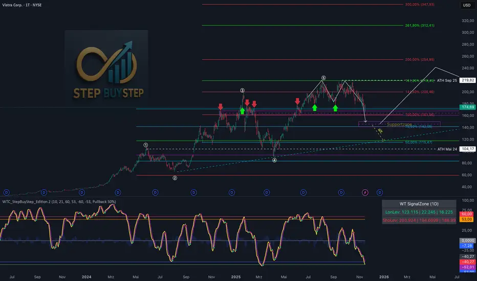
WTC Step Buy Step Edition CbyCarlo📊 WT Cross Modified – Step Buy Step Edition (v4)
WTC_StepBuyStep_Edition is an enhanced, practical, and optimized version of the classic WaveTrend (WT) Cross Indicator.
Developed for the Step Buy Step project, this tool helps traders identify market momentum shifts, structural price zones, and potential reversal areas with high clarity and precision.
🔍 Concept & Purpose
This indicator builds upon the established WaveTrend / LazyBear logic and extends it with additional structural intelligence.
The goal is to make overbought/oversold phases and trend reversals easier to spot — while also highlighting historically validated price zones where the market has previously reacted strongly.
⚙️ Key Features
1️⃣ WT Cross Signals
WT1 (yellow) and WT2 (purple) visualize market momentum.
A WT1 cross above WT2 while below the Oversold zone (−53) can indicate potential Long opportunities.
A WT1 cross below WT2 while above the Overbought zone (+53) can indicate potential Short opportunities.
Signals only confirm after candle close to prevent repainting.
2️⃣ Dynamic “WT SignalZone” Panel
Displayed in the top-right corner, this panel shows the last three valid price levels derived from WT signals:
🟢 LonLev – Buy support levels from previous WT Long signals
🔴 ShoLev – Sell resistance levels from previous WT Short signals
These zones act as objective support/resistance structures, based on historical momentum turning points — not subjective lines.
3️⃣ Flexible Calculation Modes
Choose how levels are derived from each WT signal:
Pullback 50% → Midpoint of the signal candle (high+low)/2
Close → Close price of the signal candle
Next Open → Open of the following bar (ideal for system testing)
📈 How to Interpret the Indicator
Market Condition WT Event Meaning
WT1 < −53 & CrossUp Long Signal Potential reversal / buy zone
WT1 > +53 & CrossDown Short Signal Potential exhaustion / sell zone
Price revisits LonLev Support Re-entry or bounce zone
Price revisits ShoLev Resistance Profit-taking or short setup zone
This makes the tool highly effective for:
Swing traders
Zone-based trading strategies
Systematic re-entries
Identifying structural turning points
🧠 Advantages
No repainting (signals confirmed only after bar close)
Works on all timeframes (from intraday to weekly)
Clean overview without clutter or excessive chart markers
Excellent as a filter to confirm market context
💬 Best Use Case
Use WTC_StepBuyStep_Edition as a contextual confirmation tool.
It does not replace a full trading system — but it gives you objective, repeatable, and statistically relevant zones where the market has reacted before.
Combine it with price action, volume analysis, or trend tools for even stronger setups.
© Step Buy Step • Step-Buy-Step.com
Educational trading tool intended for market analysis.
Not financial advice.
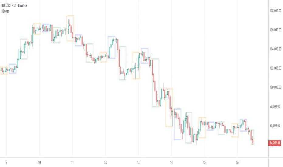
KZones Global Market Insight: Timezone moving marketsModern financial markets trade 24 hours a day, making it hard to track where the action is happening.
Do you wonder who is driving price action across Asia, Europe, and the Americas?
This indicator lets you visualize the trading activity of different geographic sessions.
For example, you can quickly see the recent move in Bitcoin was initiated by Americas selling down, represented by a large, downward-facing box. Asia and Europe followed through with more selling.
Start tracking the world's market movers today!
Note: This was inspired by ICT Killzones & Pivots
sima-Prev HTF & Sessions (Tehran)This indicator automatically plots the Opening, Closing, High, and Low levels of the major global trading sessions: London, New York, and Asia. It is designed to help traders visualize intraday liquidity zones, session-based volatility, and potential reaction levels where price commonly expands or reverses.
The script includes fully adjustable session times and highlights each session using clean visual markers so traders can easily identify market structure within different time windows. By displaying the Open, Close, High, and Low of each session, the indicator helps forecast areas of interest such as breakout levels, range boundaries, and session-based support/resistance.
This tool is especially useful for intraday traders, scalpers, and anyone who relies on session dynamics to analyze market behavior. It works on all timeframes and all markets, including Forex, indices, metals, and crypto. No repainting is used; all levels are plotted based on completed session data.
