CSP Institutional Filter PRO This indicator evaluates whether a ticker qualifies for a high-probability Cash-Secured Put (CSP) based on an institutional options-selling framework. It checks RSI, momentum, support levels, ATR-based risk, IVR, DTE, and earnings timing to determine if the setup meets either the Standard CSP Module (30–45 DTE) or the Pre-Earnings CSP Module (7–21 days before earnings). The script visually marks valid setups, highlights risk zones, and provides an on-chart diagnostic summary.
Cicli

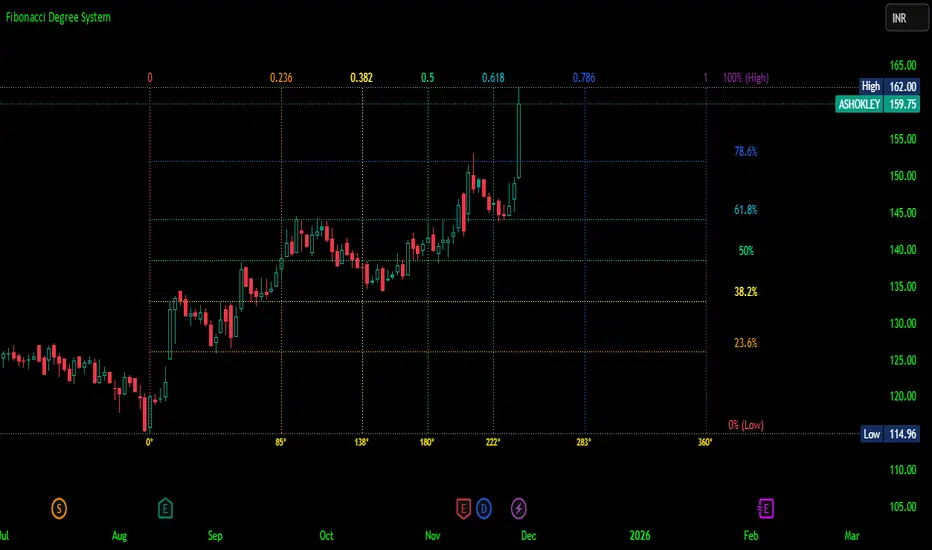
Fibonacci Degree System This Pine Script creates a sophisticated technical analysis tool that combines Fibonacci retracements with a degree-based cycle system. Here's a comprehensive breakdown:
Core Concept
The indicator maps price movements onto a 360-degree circular framework, treating market cycles like geometric angles. It creates a visual "mesh" where Fibonacci ratios intersect in both price (horizontal) and time (vertical) dimensions.
How It Works
1. Finding Reference Points
The script looks back over a specified period (default 100 bars) to identify:
Highest High: The peak price point
Lowest Low: The trough price point
Time Locations: Exactly which bars these extremes occurred on
These two points form the boundaries of your analysis window.
2. Creating the Fibonacci Grid
Horizontal Lines (Price Levels):
The script divides the price range between high and low into seven key Fibonacci ratios:
0% (Low) - Bottom boundary in red
23.6% - Minor retracement in orange
38.2% - Shallow retracement in yellow
50% - Midpoint in lime green
61.8% - Golden ratio in aqua (most significant)
78.6% - Deep retracement in blue
100% (High) - Top boundary in purple
Each line represents a potential support/resistance level where price might react.
Vertical Lines (Time Cycles):
The same Fibonacci ratios are applied to the time dimension between the high and low bars. If your high and low are 50 bars apart, vertical lines appear at:
Bar 0 (0%)
Bar 12 (23.6%)
Bar 19 (38.2%)
Bar 25 (50%)
Bar 31 (61.8%)
Bar 39 (78.6%)
Bar 50 (100%)
These suggest when price might make significant moves.
3. The Degree Mapping System
The innovative feature maps the time progression to degrees:
0° = Start point (0% time)
85° = 23.6% through the cycle
138° = 38.2% through the cycle
180° = Midpoint (50%)
222° = 61.8% through the cycle (golden angle)
283° = 78.6% through the cycle
360° = Complete cycle (100%)
This treats market movements as circular patterns, similar to how planets orbit or pendulums swing.
Visual Output
When you apply this indicator, you'll see:
A rectangular mesh extending beyond your high-low range (by 150% default)
Color-coded horizontal lines showing price Fibonacci levels
Matching vertical lines showing time Fibonacci intervals
Price labels on the right showing percentage levels
Degree labels at the bottom showing the angular position in the cycle
Intersection points creating a grid of potentially significant price-time coordinates
Trading Application
Traders use this to identify:
Support/Resistance Zones: Where horizontal and vertical lines intersect
Time Targets: When price might reverse (at vertical Fibonacci times)
Cycle Completion: When approaching 360°, a new cycle may begin
Harmonic Patterns: Geometric relationships between price and time
Customization Features
The script offers extensive control:
Lookback period: Adjust cycle length (10-500 bars)
Mesh extension: How far to project the grid forward
Visual toggles: Show/hide horizontal lines, vertical lines, labels
Styling: Line thickness, style (solid/dashed/dotted), colors
Label positioning: Fine-tune text placement for readability
The intersection at 61.8% time and 61.8% price at 222° becomes a key target zone.
This tool essentially converts the abstract concept of market cycles into a concrete, visual geometric framework that traders can analyze and act upon.
DISCLAIMER: This information is provided for educational purposes only and should not be considered financial, investment, or trading advice.
No guarantee of profits: Past performance and theoretical models do not guarantee future results. Trading and investing involve substantial risk of loss.
Not a recommendation: This script illustration does not constitute a recommendation to buy, sell, or hold any financial instrument.
Do your own research: Always conduct thorough independent research and consider consulting with a qualified financial advisor before making any trading decisions.
Keltner Channels - signal providerThis enhanced channel for pro traders visually indicates enhanced entry or exit signal based on the position of the underlying within the channel. Remember: EVERY TREND HAS ITS RETRACEMENTS - with this indicator you will avoid entering in full uptrend (bearing more downside risk than upside) or exiting (shorting) at max downtrend.
To be used together with the trend on higher timeframes (especially for the interpretation of the baseline)
Upper part = potential sell signal (especially in overall downtrends)
Lower part = potential buy signal (especially in overall uptrends)
Basis = potential buy signal (especially in strong uptrends)
= potential sell signal (especially in overall downtrends)

EMA Stack Background HighlighterThis is a simple script that highlights my backround when my criteria for my context timeframe is met, specifically, price is above the 10 EMA, the 10 is above the 20, and the 20 is above the 50 for green and vice versa for red. I use this in a multi timeframe approach similar to mentfx's EVC criteria

Weekday HighlighterThis is a simple indicator that highlights specific weekdays on the chart.
You can choose which weekdays to highlight and optionally use different colors for each day. It is useful for visually separating sessions such as Mondays, Fridays, or any custom trading day you want to focus on.
ただ単に曜日を指定してハイライトするインジです。

Filter Trend1. Indicator Name
Premium EMA Ribbon Filter (Pro Version)
(Advanced Trend & Momentum Filtering System Based on EMA Ribbons)
2. One-Line Introduction
A professional trend-analysis indicator that blends an advanced noise-filtering algorithm with an EMA ribbon system to extract only the pure bullish/bearish trend while smoothing out market noise.
3. Overall Description (7+ lines)
The Premium EMA Ribbon Filter is more than just a set of EMAs.
It analyzes the structure of a fast, medium, and slow EMA ribbon—along with the spacing and alignment between them—to determine whether the market is in a bullish trend, bearish trend, or a neutral/noise-heavy zone.
The core of this indicator is its noise-reduction algorithm and trend-strength calculation system.
Instead of relying on simple EMA cross signals, it evaluates how consistently the ribbon maintains bullish/bearish alignment over a specified period and highlights only strong trends with color coding, while weak or noisy areas are displayed in gray.
This helps traders avoid confusing or false signals and clearly focus only on the “meaningful zones.”
A Triple-Smoothing System is applied to create smoother, more refined ribbon movements, forming a stable “premium trend curve” that is less affected by short-term volatility.
As a result, this indicator works effectively for scalping, swing trading, and long-term trend following—staying true to the principle of removing noise and highlighting only the core market flow.
4. Short Advantages (6 items)
① Complete Noise Filtering
Using EMA ribbon comparison + tolerance logic, false reversals are largely eliminated, leaving only stable trend phases.
② Highly Readable Color System
Bullish trends are mint, bearish trends are red, and neutral/noise zones are gray—instantly visualizing market conditions.
③ Trend Strength Visualization
Not only trend direction but also trend strength is displayed via dynamic color transparency.
④ Smooth, Premium-Style Ribbon Design
Triple-smoothing creates a refined, luxury-level smoothness in movement.
⑤ Works Across All Timeframes
From 1-minute scalping to daily/weekly macro trend analysis.
⑥ Excellent Real-Trading Compatibility
Works extremely well when combined with ATR, SuperTrend, and volume-based indicators.
Indicator Manual (Required Section)
📌 Understanding the Core Concept
The indicator uses three EMAs (e.g., 20/50/100) arranged as a ribbon to analyze the structural alignment of the trend.
When the EMAs are cleanly aligned Top → Middle → Bottom, the market is in a bullish trend.
When aligned Bottom → Middle → Top, the market is in a bearish trend.
The indicator further evaluates the ribbon spread (gap) and the consistency of alignment to compute trend strength.
Noisy market conditions are shaded gray to clearly indicate “uncertain/indecisive” zones.
⚙️ Settings Description
Option Description
Fast EMA Most sensitive EMA; detects early trend signals
Mid EMA Stabilizes the primary trend direction
Slow EMA Defines the broader, long-term trend flow
Trend Lookback The period used to analyze trend strength
Noise Tolerance (%) Higher values = stronger noise removal
Smoothing Steps Controls how smooth the ribbon becomes
📈 Example Recognition
A bullish continuation/entry scenario forms when:
EMAs align in the order Fast → Mid → Slow (top side)
Ribbon color shifts into mint (strong bullish trend)
The ribbon begins to expand while price stays above the ribbon
📉 Example Recognition
A bearish continuation/entry occurs when:
EMAs align Fast → Mid → Slow (bottom side)
Ribbon color remains red
After contracting, the ribbon expands again during renewed downside strength
🧪 Recommended Usage
Combine with volume-based indicators (OBV, Volume Profile) → enhanced strong-trend detection
Use with SuperTrend or ATR Stop → clearer stop-loss placement
Combine with RSI/Stoch → avoid counter-trend entries in overheated conditions
Higher leverage traders should use higher tolerance settings
🔒 Cautions
EMA ribbons are trend-following tools; signals may weaken in ranging/sideways markets.
Never rely solely on this indicator—always confirm with volume, price patterns, or structure.
Very low Lookback values may cause excessive re-entry signals.
In high-volatility environments, ribbon spacing can contract/expand rapidly—use with caution.

QLC v8.4 – GIBAUUM BEAST + ANTI-FAKEOUTQLC v8.4 – GIBAUUM BEAST + ANTI-FAKEOUT
QLC v8.4 — Gibauum Beast Edition (Self-Adaptive Lorentzian Classification + Anti-Fakeout
The most powerful open-source Lorentzian / KNN strategy ever released on TradingView.
Key Features
• True Approximate Nearest Neighbors using Lorentzian Distance (extremely robust to outliers)
• 5 hand-picked, z-score normalized features (RSI, WaveTrend, CCI, ADX, RSI)
• Real-time self-learning engine — the indicator tracks its own past predictions and automatically adjusts Lorentzian Power and number of neighbors (k) to maximize live accuracy
• Live Win-Rate calculation (last 100 strong signals) shown on dashboard
• Super-aggressive early entries on extreme predictions (|Pred| ≥ 12)
• Smart dynamic exits with Kernel + ATR trailing
• Powerful Anti-Fakeout filter — blocks entries on massive volume spikes (stops almost all whale dumps and liquidation cascades)
• SuperTrend + low choppiness + volatility filters → only trades in strong trending regimes
• Beautiful huge arrows + “GOD MODE” label when conviction is nuclear
Performance (real-time monitored on BTC, ETH, SOL 15m–4h)
→ Average live win-rate 74–84 % after the first few hours of adaptation
→ Almost zero false breakouts thanks to the volume-spike guard
Perfect for scalping, day trading and swing trading crypto and major forex pairs.
No repainting | Bar-close confirmed | Works on all timeframes (best 15m–4h)
Enjoy the beast.

an_dy_time_marker+killzone+sessionAn indicator where you can configure 5 different trading times. You can also view the kill zone and the entire session.
Have fun and catch the pips!

Previous Day • Week • Month High/Low (Customizable)Simple Previous Day, Week and Month Levels. Customisable as well.

Regime [CHE] Regime — Minimal HTF MACD histogram regime marker with a simple rising versus falling state.
Summary
Regime is a lightweight overlay that turns a higher-timeframe-style MACD histogram condition into a simple regime marker on your chart. It queries an imported core module to determine whether the histogram is rising and then paints a consistent marker color based on that boolean state. The output is intentionally minimal: no lines, no panels, no extra smoothing visuals, just a repeated marker that reflects the current regime. This makes it useful as a quick context filter for other signals rather than a standalone system.
Motivation: Why this design?
A common problem in discretionary and systematic workflows is clutter and over-interpretation. Many regime tools draw multiple plots, which can distract from price structure. This script reduces the regime idea to one stable question: is the MACD histogram rising under a given preset and smoothing length. The core logic is delegated to a shared module to keep the indicator thin and consistent across scripts that rely on the same definition.
What’s different vs. standard approaches?
Reference baseline: A standard MACD histogram plotted in a separate pane with manual interpretation.
Architecture differences:
Uses a shared library call for the regime decision, rather than re-implementing MACD logic locally.
Uses a single boolean output to drive marker color, rather than plotting histogram bars.
Uses fixed marker placement at the bottom of the chart for consistent visibility.
Practical effect:
You get a persistent “context layer” on price without dedicating a separate pane or reading histogram amplitude. The chart shows state, not magnitude.
How it works (technical)
1. The script imports `chervolino/CoreMACDHTF/2` and calls `core.is_hist_rising()` on each bar.
2. Inputs provide the source series, a preset string for MACD-style parameters, and a smoothing length used by the library function.
3. The library returns a boolean `rising` that represents whether the histogram is rising according to the library’s internal definition.
4. The script maps that boolean to a color: yellow when rising, blue otherwise.
5. A circle marker is plotted on every bar at the bottom of the chart, colored by the current regime state. Only the most recent five hundred bars are displayed to limit visual load.
Notes:
The exact internal calculation details of `core.is_hist_rising()` are not shown in this code. Any higher timeframe mechanics, security usage, or confirmation behavior are determined by the imported library. (Unknown)
Parameter Guide
Source — Selects the price series used by the library call — Default: close — Tips: Use close for consistency; alternate sources may shift regime changes.
Preset — Chooses parameter preset for the library’s MACD-style configuration — Default: 3,10,16 — Trade-offs: Faster presets tend to flip more often; slower presets tend to react later.
Smoothing Length — Controls smoothing used inside the library regime decision — Default: 21 — Bounds: minimum one — Trade-offs: Higher values typically reduce noise but can delay transitions. (Library behavior: Unknown)
Reading & Interpretation
Yellow markers indicate the library considers the histogram to be rising at that bar.
Blue markers indicate the library considers it not rising, which may include falling or flat conditions depending on the library definition. (Unknown)
Because markers repeat on every bar, focus on transitions from one color to the other as regime changes.
This tool is best read as context: it does not express strength, only direction of change as defined by the library.
Practical Workflows & Combinations
Trend following:
Use yellow as a condition to allow long-side entries and blue as a condition to allow short-side entries, then trigger entries with your primary setup such as structure breaks or pullback patterns. (Optional)
Exits and stops:
Consider tightening management after a color transition against your position direction, but do not treat a single flip as an exit signal without price-based confirmation. (Optional)
Multi-asset and multi-timeframe:
Keep `Source` consistent across assets.
Use the slower preset when instruments are noisy, and the faster preset when you need earlier context shifts. The best transferability depends on the imported library’s behavior. (Unknown)
Behavior, Constraints & Performance
Repaint and confirmation:
This script itself uses no forward-looking indexing and no explicit closed-bar gating. It evaluates on every bar update.
Any repaint or confirmation behavior may come from the imported library. If the library uses higher timeframe data, intrabar updates can change the state until the higher timeframe bar closes. (Unknown)
security and HTF:
Not visible here. The library name suggests HTF behavior, but the implementation is not shown. Treat this as potentially higher-timeframe-driven unless you confirm the library source. (Unknown)
Resources:
No loops, no arrays, no heavy objects. The plotting is one marker series with a five hundred bar display window.
Known limits:
This indicator does not convey histogram magnitude, divergence, or volatility context.
A binary regime can flip in choppy phases depending on preset and smoothing.
Sensible Defaults & Quick Tuning
Starting point:
Source: close
Preset: 3,10,16
Smoothing Length: 21
Tuning recipes:
Too many flips: choose the slower preset and increase smoothing length.
Too sluggish: choose the faster preset and reduce smoothing length.
Regime changes feel misaligned with your entries: keep the preset, switch the source back to close, and tune smoothing length in small steps.
What this indicator is—and isn’t
This is a minimal regime visualization and a context filter. It is not a complete trading system, not a risk model, and not a prediction engine. Use it together with price structure, execution rules, and position management. The regime definition depends on the imported library, so validate it against your market and timeframe before relying on it.
Disclaimer
The content provided, including all code and materials, is strictly for educational and informational purposes only. It is not intended as, and should not be interpreted as, financial advice, a recommendation to buy or sell any financial instrument, or an offer of any financial product or service. All strategies, tools, and examples discussed are provided for illustrative purposes to demonstrate coding techniques and the functionality of Pine Script within a trading context.
Any results from strategies or tools provided are hypothetical, and past performance is not indicative of future results. Trading and investing involve high risk, including the potential loss of principal, and may not be suitable for all individuals. Before making any trading decisions, please consult with a qualified financial professional to understand the risks involved.
By using this script, you acknowledge and agree that any trading decisions are made solely at your discretion and risk.
Do not use this indicator on Heikin-Ashi, Renko, Kagi, Point-and-Figure, or Range charts, as these chart types can produce unrealistic results for signal markers and alerts.
Best regards and happy trading
Chervolino
MACD HTF Hardcoded

1 PM IST MarkerThis lightweight Pine Script indicator automatically marks 1:00 PM IST on intraday charts, regardless of the chart’s timezone. It extracts the date from each bar and generates a precise timestamp for 13:00 in the Asia/Kolkata timezone. When a bar matches this time, the script draws a vertical red line across the chart and adds a small label for easy visual reference.
The tool is useful for traders who track mid-session behavior, monitor liquidity shifts, or analyze post-lunch volatility patterns in Indian markets. It works on all intraday timeframes and require

NIFTY, SENSEX AND BANKNIFTY Options Expiry MarkerNSE Options Expiry Background Marker
Category: Date/Time Indicators
Timeframe: Daily
Markets: NSE (India) / Any Exchange
Description
Automatically highlights weekly and monthly options expiry days for NIFTY, BANKNIFTY, and SENSEX using color-coded background shading. Works across entire chart history with customizable transparency levels.
Key Features
✅ Background Highlighting - Non-intrusive color shading on expiry days
✅ Multi-Index Support - NIFTY, BANKNIFTY, and SENSEX simultaneously
✅ Weekly & Monthly Expiry - Different transparency levels for easy distinction
✅ Customizable Expiry Days - Set any weekday (Mon-Fri) as expiry day
✅ Adjustable Transparency - Separate controls for weekly and monthly expiries
✅ Full Historical Data - Works on all visible bars across years
✅ Smart Monthly Detection - Automatically identifies last occurrence in month
✅ Color Coded - Blue (NIFTY), Red (BANKNIFTY), Green (SENSEX)
Use Cases
Options trading strategy planning
Identify expiry day volatility patterns
Visual reference for monthly vs weekly cycles
Backtest strategies around expiry days
Track multiple index expiries on single chart
Technical Details
Uses India timezone (GMT+5:30) for accurate date calculations
Handles leap years automatically
Smart algorithm identifies last weekday occurrence per month
Works seamlessly on any chart timeframe (optimized for Daily)
No performance impact - simple background coloring

QLC - Gibaum 1.0 QLC - Gibaum 1.0
Good for Leverage AND Short - 5 to 20 minutes >70%.
Gibaum The Beast
Little Black Guy suffers in america

First day of NIFTY Monthly ExpiryAutomatically identifies and marks the first Wednesday that occurs after the last Tuesday of each calendar month on your charts. Designed specifically for NSE traders using Indian timezone (GMT+5:30). Automatically adjusts for market holidays by marking the next available trading day. Handles cases where the Wednesday falls in the following month (e.g., Sept 30 → Oct 1).

Momentum Day Trading ToolkitMomentum Day Trading Toolkit
Complete User Guide
Table of Contents
Overview
Quick Start
The Dashboard
Module 1: 5 Pillars Screener
Module 2: Gap & Go
Module 3: Bull Flag / Flat Top
Module 4: Float Rotation
Module 5: R2G / G2R
Module 6: Micro Pullback
Signal Reference
Quality Score
Settings Guide
Alerts Setup
Trading Workflows
Troubleshooting
Overview
The Momentum Day Trading Toolkit combines 6 powerful indicators into one unified system for day trading momentum stocks.
ModulePurpose① 5 PillarsConfirms stock is "in play"② Gap & GoPre-market levels & gap analysis③ Bull Flag / Flat TopClassic breakout patterns④ Float RotationMeasures true interest level⑤ R2G / G2RTracks prior close crosses⑥ Micro PullbackPrecision continuation entries
All modules work together - the dashboard shows you everything at a glance, and you can enable/disable any module you don't need.
Quick Start
Step 1: Add to Chart
Add the indicator to any stock chart
Recommended timeframes: 1-minute, 5-minute, or 15-minute
Step 2: Check the Dashboard (Top Right)
Look for:
Status = Current state (Scanning, Entry Signal, etc.)
Quality Score = Setup rating out of 10
Green checkmarks (✓) = Criteria passing
Step 3: Watch for Entry Signals
Triangles, circles, diamonds below bars = Entry signals
Arrows = R2G/G2R crosses
Step 4: Set Alerts
Right-click chart → Add Alert
Select "Momentum Day Trading Toolkit"
Choose your alert condition
The Dashboard
The dashboard in the top-right corner gives you instant analysis:
┌─────────────────────────────┐
│ MOMENTUM TOOLKIT │
├─────────────────────────────┤
│ Status │ 🎯 ENTRY SIGNAL │
│ Day │ 🟢 GREEN │
│ Gap │ +8.5% 🔥 │
│ RVol │ 3.2x ✓ │
│ Rotation │ 1.45x 🔥 │
│ Float │ 5.2M 🔥 │
│ Change │ +12.3% ✓ │
│ Pattern │ BULL FLAG! │
│ EMA 9/20 │ Above Both ✓ │
│ VWAP │ Above ✓ │
│ Prior Cl │ 5.91 │
│ PM High │ 9.11 ✓ │
│ Price │ 9.46 ✓ │
└─────────────────────────────┘
Dashboard Row Reference
RowWhat It ShowsGood ValuesStatusCurrent state🎯 ENTRY SIGNALDayGreen/Red vs prior close🟢 GREENGapGap % from prior close🔥 (5%+) or 🔥🔥 (10%+)RVolRelative volume✓ (2x+) or ✓✓ (5x+)RotationFloat rotation🔥 (1x) or 🔥🔥 (2x+)FloatFloat in millions🔥 (<5M) or Low (<10M)ChangeDaily % change✓ (meets minimum)PatternPattern statusBREAKOUT!EMA 9/20Trend positionAbove Both ✓VWAPVWAP positionAbove ✓Prior CloseKey R2G levelReference pricePM HighPre-market high✓ = Above itPriceCurrent price✓ = In range
Status Messages
StatusMeaningActionScanning...Looking for setupsWait✅ ALL PILLARSStock qualifiesWatch for pattern⏳ PATTERN FORMINGSetup developingGet ready🎯 ENTRY SIGNALSignal triggeredExecute trade
Module 1: 5 Pillars Screener
What It Does
Confirms the stock meets basic criteria to be worth trading.
The 5 Pillars
PillarDefaultWhy It MattersRelative Volume2x+ (5x for "strong")Confirms unusual interestDaily Change5%+Stock is movingPrice Range$1-$20Sweet spot for momentumFloat Size<20M sharesLower float = bigger moves
Visual Indicator
Green background appears when ALL pillars pass
Dashboard Shows
Individual pillar status with ✓ checkmarks
Quality score includes pillar factors
Settings
SettingDefaultDescriptionMin RVol2.0xMinimum relative volumeStrong RVol5.0xVolume for full qualificationMin Change5%Minimum daily moveMin Price$1Minimum stock priceMax Price$20Maximum stock priceMax Float20MMaximum float size
Module 2: Gap & Go
What It Does
Analyzes pre-market gaps and displays key price levels.
Key Levels Displayed
LevelColorDescriptionPrior CloseOrangeYesterday's close - THE key levelPM HighGreenPre-market high - breakout levelPM LowRedPre-market low - support
Gap Classification
Gap SizeRatingMeaning5-9.9%🔥 QualifyingWorth watching10%+🔥🔥 StrongHigh priority
Entry Signal
Small green triangle = PM High Breakout
How to Trade
Stock gaps up in pre-market
Wait for market open
Look for break above PM High
Enter on breakout with stop below PM Low
Settings
SettingDefaultDescriptionMin Gap %5%Qualifying gap thresholdStrong Gap %10%Strong gap thresholdShow PM LevelsONDisplay PM high/low lines
Module 3: Bull Flag / Flat Top
What It Does
Detects classic continuation patterns and signals breakouts.
Bull Flag Pattern
▲ BREAKOUT (Entry Signal)
│
┌────┴────┐
│ Pullback │ ← 2-5 red candles
│ (flag) │ Max 50% retrace
└─────────┘
│
┌────┴────┐
│ Pole │ ← 3+ green candles
│ (move) │ Strong momentum
└─────────┘
Flat Top Pattern
═══════════════ Resistance (2+ touches)
│
▲ BREAKOUT above resistance
Entry Signals
SignalShapeColorPatternBull Flag Breakout▲ TriangleLimeFlag breaks upFlat Top Breakout◆ DiamondAquaResistance breaks
How to Trade Bull Flag
See 3+ green candles (the pole)
Price pulls back 2-5 red candles
Pullback stays above 50% of move
Enter on break above pullback high
Stop below pullback low
Settings
SettingDefaultDescriptionMin Pole Candles3Green candles neededMax Pullback5Max red candles allowedMax Retrace50%Max pullback depthFT Touches2Resistance touches neededFT Lookback10Bars to check for resistance
Module 4: Float Rotation
What It Does
Tracks how many times the entire float has traded hands today.
The Formula
Rotation = Cumulative Day Volume ÷ Float
Rotation Levels
RotationEmojiMeaning0.5x—Half float traded1.0x🔥FULL rotation - significant!2.0x🔥🔥Double rotation - extreme3.0x+🔥🔥🔥Triple rotation - rare event
Why It Matters
High rotation = Extreme interest
Everyone who owns shares has likely traded
Often precedes explosive moves
Shows "real" demand beyond just volume
Dashboard Shows
Current rotation level
Fire emojis for milestones
Settings
SettingDefaultDescriptionFloat SourceAutoAuto-detect or manualManual Float10MIf auto fails, use thisAlert Level1.0xAlert when rotation hits this
Module 5: R2G / G2R
What It Does
Tracks when price crosses the prior day's close - a key psychological level.
Red to Green (R2G) 🟢
Prior Close ─────────────────
↗ CROSS TO GREEN
↗
(opened red)
Stock opened below prior close (red)
Crosses above prior close (green)
BULLISH signal
Green to Red (G2R) 🔴
(opened green)
↘
↘ CROSS TO RED
Prior Close ─────────────────
Stock opened above prior close (green)
Crosses below prior close (red)
BEARISH signal
Entry Signals
SignalShapeColorMeaningR2G↑ ArrowLimeCrossed to greenG2R↓ ArrowRedCrossed to red
Why R2G Matters
Bears who shorted get squeezed
Creates FOMO buying
Prior close becomes support
Momentum often continues
Dashboard Shows
Current day status (🟢 GREEN / 🔴 RED)
Whether R2G or G2R occurred (R2G ✓ or G2R ✓)
Settings
SettingDefaultDescriptionRequire Opposite OpenONR2G needs red openShow Prior CloseONDisplay the line
Module 6: Micro Pullback
What It Does
Finds precision entries on brief 1-3 candle pullbacks after strong moves.
The Pattern
▲ ENTRY (break pullback high)
│
┌──┴───┐
│ 1-3 │ ← Micro pullback (brief!)
│ red │ Stop = low of this
└──────┘
│
┌──┴───┐
│ 3+ │ ← Strong move
│green │ Momentum building
└──────┘
Why Micro Pullbacks Work
Tight stop = Pullback low is close
Momentum intact = Only paused briefly
Early entry = Catch continuation early
Clear trigger = Break of pullback high
Entry Signal
SignalShapeColorMicro Pullback Entry● CircleYellow
How to Trade
See 3+ green candles (strong move)
1-3 red candles (brief pause)
Pullback stays above 50% retrace
Enter when green candle breaks pullback high
Stop at pullback low
Settings
SettingDefaultDescriptionMin Green Candles3Candles before pullbackMax Pullback3Max red candlesMax Retrace50%Max pullback depth
Signal Reference
All Entry Signals (Below Bar)
ShapeColorSignalModule▲ Large TriangleLimeBull Flag BreakoutPatterns◆ DiamondAquaFlat Top BreakoutPatterns● CircleYellowMicro Pullback EntryMicro PB▲ Small TriangleGreenPM High BreakoutGap & Go↑ ArrowLimeRed to GreenR2G/G2R
Warning Signals (Above Bar)
ShapeColorSignalModule↓ ArrowRedGreen to RedR2G/G2R
Optional Forming Signals (Disabled by Default)
ShapeColorSignal🚩 FlagFaded LimeBull Flag Forming● CircleFaded YellowMicro PB Forming
Enable "Show 'Forming' Markers" in settings to see these
Quality Score
The quality score (0-10) rates the overall setup strength.
Scoring Breakdown
FactorPointsRVol 5x++2RVol 2x++1Daily change 5%++1Low float (<20M)+1Strong gap (10%+)+2Qualifying gap (5%+)+1Rotation 1x++2Rotation 0.5x++1Above EMA 20+1
Score Interpretation
ScoreGradeAction8-10A+Best setups - full position6-7AGood setups - standard size4-5BAverage - reduced size0-3CWeak - skip or paper trade
Settings Guide
Module Toggles
Turn each module ON/OFF:
SettingDefaultDescription① 5 Pillars ScreenerONStock qualification② Gap & Go AnalysisONGap & level analysis③ Bull Flag / Flat TopONPattern detection④ Float RotationONRotation tracking⑤ R2G / G2R TrackerONPrior close crosses⑥ Micro PullbackONPullback entries
Visual Settings
SettingDefaultDescriptionShow DashboardONDisplay info tableTable SizeNormalSmall/Normal/LargeShow Entry SignalsONDisplay entry shapesShow 'Forming' MarkersOFFShow pattern formingShow Key LevelsONPrior close, PM levelsShow EMA 9/20ONTrend EMAsShow VWAPONVWAP line
Recommended Presets
Minimal (Clean Chart)
Show Dashboard: ON
Show Entry Signals: ON
Show 'Forming' Markers: OFF
Show Key Levels: OFF
Show EMA: OFF
Show VWAP: OFF
Standard (Balanced)
All defaults
Full Analysis
All settings ON
Alerts Setup
Available Alerts
AlertTriggerAny Bullish EntryAny entry signal firesBull Flag BreakoutBull flag breaks outFlat Top BreakoutFlat top breaks outMicro Pullback EntryMicro PB triggersPM High BreakoutBreaks above PM highRed to GreenR2G crossGreen to RedG2R crossFloat RotationHits rotation level5 Pillars PassAll pillars qualifyPattern FormingPattern starts formingHigh Quality EntryEntry with score 7+/10
How to Set Alerts
Right-click on chart
Select "Add Alert"
Condition: "Momentum Day Trading Toolkit"
Select alert type from dropdown
Set expiration and notifications
Click "Create"
Recommended Alerts
For Active Trading:
Any Bullish Entry
High Quality Entry
For Watchlist Monitoring:
5 Pillars Pass
Float Rotation
Trading Workflows
Workflow 1: Full Qualification
Step 1: 5 PILLARS
└─→ Wait for "✅ ALL PILLARS" status
Step 2: CHECK SETUP
└─→ Quality score 6+?
└─→ Above EMA and VWAP?
Step 3: WAIT FOR ENTRY
└─→ Bull Flag, Flat Top, or Micro PB signal
Step 4: EXECUTE
└─→ Enter on signal
└─→ Stop below pattern low
└─→ Target 2:1 minimum
Workflow 2: Gap & Go
Step 1: PRE-MARKET
└─→ Stock gaps 5%+ (shows in Gap row)
Step 2: MARKET OPEN
└─→ Note PM High level (green line)
Step 3: WAIT FOR BREAK
└─→ PM High Breakout signal (small triangle)
Step 4: CONFIRM
└─→ R2G if opened red (double confirmation)
└─→ RVol 2x+
Step 5: EXECUTE
└─→ Enter on PM High break
└─→ Stop below PM Low
Workflow 3: Micro Pullback Scalp
Step 1: FIND MOMENTUM
└─→ Stock moving, 3+ green candles
Step 2: WAIT FOR PAUSE
└─→ 1-3 red candles (brief pullback)
Step 3: ENTRY
└─→ Yellow circle signal appears
Step 4: QUICK TRADE
└─→ Enter at signal
└─→ Tight stop at pullback low
└─→ Quick target (1:1 to 2:1)
Troubleshooting
Q: Lines are moving/jumping on real-time chart?
A: This was fixed in latest version. Make sure you have the newest code. Lines now lock in place at market open.
Q: Too many signals, chart is cluttered?
A:
Turn off "Show 'Forming' Markers"
Disable modules you don't need
Use "Minimal" visual preset
Q: No signals appearing?
A:
Check if "Show Entry Signals" is ON
Make sure relevant module is enabled
Stock may not meet pattern criteria
Q: Dashboard shows wrong float?
A:
TradingView float data isn't available for all stocks
Switch Float Source to "Manual"
Enter correct float in millions
Q: PM High/Low not showing?
A:
Only appears during market hours
Needs pre-market data to calculate
Check if "Show Key Levels" is ON
Q: Quality score seems wrong?
A:
Score updates in real-time
Check individual factors in dashboard
RVol and rotation change throughout day
Q: Alert not triggering?
A:
Make sure alert is set on correct symbol
Check alert hasn't expired
Verify condition is set correctly
Quick Reference Card
Entry Signals
▲ Lime Triangle = Bull Flag Breakout
◆ Aqua Diamond = Flat Top Breakout
● Yellow Circle = Micro Pullback
▲ Green Triangle = PM High Break
↑ Lime Arrow = R2G (bullish)
↓ Red Arrow = G2R (bearish)
Dashboard Quick Read
🎯 = Entry signal active
✅ = All pillars pass
🟢 = Day is green
🔥 = Strong (gap/rotation)
✓ = Criteria met
✗ = Criteria failed
Quality Score
8-10 = A+ (Best)
6-7 = A (Good)
4-5 = B (Average)
0-3 = C (Weak)
Key Levels
Orange Line = Prior Close (R2G level)
Green Line = PM High (breakout level)
Red Line = PM Low (support)
Purple Line = VWAP
Yellow/Orange = EMA 9/20
Happy Trading! 🎯📈
For questions or issues, use TradingView's comment section on the indicator page.

Smart Money Decoded [GOLD]Title: Smart Money Decoded
Description:
Introduction
Smart Money Decoded is a comprehensive, institutional-grade visualization suite designed to simplify the complex world of Smart Money Concepts (SMC). While many indicators flood the chart with noise, this tool focuses on clarity, precision, and high-probability structure.
This script is built for traders who follow the "Inner Circle Trader" (ICT) methodologies but struggle to identify valid Zones, Displacement, and Liquidity Sweeps in real-time.
💎 Key Features & Logic
1. Refined Market Structure (BOS & CHoCH)
Instead of marking every minor pivot, this script uses a filtered Swing High/Low detection system.
HH/LL/LH/HL Labels: Only significant structure points are mapped.
BOS (Break of Structure): Marks trend continuations in the direction of the bias.
CHoCH (Change of Character): Marks potential trend reversals.
2. Advanced Order Blocks (with "Strict Mode")
Not all down-candles before an up-move are Order Blocks. This script separates the weak from the strong.
Standard OBs: Visualized with standard transparency.
⚡ SWEEP OBs (High Probability): Order Blocks that explicitly swept liquidity (Stop Hunt) before the reversal are highlighted with a thicker border, brighter color, and a ⚡ symbol. These are your high-probability "Turtle Soup" entries.
Strict Mode Toggle: In the settings, you can choose to hide all weak OBs and only see the ones that swept liquidity.
3. Dynamic Breaker Blocks
A true ICT Breaker is a failed Order Block that trapped liquidity.
This script automatically detects when a valid OB is mitigated (broken through) and projects it forward as a Breaker Block.
This ensures you are trading off valid flipped zones (Support becomes Resistance, Resistance becomes Support).
4. Fair Value Gaps (FVG)
Automatically detects Imbalances (Imbalance/Inefficiency).
Includes an ATR Filter to ignore tiny, insignificant gaps, keeping your chart clean.
Option to show the Consequent Encroachment (50% CE) level for precision entries.
5. Liquidity Zones (BSL / SSL)
Automatically plots Buy Side Liquidity (BSL) and Sell Side Liquidity (SSL) at key swing points.
Once price sweeps these levels, the zone is removed or marked as "Swept," helping you identify when the draw on liquidity has been met.
6. Institutional Data Panel
A dashboard in the top right corner displays:
Market Bias: Bullish/Bearish/Neutral based on structure.
Premium/Discount: Tells you if price is in the expensive (Premium) or cheap (Discount) part of the current dealing range.
Active Zones: Counts of current open arrays.
⚙️ How To Use This Indicator
Identify Bias: Look at the Structure Labels (HH/LL) and the Panel. Are we making Higher Highs?
Wait for the Trap: Look for a Liquidity Sweep (BSL/SSL taken) or a ⚡ Sweep OB.
Entry Confirmation: Watch for a return to a Fair Value Gap (FVG) or a retest of a Breaker Block (BRK).
Manage Risk: Use the visuals to place stops above/below invalidation points.
Customization:
Go to the settings to toggle "Strict Mode" for Order Blocks, change colors to match your theme, or adjust the lookback periods to fit your specific asset (Forex, Crypto, or Indices).
📚 Credits & Acknowledgments
This script is an educational tool based on the public teachings of Michael J. Huddleston (The Inner Circle Trader - ICT).
Concepts used: Order Blocks, Breakers, FVGs, Market Structure, Liquidity Pools.
Credit is fully given to ICT for originating these concepts and sharing them with the world.
⚠️ Disclaimer
This script is NOT affiliated with, endorsed by, or connected to Michael J. Huddleston (ICT) in any way. It is an independent coding project intended for educational purposes and visual assistance.
Trading involves substantial risk. This indicator does not guarantee profits. Always use proper risk management. Trust your analysis first, and use indicators as confluence.
#Smart Money Concepts, #SMC, #ICT,#Liquidity, #Market Structure, #Trend, #Price Action.

Red to Green / Green to Red Tracker# Red to Green / Green to Red Tracker - Quick Reference
## Core Concept
```
PRIOR CLOSE = Yesterday's closing price = The "zero line" for today
Above Prior Close = 🟢 GREEN (profitable for yesterday's buyers)
Below Prior Close = 🔴 RED (losing for yesterday's buyers)
```
---
## The Two Key Moves
### 🟢 Red to Green (R2G)
```
OPEN: Below prior close (RED)
↓
CROSS: Price moves above prior close
↓
RESULT: Now GREEN - Bullish signal
```
**Why it matters:**
- Bears who shorted get squeezed
- Creates FOMO buying
- Momentum often continues
---
### 🔴 Green to Red (G2R)
```
OPEN: Above prior close (GREEN)
↓
CROSS: Price moves below prior close
↓
RESULT: Now RED - Bearish signal
```
**Why it matters:**
- Longs who bought get trapped
- Triggers stop losses
- Panic selling follows
---
## Signals Explained
| Signal | Shape | Location | Meaning |
|--------|-------|----------|---------|
| R2G | ▲ Green Triangle | Below bar | Crossed to green |
| G2R | ▼ Red Triangle | Above bar | Crossed to red |
---
## Level Lines
| Line | Color | Style | What It Is |
|------|-------|-------|------------|
| Prior Close | Orange | Solid | KEY R2G/G2R level |
| Prior High | Green | Dashed | Yesterday's high |
| Prior Low | Red | Dashed | Yesterday's low |
| Today Open | White | Dotted | Gap reference |
---
## Info Table Reference
| Field | What It Shows |
|-------|---------------|
| Status | 🟢 GREEN / 🔴 RED / ⚪ FLAT |
| Day Change | % change from prior close |
| Prior Close | The key level price |
| Distance | How far from prior close |
| Opened | Did today open green or red |
| R2G | R2G status + price if triggered |
| G2R | G2R status + price if triggered |
| Rel Vol | Current relative volume |
| Prior High | Yesterday's high + distance |
| Prior Low | Yesterday's low + distance |
---
## Trading R2G (Long Setup)
### Entry Checklist
- Stock opened RED (below prior close)
- R2G cross signal triggered (green triangle)
- Volume confirmation (1.5x+ preferred, 2x+ ideal)
- Price holding above prior close
- Overall market not tanking
### Entry Method
1. **Aggressive:** Enter immediately on R2G cross
2. **Conservative:** Wait for pullback to prior close (now support)
### Stop Loss
- Below the R2G cross candle low
- OR below prior close (tighter)
### Target
- Prior day high (first target)
- 2:1 risk-reward minimum
---
## Trading G2R (Short Setup)
### Entry Checklist
- Stock opened GREEN (above prior close)
- G2R cross signal triggered (red triangle)
- Volume confirmation
- Price staying below prior close
- Overall market not ripping
### Entry Method
1. **Aggressive:** Enter immediately on G2R cross
2. **Conservative:** Wait for bounce to prior close (now resistance)
### Stop Loss
- Above the G2R cross candle high
- OR above prior close (tighter)
### Target
- Prior day low (first target)
- Gap fill (if gapped up)
---
## Signal Quality
### High Quality R2G ✓
- Opened significantly red (-2% or more)
- Strong volume on cross (2x+)
- First R2G of the day
- Market trending up
- News catalyst present
### Low Quality R2G ✗
- Opened barely red (-0.5%)
- Low volume cross
- Multiple R2G/G2R already today (choppy)
- Fighting market direction
- No clear catalyst
---
## Common Patterns
### Clean R2G (Best)
```
Open red → Steady climb → Cross prior close → Continue higher
```
### Failed R2G (Avoid/Exit)
```
Open red → Cross to green → Immediately fail back to red
```
### Choppy R2G/G2R (Avoid)
```
Multiple crosses back and forth = Indecision, no clear direction
```
---
## First Cross Rule
**The FIRST R2G or G2R of the day is usually the most significant.**
Why?
- Catches traders off guard
- Largest reaction from market
- Sets tone for rest of day
If you miss the first cross, be more selective on subsequent crosses.
---
## Volume Guide
| Rel Volume | Quality | Action |
|------------|---------|--------|
| < 1.0x | Weak | Skip or small size |
| 1.0-1.5x | Average | Standard position |
| 1.5-2.0x | Good | Full position |
| 2.0x+ | Strong | High conviction |
---
## Settings Recommendations
### Default (Balanced)
```
Require Opposite Open: ON
Require Volume: ON (1.5x)
Candle Close Confirm: OFF
Min Cross %: 0
```
### Conservative (Fewer, Better Signals)
```
Require Opposite Open: ON
Require Volume: ON (2.0x)
Candle Close Confirm: ON
Min Cross %: 0.5
```
### Aggressive (More Signals)
```
Require Opposite Open: OFF
Require Volume: OFF
Candle Close Confirm: OFF
Min Cross %: 0
```
---
## Alert Setup
### Essential Alerts
1. **First R2G of Day** - Highest value alert
2. **R2G with Strong Volume** - High conviction
### How to Set
1. Right-click chart → Add Alert
2. Condition: R2G/G2R Tracker
3. Select alert type
4. Set notification method
---
## Combining with Other Indicators
| Indicator | How to Use |
|-----------|------------|
| **Gap & Go** | R2G on gap-down stock = strong reversal |
| **Bull Flag** | Look for bull flag after R2G confirmation |
| **Float Rotation** | R2G + high rotation = explosive potential |
| **VWAP** | R2G above VWAP = strongest setup |
---
## Common Mistakes
❌ **Chasing late R2G**
- If price is already 3-5% green, you missed the move
- Wait for pullback or next setup
❌ **Ignoring volume**
- Low volume R2G often fails
- Always check relative volume
❌ **Fighting the market**
- R2G in a tanking market often fails
- G2R in a ripping market often fails
❌ **No stop loss**
- Failed R2G can reverse hard
- Always have a defined stop
❌ **Overtrading choppy stocks**
- Multiple R2G/G2R = no clear direction
- Skip stocks that keep crossing back and forth
---
## Quick Decision Framework
```
1. Did it open opposite color? (Red for R2G, Green for G2R)
- NO → Lower probability, be cautious
- YES → Continue
2. Is volume confirming? (1.5x+ relative volume)
- NO → Skip or small size
- YES → Continue
3. Is this the first cross of the day?
- YES → Higher probability
- NO → Be more selective
4. Is market direction supportive?
- NO → Skip
- YES → Take the trade
5. Can you define risk? (Clear stop level)
- NO → Skip
- YES → Execute
```
---
## Key Takeaways
1. **Prior close is THE key level** - everyone watches it
2. **First cross matters most** - sets daily tone
3. **Volume confirms** - low volume crosses often fail
4. **Failed crosses reverse hard** - always use stops
5. **Don't overtrade choppy action** - multiple crosses = stay out
---
Happy Trading! 🟢🔴

Bull Flag & Flat Top Breakout DetectorBull Flag & Flat Top Detector - Quick Reference Guide
Pattern Overview
🚩 Bull Flag
╱╲
╱ ╲ ← Pullback (2-5 red candles)
╱ ╲
╱ ╲____
╱ ╲
│ │
│ THE POLE │ ← Strong upward move (3+ green candles)
│ │
└──────────────┘
What to look for:
Strong initial move (the "pole") - 3+ green candles, 3%+ move
Brief pullback - 2-5 candles, less than 50% retracement
Pullback should "drift" lower, not crash
Entry on first candle to make new high after pullback
📊 Flat Top Breakout
════════════════ ← Resistance (multiple touches)
↑ ↑ ↑
╱╲ ╱╲ ╱╲
╱ ╲╱ ╲╱ ╲ ← Consolidation
╱ ╲
╱ ╲
What to look for:
Multiple touches of same resistance level (2+)
Tight consolidation range
Each failed breakout builds pressure
Entry on convincing break above resistance with volume
Signal Types
SignalShapeColorMeaningBull Flag Breakout▲ TriangleLimeEntry signal - go longFlat Top Breakout◆ DiamondAquaEntry signal - go longBear Flag Breakout▼ TriangleRedShort entry (if enabled)Pattern Forming🚩 FlagFaded GreenBull flag developingPattern Forming■ SquareFaded BlueFlat top developing
Level Lines Explained
LineColorStyleMeaningEntryLimeSolidBreakout trigger priceStop LossRedDashedExit if price falls hereTarget 1AquaDottedFirst profit target (2R)Target 2YellowDottedSecond profit target (3R)
Info Table Reference
FieldWhat It ShowsBull FlagScanning / Forming 🚩 / Breakout ✓Flat TopScanning / Forming 📊 / Breakout ✓PullbackCandle count + retracement %Rel VolumeCurrent bar vs averageEMA 20Above ✓ or Below ✗VWAPAbove ✓ or Below ✗Green StreakConsecutive green candles (pole)ResistanceTouch count for flat top
Trading Checklist
Before Entry ✅
Pattern status shows "FORMING" or "BREAKOUT"
Price above EMA (table shows ✓)
Price above VWAP (table shows ✓)
Relative volume 1.5x+ (ideally 2x+)
Stock is in play (up 5%+ on day, has catalyst)
Market direction supportive (not fighting trend)
Entry Execution
Wait for breakout candle to form
Confirm volume spike on breakout
Enter as close to entry line as possible
Set stop loss at red dashed line
Know your target levels
Trade Management
If no immediate follow-through → consider exit ("breakout or bailout")
Take 50% off at Target 1
Move stop to breakeven
Let remainder run toward Target 2
Exit fully if price returns below entry
Bull Flag Quality Checklist
Pole Quality:
FactorIdealAcceptableAvoidGreen candles5+3-4Less than 3Move size10%+3-10%Less than 3%VolumeIncreasingSteadyDecliningCandle bodiesLargeMediumSmall/doji
Pullback Quality:
FactorIdealAcceptableAvoidCandle count2-34-56+RetracementUnder 38%38-50%Over 50%VolumeDecliningSteadyIncreasingCharacterOrderly driftChoppySharp drop
Flat Top Quality Checklist
FactorGood SetupWeak SetupTouches3+ at same levelOnly 2, widely spacedToleranceVery tight (0.2%)Loose (1%+)Duration5-15 barsToo short or too longVolumeDrying upErraticPrior trendUpSideways/down
Common Mistakes to Avoid
❌ Entering too early
Wait for actual breakout, not anticipation
"Forming" ≠ "Breakout"
❌ Ignoring volume
No volume = likely false breakout
Require 1.5x+ relative volume minimum
❌ Fighting the trend
Check EMA and VWAP status
Both should be ✓ for high probability
❌ Wide stops
Stop should be below pullback low
If stop is too wide, skip the trade
❌ Holding losers
"Breakout or bailout" - if it doesn't work, exit
Failed breakouts often reverse hard
❌ Chasing extended moves
If you missed entry, wait for next pattern
Don't chase 5+ candles after breakout
Risk Management Rules
Position Sizing
Risk Amount = Account × Risk % (typically 1-2%)
Position Size = Risk Amount ÷ (Entry - Stop)
Example:
Account: $25,000
Risk: 1% = $250
Entry: $5.00
Stop: $4.70
Risk per share: $0.30
Position Size: $250 ÷ $0.30 = 833 shares
Risk-Reward Targets
TargetR MultipleExample (risk $0.30)Target 12:1+$0.60 ($5.60)Target 23:1+$0.90 ($5.90)
Timeframe Guide
TimeframeProsConsBest For1-minMore patterns, precise entryNoisy, false signalsScalping5-minGood balance, cleaner patternsFewer signalsDay trading15-minHigh quality patternsMiss fast movesSwing entries
Settings Quick Reference
Default Settings (Balanced)
Pole: 3 candles, 3% move
Pullback: 2-5 candles, 50% max retrace
Volume: 1.5x required
Filters: EMA + VWAP ON
Aggressive Settings
Pole: 2 candles, 2% move
Pullback: 2-6 candles, 60% max retrace
Volume: 1.2x required
Filters: VWAP OFF
Conservative Settings
Pole: 4 candles, 5% move
Pullback: 2-4 candles, 40% max retrace
Volume: 2.0x required
Filters: Both ON
Alert Setup
Recommended Alerts
"Bull Flag Forming"
Get early warning as pattern develops
Prepare your position size and levels
"Bull Flag Breakout"
Primary entry alert
React quickly when triggered
"Any Bullish Breakout"
Catch both bull flags and flat tops
Good for watchlist scanning
Alert Setup Steps
Right-click chart → Add Alert
Condition: Select "Bull Flag & Flat Top Breakout Detector"
Choose alert type from dropdown
Set expiration and notification method
Troubleshooting
Q: Patterns not detecting?
Lower the Min Pole Move % setting
Reduce Min Pole Candles requirement
Check that price is in acceptable range
Q: Too many false signals?
Increase volume multiplier to 2.0x
Enable both EMA and VWAP filters
Increase Min Pole Move %
Q: Levels not showing?
Enable "Show Entry Line", "Show Stop Loss", "Show Targets"
Check "Max Patterns to Display" setting
Q: Info table not visible?
Enable "Show Info Table" in settings
Try different table position
Pattern Combinations
Best Setups (A+ Quality)
Bull flag on a gap day (Gap & Go → Bull Flag)
Flat top at pre-market high resistance
Pattern forming above VWAP with 5x+ volume
Avoid These
Bull flag below VWAP
Flat top in downtrending stock
Low volume patterns
Patterns late in the day (after 2pm)
Daily Routine
Pre-Market (7-9am)
Build watchlist of gappers (5%+, high volume)
Apply indicator to top 3-5 candidates
Note pre-market levels
Market Open (9:30-10:30am)
Watch for "FORMING" status on watchlist
Prepare entries as patterns develop
Execute on breakout signals
Manage trades according to plan
Midday (10:30am-2pm)
Look for second-wave patterns
Be more selective (less momentum)
Consider tighter stops
Close (2-4pm)
Generally avoid new patterns
Manage existing positions
Review day's trades

Global Liquidity Score
Global Liquidity Score – Simple Risk-On / Risk-Off Gauge
This indicator measures overall market liquidity conditions using a single, normalized score.
It takes several macro and crypto variables, standardizes each one (z-score), and combines them into one clear Liquidity Score Line.
You only follow one line (your pink/white line).
The background color shows the current liquidity regime.
⸻
What the indicator measures
The algorithm looks at four major liquidity sources:
1. USD Liquidity (tightening or easing)
• DXY (strong dollar = tighter global liquidity)
• US10Y yield (higher yields = liquidity drain)
2. Risk Sentiment (risk-on vs risk-off)
• VIX index (volatility)
• S&P 500 index (SPX)
3. Credit Market Strength
• High-yield ETFs: HYG, JNK
• Investment-grade corporate credit: LQD
Stronger credit = easier liquidity.
Weaker credit = tightening risk.
4. Internal Crypto Liquidity
• USDT dominance (higher = risk-off in crypto)
• Bitcoin price
• TOTAL2 (crypto market cap excluding BTC)
These are all converted into z-scores and combined into one metric:
Total Liquidity Score =
USD Block + Risk Block − Credit Block − 0.5 × Crypto Block
⸻
How to read the colors
The indicator uses background colors to show the liquidity regime:
Color Meaning
Dark Red Severe liquidity tightening / strong risk-off
Red Mild-to-moderate tightening
Green Liquidity easing / soft risk-on
Dark Green Strong easing, high liquidity / risk-on
Your pink/white line = the final liquidity score.
You only need to follow that single line.
⸻
How to interpret the score
📉 Positive score → Liquidity Tightening (Risk-Off)
• USD stronger
• Yields rising
• Volatility rising
• Credit markets weakening
• Crypto rotating to stablecoins
📈 Negative score → Liquidity Easing (Risk-On)
• USD weakening
• Yields falling
• Stocks rising
• Volatility low
• Credit markets strong
• Crypto beta assets outperform
⸻
What this indicator is NOT
This is not a price predictor.
It does not follow BTC directly.
It tells you liquidity conditions, not immediate price direction.
It answers the macro question:
“Is liquidity flowing INTO the market or OUT of the market?”
If liquidity is tightening (red), crypto rallies are harder to sustain.
If liquidity is easing (green), crypto rallies have more fuel.

RSI Rate of Change (ROC of RSI)The RSI Rate of Change (ROC of RSI) indicator measures the speed and momentum of changes in the RSI, helping traders identify early trend shifts, strength of price moves, and potential reversals before they appear on the standard RSI.
While RSI shows overbought and oversold conditions, the ROC of RSI reveals how fast RSI itself is rising or falling, offering a deeper view of market momentum.
How the Indicator Works
1. RSI Calculation
The indicator first calculates the classic Relative Strength Index (RSI) using the selected length (default 14). This measures the strength of recent price movements.
2. Rate of Change (ROC) of RSI
Next, it computes the Rate of Change (ROC) of the RSI over a user-defined period.
This shows:
Positive ROC → RSI increasing quickly → strong bullish momentum
Negative ROC → RSI decreasing quickly → strong bearish momentum
ROC crossing above/below 0 → potential early trend shift
What You See on the Chart
Blue Line: RSI
Red Line: ROC of RSI
Grey dotted Zero Line: Momentum reference
Why Traders Use It
The RSI ROC helps you:
Detect momentum reversals early
Spot bullish and bearish accelerations not visible on RSI alone
Identify exhaustion points before RSI reaches extremes
Improve entry/exit precision in trend and swing trading
Validate price breakouts or breakdowns with momentum confirmation
Best For
Swing traders
Momentum traders
Reversal traders
Trend-following systems needing early confirmation signals
Relative Performance Analyzer [AstrideUnicorn]Relative Performance Analyzer (RPA) is a performance analysis tool inspired by the data comparison features found in professional trading terminals. The RPA replicates the analytical approach used by portfolio managers and institutional analysts who routinely compare multiple securities or other types of data to identify relative strength opportunities, make allocation decisions, choose the most optimal investment from several alternatives, and much more.
Key Features:
Multi-Symbol Comparison: Track up to 5 different symbols simultaneously across any asset class or dataset
Two Performance Calculation Methods: Choose between percentage returns or risk-adjusted returns
Interactive Analysis: Drag the start date line on the chart or manually choose the start date in the settings
Professional Visualization: High-contrast color scheme designed for both dark and light chart themes
Live Performance Table: Real-time display of current return values sorted from the top to the worst performers
Practical Use Cases:
ETF Selection: Compare similar ETFs (e.g., SPY vs IVV vs VOO) to identify the most efficient investment
Sector Rotation: Analyze which sectors are showing relative strength for strategic allocation
Competitive Analysis: Compare companies within the same industry to identify leaders (e.g., APPLE vs SAMSUNG vs XIAOMI)
Cross-Asset Allocation: Evaluate performance across stocks, bonds, commodities, and currencies to guide portfolio rebalancing
Risk-Adjusted Decisions: Use risk-adjusted performance to find investments with the best returns per unit of risk
Example Scenarios:
Analyze whether tech stocks are outperforming the broader market by comparing XLK to SPY
Evaluate which emerging market ETF (EEM vs VWO) has provided better risk-adjusted returns over the past year
HOW DOES IT WORK
The indicator calculates and visualizes performance from a user-defined starting point using two methodologies:
Percentage Returns: Standard total return calculation showing percentage change from the start date
Risk-Adjusted Returns: Cumulative returns divided by the volatility (standard deviation), providing insight into the efficiency of performance. An expanding window is used to calculate the volatility, ensuring accurate risk-adjusted comparisons throughout the analysis period.
HOW TO USE
Setup Your Comparison: Enable up to 5 assets and input their symbols in the settings
Set Analysis Period: When you first launch the indicator, select the start date by clicking on the price chart. The vertical start date line will appear. Drag it on the chart or manually input a specific date to change the start date.
Choose Return Type: Select between percentage or risk-adjusted returns based on your analysis needs
Interpret Results
Use the real-time table for precise current values
SETTINGS
Assets 1-5: Toggle on/off and input symbols for comparison (stocks, ETFs, indices, forex, crypto, fundamental data, etc.)
Start Date: Set the initial point for return calculations (drag on chart or input manually)
Return Type: Choose between "Percentage" or "Risk-Adjusted" performance.

AP Capital – Volatility + High/Low Projection v1.1📌 AP Capital – Volatility + High/Low Projection v1.1
Predictive Daily Volatility • Session Logic • High/Low Projection Indicator
This indicator is designed to help traders visually understand daily volatility conditions, identify session-based turning points, and anticipate potential highs and lows of the day using statistical behavior observed across thousands of bars of intraday data.
It combines intraday session structure, volatility regime classification, and context from the previous day’s expansion to highlight high-probability areas where the market may set its daily high or daily low.
🔍 What This Indicator Does
1. Volatility Regime Detection
Each day is classified into:
🔴 High Volatility (trend continuation & expansion likely)
🟡 Normal Volatility
🔵 Low Volatility (chop, false breaks, mean-reversion common)
The background color automatically adapts so you always know what environment you're trading in.
2. Session-Based High/Low Identification
Different global sessions tend to create different market behaviors:
Asia session frequently sets the LOW of day
New York & Late US sessions frequently set the HIGH of day
This indicator uses those probabilities to highlight potential turning points.
3. Potential High / Low of Day Projections
The script plots:
🟢 Potential LOW of Day
🔴 Potential HIGH of Day
These appear only when:
Price hits the session-statistical turning zone
Volatility conditions match
Yesterday’s expansion or compression context agrees
This keeps signals clean and prevents over-marking.
4. Clean Visuals
Instead of cluttering the chart, highs and lows are marked only when conditions align, making this tool ideal for:
Session scalpers
Day traders
Gold / NAS100 / FX intraday traders
High-probability reversal traders
🧠 How It Works
The engine combines:
Daily range vs 20-day average
Real-time intraday high/low formation
Session-specific probability weighting
Previous day expansion and volatility filters
This results in highly reliable signals for:
Fade trades
Reversal setups
Timing entries more accurately
✔️ Best Uses
Identifying where the day’s range is likely to complete
Avoiding trades during low-volatility compression days
Detecting where the market is likely to turn during major sessions
Using potential HIGH/LOW levels as take-profit zones
Enhancing breakout or reversal strategies
⚠️ Disclaimer
This indicator does not repaint, but it is not a standalone entry tool.
It is designed to provide context, session awareness, and volatility-driven turning points to assist your existing strategy.
Always combine with sound risk management.

Debt-Cycle vs Bitcoin-CycleDebt-Cycle vs Bitcoin-Cycle Indicator
The Debt-Cycle vs Bitcoin-Cycle indicator is a macro-economic analysis tool that compares traditional financial market cycles (debt/credit cycles) against Bitcoin market cycles. It uses Z-score normalization to track the relative positioning of global financial conditions versus cryptocurrency market sentiment, helping identify potential turning points and divergences between traditional finance and digital assets.
Key Features
Dual-Cycle Analysis: Simultaneously tracks traditional financial cycles and Bitcoin-specific cycles
Z-Score Normalization: Standardizes diverse data sources for meaningful comparison
Multi-Asset Coverage: Analyzes currencies, commodities, bonds, monetary aggregates, and on-chain metrics
Divergence Detection: Identifies when Bitcoin cycles move independently from traditional finance
21-Day Timeframe: Optimized for Long-term cycle analysis
What It Measures
Finance-Cycle (White Line)
Tracks traditional financial market health through:
Currencies: USD strength (DXY), global currency weights (USDWCU, EURWCU)
Commodities: Oil, gold, natural gas, agricultural products, and Bitcoin price
Corporate Bonds: Investment-grade spreads, high-yield spreads, credit conditions
Monetary Aggregates: M2 money supply, foreign exchange reserves (weighted by currency)
Treasury Bonds: Yield curve (2Y/10Y, 3M/10Y), term premiums, long-term rates
Bitcoin-Cycle (Orange Line)
Tracks Bitcoin market positioning through:
On-Chain Metrics:
MVRV Ratio (Market Value to Realized Value)
NUPL (Net Unrealized Profit/Loss)
Profit/Loss Address Distribution
Technical Indicators:
Bitcoin price Z-score
Moving average deviation
Relative Strength:
ETH/BTC ratio (altcoin strength indicator)
Visual Elements
White Line: Finance-Cycle indicator (positive = expansionary conditions, negative = contractionary)
Orange Line: Bitcoin-Cycle indicator (positive = bullish positioning, negative = bearish)
Zero Line: Neutral reference point
Interpretation
Cycle Alignment
Both positive: Risk-on environment, favorable for crypto
Both negative: Risk-off environment, caution warranted
Divergence: Potential opportunities or warning signals
Divergence Signals
Finance positive, Bitcoin negative: Bitcoin may be undervalued relative to macro conditions
Finance negative, Bitcoin positive: Bitcoin may be overextended or decoupling from traditional finance
Important Limitations
This indicator uses some technical and macro data but still has significant gaps:
⚠️ Limited monetary data - missing:
Funding rates (repo, overnight markets)
Comprehensive bond spread analysis
Collateral velocity and quality metrics
Central bank balance sheet details
⚠️ Basic economic coverage - missing:
GDP growth rates
Inflation expectations
Employment data
Manufacturing indices
Consumer confidence
⚠️ Simplified on-chain analysis - missing:
Exchange flow data
Whale wallet movements
Mining difficulty adjustments
Hash rate trends
Network fee dynamics
⚠️ No sentiment data - missing:
Fear & Greed Index
Options positioning
Futures open interest
Social media sentiment
The indicator provides a high-level cycle comparison but should be combined with comprehensive fundamental analysis, detailed on-chain research, and proper risk management.
Settings
Offset: Adjust the horizontal positioning of the indicators (default: 0)
Timeframe: Fixed at 21 days for optimal cycle detection
Use Cases
Macro-crypto correlation analysis: Understand when Bitcoin moves with or against traditional markets
Cycle timing: Identify potential tops and bottoms in both cycles
Risk assessment: Gauge overall market conditions across asset classes
Divergence trading: Spot opportunities when cycles diverge significantly
Portfolio allocation: Balance traditional and crypto assets based on cycle positioning
Technical Notes
Uses Z-score normalization with varying lookback periods (40-60 bars)
Applies HMA (Hull Moving Average) smoothing to reduce noise
Asymmetric multipliers for upside/downside movements in certain metrics
Requires access to FRED economic data, Glassnode, CoinMetrics, and IntoTheBlock feeds
21-day timeframe optimized for cycle analysis
Strategy Applications
This indicator is particularly useful for:
Cross-asset allocation - Decide between traditional finance and crypto exposure
Cycle positioning - Identify where we are in credit/debt cycles vs. Bitcoin cycles
Regime changes - Detect shifts in market leadership and correlation patterns
Risk management - Reduce exposure when both cycles turn negative
Disclaimer: This indicator is a cycle analysis tool and should not be used as the sole basis for investment decisions. It has limited coverage of monetary conditions, economic fundamentals, and on-chain metrics. The indicator provides directional insight but cannot predict exact timing or magnitude of market moves. Always conduct thorough research, consider multiple data sources, and maintain proper risk management in all investment decisions.
