$TGM | Topological Geometry Mapper (Custom)TGM | Topological Geometry Mapper (Custom) – 2025 Edition
The first indicator that reads market structure the way institutions actually see it: through persistent topological features (Betti-1 collapse) instead of lagging price patterns.
Inspired by algebraic topology and persistent homology, TGM distills regime complexity into a single, real-time proxy using the only two macro instruments that truly matter:
• CBOE:VIX – market fear & convexity
• TVC:DXY – dollar strength & global risk appetite
When the weighted composite β₁ persistence drops below the adaptive threshold → market structure radically simplifies. Noise dies. Order flow aligns. A directional explosion becomes inevitable.
Features
• Structural Barcode Visualization – instantly see complexity collapsing in real time
• Dynamic color system:
→ Neon green = long breakout confirmed
→ red = short breakout confirmed
→ yellow = simplification in progress (awaiting momentum)
→ deep purple = complex/noisy regime
• Clean HUD table with live β₁ value, threshold, regime status and timestamp
• Built-in high-precision alerts (Long / Short / Collapse)
• Zero repaint – uses only confirmed data
• Works on every timeframe and every market
Best used on:
BTC, ETH, ES/NQ, EURUSD, GBPUSD, NAS100, SPX500, Gold – anywhere liquidity is institutional.
This is not another repainted RSI or MACD mashup.
This is structural regime detection at the topological level.
Welcome to the future of market geometry.
Made with love for the real traders.
Open-source. No paywalls. No BS.
#topology #betti #smartmoney #ict #smc #orderflow #regime #institutional
Indicatori e strategie

ADX Breakout Enhanced Signal🥋 Trading Dojo – ADX Breakout Enhanced Signal
This indicator combines the trend-strength power of the ADX with dynamic breakout-based signals, designed for traders who want more frequent and higher-probability entries on timeframes like 1 hour.
The core logic focuses on:
📌 1. Trend Strength Detection with ADX
The indicator evaluates whether the market is showing a strong directional trend using an optimized ADX.
When ADX rises above the configured threshold, the system interprets that price has enough momentum to validate an entry.
📌 2. Breakout Entry Logic
It identifies points where price breaks recent highs or lows, confirming the start or continuation of movement.
This breakout-based approach produces more entries than traditional ADX strategies alone.
📌 3. Clear and Simple Signals
🟩 Long when price breaks a recent high with strong trend confirmation.
🟥 Short when price breaks a recent low with strong trend confirmation.
📌 4. Built-In Automated Alerts
The indicator automatically generates JSON alerts ready for use with automation tools such as trading bots, webhooks, BingX, 3Commas, Discord bots, and more.
🎯 Purpose of the Indicator
To provide more frequent, well-distributed, and momentum-validated entries, while maintaining simplicity and speed — perfect for real-time decision-making.
Perfect For:
Intraday trading
1h, 30m, and 15m timeframes
Breakout-based strategies
Automated trading systems


Triple Sine Oscillator (TSO) — Squeeze EditionTriple Sine Oscillator (TSO) – Squeeze Edition
A unique sine-cubed momentum oscillator that identifies cyclic exhaustion zones combined with real-time liquidity stress detection (MLO proxy via credit spreads + VIX).
Designed for both normal stocks and heavily shorted names (GME/AMC-style).
Features:
• Overbought/oversold reversals
• Bullish/bearish divergence
• "Squeeze Favorable" background + amplified alerts
• Real-time dashboard with trading advice
• Special 🚀 SQUEEZE and 💎 MEGA alerts when conditions align

Psychological levels [Kodologic] Psychological levels
Markets are not random, they are driven by human psychology and algorithmic order flow. A well-known phenomenon in trading is the "Whole Number Bias" — the tendency for price to react significantly at clean, round numbers (e.g., Bitcoin at $95,000 or EURUSD at 1.0500).
Manually drawing horizontal lines at every round number is tedious, clutters your object tree, and distracts you from analyzing price action.
Psychological levels Numbers is a workflow utility designed to solve this problem. It automatically projects a clean, customizable grid of key price levels onto your chart, helping you instantly identify areas where liquidity and orders are likely to cluster.
Why This Indicator Helps Traders :
Professional traders know that "00" and "50" levels act as magnets for price. Here is how this tool assists in your analysis:
1. Institutional Footprints : Large institutions and bank algorithms often execute orders at whole numbers to simplify accounting. This script highlights these potential liquidity zones automatically.
2. Support & Resistance Discovery: You will often notice price wicking or reversing exactly on these grid lines. This helps in spotting natural support and resistance without needing complex technical analysis.
3. Cognitive Load Reduction: Instead of calculating where the next "major level" is, the grid is visually present, allowing you to focus on candlestick patterns and market structure.
Features :
Dynamic Calculation : The grid updates automatically as price moves, you never have to redraw lines.
Zero Clutter : The lines are drawn using code, meaning they do not appear in your manual drawing tools list or clutter your object tree.
Fully Customizable Step : You define what constitutes a "Round Number" for your specific asset class (Forex, Crypto, Indices, or Stocks).
Visual Control : Adjust line styles (Solid, Dotted, Dashed), colors, and transparency to keep your chart aesthetic and readable.
How to Use in Your Strategy :
1. Target Setting (Take Profit)
If you are in a long position, use the next upper grid line as a logical Take Profit area. Price often gravitates toward these whole numbers before reversing or consolidating.
2. Stop Loss Placement
Avoid placing Stop Losses exactly on a round number, as these are often "stop hunted." Instead, use the grid to visualize the level and place your stop slightly *below* or *above* the round number for better protection.
3. Confluence Trading
Do not use these lines in isolation. Look for Confluence :
Example: If a Fibonacci 61.8% level lines up exactly with a Round Number grid line, that level becomes a high-probability reversal zone.
Settings Guide (Important)
Since every asset is priced differently, you must adjust the "levels Step Size" to match your instrument:
Forex (e.g., EURUSD, GBPUSD): Set Step Size to `0.0050` (50 pips) or `0.0100` (100 pips).
Crypto (e.g., BTCUSD): Set Step Size to `500` or `1000`.
Indices (e.g., US30, SPX500): Set Step Size to `100` or `500`.
Gold (XAUUSD):** Set Step Size to `10`.
Disclaimer: This tool is for educational and visual aid purposes only. It does not provide buy or sell signals. Always manage your risk.

Previous & Current Day LevelsPine Script indicator that displays key price levels from the previous trading day and the current day's opening price on your chart.
What it displays:
The script draws four horizontal reference lines across your chart:
Previous Day High (PDH) - The highest price reached yesterday
Previous Day Low (PDL) - The lowest price reached yesterday
Previous Day Close (PDC) - Yesterday's closing price
Daily Open (DO) - Today's opening price
Key features:
Visual customization - You can adjust colors, line styles (solid/dashed/dotted), line thickness, and text size for all levels
Label positioning - Labels can be offset to the right of the current price action to keep them visible and out of the way
Flexible display - Choose between full descriptive labels ("Prev Day High") or shorthand abbreviations ("PDH")
Performance optimization - The script limits how far back lines are drawn (configurable up to 5000 bars) to prevent rendering issues
Clean presentation - Each level includes a solid horizontal line from its starting point, plus a dotted connector line extending to the label
Why traders use it:
These levels are important reference points for intraday traders. Previous day levels often act as support/resistance zones, and the daily open helps identify potential trend direction. The script automatically updates these levels each day, making it easy to track key price areas without manual drawing.

Harris Triple Impulse Candle Detector Triple impulse candle detector system. Indicator uses size multiplier, volume multiplier and body to mick ratio, to calculate the size of its impulse

KAMA Flip strategyI built this strategy because I wanted something that doesn’t overcomplicate trading.
No 20 indicators, no guessing, no “maybe I should close here.”
Just a clear momentum flip, a defined stop, and a defined take profit. (for me on 1D BTC chart it works best with 6% stoploss and 3% takeprofit, lookback should be 40, everything else standard)
The idea is simple: when momentum shifts, I want to be on the right side of it.
KAMA is good for this because it speeds up when the market moves and slows down when it doesn’t.
I normalize it so it becomes a clean zero-line oscillator.
Above zero means momentum is turning up. Below zero means it’s turning down.
That’s the entire entry logic. A flip is a flip.
The exit logic is just as simple: one stop loss, one take profit, both fixed percentages from the entry.
The position closes 100% at the target or the stop. No scaling in, no scaling out, no trailing.
It’s straightforward and easy to analyze because every trade has the exact same structure.
I originally made this for BTC on the daily chart, but nothing stops you from trying it on other charts.
If you want it only to go long, only to go short, or take both sides, you can set that.
All the KAMA parameters are open so you can play with how reactive the signal is.
The visuals and SL/TP lines can be turned on or off depending on how clean you want your chart.
This isn’t financial advice. It’s just a system I like because it’s simple, objective, and does exactly what it’s supposed to do.
Test it, adjust it, break it, rebuild it — do whatever fits your own approach.


Estrategia TEMA Pro [Límite Ops por Ventana]good money
jucale
keep faith
dont stop working
eat vegatables

🗓️ FTD Cycle Lite Tracker🗓️ FTD Cycle Lite Tracker (Open Source)This is the simplified, open-source companion to the premium FTD SPIKE PREDICTOR - ML Model.This Lite version focuses purely on time-based cyclic analysis, highlighting the periods when the market is approaching the most well-known FTD-related time windows, based on historical, cyclic patterns.It's the perfect tool for traders who want clean, visual confirmation of anticipated cyclic dates without the complexity or predictive power of a multi-factor model.Key Features of the Lite Version:T+35 Cycle Tracking: Highlights the approximate 49-day calendar cycle (representing 35 trading days) often associated with mandatory Failures-to-Deliver clearing.147-Day Major Cycle: Highlights the long-term institutional cycle commonly observed in assets with complex contract deadlines, anchored from the January 28, 2021 date.Custom Anchor Points: Both cycles allow you to adjust the anchor date to suit different ticker-specific patterns.Visual Windows: Provides clear background shading and shape markers to indicate when the critical 5-day cycle windows are active.👑 Upgrade to the Full Prediction Engine!The open-source Lite version only gives you the calendar dates. The full, proprietary indicator goes far beyond simple calendar counting by telling you how probable a spike is on those dates, and which other factors are confirming the risk.Why Upgrade?FeatureFTD Cycle Lite (Free)FTD SPIKE PREDICTOR (Premium)OutputCalendar Dates0-100% Probability ScoreLogic2 Time Cycles Only7 Weighted Features (ML Model)ConfirmationNoneVolume, Price, Volatility, OPEX, Swap RollConfidenceNone95% Confidence IntervalsSignalsDate MarkersCritical Alerts & Feature BreakdownUnlock the Full PowerYou can get the FTD SPIKE PREDICTOR - ML Model for a one-time fee of $50.00.Since TradingView's invite-only feature is not available, you can contact me directly to gain access:TradingView: Timmy741X.com (Twitter): TimmyCrypto78


50, 100 & 200 Week MA (SMA/EMA Switch)Clean, multi-timeframe weekly moving average indicator displaying the classic 50, 100, and 200-week MAs directly on any chart timeframe.
Features:
True weekly calculations using request.security (accurate, no daily approximation)
Switch between SMA and EMA with one click
Individually toggle each MA (50w orange, 100w purple, 200w blue)
Perfect for long-term trend analysis, golden/death crosses, and institutional-level support/resistance
Ideal for swing traders, investors, and anyone tracking major market cycles. Lightweight and repaints-free.

🚀 Hull Squeeze + Money Flow Trinity - Ultimate Breakout Hunter🚀 Hull Squeeze + Money Flow Trinity - Ultimate Breakout HunterThis is a high-octane, multi-factor breakout hunter designed to capture explosive moves by identifying the rare confluence of extreme price compression, aligned trend, and confirmation from institutional money flow. It combines three best-in-class market analysis tools into a single, comprehensive signaling system.The indicator is engineered to filter out noisy, low-probability setups, focusing instead on high-conviction events like "MEGA SQUEEZE FIRE" and the elusive "GOD MODE SETUP".How the Trinity Works:📊 Hull Ribbon & Compression: Uses a ribbon of Hull Moving Averages (HMAs) to filter the underlying trend and, crucially, measure the compression of volatility relative to ATR. When the ribbon is highly compressed, it signals the market is coiled and ready for a major move—a Pre-Squeeze warning.💥 Squeeze Detection: Implements the classic Bollinger Band (BB) / Keltner Channel (KC) Squeeze logic to pinpoint the exact moment volatility is drained (Squeeze ON) and the moment the resulting energy is released (Squeeze FIRE).💰 Money Flow Trinity: Confirms the quality of the move by aggregating three volume-based indicators—Force Index, Chaikin Money Flow (CMF), and Accumulation/Distribution (A/D) Line. This generates a Money Flow Score ($\le 3$) that validates the directional pressure, ensuring the breakout is backed by genuine buying or selling.The Ultimate Edge:The indicator plots actionable signals directly on the chart and provides a real-time Dashboard displaying the status of each component and the final Signal Status. Use it to spot low-risk, high-reward opportunities on your favorite instruments.

SHAMAZZ = Smoothed Heikin Ashi + MA + ZigZagSHAMAZZ: Smoothed Heikin Ashi + Moving Averages + ZigZag Structure
This script is a visual analysis tool that combines three components in one place:
Smoothed Heikin Ashi candles
• Candles are generated using a two-stage exponential smoothing process applied to open, high, low, and close
• Helps visualize general price direction and candle transitions
• Supports optional multi-timeframe views using TradingView’s request.security()
Moving Averages
• Includes two standard moving averages (SMA 50 and SMA 200 by default)
• These are plotted on the same timeframe as the main chart or a selected higher timeframe
• No trading signals or strategies are generated from the averages
ZigZag Pivot Mapping
• Identifies swing highs and lows based on user-selected pivot length
• Classifies pivots into simple categories such as higher high, lower high, higher low, or lower low
• Draws connecting lines between detected pivots
• Can optionally display small labels showing the pivot type
• The ZigZag is not predictive and only reflects swings already formed by the chosen pivot settings
Purpose
The script is meant as a charting helper for traders who want to visualize smoothed candles, major moving averages, and swing structure without switching indicators. It does not generate signals, alerts, or trading advice. It does not imply future outcomes, accuracy, or profitability.
Note on Higher Timeframes
When higher-timeframe values are requested, the script only displays confirmed higher-timeframe candle closes. No lookahead behavior is intended. Users who want the safest and strictest mode should keep all additional timeframe options disabled and use the indicator on one timeframe only.
How to Use
• Turn components on or off depending on your workflow
• Adjust pivot length to make the ZigZag more or less sensitive
• Use smoothed candles and moving averages as visual references
• Use ZigZag swings only for structure mapping, not for trade signals or forecasts
This tool is provided for visual analysis only and does not promise performance or predictive value.

TheStrat: Timeframe Continuity Failed 2This indicator highlights TheStrat Failed 2 reversals only when the market is in Full Time Frame Continuity (FTFC) based on your chosen timeframes.
It is designed for high-probability directional trades with strong trend confirmation.
⸻
What It Detects
Failed 2 (Reversal Setup)
A Failed 2 occurs when price breaks one side of the previous candle, then fails and closes in the opposite direction:
• Failed 2D → Bullish reversal
• Failed 2U → Bearish reversal
This produces trapped breakout traders, often leading to explosive continuation.
FTFC measures whether price is above or below the opening price of higher timeframes.
If selected timeframes are all aligned, trend conviction is strong.
You can toggle ON/OFF each timeframe to define FTFC:
• 1H
• 1D
• 1W
• 1M
• 1Q
• 1Y
Only the timeframes you select must agree.
⸻
Modes for Different Styles
This indicator supports different trading horizons.
Swing Mode (Recommended for Options 1–5 Days Out)
Focus: Fast multi-day trend continuation
Ideal holding: 1–5 days
Best for: Weekly option expirations
Enable:
• 1H → Entry trigger timeframe
• 1D → Short-term direction
• 1W → Swing trend
• 1M → Macro push behind the move
• Q / Y not required
You end up catching the 1H reversal ignition, with Daily/Weekly/Monthly backing it.
Great for:
• Tuesday–Thursday continuation plays
• Multi-day directional runs
• “Ride the weekly magnitude”
Macro Mode (Long-Term Trend Filter)
Focus: Broad market bias
Ideal holding: weeks to months
Best for: Equity swing traders, leaps, ETF positioning
Enable:
• 1W
• 1M
• 1Q
• 1Y
• 1H / 1D not required
Used to ensure you’re riding institutional trend, not counter-trend noise.
Can be paired with a lower-TF entry tool like this indicator running in Swing Mode.
Label Up “F2D FTFC↑!” —— Bullish Failed-2 triggers FTFC → long setup
Label Down “F2U FTFC↓!” —— Bearish Failed-2 triggers FTFC → short setup
Small Circles —— Failed-2 continuation while FTFC remains intact
Optional Intrabar Alerts when price begins to form a Failed-2.
All plotted entries are close-confirmed unless you enable intrabar alerts.

MFM - Light Context HUD (Free)Overview
MFM Light Context HUD is the free version of the Market Framework Model. It gives you a fast and clean view of the current market regime and phase without signals or chart noise. The HUD shows whether the asset is in a bullish or bearish environment and whether it is in a volatile, compression, drift, or neutral phase. This helps you read structure at a glance.
Asset availability
The free version works only on a selected list of five assets.
Supported symbols are
SP:SPX
TVC:GOLD
BINANCE:BTCUSD
BINANCE:ETHUSDT
OANDA:EURUSD
All other assets show a context banner only.
How it works
The free version uses fixed settings based on the original MFM model. It calculates the regime using a higher timeframe RSI ratio and identifies the current phase using simplified momentum conditions. The chart stays clean. Only a small HUD appears in the top corner. Full visual phases, ratio logic, signals, and auto tune are part of the paid version.
The free version shows the phase name only. It does not display colored phase zones on the chart.
Phase meaning
The Market Framework Model uses four structural phases to describe how the market behaves. These are not signals but context layers that show the underlying environment.
Volatile (Phase 1)
The market is in a fast, unstable or directional environment. Price can move aggressively with stronger momentum swings.
Compression (Phase 2)
The market is in a contracting state. Momentum slows and volatility decreases. This phase often appears before expansion, but it does not predict direction.
Drift (Phase 3)
The market moves in a more controlled, persistent manner. Trends are cleaner and volatility is lower compared to volatile phases.
No phase
No clear structural condition is active.
These phases describe market structure, not trade entries. They help you understand the conditions you are trading in.
Cross asset context
The Market Framework Model reads markets as a multi layer system. The full version includes cross asset analysis to show whether the asset is acting as a leader or lagger relative to its benchmark. The free version uses the same internal benchmark logic for regime detection but does not display the cross asset layer on the chart.
Cross asset structure is a core part of the MFM model and is fully available in the paid version.
Included in this free version
Higher timeframe regime
Current phase name
Clean chart output
Context only
Works on a selected set of assets
Not included
No forecast signals
No ratio leader or lagger logic
No MRM zones
No MPF timing
No auto tune
The full version contains all features of the complete MFM model.
Full version
You can find the full indicator here:
payhip.com
More information
Model details and documentation:
mfm.inratios.com
Disclaimer
The Market Framework Model (MFM) and all related materials are provided for educational and informational purposes only. Nothing in this publication, the indicator, or any associated charts should be interpreted as financial advice, investment recommendations, or trading signals. All examples, visualizations, and backtests are illustrative and based on historical data. They do not guarantee or imply any future performance. Financial markets involve risk, including the potential loss of capital, and users remain fully responsible for their own decisions. The author and Inratios© make no representations or warranties regarding the accuracy, completeness, or reliability of the information provided. MFM describes structural market context only and should not be used as the sole basis for trading or investment actions.
By using the MFM indicator or any related insights, you agree to these terms.
© 2025 Inratios. Market Framework Model (MFM) is protected via i-Depot (BOIP) – Ref. 155670. No financial advice.

Elite S&D [By:CienF]Elite Supply & Demand
Description
Elite Supply & Demand is not just another zone indicator; it is a complete institutional trading system designed to identify high-probability imbalances in the market. Unlike standard indicators that flood the chart with weak zones, this script applies rigorous Price Action rules to filter, score, and validate only the most significant areas of interest.
The core philosophy of this tool is "Anormality". Institutional activity leaves a footprint in the form of explosive volatility relative to the recent context. This indicator detects these footprints, measures their intensity, and validates them against market structure.
Key Features
🔥 Dynamic Quality Scoring (The "Elite" Feature) The indicator doesn't just draw boxes; it rates them. It calculates a Volumetric Ratio comparing the explosive move against the historical average at the moment of creation.
Contextual Intelligence: It continues to track the initial move. If the momentum continues after a small pause, the score updates in real-time.
Visual Grades:
🔥 Fire: High Anormality (Institutional Imbalance).
⚡ Lightning: Moderate Anormality (Decent strength).
No Icon: Standard move.
🏗️ Advanced Structure Validation Includes a unique "Eventual Break" filter.
Latent Zones: You can choose to hide zones that haven't broken structure yet.
Auto-Validation: The zone remains invisible/transparent until price breaks a recent High/Low or Fractal Pivot. Once the break occurs, the zone "activates" on your chart.
🧠 Smart Mitigation Logic
No Zombie Zones: Once a zone is mitigated (touched), it is strictly processed. It can either turn gray (History Mode) or be removed instantly.
Priority Handling: Mitigated zones are never re-colored or re-validated, keeping your chart clean and accurate.
🚀 Performance Optimization
Date Lookback: Includes a "Days Back" filter to prevent the script from calculating thousands of historical candles, ensuring smooth performance even on lower timeframes (1m, 5m).
🔔 Integrated Alerts
Creation: Get notified immediately when a potential zone forms.
Validation: Get notified specifically when a latent zone breaks structure and becomes active.
How It Works ( The Logic)
Phase 1: The Base (Indecision): Identifies candles with small bodies (≤ 50% of range) representing equilibrium/accumulation.
Phase 2: The Explosion (Imbalance): Looks for a strong breakout candle (≥ 60% body) that moves away from the base.
Phase 3: The Follow-up: Verifies that the move continues. It allows for "Smart Pauses" (single indecision candles) within the trend but invalidates the zone if a reversal occurs immediately.
Phase 4: Structure Check: Verifies if the move broke the Recent Range (High/Low) or Fractal Pivots.
Settings & Configuration
1. Base & Exit Rules
Max % Body: Threshold to define an indecision candle (Default: 50%).
Explosive Min: Minimum strength required for the exit candle.
2. Structure Validation
Structure Type: Choose between Recent Range (more fluid) or Fractal Pivots (stricter).
Filter Eventual Break: Highly Recommended. If checked, zones appear only after they prove their strength by breaking structure.
3. Scoring (Quality)
High Quality Ratio: The multiplier required to earn the 🔥 icon (e.g., 2.0x larger than average).
Allow Pause: Allows the algorithm to capture larger moves even if there is a single small candle in the middle of the explosive leg.
4. Performance
Days Back: Limits how far back the indicator draws. Reduce this number on low timeframes to speed up loading.
Usage Recommendations
For Trend Trading: Look for "Follow-up" zones. If you see a 🔥 zone forming in the direction of the higher timeframe trend, it is a high-probability entry.
For Reversals: Use the "Filter Eventual Break" feature. Wait for the indicator to reveal a zone that has broken a major structure point.
Stop Loss Placement: The indicator draws the zone covering the entire "Base" (wicks included). A safe stop is typically just beyond the distal line (33% recommended) of the box.
🔔 How to Set Up Alerts
Since this indicator uses the dynamic alert() function to send detailed messages (Entry Price, Stop Zone, Type), you must configure it correctly:
Add the indicator to your chart and adjust the settings to your preference.
Click the "Create Alert" button (Clock Icon) on the right toolbar or press Alt + A.
Condition: Select "Elite S&D " from the dropdown menu.
Trigger (CRITICAL): You must select "Any alert() function call".
Note: Do not select "Crossing" or other standard conditions, or the alerts will not trigger.
Expiration: Select "Open-ended" (if you have a Premium plan) or set a future date.
Alert Actions: Choose where you want to receive the alert (Notify on App, Show Popup, Send Email, etc.).
Message: You can leave this default. The script automatically generates a detailed message with the Ticker, Timeframe, Zone Type, and Coordinates.
Click Create.
Disclaimer: This tool is designed to assist in technical analysis and does not constitute financial advice. Always use proper risk management.

XAUUSD 9/1 and 6/4 zone lane chart (BUY zone and SELL zone)XAUUSD 9/1 and 6/4 zone lane chart (BUY zone and SELL zone)

SPY Key LevelsUse Case
Do you belong to a group of traders that post key levels based on their technical analysis to be utilized for trading opportunities? The goal of this indicator is to reduce your daily prep time by allowing you to paste in the actual level values instead of trying to manually create each of the horizontal lines.
How it works
Simply enter the values of the key levels that you would like to plot horizontal lines for
Settings
You can enable/disable any of the levels
You can change the colors of the levels
You can add Previous Day High and Previous Day Low levels to the chart
Limitations
Currently the levels (besides PDH/PDL) are hardcoded to only display for the SPY security "AMEX:SPY"
// Terms \\
Feel free to use the script, If you do use the script could you please just tag me as I am interested to see how people are using it. Good Luck!

Megvie Scalping C - Pullback EMA20/50 (3-5m) by Lynda//@version=5
indicator("Megvie Scalping C - Pullback EMA20/50 (3-5m)", overlay=true, max_labels_count=500, max_lines_count=500)
// === INPUTS ===
ema_fast_len = input.int(20, "EMA fast (pullback)")
ema_slow_len = input.int(50, "EMA slow (trend)")
rsi_len = input.int(14, "RSI length")
rsi_min = input.int(40, "RSI min for entry")
atr_len = input.int(14, "ATR length (for SL/TP)")
use_atr_for_sl = input.bool(true, "Use ATR for SL size")
atr_sl_mult = input.float(1.0, "SL = ATR * multiplier", step=0.1)
rr = input.float(1.8, "Risk:Reward (TP = SL * RR)", step=0.1)
max_signals_repeat = input.int(3, "Min bars between signals", minval=1)
// === INDICATORS ===
ema_fast = ta.ema(close, ema_fast_len)
ema_slow = ta.ema(close, ema_slow_len)
rsi = ta.rsi(close, rsi_len)
atr = ta.atr(atr_len)
plot(ema_fast, color=color.new(color.green, 0), title="EMA 20")
plot(ema_slow, color=color.new(color.red, 0), title="EMA 50")
// === TREND FILTER ===
trend_bull = ema_fast > ema_slow
trend_bear = ema_fast < ema_slow
// === PULLBACK CONDITION ===
// Consider a pullback when price traded at/under EMA20 within the last 3 bars and now shows a bullish/bearish confirmation
pullback_bull = ta.lowest(low, 3) <= ema_fast and close > ema_fast
pullback_bear = ta.highest(high, 3) >= ema_fast and close < ema_fast
// === CONFIRMATION CANDLE ===
// Bullish confirmation: current close > open AND close > high (strong close)
// Bearish confirmation: current close < open AND close < low
bullish_candle = close > open and close > high
bearish_candle = close < open and close < low
// === ENTRY SIGNALS (Version C logic) ===
buySignal = trend_bull and pullback_bull and rsi >= rsi_min and bullish_candle
sellSignal = trend_bear and pullback_bear and rsi <= (100 - rsi_min) and bearish_candle
// Prevent firing signals too often
var int lastSignalBar = na
ok_to_fire = na(lastSignalBar) ? true : (bar_index - lastSignalBar) > max_signals_repeat
buyFire = buySignal and ok_to_fire
sellFire = sellSignal and ok_to_fire
if buyFire
lastSignalBar := bar_index
if sellFire
lastSignalBar := bar_index
// === SL / TP CALCULATION ===
var float sl_price = na
var float tp_price = na
var line sl_line = na
var line tp_line = na
var label sig_label = na
if buyFire
if use_atr_for_sl
sl_price := close - atr * atr_sl_mult
else
sl_price := ta.lowest(low, 3) - syminfo.mintick * 5
tp_price := close + (close - sl_price) * rr
// draw lines and label
line.delete(sl_line )
line.delete(tp_line )
label.delete(sig_label )
sl_line := line.new(bar_index, sl_price, bar_index + 50, sl_price, color=color.new(color.red, 0), width=1, extend=extend.right)
tp_line := line.new(bar_index, tp_price, bar_index + 50, tp_price, color=color.new(color.green, 0), width=1, extend=extend.right)
sig_label := label.new(bar_index, low, "BUY SL:" + str.tostring(sl_price, format.mintick) + " TP:" + str.tostring(tp_price, format.mintick), style=label.style_label_up, color=color.new(color.green,0), textcolor=color.white, size=size.small)
if sellFire
if use_atr_for_sl
sl_price := close + atr * atr_sl_mult
else
sl_price := ta.highest(high, 3) + syminfo.mintick * 5
tp_price := close - (sl_price - close) * rr
// draw lines and label
line.delete(sl_line )
line.delete(tp_line )
label.delete(sig_label )
sl_line := line.new(bar_index, sl_price, bar_index + 50, sl_price, color=color.new(color.red, 0), width=1, extend=extend.right)
tp_line := line.new(bar_index, tp_price, bar_index + 50, tp_price, color=color.new(color.green, 0), width=1, extend=extend.right)
sig_label := label.new(bar_index, high, "SELL SL:" + str.tostring(sl_price, format.mintick) + " TP:" + str.tostring(tp_price, format.mintick), style=label.style_label_down, color=color.new(color.red,0), textcolor=color.white, size=size.small)
// === PLOT SIGNAL ARROWS ===
plotshape(buyFire, title="Buy Signal", location=location.belowbar, color=color.green, style=shape.triangleup, size=size.small, text="BUY")
plotshape(sellFire, title="Sell Signal", location=location.abovebar, color=color.red, style=shape.triangledown, size=size.small, text="SELL")
// === ALERTS ===
alertcondition(buyFire, title="BUY Signal", message="Megvie C: BUY signal. SL: {{plot_0}} TP: {{plot_1}}")
alertcondition(sellFire, title="SELL Signal", message="Megvie C: SELL signal. SL: {{plot_0}} TP: {{plot_1}}")
alertcondition(ta.cross(close, tp_price), title="TP Hit", message="Megvie C: TP reached")
alertcondition(ta.cross(close, sl_price), title="SL Hit", message="Megvie C: SL reached")
// === NOTES ===
// - Optimized for 3-5 minute charts.
// - Test in paper trading before using real capital.
// - Adjust ATR multiplier and RR to match your risk management.

Double MOST with Pivot and EMAMOST Long Strategy with Multi-Filter Confirmation (Pivot + VAR Trend Filter)
This strategy combines a custom MOST stop-line structure with a moving average trend filter (EMA / VAR / ZLMA), daily pivot levels, and a 9-period VAR filter to generate clean long-only entries.
It aims to capture early trend continuations while avoiding reversals and false breakouts.
✔ Buy Conditions
A long position is opened only if all of the conditions below occur simultaneously:
MA (ort) > MOST Line (s2)
– Confirms that momentum is on the long side.
Price > Daily Pivot (pvt_gun)
– Ensures the market is trading above the day’s fair-value level.
Price > VAR(9)
– Short-term VAR filter to confirm trend strength and reduce noise.
Only the first bar where all conditions turn true generates a position.
✔ Sell Condition
A long position is closed when:
MOST Line (s2) crosses above MA (ort)
– Indicates a momentum shift against the long position.
✔ Execution Style (MetaStock-like)
Strategy operates long-only
Orders are filled on the next bar open, not on the signal bar
Commission: 0.03% (3 bps / on-binde 3)
Position size: 100% of equity per trade
This makes the behavior comparable to classical MetaStock backtesting logic.
✔ Chart Markers
Only actual trade entries and exits are drawn
No repeated signals or overlapping markers
Clean visual trade history
Purpose
This strategy is ideal for traders who want:
A structured long-only trend model
A multi-layer confirmation filter
Clean execution without repaint
High-quality entries above market structure levels

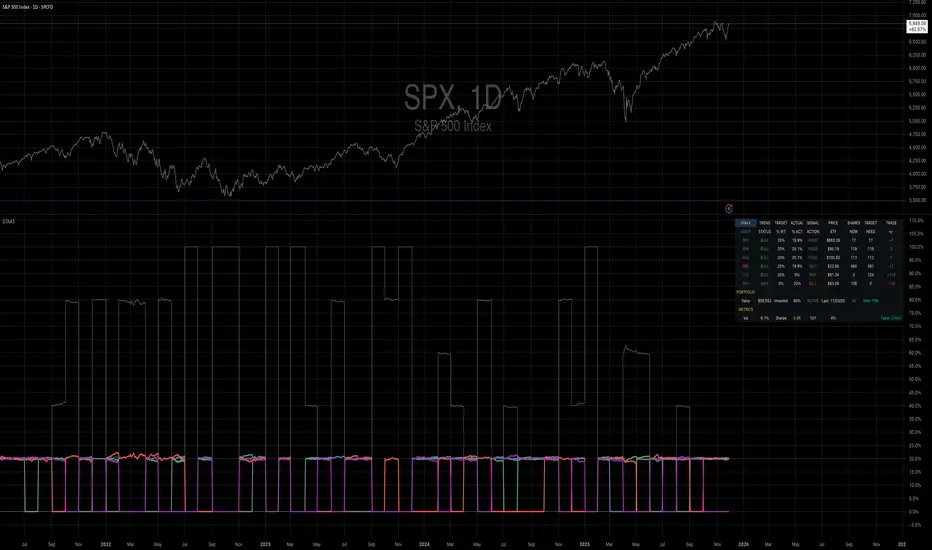
Mebane Faber GTAA 5In 2007, Mebane Faber published research that challenged the conventional wisdom of buy-and-hold investing. His paper, titled "A Quantitative Approach to Tactical Asset Allocation" and published in the Journal of Wealth Management, demonstrated that a simple timing mechanism could reduce portfolio volatility and drawdowns while maintaining competitive returns (Faber, 2007). This indicator implements his Global Tactical Asset Allocation strategy, known as GTAA5, following the original methodology.
The core insight of Faber's research stems from a century of market data. By analyzing asset class performance from 1901 onwards, Faber found that a ten-month simple moving average served as an effective trend filter across major asset classes. When an asset trades above its ten-month moving average, it tends to continue its upward trajectory; when it falls below, significant drawdowns often follow (Faber, 2007, pp. 12-16). This observation aligns with momentum research by Jegadeesh and Titman (1993), who documented that intermediate-term momentum persists across equity markets.
The GTAA5 strategy allocates capital equally across five diversified asset classes: domestic equities (SPY), international developed markets (EFA), aggregate bonds (AGG), commodities (DBC), and real estate investment trusts (VNQ). Each asset receives a twenty percent allocation when trading above its ten-month moving average. When an asset falls below this threshold, its allocation moves to short-term treasury bills (SHY), creating a dynamic cash position that scales with market risk (Cambria Investment Management, 2013).
The strategy's historical performance during market crises illustrates its function. During the 2008 financial crisis, traditional sixty-forty portfolios experienced drawdowns exceeding forty percent. The GTAA5 strategy limited losses to approximately twelve percent by reducing equity exposure as prices declined below their moving averages (Faber, 2013). This asymmetric return profile represents the strategy's primary characteristic.
This implementation uses monthly closing prices retrieved via request.security() to calculate the ten-month simple moving average. This distinction matters, as approximations using daily data (such as a 200-day moving average) can generate different signals during volatile periods. Monthly data ensures the indicator produces signals consistent with published academic research.
The indicator provides position monitoring, automatic rebalancing detection on either the first or last trading day of each month, and share calculations based on user-defined capital. A dashboard displays current trend status for each asset class, target versus actual weightings, and trade instructions for rebalancing. Performance metrics including annualized volatility and Sharpe ratio provide ongoing risk assessment.
Several limitations warrant acknowledgment. First, the strategy rebalances monthly, meaning it cannot respond to intra-month market crashes. Second, transaction costs and taxes from monthly rebalancing may reduce net returns for taxable accounts. Third, the ten-month lookback period, while historically robust, offers no guarantee of future effectiveness. As Ilmanen (2011) notes in "Expected Returns", all timing strategies face the risk of regime change, where historical relationships break down.
This indicator serves educational purposes and portfolio monitoring. It does not constitute financial advice.
References:
Cambria Investment Management (2013). Global Tactical Asset Allocation: An Introduction to the Approach. Research Report, Los Angeles.
Faber, M.T. (2007). A Quantitative Approach to Tactical Asset Allocation. Journal of Wealth Management, Spring 2007, pp. 9-79.
Faber, M.T. (2013). Global Asset Allocation: A Survey of the World's Top Asset Allocation Strategies. Cambria Investment Management, Los Angeles.
Ilmanen, A. (2011). Expected Returns: An Investor's Guide to Harvesting Market Rewards. John Wiley and Sons, Chichester.
Jegadeesh, N. and Titman, S. (1993). Returns to Buying Winners and Selling Losers: Implications for Stock Market Efficiency. Journal of Finance, 48(1), pp. 65-91.