TradingCharts SCTR + SPY Relative [NR]Basic chart with some indicators to gauge strength, direction and relative strength
Indicatori e strategie

NQ Pro Dashboard (Master Fix)This indicator is a "Head-Up Display" designed specifically for trading NQ (Nasdaq-100 Futures). It aggregates data from the broader market (volatility) and the specific stocks that drive the Nasdaq index (The "Magnificent 7") to give you a single Trend Power Score.
Here is a breakdown of how the logic works under the hood:
1. The Inputs (Data Feed)
The script watches 9 specific assets in real-time (daily timeframe data):
Fear Gauges:
VIX: The volatility index for the S&P 500.
VXN: The volatility index specifically for the Nasdaq-100.
The Engine (Mag 7):
NVDA, AAPL, MSFT, AMZN, GOOGL, META, TSLA.
2. The Logic: "Weighted" Market Strength
Instead of treating every stock equally, the script applies a Weighting Multiplier to the Mag 7 stocks based on their approximate impact on the Nasdaq-100 index.
Heavyweights (1.5x): NVDA, AAPL, MSFT (These move the market the most).
Middleweights (1.0x): AMZN, GOOGL, META.
Lightweight (0.7x): TSLA (Has the least pull of the group).
It calculates a single percentage number (MAG 7 (W)) representing the combined push or pull of these stocks.
3. The "Trend Power" Score (0-100)
This is the core signal. It starts at a neutral 50 and adds/subtracts points based on market conditions.
Fear Factor:
If VIX or VXN drops > 2% (Fear dying), it adds points (Bullish).
If VIX or VXN spikes > 2% (Fear rising), it subtracts points (Bearish).
Stock Strength:
If the Weighted Mag 7 Average is > 1.0% (Strong Rally), it adds a massive 30 points.
If it's negative (Sell-off), it subtracts points.
The Score Breakdown:
80 - 100 (Green): STRONG BULL. The engines are firing (stocks up) and the brakes are off (VIX down). Do not short.
0 - 20 (Red): STRONG BEAR. Panic selling is occurring. Do not buy.
40 - 60 (Orange): CHOP / RANGE. Conflicting signals (e.g., stocks are up but VIX is also up). Be careful.
4. The "Exhaustion" Meter (ATR)
The RANGE row tells you if the market has "gas left in the tank."
It compares Today's Range (High - Low) to the 14-Day Average Range (ATR).
< 50% (Yellow): Compressed. The market hasn't moved much yet. Expect a breakout soon.
> 120% (Purple): Extended. The market has moved massive amounts today. A reversal or pause is statistically likely (mean reversion).
5. The Visuals (Leaders Row)
The bottom row gives you a quick visual scan of the individual stocks:
N▲ (Green): Nvidia is up.
T▼ (Red): Tesla is down.
This helps you spot "divergences"—for example, if the Trend Score is high but NVDA is Red, the rally might be fragile.

NQ TICK Graph IndicatorDisplays the NQ TICKQ in real time with a historical graph and highlights positive or negative values over 500.

Bar CounterAdjustable for dark and bright chart backgrounds. Useful for use with other indicators highlighting bar period look backs and more.

CRR Nemesis - Institutional Multi Layer Gold Decision SystemCRR Nemesis is an institutional multi-layer decision system designed specifically for XAUUSD scalping and intraday trading.
It is not a simple combination of indicators.
Nemesis is a structured permission-based engine that filters market conditions using hierarchical multi-timeframe logic, smart money structure, institutional timing, Fibonacci mitigation zones and candlestick power confirmation.
Instead of producing constant buy/sell signals, Nemesis creates trade permission states.
A trade is only allowed when all institutional layers agree.
System architecture
Multi-timeframe direction engine
Nemesis analyzes trend permission across 1m, 5m, 15m and 1D.
Lower timeframes must align with or not contradict higher-timeframe structure.
Smart money structure (SMC)
Tracks HH, HL, LH, LL sequences, break of structure (BOS), change of character (ChoCH) and internal swing ranges.
Institutional mitigation zones
Automatically draws bullish and bearish mitigation zones based on internal swing structure and ATR logic.
Fibonacci mitigation engine
Defines premium and discount areas (38.2%–78.6%) to identify institutional entry zones.
Anti-trap institutional filter
Blocks low-probability and retail-type entries, preventing buy traps and false momentum trades.
Institutional session timing engine
Uses real New York, London and Tokyo session timing to define high-probability trading windows.
Candlestick power confirmation
Validates entries using institutional candlestick behavior such as engulfing patterns, strong impulse candles and reversal structures.
Pro setup engine
Final pro buy and pro sell signals are only released when all layers are aligned.
How to use
• Use on XAUUSD
• Main execution timeframe: 1 minute
• Trade only during London and New York sessions
• Follow pro buy and pro sell labels
• Avoid trades when the system shows blocked conditions
Descripción en español
CRR Nemesis es un sistema institucional de decisión por capas diseñado para el scalping e intradía en XAUUSD.
No es un mashup de indicadores, sino un motor de permisos de entrada que filtra condiciones mediante estructura Smart Money, zonas de mitigación institucional, Fibonacci, sesiones reales y confirmación por velas.
Nemesis bloquea operaciones de baja probabilidad y libera setups pro solo cuando todas las capas institucionales están alineadas.

BTC - RVPM: Run Velocity & Probability MapBTC – RVPM: Run Velocity & Probability Map | RM
Strategic Context: Understanding Price Runs
A "Price Run" (also known as a streak or consecutive sessions) is a foundational concept in time-series analysis that measures the duration of a price movement without a significant counter-signal. While common indicators like RSI or MACD measure magnitude or momentum, they often ignore the Persistence of the trend. Historically, markets move through cycles of expansion and mean-reversion. A Price Run represents a period of "Unidirectional Flow" — a fingerprint of institutional accumulation or systematic distribution. However, standard "run-counting" is often too simplistic for the volatile crypto markets.
What Makes RVPM Special?
Most community run-counters are binary; they simply tell you if X days were green or red. The RVPM distinguishes itself through three proprietary layers:
• The Intensity Filter: It doesnt just count days; it counts effort . By ignoring "flat" days through a percentage-return threshold, it filters out noise that would otherwise skew the statistical probability.
• Dynamic Benchmarking: Instead of using an arbitrary number (like "7 days"), the RVPM looks back at 200 bars of history to find the local "Persistence Ceiling." It adapts to the current volatility regime of Bitcoin.
• The Velocity Score: It transform simple counts into a -100 to +100 histogram, allowing traders to see momentum "decaying" (e.g., dropping from 90 to 70) even if the price continues to rise.
The 3 Pillars of the Engine
1. Velocity Mapping (Persistence Histogram)
The histogram calculates the density of directional effort within a defined window. It functions as the "Pulse" of the trend, mapping market behavior into three distinct zones:
• High Velocity Zone (> 80 or < -80): Institutional Expansion. This identifies a "clean" move where one side of the market possesses total structural control. In this zone, the trend is efficient, and counter-signals are immediately absorbed.
• The Neutral Zone (Near Zero): Momentum Equilibrium. When the histogram fluctuates near the zero line, the market is in a "Recharge Phase." Neither bulls nor bears are achieving persistent dominance. Tactically, this is the "Waiting Room" where range-bound chop is likely, and traders should wait for a new "Expansion" spike before committing.
• Velocity Decay: The Exhaustion Warning. Velocity Decay occurs when the indicator moves from an extreme (e.g., +95) back toward the zero line (e.g., +50) while the price is still rising. This is a "Persistence Divergence." It tells you that while the trend is still moving, the consistency of the bars is fragmenting. The "fuel" is being depleted, and the trend is transitioning from an "Institutional Expansion" into a "Speculative Exhaustion."
2. n-of-m Consistency (The Pips)
The "Pips" (Circles) mark when a specific consistency threshold is met (e.g., 5 out of 7 bars in one direction). This identifies "Leaky Trends" that are still statistically dominated by one side of the ledger.
3. Statistical Exhaustion (The Arrows)
The Dark Red (Top) and Dark Green (Bottom) triangles represent the engine's "Mean-Reversion Signal." The calculation is based on a Relative Maximum Streak (RMS) logic: the script tracks the current linear, consecutive bar count (ignoring bars that fail the Intensity Filter) and continuously benchmarks this against the highest streak recorded over the last 200 bars ( ta.highest(streak, 200) ). The triangles are triggered specifically when the current run reaches 80% of this historical record (the "Anomaly Threshold"). Mathematically, this identifies a move that is statistically pushing against its half-year limit. By using this dynamic threshold rather than a fixed number, the "Extreme" signal automatically tightens during low-volatility regimes and expands during high-volatility expansions, ensuring the signal only appears when the "statistical rubber band" is at a true breaking point.
Operational Interface: The RVPM Dashboard
The Status Dashboard (Top Right) serves as a real-time monitor for momentum health, providing a clean summary of the underlying persistence data:
• Current STREAK: The active, consecutive count of bars meeting the Intensity Filter. It is dynamically color-coded (Cyan/Bullish or Red/Bearish) to provide an instant read on trend seniority.
• WINDOW Consistency: Measures the Momentum Density (the n-of-m value). A value of "6" in a "7-bar" window indicates a high-conviction regime that is successfully absorbing pullbacks without losing its primary trajectory.
Tactical Playbook: The Mean-Reversion Rule
Price action typically follows a "Rubber Band" effect. The further it is stretched without a break, the more "unstable" the trend becomes as the pool of available buyers or sellers is depleted.
• The Setup: Wait for the Triangle Arrows to appear.
• The Logic: The move has reached a 200-day anomaly. A "Liquidity Vacuum" is forming on the opposite side.
• The Action: This is a high-probability Mean-Reversion signal. It is a tactical time to take profits or look for a sharp snap-back move toward the 20-period moving average or the "Institutional Mean."
Settings & Parameters
• Window Length (m): The lookback window used to calculate the Velocity Score.
• Required Days (n): The minimum number of directional bars needed within the window to trigger a "Consistency Pip."
• Intensity Filter (%): The minimum % change required for a bar to be counted toward a run.
• Lookback Period: The historical window (Default: 200 bars) used to calculate the "Maximum Streak" records for exhaustion alerts.
Timeframe Recommendation
The RVPM is best viewed on the Daily (1D) timeframe. This filters out intraday noise and provides the most reliable statistical mapping for macro exhaustion points.
Credits & Verification
The RVPM logic aligns with institutional "Persistence" models and Glassnode's Price Stretch benchmarks. By benchmarking against a rolling 200-day window, the indicator automatically adapts to changing market volatility.
Risk Disclaimer & No Financial Advice
The information, data, and analytical models provided in this publication are for educational and informational purposes only. This script does not constitute financial, investment, or trading advice. Trading cryptocurrencies and other financial instruments carries a high degree of risk, and statistical anomalies or "Extreme Runs" do not guarantee future price action. Past performance is never indicative of future results. Every trader is responsible for their own due diligence and risk management. Rob Maths and the associated entities are not liable for any financial losses incurred through the use of this tool. Always consult with a certified financial professional before making significant investment decisions.
Tags:
bitcoin, btc, persistence, streaks, price-runs, momentum, mean-reversion, exhaustion, Rob Maths

Quantum Power Engine v4.1 (Global Market Edition)ONLY FOR GC SI
This guide explains how to effectively use the Quantum Power Engine v4.1 (Light Mode). This indicator is a multi-factor scoring system designed to aggregate momentum, volume, and trend data into a single, actionable "Power Score."
1. The Core Scoring System
The indicator calculates a Power Score ranging from -100 to +100. This score is derived from five weighted technical dimensions:
| Factor | Weight | Condition |
|---|---|---|
| MACD | 30% | Based on histogram direction and slope. |
| Volume/VWAP | 25% | Checks if price is above VWAP with high volume (Relative Vol > 2.0). |
| RSI | 15% | Relative strength compared to its SMA and the 60/40 levels. |
| CMF | 15% | Measures institutional capital inflow (Chaikin Money Flow). |
| SuperTrend | 15% | Defines the overall structural market direction. |
2. Market Status & Strategy
Depending on the current Power Score, the dashboard will display one of seven market states. Use the following guide for your trade execution:
🟢 Bullish Zones (Positive Score)
* +75 to +100: Hyper-Bullish (☀️)
* Market Sentiment: Extreme Greed / Buying Climax.
* Strategy: Hold current positions; tighten Stop-Losses; do not short, but be wary of a "blow-off top."
* +45 to +75: Strong Up-trend (🚀)
* Market Sentiment: Optimistic / Main Momentum Wave.
* Strategy: This is the most profitable phase. Focus on trend-following and adding to winners.
* +15 to +45: Momentum Entry (🟢)
* Market Sentiment: Recovery / Capital Inflow.
* Strategy: Look for long entries (Right-side trading). Monitor if volume continues to expand.
🟡 Neutral Zone
* -15 to +15: Extreme Volatility (⚡)
* Market Sentiment: Indecision / Market Chop.
* Strategy: Wait and See. Avoid trading in this zone as "fakeouts" are common.
🔴 Bearish Zones (Negative Score)
* -15 to -45: Defensive Phase (🔴)
* Market Sentiment: Cautious / Selling Pressure.
* Strategy: Reduce long positions. Do not "buy the dip" yet.
* -45 to -75: Violent Sell-off (🩸)
* Market Sentiment: Panic / Breakdown.
* Strategy: Avoid catching falling knives. Stay in cash or look for short opportunities.
* -75 to -100: Total Breakdown (💀)
* Market Sentiment: Despair / Liquidity Exhaustion.
* Strategy: Maximum bearishness. Wait for a "Right-side" bottoming signal before looking for a reversal.
3. Key Visual Indicators
The Dashboard (Top Right)
* Power Score (战力值): The "temperature" of the market.
* MACD Momentum: Shows if the trend is accelerating (Enhancing) or losing steam (Fading).
* Volume Ratio: Compares current volume to the average.
* Purple (Hyper-Volume): Institutional activity.
* Yellow (Significant): Strong participation.
* Grey (Low): Danger of a trap or lack of interest.
The Squeeze Alert (⚡)
When you see a Gold Bolt (⚡) above a candle, it indicates a "Squeeze" signal:
* Meaning: Low volatility + Low volume + Neutral score.
* Action: The market is "coiling" like a spring. Expect a violent breakout (up or down) shortly. Prepare your triggers.
4. How to Trade with This Indicator
* Identify the Bias: Look at the Dashboard. If the score is > 45, look for Longs. If < -45, look for Shorts.
* Confirm with Volume: Ensure the "Volume Ratio" is at least > 1.2x (Green or Yellow) before entering a trend trade.
* The Exit: If you are in a long trade (Score > 45) and the score drops below +15 or the MACD Momentum changes to "Fading" (⚪), consider taking profits.
* The "Squeeze" Play: If you see the ⚡ icon, wait for the first candle to break the range with a rising Power Score to catch the start of a new move.

Keltner Channel MTF with VWAP [MK]This strategy is designed for momentum and trend-following traders who prioritize high-volatility "breakout" environments. By anchoring a 15-minute volatility boundary against a lower-timeframe channel, it identifies rare moments where price action aggressively decouples from standard volatility ranges.
Strategy Overview: Keltner Channel MTF with VWAP
The Keltner Channel MTF with VWAP is a quantitative momentum strategy that uses Multi-Timeframe (MTF) volatility displacement to trigger trades. It focuses on "full channel breakouts," where the entire short-term price range (Current Timeframe Keltner Channel) shifts completely outside the medium-term volatility range (15-Minute Keltner Channel).

Round Level Pro Stats
Here is a professional English description of your indicator, which you can use for your own records or if you ever want to share it on the TradingView Community Scripts:
Indicator Name: Dynamic Round Levels & Historical Strength Grid
Overview
This indicator is a sophisticated technical analysis tool designed to identify and evaluate "Round Number" psychological levels (e.g., 1.17100, 1.17200, 1.17300). Unlike a static grid, this tool actively scans historical data to provide a "Strength Score" for each level, helping traders distinguish between minor price points and significant historical reaction zones.
Key Features
Automated Price Grid: Generates a clean, horizontal grid based on user-defined price intervals (Steps). Perfect for Forex (0.001 pips), Stocks, or Crypto.
Historical Strength Engine: Analyzes up to 5,000 historical bars to calculate how "respected" a price level is.
The "3-Candle Confirmation" Logic: A level's strength is only increased if the price touches the line and successfully reverses/bounces, staying on the same side for at least 3 subsequent candles.
Smart Visual Coding:
Green (High Strength): Levels with >60% historical reversal success.
Orange (Medium Strength): Levels with 35%–60% success.
Red (Low Strength): Levels frequently breached without reaction.
Pro HUD Display: Bold percentage labels are positioned at the far right of the chart (near the price scale) to keep the main trading area clutter-free.
How to Use
Set your Step: For Forex, use 0.001 to see 10-pip increments. For Bitcoin or Gold, use 10 or 100.
Lookback Period: Adjust the history scan (up to 5,000 bars) to match your trading timeframe.
Identify Support/Resistance: Look for Green % STR labels. These represent "Round Numbers" that have acted as strong barriers in the past, offering higher-probability entry or exit points.
Technical Summary for Pine Script
Language: Pine Script v5
Max Lines/Labels: 500 (Optimized for performance)
Placement: Far-right margin alignment using bar_index offsets.

Smart Money Fluid [JOAT]
Smart Money Fluid — Accumulation and Distribution Flow Analysis
Smart Money Fluid tracks institutional-style accumulation and distribution patterns using a sophisticated combination of Money Flow Index, Chaikin Money Flow, and VWAP-relative price analysis. It aims to reveal whether larger participants may be accumulating (buying) or distributing (selling)—information that can precede significant price moves.
What Makes This Indicator Unique
Unlike single money flow indicators, Smart Money Fluid:
Combines three different money flow methodologies into one composite signal
Detects divergences between price and money flow automatically
Identifies high-volume conditions that add conviction to signals
Provides both the composite signal and individual component values
Features a momentum histogram showing flow acceleration
What This Indicator Does
Combines multiple money flow indicators into a composite signal (0-100 scale)
Identifies accumulation zones (potential institutional buying) and distribution zones (potential selling)
Detects divergences between price and money flow
Highlights high-volume conditions for stronger signals
Tracks momentum direction within the flow
Provides comprehensive dashboard with all component values
Composite Calculation Explained
The Smart Money Flow composite combines three proven money flow methodologies:
// Component 1: Money Flow Index (MFI) - 40% weight
// Measures buying/selling pressure using price and volume
float mfi = 100 - (100 / (1 + mfRatio))
// Component 2: Chaikin Money Flow (CMF) - 30% weight
// Measures accumulation/distribution based on close position within range
float cmf = sum(mfVolume, length) / sum(volume, length) * 100
// Component 3: VWAP Price Strength - 30% weight
// Measures price position relative to volume-weighted average price
float priceVsVWAP = (close - vwap) / vwap * 100
// Final Composite (scaled to 0-100)
float rawSMF = (mfi * 0.4 + (cmf + 50) * 0.3 + (50 + priceVsVWAP * 5) * 0.3)
float smf = ta.ema(rawSMF, smoothLength)
State Classification
Accumulating (Green Zone) — SMF above accumulation threshold (default: 60). Suggests institutional buying may be occurring.
Distributing (Red Zone) — SMF below distribution threshold (default: 40). Suggests institutional selling may be occurring.
Neutral (Gray Zone) — SMF between thresholds. No clear accumulation or distribution detected.
Divergence Detection
The indicator automatically detects divergences using pivot analysis:
Bullish Divergence — Price makes a lower low while SMF makes a higher low. This suggests selling pressure is weakening despite lower prices—potential reversal signal.
Bearish Divergence — Price makes a higher high while SMF makes a lower high. This suggests buying pressure is weakening despite higher prices—potential reversal signal.
Divergences are marked with "DIV" labels on the chart.
Visual Features
SMF Line with Glow — Main composite line with gradient coloring and glow effect
Signal Line — Slower EMA of SMF for crossover signals
Flow Momentum Histogram — Shows the difference between SMF and signal line with four-color coding:
- Bright green: Positive and accelerating
- Faded green: Positive but decelerating
- Bright red: Negative and accelerating
- Faded red: Negative but decelerating
Zone Backgrounds — Green tint in accumulation zone, red tint in distribution zone
Reference Lines — Dashed lines at accumulation/distribution thresholds, dotted line at 50
Strong Signal Markers — Triangles appear when accumulation/distribution occurs with high volume
Divergence Labels — "DIV" markers when divergences are detected
Color Scheme
Accumulation Color — Default: #00E676 (bright green)
Distribution Color — Default: #FF5252 (red)
Neutral Color — Default: #9E9E9E (gray)
Gradient Coloring — SMF line transitions smoothly between colors based on value
Dashboard Information
The on-chart table (top-right corner) displays:
Current SMF value with state coloring
State classification (ACCUMULATING, DISTRIBUTING, or NEUTRAL)
Flow momentum direction (Up/Down with magnitude)
MFI component value
CMF component value with directional coloring
Volume status (High or Normal)
Active divergence detection (Bullish, Bearish, or None)
Inputs Overview
Calculation Settings:
Money Flow Length — Period for flow calculations (default: 14, range: 5-50)
Smoothing Length — EMA smoothing period (default: 5, range: 1-20)
Divergence Lookback — Bars for pivot detection in divergence analysis (default: 5, range: 2-20)
Sensitivity:
Accumulation Threshold — Level above which accumulation is detected (default: 60, range: 50-90)
Distribution Threshold — Level below which distribution is detected (default: 40, range: 10-50)
High Volume Multiplier — Multiple of average volume for "high volume" classification (default: 1.5x, range: 1.0-3.0)
Visual Settings:
Accumulation/Distribution/Neutral Colors — Customizable color scheme
Show Flow Histogram — Toggle momentum histogram
Show Divergences — Toggle divergence detection and labels
Show Dashboard — Toggle the information table
Show Zone Background — Toggle colored backgrounds in accumulation/distribution zones
Alerts:
Await Bar Confirmation — Wait for bar close before triggering (recommended)
How to Use It
For Trend Confirmation:
Accumulation during uptrends confirms buying pressure
Distribution during downtrends confirms selling pressure
Divergence between price trend and SMF warns of potential reversal
For Reversal Detection:
Bullish divergence at price lows suggests potential bottom
Bearish divergence at price highs suggests potential top
Strong signals (triangles) with high volume add conviction
For Entry Timing:
Enter longs when SMF crosses into accumulation zone
Enter shorts when SMF crosses into distribution zone
Wait for high volume confirmation for stronger signals
Use divergences as early warning for position management
Alerts Available
SMF Accumulation Started — SMF entered accumulation zone
SMF Distribution Started — SMF entered distribution zone
SMF Strong Accumulation — Accumulation with high volume
SMF Strong Distribution — Distribution with high volume
SMF Bullish Divergence — Bullish divergence detected
SMF Bearish Divergence — Bearish divergence detected
Best Practices
High volume during accumulation/distribution adds significant conviction
Divergences are early warnings—don't trade them alone
Use in conjunction with price action and support/resistance
Works best on liquid markets with reliable volume data
This indicator is provided for educational purposes. It does not constitute financial advice. Past performance does not guarantee future results. Always conduct your own analysis and use proper risk management before making trading decisions.
— Made with passion by officialjackofalltrades

Quantum Power Engine v4.1 Light ModeThis guide explains how to effectively use the Quantum Power Engine v4.1 (Light Mode). This indicator is a multi-factor scoring system designed to aggregate momentum, volume, and trend data into a single, actionable "Power Score."
1. The Core Scoring System
The indicator calculates a Power Score ranging from -100 to +100. This score is derived from five weighted technical dimensions:
| Factor | Weight | Condition |
|---|---|---|
| MACD | 30% | Based on histogram direction and slope. |
| Volume/VWAP | 25% | Checks if price is above VWAP with high volume (Relative Vol > 2.0). |
| RSI | 15% | Relative strength compared to its SMA and the 60/40 levels. |
| CMF | 15% | Measures institutional capital inflow (Chaikin Money Flow). |
| SuperTrend | 15% | Defines the overall structural market direction. |
2. Market Status & Strategy
Depending on the current Power Score, the dashboard will display one of seven market states. Use the following guide for your trade execution:
🟢 Bullish Zones (Positive Score)
* +75 to +100: Hyper-Bullish (☀️)
* Market Sentiment: Extreme Greed / Buying Climax.
* Strategy: Hold current positions; tighten Stop-Losses; do not short, but be wary of a "blow-off top."
* +45 to +75: Strong Up-trend (🚀)
* Market Sentiment: Optimistic / Main Momentum Wave.
* Strategy: This is the most profitable phase. Focus on trend-following and adding to winners.
* +15 to +45: Momentum Entry (🟢)
* Market Sentiment: Recovery / Capital Inflow.
* Strategy: Look for long entries (Right-side trading). Monitor if volume continues to expand.
🟡 Neutral Zone
* -15 to +15: Extreme Volatility (⚡)
* Market Sentiment: Indecision / Market Chop.
* Strategy: Wait and See. Avoid trading in this zone as "fakeouts" are common.
🔴 Bearish Zones (Negative Score)
* -15 to -45: Defensive Phase (🔴)
* Market Sentiment: Cautious / Selling Pressure.
* Strategy: Reduce long positions. Do not "buy the dip" yet.
* -45 to -75: Violent Sell-off (🩸)
* Market Sentiment: Panic / Breakdown.
* Strategy: Avoid catching falling knives. Stay in cash or look for short opportunities.
* -75 to -100: Total Breakdown (💀)
* Market Sentiment: Despair / Liquidity Exhaustion.
* Strategy: Maximum bearishness. Wait for a "Right-side" bottoming signal before looking for a reversal.
3. Key Visual Indicators
The Dashboard (Top Right)
* Power Score (战力值): The "temperature" of the market.
* MACD Momentum: Shows if the trend is accelerating (Enhancing) or losing steam (Fading).
* Volume Ratio: Compares current volume to the average.
* Purple (Hyper-Volume): Institutional activity.
* Yellow (Significant): Strong participation.
* Grey (Low): Danger of a trap or lack of interest.
The Squeeze Alert (⚡)
When you see a Gold Bolt (⚡) above a candle, it indicates a "Squeeze" signal:
* Meaning: Low volatility + Low volume + Neutral score.
* Action: The market is "coiling" like a spring. Expect a violent breakout (up or down) shortly. Prepare your triggers.
4. How to Trade with This Indicator
* Identify the Bias: Look at the Dashboard. If the score is > 45, look for Longs. If < -45, look for Shorts.
* Confirm with Volume: Ensure the "Volume Ratio" is at least > 1.2x (Green or Yellow) before entering a trend trade.
* The Exit: If you are in a long trade (Score > 45) and the score drops below +15 or the MACD Momentum changes to "Fading" (⚪), consider taking profits.
* The "Squeeze" Play: If you see the ⚡ icon, wait for the first candle to break the range with a rising Power Score to catch the start of a new move.

LiquidityPulse Volume-Weighted Price Movement OverlayLiquidityPulse Volume-Weighted Price Movement Overlay (VWPM)
-This is a non-repainting indicator.
What this indicator does
This overlay is designed to make directional pressure + participation + wick rejection readable directly on price.
It combines:
Volume-Weighted directional pressure (bull vs bear pressure on the current timeframe)
Wick rejection “heat bands” (strength of upper/lower wick pressure, with optional volatility adaptation)
Lower-timeframe (LTF) trend + wick context (auto-selected or manual LTFs)
Chart markers for:
VOL = participation spike aligned with the current pressure direction
EXH = exhaustion warning when trend direction is met with strong opposite-wick pressure
This script is intended as an overlay/structure companion to the separate Volume-Weighted Price Movement (Oscillator) script (pane-based), which focuses on oscillator-style pressure/participation metrics.
Image: Overlay indicator applied to price
How to read it on the chart
1) Pressure Cloud + Candle Tint
The cloud and optional candle tint reflect the current timeframe’s pressure direction:
Green = bullish pressure dominant
Red = bearish pressure dominant
Brightness/opacity scales with pressure strength (normalized by a lookback period).
2) Wick Pressure Heat Bands
The lower band represents bullish wick pressure (lower-wick rejection/absorption).
The upper band represents bearish wick pressure (upper-wick rejection/supply).
Brighter = stronger wick pressure relative to its recent baseline.
Optional Adaptive bands to volatility uses ATR to keep band scaling more consistent across changing volatility regimes.
Image: Overlay + Oscillator working together
This chart highlights how volume participation and wick behaviour can be observed during periods of increased market interaction.
The arrows are used for visual reference only:
Red arrows indicate rising volume participation during the move.
Green arrows highlight increasing wick pressure, suggesting stronger rejection or absorption at those points.
3) VOL signal (Participation Spike)
A VOL marker appears when volume % of average exceeds your threshold and aligns with the current pressure direction.
This is a quick filter for:
“The current pressure direction is being supported by above-average participation.”
4) EXH signal (Exhaustion)
An EXH marker appears when the current trend is met with strong/extreme opposite wick pressure, e.g.:
Trend is Bullish but Bear wick becomes Strong/Extreme → possible bullish exhaustion / rejection risk
Trend is Bearish but Bull wick becomes Strong/Extreme → possible bearish exhaustion / absorption risk
Table (top-right)
You can toggle individual rows on or off in the settings. The table can display:
Trend (Chart)- Directional volume-weighted pressure on the chart timeframe (Bullish / Bearish, shown with ▲ ▼ icons)
Wick (Chart)- A real-time summary of wick pressure on the chart timeframe, reflecting how price is being rejected or absorbed within candles.
Possible states include:
Strong Bull – dominant lower-wick rejection (bullish absorption), shown with a green ▲
Strong Bear – dominant upper-wick rejection (bearish pressure), shown with a red ▼
Neutral – no meaningful wick imbalance, shown with a ●
Strong Both – elevated rejection on both sides, shown with a dual-pressure marker, often seen during volatility expansion or transitional conditions
Trend + Wick (Lower Timeframes)- Trend and wick context for two lower timeframes (auto-selected or manually chosen), allowing short-term behaviour to be viewed within the higher-timeframe structure
Core metrics- Bull Avg / Bear Avg, Bull–Bear Difference, Volume % Avg, and related participation statistics
Additional metrics- Further table rows can be enabled or disabled via the settings panel
How traders can use this indicator
Traders can use LiquidityPulse VWPM as a contextual tool to observe how price movement, volume participation, and wick behaviour interact.
Common use cases include:
Identifying periods where bullish or bearish pressure is dominant on the current timeframe
Observing wick rejection or absorption near highs/lows, especially during strong moves
Monitoring lower-timeframe trend and wick alignment within a higher-timeframe move
Noticing participation spikes (VOL) that confirm increased market involvement
Spotting exhaustion conditions (EXH) where strong opposing wick pressure appears against the prevailing trend
Image: This example highlights how the overlay can be used to monitor directional pressure on the chart timeframe while simultaneously observing trend and wick conditions from selected lower timeframes. The statistics table shows instances where lower-timeframe trend readings diverge from the chart-level pressure, alongside changes in wick behaviour. This allows traders to visually contextualise short-term shifts in participation and rejection within the broader structure.
Key settings (what they change)
Presets: Scalp / Intraday / Swing adjusts effective smoothing/normalization defaults to fit different trading speeds.
Lookback Period + Smoothing: These control how fast/slow the pressure model responds.
Lower values = faster response (more reactive/noisier)
Higher values = smoother response (slower/more stable)
Wick thresholds + Wick row mode: Strong / Extreme thresholds define when wick pressure is classified as Strong/Extreme relative to baseline.
Wick rows show can filter table wick rows to Extreme-only, Strong + Extreme, or Full.
Wick bands- Volatility Adapt: Adaptive bands to volatility (ATR-based) helps wick band height/offset remain visually consistent as volatility expands/contracts.
Adapt Strength controls how much the ATR regime affects the bands.
Visual controls: Transparency controls let you make the overlay more subtle or more prominent without changing calculations.
Why there is an Overlay and Oscillator version
This tool is intentionally split into two complementary indicators to preserve clarity and usability
Overlay version (this script): Focuses on price-level context, structure, wick pressure, lower-timeframe alignment, and event markers directly on the chart.
Oscillator companion version: Provides a dedicated pane for pressure balance, participation, and momentum acceleration metrics that benefit from oscillator-style visualisation.
Separating these views avoids overcrowding the price chart and allows each component to be interpreted more clearly in its appropriate context.
Disclaimer
This indicator is designed to visualise price–volume interaction, pressure, and wick behaviour.
It does not generate trade entries or exits signals and should be used as analytical context alongside a trader’s existing methodology and risk management only.

Adaptive 2 EMA Cloud (Trend-Aware)Adaptive 2 EMA Cloud (Trend-Aware)
This indicator combines a classic 2-EMA cloud and crossover with an adaptive Trend vs Chop filter designed to reduce whipsaws during sideways markets.
Instead of treating every EMA crossover equally, this script evaluates EMA separation and directional commitment (normalized by ATR) to determine whether price is trending or chopping. Signals can optionally be filtered so they only appear during qualified trend conditions.
What This Indicator Does
Plots two configurable EMAs with a filled EMA cloud
Marks bullish and bearish EMA crossovers
Classifies market state as BULLISH / BEARISH / CHOP
Optionally filters signals during chop
Highlights chop zones with a subtle background
Displays a movable Trend status label (Top / Bottom × Left / Middle / Right) with offset controls to avoid UI overlap
This makes the indicator useful both as:
A visual trend context tool
A signal filter to pair with discretionary or systematic entries
Quick Presets (Main Framework)
Scalp / Fast (1–2 min)
Built for speed and momentum bursts. Uses tighter EMAs and stricter filters to avoid chop on very fast charts.
EMA pairs (choose one):
5 / 9
8 / 13
slopeLen: 4–6
minDistATR: 0.25–0.40
minSlopeATR: 0.06–0.12
Balanced Intraday (3–5 min)
General-purpose intraday setup. Balances early trend participation with chop filtering. Recommended starting point if unsure.
EMA pairs (choose one):
8 / 13
9 / 21
slopeLen: 5–8
minDistATR: 0.18–0.30
minSlopeATR: 0.04–0.08
Slower / Swing (15–60 min)
Designed for higher timeframes and smoother trends. Allows longer trends to develop without requiring sharp acceleration.
EMA pairs (choose one):
13 / 21
21 / 34
slopeLen: 8–14
minDistATR: 0.10–0.22
minSlopeATR: 0.02–0.06
Input Guide (Streamlined)
minDistATR — EMA Separation
Sets the minimum EMA spacing (ATR-normalized) required for a trend.
Higher = stricter, fewer signals
Filters EMA compression / ranges
Too much chop → increase
Too few signals → decrease
Too low = congestion signals · Too high = late entries
minSlopeATR — EMA Slope / Commitment
Sets the minimum directional strength (ATR-normalized) of the EMAs.
Higher = stricter, fewer signals
Filters weak drift and slow grind
Signals stall → increase
Miss smooth trends → decrease
Too low = flat EMAs allowed · Too high = requires acceleration
slopeLen — Slope Lookback
Controls how quickly the filter reacts.
Lower = faster, noisier
Higher = smoother, fewer signals
3–5 responsive · 8–14 stable
atrLen — Normalization
Stabilizes distance and slope across symbols and timeframes.
Leave at 14 normally
Use 20–30 during extreme volatility shifts
Notes
This is an indicator, not a strategy. It does not backtest or predict outcomes.
No filter eliminates chop entirely—this tool is designed to reduce low-quality conditions, not remove them.
Best results come from matching presets to timeframe first, then making small adjustments only when behavior is clearly off.

Low Volume Pullback [CrossTrade]PACKAGE 2: CrossTrade Edition (NinjaTrader)
1. The Strategy Guide
Strategy: Low Volume Pullback Detector (VPA)
Concept: Same logic as above (Trend + Volume Dry Up).
Integration: Designed for NinjaTrader 8 via CrossTrade.
Automation:
ATM Strategy: Uses the bot_strat name (e.g., "twoRun") to trigger your saved stops/targets in NinjaTrader.
Entry Timing: Select "Signal Candle Close" (Standard) or "Confirmation Candle Close" (Conservative).
CrossTrade Setup Steps
Add Script: Paste the code above into the Pine Editor and click "Add to Chart".
Settings: Open the indicator settings and enter your Secret Key, Account Name, and ATM Strategy Name (case sensitive).
Get Webhook: Go to your CrossTrade Dashboard and copy your URL.
Create Alert:
In TradingView, create a new Alert.
Condition: Select Low Volume Pullback .
Trigger: Select "Any function call".
Webhook: Paste your CrossTrade URL in the Webhook box.
Message: LEAVE EMPTY (The script handles this).
Click Create.

Low Volume Pullback [TraderPost]ACKAGE 1: TraderPost Edition (Tradovate)
1. The Strategy Guide
Strategy: Low Volume Pullback Detector (VPA)
Concept: Identifies trend continuation trades by looking for "weak" pullbacks against the main trend where volume dries up (institutions are not selling).
Trend Filter: Only trades above/below the 50 EMA.
The Trigger: Enters when price breaks out of the weak pullback structure.
Automation:
Smart Payloads: Automatically calculates Stop Loss and Take Profit prices and sends them to TraderPost.
Cooldown: Prevents over-trading by sleeping for 10 mins after a signal.
Entry Timing: You can choose to enter immediately on the signal candle close or wait for an extra confirmation candle.
TraderPost Setup Steps
Add Script: Paste the code above into the Pine Editor and click "Add to Chart".
Get Webhook: Go to your TraderPost Dashboard > Webhooks and copy your URL.
Create Alert:
In TradingView, create a new Alert.
Condition: Select Low Volume Pullback .
Trigger: Select "Any function call".
Webhook: Paste your TraderPost URL in the Webhook box.
Message: LEAVE EMPTY (The script handles this).
Click Create.

Opening 5m % Change (09:30 NY) - All Day vs 09:30 OpenThis indicator displays the real-time percentage change relative to the US market open at 09:30 (New York time).
It captures the 09:30 opening price and continuously updates the percentage change throughout the entire trading session, even if the chart is opened after the market open.
Green = price above the 09:30 open
Red = price below the 09:30 open
The value is shown in the top-right corner of the chart, stays visible all day, and updates live with price movements.
Designed to be lightweight, reliable, and easy to read, even when multiple charts are open.
Best used on US stocks, indices, and futures during regular trading hours.

Static H-LineDraw simple horizontal line with static value. The purpose is that indicator stays on the chart when switching instruments (via alerts log, for example).

EMA + Previous Candle High/LowA clean and simple indicator that combines trend-following EMAs with multi-timeframe support/resistance levels.
Features:
3 EMAs (20, 50, 200) for trend identification
Previous candle high/low from any timeframe (Daily, 4H, 1H, etc.)
Shaded zone between previous high/low for easy visualization
Dashed horizontal lines extending into the future
Labels showing exact price levels
Fully customizable colors, transparency, and extension length
Use Case:
Perfect for swing traders and day traders who use previous day/week highs and lows as key support/resistance levels combined with EMA trend confirmation. Great for identifying breakout opportunities and range-bound trading zones.
Settings:
Toggle EMAs on/off
Select any timeframe for previous candle (D, W, 4H, etc.)
Adjust shading transparency
Customize line extension length
Simple, effective, and clutter-free. Works on all markets and timeframes.

True ADR% (Range/Close) / ATR / LoD dist. / Market CapHi guys
Couldn't find the script of my dreams and therefore adapted some existing ones I found from the users MikeC (AKA TheScrutiniser) & armerschlucker.
Notes on formulas used in this script:
// ADR% is calculated using the standard definition: 100 * SMA(High - Low, N) / Close
// (average daily range in points over N daily bars, normalized by the current daily close).
// ATR is standard Wilder ATR: ta.atr(N) computed on daily bars.
// LoD dist. is the distance from current close to today’s low, expressed as a % of daily ATR:
// 100 * (Close - Low) / ATR.
// All three metrics are forced to daily bars via request.security(..., "D", ...), so they stay consistent
// regardless of the chart timeframe.
Hope it helps. Please provide feedback in case I made errors.

Balanced 0DTE Scalper [Clean]Balanced 0DTE Scalper is a professional-grade execution system designed specifically for the high-velocity world of 0DTE (Zero Days to Expiration) options trading on indices like SPY, QQQ, and IWM.
Unlike standard indicators that repaint or lag, this system uses Non-Repainting Multi-Timeframe Logic to align the institutional trend (15m) with precision entry triggers (5m). It is engineered to solve the two biggest killers of 0DTE traders: Theta Decay (holding too long) and Choppy Markets (trading without trend).
How It Works
1. The "Safety Belt" (15-Minute Trend Filter) Before any trade is taken, the system checks the confirmed 15-minute Trend and ADX (Strength).
No Repainting: It strictly uses the previous closed 15m bar to determine bias. Once a signal prints, it stays printed.
Regime Detection: It automatically blocks trades during low-volume "chop" (Low ADX) to save you from theta burn.
2. Precision Entry Triggers (5-Minute) Once the 15m trend gives the "Green Light," the system hunts for 5m setups using a confluence of:
EMA Crossovers: For immediate momentum.
VWAP Filter: Ensuring you are on the right side of institutional volume.
RSI Check: To avoid buying tops or selling bottoms.
3. Aggressive Risk Management (The "Profit Locker") 0DTE profits can vanish in seconds. This script manages the trade for you visually:
Dynamic Trailing Stop: Trails price based on candle Highs/Lows (not closes), allowing it to lock in profits at the peak of a spike.
Time Stop: If a trade stalls for 60 minutes (12 bars), the system triggers a "Time Exit." In 0DTE, time is money—if it's not working, get out.
Visual Levels: Automatically draws your Stop Loss, Target 1 (Conservative), and Target 2 (Runner) lines on the chart.
Features & Dashboard
Live Dashboard: Monitors Trend Bias, ADX Strength, RSI, and Open PnL in real-time.
On-Chart Tickets: Prints a "CALL OPEN" or "PUT OPEN" label with the exact Entry Price, Stop Loss, and Strike Suggestion.
Session Filters: Automatically avoids the first 10 minutes (Open Volatility) and the last 15 minutes (Close Chaos).
Settings Guide
Risk Mode:
Balanced (Default): The recommended blend of Trend + Momentum.
Conservative: Requires a very strong ADX trend. Fewer trades, higher win rate.
Aggressive: Ignores ADX strength. Good for FOMC/CPI days only.
Strike Suggestion: Automatically calculates the nearest Strike Price (ATM/OTM) for SPY/QQQ based on your settings.
Disclaimer
This tool is for educational purposes only. 0DTE options trading involves extreme risk of capital loss. Past performance (even with non-repainting logic) is not indicative of future results. Always manage your risk.

52-Week Range Dashboardthis shows the diff in % between the 52 week high and low
this is called coiling method, you may observe whenever the diff in % between 52 week high and low price is 30% or below, that's the time the script will show a move.
Thank you
have a great day

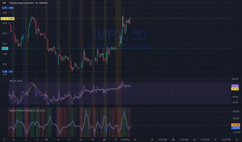
Biotech Volume Oscillator
This oscillator is percentage-based, not raw volume.
Key Levels (Rules of Thumb)
Above +25 → abnormal participation (real interest)
+10 to +25 → constructive, but not decisive
Around 0 → drift / float
Below –25 → participation drying up
These levels work well for:
Small-cap biotech
Catalyst setups
Pre-data ramps
How You’d Use This With RSI (Your Exact Setup)
Bullish / Valid Move
RSI above 50
RSI purple > yellow
Biotech Volume Osc above +10 and rising
➡️ Move has sponsorship
Fake / Suspect Move
Price up
RSI flat or diverging
Volume Osc near 0 or falling
➡️ Float + headline + thin liquidity
Distribution Signal (Very Useful)
Price makes higher high
RSI fails to confirm
Volume Osc rolls over from +25
➡️ Selling into strength
➡️ Excellent context for sell orders like your 7.75
Position Avg Line + P/L Table - SightLine LabsPosition Avg – SLL is a lightweight position-tracking indicator designed to display a persistent average price level on the chart along with a real-time position summary table.
This script is non-trading and does not generate signals, entries, or exits. It is intended strictly for position awareness and visual reference.
What this indicator does:
Plots a persistent horizontal average price line (dashed by default)
Displays a live position statistics table showing:
Shares owned
Average price
Current price
Unrealized profit/loss in dollars
Unrealized profit/loss in percent
Updates automatically as price changes
Works across all timeframes
Does not depend on broker integration or strategy logic
Key features:
Average Price Line:
User-defined average price input
Persistent across the entire chart
Adjustable color and width
Visibility toggle
Position Table:
Six selectable table positions:
Top Left, Top Center, Top Right, Bottom Left, Bottom Center, Bottom Right
Adjustable text size (Tiny through Huge)
Optional table background fill
Optional inner grid lines
Optional outer frame border
Independent color control for:
Header background
Header text
Value text
Positive and negative P/L values
Chart Overlay Options:
Optional chart background tint
Does not modify the global chart theme
Inputs overview:
Position Settings:
Shares Owned
Average Price
Visual Settings:
Show or hide average price line
Line color and width
Table Settings:
Table position
Table text size
Color Settings:
Header background and text colors
Value text color
Positive and negative P/L colors
Optional table background, grid, and frame colors
How to use:
Add the indicator to a chart
Open the settings panel
Enter the number of shares and the average price
Adjust table position, size, and colors as desired
Use the average price line and table as a visual reference for trade and risk management
Notes and limitations:
This indicator does not place trades
It does not connect to any broker
All values are manually entered
Unrealized P/L is calculated using the chart’s current price
Commissions, fees, and slippage are not included
Disclaimer:
This script is provided for educational and informational purposes only. It does not constitute financial advice, investment recommendations, or trade signals. All trading decisions are the sole responsibility of the user.
Developed by SightLine Labs.
