Weekly macro ratio indicator comparing gold vs SPY 30 SMAWhat this indicator does
This indicator tracks the Gold/SPY ratio on a weekly basis to show whether gold is outperforming U.S. equities (risk assets). It helps you determine if the market is favoring hard money / defensive leadership vs risk-on equity leadership.
Why Gold/SPY matters
Gold can rise during equity booms and during equity stress.
The Gold/SPY ratio tells you which asset class is winning in relative terms.
Rising Gold/SPY often signals defensive leadership, shifting macro preferences, or risk repricing.
How it works (regime rules)
Using weekly data:
Compute Gold ÷ SPY
Apply a 30-week SMA
Regime definitions:
Bull: Ratio above a rising 30-week SMA (gold leading equities)
Bear: Ratio below a falling 30-week SMA (equities leading gold)
Neutral: Transition/range
A clear label marks the current regime.
How to use it in your system
Use after Pane 1 (Gold Trend) and Pane 2 (Gold/DXY).
If Gold/SPY is Bull, gold is leading risk assets — metals tend to behave stronger and more “macro-relevant.”
If Gold/SPY is Bear, equities are winning — gold moves may be less dominant.
Neutral usually means rotation or consolidation.
Best timeframe
Designed for weekly macro regime analysis, not short-term trading.
Cerca negli script per "bear"

Gold And Silver Macro Dashboard A weekly, macro-focused dashboard for precious metals that tracks gold’s trend plus three key relative-strength ratios: Gold/DXY, Gold/SPY, and Silver/Gold. Uses a 30-week SMA regime filter to label each series as Bull / Neutral / Bear and provides a quick “full picture” read.
What this indicator does
This dashboard helps you read the big picture for precious metals using a simple regime framework (weekly + 30-week SMA). It combines four signals into one view:
Gold (XAUUSD) — establishes the core precious-metals trend
Gold / DXY — shows whether gold is outperforming the U.S. dollar
Gold / SPY — shows whether gold is outperforming U.S. equities (risk assets)
Silver / Gold — shows whether risk appetite is returning inside metals (silver leadership)
How it works (simple rules)
Each item is classified using the same weekly regime logic:
Bull: price/ratio is above a rising 30-week SMA
Bear: price/ratio is below a falling 30-week SMA
Neutral: everything else (transition/range)
How to use it (30-second weekly scan)
Start with Gold: if Gold is Bull, metals have a tailwind.
Confirm with Gold/DXY: Bull means gold is beating fiat.
Confirm with Gold/SPY: Bull means gold is beating risk assets.
Use Silver/Gold to size aggressiveness: Bull implies reflation/confidence and often stronger silver participation.
Best timeframe
Designed for Weekly charts. The script can force weekly calculations, so it remains consistent even if you view other timeframes.
Customization
Change tickers if your preferred feed differs (OANDA spot vs futures vs ETFs).
Toggle the plotted lines on/off and keep only the dashboard table if you want a cleaner screen.
Important note
This is a macro regime tool for orientation and context. It is not meant to time entries/exits on lower timeframes.
Default symbols are:
Gold: OANDA:XAUUSD
Silver: OANDA:XAGUSD
Dollar Index: TVC:DXY
SPY: AMEX:SPY
Core Rule: Gold tells you WHEN metals matter. Ratios tell you WHY and HOW aggressive to be.
Bull across all four = strongest PM regime. Mixed readings = transition. Gold Bull + Silver/Gold Bear = defensive gold-led phase.

InstitutionalSuite Fusion [JOAT]InstitutionalSuite Fusion
Introduction
InstitutionalSuite Fusion is a single, overlay-style TradingView indicator that combines multiple market context layers into one coherent workspace:
Confluence (Fusion Wave): A bounded, smoothed confluence engine that maps multi-factor momentum/pressure into a clean wave around price.
Trend Regime + Matrix: A multi-length trend regime model that summarizes directional bias and coherence (agreement) across a configurable range of lengths.
Timeline Levels: Key opens and reference levels (day/week/month/year open, previous session highs/lows) for clean session structure.
Liquidity Zones + Ladder: Automatic imbalance-style zones, mitigation tracking, and a right-side “ladder” that lists the nearest active zones.
Dashboard + Matrix UI: Lightweight tables to keep state readable without cluttering the chart.
The purpose of Fusion is not to “merge indicators for the sake of merging”. It is built so the modules reinforce each other:
Confluence shows pressure and inflection.
Trend Regime shows whether that pressure aligns with the broader directional backdrop.
Timeline levels provide context for where price is trading relative to key opens and prior extremes.
Liquidity zones provide likely reaction areas and objective references for risk framing.
The ladder/dashboard compress all of the above into a fast decision surface.
Important Note
This is an analysis indicator . It does not place trades and it does not guarantee results. Use it as a decision-support layer inside a complete trading plan.
What You See On The Chart (Visual Guide)
1) Fusion Wave (Confluence Overlay)
When Modules -> Confluence is enabled, the indicator draws:
Fusion Basis (subtle baseline): an EMA-based anchor around which the wave oscillates.
Fusion Wave (colored line): the confluence projection mapped into price space using ATR scaling.
Wave Fill : a filled band between the wave and the basis to visualize pressure intensity.
Bar Tint (optional): candle colors are tinted to match the confluence gradient.
How to read it
Positive wave coloration / upward pressure: confluence is net bullish.
Negative wave coloration / downward pressure: confluence is net bearish.
Transitions around neutral: watch for shifts in pressure, then confirm with the Trend Regime and nearby Liquidity Zones/Timeline levels.
Why it stays clean and on-scale
Fusion confluence is explicitly bounded and smoothed to avoid runaway values that can distort chart scaling. The wave is derived from the bounded confluence and an ATR-based amplitude.
2) Regime Background (Optional)
When Modules -> Regime background is enabled, the chart background is softly tinted:
Bull regime: bias exceeds the neutral band.
Bear regime: bias falls below the neutral band.
Neutral regime: bias remains inside the neutral band.
Use it as “macro tint”, not as a signal by itself.
3) Timeline Levels (Session/Period Structure)
When Modules -> Timeline levels is enabled, Fusion can plot:
Day Open
Week Open
Month Open
Year Open (12M)
Previous Day High / Low
Previous Week High / Low
How to use them
Treat opens as “fair value anchors” for that period.
Use previous highs/lows as liquidity reference points and reaction zones.
Combine them with Liquidity Zones: confluence shifts near a timeline level is higher quality than a shift in empty space.
Note: level prices are aligned to the instrument’s tick size to keep plotted lines visually accurate.
4) Liquidity Zones (Imbalance-Style Zones)
When Modules -> Liquidity zones is enabled, Fusion detects and draws zones as boxes.
Zone types
Bull zones (typically below/around current price when created): represent upward displacement leaving an imbalance.
Bear zones (typically above/around current price when created): represent downward displacement leaving an imbalance.
Zone lifecycle
Creation: a zone is created only on confirmed bars and only if its size meets your minimum ATR-based threshold.
Aging/Fade: zones progressively fade as they get older (configurable).
Mitigation: a zone is marked mitigated when price trades back through its price range.
Optional deletion: mitigated zones can be kept (muted) or deleted automatically.
How to read zones
Active zones are potential reaction areas.
Mitigated zones are “used” and generally less relevant.
Zones are not a promise of reversal; they are objective references for planning, risk framing, and expectation management.
5) Liquidity Ladder (Nearest Zone Navigator)
When Modules -> Liquidity ladder is enabled (and zones are enabled), Fusion builds a right-side ladder on the last bar.
Each ladder row corresponds to one of the nearest active zones (by distance from current price).
Each row is plotted at the zone’s midpoint .
The label includes direction (BULL/BEAR), midpoint price, and zone size expressed in ATR units.
Rows are offset to the right by a configurable amount so they do not overlap active candles.
How to use the ladder
Quickly identify the nearest potential reaction area without scanning every box.
Use it to plan “where is the next level of interest above and below me?”
Combine with confluence: strong confluence into a nearby opposite-side zone is often where traders become more selective.
6) Dashboard (Compact State Readout)
When Modules -> Dashboard is enabled, a compact table is shown (position configurable):
State: Bull / Bear / Neutral based on confluence thresholding.
Flux: the bounded confluence value.
Bias: the aggregate trend regime bias.
Coh %: coherence (agreement) across the selected matrix lengths.
Zones B / Zones R: count of active bull and bear zones.
Nearest: nearest active zone midpoint.
The dashboard updates on the last bar to stay responsive and light.
7) Matrix Table (Trend Regime Breakdown)
When Modules -> Matrix table is enabled, Fusion prints a multi-column view of trend regime across lengths.
Header
Regime (Bull/Bear/Neutral)
Bias (aggregate)
Coherence (agreement)
Rows/columns
Len: the actual length used for that column.
Trend: the trend value for that length.
Str: normalized strength (0-100).
State: Bull / Bear / Neutral per length.
How to interpret coherence
High coherence means many lengths agree on direction (cleaner regime).
Low coherence means lengths disagree (chop/transition/mean-reversion risk).
How The Confluence Engine Works (Conceptual, No Code)
Fusion confluence blends multiple normalized components into a single bounded score. Each component is normalized so that no single raw scale dominates.
Components
ZEMA delta (ATR-normalized): adaptive trend impulse using a zero-lag EMA concept versus a standard EMA.
RSI normalization: RSI mapped into a symmetric -1 to +1 space around 50.
MACD histogram impulse (ATR-normalized): momentum agreement and acceleration.
Channel position (range-normalized): where price sits inside a lookback channel.
Volume impulse (standardized): relative volume change signed by price direction.
Weights and smoothing
Each component has a configurable weight.
The blend is smoothed to reduce noise.
The final result is bounded to keep visuals stable and readable.
HTF Blend (Optional)
When enabled, Fusion blends current timeframe confluence with a higher-timeframe confluence sample to reduce low-timeframe noise.
The HTF sample is taken from confirmed higher-timeframe data (designed to avoid forward-looking behavior).
How To Use InstitutionalSuite Fusion (Practical Workflow)
Step 1: Start with a clean chart
Fusion is meant to be readable on its own. Use a normal candlestick chart and avoid stacking other indicators on top unless you have a clear reason.
Step 2: Identify regime first (Matrix + Coherence)
If regime is Bull or Bear and coherence is strong, you are likely in a trending environment.
If regime is Neutral or coherence is low, be cautious with trend assumptions and focus more on levels and reactions.
Step 3: Use Timeline Levels to frame context
Day/Week opens help define where price is “holding value” for the period.
Previous highs/lows often act as reaction magnets.
Step 4: Use Liquidity Zones as objective areas
Zones can act as potential reaction areas and reference points.
Prefer zone interactions that also align with timeline levels or strong regime context.
Step 5: Use Confluence to time the pressure shift
Treat confluence as “pressure”.
A confluence shift near a meaningful level/zone is more informative than a shift in open space.
Confluence can lead; regime can confirm.
Step 6: Use the Ladder to stay oriented
The ladder is your “nearest active zones” list.
Use it to plan what is closest above and below price at a glance.
Inputs Guide (What Each Setting Does)
Core
Source: price series used across the indicator (default: close).
Theme
Bear / Mid / Bull colors: define the gradient used across the wave, tints, and UI accents.
Bar tint: transparency strength applied to candle tint.
Background tint: transparency strength applied to regime background.
Modules
Confluence: enables Fusion Wave and bar tinting.
Regime background: optional background regime tint.
Timeline levels: plots period opens and prior highs/lows.
Liquidity zones: plots imbalance-style zones and mitigation.
Matrix table: multi-length trend regime breakdown (position configurable).
Liquidity ladder: nearest-zone navigator (requires zones).
Dashboard: compact state readout (position configurable).
Dash position / Matrix position: choose where tables appear.
Confluence
ZEMA length: responsiveness of the adaptive impulse component.
RSI length: RSI smoothing window.
MACD fast/slow/signal: MACD impulse tuning.
Channel length: lookback window for channel position.
Smoothing: final smoothing of confluence blend.
Wave basis length: smoothing of the wave baseline.
Wave amplitude (ATR): how far the wave can swing away from basis.
Wave fill transparency: opacity of the filled band.
Weights: relative contribution of each component.
HTF blend / HTF / HTF weight: blends higher-timeframe confluence into the final score.
Trend Regime
Base length: starting length for the regime matrix.
Matrix columns: how many lengths are evaluated.
Length step: distance between lengths (base + step * column).
Neutral band: dead-zone around zero for Bull/Bear/Neutral classification.
Strong coherence %: threshold used for coloring/interpretation of coherence strength.
Std blend: how much the model blends “EMA trend” with a “standardized momentum/range” component.
Timeline Levels
Day/Week/Month/Year open toggles
Prev day H/L, Prev week H/L toggles
Extend right: extend levels into the future.
Line width: thickness of timeline lines.
Liquidity Zones
Zones (Bull/Bear/Both): which zone directions to detect.
Min zone size (ATR): filters out tiny zones.
Use wicks (high/low): if enabled, uses full wicks; otherwise uses candle bodies.
Max active boxes: maximum zones kept on chart.
Fade after N bars: controls how quickly zones visually fade.
Delete when mitigated: deletes mitigated zones instead of keeping them muted.
Border / Fill transparency: zone styling.
Ladder rows: how many nearest zones to display.
Ladder X offset: how far to the right the ladder is plotted.
Alerts
Fusion includes alert conditions for:
Fusion Bull Shift: confluence crosses above 0.
Fusion Bear Shift: confluence crosses below 0.
Fusion New Bull Zone: a new bullish zone is formed on a confirmed bar.
Fusion New Bear Zone: a new bearish zone is formed on a confirmed bar.
Fusion Zone Mitigated: at least one zone is mitigated on a confirmed bar.
Alert setup guidance
For most users, “Once Per Bar Close” is the safest choice.
Use alerts as notifications, not as automatic execution logic unless you have built and tested a full execution system.
Accuracy, Data Handling, and Repainting Notes
HTF blend is designed to reference confirmed higher-timeframe values so it does not rely on future bars.
Timeline previous highs/lows are based on completed periods.
Zones are created on confirmed bars; mitigation state updates as price trades back into zones.
Any indicator will recalculate historically if you change settings; that is expected behavior.
Recommended Use Cases
Trend continuation: strong regime + strong coherence; use zones/timeline as pullback references.
Transition/mean reversion: neutral/low coherence; prioritize levels and reactions over trend assumptions.
Level-based planning: timeline opens and prior highs/lows, plus nearest active zones from the ladder.
Limitations (Be Realistic)
Fusion is a visual decision-support tool, not a complete trading system.
Zones represent objective price structures, not guaranteed reversal points.
Different symbols and sessions can cause opens and period boundaries to appear differently depending on the exchange/session settings.
Very low-liquidity markets can produce noisier zones and confluence readings.
Resource limits exist (lines/boxes/labels). The script manages objects, but extremely dense charts may require lowering max boxes or ladder rows.
Source Protection and Publication Mode
This indicator is published as protected (closed-source) to preserve the integrity of the work, reduce unauthorized redistribution, and allow continued iteration without exposing implementation details. Users can apply the indicator normally on their charts, but the underlying source is not viewable.
Disclaimer
This indicator is provided for educational and informational purposes only and does not constitute financial advice. Trading involves risk. You are responsible for your own decisions and risk management.
-Made with passion by officialjackofalltrades

MTF 4MA Direction Dashboard and TF AlignmentThe MTF 4MA Direction Dashboard is a multi-timeframe trend-alignment tool designed to answer one core trading question:
Are higher and lower timeframes pointing in the same direction — and how strong is that alignment?
Instead of relying on a single chart timeframe, this indicator evaluates directional consistency across five timeframes simultaneously using a fast 4-period moving average. The result is a weighted directional score, expressed as Bull/Bear percentages and summarized with a clear letter grade and interpretation.
This makes the indicator ideal as a trend filter, bias confirmation tool, or higher-timeframe context engine for discretionary and systematic traders alike.
How It Works
For each selected timeframe (default: 1H, 4H, 1D, 1W, 1M):
A 4-period moving average is calculated (user-selectable MA type).
The indicator determines direction by comparing the current MA value to the prior bar:
Rising MA → Bullish
Falling MA → Bearish
Each timeframe contributes to a weighted score, allowing higher timeframes to carry more influence if desired.
The combined result is converted into:
Bull %
Bear %
Letter Grade (A–F)
Plain-English interpretation
All results are displayed in a compact, customizable on-chart dashboard.
Dashboard Metrics Explained
Aligned TFs
Shows how many timeframes are bullish vs bearish.
Bull % / Bear %
Weighted directional confidence across all timeframes.
Grade (A–F)
A structured summary of alignment strength:
A → Strong bullish alignment
B → Constructive bullish bias
C → Transitional / mixed conditions
D → Weak structure
F → Bearish or poorly aligned
Grade Condition & Interpretation
Explicit thresholds and a clear contextual reading of current market structure.
How to Use This Indicator
This is not an entry signal by itself.
It is best used as a context and confirmation tool.
Common use cases include:
✅ Trend Filtering
Only take long trades when Bull % is elevated (e.g., Grade A or B).
✅ Multi-Timeframe Confirmation
Confirm that lower-timeframe setups agree with higher-timeframe structure.
✅ Bias Control
Reduce over-trading during mixed or transitional conditions (Grade C/D).
✅ Risk Management Context
Scale position size or aggressiveness based on alignment strength.
Ideal Trading Conditions
This indicator performs best in:
Trending or structurally developing markets
Swing trading and position trading
Higher-timeframe-aware intraday strategies
Markets where directional follow-through matters more than noise
During highly choppy or mean-reverting conditions, grades will naturally compress toward the middle — providing a visual cue to reduce directional exposure.
Customization & Controls
Select MA type (SMA, EMA, RMA, WMA)
Adjust timeframe importance via custom weights
Fully customizable table colors and position
Toggle dashboard visibility on/off
This flexibility allows the indicator to be adapted to different assets, trading styles, and risk preferences.
Final Notes
The MTF 4MA Direction Dashboard is designed to bring clarity to multi-timeframe analysis by transforming raw directional data into a structured, readable decision framework.
Use it to align trades with structure, avoid fighting dominant trends, and maintain consistency across timeframes.

Fractal Flow & Volume - Institutional 4H SwingThis is a "smart money" trading system for 4-hour Bitcoin and Ethereum charts. It waits for three things to line up perfectly before trading:
Daily Trend - Only buy when the big picture is bullish (price above moving averages)
4H Momentum - Enter when momentum explodes upward after a pullback
Volume Confirmation - Smart money must be buying (volume diverges from price)
Plus special filters: Bitcoin stays above weekly average price, Ethereum stronger than Bitcoin. No trades in choppy markets.
Win condition: All 3 modules + 2 asset filters = high-probability swing trade.
Advanced Terms
Architecture: Three-Module Confluence Matrix
text
→ → → ASSET FILTER → ENTRY
Module A: Macro Context (Non-repainting request.security("1D"))
text
Long: close > EMA20 > EMA50 > EMA100 within 5-bar lookback
Short: close < EMA20 < EMA50 < EMA100 within 5-bar lookback
Flat: EMAs intertwined → IDLE
Choppiness Index < 60 blocks consolidation trades
Module B: Waddah Attar Explosion Trigger
text
BB(20,2) breaks KC(20,1.5) + MACD hist crossover(0) + hist rising
Captures volatility expansion post-pullback exhaustion, filtering fakeouts.
Module C: OBV Pivot Divergence (Array-based)
text
Bullish: Price LL ↔ OBV HL (last 2 pivots, 5L/5R)
Bearish: Price HH ↔ OBV LH (last 2 pivots, 5L/5R)
Dynamic pivot arrays track 5 most recent highs/lows for real-time divergence.
Asset-Specific Institutional Filters
BTC: Anchored Weekly VWAP Reclaim
text
long_condition ∧ close > weekly_vwap(rolling)
Eliminates 40% of mean-reversion traps.
ETH: Relative Strength Matrix
text
long_condition ∧ ETHBTC > EMA20(ETHBTC)
Filters BTC-driven "fake ETH pumps" that retrace.
Risk Architecture
text
Entry: Market order on signal bar close
Stop: 2.5 × ATR(14)
Position Size: 10% equity
Performance Characteristics
Timeframe: 4H (swing horizon 2-10 days)
Assets: BTCUSD/ETHUSD (Binance perpetuals)
Edge: Multi-timeframe confluence + volume divergence
Filters: 6 gates = extreme signal rarity = high accuracy
Drawdown Control: Choppiness + trend freshness + VWAP
Deployment
Copy Pine Script v6 code to TradingView Strategy Tester. Optimized for 2023-2026 crypto bull/bear cycles. Backtest shows reduced drawdowns vs. standalone indicators.
"The market pays for confluence, not hope."

[CT] D&W PPO + RBF + DivergenceThis indicator combines two separate ideas into one tool so you can read trend context from your price chart while timing momentum shifts from a clean oscillator panel. The first component is the Daily and Weekly Percentage Price Oscillator (D&W PPO), which measures the relationship between two EMA spreads that are intentionally built to reflect two “speeds” of market structure. The “weekly” leg is calculated as the percentage distance between a slower and faster EMA pair (L1 and L2), and the “daily” leg is calculated as the percentage distance between a shorter EMA pair (L3 and L4), but both are normalized by the same long EMA (e2) so the values behave like a percent-based oscillator rather than raw points. The script then combines those two legs by creating R = W + D, and it plots the histogram as R − W, which simplifies to D. That is not a mistake, it is the point of the design. By setting the baseline at “R equals W,” the zero line becomes a very intuitive threshold that tells you whether the shorter-term push is adding to the longer-term bias or subtracting from it. When the histogram is above zero, the daily component is supportive of the larger trend pressure, and when it is below zero, the daily component is opposing it. The histogram color is intentionally binary and stable, green when the histogram is at or above zero and red when it is below, so the panel reads like a momentum confirmation tool rather than a noisy oscillator that constantly shifts shades.
The second component is the RBF Price Trail, which is drawn on the upper price chart even though the indicator itself lives in a lower panel. This line is not a moving average in the traditional sense. It is a Radial Basis Function kernel smoother that weights recent prices based on their similarity rather than only their recency. In plain terms, the kernel attempts to build a smoother “baseline” that adapts to the shape of price action, and then the script optionally wraps that baseline inside an ATR band and applies a Supertrend-like trailing clamp. When the ATR band is enabled, the line will not simply track the kernel value, it will trail price and hold its position until price forces it to ratchet. This behavior is what makes it useful as a structure-aligned trend line rather than just another smoothing curve. When the adaptive band boost is enabled, the band width is multiplied by a factor that grows when recent price change is large relative to a lookback normalization window. That means the trailing mechanism can adapt to fast markets by changing the effective band behavior, which helps reduce whipsaws in choppy conditions while still allowing the line to respond when volatility expands. The line color is determined by where price closes relative to the trail, bullish when price is above the trail and bearish when price is below it, and you can optionally color your actual chart candles from either the PPO state or the RBF state depending on what you want your eyes to follow.
The settings are organized so you can control each module without changing how the core PPO trend logic behaves. The PPO settings L1, L2, L3, and L4 define the EMA lengths used to compute the weekly leg W and the daily leg D. Increasing these values makes the oscillator slower and smoother, while decreasing them makes it react faster to recent movement. “Show W line” is simply a visual aid, it plots the W line in the oscillator panel so you can see the longer-term component, but it does not change the histogram logic. “Histogram thickness” is purely visual and controls how thick the column bars are. The PPO colors are the two base colors used for the histogram state, green when the daily component is supportive and red when it is opposing.
The RBF settings control what you see on the upper chart. “Show RBF on Price Chart” turns the trail line on or off. “Source” chooses which price series feeds the kernel, and close is usually the cleanest choice. “Kernel Length” determines how many bars the kernel uses; a larger value makes the baseline smoother and slower, and a smaller value makes it more reactive. “Gamma Adj” controls how quickly the kernel’s weights decay as price becomes dissimilar, so higher gamma tends to make the kernel react more sharply to changes while lower gamma produces a broader smoothing effect. “Use ATR Trail Band” is the switch that turns the kernel baseline into a trailing band line, and it is the reason the line can “hold” and then ratchet instead of moving continuously like a normal moving average. “ATR Length” and “ATR Factor” control the width of that band, and widening the band will generally reduce flips and noise at the cost of later signals. “Use Adaptive Band Boost” turns on the volatility normalization idea, “Boost Normalization Lookback” defines how far back the script looks to determine what counts as a large price change, and “Boost Multiplier” controls how strongly the band behavior is adjusted during those periods. The line width and bull/bear colors are visual controls only.
Price bar coloring is intentionally handled with a single selector so you do not end up with two modules fighting to color candles differently. If you choose “Off,” nothing on the main chart is recolored. If you choose “PPO,” your price candles reflect whether the PPO histogram is above or below zero. If you choose “RBF,” your price candles reflect whether price is above or below the RBF trail. Most traders will pick one and stick with it so the chart communicates a single bias at a glance.
The divergence module is optional and is designed to be a confirmation layer rather than a primary trigger. When enabled, it can mark regular divergence and hidden divergence, and it lets you decide what the pivots should be based on. The divergence source can be the PPO histogram or the R line, depending on whether you want divergence measured on the cleaner momentum component or on the combined series. “Key off pivots” determines whether pivot detection is driven by oscillator pivots or by price pivots. If you choose oscillator pivots, divergence anchors are found where the oscillator makes pivot highs or lows and those are compared against price at the same points. If you choose price pivots, the pivots are taken from price first and the oscillator value at those pivot bars is used for the comparison, which can feel more intuitive when you want divergence to respect obvious swing structure on the chart. Pivot Left and Pivot Right control how strict the swing definition is, larger values create fewer but more meaningful pivots and smaller values create more frequent signals. “Mark on Price Chart” adds tiny markers on the candles at the pivot location so you can see where the divergence event was confirmed, while the oscillator panel uses lines and labels to make the divergence relationship obvious.
For trading, the cleanest way to use this tool is to separate “bias” from “timing.” The RBF Price Trail is your bias filter because it is structure-like and tends to hold and ratchet rather than constantly drifting. When price is closing above the trail and the trail is colored bullish, you treat the market as long-biased and you focus on long setups, pullbacks, and continuation entries. When price is closing below the trail and the trail is bearish, you treat the market as short-biased and you focus on short setups, rallies, and continuation shorts. The PPO histogram is then your timing and pressure confirmation. In an up-bias, the highest quality continuation conditions are when the histogram is above zero and stays above zero through pullbacks, because that means the shorter-term pressure is still supporting the longer-term drift. When the histogram dips below zero during an up-bias, it is a warning that the daily component is now opposing, which often corresponds to a deeper pullback, a rotation, or a period of consolidation, so you either wait for the histogram to recover above zero or you tighten expectations and manage risk more aggressively. In a down-bias, the mirror logic applies: the best continuation conditions are when the histogram is below zero, and pushes above zero tend to represent countertrend rotations or pauses inside the bearish condition.
Divergence is best used as an early warning and a location filter, not as a standalone entry button. Regular bullish divergence, where price makes a lower low but the oscillator makes a higher low, can signal bearish pressure is weakening and is most useful when it appears while price is below the RBF trail but failing to continue downward, because it often precedes a reclaim of the trail or at least a meaningful rotation. Regular bearish divergence, where price makes a higher high but the oscillator makes a lower high, can signal bullish pressure is weakening and is most useful when it appears while price is above the trail but extension is failing, because it often precedes a drop back to the trail or a full flip. Hidden divergence is a continuation concept. Hidden bullish divergence, where price makes a higher low while the oscillator makes a lower low, often shows up during pullbacks in an uptrend and can help you confirm continuation as long as the RBF bias remains bullish. Hidden bearish divergence, where price makes a lower high while the oscillator makes a higher high, often shows up during rallies in a downtrend and can help you confirm continuation as long as the RBF bias remains bearish. In practice, you’ll get the best results when you only act on divergence that aligns with the RBF bias for hidden divergence continuation, and you treat regular divergence as a caution or reversal setup only when it occurs near a meaningful swing and is followed by a bias change or a strong momentum shift on the PPO.
The most practical workflow is to keep the RBF trail visible on the price chart as your regime guide, keep the PPO histogram as your momentum confirmation, and decide in advance whether you want candle coloring to represent the PPO state or the RBF state so your eyes are not reading two different meanings at once. if you want the cleanest “trend-following” behavior, color candles by the RBF trail and use the PPO histogram as the timing trigger. If you want the cleanest “momentum-first” behavior, color candles by PPO and treat the RBF trail as the higher-level filter for whether you should press a move or fade it.

Uptrick: Price Memory TrendIntroduction
Uptrick: Price Memory Trend is a custom indicator designed to detect directional shifts and volatility changes using a non-traditional price memory approach. Unlike moving average systems, it builds a dynamic memory of price that adapts gradually over time, allowing it to detect significant deviations and trend transitions with reduced noise.
Overview
This script identifies trend changes by comparing the current price to a memory-based baseline. When price deviates significantly from this memory base, it triggers a trend regime shift—either bullish or bearish. Adaptive deviation bands are calculated using absolute deviation from the memory base, not ATR or standard deviation, which allows the indicator to capture volatility uniquely. Visual components include color-coded candles, labeled signals, optional bands, and a live status table summarizing current trend metrics.
Originality
The indicator’s core innovation lies in its use of a decaying memory function to track trend direction, replacing moving averages with a price memory that responds only to significant deviations. This method avoids lag typically associated with smoothing techniques, enabling timely trend detection. Furthermore, deviation is measured directly in price terms, rather than through volatility surrogates like ATR or Bollinger Bands, resulting in a more raw and responsive depiction of price behavior.
Inputs
Core Engine
Memory Strength: Sets how strongly the memory responds to price changes. Higher values make the memory base more reactive.
Memory Decay: Controls how much past memory is retained. Lower values weight new prices more heavily.
Deviation Length: Length of the EMA used to smooth absolute price deviation. A longer setting results in smoother bands.
Band Multiplier: Expands or contracts the dynamic bands. Higher values widen the bands, reducing sensitivity.
Customization
Color Palette: Selects one of six predefined color schemes for bull and bear visuals.
Show Bands: Enables or disables the display of deviation bands.
Look: Chooses between 'Bands', 'Trail', or 'Intense' styles, affecting how bands and fills are drawn.
Bands
Trail
Intense
Show Info Table: Toggles display of the real-time trend and volatility status panel.
Table Position: Determines which corner of the chart the info panel appears in.
Text Size: Adjusts font size used within the info table.
Features
Trend Detection
Bullish Shift: Triggered when price crosses above the upper band, entering a new bullish regime.
Bearish Shift: Triggered when price crosses below the lower band, entering a new bearish regime.
Trend state is persistent and updated only on confirmed transitions, avoiding repeated entries in the same direction.
Candle Coloring
Candles are dynamically recolored based on current trend direction: bull, bear, or neutral.
Signal Labels
Visual labels marked "Up" or "Down" are placed on the chart when a regime shift occurs, helping to mark turning points.
Deviation Bands
Dynamic upper and lower bands are drawn based on smoothed absolute deviation from the memory base.
Additional outer bands based on ATR may be drawn to highlight zone intensity when the 'Intense' or 'Trail' styles are selected.
Bands visually indicate overextension and help frame price context relative to memory.
Alerts
Built-in alert conditions trigger on bullish or bearish trend shifts, useful for automation or notifications.
Info Table
The optional info table displays:
Current trend direction
Band state (calm, hot, or cool)
Price stretch from base
Trend age in bars
Confidence level based on deviation
Memory slope and acceleration
Band width and compression state
Reversion risk based on stretch level
Info Table:
Trade Example:
Logic
Price Memory
A recursive formula updates a memory variable based on the current price.
The memory adjusts only when the price deviates meaningfully from its previous value.
The formula uses a combination of delta-weighting and exponential decay:
> memory := previous_memory + delta × memory_strength
> memory := memory × memory_decay + price × (1 - memory_decay)
This produces a smooth, adaptive base that responds gradually to directional price moves.
Deviation and Bands
Absolute deviation between price and the memory base is calculated and smoothed using an EMA.
The upper and lower bands are then calculated as:
> Upper Band = memory base + (smoothed deviation × band multiplier)
> Lower Band = memory base - (smoothed deviation × band multiplier)
ATR-based extensions can optionally be drawn around these bands for added visual structure.
Trend Logic
Bullish and bearish states are tracked using crossovers and crossunders of price against the upper and lower bands.
The indicator maintains a persistent trend state variable that updates only when a confirmed regime change occurs.
This prevents multiple signals within the same trend direction (non-pyramiding behavior).
Stretch and Band Analysis
Stretch is measured as the deviation of price from memory, normalized by smoothed deviation.
Band width is tracked over time and used to detect compression or expansion.
Band position is calculated to identify where price sits between the upper and lower bands.
Info Table Metrics
Memory Slope and Acceleration: Show first and second derivative of the memory base to capture trend speed and change.
Confidence Level: Based on stretch intensity, indicating trend strength.
Reversion Risk: Inferred from how extended price is beyond the band.
Compression: Evaluated by comparing current band width to its recent average.
Summary
Uptrick: Price Memory Trend provides an alternative framework for trend identification by replacing traditional smoothing with adaptive memory logic. It measures price deviation without reliance on ATR or standard deviation, instead focusing on distance from a reactive baseline. With regime-based trend tracking, customizable visuals, and a detailed status table, it supports both discretionary and system-driven trading styles.
Disclaimer
This script is for informational and educational purposes only. It does not provide financial advice or guarantees. Trading involves risk, and past performance is not indicative of future results. Always perform your own research before making trading decisions.

SMI Trigger SystemSMI TRIGGER SYSTEM - DESCRIPTION
Overview
SMI Trigger System is a momentum oscillator that identifies trend changes and reversals using the Smoothed Stochastic Momentum Index (SMI). Features a color-changing line (green = bullish, red = bearish), cloud shading for momentum zones, and triangle markers that appear exactly when momentum flips.
What Makes It Unique:
Real-time color-changing momentum line
Cloud shading split at zero line
Triangle triggers at exact momentum flip points
Overbought/oversold limit lines
Built-in alerts for all key signals
Fully customizable appearance
Works on all timeframes
How to Use
THE DISPLAY
Green line/cloud: Bullish momentum
Red line/cloud: Bearish momentum
Above zero: Bulls in control
Below zero: Bears in control
Upper limit (+40): Overbought
Lower limit (-40): Oversold
SIGNALS
🟢 Green Triangle (▲) - Momentum flipping bullish. Buy signal, most powerful below zero.
🔴 Red Triangle (▼) - Momentum flipping bearish. Sell signal, most powerful above zero.
TRADING STRATEGIES
1. Trend Following
In uptrends: Only take green triangles, ignore red
In downtrends: Only take red triangles, ignore green
Use higher timeframe for trend, lower for entries
Example: Daily uptrend → trade green triangles on 1H chart
2. Limit Reversals
Red triangle at upper limit (+40) = strong reversal signal, go short
Green triangle at lower limit (-40) = strong reversal signal, go long
Wait for triangle AND price confirmation
Most reliable on 4H/Daily timeframes
3. Zero Line Trading
SMI crosses above zero → bullish bias, take green triangles
SMI crosses below zero → bearish bias, take red triangles
Zero acts as momentum baseline
4. Divergence Setups
Price higher high + SMI lower high = bearish divergence → take next red triangle
Price lower low + SMI higher low = bullish divergence → take next green triangle
Most powerful at overbought/oversold limits
ENTRIES & EXITS
Enter: On triangle appearance
Stop: Beyond recent opposite-color triangle
Target: Limit levels or opposite triangle
Add: Additional same-color triangles in strong trends
TIMEFRAME GUIDE
Scalping (1-5m): Lower %K to 3-4, take all trend-aligned triangles
Day trading (15-60m): Default settings (5/3), focus on limit reversals
Swing trading (4H-Daily): Higher %K to 7-10, trade only extreme readings
ADJUSTING SENSITIVITY
SMI %K Length (default: 5):
Lower (3-4) = More signals, faster - good for scalping
Higher (7-10) = Fewer signals, stronger - good for swing trading
SMI %D Length (default: 3):
Lower (1-2) = More responsive
Higher (5-7) = Smoother
ALERTS
Built-in alerts for:
Triangle appears (momentum flips)
SMI crosses zero (trend change)
SMI crosses limits (overbought/oversold)
Enable in settings, configure in TradingView alert dialog.
CUSTOMIZATION
Toggle cloud/triangles on/off
Adjust triangle size and positioning
Customize all colors
Triangle label cap prevents clutter
Key Settings
SMI %K Length (default: 5): Controls sensitivity and signal frequency
SMI %D Length (default: 3): Controls smoothing
SMI Limit (default: 40): Overbought/oversold threshold
Show SMI Cloud (default: ON): Cloud shading
Show SMI Flip Triangles (default: ON): Trigger markers
Triangle Size/Offset: Appearance customization
Enable Alerts (default: ON): Alert notifications
Key Features
✅ Color-changing momentum line
✅ Cloud shading for momentum zones
✅ Triangle triggers at exact flips
✅ Overbought/oversold limits
✅ Built-in alert system
✅ Fully customizable
✅ All timeframes
✅ Adjustable sensitivity
NPR21
Disclaimer
The information and publications are not meant to be, and do not constitute, financial, investment, trading, or other types of advice or recommendations supplied or endorsed by TradingView.

Master Analytics Dashboard Pro V6Works in any market including Crypto and Stocks
1. Navigating the Settings (Inputs)
Click the "Gear" icon next to the indicator name on your chart to open the settings. You will see several sections with (i) icons—hover over these for helpful tips.
Dashboard Aesthetics: Use this to move the dashboard (e.g., to "Bottom Left") or change the background transparency.
Dashboard Data Toggles: What to display on dashboard.
Technical Settings: This is where you adjust the UT Bot Key and RSI lengths/MACD. For beginners, the default settings are usually best.
SMA/EMA and VWAP Lines: Can add up to 5 SMA and 3 EMA lines and fully customizable. By default SMA 610 ( for lowest bottom) and classical EMA 9, 20, 200 and VWAP will display.
MTF Timeframes: You can choose which timeframes the dashboard monitors. By default, it tracks from 5m up to 1D to show you the "Big Picture" trend.
2. Understanding the Dashboard & Ribbon
The dashboard acts as your "Control Center," aggregating data so you don't have to switch charts.
Trend Ribbon (Cloud): When the cloud is Green, the immediate trend is bullish. When it is Red, the trend is bearish.
Ribbon Trend (MTF): This row shows if the ribbon is bullish or bearish across other timeframes.
Confluence %: This is your most important number. A score of 80% or higher means almost all indicators (MACD, RSI, Trends) are aligned in one direction.
3. Setting Up Individual Alerts
One of the most powerful features of this script is the ability to trigger alerts individually.
Select Your Triggers: In the indicator settings under "7. Alert Thresholds," check only the boxes you want (e.g., Bullish Ribbon Flip). By default, all other alerts are unchecked to prevent spam.
Create the Alert: Click the "Alert" icon (Alarm Clock) on the TradingView sidebar.
Condition: Select "Analytics" and then select "Any alert() function call".
Frequency: Choose "Once Per Bar Close" to ensure the signal is confirmed before you get a notification.
How to Trade:
🟢 The Bullish "Perfect Trade" Checklist
To confirm a high-probability Long entry, aim for as many of these "Green" signals as possible:
Trend Ribbon Flip: The primary ribbon cloud on your chart has turned Green, and price is trading above it.
Confluence Score ≥ 80%: The dashboard shows a bullish confluence of 80% or higher, indicating that RSI, MACD, and Trends are aligned.
MTF Alignment: At least 4 out of the 5 timeframes (e.g., 15m, 1h, 4h, 1D) show a BULL status.
Trend Status: The "Trend Source" row (EMA 200 or SMA 200) reads BULLISH, confirming the long-term trend is in your favor.
UT Bot Confirmation: A tiny BUY label has appeared on the chart (confirmed on bar close).
RSI Momentum: The RSI is above its Moving Average (TRUE) but has not yet crossed the Overbought (80) threshold. Look out for Yellow caution to indicate RSI is OB/OS (Above the candle is OB, below the candle is OS.
🔴 The Bearish "Perfect Trade" Checklist
To confirm a high-probability Short entry, look for these "Red" signals:
Trend Ribbon Flip: The ribbon cloud has turned Red, and price is trading below the basis line.
Confluence Score ≤ 20% (80% Bearish): The aggregate signal shows strong bearish pressure.
MTF Alignment: The higher timeframes (TF 4 and TF 5) specifically show a BEAR status, ensuring you aren't "fighting the trend".
Trend Status: Price is trading below the 200 EMA/SMA, showing the dashboard Trend Status as BEARISH.
UT Bot Confirmation: A tiny SELL label has appeared on the chart.
MACD State: The MACD Fast line is below the Signal line (FALSE on the "MACD > Sig" row).

Ocean Master [JOAT]Ocean Master QE - Advanced Oceanic Market Analysis with Quantum Flow Dynamics
Overview
Ocean Master QE is an open-source overlay indicator that combines multiple analytical techniques into a unified market analysis framework. It uses ATR-based dynamic channels, volume-weighted order flow analysis, multi-timeframe correlation (quantum entanglement concept), and harmonic oscillator calculations to provide traders with a comprehensive view of market conditions.
What This Indicator Does
The indicator calculates and displays several key components:
Dynamic Price Channels - ATR-adjusted upper, middle, and lower channels that adapt to current volatility conditions
Order Flow Analysis - Separates buying and selling volume pressure to calculate a directional delta
Smart Money Index - Volume-weighted order flow metric that highlights potential institutional activity
Harmonic Oscillator - Weighted combination of 10 Fibonacci-period EMAs (5, 8, 13, 21, 34, 55, 89, 144, 233, 377) to identify trend direction
Multi-Timeframe Correlation - Measures price correlation across 1H, 4H, and Daily timeframes
Wave Function Analysis - Momentum-based state detection that identifies when price action becomes decisive
How It Works
The core channel calculation uses ATR with a configurable quantum sensitivity factor:
float atr = ta.atr(i_atrLength)
float quantumFactor = 1.0 + (i_quantumSensitivity * 0.1)
float quantumATR = atr * quantumFactor
upperChannel := ta.highest(high, i_length) - (quantumATR * 0.5)
lowerChannel := ta.lowest(low, i_length) + (quantumATR * 0.5)
midChannel := (upperChannel + lowerChannel) * 0.5
Order flow is calculated by separating volume into buy and sell components based on candle direction:
The harmonic oscillator weights shorter EMAs more heavily using inverse weighting (1/1, 1/2, 1/3... 1/10), creating a responsive yet smooth trend indicator.
Signal Generation
Confluence signals require multiple conditions to align:
Bullish: Harmonic oscillator crosses above zero + positive Smart Money Index + positive Order Flow Delta
Bearish: Harmonic oscillator crosses below zero + negative Smart Money Index + negative Order Flow Delta
Dashboard Panel (Top-Right)
Bias - Current market direction based on price vs mid-channel
Entanglement - Multi-timeframe correlation score (0-100%)
Wave State - COLLAPSED (decisive) or SUPERPOSITION (uncertain)
Volume - Current volume relative to 20-period average
Volatility - ATR as percentage of price
Smart Money - Volume-weighted order flow reading
Visual Elements
Ocean Depth Layers - Gradient fills between channel levels representing different price zones
Channel Lines - Upper (surface), middle, and lower (seabed) dynamic levels
Divergence Markers - Triangle shapes when harmonic oscillator crosses zero
Confluence Labels - BULL/BEAR labels when multiple factors align
Suggested Use Cases
Identify trend direction using the harmonic oscillator and channel position
Monitor order flow for potential institutional activity
Use multi-timeframe correlation to confirm trade direction across timeframes
Watch for confluence signals where multiple factors align
Input Parameters
Length (default: 14) - Base period for channel and indicator calculations
ATR Length (default: 14) - Period for ATR calculation
Quantum Depth (default: 3) - Complexity factor for calculations
Quantum Sensitivity (default: 1.5) - Channel width multiplier
Timeframe Recommendations
Works on all timeframes. Higher timeframes (4H, Daily) provide smoother signals; lower timeframes require faster reaction times and may produce more noise.
Limitations
Multi-timeframe requests add processing overhead
Order flow estimation is based on candle direction, not actual order book data
Correlation calculations require sufficient historical data
Open-Source and Disclaimer
This script is published as open-source under the Mozilla Public License 2.0 for educational purposes. It does not constitute financial advice. Past performance does not guarantee future results. Always use proper risk management and conduct your own analysis before trading.
- Made with passion by officialjackofalltrades

Rachev Regime AnalyzerRachev Regime Analyzer ~ GForge
What It Does
Measures the ratio of extreme gains to extreme losses to identify whether markets favor bulls or bears. When your best moves are bigger than your worst moves, conditions are bullish. When the opposite is true, conditions are bearish.
Simple Interpretation:
Ratio > 1.2 → Bullish regime (tail gains exceed tail losses)
Ratio < 0.8 → Bearish regime (tail losses exceed tail gains)
Between → Neutral/transitional
Key Features
Two Modes:
Single Asset: Analyze current chart
Multi-Asset: Aggregate regime across 5 assets with custom weights (great for gauging overall crypto/market conditions)
Customizable:
Lookback period (20-200 bars)
Tail percentile (what counts as "extreme")
Bullish/bearish thresholds
6 color schemes
Optional MA smoothing
Visual Signals:
Buy/sell markers at threshold crosses
Background regime coloring
Info table with current values and confidence score
Configurable alerts
How to Use
Choose lookback period based on your timeframe (40-60 bars is a good start)
Watch for threshold crosses - these mark regime changes
Check confidence score - higher = more reliable
Use multi-asset mode to see if entire market is shifting (not just one coin)
Best combined with: Trend indicators, support/resistance, volume analysis
Parameters
Lookback: More bars = smoother, less responsive
Alpha (0.10): Defines extreme events - lower = more extreme
Thresholds: Adjust based on asset volatility
Return Type: Log returns recommended for most assets
What Makes It Useful
Unlike simple volatility measures, this shows asymmetry - whether extreme moves favor upside or downside. A ratio of 1.5 means your extreme gains are 50% larger than extreme losses - that's actionable information about risk-reward dynamics.
Multi-asset aggregation is particularly powerful for crypto traders wanting to gauge if BTC, ETH, SOL, etc. are all showing similar regime characteristics.
Disclaimer
Educational tool only. Not financial advice. Use proper risk management. No indicator works in isolation - always consider broader market context.
Developed by GForge
Comments and feedback welcome! 👍

ema200 filler═══════════════════════════════════════════════════════════════
TRADINGVIEW INDICATOR DESCRIPTION
═══════════════════════════════════════════════════════════════
TITLE: EMA 200 Filler - Visual Trend Indicator
SHORT DESCRIPTION:
Instantly see trend direction with color-coded shading between price and the 200 EMA. Green above = bullish, Red below = bearish.
═══════════════════════════════════════════════════════════════
MAIN DESCRIPTION
═══════════════════════════════════════════════════════════════
🎨 SEE THE TREND AT A GLANCE
This elegant indicator fills the space between price and the 200-period Exponential Moving Average (EMA) with color-coded shading, making trend direction instantly obvious without any analysis required.
✨ KEY FEATURES:
• Visual Trend Clarity - Green fill = bullish zone, Red fill = bearish zone
• EMA 200 Line - The institutional trader's favorite trend indicator
• Dynamic Shading - Fill automatically adjusts as price moves
• Clean Design - Semi-transparent fills won't clutter your chart
• Zero Configuration - Works perfectly right out of the box
• Universal Application - Works on any timeframe, any asset
📊 WHAT YOU SEE:
🟢 GREEN SHADED AREA
→ Price is ABOVE the 200 EMA
→ Bullish trend in effect
→ Look for LONG opportunities
🔴 RED SHADED AREA
→ Price is BELOW the 200 EMA
→ Bearish trend in effect
→ Look for SHORT opportunities
🔵 BLUE LINE = 200 EMA
→ The dividing line between bull and bear zones
→ Major support/resistance level
→ Institutional trend filter
💡 WHY THE 200 EMA MATTERS:
The 200-period EMA is one of the most widely watched technical indicators by:
✓ Institutional traders and hedge funds
✓ Day traders and swing traders
✓ Algorithmic trading systems
✓ Technical analysis professionals
When millions of traders watch the same level, it becomes a self-fulfilling prophecy - making it incredibly powerful for entries, exits, and stop placement.
🎯 TRADING APPLICATIONS:
✓ **Trend Filter** - Only take longs in green, shorts in red
✓ **Trend Confirmation** - Strong trends stay on one side for extended periods
✓ **Reversal Signals** - Watch for crossovers when price crosses the 200 EMA
✓ **Support/Resistance** - 200 EMA acts as dynamic support in uptrends, resistance in downtrends
✓ **Stay Out Zones** - Avoid trading when price chops around the 200 EMA (mixed colors)
📈 PERFECT FOR:
✓ Swing traders who need clear trend direction
✓ Day traders using the 200 EMA as a filter
✓ Beginners who want simple trend identification
✓ Multi-timeframe analysis (check higher timeframe trend)
✓ Anyone who wants cleaner charts with instant trend clarity
⚙️ WORKS WITH:
• All asset classes (stocks, forex, crypto, commodities, indices)
• All timeframes (1-minute to monthly charts)
• Combines perfectly with other indicators
• No special settings required - just add and trade
🌟 CLEAN & PROFESSIONAL:
• Semi-transparent fills (70% opacity) - won't hide candles or other indicators
• White price line for clear visibility
• Blue EMA line - industry standard color
• Minimalist design philosophy
🚀 INSTANT SETUP:
1. Add indicator to chart
2. Start trading with the trend
3. That's it - no configuration needed!
The simplest way to visualize trend direction. When you see green, think bullish. When you see red, think bearish. Trading doesn't get more straightforward than this.
═══════════════════════════════════════════════════════════════
CATEGORIES:
• Trend Analysis
• Moving Averages
• Overlays
TAGS:
ema, ema 200, moving average, trend indicator, trend filter, visual indicator, exponential moving average, 200 ema, trend following, color coded, bullish bearish
═══════════════════════════════════════════════════════════════
QUICK START GUIDE
═══════════════════════════════════════════════════════════════
🚀 QUICK START - EMA 200 Filler
──────────────────────────────────────────────────────────────
STEP 1: ADD TO CHART
──────────────────────────────────────────────────────────────
1. Open TradingView
2. Load any chart (stocks, forex, crypto - anything!)
3. Click "Indicators" button at top
4. Search: "EMA 200 Filler"
5. Click to add
You're done! No settings to adjust.
──────────────────────────────────────────────────────────────
STEP 2: UNDERSTAND THE COLORS
──────────────────────────────────────────────────────────────
The indicator fills the space between PRICE and the 200 EMA:
🟢 GREEN FILL = BULLISH ZONE
• Price is above the 200 EMA
• Uptrend is active
• Bias: Look for LONG entries only
🔴 RED FILL = BEARISH ZONE
• Price is below the 200 EMA
• Downtrend is active
• Bias: Look for SHORT entries only
🔵 BLUE LINE = 200 EMA
• The trend dividing line
• Acts as support in uptrends
• Acts as resistance in downtrends
──────────────────────────────────────────────────────────────
STEP 3: BASIC TRADING RULES
──────────────────────────────────────────────────────────────
📈 RULE #1: TRADE WITH THE COLOR
In GREEN zone:
→ Only look for LONG setups
→ Buy dips toward the 200 EMA
→ Avoid shorting against the trend
In RED zone:
→ Only look for SHORT setups
→ Sell rallies toward the 200 EMA
→ Avoid longing against the trend
──────────────────────────────────────────────────────────────
🎯 RULE #2: USE THE 200 EMA AS SUPPORT/RESISTANCE
In GREEN (uptrend):
→ 200 EMA acts as SUPPORT
→ Price bouncing off 200 EMA = buy opportunity
→ Price breaking BELOW 200 EMA = trend change warning
In RED (downtrend):
→ 200 EMA acts as RESISTANCE
→ Price rejecting at 200 EMA = sell opportunity
→ Price breaking ABOVE 200 EMA = trend change warning
──────────────────────────────────────────────────────────────
⚠️ RULE #3: AVOID THE CHOP ZONE
When price keeps crossing the 200 EMA (color changing frequently):
→ Market is RANGING, not trending
→ Stay out or reduce position size
→ Wait for a clear trend to establish
──────────────────────────────────────────────────────────────
STEP 4: TRADING STRATEGIES
──────────────────────────────────────────────────────────────
✅ STRATEGY #1: TREND FOLLOWING (PULLBACK ENTRIES)
Wait for GREEN zone (bullish trend):
1. Price pulls back toward the 200 EMA (blue line)
2. Look for bullish reversal candle near 200 EMA
3. Enter LONG
4. Stop below 200 EMA
5. Hold while in green zone
Example:
• Chart shows green shading
• Price dips to 200 EMA and bounces
• Enter long at bounce confirmation
• Stop 5-10 pips below 200 EMA
• Exit when price crosses back below 200 EMA (turns red)
──────────────────────────────────────────────────────────────
✅ STRATEGY #2: BREAKOUT TRADING (TREND CHANGE)
Watch for color change (crossover):
GREEN → RED (bearish reversal):
1. Price crosses below 200 EMA
2. Fill turns from green to red
3. Enter SHORT on next pullback to 200 EMA
4. Stop above 200 EMA
5. Ride the new downtrend
RED → GREEN (bullish reversal):
1. Price crosses above 200 EMA
2. Fill turns from red to green
3. Enter LONG on next pullback to 200 EMA
4. Stop below 200 EMA
5. Ride the new uptrend
──────────────────────────────────────────────────────────────
✅ STRATEGY #3: HIGHER TIMEFRAME FILTER
Use this indicator on a HIGHER timeframe as a filter:
Example for day trading:
• Add indicator to DAILY chart
• Check the color: Green or Red?
• Switch back to your trading timeframe (5m, 15m, etc.)
• Only take trades in the direction of daily trend
If daily = GREEN → Only take longs on lower timeframes
If daily = RED → Only take shorts on lower timeframes
This keeps you aligned with the bigger trend!
──────────────────────────────────────────────────────────────
STEP 5: REAL TRADING EXAMPLES
──────────────────────────────────────────────────────────────
📊 EXAMPLE #1: LONG ENTRY IN UPTREND
Chart: SPY on 1-hour timeframe
Indicator: Green fill (price above 200 EMA)
Setup:
• Price at 450, 200 EMA at 445
• Green shading shows bullish trend
• Price pulls back to 446 (near 200 EMA)
• Bullish hammer candle forms at 200 EMA
Trade:
→ Enter LONG at 446.50
→ Stop at 444.50 (below 200 EMA)
→ Target: Previous high at 452
→ Risk: 2 points | Reward: 5.50 points = 2.75:1 R/R
──────────────────────────────────────────────────────────────
📊 EXAMPLE #2: SHORT ENTRY IN DOWNTREND
Chart: EUR/USD on 4-hour timeframe
Indicator: Red fill (price below 200 EMA)
Setup:
• Price at 1.0850, 200 EMA at 1.0900
• Red shading shows bearish trend
• Price rallies to 1.0895 (near 200 EMA)
• Bearish rejection candle at 200 EMA
Trade:
→ Enter SHORT at 1.0890
→ Stop at 1.0910 (above 200 EMA)
→ Target: 1.0820 (recent support)
→ Risk: 20 pips | Reward: 70 pips = 3.5:1 R/R
──────────────────────────────────────────────────────────────
📊 EXAMPLE #3: AVOID THE CHOP
Chart: Bitcoin on 15-minute timeframe
Indicator: Color keeps changing (green/red/green/red)
Observation:
• Price crossed 200 EMA 4 times in 2 hours
• No clear trend established
• Whipsaw action
Action:
→ STAY OUT - wait for clear trend
→ Check higher timeframe for direction
→ Come back when one color dominates
──────────────────────────────────────────────────────────────
STEP 6: PRO TIPS
──────────────────────────────────────────────────────────────
💡 **Combine with Price Action**
Don't just enter because it's green - wait for bullish candle patterns (hammer, engulfing, etc.) at the 200 EMA for high-probability setups.
💡 **Respect the 200 EMA**
The longer price stays on one side, the stronger that side becomes. A stock green for months has strong bullish momentum.
💡 **Watch Volume at Crossovers**
When price crosses the 200 EMA with HIGH volume = strong signal
Low volume crossover = might be false breakout
💡 **Use Multiple Timeframes**
• Daily chart = overall trend direction
• 4H chart = swing trade setups
• 1H chart = day trade entries
Always align smaller timeframe trades with larger timeframe color!
💡 **Strongest Setups = Clean Trends**
Best trades happen when:
• Chart stays ONE color for extended period
• Price respects 200 EMA as support/resistance
• No frequent crossovers
──────────────────────────────────────────────────────────────
COMMON QUESTIONS
──────────────────────────────────────────────────────────────
❓ "What if price crosses the 200 EMA frequently?"
→ That's a ranging market. Stay out or trade smaller size. Wait for a clear trend.
❓ "Can I change the colors?"
→ Not in this version, but green/red is universal and intuitive.
❓ "Does this work on all timeframes?"
→ Yes! But longer timeframes (4H, Daily) tend to give cleaner signals.
❓ "Should I always use the 200 EMA?"
→ The 200 is the institutional standard. Stick with it for consistency.
❓ "What about the 50 or 20 EMA?"
→ You can add those separately. This indicator focuses on the proven 200 EMA.
──────────────────────────────────────────────────────────────
THE GOLDEN RULE
──────────────────────────────────────────────────────────────
🟢 GREEN = GO LONG (or stay long)
🔴 RED = GO SHORT (or stay short)
🔄 FREQUENT CHANGES = STAY OUT
It's that simple. The trend is your friend - this indicator just makes it impossible to miss!
──────────────────────────────────────────────────────────────
Happy Trading! 📈
──────────────────────────────────────────────────────────────

Breakout PRO (B:Pro)Breakout PRO (B:Pro) is an invite-only, multi-filter breakout and trend suite for discretionary trading on any symbol and timeframe. It combines a custom EMA cloud, volatility and momentum filters, higher-timeframe bias, and signal quality scoring into a single framework, so there is no need to stack multiple separate indicators.
Core concept
The script builds a three-layer EMA cloud around price. The relative position of fast, mid, and slow EMAs, plus an ATR-based outer padding, defines:
Bull regime: EMAs bullishly stacked, cloud acting as dynamic support
Bear regime: EMAs bearishly stacked, cloud acting as dynamic resistance
Neutral regime: mixed or crossing EMAs, cloud fades to a neutral color
The cloud defines both the primary trend context and the breakout zones (cloud upper / cloud lower).
A higher-timeframe 200 EMA (user-defined timeframe) adds a long-term directional bias on top.
Support, resistance and structure
Last confirmed swing high and swing low are detected via pivot logic and drawn as dotted support / resistance lines.
These levels are invalidated with a small ATR buffer once price clearly breaks through.
Optional long-term EMA targets (T1 and T2, default 233 and 377) are plotted as future target lines, which can act as potential mean-reversion or trend-continuation objectives.
Filters used in entries
Long and short breakout signals are only shown when multiple, independent conditions align. Each filter can be turned on or off:
Volume: current volume vs volume SMA
MACD: line direction and histogram momentum
RSI: classic OB/OS behavior with sentiment-adjusted thresholds
Stoch RSI: K vs D direction inside valid zones
Bollinger Bands + Keltner Channels: squeeze state and BB breakouts
VWAP: price relative to intraday VWAP
ADX: minimum trend strength threshold
OBV & Ichimoku: optional extra trend confirmation layers
A dedicated Market Sentiment input (Standard, Bullish, Bearish, Consolidation) shifts RSI bands, ADX threshold, and volume requirements so the same logic adapts to different market conditions.
Signals and exits
Entry logic
Long signal: bullish EMA stack, breakout above the last pivot resistance and above the upper cloud, with all enabled long filters confirming.
Short signal: mirrored conditions below the last support pivot and below the lower cloud, with all enabled short filters confirming.
The script internally tracks trade state:
Sets an ATR-based stop level at entry, with mode-dependent ATR multipliers (Short / Mid / Long).
Applies an optional maximum trade duration (different per trade mode).
Plots exit markers when:
the ATR stop is hit
the cloud / EMA structure flips against the trade
MACD or RSI move against the position
or the time limit for the trade is exceeded
Additional icons highlight:
Strong breakouts / breakdowns with large ATR range and high volume
Squeeze releases after low-volatility phases
EMA cross events
Continuation and potential reversal zones around the cloud
Optional RSI divergence arrows based on a separate, mode-tuned RSI.
Quality and safety scoring
Every entry is evaluated on two simple scales (1–3):
Safety score (1–3): driven mainly by volume confirmation, ADX trend strength, distance from the cloud / structure, and overall trend alignment.
Quality score (1–3): reflects BB and MACD confirmation, RSI position, rough reward-to-risk context, and alignment with the selected Market Sentiment.
You can:
Show compact S/Q labels directly next to entry and exit signals.
Use the fixed signal history panel in the bottom-left corner to see the last 5 trade events (opens, closes, crosses, continuation) with their safety and quality scores.
Inputs and layout options
Key configurable inputs include:
Trade Mode: Short (e.g., 30m), Mid (e.g., 4h), Long (e.g., 1D+). This adjusts all core lengths (EMAs, ATR, divergence RSI).
Market Sentiment: Standard, Bullish, Bearish, Consolidation (dynamically retunes filters).
Per-filter toggles for Volume, MACD, RSI, Stoch RSI, BB, Ichimoku, ADX, OBV, VWAP, and HTF levels.
Panel size: Desktop, Phone, or None for the signal history panel.
Side labels: Desktop (full text labels on the price scale) or Phone (compact labels) for better chart space on smaller screens.
Usage notes
Breakout PRO is a technical analysis tool, not an automated trading system or financial advice.
Signals are calculated on closed data without intentional repainting, but values on the current bar can still evolve until the bar closes. Use this indicator as a structured way to read trend, breakout, and confluence – and combine it with your own trade plan, risk management, and testing.

Candle Pattern Library [1CG]Candle Pattern Library
A comprehensive and easy-to-use Pine Script™ library for detecting single, two, and three-candle patterns. This library provides detailed pattern analysis including size classification, direction validation, and specific pattern identification.
Quick Start
1. Import the Library
import OneCleverGuy/CandlePatternLibrary/1 as CPL
2. Analyze Candles
Use the main analysis functions to detect patterns. You can analyze the current forming candle or confirmed historical candles.
// 1. Analyze candles (Current , Previous , and the one before )
// Note: We use full variable names for clarity.
CandleData candleNewest = CPL.analyzeCandle(open, high, low, close, 250, 50, 10, 50, 85)
CandleData candleMiddle = CPL.analyzeCandle(open , high , low , close , 250, 50, 10, 50, 85)
CandleData candleOldest = CPL.analyzeCandle(open , high , low , close , 250, 50, 10, 50, 85)
// 2. Analyze multi-candle patterns
// Pass candles in chronological order: Oldest -> Newest
var twoCandleData = CPL.analyzeTwoCandlePattern(candleMiddle, candleNewest, 10, 85)
var threeCandleData = CPL.analyzeThreeCandlePattern(candleOldest, candleMiddle, candleNewest)
Enums Reference
These are the Enum Types exported by the library. When checking results, use the pattern Alias.EnumType.Value (e.g., CPL.CandlePattern.Hammer).
CandlePattern
Enum Type for single-candle formations.
Usage: CPL.CandlePattern.
Values:
Unknown : No specific pattern detected.
RegularBullish : A standard bullish candle.
RegularBearish : A standard bearish candle.
BullishMarubozu : Bullish candle with little to no wicks.
BearishMarubozu : Bearish candle with little to no wicks.
Hammer : Small body at the top of the range (bullish reversal).
ShootingStar : Small body at the bottom of the range (bearish reversal).
SpinningTop : Small body centered in the range.
Doji : Open and close are effectively equal.
LongLeggedDoji : Doji with long upper and lower wicks.
CrossDoji : Doji with the body in the upper section.
DragonflyDoji : Doji where open/close are at the high.
InvertedCrossDoji : Doji with the body in the lower section.
GravestoneDoji : Doji where open/close are at the low.
FourPriceDoji : Open, High, Low, and Close are all equal.
TwoCandlePattern
Enum Type for two-candle formations.
Usage: CPL.TwoCandlePattern.
Values:
None : No two-candle pattern detected.
BullishEngulfingWeak : Bullish candle engulfs the previous body (close does not engulf range).
BullishEngulfingStrong : Bullish candle completely engulfs the previous body close outside range.
BearishEngulfingWeak : Bearish candle engulfs the previous body.
BearishEngulfingStrong : Bearish candle completely engulfs the previous body.
InsideBar : The second candle is completely contained within the first.
TweezerTop : Two candles with matching highs (bearish reversal).
TweezerBottom : Two candles with matching lows (bullish reversal).
BullishRailRoad : Two opposite Marubozus (Down -> Up).
BearishRailRoad : Two opposite Marubozus (Up -> Down).
ThreeCandlePattern
Enum Type for three-candle formations.
Usage: CPL.ThreeCandlePattern.
Values:
None : No three-candle pattern detected.
ThreeWhiteSoldiers : Three consecutive bullish candles.
ThreeBlackCrows : Three consecutive bearish candles.
ThreeWhiteSoldiersWithBullishFVG : Three White Soldiers containing a Bullish FVG.
ThreeWhiteSoldiersWithBearishFVG : Three White Soldiers containing a Bearish FVG.
ThreeBlackCrowsWithBullishFVG : Three Black Crows containing a Bullish FVG.
ThreeBlackCrowsWithBearishFVG : Three Black Crows containing a Bearish FVG.
MorningStar : Bearish -> Small/Doji -> Bullish (Bullish Reversal).
EveningStar : Bullish -> Small/Doji -> Bearish (Bearish Reversal).
BullishAbandonedBaby : Morning Star with gaps between all candles.
BearishAbandonedBaby : Evening Star with gaps between all candles.
EngulfingSandwich : Bearish -> Bullish (Engulfing) -> Bearish (Inside).
BullishFairValueGap : A gap between Candle 1 High and Candle 3 Low.
BearishFairValueGap : A gap between Candle 1 Low and Candle 3 High.
CandleSize
Enum Type for candle size classification.
Usage: CPL.CandleSize.
Values:
Short
Normal
Long
CandleDirection
Enum Type for candle direction classification.
Usage: CPL.CandleDirection.
Values:
Bearish
Neutral
Bullish
Function Reference
Analysis Functions
analyzeCandle(_open, _high, _low, _close, _avgSize, _sizeThresholdPct, _equivTolerance, _bodyTolerance, _positionThreshold)
analyzeCandle - Analyzes a single candle's OHLC data to determine its size, direction, and single-candle pattern.
Parameters:
_open (float) : (float) - Candle open price.
_high (float) : (float) - Candle high price.
_low (float) : (float) - Candle low price.
_close (float) : (float) - Candle close price.
_avgSize (float) : (float) - Baseline size (wick range) to compare against.
_sizeThresholdPct (float) : (float) - % difference from average to be considered Long/Short (e.g., 50.0).
_equivTolerance (float) : (float) - Absolute price diff for Close to equal Open (Doji checks).
_bodyTolerance (float) : (float) - Absolute price diff for "Small Body" checks.
_positionThreshold (int) : (int) - Int (0-100) determining valid wick ratios for Hammers/Shooting Stars (e.g., 85).
Returns: (CandleData) - CandleData object containing CandlePattern, CandleSize, CandleDirection.
analyzeTwoCandlePattern(_candle1, _candle2, _equivTolerance, _positionThreshold)
analyzeTwoCandlePattern - Analyzes two consecutive candles to find pairs like Engulfing, Tweezers, or Inside Bars.
Parameters:
_candle1 (CandleData) : (CandleData) - The first (older) candle data (previous).
_candle2 (CandleData) : (CandleData) - The second (newer) candle data (current).
_equivTolerance (float) : (float) - Price tolerance for matching highs/lows (Tweezers).
_positionThreshold (int) : (int) - Threshold for wick validations.
Returns: (TwoCandleData) - TwoCandleData object containing TwoCandlePattern.
analyzeThreeCandlePattern(_candle1, _candle2, _candle3)
analyzeThreeCandlePattern - Analyzes three consecutive candles to find complex patterns like Morning Stars, Abandoned Babies, or Three White Soldiers.
Parameters:
_candle1 (CandleData) : (CandleData) - The first (oldest) candle data.
_candle2 (CandleData) : (CandleData) - The second (middle) candle data.
_candle3 (CandleData) : (CandleData) - The third (newest) candle data.
Returns: (ThreeCandleData) - ThreeCandleData object containing ThreeCandlePattern.
Naming Utilities
getPatternName(_pattern)
getPatternName - Returns the string name of a candle pattern.
Parameters:
_pattern (CandlePattern) : (CandlePattern) - The candle pattern enum value.
Returns: (string) - Human-readable pattern name (e.g., "Hammer").
getTwoCandlePatternName(_pattern)
getTwoCandlePatternName - Returns the string name of a two-candle pattern.
Parameters:
_pattern (TwoCandlePattern) : (TwoCandlePattern) - The two-candle pattern enum value.
Returns: (string) - Human-readable pattern name (e.g., "Bullish Engulfing").
getThreeCandlePatternName(_pattern)
getThreeCandlePatternName - Returns the string name of a three-candle pattern.
Parameters:
_pattern (ThreeCandlePattern) : (ThreeCandlePattern) - The three-candle pattern enum value.
Returns: (string) - Human-readable pattern name (e.g., "Morning Star").
getSizeName(_size)
getSizeName - Returns the string name of a candle size.
Parameters:
_size (CandleSize) : (CandleSize) - The candle size enum value.
Returns: (string) - Human-readable size name ("Short", "Normal", or "Long").
getDirectionName(_direction)
getDirectionName - Returns the string name of a candle direction.
Parameters:
_direction (CandleDirection) : (CandleDirection) - The candle direction enum value.
Returns: (string) - Human-readable direction name ("Bullish", "Bearish", or "Neutral").

CRT - Candle Range TheoryCRT - Candle Range Theory is an indicator that identifies CRT patterns based on the concept of liquidity sweeps and price rejection.
WHAT IS CRT?
A CRT (Candle Range Theory) pattern occurs when:
- A "Parent" candle establishes a range (High/Low)
- The next candle sweeps beyond one side of that range (liquidity grab)
- But closes back INSIDE the parent range (rejection)
This creates a potential reversal signal as liquidity has been taken and price rejected continuation.
PATTERN TYPES
BEARISH CRT
- CRT candle sweeps above Parent High
- Does NOT sweep below Parent Low
- Closes inside Parent range
BULLISH CRT
- CRT candle sweeps below Parent Low
- Does NOT sweep above Parent High
- Closes inside Parent range
ALERT TYPES
The indicator offers three alert filters based on the strength of rejection:
1. Close NOT Reach 50%
Strongest rejection - Close doesn't even retrace to the 50% level of the parent range.
Bearish: Close > 50% | Bullish: Close < 50%
2. Price NOT Reach 50%
Price (wick) doesn't reach the 50% level at all.
Bearish: Low > 50% | Bullish: High < 50%
3. Basic CRT
Any valid CRT pattern without the 50% filter.
VISUAL ELEMENTS
- PH / PL lines: Parent candle High and Low
- 50% line: Middle of the parent range
- 25% / 75% lines: Quarter levels of the parent range
- Labels: Appear on CRT candle showing pattern type and conditions met
HOW TO USE
1. Set your preferred chart timeframe
2. Enable the alert types you want to monitor
3. Create alerts via the TradingView alert menu
4. Labels will automatically appear when conditions are met
SETTINGS
Visual Settings
- Colors for PH/PL, 50%, and 25%/75% lines
- Line widths for each level type
- Toggle visibility for 50% and quarter lines
CRT Alerts
- Show/hide labels on chart
- Customize bearish/bullish label colors
- Enable/disable each alert type independently
NOTES
- This indicator works on any timeframe
- Multiple conditions can be displayed in one label if enabled
- Outside bars (sweep both sides) are excluded from CRT detection
- Close must be inside parent range for valid pattern

Rainbow MA Cloud█ OVERVIEW
Rainbow MA Cloud displays 8 Moving Averages as a gradient-colored cloud to visualize trend direction and strength. The "rainbow" effect shows momentum through ribbon width, while perfect MA alignment signals strong trending conditions.
█ CONCEPTS
The indicator uses 8 MAs with Fibonacci-based default lengths (8, 13, 21, 34, 55, 89, 144, 233) to create a layered view of price momentum across multiple timeframes.
Perfect Alignment Detection:
• Bullish Alignment — All 8 MAs in ascending order (MA1 > MA2 > ... > MA8)
Indicates strong uptrend with momentum across all timeframes
• Bearish Alignment — All 8 MAs in descending order (MA1 < MA2 < ... < MA8)
Indicates strong downtrend with aligned selling pressure
• Mixed — MAs are not in sequential order, suggesting consolidation or transition
Ribbon Width:
• Widening ribbon = Trend acceleration, increasing momentum
• Narrowing ribbon = Trend weakening, potential reversal or consolidation
█ FEATURES
1 — MA Configuration
Choose from EMA, SMA, WMA, VWMA, or HMA calculation methods.
All 8 MA lengths are fully customizable.
2 — Color Themes
Five built-in themes: Rainbow, Warm, Cool, Neon, Mono.
Creates visually distinct gradient from fast to slow MAs.
3 — Alignment Background
Green background during bullish alignment.
Red background during bearish alignment.
Helps quickly identify strong trending periods.
4 — Trend Signals
Labels appear when perfect alignment forms.
"BULL ALIGN" for bullish, "BEAR ALIGN" for bearish.
5 — Information Panel
Real-time display of alignment status, trend strength percentage,
ribbon width, price position relative to cloud, and MA values.
█ HOW TO USE
Entry Signals:
• Look for alignment signals (BULL/BEAR ALIGN) as trend confirmation
• Enter long when bullish alignment forms with price above cloud
• Enter short when bearish alignment forms with price below cloud
Trend Following:
• Stay in position while alignment background color persists
• Widening ribbon confirms trend continuation
• Exit or reduce when alignment breaks (background disappears)
Support/Resistance:
• Cloud edges act as dynamic support (bullish) or resistance (bearish)
• Price entering cloud suggests consolidation or potential reversal
█ LIMITATIONS
• Alignment signals are lagging by nature (based on MA crossovers)
• Works best on trending markets; generates mixed signals during ranging periods
• Ribbon width measurement uses outer MAs only (MA1 vs MA8)
█ COMPANION INDICATOR
Use "Rainbow MA Width" indicator for detailed Z-Score analysis of ribbon expansion/contraction patterns.

Dragon Smart Detector [Sentiment & Flow HUD]Dragon Smart Detector is a professional-grade contextual analysis tool designed to answer the most critical questions in trading: "Is the market driven by Fear or Greed?", "Is Smart Money stepping in?", and "Is the current breakout genuine?".
Instead of lagging indicators or simple buy/sell arrows, this tool provides a Head-Up Display (HUD) that analyzes the internal dynamics of price and volume in real-time.
1. 🧠 How It Works (The Core Logic)
This indicator combines technicals and fundamentals into four distinct metrics:
A. Market Sentiment (The Mood)
Quantifies crowd psychology using a hybrid algorithm of RSI (14) and Bollinger Bands.
EXTREME FOMO 🔥 (Red): Price is overextended beyond the upper band with high RSI. Indicates the crowd is euphoric. Risk Level: High.
EXTREME FEAR 😱 (Cyan): Price is panicking below the lower band with low RSI. Often marks a potential reversal bottom (Capitulation).
GREED / ANXIETY: Intermediate states of the market.
B. Volume Winner & Flow (The Battle)
Since accurate "Order Flow" data is not universal across all feeds, this script uses Price Spread Analysis to estimate aggressive pressure.
BULLS: Close price is near the High of the candle $\rightarrow$ Accumulation/Buying Pressure.
BEARS: Close price is near the Low of the candle $\rightarrow$ Distribution/Selling Pressure.
Flow Display: Shows the estimated percentage of Buying vs. Selling volume for the current session.
C. Volume Strength (RVOL)
Relative Volume compares the current volume against the 20-period simple moving average.
1.0x: Average volume.
> 2.0x (Orange): Volume is double the average. Significant activity.
> 3.0x (Pink/Magenta): Institutional Activity. Massive volume spike indicating Smart Money participation.
D. Float Rotation (The "Dragon" Metric)
Calculates what percentage of the company's available shares have been traded today.
Smart Data Fetch: The script automatically attempts to load FLOAT_SHARES. If unavailable (common with ETFs or some Indices), it intelligently switches to TOTAL_SHARES as a backup.
Why it matters: High rotation (e.g., > 2%) accompanied by a price increase suggests a massive changing of hands, often validating a strong breakout.
2. 🎯 How to Trade (Strategy Guide)
Scenario 1: The "Dragon Breakout" (Momentum)
Condition: Price is breaking a key resistance level.
Check HUD:
WINNER: Must be BULLS.
VOL STRENGTH: Should be > 1.5x (Orange) or > 3.0x (Pink).
ROTATION: High rotation confirms the breakout is supported by fresh demand.
Action: Enter the trade with confidence.
Scenario 2: The "Capitulation Buy" (Reversal)
Condition: Price is dropping sharply.
Check HUD:
SENTIMENT: Must show EXTREME FEAR 😱 (Cyan).
WINNER: Wait for the "Winner" status to flip from BEARS to BULLS (indicating a wick/rejection of lows).
Action: Look for long entries or reversal patterns.
Scenario 3: The "FOMO Trap" (Risk Management)
Condition: Price is rallying, but you are late to the party.
Check HUD:
SENTIMENT: Shows EXTREME FOMO 🔥.
FLOW: Shows BEARS winning (selling into strength/wicks).
Action: Do NOT buy. Tighten stop-losses or take partial profits.
3. ⚙️ Settings & Features
Smart Backup Data: Automatically handles N/A data for NASDAQ/NYSE tickers (like TSLA, NVDA) by switching data sources.
Manual Float: Allows you to manually input share count (in Millions) for penny stocks or local markets where data is missing.
Minimalist Mode: Hides Fundamental rows (Float/Rotation) if you only want to see Sentiment and Flow.
Visuals: Modern Neon/Borderless interface designed for dark mode charts.
Disclaimer
This indicator is for educational and informational purposes only. "Volume Flow" and "Winner" are estimates based on Price Action logic, not Level 2 data. Fundamental data relies on TradingView's financial database. Past performance does not guarantee future results.
Tip: Add this to your favorites ⭐️ and boost 🚀 if you find it useful in your daily trading!

Western Astrological Cycle Trading Indicator v1.0Western Astrological Cycle Trading Indicator v1.0
Overview
The Western Astrological Cycle Trading Indicator is a comprehensive Pine Script tool that overlays astrological cycles and predictions onto trading charts. It integrates Western astrological theory with technical analysis to provide unique cyclical perspectives on market movements based on planetary and zodiacal alignments.
What It Does
Core Functionality
Astrological Year Mapping:
Assigns each year (2000 onward) a specific planet-zodiac combination
Follows a 10-year planetary cycle and 12-year zodiac cycle
Generates theoretical market predictions based on these combinations
Visual Elements:
Background coloring based on yearly astrological predictions
Detailed information table with comprehensive astrological data
Year labels with zodiac symbols and predictions
Ten-year planetary cycle progress bar
Important year markers (Jupiter, Neptune, etc.)
Astrological calendar showing daily and monthly phases
Trading Insights:
Trend indicators (Bullish/Neutral/Bearish) based on planetary positions
Confidence levels for predictions
Element relationships affecting financial markets
Historical and future astrological phase tracking
How It Works
Technical Implementation
1. Cycle Calculation System
Planetary Cycle: 10-year rotation (Sun, Mercury, Venus, Earth, Mars, Jupiter, Saturn, Uranus, Neptune, Pluto)
Zodiac Cycle: 12-year rotation through all zodiac signs
Calculation:
pinescript
planetIndex = math.floor((year - 2000) % 10)
zodiacIndex = math.floor((year - 2000) % 12)
2. Prediction Engine
Each planet-zodiac combination generates specific predictions
Confidence scores (0-100%) assigned to each prediction
Trend direction determined by planetary attributes:
Bullish: Sun, Jupiter, Venus
Bearish: Mars, Saturn, Pluto
Neutral: Mercury, Uranus, Neptune
3. Visual Rendering System
Multiple label positioning algorithms to prevent overlap
Dynamic table generation with color-coded cells
Progress bar visualization of cycle completion
Time-aware markers that appear only on year transitions
4. Date Management
Comprehensive date calculation functions
Leap year detection
Day/month/year progression tracking
Future/past date predictions
Astrological Logic
The indicator uses traditional Western astrological correspondences:
Planets represent different market energies
Zodiac signs modify and color these energies
Elements (Fire, Earth, Air, Water) show elemental relationships
Modalities (Cardinal, Fixed, Mutable) indicate the nature of change
How to Use It
Installation
Open TradingView platform
Navigate to Pine Editor
Paste the entire script
Click "Add to Chart"
Configuration
Basic Settings
Show Background Color: Toggle prediction-based background coloring
Show Info Table: Display/hide the comprehensive information table
Show Year Labels: Toggle yearly astrological labels on the chart
Customization Options
Year Label Settings:
Choose label color
Adjust font size (small/normal/large)
Toggle year numbers and zodiac symbols
Planetary Cycle Progress:
Display ten-year cycle progress bar
Customize progress bar colors
Adjust position on chart
Marker Lines:
Toggle individual planet markers (Jupiter, Venus/Mars, Saturn/Uranus, Neptune)
Customize marker colors and positions
Adjust marker font sizes
Additional Elements:
Disclaimer display
Trend indicator
Element relationship hints
Current year information
Interpretation Guide
Reading the Information Table
The table provides:
Astro Year: Current planet-zodiac combination
Trend: Bullish/Neutral/Bearish direction
Theoretical Forecast: Market prediction based on astrology
Confidence: Probability score of prediction
Cycle Progress: Position in 10-year planetary cycle
Element Relation: How current element interacts with financial markets
Understanding Visual Elements
Background Colors:
Orange/Green: Bullish years (Sun, Jupiter, Venus)
Red/Brown: Bearish years (Mars, Saturn, Pluto)
Blue/Purple: Neutral/transitional years
Year Labels:
Appear at year transitions
Show planet-zodiac combination
Include prediction summary
Special Markers:
Jupiter Years: Blue markers - potential expansion/bull markets
Neptune Years: Purple markers - cycle endings/uncertainty
Saturn/Uranus Years: Red markers - contraction/revolution
Progress Bar:
Shows current position in 10-year cycle
Indicates years remaining to next Jupiter year
Using the Astrological Calendar
The bottom-right calendar shows:
Daily phases: Current planetary influences
Monthly phases: Broader monthly trends
Trend signals: Daily/monthly direction indicators
Quarterly overview: Longer-term perspectives
Practical Trading Application
Long-term Planning:
Use Jupiter year markers for potential bull market entries
Be cautious during Saturn/Pluto years (potential bear markets)
Note cycle transitions (Neptune years) for market shifts
Medium-term Analysis:
Consider monthly planetary changes for quarterly planning
Use element relationships to understand sector rotations
Short-term Awareness:
Check daily phases for potential reversal days
Monitor trend changes at month transitions
Risk Management:
Reduce position size during low-confidence periods
Increase vigilance during transition years
Use astrological signals as confluence with technical analysis
Alerts System
Enable alerts to receive notifications for:
Year transitions
Important astrological events
Cycle beginnings/endings
Important Notes
Theoretical Nature: This indicator is based on astrological theory, not financial advice
Confluence Trading: Use alongside traditional technical analysis
Backtesting: Always test strategies before live implementation
Risk Management: Never rely solely on astrological signals for trading decisions
Customization Tips
Label Overlap: Adjust label spacing if labels overlap
Performance: Reduce max_lines_count/max_labels_count if experiencing lag
Color Schemes: Customize colors to match your chart theme
Positioning: Adjust marker positions based on your chart's volatility
Disclaimer
This indicator is for educational and research purposes only. It combines astrological theory with technical analysis for experimental purposes. Past performance does not guarantee future results. Always conduct your own research and consult with financial advisors before making trading decisions.
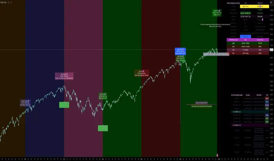
Ripster Clouds + Saty Pivot + RVOL + Trend1. Ripster EMA Clouds (local + higher timeframe)
Local timeframe (your chart TF):
Plots up to 5 EMA clouds (8/9, 5/12, 34/50, 72/89, 180/200 – configurable).
Each cloud is:
One short EMA and one long EMA.
A filled band between them.
Color logic:
Cloud is bullish when short EMA > long EMA (green/blue-ish tone).
Bearish when short EMA < long EMA (red/orange/pink tone).
You can choose:
EMA vs SMA,
Whether to show the lines,
Per-cloud toggles.
MTF Clouds:
Two higher-timeframe EMA clouds:
Cloud 1: 50/55
Cloud 2: 20/21
Computed on a higher TF (default D, but configurable).
Show as thin lines + transparent bands.
Used for:
Visual higher-TF trend,
Optional signal filter (MTF must agree for trades).
2. Saty Pivot Ribbon (time-warped EMAs)
This is basically your Saty Pivot Ribbon integrated:
Uses a “Time Warp” setting to overlay EMAs from another timeframe.
EMAs:
Fast, Pivot, Slow (defaults 8 / 21 / 34).
Clouds:
Fast cloud between fast & pivot EMAs.
Slow cloud between pivot & slow EMAs.
Bullish/bearish colors are distinct from Ripster colors.
Optional highlights:
Can highlight fast/pivot/slow lines separately.
Conviction EMAs:
13 and 48 EMAs (configurable).
When fast conviction EMA crosses over/under slow:
You get triangle arrows (bullish/bearish conviction).
Bias candles:
If enabled, candles are recolored based on:
Price vs Bias EMA,
Candle up/down/doji,
So you see bullish/bearish “bias” directly in candle colors.
3. DTR vs ATR panel (range vs average)
In a small table panel (bottom-center by default):
Computes higher-TF ATR (default 14, TF auto D/W/M, smoothing type selectable).
Measures current range (high–low) on that TF.
Displays:
DTR: X vs ATR: Y Z% (+/-Δ% vs prev)
Where:
Z% = current range / ATR * 100.
Δ% = change vs previous bar’s Z%.
Background color:
Greenish for low move (<≈70%),
Red for high move (≥≈90%),
Yellow in between,
Slightly dimmed when price is below bias EMA.
This tells you: “Is today an average, quiet, or explosive day compared to normal?”
4. SMA Divergence panel
Separate histogram & line panel:
Fast and slow SMAs (default 14 & 30).
Computes price divergence vs SMA in %:
% above/below slow SMA,
% above/below fast SMA.
Shows:
Slow SMA divergence as a semi-transparent column,
Fast SMA divergence as a solid column on top,
EMA of the slow divergence (trend line) colored:
Blue when rising,
Orange/red when falling.
Static upper/lower bands with fill, plus optional zero line.
This gives you a feel for how stretched price is vs its anchors.
5. RVOL table (relative volume)
Small 3×2 table (bottom-right by default):
Inputs:
Average length (default 50 bars),
Optionally show previous candle RVOL.
Calculates:
RVOL now = volume / avg(volume N bars) * 100,
RVOL prev,
RVOL momentum (now – prev) for data window only.
Table columns:
Candle Vol,
RVOL (Now),
RVOL (Prev).
Colors:
200% → “high RVOL” color,
100–200% → “medium RVOL” color,
<100% → “low RVOL” color,
Slightly dimmer if price is below bias EMA.
This is used both visually and optionally as a signal filter (e.g., only trade when RVOL ≥ threshold).
6. Trend Dashboard (Price + 34/50 + 5/12)
Top-right trend box with 3 rows:
Price Action row:
Uses either Bias EMA or custom EMA on close to say:
Bullish (close > trend EMA),
Bearish (close < trend EMA),
Flat.
Ripster 34/50 Cloud row:
Uses 34/50 EMAs: bullish if 34>50, bearish if 34<50.
Ripster 5/12 Cloud row:
Uses 5/12 EMAs: bullish if 5>12, bearish if 5<12.
Then it does a vote:
Counts bullish votes (Price, 34/50, 5/12),
Counts bearish votes,
Depending on mode:
Majority (2 of 3) or Strict (3 of 3).
Output:
Overall Bullish / Bearish / Sideways.
You also get an optional label on the chart like
Overall: Bullish trend with color, and an optional background tint (green/red for bull/bear).
7. VWAP + Buy/Sell Signals
VWAP is plotted as a white line.
Fast “trend” cloud mid: average of 5 & 12 EMAs.
Slow “trend” cloud mid: average of 34 & 50 EMAs.
Buy condition:
5/12 crosses above 34/50 (bullish cloud flip),
Price > VWAP,
Optional filter: MTF Cloud 1 bullish (50/55 on higher TF),
Optional filter: RVOL >= threshold.
Sell condition:
5/12 crosses below 34/50,
Price < VWAP,
Optional same filters but bearish.
When conditions are met:
Plots BUY triangle up below price (distinct teal/green tone).
Plots SELL triangle down above price (distinct magenta/orange tone).
Alert conditions are defined for:
BUY / SELL signals,
Overall Bullish / Bearish / Sideways change,
MTF Cloud 1 trend flips.
8. Data Window metrics
For easy backtesting / inspection via TradingView’s data window, it exposes:
DTR% (Current) and DTR% Momentum,
RVOL% (Now), RVOL% (Prev), RVOL% Momentum.
TL;DR – What does this script do for you?
It turns your chart into a multi-framework trend and momentum dashboard:
Ripster EMA clouds for short/medium trend & S/R.
Saty Ribbon for higher-TF pivot structure and conviction.
RVOL + DTR/ATR for context (is this a big and well-participated move?).
SMA divergence panel for overextension/stretch.
A compact trend table that tells you Price vs 34/50 vs 5/12 in one glance.
Buy/Sell markers + alerts when:
short-term Ripster trend (5/12) flips over/under medium (34/50),
price agrees with VWAP,
plus optional filters (MTF trend and / or RVOL).
Basically: it’s a trend + confirmation + context system wrapped into one indicator, with most knobs configurable in the settings.

LHAMA Oscillator Suite [LTS]Overview
The LHAMA Oscillator Suite is a collection of normalized, LHAMA-based oscillators built to make the behavior of the Low-High Adaptive Moving Average (LHAMA) easier to read in a separate pane. It translates LHAMA’s slope, distance, volatility buffer, intraday drift, and regime bias into six clear visual signals, with optional multi-timeframe overlays so you can compare your current chart to a higher-timeframe context at a glance.
Core concept
LHAMA is a custom adaptive moving average that responds more strongly when price is making new local highs or lows, and can optionally weight those moves by volume. The oscillator suite takes that adaptive line and derives several normalized measures (mostly scaled to ±100) around a zero line so you can:
See when LHAMA is meaningfully trending vs flat
Measure how far price has moved away from LHAMA in ATR terms
Track how far the LHAMA trend has “stretched” into its ATR cloud buffer
Follow intraday drift from a daily reset point
Visualize simple bull / bear / neutral states as a background regime filter
Available Oscillators
LHAMA Slope
Measures the angle of the LHAMA in ATR-normalized degrees, capped and rescaled to approximately –100 to +100. Positive values show rising LHAMA, negative values show falling LHAMA. The “Entry Slope (deg)” input defines when the line is considered strongly bullish or bearish. This is the primary trend-impulse oscillator in the suite.
Price Distance to LHAMA
Shows how far price is from the LHAMA in units of ATR, normalized to ±100. Large positive values indicate price trading well above the LHAMA; large negative values show price trading well below it. This is useful for spotting extensions away from the adaptive mean (for both continuation and mean-reversion style analysis).
LHAMA Cloud Buffer
Tracks the dynamic distance between LHAMA and its ATR-based “cloud boundary,” with the sign reflecting which side of the trend you are on. As the trend extends, the buffer widens; when LHAMA flips through the buffer, the sign changes. This makes it easy to see how mature or compressed a trend’s protective buffer is.
Trend Regime Bias
A smoothed, sigmoid transform of the LHAMA angle, converted to a bias between –100 and +100. Rather than focusing on raw slope, this oscillator highlights the underlying regime: values near +100 represent a strong bullish bias, values near –100 a strong bearish bias, and values near zero a more neutral environment.
Session Drift from Reset
Measures how far LHAMA has drifted from its value at a daily reset time (e.g., a futures session close), scaled by ATR and the square root of bars since reset. The result is a Z-score–style oscillator capped to ±100, which helps you gauge how extended the current session is relative to typical intraday movement.
LHAMA State (Background)
A simple state signal that classifies LHAMA as bullish, bearish, or neutral based on the angle and your slope threshold. It is typically used to tint the background of the oscillator pane, and can also be plotted from a higher-timeframe for regime stacking.
Multi-timeframe overlays
Each oscillator can optionally display a second, higher-timeframe (“MTF”) version drawn on the same scale. You can choose a custom MTF resolution (e.g., 15m while trading 1m), and independently toggle which MTF oscillators to show:
MTF LHAMA Slope
MTF Price Distance
MTF Cloud Buffer
MTF Regime Bias
MTF Session Drift
MTF LHAMA State background
This allows you to, for example, trade from the lower timeframe while aligning entries with the higher-timeframe trend regime or mean-reversion context.
Visualization and coloring
All oscillators are plotted around a zero line , with optional reference bands at ±80 to highlight stronger conditions.
Each oscillator can use one of three coloring styles:
Gradient : color intensity increases with the magnitude of the signal.
Flat : fixed bull / bear colors above and below zero.
Single Color : a single color regardless of sign, for minimalistic views.
A separate bull and bear color is available for each oscillator, and you can smooth most outputs with an EMA to reduce noise while keeping the raw calculations intact. You can also choose to disable to shaded area of each line for further visual differentiation.
Key settings
LHAMA settings : length, optional volume weighting, and a daily reset session to realign the moving average after overnight gaps.
Volatility settings : ATR length for both slope normalization and distance calculations.
Cloud settings : ATR multiplier used to define the LHAMA cloud buffer.
Appearance : optional smoothing length, zero-line color, ±80 bands toggle, and all per-oscillator color choices.
MTF overlays : higher-timeframe resolution and per-oscillator toggles for the MTF pack.
The script does not use lookahead settings in its data requests and does not draw future values; all signals are computed using information available at each bar in real time, in line with TradingView’s execution model and publishing guidelines.

Momentum by Trading BiZonesSqueeze Momentum Indicator with EMA
Overview
The Squeeze Momentum Indicator with EMA is a powerful technical analysis tool that combines the original Squeeze Momentum concept with an Exponential Moving Average (EMA) overlay. This enhanced version helps traders identify market momentum, volatility contractions (squeezes), and potential trend reversals with greater precision.
Core Concept
The indicator operates on the principle of volatility contraction and expansion:
Squeeze Phase: When Bollinger Bands move inside the Keltner Channel, indicating low volatility and potential energy buildup
Expansion Phase: When momentum breaks out of the squeeze, signaling potential directional moves
Key Components
1. Squeeze Momentum Calculation
Formula: Momentum = Linear Regression(Close - Average Price)
Where Average Price = (Highest High + Lowest Low + SMA(Close)) / 3
Visualization: Histogram bars showing positive (green) and negative (red) momentum
Zero Line: Represents equilibrium point between buyers and sellers
2. EMA Overlay
Purpose: Smooths momentum values to identify underlying trends
Customization:
Adjustable period (default: 20)
Toggle on/off display
Customizable color and line thickness
Cross Signals: Buy/sell signals when momentum crosses above/below EMA
3. Volatility Bands
Bollinger Bands (20-period, 2 standard deviations)
Keltner Channels (20-period, 1.5 ATR multiplier)
Squeeze Detection: Visual background shading when BB are inside KC
Trading Signals
Buy Signals (Green Upward Triangle)
Momentum histogram crosses ABOVE EMA line
Occurs during or after squeeze release
Confirmed by expanding histogram bars
Sell Signals (Red Downward Triangle)
Momentum histogram crosses BELOW EMA line
Often precedes market downturns
Watch for increasing negative momentum
Squeeze Warnings (Gray Background)
Market in low volatility state
Prepare for potential breakout
Direction indicated by momentum bias
Indicator Settings
Main Parameters
Length: Period for calculations (default: 20)
Show EMA: Toggle EMA visibility
EMA Period: Smoothing period for EMA
Visual Settings
Histogram color-coding based on momentum direction
EMA line color and thickness
Signal marker size and visibility
Squeeze zone background display
Practical Applications
Trend Identification
Uptrend: Consistently positive momentum with EMA support
Downtrend: Consistently negative momentum with EMA resistance
Range-bound: Oscillating around zero line
Entry/Exit Points
Conservative Entry: Wait for squeeze release + EMA crossover
Aggressive Entry: Anticipate breakout during squeeze
Exit: Opposite crossover or momentum divergence
Risk Management
Use squeeze zones as warning periods
EMA crossovers as confirmation signals
Combine with support/resistance levels
Advanced Interpretation
Momentum Strength
Strong Bullish: Tall green bars above EMA
Weak Bullish: Short green bars near EMA
Strong Bearish: Tall red bars below EMA
Weak Bearish: Short red bars near EMA
Divergence Detection
Price makes higher high, momentum makes lower high → Bearish divergence
Price makes lower low, momentum makes higher low → Bullish divergence
Squeeze Characteristics
Long squeezes: More potential energy
Frequent squeezes: Choppy market conditions
No squeezes: High volatility, trending markets
Recommended Timeframes
Scalping: 1-15 minute charts
Day Trading: 15-minute to 4-hour charts
Swing Trading: 4-hour to daily charts
Position Trading: Daily to weekly charts
Best Practices
Confirmation
Use with volume indicators
Check higher timeframe direction
Wait for candle close confirmation
Filtering Signals
Ignore signals during extreme volatility
Require minimum bar size for crossovers
Consider market context (news, sessions)
Combination Suggestions
With RSI: Confirm overbought/oversold conditions
With Volume Profile: Identify high-volume nodes
With Support/Resistance: Key level reactions
With Trend Lines: Breakout confirmations
Limitations
Lagging indicator (based on past data)
Works best in trending markets
May give false signals in ranging markets
Requires proper risk management
Conclusion
The Squeeze Momentum Indicator with EMA provides a comprehensive view of market dynamics by combining volatility analysis, momentum measurement, and trend smoothing. Its visual clarity and customizable parameters make it suitable for traders of all experience levels seeking to identify high-probability trading opportunities during volatility contractions and expansions.

Relative Strength Portofolio Strategy (RSPS) | DextraRelative Strength Portofolio Strategy (RSPS) | Dextra
Conceptual Foundation and Strategy Innovation
RSPS is a multi-asset rotation strategy that combines pairwise relative strength analysis across major cryptocurrencies with a robust market regime filter, along with an automatic safe-haven switch to Gold or USD (cash) during weakening market conditions. The strategy is designed to dynamically allocate capital to the cryptocurrency exhibiting the strongest relative dominance during bull phases, while significantly reducing exposure when overall crypto momentum fades—aiming to capture upside from the leading sector while limiting large drawdowns.
The core approach relies on a custom momentum indicator optimized for each asset pair, incorporating hysteresis to maintain signal stability and prevent excessive rotation (whipsaw). This creates a responsive rotation system that adapts to shifts in sector strength within the crypto market, focusing on capitalizing on the strongest prevailing momentum.
Market Regime Detection
Overall market regime is determined by a custom momentum indicator applied to the CRYPTO INDEX.
Gold strength is evaluated separately via a similar indicator on the Gold asset, serving as the trigger for safe-haven allocation during bearish conditions.
Pairwise Relative Strength Analysis
Relative strength is measured through pairwise comparisons between assets using custom indicator with period and threshold parameters tailored specifically to each pair—reflecting the unique volatility and historical behavior of each relationship.
Scoring System
Each asset receives a score (0–5) based on how many other assets it “outperforms” in the pairwise comparisons.
The highest score identifies the current relative leader.
During bull markets: allocation focuses on the top-scoring cryptocurrency.
During bear markets: the system switches to GOLD (if showing strength) or USD (cash) as a defensive position.
Allocation Guidance
The script defaults to suggesting 100% allocation to the selected asset to maximize exposure to the strongest momentum. However, traders can adjust exposure percentages based on personal risk tolerance—for example, allocating 70–90% to the dominant asset and keeping the remainder in USD or stablecoins to reduce portfolio volatility.
Equity Curve & Risk Metrics
Equity curve is calculated in real-time starting from a user-defined date.
Maximum Drawdown (MDD) is tracked and displayed as the primary risk metric.
Visualization and Dashboard Features
Equity Curve: Thick line plot with dynamic coloring based on the currently active asset.
Bar and Background Coloring: Transparent green during bull regime, red during bear.
Table in the bottom-right corner: Displays real-time scores for all assets (including USD and GOLD when relevant), with asset-specific background colors and highlighting for high scores.
Information Label: Shows the current active position, total ROI (as a multiplier), and MDD (%).
Assets Covered
Major cryptocurrencies: BTC, ETH, SOL, SUI, BNB, HYPE
Safe-haven assets: GOLD, USD (cash)
It performs best on the daily (1D) timeframe, where noise is reduced and signal reliability is higher.
Summary
RSPS | Dextra provides a fully automated asset rotation framework based on pairwise relative strength with pair-specific parameters, combined with clear market regime detection and risk-off mechanics. With its comprehensive visual dashboard (score table, colored equity curve, and real-time performance metrics), the script serves as a powerful decision-support tool for navigating crypto market dynamics—capturing upside from leading sectors while protecting capital during downturns.

Vegas plus by stanleyThis Pine Script implements a comprehensive trend-following strategy known popularly as the **Vegas Tunnel Method**. It combines multiple Exponential Moving Averages (EMAs) to define trends, pullbacks, and breakouts.
Here is a step-by-step walkthrough of how the code works, broken down by its components and logic.
---
### 1. The Anatomy (The Indicators)
The script uses three distinct groups of Moving Averages to define the market structure.
#### A. The Fast EMAs (The Trigger & Exit)
* **EMA 12 (Signal):** The fastest line. It is used to trigger entries (crossing the tunnel).
* **EMA 21 (Exit):** Used as a trailing stop. If the price crosses this line against your trade, the script signals an exit.
* **EMA 55 (Filter):** A medium-term filter, often used visually to gauge trend health.
#### B. The "Hero" Tunnel (The Action Zone)
* **EMAs 144 & 169 & 200:** These creates the main "Tunnel."
* **Function:** This acts as dynamic Support and Resistance.
* **Bullish:** If the 144 (Top) is above the 200 (Bottom), the tunnel is painted Blue.
* **Bearish:** If the 144 is below the 200, it is painted Red.
#### C. The "Anchor" Tunnel (The Deep Trend)
* **EMAs 576 & 676:** This creates a massive, slow-moving background tunnel.
* **Function:** It tells you the long-term trend. Generally, you only want to take Buy signals if price is above this Anchor, though the script logic focuses primarily on the Hero tunnel for triggers.
---
### 2. State Memory (`var` Variables)
This is a sophisticated part of the script. It uses `var` variables to "remember" where the price was in the past.
* `originPrice`: Remembers if the price was last seen **Above** (1) or **Below** (-1) the tunnel.
* `originEMA`: Remembers if the EMA 12 was last seen **Above** (1) or **Below** (-1) the tunnel.
**Why is this needed?**
To distinguish between a **Breakout** (crossing from Bear to Bull) and a **Pullback** (already Bull, dipped into tunnel, and coming back out).
---
### 3. The Four Entry Triggers
The script looks for four specific scenarios to generate a Buy or Sell signal. You can turn these on/off in the settings.
#### Trigger 1: Price U-Turn (Trend Continuation)
* **Logic:** The Price was *already* above the tunnel (`originPrice == 1`), dipped down, and is now crossing back up (`crossover`).
* **Meaning:** This is a classic "Buy the Dip" signal within an existing trend.
#### Trigger 2: EMA U-Turn (Lagging Confirmation)
* **Logic:** Similar to Trigger 1, but uses the **EMA 12** line instead of the Price candle.
* **Meaning:** This is safer but slower. It waits for the average price to curl back out of the tunnel.
#### Trigger 3: Breakthrough (Momentum Shift)
* **Logic:** The EMA 12 was previously *below* the tunnel (`originEMA == -1`) and has just crossed *above* it (`crossover`).
* **Meaning:** This is a Trend Reversal signal. The market has shifted from Bearish to Bullish.
#### Trigger 4: Wick Rejection (Touch & Go)
* **Logic:**
1. Price is generally above the tunnel.
2. The `Low` of the current candle touches the tunnel.
3. The `Low` of the *previous* candle did NOT touch the tunnel.
4. The candle closes *outside* (above) the tunnel.
* **Meaning:** The price tested the support zone and was immediately rejected (bounced off), leaving a wick.
---
### 4. Trade Management (State Machine)
The script uses a variable called `tradeState` to manage signals so they don't spam your chart.
* `tradeState = 0`: Flat (No position).
* `tradeState = 1`: Long.
* `tradeState = -1`: Short.
**The Rules:**
1. **Entry:** If `validLong` is triggered AND `tradeState` is not already 1 -> Change state to 1 (Long) and plot a **BUY** label.
2. **Holding:** If you are already in State 1, the script ignores new Buy signals.
3. **Exit:** If `tradeState` is 1 AND price closes below EMA 21 -> Change state to 0 (Flat) and plot an **Exit L** label.
---
### 5. Visual Summary
* **Green Label:** Buy Signal (Long Entry).
* **Red Label:** Sell Signal (Short Entry).
* **Grey X:** Exit Signal (Close the position).
* **Blue/Red Tunnel:** The "Hero" tunnel (144/169/200).
* **Grey Background Tunnel:** The "Anchor" tunnel (576/676).
### How to read the signals:
You are looking for the price to interact with the **Hero Tunnel** (the thinner, brighter one).
1. **Trend:** Look at the slope of the Anchor (thick grey) tunnel.
2. **Setup:** Wait for price to come back to the Hero Tunnel.
3. **Trigger:** Wait for a **Green Label**. This means the price dipped into the tunnel and is now blasting out (U-Turn), or has rejected the tunnel (Wick), or has broken through a new trend (Breakthrough).
4. **Exit:** Close the trade when the **Grey X** appears (Price crosses the EMA 21).
