Pearson's R TrendPearson's R Trend Indicator
Overview
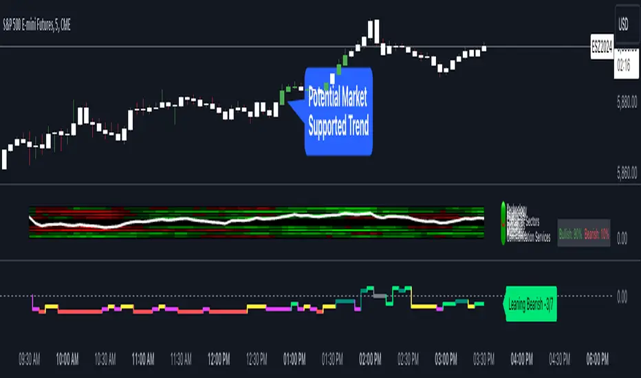
The Pearson's R Trend Indicator is an advanced technical analysis tool that measures the strength and direction of price trends using statistical correlation. By comparing fast and slow-period Pearson correlation coefficients, this indicator helps identify trend momentum, potential reversals, and overbought/oversold conditions.
Key Features
Dual timeframe correlation analysis (Fast and Slow periods)
Signal line with crossover alerts
Dynamic histogram for trend visualization
Configurable overbought/oversold levels
Multiple visual components with customizable colors
Comprehensive alert system
Technical Details
Core Calculations
Fast R: Calculates Pearson's correlation coefficient over the faster period (default: 21 periods)
Slow R: Calculates Pearson's correlation coefficient over the slower period (default: 34 periods)
R-Diff: Normalized difference between Fast and Slow R values (range: -1 to 1)
Signal Line: Smoothed average of R-Diff (default: 3-period SMA)
Histogram: Difference between R-Diff and Signal Line
Signal Generation
Zero Line Crosses
• Bullish: R-Diff crosses above zero
• Bearish: R-Diff crosses below zero
Signal Line Crosses
• Bullish: R-Diff crosses above Signal Line
• Bearish: R-Diff crosses below Signal Line
Overbought/Oversold Conditions
• Overbought: R-Diff above 0.45 (default)
• Oversold: R-Diff below -0.45 (default)
Customization Options
Calculation Settings
Fast Length: Period for fast correlation calculation (default: 21)
Slow Length: Period for slow correlation calculation (default: 34)
Signal Smoothing: Moving average period for signal line (default: 3)
Price Source: Configurable input source (default: close)
Visual Settings
Histogram display toggle
Signal line display toggle
Crossing markers toggle
Line width adjustments
Custom color schemes for bullish/bearish signals
Configurable overbought/oversold levels
Interpretation
Bullish Signals
R-Diff crossing above zero
R-Diff crossing above signal line
R-Diff emerging from oversold territory
Positive histogram expansion
Bearish Signals
R-Diff crossing below zero
R-Diff crossing below signal line
R-Diff dropping from overbought territory
Negative histogram expansion
Alert Conditions
Zero line crosses (both directions)
Signal line crosses (both directions)
Overbought zone entry
Oversold zone entry
Best Practices
Use multiple timeframe analysis for confirmation
Combine with volume and price action analysis
Watch for divergences between R-Diff and price
Pay attention to histogram momentum changes
Use overbought/oversold levels as dynamic support/resistance zones
Notes
The indicator uses statistical correlation to measure trend strength
Normalized calculations ensure consistent -1 to 1 range
Built-in alert system for all major signal types
Customizable visual elements for optimal chart analysis
Disclaimer
This technical indicator is designed to supplement your trading analysis and should not be used as the sole decision-making tool. Always combine with other forms of analysis and proper risk management techniques.
Indicatore Pine Script®